Color Diary · No. 132
Sherwin-Williams Slate Tile: One Surface, Good Light, and No Regrets
Sherwin-Williams' quiet blue-gray workhorse, reviewed honestly: where it reads a real blue, the light that turns it flat black, and what to paint it on instead of a whole room.

Susan HartleyNovember 20, 2026 · 16 min read
Slate Tile · Sherwin-Williams SW 7624
Hex#606E74LRV15Undertonesblue-gray anchored by charcoal
In our last house—a 1990s center-hall colonial with more drywall than architectural charm—I spent an entire April convinced that painting our kitchen island would cure my dissatisfaction with the room. The perimeter cabinets were a plain builder-grade white, the laminate counters were screaming for replacement, and I didn't have the budget for a gut renovation. What I did have was a twenty-dollar brush, a quart of satin enamel, and an eye on Sherwin-Williams Slate Tile (SW 7624). At LRV 15, it promised depth without the ink-well drama of a full black or the bright preppiness of a nautical navy. I taped off the baseboard, wiped down the oak veneer island base, and went to work.
We lived with it for seven years in that kitchen. In year two, a rogue toddler riding a plastic tricycle took a gouge out of the front corner; in year four, the steam from the dishwasher left a hazy grease line right below the counter overhang. I scrubbed clean that panel more times than I care to admit, and every single time, that deep, stony teal-gray bounced back without complaining. When we sold that colonial three years later, our real estate agent specifically pointed out the kitchen island as one of the visual anchors that stopped prospective buyers from noticing how dated the surrounding sheet vinyl actually was.
That is the reality of Slate Tile. It is not an internet-darling color designed to generate millions of breathless saves on a digital board. You won't find it headlining a major trend campaign or being crowned Color of the Year. It is simply a quiet, deliberate Sherwin-Williams workhorse that seasoned designers pull out when a homeowner says, "I want something moody and grounded, but I don't want black, and I don't want a bright blue." Put it on one hardworking surface with adequate daylight, and it earns its keep every day of the week. Roll it over four walls of a dim room with cheap overhead bulbs, however, and you will find yourself staring into a cheerless cave before the roller dries.
When people ask me about living with color long-term, I always tell them to look past the first forty-eight hours. Anyone can fall in love with a fresh coat of wet paint gleaming under work lights on a Sunday afternoon. The real test is five years in, when the morning sun hits it sideways, the dust has settled into the corners, and life has happened against the baseboards. Slate Tile sits at a very specific juncture on the color wheel: it is officially cataloged in Sherwin-Williams' teal family, but in practice, it is a slate-charcoal that holds blue in reserve. Depending on your windows, your lamps, and the time of day, it will show you three entirely distinct faces.
The Undertone Breakdown: How Slate Tile Shifts
Slate Tile sits at LRV 15 with a heavy gray backbone and an underlying blue-teal pigment. In strong daylight, the blue steps forward; under overcast skies, the gray takes command; under dim or cool lighting, it collapses straight toward black.
warm sun
overcast, north light
dusk, rain, cool bulbs
A true blue-gray whose gray backbone keeps it grounded in bright sun, but will pull murky charcoal if starved for warm illumination.
Knoxville GrayBenjamin Moore · see diary
Inchyra BlueFarrow & Ball · see diary
Slate TileSW 7624
Smoky BlueSherwin-Williams · see diary
Hamilton BlueBenjamin Moore · see diary
Light Shifts: From Morning Chill to Evening Glow
Before you commit a whole weekend to cutting in this color, you need to understand how drastically LRV 15 paint responds to changing daylight. A light reflectance value of 15 means the surface absorbs roughly 85 percent of the visible light hitting it. If you put that on a wall facing an unobstructed southern window, you get a gorgeous, smoky slate-blue that looks rich, tailored, and quiet. But if you starve it of natural daylight, the blue simply disappears into the shadows.
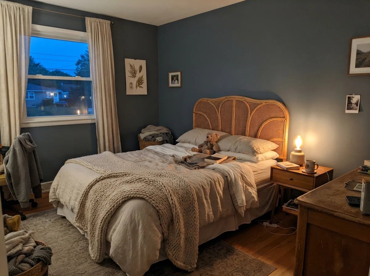
I've watched this paint cycle through an entire twenty-four hours in our bedrooms. In cool morning light, Slate Tile can look surprisingly restrained, almost washed out or chalky if the sky outside is gray and no lamps are lit. But turn on a bedside lamp with a warm 2700K incandescent or warm-white LED bulb at dusk, and the entire perimeter transforms into an intimate, cocooning navy-charcoal that feels like a wool blanket. That swing is part of its charm—provided you expect it.
Where It Works Best: The Single-Surface Rule
Here is my honest rule after thirty years and three houses: Slate Tile is at its absolute best when it is treated as an architectural punctuation mark rather than the whole sentence. In the home design magazines, you will occasionally see a brave soul drenching a four-wall library in dark slate blue. It photographs wonderfully for ten minutes under heavy studio strobes. In real life, for a family that actually lives in the room, four walls of an LRV 15 paint can feel oppressive unless the room is flooded with sun from three exposures.
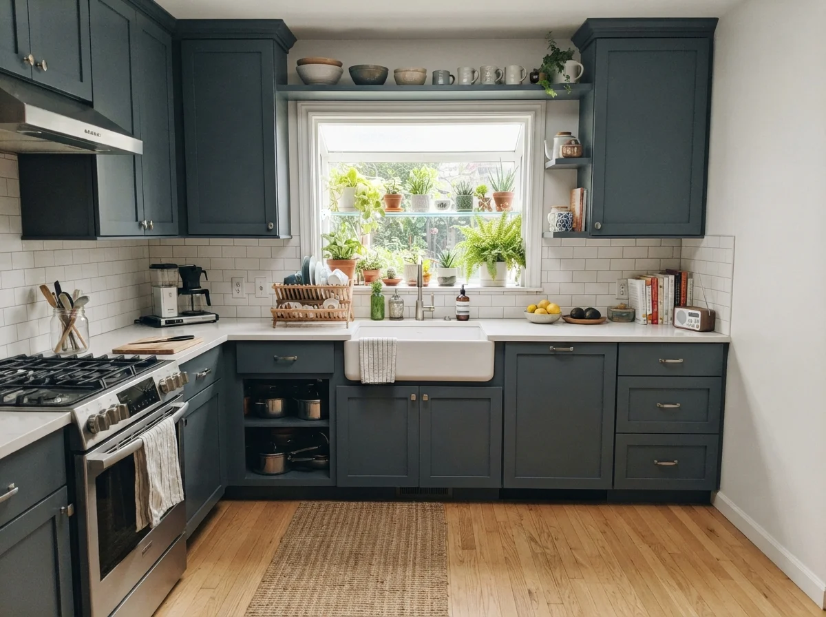
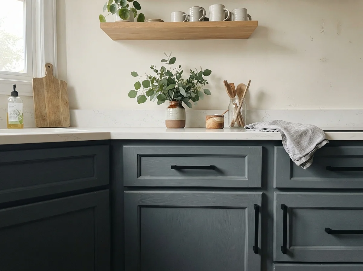
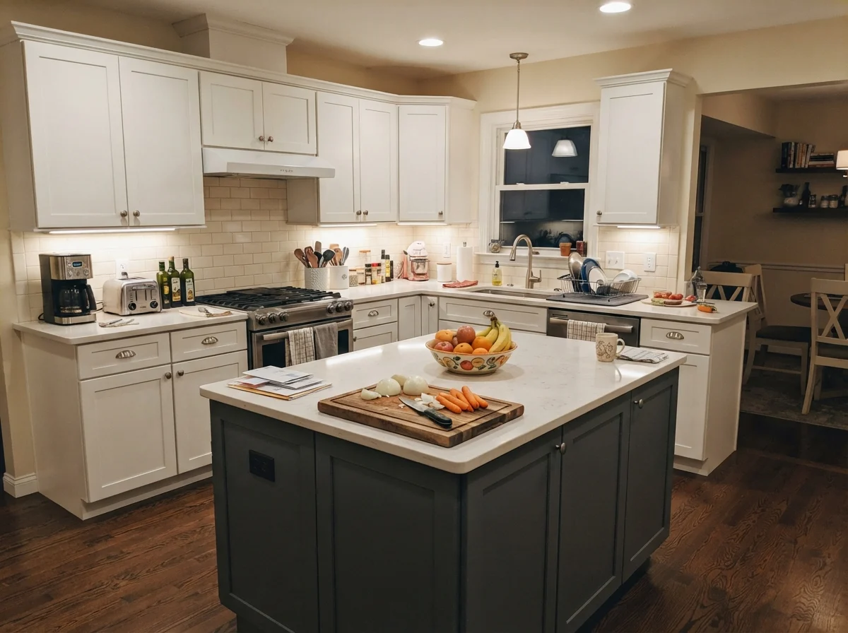
Where Slate Tile truly shines is on a single, hardworking element. Kitchen cabinetry—particularly lower cabinets or an island base—is its signature calling. Against crisp white perimeter walls and white subway tile, it grounds the room completely. When we paired it with a light quartz counter and brushed brass cup pulls, it gave the kitchen an intentional, custom feel without costing us a fortune in custom cabinetry.
Notice the breathing room in that kitchen: the island carries the weight, while the surrounding cabinets and cream walls keep the room light and open. That balance is what keeps a deep color from feeling like an impulse buy that looked dated within a few seasons. When you keep the perimeter bright, you don't grow tired of the depth; you appreciate it every time you walk into the room with groceries.
Bathrooms: Wainscoting, Vanities, and Clawfoot Tubs
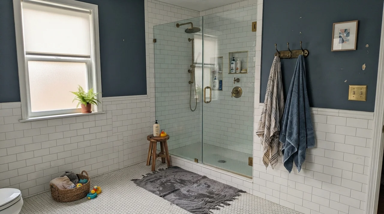
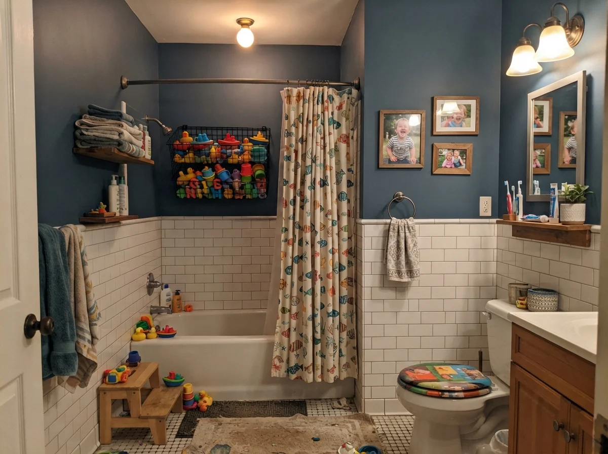
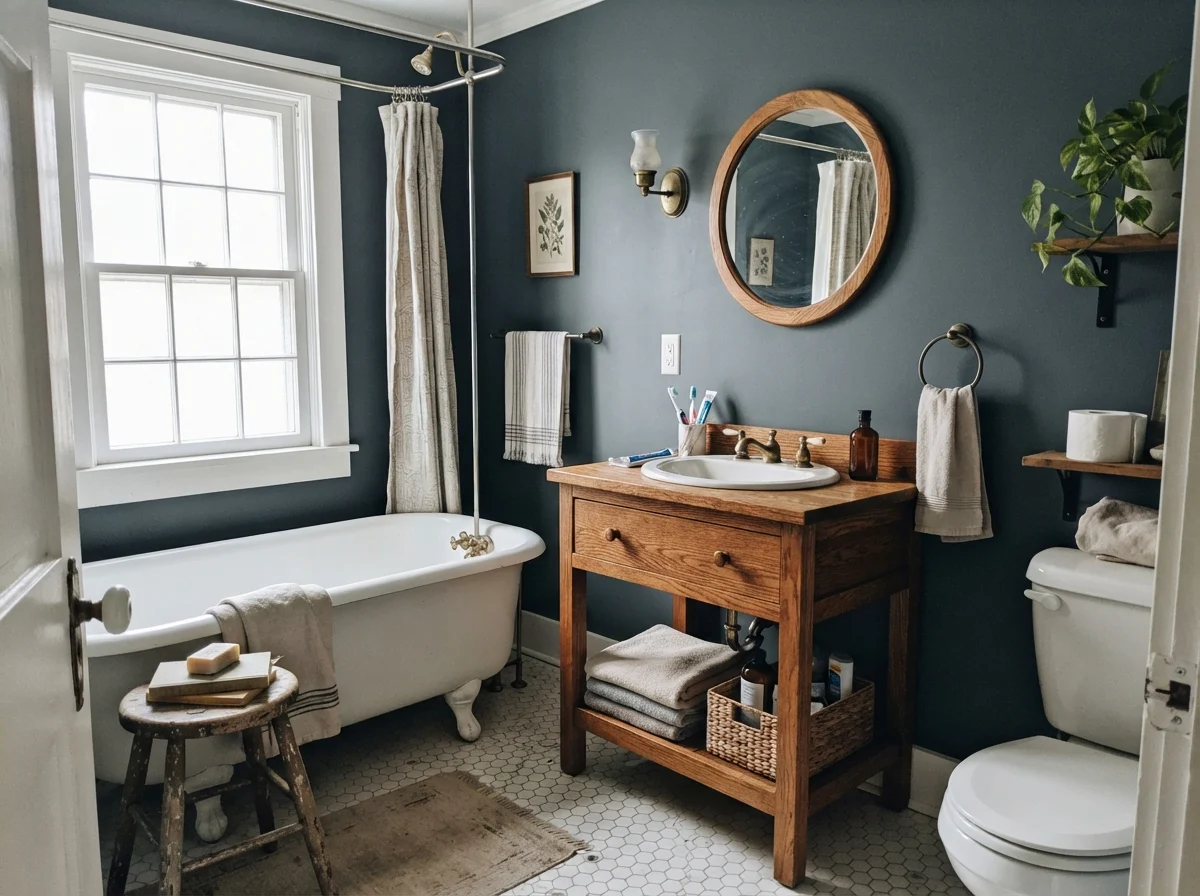
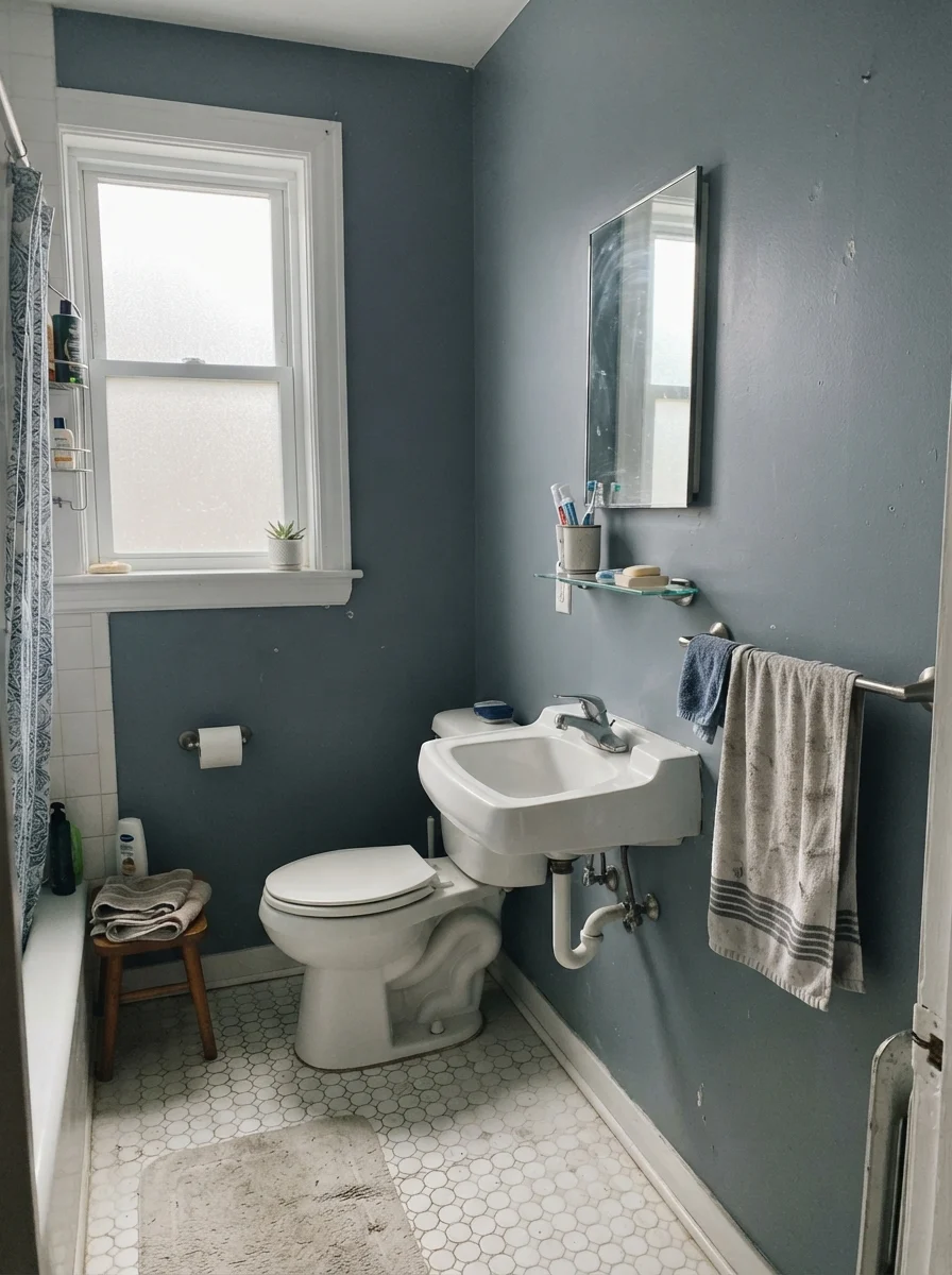
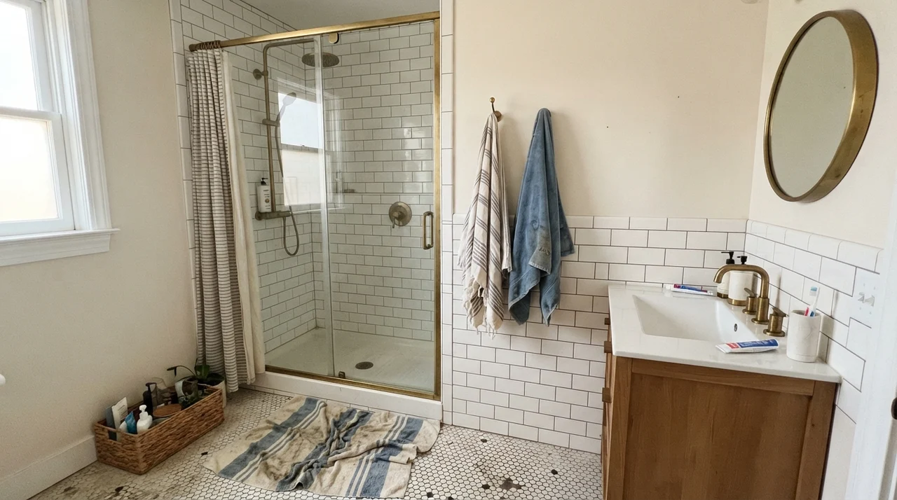
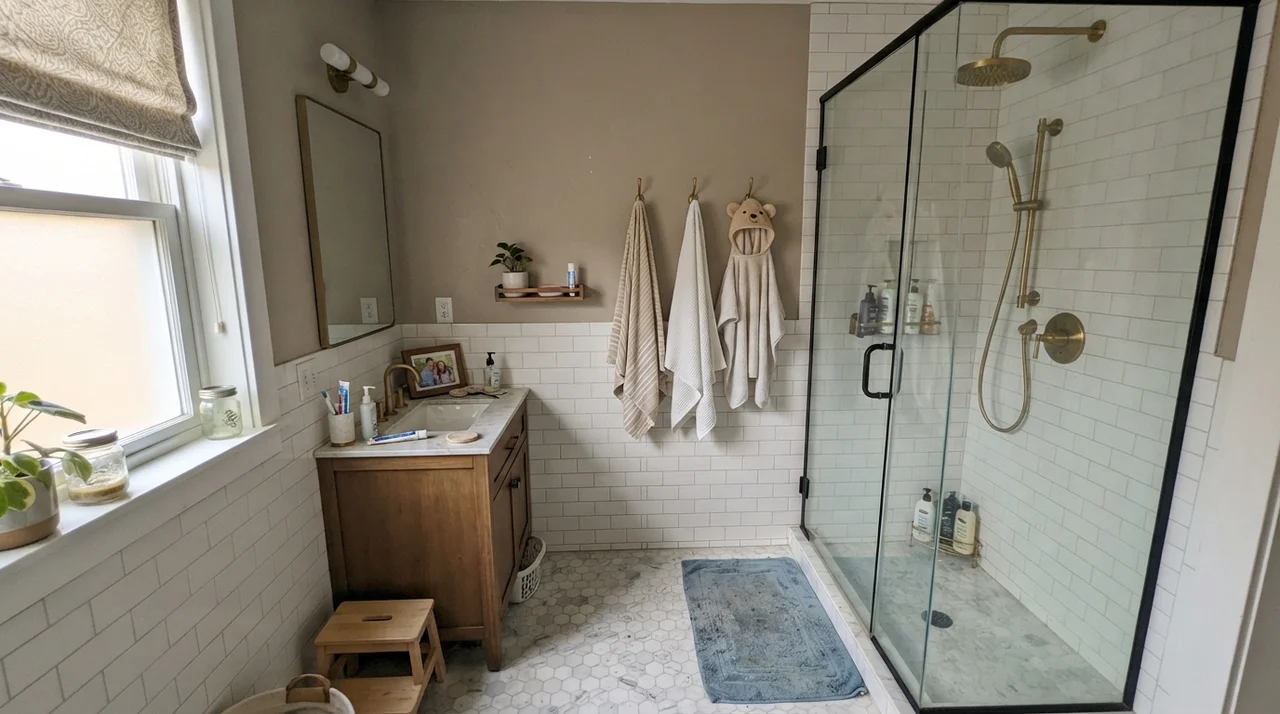
If you do want to use Slate Tile on walls, the bathroom is where it can make total architectural sense—provided you pair it with high-contrast materials. In a small powder room or a family bath, painting the upper walls in Slate Tile above a crisp white subway tile wainscot creates an immediate vintage elegance. The tile reflects light around the lower half of the room, while the dark paint above lowers the visual ceiling and adds warmth.
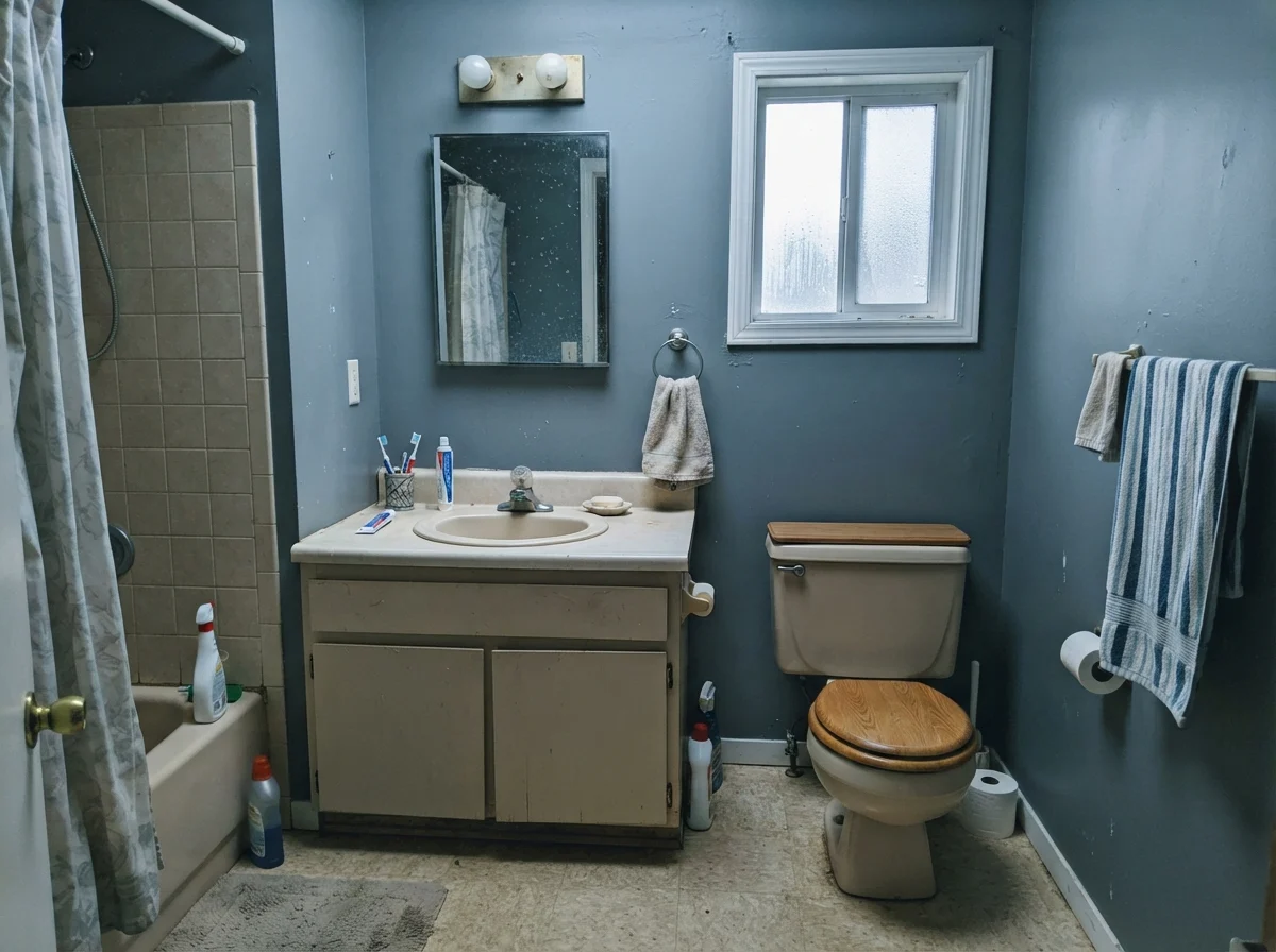
Take a hard look at that last bathroom in the rainy light. That is the exact trap homeowners fall into. If your bathroom has older almond or beige porcelain and relies on weak north daylight, Slate Tile won't turn into a magical spa retreat. It will show its cool, moody teeth and make the beige fixtures look even more dated. But pair it with white porcelain, warm oak, or unlacquered brass, and the blue undertones snap into focus with remarkable dignity.
Bedrooms, Living Rooms, and Daylight Exposure
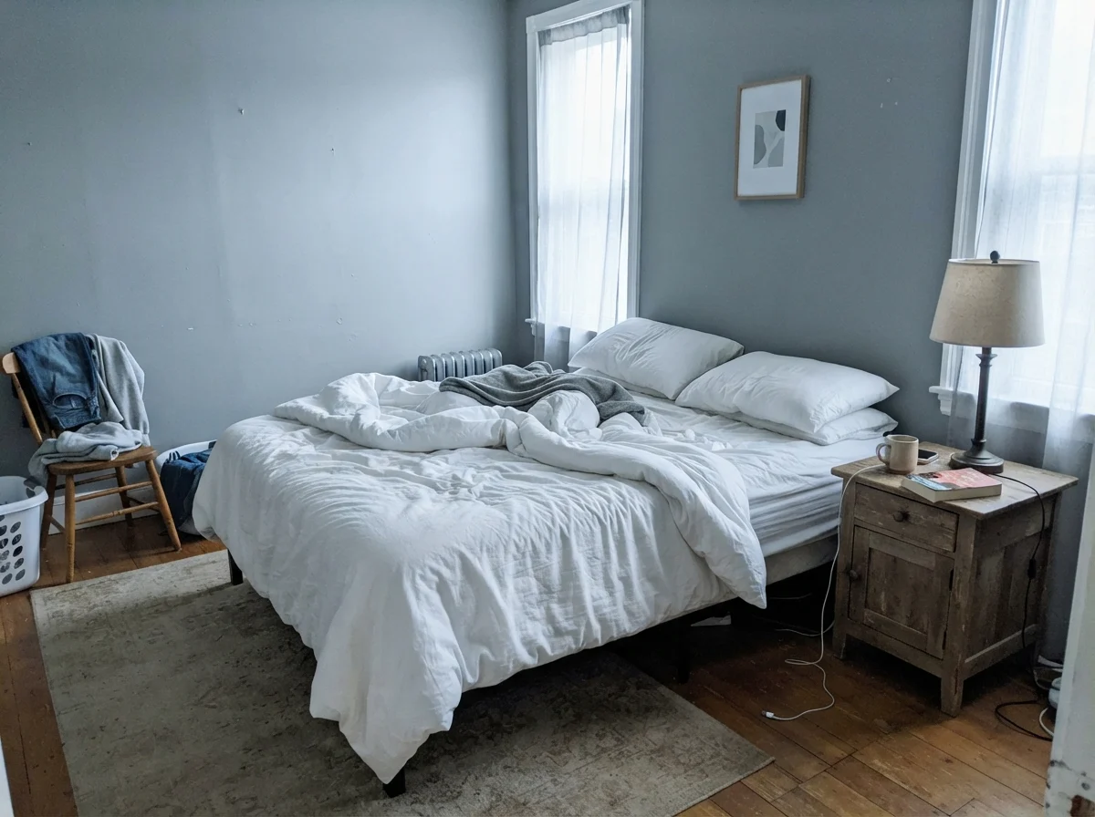
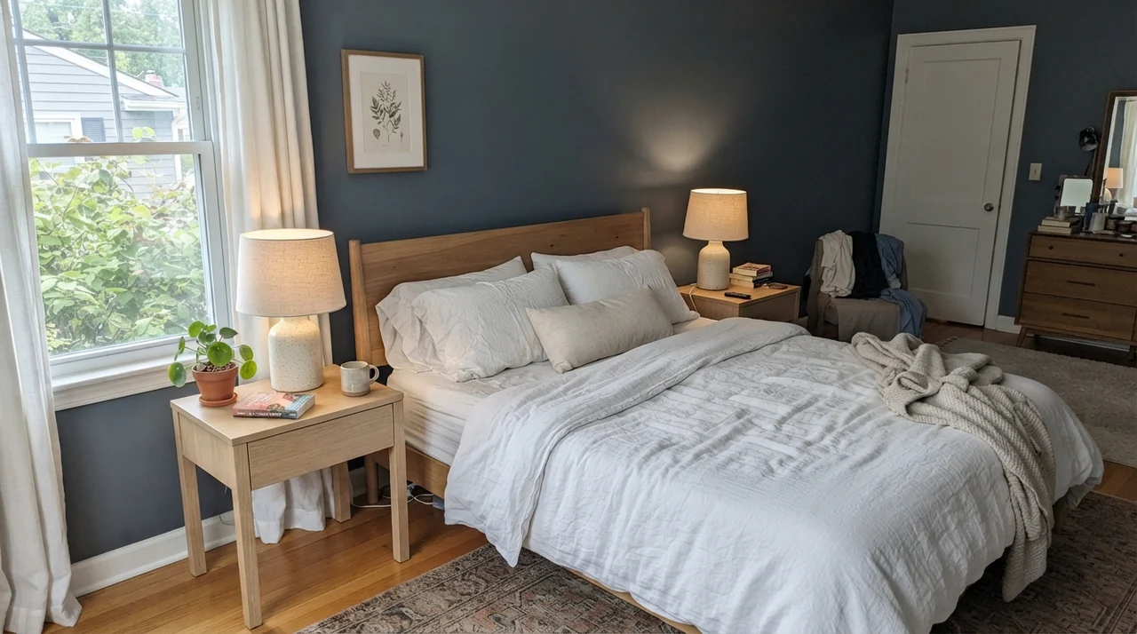
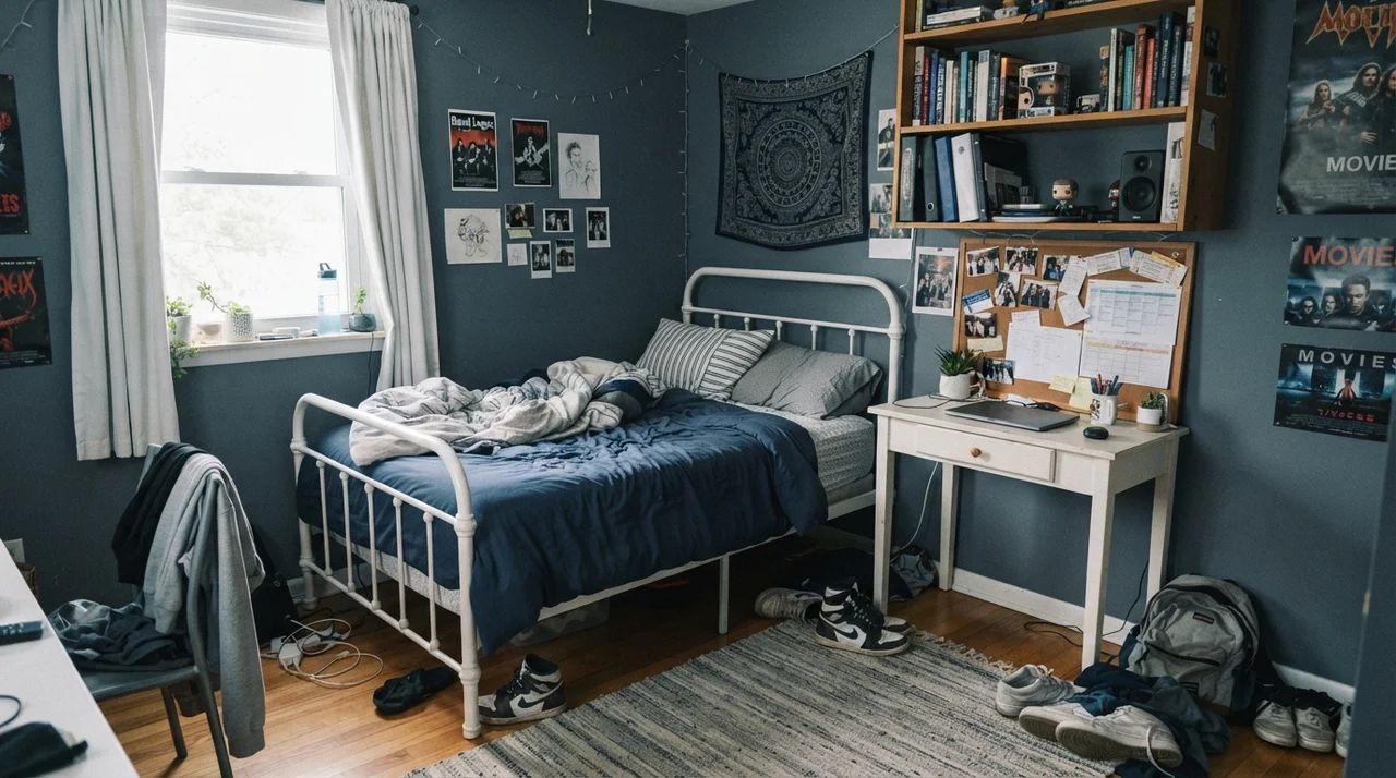
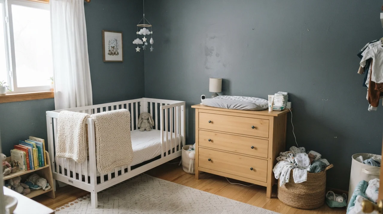
In bedrooms, Slate Tile can create a deeply restorative atmosphere, but only if you dress the bed in clean, high-contrast textiles like pale linens or natural wood frames. In our 1970s split-level, our guest room sat on the east side of the house. In the mornings, when the sun crested the tree line, a deep slate blue like this was breathtaking. By mid-afternoon, as the sun swung around to the west, the room grew quite dark. If we hadn't kept the trim clean and bright, it would have felt like a broom closet.
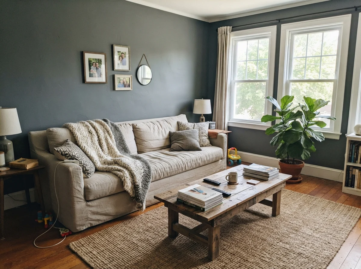
In that living room, notice how the generous double windows and large panes flood the wall space with natural midday sun. That is the only scenario where four walls of Slate Tile work in a central family living area. The direct light hits the pigment, bounces off the texture, and prevents the paint from feeling heavy. Without those generous windows, that same room would swallow the room's energy whole.
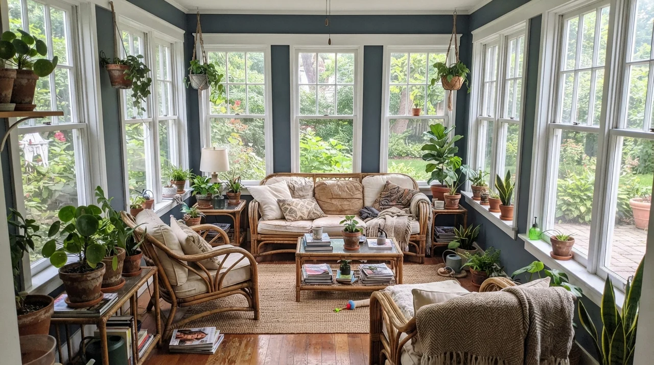
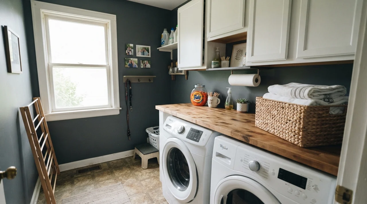
Beyond standard walls and cabinet boxes, Slate Tile has two other natural habitats that I recommend to neighbors constantly: transition spaces like laundry rooms, and architectural trim accents like doors and exterior elements.
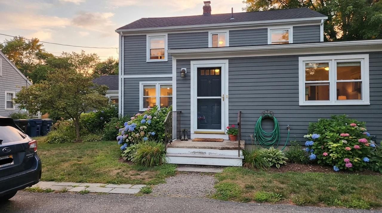
When you take Slate Tile outside onto siding or shutters, daylight works wonders on it. The vast ambient light of the sky dilutes the gray and brings out the underlying blue tones. In our 1960s ranch, exterior shutters painted in this depth gave the facade an anchor without looking like standard black builder stock. Under direct sunlight, it softens by at least two visual shades.
The Honest Fail: The Windowless Corridor
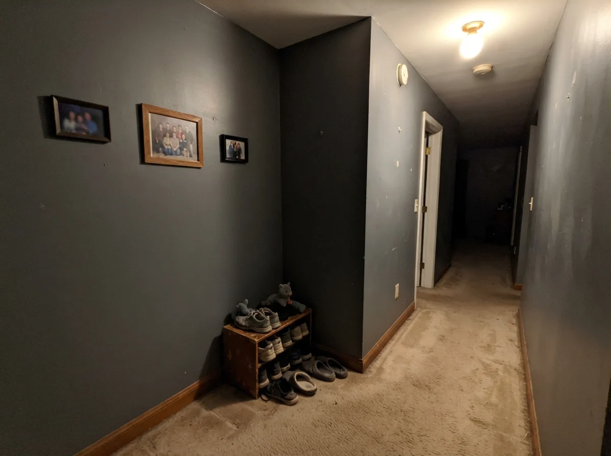
Now, let's talk about the mistake people make when they buy a pint sample, fall in love with it under the fluorescent tubes at the paint counter, and decide to coat a dark interior hall. This is the failure scenario I see repeated year after year.
Look closely at that corner. Without a window or a dedicated warm lamp, the blue pigment simply dies. What you are left with is an uninviting, flat, charcoal-mud wall that shrinks the hall and highlights every scuff. If you have a closed hallway with no natural light and an overhead flush-mount fixture running a cold bulb, Slate Tile is decidedly not worth the money. You will be back at the hardware store within six months buying primer to cover it up.
At LRV 15, a full room in ordinary daylight stops reading as a color and starts reading as an absence of light. Slate Tile works on one surface; it was not built to carry a living room alone.
Finishes and Sheens: How to Avoid Burnishing
Over thirty years of repainting our homes, I have learned the hard way that dark, saturated paints behave very differently from off-whites when it comes to sheen. In cheap flat or matte paints, deep pigments burnish if you look at them funny. Someone brushes past the hallway wall in a winter coat, or you try to wipe a greasy thumbprint off the cabinet door, and suddenly you have a shiny, permanent smudge that catches every glint of light.
For Slate Tile, follow this sheen rule strictly:
- Kitchen Islands & Bathroom Vanities: Use a high-grade satin cabinet enamel (urethane-fortified). It flows out smooth, wipes down easily after dinner, and resists chipping.
- Front Doors & Exterior Shutters: Semi-gloss. The higher sheen sheds water, stands up to the sun, and gives the color an extra kick of clarity outdoors.
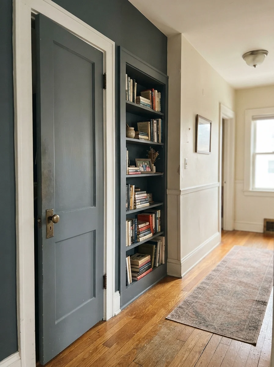
- Accent Walls & Built-ins: Matte or eggshell. If it's a true accent wall behind a headboard where people won't be constantly bumping into it, a velvety eggshell looks sophisticated. For bookshelves where books slide back and forth, eggshell or satin will prevent scuffing.
- Whole-Room Walls: If you must do a small powder room or study, keep to eggshell. A flat finish will show every water drop or splash near the sink.
How Slate Tile Compares to Its Closest Counterparts
One of the easiest mistakes to make in the paint aisle is pulling three chips that look almost identical under store lighting and guessing which one to buy. Because Slate Tile sits in the grayed-out teal family, it shares shelf space with several notable competitors from Sherwin-Williams, Benjamin Moore, and Farrow & Ball. Here is how they actually differ once rolled out on a real board.
Durability, Touch-Ups, and the Five-Year Test
Here is my budget view on Slate Tile: it is an exceptional investment on wood, trim, and millwork, but it is not where I would spend money painting an entire drywall living room. In our current 1960s ranch, I used a quart of high-grade satin enamel on our back entry door and mudroom bench. Five years in, that door handle area has been scrubbed clean with soapy water at least forty times. The paint film held up beautifully without softening or fading, and the scuffs from winter boots wiped right off.
However, dark walls do have a catch that no paint chip will ever tell you: touch-ups. If you ding a deep LRV 15 wall three years after painting it, you cannot simply dab a brush in leftover paint and feather the edge. Darker paints dry slightly different depending on humidity, temperature, and age, leaving a visible flashing patch that catches the light. If you scratch a Slate Tile wall, plan on rolling the entire section from corner to corner. That is why I love it on cabinets and doors—where edge-to-edge repainting takes twenty minutes—and hesitate to recommend it across sprawling 12-foot drywall sheets.
Does Sherwin-Williams Slate Tile look green?
Slate Tile belongs to the teal family in the Sherwin-Williams fan deck, but in real rooms, the heavy charcoal-gray backbone keeps green from showing up. It reads as a true slate blue-gray. If you want noticeable green, look at Smoky Blue or Knoxville Gray instead.
Can I paint an entire room in Slate Tile?
Unless the room is blessed with exceptional, all-day daylight from large windows, painting all four walls will feel heavy and oppressive. It is designed to shine on a single architectural feature—like a kitchen island, vanity, or accent wall—or in small jewel-box spaces like a powder room.
What light bulbs look best with Slate Tile?
Always pair Slate Tile with warm 2700K to 3000K bulbs. Cool-white LEDs (4000K and above) flatten the color, stripping out the rich blue undertones and turning it into a lifeless, cold dark gray.
What is the best finish for kitchen cabinets painted Slate Tile?
A satin cabinet enamel is the sweet spot. It provides enough sheen to wipe down spills and grease without creating harsh, plastic-like reflections across the shaker panels.
Susan's Verdict · Worth the Money on the Right Surface
Slate Tile (SW 7624) is not a color to buy on a whim for your living room walls, but it is one of the most reliable dark accents in the entire Sherwin-Williams catalog. Give it a single, hardworking surface—a kitchen island, a powder room vanity, or a front door—pair it with crisp white trim, quartz, and warm brass, and it will reward you with quiet, enduring dignity for years to come.