Color Diary · No. 37
Behr Even Better Beige: How We Finally Stopped Painting Everything Gray
Behr's modern beige, reviewed honestly: the rooms where it feels expensive, the west wall where it turns peachy, and what to buy instead.

Susan HartleySeptember 20, 2026 · 14 min read
Even Better Beige · Behr DC-010
Hex#D4CABALRV60Undertonessand → peach-tan → grayed putty
In our last house—a 1990s colonial with honey oak floors running through the entire ground floor—I spent the better part of seven years trying to make cool grays behave. Every design magazine in 2014 insisted that gray was the only modern choice. So I bought five gallons of a popular cool neutral, rolled it across the center hall and family room, and watched in despair as my warm wood floors turned violently orange by comparison while the walls took on the chilly ambiance of an overcast concrete basement. I lived with it for three years before I finally admitted the truth: fighting the existing wood in a house is an expensive, exhausting losing battle.
When we moved into our current 1960s ranch, I swore off the chilly grays for good. But I also remembered the dingy yellow-gold tans of the early 2000s that took three coats of heavy primer to cover. What most of us are actually looking for when we say we want a warm neutral is a true sand beige—something that sits right around LRV 60, carries enough pigment to keep from washing out under midday light, and flatters oak without turning the room into a stick of butter. That brings us to Behr Even Better Beige (DC-010).
Behr Even Better Beige is part of Behr's Designer Collection palette, and it sits at a Light Reflectance Value of 60. That number is crucial for whole-house repaints. LRV 60 means it bounces sixty percent of the light back into the room. It is light enough to carry through an entire open floor plan without turning a dim back hallway into a cavern, yet it has enough body that your white woodwork actually pops against it. But like any color built on a subtle foundation, it has quirks you need to understand before you buy five gallons at the paint desk.
The Three Faces of Even Better Beige
Every neutral shifts as the sun moves across your roofline, but Even Better Beige has a specific red-orange undertone base that dictates its behavior. It never goes green and it refuses to go yellow, but depending on your windows, it will show you three distinctly different personalities throughout the day.
warm sun
overcast, north light
dusk, rain, cool bulbs
sand → peach-tan → grayed putty
Almond WispBehr · see diary
Accessible BeigeSherwin-Williams · see diary
Even Better BeigeDC-010
MushroomSherwin-Williams · see diary
Cedar KeyBenjamin Moore · see diary
Watching the Daylight Shift
The biggest mistake I see homeowners make with this color is painting a tiny swatch on one wall at noon, nodding approvingly, and ordering paint for the whole house. Because of its red-orange pigment base, Even Better Beige is a chameleon between dawn and dusk. In the morning, or under cool indirect light, it can appear quiet, muted, and slightly washed out. But as the afternoon sun rolls in from the west, that red-orange core wakes up fast.
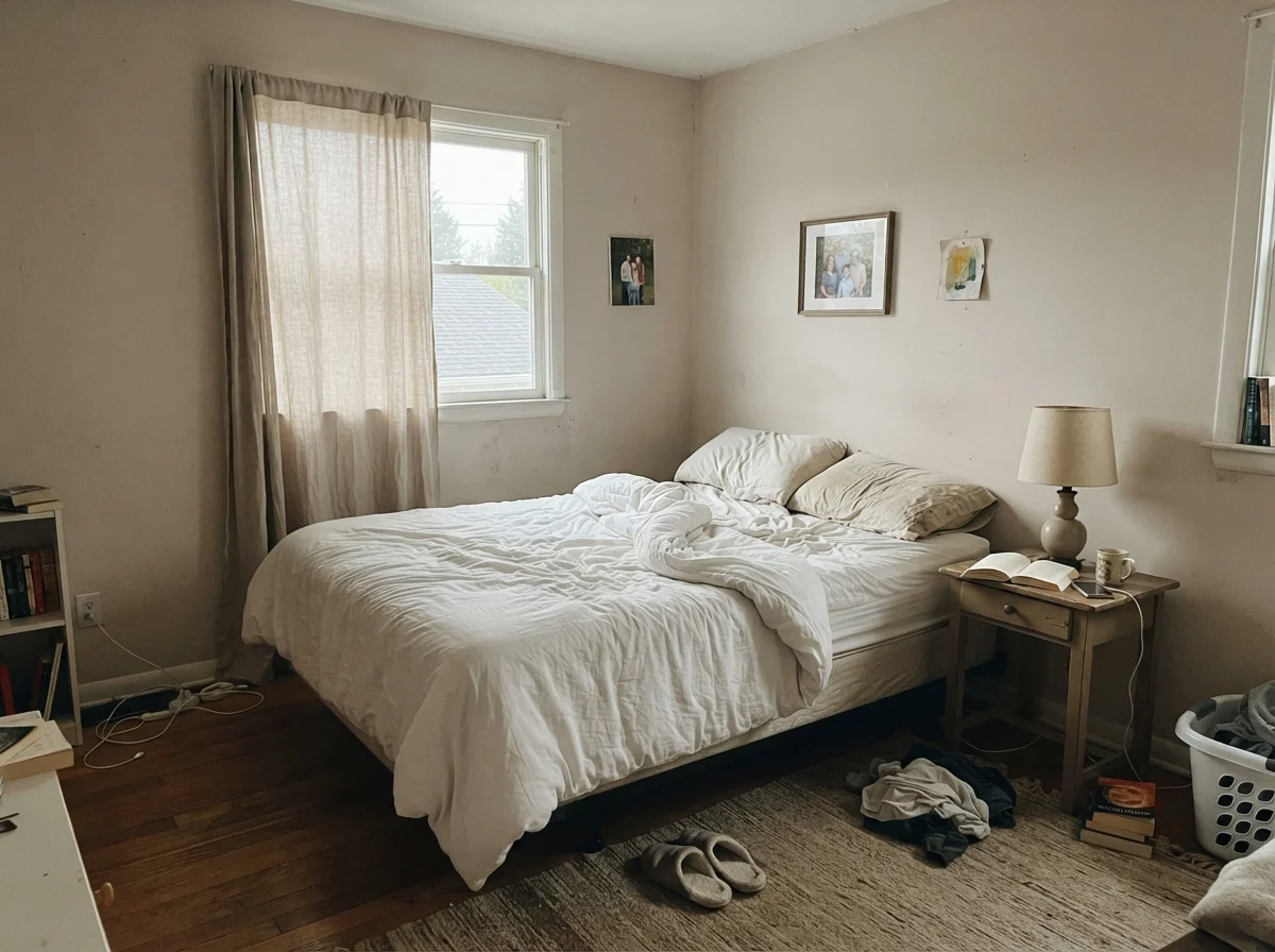
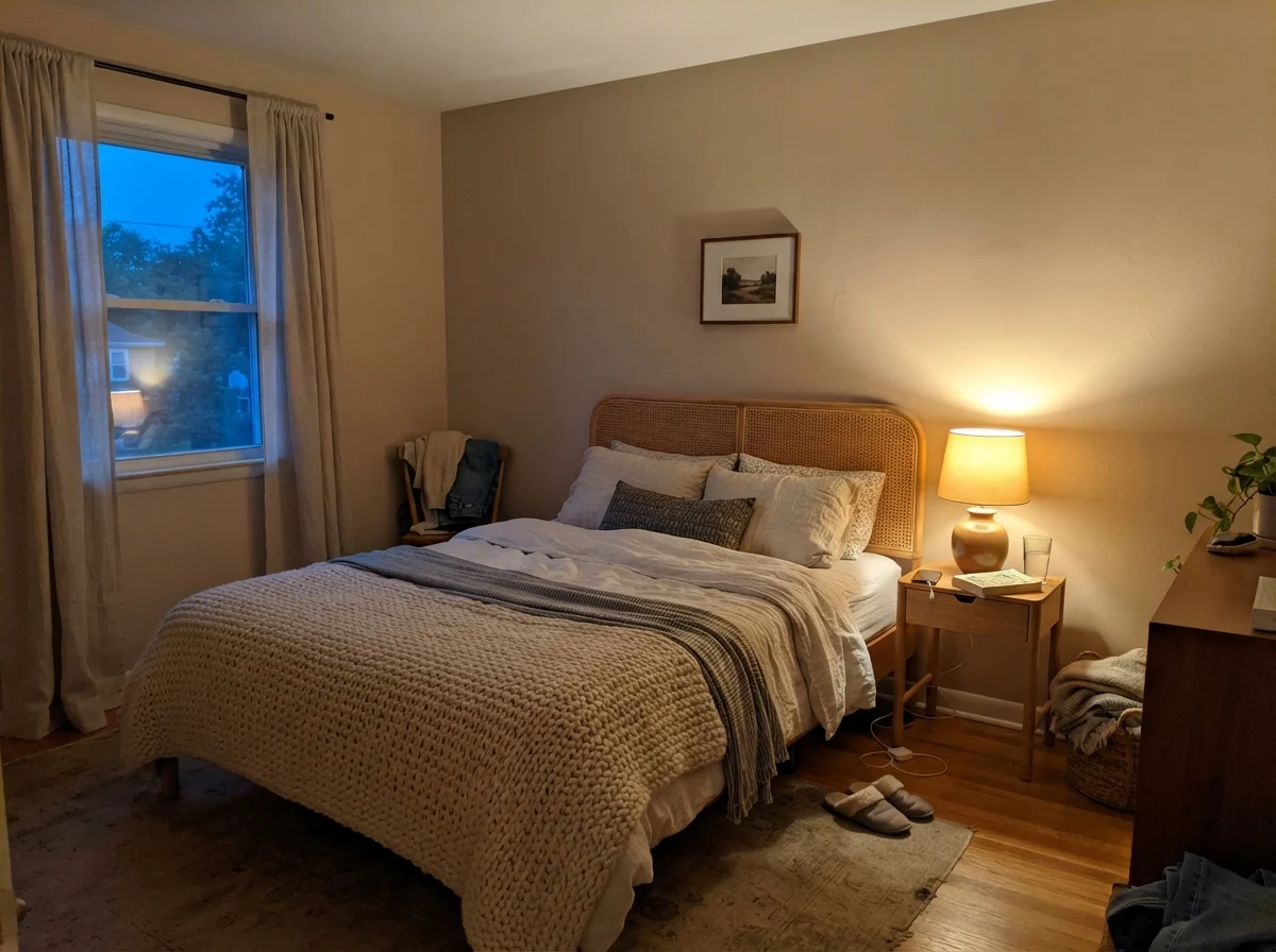
When you look at those two lighting conditions side by side, you can see why testing is non-negotiable. In cool early morning light, the walls lose their glow and settle into a restrained, almost stony greige. Turn on a 2700K bedside lamp in the evening, however, and the paint drinks up the warm artificial light, wrapping the room in a rich, comfortable sand. If you find the evening shift feels a bit too heavy, swapping your bulbs to 3000K or 3500K keeps the color grounded without letting it tip overly warm.
The Main Living Spaces: Where It Shines
Where Even Better Beige truly earns its keep is across open-concept spaces. In our current home, the main living area flows directly into the dining room and kitchen. Painting each zone a different color breaks up sightlines and makes a house feel smaller. But finding one paint color that works equally well across a sun-drenched southern exposure and a shadowed interior hallway is notoriously difficult. At LRV 60, Even Better Beige is light enough that the darker corners don't feel dingy, but rich enough that the sunny living room walls don't look like stark drywall primer.
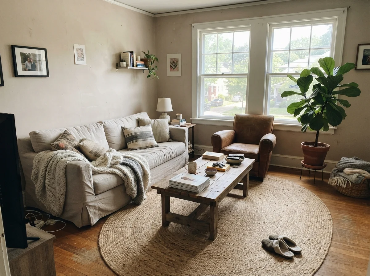
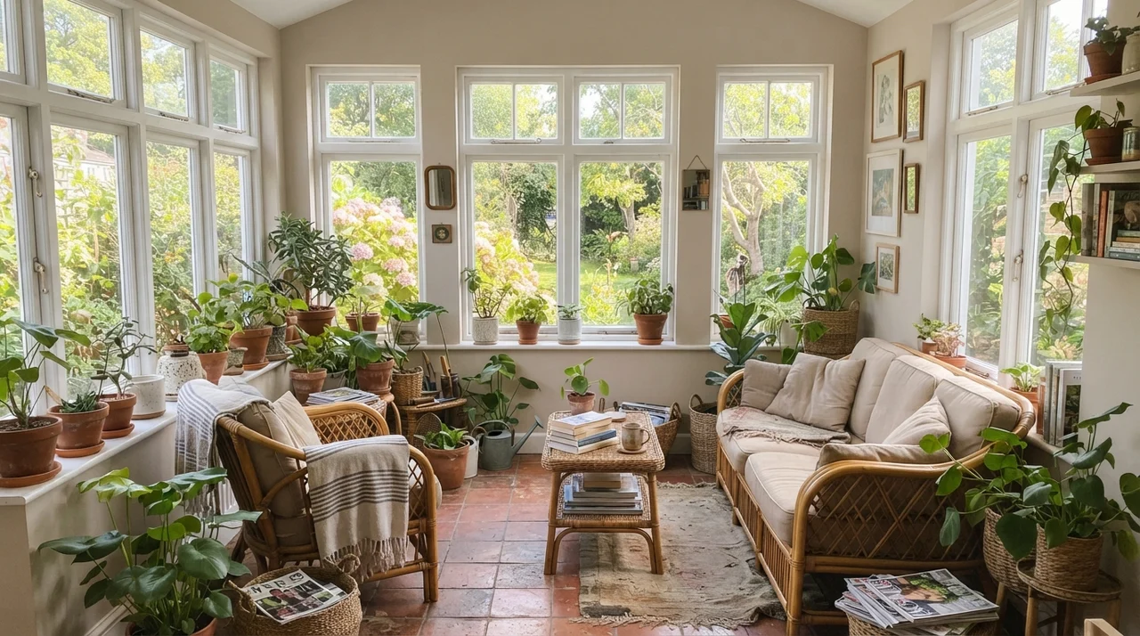
In the living room, paired with natural textures like a jute rug, linen upholstery, and natural wood furniture, this shade acts as an effortless backdrop. It takes away the sterile feel of white without committing you to a heavy accent wall. In side-lit spaces and sunrooms where light pours in through multiple directions, the color settles into its softest, most tailored look.
Bathrooms and Water Spaces
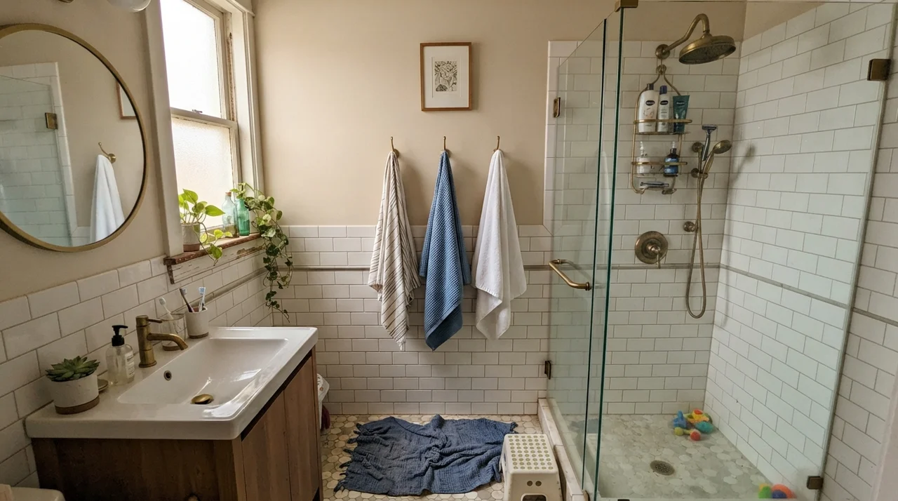
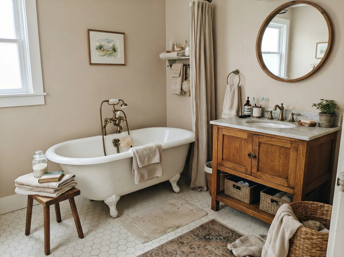
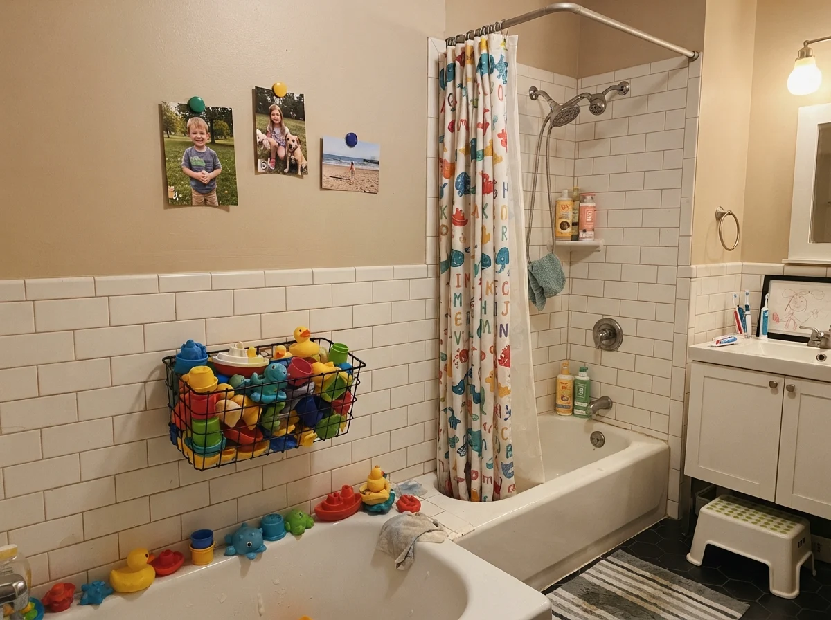
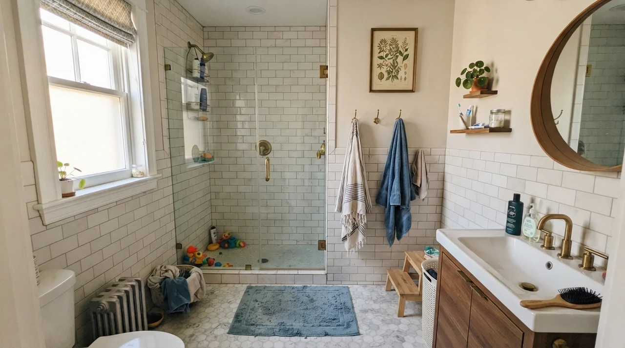
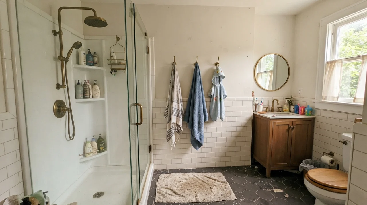
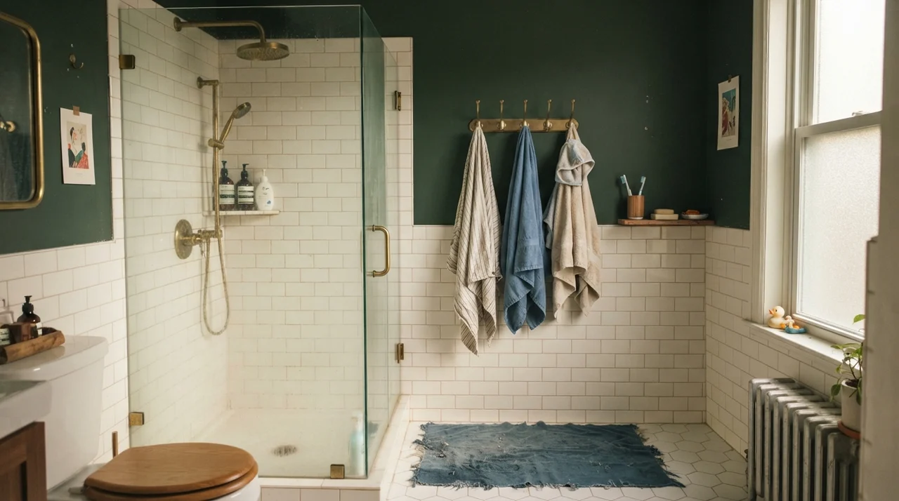
Bathrooms are high-humidity, high-scrub zones where your paint needs to balance tile, porcelain, and metal fixtures. When we redid our family bathroom five years in, I chose Even Better Beige above the white subway tile wainscoting. Because the lower half of the wall is bright white ceramic tile, the beige on top provides just enough weight to keep the room from looking like an institutional clinic.
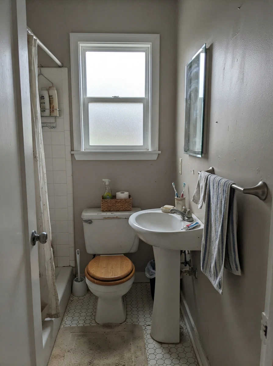
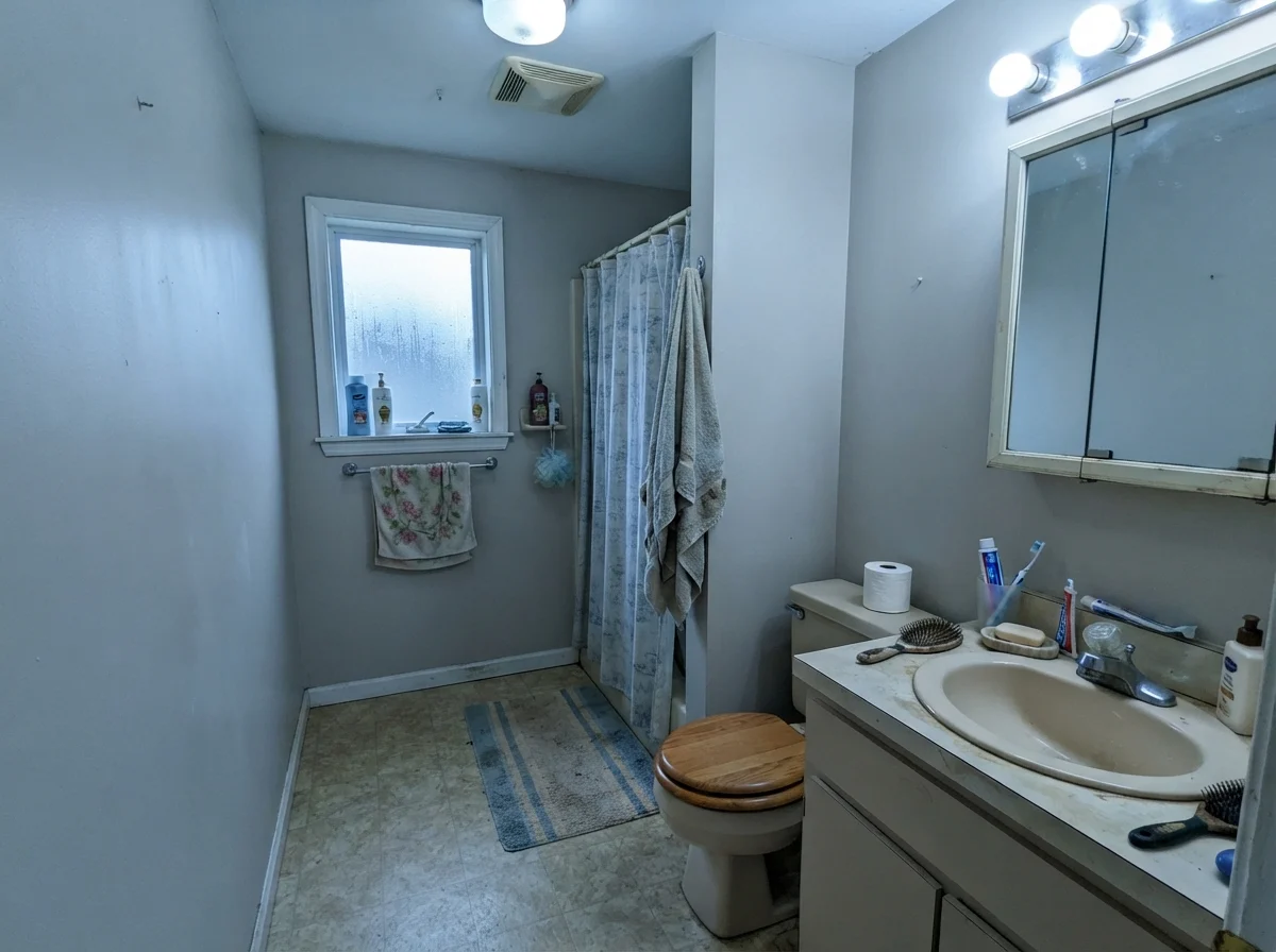
However, you have to pay attention to your bathroom window orientation and plumbing fixtures. If your bathroom faces strictly north or sits under flat, overcast skies with only a small frosted window, Even Better Beige loses its warmth. It doesn't turn icy blue the way gray does, but it does read flatter and more putty-like. If that room also has an older, yellowed beige vanity or cool chrome hardware, the walls can appear slightly tired.
Cabinets and Islands: Is It Worth Painting Woodwork?
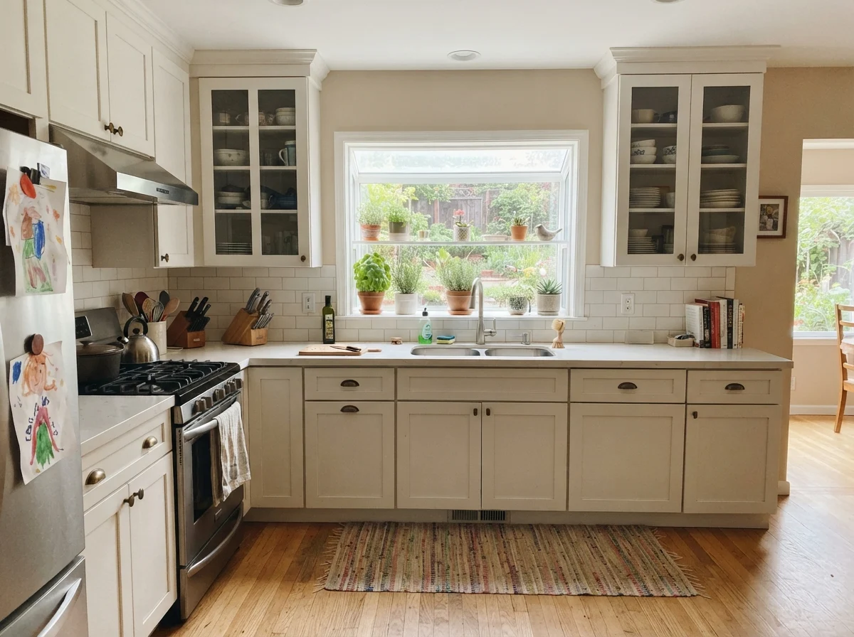
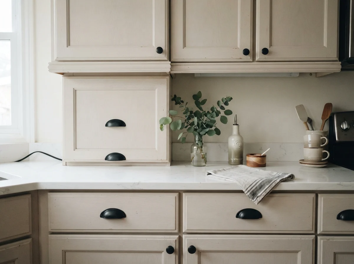
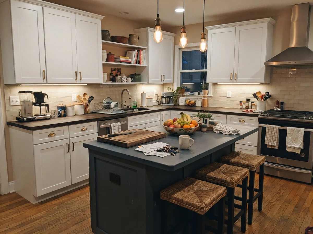
Painting kitchen cabinets is one of the most labor-intensive DIY jobs you can take on, and hiring it out will easily run several thousand dollars. You do not want to repaint your cabinets twice because the shade looked wrong under your pendants. Even Better Beige on shaker cabinet doors creates a calm, furniture-style look, provided your kitchen finishes lean warm. It sits beautifully against white subway backsplash tile, warm butcher block, and light oak floors.
A practical tip from someone who has lived with painted cabinetry: do not use standard wall eggshell on cabinets. Buy a dedicated satin cabinet enamel. Even Better Beige at LRV 60 hides greasy thumbprints around drawer pulls infinitely better than bright white paint ever could, and it wipes clean with a damp microfiber cloth without leaving burnished shiny spots behind.
Bedrooms and Quiet Spaces
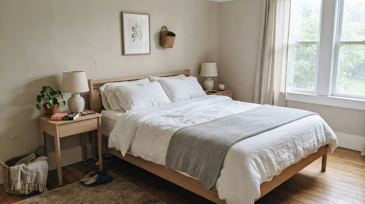
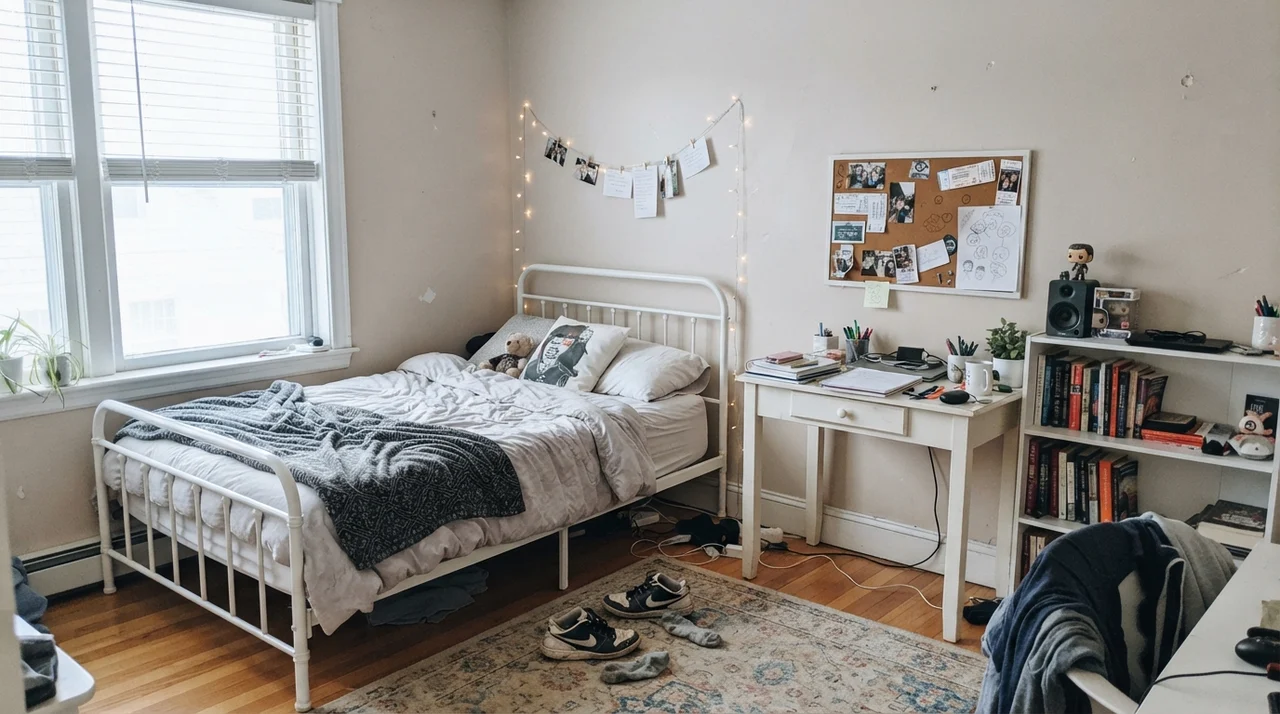
In bedrooms, where you want visual calm at the end of a long day, this color excels. Gray walls in a bedroom can feel clinical unless you layer in hundreds of dollars of heavy textiles to warm them up. Even Better Beige provides that cozy baseline automatically. It creates an understated backdrop for linen bedding, pale oak furniture, and simple metal bed frames.
A beige this warm demands a crisp, clean white on the woodwork. Pair it with a creamy off-white and your trim looks yellowed while your walls look dirty.
Where Even Better Beige Fails: The Honest Truth
Every paint has scenarios where it simply will not work, and Even Better Beige has three predictable failure points. The unhappy emails I get from homeowners who regret this color almost always stem from one of these exact situations.
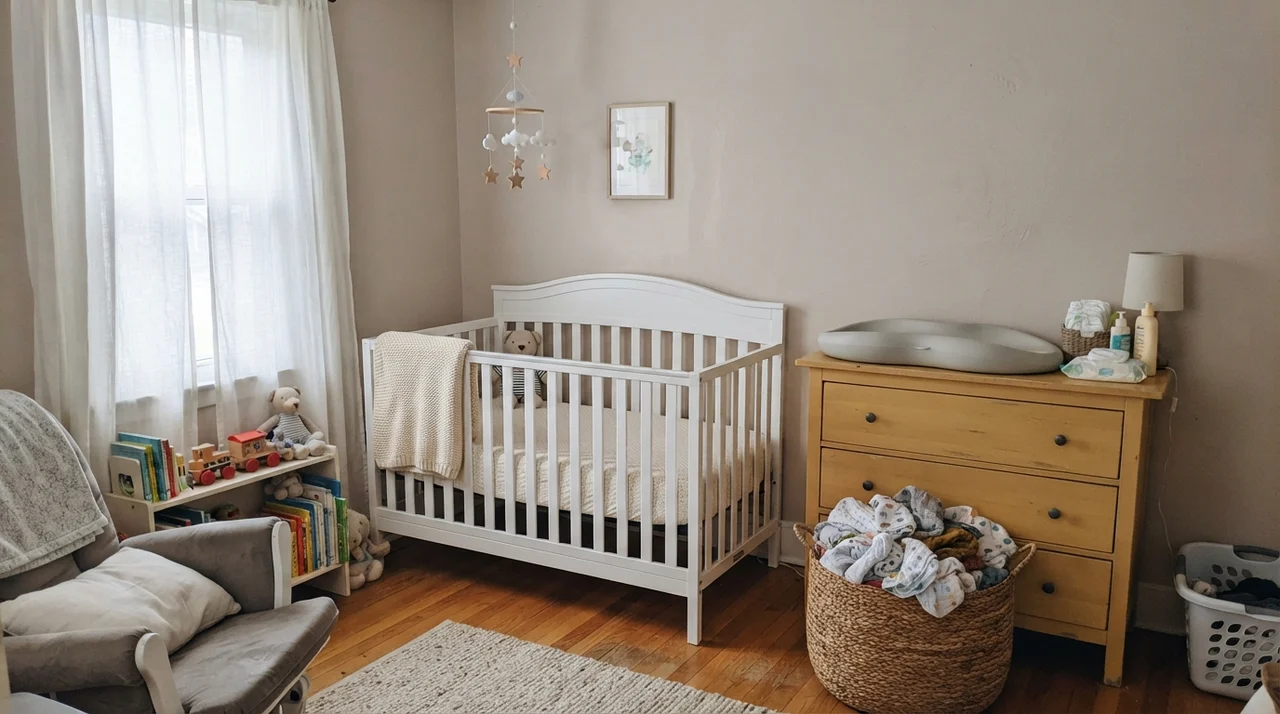
First is the large, uninterrupted west-facing wall. Late afternoon sun carries heavy orange and red wavelengths. Because Even Better Beige already sits on a warm red-orange base, strong 5:00 PM summer sun hits that big wall and pushes it straight into peachy-tan territory. Some people describe it as suddenly looking like a 1980s nursery for two hours every evening. If your primary living room wall faces west and has huge uncovered picture windows, sample Behr Tranquil Gray (DC-007) instead; it maintains the same LRV 60 brightness but with a cooler balance that resists the sunset flare.
Second is the cool flooring trap. If you have cool blue-gray slate tile, cool gray luxury vinyl plank (LVP), or modern stainless steel appliances everywhere, Even Better Beige will fight them. When placed directly against cool gray flooring, the pink-tan side of the beige is forced straight into the foreground. The wall stops looking like a neutral and starts looking like an accidental color clash.
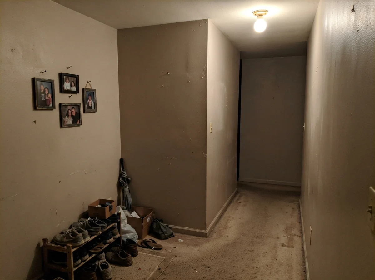
Third is the dark, windowless interior box. In a windowless hallway or basement corner illuminated by a single dingy overhead bulb, the color loses its depth and turns into a muddy putty.
Trim Pairings and Interior Doors
Getting your trim color right is fifty percent of a successful repaint. With Even Better Beige, the biggest self-inflicted mistake is trying to pair it with a creamy, yellow-based white like Behr Swiss Coffee or Benjamin Moore White Dove. Because both colors share warm undertones, they blur together. The trim ends up looking like aged, yellowed enamel, and the wall color looks like it needs a good scrub.
To make Even Better Beige look tailored and deliberate, you need a clean, bright trim white with little to no yellow undertone. Behr Ultra Pure White (PPU18-06) or Behr Polar Bear (75) provide the crisp contrast needed to frame the walls cleanly.
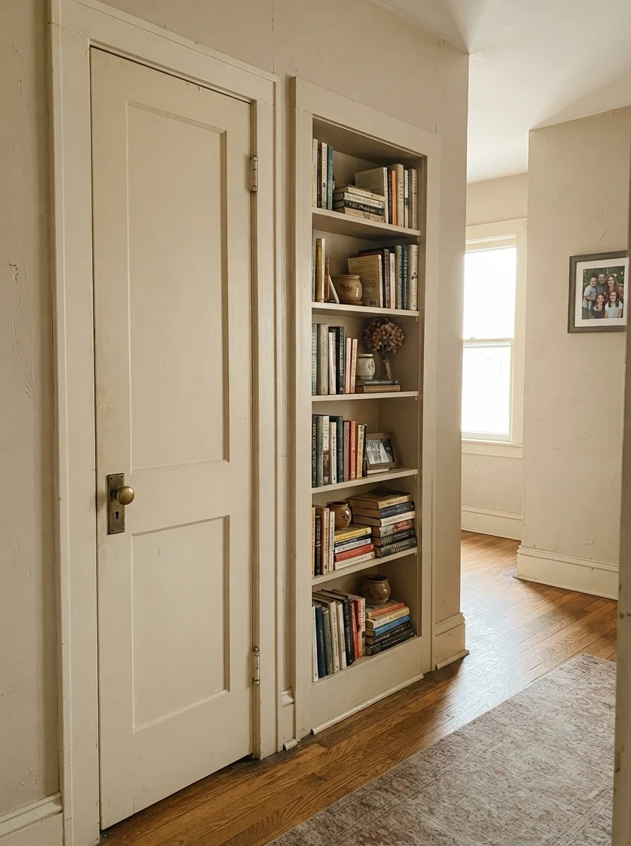
You can also use this color on interior doors and built-in architectural features. When we painted an interior two-panel door and built-in bookshelf in an older hallway, using Even Better Beige against off-white surrounding walls gave the hallway an immediate sense of custom permanence.
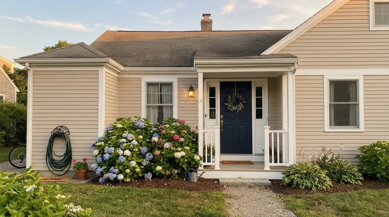
Outside, Even Better Beige behaves exceptionally well on traditional, ranch, and craftsman homes. In broad outdoor daylight, colors always lighten by about two shades. On horizontal siding, this color reads as a grounded, natural limestone hue that pairs naturally with red brick, stone retaining walls, and dark accents like a navy or charcoal front door (Behr Cracked Pepper PPU18-01 works beautifully here).
Durability, Scrubbing, and Budget Decisions
Here is the practical side of painting that design swatch books ignore: five years in, someone is going to scuff a laundry basket along the baseboard, kick the hallway corner while taking off boots, or splash spaghetti sauce behind the kitchen trash can. How does Even Better Beige hold up to real life?
Because it sits at LRV 60 with a healthy pigment load, it hides everyday scuffs, minor dings, and hall traffic significantly better than stark off-whites. In our hallways, eggshell finish has held up to repeated scrubbing with warm water and mild dish soap without burnishing or peeling down to the drywall primer. On baseboards and door casings, semi-gloss provides the necessary wipeable shell.
From a budget perspective, Behr paint sold at Home Depot offers solid value. You do not need to pay eighty dollars a gallon for boutique designer paint to get a handsome, durable sand neutral. Another practical perk: because Behr formulas are standard stock nationwide, five years later when you need half a quart to touch up after hanging a new gallery wall, you can walk in and get an exact match mixed in ten minutes.
Is Behr Even Better Beige considered a greige or a true beige?
It is cataloged under greiges, but in real rooms it lives as a true sand beige. It has just enough gray pigment to prevent it from looking yellow or gold, but its warmth comes from a subtle red-orange base.
What ceiling paint should I use with Even Better Beige?
A flat ceiling white like Behr Ultra Pure White provides clean contrast. If you want a softer, more seamless look in a bedroom, Behr Blank Canvas (DC-003) in flat finish keeps the overhead plane gentle.
Does Even Better Beige make rooms look small?
Not at all. With an LRV of 60, it reflects sixty percent of available light. It keeps rooms open and airy while providing enough wall definition to make white furniture and woodwork stand out.
What paint sheen should I use for each room?
Use eggshell on standard living room and bedroom walls, semi-gloss on trim and baseboards, satin cabinet enamel on kitchen cabinets and built-ins, and flat on ceilings.
Susan's Verdict · The Whole-Floor Workhorse
Even Better Beige is the paint color people are actually trying to find when they ask for a warm neutral that isn't gray and isn't yellow. Across an open main floor with oak underfoot, crisp bright white trim, and balanced side light, it looks tailored, calm, and far more expensive than its Home Depot price tag. Just remember its red-orange base: sample your west-facing walls to watch for afternoon peachiness, keep it far away from cool gray flooring, and pair it only with clean, bright white trim. Do that, and it is a paint you will happily live with for the next decade.