Color Diary · No. 10
Behr Swiss Coffee in Real Rooms: The Cream You Don't Pair with Bright White
Home Depot's most-searched off-white, reviewed honestly: where the cream flatters a room, where it tips butter-yellow, and the name mix-up that costs people a whole gallon.

Susan HartleySeptember 2, 2026 · 14 min read
Swiss Coffee · Behr 12
Hex#F1EDE0LRV85Undertonescream → warm yellow-linen → muted putty
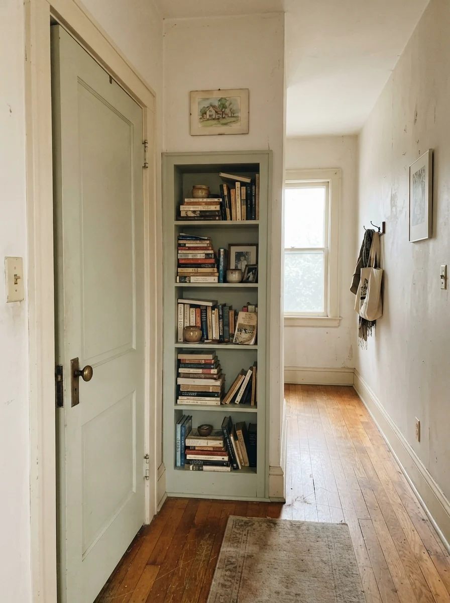
In our last house—the 1990s colonial with the endless golden-oak baseboards—I spent three weeks testing white swatches trying to make the trim look intentional without having to strip and refinish twenty-two hundred square feet of woodwork. I made every rookie mistake in the book before I drove down to the local Home Depot and picked up a gallon of Behr Swiss Coffee (SKU 12). I had bought into the idea that a modern white had to be crisp, almost optical. What I ended up with on the first try was a wall color that fought the orange in the honey oak so violently the trim looked like cheap orange peel, while the walls looked like cold surgical plaster.
Swiss Coffee fixed that hallway in a single afternoon. But it also taught me the single most important rule about this paint: it is not a white with a gentle blush of warmth. It is a full-bodied, unapologetic cream. Five years in, when you've lived with it through winter rain and summer sun, you realize that Behr Swiss Coffee is designed to make a room feel settled from the hour the roller dries. If you understand what it is—and just as crucially, what it refuses to pair with—it is one of the most reliable off-whites on the market. If you buy it expecting a crisp gallery background, you will be repainting by next weekend.
The Name Mix-Up and the Chemistry of a True Cream
Before we talk about lighting, we need to clear up the gallon-costing mix-up that trips up homeowners every single week. Benjamin Moore makes a color called Swiss Coffee (OC-45), and Behr makes a color called Swiss Coffee (12). They are not the same color, they do not have the same LRV, and asking the paint counter to cross-match them rarely yields an exact twin. Benjamin Moore's version sits slightly lighter with an LRV of 84 and a softer, airier balance. Behr's Swiss Coffee comes in at an LRV of 85, carrying a noticeably richer yellow-orange undertone that gives it that distinct, buttery warmth.
That warmth is exactly why it ranks at number 28 globally among popular paint colors. It softens hard architectural angles and bridges the gap between older, dated wood finishes and updated decor. But because it carries that substantial warm base, its personality changes dramatically depending on what you put on your ceiling, what bulbs you screw into your lamps, and which direction your windows face.
How Behr Swiss Coffee Shifts Across Daily Light
Because Swiss Coffee sits at LRV 85 with a warm cream foundation, it does not stay static. It reacts to surrounding daylight, bulb temperatures, and adjacent surfaces faster than a neutral off-white.
warm sun
overcast, north light
dusk, rain, cool bulbs
Cool daylight balances the yellow base into a balanced cream; artificial 2700K lighting exposes the butter tones.
Blank CanvasBehr · see diary
White StoneBehr · see diary
Swiss Coffee12
PointingFarrow & Ball · see diary
Westhighland WhiteSherwin-Williams · see diary
Light Shifts: The Morning Calm Versus the Evening Butter
In north-facing daylight, Swiss Coffee is perhaps at its absolute best. The cool, slightly blue-gray natural sky light works like a natural counterweight to the yellow in the paint formula. What you see on the drywall is a soft, quiet, perfectly balanced warm white that never looks chilly or stark. If you have a room that feels gloomy and cold from flat northern exposure, Swiss Coffee breathes life into the plaster without turning into an obvious yellow.
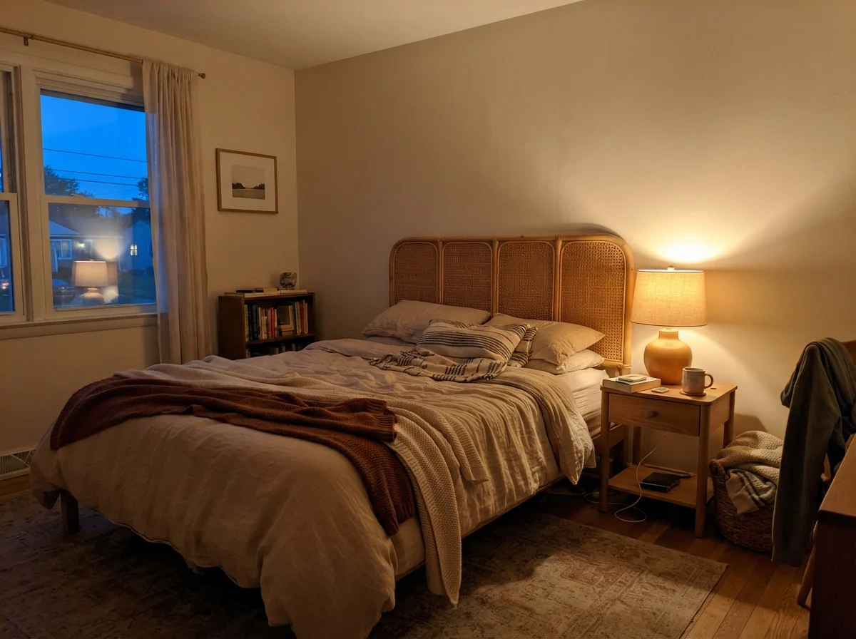
South-facing rooms and direct western afternoon sun, however, turn the volume all the way up. Midday southern light will coax out the creamy butter tones. For most traditional homes with oak floors or warm textiles, that glow is inviting. But the real friction point—the one where homeowners start questioning their sanity—happens after dark. Under standard 2700K warm incandescent or LED bulbs, the paint formula's yellow-orange base has nothing natural to balance it. The walls will read unmistakably butter-toned. If you want to keep Swiss Coffee looking like a refined cream at night rather than a pale yellow kitchen from 1994, swap your light bulbs to 3000K or 3500K before you consider repainting.
Bathrooms and the Subway Tile Dilemma
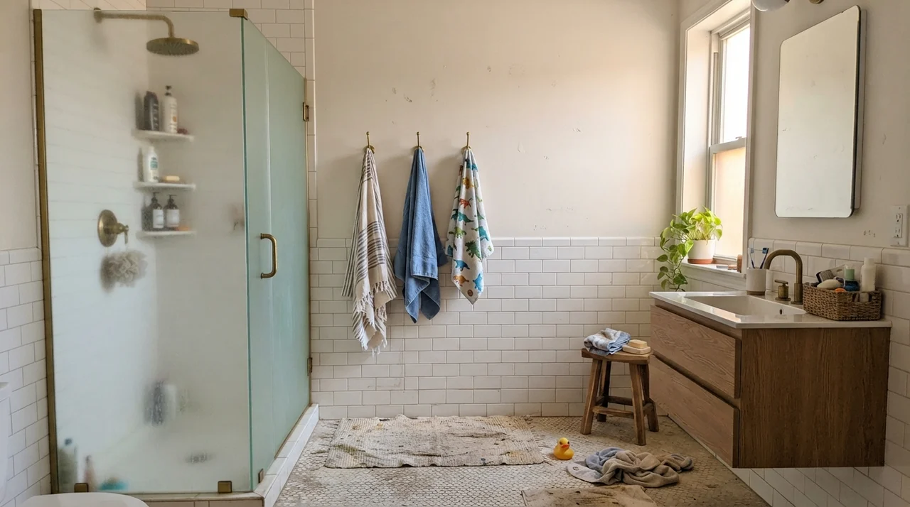
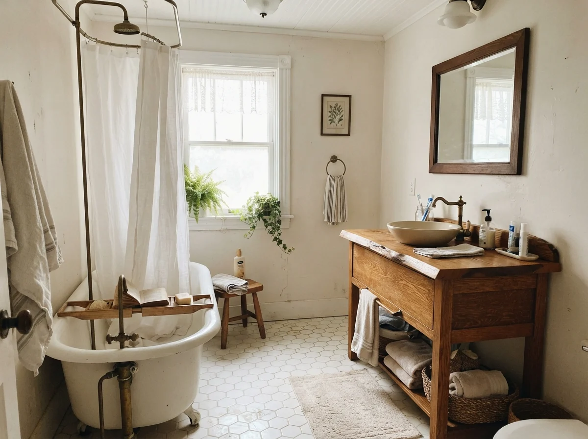
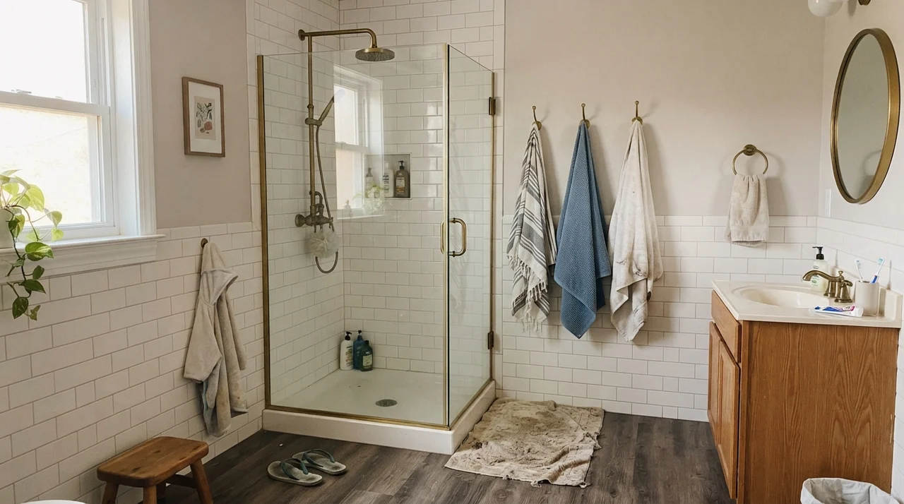
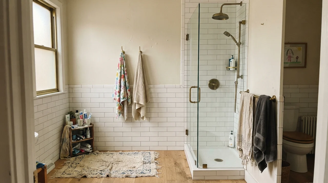
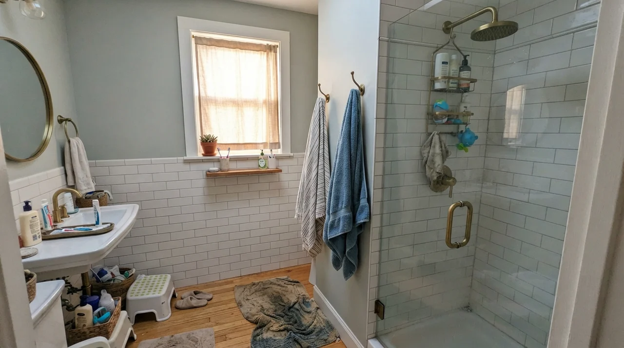
Bathrooms are where Swiss Coffee either looks like a million dollars or falls completely flat, and the outcome almost always hinges on your hard finishes. When paired with warm marble, butcher block, unlacquered brass hardware, or warm oak vanities, Swiss Coffee acts like a rich, grounding envelope. It makes utilitarian fixtures feel historic and lived-in rather than sterile.
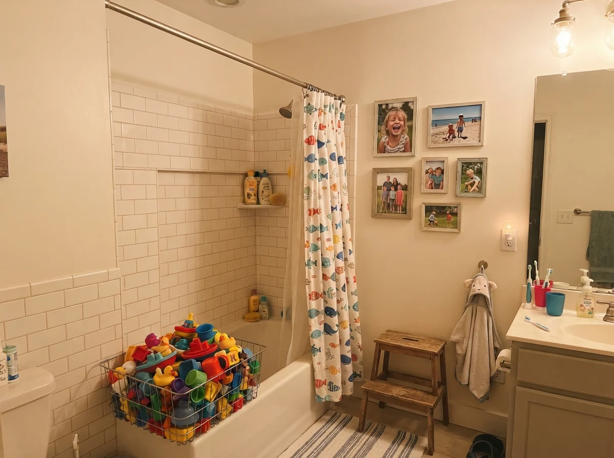
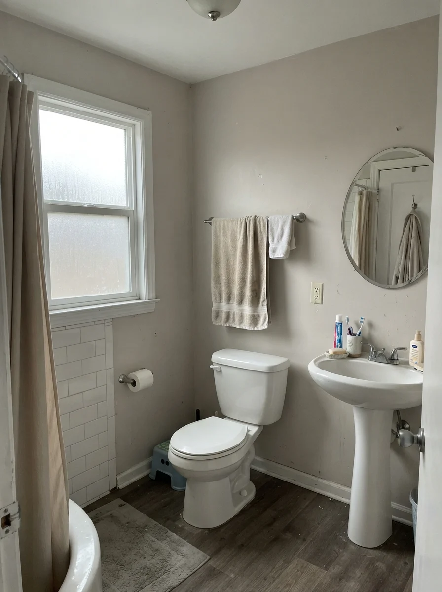
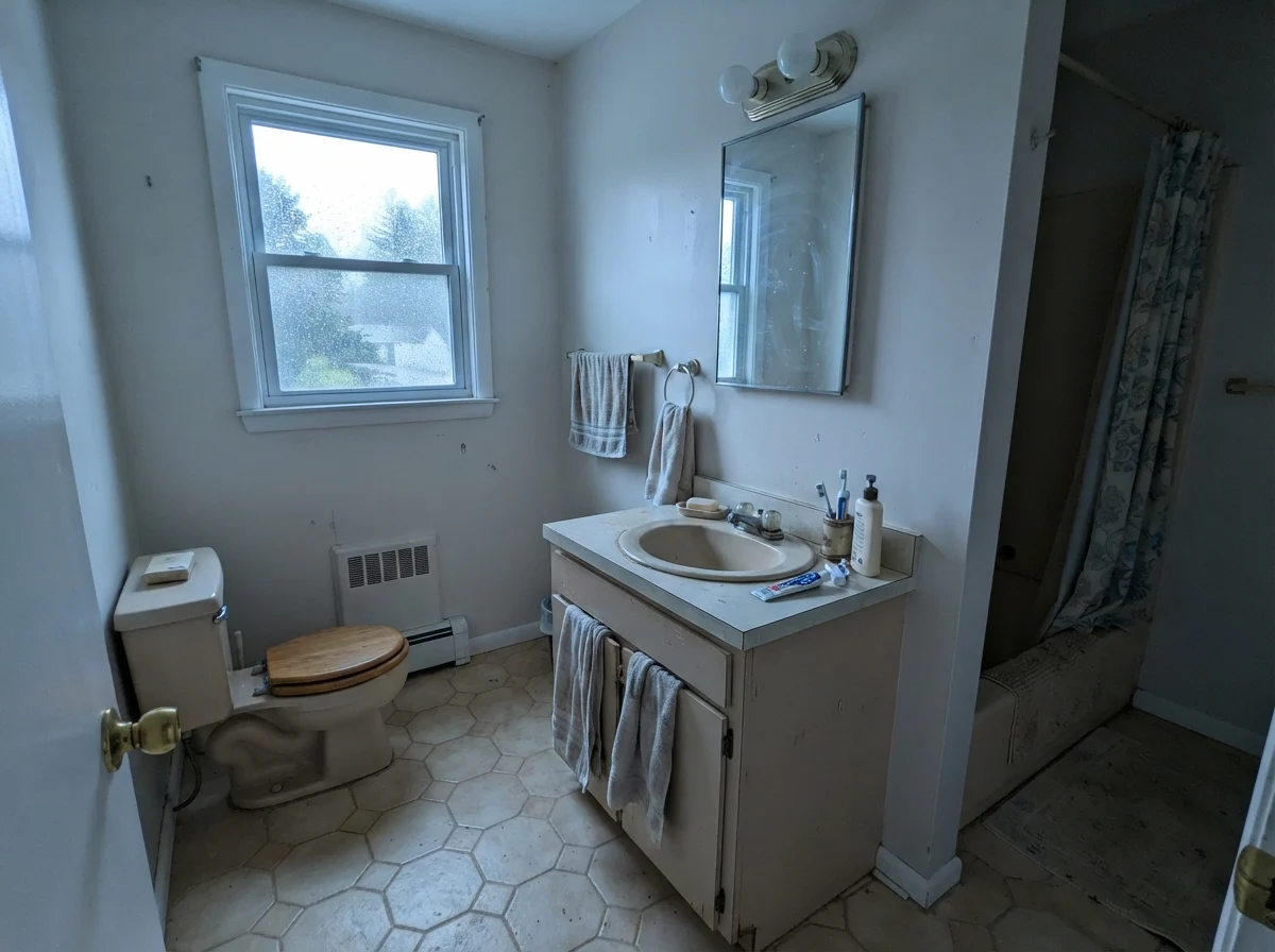
However, you have to be careful with tile selections. Classic bright white subway tile has a very clean, high-reflectance finish. When Swiss Coffee sits directly against stark white ceramic wainscoting or cool gray floor tile, the eye immediately registers the difference in LRV and temperature. Against stark cool white, Swiss Coffee can look slightly heavy or dingy by comparison. In our 1960s ranch, when we refreshed the family bath, running satin-finish Swiss Coffee over warm wood details and classic wainscot gave the room an immediate sense of age and permanence that held up through years of daily family showers.
When the daylight goes flat or rainy, Swiss Coffee drops its sunny disposition and reveals its neutral side. Overcast skies push the color toward a muted, earthy stone shade. That muting is actually one of its strengths—it prevents the wall from ever looking fluorescent or glaring when the weather turns sour.
Kitchens, Islands, and the Cabinet Equation
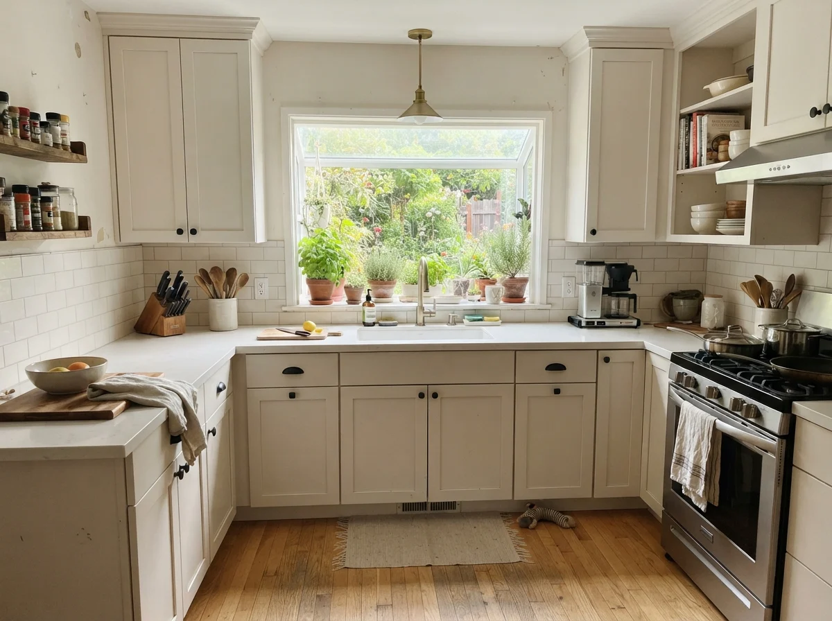
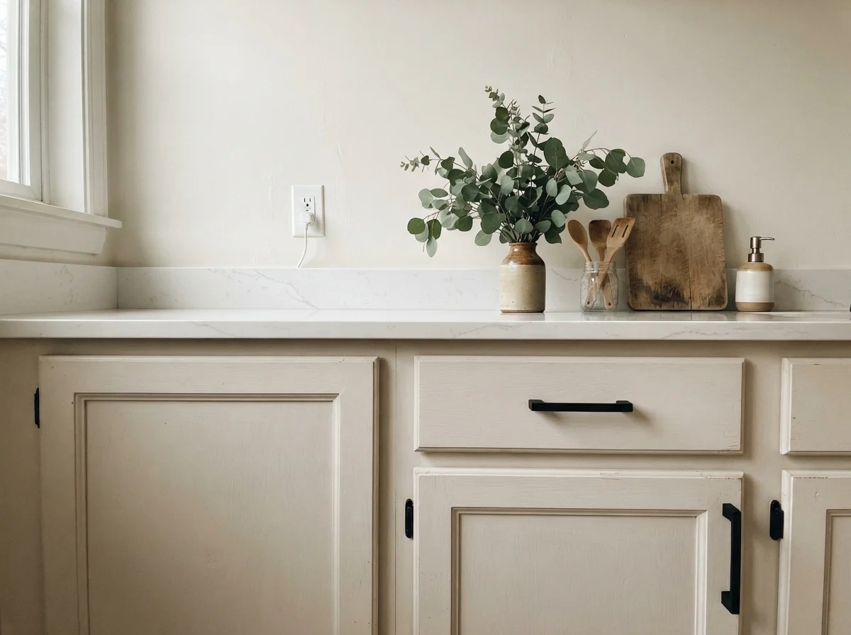
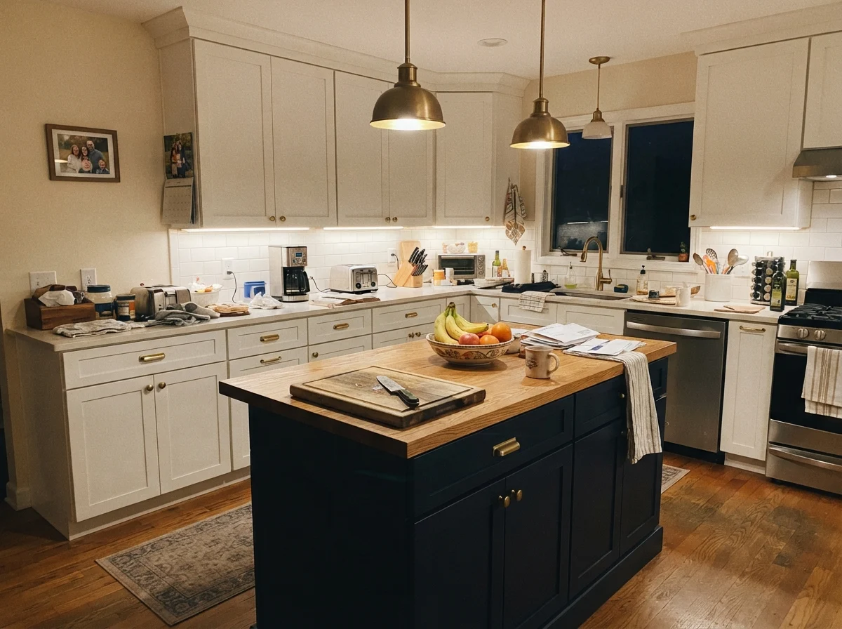
If you're looking for a budget-friendly cabinet makeover that feels timeless rather than clinical, Swiss Coffee in a durable satin sheen is hard to beat. It softens shaker doors and provides an immediate warmth that works remarkably well with butcher block counters and brass hardware. In a busy family kitchen, stark white cabinets show every fingerprint, coffee splash, and scuff mark by noon. Swiss Coffee is far more forgiving of real life.
There is, however, one major warning sign in modern kitchens: bright white engineered quartz countertops. If your counters are an icy, optic white with crisp gray veining, Swiss Coffee cabinets will look distinctly yellowed next to them. But if your surfaces lean toward warm soapstone, warm marble, butcher block, or off-white quartz, the pairing is seamless. We lived with it on our kitchen perimeter in our second house, and it held up beautifully across five years of heavy cooking, needing only occasional spot cleaning.
Bedrooms, Living Rooms, and the Whole-Room Color Drench
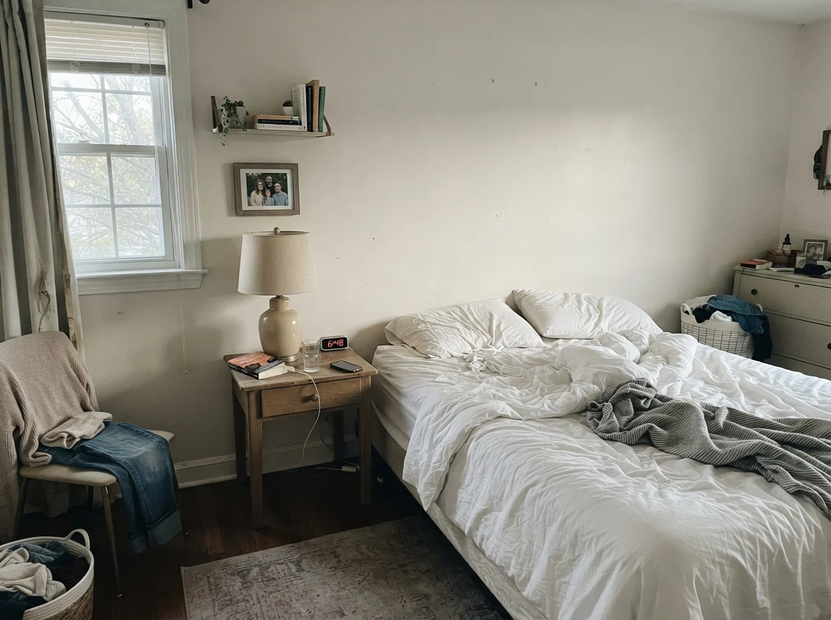
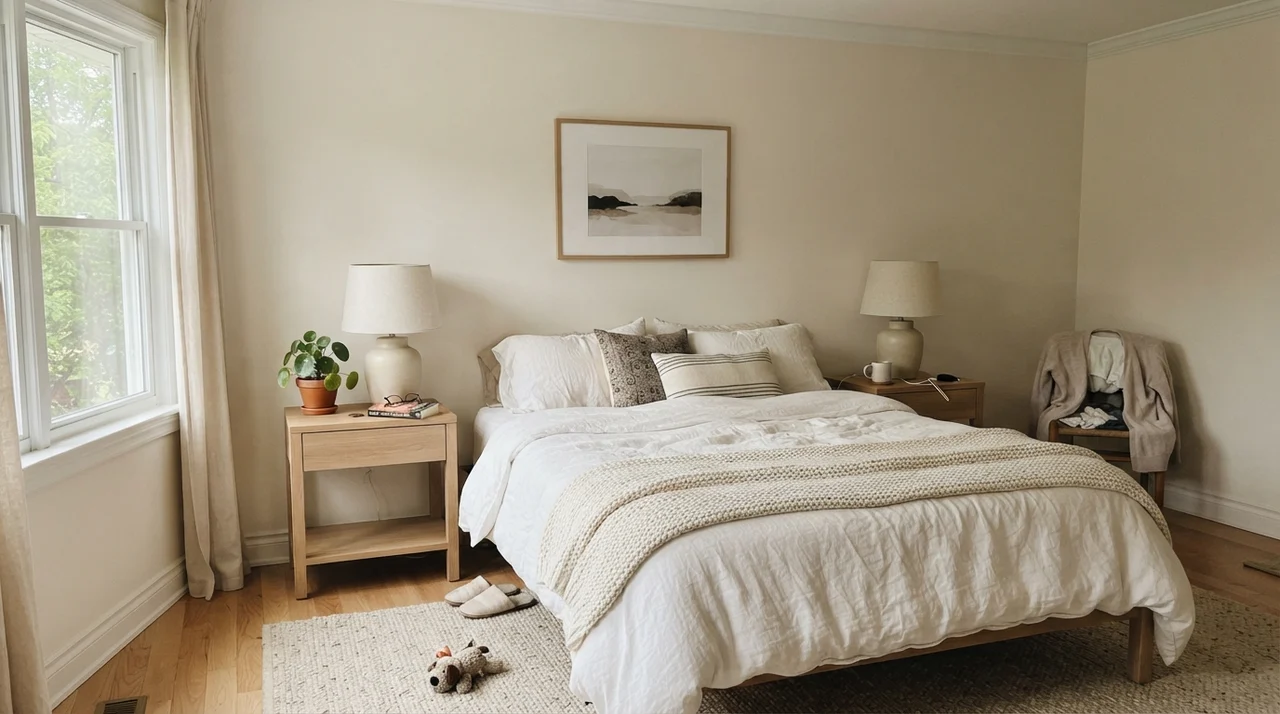
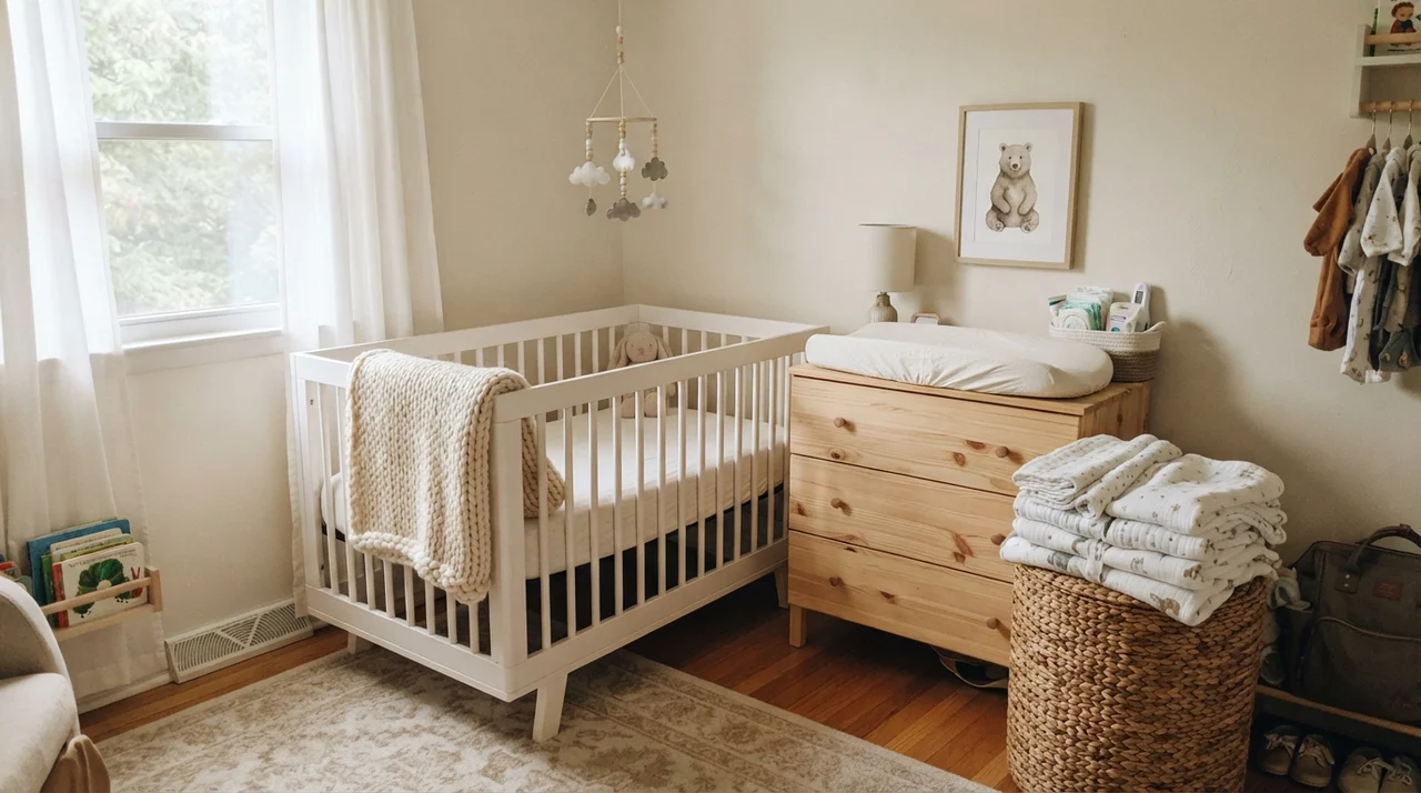
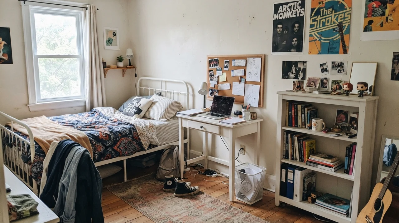
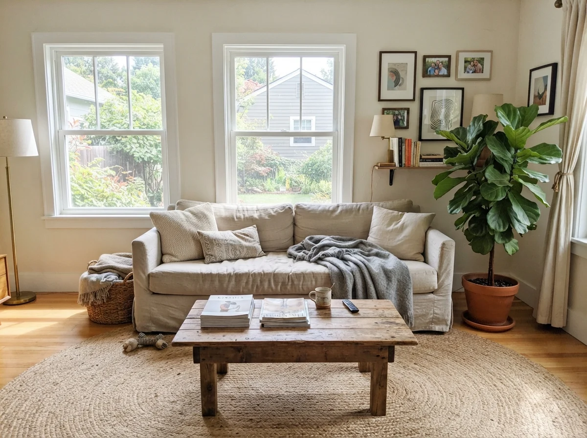
In bedrooms and living rooms, Swiss Coffee does what few cold whites can: it creates an instant feeling of shelter. At LRV 85, it reflects plenty of daylight into rooms with only a single window, yet it possesses enough pigment that white linen sheets, cream drapery, and wool blankets feel layered rather than washed out. It creates a tranquil backdrop for light-wood dressers, rattan textures, and unvarnished linen.
My favorite way to use this color—and the best way to prevent the dreaded "dingy contrast" problem—is to use Swiss Coffee on the walls, the trim, and the ceiling all at once. By keeping the color consistent throughout the entire room and varying only the sheen (eggshell on the drywall, semi-gloss on the casing, and flat on the ceiling), you eliminate the harsh LRV drop between the wall and the ceiling. Heavy trim and older crown moulding in dated houses suddenly look architectural and tailored rather than heavy-handed.
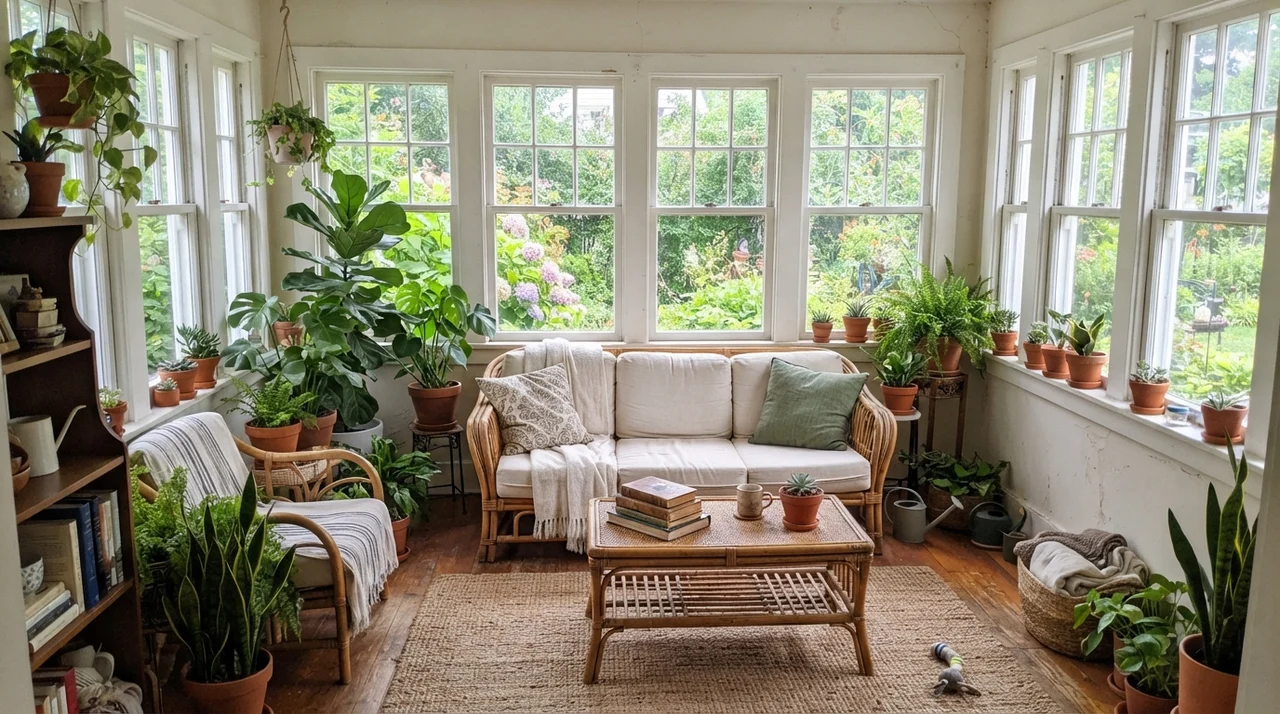
When carried into expansive living spaces and sunrooms, Swiss Coffee links furniture styles together. Natural jute rugs, rumpled linen sofas, and terracotta planters sit comfortably against its warm surface without looking dated within a couple of seasons.
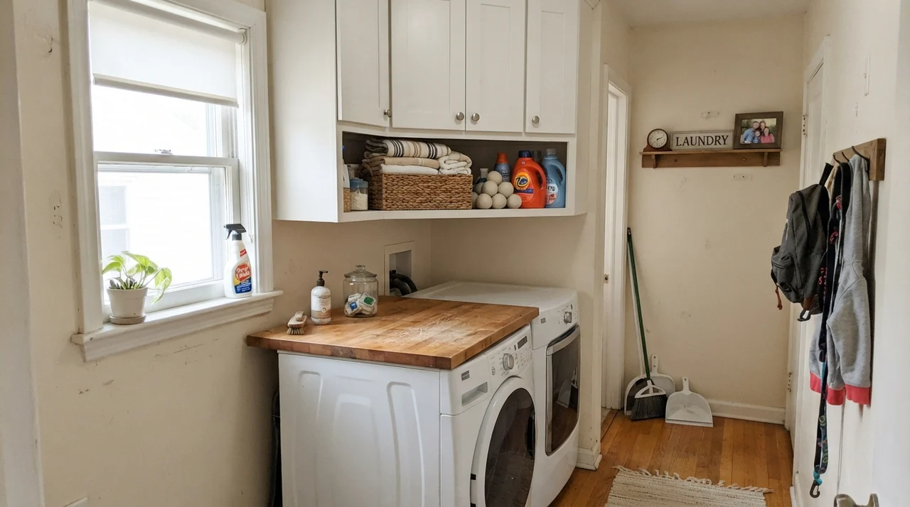
In utility areas like laundry rooms and connecting hallways, running this shade across built-ins and interior doors delivers an understated, custom feel that would cost five times as much if you tried to achieve it with specialty millwork.
Where Swiss Coffee Fails: The Windowless Corner and Cool Floors
No paint review is honest without naming the situations where a color simply falls apart. With Behr Swiss Coffee, there are two distinct failure zones that no amount of extra coats will ever remedy.
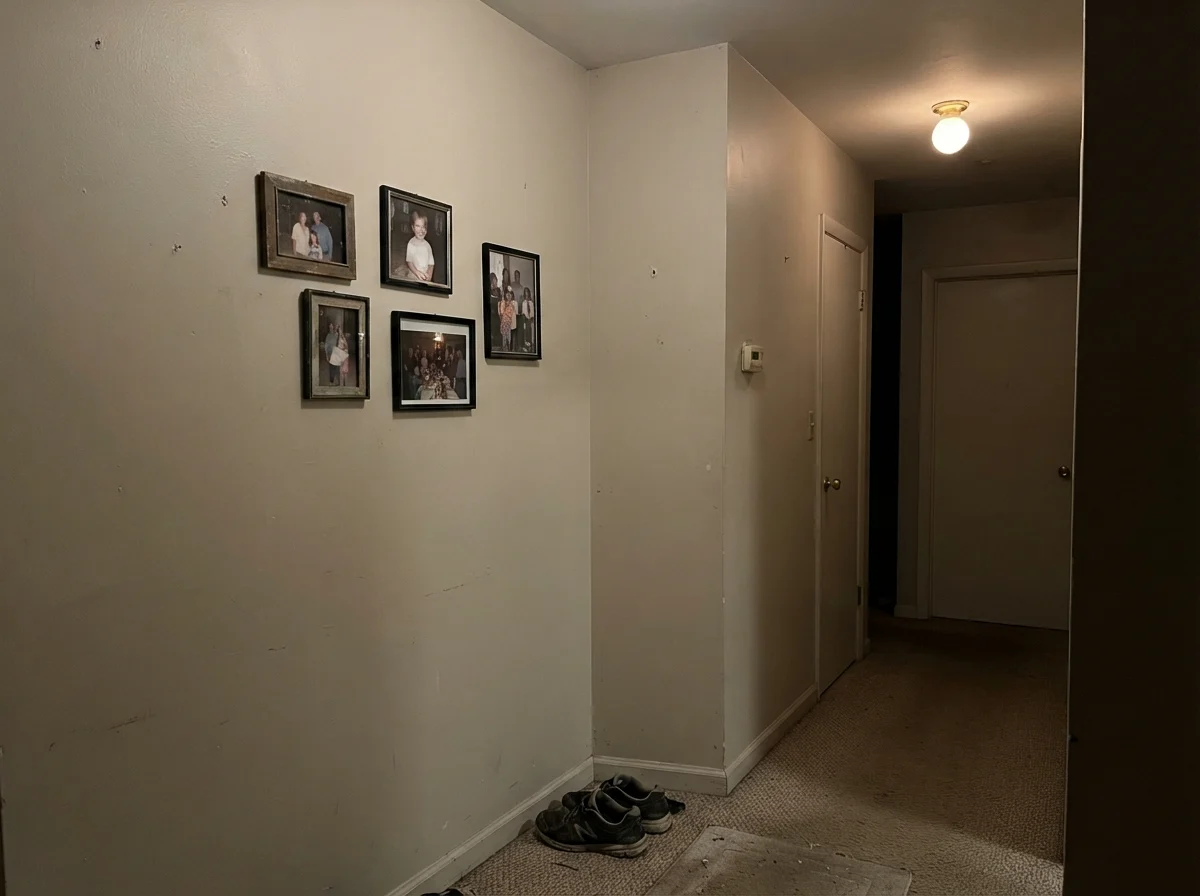
The first is the windowless interior space illuminated by a single low-wattage bulb. In a dark interior hallway or unlit basement stairwell, Swiss Coffee loses its light bounce and turns into a flat, lifeless putty. It looks muddy, dated, and unwashed. The second failure zone is any room with cool gray flooring—whether that is gray-washed oak, blue-gray slate tile, or cool gray luxury vinyl plank (LVP). Cool gray floors sit on the opposite side of the color temperature spectrum; they aggressively push Swiss Coffee's warmth to the forefront until the walls look loudly yellow. If you have cool gray flooring, skip Swiss Coffee entirely and look at a neutral white like Sherwin-Williams Pure White instead.
Exterior Siding and Long-Term Performance
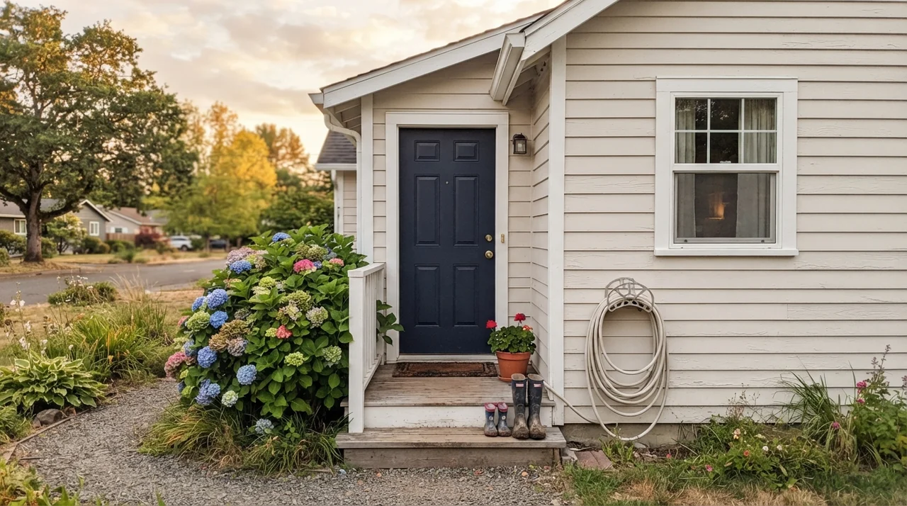
While an interior room can make Swiss Coffee look heavily creamy, direct outdoor sunlight does something remarkable: the intense UV wash bleaches out the perceived yellow, leaving you with an elegant, soft white exterior that never glares or blinds the neighbors. On exterior horizontal siding, it feels historic and substantial, particularly when balanced by high-contrast accents like Behr Dark Navy or Cracked Pepper on the front door and shutters.
Living with It: Scrubbing, Touching Up, and Daily Wear
Here is what thirty years of repainting rooms has taught me about paint maintenance: low-sheen whites are often a trap in family homes. If you buy a dead-flat wall paint, the first time someone bumps a muddy grocery bag or a wet dog tail against the hallway corner, scrubbing it leaves a permanent burnished mark that forces you to repaint the entire span from door casing to corner.
In our current 1960s ranch, we used Behr Swiss Coffee in an eggshell sheen on the main hall walls and satin on the interior doors. Five years in, it has held up admirably. Fingerprints near the light switches scrubbed clean with a damp microfiber cloth and a drop of dish soap without stripping the sheen or leaving dull patches. Because Behr's Swiss Coffee is stocked at every Home Depot and mixed identically across stores, grabbing a quart for touch-ups years later has proven completely stress-free. For a budget-friendly project where you're buying four or five five-gallon buckets for a dated-home refresh, it is entirely worth the money.
Comparing Swiss Coffee to the Alternatives
Choosing an off-white is always an exercise in fine calibration. When we sold our colonial, the buyer actually asked whether our walls were Sherwin-Williams Alabaster or Behr Swiss Coffee because both colors occupy that beloved warm-white territory. Here is how Swiss Coffee stacks up against the closest alternatives on the paint deck.
That's the thing nobody tells you about cream: you don't judge it against a paint swatch. You judge it by how your trim looks beside it five years in.
Why does Behr Swiss Coffee look yellow in my living room?
Swiss Coffee contains a warm yellow-orange base. Under 2700K warm incandescent or LED lighting, that base is exaggerated, making the walls read like soft butter. Changing your light bulbs to 3000K or 3500K neutral white typically corrects the issue immediately.
What is the best ceiling color to pair with Swiss Coffee walls?
The best ceiling color is Behr Swiss Coffee itself in a flat ceiling finish. Pairing it with a stark optic white ceiling like Ultra Pure White creates a noticeable color drop that can make the walls look dingy.
Is Behr Swiss Coffee identical to Benjamin Moore Swiss Coffee?
No. They share the same name but have different formulas, different LRVs, and distinct undertones. Benjamin Moore's OC-45 is slightly lighter and airier, while Behr's SKU 12 is a richer, warmer cream.
What sheen should I choose for Swiss Coffee on walls and trim?
Use eggshell on standard living room and bedroom walls, semi-gloss on baseboards, doors, and trim, satin on kitchen cabinets, and flat on ceilings.
Susan's Verdict · Buy with Confidence (If You Love Cream)
Behr Swiss Coffee is a workhorse off-white that makes dated, wood-heavy homes feel welcoming and finished on day one. It is not worth the money if you have cool gray floors or bright white quartz, but if you have warm oak hardwoods and want a room that feels lived-in rather than sterile, it is one of the most reliable gallons you can buy.