Color Diary · No. 116
Benjamin Moore Alabaster 876 and That Unmistakable Hint of Blush
Benjamin Moore's Alabaster is not the Alabaster you saw on Instagram — here is what 876 really does on a wall, where the pink shows up, and who should buy Cloud White instead.

Susan HartleyNovember 9, 2026 · 17 min read
Alabaster · Benjamin Moore 876
Hex#F2EFE8LRV85Undertonessoft pink → clean white → warm blush
In our last house, a drafty 1990s colonial with oversized windows and drywall that had never seen a level edge, I ordered three gallons of paint by phone from our local hardware dealer. I told the clerk I wanted two cans of Alabaster in eggshell and one in semi-gloss for the baseboards. I assumed, as nearly every homeowner with an internet connection assumes, that Alabaster was Alabaster. The swatch on the kitchen table came from a magazine clipping, torn out beside a photo of a farmhouse kitchen bathed in creamy afternoon sun. Two coats later, around four in the afternoon when the light swung west and hit the upstairs hallway, my husband walked by, stopped dead in his tracks, and asked why I had painted the guest corridor faint ballet slipper pink.
That was my introduction to Benjamin Moore Alabaster, color number 876. It is not Sherwin-Williams Alabaster SW 7008, the famous griege-tinted neutral that launched ten million modern farmhouse renovations. Benjamin Moore’s 876 is an entirely different beast: an LRV 85 white with a distinct, unapologetic drop of red pigment in the formula. On the paper swatch tucked inside the store rack, it looks like a clean, polite off-white. On a twelve-foot wall when the sun gets low, that blush shows up to the party. Depending on who you are, the direction your windows face, and what you placed on the floor, that touch of pink is either the most flattering thing that ever happened to your morning routine or the exact reason you find yourself back in the paint aisle five days later holding a roller frame and cursing under your breath.
I have lived with both colors now across thirty years and three houses. Some whites are workhorses that disappear into the trim, and some whites have opinions. Benjamin Moore Alabaster 876 has definite opinions, and if you are going to put it on your drywall, you need to understand what you are getting into before you open the can.
The Undertone Nobody Warns You About
When paint manufacturers describe a white as having 'a touch of pink,' homeowners tend to imagine something subtle, like the rim of a seashell. Then they roll two coats onto sixteen linear feet of drywall and suddenly their living room looks like strawberry milk. Undertones multiply across square footage. A pigment that looks like a whisper on a two-inch chip becomes a shout when reflected off three adjacent walls and bounced onto an eight-foot ceiling.
With Benjamin Moore Alabaster 876, that warmth is genuine red-violet. It does not lean yellow like Benjamin Moore Linen White, nor does it carry the soft greenish-gray grounding of White Dove OC-17. In a room starved of natural light, or one receiving cool, washed-out daylight from the north, this undertone is actually a lifesaver. Cool north light carries a heavy blue-gray cast. When you throw a standard neutral white into a north-facing bedroom, the walls look like wet cement by two in the afternoon. Alabaster’s pink cast acts as a counterbalance: the blue of the sky and the blush of the pigment cancel each other out, leaving behind a clean, balanced, comfortable white that feels inhabited rather than institutional.
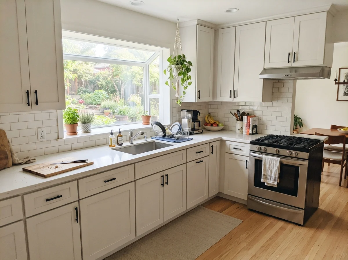
The trouble starts when you take Alabaster into an unshaded southern or western exposure. Golden afternoon sun amplifies warm pigments. At 4:00 PM in July, a south-facing wall painted in 876 stops looking white altogether. It warms up, flushes, and reads unmistakably rosy. If you intended to create a soft, romantic space with antique brass and warm walnut furniture, you will think you are a design genius. If you were aiming for a crisp, clean Scandinavian backdrop for gray linen upholstery, you will be deeply distressed.
Living with It in the Bedroom and Bath
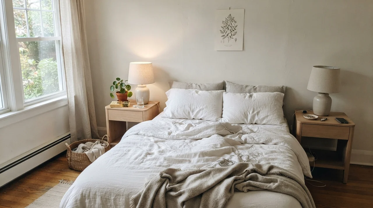
There is a good reason why older homeowners and seasoned designers quietly specify blush-undertone whites in private spaces: they are remarkably flattering on human skin. Standard high-LRV whites make tired eyes and winter complexions look pale and washed out. Alabaster 876, with its soft red backbone, acts like permanent candlelight. It softens harsh morning shadows around a vanity mirror and makes a bedroom feel tucked-in and rested.
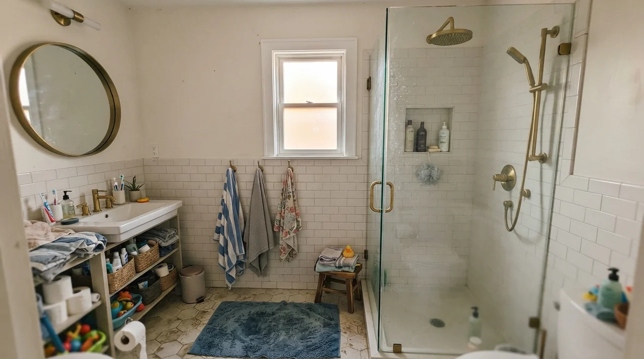
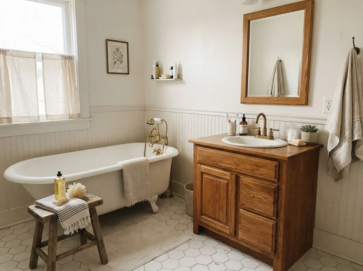
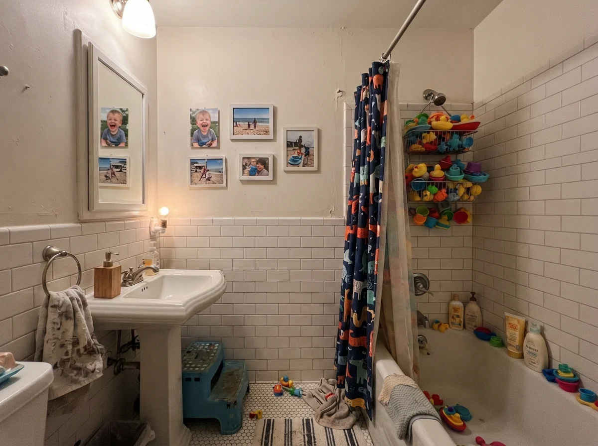
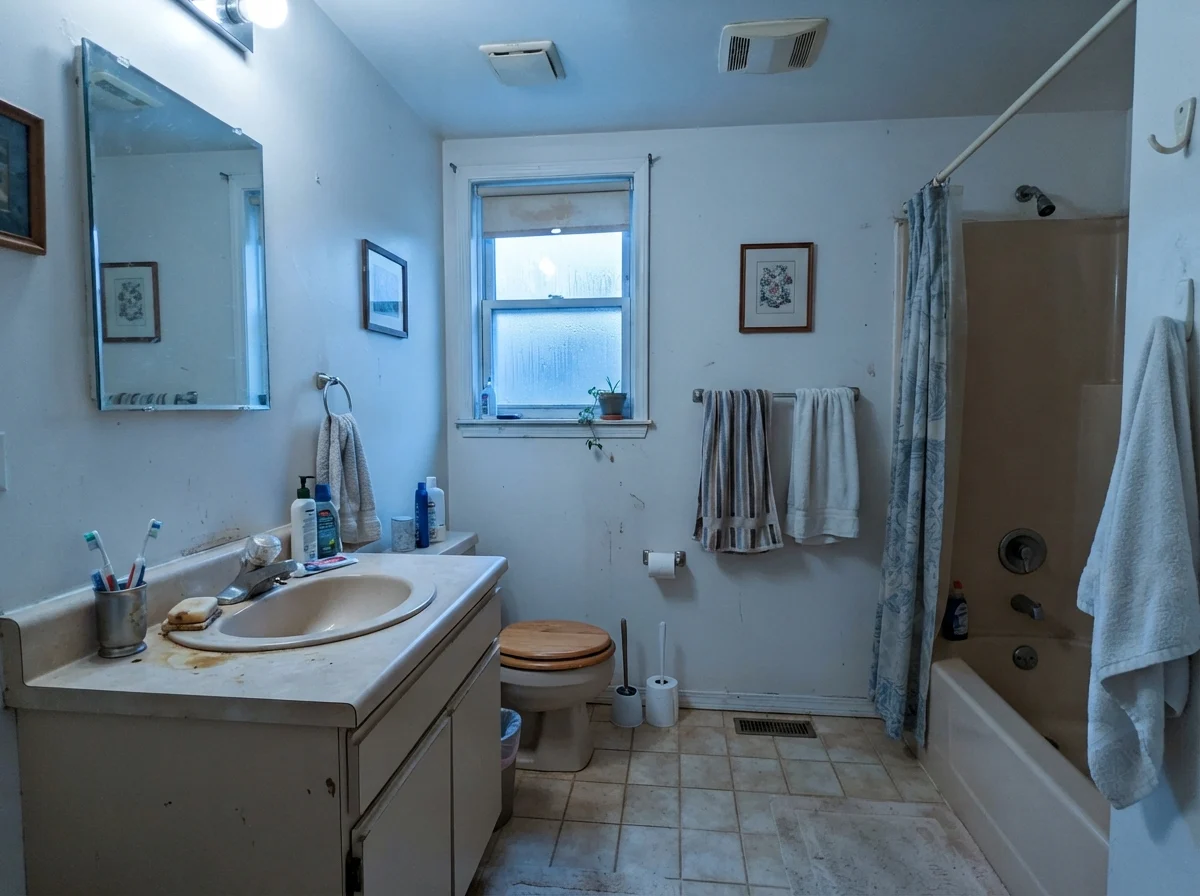
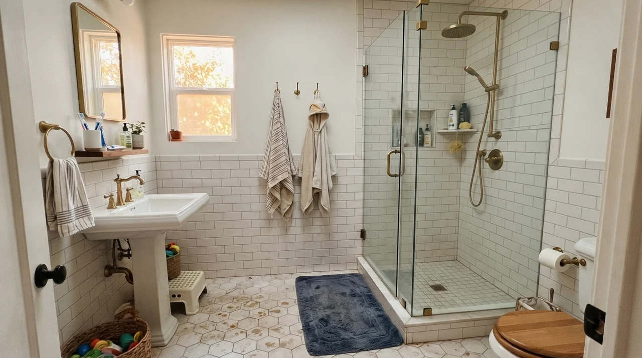
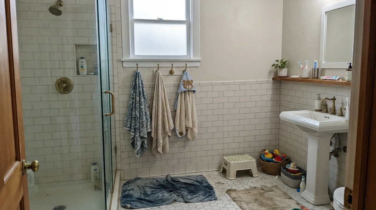
In our current 1960s ranch, I rolled 876 on the walls of our main bathroom. We kept the original white subway tile around the tub and installed an oiled oak vanity. Five years in, that paint choice has held up as one of the best cosmetic decisions in the house. When I flick on the vanity lights at six in the morning in the dead of February, the room does not feel like an operating suite. It feels warm, forgiving, and quiet.
You must, however, keep your tile choices honest. If your bathroom has cool Carrara marble with sharp blue-gray veining, or charcoal slate floor tile, Alabaster will look dirty beside them. The cool stone pulls the warm rose out of the paint, and the paint makes the stone look cold and clinical. They fight each other from dawn to dusk. Put 876 beside warm woods, unlacquered brass, handmade cream ceramics, or warm-toned marble, and it settles into place without an argument.
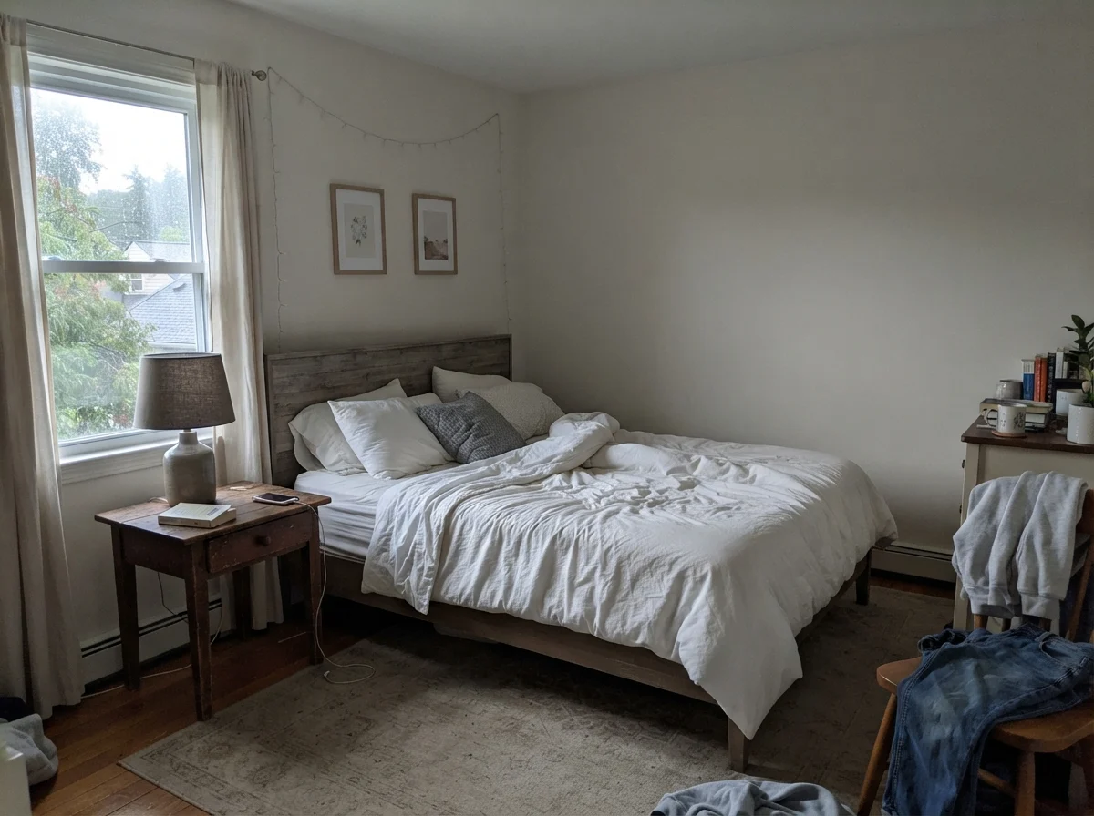
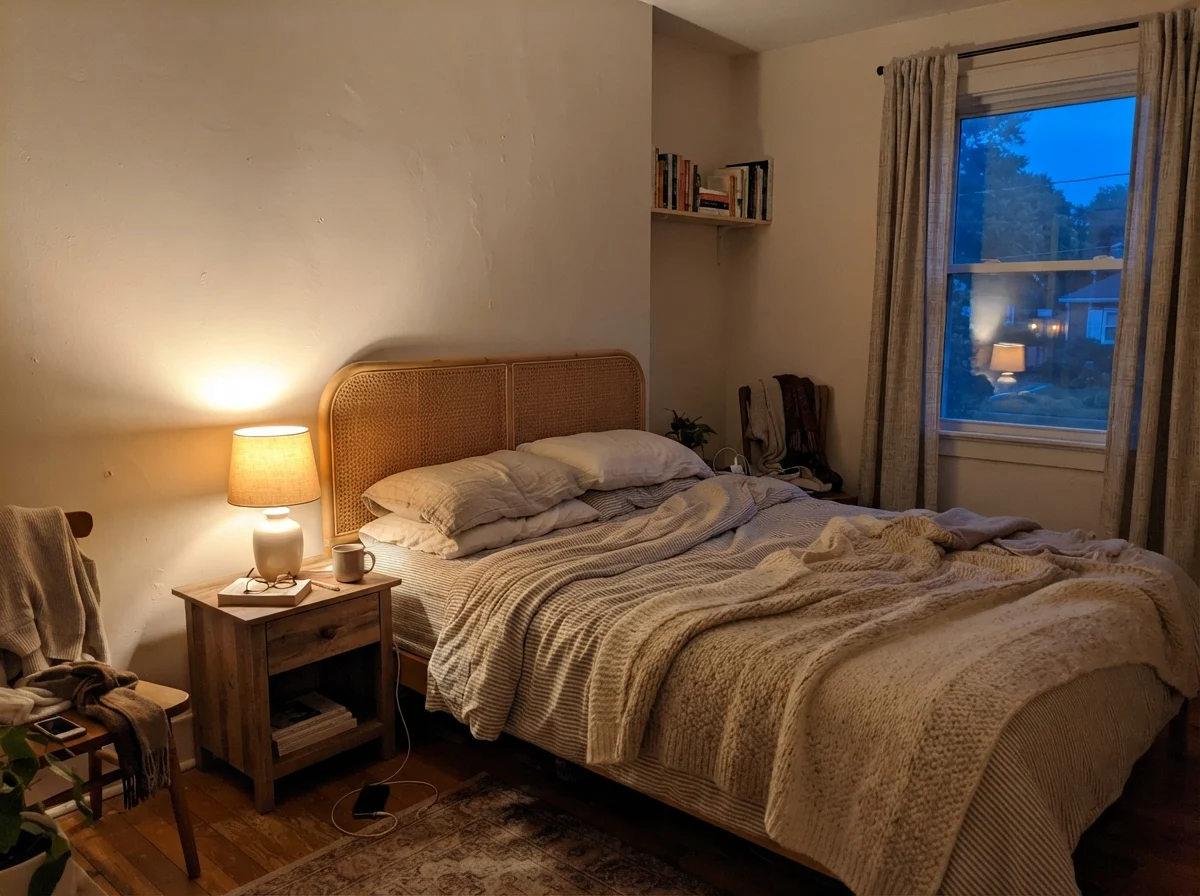
When the clouds roll in or you are dealing with a small window facing straight north, look at what happens in the third panel above. That flat, overcast sky takes all the punch out of the red pigment. The paint settles down into a soft, quiet gray-white. It never turns cold or chalky, which is the primary danger with pure whites like Chantilly Lace in modest rooms, but it certainly loses its romantic blush. Knowing that shift happens is what saves you from panic. If you judge a paint solely by how it looks on a sunny Saturday afternoon, you will be disappointed for the remaining five days of rain.
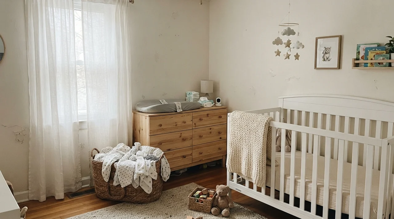
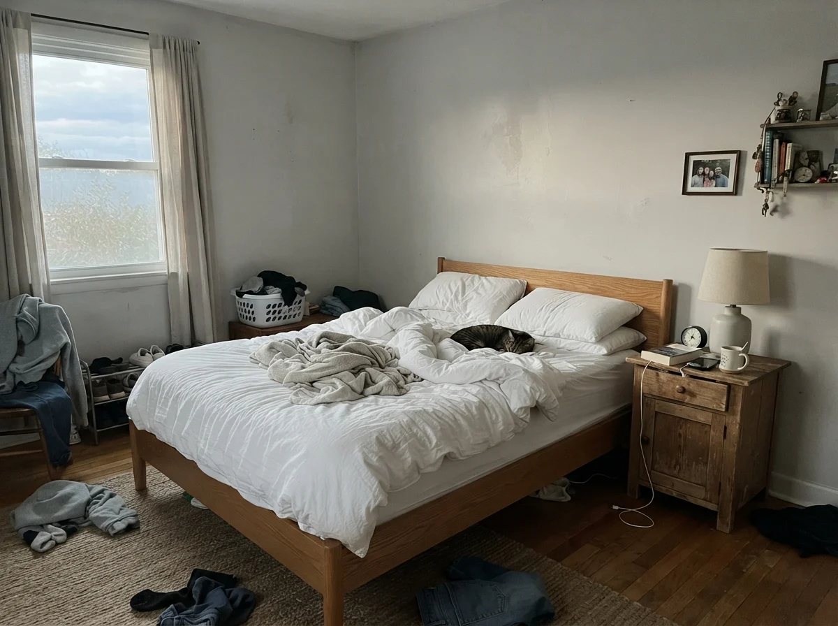
In bedrooms, that same dual personality is a blessing. In the nursery or a guest bedroom, 876 creates a calm, resting-place feel that stark whites simply cannot achieve. It wraps around bedding and painted trim softly, eliminating the hard, clinical lines that keep a room feeling sterile.
Kitchens, Cabinets, and Countertop Pitfalls
Cabinets are the single most expensive paint job in any house, and they are where color mistakes hurt your wallet the most. A bad wall color costs you a weekend and fifty dollars in supplies to fix; bad cabinet paint costs thousands in prep, spraying, and drying time, or months of painstaking hand work. If you are considering Benjamin Moore Alabaster for cabinetry, pause and look at your countertop sample before you touch a brush.
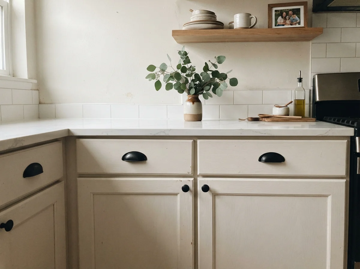
Alabaster on shaker cabinet doors in a satin finish looks exceptionally rich. It has a custom, furniture-like quality that immediately separates your kitchen from builder-grade flat white melamine. Knuckle marks around the handles and small scuffs from cooking spoons hide far better on an LRV 85 warm white than they ever do on a stark, bright gallery white. In our 1970s split-level, our first kitchen had bright white factory cabinets that showed every speck of dried coffee and tomato sauce within two hours of cleaning. A softer white gives you some breathing room between wipe-downs.
The catch is your solid surface. If your island or perimeter is capped with bright white quartz, engineered stone with icy gray flecks, or cool gray soapstone, Alabaster cabinets will instantly read as slightly yellowed or dirty. The eye seeks comparison. When placed directly against a cooler, whiter plane, the soft rose-cream warmth of 876 reads as an error rather than an intention. However, pair those same cabinets with warm white subway tile, butcher block, or warm soapstone, and the result is timeless.
Living Rooms, Sunrooms, and Natural Exposure
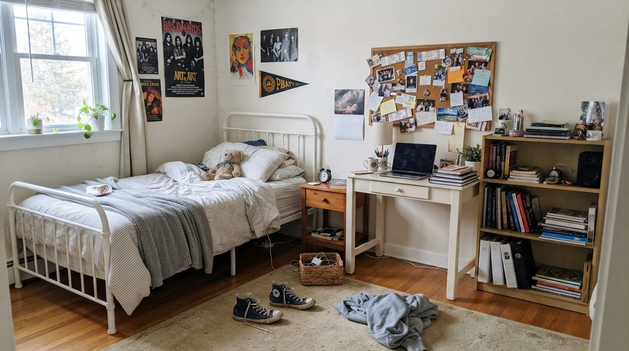
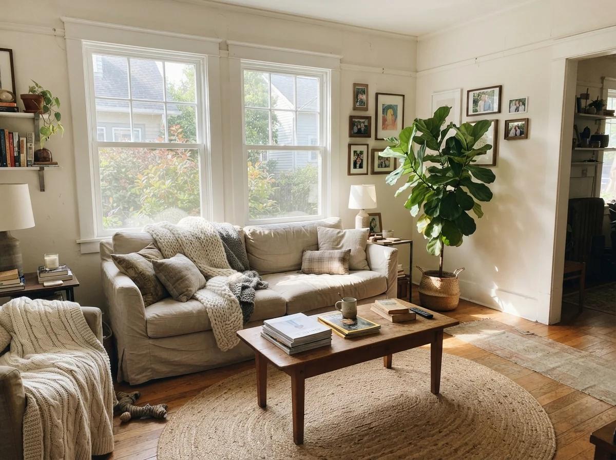
If you are painting a main living space with 876, the rule is simple: map your windows. A living room with expansive southern exposure is going to turn this paint into a warm, faintly peachy backdrop for four hours every afternoon. For some homes, particularly those with rich pine flooring, heavy linen upholstery, and lots of leafy greenery, that glow is inviting. It feels like a late September afternoon year-round.
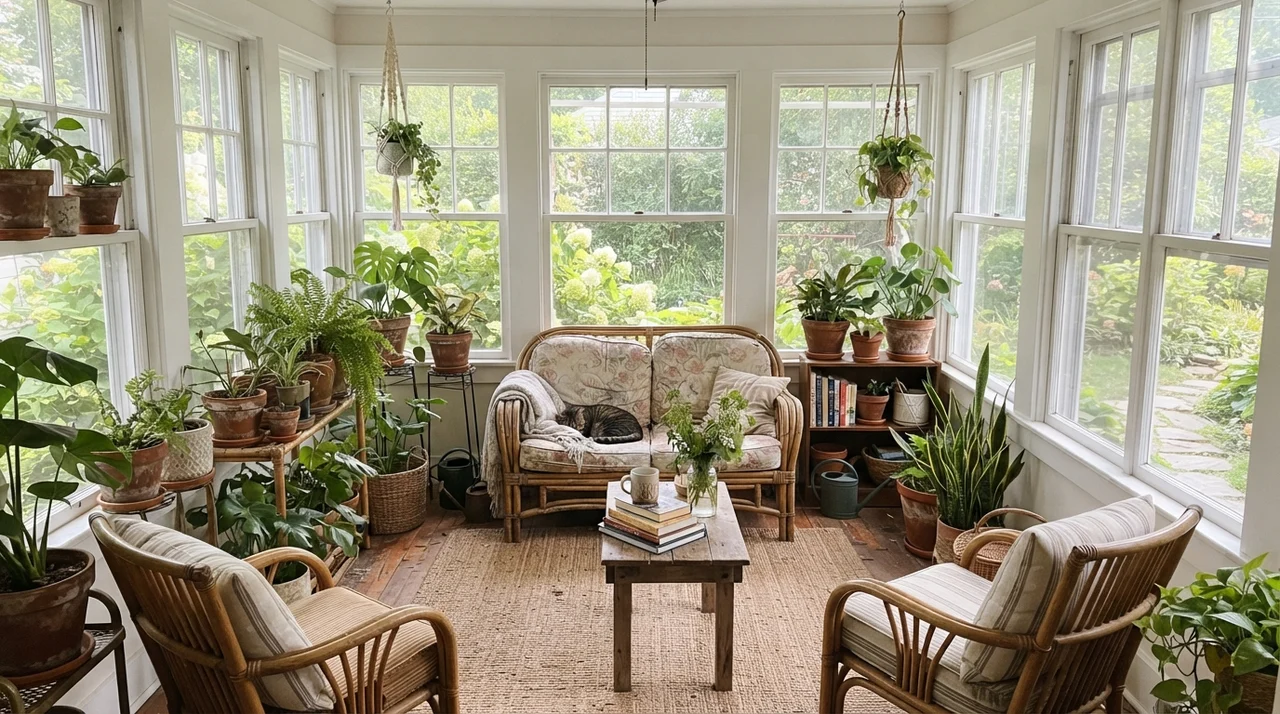
In a sunroom lined with glass on three sides, the sheer volume of unfiltered daylight washes out undertones dramatically. Here, Alabaster behaves like a softened gallery white. It eliminates the aggressive, blinding glare that high-gloss or pure-white paints create when the midday sun hits them, saving you from having to wear sunglasses inside your own home.
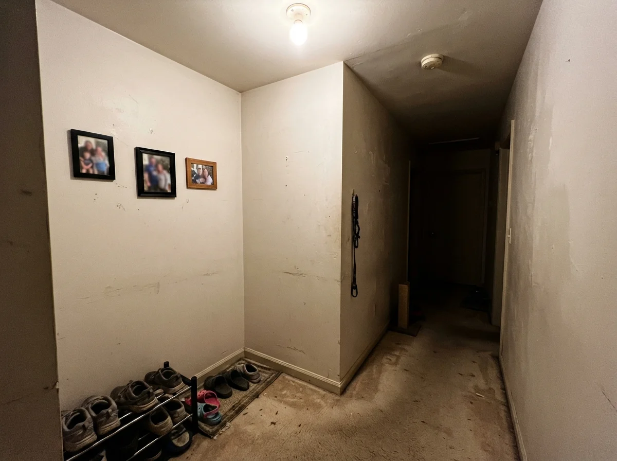
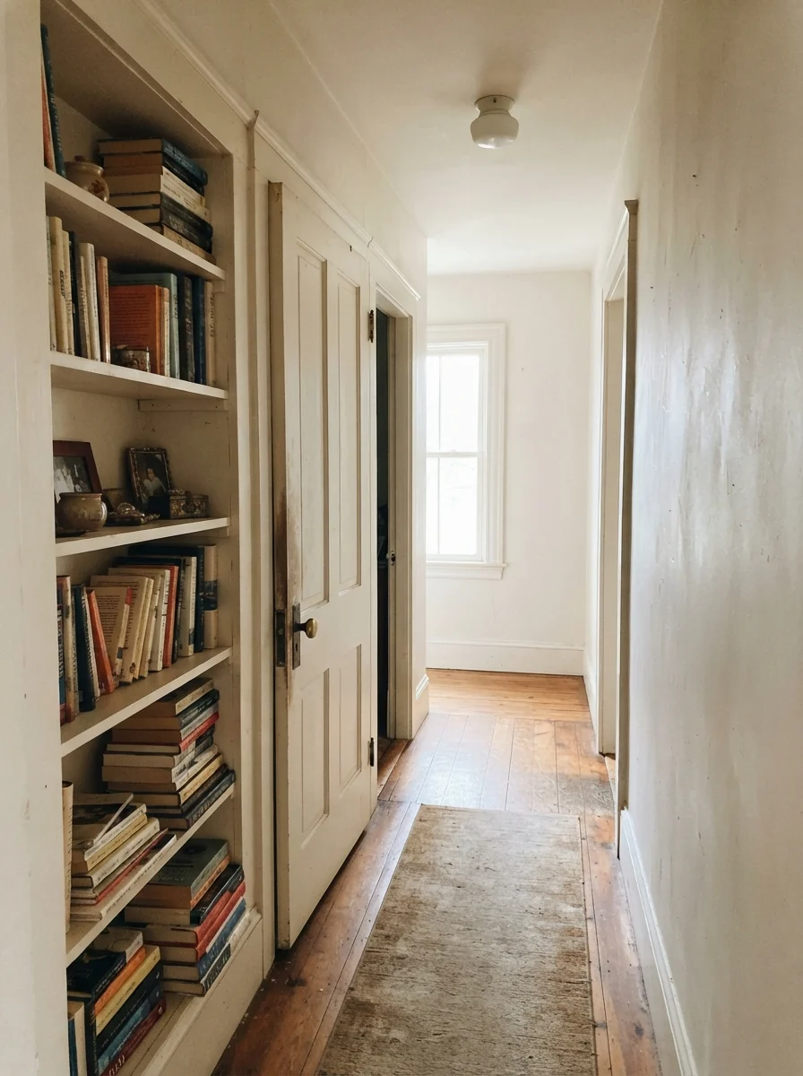
Where homeowners get burned is in the transitional spaces: the dark hallway between bedrooms, the small laundry room off the garage, or the basement staircase. An LRV of 85 sounds bright enough to illuminate a cave. But LRV (Light Reflectance Value) only tells you how much light a paint bounces back; it cannot invent light that does not exist. If you put a warm, blush-toned white into a dim hallway lit by a single 40-watt bulb, the paint does not magically glow. It goes muddy.
Paint cannot manufacture sunshine. If you roll an 85 LRV off-white into a dark hallway, it doesn't glow — it turns to wet clay.
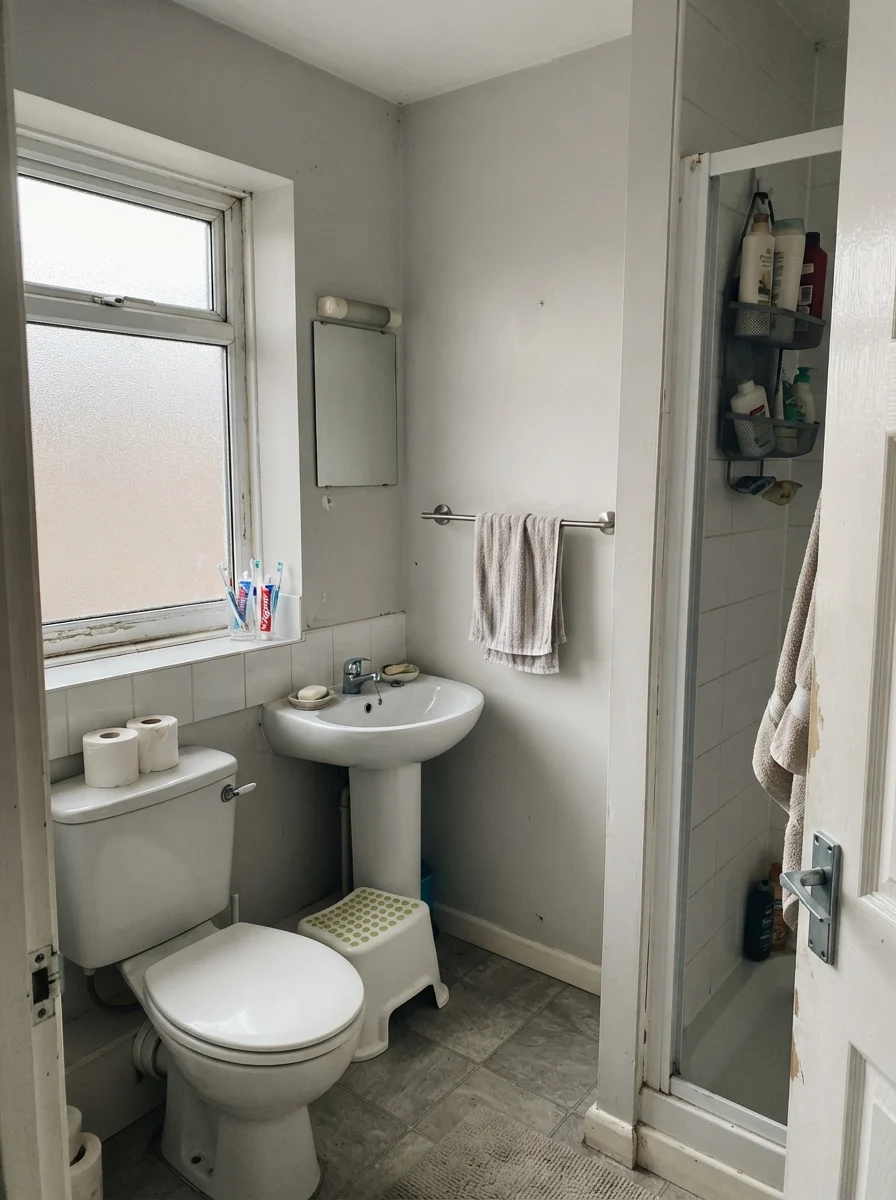
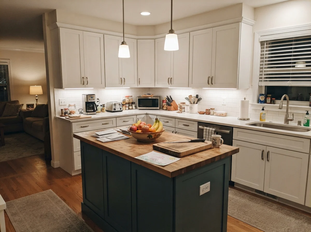
That photo above shows the reality of unvarnished homeownership. No staging, no photographer bouncing daylight from an umbrella reflector down the hall. In an unlit corner, Alabaster loses its charm and reads like putty. If you have an interior hall with zero exterior windows, either commit to proper 3500K overhead illumination or pick a color with real depth, like a mid-tone greige, that does not rely on sun to show its dignity.
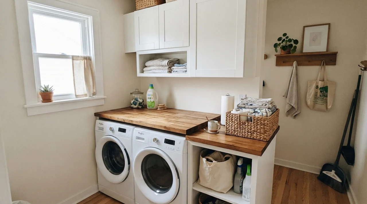
On the other hand, look at what happens when you give Alabaster even one modest window in a utilitarian workspace. In a bright laundry room, it keeps the room looking clean, fresh, and scrubbed without feeling cold like a commercial dry cleaner.
Exterior Siding and Whole-House Cohesion
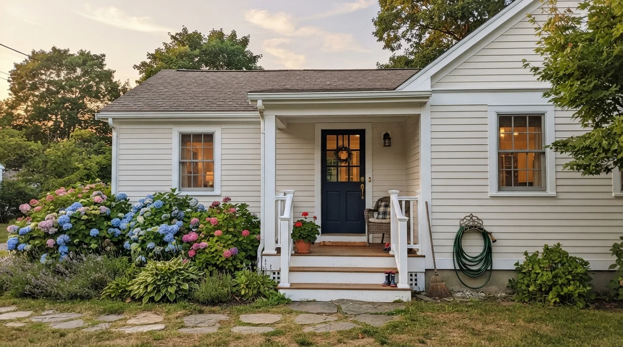
Outside, the physics of natural light change the game completely. Direct sunlight is exponentially brighter than interior lamp light, and at that scale, delicate undertones get bleached out. Benjamin Moore Alabaster 876 on exterior horizontal siding reads as a crisp, timeless, historical white. The pink undertone is swallowed by the sky, leaving just enough warmth to prevent the house from looking like plastic vinyl siding.
In our neighborhood, there are two 1920s bungalows painted white. One was done in a pure brilliant white; on a clear June midday, looking at the facade literally hurts your eyes, and every speck of road dust and mildew on the foundation shows up like a neon sign. The second house was painted in a softened off-white very close to 876, paired with dark navy shutters and an unpainted brick foundation. It looks established, grounded, and expensive. It held up across four harsh winters before needing a light power wash, and it never once looked tired.
How It Behaves Over Five Years
You don't choose a paint color for the afternoon the painter rolls up his drop cloths. You choose it for year four, when the hallway corner has taken twenty hits from grocery bags, the dog has brushed his muddy flank against the mudroom doorframe, and you have to decide whether to scrub the drywall or repaint the whole stretch.
In terms of durability, Alabaster 876 in an eggshell finish on walls and satin on cabinets is forgiving. High-contrast whites (LRV 90 and above) are unforgiving: every fingerprint near the light switch stands out, and every scuff mark looks like a pencil line. Alabaster’s warmth absorbs minor household wear. I have scrubbed clean the spot around our back door handle a hundred times with a damp microfiber cloth, and because the pigment has some depth, the touch-ups blend cleanly without flashing.
Where it does not forgive you is when you replace a fixture five years later. If you paint a room in Alabaster and later install a bright, cool white vanity top or cool gray porcelain floor tile, you will suddenly notice the pink undertone all over again. That isn't paint failure; it's the law of simultaneous contrast. Once you commit to a warm blush-white, your future renovation materials must stay in the warm family.
The Two Alabasters: Don't Make This Mistake
This is the most frequent question I receive from neighbors and readers alike: 'Susan, why does my Alabaster look nothing like my daughter's Alabaster?'
Because you are holding cans from two different companies. Sherwin-Williams Alabaster SW 7008 is an iconic, award-winning paint color with an LRV of 82. It contains yellow and black pigments, giving it a soft, creamy greige cast. It is heavier, warmer in a golden sense, and contains zero pink. Benjamin Moore Alabaster 876 has an LRV of 85, sits three points higher on the lightness scale, and gets its warmth from red-violet. If you walk into a Benjamin Moore store and ask for 'Alabaster,' they will mix 876. If you brought an inspiration picture from Pinterest that originated in a Sherwin-Williams house, you will be baffled when you roll it onto your wall. Always check the SKU number on the lid.
Does Benjamin Moore Alabaster look pink on the wall?
Yes, in south- or west-facing rooms with generous afternoon sun, the red undertone comes forward noticeably. In north-facing rooms or under cool overcast skies, that pink cancels out the natural blue daylight, leaving behind a soft, clean white.
What is the difference between Benjamin Moore 876 and Sherwin-Williams 7008?
They are completely unrelated paint formulas sharing the same name. Sherwin-Williams Alabaster SW 7008 is an LRV 82 warm cream-greige. Benjamin Moore Alabaster 876 is lighter (LRV 85) and has a soft pink/rose undertone. Always order by code number.
What sheen should I choose for Benjamin Moore Alabaster?
Walls do best in eggshell, ceilings in flat, trim and doors in semi-gloss, and kitchen cabinets in satin. Using Alabaster across all surfaces in these varying sheens prevents undertone clashes.
Will Alabaster work with gray quartz countertops or gray bathroom tile?
Generally, no. Cool blue-gray stones and slate make Alabaster look muddy or exaggeratedly pink. It pairs best with warm marble, white subway tile, unlacquered brass, and natural wood.
Susan's Verdict · Buy the Sample First
Benjamin Moore Alabaster 876 is one of the most flattering, skin-softening whites in the fan deck, but it is not a neutral white you can buy sight unseen. If you need a white that banishes the dreary chill from a north-facing bedroom or guest bathroom, it is worth every penny of the gallon price. But if your heart is set on the beige-warm farmhouse look, or your kitchen has cool gray quartz counters, put down the roller and order Cloud White or SW 7008 instead. Always check the SKU on the label, paint a large test board, and watch what happens to it at four o'clock in the afternoon before you commit.