Color Diary · No. 12
Balboa Mist in Real Light: The Greige That Flashes Violet
The soft greige everyone recommends until it flashes lavender — reviewed honestly, including the exact rooms where that happens and what to paint instead.

Susan HartleySeptember 3, 2026 · 15 min read
Balboa Mist · Benjamin Moore 1549
Hex#DAD6CCLRV66Undertonesviolet → gray → warm greige
In our last house—a center-hall colonial we bought back in 2004—we had a long, stubborn hallway upstairs that connected four bedrooms. It had zero direct windows, picked up whatever stray light bounced off the stair landing, and managed to make every traditional tan look like wet cardboard. By the time we decided to give the entire second floor a fresh coat of paint, beige felt completely dated, but the cool industrial grays that were flooding every magazine felt cold enough to give you a chill. That was my introduction to Benjamin Moore Balboa Mist.
On the paint chip, Balboa Mist (SKU 1549) looks like the ultimate peace treaty between beige and gray. With a Light Reflectance Value of 66, it sits squarely in that sweet spot where a paint color is pale enough to keep a shadowy space feeling open, but carries just enough pigment that it won't be mistaken for plain ceiling white. On paper, it is everything a homeowner wants when updating a dated interior: quiet, tailored, and soft.
We rolled two coats on that hallway, stepped back, and felt like geniuses. For about four hours. Then five o'clock rolled around, the sun dropped below the tree line, I flipped on the hallway fixtures, and the entire corridor turned the color of a pale lilac sweater. That is the lived reality of Balboa Mist. It is a gorgeous, refined warm gray—until the wrong light hits it, at which point the violet undertone hiding in its formula steps directly into the spotlight.
The Violet Factor: What Balboa Mist Is Actually Made Of
Paint companies love to describe colors with words like 'neutral' and 'versatile,' but every neutral is anchored to a color family. Balboa Mist sits in the greige family, but unlike colors that lean on yellow or green to provide their warmth, Balboa Mist carries a whisper of violet in its gray base. That subtle purple pigment is exactly what gives the color its sophisticated, misty quality in balanced daylight—it prevents the gray from reading cement-like or dreary. But that same violet is also why people end up frantic in online forums asking why their newly painted living room looks like a lavender sachet.
Whether Balboa Mist looks like an expensive, soft warm gray or a distinct pastel purple comes down entirely to three factors: the direction of your windows, the fixed materials sitting next to it, and the lightbulbs you screw into your lamps. When those three things align, it is one of the most elegant neutrals Benjamin Moore has ever formulated. When they fight it, no amount of wishing or second-coating will fix it.
How Daylight and Bulbs Control This Color
Over thirty years of repainting rooms across three houses, I have learned that light is not passive. It actively pulls colors apart. Balboa Mist behaves completely differently at seven in the morning than it does at eight at night, and understanding that shift is the difference between loving your walls and regretting your weekend paint project.
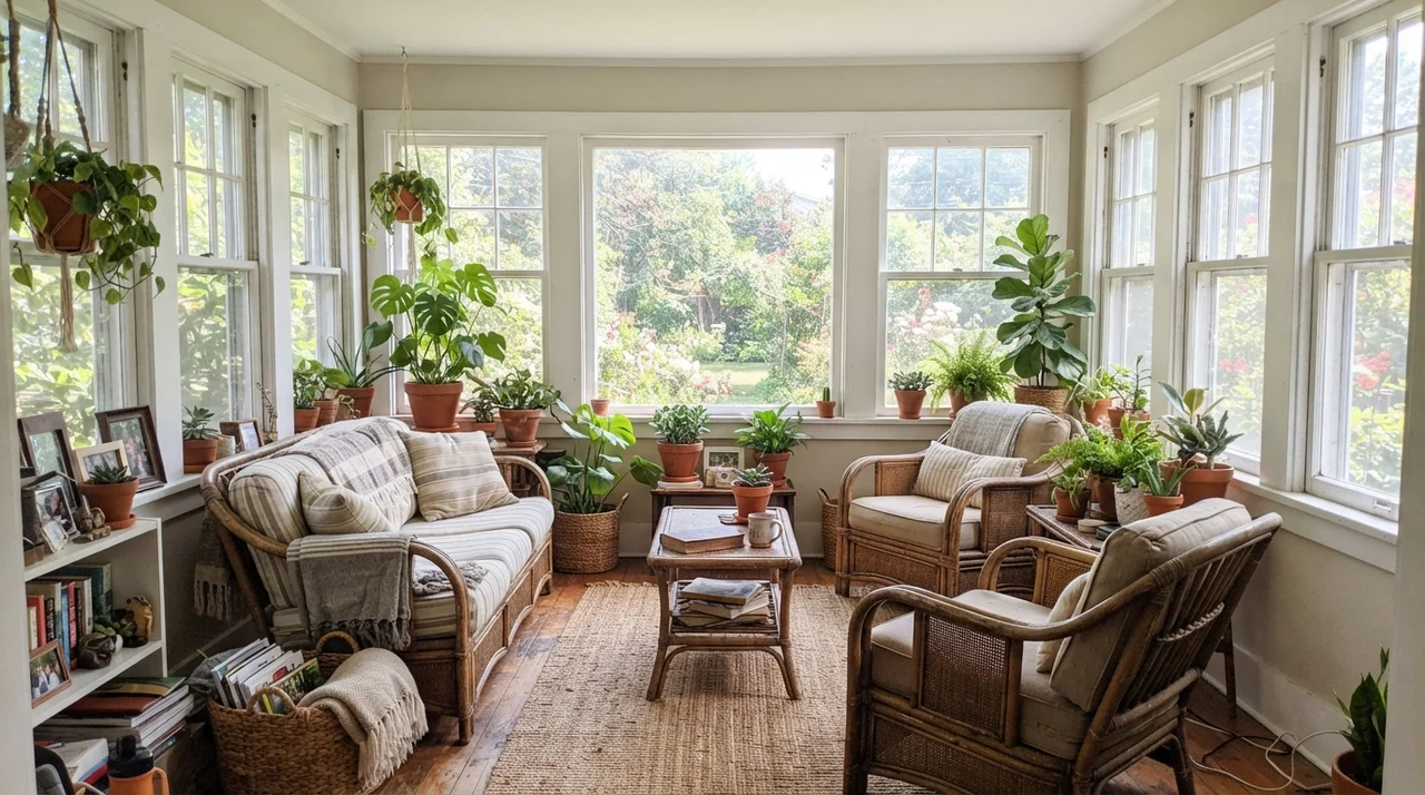
In moderate, direct daylight—especially rooms with east- or west-facing windows—Balboa Mist is at its absolute best. The natural warmth of the sun balances the cool gray notes, resulting in a gentle, warm stone shade that makes a space feel open and restful. In south-facing rooms flooded with intense midday sun, the high LRV of 66 means the color washes out significantly, acting almost like a soft off-white until the golden hour arrives late in the day.
The trouble zones are north-facing rooms and cloudy days. Cool, flat northern light strips out whatever subtle warmth exists in the paint formula, allowing the cool blue-gray sky to pull that violet undertone straight to the surface. If you pair that northern exposure with 4000K or 5000K 'daylight' LED bulbs—which I always caution homeowners against using in living areas—your walls will look unmistakably purple-gray once night falls. To keep Balboa Mist looking like a proper greige in the evening, stick strictly to 3000K warm-white bulbs.
Balboa Mist in Main Living Spaces
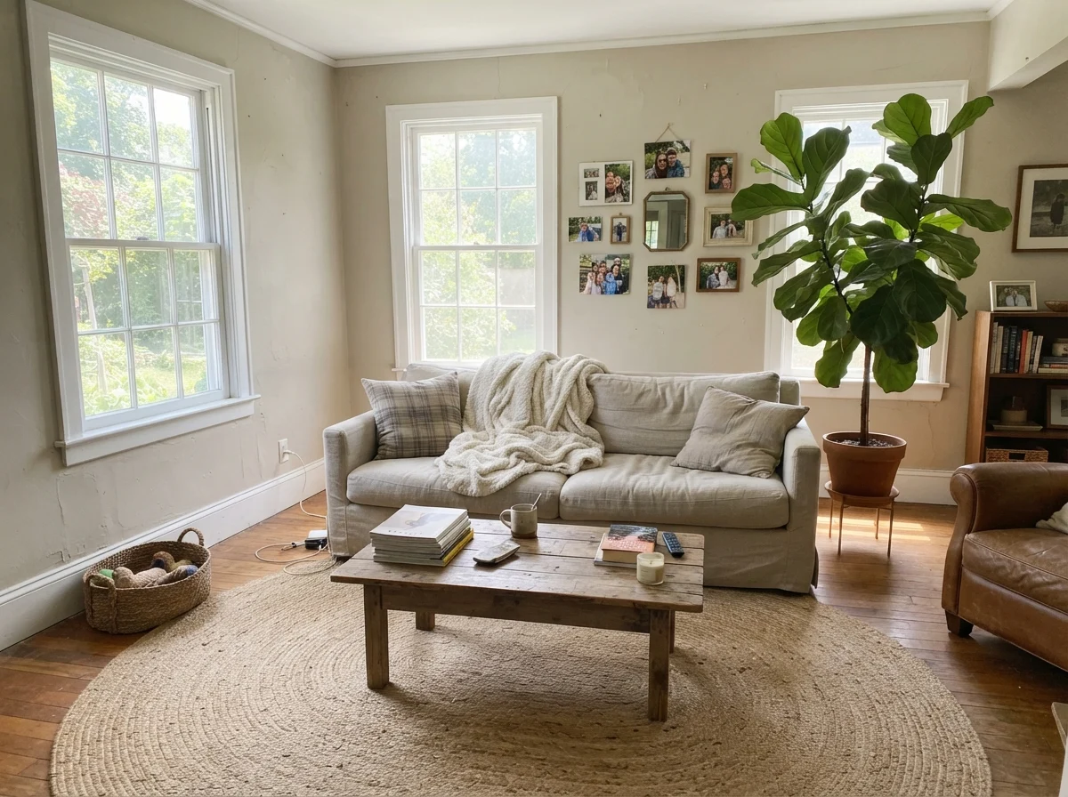
In our current 1960s ranch, the main living area gets generous daylight from two large picture windows. When we tested Balboa Mist on an eight-foot board propped against the baseboards, it showed exactly why it remains ranked number 22 in Benjamin Moore's catalog. It sits quietly behind furniture without demanding attention, letting white oak flooring, aged brass accents, and neutral linen upholstery take center stage.
Because it reads distinctly gray rather than creamy, it gives a room an updated, architectural feel without the sterile chill of a pure gray like Stonington Gray or Coventry Gray. If your home has an open floor plan where the living room transitions into a dining space or sunroom, Balboa Mist acts as an exceptional unifying neutral—provided your trim is clean and crisp.
Bedrooms and Quiet Retreats: Where It Truly Shines
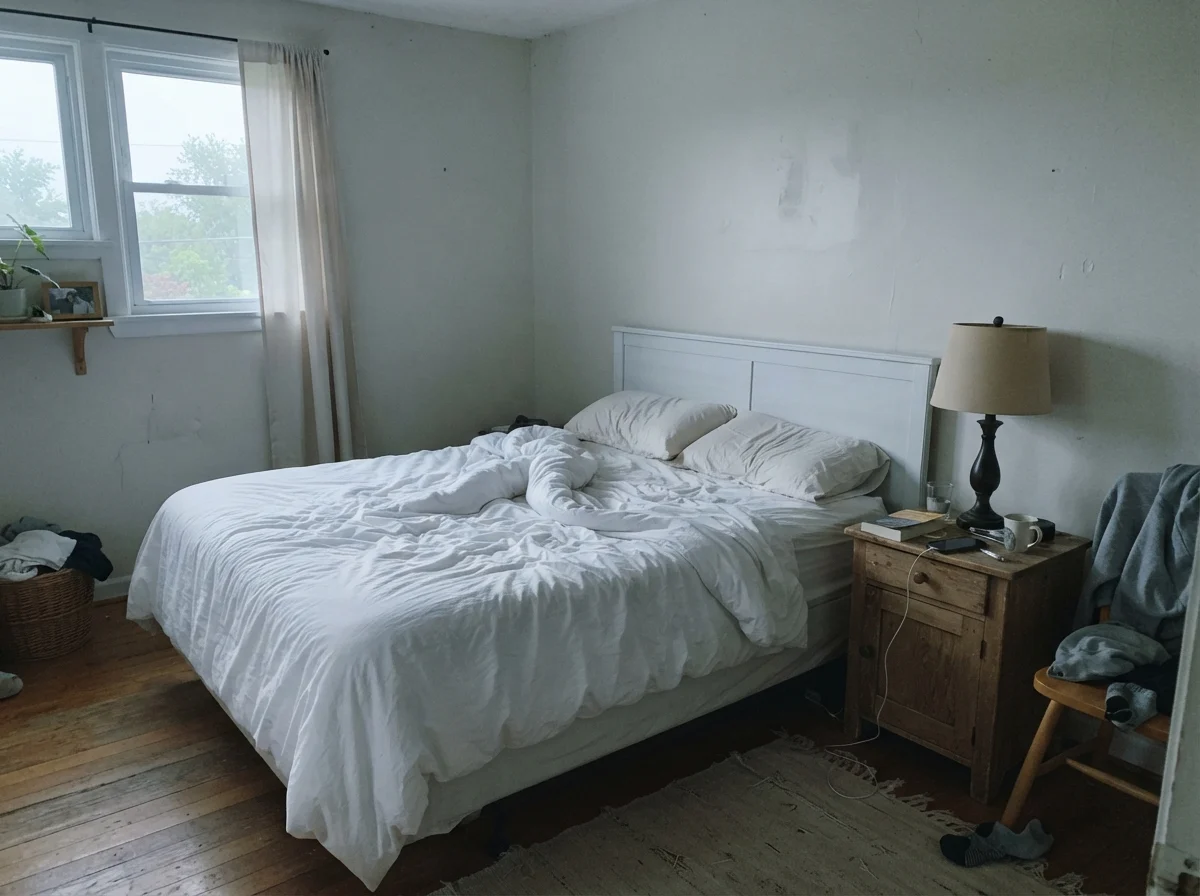
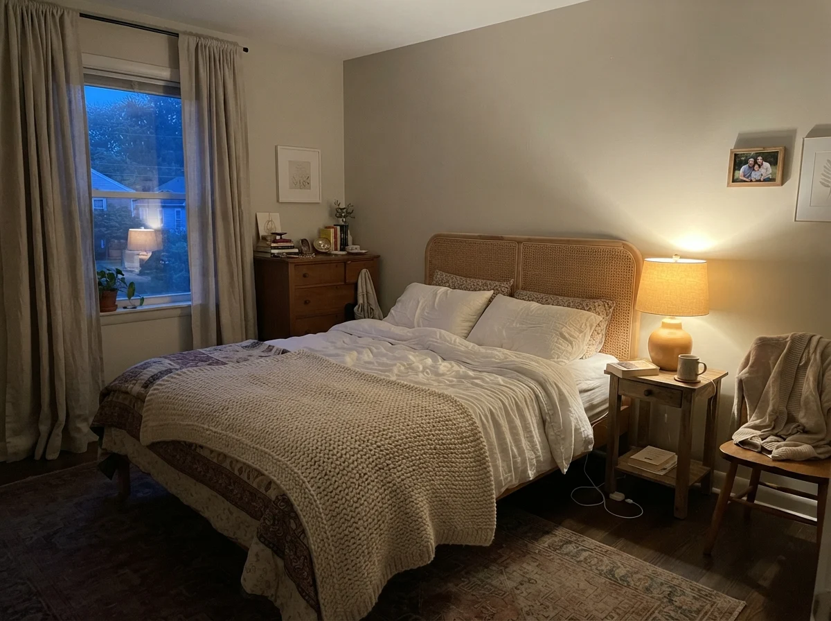
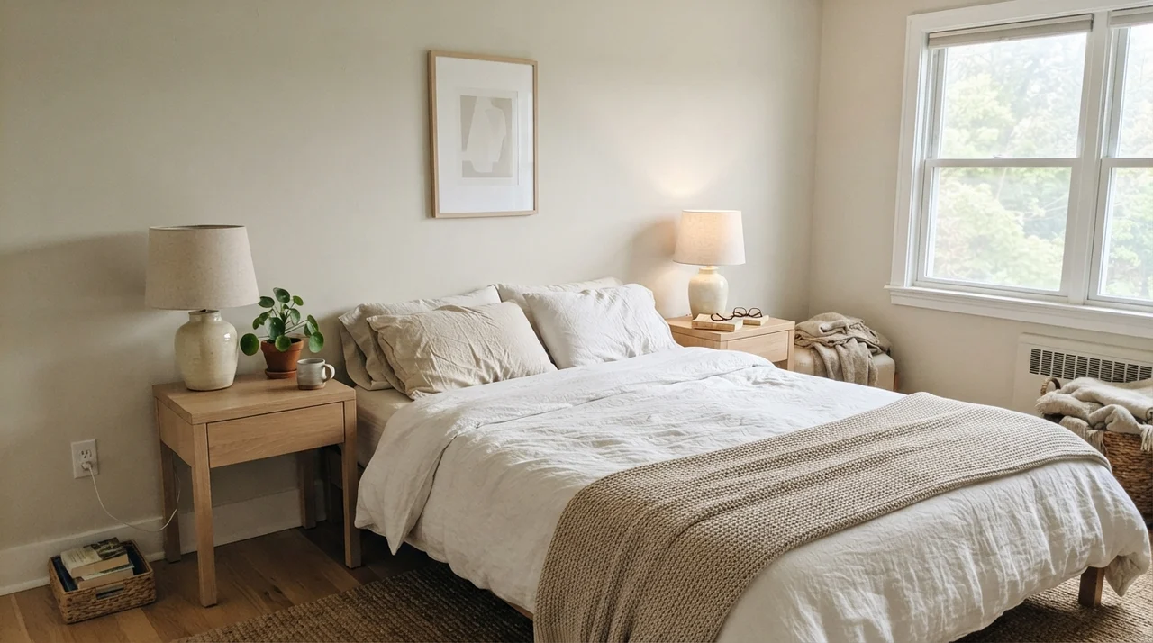
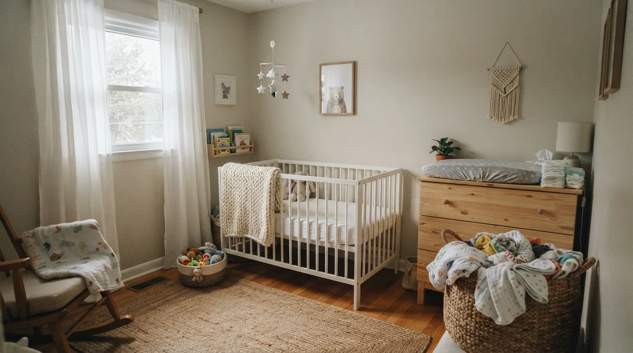
If there is one room where Balboa Mist consistently earns its keep, it is the bedroom. Bedrooms do not need high-contrast drama; they need to feel calm, quiet, and grounded. Because Balboa Mist has just enough pigment to contrast gently against crisp white bedding and trim, it makes a primary bedroom or nursery feel like a sanctuary.
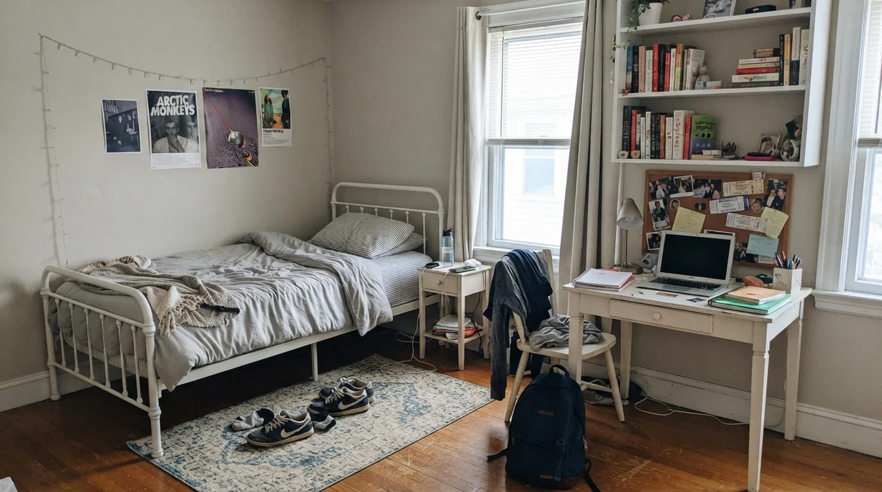
We lived with a similar soft greige in our daughter's bedroom five years in, and it held up beautifully as she transitioned from nursery furniture to a desk and bookshelf setup. It is soft enough for a baby's room without feeling juvenile, and neutral enough for a teenager's changing tastes without needing to be repainted every two years.
Kitchens and Cabinetry: The Undertone Collision Zone
Here is where you must be exceptionally careful. Kitchens are filled with expensive, permanent materials: quartz counters, tile backsplashes, and rows of finished cabinetry. Unlike wall paint, you cannot change your granite or cabinet color over a weekend for eighty dollars.
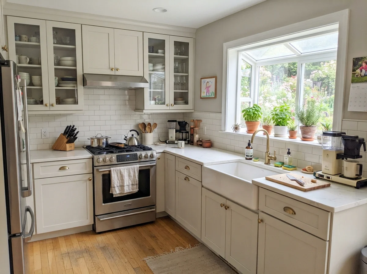
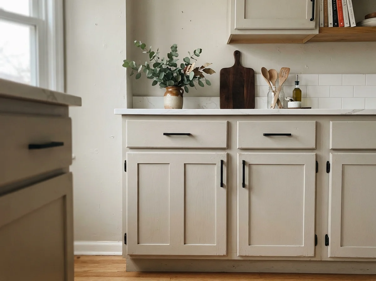
Balboa Mist looks stunning on kitchen walls when paired with clean white quartz counters, white subway tile, and bright white or charcoal cabinetry. When used directly on the shaker cabinets themselves, it delivers an understated, custom-built look that pairs wonderfully with black hardware and light oak floorboards.
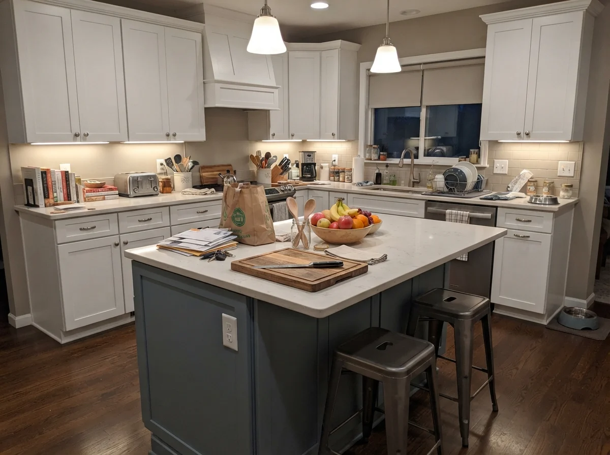
However, if your kitchen has warm almond tile, creamy yellow-based perimeter cabinets, or 1990s honey oak, painting the walls or an island in Balboa Mist is a recipe for instant regret. The golden-yellow undertones in honey oak or cream cabinets will immediately clash with the cool violet-gray in Balboa Mist. The cabinets will look dingy and yellowed, while the walls will look distinctly pinkish-purple. If your fixed finishes lean yellow or almond, walk away from Balboa Mist and pick a neutral with a golden or beige base instead.
The golden undertone in honey oak will fight the violet-gray base every single day. The cabinets will look dirty yellow, and the walls will look pink.
Bathrooms and Tile: Check Your Fixed Surfaces
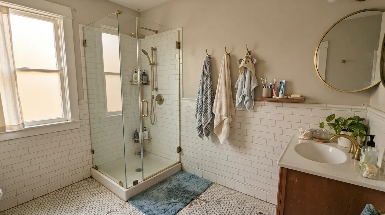
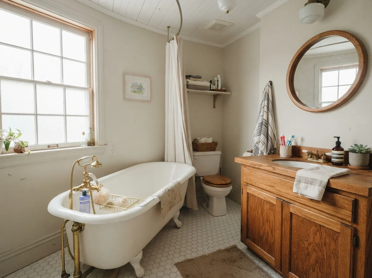
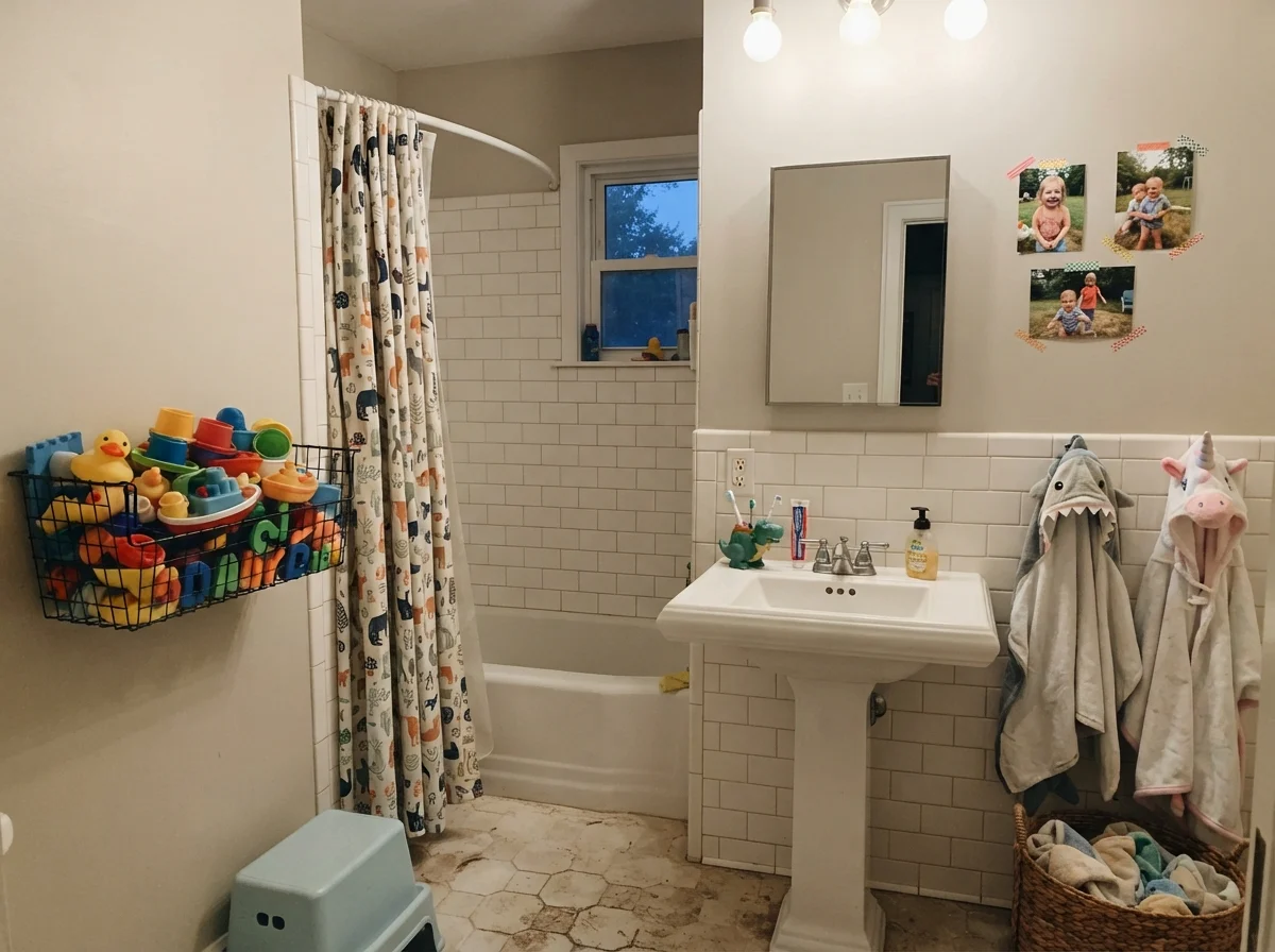
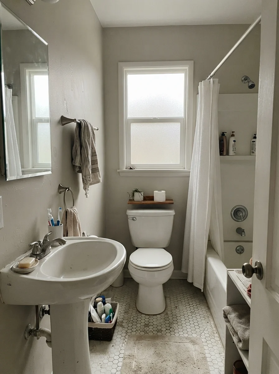
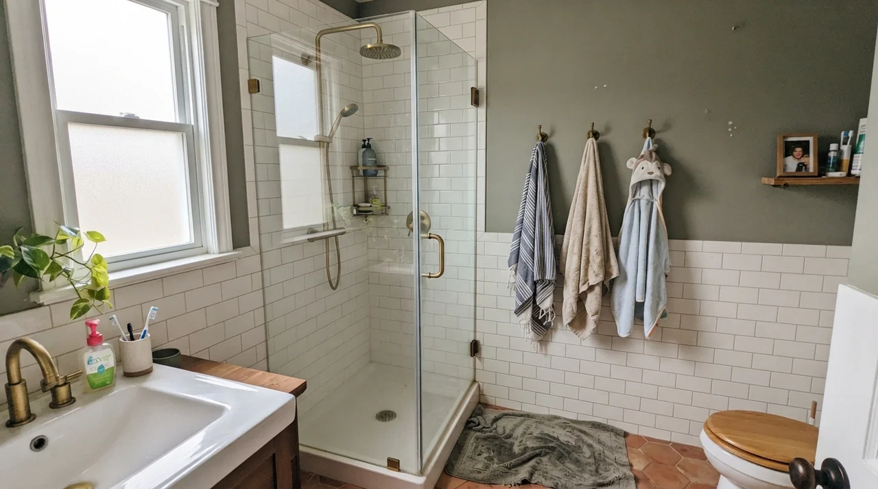
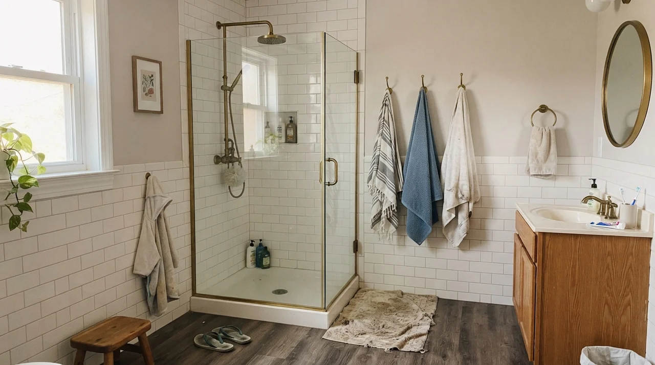
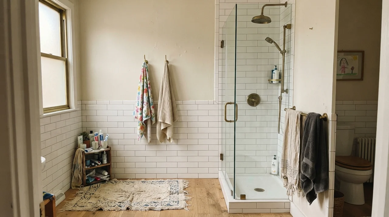
In bathrooms, Balboa Mist is a chameleon that depends entirely on the surrounding ceramic and lighting. In a vintage-style bath with classic white subway wainscot, hex tile, and unlacquered brass hardware, it provides just enough pigment on the upper walls to make the white tile pop cleanly.
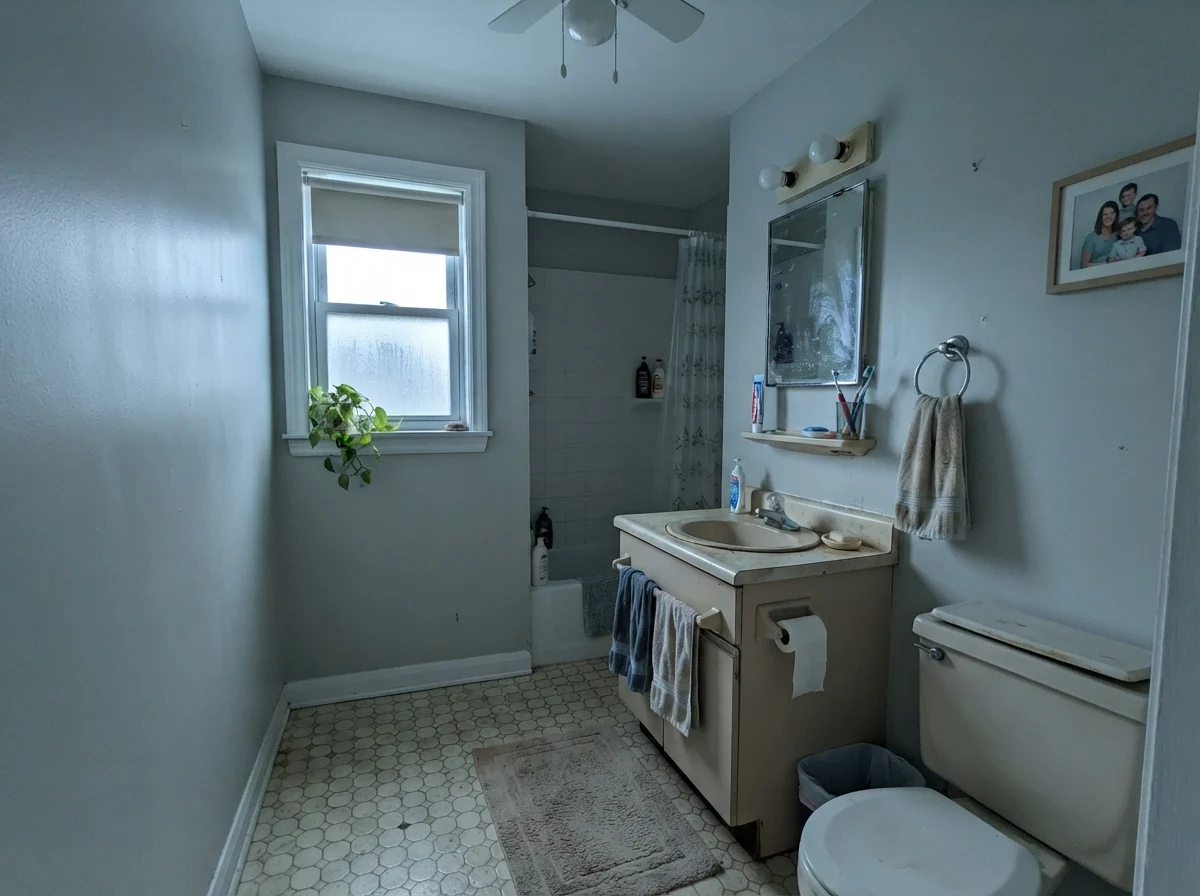
However, many older bathrooms feature dated beige or travertine tile. When cool, overcast daylight filters through a small bathroom window onto those beige surfaces, Balboa Mist looks muted, flat, and slightly bruised. If you are repainting a bathroom with existing beige or almond fixtures, test this color directly against the vanity counter under your actual vanity lights before rolling the entire room.
Utility Spaces, Millwork, and Everyday Living
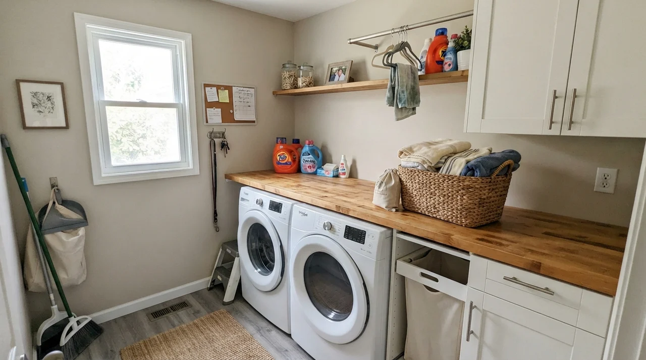
Where Balboa Mist offers real practical value is in hardworking transitional spaces: laundry rooms, interior doors, and built-in millwork. Because it has an LRV of 66, it reflects ample light in small utility areas without feeling as clinical as a stark commercial white.
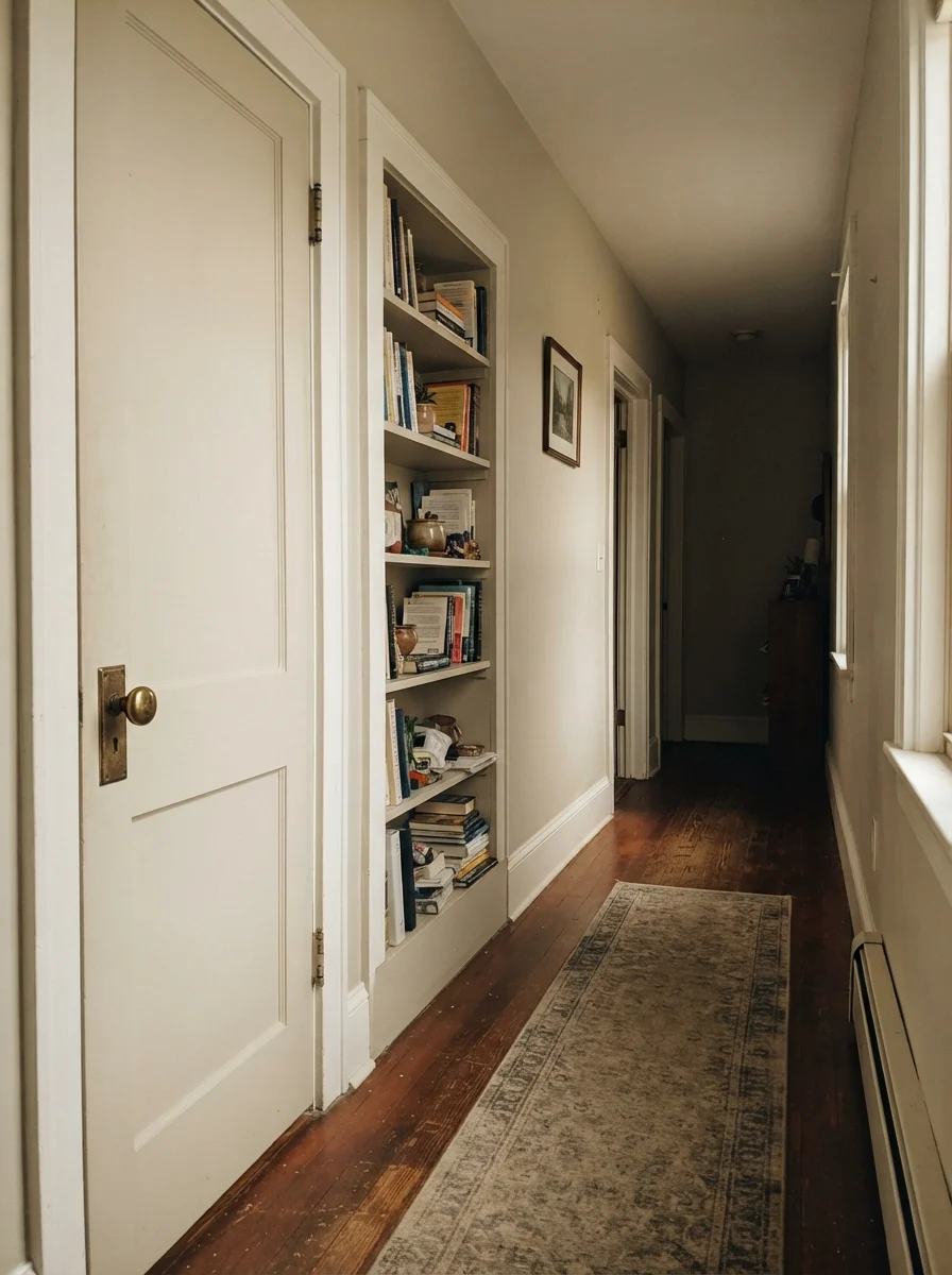
When we painted the interior passage doors and built-in bookcase in our hallway, Balboa Mist gave the woodwork subtle depth against slightly lighter walls. It created that tailored, layered look you see in custom homes, without requiring dark, heavy paint colors that show every nick and scratch.
Exterior Applications: Why It Needs Dark Framing
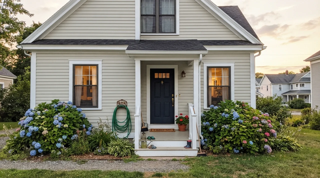
Using Balboa Mist on an exterior requires caution. Natural outdoor sunlight is significantly brighter than even the best-lit interior room. At an LRV of 66, full midday sun will completely blow out Balboa Mist, making your siding look like a washed-out, generic off-white rather than a sophisticated greige.
If you want to use it on horizontal siding, you must ground it with high-contrast framing. Pairing it with a dark navy or charcoal front door, rich architectural trim, and deep shutters keeps the exterior from looking faded or indecisive. In soft early-evening light, the greige tone returns, but if your home sits in blazing, unshaded southern sun, this color lacks the body to hold its ground outside.
Where Balboa Mist Completely Collapses
The bad reviews for Balboa Mist are remarkably consistent. In thirty years of looking at paint jobs, I have seen homeowners make the exact same three mistakes with this color, and no second coat will fix them once the paint dries.
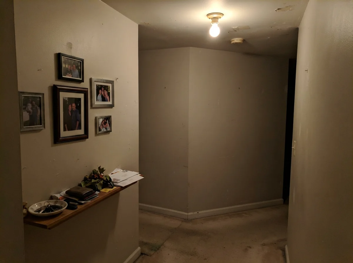
First, putting Balboa Mist into a dark, windowless hallway or a dim north-facing room with beige carpet. The lack of warm daylight instantly kills the greige balance, leaving the walls looking flat, muddy, and drab—like wet putty. Second, pairing it with warm almond countertops or yellow honey-oak trim, which forces the violet undertone into an ugly fight with the yellow base. Third, lighting the room with cool 4000K commercial LED bulbs, which turns the entire space into an accidental lavender nursery the second you flip the wall switch.
Durability, Cleaning, and Resale: The Five-Year Reality
Choosing a paint color is only half the battle; the finish and formula you pick determine how it looks five years in. In our houses, we have scrubbed mud off baseboards, wiped sauce splatters off kitchen walls, and patched nail holes when kids rearranged their bedrooms. Here is how Balboa Mist behaves over real time.
For whole-house repaints and living spaces, eggshell on the walls is the only sheen worth the money. It provides just enough washability to wipe away fingerprints with a damp microfiber cloth without creating an undesirable plastic sheen that highlights drywall imperfections. For bathrooms and laundry rooms, step up to satin to resist moisture marks and shower humidity. Keep your ceilings in dead flat to hide seams, and use semi-gloss on trim and baseboards so scuffs can be scrubbed clean without wearing down the paint film.
When we sold our last house, our real estate agent specifically remarked on how well a cohesive, light neutral carried through the main floor. Balboa Mist photographs cleanly in listing photos and makes rooms feel expansive, provided it has crisp white trim to define it. It signals to buyers that a home has been updated, eliminating that dated early-2000s beige feel without feeling cold.
Why does Balboa Mist look purple in my room?
Balboa Mist carries a subtle violet undertone in its gray base. When exposed to cool, flat north light, overcast skies, or cool 4000K+ LED lightbulbs, that violet pigment is pulled forward. Swapping your bulbs to 3000K warm-white will resolve the issue in most rooms.
What is the best trim color to use with Balboa Mist?
Benjamin Moore Chantilly Lace (OC-65) is the best choice because its clean, neutral white provides crisp contrast that keeps Balboa Mist reading as an intentional gray. Benjamin Moore White Dove (OC-17) is also an excellent soft white option for traditional homes.
Does Balboa Mist work with honey oak cabinets?
No. The warm yellow-orange base of honey oak clashes directly with the cool violet-gray undertone in Balboa Mist. This pairing makes oak cabinets look dirty yellow and the walls look pinkish-purple. Use Pale Oak OC-20 instead.
Is Balboa Mist considered a gray or a beige?
It is officially categorized as a greige, but on the wall it leans predominantly toward a soft, warm gray rather than a tan or beige. That gray-forward balance is why homeowners frequently pick it over warmer options like Edgecomb Gray.
Susan's Verdict · Keep It in Real Daylight
Balboa Mist is an exceptional, expensive-looking greige that solves the problem of dated beige without turning your walls into cold gray concrete. But it demands honest conditions. If your room has moderate east or west daylight, crisp white trim, and warm 3000K bulbs, buy it with confidence. If the room is a dim north-facing box filled with honey oak and cool LEDs, leave the can on the shelf and buy Edgecomb Gray instead.