Color Diary · No. 36
Benjamin Moore Ballet White: Why We Kept This Dirty Cream for Ten Years
The off-white designers call a "dirty cream," reviewed honestly: the rooms where it glows, the north-facing rooms where it turns faintly green, and what to buy instead.

Susan HartleySeptember 18, 2026 · 16 min read
Ballet White · Benjamin Moore OC-9
Hex#E5E0D0LRV72Undertonescream → warm gray → olive undertone
In our last house, a 1990s colonial with oversized windows in the back and practically none in the front hallway, I spent six months trying to find a wall paint that did not look like cold typing paper. It was 2004. Everyone was tearing down wallpaper and rushing into crisp gallery whites, only to realize their rooms felt like medical clinics by November. I bought three sample cans of stark whites, rolled them onto the drywall in our center hall, and watched them turn a dismal, chalky gray by three in the afternoon.
A neighbor down the street who had worked in decorating told me to look at Benjamin Moore Ballet White OC-9. She called it a "dirty cream." At the time, that sounded like an insult. But once I put the test patch up next to our warm honey-oak baseboards, I understood what she meant. Ballet White is what people actually mean when they say they want white without the bite. It is an off-white that has had a measured dose of gray stirred into its yellow base, which keeps it soft instead of buttery. At a light reflectance value of 72, it has real pigment behind it. It does not pretend to be snow; it behaves like a quiet, warm neutral that holds the wall.
We lived with it in that colonial for over ten years, and when we sold, three different prospective buyers asked for the paint schedule specifically so they could keep the center hall exactly as it was. But Ballet White is not foolproof. Over thirty years and three houses, I have learned that any paint with gray mixed into yellow has a sharp boundary line. In generous south light, it gives you that calm, old-money stillness that modern stark whites simply cannot achieve. In a dark north-facing hall with no lamps on, that gray base can rear up and read faintly olive. You have to know what your windows are doing before you buy five gallons of it.
The Anatomy of a Gray-Cream
Ballet White lives in Benjamin Moore's yellow family, but you would never mistake it for a pastel or a vanilla. The gray pigment added to the mix pulls the light down to LRV 72 and stabilizes the yellow, keeping the wall from going sweet under midday sun. Here is how that blend behaves across shifting daylight.
warm sun
overcast, north light
dusk, rain, cool bulbs
South sun pulls the rich cream forward, while overcast northern daylight exposes the quiet gray base.
Feather DownBenjamin Moore · see diary
Off WhiteBehr · see diary
Ballet WhiteOC-9
Maritime WhiteBenjamin Moore · see diary
Slipper SatinFarrow & Ball · see diary
How Daylight Changes the Wall: Morning to Night
The mistake most homeowners make when sampling an off-white is looking at it once at noon, deciding they love it, and ordering the paint. Ballet White is a chameleon that responds directly to the temperature of incoming daylight. Because its LRV sits at 72—thirteen points below a true bright white like White Dove—it absorbs shadows rather than bouncing them away.
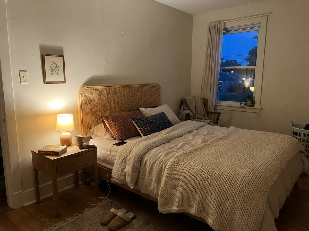
In cool early-morning daylight, especially in bedrooms that face east before the sun hits or rooms facing north, the paint can look slightly washed out and pale. The yellow pigments sleep while the cool sky emphasizes the gray foundation. By late afternoon and evening, however, the entire personality shifts. Once you click on warm 2700K table lamps, the yellow base wakes up, the gray acts as a softening filter, and the room turns deeply restful. If you use 4000K daylight LED bulbs, you will strip that warmth right back out and flatten the wall toward a dead gray-white. Stick to warm bulbs if you want the cozy depth you bought it for.
Ballet White in Bathrooms: Tile, Vanity, and Light Checks
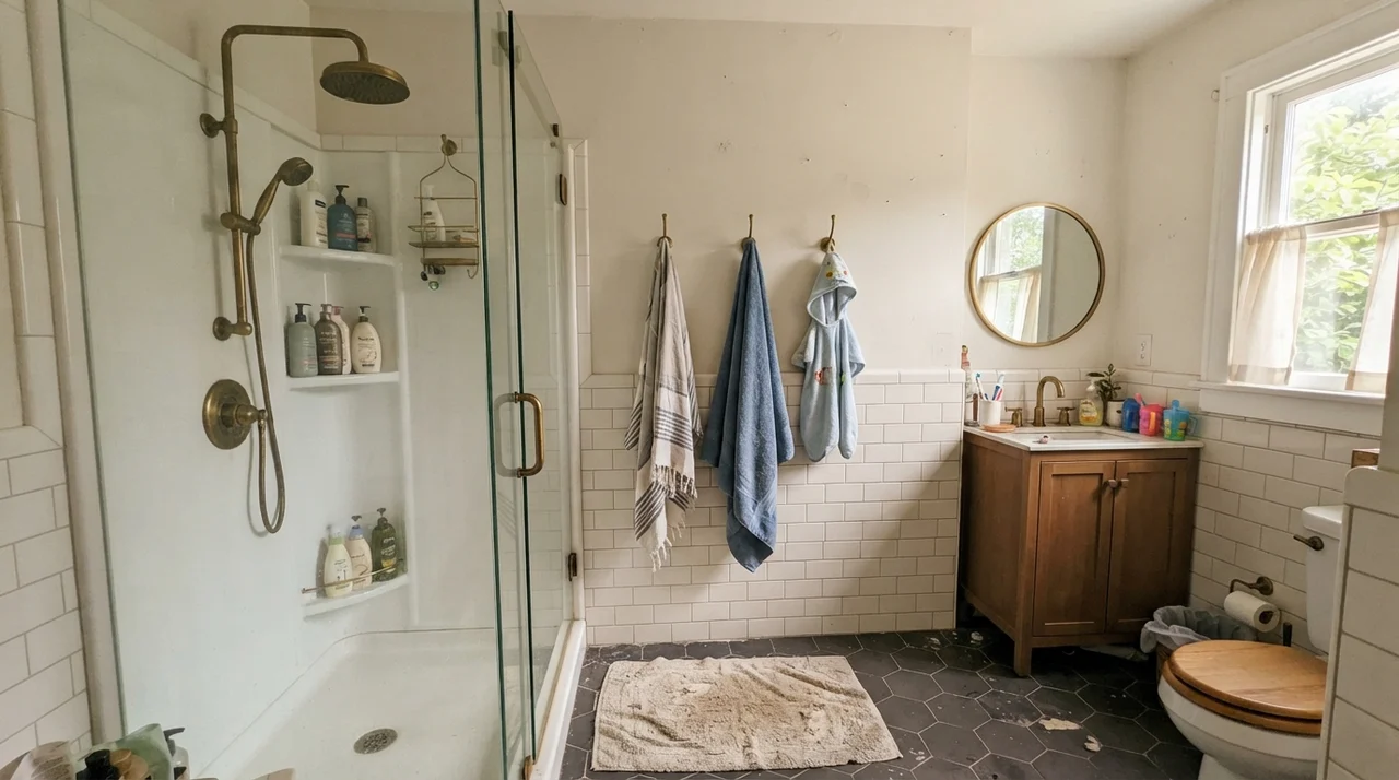
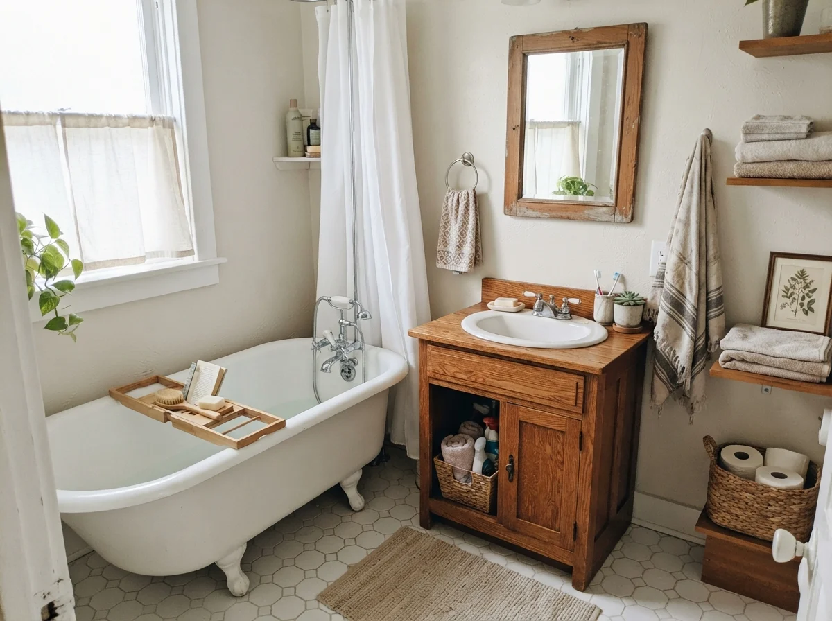
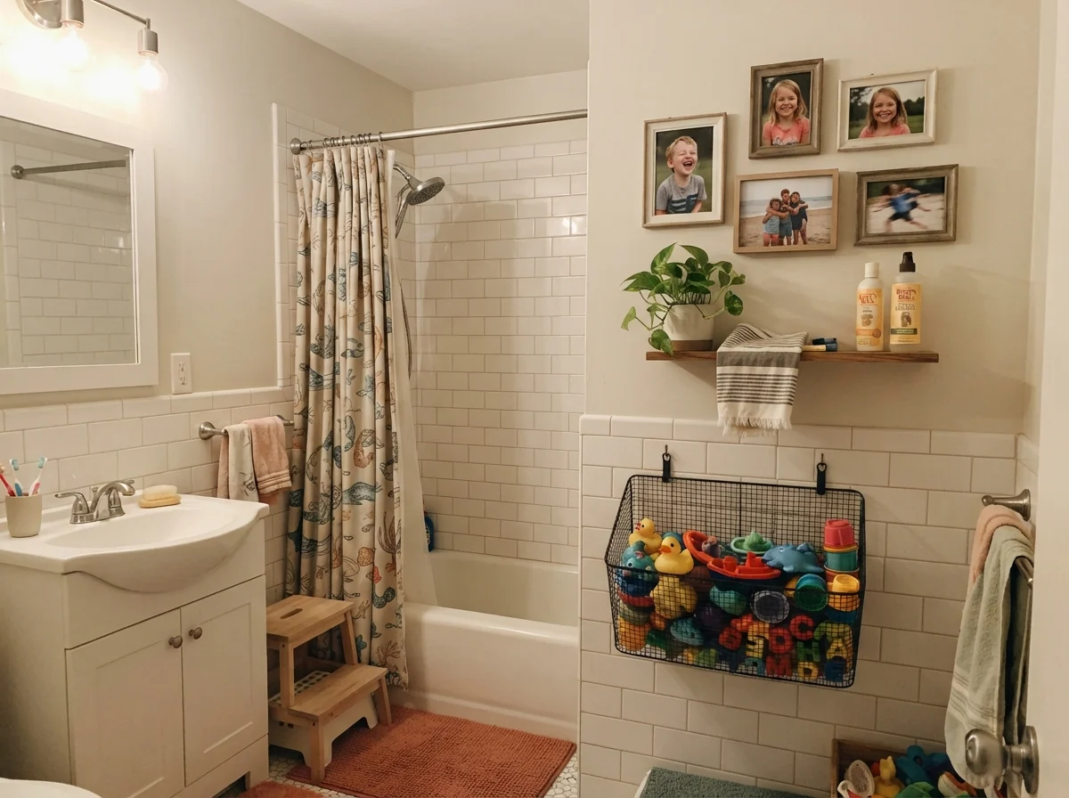
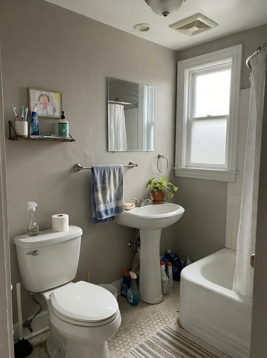
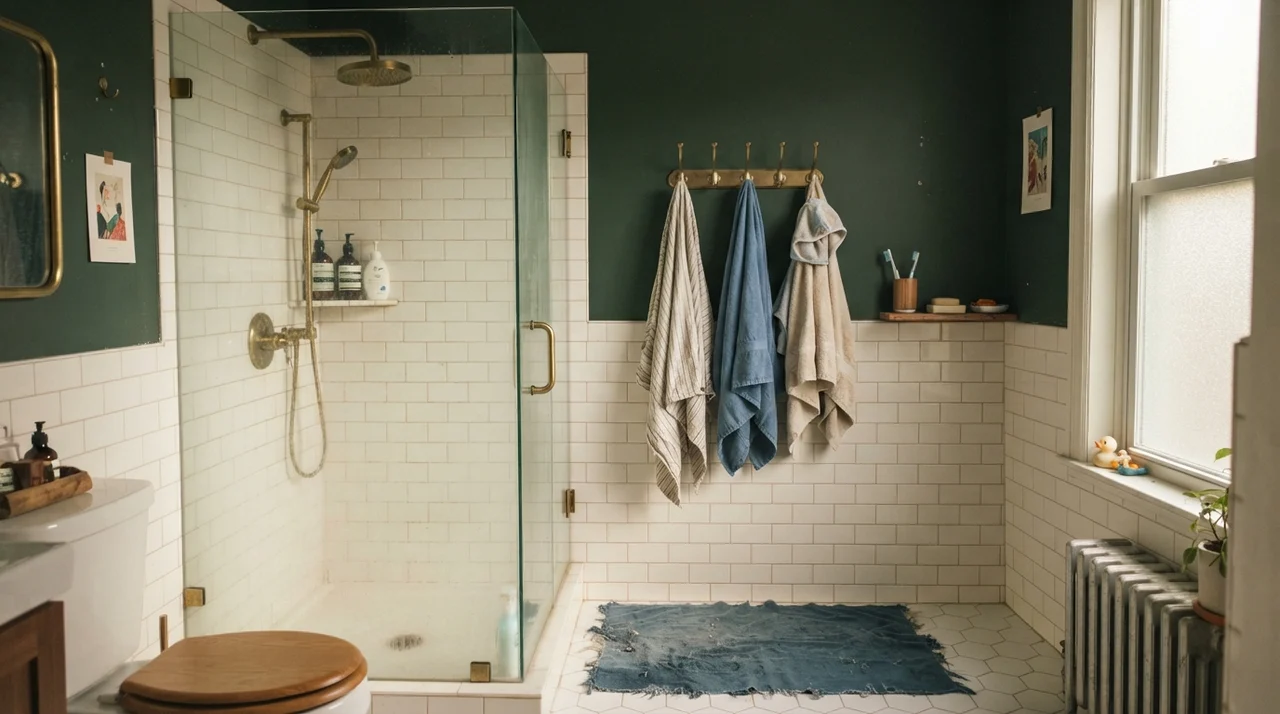
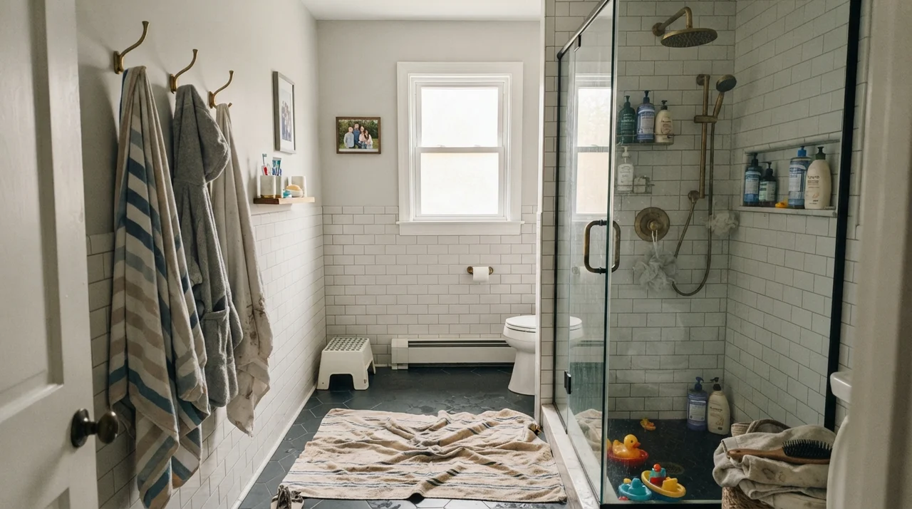
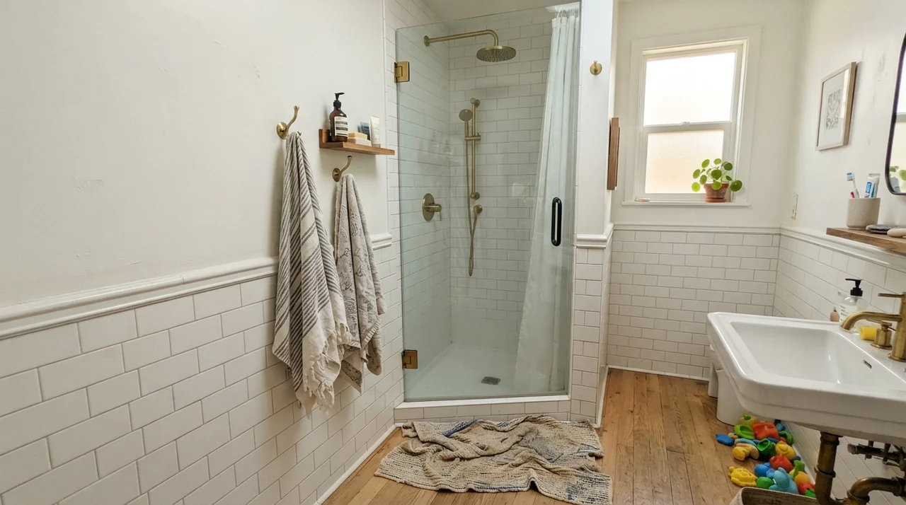
Bathrooms are an unforgiving test for dirty creams because they are packed with high-contrast, reflective hard surfaces. In our current 1960s ranch, our family bath has traditional white subway tile with white porcelain fixtures. When you put a paint like Ballet White on the upper wall above white tile, you get an immediate visual contrast. The wall reads as an intentional, soft linen shade rather than an accidental mismatch.
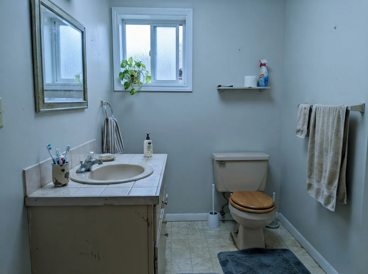
However, you have to watch your floor tile and vanity wood tones. Ballet White flatters warm oak vanities, brass plumbing fixtures, and natural stone like travertine or warm marble effortlessly. But if your bathroom has cool blue-gray slate or cool gray porcelain tile, the gray base in Ballet White will fight the tile while the yellow undertone gets pushed forward, making the paint look slightly muddy or overly yellow. If you have flat, overcast light coming through a frosted window, the paint will read very muted and gray. In modest, dated bathrooms with cool north light on rainy days, it can pick up a distinct cool cast. Check your tiles under your vanity bulbs before you open the can.
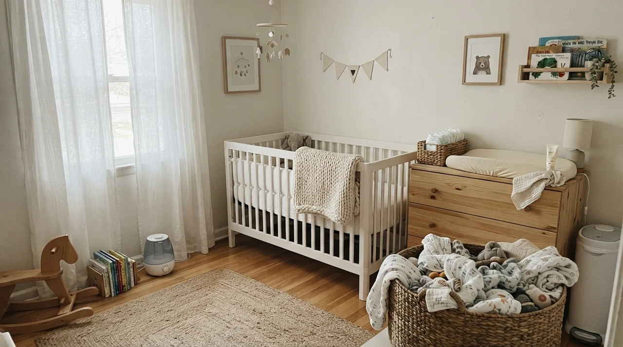
Bedrooms and Nurseries: Why the Gray Base Helps You Rest
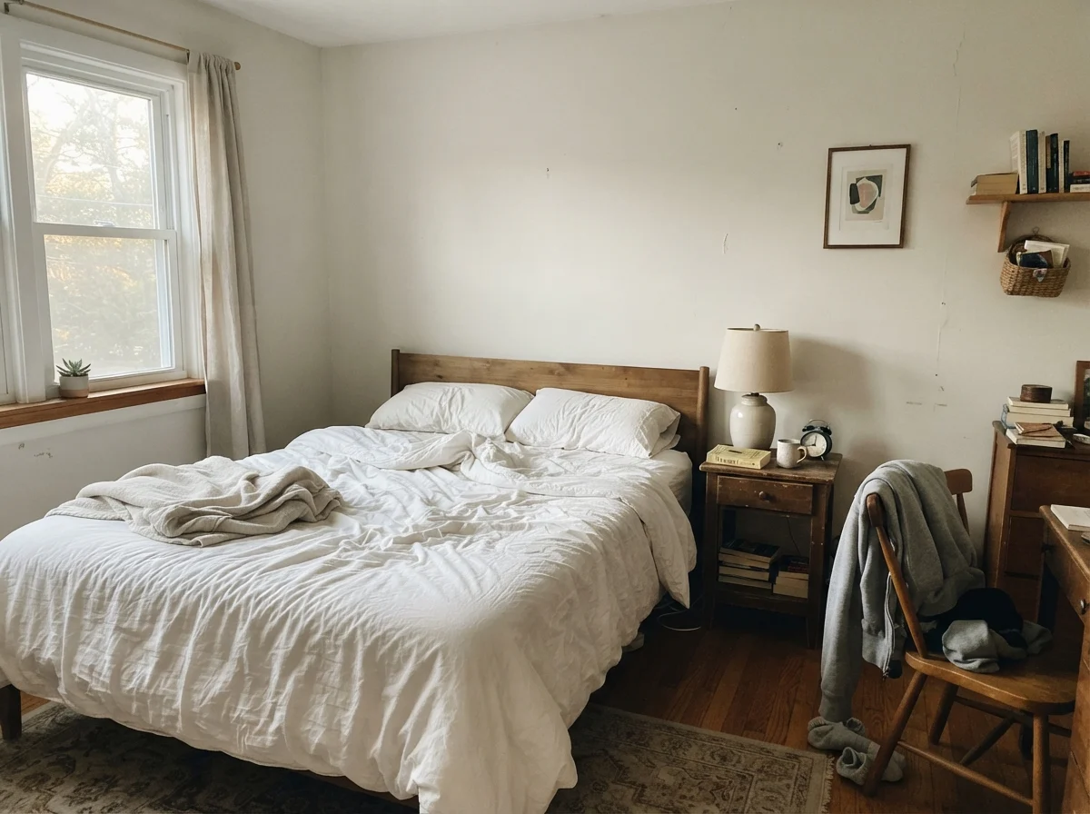
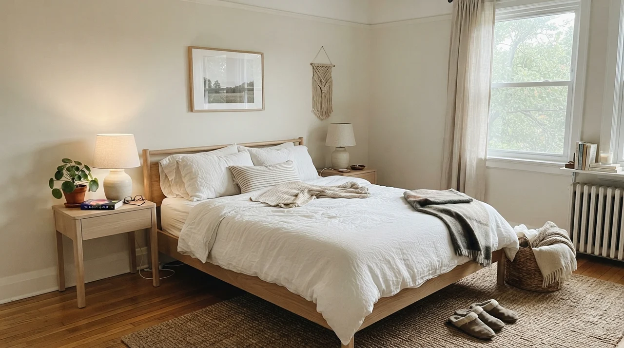
A pure, high-reflectance white in a bedroom can feel aggressive on Saturday mornings. You want a wall that cradles the morning sun rather than bouncing it directly into your eyes. In bedrooms with good side-window daylight, Ballet White functions as a grounding backdrop for white linen bedding, pale oak furniture, and ceramic lighting. It gives the room structure without imposing a loud color theme.
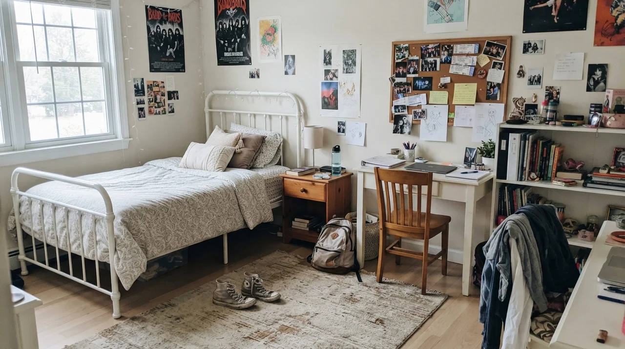
In a nursery or a teenager's room, that LRV 72 rating is practical. Pure white walls in children's bedrooms look scuffed and grubby within eighteen months; Ballet White has enough body to absorb daily wear. It pairs naturally with light wood dressers, woven baskets, and casual open shelving without fighting the inevitable clutter of toys or schoolbooks. If the bedroom faces north with a tiny window, just remember that the color will settle into a cooler, flatter tone unless you add warm accent lamps.
Kitchen Cabinets: Its Absolute Strongest Use
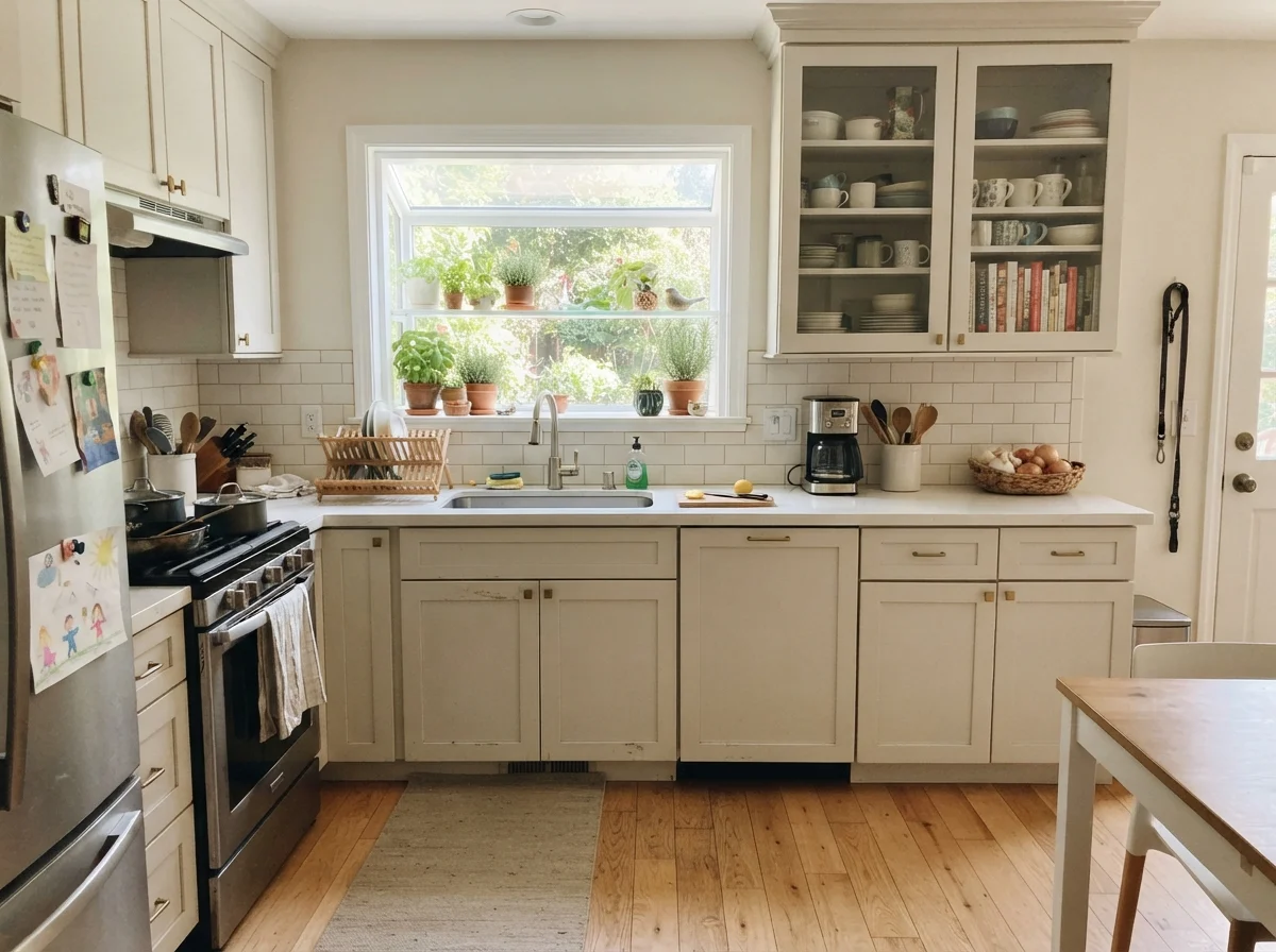
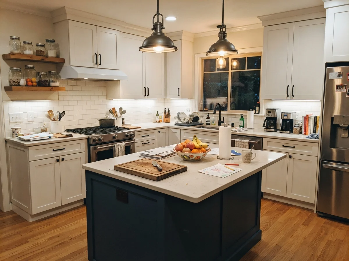
If you ask me where Ballet White earns its keep best, the answer is kitchen cabinetry. In the late 1990s, everyone painted their cabinets stark builder-white or bright appliance white. Five years in, every door around the trash pullout and the silverware drawer looked dingy from daily handling, and the stark color made the kitchen feel harsh under recessed lighting.
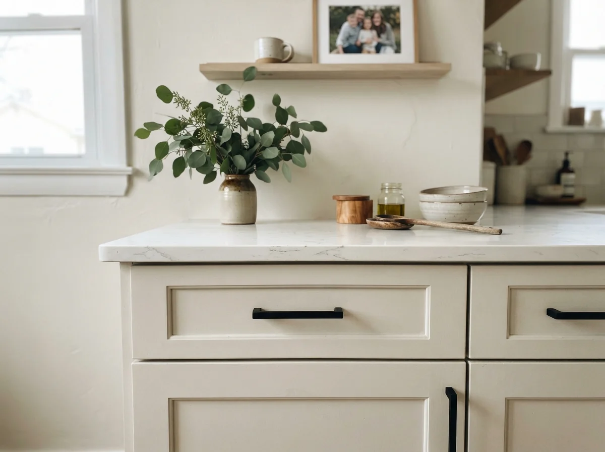
When you paint shaker cabinets in Ballet White—specifically using a satin sheen in a urethane-fortified cabinet formulation—the kitchen immediately reads custom and architectural. It softens the hard reflective planes of polished quartz counters and white subway backsplash tile. Most importantly, that tiny drop of gray hides the unavoidable thumbprints around drawer pulls and cabinet knobs that would broadcast across a bright white. Paired with light oak flooring, butcher block, or unlacquered brass hardware, it produces a classic, timeless kitchen that will not look dated within a few seasons.
Living Areas, Sunrooms, and Everyday Utility
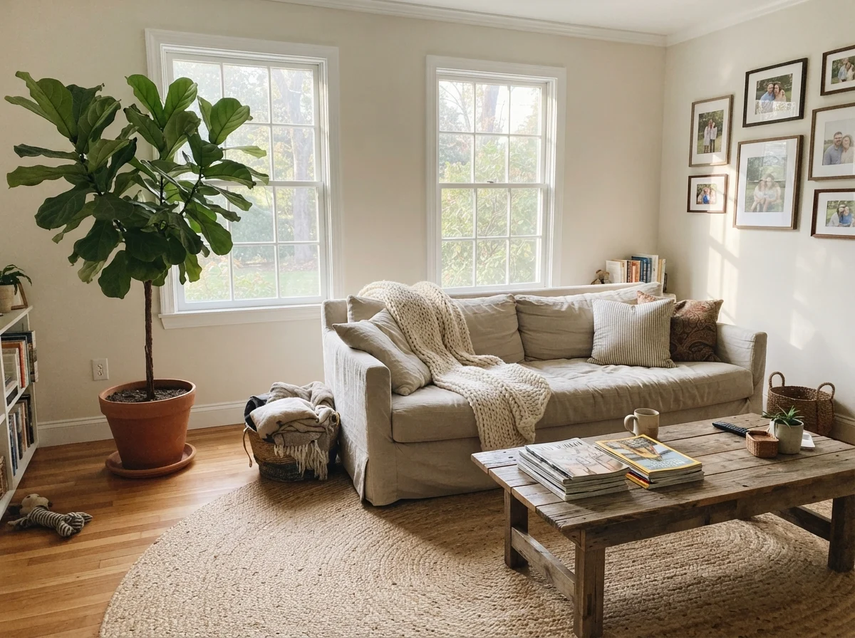
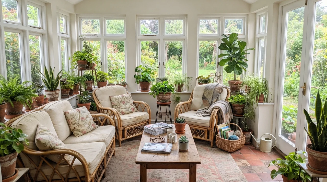
In living rooms and sunrooms with generous natural daylight from multiple windows, Ballet White acts like an expensive linen fabric. It does not shout for attention. Midday sunlight brings out the gentle cream tone, making natural textures like jute rugs, rumpled linen sofas, terracotta pots, and leafy houseplants pop. It bridges the gap between traditional architectural wood elements and casual furniture.
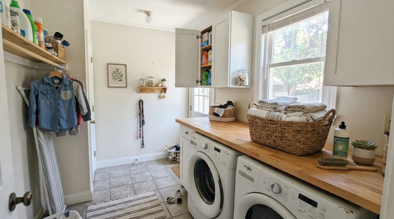
Even in utility spaces like a laundry room, having a window makes all the difference. In a small laundry room with one good window, painting the walls in eggshell finish above a butcher-block counter over white appliances creates a bright, cheerful workspace that resists scuffs. Because the color carries an LRV of 72, it lifts smaller rooms without creating the glaring, sterile reflection that pure whites produce in tight spaces.
Hallways, Doors, and Trim Architectural Details
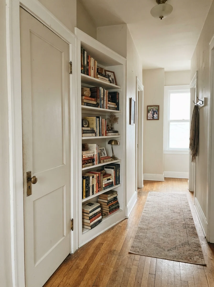
Hallways and staircases are where many open-concept paint plans fall apart. When you carry a stark white through a central corridor, every door frame, corner bead, and handrail scuff stands out in high contrast. Ballet White is one of the few neutrals that can bridge an entire hallway network without fighting the adjoining rooms. It has enough pigment to stand up to trim details like interior doors and built-in shelving.
In an older home with solid woodwork, painting a two-panel interior door and a built-in bookshelf in Ballet White against soft cream walls creates a quiet, historic depth. Paired with an unlacquered brass doorknob and warm wood flooring, the color feels architectural rather than flat. In an eggshell sheen, hallway scuffs from laundry baskets and backpacks scrub clean with a damp microfiber cloth without leaving a shiny bald spot.
The Honest Fail: Where Ballet White Goes Muddy
I promised you no sugarcoating, and here is where Ballet White falls flat on its face. The bad stories about this color are remarkably consistent, and every single one of them is predictable before you pop the lid off the can. If your space matches one of these scenarios, no amount of extra coats will fix it.
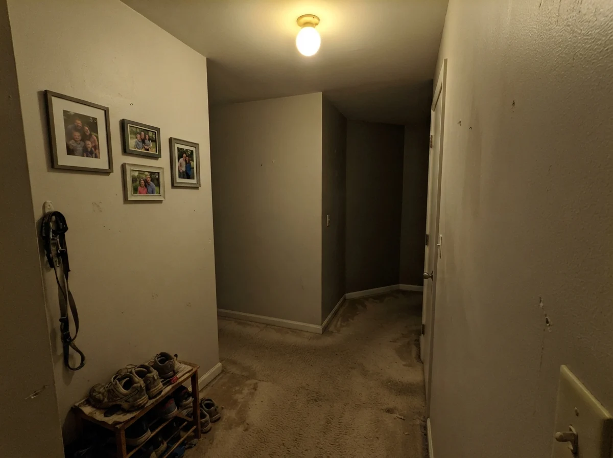
First, a dim, windowless interior hallway or north-facing room with weak lighting is Ballet White's worst enemy. Northern daylight is cool and shadow-heavy; it siphons out the cream pigment and leaves only the gray foundation behind. In a dark hallway corner with only a single overhead builder bulb, the paint turns flat, muddy, and slightly olive-green. People call it 'dirty putty,' and they are right. If you have that kind of dark corridor, you need to go lighter and cleaner with Swiss Coffee OC-45 at LRV 84, or commit to warm 2700K lamps kept on all day.
Second, watch out for pairing it with bright, stark builder-white trim like Chantilly Lace 2121-70. With a nineteen-point gap in LRV, high-contrast bright white trim will make Ballet White walls look like nicotine-stained drywall. Third, if you have honey-orange red-oak floors and huge west-facing windows, late four o'clock sun bouncing off that orange wood will push Ballet White straight into a heavy peachy-gold that you never bargained for.
Exterior Siding: How Sun Bleaches the Gray
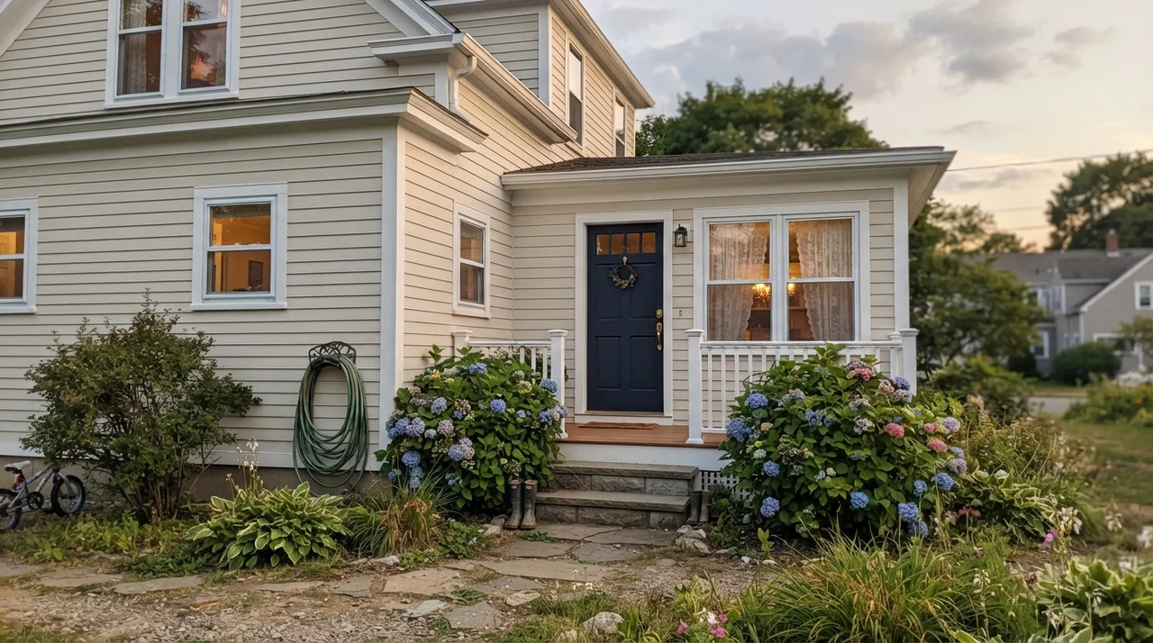
Here is an exterior secret that took me two houses to fully realize: full outdoor sunlight washes paint out by roughly two full shades. A color that looks like a rich, velvety cream in your dining room will look crisp, light, and almost off-white on horizontal exterior siding.
Because Ballet White has that gray backbone, it does not blow out into a blinding yellow-white on an exterior facade under bright midday sun. It holds its ground, looking like classic painted clapboard on a historic home. When paired with clean white trim, a dark navy front door, and charcoal accents like Kendall Charcoal HC-166 or Wrought Iron 2124-10 on shutters, the exterior reads established, warm, and sophisticated rather than brand-new.
Five Years In: Cleaning, Scuffs, and Resale Prep
Here is what happens to paint after five years of real family life: people bump into corners, hands touch the door frames, and dogs brush against the hallway wainscot. In our 1990s colonial, our center hall in Ballet White eggshell took an astonishing amount of punishment. Because the color sits at LRV 72 rather than LRV 88, everyday dirt around light switches simply does not broadcast across the room the way it does on pure white walls.
When it came time to wash the walls, an eggshell finish scrubbed clean with a warm microfiber rag and mild soap without leaving shiny burnish marks. On kitchen cabinets, a satin sheen in a urethane-fortified formula held up to daily grease, water drips, and scrubbing around drawer pulls without peeling or chipping. For resale prep, Ballet White is worth every penny of the paint can cost. When we sold, it read as warm, calm, and expensive—giving buyers the feeling that the house was well-cared-for and solid rather than slapped with cheap flip-white paint the weekend before listing.
What sheen should I use for Ballet White?
For interior walls, use an eggshell finish. It gives you washability while keeping the cream tone soft. For trim, baseboards, and interior doors, use semi-gloss in White Dove OC-17. For kitchen cabinets, choose a satin sheen in a dedicated urethane-fortified cabinet enamel.
Does Ballet White look yellow or beige?
On the wall, it reads as a light, warm beige-cream rather than yellow. The generous drop of gray in its formula prevents it from going butter-yellow, though late afternoon western sunlight can bring out a rich golden glow.
Why does Ballet White look green in my room?
North-facing daylight and cool LED light bulbs (3500K to 4000K) drain the warm yellow tones out of the mix, leaving the gray base exposed. In low light, that gray base can cast a faint olive-green shadow. Switch to warm 2700K bulbs or use a cleaner cream like Swiss Coffee.
Is Ballet White good for whole-house painting?
Yes, provided your home has reasonable natural light. Its LRV of 72 allows it to flow from foyer to living room to kitchen without clashing with adjoining colors, making open-concept spaces feel unified and calm.
Susan's Verdict · The Benchmark Gray-Cream
Ballet White OC-9 is not a crisp white, and calling it one sets homeowners up for disappointment. It is a sophisticated, quiet cream anchored by gray that makes living rooms, open floor plans, and kitchen cabinets feel custom and lived-in. Keep it away from dim northern rooms and cool gray vinyl floors, pair it with White Dove trim and warm wood, and it will serve your house gracefully for a decade.