Color Diary · No. 57
Boothbay Gray on the Wall: What the Paint Store Swatch Leaves Out
The coastal blue-gray everyone calls a gray, reviewed honestly: how blue it really goes, the rooms where it drains flat, and what to pick instead.

Susan HartleyOctober 2, 2026 · 12 min read
Boothbay Gray · Benjamin Moore HC-165
Hex#AAB2B0LRV43Undertonesteal-gray → soft slate blue → misty green-gray
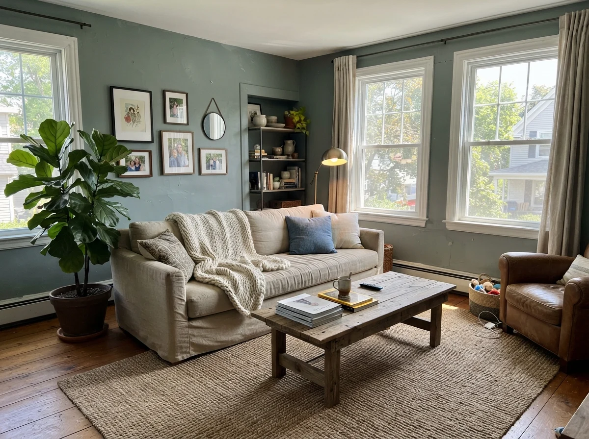
In our last house—a 1990s colonial with oversized windows and trim that had yellowed into butter—I spent three weeks testing gray swatches for the main upstairs guest room. This was back when everyone was stripping out beige and replacing it with cool flannel neutrals. I bought a quart of Benjamin Moore Boothbay Gray HC-165, convinced by the paper chip in the store that I was getting a quiet, well-behaved architectural gray with just a hint of depth. By ten o'clock the next morning, when the sun cleared the maple tree outside, the room wasn't gray at all. It was a soft, misty coastal blue.
I lived with it for seven years. In fact, when we sold that colonial, the buyer specifically wrote into the contract asking for the leftover paint cans in the basement. But that outcome only happened because the room had three large southeast windows and bright white woodwork. Had I rolled that exact same can into a dark hallway or over honeyed oak without adjusting my expectations, I would have hated it within forty-eight hours.
That is the central truth of Boothbay Gray: it is a chameleon sitting right on the fence of the teal family, carrying a light reflectance value of 43. It has enough pigment weight to anchor a room, but on four walls it will almost always show you its blue side. If you want a dead-neutral slate, you will feel tricked. But if you walk into the project knowing you are choosing a fog-drenched coastal mid-tone, it is one of the most forgiving, handsome colors Benjamin Moore has ever formulated.
The Three Shifts of Boothbay Gray
Because Boothbay Gray sits in the teal color family with a light reflectance value of 43, its character swings entirely based on your light source and surrounding surfaces.
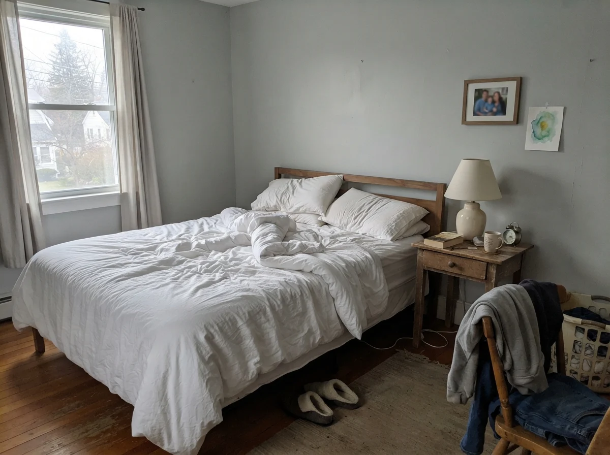
warm sun
overcast, north light
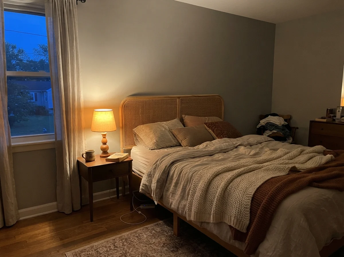
dusk, rain, cool bulbs
South sunlight brings out the breezy green-slate undertone. Cool northern light or 4000K LED bulbs will strip the warmth right out of it, leaving a cold, stony gray.
EventideSherwin-Williams · see diary
Gull Wing GrayBenjamin Moore · see diary
Boothbay GrayHC-165
PearlBenjamin Moore · see diary
StardewSherwin-Williams · see diary
How Daylight Dictates the Blue
When you look at an LRV 43 paint, you are dealing with a true mid-tone. It absorbs more than half the light hitting the wall. That means in low-light spaces or early mornings, the pigment has to work harder, and the cool daylight pushes the blue forward immediately.
Watch what happens across a single day in a bedroom. At dawn, under cool natural light with no lamps turned on, the wall can look subdued and slightly pale. But flip on a 2700K bedside table lamp at dusk, and the entire wall softens into a cozy, slate-hued sanctuary. The warm artificial bulb pulls out the green-gray balance, whereas early morning chill makes it read noticeably cooler.
Where people get into trouble is ignoring the weather outside their windows. Under clear skies, direct sun warms the teal pigments, giving you that breezy, coastal atmosphere people save pictures of. But on a rainy afternoon or under flat, overcast skies through frosted glass, Boothbay Gray retreats into a quiet, muted gray. And if your room faces north with a low-slung window, you will see a decidedly cool cast emerge.
You do not choose a mid-tone blue-gray for the paint swatch in the aisle. You choose it for the rainy Tuesday when the lamps are on and the house feels settled.
Bedrooms: The Color at Its Best
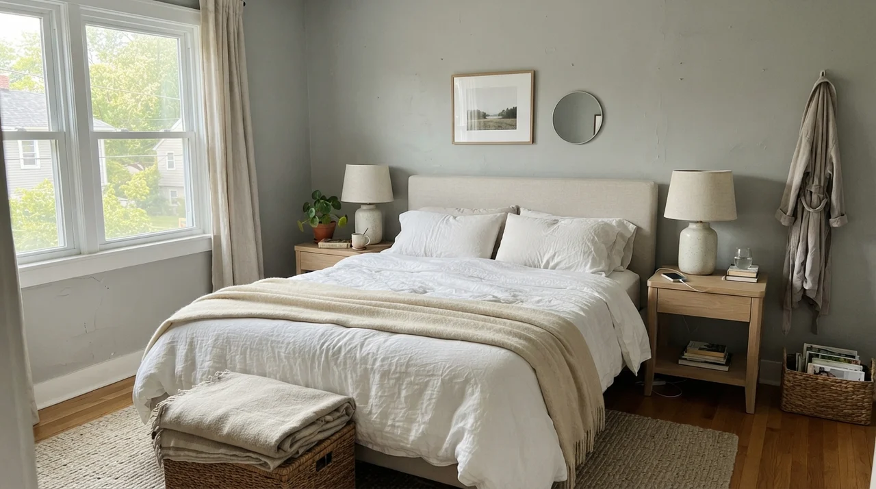
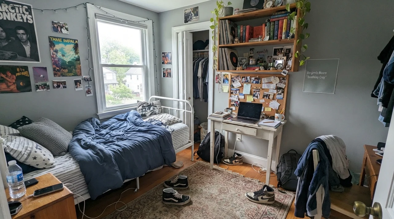
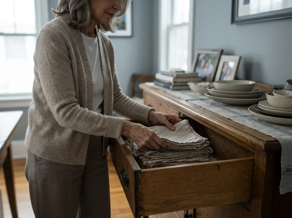
In thirty years of maintaining homes, I have repainted master bedrooms and children's rooms dozens of times. Many popular light blues look nursery-sweet by year two, while dark navy makes a standard eight-foot bedroom feel like a submarine. Boothbay Gray hits that rare middle ground. It gives you real visual depth without eating up the room's light.
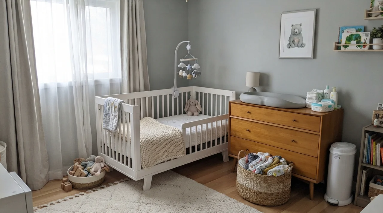
Because it sits at LRV 43, it creates an instant, crisp backdrop for white linen bedding and pale wood furniture. In a nursery, paired with natural light-wood dressers and white cribs, it provides a soothing environment that doesn't feel trendy or childish—meaning you won't feel compelled to repaint it when the child turns eight. Even in a teenager's room with metal bed frames, desks, and open book shelving, it holds its own as a mature, focused backdrop.
Bathrooms and Powder Rooms: The Window Rule
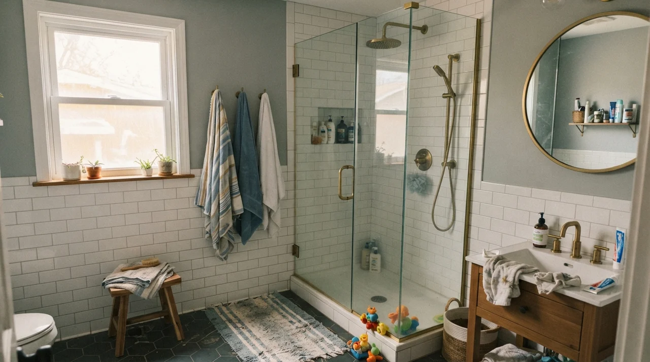
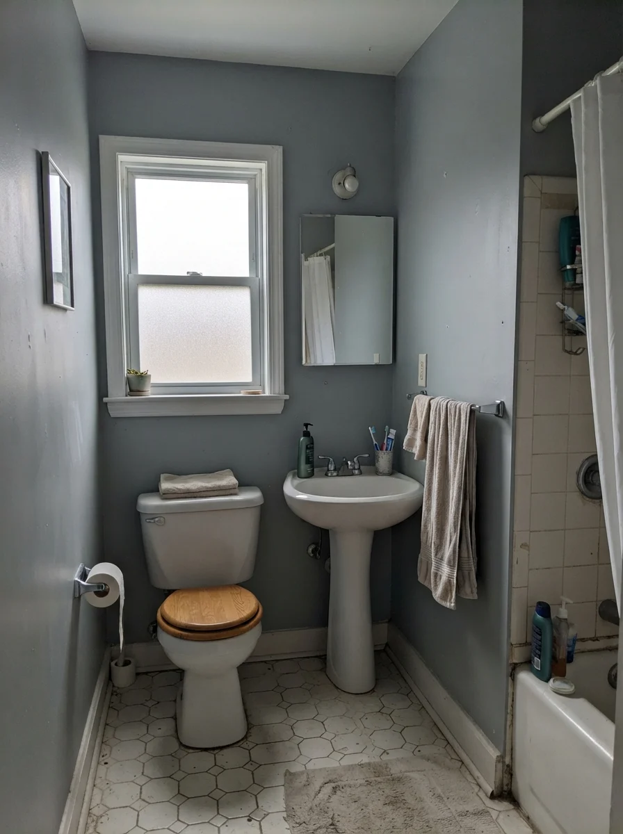
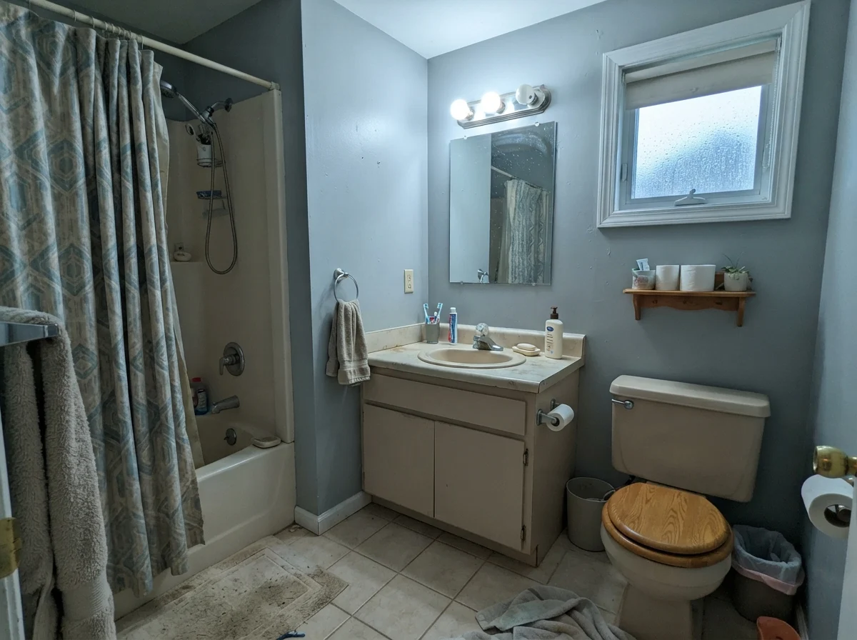
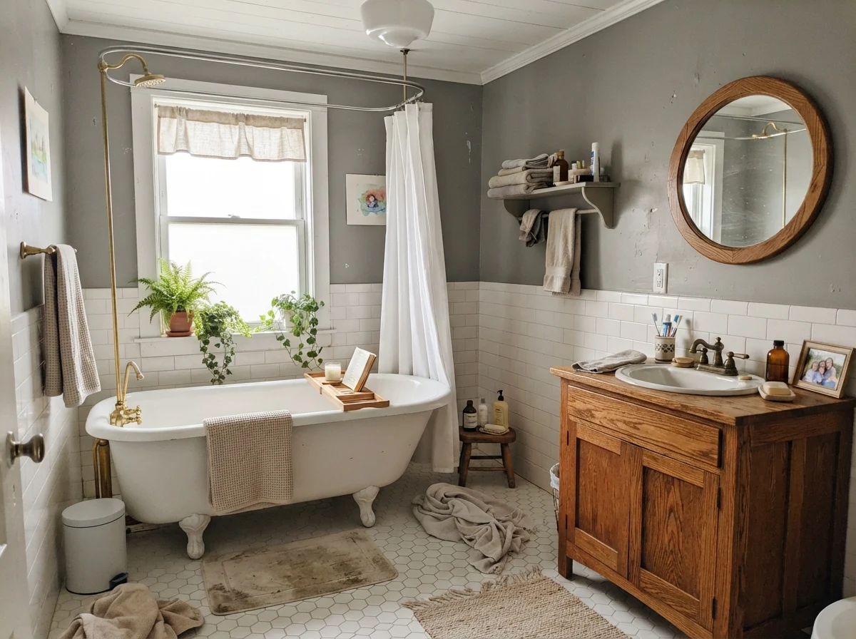
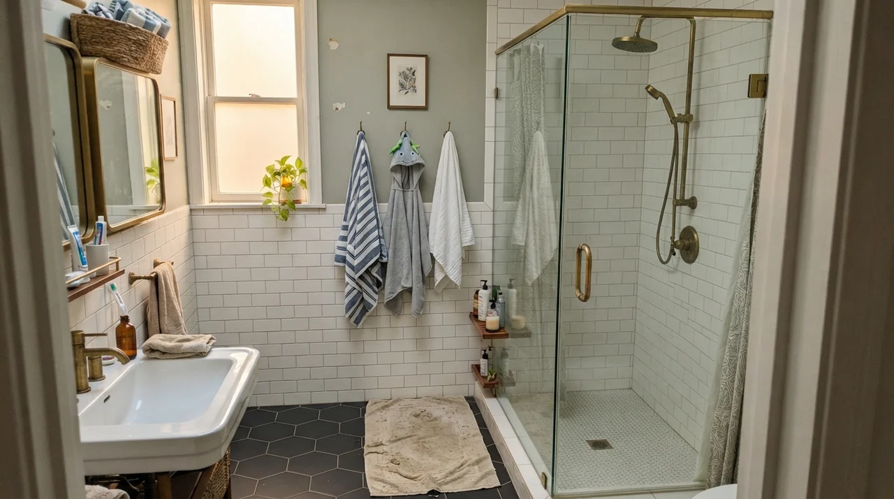
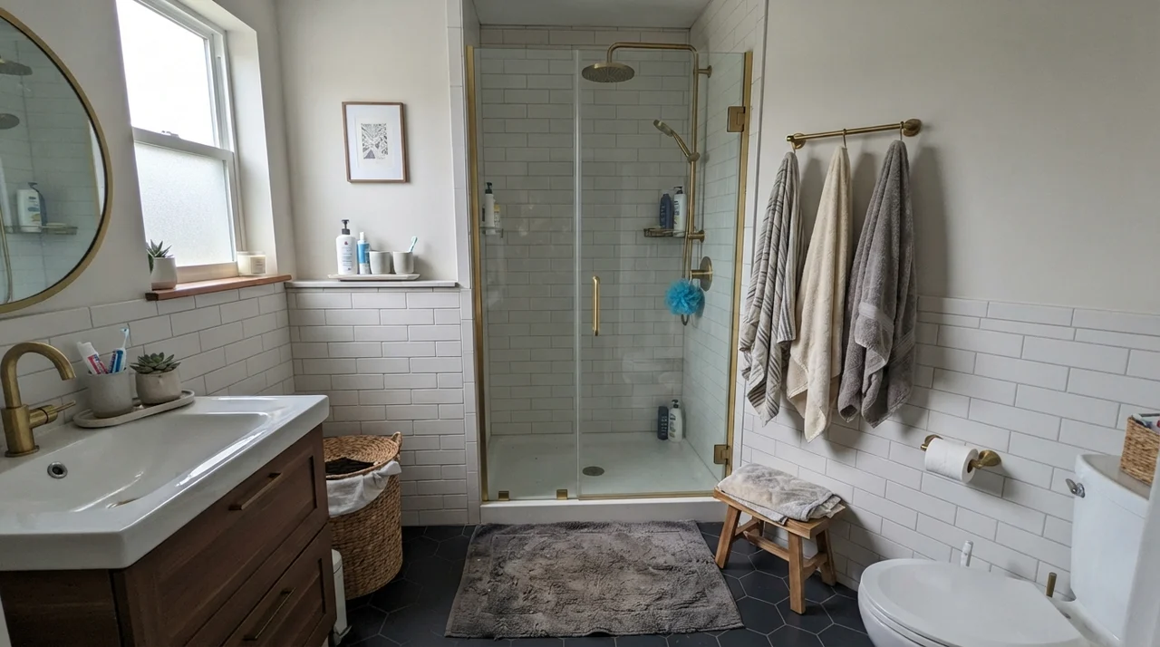
If there is one non-negotiable rule I give neighbors asking about Boothbay Gray, it is this: do not put it in a windowless bathroom. In a space relying solely on builder-grade vanity bars or 4000K overhead bulbs, the color dies. It turns into a flat, institutional slate that makes white porcelain look harsh and skin tones look tired.
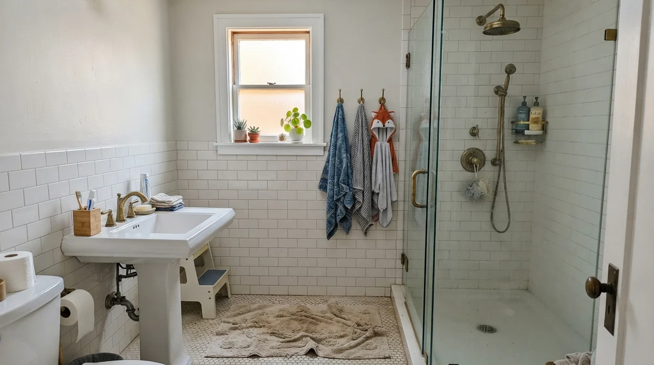
However, if your bathroom has a window—even a small one—Boothbay Gray is magnificent. It wraps around white clawfoot tubs, flatters hex tile flooring, and makes simple subway wainscoting feel intentional and historic. In our family bathrooms, it has stood up to endless bath-toy chaos, moisture, and daily routines while maintaining a tailored, clean appearance.
Cabinets, Built-ins, and Kitchen Islands
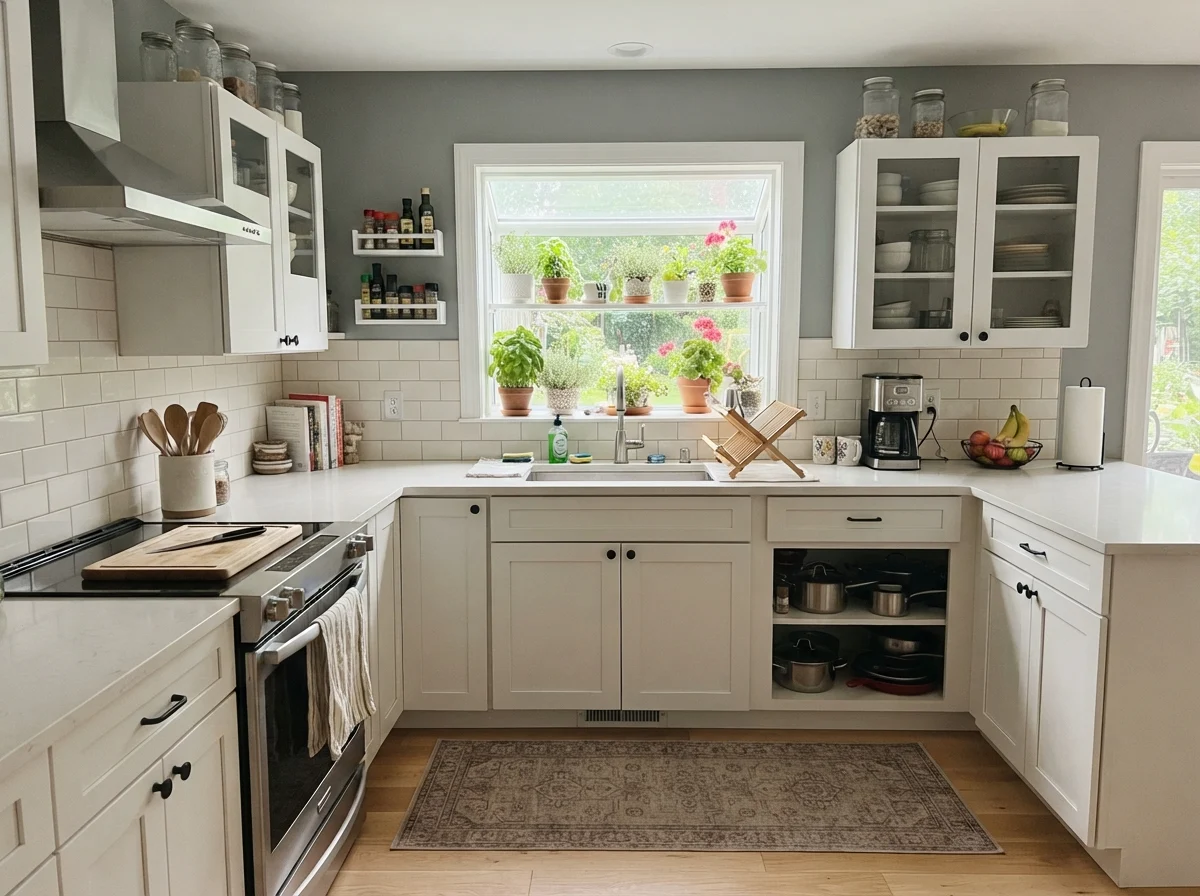
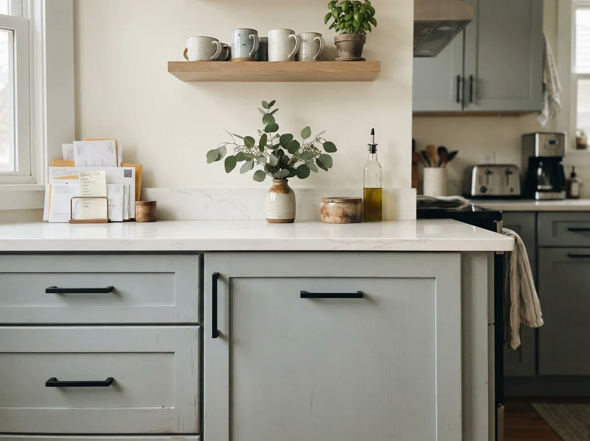
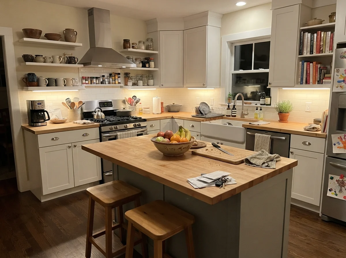
White kitchens dominated the 2010s, and while I love a clean kitchen, five years in, all-white base cabinets become a chore of wiping scuff marks and toe-kick grime. Painting kitchen cabinets or an island in Boothbay Gray provides that coastal character without locking you into high-contrast navy.
When we refreshed the built-ins in our 1960s ranch, I chose satin enamel in a mid-tone blue-gray precisely because it hides daily handprints while framing books and dishes beautifully. In a kitchen, Boothbay Gray uppers and lowers pair effortlessly with white quartz counters, white subway tile backsplashes, and light oak floors. If you only want a subtle accent, using it solely on a central kitchen island anchors the room and breaks up walls of cream or off-white.
Utility Spaces and Sunrooms
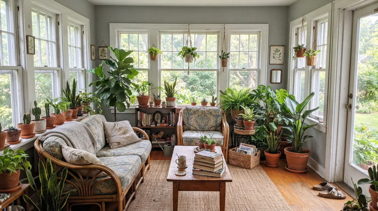
Because Boothbay Gray has a touch of teal in its formulation, it naturally complements green foliage, terracotta pots, and natural woven textures. In a bright sunroom surrounded by white-framed glass, the wall spaces between windows echo the sky and garden outside. It softens harsh glare without darkening the room.
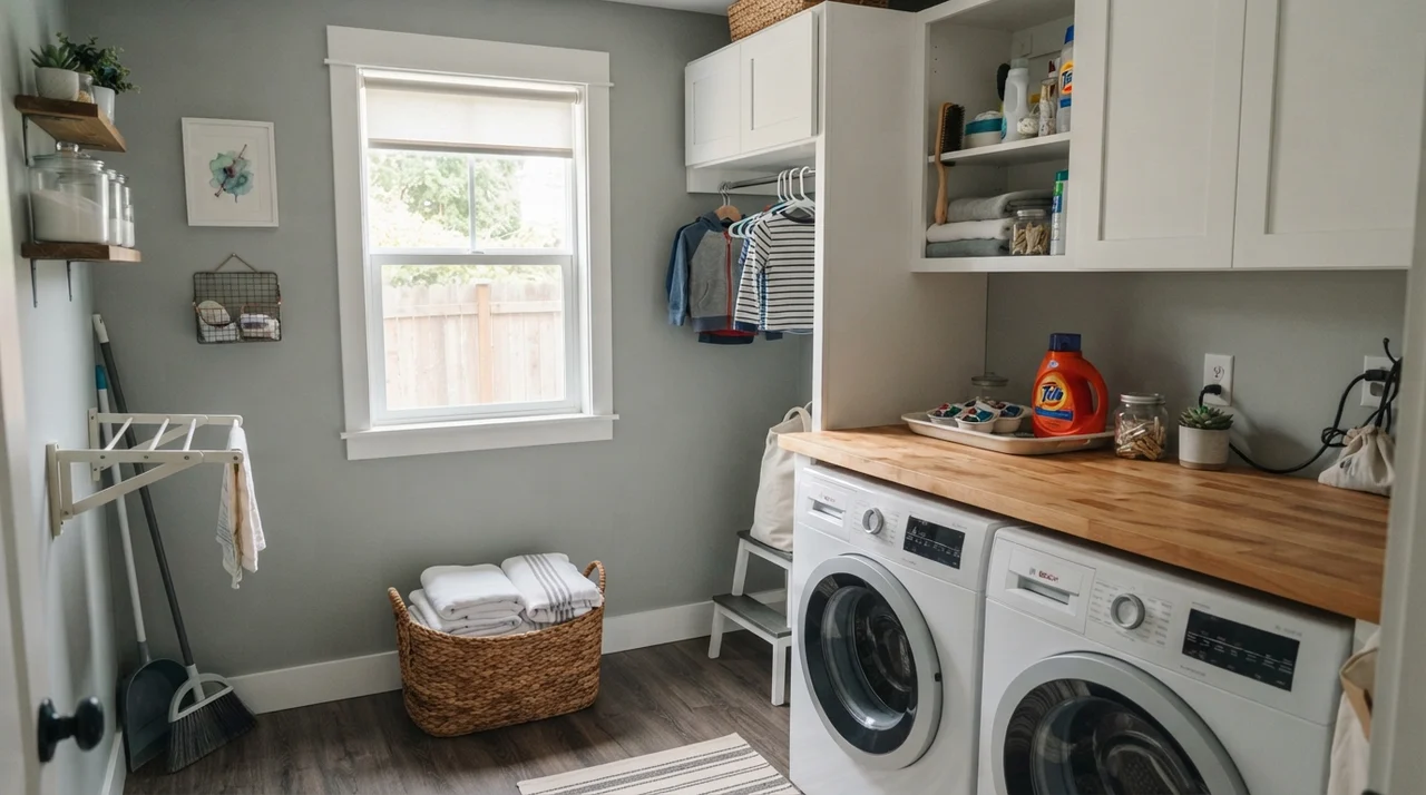
The same logic applies to laundry rooms. A utility room should feel clean and orderly, but pure white walls over white appliances can make the space feel like a sterile hospital basement. Boothbay Gray on the walls—paired with a butcher-block counter, woven baskets, and white cabinetry—instantly turns a utilitarian chore room into a welcoming, finished space.
Doors, Built-ins, and Exterior Siding
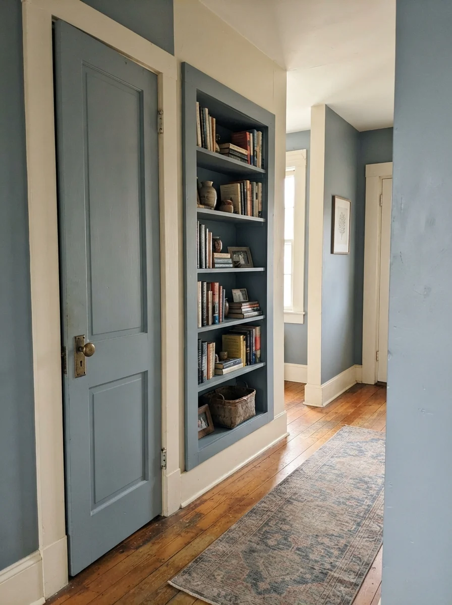
One of my favorite tricks for dated homes is painting interior doors a contrasting color while keeping the surrounding walls neutral. A two-panel interior door and matching hallway bookshelf in Boothbay Gray adds architectural weight to a home that might otherwise feel plain, especially when accented by original brass hardware and warm hardwood floors.
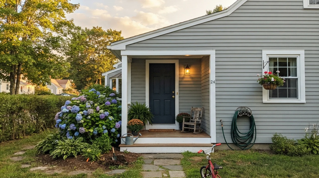
Outside, Boothbay Gray is one of the safest blue-gray siding choices on the market. Direct outdoor sun washes out paint by roughly twenty to thirty percent. Deep charcoals can look oppressive on exterior siding, while pale silvers chalk out into blinding off-whites. Boothbay Gray in low-lustre exterior finish holds its color under full sun, pairing cleanly with bright white trim and a deep navy front door.
Where Boothbay Gray Fails (And Why)
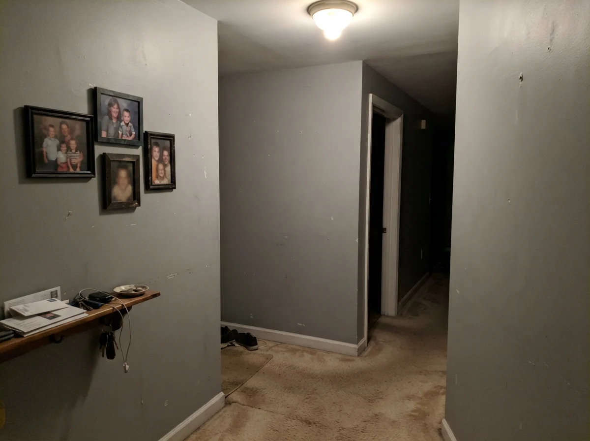
The complaints about Boothbay Gray are entirely consistent, and they always come down to two problems: unrealistic undertone expectations or the wrong flooring. If you expect this paint to behave like a stone gray, you will be disappointed the moment full daylight strikes the wall. But the structural failure happens when it meets warm beige carpets, 1990s honey oak floors, or speckled tan granite.
Cool slate blue and yellow-beige flooring trigger simultaneous contrast: the carpet is forced into looking dirty pink, and the wall turns icy and harsh. When you roll Boothbay Gray into a windowless hallway over old beige carpet under a single ceiling fixture, the teal pigment collapses into a muddy, dingy putty. In those rooms, no amount of touch-ups will save it.
Sheens, Durability, and the Five-Year Reality
In our thirty years of repainting, I have learned the hard way that sheen choice makes or breaks a mid-tone color. Because Boothbay Gray sits at LRV 43, higher sheens will show every drywall imperfection, tape seam, and roller lap mark if applied carelessly.
For interior drywall, stick to eggshell. It provides enough surface washability for busy households while keeping the color deep and velvety. On millwork, interior doors, and kitchen cabinets, satin finish in a urethane cabinet enamel is worth the extra money. It levels out smoothly and resists the sticky residue around cabinet pulls. When cleaning Boothbay Gray, standard mild soap and warm water work fine—avoid aggressive chemical degreasers, which can burnish mid-tone paints and leave noticeable shiny patches.
Is Benjamin Moore Boothbay Gray considered blue or gray?
It is officially categorized in the teal family, but on four walls in natural daylight, it reads as a soft, muted slate blue. If you expect a true charcoal or cement gray, it will feel much bluer than expected.
What trim white works best with Boothbay Gray?
Benjamin Moore White Dove OC-17 provides a soft, warm boundary that balances the cool blue, while Chantilly Lace OC-65 offers sharp, modern contrast. Avoid heavy cream whites like Navajo White.
Can I use Boothbay Gray in a windowless room?
It is not recommended. Without natural light, LRV 43 drains into a flat, institutional gray that can feel gloomy under typical overhead lighting.
How does Boothbay Gray hold up on exterior siding?
It performs exceptionally well. Direct outdoor sunlight washes out mid-tones, making Boothbay Gray look like an airy coastal blue-gray that never turns stark or heavy.
Susan's Verdict · A Reliable Coastal Slate
Boothbay Gray is one of the most dependable coastal blue-grays in Benjamin Moore's fan deck—provided you treat it as blue, not gray. Give it white trim, natural daylight, and pale or dark wood accents. Keep it away from windowless basements and orange oak flooring, and it will reward you with a calm, handsome presence that holds up year after year.