Color Diary · No. 56
Why Benjamin Moore Calm Needs Warm Lamps to Keep Its Promise
The off-white everyone calls soft and serene, reviewed honestly — including the lavender cast that shows up in north-facing rooms and under cool bulbs.

Susan HartleyOctober 2, 2026 · 17 min read
Calm · Benjamin Moore 2111-70
Hex#E6E4DFLRV76Undertonessoft warm white → misty gray → lavender-violet
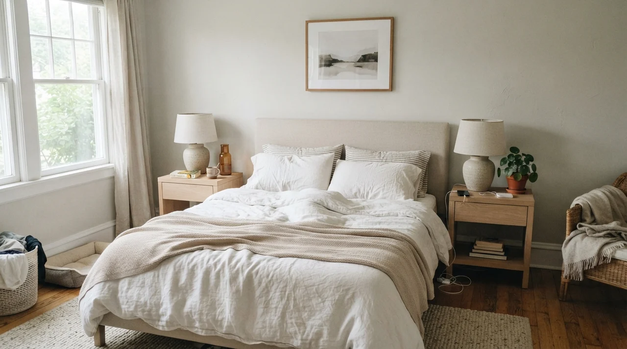
In our last house, a 1990s colonial with oversized windows facing directly south across a lawn of old maples, I painted our main bedroom Benjamin Moore Calm on a Saturday in mid-May. When the second coat dried at three in the afternoon, it looked like sheer perfection. It wasn’t the stark, tooth-aching hospital white that makes you squint when the sun bounces off it, nor was it the heavy, buttery yellow-cream that had taken over every new build when our first home was built in the seventies. It sat somewhere in that quiet middle ground: airy, dignified, and so gentle on the eyes you barely noticed the walls were there at all.
I lived with it for five years in that room. And for five years, anyone who walked in during the afternoon asked for the paint chip. But here is the thing about paint that swatch cards and quick weekend makeovers will never show you: the exact same gallon of Benjamin Moore Calm 2111-70 poured into our windowless lower-level guest bath looked like cold dishwater with a splash of grape juice by November.
That is the real story of Benjamin Moore Calm. It is one of the most flattering, restful off-whites ever bottled when the lighting cooperates. But it is fundamentally a shape-shifter. If you don't understand the violet undertone tucked beneath its pale gray surface, you are going to wonder why your peaceful retreat suddenly turned chilly and strange the minute the sun went down.
The Undertone Shift Nobody Expects
Calm sits at an LRV of 76 (often listed near 78 on various scales), which puts it firmly in the off-white category. It is light enough to bounce generous light around a dark hallway, but tinted just enough to keep from blinding you. The pivot point is its base. While most popular off-whites lean either yellow-warm (like cream) or green-gray (like traditional greige), Calm carries a subtle gray-violet drop. That drop gives it a lovely misty coolness in warm sunlight, but exposes a sharp lavender flash when cool light hits it.
warm sun
overcast, north light
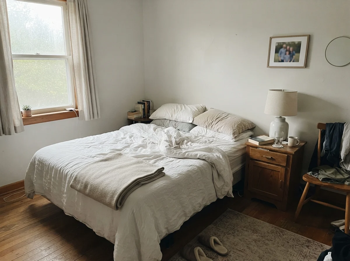
dusk, rain, cool bulbs
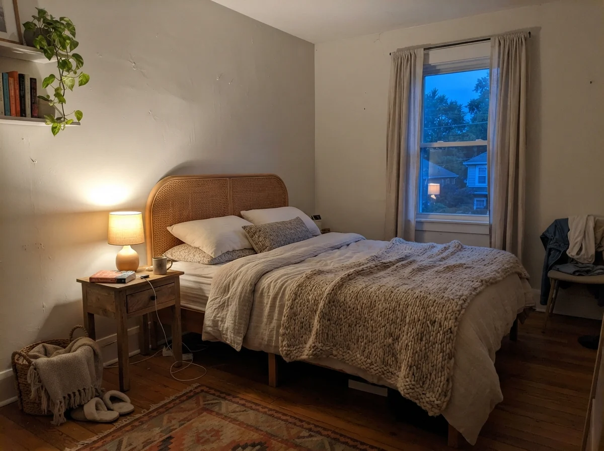
Calm changes tone drastically across the daylight cycle: from a warm sunlit pearl to an overcast misty gray, and finally into a cool lavender-slate when evening falls or cool bulbs take over.
Cameo WhiteBehr · see diary
Strong WhiteFarrow & Ball · see diary
Calm2111-70
Weathered WhiteBehr · see diary
Spare WhiteSherwin-Williams · see diary
The Two Faces: Morning Coolness vs. Evening Glow
When you look at Calm on a fan deck under the harsh fluorescent tubes of a paint store counter, it looks like a clean, civilized off-white with zero attitude. But bring that can home and roll it onto drywall, and you will quickly realize that Calm lives two entirely distinct lives every single day.
In the early morning, especially in rooms with eastern or northern exposures, Calm wakes up looking pale, quiet, and slightly washed out. The warmth from the sun has not yet crested the roofline, so the paint stays flat and cool. If you have crisp white bedding or pale oak trim, it feels modern and clean, but nobody would mistake it for a cozy beige.
Come evening, the personality flips entirely depending on your light fixtures. Switch on a 2700K incandescent or warm LED lamp with a linen shade, and Calm transforms into a velvety, peaceful cocoon. The yellow-orange wavelength of the warm bulb neutralizes the violet pigment in the paint, pushing the wall into a gentle, creamy softness. But leave a 4000K commercial daylight bulb buzzing overhead, and that underlying lavender will step forward so fast you will swear someone switched the paint while you were at work.
Calm in the Bathroom: Where It Outshines the Creams
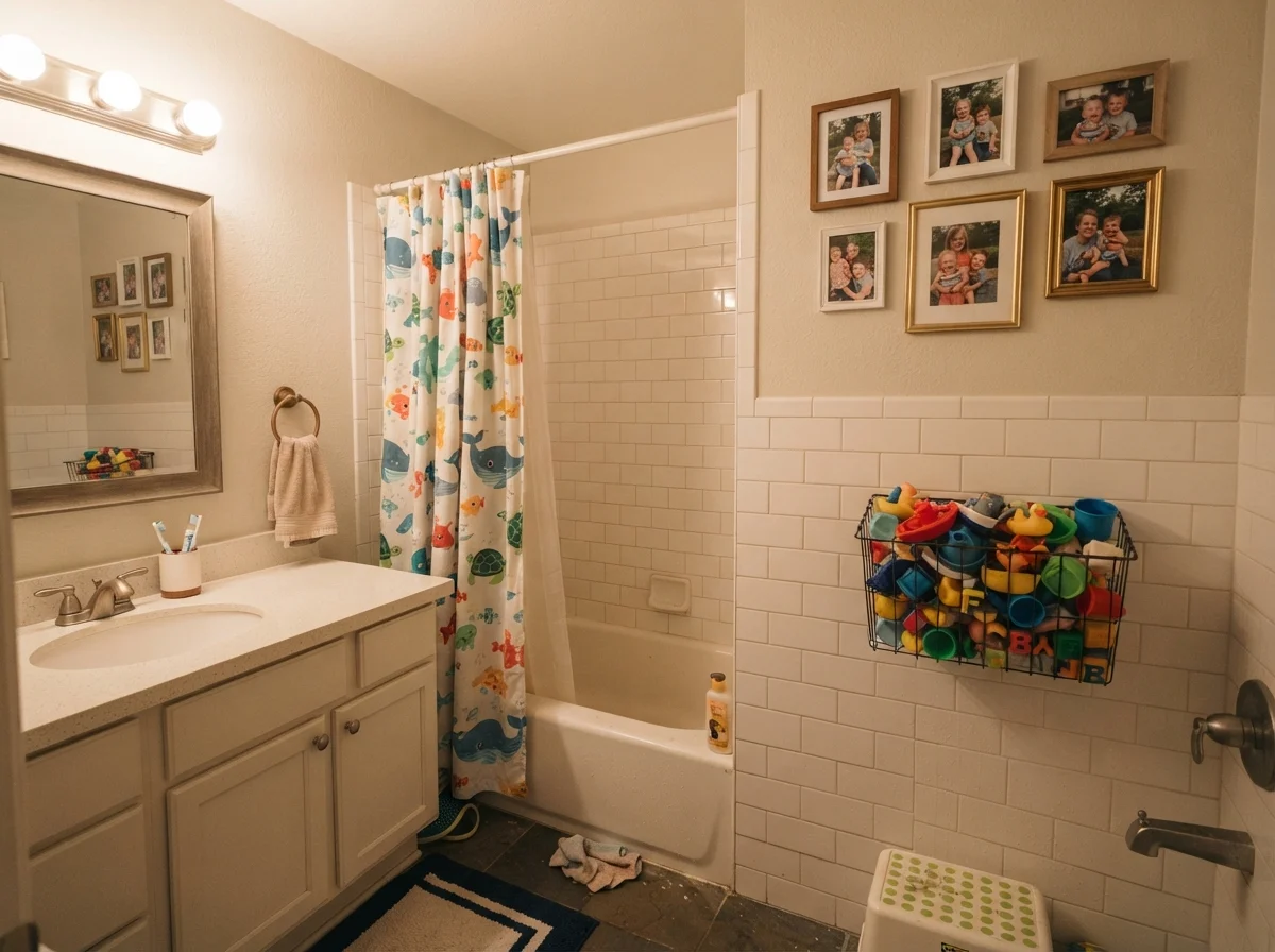
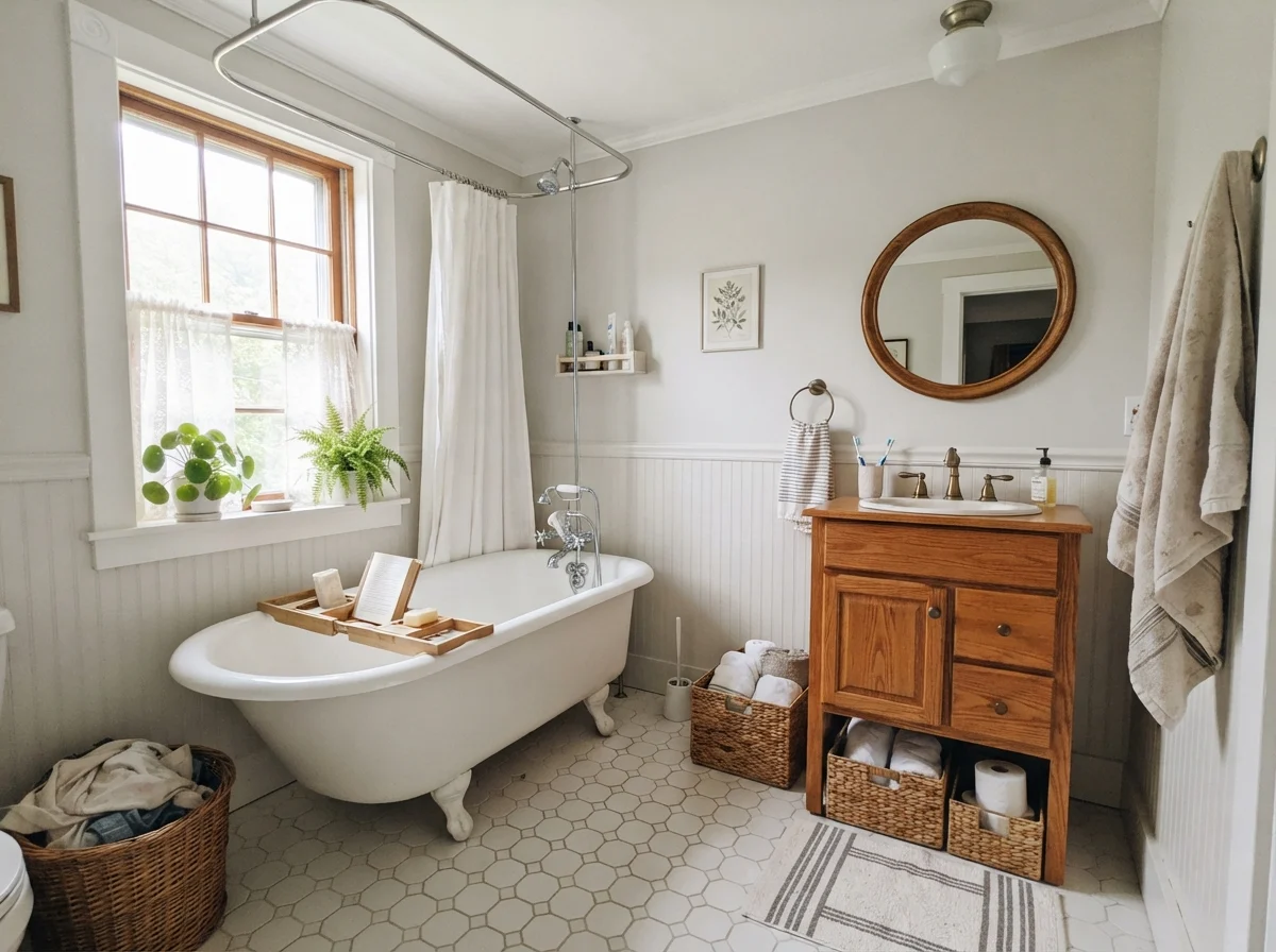
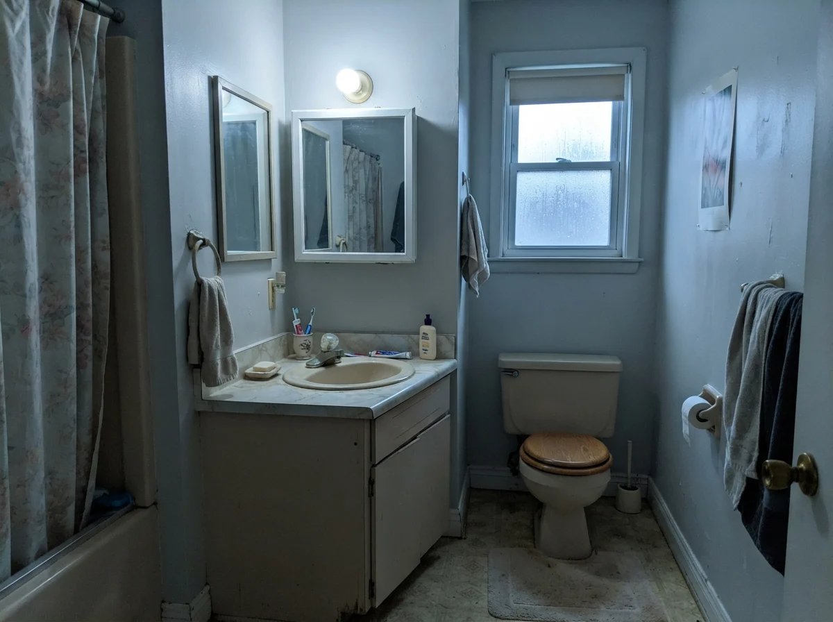
Bathrooms are notoriously difficult to paint because most modern bathrooms are filled with hard, cool surfaces. You have white porcelain toilets, chrome or matte black faucets, and gray-veined Carrara marble or porcelain hex tile. If you paint a room like that in a traditional warm cream—say, Navajo White or even a rich ivory—the walls fight the tile immediately. The walls end up looking like aged cigarette smoke, and the tile looks cold and antiseptic.
This is where Benjamin Moore Calm earns every nickel. Because it carries that grayed, slightly violet-tinted backbone, it bridges the gap between white porcelain and cool stone effortlessly. It gives you the softness of an off-white without throwing greasy yellow tones against silvery grout or gray marble slabs.
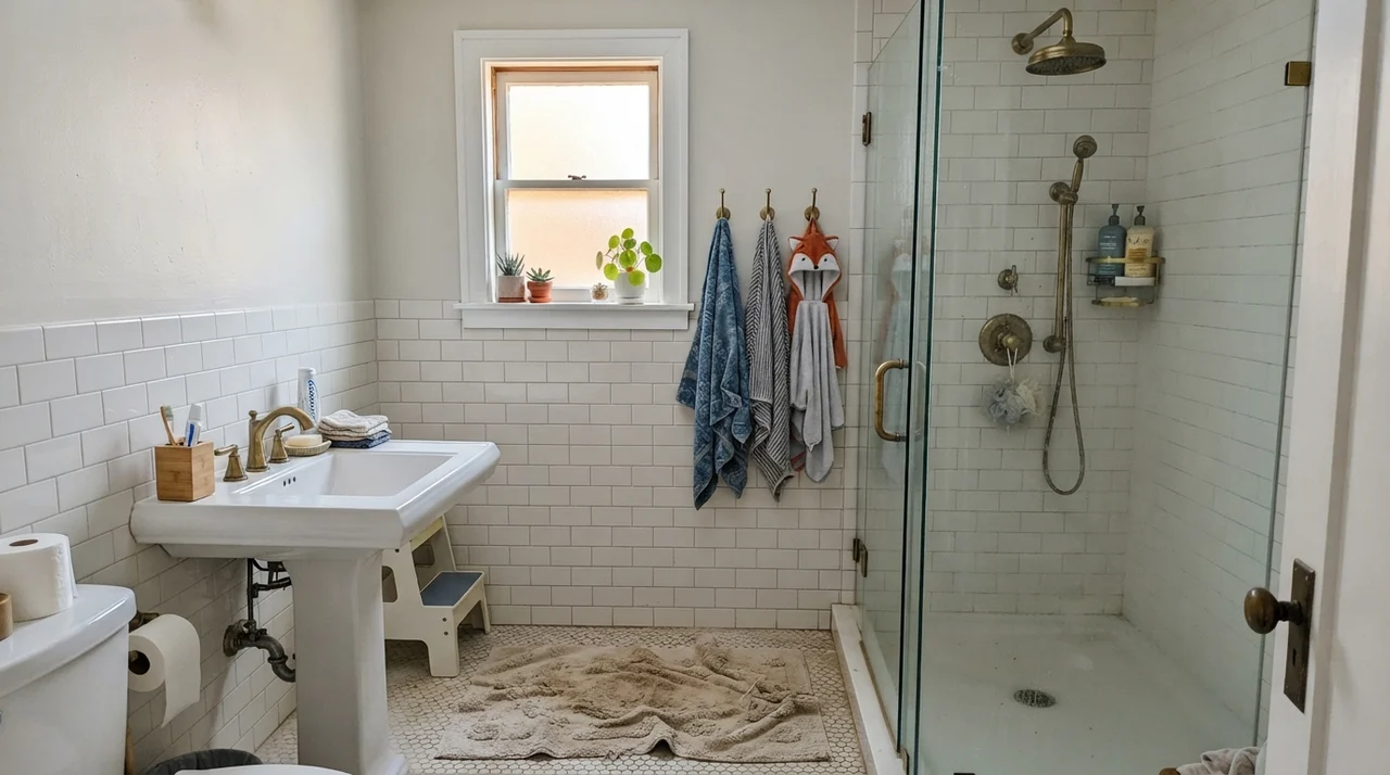
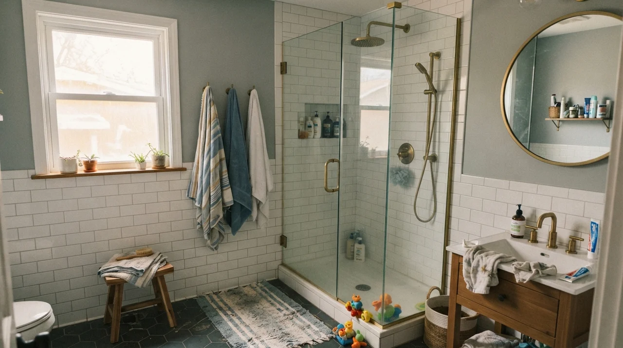
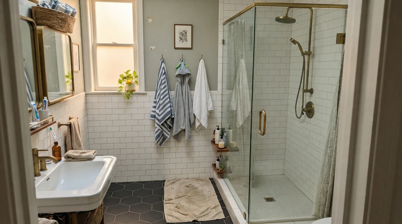
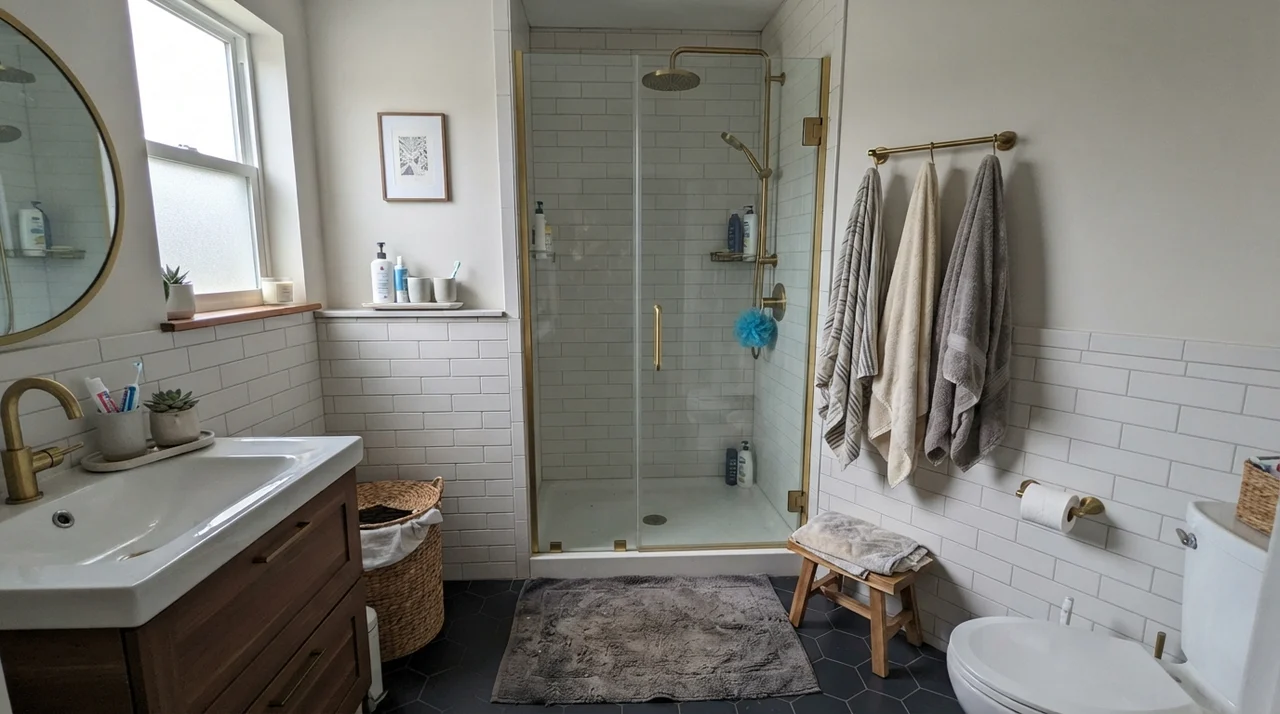
We put Calm on the upper drywall above white subway tile in our family bath, paired with brass shower fixtures and a glass shower enclosure. Five years in, through thousands of steamy showers and endless towel changes, it held up beautifully in an eggshell finish. It never looked dingy against the bright tile, and it never felt stark when stepping out of the shower on a cold winter morning.
Living Rooms and Sunrooms: Riding the Afternoon Light
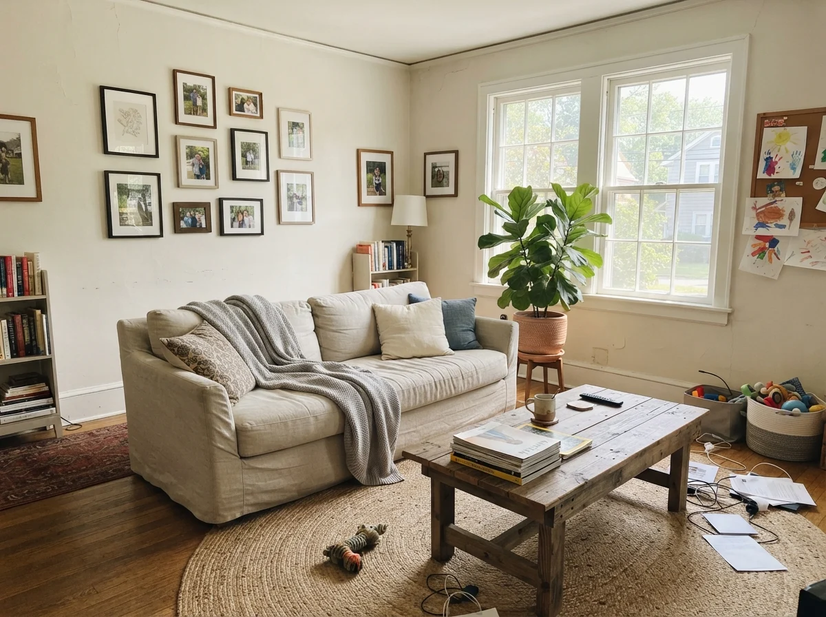
In our current 1960s ranch, the main living area faces west, taking the brunt of that golden three-o'clock glare. If you put a high-LRV stark white in a room like that, you will literally need sunglasses to read the Sunday paper. But Benjamin Moore Calm absorbs just enough of that direct solar kick to feel grounded.
Because it registers at LRV 76, it reflects ample light while softening the sharp edges of window frames and drywall corners. Wood furniture looks rich and grounded against it. A linen sofa with a rumpled throw, an unvarnished oak coffee table, and a natural jute rug sit against Calm without any visual clashing. It lets your art and your furniture take center stage while providing a quiet, velvety backdrop.
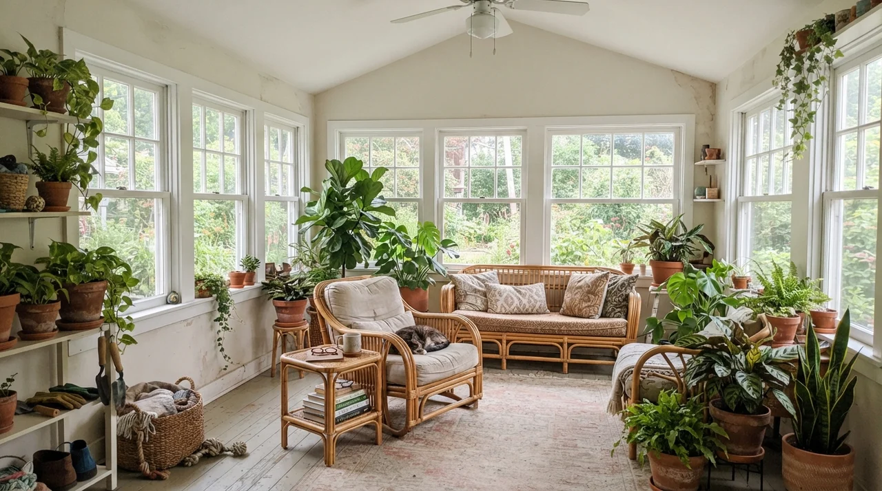
The same rule applies to sunrooms and enclosed porches. When you are surrounded by glass on three sides, green foliage bounces cool green light onto interior walls. Calm absorbs that reflection gracefully, reading like an old-world lime wash rather than modern synthetic drywall paint.
Bedrooms and Nurseries: The Restful Zone
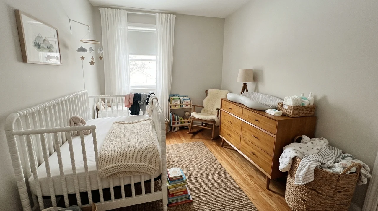
If you ask three interior designers for their favorite bedroom off-white, at least two of them will mention Calm 2111-70 within thirty seconds. There is a genuine psychological reason for this: human eyes find low-chroma gray-whites inherently relaxing, provided they don't turn sour.
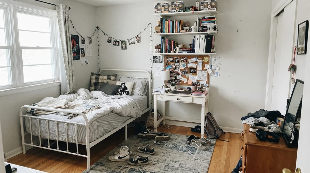
In a nursery or a teenager’s bedroom, Calm acts like a clean slate. When our daughter was twelve and decided her bedroom needed to transition away from pastel yellow, we rolled Calm on the walls. It handled the chaos of white metal bed frames, corkboards pinned with concert tickets, messy desks, and sneakers on the rug without feeling precious. When we sold that house a few years later, that room required zero repainting before the open house—the buyer's agent specifically noted how fresh and clean the bedroom felt.
Kitchen Cabinets and Millwork: Old Paint, Not Factory Plastic
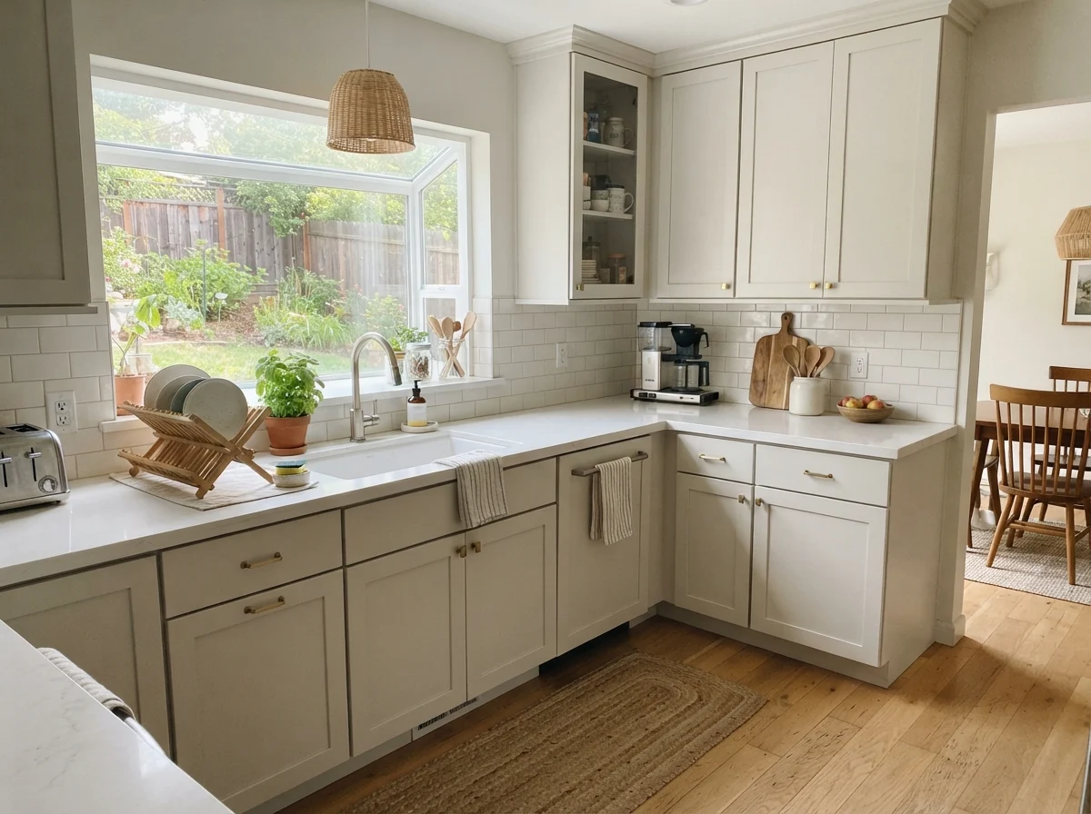
Here is an area where spending more on top-grade paint actually paid off in our renovations: kitchen cabinetry and interior doors. If you spray kitchen cabinets in a standard untinted ultra-bright white, they can easily look like cheap laminate or plastic shrink-wrap from a big-box store. There is no soul to them.
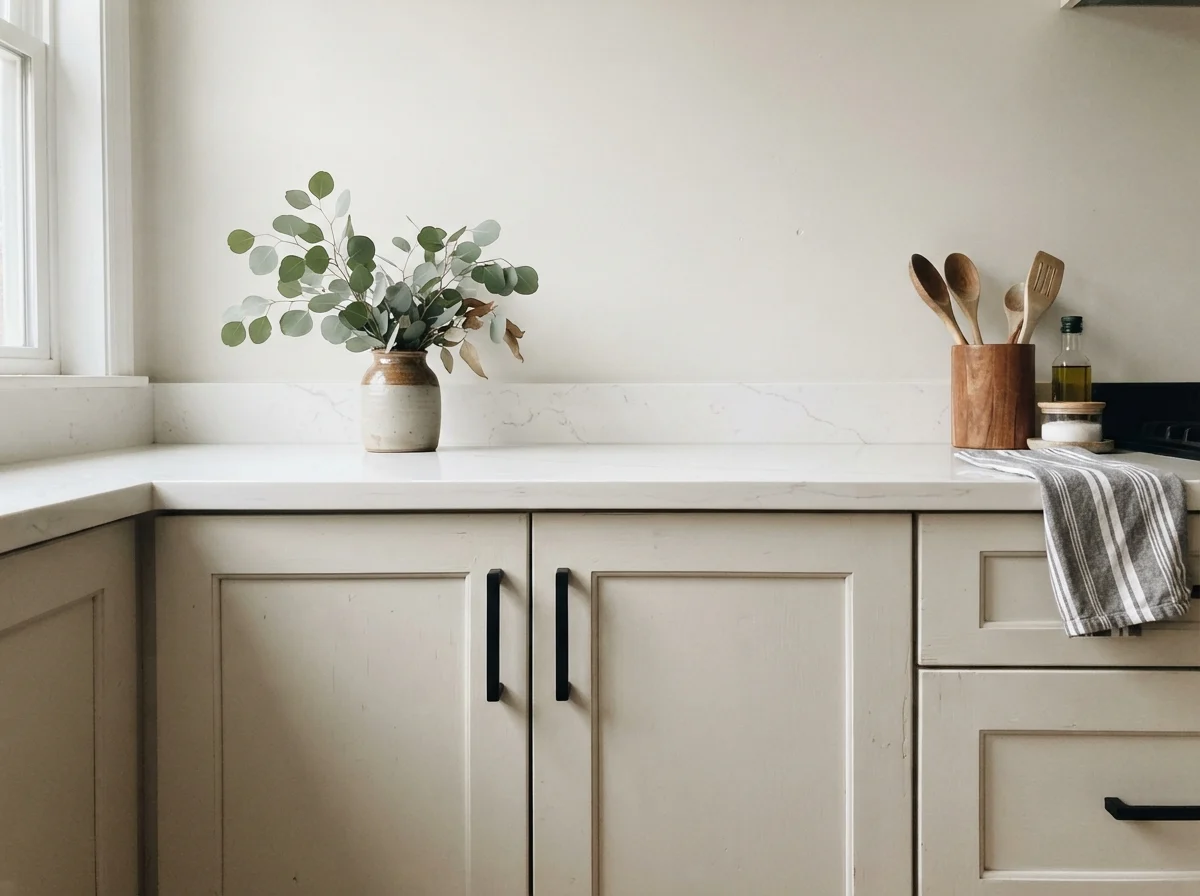
When you spray shaker cabinets in Benjamin Moore Calm using a satin finish, the color reads like soft, historic milk paint. It looks substantial, quiet, and lived-in. It pairs brilliantly with white quartz counters, matte black hardware, and pale oak floorboards. Because Calm has that tiny drop of pigment, it defines the millwork profile of shaker doors against pure white backsplash tile without screaming for attention.
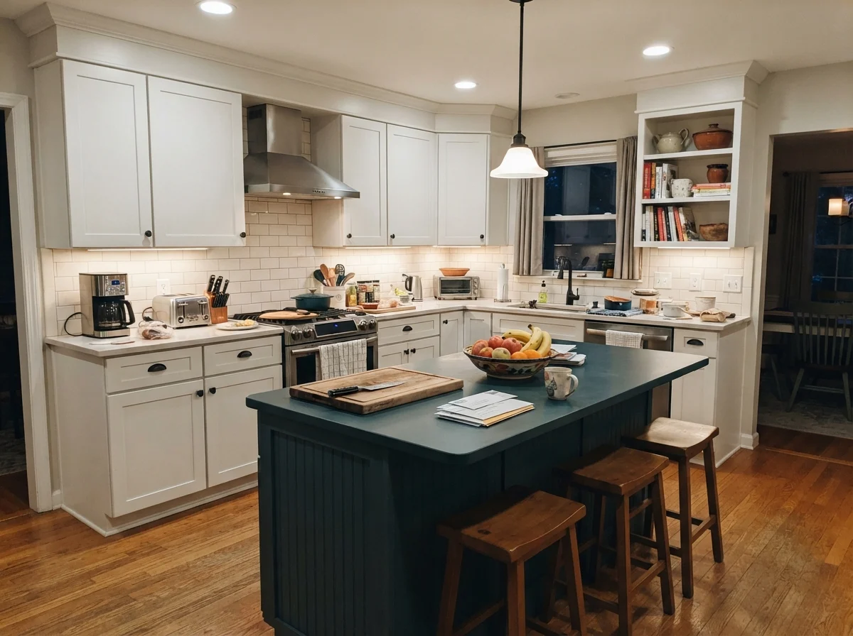
If you are painting an accent island, Calm plays remarkably well with surrounding cream walls or simply white upper cabinets, as long as you keep the island hardware grounded with dark bronze, matte black, or brushed brass.
Hallways, Built-ins, and the Exterior Story
In narrow hallways and stairwells that only get second-hand daylight from adjacent bedrooms, Calm behaves remarkably well. A stark white in a narrow hall bounces light so aggressively that it highlights every drywall bump, tape seam, and pencil mark left by the kids. Calm’s subtle gray body masks those minor wall imperfections while still lifting the gloom out of the corridor.
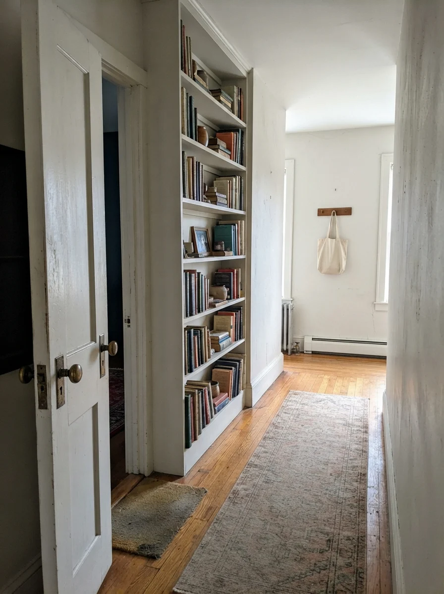
We also tested Calm on millwork in an older hallway: a two-panel interior door and an adjacent built-in bookshelf set against cream walls. With an antique brass doorknob and stacks of weathered hardcovers, the color felt historically appropriate—neither sterile nor yellowed with age.
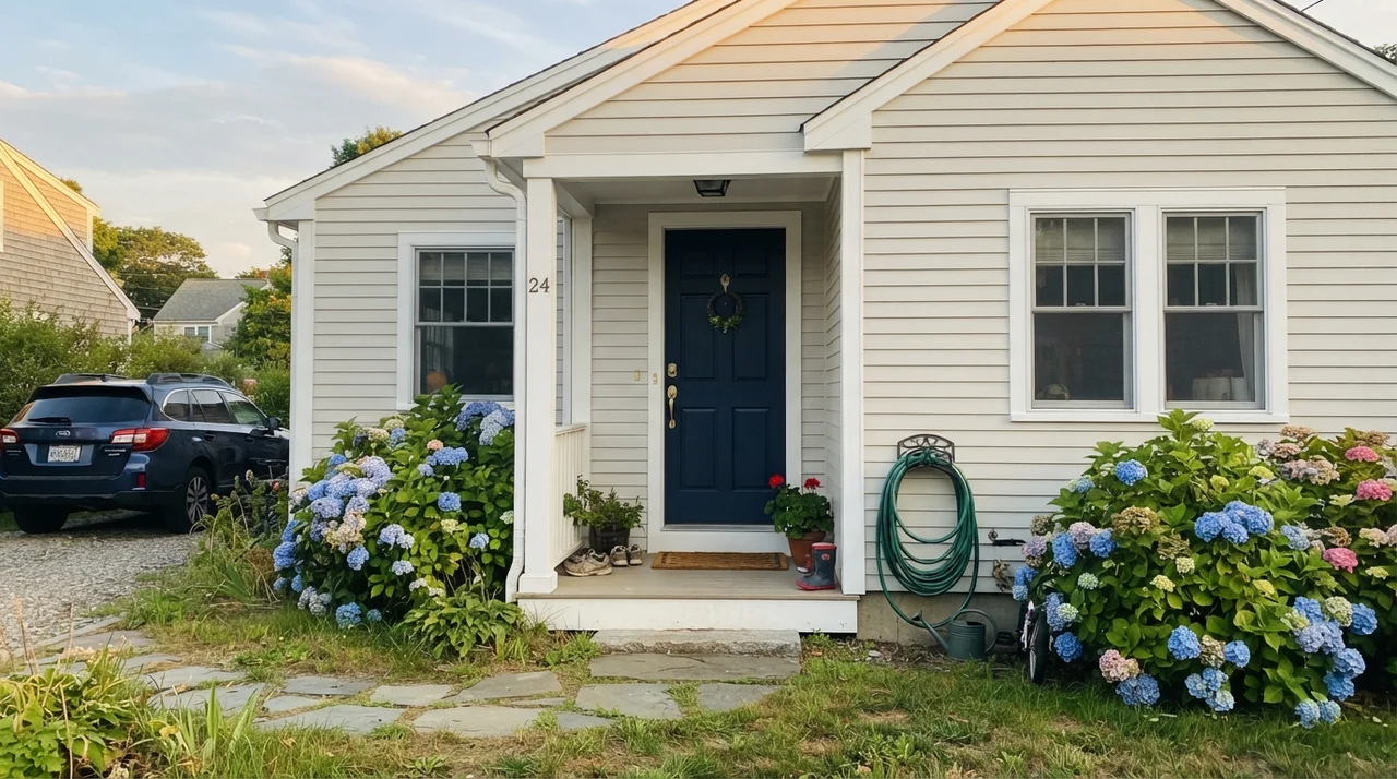
Outside on horizontal siding, direct sunlight burns off nearly all the underlying violet, leaving a soft, elegant off-white that makes dark charcoal shutters, a Hale Navy front door, and green foundation hydrangeas look tailored and expensive.
Calm is not a warm cream in disguise. If your room faces north and gets cold winter daylight, that lavender drop will announce itself whether you invited it or not.
The Honest Fail: When Calm Turns Muddy, Dingy, or Lavender
Now let's talk about the failures, because every paint has them and Calm has three very specific traps that will ruin your weekend if you don't heed the warning signs.
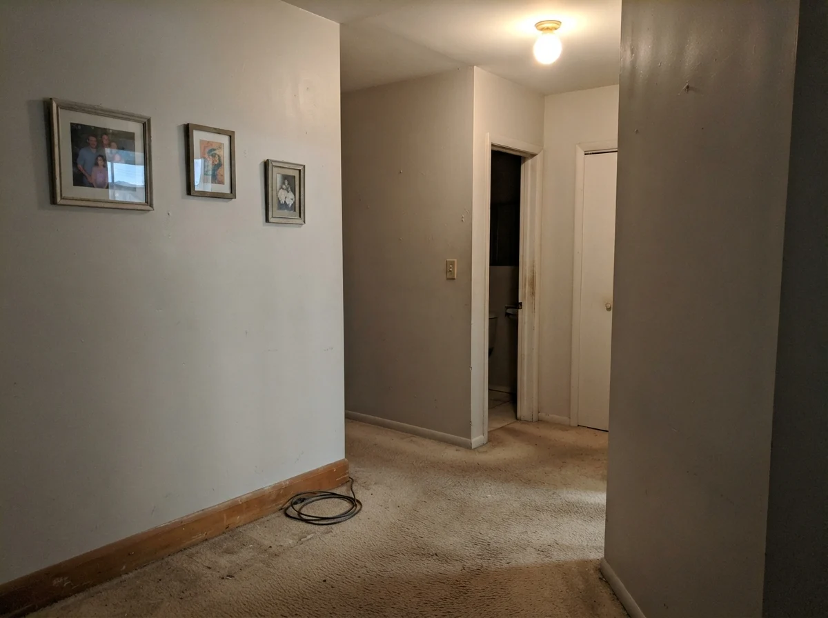
First, windowless or poorly lit interior hallways. In a dim hall with no natural light and a single, low-output ceiling fixture over beige carpet, Calm loses its luminous quality entirely. It drops into a flat, chalky, putty-colored mess that looks like unprimed drywall mud. If you don't have good natural light or deliberate warm lamp glow, Calm will not do the heavy lifting for you.
Second, north-facing rooms with flat, overcast skies. Cool north light strips out every ounce of warmth in a paint film. When that happens to Calm, the gray-violet base is left completely exposed. The wall doesn't read off-white anymore; it reads pale, chilly lavender-gray. I have seen homeowners swear up and down that the store mixed the wrong formula because their north-facing dining room looked like diluted grape popsicle on a rainy Tuesday.
Third, pairing it with warm, yellow-cream trim. If your baseboards are painted in Navajo White or Swiss Coffee, Calm will look dingy, dirty, and bruised next to them. Trim requires deliberate planning with this color.
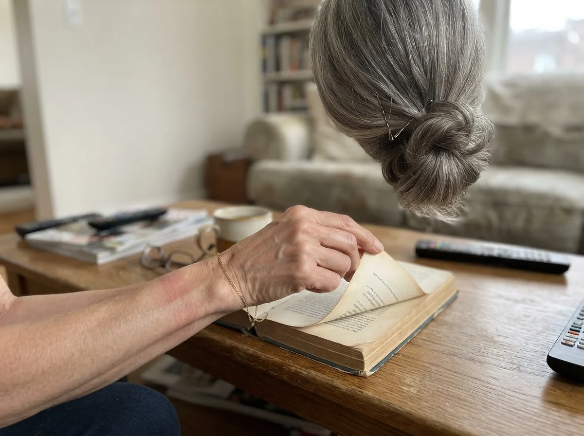
That brings me to a quiet afternoon habit I've kept up through every repaint in three houses. Whenever I am testing a near-white that carries a temperamental undertone like Calm, I don't just paint a board and stare at it for two minutes. I carry a favorite book into the room, sit down on the rug or at the coffee table, and just live beside the wall while the light changes across three hours. You notice things when you let your eyes settle: how the shadow behind a side table deepens, how the wall responds when the sun dips behind the oak trees, and whether the paint keeps its promise once the room goes quiet.
Living with Calm Five Years In: Cleaning and Durability
When you commit to an off-white at LRV 76 across high-traffic family zones, durability isn't a theoretical question—it is a daily reality. Over thirty years and three houses, I have learned the hard way that saving twenty dollars on a gallon of cheap flat wall paint will cost you hundreds in touch-up labor down the line.
For Benjamin Moore Calm on drywall, eggshell is the absolute sweet spot. Flat paint in this color marks if you look at it too hard, and scrubbing a muddy paw print or a scuff mark off flat paint leaves a shiny, burnished ring that looks worse than the scuff. In an eggshell sheen, Calm scrubbed clean with a damp microfiber cloth and mild dish soap every single time. It hides minor drywall taping imperfections far better than a stark, glossy white, while still holding up to routine family wiping.
For trim and millwork, stick to semi-gloss in a high-grade enamel like Benjamin Moore Advance or Command. On kitchen cabinets, satin finish provides that velvety historic look while repelling grease and water splatters around the sink. As for ceilings, keep it dead flat—Calm works nicely as a ceiling color only if the walls are painted a deeper greige or charcoal; otherwise, stick to untinted ceiling flat.
Does Benjamin Moore Calm look purple or lavender?
It can. Calm has a gray-violet undertone. In south-facing rooms and under warm 2700K bulbs, that violet stays invisible, giving you a serene off-white. In cool north daylight or under 4000K daylight LED bulbs, that lavender flash frequently steps forward.
What is the best trim color for Benjamin Moore Calm?
Benjamin Moore Chantilly Lace OC-65 is the top recommendation. Its clean, crisp neutrality creates sharp contrast without highlighting Calm's undertones. Benjamin Moore White Dove OC-17 also works well for a softer look. Avoid yellow-creams like Swiss Coffee or Navajo White.
What sheen should I use for Benjamin Moore Calm?
Use eggshell on standard drywall to balance durability with low glare. Use semi-gloss on baseboards, doors, and millwork. If you are painting kitchen cabinets, use satin for a smooth, wipeable finish that looks like aged milk paint.
Why does Calm look dingy in my hallway?
Calm requires adequate lighting to reflect properly. In dim, windowless hallways or spaces lit only by cool overhead bulbs, Calm loses its luminous quality and reads as flat, muddy putty. If you cannot add warm lighting, choose a cleaner, brighter white.
Is Benjamin Moore Calm warm or cool?
It sits right in the transitional middle. It is technically a warm-leaning off-white because of its soft pearl quality, but its violet-gray base makes it read significantly cooler than cream or traditional beige.
Susan's Verdict · Beautiful with Sun, Risky in the Shade
If you are painting a bedroom, bathroom, or living space that gets generous southern daylight or afternoon sun—and you light your evenings with warm 2700K lamps—Benjamin Moore Calm 2111-70 is worth every single dollar. It delivers an effortless, quiet elegance that brighter whites and heavier beiges simply cannot match. But if you have a dark, north-facing room with cold LED fixtures, save yourself the repainting headache and buy White Dove or Classic Gray instead. Calm is a thoroughbred: give it the daylight it needs, and it will reward you for years.