Color Diary · No. 48
Classic Gray: The Off-White That Refuses to Act Like Real Gray
The gray that is barely a gray, reviewed honestly: the rooms where it turns into plain white, the mauve flash people miss, and what to pick instead.

Susan HartleySeptember 26, 2026 · 16 min read
Classic Gray · Benjamin Moore 1548
Hex#E3E0D7LRV74Undertonesviolet-pink → warm gray → off-white
In our last house—a 1990s colonial with oversized baseboards and a foyer that swallowed sunlight whole—we spent three weeks agonizing over gray swatches. This was back when everyone was rushing to banish the nineties beige, and I was convinced our main hallway needed something cool, tailored, and crisp. We rolled out test patches of four different grays. Half of them looked like wet sidewalk cement by four in the afternoon, and the other half felt like a commercial office building. Then a friend handed me a chip of Benjamin Moore Classic Gray 1548.
I painted a square by the front door, stepped back, and thought: this isn’t gray at all; it’s just white that forgot to put on its coat. But then the morning light hit it. The color gave the wall a gentle, powdery shadow that softened every corner without turning gloomy. We ended up carrying it down the hall, up the stairwell, and into three bedrooms. We lived with it across seven years in that house, and when we sold, every potential buyer who walked through commented on how peaceful and bright the rooms felt.
That is the paradox of Classic Gray. If you come to it expecting an actual gray wall—the kind of tailored charcoal or slate-adjacent neutral you see in architectural magazines—you are going to be profoundly disappointed. At a Light Reflectance Value (LRV) of 74, Classic Gray is barely a gray. It sits squarely in Benjamin Moore’s off-white family. It is a whisper of warm gray suspended in a bath of soft cream, carrying a subtle violet-pink undertone that keeps it from ever curdling into yellow or mustard. The secret is knowing where that whisper is enough, and where real life blows it completely away.
What LRV 74 Really Means in Daily Life
When you look at a paint chip in the store under fluorescent tubes, your eye plays tricks on you. Stacked against crisp printer paper, Classic Gray looks like a quiet, dignified silver-stone. But once you spread it across a twelve-foot drywall expanse, light physics takes over. LRV measures how much visible light a color reflects back into the room on a scale from 0 to 100. At 74, Classic Gray reflects nearly three-quarters of the daylight entering your space.
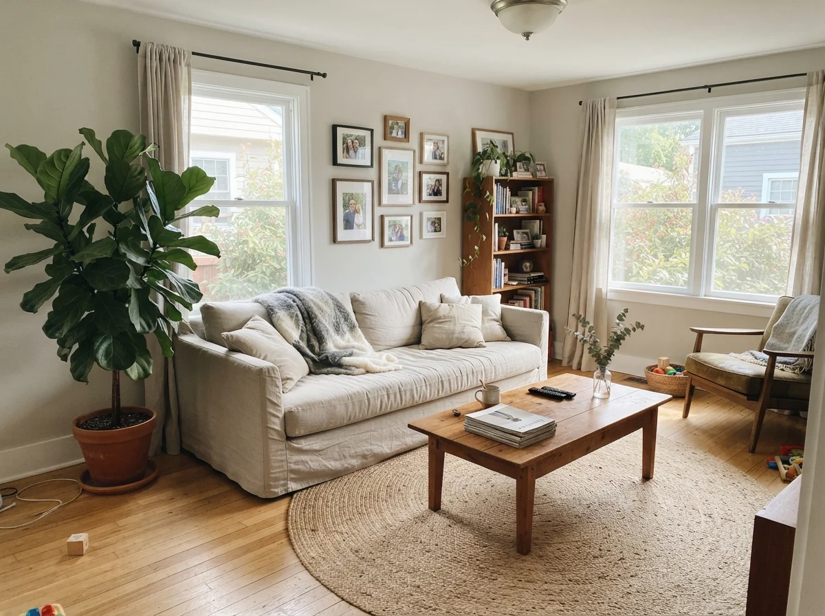
That high reflectivity means the color relies almost entirely on surrounding shadow and contrast to register as a tint. In a room with balanced, moderate daylight—say, one or two normal east- or west-facing windows—the pigment settles in and does its job. You get a dimensional, cloudy warmth that makes white trim pop gently. But in a room flooded with direct southern sun, all that light overwhelms the pale pigments. The whisper of gray vanishes completely, bleaching out into what reads as standard off-white. Five years in our colonial taught me that if you put this color in a glass-heavy sunroom expecting contrast against white trim, you are essentially paying for colored water that dries into builder white.
The Shifting Light: Morning Coolness to Evening Glow
One of the biggest mistakes I see homeowners make is testing a paint sample at noon on a Saturday and deciding their whole house based on that single thirty-minute window. A wall is a living canvas that reacts to every cloud passing overhead and every lamp switched on at twilight. Classic Gray is especially sensitive because its pigment load is delicate.
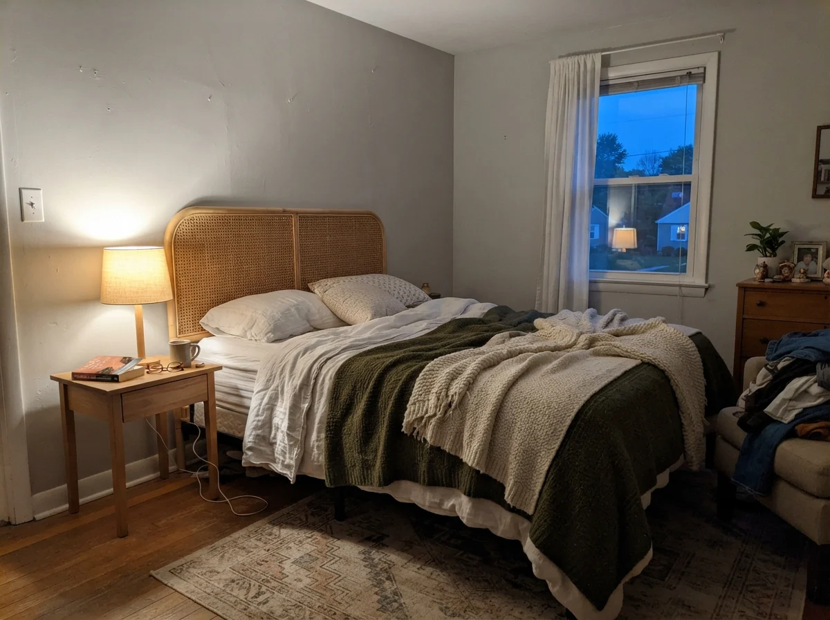
In early morning light, before the household stirs and when the daylight outside is still crisp and cool, Classic Gray pulls slightly cool and pale. It looks airy and clean, almost like fresh linen. It does not feel sterile, but it certainly doesn't feel like a heavy beige blanket either. As the sun moves across the roofline and afternoon turns into evening, the color drinks in artificial illumination. If you have warm incandescent or 2700K–3000K LED lamps, the walls instantly melt into a soft, creamy greige that makes wood furniture look rich and grounded.
Where things can turn tricky is in flat or overcast daylight. On rainy days or in rooms facing strictly north, that subtle violet-pink base note steps to the front. You might catch a fleeting glimpse of dusty mauve or muted lilac in the shadowy corners. Some homeowners panic when they see this, thinking their painter grabbed the wrong can. It is not an error; it is simply how the red and violet colorants interact with blue-tinted sky light. If you know to expect it, it reads as rich complexity. If you were expecting pure gray or creamy yellow, it can catch you off guard.
Where Classic Gray Truly Shines
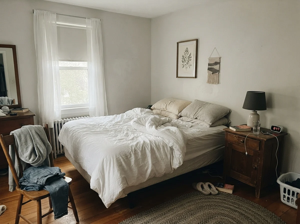
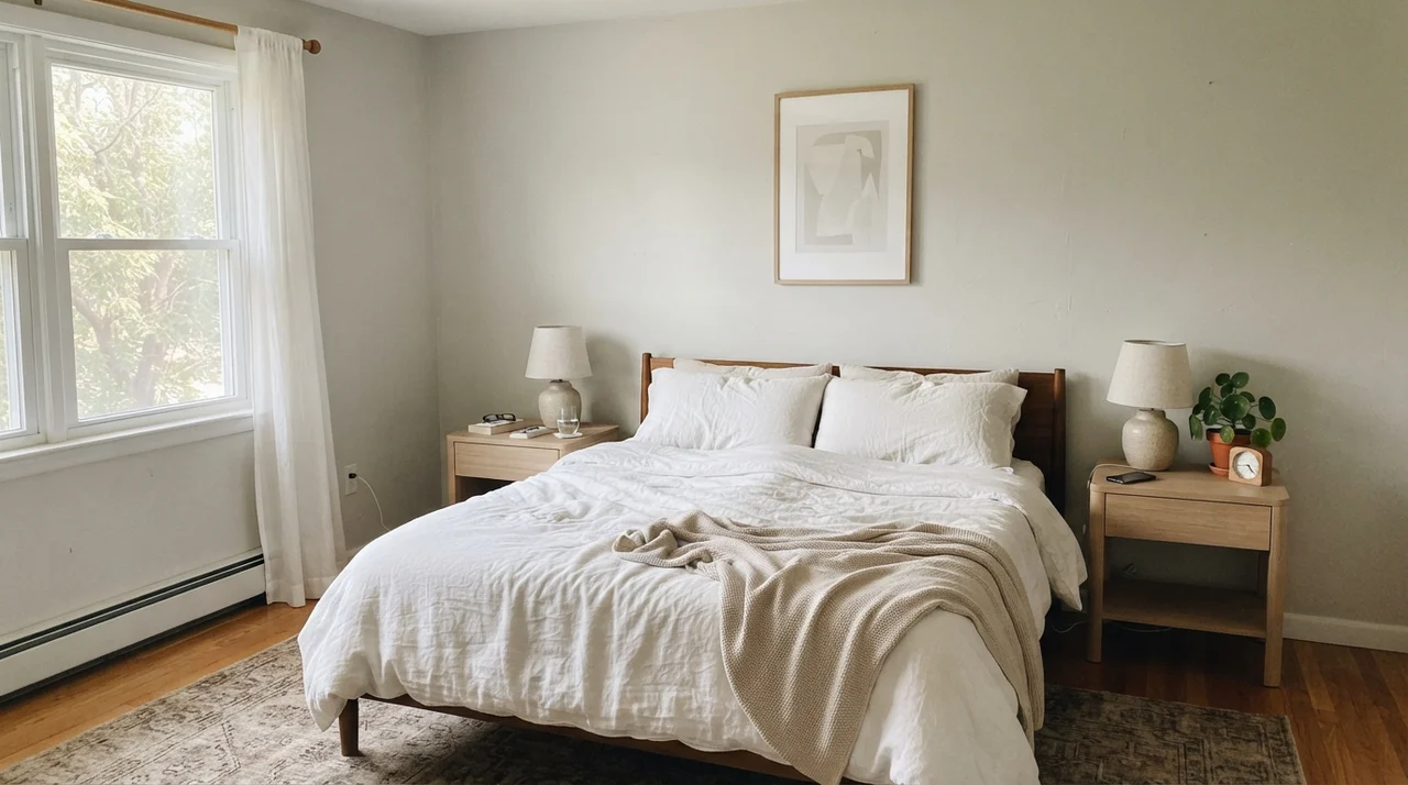
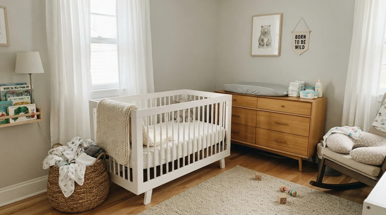
After repainting dozens of rooms across thirty years, I have found that Classic Gray has a very specific natural habitat: quiet, restful rooms where you want the walls to recede and let your life take center stage. Bedrooms and nurseries are where it earns every penny of its purchase price.
A nursery painted in true stark white can feel clinical and cold, while traditional beige often feels heavy and dated within a few seasons. Classic Gray strikes the exact balance needed for a calming sanctuary. It cradles soft white cribs, natural wood dressers, and woven storage baskets without fighting against pastel accents or natural textiles. Under soft lamps during late-night feedings, the walls wrap the room in a gentle warmth that never glares back at you.
It also handles the evolving chaos of a growing family better than most pale shades. In our 1970s split-level, our teenager’s bedroom was a rotating gallery of posters, open bookshelves, and sports gear. Classic Gray gave the space a clean, structured perimeter that kept the visual clutter from feeling overwhelming. Unlike cooler grays that make clutter feel messy and industrial, this color maintains a lived-in hominess.
Bathrooms and Powder Rooms: The Tile Question
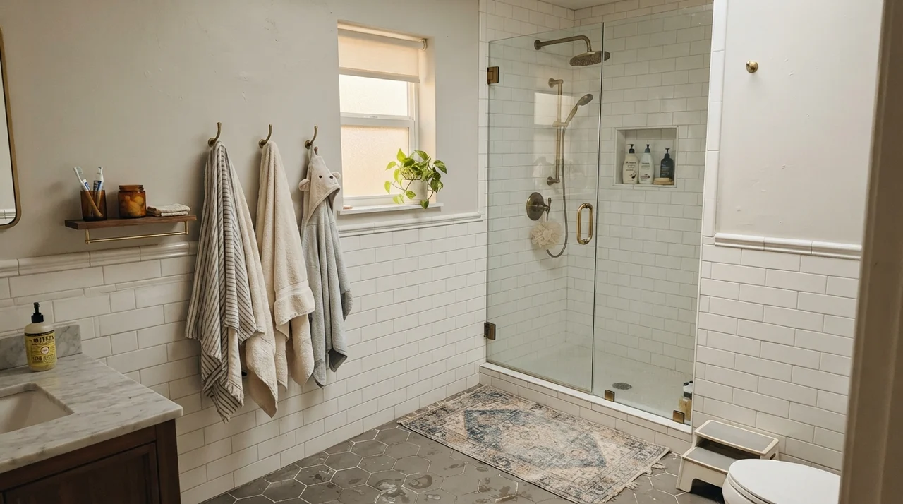
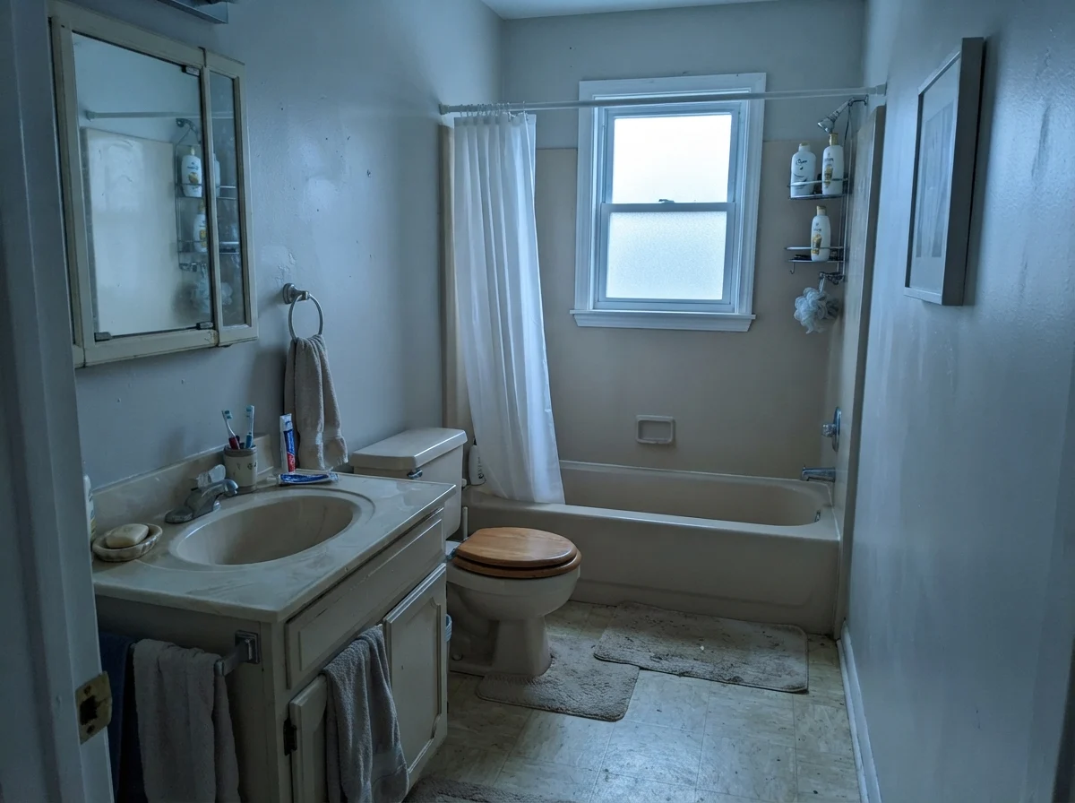
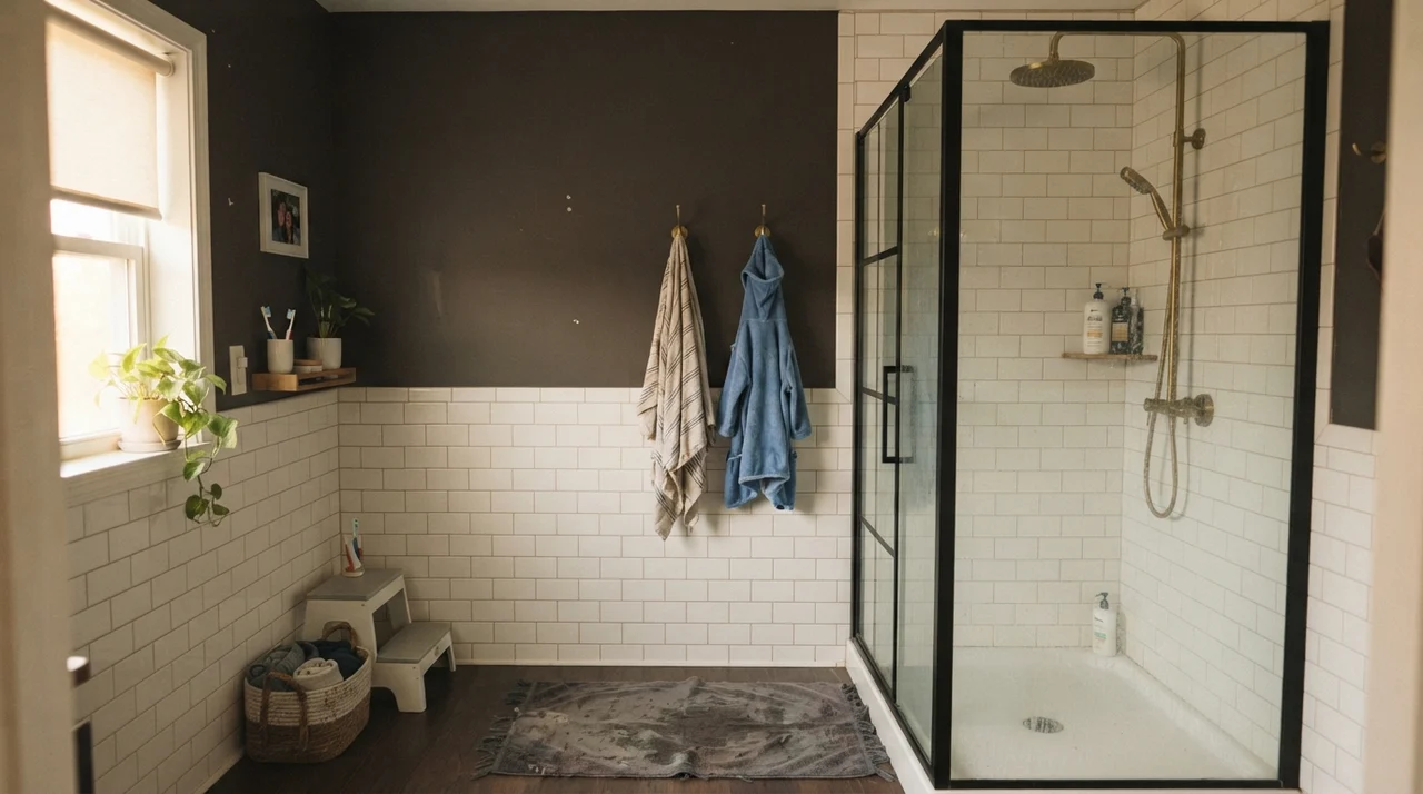
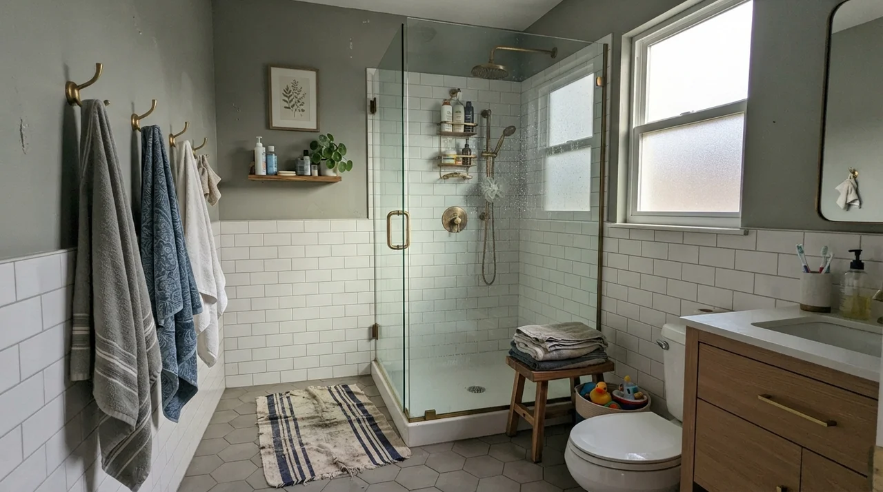
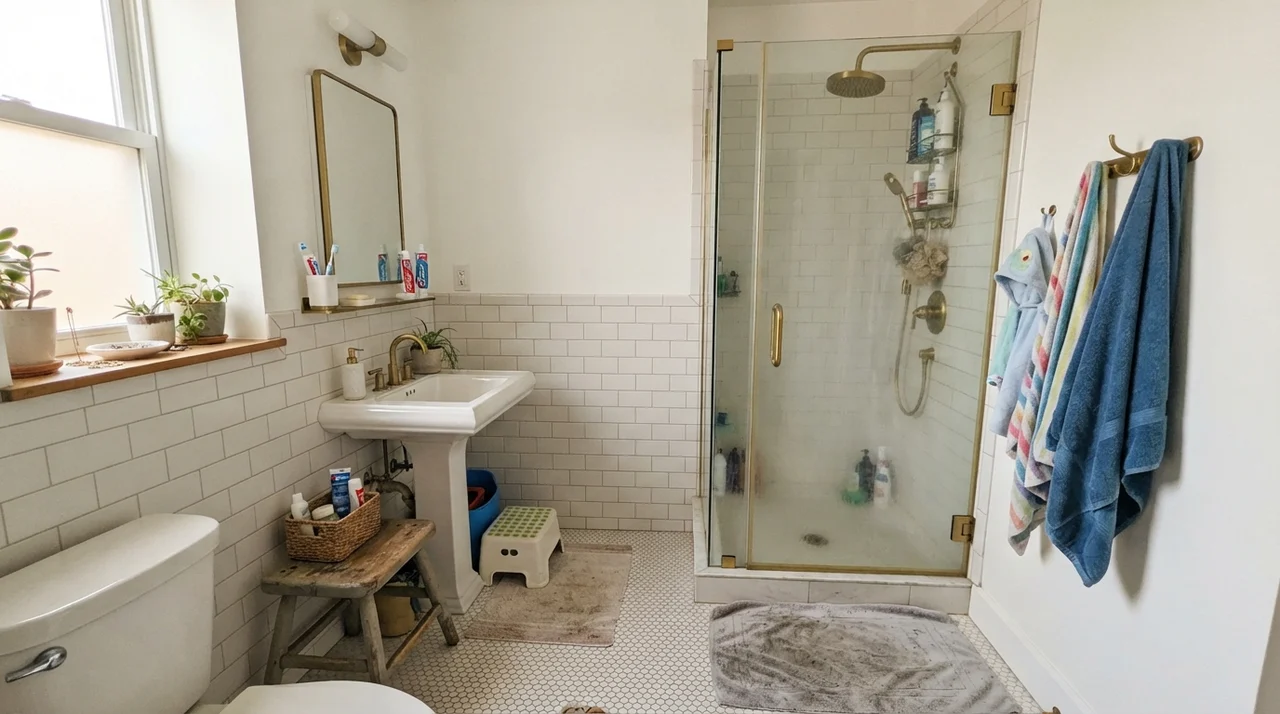
In bathrooms, Classic Gray is a workhorse—provided you pair it with the right hard surfaces. Because of its violet-pink undertone, it looks exceptional when placed right against classic white subway tile, clean Carrara marble, and polished chrome or warm brass hardware. The starkness of bright porcelain gives Classic Gray something to push against, allowing that quiet gray pigment to actually show up on the wall.
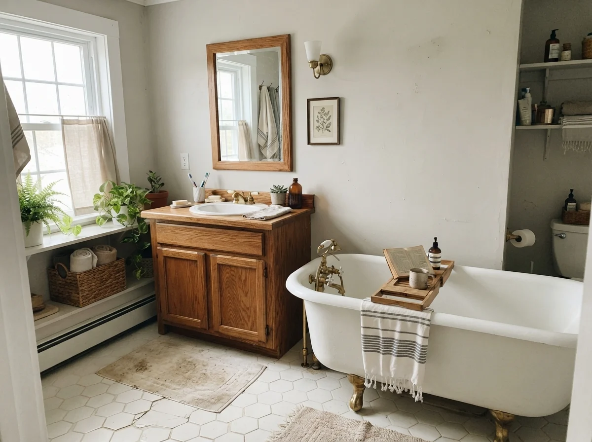
Where you need to be cautious is in bathrooms with heavy cream, yellow-beige travertine, or earthy golden oak. If your tile is warm and yellowish, Classic Gray’s cool undertone will pull away from it, making the wall look slightly dusty or violet while making the tile look dingy. But set it above crisp white wainscoting or alongside a vintage clawfoot tub, and it creates an effortless vintage cottage aesthetic that never feels tired.
Kitchens, Islands, and Cabinetry
If you want painted kitchen cabinetry that feels airy without resorting to clinical hospital-white, Classic Gray in a durable satin finish is worth serious consideration. On shaker uppers and lowers, it delivers a soft, muted look that feels bespoke and architecturally grounded.
However, there is one non-negotiable rule when using this color on cabinetry: it must be paired with something distinctly whiter than itself. If you install Classic Gray cabinets against off-white quartz counters or a cream backsplash, the cabinets will simply read as dirty white. But place them next to crisp white subway tile and solid white quartz, and suddenly the subtle gray depth emerges clearly. Adding matte black hardware or unlacquered brass pulls anchors the color beautifully.
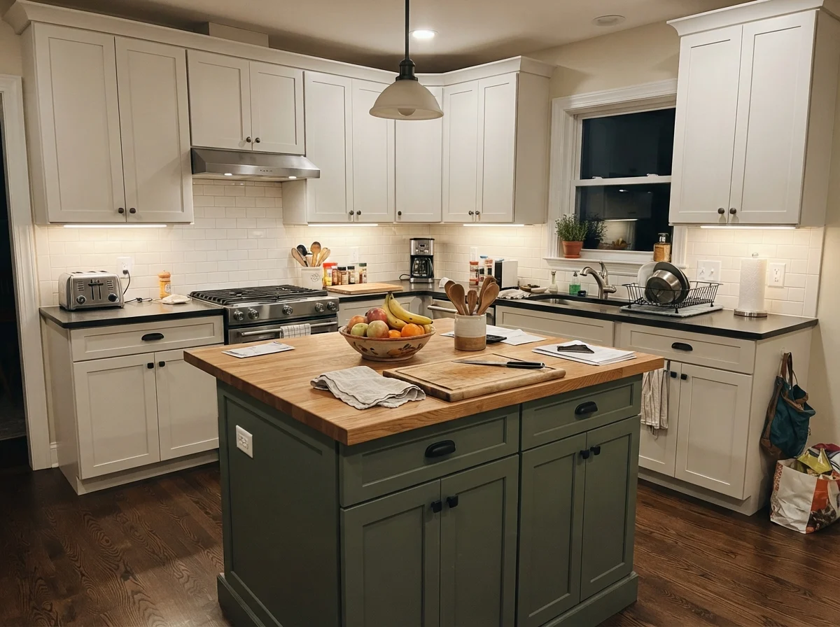
You can also use it selectively on an accent piece, like a central kitchen island surrounded by bright white perimeter cabinets. In an open-concept family kitchen with everyday clutter on the counters, a Classic Gray island creates a soft focal point that hides minor scuffs better than untinted white while reflecting warm under-cabinet task lighting.
Utility Spaces, Sunrooms, and Architectural Trim
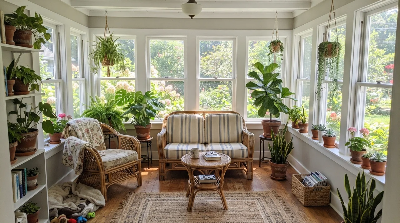
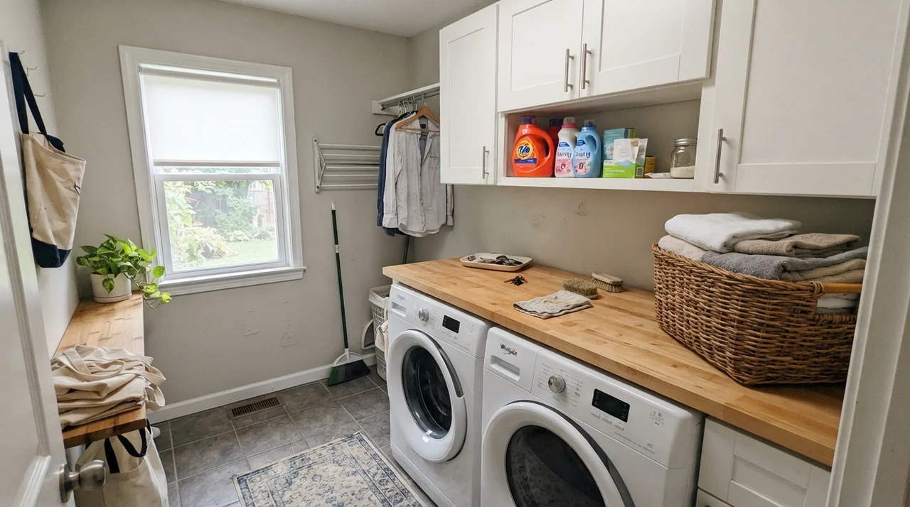
Because Classic Gray is so light, it flows effortlessly through transitional areas like laundry rooms, utility spaces, and glass-heavy sunrooms. In a sunroom wrapped in white-framed windows, the slivers of painted drywall between frames absorb the garden greenery outside without turning sour or muddy. In a bright laundry room with butcher-block counters, it provides just enough pigment to keep the walls from looking unfinished.
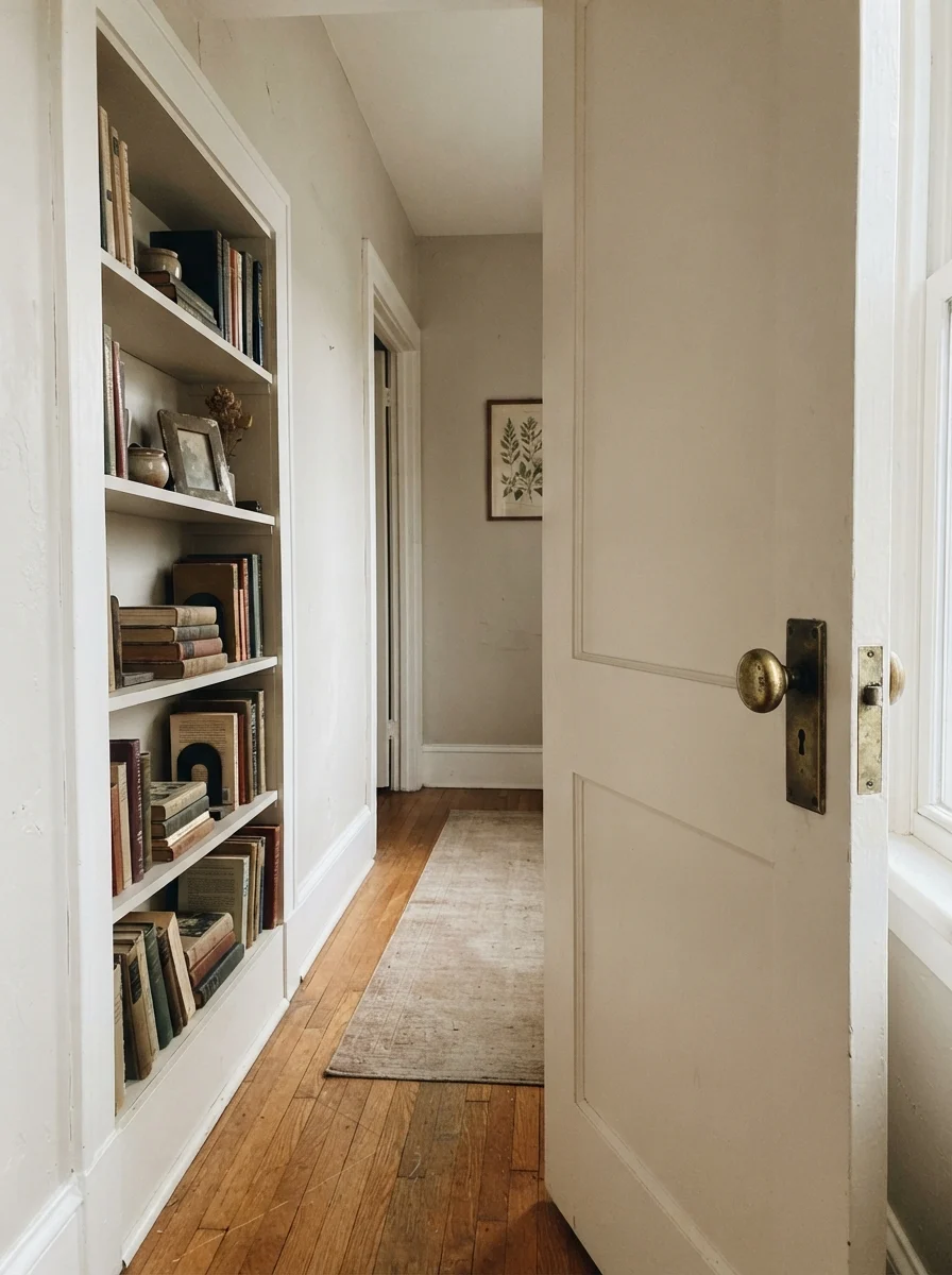
Another clever application in older homes is using Classic Gray on interior architectural details—such as interior passage doors or built-in hallway bookcases—set against warmer cream walls. It creates a quiet, historic two-tone contrast that honors the craftsmanship of older millwork without the visual weight of dark paint.
Taking It Outside: Siding and Exteriors
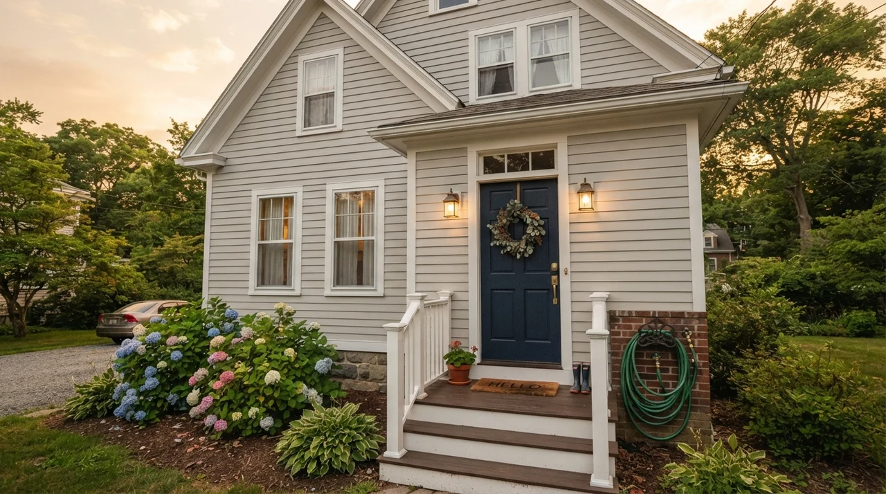
Can you use Classic Gray on a home exterior? Yes, but you have to understand what natural outdoor UV light does to it. Outdoors, unmitigated sunlight bleaches everything by several degrees. Classic Gray on horizontal siding behaves essentially like a warm, soft off-white. It completely sheds its gray identity and simply looks like a clean, historic white that doesn't glare blindingly in the sun.
To make it look intentional on an exterior, you must anchor it with bold, high-contrast trim and accents. Frame your rooflines with crisp white trim, and paint the front door in a commanding shade like Benjamin Moore Kendall Charcoal HC-166 or Hale Navy HC-154. And whatever you do, never paint your front entry door in Classic Gray—at this lightness level, a front door will simply dissolve into the facade from the curb.
The Honest Failure: Where Classic Gray Falls Apart
Every paint color has a breaking point, and Classic Gray's breaking point is a windowless, poorly lit interior hallway. If you put this color in a dark corridor that relies entirely on an old overhead fixture with a cool 4000K LED bulb, the paint cannot perform. Without natural daylight to reflect, the delicate pigments lose all their luminosity. The wall turns into a flat, drab, putty-like slab that looks dingy rather than designed.
I saw a neighbor make this exact mistake in her 1980s ranch. She loved Classic Gray in her front formal living room, so she bought an extra ten gallons and rolled it all the way down a long, dark basement hallway with low ceilings. Within forty-eight hours, she was calling me to ask why her walls looked like unpainted wet drywall. If your space has zero natural light and only single ceiling cans, skip this shade entirely. You need a white that brings its own golden warmth, like Benjamin Moore White Dove OC-17, or a deeper greige with enough backbone to stand on its own.
Classic Gray is the paint you choose when you want a room to look soft, settled, and finished without actually choosing a color.
Trim Pairings and White Relationships
Because Classic Gray is an off-white hovering at LRV 74, your trim selection dictates how the wall is perceived. If you make the mistake of using an off-white trim that is identical in value, the room loses all its definition and feels unfinished. You have two distinct, proven paths for trim:
For crisp contrast where you want the walls to read as an intentional pale tint, choose Benjamin Moore Chantilly Lace OC-65. Its clean, cool-neutral purity makes Classic Gray visibly read as a soft, warm neutral. For a softer, low-contrast, traditional look (especially in bedrooms), pair it with Benjamin Moore White Dove OC-17 on the woodwork. The slight creaminess of White Dove creates a subtle transition that feels gentle and lived-in.
Durability, Scrubbing, and Living with It Long-Term
Here is what thirty years of homeownership has taught me about light off-whites: the paint finish you choose matters just as much as the swatch. In our 1990s colonial, we used flat finish in the hallway during our first round of repainting. That was a mistake. Within six months, dog tails, laundry baskets, and kids' backpacks had left gray scuffs along every corner. When I tried to scrub them clean, the flat paint burnished into shiny, ruined spots.
We repainted the walls in an eggshell sheen, kept the trim in semi-gloss, and used flat strictly on the ceilings. In eggshell, Classic Gray held up beautifully. Mud splatters wiped right off with a warm washcloth and mild dish soap, and touch-ups blended seamlessly five years in. When we sold the house, the walls still looked freshly done, which saved us thousands in pre-listing painter fees.
From a budget perspective, Benjamin Moore’s mid-tier formulas (like Regal Select) are completely worth the money here. Cheaper contractor-grade paints often lack the fine pigment suspension needed for a delicate color like this, requiring three or four coats just to cover an old color evenly without streaking.
Why does Classic Gray look like plain white in my living room?
At LRV 74, Classic Gray carries very little pigment. If your living room has large south-facing windows, direct sunlight will wash out the color completely. To get noticeable gray walls in high-sun rooms, step down to a deeper shade like Edgecomb Gray HC-173.
Does Classic Gray have purple or pink undertones?
It has a subtle violet-pink base. In normal daylight and under warm bulbs, this base simply makes the gray feel warm and soft. However, on overcast days or in cool north-facing rooms, that violet cast can surface as a faint dusty mauve.
What light bulbs should I use with Classic Gray?
Warm white LED bulbs between 2700K and 3000K are ideal. Cool 4000K or 5000K bulbs will pull the violet base forward and make the walls look flat, cold, and dingy.
Can I use Classic Gray as a whole-house neutral?
Yes, it is one of the best whole-house colors on the market because it flows effortlessly between rooms without clashing. Just ensure windowless spaces like interior hallways have warm 3000K lighting so the color doesn't turn drab.
Susan's Verdict · The Whisper-Soft Workhorse
Classic Gray 1548 is not the paint for someone who wants to walk into a room and say, 'Look at my gray walls.' It is the paint for someone who wants their home to feel finished, peaceful, and bathed in soft light without fighting their furniture or trim. If your room gets moderate daylight, you have warm 3000K bulbs, and you pair it with crisp white woodwork, it is worth every penny of the can. But if your room is drenched in all-day southern sun, save yourself the frustration and buy a shade with more pigment—because in bright light, this gray simply packs its bags and leaves.