Color Diary · No. 51
Benjamin Moore Edgecomb Gray: The Greige That Demands Daylight and Forgives Your Oak
The light greige everyone recommends, reviewed honestly: the rooms where it glows, the rooms where it turns muddy, and what to buy instead.

Susan HartleySeptember 27, 2026 · 16 min read
Edgecomb Gray · Benjamin Moore HC-173
Hex#D9D3C4LRV63Undertoneswarm greige · soft stone · gray-green in shadow
In our last house, a 1990s colonial that had more builder-grade golden oak and almond ceramic tile than any single family could reasonably modernize at once, I spent three months staring at sample boards trying to bridge the gap between our furniture and the architecture. That was the year everyone on our street was putting Revere Pewter in their center halls. I bought two gallons, rolled out half of the front foyer on a Saturday morning, and by Tuesday afternoon I had to face the facts: in a center-hall layout with a covered porch cutting off the direct light, Revere Pewter felt like wet cement. It was too heavy, it swallowed the afternoon sun, and it made our honey oak stair treads look aggressively orange.
A neighbor down the block who had worked with an interior designer suggested Benjamin Moore Edgecomb Gray (HC-173). She called it the polite version of greige. We repainted the foyer the following weekend. That can of paint stayed on our walls for seven years until the day we sold the house, and the buyers actually wrote a note into the closing paperwork asking for the paint formula so they could touch up the baseboards after moving their furniture in.
I have lived with Edgecomb Gray across two different houses now, in rooms facing east, west, north, and south. I have watched it behave on kitchen cabinets, on trim, in guest bathrooms, and down dim hallways. It is one of the most capable, adaptable neutral paints Benjamin Moore has ever formulated, but it is not magic. It has an exact light requirement, a specific threshold where it succeeds, and an equally predictable tipping point where it turns flat and dingy. If you are considering buying five gallons for a main floor, there are a few hard truths you need to know before you sign off on the estimate.
What Edgecomb Gray Actually Is (and Why the Chip Is Deceptive)
Edgecomb Gray sits right at an LRV of 63 (Light Reflectance Value on a scale of 0 to 100). That number is important. True off-whites usually hover between 72 and 84; deep, moody greiges like Revere Pewter sit down at 56. At 63, Edgecomb Gray has enough pigment and body that it will never be mistaken for a white wall, yet it reflects enough light to keep an open main floor feeling airy and interconnected. It belongs to Benjamin Moore's Historical Collection under SKU HC-173 (it is also cataloged as Baby Fawn OC-15, which is identical in pigment and formula).
When you look at the paper swatch under the fluorescent lighting of a paint counter, Edgecomb Gray looks like a quiet, warm gray with a drop of taupe. Once you get it onto four walls in a real house, the story changes. Because it is formulated with a mix of black, yellow oxide, and umber colorants, its behavior depends entirely on the quality of natural daylight entering your windows and the color of the surfaces surrounding it.
The Three Faces of Edgecomb Gray
Greige is never a fixed color; it is a chameleon that responds to the temperature of your daylight, the reflections from outside, and your artificial light bulbs.
warm sun
overcast, north light
dusk, rain, cool bulbs
Under warm southern exposure, Edgecomb Gray reads as a rich, creamy greige with distinct beige warmth. On overcast days or in north-facing rooms, the warmth recedes and a soft, muted gray-green undertone steps forward. Under cool artificial lighting or at twilight, it reads as a quiet, stony neutral.
Baby FawnBenjamin Moore · see diary
Natural CreamBenjamin Moore · see diary
Edgecomb GrayHC-173
Elmira WhiteBenjamin Moore · see diary
Warm PuttyValspar · see diary
How Daylight Moves Edgecomb Gray from 8:00 AM to 8:00 PM
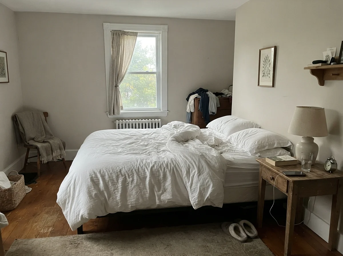
The biggest surprise for homeowners testing this shade is the shift between morning and evening. In early morning light—especially in east-facing bedrooms—Edgecomb Gray can look cool, pale, and slightly washed out before the sun gets high enough to warm the room. By late afternoon and evening, when table lamps are switched on, the wall absorbs the artificial warmth and leans distinctly into a soft, comforting tan.
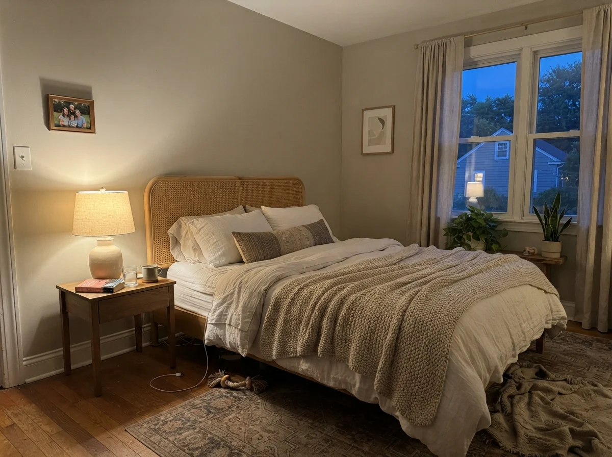
We tested this exact rhythm in our guest bedroom. At 7:00 AM on a crisp morning with no lamps turned on, the wall showed its calm, stony backbone. By 8:00 PM with a single bedside lamp lit and the curtains open to dusk, the room felt like a cozy linen cocoon. If you only look at your sample patch during the middle of the day, you will miss half of what this paint does.
Living Rooms and Main Living Areas: Its Primary Purpose
If you have an open-concept floor plan where the living room, dining room, and kitchen flow into one another without dividing walls, picking a single color can be a nightmare. One end of the room might face south and catch direct sunlight, while the other end faces north toward a shady patio. Many colors fall apart under that kind of cross-exposure—they look brilliant by the front door and sickly gray near the kitchen pantry.
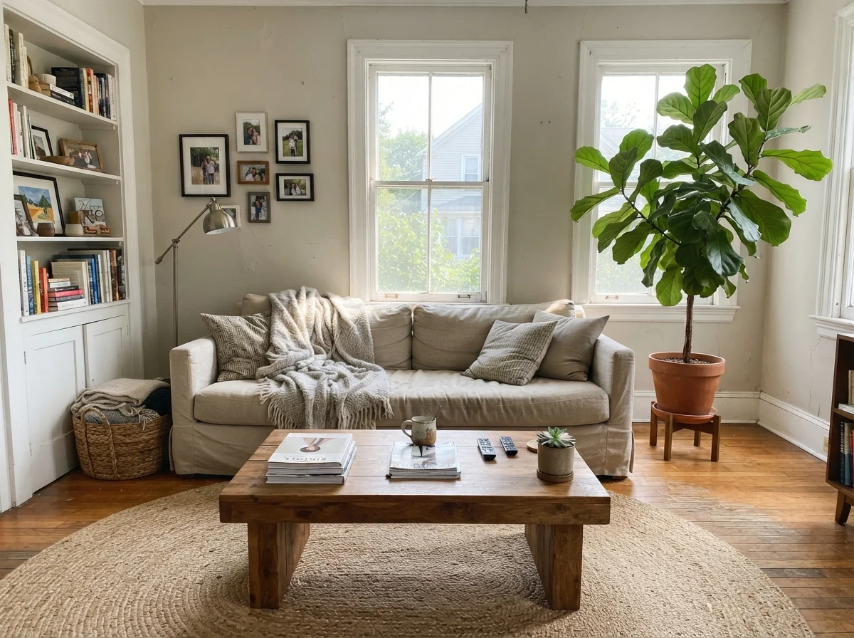
Edgecomb Gray is built specifically for this challenge. Because it sits right on the borderline between beige and gray, it adapts to differing exposures across a single continuous wall run. In a living room with generous midday sun from two large windows, it reads as a clean, soft neutral that lets natural linen upholstery, jute rugs, and warm wood coffee tables shine without clashing.
Where people get into trouble in living spaces is when they lack enough window area. If your living room has only one modest window shadowed by a wide front porch or heavy tree canopy, Edgecomb Gray doesn't have enough light to bounce. Instead of looking soft and sophisticated, it turns into a flat, shadowy putty by four in the afternoon. To make this color sing across a large open main floor, you need at least two good light sources, or an unobstructed southern or western exposure.
Edgecomb Gray is what you buy when Revere Pewter feels like wet cement and pure beige feels like 1994.
Bedrooms and Quiet Spaces
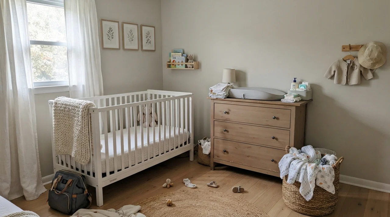
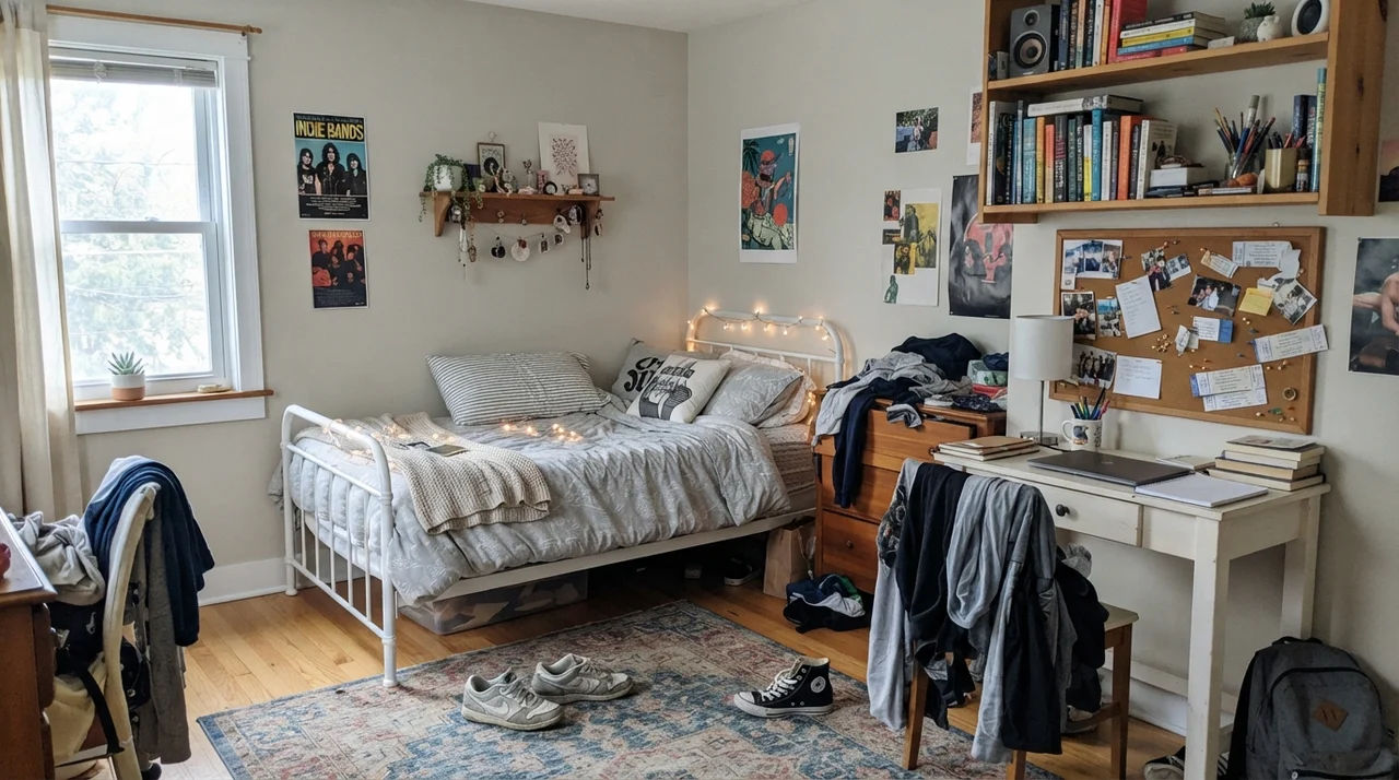
In bedrooms, nurseries, and teenagers' rooms, Edgecomb Gray works as a serene, grounding backdrop that allows changing bedding and furniture styles to evolve without demanding a repaint every three years. When our oldest transitioned from a nursery to a teenager's study space, having a neutral with some warmth meant we didn't have to touch the walls—the painted finish held up against posters, corkboards, and changing furniture finishes.
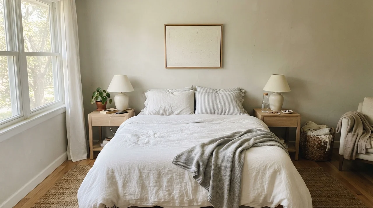
In a primary bedroom with soft side-window daylight, pairing Edgecomb Gray with pale oak nightstands, white linen bedding, and simple ceramic lamps creates a calm, hotel-like atmosphere. It gives enough contrast against crisp white sheets while keeping the overall envelope warm and quiet.
Kitchens, Cabinets, and Island Accents
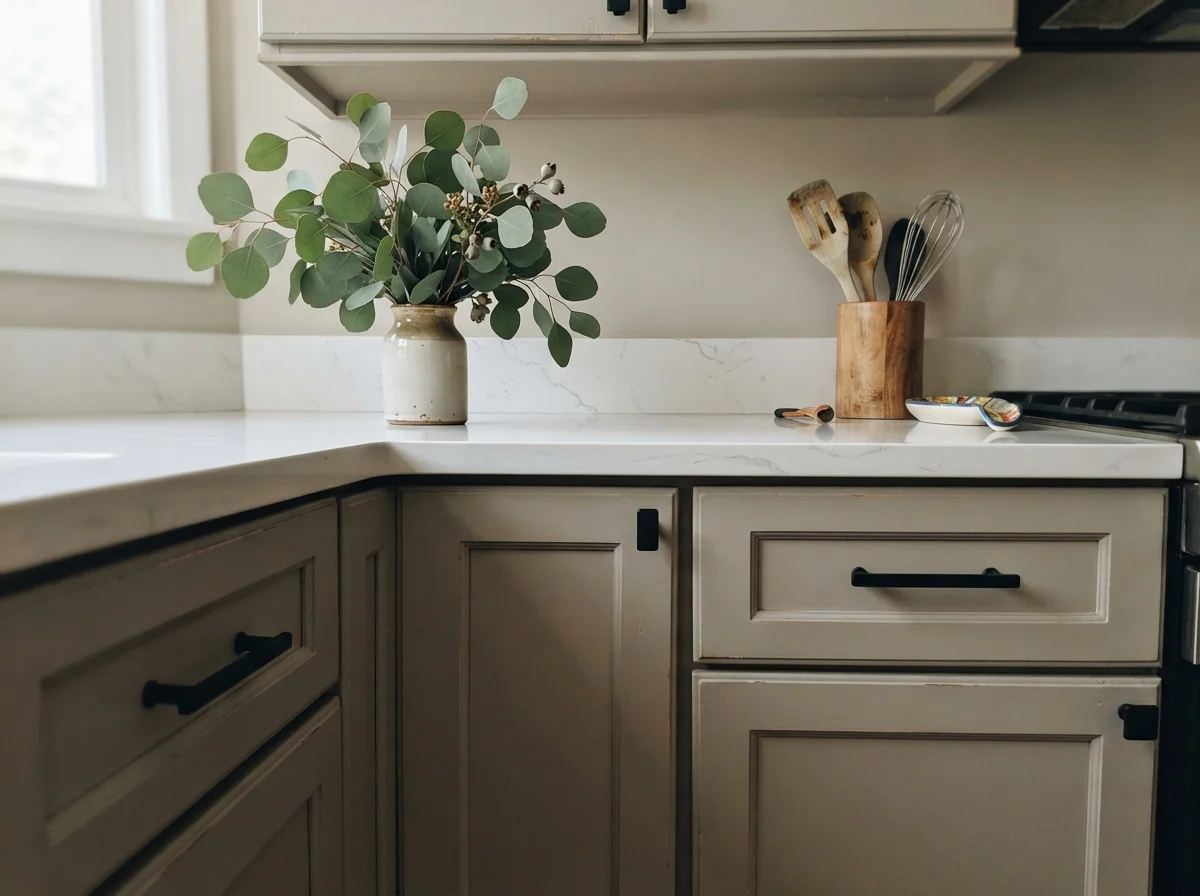
One of the most practical applications for Edgecomb Gray over the last five years has been on kitchen cabinetry. If you are tired of stark all-white kitchens that show every single splash of spaghetti sauce and peanut butter fingerprint, but you aren't ready to commit to dark navy or forest green, a satin cabinet enamel in Edgecomb Gray is an incredible middle ground.
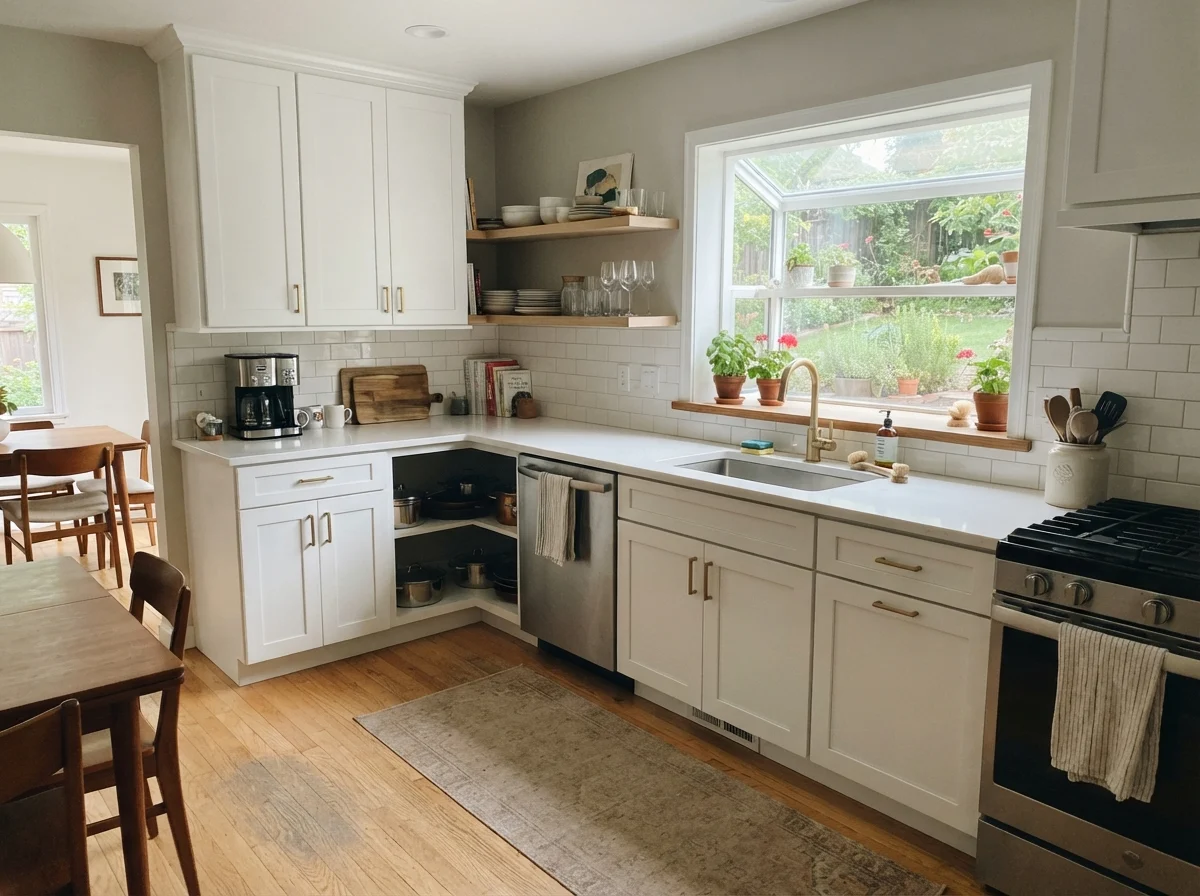
When painted on shaker cabinets with white quartz counters, a white subway backsplash, and light oak floors, Edgecomb Gray reads tailored, warm, and intentional. It pairs beautifully with matte black hardware or warm unlacquered brass. It softens the starkness of white quartz without making the kitchen feel dark.
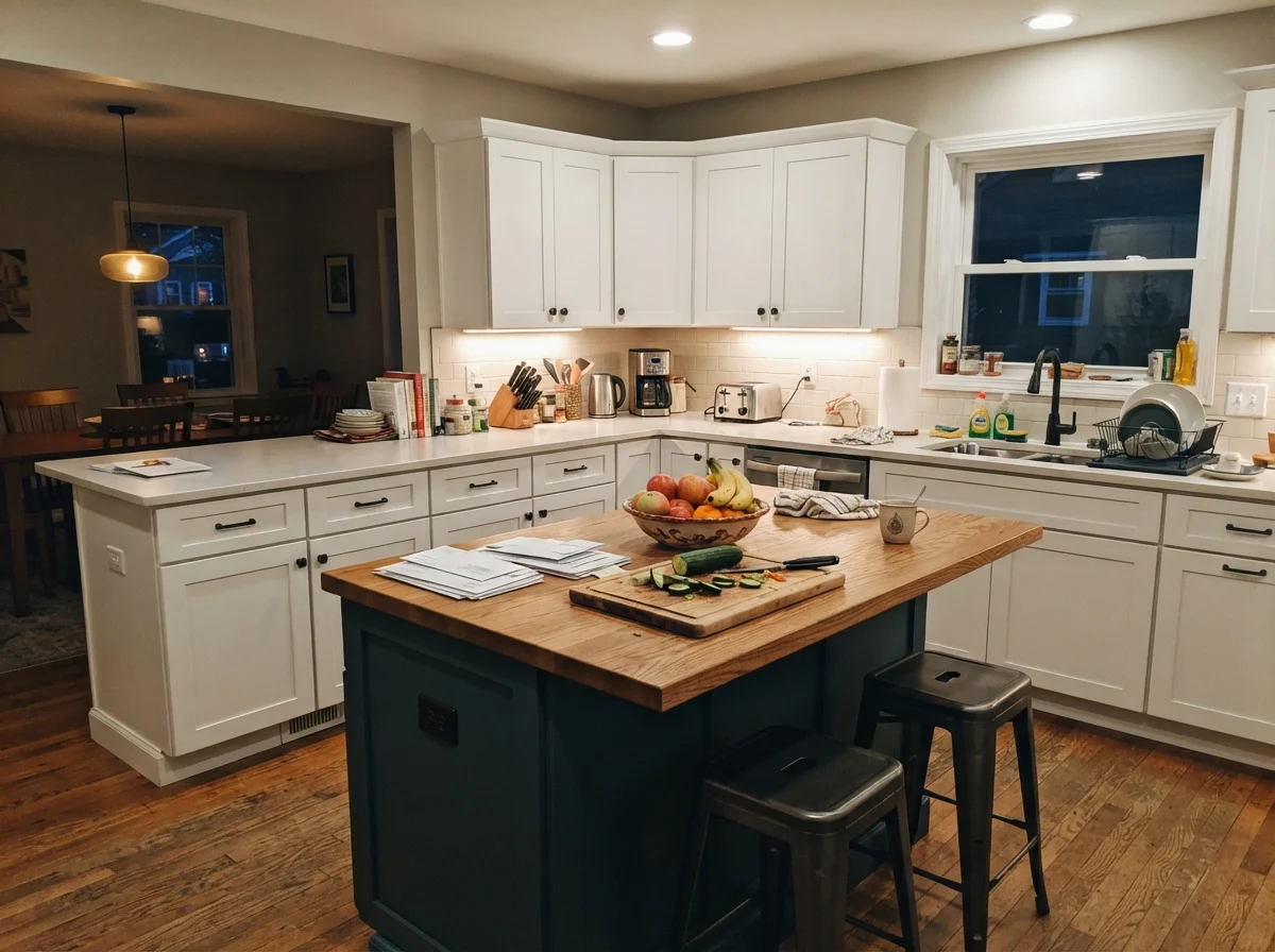
If you don't want to repaint all your cabinetry, using Edgecomb Gray strictly on an island while keeping the perimeter cabinets a clean white is an easy way to break up an oversized kitchen. It grounds the island in the center of the room without visually shrinking the floor plan.
Bathrooms, Sunrooms, and Utility Spaces
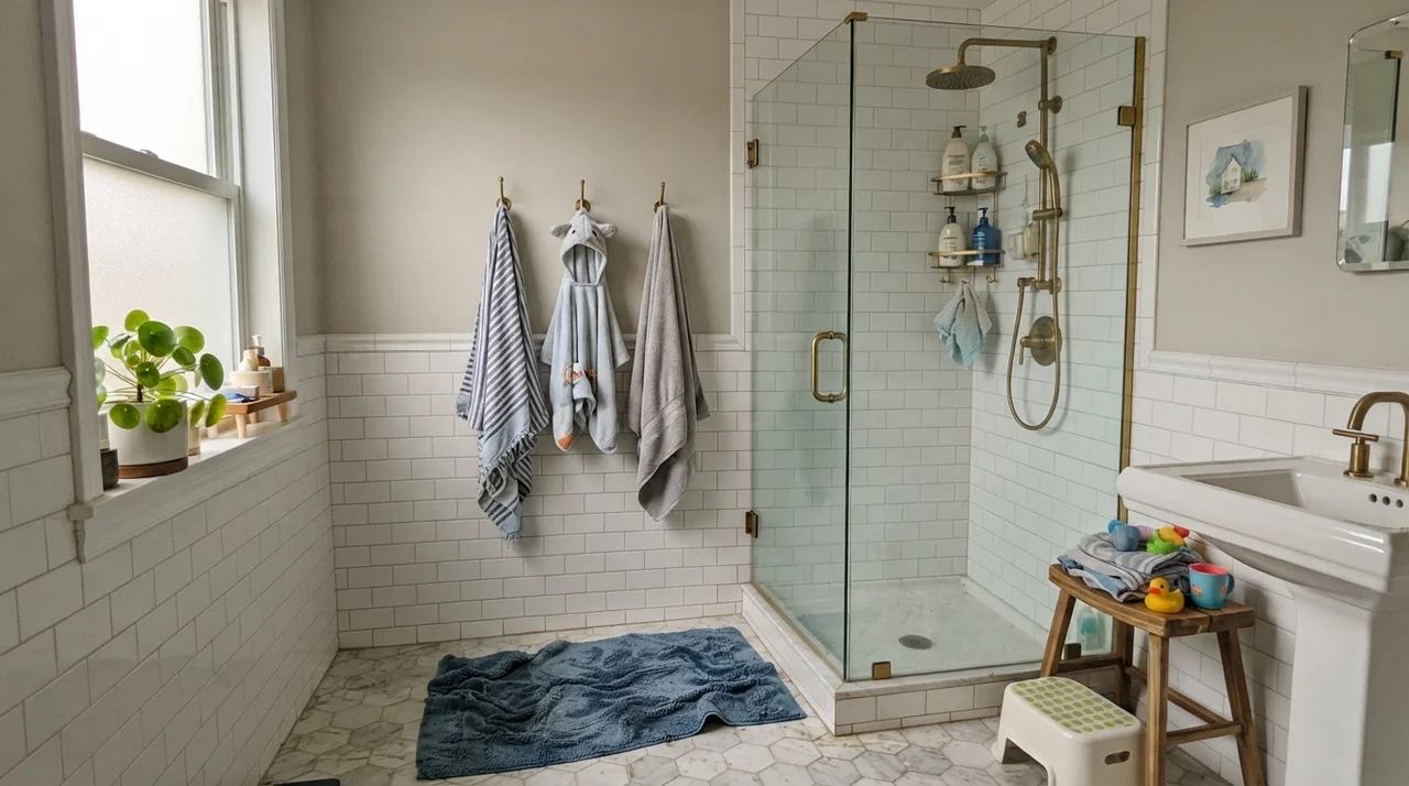
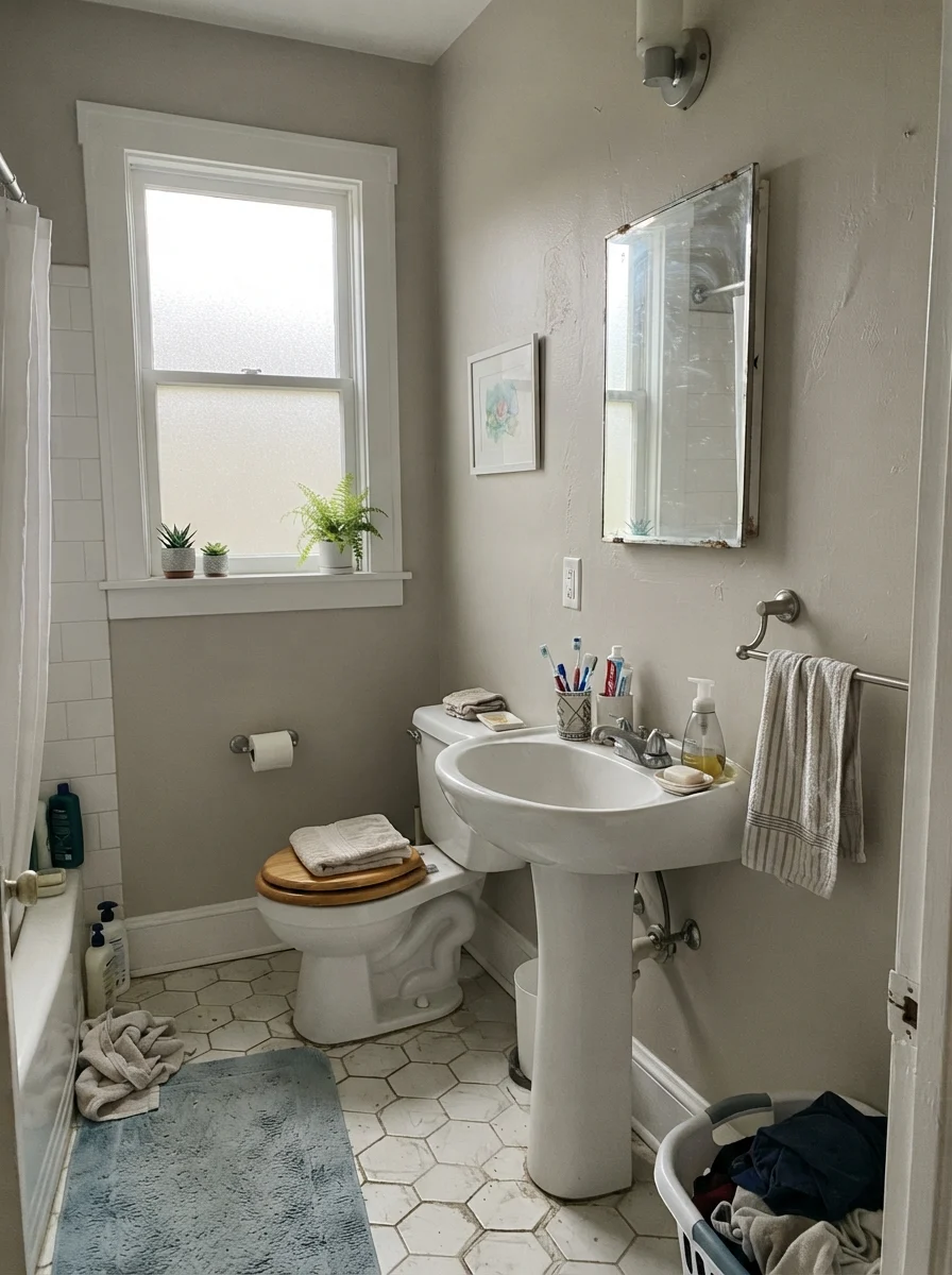
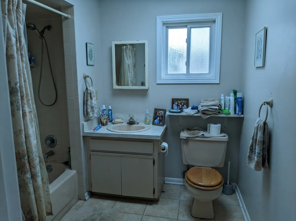
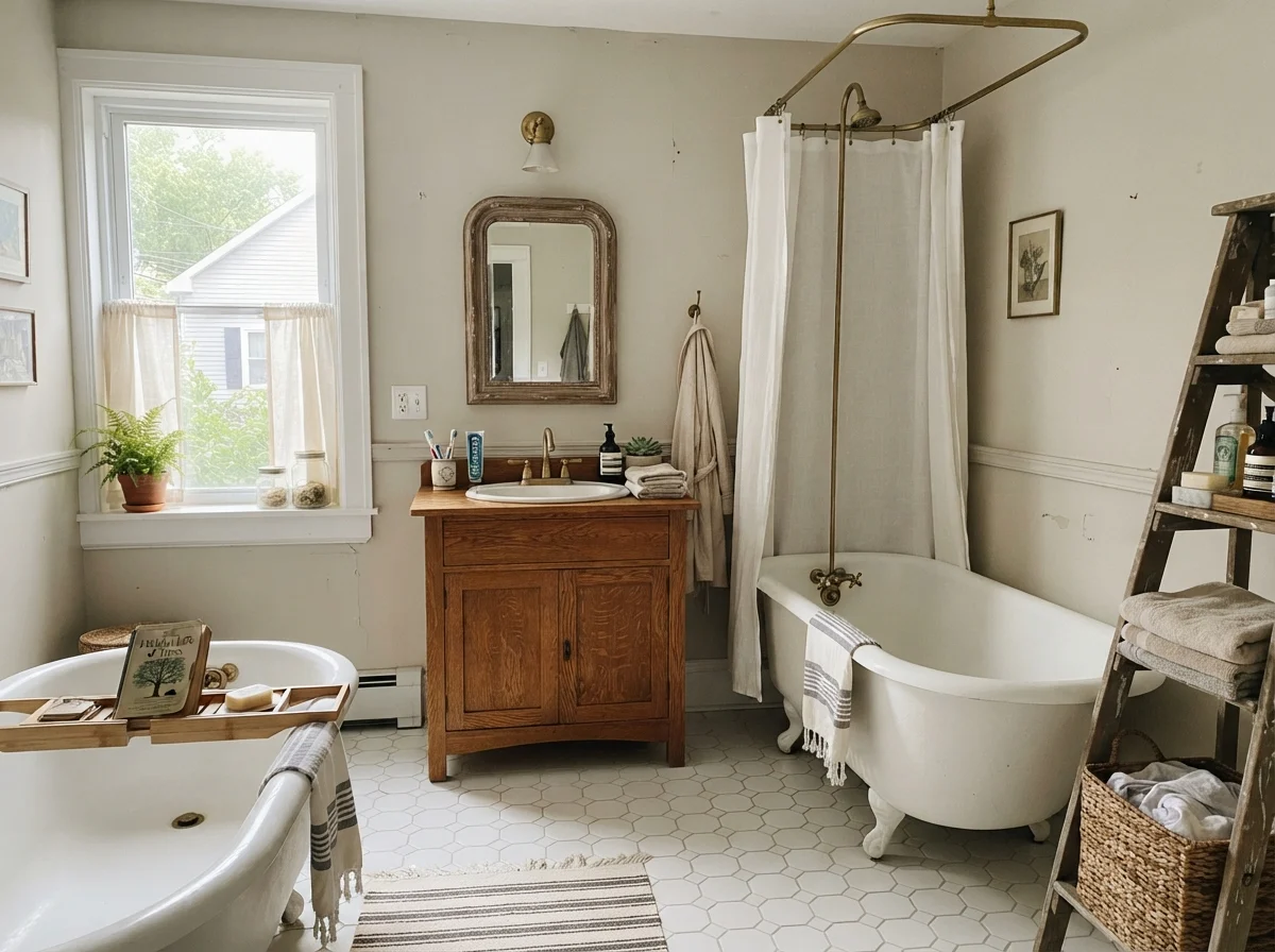
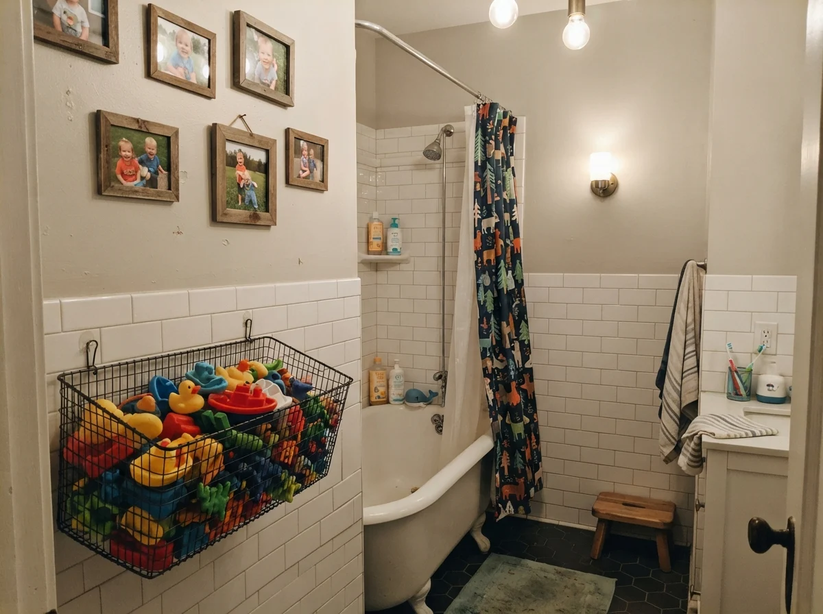
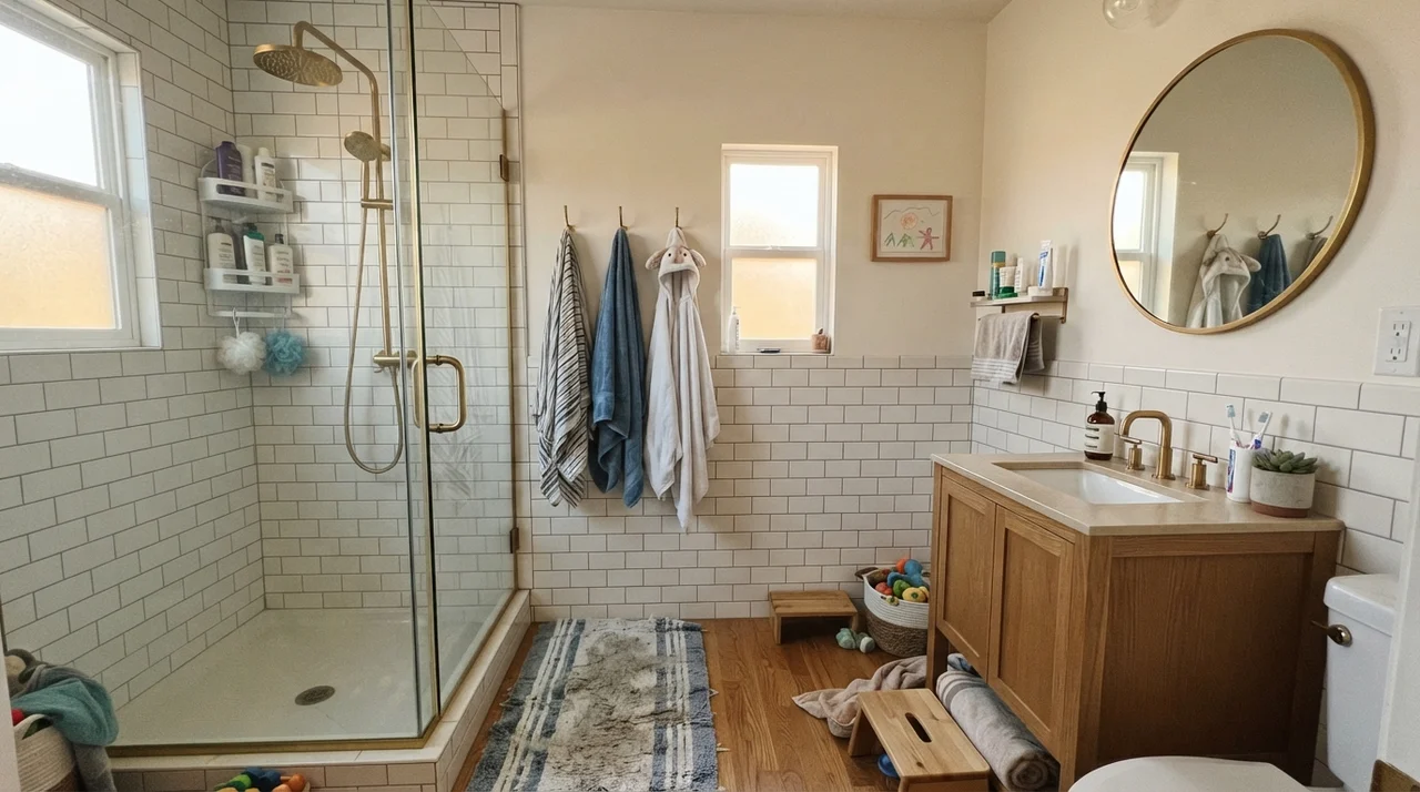
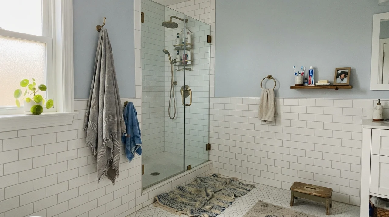
In bathrooms, your tile choice will make or break this color. If your bathroom has warm travertine, beige porcelain, white hex tile, or a natural oak vanity, Edgecomb Gray ties the whole room together effortlessly. In a cottage bathroom with a clawfoot tub and warm wood accents, the walls feel soft and timeless. Even in a busy family bath or a kids' bathroom with white subway tile wainscoting, it adds depth while taking scrubbings from damp towels without showing water spots.
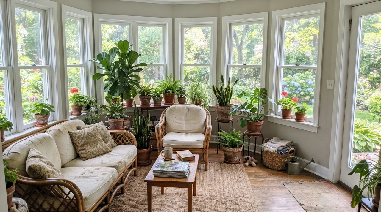
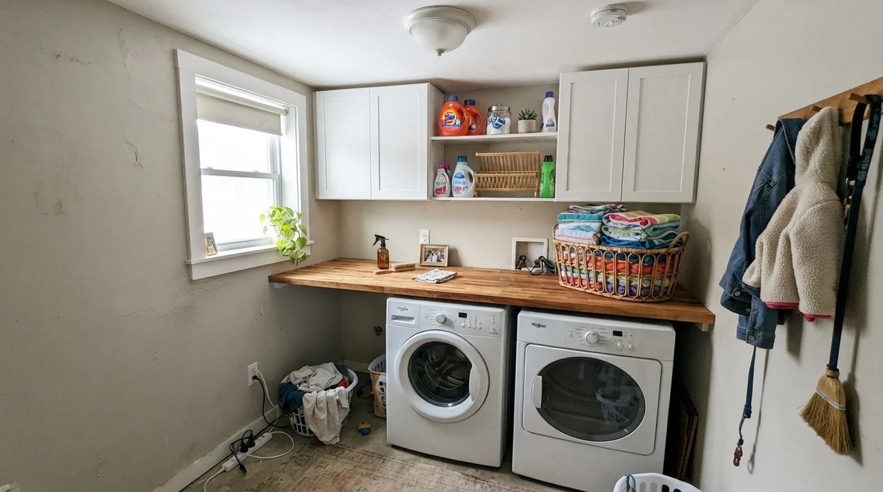
In small spaces that receive ample natural daylight, like a bright laundry room with butcher-block counters or a sunroom surrounded by multi-pane windows and terracotta pots, Edgecomb Gray acts as a soft, garden-ready backdrop. The natural greenery outside contrasts gently against the subtle warmth of the greige walls.
Architectural Accents and Exterior Siding
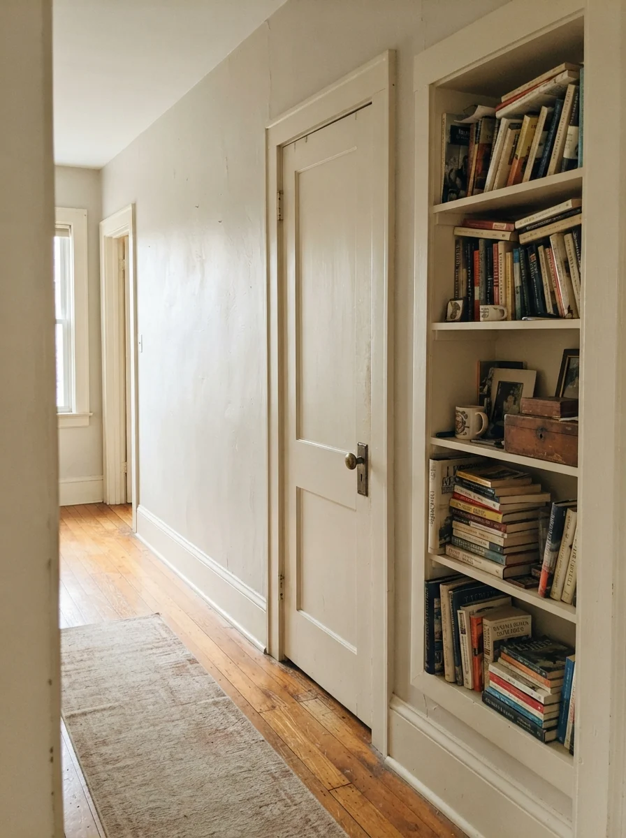
You do not have to limit Edgecomb Gray to four broad drywall sheets. In an older home or a dated hallway, painting an interior two-panel door and an adjacent built-in bookcase in Edgecomb Gray semi-gloss against creamy walls provides an understated architectural elevation. It gives the look of custom woodwork without the heavy commitment of a dark accent color.
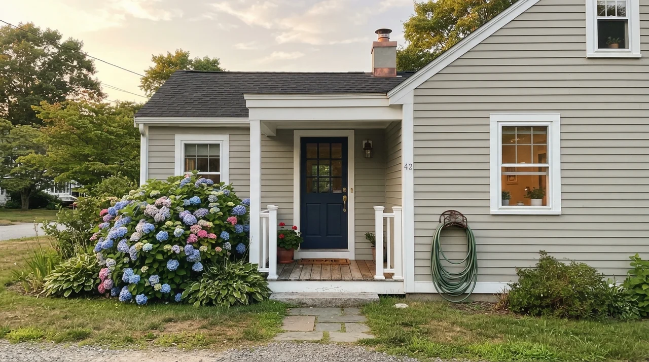
On the exterior of a home, full outdoor sunlight will wash out roughly one step of the color's depth. Siding painted in Edgecomb Gray will read as a warm, classic, light stone-tan rather than gray. Paired with crisp white trim, a dark navy front door (like Benjamin Moore Hale Navy HC-154), and dark accents (such as Kendall Charcoal HC-166 or Wrought Iron 2124-10), it gives a ranch or traditional colonial an enduring, tailored curb appeal.
The Three Traps: Where Edgecomb Gray Fails
The complaints about Edgecomb Gray are remarkably consistent across thirty years of paint forums and neighborhood conversations. Three specific conditions produce almost every bad review, and every single one is completely avoidable if you know what to watch for.
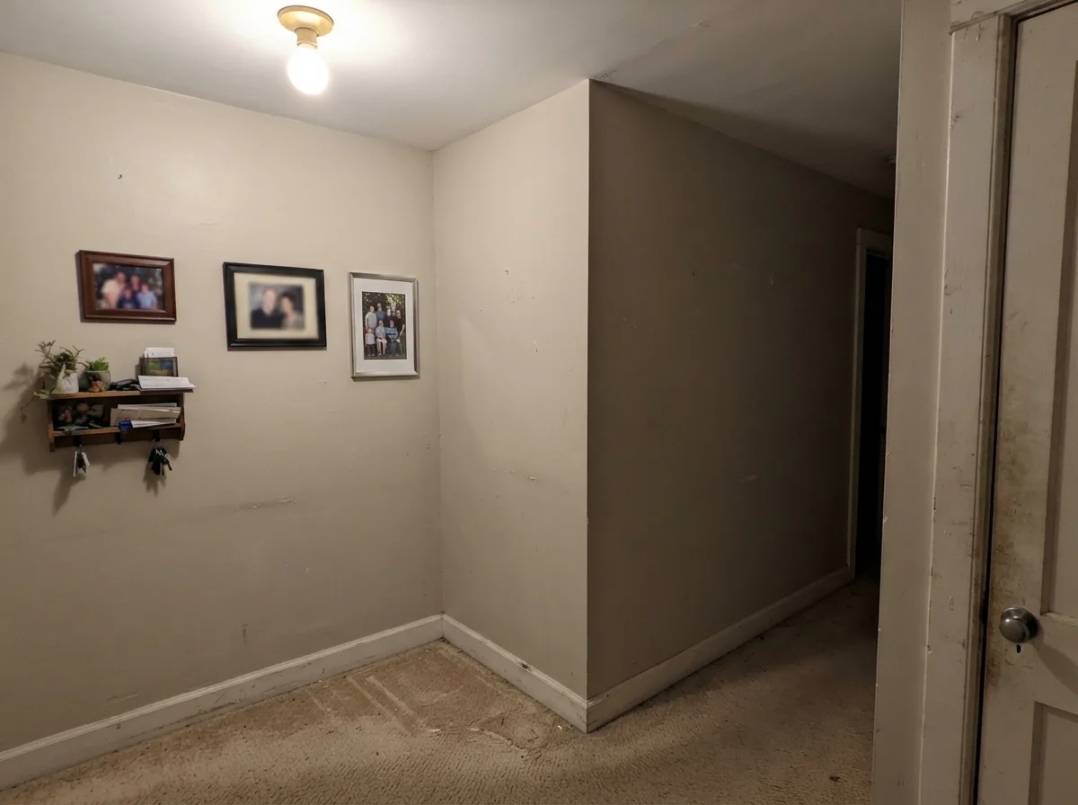
1. A room with only one small window or zero natural light. This is the number one failure point. Edgecomb Gray's LRV of 63 requires natural light to activate its warmth. When trapped in an enclosed, windowless hallway or a dark laundry closet under a single overhead bulb, the beige pigment collapses into a muddy, dingy brown-gray. The wall ends up looking unwashed rather than neutral. Painters are asked so often to fix this that homeowners frequently try having Edgecomb Gray mixed at "50 percent strength" to lighten it up. Don't play that tint-counter guessing game; if your room lacks windows, choose Classic Gray OC-23 (LRV 74) instead.
2. Next to stark, ultra-bright white trim in afternoon sun. If your baseboards and window casings are painted in a high-chroma, stark white like Benjamin Moore Chantilly Lace OC-65, intense southern or western afternoon sun will cause the wall to flash an unappealing yellow-green tone next to the trim. People often describe this effect as looking like an old yellowed tooth. The problem is not the wall paint; it is the extreme contrast of the trim. Pairing Edgecomb Gray with a softer, gently warmed white like White Dove OC-17 harmonizes the undertones instantly.
3. Heavy green bounce from summer foliage. If your main living room has large picture windows looking directly out onto an expansive green lawn or dense leafy trees, strong summer light reflecting off the grass will bounce straight onto your interior walls. Because Edgecomb Gray has a subtle umber-green base in its shadow profile, it will catch that green lawn reflection and amplify it. If your windows are filled with intense green foliage, switch to Benjamin Moore Pale Oak OC-20; its slight taupe-pink backbone neutralizes the green lawn cast instead of absorbing it.
Durability, Scrubbing, and Long-Term Wear: Five Years In
Whenever you choose a light neutral with an LRV around 63, you have to think about how it will look after four or five years of real family life. In our colonial, we used Benjamin Moore Regal Select in an eggshell finish on all the living and hallway walls. Five years in, that finish was scrubbed clean around the garage entryway door at least once a month with a damp microfiber cloth and mild soap. Because Edgecomb Gray has enough pigment depth, minor scuffs from vacuum cleaner bumpers and backpacks don't jump out the way they do against pure white paint.
For sheen selection, stick to the time-tested rule: flat on the ceilings, eggshell on the living and bedroom walls, semi-gloss on the baseboards and trim, and satin enamel on kitchen cabinets and interior doors. Satin gives just enough sheen on cabinetry to resist hand oils around the pulls while maintaining a soft, furniture-quality appearance.
Is Edgecomb Gray warm or cool?
Edgecomb Gray is a distinctly warm greige. It balances gray and beige pigments, but its yellow oxide and umber base ensure that in natural daylight it reads creamy, soft, and inviting rather than chilly.
What is the Sherwin-Williams equivalent of Edgecomb Gray?
Sherwin-Williams Natural Tan (SW 7567, LRV 65) is very close in warm tone. Agreeable Gray (SW 7029, LRV 60) is often suggested as an alternative, though Agreeable Gray is slightly darker and reads cooler.
Why does my Edgecomb Gray look green on the wall?
Edgecomb Gray can flash green for two reasons: reflection from a lush green lawn or trees right outside your window, or contrast against stark, cool white trim (like Chantilly Lace) under intense afternoon sun. Switching trim to White Dove OC-17 calms this down.
What light bulbs look best with Edgecomb Gray?
Aim for LED bulbs between 3000K and 3500K (warm white to soft neutral). Bulbs at 2700K will pull the color heavily toward yellow-beige, while 4000K daylight bulbs will make it look flat and stony. Swapping light bulbs is always cheaper than repainting.
Susan's Verdict · The Main-Floor Workhorse
Edgecomb Gray remains one of the smartest investments you can make for an open-concept main floor, provided you have real daylight coming through the windows. It forgives 1990s honey oak, flatters warm stone, cleans up beautifully in an eggshell finish, and stays stylish year after year without chasing fads. Keep it out of dark, single-window hallways and pair it with White Dove trim, and you will never regret buying the five-gallon bucket.