Color Diary · No. 64
Gray Owl in Real Light: The Day I Realized the Room Chooses the Color
America's default light gray, reviewed honestly: where it stays calm, the rooms where it turns green or blue, and what to paint instead.

Susan HartleyOctober 6, 2026 · 16 min read
Gray Owl · Benjamin Moore 2137-60
Hex#D3D4CCLRV65Undertonesgreen → gray → blue
In our last house—a 1990s colonial with oversized windows facing every which way—I thought I had outsmarted gray paint entirely. It was late spring, and like half the country at the time, I was tired of heavy beige but terrified of waking up inside an icebox. A friend down the street swore by Benjamin Moore Gray Owl 2137-60. On her sample card, it looked like the holy grail: soft, airy, and entirely unbothered by trends. I bought three gallons for our family bathroom and main hallway without putting a single tester pot on the drywall.
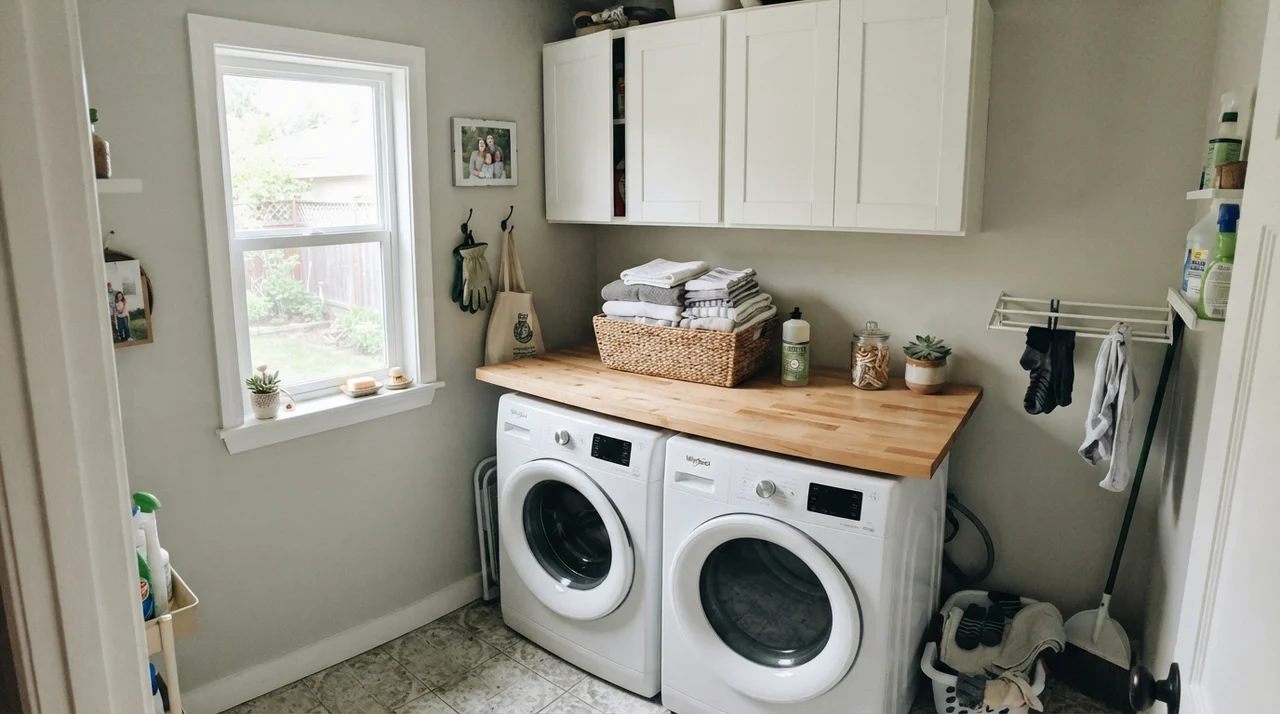
By noon on a sunny Saturday, the bathroom looked like a tranquil, misty spa. By four o'clock, the hallway looked distinctly like pale celery. And by November, when the gray Midwestern rain set in, the upstairs landing looked as cold and blue as skim milk. That was my first real lesson in what low-pigment neutrals actually do once you move your life in. Gray Owl doesn't dictate terms to a room; the room dictates terms to Gray Owl.
We lived with it in that colonial for seven years, through muddy boots, steamy showers, and two rounds of bulb changes, before bringing it into select spaces in our 1960s ranch. Over thirty years and three houses, I have learned that a color with an LRV of 65 is both a blessing and a wild card. It is light enough to rescue windowless corridors, but because there is so little pigment anchoring the formula, whatever light hits that wall is exactly the color you are going to get.
The Shifting Undertones of Gray Owl
Gray Owl sits in that narrow band where gray, green, and blue overlap. Because it carries so little tint, it has no heavy mass of pigment to resist surrounding reflections. In balanced east-to-west daylight, it presents as a calm, silvery neutral. But put it under high-noon southern sun and its yellow-green undertone wakes up, drifting into soft sage. Strip away the sun with a north-facing window or a rainy afternoon, and the wall surrenders completely to cool blue.
warm sun
overcast, north light
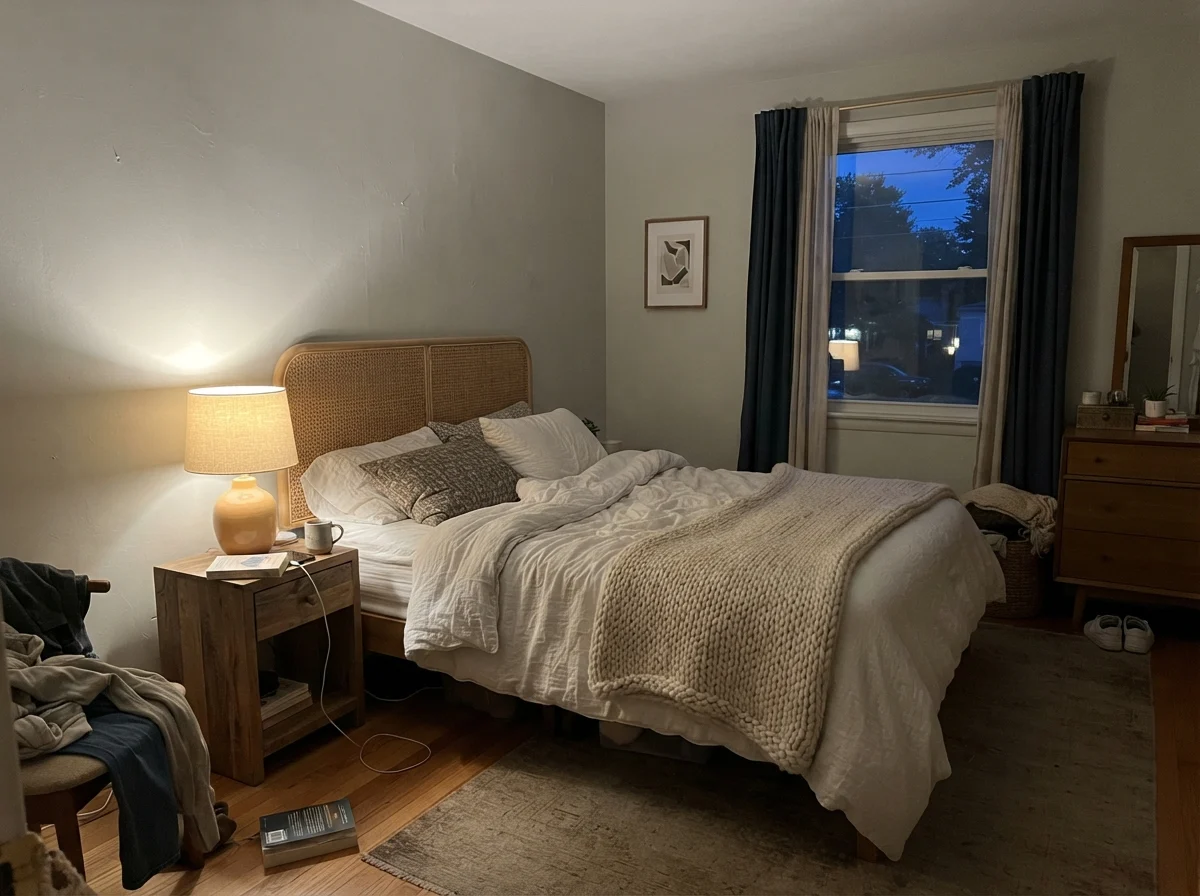
dusk, rain, cool bulbs
green → gray → blue
MoonshineBenjamin Moore · see diary
AmmoniteFarrow & Ball · see diary
Gray Owl2137-60
Crushed IceSherwin-Williams · see diary
Sea SaltSherwin-Williams · see diary
How Daylight Rewrites the Formula
The biggest mistake I see neighbors make with Gray Owl is painting a single swatch on poster board, looking at it at 2:00 PM, and buying five gallons. You cannot evaluate a paint with an LRV of 65 at one hour of the day. LRV stands for Light Reflectance Value—scale of 0 to 100—and at 65, this paint bounces nearly two-thirds of the light back into your room. When the incoming light is warm and golden, that warmth bounces right back. When the light is cold and shadowy, the wall gives back nothing but chill.
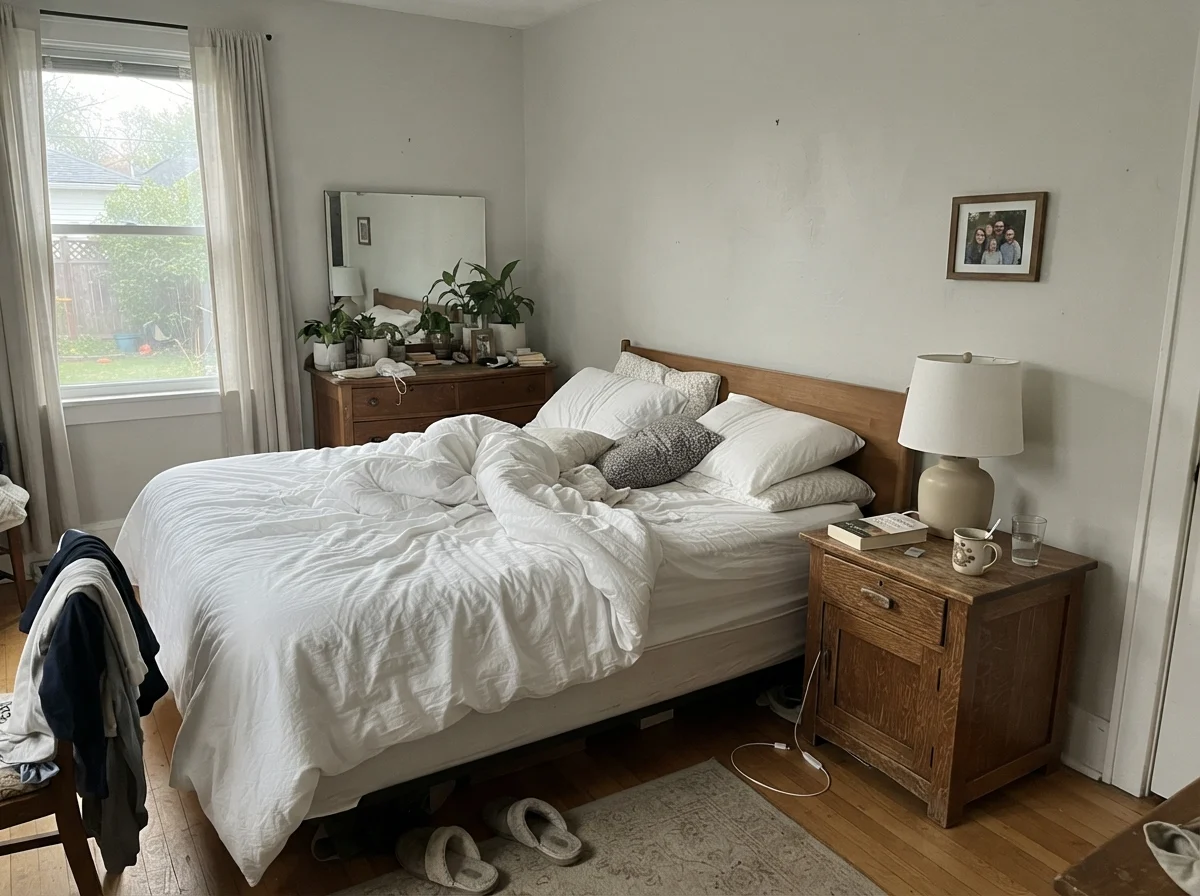
East- and west-facing rooms are where Gray Owl truly earns its keep. In the morning, an east-facing space receives gentle morning sun that warms the greige backbone without pulling the green too hard. By afternoon, when the direct rays move elsewhere, the paint settles into a restful, quiet neutral that feels composed and peaceful. In our bedrooms, that shift felt natural and pleasant, moving effortlessly from dawn to dusk.
South-facing rooms, however, will expose the green hiding inside the can. If you have floor-to-ceiling southern exposure, expect Gray Owl to read as a delicate, muted sage. If you love gentle earth tones, it is lovely; if you paid a painter expecting gunmetal or slate, you will be disappointed. North light does the exact opposite: it strips every trace of yellow out, leaving a faint baby-blue tint that can feel clinical if you don't warm it up with lamps.
Bedrooms, Nurseries, and Restful Corners
In a bedroom, you want walls that recede. You do not want a paint color that demands attention when you are trying to wind down with a book. Gray Owl performs beautifully in bedrooms precisely because it lacks heavy saturation. It acts like a soft linen backdrop, allowing bedding, wood nightstands, and ceramic lamps to anchor the space.
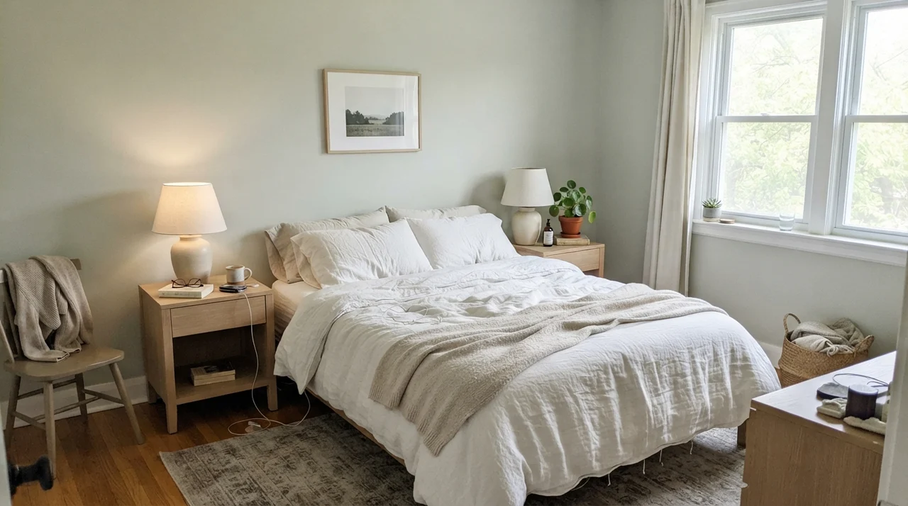
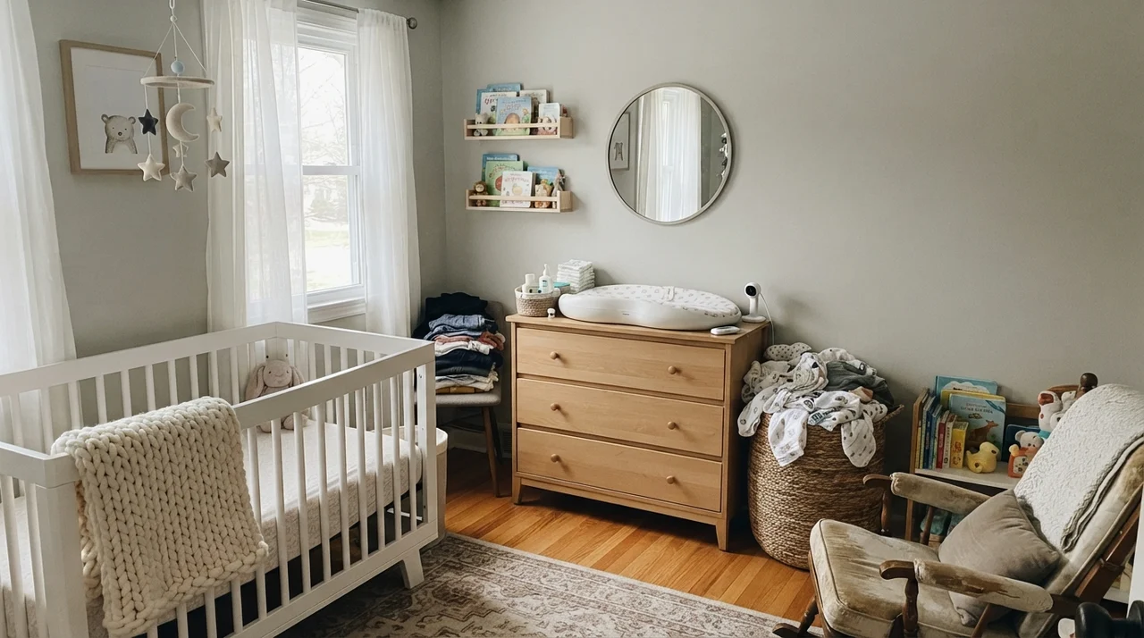
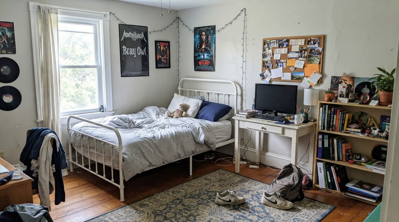
In our guest bedroom, I paired Gray Owl with warm pale oak furniture and soft white linens. Five years in, it remained one of the easiest rooms in the house to refresh because any accent blanket or rug worked seamlessly against it. For nurseries and kids' rooms, it offers another distinct advantage: it grows up gracefully. It doesn't scream 'baby room' when you have a crib and a basket of muslin swaddles, yet when the room transitions to a teenager's desk, corkboards, and sneakers on the rug, you don't need to repaint.
The only caveat in a bedroom is your lighting choices. If your bedroom faces north and you install 5000K daylight LED bulbs, you will feel like you are sleeping in a walk-in freezer. Stick to 2700K incandescent-warm bulbs in your bedside lamps. Under that soft 2700K glow, Gray Owl relaxes into a creamier, cozier version of itself that feels welcoming at night.
Bathrooms and the Great Tile Trap
Bathrooms are where Gray Owl either looks like a million dollars or completely falls apart. Because bathrooms are packed with fixed surfaces—porcelain, glazed ceramics, marble, and polished quartz—the wall paint has to negotiate with a lot of competing undertones in a tight footprint.
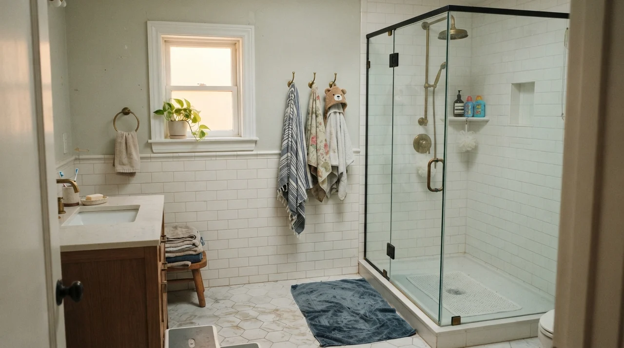
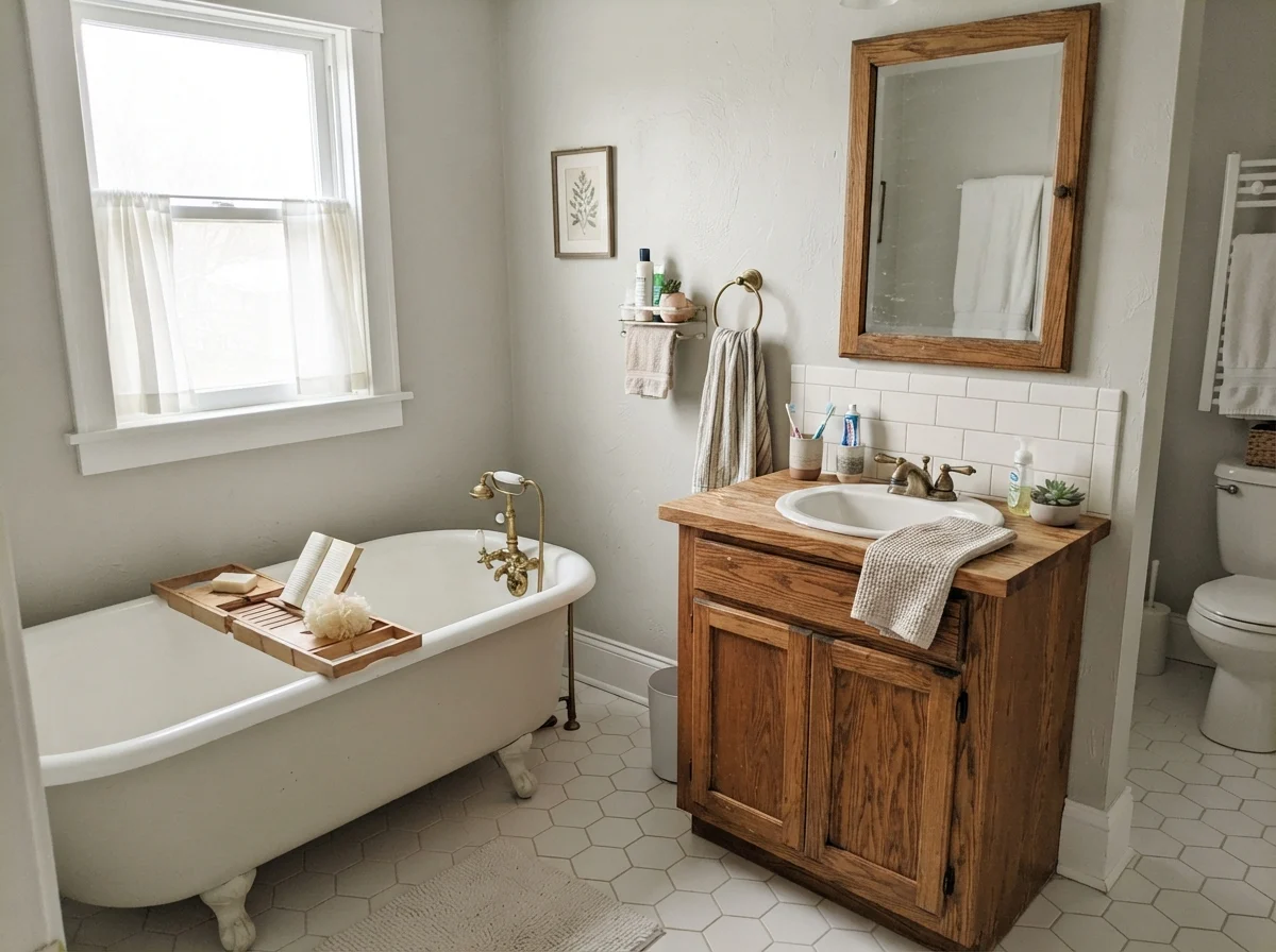
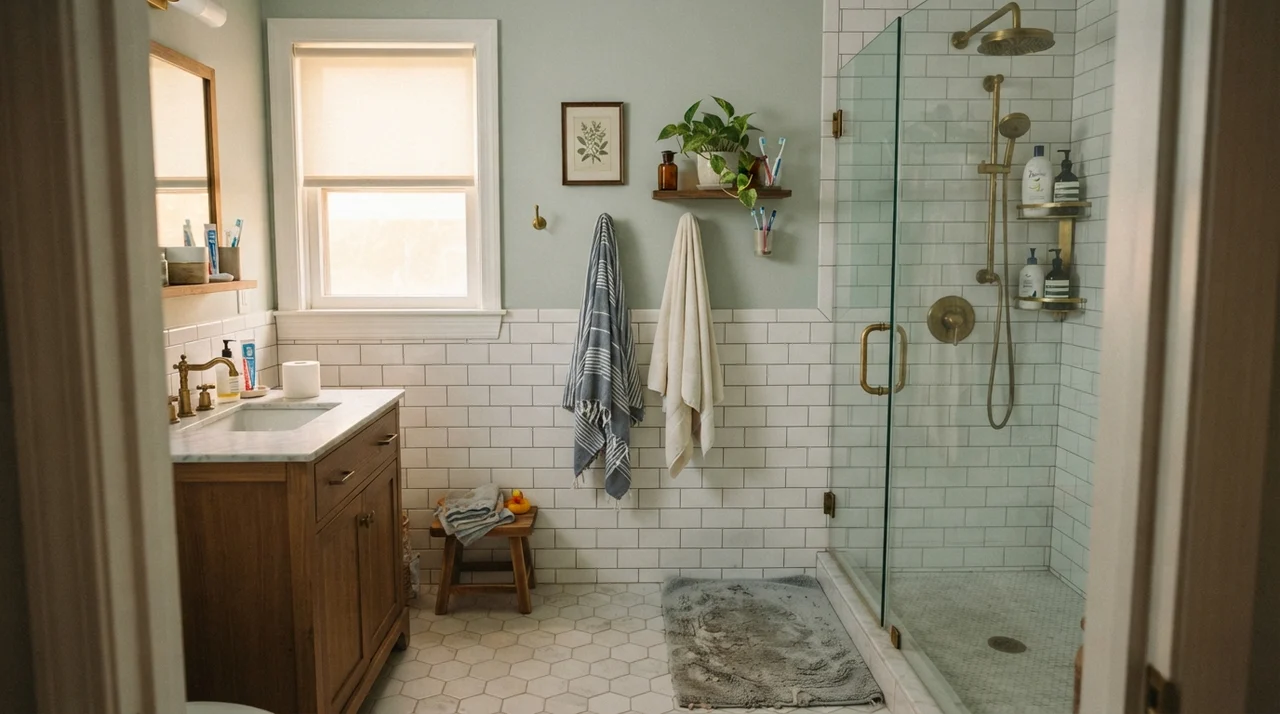
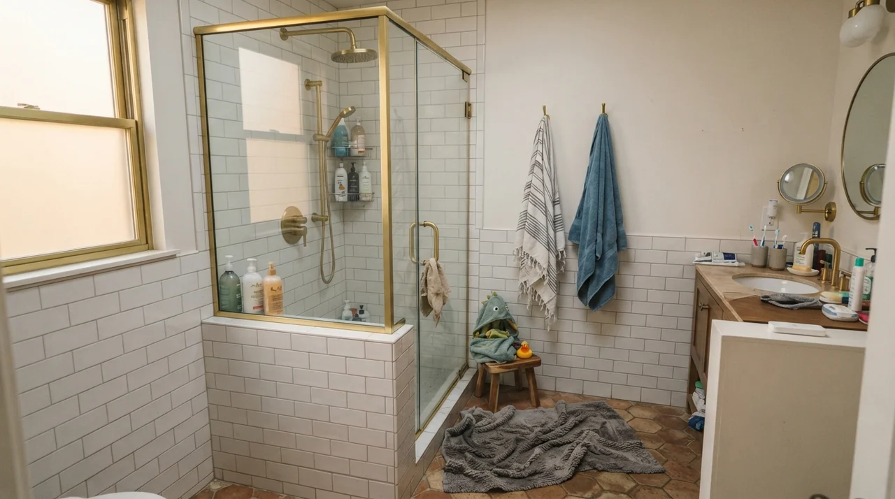
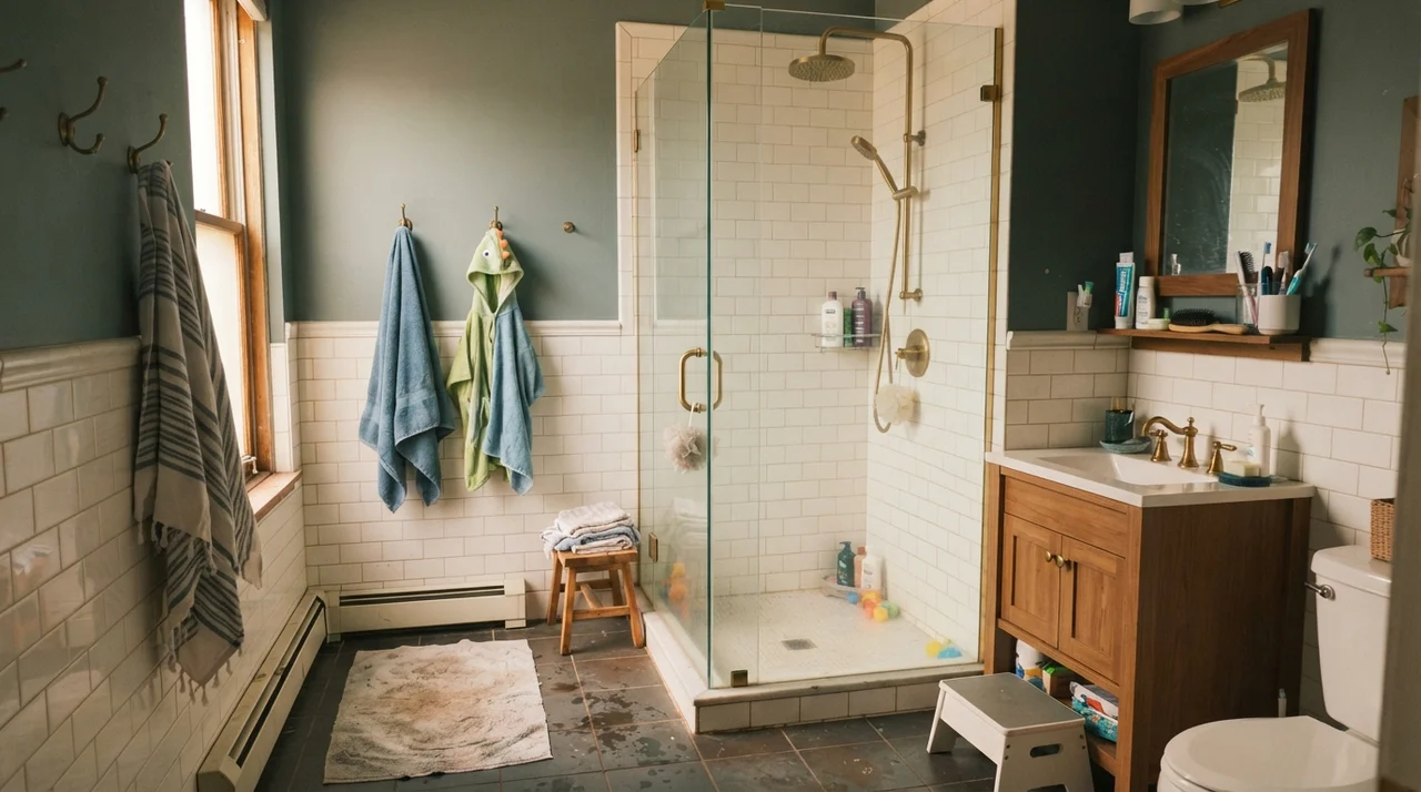
If you have classic white subway tile, a white clawfoot tub, hex floor tile, and a warm wood vanity, Gray Owl is magic. The crispness of the white ceramic gives the subtle gray enough contrast to actually read as a color, while the wood vanity keeps the atmosphere grounded and warm. We had this exact combination in our previous home, and visitors asked for the color formula constantly.
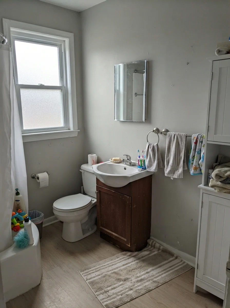
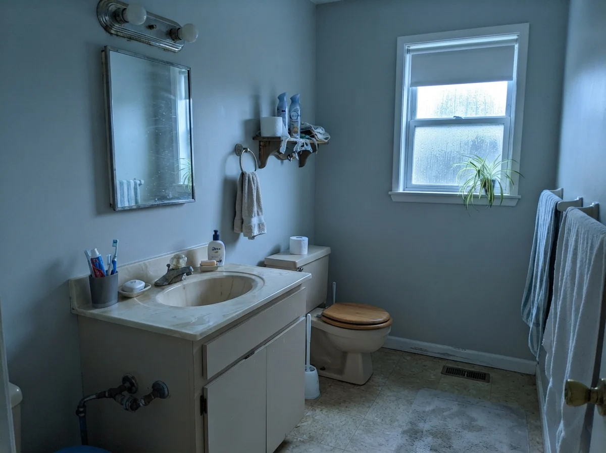
Here is the trap: if your bathroom tile has a slight green-gray or slate cast, Gray Owl will latch onto that undertone and amplify it. If you have an older beige vanity or cool blue tiles, the walls can look muddy and lost. In flat, overcast daylight through frosted privacy glass, Gray Owl will pull quiet and neutral; on a dark, rainy morning in a windowless powder room, it can look washed out. Always hold your tile samples directly against a painted swatch before committing.
Kitchens, Cabinets, and Countertop Realities
Painting kitchen cabinets is a massive undertaking. It is tedious, messy, and expensive whether you hire a professional or spend three weekends taking off door hinges yourself. If you are considering Gray Owl for cabinetry, you need to understand its relationship with your countertops.
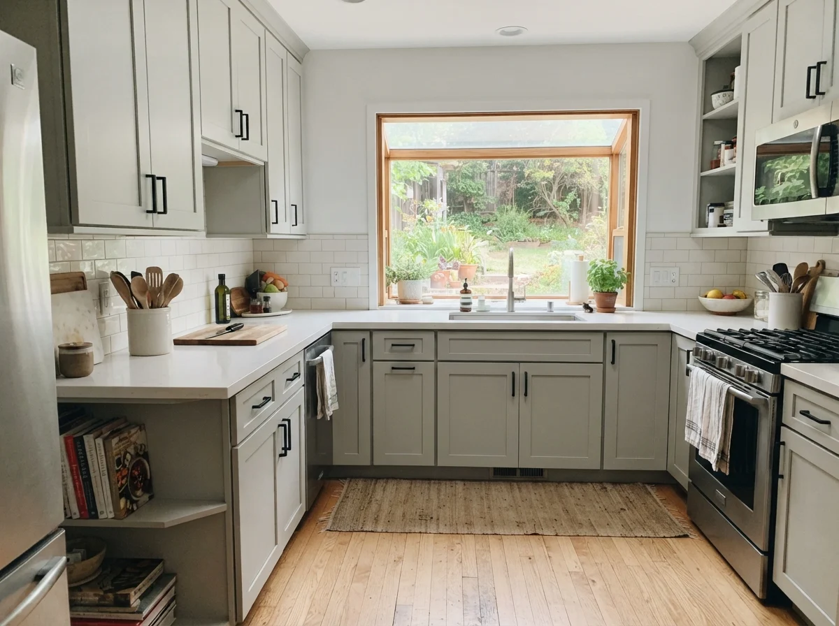
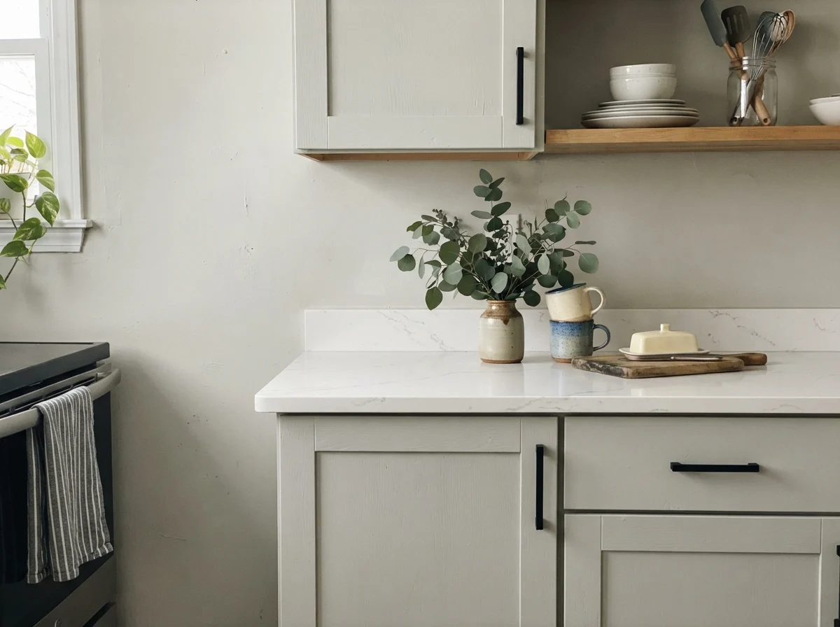
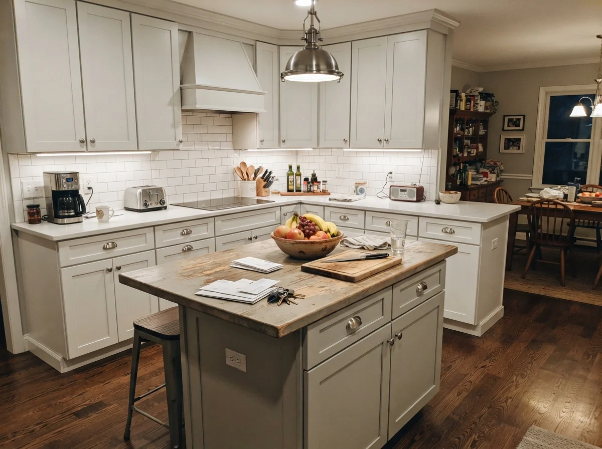
On shaker cabinet fronts, Gray Owl in a durable satin finish provides a relaxed, soft gray that hides knuckle smudges far better than stark white. When paired with plain white walls, white subway tile backsplash, and light oak floors, the result is bright, airy, and very clean. It softens the kitchen without feeling heavy.
However, contrast is where many homeowners stumble. If you have bright white quartz countertops and paint both upper and lower cabinets in Gray Owl, the lowers can look slightly washed out rather than grounded. The biggest hazard is stone with distinct green veining. Because Gray Owl already has that slight yellow-green tendency in warm light, pairing it with green-toned stone will pull the green straight out of the woodwork. If you want an island that stands out as an architectural feature, Gray Owl works best against warm cream perimeter walls where its subtle coolness creates gentle depth.
Living Rooms, Sunrooms, and Passageways
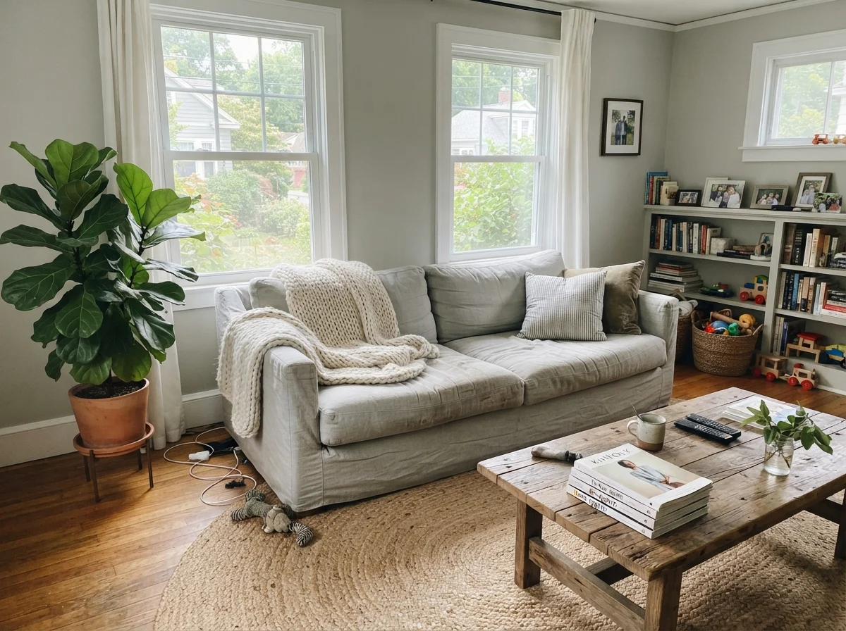
Where Gray Owl truly shines—and where it earned its reputation as a whole-house staple—is in open-concept living spaces and hallways. In a living room flooded with generous midday sun, Gray Owl acts as a tranquil, neutral canvas. It flatters linen sofas, jute rugs, and warm walnut coffee tables without fighting your art or colorful accessories.
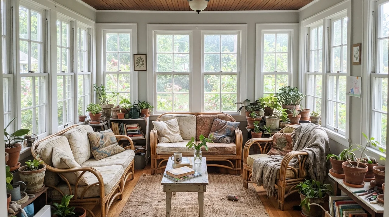
In a sunroom surrounded by white-framed windows, rattan furniture, and potted plants, Gray Owl feels organic and alive. The natural greenery outside reinforces the soft warmth of the paint, making the room feel connected to the garden. It avoids the harsh glare that pure white paint can cause in a glass-heavy room.
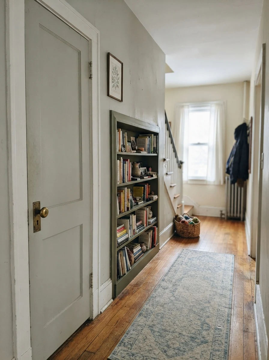
Windowless hallways and stairwells are another major success story. An LRV of 65 reflects enough ambient light from adjoining doorways to keep tight hallways from feeling like dim tunnels. Because the color is so quiet, it creates seamless transitions between rooms. In our 1970s split-level, painting the central stairwell and hallway in Gray Owl connected three disjointed rooms instantly, without creating harsh paint lines at the doorframes.
Living with It Long-Term: My Personal Take
When you live with a color across multiple years, you stop looking at swatches and start noticing how the paint interacts with your daily routine. In our master bedroom, Gray Owl has been on the walls through early morning rush hours, sick days, and quiet Sunday afternoons. It is one of those rare colors that never irritates you when you have a headache, and never feels oppressive in the dead of winter.
The secret is simply accepting that it is a shape-shifter. If you need a color that stays perfectly consistent under every lamp and sky condition, Gray Owl will drive you crazy. But if you appreciate a neutral that gently adapts to the season—looking crisp in July and warmer when the amber table lamps click on in December—it is a dependable companion.
Where Gray Owl Fails: The Honest Truth
The complaints about Gray Owl online are remarkably consistent, and none of them stem from bad paint chemistry. They come from homeowners asking a low-pigment neutral to solve an impossible lighting situation. There are three specific scenarios where Gray Owl simply will not work:
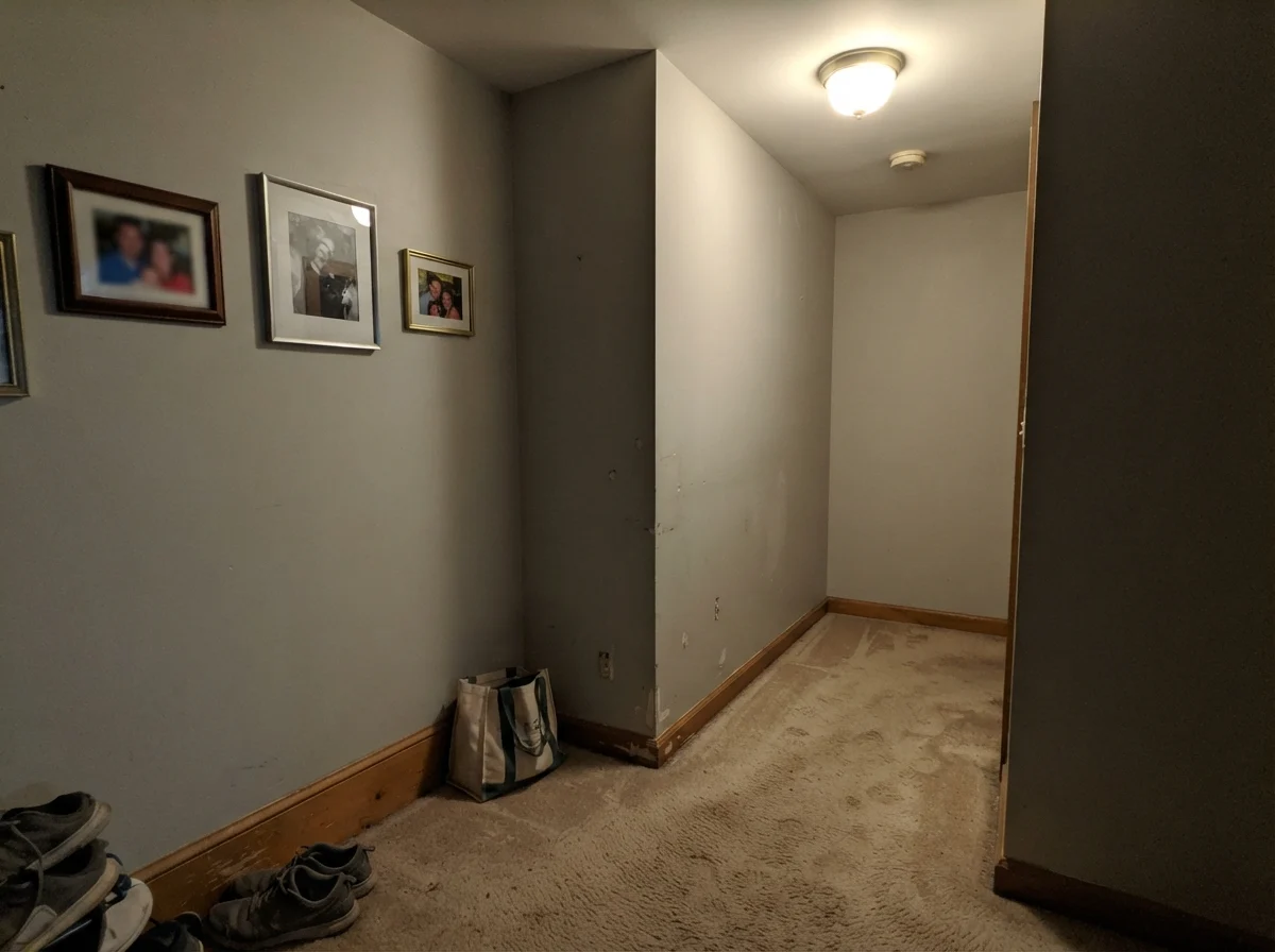
First, windowless or deep interior hallways with poor artificial lighting. In a dark corner under a single builder-grade bulb, Gray Owl loses its luminous quality and can read as flat, muddy, and dingy—almost like dirty putty against beige carpet. If there is no daylight to activate it, it falls flat.
Second, north-facing rooms with cool light. North light completely drains the warmth, leaving behind a chilly, watery blue-gray that can feel uninviting. Third, small rooms paired with ultra-bright white trim. Because Gray Owl is so light (LRV 65), placing it right next to a glaring white can trick your eye into thinking the walls are just dusty off-white rather than a deliberate, elegant gray.
Exterior Applications
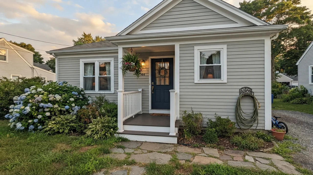
Can you use Gray Owl on a home exterior? Yes, but you must keep the outdoor sun in mind. Direct exterior sunlight washes out paint colors by roughly two shades. On horizontal lap siding, Gray Owl will read as a very light, soft off-white with just enough gray warmth to avoid glaring in the sun.
To make it work on an exterior, you need strong contrasting anchors. Pair it with crisp white trim around the eaves and windows, and ground the facade with a bold front door in a deep shade like Essex Green HC-188 or Wrought Iron 2124-10. Do not expect your house to look distinctly charcoal or slate from the curb; it will look bright, fresh, and classic.
Durability, Sheens, and Touch-Ups
Over thirty years of repainting rooms, I have developed strict rules for sheens. For Gray Owl walls, stick to eggshell. Flat paint scuffs if you look at it wrong, and trying to wipe a scuff off a flat wall usually leaves a burnished shiny spot. A quality eggshell finish allows you to scrub clean muddy paw prints, crayon marks, and backpack scuffs by the back door without ruining the finish.
For trim and baseboards, semi-gloss is non-negotiable for durability. On kitchen cabinets, satin is the sweet spot: it provides enough wipeability for grease splatters while keeping a soft, furniture-like appearance. For ceilings, always choose flat white—never put an LRV 65 color in a sheen on an imperfect ceiling drywall seam.
When it comes to touch-ups, Gray Owl is relatively forgiving. Because it has minimal saturation, two coats easily cover most existing light builder beiges and whites, making it very cost-effective to live with. However, if you have to touch up a scuff three years down the road, always feather the paint out from the center with a lightly damp roller edge; otherwise, the fresh pigment will sit slightly proud of the faded wall.
Why does my Gray Owl look green on the wall?
Gray Owl carries a delicate yellow-green undertone. When exposed to warm southern afternoon light, or when placed near green lawns, trees, or green-toned flooring, that undertone comes to the forefront, reading as a muted sage.
What is the best light bulb color temperature for Gray Owl?
Warm white bulbs between 2700K and 3000K are ideal. They enhance the paint's subtle warmth in the evenings. Avoid 4000K to 5000K daylight bulbs unless you want the room to look crisp and cool.
Is Gray Owl light enough for a whole-house color?
Yes. At LRV 65, it reflects 65% of light, making it bright enough to flow through dark hallways, foyers, and open living spaces without feeling heavy or closed in.
Which trim color works best with Gray Owl?
Benjamin Moore White Dove OC-17 is the most forgiving match because its soft creaminess cushions Gray Owl's cool edge. For a sharper, modern contrast, Benjamin Moore Chantilly Lace 2121-70 is an excellent choice.
Susan's Verdict · Worth the Money with Proper Lighting
Gray Owl 2137-60 is one of the most versatile whole-house paints on the market, but only if you respect its low-pigment nature. In balanced daylight alongside warm oak, brass, and crisp white trim, it delivers an effortless, airy calm that holds up year after year. If you have dim north light or green tile, skip it for a warmer greige. Otherwise, buy the sample pot, test two opposite walls, and enjoy one of the cleanest light grays available.