Color Diary · No. 18
The Real Test of Benjamin Moore Hale Navy Across Thirty Years
America's default navy, reviewed honestly: the rooms where it turns black, the reason it can flash gray instead of blue, and what to pick instead.

Susan HartleySeptember 6, 2026 · 13 min read
Hale Navy · Benjamin Moore HC-154
Hex#434B56LRV8Undertonescharcoal gray → slate navy → blackened indigo
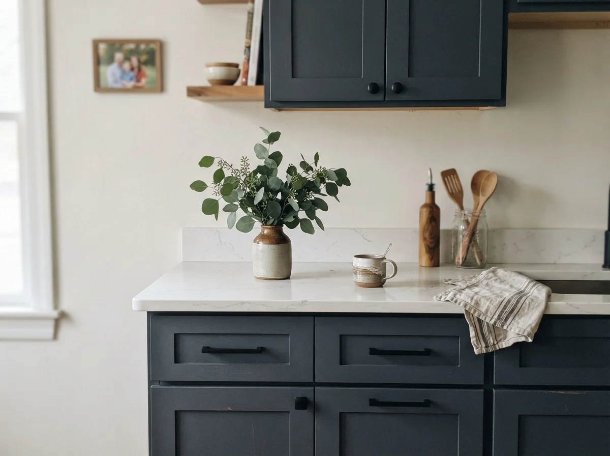
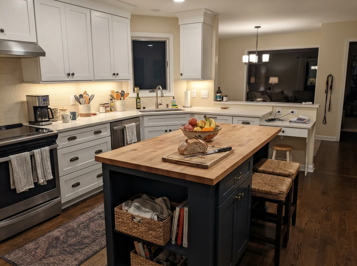
In our last house—a center-hall colonial we bought back in 1996—I spent an entire weekend rolling Benjamin Moore Hale Navy HC-154 onto the lower kitchen cabinets. The upper cabinets stayed a warm, creamy off-white, and my husband told me I was out of my mind for putting such a dark color where spilled milk and muddy dog paws landed every afternoon. I lived with it for twelve years in that house, and when we sold, the buyers specifically wrote into their offer letter how much they loved that kitchen island. Five years in, those lowers had been scrubbed clean more times than I care to count, and they held up with a kind of dignified calm that cheap paints never manage.
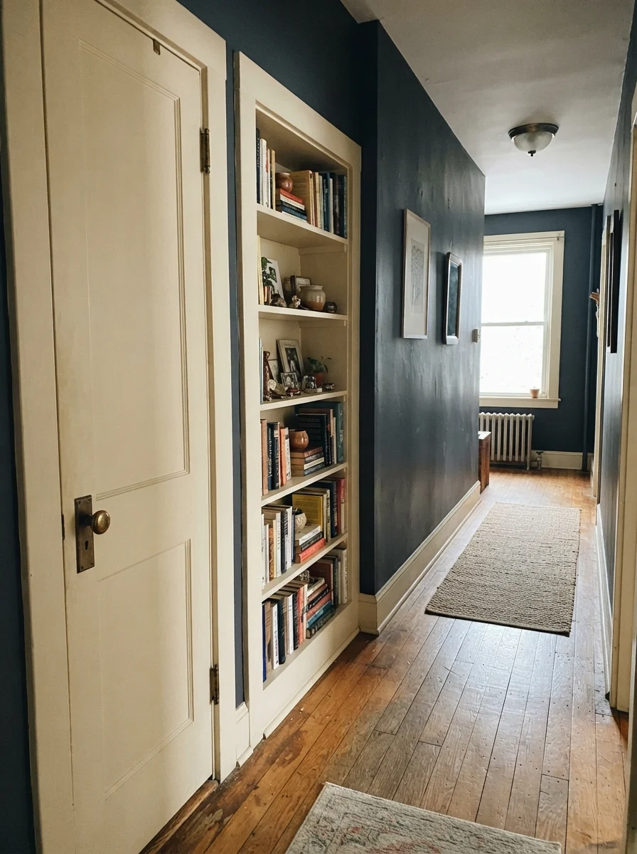
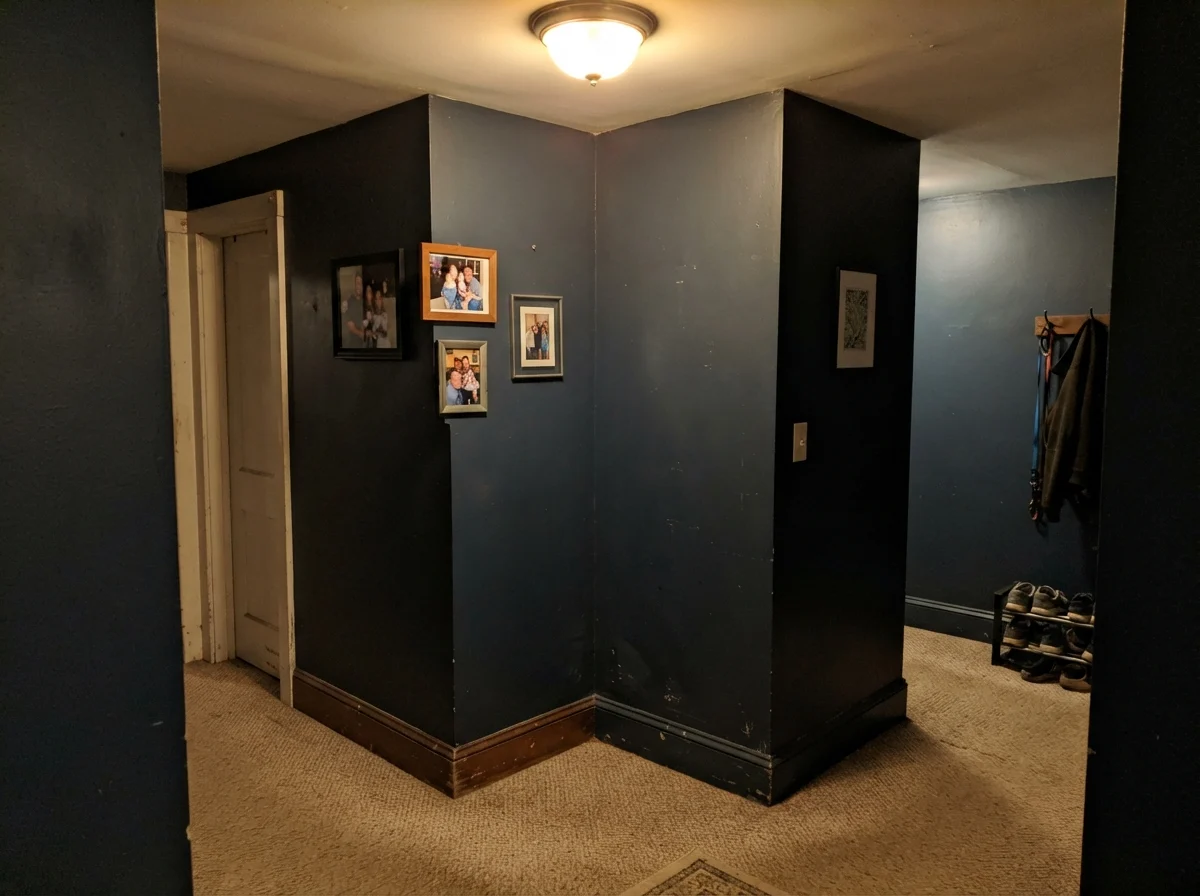
That is the paradox of Hale Navy. It is probably the most recommended dark blue in North America, and for good reason: it acts like an anchor without screaming for attention. But at a Light Reflectance Value (LRV) of 8, it is genuinely dark. People fall in love with it under the high-output halogen spotlights of a design showroom, paint a dim north-facing hallway, and then wonder why their walls look like wet slate by three in the afternoon. Dark paint hides nothing about the room it lives in, and it certainly will not forgive a lack of natural daylight.
The Undertone Balance: Why It Doesn't Scream Primary Blue
The reason Hale Navy became an enduring staple rather than a passing trend comes down to its gray backbone. With roughly sixteen percent saturation, it carries a heavy dose of charcoal and black pigment. That gray keeps the blue grounded, preventing it from ever looking like a nautical cartoon or an electric primary blue. Under strong warm light, the blue steps forward; under overcast skies or dim bulbs, the gray takes over.
warm sun
overcast, north light
dusk, rain, cool bulbs
charcoal gray → slate navy → blackened indigo
Blue NoteBenjamin Moore · see diary
Starless NightBehr · see diary
Hale NavyHC-154
Sea SerpentSherwin-Williams · see diary
Hague BlueFarrow & Ball · see diary
How Daylight and Artificial Bulbs Shift the Color
When you put an LRV 8 paint on a wall, daylight becomes your primary design tool. Hale Navy needs light to bounce off its surface to reveal the navy pigment hiding beneath the charcoal base. In southern or western exposures, warm afternoon sun hits the wall and wakes up the blue tones, giving you that rich, tailored maritime depth that looks tailored and expensive. But in northern exposures, cool gray light strips the blue right out of the formula, pulling it toward a flat, heavy slate.
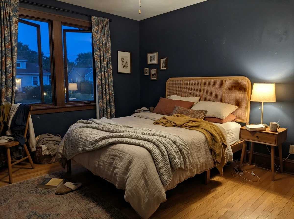
Artificial lighting is where most homeowners unknowingly sabotage this color. If you screw standard 2700K soft-white incandescent bulbs into your fixtures, the amber glow combines with the dark base to turn the walls into near-black shadows. If you want the blue to remain legible when the sun goes down, you have to move to 3000K or 3500K LED bulbs. That clean, neutral illumination keeps the pigment crisp instead of letting it slip into murky darkness.
Kitchens and Built-ins: The Color's Natural Habitat
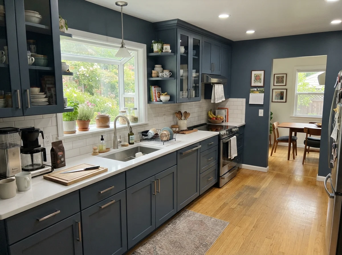
If there is one place Hale Navy consistently proves it was worth the money, it is on cabinetry and woodwork. In our 1960s ranch today, I used it on the lower kitchen cabinets paired with White Dove OC-17 uppers and Edgecomb Gray HC-173 on the surrounding walls. That combination works because the contrast is crisp without being jarring. Pure blacks can look stark and clinical against white quartz counters, but Hale Navy's gray undertone acts like a softened neutral, bridging the gap between pale stone and warm wood flooring.
A satin sheen is mandatory here. Dark paint in a high-gloss finish will show every stray fingerprint, errant drip, and rough brush stroke. Satin provides just enough durability to be wiped clean with a warm rag after dinner while remaining matte enough to disguise the minor dings of daily life. If you are painting cabinets yourself, do not try to rush it with a coarse roller; dark pigments show application ridges immediately. Spray them if you can, or use a high-density foam roller and lay off the paint smoothly.
Bathrooms: Powder Rooms vs. Family Spaces
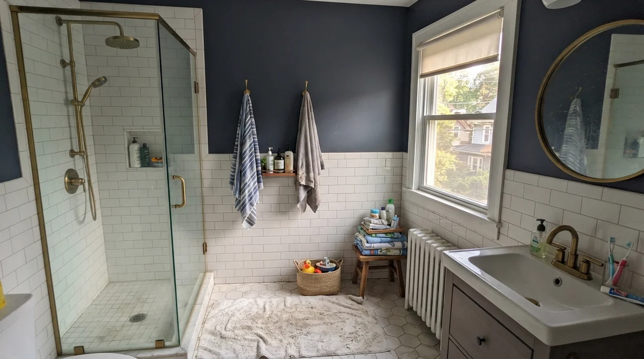
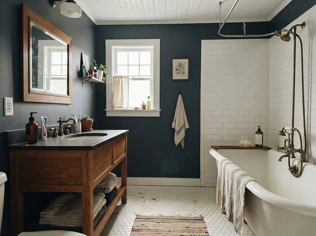
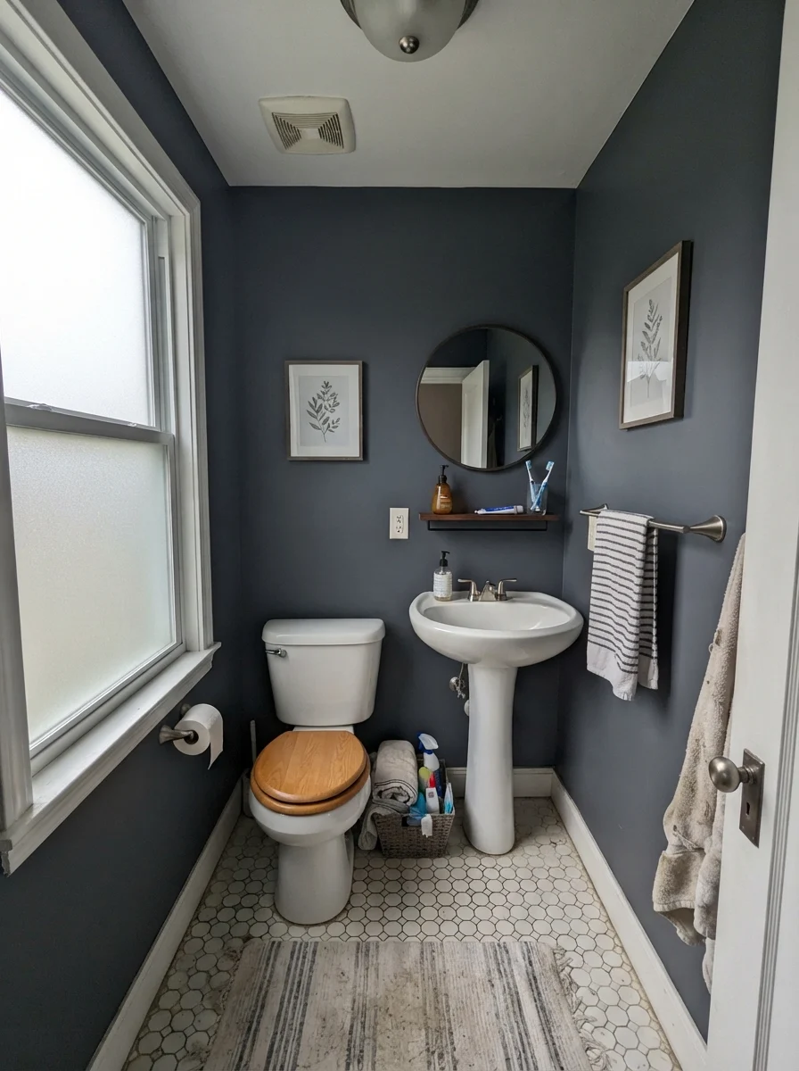
In bathrooms, you have to be extremely intentional about the purpose of the space. In a small, windowless powder room, leaning into the darkness is often a brilliant move. Because there is no natural daylight to fight, painting the walls Hale Navy, hanging a large mirror with a brass frame, and installing warm sconces creates an intimate, jewel-box feel where the deep tone looks deliberate.
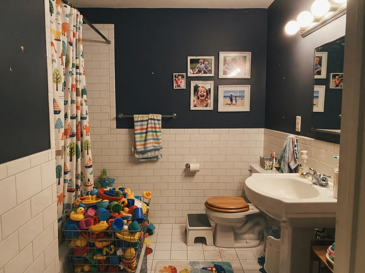
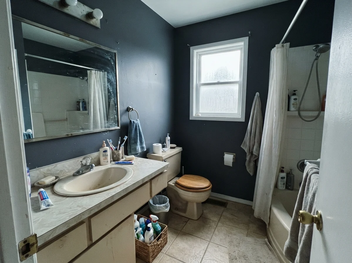
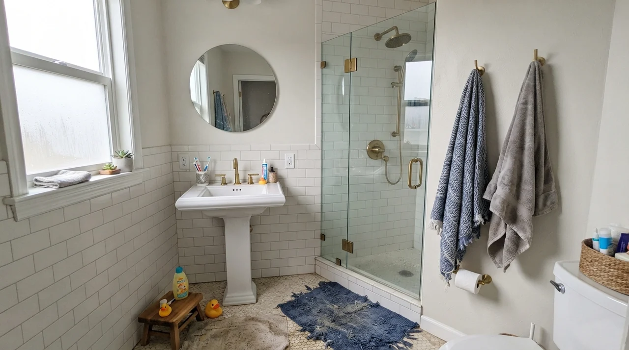
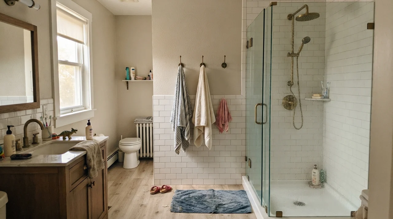
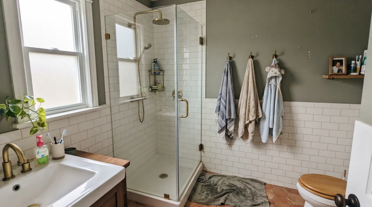
However, putting this color across four walls in a busy family bathroom is a mistake I have seen friends make more than once. When you are trying to shave, put on makeup, or wash toddlers before bed, an LRV 8 paint swallows the illumination, making the room feel dim, cramped, and frustratingly cavernous. If you love the navy look in a family bath, keep it above a bright white wainscot or use it strictly on the vanity base.
Living Spaces, Sunrooms, and Bedrooms
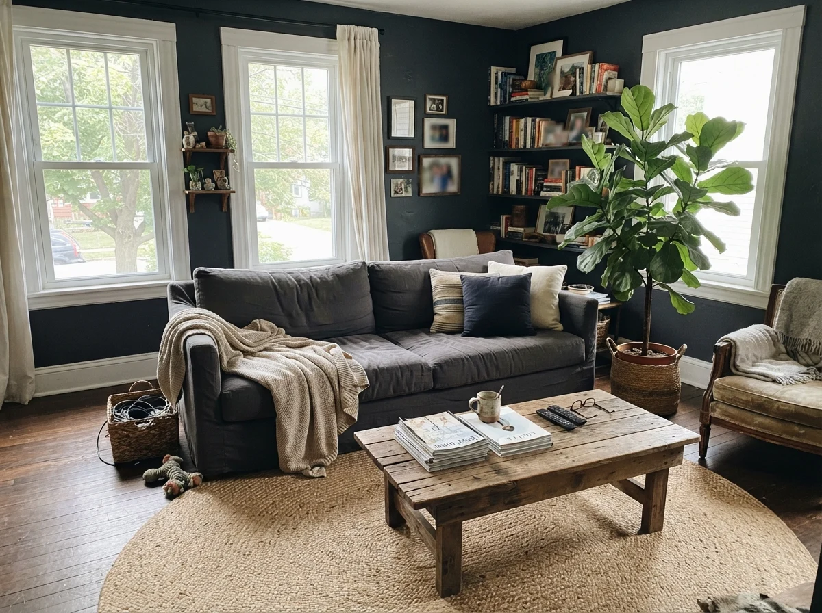
In living rooms and family spaces, wrap-around Hale Navy on all four walls can feel heavy unless you have exceptional ceiling height and massive south-facing windows. In most suburban homes, it performs far better as a grounding accent: coating a wall of built-in bookshelves, backing a fireplace, or finishing an interior passage door. In our 1970s split-level, we painted the basement den in a deep navy; it looked wonderful during evening movie nights with lamps on, but during the day it felt like a subterranean cave.
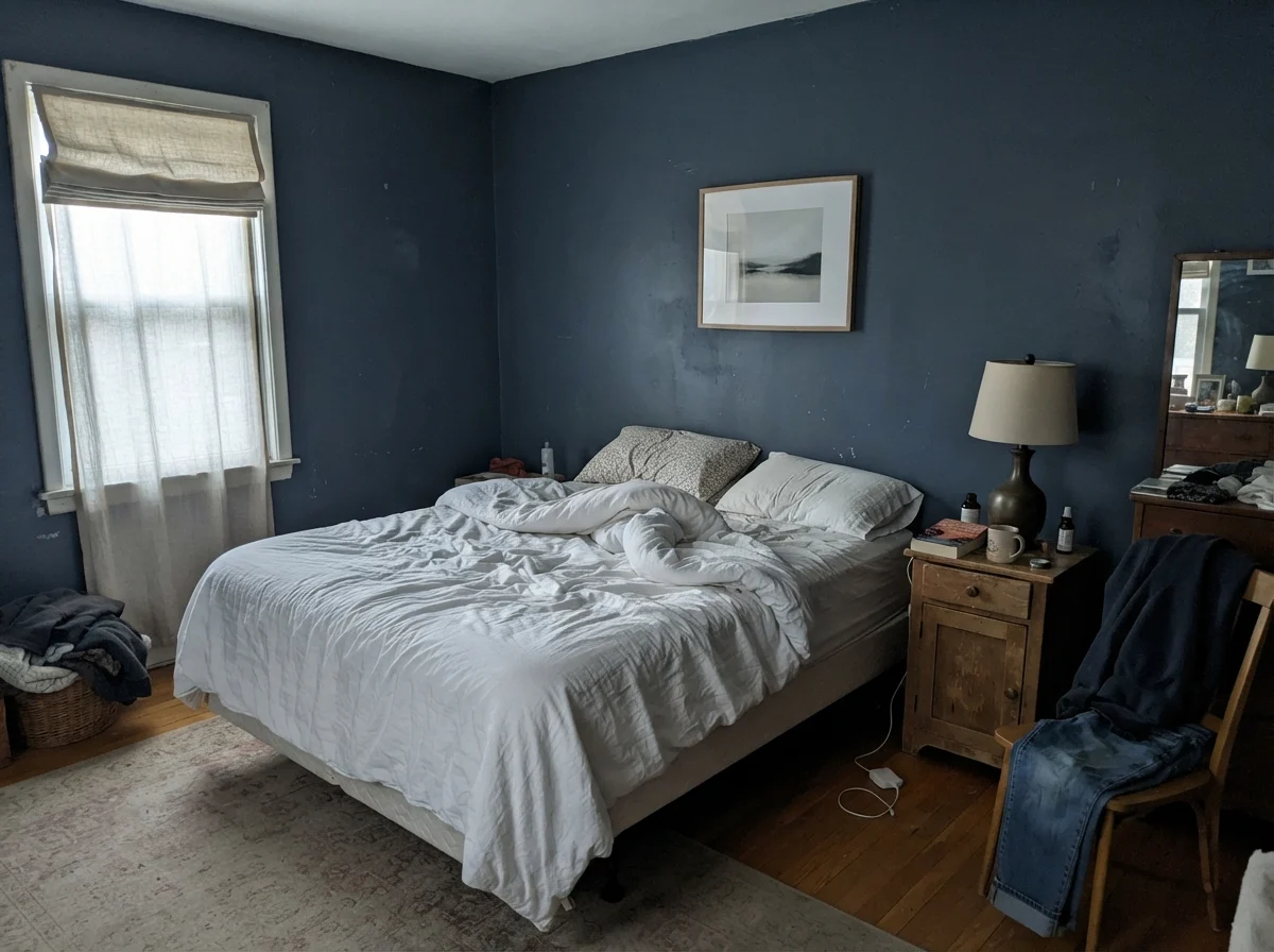
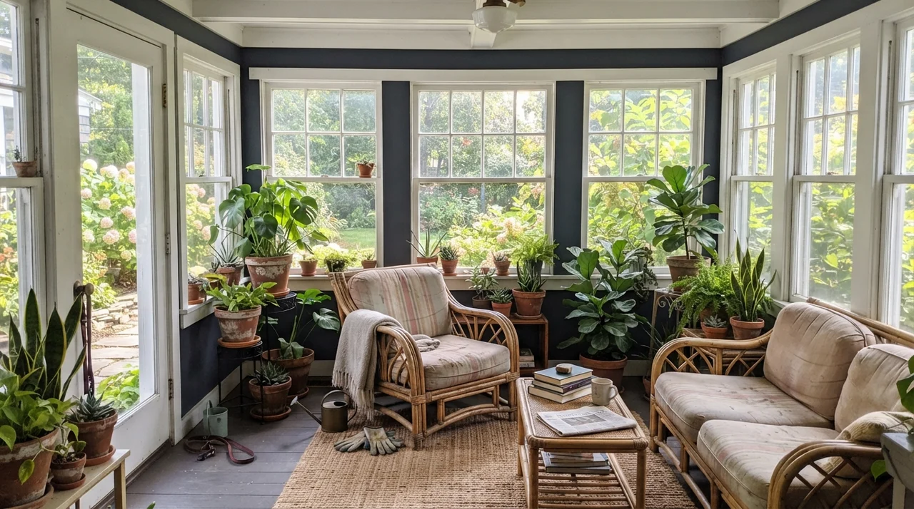
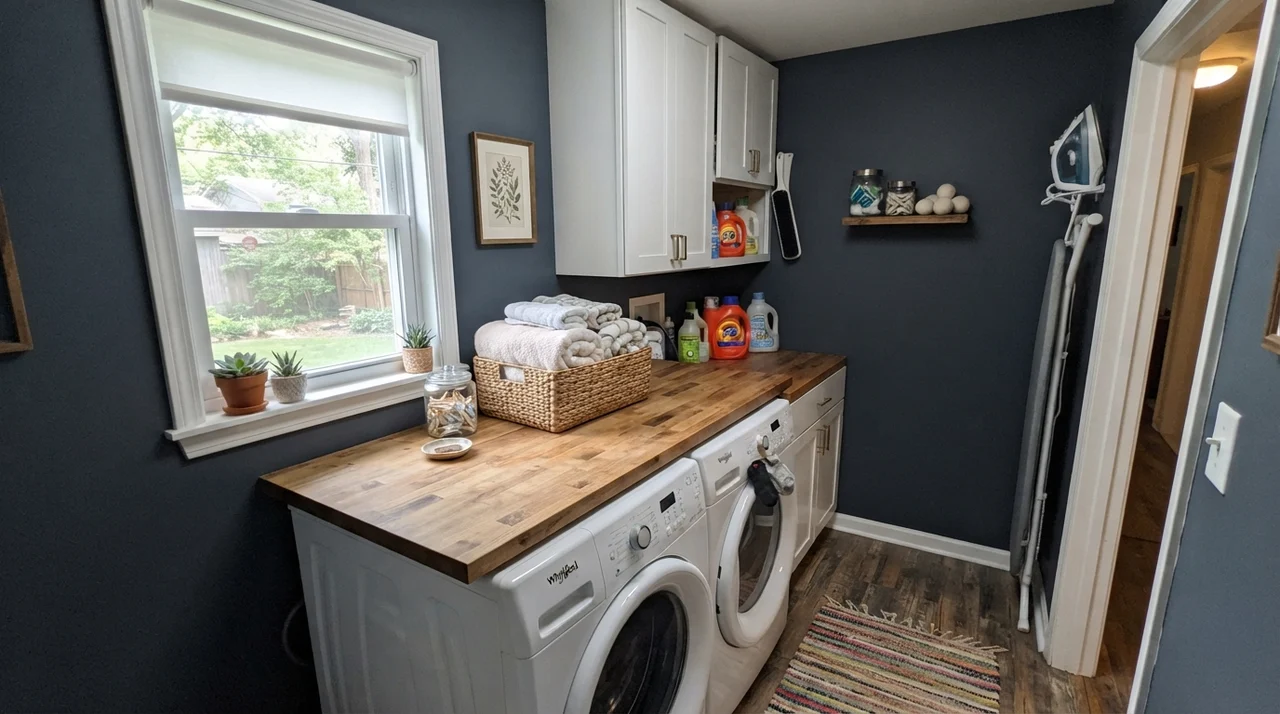
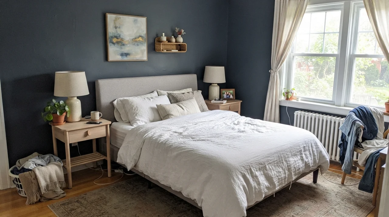
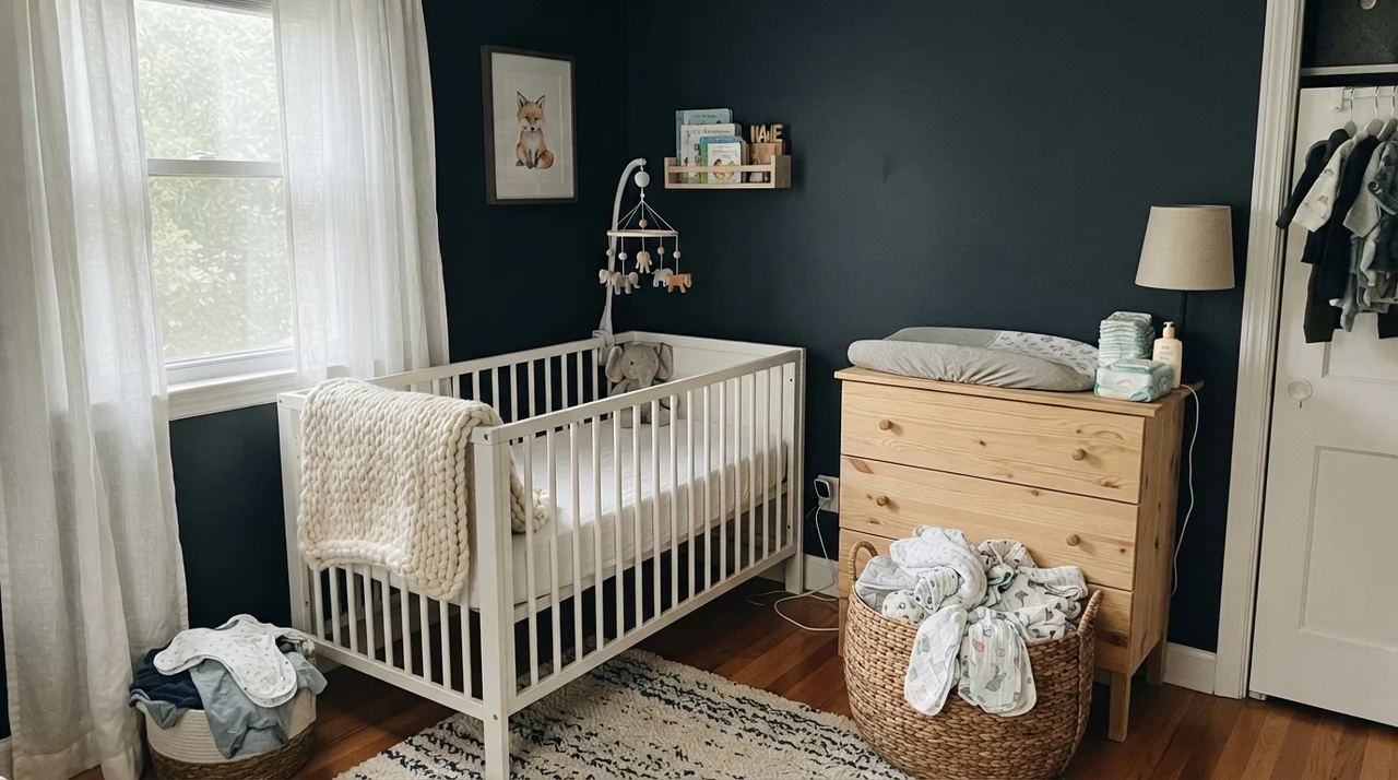
In bedrooms, Hale Navy provides a deeply restful backdrop, particularly when balanced by light linen bedding, warm white oak furniture, and textured rugs. In well-lit sunrooms or laundry rooms with ample exterior glass, the color never feels oppressive; the surrounding landscape and natural daylight pull out its rich blue character, letting the greenery outside pop against the dark architectural envelope.
Where Hale Navy Fails: The Honest Pitfalls
The complaints about Hale Navy are remarkably consistent across decades, and almost all of them trace back to two things: an underlit room, or the wrong expectation. If your room lacks strong natural daylight, a second coat will not fix it. At LRV 8, there is simply not enough ambient bounce to keep the navy alive, and the walls will collapse into a flat, shadowy near-black by mid-afternoon.
The other common regret comes from homeowners who were expecting a saturated, electric ink-blue. The gray content in Hale Navy is sixteen percent saturation doing its job. It was formulated to behave like a calm architectural neutral. If you paint an entire room hoping for vibrant cobalt drama, you will end up disappointed that it flashes slate-gray under overcast skies.
Exterior Performance and Durability
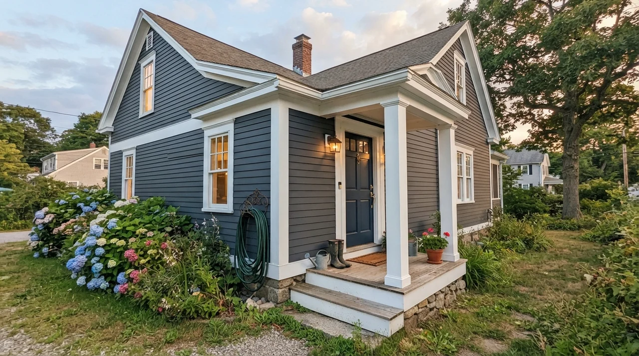
On exteriors, Hale Navy is close to a sure thing. On a white, gray, or red-brick house, painting the front door in Hale Navy semi-gloss gives an immediate sense of permanence. When used as a full siding color paired with Benjamin Moore White Dove OC-17 trim, it looks classic, stately, and grounded in the landscape.
The one honest caveat you must plan for is UV exposure. Dark exterior paints absorb significant heat and fade considerably faster than light neutrals. If you put Hale Navy on a west-facing front door that bakes in unshaded afternoon sun all summer, expect to apply a fresh refresh coat every four to five years to keep the rich blue from chalking and graying out. A Palladian Blue HC-144 porch ceiling above it is a timeless touch that softens the entryway.
Durability, Scrubbing, and Long-Term Wear
Having lived with Hale Navy across three decades and two house sales, I can tell you exactly how it behaves year over year. The biggest advantage of a gray-based navy on kitchen lowers is that it hides everyday scuffs and shoe heel marks substantially better than stark black or crisp white. In our colonial, the baseboards and island held up against three kids and two golden retrievers with only occasional wipedowns.
However, dark paint hides nothing during the painting process itself. Dark bases are notoriously prone to flashing—where sheen variations appear because one section dried faster or received uneven roller pressure. Do not cut corners on prep work. Prime thoroughly, use eggshell on interior walls, satin on cabinetry, and semi-gloss on exterior doors. When you invest in top-tier paint for a color this dark, it is worth the money; cheaper formulations will scuff off down to the primer the first time you scrub clean a smudge by the door handle.
Does Hale Navy look black at night?
Yes, in dim rooms or under soft 2700K incandescent lighting, Hale Navy will read as near-black due to its low LRV of 8 and charcoal base. Using 3000K to 3500K LED bulbs keeps the blue pigment visible after sundown.
What is the best sheen for Hale Navy on kitchen cabinets?
Satin is the ideal cabinet sheen. It provides the scrubbability needed to wipe away grease and knuckle scuffs without creating the harsh glare or brush-stroke texture of high-gloss.
Why does Hale Navy look gray on my wall swatch?
Hale Navy contains roughly sixteen percent color saturation, meaning it carries a substantial amount of gray. In flat, overcast light or north-facing rooms, the gray undertone dominates over the blue.
Is Hale Navy considered dated for home resale?
Not when used thoughtfully. While full four-wall navy living rooms looked dated within a few years of the 2010s trend peak, using Hale Navy on kitchen islands, lower cabinets, front doors, and built-in bookshelves remains a proven classic that buyers consistently appreciate.
Susan's Verdict · The Benchmark Navy
Hale Navy is the benchmark dark blue against which all others are measured, and it has earned that reputation over decades of real-world use. It is not an electric, punchy blue, and it will not magically brighten a dark room. But when given decent daylight and paired with crisp white trim and warm woods, its charcoal-navy backbone acts like the ultimate neutral anchor. Put it on kitchen lowers, islands, built-ins, and front doors with complete confidence—just leave small, windowless hallways to a lighter shade.