Color Diary · No. 60
Natural Cream OC-14: The Quiet Wall for People Exhausted by Cold Grays
Benjamin Moore's quiet cream, reviewed honestly: the rooms where it glows, the afternoon light that turns it butter, and what to paint instead.

Susan HartleyOctober 3, 2026 · 13 min read
Natural Cream · Benjamin Moore OC-14
Hex#DAD5C6LRV65Undertonesstraw yellow → muted gray-greige → soft off-white
In our last house—the 1990s colonial where our kids did most of their growing up—we spent nearly four years living inside a cool, fashionable gray that made every winter morning feel like an overcast Tuesday in November. I fell for the chip at the paint desk because it looked crisp, modern, and neat. On the wall, five years in, it felt like living inside a wet concrete basement. When we finally decided to repaint the main floor, I made a promise to myself: no more sterile walls, and no fake warmth that turns into 1980s butterscotch the second the sun comes out.
That is how I ended up with Benjamin Moore Natural Cream OC-14. It sits at an LRV of 65 in the greige family, but calling it a plain greige doesn't quite capture what it actually does in a home. It is a genuine, grounded cream with the sweetness dialed way down. It gives you the gentle warmth that people wanted when they abandoned the cold grays, without dropping you right back into the yellow-beige rut of twenty-five years ago.
We have lived with it across multiple spaces, watched it through changing seasons, scrubbed it behind towel racks, and watched what happens when afternoon light hits it at four o'clock. Like any paint with real personality, it has clear strengths and a couple of distinct situations where it will fail you if you aren't paying attention.
The Undertone Reality: Cream, Gray, and Daylight
Natural Cream carries a muted straw-yellow base tempered by a noticeable dose of gray. In balanced or cool daylight, that gray keeps the yellow from looking sweet or decorated. But because it sits right on the edge of off-white and greige, shifting light changes its face dramatically throughout the day.
warm sun
overcast, north light
dusk, rain, cool bulbs
Natural Cream shifts between a warm straw-cream in bright sun, a balanced muted greige in indirect north light, and a cooler, flatter tone under overcast skies.
Edgecomb GrayBenjamin Moore · see diary
Baby FawnBenjamin Moore · see diary
Natural CreamOC-14
Elmira WhiteBenjamin Moore · see diary
Warm PuttyValspar · see diary
How Daylight Moves Across Natural Cream
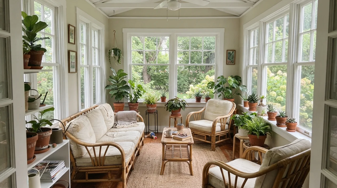
The single most important thing to know about Natural Cream before you buy five gallons is how it reacts to changing light. In a north-facing room, cool daylight cancels out the yellow pigment and leaves behind a soft, warm off-white that makes a cold space feel immediately inhabited. It solves the flat, chilling effect of northern exposure better than almost any color I know.
However, when strong southern or low western sun pours across the wall in the late afternoon, that warm light magnifies the straw undertone. By 4:30 PM in July, a west-facing room painted in Natural Cream reads clearly creamy, edging close to butter. If you wanted a calm, stony greige, that shift can come as an unwelcome surprise. On gray, rainy days, the opposite happens: the flat daylight pulls the gray base forward, and without warm lamplight, you might catch a faint greenish-drab cast.
Natural Cream in Bathrooms and High-Traffic Spaces
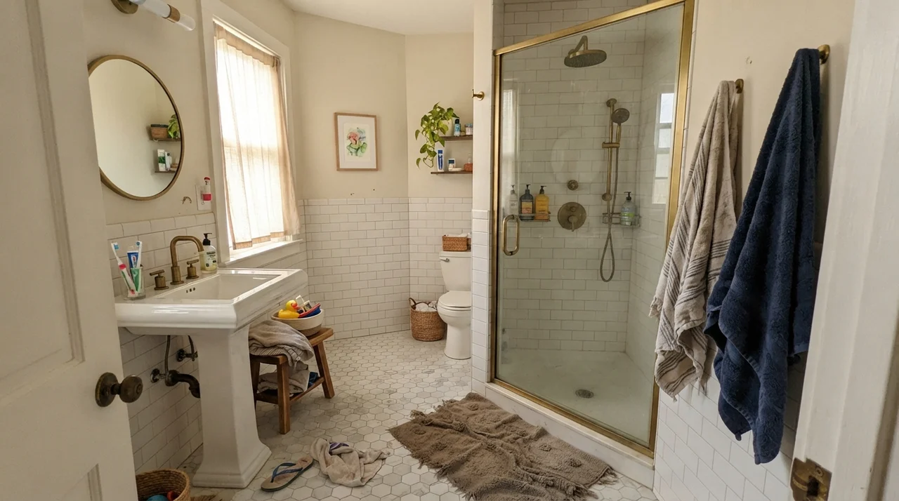
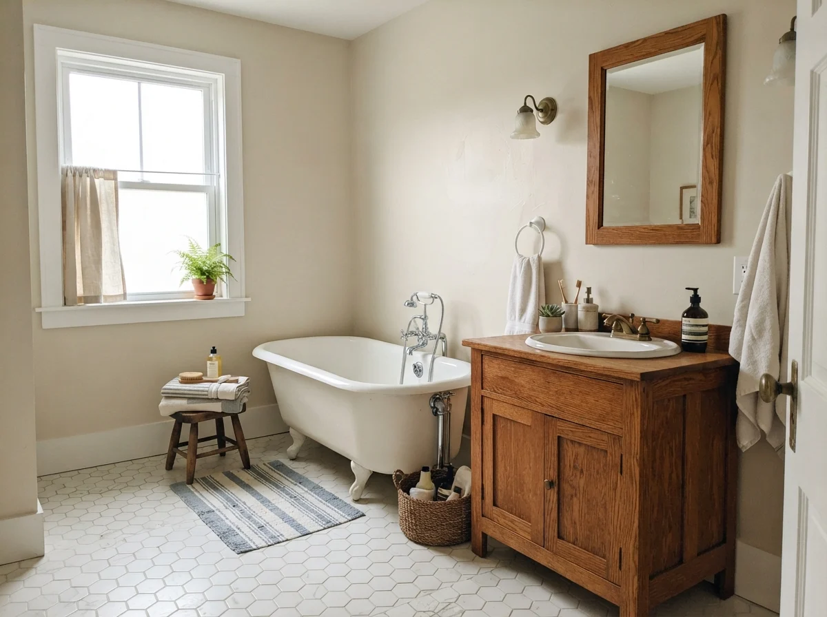
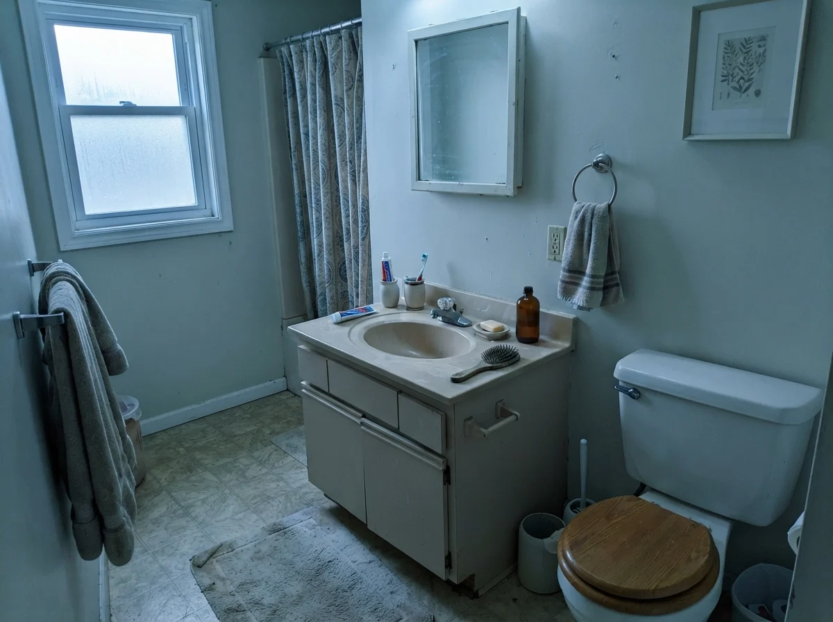
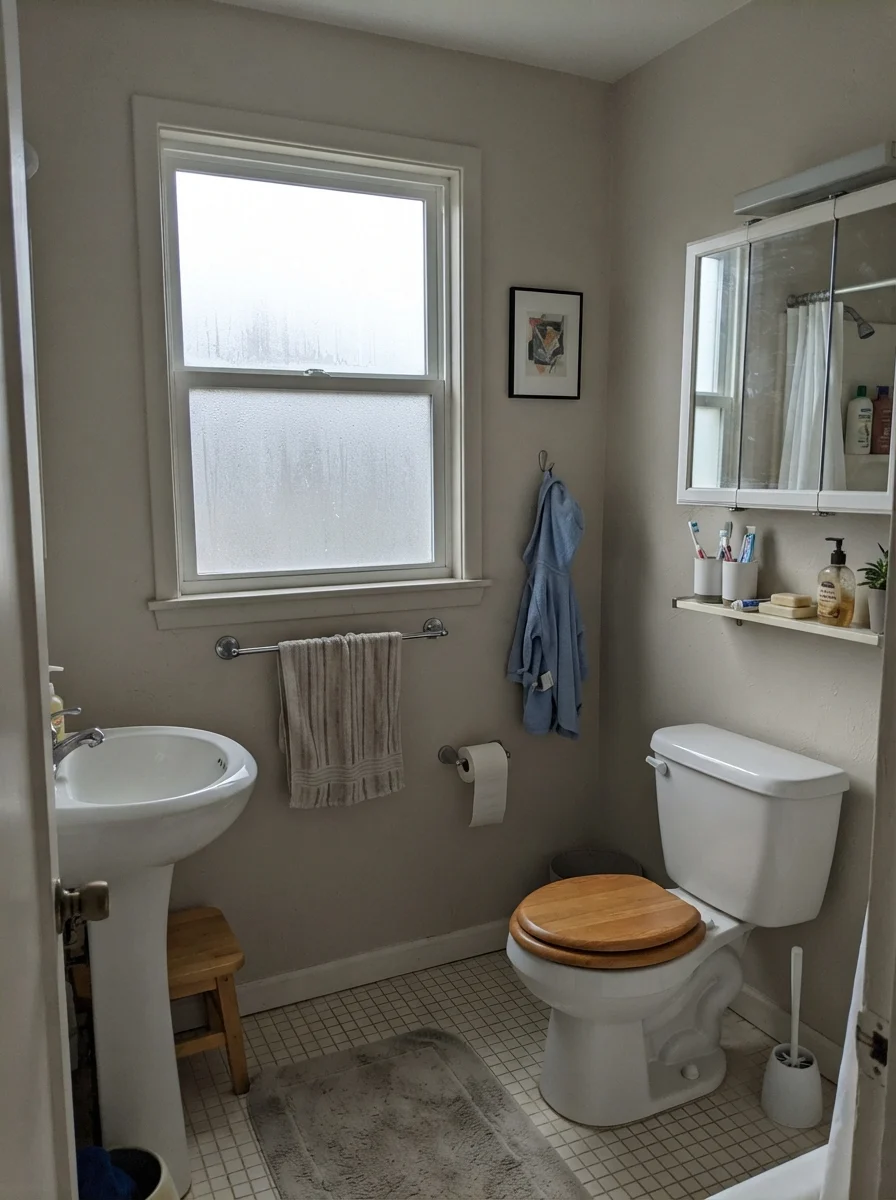
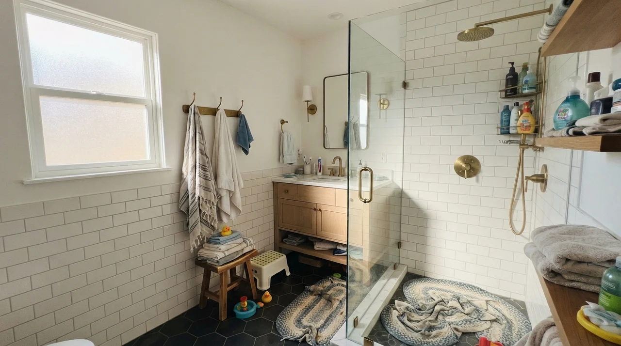
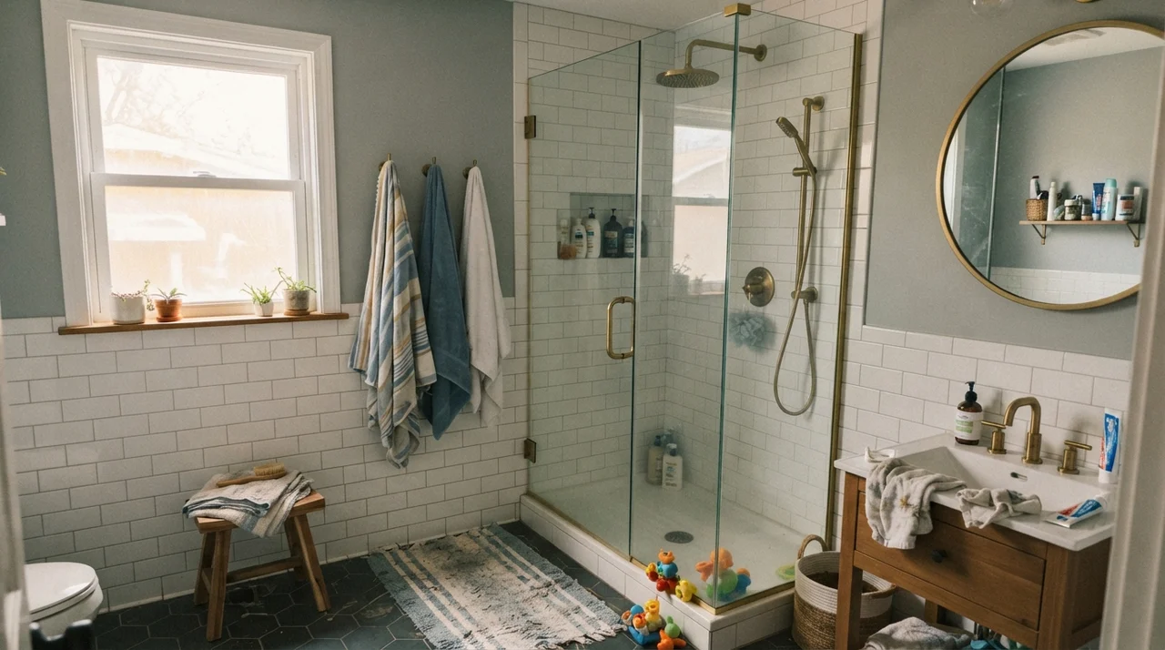
In our current 1960s ranch, I've learned that small bathrooms need a color that can handle hard utility and uneven fixtures. Natural Cream works exceptionally well above traditional white tile wainscoting. Because it has an LRV of 65, it has enough body and depth to stand out against crisp porcelain and white subway tile without turning muddy.
Where people get into trouble in bathrooms is with countertops. If your vanity has warm oak, travertine, or creamy quartz, Natural Cream looks tailored and intentional. But if you have cool gray Carrara marble or a stark blue-white quartz counter, Natural Cream will suddenly look yellowed and slightly dirty by comparison. Paint never exists in a vacuum; it will always tell you what your countertops are really made of.
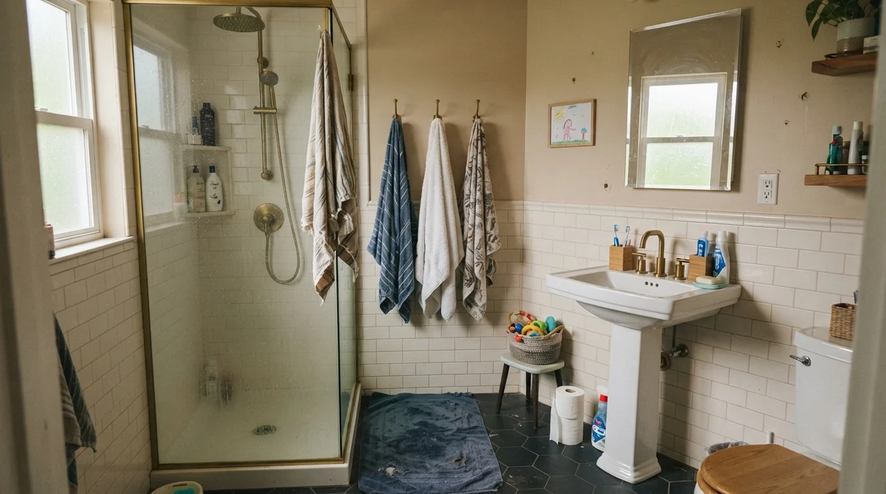
When you look at Natural Cream under flat, overcast light through a frosted pane, you can see that gray pigment at work. It keeps the walls grounded, even when there isn't a direct ray of sunshine in sight.
Bedrooms, Nurseries, and Restful Corners
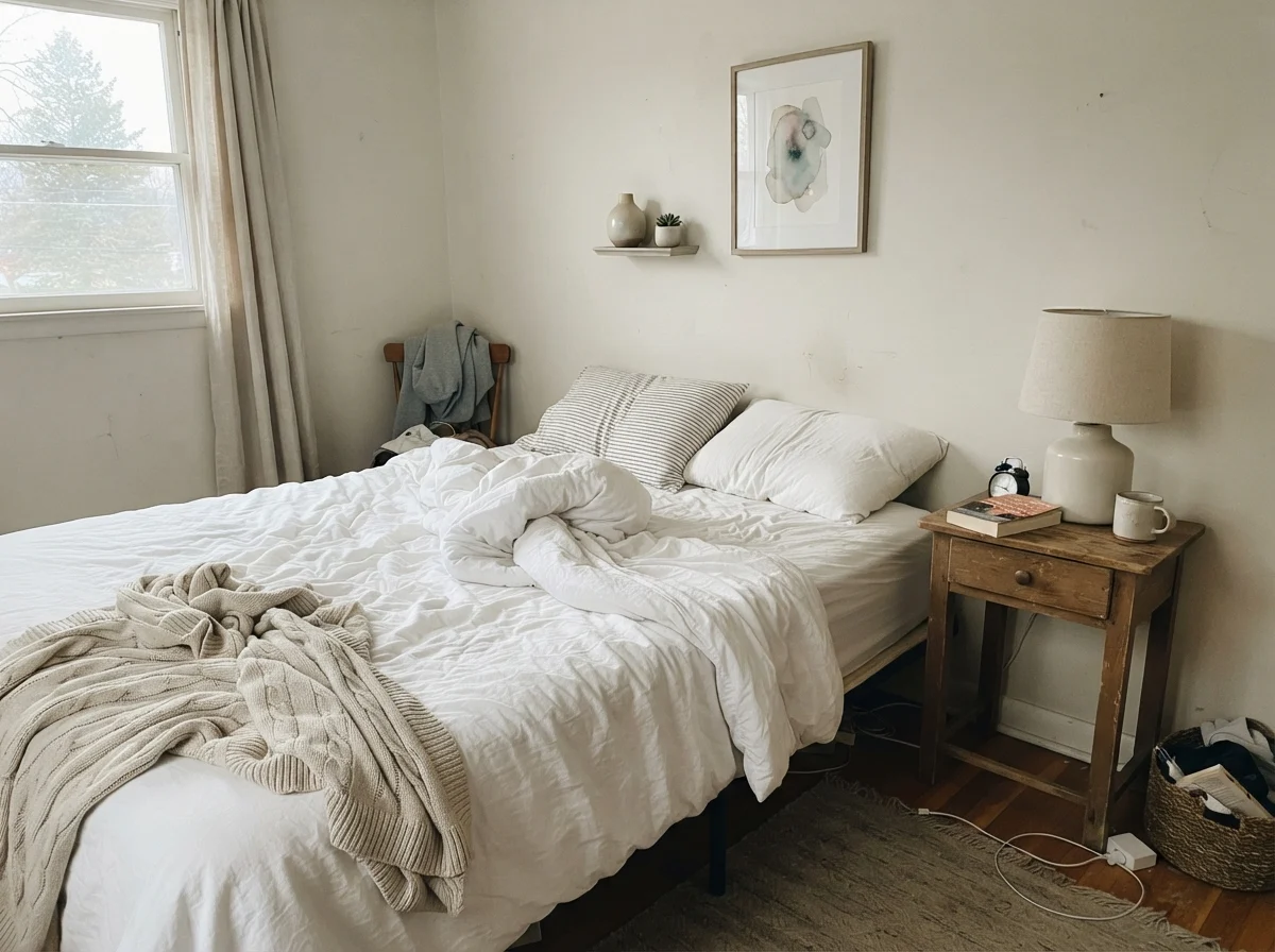
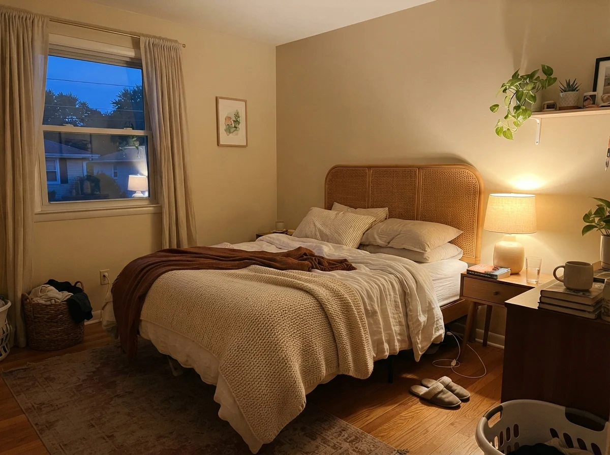
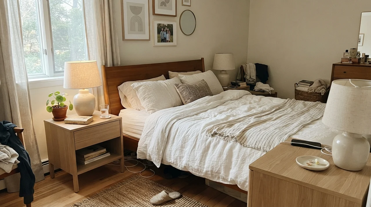
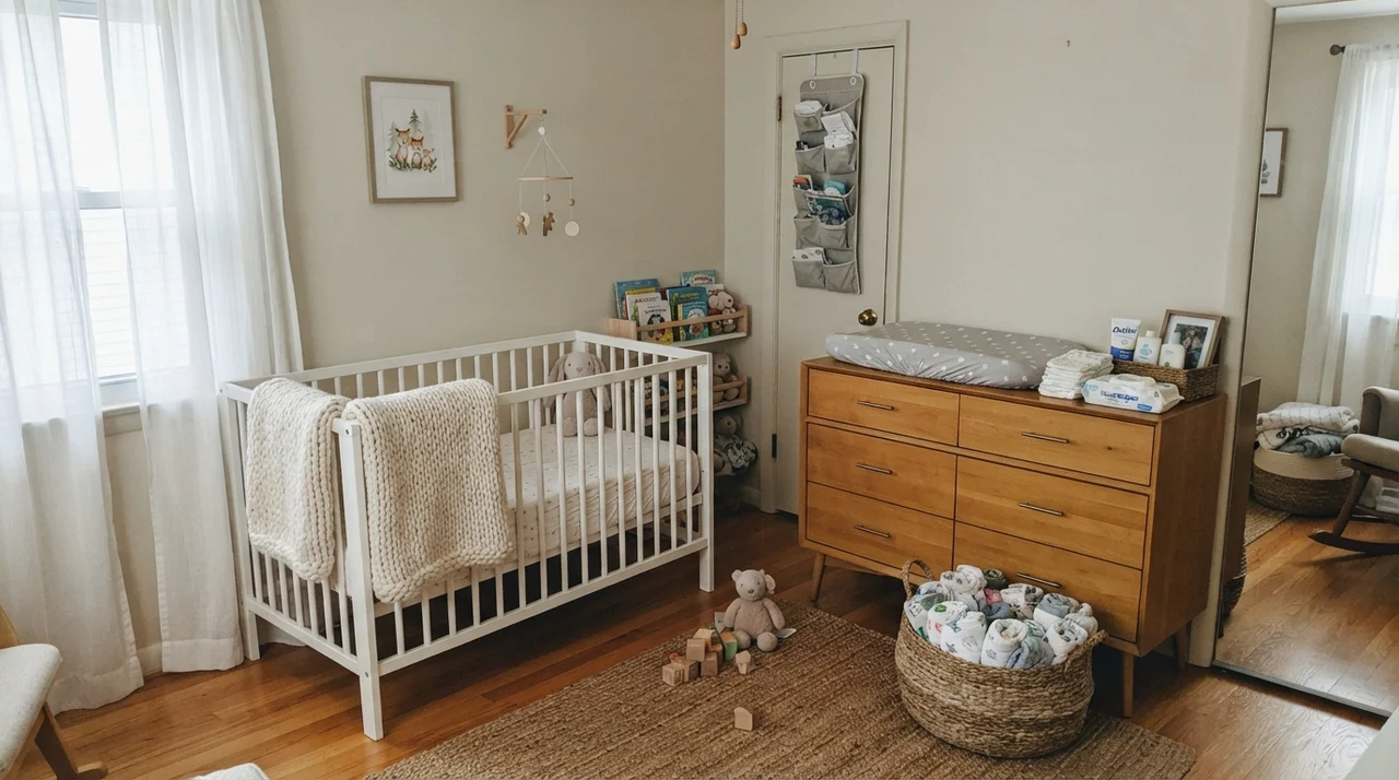
If you want a bedroom that feels calm when you wake up and cocooning when you turn on a bedside lamp, this is where Natural Cream does some of its best work. Unlike stark whites that bounce cold early-morning light around the room, this shade absorbs just enough daylight to keep the room feeling settled.
We used it in our guest room with white linen bedding and pale oak furniture. Under standard 2700K incandescent or warm LED bulbs at night, the wall deepens into something quiet and relaxing. If you like an accent color behind the bed, a soft muted tone like Saybrook Sage HC-186 pairs with it seamlessly without creating an aggressive contrast.
Even in spaces with slightly cooler daylight, such as a teenager's bedroom facing east or northeast, Natural Cream holds up cleanly against simple white metal furniture and open shelving without turning into a sterile white box.
Kitchens, Cabinets, and Millwork
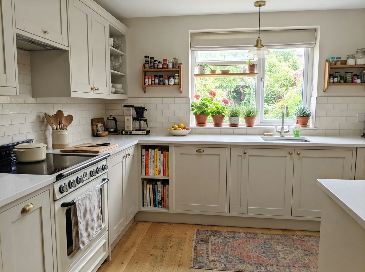
One of the quietest strengths of Natural Cream is what it does on cabinetry. A lot of homeowners want white kitchen cabinets, paint them an untinted bright white, and then wonder why their kitchen looks like a dental clinic next to their warm oak floors or brass hardware.
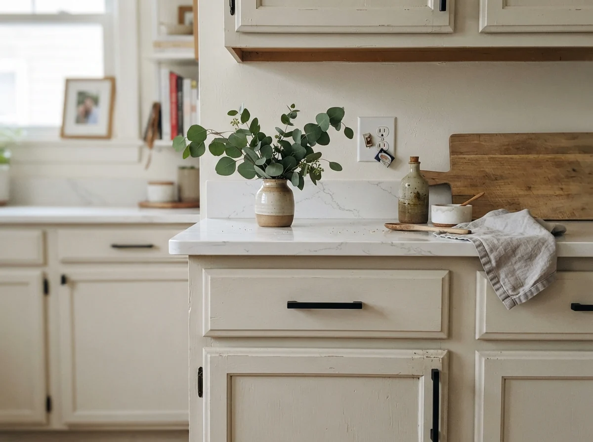
When painted on shaker cabinets in a durable satin finish, Natural Cream acts as a soft, architectural finish. It gives you the lightness of a painted kitchen without the clinical glare. It sits comfortably next to light oak flooring, warm quartz counters, and subway tile, allowing the walls above to be painted in a clean warm white like White Dove OC-17.
Main Living Areas, Open Plans, and Hallways
Painting an open floor plan is easily the hardest painting decision you will ever make in a house. You have one wall running from a sun-drenched southern living room directly into a dim interior hallway, and most paint colors fall apart in at least one of those zones. A pale off-white washes out in the sun and turns dingy in the hall; a deeper greige looks great in the hall and feels heavy in the living room.
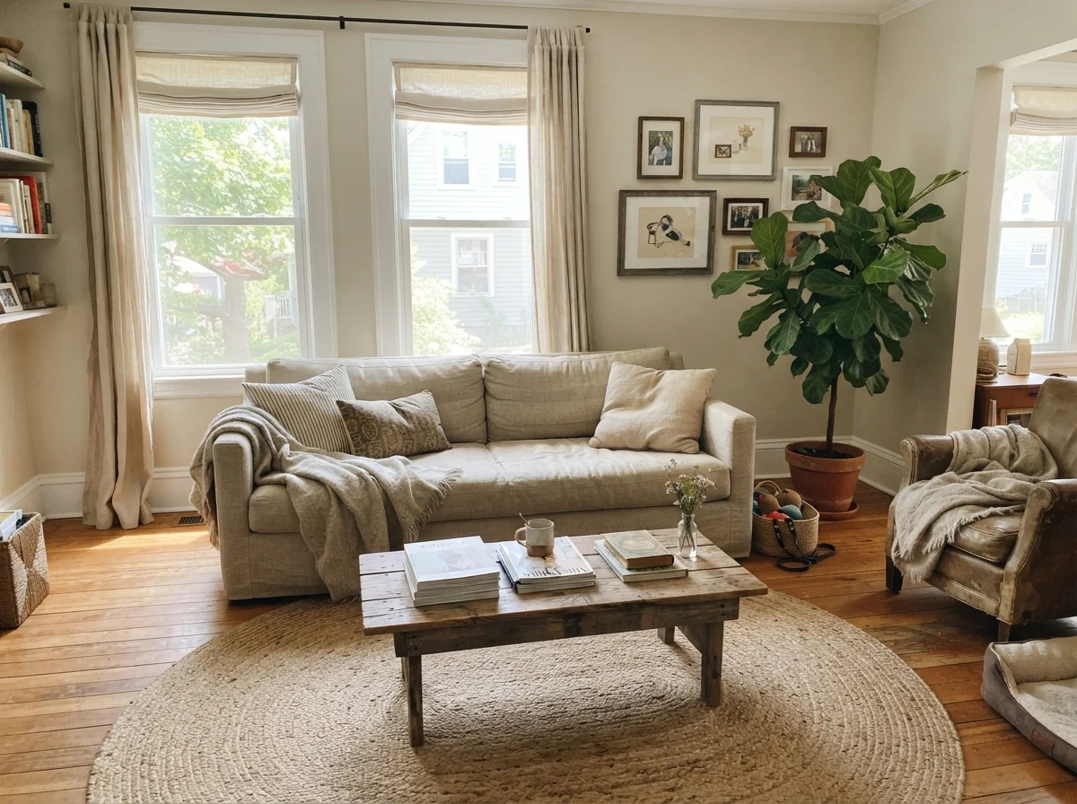
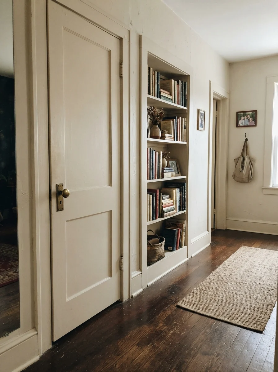
Because Natural Cream sits right at LRV 65, it has the stamina to handle both. In the bright living room, it reads as an intentional, soft color that flatters linen upholstery and jute rugs. In the hallway, it keeps enough warmth that the space doesn't look neglected.
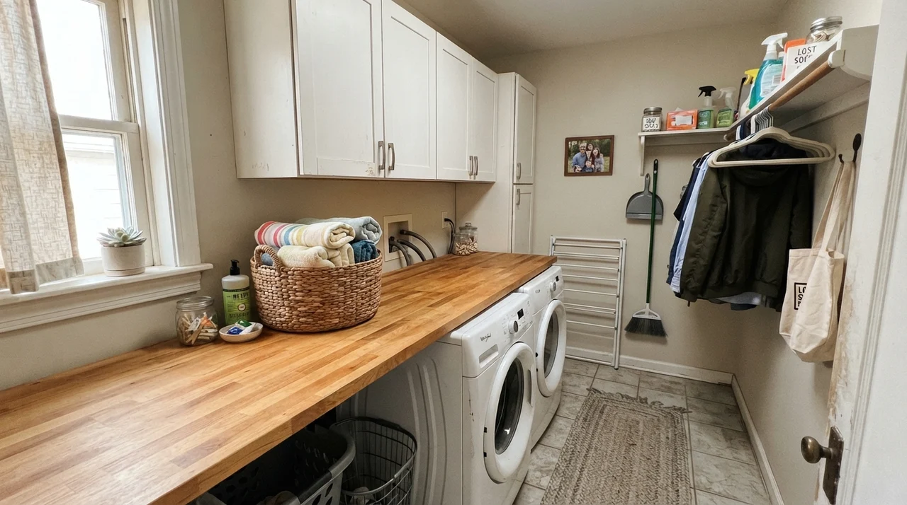
In secondary utility areas like laundry rooms or older hallways, Natural Cream gives you enough pigment to feel finished without demanding high-end architectural millwork to look good.
Where Natural Cream Fails (The Honest Regrets)
I always tell our readers: the paint color you love in a magazine will break your heart if you put it in the wrong conditions. The complaints about Natural Cream are consistent and predictable, and all three come down to light or what sits directly next to it.
First, if your room faces west and gets hit with blazing 4:00 PM sun, Natural Cream will go noticeably butter-yellow. The warm afternoon sun supercharges the yellow pigment, and if you were hoping for a clean, neutral greige, you'll be frustrated. In a west-facing room, Edgecomb Gray HC-173 is the smarter pick because its gray backbone holds the line against the sun.
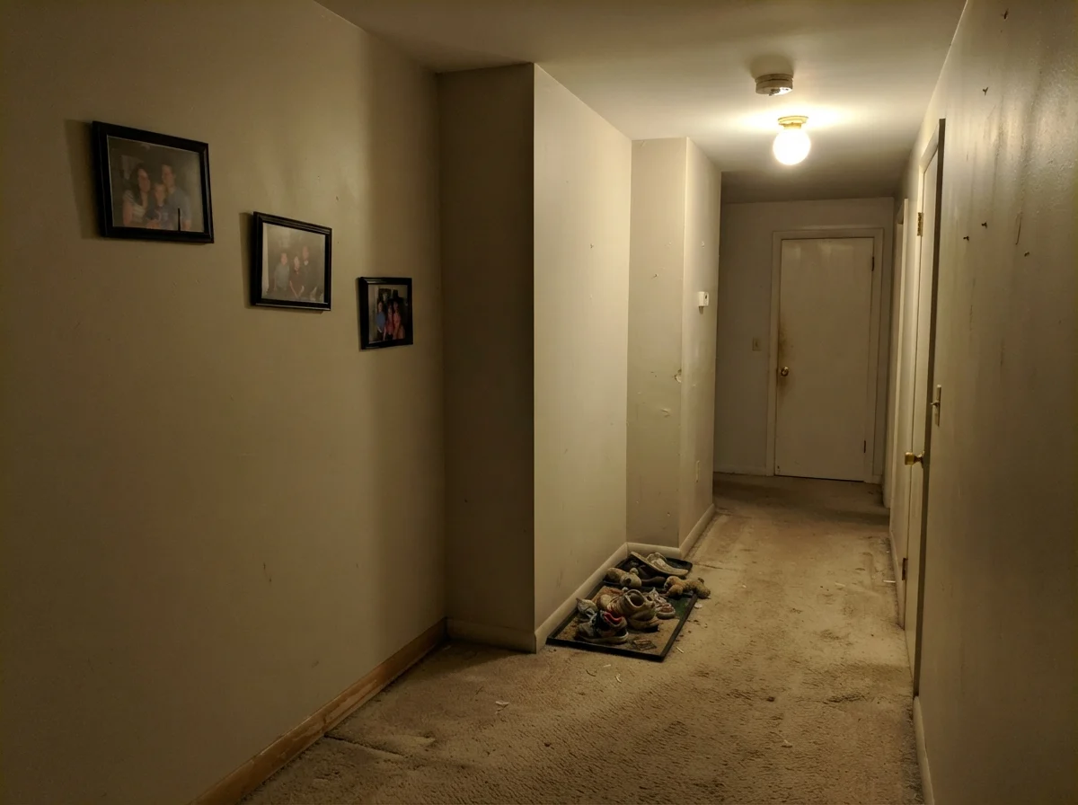
Second, in a dark, windowless interior hallway with a single dim bulb overhead, Natural Cream loses its bounce and can look flat, muddy, and putty-like. If a hallway gets zero natural daylight, a pure warm white will serve you better.
Exterior Siding and Exterior Trim
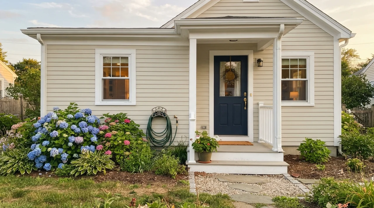
Most people think of Natural Cream strictly for interior living rooms, but it is actually a wonderful, underused body color for traditional homes and shingle-style siding. In direct, unfiltered outdoor sunlight, colors always read one to two shades lighter than they do indoors. Outside, Natural Cream looks like a rich, crisp off-white that never glares. To keep it grounded on an exterior, pair it with dark, confident trim like Kendall Charcoal HC-166 or Essex Green HC-188 on shutters and doors.
Durability, Cleaning, and the Right Sheens
After thirty years of repainting every room in three different houses, here is my rule on sheens: do not let anyone talk you into flat paint on a family living room wall to hide sheetrock flaws. Flat paint absorbs scuffs, and the second you wipe a greasy fingerprint off flat cream, you leave a burnished shiny spot that you will stare at for the next five years.
For Natural Cream on walls, stick strictly to eggshell. It has just enough resin to be scrubbed clean with a damp rag and mild soap without losing its finish. On trim, baseboards, and interior doors, use semi-gloss for impact resistance. If you are spraying kitchen cabinets, a satin urethane-fortified cabinet paint gives you the perfect furniture-grade glow that resists kitchen grease and sticky fingers. Ceilings should stay flat white to keep the light reflecting evenly across the room.
Is Benjamin Moore Natural Cream warm or cool?
It is definitely warm. It sits in the greige family, but its primary undertone is a softened straw cream balanced with a small amount of gray.
What is the LRV of Natural Cream OC-14?
Natural Cream has a Light Reflectance Value (LRV) of 65. This places it in the light mid-tone range—light enough to bounce light, but with enough pigment to contrast nicely with white trim.
Can I use Natural Cream with honey oak cabinets or floors?
Yes, it is one of the best colors for working alongside honey oak, warm walnut, and travertine stone. It flatters wood tones without making them look orange.
Why does Natural Cream look dingy next to my trim?
This happens when your trim is painted a cool, blue-based stark white like Chantilly Lace. To look right, Natural Cream needs a warm trim white like White Dove OC-17 or Cloud White OC-130.
Does Natural Cream ever look yellow or green?
In strong late-afternoon western sun, the straw undertone warms up into a visible butter-cream. Under flat, gray overcast skies with no lamps on, the gray base can momentarily flash a faint greenish cast.
Susan's Verdict · A Quiet Whole-House Warmth
Natural Cream OC-14 is the color I recommend to anyone who tried cool gray, hated how cold it felt in winter, and wants real warmth without going back to heavy 1990s beige. Buy it for cold north-facing living rooms, open floor plans, and kitchen cabinets paired with oak floors. Skip it in west-facing rooms that bake in late afternoon sun, and keep it far away from icy blue-white trim and cool gray marble.