Color Diary · No. 125
The Low-Contrast Bathroom Gamble: Five Years with Benjamin Moore Ocean Air
Benjamin Moore's palest blue-green, reviewed honestly: the small rooms it was built to open up, the light that flattens it to gray, and what to pick instead.

Susan HartleyNovember 15, 2026 · 16 min read
Ocean Air · Benjamin Moore 2123-50
Hex#D3E1E1LRV73Undertonesgreen → gray → blue
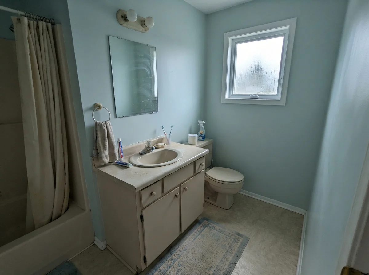
In our last house—a 1990s colonial with three bathrooms that had never seen a real update—the upstairs guest bath was an exercise in claustrophobia. It had eight-foot ceilings, zero architectural character, and a single window facing east that gave you about forty minutes of decent morning light before leaving the room to fend for itself. When we decided to tackle it, I knew I didn't want another safe, polite off-white, but I also knew that four walls of full-strength spa blue in an eight-by-five space would feel like being trapped inside an Easter basket.
That is how I ended up standing at the paint counter holding a swatch of Benjamin Moore Ocean Air (2123-50). My husband took one look at the chip and asked why I was spending money on two gallons of what looked like tinted skim milk. He wasn't entirely wrong to ask. Ocean Air carries a Light Reflectance Value of 73, which places it right at the top edge of the light scale. In the can, it looks less like a color and more like white paint that had a brief conversation with a teal deck. But that barely-there quality is precisely the mechanic behind it. It sits in that narrow band where a paint has just enough gray-green cast to register as color on a wall without ever announcing itself as a statement.
We lived with it in that guest bath for six years, right up until the day we sold the house. Over those years, I learned exactly where this quiet shade earns its keep, where it completely falls apart, and why the hardware you screw into the wall matters just as much as the pigment inside the can.
The Undertone Balancing Act: Blue, Green, and Gray
Ocean Air lives in the teal family of the deck, but do not buy this paint expecting a tropical lagoon or a vibrant robin's egg. At an LRV of 73, it is grayed down almost to its vanishing point. The pigment structure is a delicate equilibrium: real blue, a touch of leafy green, and a steady backbone of gray that stops it from turning sweet. Because it is so light, the room's exposure will dictate which of those three faces takes over.
warm sun
overcast, north light
dusk, rain, cool bulbs
green → gray → blue
Glass SlipperBenjamin Moore · see diary
HeadspaceClare · see diary
Ocean Air2123-50
Borrowed LightFarrow & Ball · see diary
Light French GrayBehr · see diary
When you look at Ocean Air alongside its neighbors, you see how restrained it really is. It doesn't carry the clear sky-blue notes of Farrow & Ball Borrowed Light, nor does it have the slightly deeper herbal pull of Clare's Headspace. Instead, it hovers right on the edge of neutral. That gray component is what keeps it sophisticated, but it is also the trait that gets homeowners into trouble when they don't have the light to support it.
The Daylight Shift: From Soft Coastal to Cold Concrete
Here is the fundamental truth about paints with an LRV above 70: they cannot manufacture warmth or color on their own. They reflect whatever light you pour into the room. If your daylight is warm, diffused, and steady, Ocean Air responds with a serene, clean blue-green that makes a small room feel airier than its square footage should allow.
Put that same paint in a north-facing bath on a dreary Tuesday in November, however, and the experience changes entirely. Without direct light to bounce through that high LRV base, the blue and green pigments retreat, leaving only the cool gray behind. It doesn't turn ugly, but it does turn flat—reading more like an uninspired, chilly gray primer than a thoughtful designer shade.
In an east- or west-facing room, Ocean Air puts on a two-act play every single day. In our colonial, the morning sun made the guest bath feel luminous and lightly aquatic, bringing the soft green cast forward. By three in the afternoon, once the direct sun had moved over the ridge of the roof, the walls settled into a quiet, almost off-white mist. It never looked dirty—a blessing in an older house—but it certainly gave up its colorful identity for the second half of the day.
Artificial lighting creates another fork in the road. In the evening, standard 2700K warm-white bulbs draw out the green side of the formula, softening the edges until the wall looks closer to a pale, misty greige. If you install cool-white daylight LEDs (anything 4000K or above), the blue comes forward sharply, but the space can quickly feel clinical and sterile, like a doctor's examination room. Before you commit to your wall paint, buy the lightbulbs you intend to live with; they will dictate whether you see a soft bedroom wall or an institutional hallway at 8:00 PM.
The Small-Bath Secret: Why Low Contrast Matters
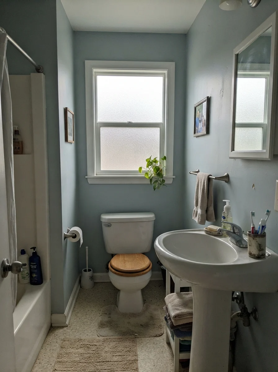
If you search through decorating magazines, almost every photo of Ocean Air is taken inside a small bathroom or powder room. That isn't an accident. Small bathrooms are difficult because their footprints are cluttered: you have a sink, a toilet, a shower curtain or glass door, towel bars, mirrors, and tile lines all competing inside sixty square feet. If you put a saturated, heavy paint on the upper walls, you chop that small volume into stark horizontal slices.
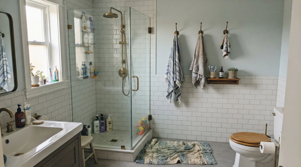
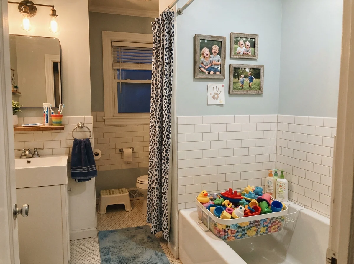
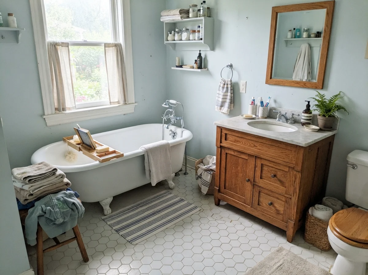
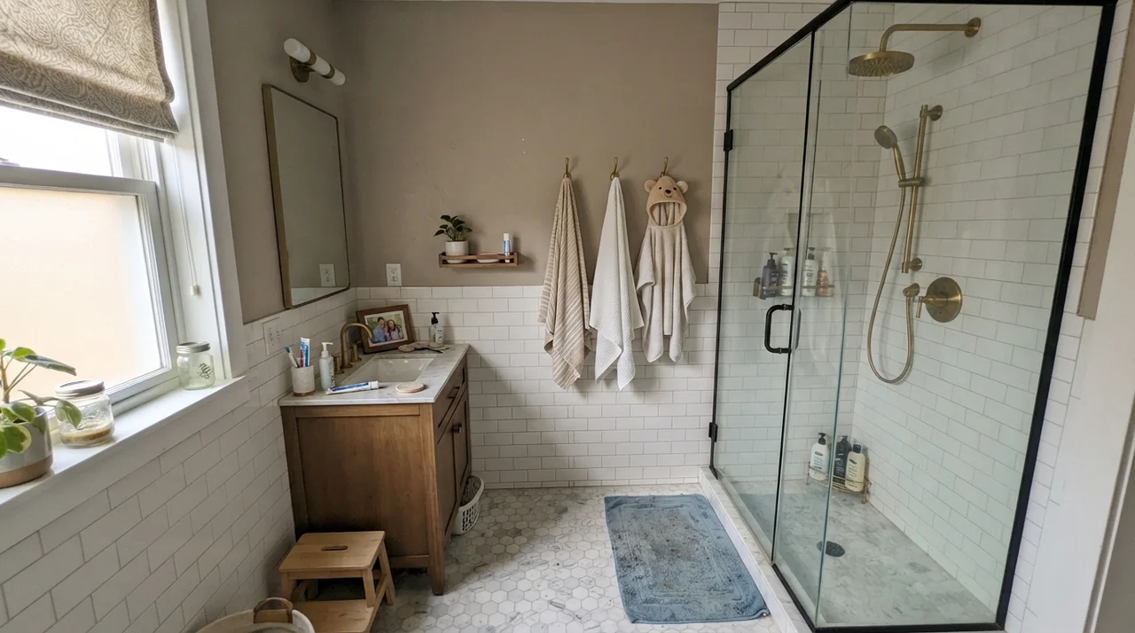
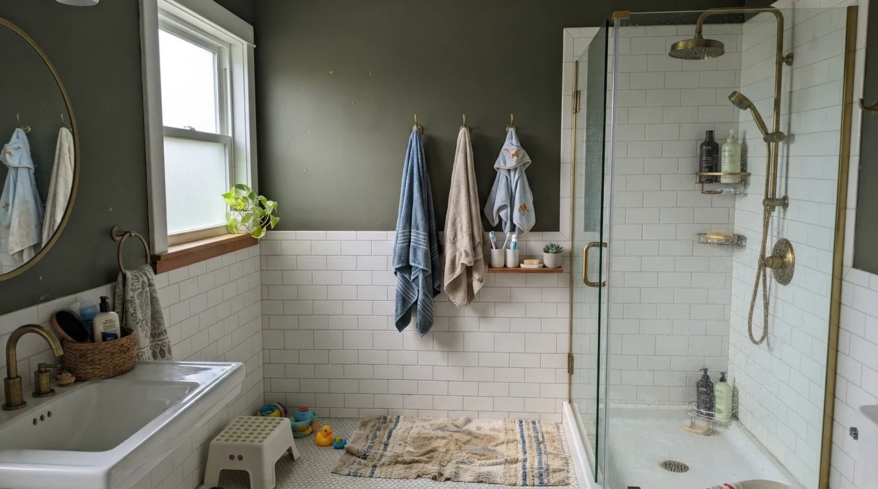
Ocean Air solves this problem through low contrast. When paired with white wainscoting or classic subway tile, it provides just enough separation to frame the tile without drawing a heavy visual boundary. It lets your eye glide straight up to the ceiling without stopping at an aggressive line. That slight blur between wall and trim is the classic trick that makes tight spaces feel bigger.
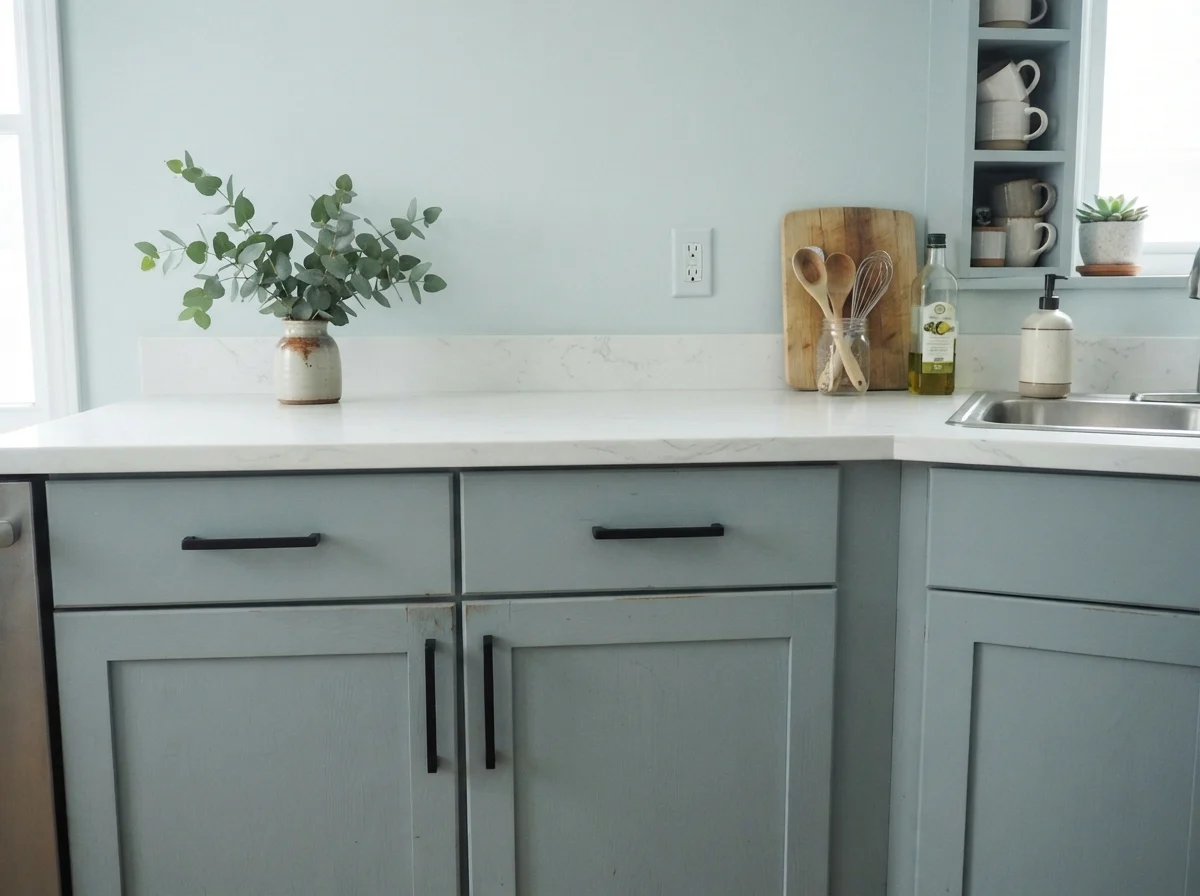
The small-room trick this color is famous for depends entirely on low contrast. Swap your soft metal fixtures for harsh matte black, and the magic disappears immediately.
Where people ruin this effect is with hardware. In recent years, everyone has been rushing to install matte black faucets, black mirror frames, and black towel hooks. On an off-white or deep navy wall, black hardware looks intentional and crisp. But against Ocean Air? It completely destroys the low-contrast trick. Dark black fixtures punch hard visual holes into a delicate, pale surface. Instead of feeling open and continuous, the bathroom suddenly feels punctuated, busy, and visually crowded. If you want Ocean Air to work the way it was designed to, stick with polished chrome, brushed nickel, or soft vintage brass. Let the metals sit close in visual weight to the wall.
Bedrooms and Nurseries: The Antidote to Theme-Park Pastels
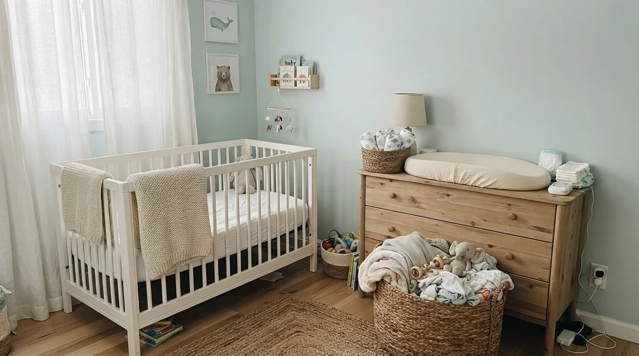
Pastel blues and greens are notoriously dangerous in bedrooms. Pick the wrong swatch, and by coat two your guest room looks like an ice cream parlor or a themed baby nursery. What I appreciate about Ocean Air is that its heavy gray undertone keeps it grounded. It provides the restful, heart-rate-slowing effect of a blue-green without any of the sugary sweetness.
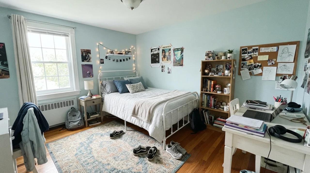
In a nursery or a child's bedroom, that neutrality is a lifesaver. It works seamlessly as a gender-neutral backdrop when a baby is tiny, but more importantly, it doesn't look dated within four years when the crib gets swapped out for a twin bed and a study desk. A child won't outgrow this color at age seven because it never read as a toddler pastel in the first place.
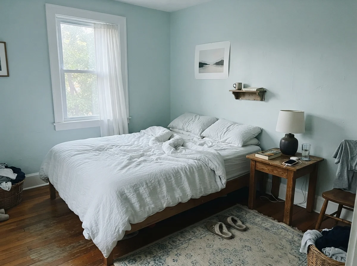
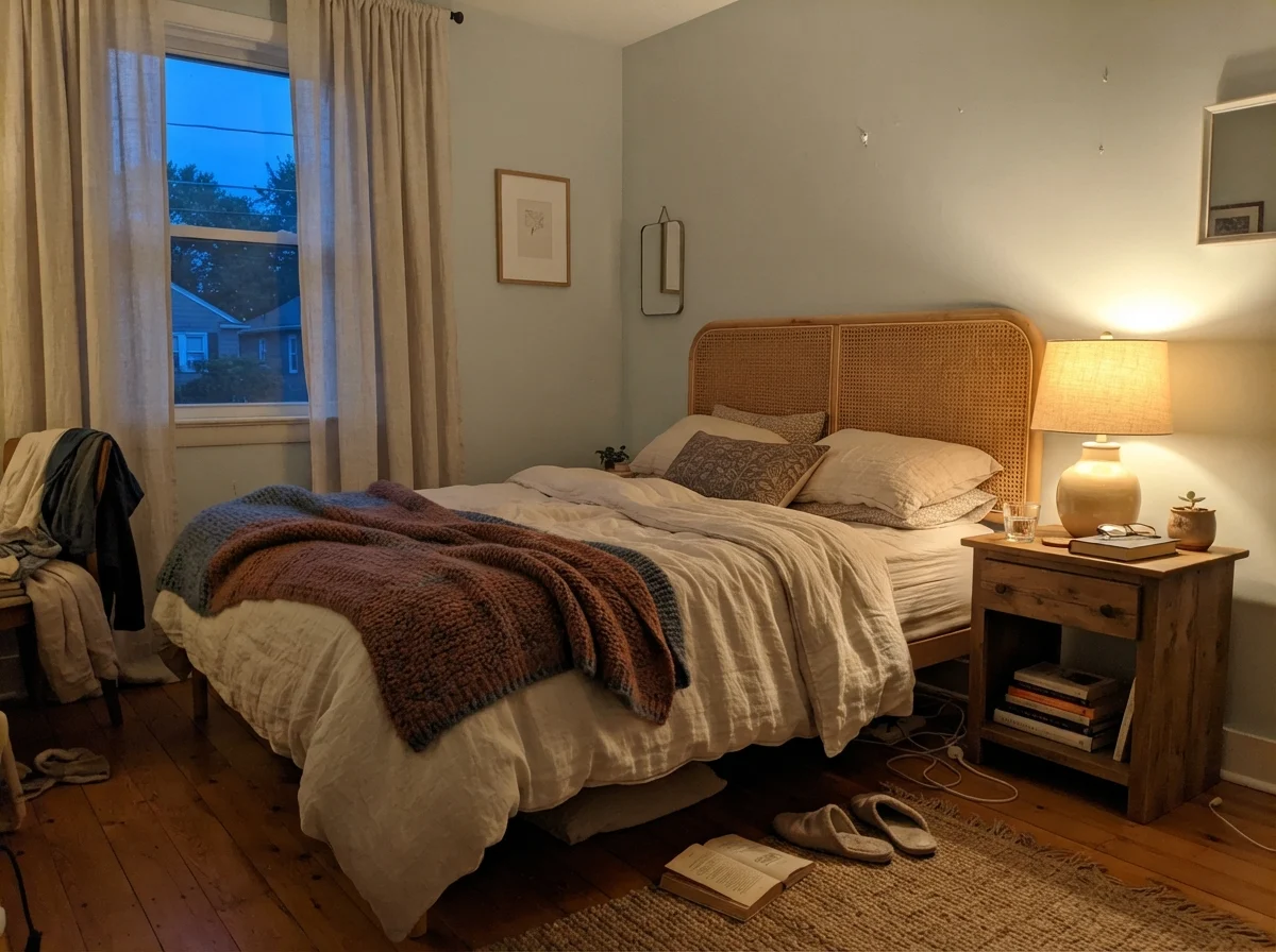
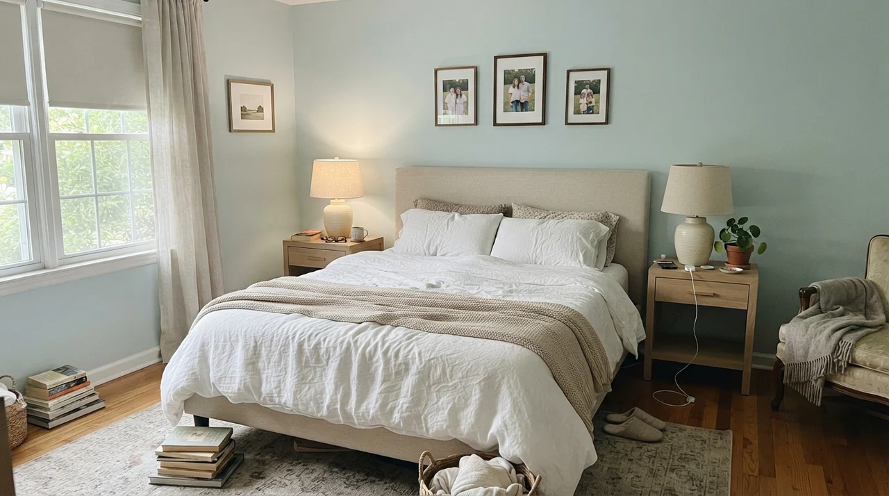
In our current 1960s ranch, I tried testing a board of Ocean Air in the primary bedroom. We have pale oak dressers and light linen bedding, and in the bright morning light, it looked like a peaceful retreat. But keep this in mind: because it is so pale, you need texture in the room to keep it from looking unfinished. If you have plain drywall, white trim, and flat synthetic bedding, the room can feel washed out and barren. Pair it with woven cane, natural linens, warm wood, and ceramic lamps to give those whisper-soft walls something tactile to lean against.
Kitchens: Strategic Accents Over Whole-Room Surrenders
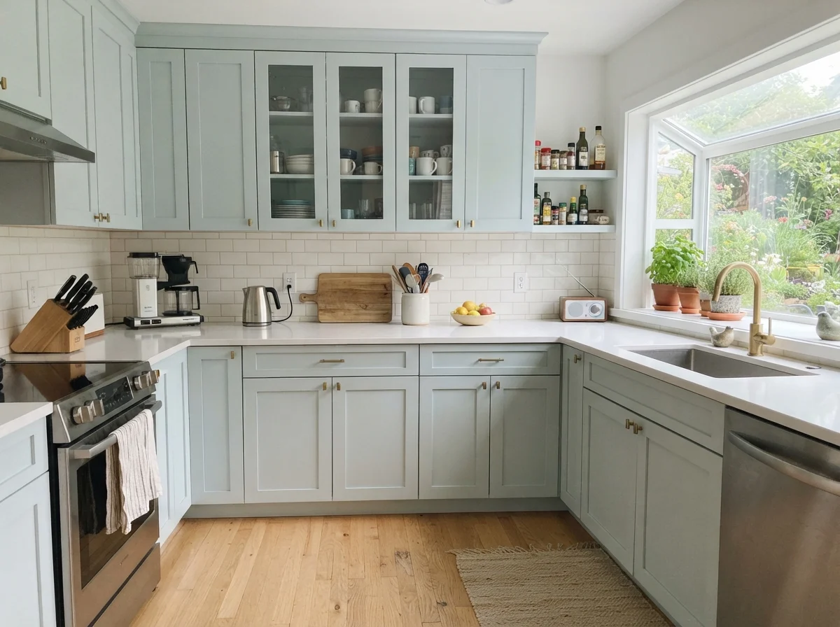
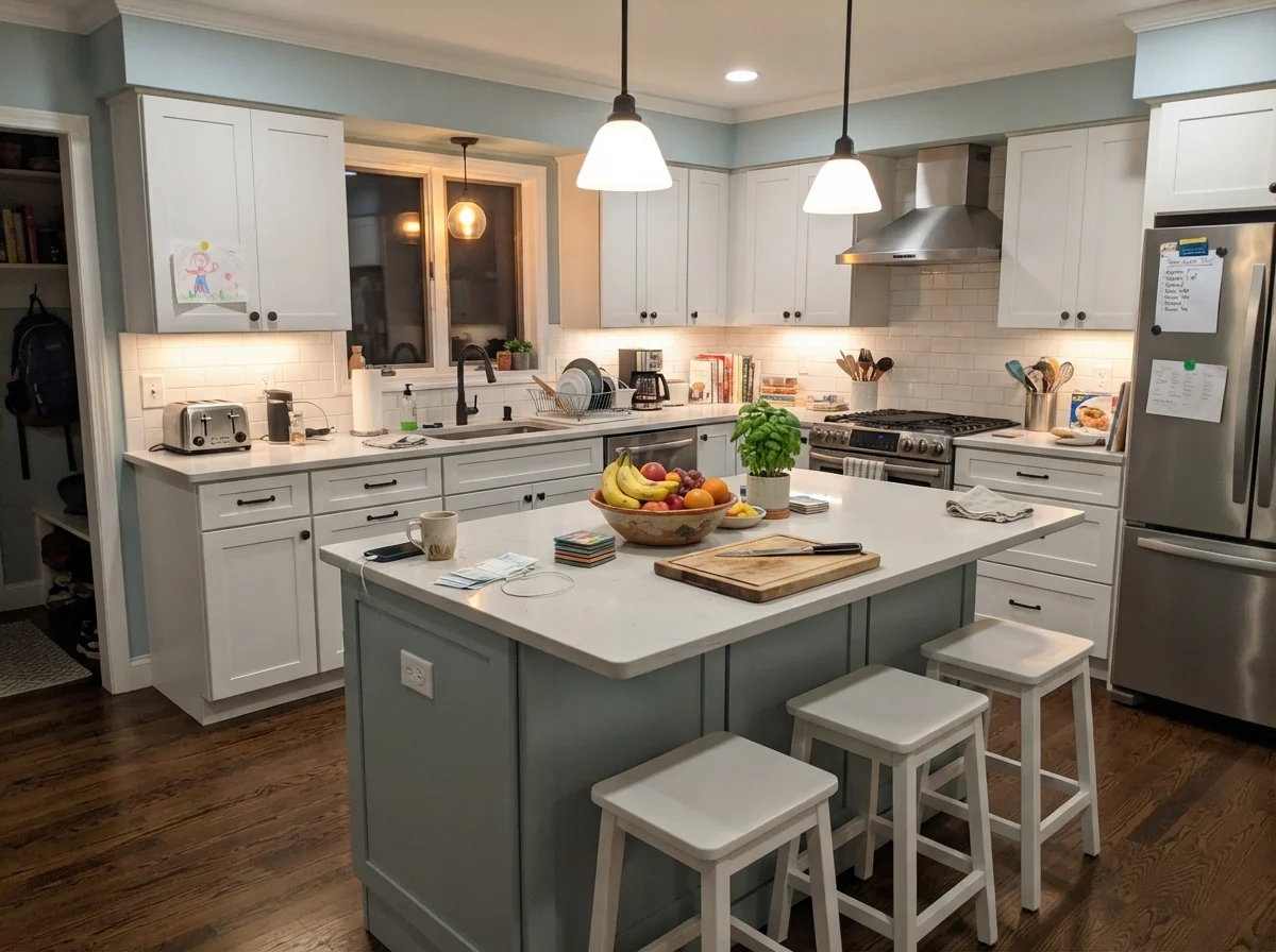
I get asked fairly often whether Ocean Air works as a whole-kitchen wall color. My honest answer is almost always no. In a modern kitchen packed with stainless steel appliances and wide expanses of cool white quartz, an LRV 73 blue-green wall washes out into an indistinct haze. It doesn't provide enough contrast against white upper cabinetry, and it fights with the cold undertones of large stainless surfaces.
Where it shines in a kitchen is on cabinetry itself—particularly when treated as an intentional, soft accent. On an island or a run of shaker lower cabinets against clean white surroundings, Ocean Air reads as a sophisticated alternative to gray or navy. It brings personality to the room without locking you into a trendy color that will scream its installation date five years in.
Sunrooms, Living Spaces, and Laundry Rooms
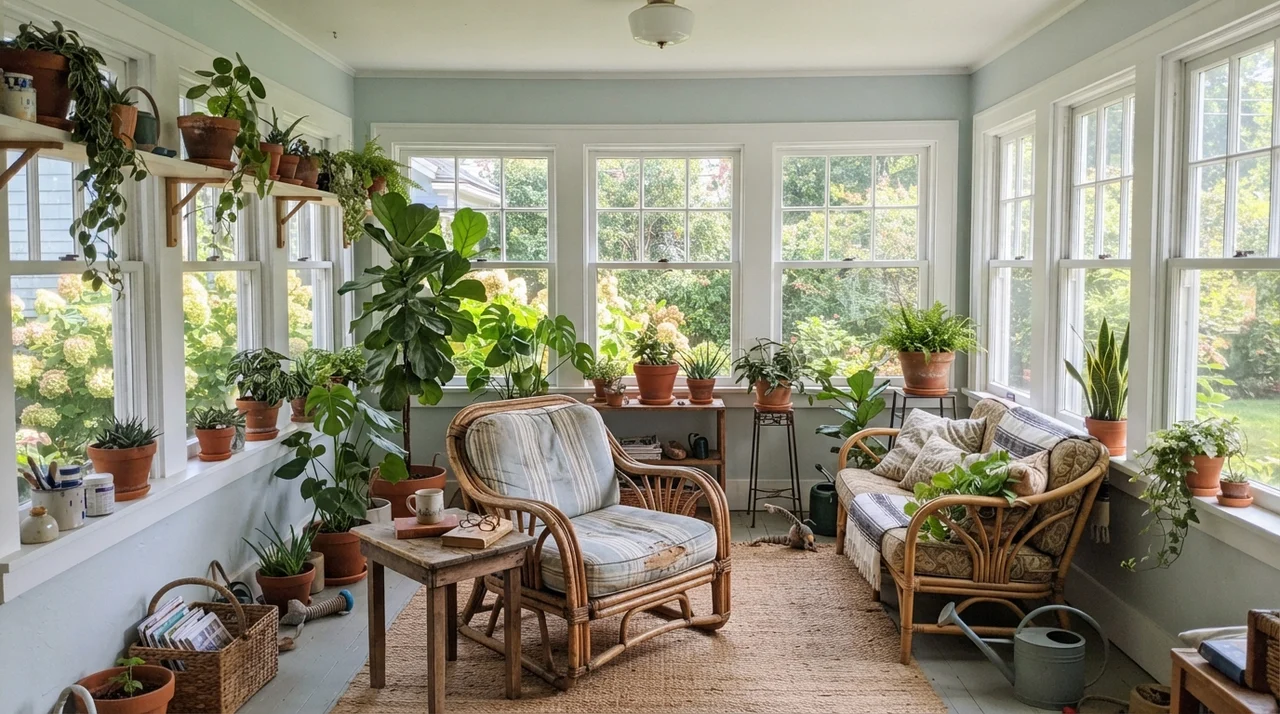
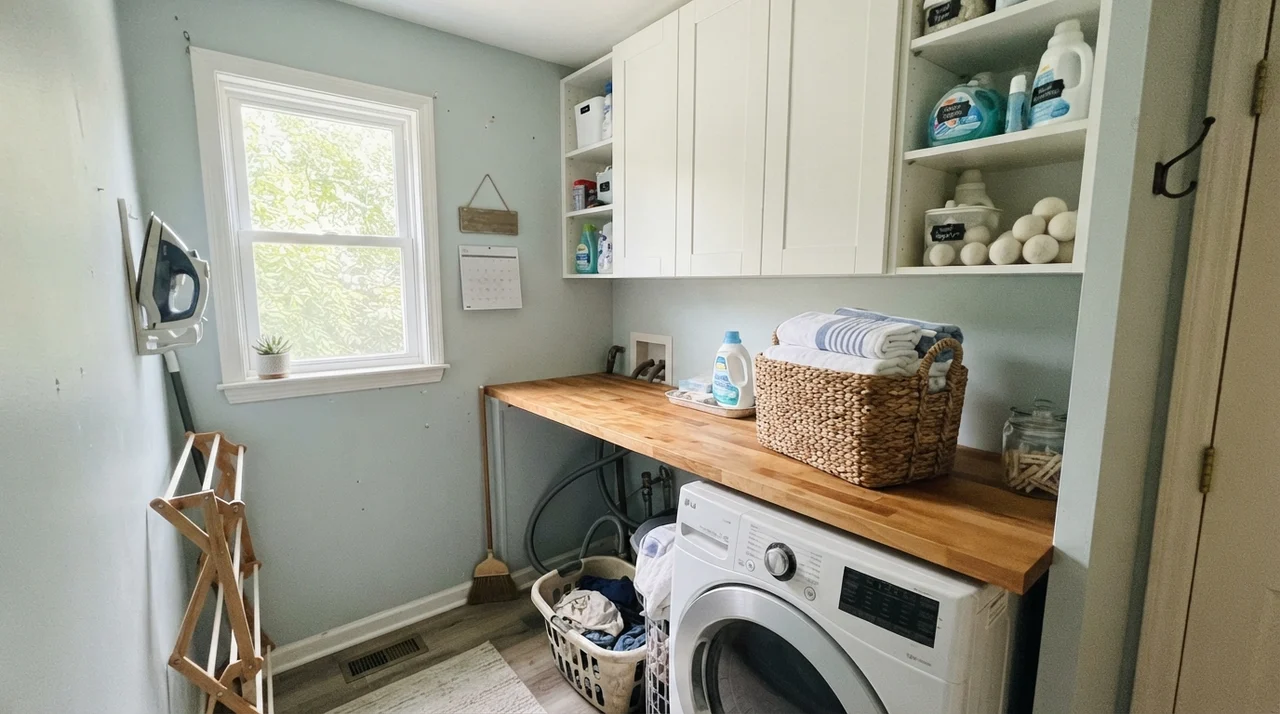
Because Ocean Air requires real daylight to sing, sunrooms and perimeter laundry rooms are natural habitats for it. In a sunroom lined with white-cased windows and packed with greenery, the green undertone in Ocean Air steps forward to shake hands with your houseplants. The light bounces through the high LRV base effortlessly, creating that fresh, garden-porch feeling that heavy colors stifle.
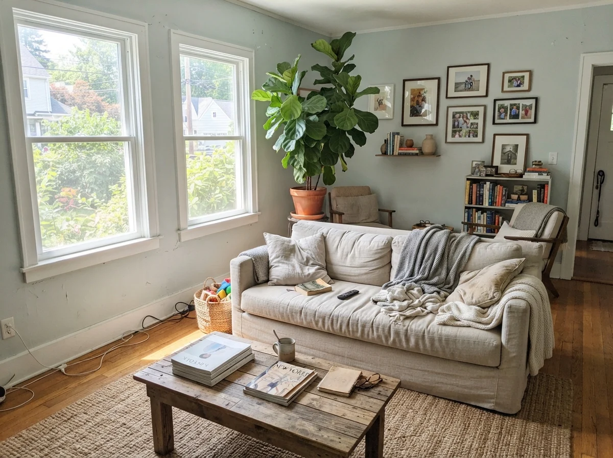
In a large living room, however, proceed with eyes wide open. Across twenty feet of unbroken drywall, Ocean Air can play a vanishing trick. In bright midday sun, it will reflect so much illumination that visitors won't realize you painted the walls anything other than a soft off-white. If you were hoping for people to walk into your home and say, "What a gorgeous blue-green," you will be sorely disappointed. It acts as an environmental wash, not a centerpiece.
Where Ocean Air Completely Fails
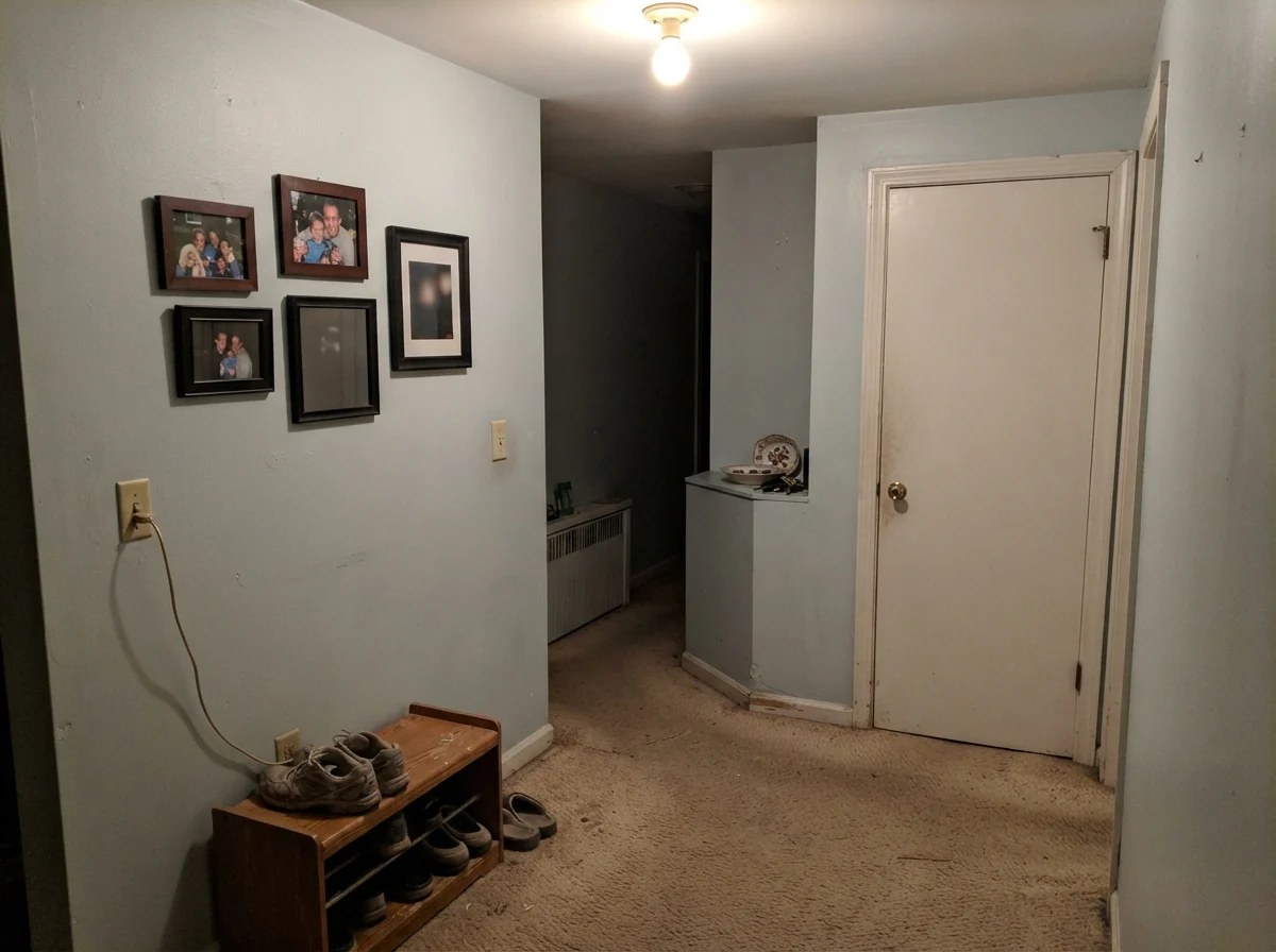
Every paint has its breaking point, and with Ocean Air, that breaking point is a dark, windowless interior hallway. A neighbor down the street tried rolling it in an interior hall that had no windows and relied solely on an older ceiling fixture with a low-wattage bulb. She called me three days later wondering why her brand-new designer paint looked like dirty putty.
When you deprive an LRV 73 blue-green of natural photons, the color dies. There isn't enough raw pigment in the can to assert a chromatic identity without light bouncing off the wall. Instead of reading as clean or coastal, it absorbs the dim shadows of the hall, accentuates beige carpeting, and looks like wet drywall mud. If a room doesn't have a window or generous, well-placed warm lamps, keep Ocean Air far away from it.
Architectural Accents and Exterior Siding
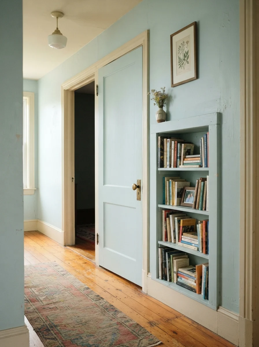
If four walls of Ocean Air feel too timid or your lighting won't support it, using it as an accent on interior millwork is an understated way to bring character into an older home. A two-panel interior door or a built-in bookcase painted in this shade against warm cream walls creates an heirloom, collected feel. It gives you the charm of painted woodwork without the heavy commitment of a darker colonial teal.
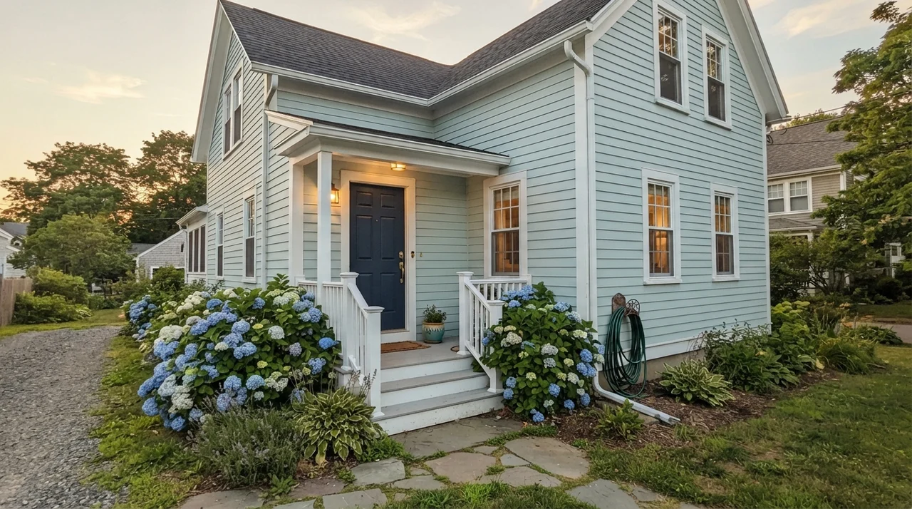
On an exterior, however, caution is mandatory. Sunlight outside is exponentially more intense than any daylight that passes through your interior window glass. Direct sun will bleach Ocean Air out until it reads as plain, unpigmented white from the curb. If you want to use it outside, it belongs on protected surfaces: the ceiling of a deep covered porch, or a shaded, north-facing front door framed by clean white trim. If you roll it across twenty feet of horizontal lap siding in full sun, prepare to see an off-white house.
Durability, Scrubbing, and Getting the Sheens Right
After thirty years of painting and repainting houses, I can tell you that sheen selection will make or break your relationship with a wall. With a color this pale, imperfections, water spots, and scuffs have nowhere to hide. You cannot afford to put the wrong finish in the wrong room.
For walls, stick strictly to eggshell. Flat paint in a pale blue-green is an absolute trap in any home where actual people live; you will scrub clean a spot near a doorway or light switch once and leave behind a burnished, shiny mark that ruins the velvet illusion forever. Eggshell gives you just enough resin to wipe away bathroom steam condensation and muddy dog splashes without creating an annoying glare.
On bathroom trim, baseboards, and door casings, use semi-gloss. Trim takes the brunt of the vacuum cleaner, dropped laundry baskets, and wet mop splashes. The semi-gloss resin pack forms a hard barrier that resists chipping and wipes clean with a damp rag without dulling.
If you decide to roll Ocean Air on a bathroom vanity or kitchen island, use satin. Semi-gloss on cabinetry can look plasticky under bright task lighting, while satin provides a rich, hand-rubbed furniture appearance that has enough washability to survive toothpaste dribbles and dish soap splatters five years in.
Will Ocean Air make my small bathroom feel bigger?
Yes, but only if you use low-contrast fixtures. Paired with white subway tile, white wainscoting, and chrome or nickel hardware, its LRV 73 brightness lets the eye move seamlessly across the room without harsh visual boundaries.
Why does Ocean Air look mint green in my house?
Warm light from west-facing afternoon sun or 2700K bulbs pulls the green component forward. Honey-oak cabinets or yellow pine flooring will also reflect warm tones onto the wall, turning the blue-green toward mint or seafoam.
Can I use Benjamin Moore Ocean Air in a windowless room?
It is not recommended. Without natural daylight, this high-LRV paint loses its color saturation and flattens out into an uninspired, muddy gray putty. Save it for rooms with at least one good window.
What sheen should I choose for Ocean Air in a bathroom?
Eggshell for the upper walls, semi-gloss for baseboards and trim, and satin if you are painting a vanity. This combination handles moisture and scrubbing without leaving shiny burnish marks.
Susan's Verdict · Buy with clear eyes
Ocean Air is not a bold color, and it will never play the hero in a grand living room. But if you have a cramped bathroom with a decent window, white tile, and nickel hardware, it is worth every penny of the can. It delivers that rare, restful pause on a wall—giving you color without the commitment, and room to breathe where you need it most.