Color Diary · No. 8
Benjamin Moore Pale Oak: The Greige That Changes Its Mind at Sunset
The soft greige everyone recommends — reviewed honestly, including the purple flash that catches people out and the rooms where it disappears.

Susan HartleyAugust 31, 2026 · 15 min read
Pale Oak · Benjamin Moore OC-20
Hex#DDD9CELRV69Undertonestaupe → soft gray → faint violet
When we bought our 1990s colonial back in 2004, the previous owners had rolled a heavy, buttery beige over every square foot of drywall from the front foyer right up the stairwell. It felt like living inside a jar of mayonnaise. A few years later, when the entire country decided gray was the only acceptable color to paint a wall, I swung the pendulum all the way to the other side and put a chilly, steely gray in the upstairs hallway. That looked dated within thirty-six months. By the time we moved into our current 1960s ranch, I was thoroughly exhausted by colors that screamed a specific decade. I wanted a neutral that acted like a quiet backdrop—something warm without looking yellow, and calm without feeling like a commercial office building.
That is how I ended up with Benjamin Moore Pale Oak (OC-20). It is one of those colors that interior designers and paint store clerks hand you with utter confidence, promising it will solve all your open-concept layout problems. And in many ways, it does. But after living with it across changing seasons, scrubbing finger marks off it by the pantry door, and watching how it behaves under every type of lightbulb known to hardware stores, I can tell you that Pale Oak is not quite the polite, invisible greige everyone claims it to be. It has a definite personality, a specific temperament, and a subtle shift under cool light that catches people completely off guard.
What Pale Oak Actually Is (and Why It Shifts)
On paper, Pale Oak sits at a Light Reflectance Value (LRV) of 69. In plain English, that means it reflects quite a bit of light—putting it right on the boundary between an off-white and a very pale, milky greige. When you see it on a color strip under the bright halogen lighting of a paint desk, it looks like a soft, creamy stone. It does not carry the heavy mustard tint of traditional beiges, nor does it have the concrete chill of modern grays. It feels delicate, warm, and exceptionally peaceful.
The trouble—or the charm, depending on how well you prepare—lies in the underlying pigment. Pale Oak gets its warmth from a soft taupe base rather than a yellow ochre. Taupe sits right on the edge of the color wheel where red and violet mingle with gray. In a room that receives warm morning or afternoon sunlight, those warm undertones behave beautifully, reading like washed linen or natural raw oak. But the moment you deprive Pale Oak of warm natural light, or switch on a modern LED bulb that burns anywhere above 3000K, that warm red edge shifts. The cool light strips away the creaminess and exposes a faint pink-purple shadow that some people love and others cannot stand.
The Daylight Test: Why You Must Sample Twice
In our last house, I made the classic rookie mistake with our guest bedroom. I brought home a paper swatch, taped it up by the south window at two o'clock on a sunny Tuesday, decided it was perfection, and bought three gallons. By November, with the gray Ohio overcast outside and a budget lightbulb overhead, that guest room looked like a bowl of cold mushroom soup with a dash of lavender. I lived with it for three years because I refused to repaint a room I had just finished, but every time I walked past that doorway in December, it bothered me.
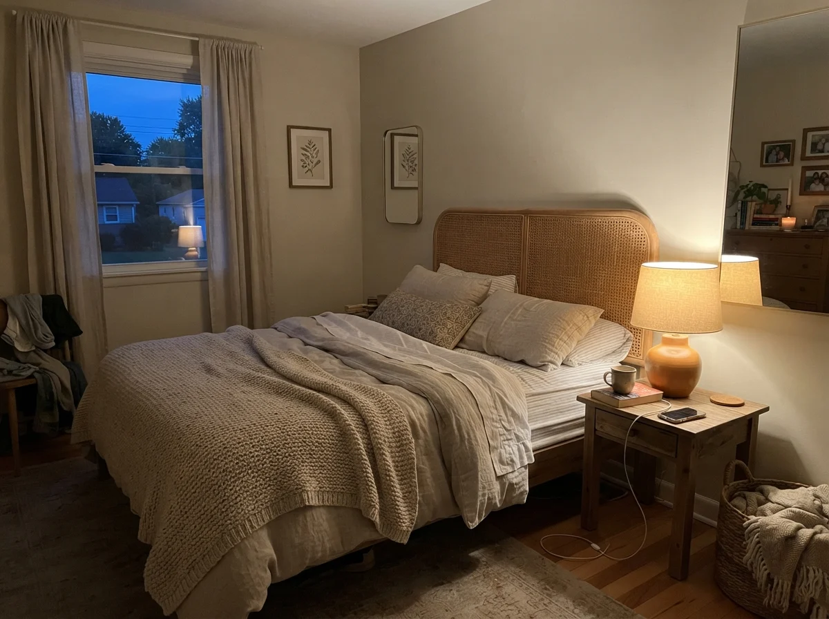
Pale Oak will do exactly that if you do not test it across different hours of the day. In the early morning, before the sun climbs over the roofline, it can look pale, cool, and a little washed out. But as the day turns and you flick on a table lamp with a warm 2700K bulb, the color gathers itself together and turns into the coziest, most comforting milky taupe you could ask for. If you paint a room in Pale Oak, buy your lightbulbs before you open the paint can.
Bathrooms and Tile: Where undertones Make or Break the Room
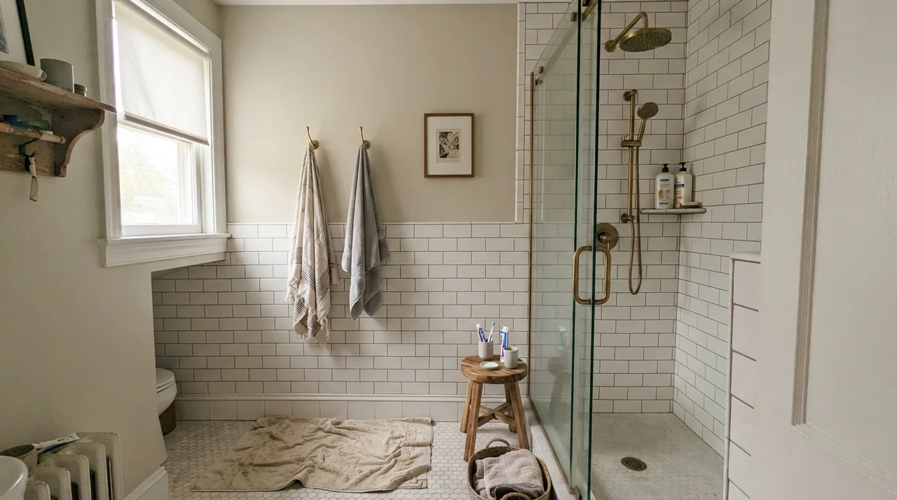
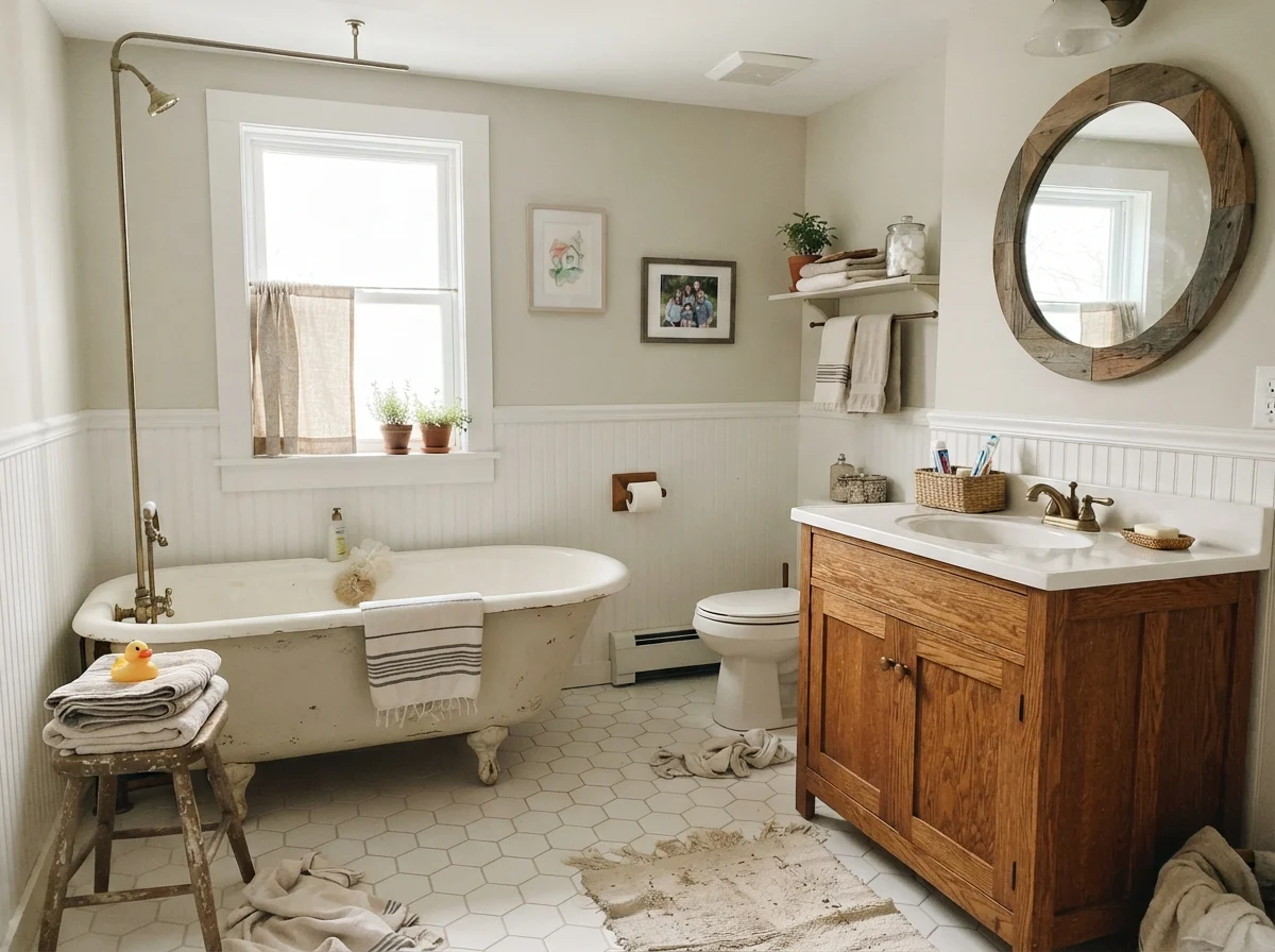
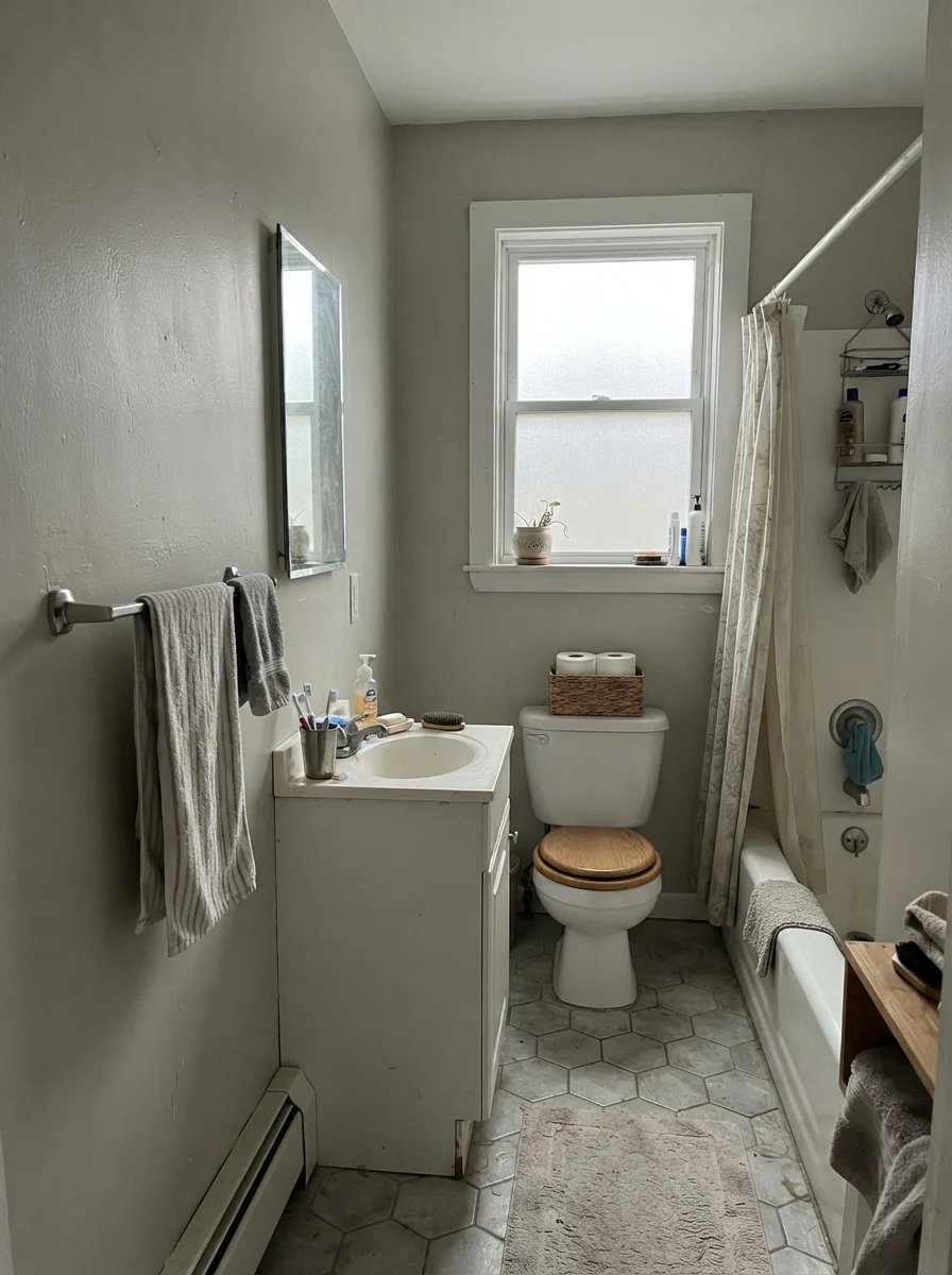
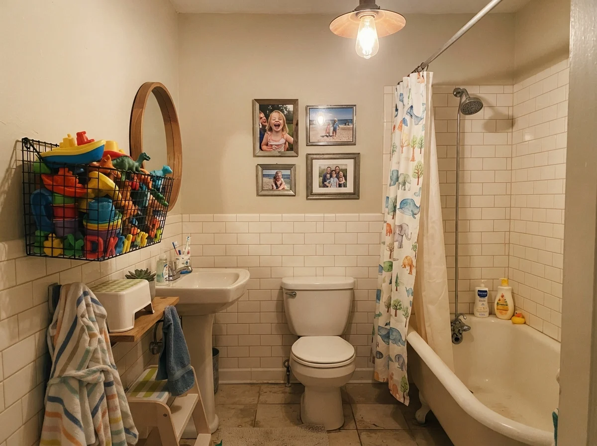
Bathrooms are where paint colors either earn their keep or cause an immediate headache. Because bathrooms are packed with fixed surfaces—tile, porcelain fixtures, chrome or brass hardware, and stone countertops—a wall color has nowhere to hide. If your tile is a clean, bright white subway tile, Pale Oak acts as a gentle framing color that softens the clinical edge of the porcelain without making the room feel closed in.
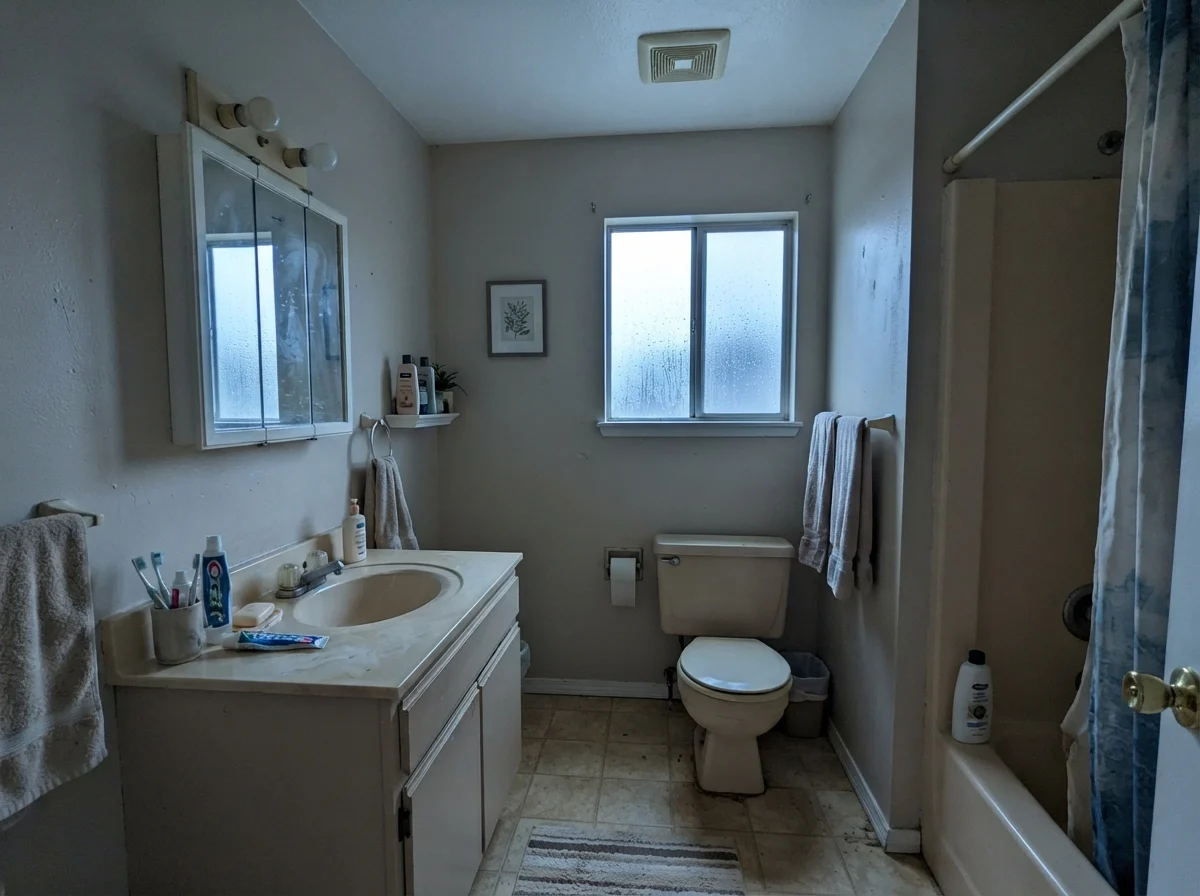
However, you need to pay close attention to your daylight exposure and plumbing trim. Under bright morning light or soft side daylight, Pale Oak feels classic, especially against warm wood vanities and traditional white tubs. But under flat overcast skies or in windowless rooms with cool recessed lights, it will lean hard into its muted gray side. If your bathroom has older beige tile or a yellowed vanity counter, Pale Oak will fight it immediately; its pink-taupe undertone will clash with yellow-beige, making the walls look faintly dirty.
In our family bathroom, I used an eggshell finish on the walls above the tile wainscot. For high-traffic bathrooms where kids are splashing soapy water and bath toys end up everywhere, an eggshell finish is worth the money because it can actually be wiped down without leaving dull burnish marks. Flat paint in a bathroom is an absolute mistake that will leave you repainting within twelve months.
Bedrooms and Nurseries: The Cozy Sweet Spot
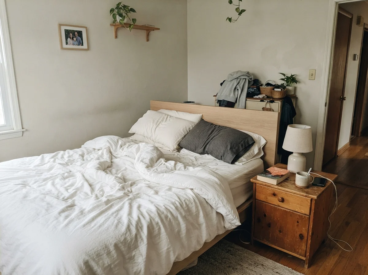
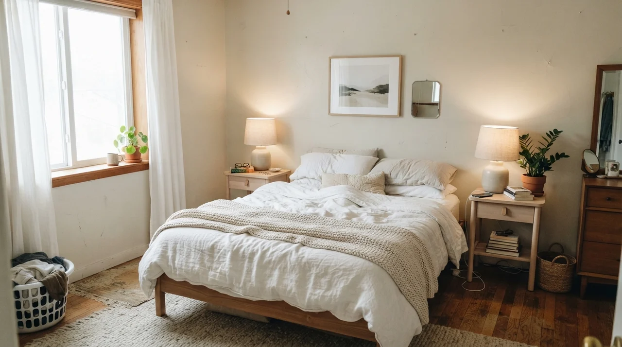
If you ask me where Pale Oak performs at its absolute best, I will tell you without hesitation: bedrooms. A bedroom does not need to shout. You want walls that recede into the background at night when the bedside lamps are turned on, creating a restful, cocooning environment that lets linens, wood furniture, and soft blankets take center stage.
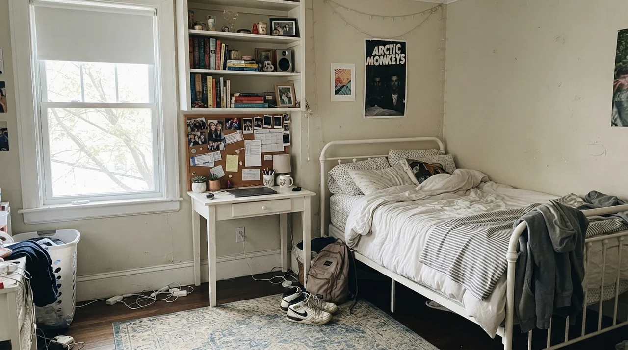
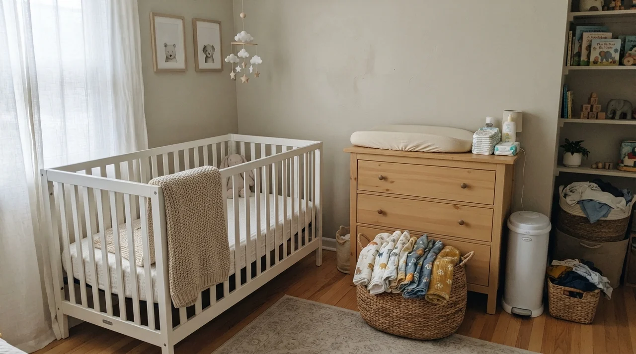
Because Pale Oak is light (LRV 69), it keeps a master bedroom feeling airy during the day, especially when paired with natural oak nightstands, white linen sheets, and simple ceramic lamps. It avoids the clinical sterility of pure stark white, yet it never feels dark or heavy like the tan shades of twenty years ago. In nurseries and teen rooms, it serves as an exceptional long-term foundation. Children change their bedding, posters, and favorite colors every three years; a wall painted in Pale Oak adapts to knit baby blankets just as easily as it handles corkboards, desks, and piles of sneakers without requiring a fresh paint job every time your child enters a new phase.
Kitchens and Cabinets: The Contrast Rule
In thirty years of maintaining houses, I have painted cabinets four times. Let me tell you straight: cabinet repaints are exhausting, messy, and expensive. If you are going to take the doors off and spend a week sanding and priming, you want a color you will not despise five years in. Pale Oak has become a very popular choice for kitchen cabinetry, but you have to be careful with how you build contrast around it.
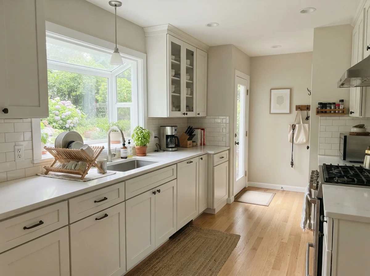
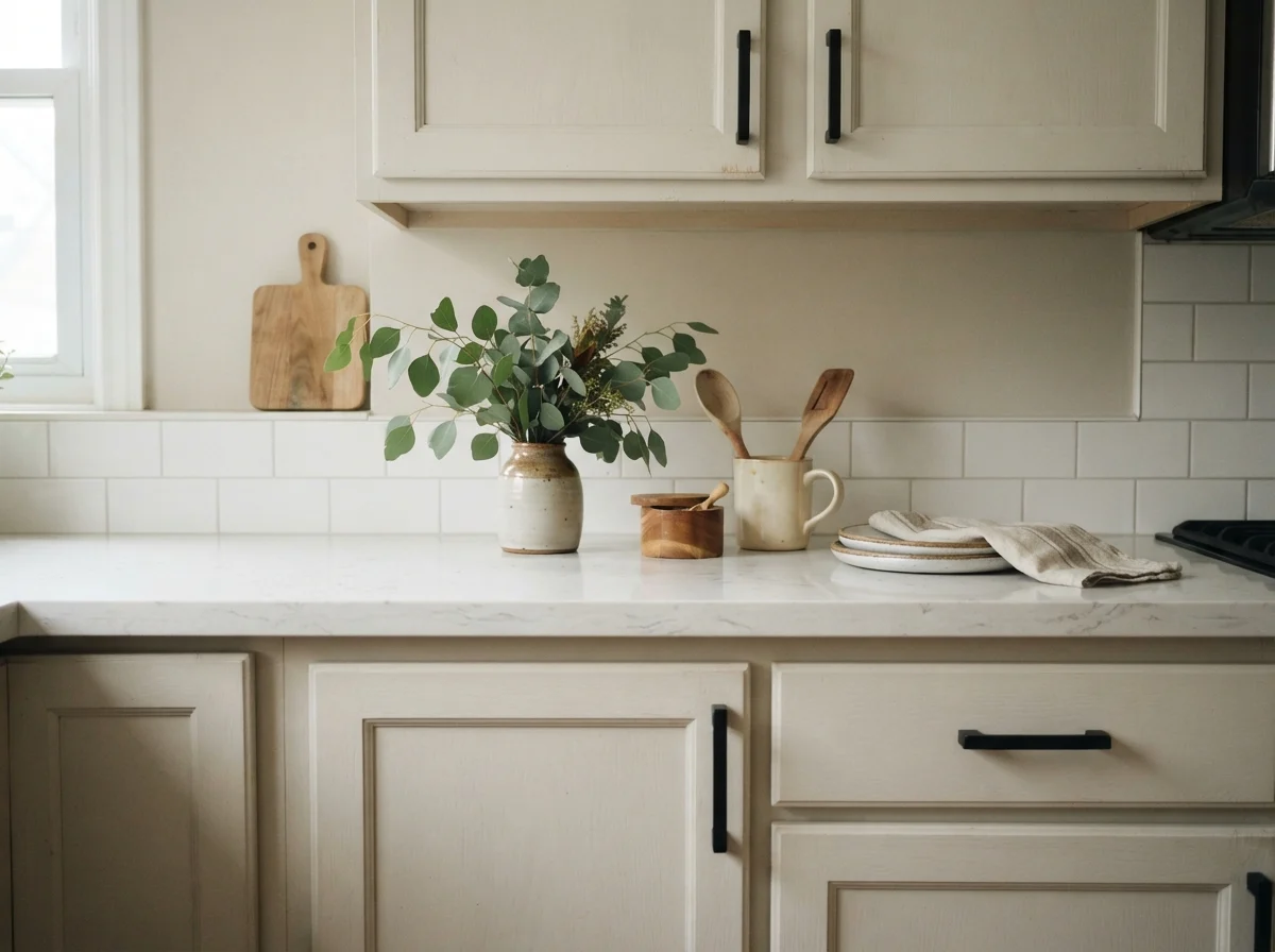
When used on shaker cabinets in a satin finish, Pale Oak offers a wonderfully soft, organic alternative to stark builder-white cabinets. It pairs gorgeously with white quartz countertops, clean white subway tile backsplashes, and light oak floorboards. But you must ensure your backsplash and countertops have enough crispness or depth to give the cabinets definition. If your countertop is an antique almond laminate or a creamy yellow granite, Pale Oak cabinets will blend into one murky, edge-less smudge. Alternatively, using Pale Oak on kitchen walls behind crisp white cabinetry is close to foolproof.
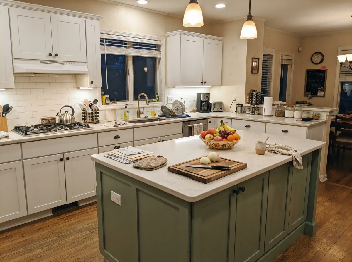
If painting every cabinet in Pale Oak feels like too big of a risk, painting just the kitchen island is an easy, low-stress middle ground. It grounds a large kitchen without requiring you to commit the entire room to a single shade, and it holds up well to everyday family wear and tear when finished in a durable satin enamel.
Living Rooms, Sunrooms, and Hallways: Managing Bright Light
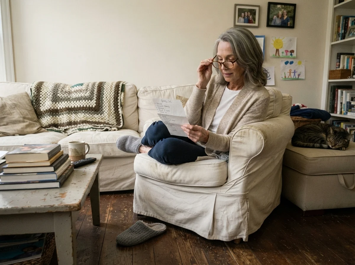
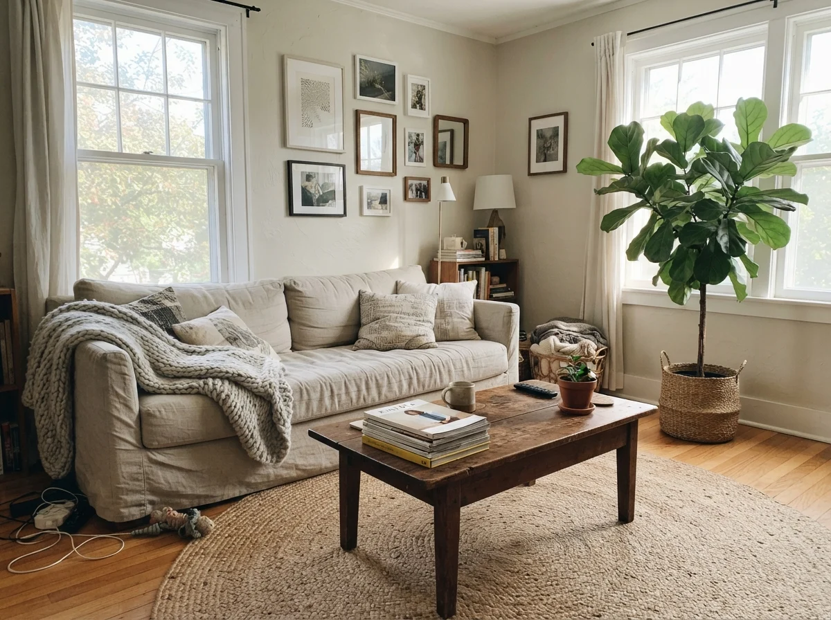
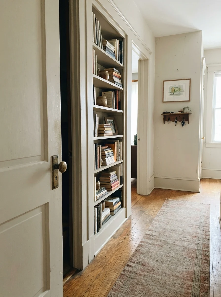
In living rooms and large open-plan spaces, Pale Oak shines as a whole-house neutral because it carries easily from room to room without awkward transitions at drywall corners. In our current home, the main hallway feeds into three different rooms, each facing a slightly different direction. Pale Oak handles those shifts with dignity, provided you don't expect it to carry the room entirely by itself. Because it is so soft, a living room painted in Pale Oak needs a few dark anchors—like a charcoal fireplace surround or a deep navy accent piece—to keep the space from floating away into visual boredom.
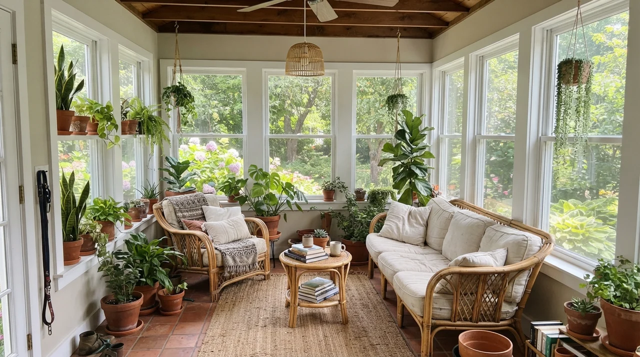
There is, however, one trap: rooms flooded with blazing southern or western sun. In a sunroom wrapped in wall-to-wall glass, Pale Oak has so little pigment that the midday sun completely washes it out, making it look like an unremarkable, flat off-white. If you spent two full weekends taping baseboards and rolling two coats of paint, you want to actually see color on the drywall. In high-sun spaces, a slightly deeper neutral with more body will hold its own much better.
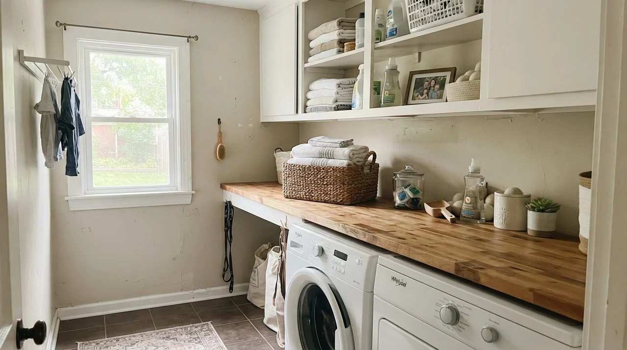
In smaller secondary spaces, like bright laundry rooms or traditional hallways where you want to highlight woodwork, Pale Oak behaves nicely. It provides just enough contrast against crisp white trim, built-in shelving, and wood flooring to look intentional, clean, and well-tailored.
The Honest Fail: Where Pale Oak Falls Apart
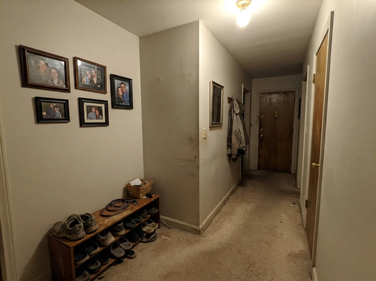
I have repainted enough rooms in thirty years to know that every paint color has a failure point. The paint brochures never show you this, but I will. If you put Pale Oak in a windowless hallway, a dark basement stairwell, or a small room lit by a single, cheap ceiling fixture, it turns flat, muddy, and lifeless. Without natural daylight to give it warmth, or 2700K warm lamps to bring out its taupe undertone, it looks like wet cement putty. It will not brighten a dark cave; it will simply make the cave look dingy and tired.
Exterior Siding: Shelter Is Essential
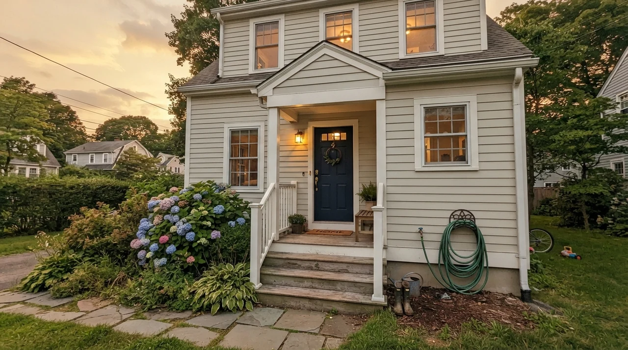
Using Pale Oak on a house exterior is possible, but only under specific architectural conditions. Because outdoor sunlight is roughly ten times stronger than indoor daylight, Pale Oak will read as a soft, warm off-white on exterior siding. It looks lovely on covered porches, sheltered elevations, or craftsman cottages paired with dark navy or charcoal trim. However, on an unshaded western facade exposed to blinding late-afternoon sun, that purple-pink undertone can rear its head on exterior siding. If you are considering it for siding, paint a substantial board and lean it against your house at five o'clock before buying five-gallon buckets.
Pale Oak is a whole-house neutral for people who want warmth without yellow and quiet without cold gray—just don't expect it to behave under cool bulbs.
Durability, Scrubbing, and the Five-Year Test
Here is what thirty years of homeownership teaches you: no paint color looks good if the finish cannot survive a sponge. When we repainted our family room and hallway, I used an eggshell sheen on the walls, semi-gloss on the trim, and flat on the ceilings. In our last house, I tried a flat finish on a main hallway because a designer magazine said it looked luxurious. That lasted about four months until my golden retriever brushed against the corner with muddy fur and scrubbing it clean left a shiny, polished bald spot. Flat paint in a family hallway is not worth the money unless you enjoy touching up paint every Saturday morning.
Pale Oak in Benjamin Moore's eggshell finish has held up exceptionally well over five years. It has been scrubbed clean around the light switches, wiped down after coffee splashes by the kitchen counter, and lived with through muddy winters. Because it sits at LRV 69, touch-ups blend in reasonably well if you keep a labeled mason jar of the original batch in your basement. When we sold our previous home, having a consistent, quiet greige across the main floor was one of the things the buyer's agent specifically praised—it felt fresh, current, and made the whole house look cohesive rather than piecemeal.
Does Benjamin Moore Pale Oak look purple?
It can in cool lighting. Because Pale Oak has a taupe base rather than a yellow base, north-facing daylight and cool LED bulbs (3500K to 4000K) strip out the warmth and reveal a subtle lavender-pink cast. Under warm 2700K bulbs and south-facing daylight, it reads as a warm, creamy greige.
What sheen should I use for Pale Oak?
Use an eggshell finish on living room and bedroom walls for scrubbability, semi-gloss on baseboards and trim, satin on kitchen cabinets, and flat on ceilings.
Is Pale Oak warm or cool?
Pale Oak is a warm greige, but its warmth comes from a soft taupe rather than yellow or gold. This keeps it from reading dated or yellowed, but gives it a subtle shift in cool rooms.
Does Pale Oak go with honey oak cabinets and trim?
Yes. Pale Oak flatters oak, walnut, and warm wood tones exceptionally well because it does not clash with the wood's natural grain or pull out unwanted yellow tones.
Susan's Verdict · Worth the Money with the Right Bulbs
If you want a single, whole-house neutral that connects an open-concept floor plan without turning cold gray or dingy yellow, Benjamin Moore Pale Oak is an outstanding choice. It makes rooms feel peaceful, flatters wood floors, and survives everyday family living. Just remember the homeowner's rule: swap your lightbulbs to warm 2700K, avoid pairing it with yellow-cream trim, and sample it in your dimmest room first.