Color Diary · No. 29
Revere Pewter Fifteen Years Later: The Greige That Demands Real Sun
America's best-selling greige, reviewed honestly: the green flash, the rooms where it turns murky, and whether it really looks dated now.

Susan HartleySeptember 14, 2026 · 13 min read
Revere Pewter · Benjamin Moore HC-172
Hex#CBC6B8LRV55Undertoneswarm gray → muted green → muddy taupe
In our last house—a 1990s colonial with honey oak floors and more drywall than any family of four knows what to do with—I rolled Benjamin Moore Revere Pewter across the entire first floor. It was 2011. Every design magazine in the country was declaring beige dead and gray the future, and Revere Pewter (HC-172) was the compromise that promised to bridge the gap. It promised to make golden oak trim look intentional, white trim look crisp, and dated rooms feel current without turning cold.
We lived with it for seven years in that house. I watched it in morning sun, through November sleet, under warm incandescent lamps, and beneath those awful early compact fluorescent bulbs we all bought before LEDs got good. Five years in, I had learned everything this swatch hides from you in the store aisle. Revere Pewter isn't a neutral that sits quietly in the background while your life happens around it. It is an opinionated, light-sensitive chameleon that behaves like three completely different paints depending on which direction your windows face.
The Undertone Breakdown: Why It Flashes Green
Revere Pewter sits at an LRV of 55, making it a true mid-tone greige. It carries a subtle green-gray undertone that provides its signature warmth in natural light. But when daylight drops or cool bulb temperatures hit the wall, that warm balance shifts dramatically.
warm sun
overcast, north light
dusk, rain, cool bulbs
South sun pulls out the soft, earthy putty tones. North-facing rooms and rainy afternoons pull the cool gray-green base forward. Under cool 4000K LEDs, it turns flat cement.
Vintage PewterBehr · see diary
Wheat BreadBehr · see diary
Revere PewterHC-172
Smokey TaupeBenjamin Moore · see diary
Clay FigurineValspar · see diary
The Morning vs. Evening Shift
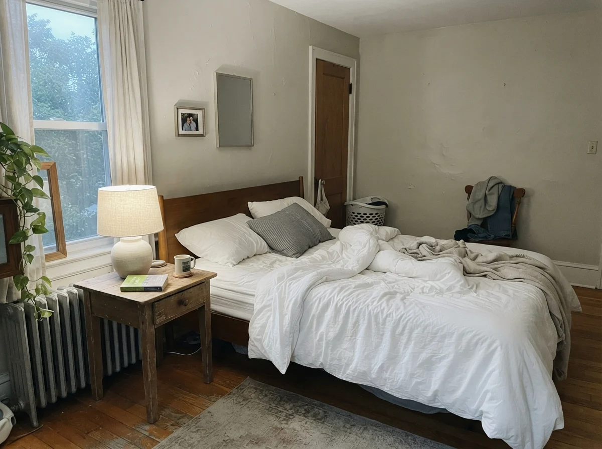
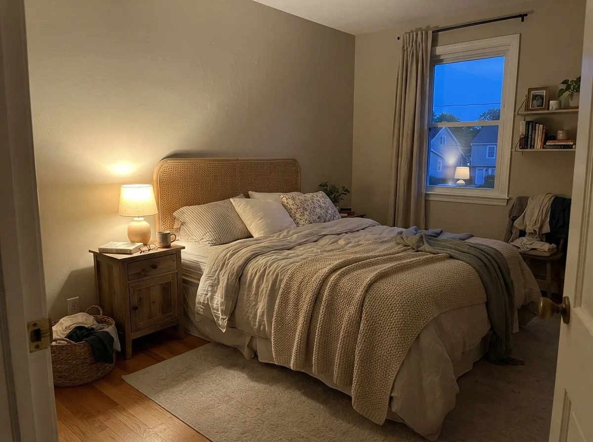
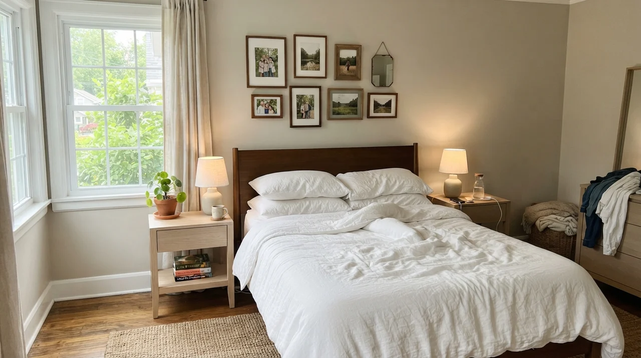
Here is the reality of living with Revere Pewter in a bedroom. In the early morning, when the sun is still low and daylight is pale, the paint can look slightly washed out and cool. It doesn't have the heavy pigmentation of darker taupes, so it needs photons to wake up. But come evening, when you switch on 2700K bedside lamps, the warm base ignites. The wall wraps around the room like a cashmere blanket.
This dual nature is why people either revere this color or spend years cursing it on remodeling forums. If you judge it at 7:00 AM on an overcast Tuesday, you'll think you painted your bedroom the color of wet sidewalk. If you judge it at 8:00 PM with your lamps on, you'll think it's the coziest room in the house.
Light Direction: The Three Faces of HC-172
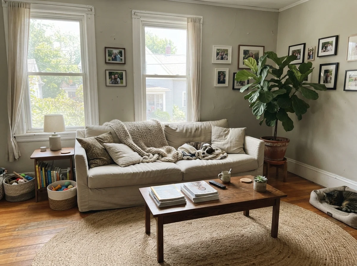
In our current 1960s ranch, I tested Revere Pewter in three separate exposures before deciding where it belonged. The results were consistent with everything I saw over decades of painting. South-facing light brings out the absolute best in this formula. The natural golden warmth of the sun balances the gray-green pigment, producing a settled, creamy putty that makes leather furniture and oak floors sing.
North light, however, strips every drop of warmth right out of it. Because there is not a heavy saturation of yellow or red in HC-172, cool northern exposure exposes the green undertone instantly. On flat, overcast afternoons or in north-facing baths, expect the wall to read distinctly darker, cooler, and noticeably grayer than the small chip on the paint counter.
Kitchens, Cabinets, and Millwork
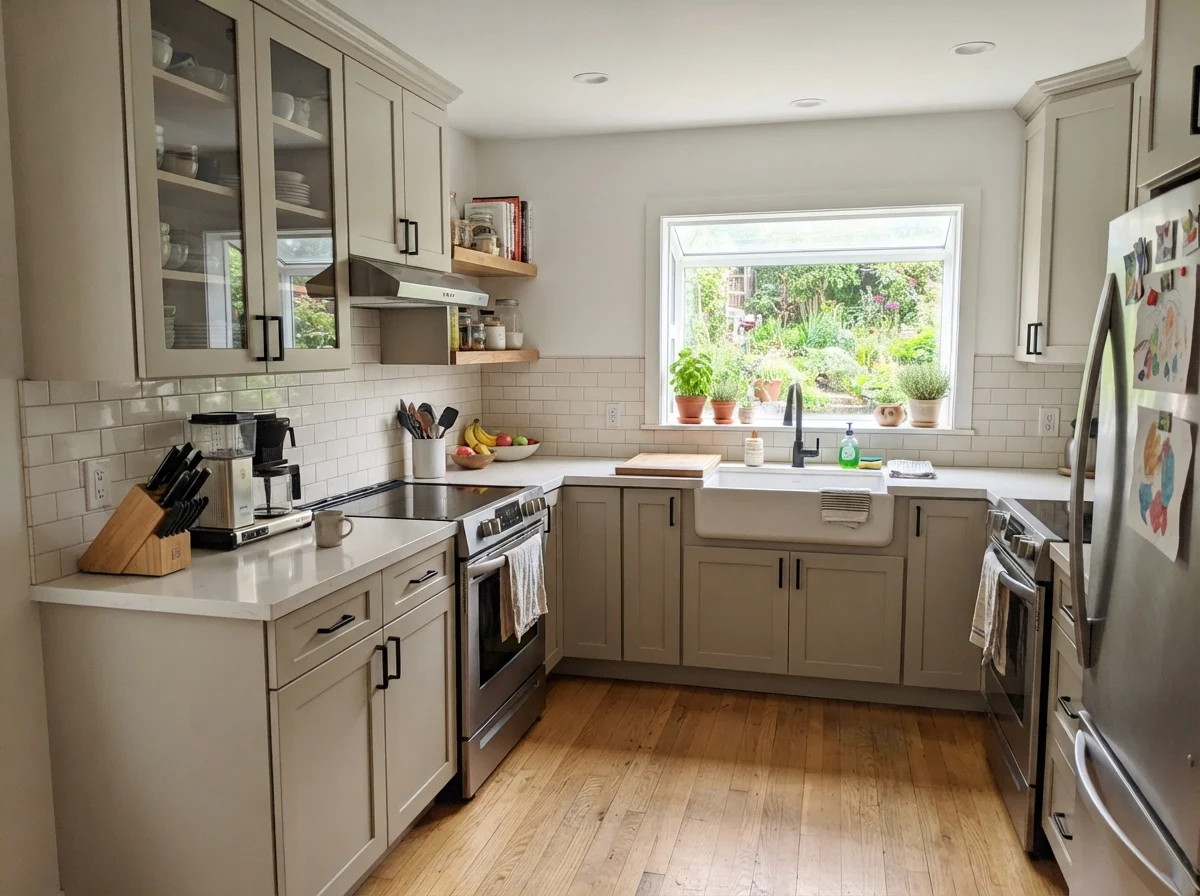
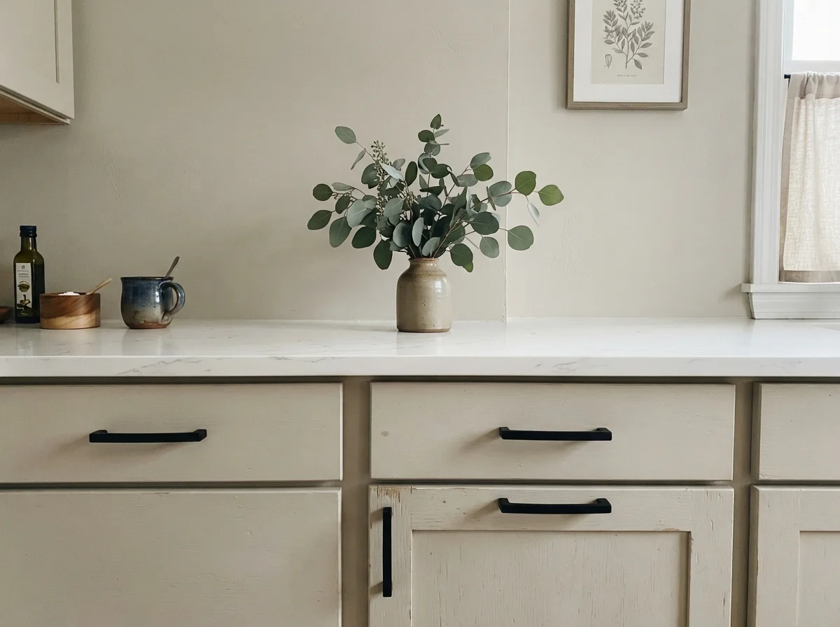
Where Revere Pewter has genuinely earned its stay over the last decade is on cabinetry and trim. A true gray on kitchen cabinets can feel sterile and commercial, especially under harsh task lighting. Because Revere Pewter carries that grounded, earthy warmth, it gives cabinetry weight without feeling cold. When you spray it in satin on shaker doors, it provides enough contrast against crisp white walls and white quartz counters to look bespoke.
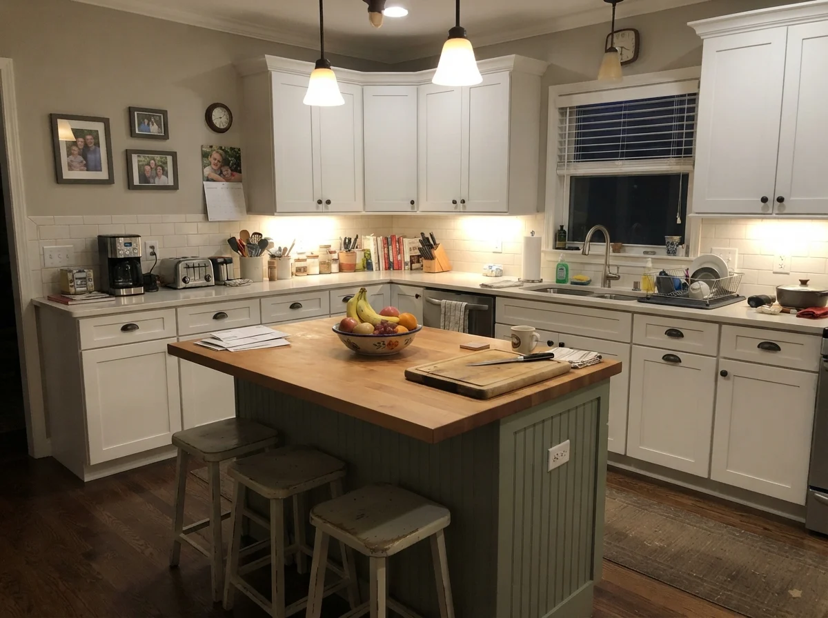
In our colonial, we painted the island in Revere Pewter while keeping the perimeter cabinets off-white. It was scrubbed clean weekly for years, took knocks from grocery bags and kids' boots, and held up beautifully. The color masked everyday scuffs far better than stark white ever could, and the satin sheen kept the greige from looking chalky.
Sunrooms, Mudrooms, and Utility Spaces
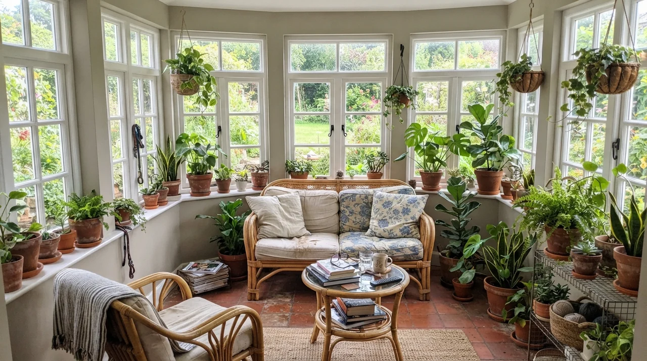
Rooms that get flooded with natural light from multiple directions are where Revere Pewter shines with zero fuss. In a sunroom wrapped in white-framed windows, the walls act as a quiet, organic backdrop for greenery, terracotta planters, and woven rattan. The green undertone that causes trouble in dark corners actually helps here—it connects the indoor room to the garden outside.
The same logic applies to bright laundry rooms. Paired with butcher-block countertops, white appliances, and warm wood details, eggshell walls in HC-172 feel tidy and substantial. It is one of the few neutrals that can handle bright sun without bleaching out into plain white.
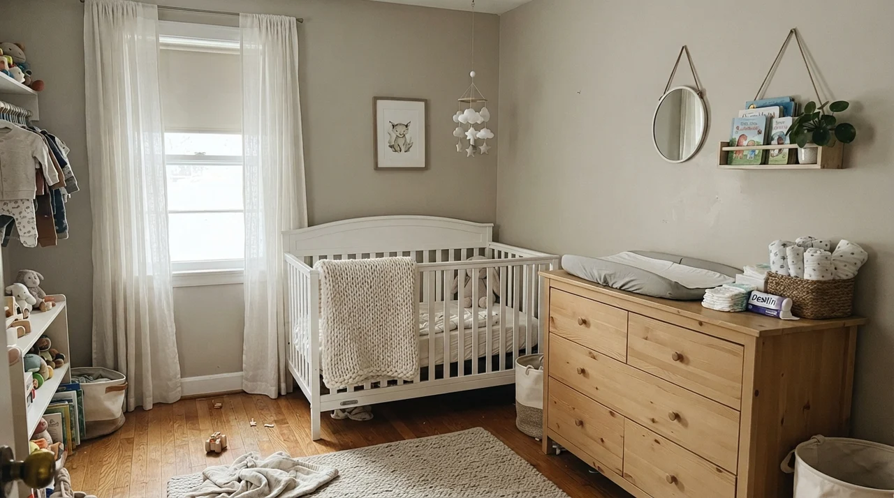
Bedrooms, Nurseries, and Bathrooms
In bedrooms, Revere Pewter creates an uncluttered, serene backdrop that adapts to shifting decor over time. When my daughter was a teenager, her room went through three distinct phases in four years—from pastel bedding to stark black-and-white prints. Revere Pewter absorbed every switch without needing a repaint. Against white metal bed frames, pale oak dressers, and simple linen bedding, it provides enough depth to make white linens look brighter by comparison.
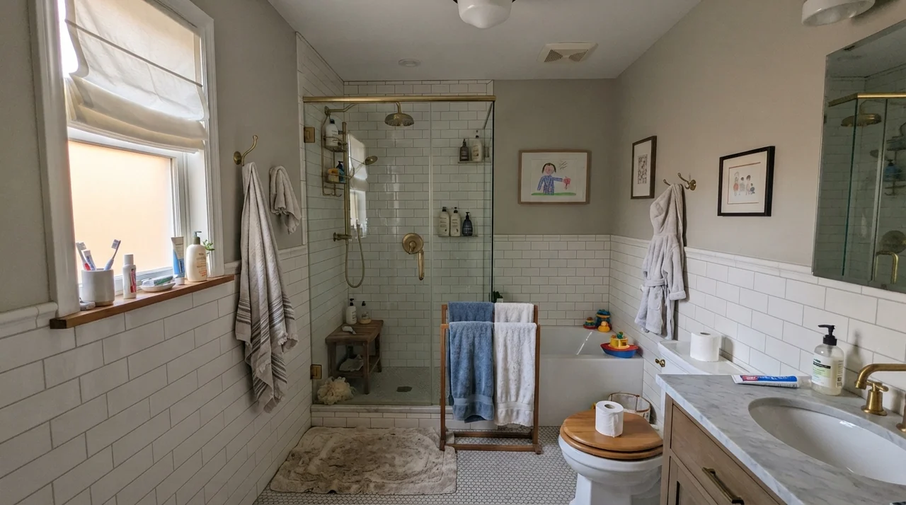
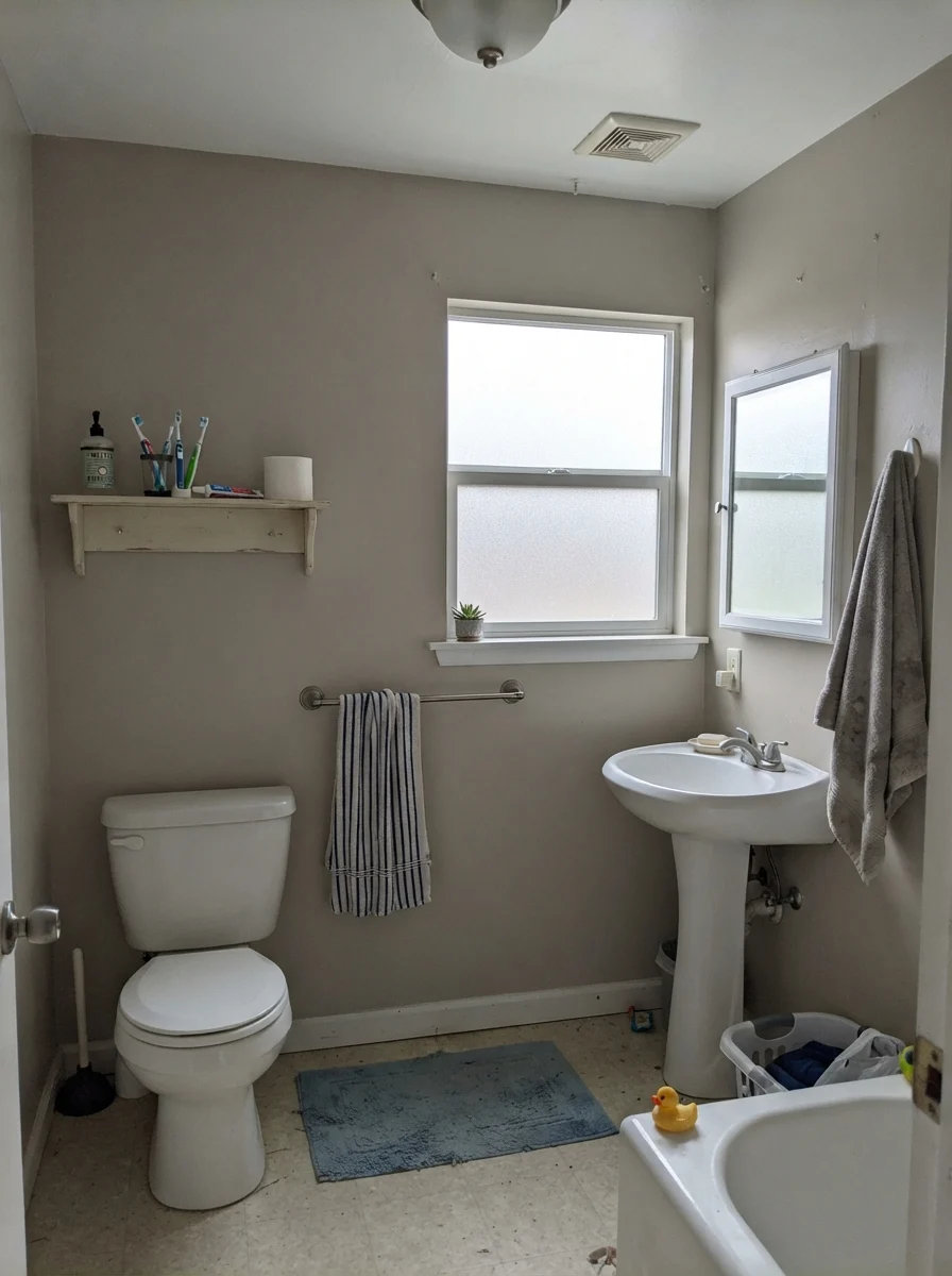
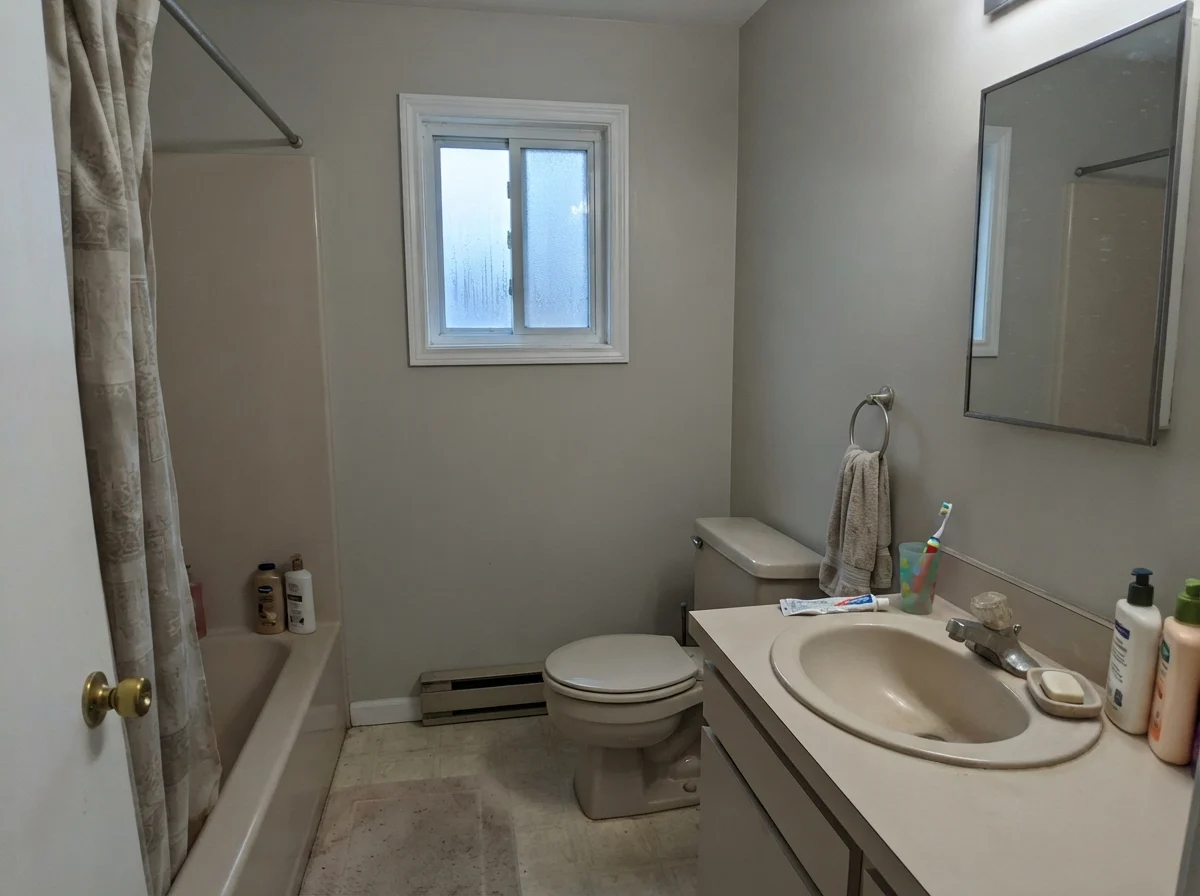
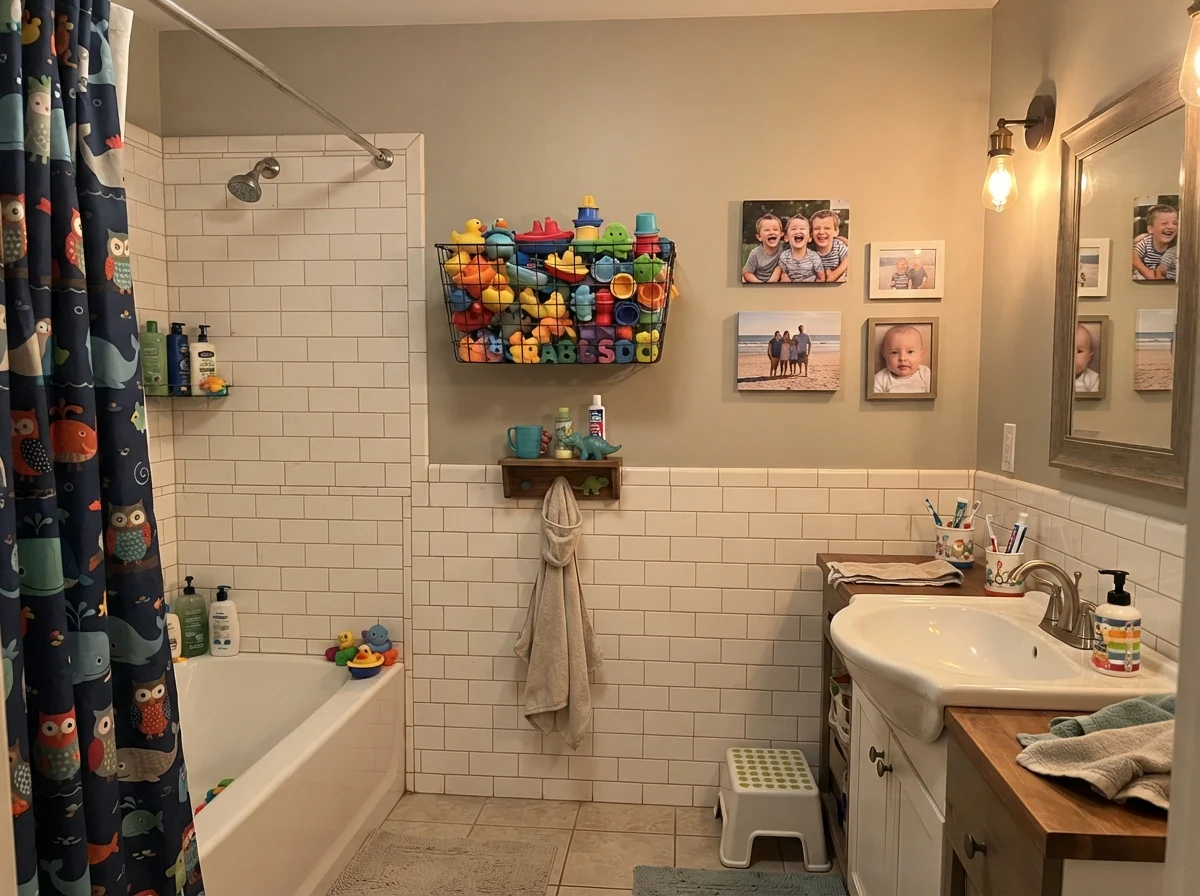
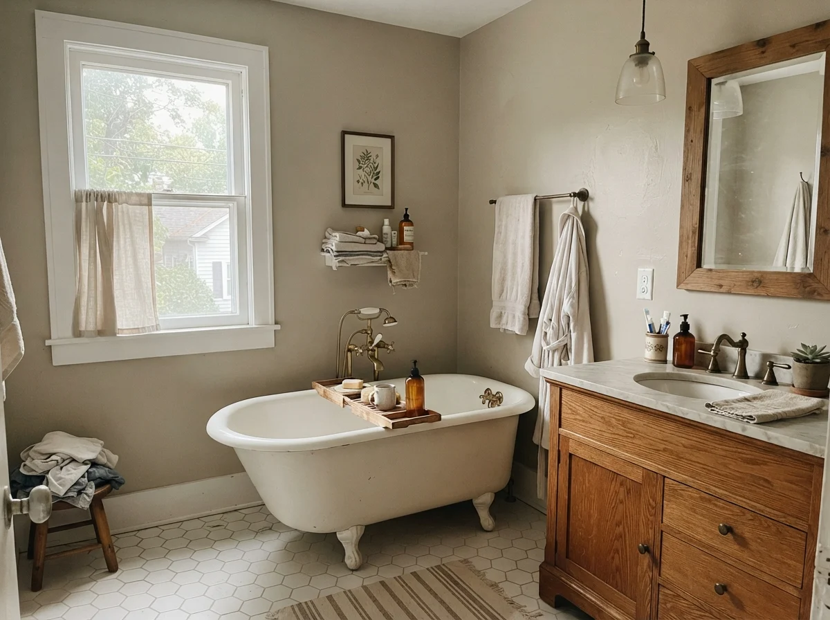
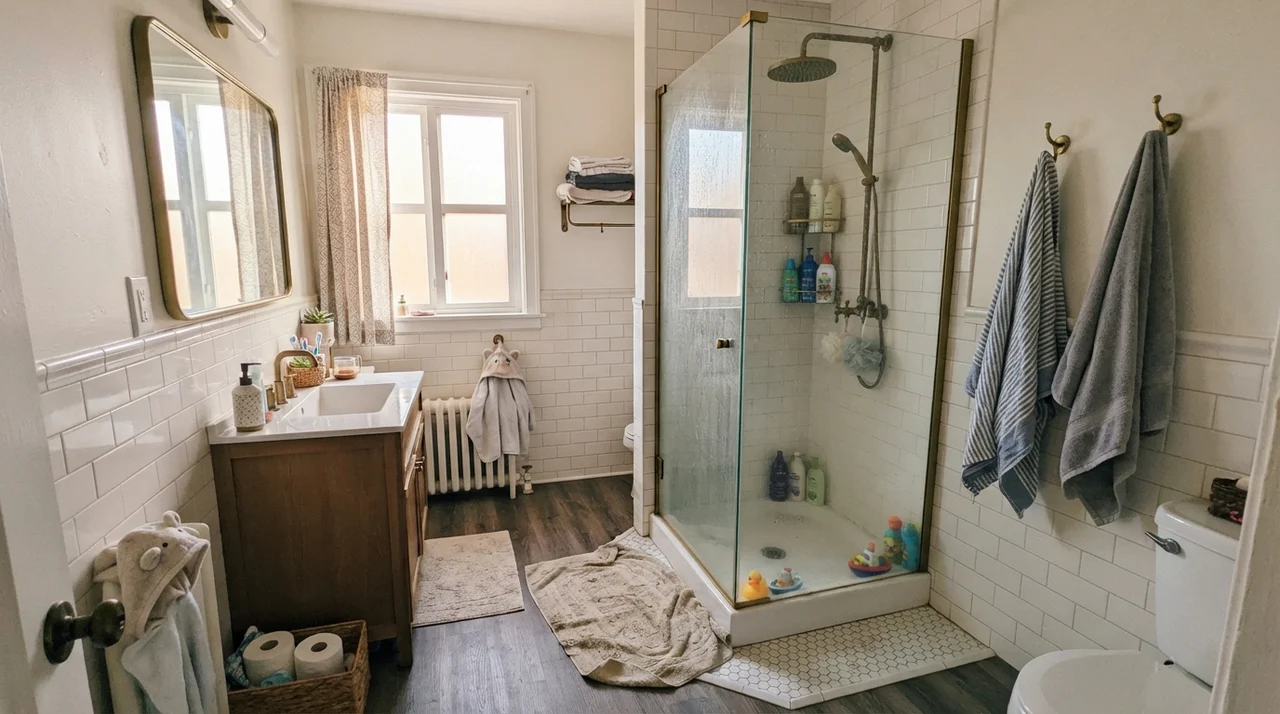
For bathrooms, the rule is simple: inspect your tile before buying the paint. If you have white subway tile, white hex floor tile, or natural warm oak vanities, Revere Pewter works like a charm. But if your tile leans beige, peach, or pink, stop immediately. We will talk about that clash in a moment.
Architectural Accents and Siding
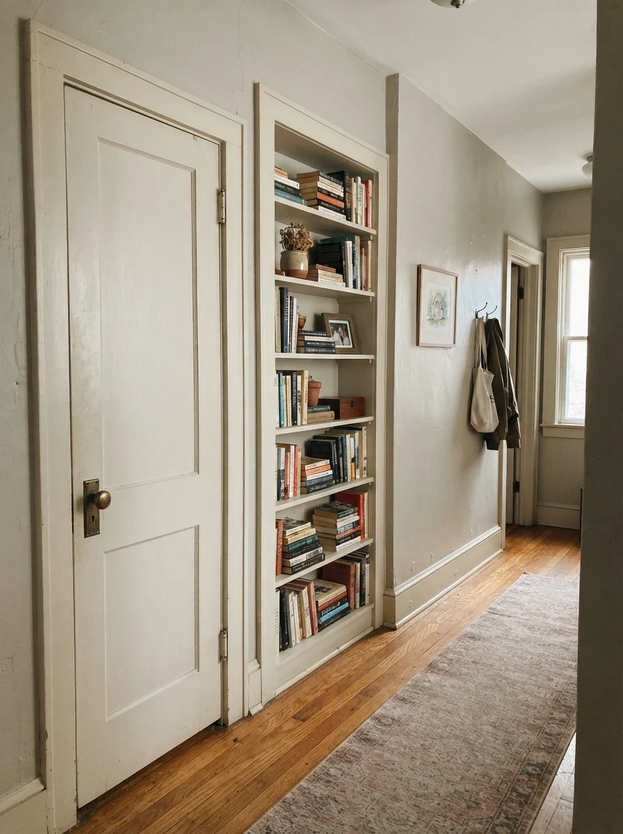
You do not have to confine Revere Pewter to wall-to-wall drywall. In fact, using it on interior doors, trim, or built-in bookshelves against off-white or cream walls is one of the most effective ways to update an older home. Painting an interior door in semi-gloss Revere Pewter with a vintage brass knob gives an ordinary hallway instant architectural substance.
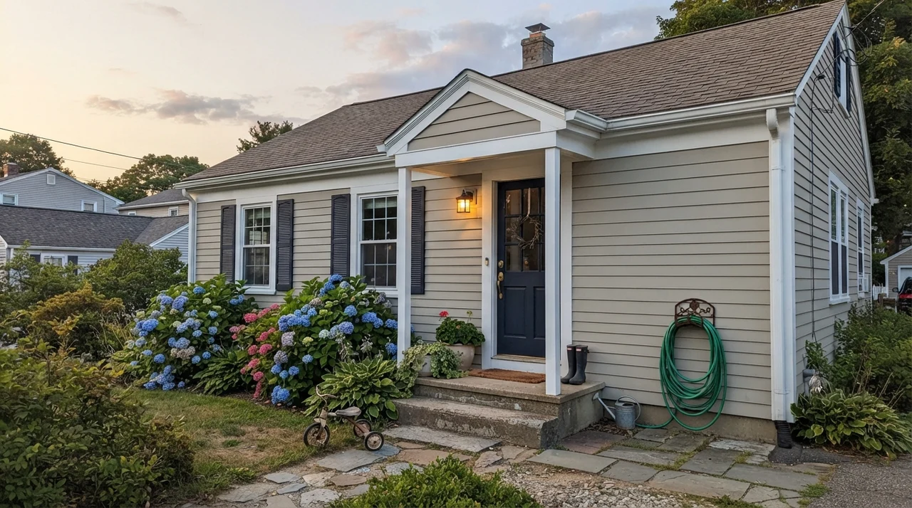
Outside the house, it performs with surprising grace. Exterior siding receives direct sun, which draws the warm base right to the surface. Exterior siding in low-lustre Revere Pewter paired with clean white trim and a deep navy front door—like Benjamin Moore Hale Navy (HC-154)—creates a calm, grounded curb appeal that will not looked dated within five years.
Where Revere Pewter Fails: The Honest Complaints
Revere Pewter has millions of happy rooms across the country, but the complaints on home improvement forums are remarkably consistent. If someone tells you they hate this paint, their room almost certainly suffered from one of three structural missteps.
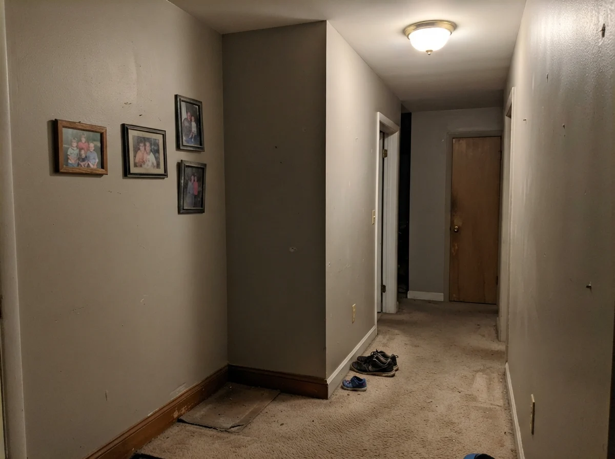
First: dim, windowless spaces. At LRV 55, Revere Pewter is not an airy off-white. It is a true mid-tone. Without natural daylight to reflect off the surface, the paint collapses. In a closed interior hallway or a windowless powder room, it turns into a heavy, muddy putty that makes the space feel confined and dusty.
Second: pink, peach, or red flooring. Because Revere Pewter carries a subtle green undertone, putting it next to pink-undertone carpet, travertine tile, or red cherry floors triggers an aggressive color clash. Green and red sit opposite each other on the color wheel. The walls will look distinctly greener, and your flooring will look pinker and dirty. If your floors lean rosy, skip Revere Pewter entirely and pick Balboa Mist (OC-27), which drifts violet instead.
Third: rolling it wall-to-wall in an already-beige house. When people complain that Revere Pewter looks dated, this is why. If you paint it over every wall of a 2000s builder home with beige floor tile and orange-stained oak baseboards, it loses its gray crispness and just reads as more beige. It needs contrast—white trim, black accents, or clean wood tones—to stay sharp.
Durability, Sheens, and Touch-Ups
Over seven years of family traffic in our last house, Revere Pewter held up remarkably well. Because it sits at LRV 55, it handles daily scuffs and greasy fingerprints around doorway casings much better than pale off-whites. When our golden retriever shook mud across the hallway base, eggshell walls scrubbed clean with warm water and mild dish soap without flashing shiny spots.
For walls, stick strictly to eggshell. Flat paint in HC-172 can look chalky and attracts marks, while satin on drywall exaggerates drywall seam flaws. For kitchen cabinets and bathroom vanities, satin is worth the money—it provides a silky, washable barrier that protects against grease and steam. On trim, use semi-gloss to give the edge definition Revere Pewter needs. For exterior siding, a low-lustre finish will shed rain without looking plastic in full sun.
That is the long-game truth about Revere Pewter: it is not an all-purpose white. It is a mid-tone greige that demands real daylight to show its warmth.
Is Benjamin Moore Revere Pewter considered dated now?
It looked dated within homes that rolled it over every surface of a 2000s beige builder house. Today, it looks completely current when used thoughtfully: on kitchen cabinets, on interior doors, or in sunlit rooms paired with crisp white trim like Chantilly Lace (OC-65) and matte black or unlacquered brass hardware.
What light bulbs look best with Revere Pewter?
Warm 2700K incandescent or LED bulbs bring out its soft putty warmth. Avoid cool 4000K daylight LEDs, which strip out the warmth and make the paint look like flat industrial gray.
Can I use Revere Pewter in a windowless powder room or hallway?
No. At LRV 55, without natural light it closes in, turns murky, and looks like wet putty. Step up to Edgecomb Gray (HC-173) or Balboa Mist (OC-27) for dim, enclosed spaces.
Why does Revere Pewter look green on my walls?
Revere Pewter has a natural green-gray undertone. In cool north-facing light, or when placed next to pink-toned carpets, cherry cabinets, or beige tile, that green undertone is pulled forward aggressively.
Susan's Verdict · Worth It for Sunlit Main Floors and Cabinets
If you have an open-plan main floor with generous south or west daylight, oak floors, and crisp white trim, Revere Pewter remains one of the best whole-house greiges on the market. It bridges traditional millwork and modern hardware better than nearly anything else. But keep it far away from windowless powder rooms and pink-toned tile, where its green undertone and mid-tone weight will quickly disappoint you.