Color Diary · No. 19
Saybrook Sage in Daily Life: The Historic Green That Won't Be Pushed Around
Benjamin Moore's quiet historic sage, reviewed honestly: the rooms where it reads calm and expensive, the light that turns it minty, and what to paint instead.

Susan HartleySeptember 7, 2026 · 14 min read
Saybrook Sage · Benjamin Moore HC-114
Hex#B1B7A2LRV45Undertonessoft sage green → muted celadon → cool stone gray
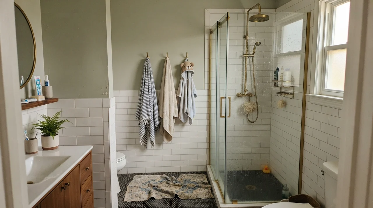
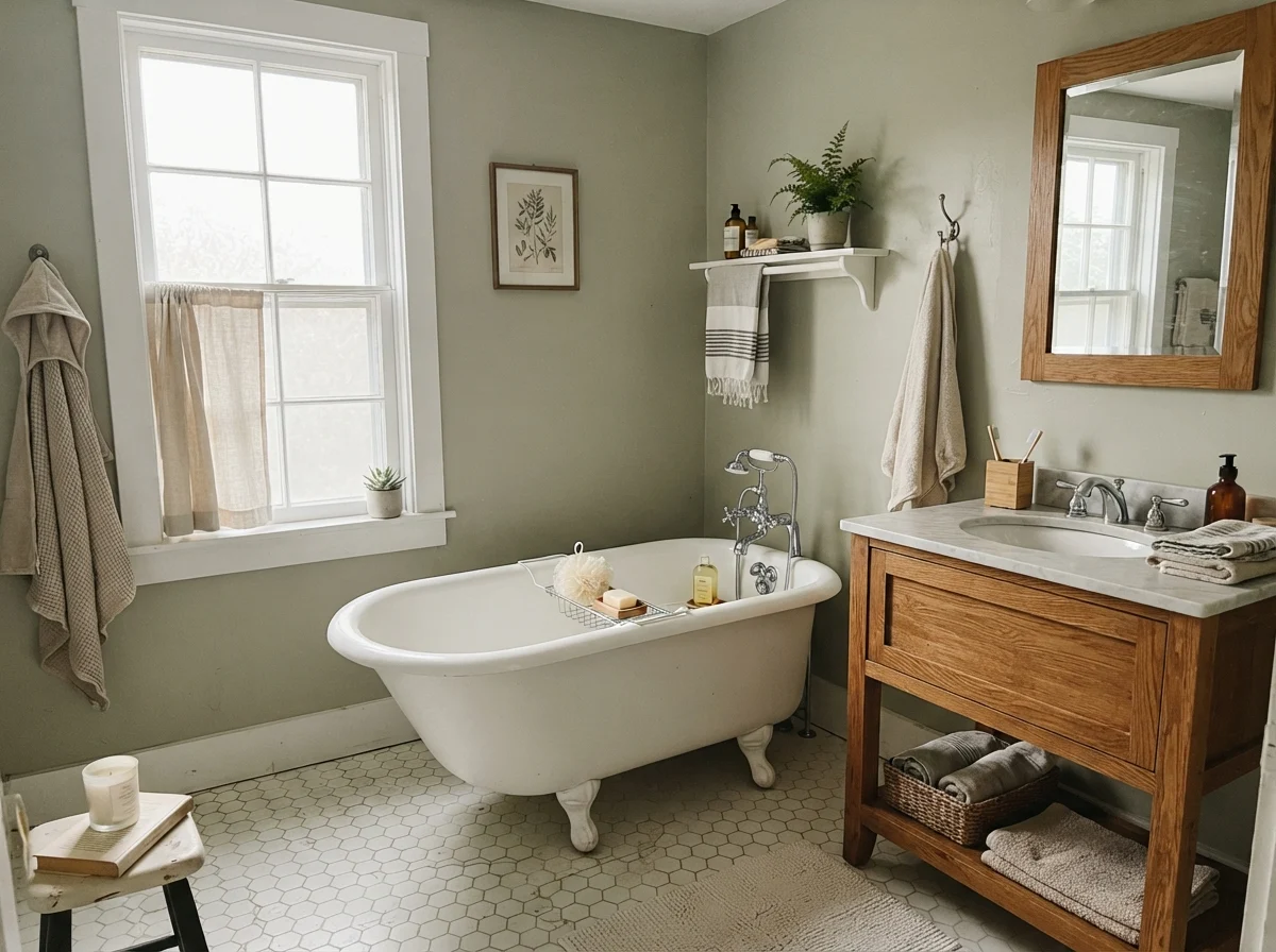
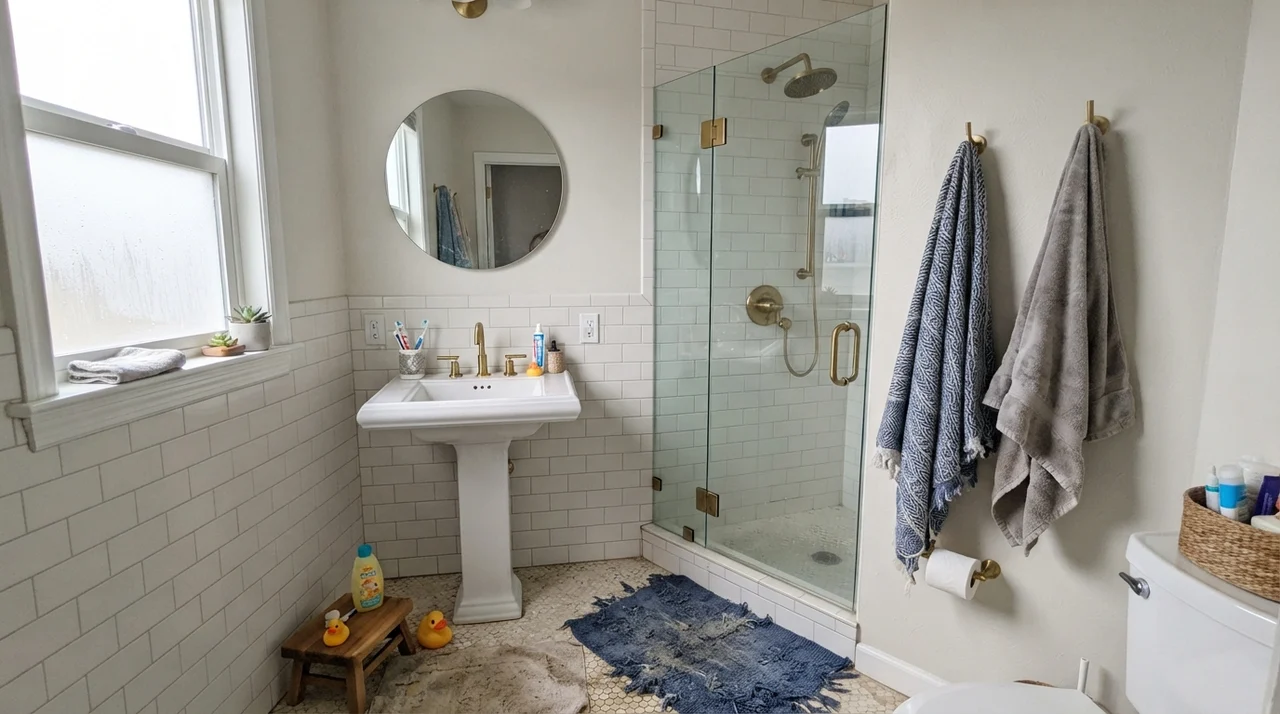
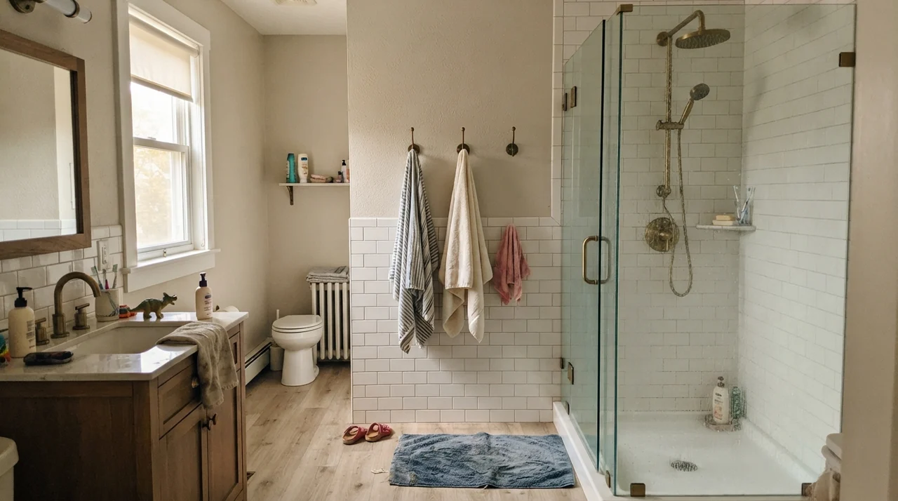
In our last house, a center-hall colonial we bought in the late nineties, I spent three solid weeks trying to find a green for the family bathroom that didn't feel like an English pub or a hospital waiting room. We had just stripped down layers of floral wallpaper, and the bare drywall seemed to swallow every sample pot I brought home. I wanted something soft, grounded, and polite—a color that would bridge the white subway tile and the warm unlacquered brass fixtures we had saved up for months to install.
A neighbor down the street suggested Benjamin Moore Saybrook Sage (HC-114). She had painted her sunroom in it five years earlier and promised me it was the one green that never went sour. I bought two gallons, rolled it on a Saturday morning, and immediately understood why it sits in their Historic Collection. It was calm, tailored, and effortless. We lived with it for seven years until we sold the house, and when the listing agent came through for the walk-through, that bathroom was the only room she told me not to touch.
That said, Saybrook Sage is not a fool-proof color you can throw at any dark hallway and expect miracles. Over thirty years of repainting rooms across three houses, I have learned that soft greens are the chameleons of the paint world. They take their temperature from whatever is outside your window and whatever lightbulbs you screw into your lamps. When Saybrook Sage gets the right daylight, it looks like old money. When it doesn't, it will remind you uncomfortably of spearmint chewing gum.
The Light-Reflecting Value and Undertone Shifts
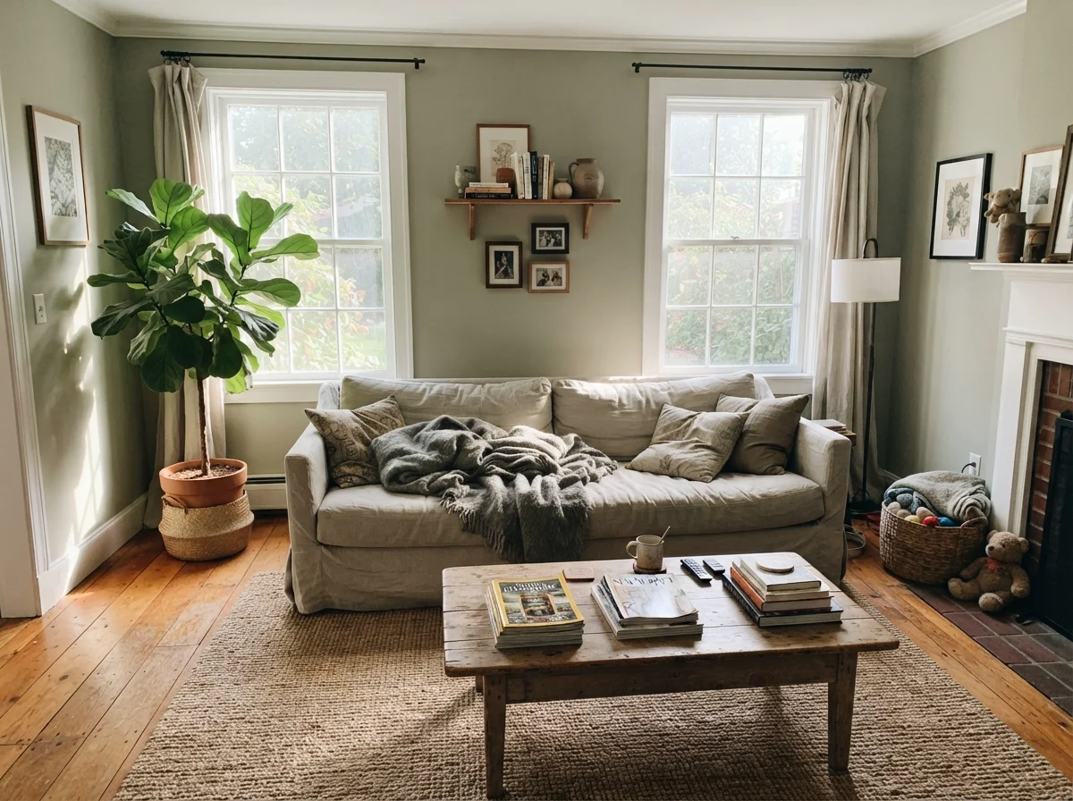
At a Light Reflectance Value (LRV) of 45, Saybrook Sage sits right in that sweet spot where it holds enough body to look intentional without ever darkening a room. It is a true mid-tone green that balances a subtle yellow cast with a measured dose of gray. Because it is balanced so delicately, the color temperature of your light dictates which side takes over.
warm sun
overcast, north light
dusk, rain, cool bulbs
South light brings out the yellow warmth, turning it into a soft celadon; north light and cool LEDs draw out the gray-green stone.
JojobaBehr · see diary
October MistBenjamin Moore · see diary
Saybrook SageHC-114
Softened GreenSherwin-Williams · see diary
Green TrellisValspar · see diary
How Daylight Moves Across the Walls
The biggest mistake I see folks make with historic greens is checking the swatch once at noon on a Saturday and calling the painter on Monday. Saybrook Sage shifts personality between breakfast and bedtime. In direct southern sun, the yellow pigment steps forward, softening the wall into a gentle celadon that flatters wood and linen. But in early morning eastern light or indirect north-facing rooms, the warm notes step back, leaving behind a cooler, stony tone.
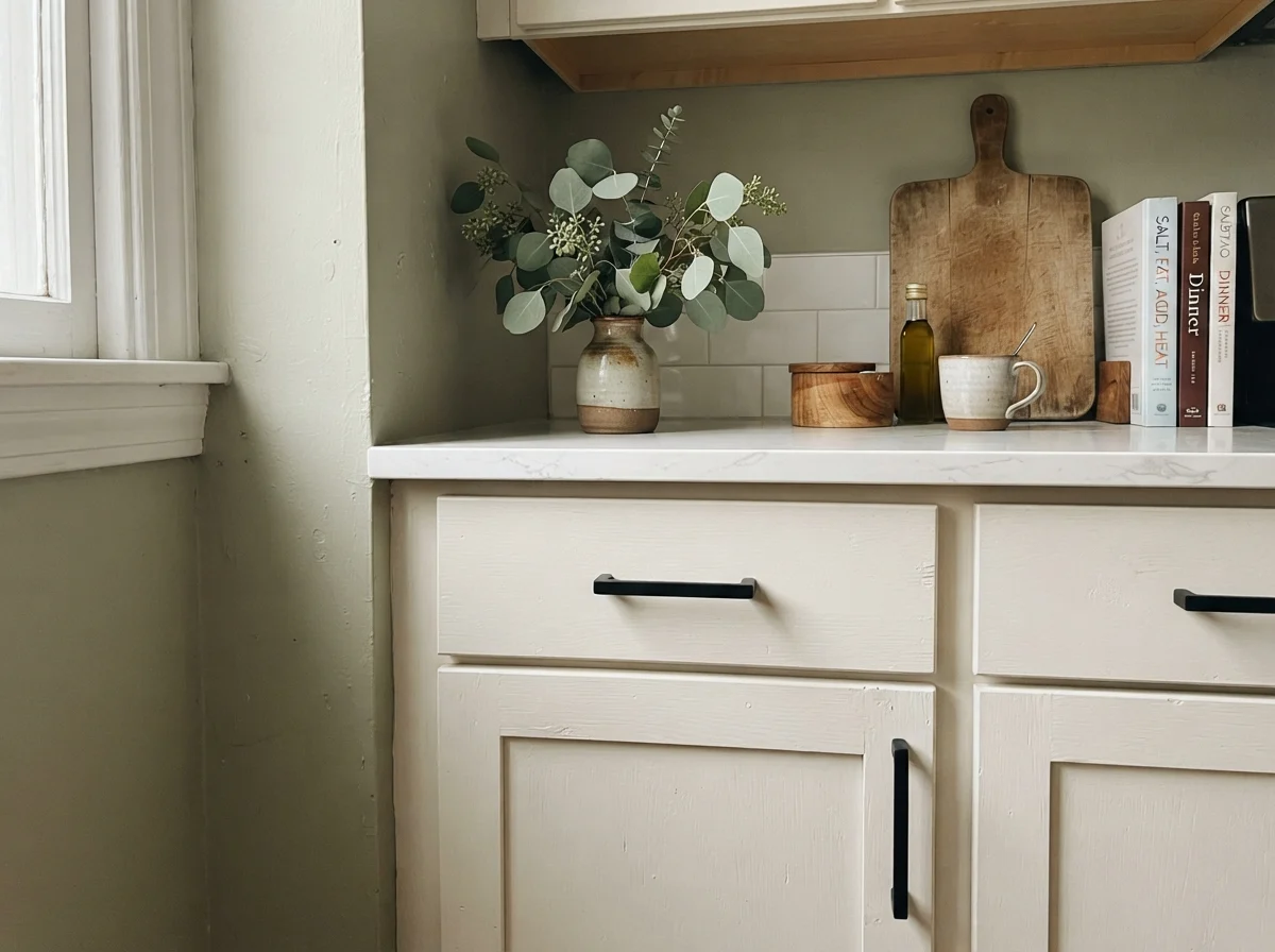
If your room has cool light and you fill it with stark white trim or cool gray furnishings, that stony tone loses its balance and can read distinctly minty. It requires a bit of warmth around it—warm wood, unlacquered brass, or a soft cream trim—to keep its footing.
Living with Saybrook Sage in Bathrooms
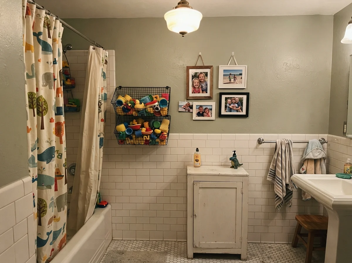
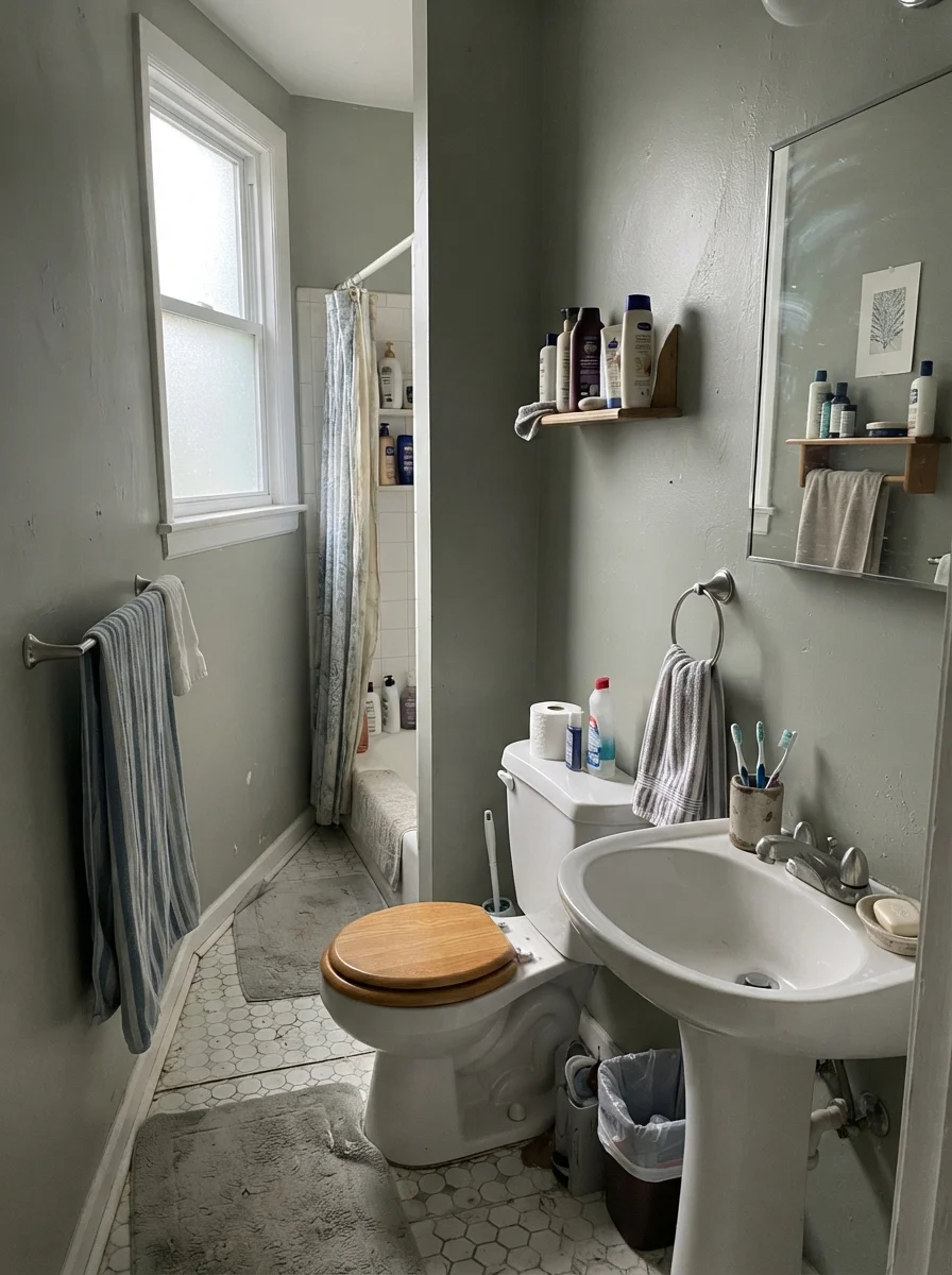
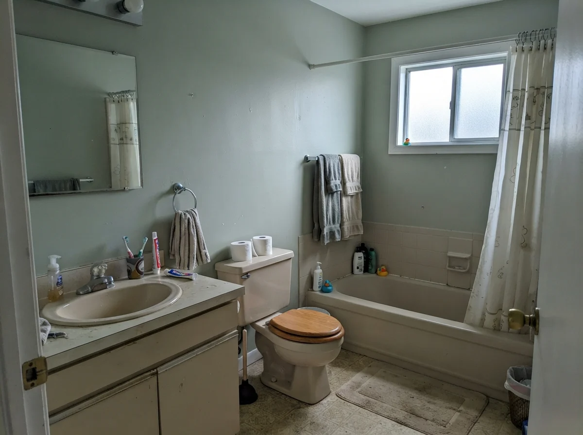
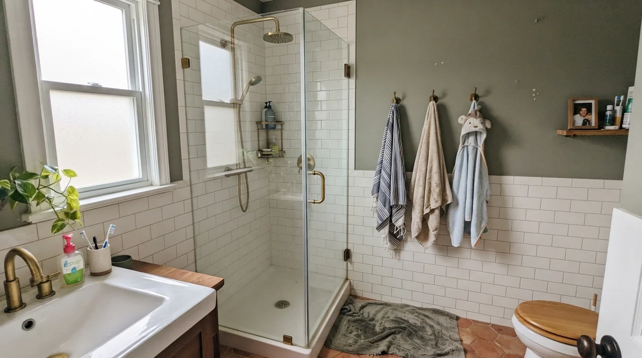
Bathrooms are where Saybrook Sage made its initial reputation, and it remains one of the safest bets in the deck if you have white tile or beadboard to break it up. Because bathrooms tend to have hard, cold surfaces—porcelain, chrome, and mirror glass—a soft green brings in an organic warmth that stops the room from feeling sterile. In our colonial, we lived with it in the kids' bath for years, and it held up beautifully to steam, damp towels, and the occasional bath-time splash.
However, you have to watch your window exposure. A bath with bright diffuse morning light or warm afternoon sun lets this color relax into its softest, most flattering posture. But if your bathroom relies on a small north-facing frosted window or flat overcast skies, the color leans heavily into its gray base. It won't look bad, but it will read much cooler and more stone-like than you might expect from the chip.
Bedrooms: The Most Reliable Room in the House
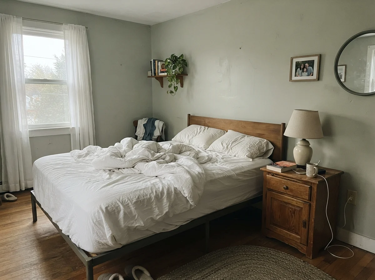
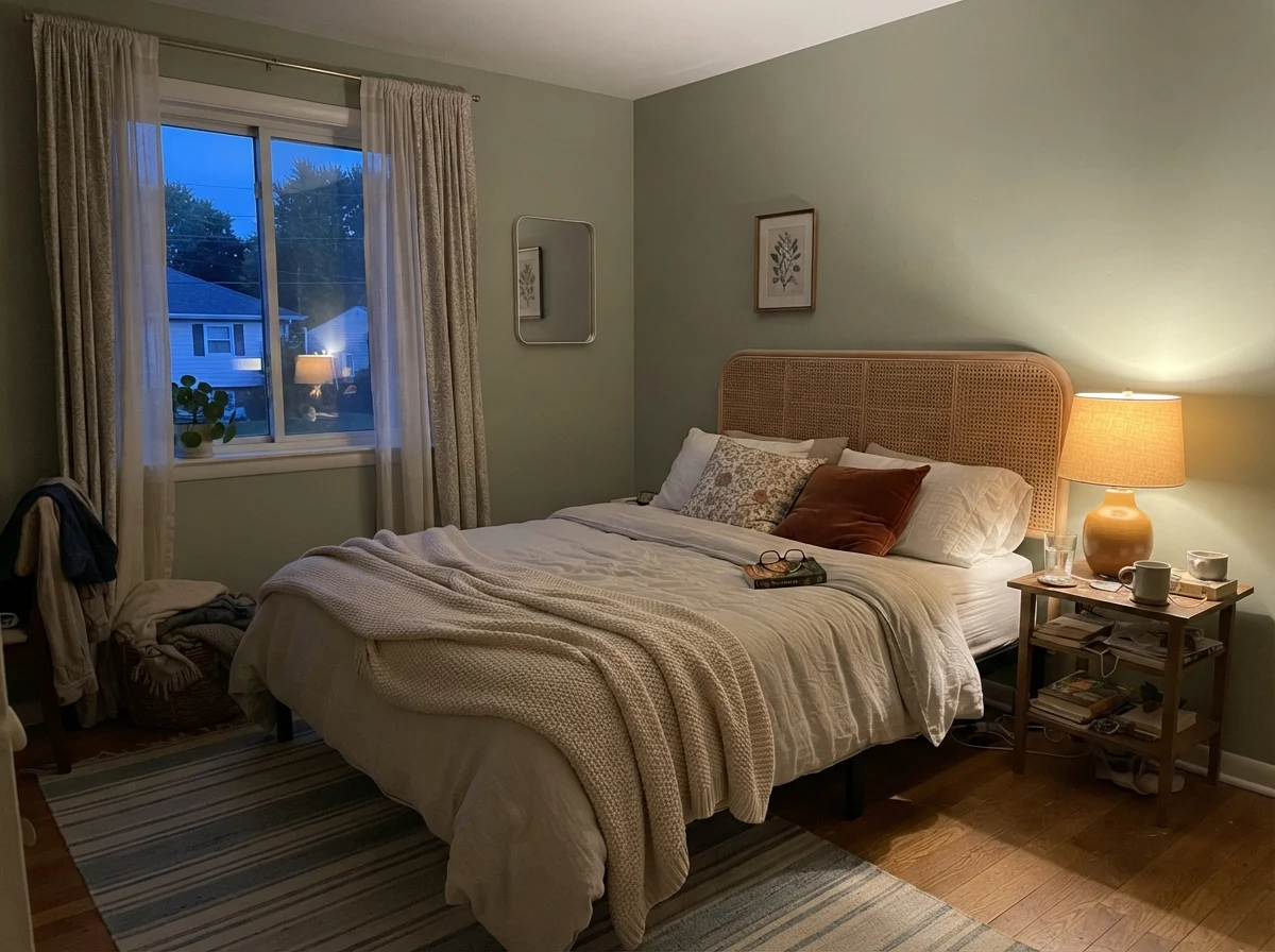
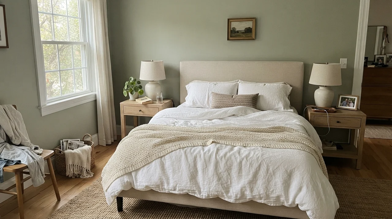
If you ask me where Saybrook Sage is easiest to live with, I will tell you the bedroom every single time. It has just enough color to feel deliberate, but at LRV 45, it never closes in on you or demands your attention when you are trying to wind down. In our 1960s ranch, I used a similar soft sage in the guest room, and it was the one space where every visitor commented on how restful the room felt.
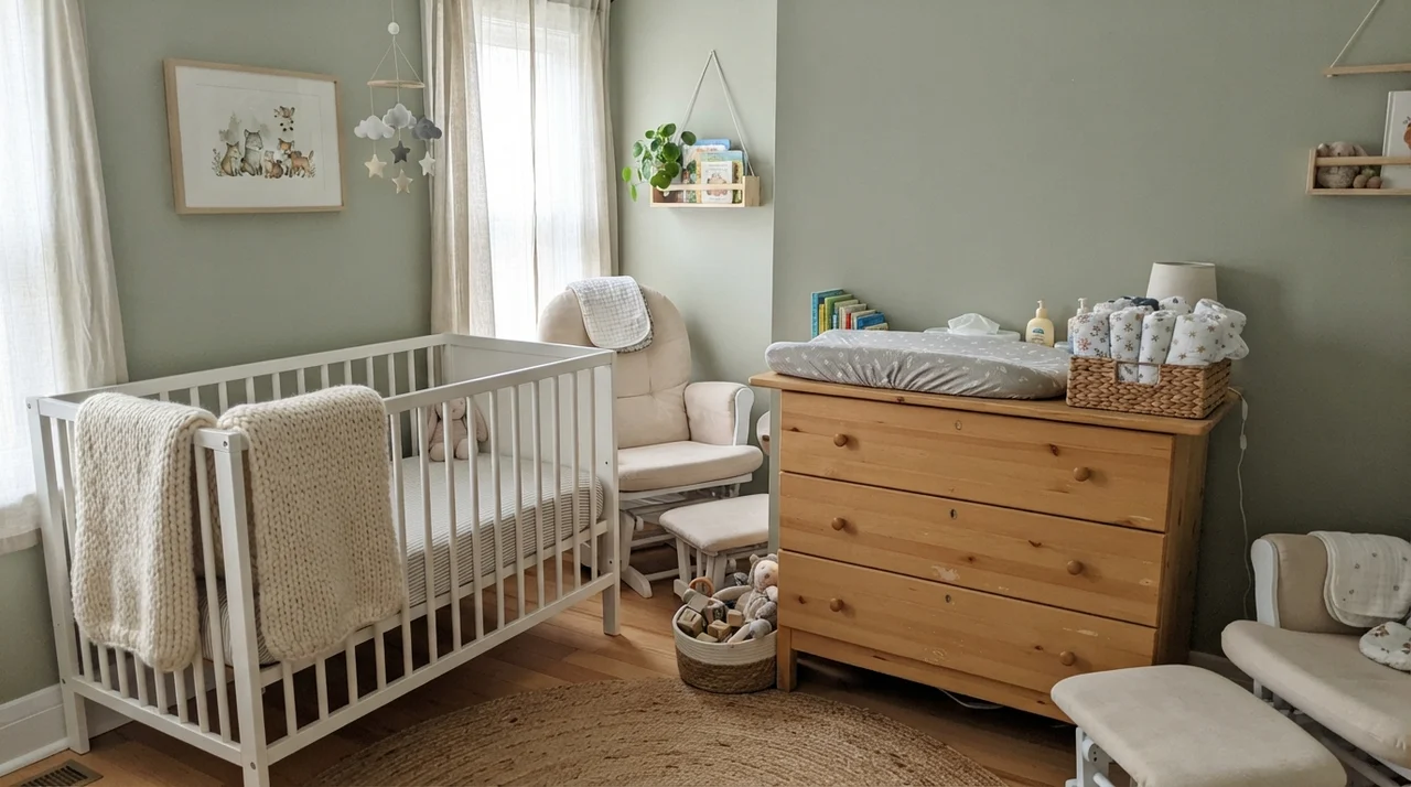
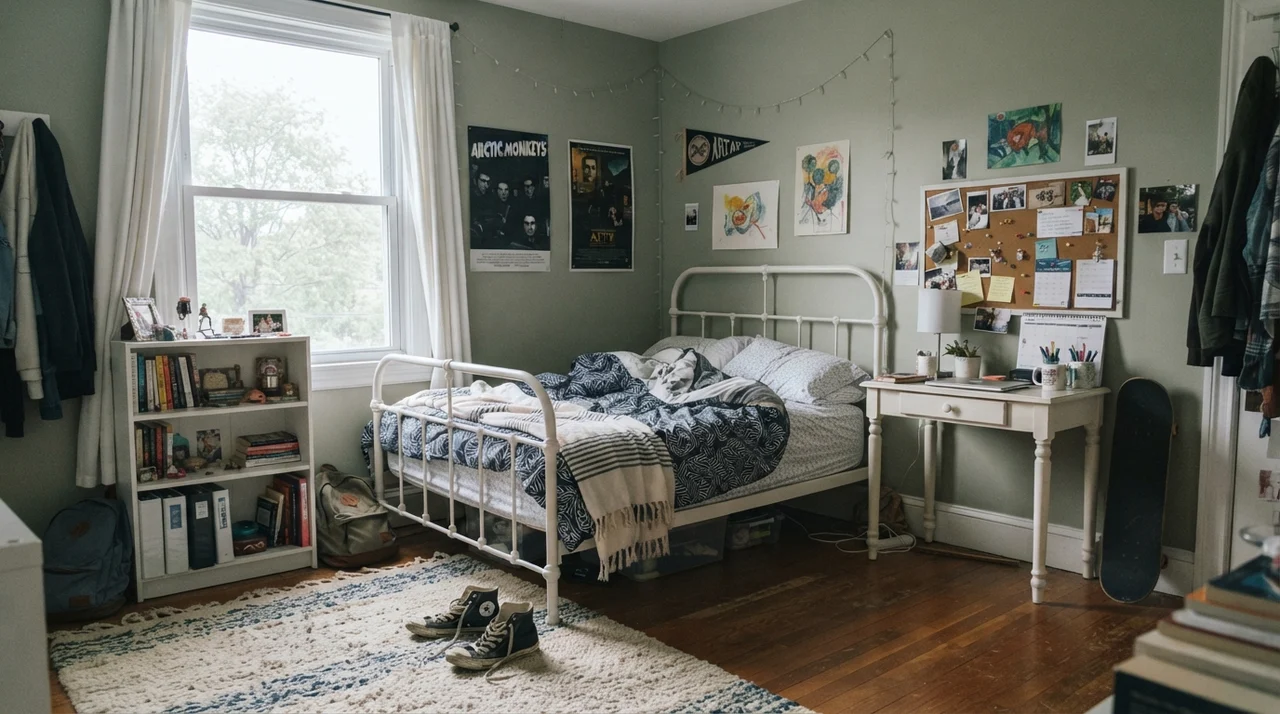
The trick in a bedroom is pairing it with natural textures. Pale oak nightstands, crisp linen bedding, or woven wool rugs give the green something grounded to rest against. It also spans ages effortlessly: it works just as gracefully in a serene main suite as it does in a bright nursery or a teenager's homework space, because it refuses to lean too trendy or too juvenile.
Cabinets and Kitchens: When Green Behaves Like a Neutral
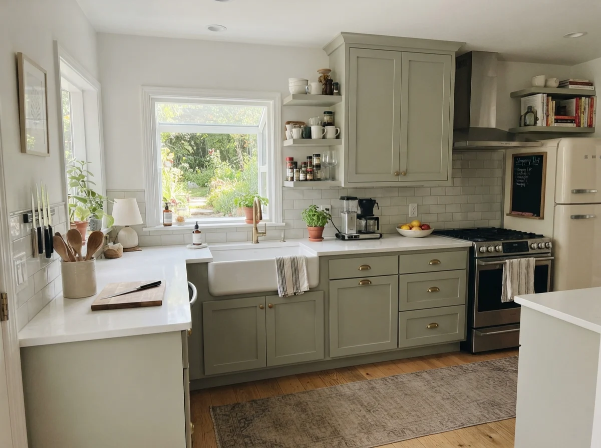
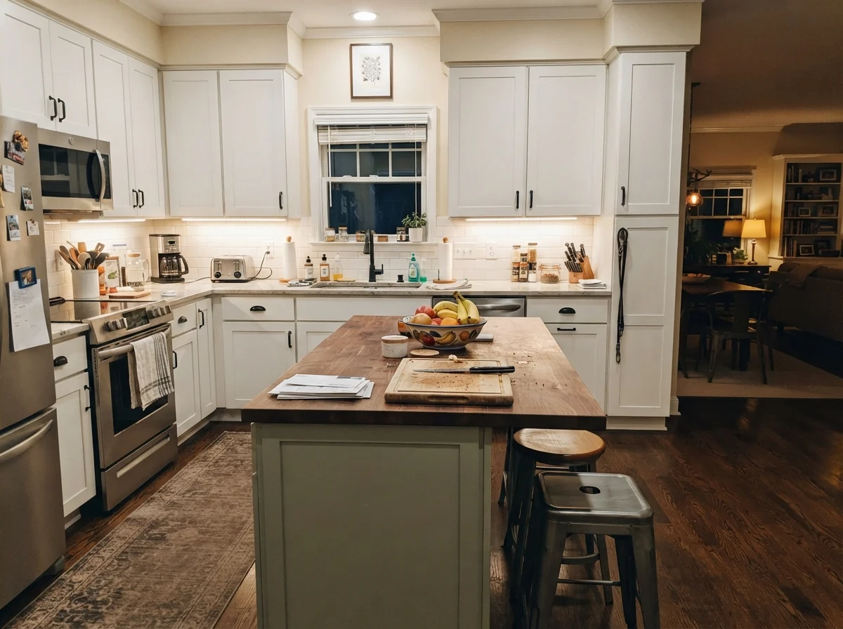
In the kitchen, Saybrook Sage acts like a quiet classic. When everyone started painting kitchen cabinets navy and charcoal ten years ago, I warned my friends that dark, brooding cabinets take a lot of work to keep clean and can leave a kitchen feeling heavy when winter rolls around. A soft sage on shaker cabinets gives you real color without the visual weight, and it doesn't show every speck of dust or stray flour smudge the way dark enamel does.
We have seen it used across full cabinetry runs as well as isolated on kitchen islands. If you are doing perimeter cabinets, stick to satin cabinet enamel and pair them with warm off-white walls like Swiss Coffee OC-45 or White Dove OC-17. For hardware, unlacquered brass or satin brass warms up the gray in the paint. Oil-rubbed bronze can drag it down toward a muddy brown, and polished chrome can make it feel sterile.
You don't choose a paint color for the weekend you roll it on. You choose it for year five, after you've wiped down the cabinets a thousand times and watched the seasons change outside the window.
Living Areas, Sunrooms, and Interior Accents
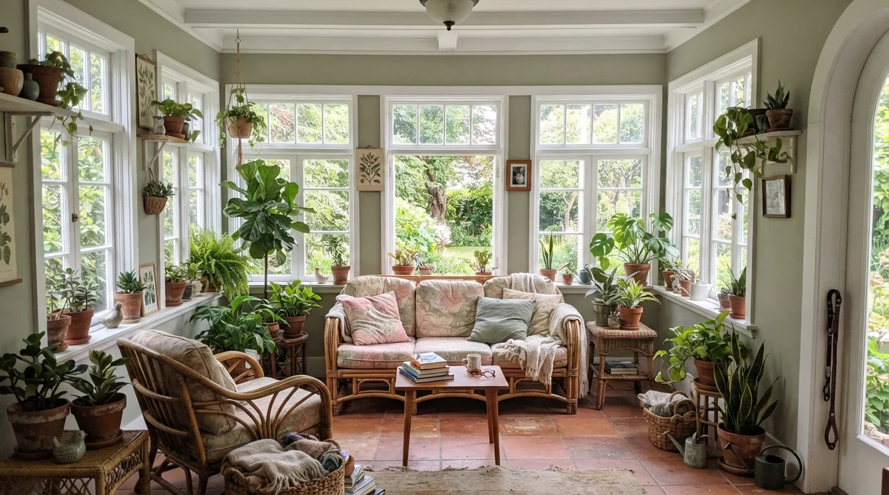
When you take Saybrook Sage into large living spaces, it demands daylight. In a bright living room or a garden sunroom surrounded by windows, the color opens right up. It sits quietly behind furniture rather than competing with it, making it an excellent backdrop for jute rugs, terracotta planters, and warm leather chairs. It lets greenery from houseplants look lush without clashing.
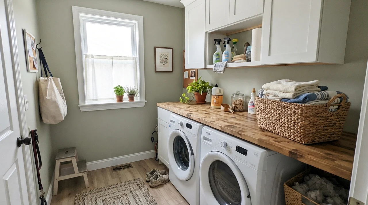
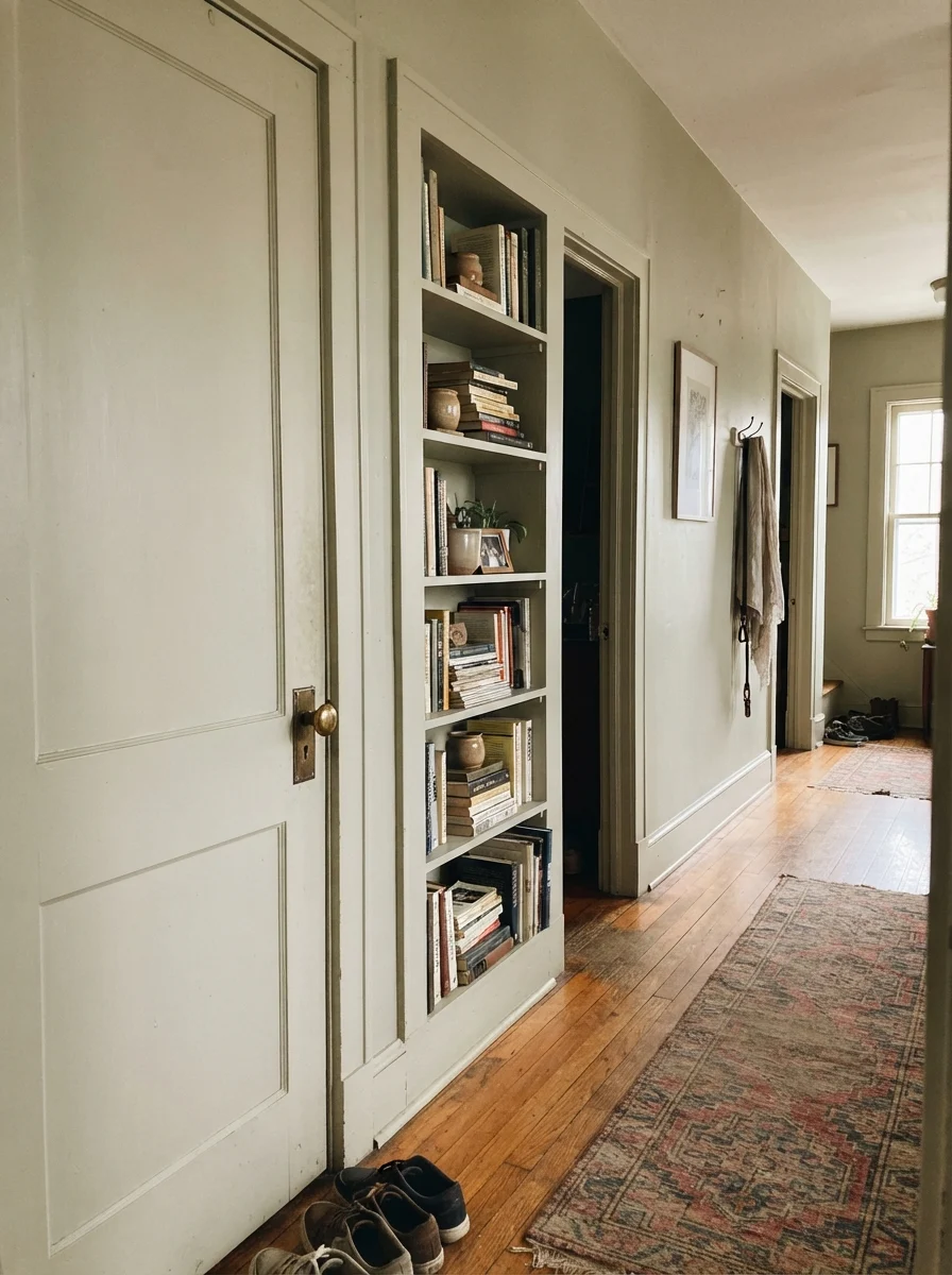
I also love using it for smaller architectural moments. In an older home where all the walls are painted a simple off-white, painting an interior two-panel door or a built-in bookshelf in Saybrook Sage gives the space character without requiring you to commit an entire hallway to green. In a bright laundry room over a butcher-block counter, it brings a fresh, scrubbed-clean feel that makes folding towels slightly less of a chore.
Where Saybrook Sage Fails (And Why)
The unhappy stories I hear about Saybrook Sage are remarkably consistent, and they almost never have anything to do with paint coverage or can quality. They come down to poor lighting and bad finish pairings.
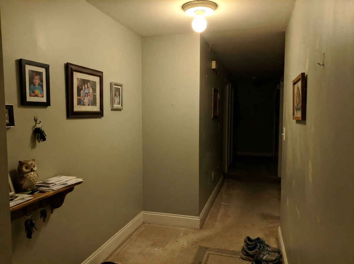
First, if you put this color in a dim, windowless hallway or a basement powder room lit by a single, cheap bulb, it will look flat, muddy, and putty-like. It needs natural photons to separate the green from the gray pigment. Without daylight, LRV 45 collapses into a drab haze.
Second, if you have a cool east-facing dining room filled with cream upholstery and beige carpet, early morning light will strip out the subtle yellow tone and leave you with a chalky, minty tint that feels straight out of an eighties dental clinic. And third, if you run warm 2700K incandescent bulbs next to heavy gold-veined countertops, that same yellow gets pulled so hard to the front that the paint can look khaki and slightly dirty. Know your light before you crack the lid.
Taking It Outdoors: Exterior Siding
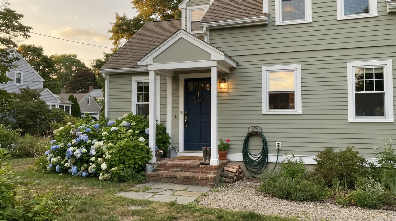
On exteriors, Saybrook Sage has been a staple on coastal and shingle-style homes for decades. Direct sunlight washes out color intensity significantly, meaning a mid-tone green that looks rich on an interior wall will look fresh, soft, and slightly lighter outside. Paired with crisp white trim on windows and corner boards, and anchored by a deep navy front door, it gives a house timeless curb appeal that will still look right fifteen years from now when you decide to put the house on the market.
Durability, Scrubbing, and Budget Choices
In thirty years of maintaining family homes, I have scrubbed every kind of paint finish imaginable. When you choose a mid-tone color like Saybrook Sage, sheen matters just as much as hue. For interior walls, stick strictly to eggshell. Flat paint looks wonderful on the first day, but five years in, high-traffic corners near doorways and towel hooks will burnish into shiny patches if you have to wipe off fingerprints or mud.
For trim and baseboards, semi-gloss gives you the scrub resistance you need when the vacuum cleaner bumps along the floor. On kitchen cabinets, spend the extra money on a proper satin cabinet enamel. Cheap latex paint will gum up along drawer edges within two years, whereas a quality enamel cures hard and can be scrubbed clean with a warm, damp microfiber cloth without lifting the pigment.
Will Saybrook Sage look too dark in a small bedroom?
Not at all. With an LRV of 45, it reflects nearly half the light that hits it. As long as you have one decent window with natural daylight and paint your ceiling and trim a warm white like White Dove OC-17, the room will feel cozy rather than small.
Why does my sample swatch look minty on the wall?
You are likely looking at it in cool morning light, under 4000K daylight LED bulbs, or against cool gray flooring. To neutralize the mint effect, swap your lightbulbs to 3000K neutral bulbs and sample the color on a board placed next to warm wood or unlacquered brass.
Can I use Saybrook Sage on kitchen cabinets with gold-veined marble?
Be very careful. Under warm 2700K evening lighting, the strong yellow veining in the stone can clash with the green-gray base, pulling the cabinets toward a dirty khaki tone. Always test a large painted cabinet board directly against your countertop slab first.
What is the best exterior front door color with Saybrook Sage siding?
Benjamin Moore Hale Navy HC-154 is the time-tested favorite. The rich, dark maritime navy provides the grounded contrast needed to balance the lighter, soft-green siding.
Susan's Verdict · Worth the Money with Proper Daylight
Saybrook Sage is one of those rare colors that earns its keep across decades, provided you don't ask it to do a job it wasn't built for. It is not an earthy, muddy olive, and it will not survive in a dark, windowless corridor. But give it daylight, pair it with warm oak floors or brass hardware, and keep your trim in a soft white like White Dove, and it delivers a calm, timeless quality that outlasts every passing trend. If you have the daylight to support it, it is worth every penny of the can.