Color Diary · No. 111
Benjamin Moore Sea Salt and the Accidental Greige We Kept
The Benjamin Moore color everyone orders by mistake, reviewed honestly: it is a warm greige, not the spa green — here is where it works and where it goes drab.

Susan HartleyNovember 5, 2026 · 17 min read
Sea Salt · Benjamin Moore CSP-95
Hex#D4CFC3LRV63Undertoneswarm greige → soft sandy beige → flat gray
When we moved into our 1960s ranch, I sent my husband to the paint counter with a scribbled scrap of paper that simply said “Sea Salt.” I was picturing the soft, misty coastal green everyone had been talking about for years. Two hours later, he returned with two gallons of Benjamin Moore Sea Salt, code CSP-95. We popped the lid with a flathead screwdriver right there in the sunny kitchen, and I stared into the bucket. There wasn’t a single drop of green in it. It was a pale, quiet, sandy greige.
That is the number one story with this color, and it happens every single week at paint stores across the country. Someone sees the famous spa-like tint online, walks into a Benjamin Moore retailer instead of a Sherwin-Williams shop, and walks out with CSP-95. But because the painters were scheduled to arrive at seven the next morning, we decided to roll it on the hallway and the back bedroom anyway. We lived with it. And what started as an accidental purchase ended up teaching me a great deal about what makes a quiet neutral actually survive the real chaos of home life over years rather than days.
Benjamin Moore Sea Salt sits at an LRV of 63, squarely in the greige family. That means it reflects 63 percent of the light entering a room, placing it comfortably above heavy mid-tones while keeping it grounded enough that it never reads as an off-white. It belongs to Benjamin Moore’s Color Stories collection, a deck formulated with an intricate blend of pigments rather than standard formulas. Because of that layered formulation, it has a living personality that behaves differently depending on the direction of your windows, the warmth of your lamps, and the floors underneath your socks.
The Shifting Faces of CSP-95
Because Sea Salt CSP-95 comes from a complex tint recipe, it does not hold a rigid, single identity throughout the day. It bends with the light coming through your windows, shifting between a warm sandy beige and a cool, muted gray.
warm sun
overcast, north light
dusk, rain, cool bulbs
South sun brings out the warmth; cool northern light strips the sand away and leaves a quiet gray.
MuslinDunn-Edwards · see diary
Toasty GrayBehr · see diary
Sea SaltCSP-95
Gossamer VeilSherwin-Williams · see diary
CollingwoodBenjamin Moore · see diary
How Morning Light and Evening Bulbs Transform the Wall
In our last house—a 1990s center-hall colonial with tall windows—I learned that you can never judge a neutral by how it looks at noon on a Saturday. At midday, almost any paint looks respectable if the sun is out. The real test comes at 6:30 on a dreary Tuesday morning, or at 8:00 at night when the kids have left their shoes in the middle of the floor and the only light comes from a single end-table lamp.
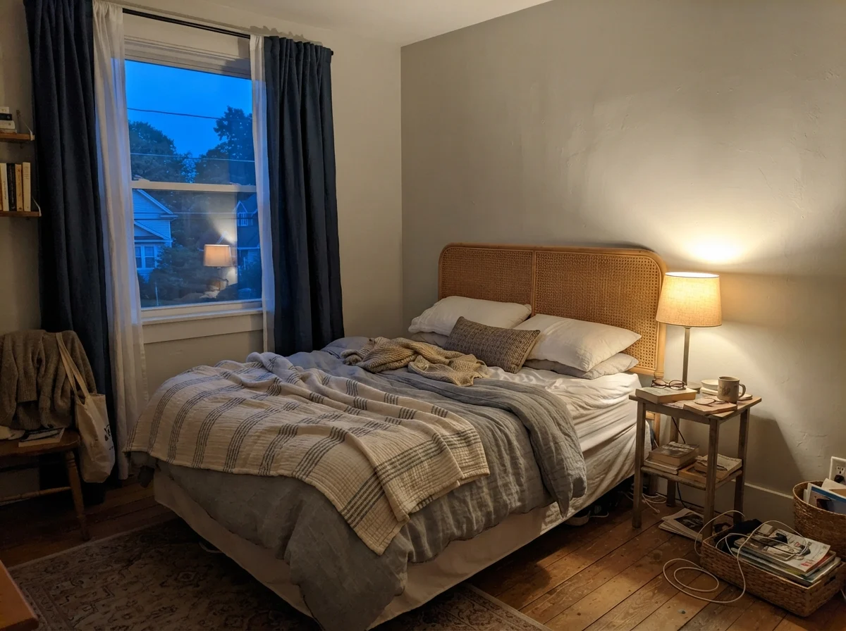
Benjamin Moore Sea Salt shows that difference with dramatic clarity. Because it carries so little heavy baseline gray, cool early-morning light will almost wash it out completely. It can look quiet, pale, and borderline chilly right when you wake up. But flick on a warm 2700K lamp in the evening, and those complex tints wake up. The color wraps around the room like a soft wool sweater, pulling toward a gentle, cozy beige that makes you want to sit down and stay there.
Living Rooms, Sunrooms, and Natural Sunlight
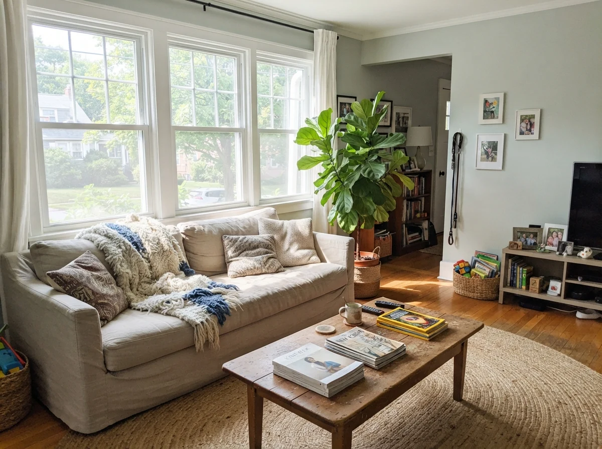
If you have generous windows, Sea Salt is remarkably forgiving. In a south-facing room flooded with midday light, it does not flash yellow the way many creams or warm beiges do. It stays composed, offering just enough contrast against white trim without shouting. When we lived with it in our main living space, it flattered our furniture without demanding any special accommodations. Oak end tables, a textured jute rug, and brass reading lamps all sat comfortably against it.
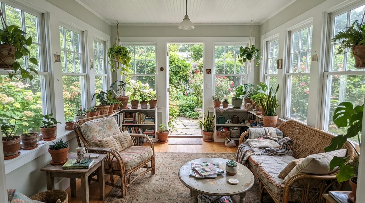
In a sunroom surrounded by glass, it provides a quiet pause between the outdoors and the indoors. It has enough pigment to avoid the glare of pure white while letting green garden views take center stage.
Kitchens: Walls vs. Cabinets
Here is my honest budget view on putting this color in a kitchen. On the walls above a backsplash or around a pantry, it is worth the money because it disappears politely. It does not fight your countertops, it sits happily above tile, and it gives the room a finished warmth without complicating your palette. When we sold our second house, having an unobtrusive, warm neutral like this in the kitchen was a genuine selling point because prospective buyers never had to wonder how their dishes or tables would look against it.
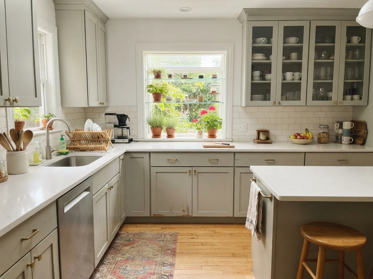
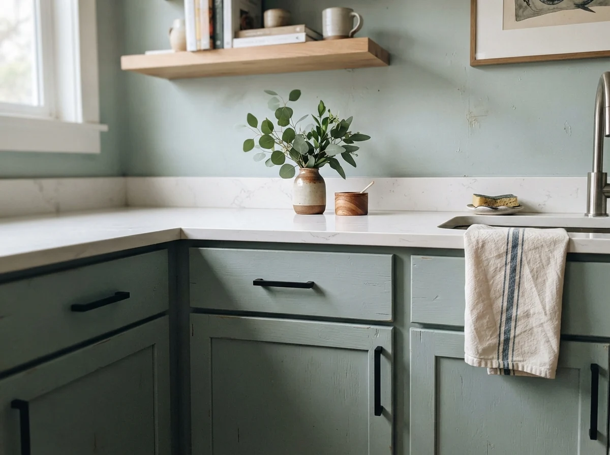
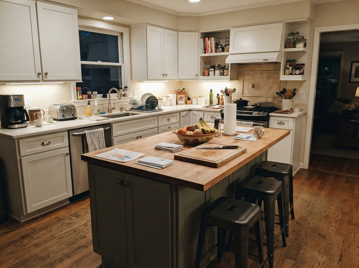
On full kitchen cabinet runs, however, I urge caution. On a long wall of upper and lower cabinetry, CSP-95 can look slightly unfinished—almost like an unpainted primer—especially if set directly against crisp white quartz counters. Where it genuinely earns its keep on cabinetry is in smaller doses: a single laundry run, a mudroom bench, or a kitchen island where it grounds the center of the room without taking over the whole workspace.
Bathrooms: Clean Contrast and Light Hazards
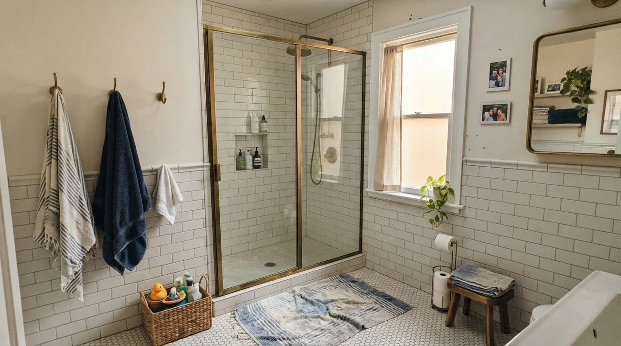
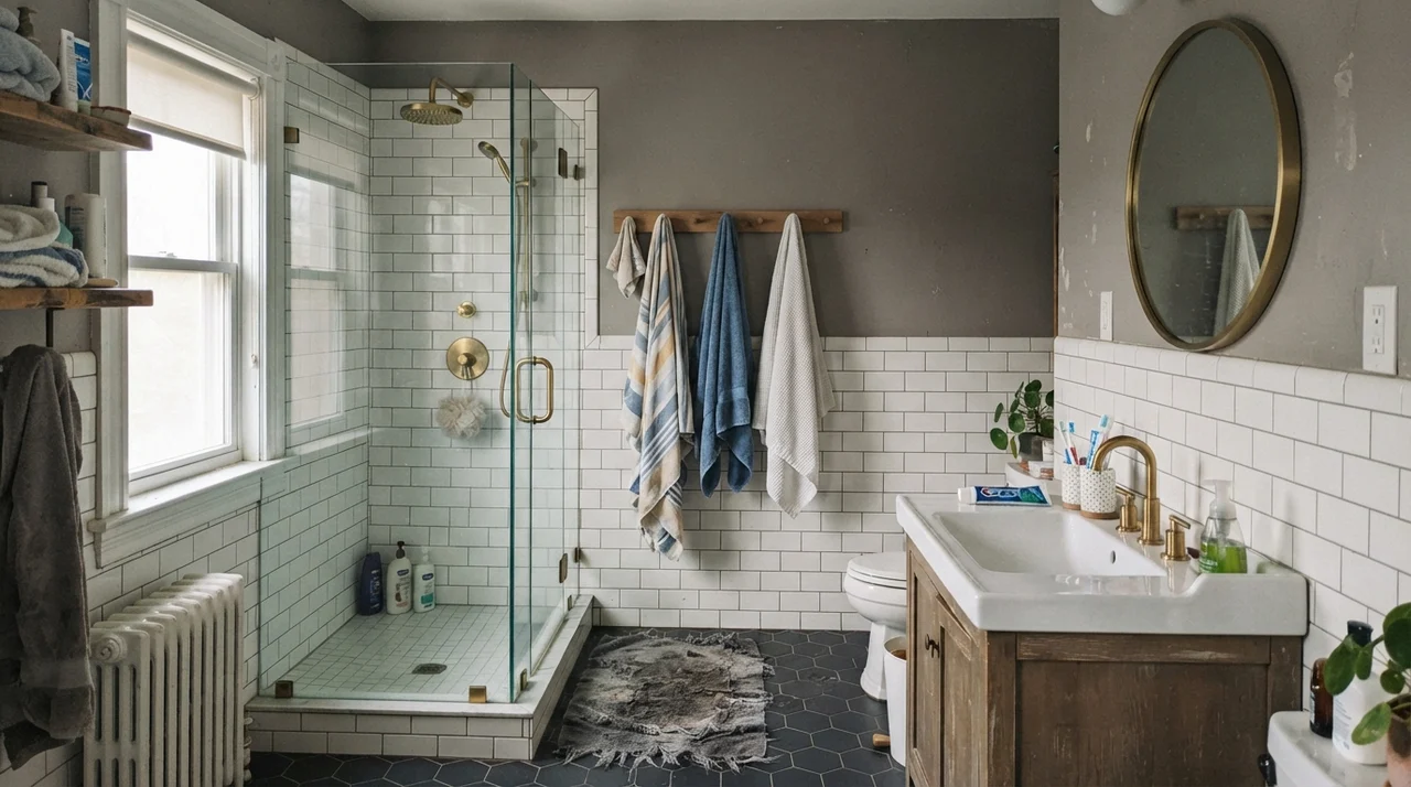
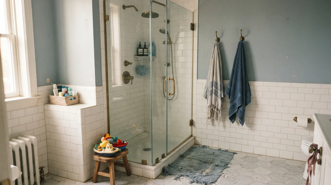
Bathrooms are where people often try to get clever with color and end up regretting it. A deep shade can turn a windowless powder room into a dark closet, while a stark white can make an older acrylic tub or vintage tile feel sterile and cold. Benjamin Moore Sea Salt works in bathrooms because it takes the sharp clinical edge off bright white porcelain fixtures while maintaining an LRV of 63 that keeps the space open and airy.
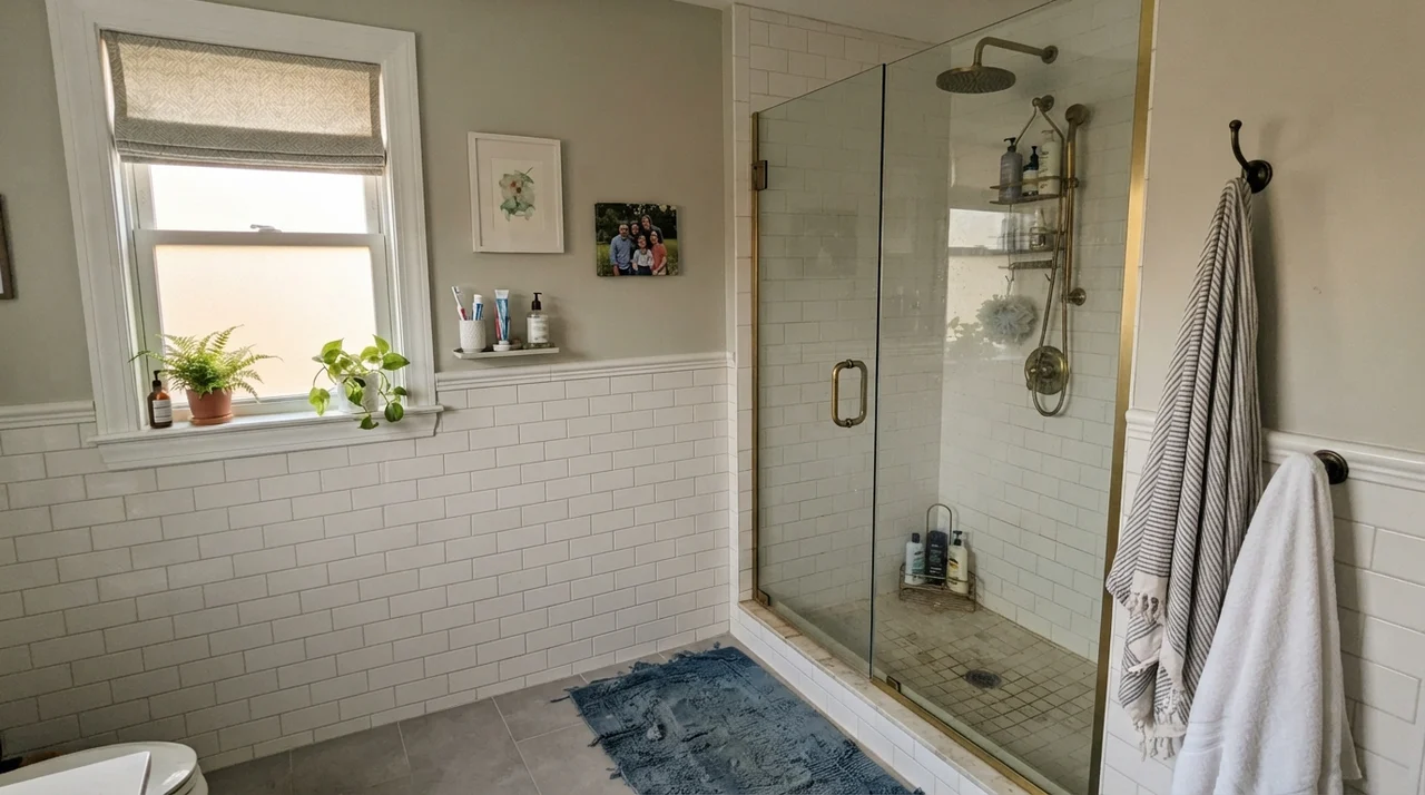
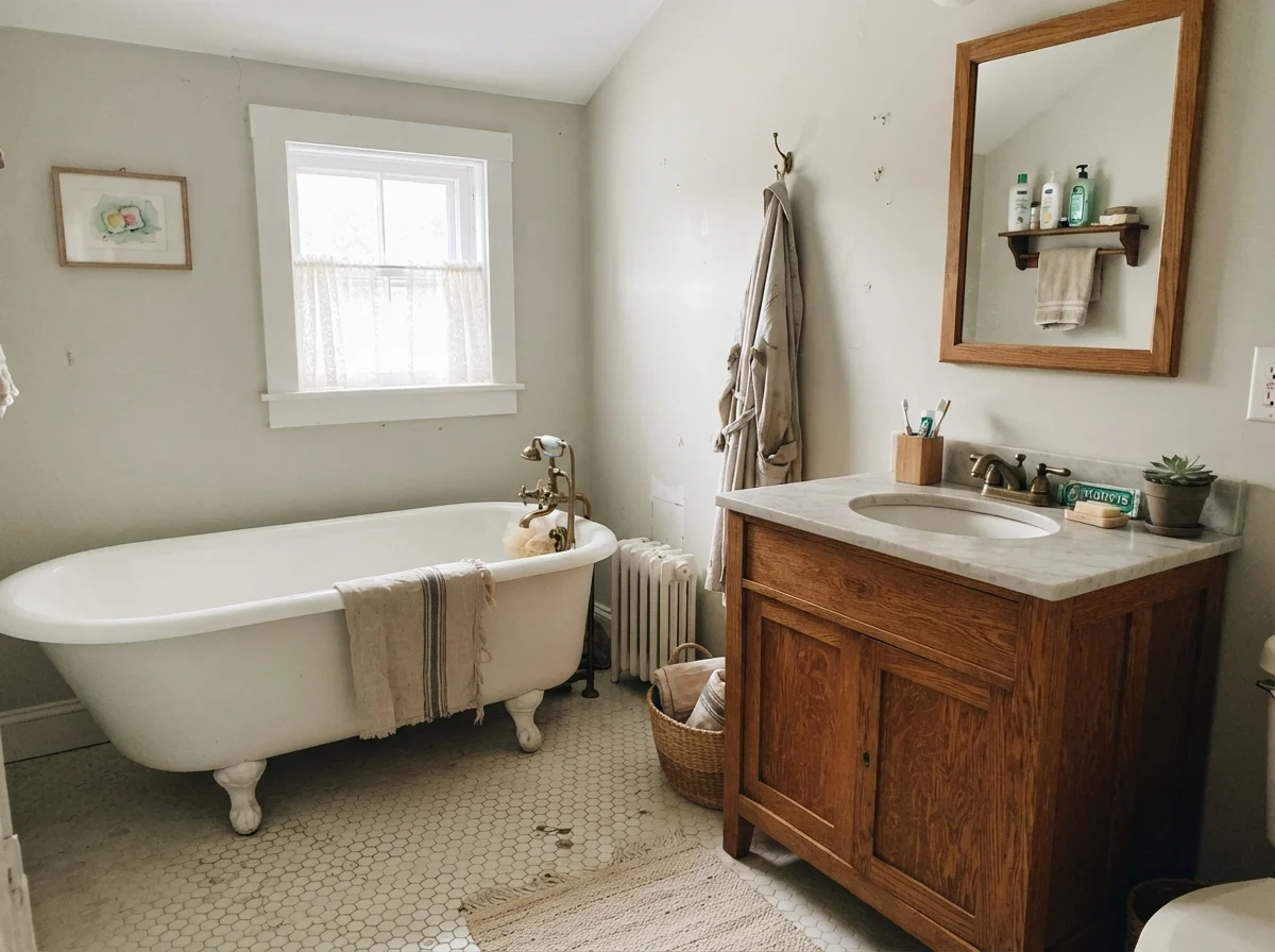
However, the tile you pair it with matters tremendously. When placed next to warm subway tile, marble with warm veining, brass fixtures, or a rich wood vanity, Sea Salt looks intentional and refined. But if your bathroom has cold blue-gray floor tile, Sea Salt’s low pigment base will make the wall look slightly dingy or dirty by comparison. You have to look at your hard surfaces before you make your trip to the paint counter.
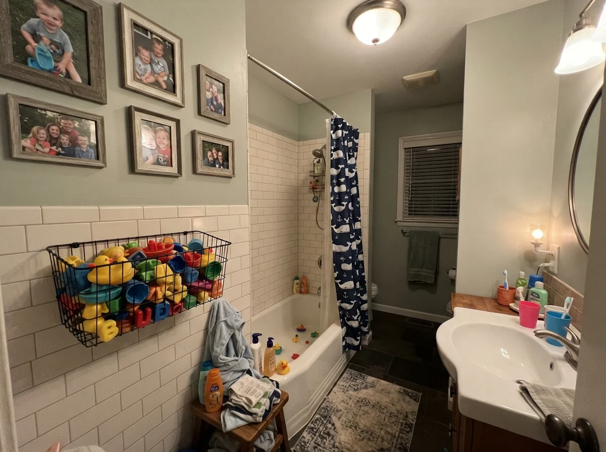
We put this shade in the kids' bathroom five years in on our current house, and it proved to be a practical choice. Children splash water, leave damp towels bunched on the floor, and drop bright bath toys everywhere. A neutral background that has enough body to absorb the visual chaos without demanding center stage makes a family bathroom feel far less frantic.
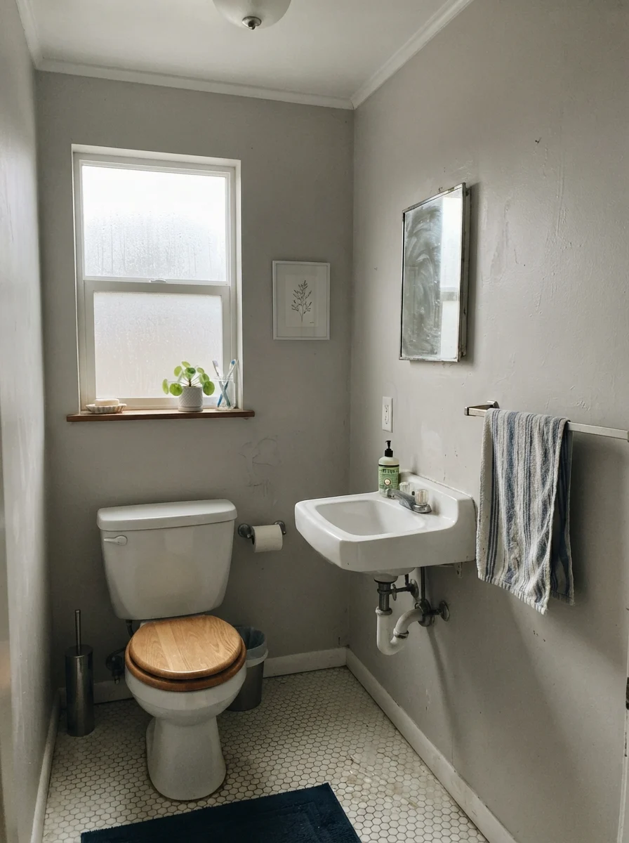
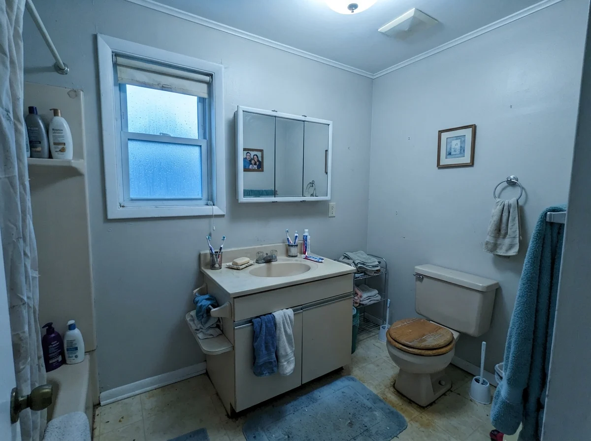
Be honest about the exposure your bathroom gets, though. In a room with flat overcast light or an unyielding north-facing window, the warm base of CSP-95 simply drops out. It won’t look actively green or blue; instead, it reads as a quiet, muted gray. If you like a cool, Scandinavian gray, that might suit you fine. But if you were hoping for a sandy morning glow, an overcast day will tell you the cold truth.
Bedrooms, Nurseries, and Restful Corners
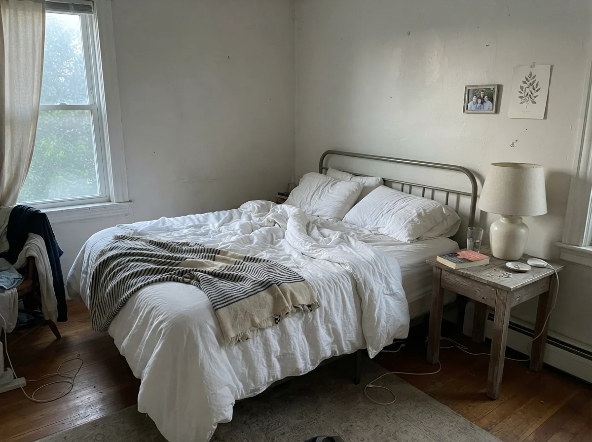
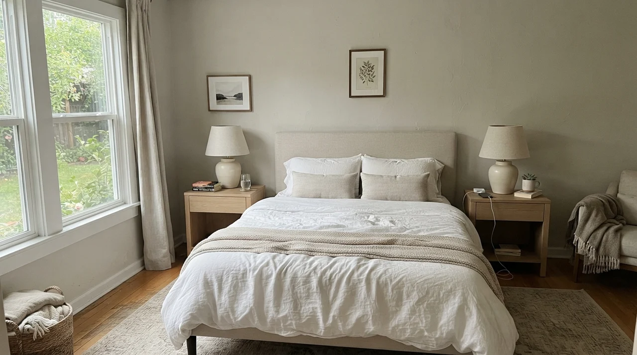
In bedrooms, Sea Salt is at its absolute best. A bedroom does not need to announce a bold color statement; it needs to be a place where your shoulders drop the moment you close the door. Because LRV 63 keeps the walls light without blinding you when you pull the blinds back, it creates a restful, quiet perimeter. In our primary bedroom, pairing it with linen bedding and pale oak furniture gave the room an easy, lived-in calm that never looked dated within a few seasons.
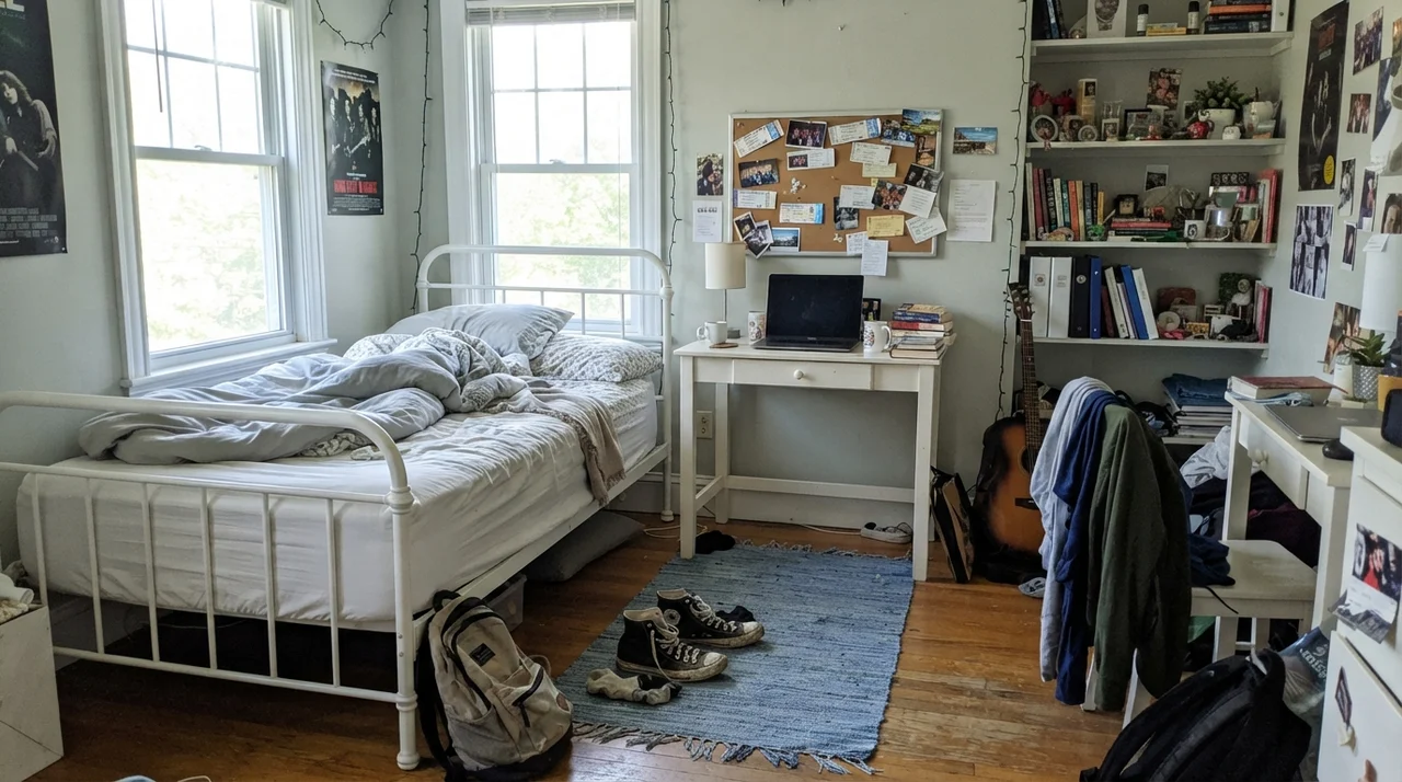
It also handles the transitions of childhood remarkably well. From a gentle nursery with light wood furniture to a teenager's room covered in posters and open shelving, this greige steps back and lets books, rugs, and personal clutter live comfortably in front of it.
Utility Spaces and Hallway Transitions
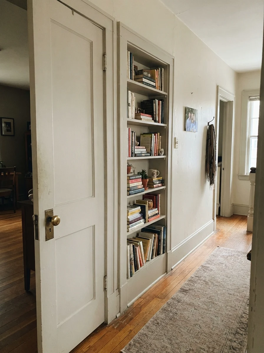
Hallways and laundry rooms are the workhorses of a busy home. They take laundry baskets dragged along the baseboards, dirty hands trailing along the wall, and the constant thud of winter coats. If you paint a long, continuous hallway in a mid-tone greige with strong undertones, it can turn patchy and bizarre as it turns corners through different lighting zones. Sea Salt, being light and softly balanced, runs a whole floor plate consistently.
In a laundry room with a decent window, it makes a tiny utility space feel intentional. Paired with white cabinets and a butcher-block folding counter, it provides just enough pigment to keep the white appliances from looking like they're sitting in an unpainted garage.
Where Benjamin Moore Sea Salt Fails
The bad reviews for this color are remarkably consistent, and only one of them is really the paint's fault. If your project matches one of these scenarios, save yourself the sample pot and choose a different path.
First, if you are looking for the misty spa green people talk about on decorating forums, you are buying the wrong can of paint entirely. That is Sherwin-Williams Sea Salt SW 6204. CSP-95 has no blue-green coastal mood whatsoever. If you want that look in the Benjamin Moore deck, Healing Aloe 1562 is the closest honest match to look at.
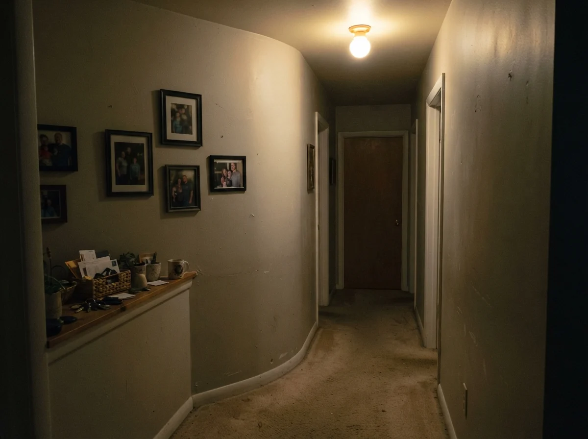
Second, this color completely collapses in dim, lamp-free spaces. In a dark, windowless interior hallway or a finished basement with a single overhead bulb, the warm base drops out completely. What remains reads murky, flat, and distinctly khaki. If your space lacks natural light and you refuse to leave table lamps turned on, this color will look like tired wet cement. In those genuinely dark spaces, a lighter, cleaner option like Classic Gray OC-23 at LRV 74 keeps its softness without turning muddy.
Third, watch your flooring. Because Sea Salt carries subtle pigmentation, it takes cues from whatever sits on the floor. Put it against strong, golden builder oak or a heavy tan tile floor, and the contrast pulls the warmth out of the paint, leaving the wall looking plain, chalky gray. If your floors are warm and you need the walls to keep up, Edgecomb Gray HC-173 has more definite warmth and holds its ground much better.
The Exterior Question: Why You Must Say No
Every so often, a homeowner loves an interior greige so much they ask the paint counter to mix it into an exterior can. Do not do this with Benjamin Moore Sea Salt CSP-95. Benjamin Moore lists CSP-95 as strictly interior only. There is no exterior formulation sold for it.
A counter clerk might offer to do a custom hand-match in an exterior base, but the intricate, multi-pigment formula of the Color Stories deck will not translate across exterior colorants. It will fade unevenly, lose its subtle warmth, and leave your siding looking drab. If you want this soft greige look on siding, use Edgecomb Gray HC-173 instead, which is proven to hold up outdoors.
Recommended Sheens by Surface
Here is my standard rule for finishes after thirty years of cleaning walls: keep your walls in eggshell, your trim in semi-gloss, and your cabinets in satin. An eggshell finish gives Sea Salt enough wipeability to survive fingerprints around light switches without adding high-gloss reflection that ruins the paint's soft, sandy texture. Semi-gloss on the trim gives you the scrubbable durability you need against scuff marks from boots and vacuum cleaners. If you spray a bathroom vanity or mudroom bench, satin provides the smooth, scrubbed-clean toughness needed for damp towels and everyday use.
Durability: Five Years In with a Working Greige
I have scrubbed enough walls in my life to know that paint performance comes down to how a color handles real life, not how it looks when the painter pulls his tape. In our last house, our hallway walls saw daily abuse: backpacks dropped on the floor, muddy golden retriever flanks brushing the corners, and grocery bags grazing the entryway.
Five years in, Sea Salt held up remarkably well. Because it sits at LRV 63, it has enough body that minor drywall imperfections, patched nail holes, and scuffs don't scream across the room like they do on a stark white wall. When a smudge did appear by the bathroom door handle, it scrubbed clean with a damp microfiber cloth and a drop of dish soap without burnishing or leaving a shiny spot. And when my grandson grazed the corner with a toy truck, doing a small feather-touch-up from the leftover can blended seamlessly into the wall. That is where a quality paint formula proves whether it was worth the money.
Living with CSP-95 Across a Whole House
When you're painting to sell or refreshing an older home that feels chopped up into disjointed boxes, using one steady color across the common spaces is the smartest budget move you can make. In our 1970s split-level, every room had previously been painted a different pastel—a pink powder room, a buttery den, a sky-blue kitchen. It made the house look choppy, cramped, and dated within minutes of walking through the front door.
Running a continuous, light greige like Sea Salt from the front entryway down through the main hall and into the kitchen instantly tied the architecture together. Because it is soft enough to flatter wood tones without competing with them, it allowed the house to breathe. For an accent in a bedroom, you can pair it with White Dove OC-17 on the trim and a deeper tone like Pashmina AF-100 behind a bed to create subtle depth without dramatic harshness.
Why isn't Benjamin Moore Sea Salt green like the pictures I see online?
Because those pictures are almost certainly Sherwin-Williams Sea Salt SW 6204. Benjamin Moore Sea Salt CSP-95 is an entirely different color from the Color Stories collection, formulated as a warm greige rather than a coastal green-blue.
Can I use Benjamin Moore Sea Salt on my house exterior?
No. Benjamin Moore lists CSP-95 as interior only. The Color Stories formula relies on specific tints that are not rated for exterior durability. For exterior siding, look at Edgecomb Gray HC-173 instead.
What trim color works best with Benjamin Moore Sea Salt?
White Dove OC-17 in semi-gloss is the most dependable choice. It carries just enough creamy softness to frame Sea Salt gently without creating an aggressive, stark contrast.
Does Benjamin Moore Sea Salt turn yellow in sunny rooms?
No. In south-facing light, its sandy warmth comes forward, but it stays comfortably greige and avoids the harsh yellow flash common to heavier creams or yellow-based beiges.
How does Sea Salt hold up against scuffs and everyday cleaning?
Very well. In an eggshell sheen, it sits at LRV 63, which means it masks small scuffs and touch-ups far better than stark off-whites while wiping clean easily with a damp cloth.
Susan's Verdict · Benjamin Moore Sea Salt CSP-95
Start by making sure you aren't ordering the wrong paint: Benjamin Moore Sea Salt CSP-95 is a warm greige, not a coastal green. If you need a whole-floor neutral that flatters oak, jute, and brass in rooms with real daylight, it is worth the money and holds up gracefully over years of family living. But if your room is dark and windowless, leave it on the shelf—without light, it will turn into flat, muddy khaki.