Color Diary · No. 53
Benjamin Moore Smoke in the Rooms Where Everyone Expects a Miracle
The quiet blue-gray everyone calls spa-like, reviewed honestly: the rooms where it stays beautiful, the light that turns it cold, and what to paint instead.

Susan HartleySeptember 29, 2026 · 15 min read
Smoke · Benjamin Moore 2122-40
Hex#BAC8C9LRV56Undertonessoft sea-glass gray → cool slate → faded violet-gray
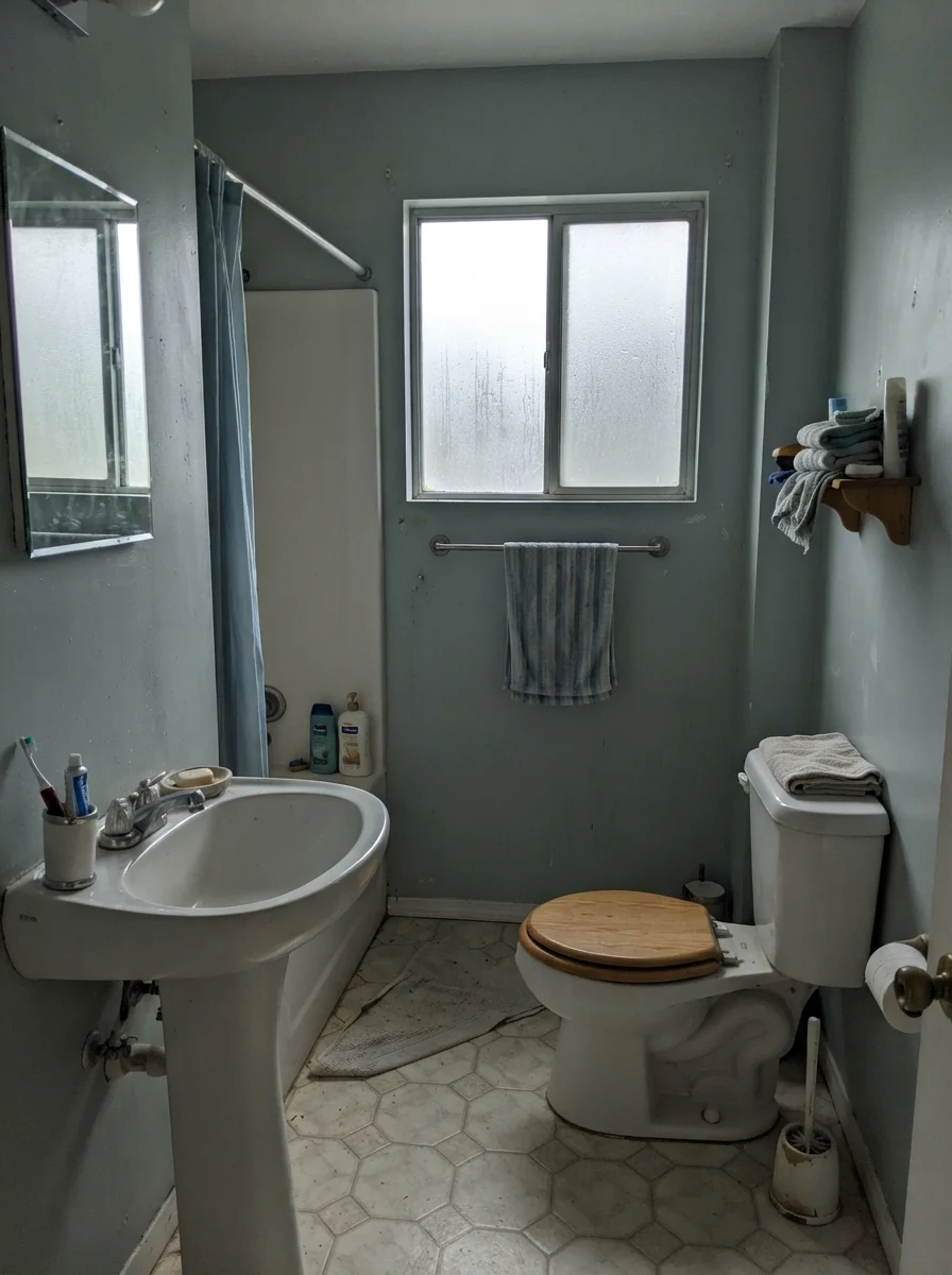
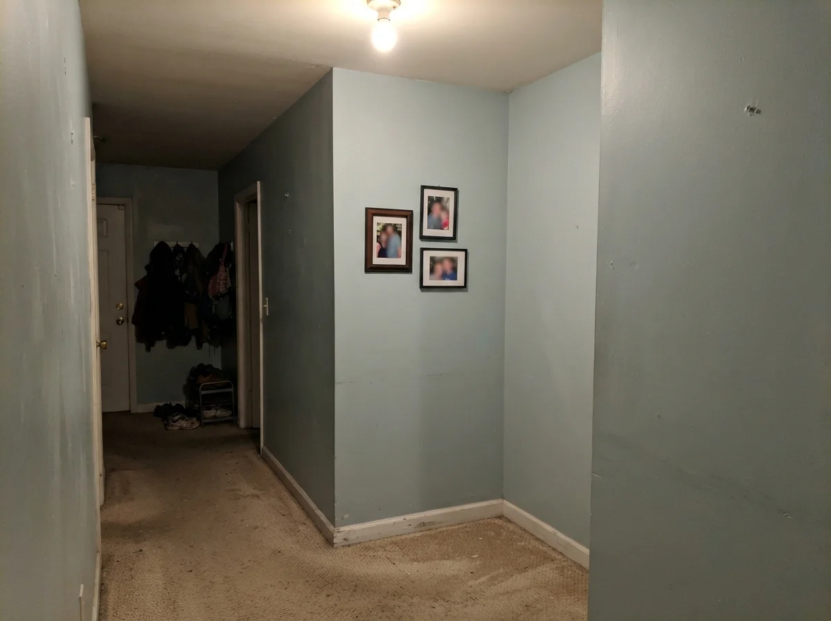
In our last house, an ordinary 1990s center-hall colonial with builder-grade oak floors and eight-foot ceilings, I bought two gallons of Benjamin Moore Smoke because four different design magazines promised me it was an instant spa in a can. I spent an entire Saturday rolling it onto the walls of our windowless upstairs hallway bathroom. By Sunday night, standing under the warm glow of three standard vanity bulbs, the blue had completely evaporated. The walls looked like wet cement. Two days later, on a dreary November Tuesday morning with only cool north light filtering through the small frosted privacy glass, it shifted again into a chilly, almost bruised violet-gray.
I lived with it in that bathroom for nearly four years before I admitted defeat. I kept telling myself it was sophisticated and calming, because that is what the paint brochures said. But every morning when I brushed my teeth, the room felt cold, and the oak mirror frame we had at the time looked violently orange next to it. That is the thing nobody tells you about blue-gray paint: it is one of the most temperamental color families you will ever put on drywall. When it works, it is breathtaking. But when the light or the woodwork turns against it, no amount of white towels will save it.
How Daylight and Night Lamps Change This Color
Before you commit to five gallons, you have to understand how dramatically Smoke shifts over twenty-four hours. An LRV of 56 means it reflects just over half the light that hits it, which is high enough to keep an entire room feeling open and airy. But because the color saturation is subtle—only about twelve percent saturated—it takes on the personality of whatever bulb or sun angle is hitting it.
In cool early-morning light, before the lamps are flicked on, Smoke can look pale, washed out, and slightly distant. As the sun moves around the house, direct southern exposure warms the teal undertone into that powdery sea-glass shade people fall in love with on Pinterest. But once dusk falls and you turn on standard 2700K incandescent or warm LED bulbs, the yellow wavelength cancels out the gentle blue pigment entirely. What remains on the wall is a plain, flat gray. If you want the color to stay blue after sunset, you need to step up your light bulbs to 3000K or 3500K, or look at a more saturated alternative like Yarmouth Blue.
Bathrooms: Where Smoke Belongs (And Where It Struggles)
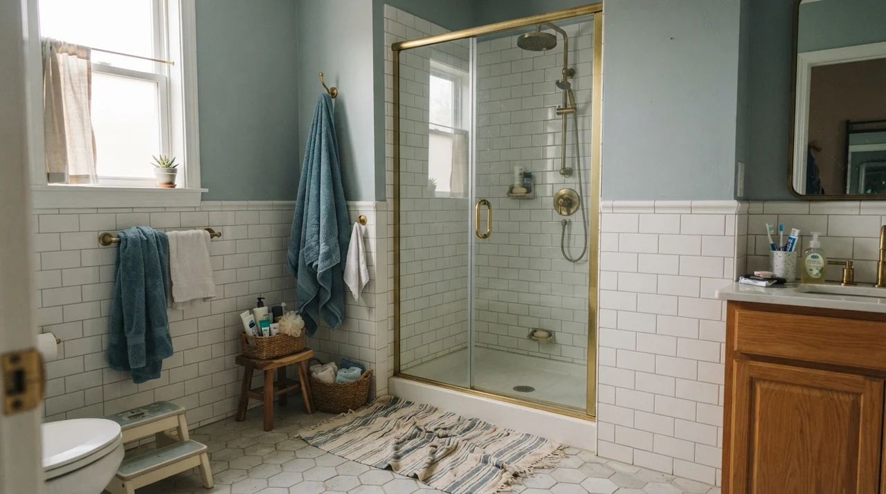
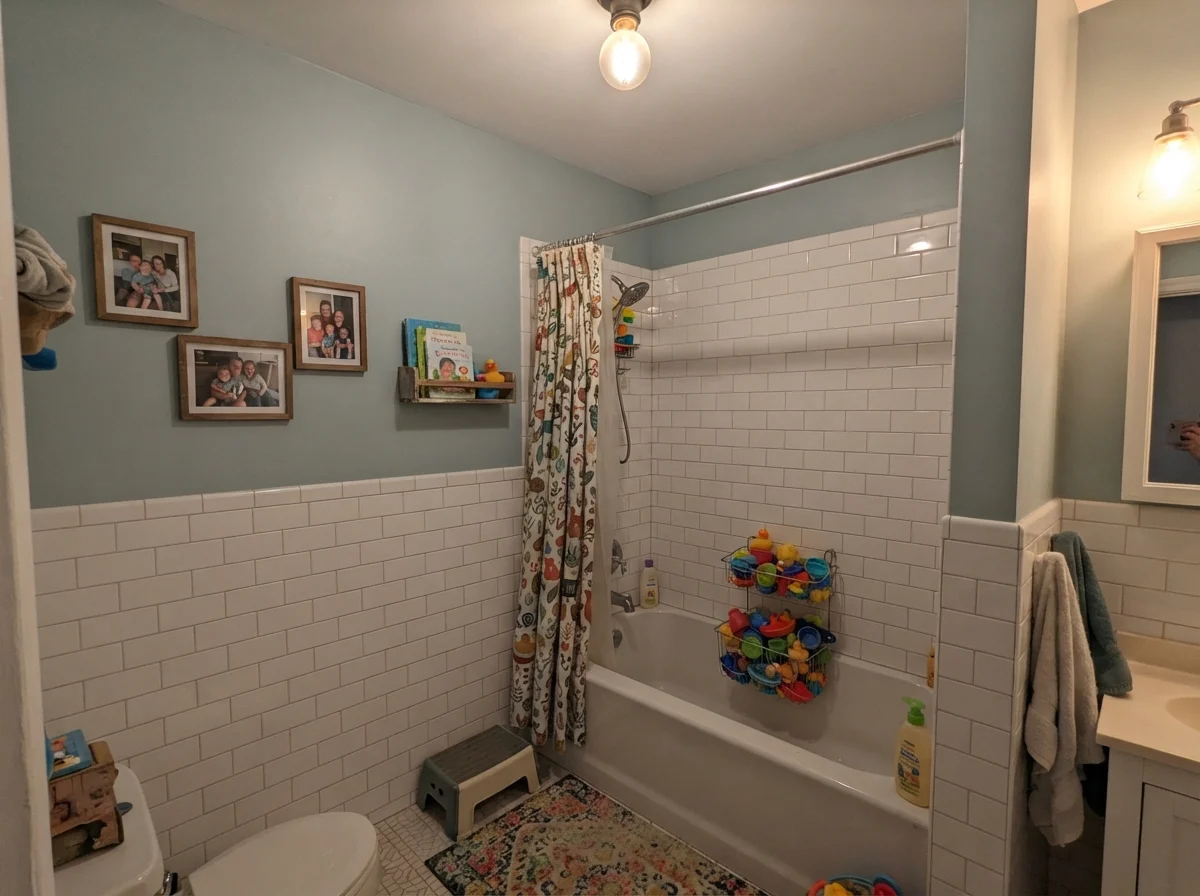
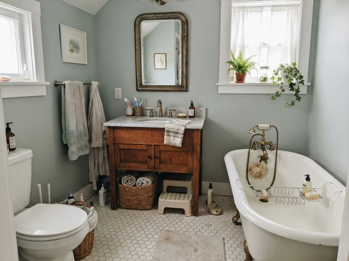
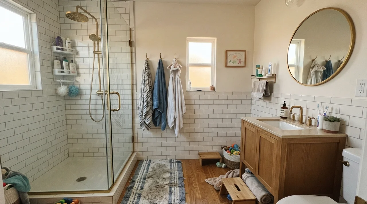
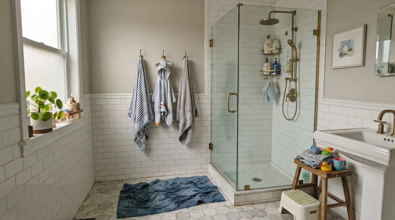
There is a good reason Smoke is constantly recommended for bathrooms. When you give it crisp white tile, clean porcelain fixtures, and chrome or polished nickel hardware, it delivers the exact calm, pulled-together look people want. The cool undertone makes white ceramic pop, and in a bathroom with generous daylight, it feels clean without feeling sterile.
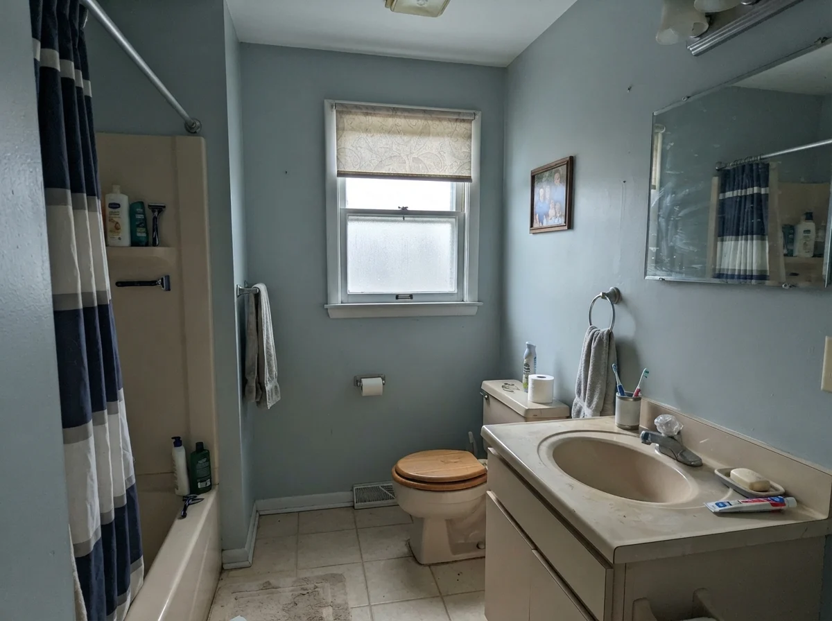
We used it in our current 1960s ranch when we redid the hall bath with classic white subway wainscot and satin nickel plumbing. Five years in, it has held up beautifully to moisture and everyday routine. But that success came with a strict rule: you cannot mix it with heavy, warm builder finishes. If you have an older beige laminate countertop, honey oak trim, or yellow-toned travertine, Smoke will fight every single one of them. The wood will look dingy and orange, and the paint will look icy and clinical.
Even the fixture finishes matter. While brass or warm unlacquered nickel can provide a lovely contrast if your lighting is right, cool chrome and polished nickel are foolproof. They echo the crispness of the paint without introducing conflicting undertones. If your bathroom has only a single north-facing frosted window, however, prepare yourself: flat cloudy light will drain the warmth right out of it, leaving the room looking muted and gray.
Smoke behaves like a quiet neutral until the lighting turns against it. Give it warm sun and white tile, and it shines; trap it in a dark north corner, and it turns icy.
Bedrooms and Nurseries: Finding the Right Balance
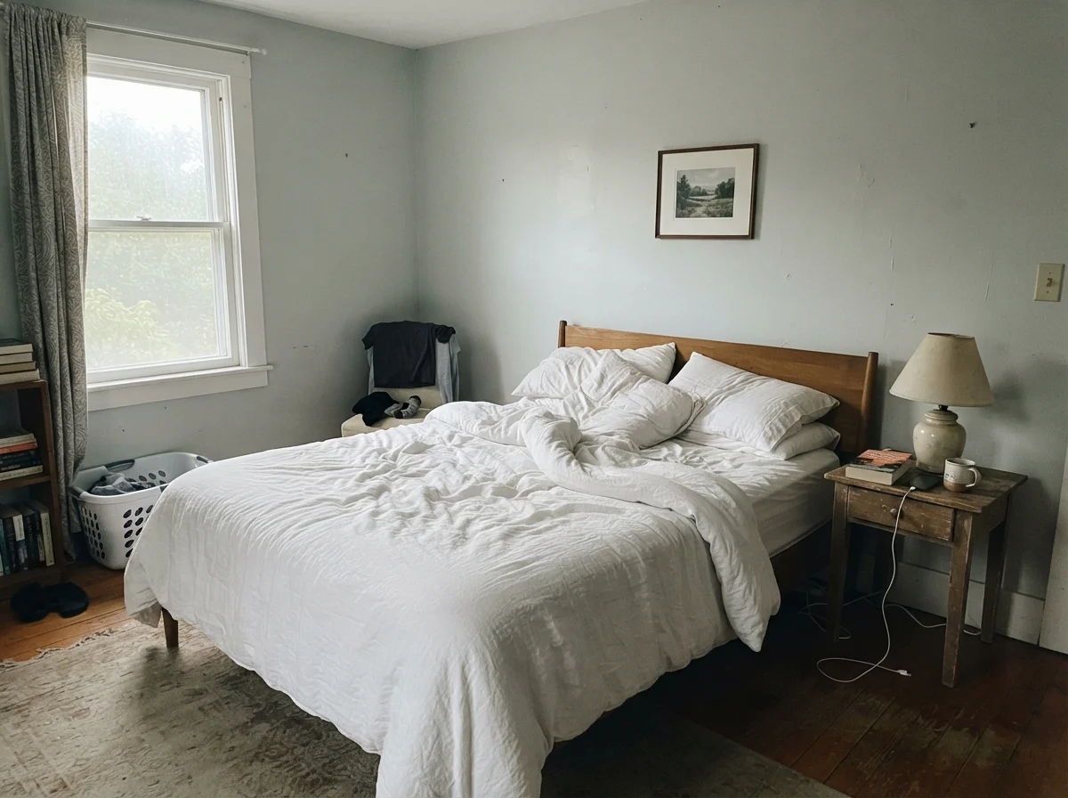
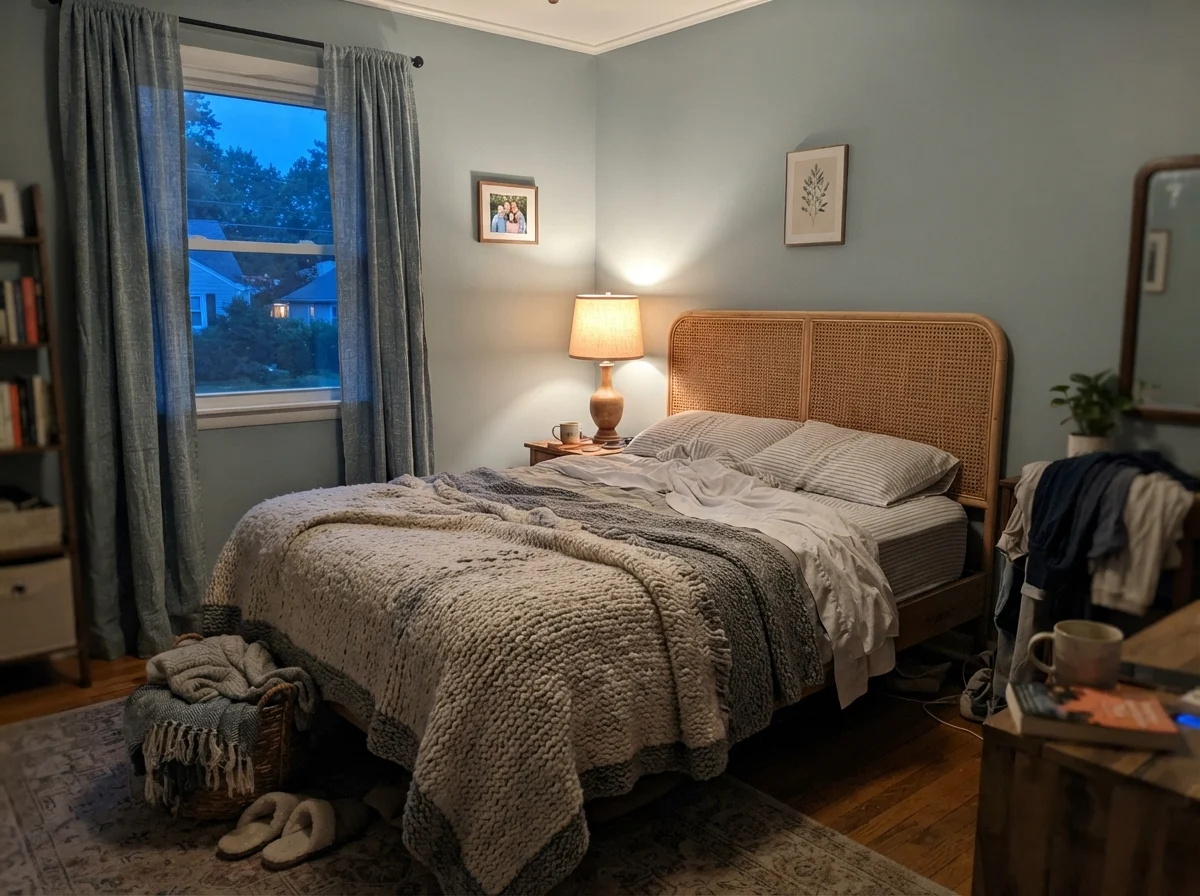
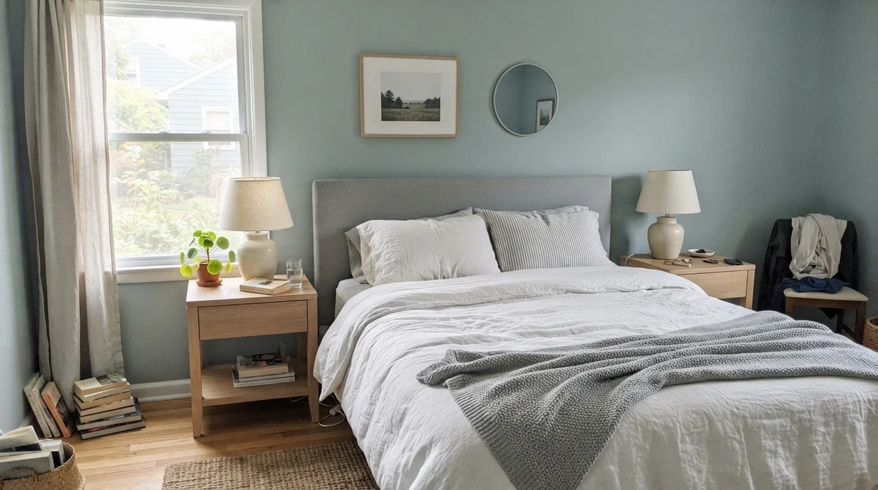
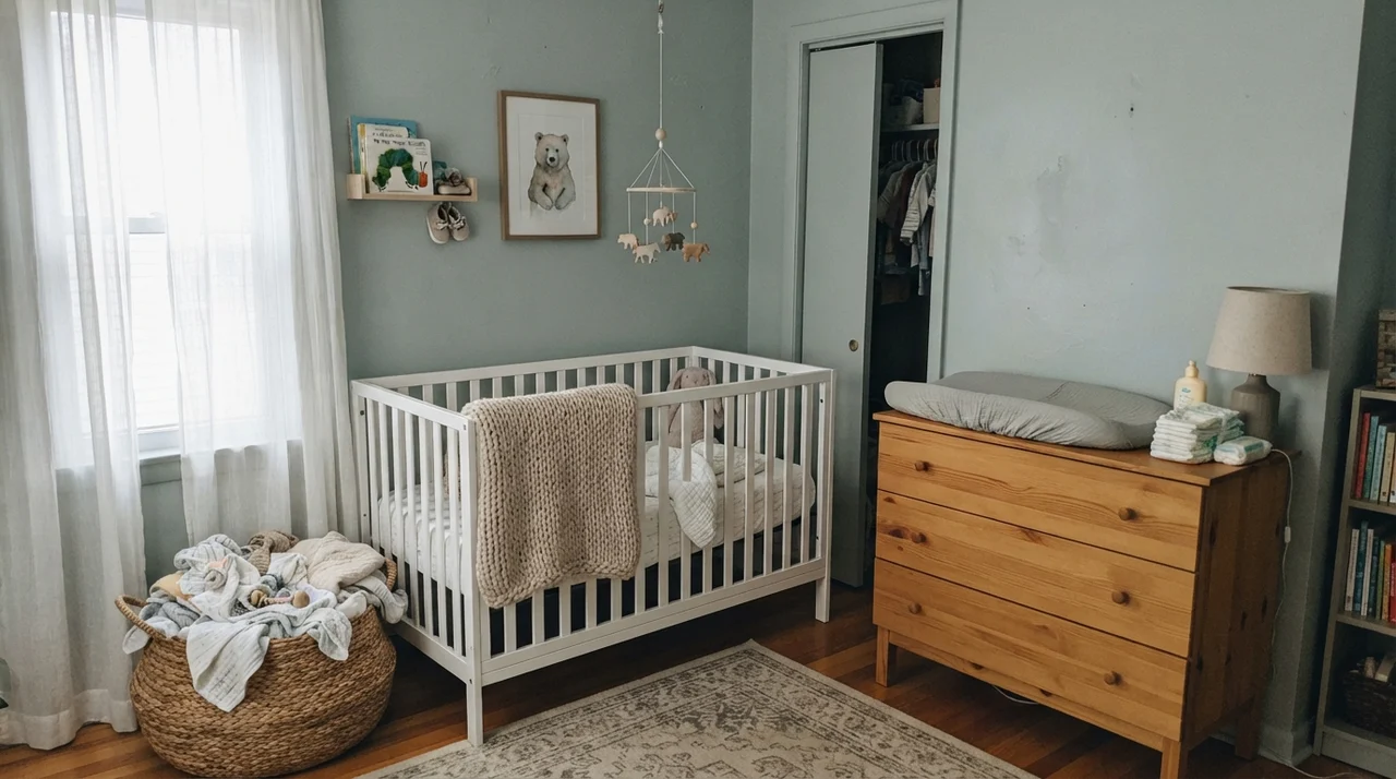
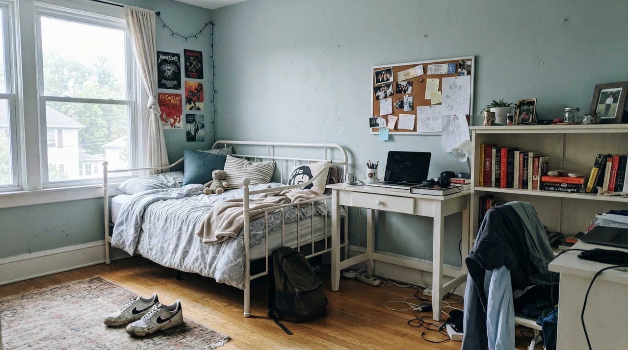
In a bedroom, Smoke offers something rare: visible color that does not demand attention when you are trying to sleep. Because its LRV is 56, you can paint all four walls without feeling like the ceiling is dropping or the room is shrinking. In south-facing and west-facing bedrooms, where the late afternoon sun pours across the drywall, the color softens into that soothing, sea-glass tone that makes linen bedding and pale woods look effortless.
The secret to keeping a Smoke bedroom from feeling cold at night is introducing warm textural counterweights. We learned this the hard way in our colonial: if your furniture is dark espresso or sharp black, and your bedding is plain gray, the room ends up feeling like an unheated hotel room in February. Pair it instead with light oak nightstands, woven rattan accents, natural linen drapery, or an accent wall in a grounding neutral like Pashmina AF-100. That warmth balances the cool blue-green base and keeps the room inviting when the sun goes down.
Kitchens and Built-Ins: The Cabinet Secret
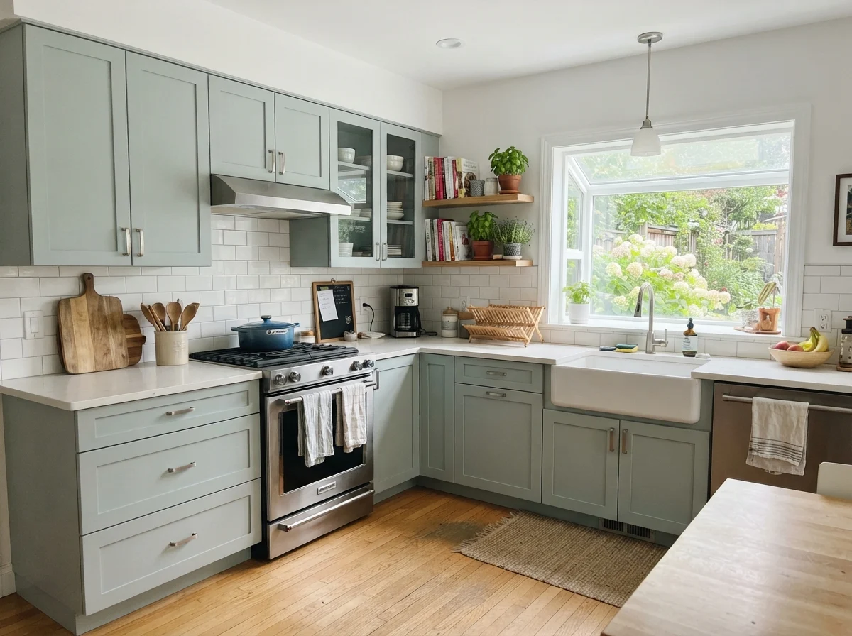
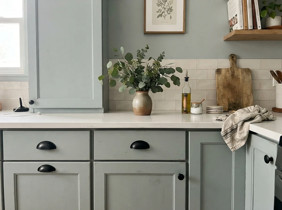
Most homeowners default to crisp white, navy, or sage green when painting cabinets. But painted vanities and utility room cabinetry in Smoke are an underrated middle ground. On a run of shaker doors, Smoke reads softer than a true navy and cleaner than a muted sage. It brings just enough personality into a workspace without overwhelming the eye.
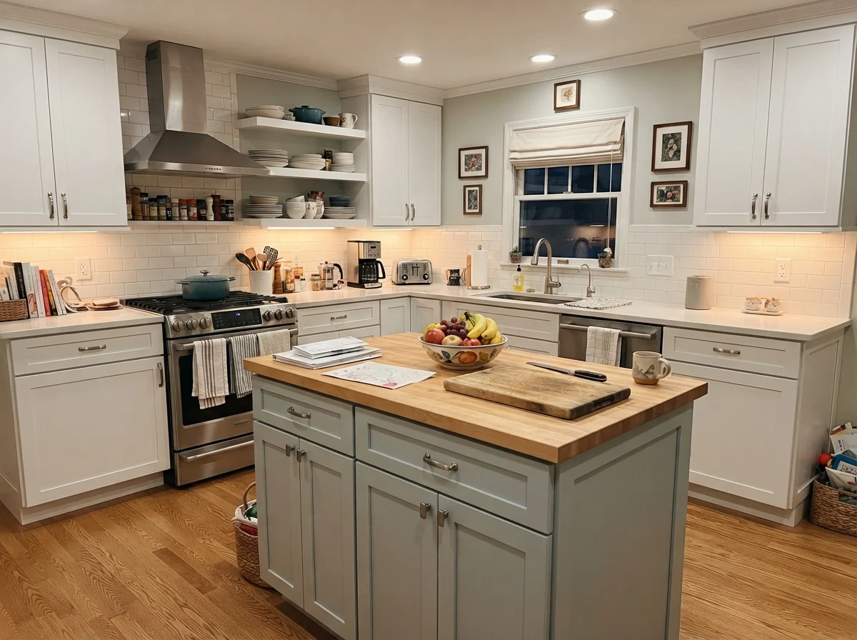
If you decide to paint kitchen cabinets or an island in Smoke, your countertop and flooring choices will make or break the installation. It looks stunning next to white quartz, marble-look slabs, and pale white-oak floors. But it will actively clash with warm golden granite, yellowed butcher block, or speckled brown counters. When we updated the kitchen island in our current ranch, we tested Smoke against our cream perimeter walls. Because the island sat under soft daylight from a garden window, it grounded the center of the room without making the small kitchen feel chopped in half.
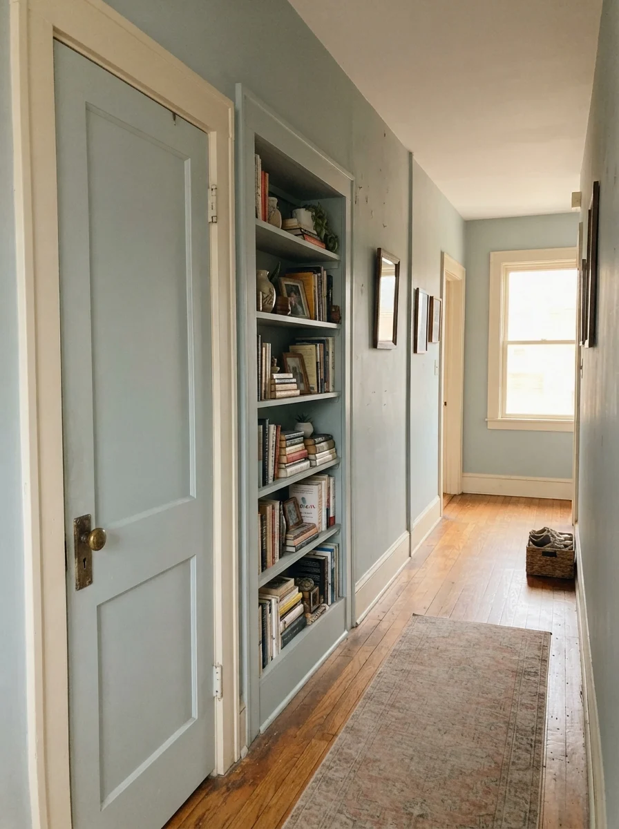
For doors and architectural millwork in an older home, Smoke can add quiet depth without the heavy contrast of dark gray or black. A two-panel interior door or a built-in reading nook painted in Smoke creates a soft transition against warm cream walls, especially when paired with an aged brass doorknob.
Living Rooms, Sunrooms, and Laundry Spaces
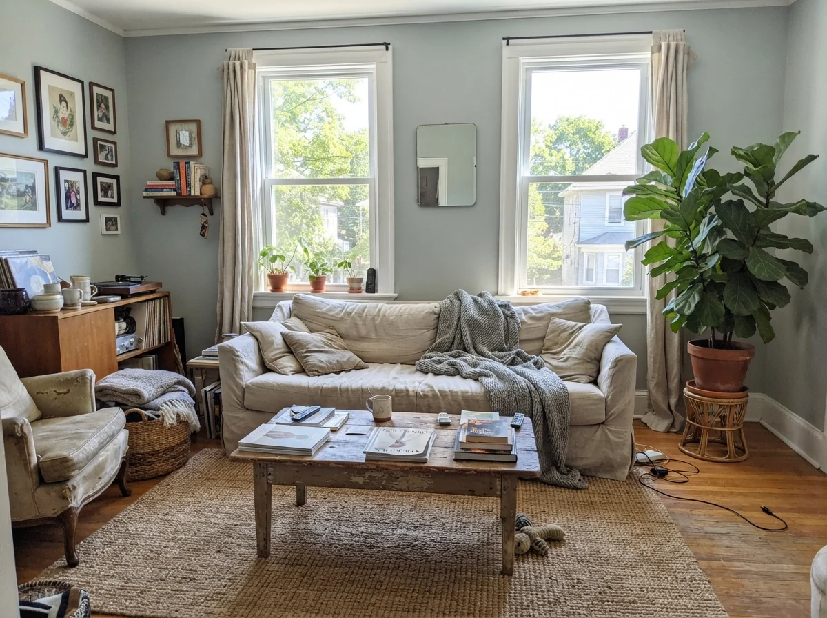
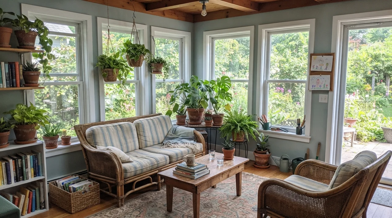
In main living areas, Smoke works best where there is plenty of natural glass. A sunroom wrapped in white-framed windows allows the generous garden light to bring out the subtle green undertones of the teal family. Combined with terracotta pots, green foliage, and natural rattan furniture, the color feels organic and fresh rather than cold.
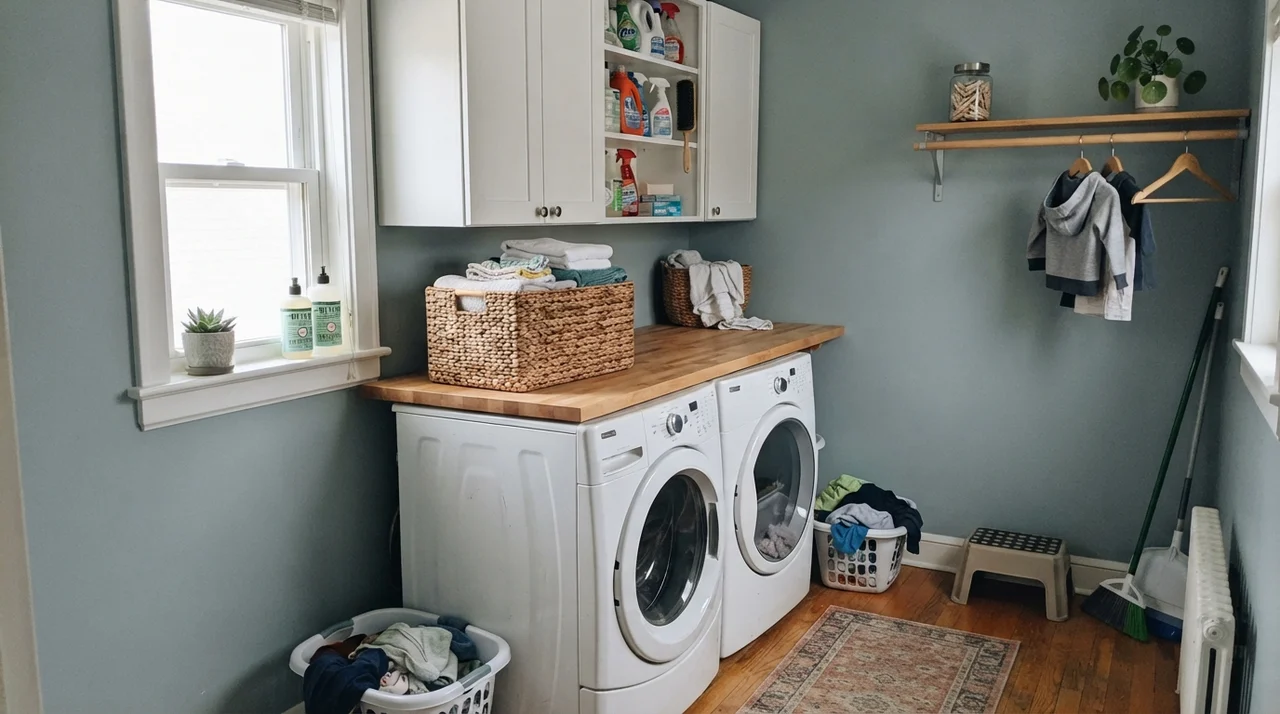
The same logic applies to utility spaces. A bright laundry room with a south-facing window, white appliances, and clean butcher block makes Smoke feel like a deliberate design choice rather than an afterthought. Because laundry rooms are small and hardworking, having a wall color with an LRV of 56 keeps the space feeling expansive while hiding the stray scuffs of laundry baskets far better than stark white drywall.
Exterior Siding and Porch Ceilings
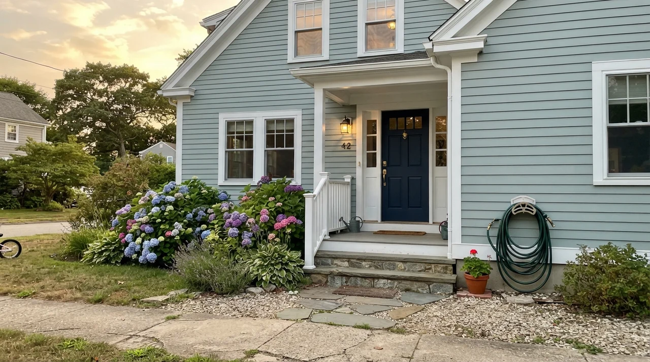
Outside, sunlight washes paint colors out by at least thirty percent. On horizontal siding, Smoke reads significantly lighter and paler than it does on an interior swatch. It is a lovely choice for coastal cottages or split-level homes paired with crisp white trim, gray stone foundations, and dark accent shutters like Benjamin Moore Wrought Iron 2124-10.
However, be cautious if your home has warm red or orange brickwork. Just like orange oak floors indoors, the warm brick makes Smoke look washed out and chalky by comparison. Where it truly excels outdoors is on a covered porch ceiling—serving as a refined, slightly grayed nod to the traditional southern 'haint blue' ceiling that softens the entryway.
Where Benjamin Moore Smoke Fails: The Honest Truth
Nobody complains about how Smoke covers drywall or how it cleans up when you scrub it. The formula is reliable, and across five years of living with it, we never had issues with peeling or premature fading. Every complaint I have ever heard about Smoke comes down to one simple problem: the color on the wall stopped looking like the color on the paint chip.
Three specific room conditions will ruin this paint almost every single time:
- Dim, windowless north-facing spaces: North light is naturally cool and blue-tinged. It feeds the blue-green undertone until the wall looks frosty and gloomy. In a dark hallway or basement bath, it can drift into a muddy violet-gray that feels depressing. If your room lacks strong daylight, skip Smoke and choose a warm neutral like Edgecomb Gray HC-173 instead.
- Orange oak, cherry, and espresso woodwork: When placed directly beside warm builder oak or red-toned cherry floors, Smoke acts like a color wheel mirror. It forces the wood to look aggressively orange and makes the paint look clinical. Dark espresso floors create a heavy, shadowy contrast. If you have warm floors you cannot change, look at a softer green-gray like Quiet Moments 1563.
- Rooms used strictly at night under warm bulbs: At 2700K, household bulbs flood the walls with yellow wavelengths. Because Smoke has low saturation, the blue disappears, leaving a flat, dreary gray. If you want true blue at night, you need the stronger saturation of Yarmouth Blue HC-150.
Trim Colors and Finishes That Actually Hold Up
When choosing a trim color for Smoke, your goal is either crisp definition or soft blending. Because Smoke has cool gray-teal roots, stark yellow-cream trim will look like dirty masking tape next to it. You need whites with clean or slightly soft undertones.
For sheens, stick to practical homeowner rules. On general bedroom and living room walls, eggshell is the sweet spot. It provides enough wipeability for stray scuffs without highlighting wall imperfections. In bathrooms, laundry rooms, and on painted cabinets, always step up to satin. Flat and matte finishes in Smoke look chalky across large walls and will burnish if you scrub them with a sponge. For trim, standard semi-gloss keeps the edges sharp and clean.
Durability, Scrubbing, and Long-Term Value
When you paint a high-traffic room, you are investing in how the surface behaves three, five, and eight years later. We lived with Smoke on our bathroom walls through years of steam, splashed toothpaste, and wet bath towels. In eggshell and satin finishes, Benjamin Moore's formula held up remarkably well. Water spots wiped clean without leaving ghost stains, and mild soap took off stray marks around the towel bar without lifting the sheen.
Where people waste money is buying matte or flat paint in this specific color to hide bumpy drywall. Matte blue-gray paints absorb light unevenly, making the wall look dusty. If a child bumps the wall or you scrub a mark near a light switch, flat paint burnishes into a shiny patch that cannot be fixed without repainting the entire section corner-to-corner.
From a resale standpoint, Smoke is one of the few colored paints real estate agents do not tell you to paint over before listing. When used in a bathroom or primary bedroom with good light, buyers view it as clean and move-in ready. When we sold our colonial, the listing agent specifically noted that the master bath looked fresh and spa-like in the open-house photos.
How Benjamin Moore Smoke Compares to Similar Blue-Grays
If you are standing in the paint aisle staring at paint swatches, these four alternatives are the ones you are likely cross-referencing. Here is how they actually behave side by side on a real wall:
Is Benjamin Moore Smoke blue, green, or gray?
It is a blue-gray with a soft teal undertone. In warm south light it looks like sea-glass gray; under cool north daylight it shifts blue-violet; under warm 2700K night bulbs it looks gray.
What is the LRV of Benjamin Moore Smoke?
Smoke 2122-40 has a Light Reflectance Value (LRV) of 56. It reflects just over half the light in a room, making it light enough for all four walls without feeling dark.
Does Benjamin Moore Smoke look good with honey oak cabinets?
No. The cool blue-green undertones clash directly with warm orange oak, making the wood look brighter orange and the walls look chilly and clinical. Use Quiet Moments or Edgecomb Gray instead.
What is the best trim color for Benjamin Moore Smoke?
Chantilly Lace OC-65 gives the crispest, cleanest contrast. If you want a softer look that is not quite as stark, White Dove OC-17 works well.
What sheen should I choose for Smoke in a bathroom?
Use satin for bathroom walls and painted vanities. It resists moisture, wipes clean easily, and keeps the color from looking chalky.
Susan's Verdict · Worth buying with one strict rule
Smoke 2122-40 is a genuinely beautiful color that earned its reputation for a reason. If you put it in a bathroom, bedroom, or sunroom with south or west light, white tile, and pale wood, it is serene and timeless. But do not buy it for a dim north-facing hallway or a room surrounded by orange oak trim. Paint a large sample board, carry it into your room at 8:00 AM and 8:00 PM, and make sure you love its evening face before opening the gallon.