Color Diary · No. 23
Benjamin Moore Vintage Vogue: A Dark Olive That Demands Good Lamps
Benjamin Moore's most-loved dark green, reviewed honestly: the rooms where it glows, the rooms where it turns to gray sludge, and what to paint instead.

Susan HartleySeptember 11, 2026 · 16 min read
Vintage Vogue · Benjamin Moore 462
Hex#565D4FLRV12Undertonesdeep olive green → muted charcoal gray → murky slate
In our last house, a 1990s colonial with oversized south-facing windows and eight-foot ceilings, I bought a quart of Benjamin Moore Vintage Vogue (462) thinking I had found the holy grail of sophisticated muted greens. On the paper paint chip at the hardware store counter, it looked like an elegant, historic, dusty sage-olive. It looked like the kind of color that belonged in an old English manor house full of oil paintings, unlacquered brass, and weathered walnut desks.
Then I rolled two coats onto the study walls.
When the sun was pouring across the floorboards at two o'clock on a Tuesday afternoon, it was pure magic. It was rich, deep, and grounded without ever screaming green like a pool table. But when six o'clock rolled around and I flicked on the single overhead builder-grade light fixture, my cozy study looked like the inside of a cast-iron skillet. The warm olive tones vanished entirely, swallowed by an unyielding, flat charcoal sludge.
That is the reality of Benjamin Moore Vintage Vogue. It has a Light Reflectance Value (LRV) of 12. On a scale where zero is pure black and 100 is pure white, an LRV of 12 means this paint absorbs almost 88 percent of all the light that hits it. It gives almost nothing back. If you give it warm daylight or layer your room with 2700K lamps, it rewards you with one of the most handsome, expensive-looking dark greens Benjamin Moore sells. But if you starve it of light, it will punish you without hesitation.
Light Shifts: The Morning Pale and the Evening Glow
Before you commit five gallons to a room, you need to understand how drastically a low-LRV paint shifts across twelve hours. Most people sample a color at noon on a Saturday, decide they love it, and then wonder why their bedroom feels chilly and uninviting when their alarm goes off at 6:30 on a winter morning.
In cool early-morning light, before any lamps are switched on, Vintage Vogue loses its yellow undertone. It sits on the wall looking somewhat pale, desaturated, and grayed-out. It does not possess enough built-in brightness to bounce that weak morning sky back into the room. But once dusk settles and you switch on warm bedside lamps, the color wakes up. The warm yellow wavelengths from 2700K incandescent or warm LED bulbs ignite the green pigment, transforming the walls into a snug, velvety cocoon.
Living Rooms and Daylight Spaces
In our current 1960s ranch, I painted our main living room walls in Vintage Vogue after living with off-white for four years. The room has two substantial windows that let in generous midday sun. That abundant natural light is the exact antidote to LRV 12 darkness. When southern or southwestern light fills the space, Vintage Vogue reads as a true, dusty, organic green—never loud, never like a billiard table, but unmistakably earthy.
It provides an incredible grounding backdrop for natural materials. Warm wood coffee tables, woven jute rugs, and warm linen upholstery look significantly more expensive against this wall than they ever did against builder beige or sterile cool grays. Dark muted greens have a way of anchoring a room and giving casual, lived-in furniture a sense of permanence.
Where this color truly sings without hesitation is in sun-drenched transition spaces like sunrooms and bright breezeways. When framed by generous white trim and surrounded by glass on multiple sides, the dark paint does not make the room feel small; instead, it blurs the boundary between the interior and the foliage outside in the garden.
The Hallway Test and Built-In Features
If you have an older home with wide baseboards, solid interior doors, or built-in bookshelves, Vintage Vogue is a stunning tool when used selectively. In our 1970s split-level, the long central hallway was an awkward, sprawling space. Rather than painting the whole corridor dark, we used Vintage Vogue exclusively on the interior doors and a built-in linen cupboard against creamy off-white walls.
Doing this gives you the grounding weight of a historic dark green without suffocating a windowless pass-through. Against warm wood floors and paired with aged brass doorknobs, Vintage Vogue in a semi-gloss or satin finish looks like it has been part of the house for a hundred years.
Kitchens: Full Cabinets vs. The Accent Island
Over thirty years and three kitchens, I have painted cabinets white, navy, honey pine, and green. Dark green kitchen cabinetry has exploded in popularity, but living with it long-term requires an honest appraisal of your room's layout. Vintage Vogue looks magnificent on shaker cabinet doors, but you must know where to stop.
If you have a large kitchen with tall ceilings and large garden windows, painting both the upper and lower cabinets in Vintage Vogue creates a tailored, classic feel. Paired with white subway tile backsplash, white quartz or marble-look counters, and light oak floors, the contrast keeps the kitchen feeling fresh and intentional rather than heavy.
However, for the vast majority of everyday family kitchens—especially those with standard eight-foot ceilings or limited natural light—painting every upper cabinet in an LRV 12 paint will make the room close in fast. That is why using Vintage Vogue strictly on a central kitchen island is the smarter, more enduring design decision.
In our colonial, we kept the perimeter cabinetry a soft, creamy off-white and painted only the island in Vintage Vogue in a satin enamel. It gave us the warmth and richness of dark green while maintaining an airy workspace. It also had the practical benefit of hiding shoe scuffs from the kids kicking the back of the island bar stools—something our old off-white paint failed at miserably.
At LRV 12, Vintage Vogue gives almost nothing back. Give it daylight or warm lamps and it looks like a million bucks; starve it of light and it turns straight to charcoal.
Bathrooms: Wainscoting, Clawfoot Tubs, and Shifting Skies
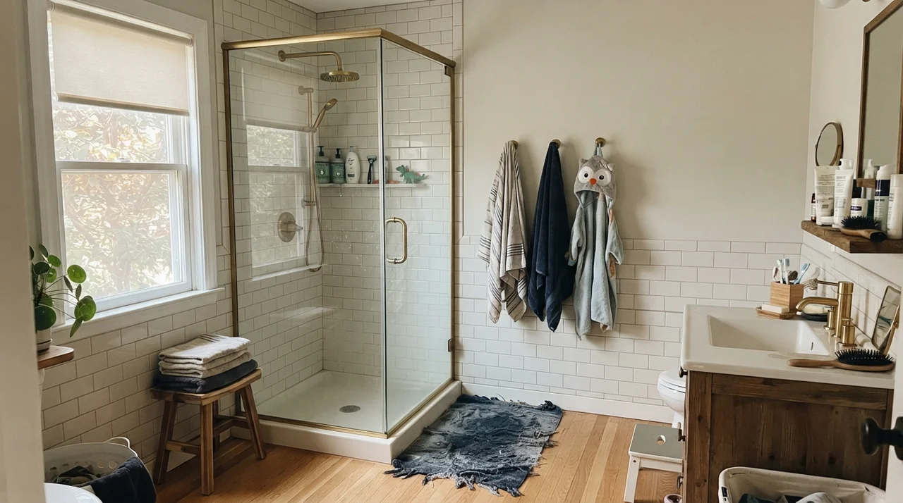
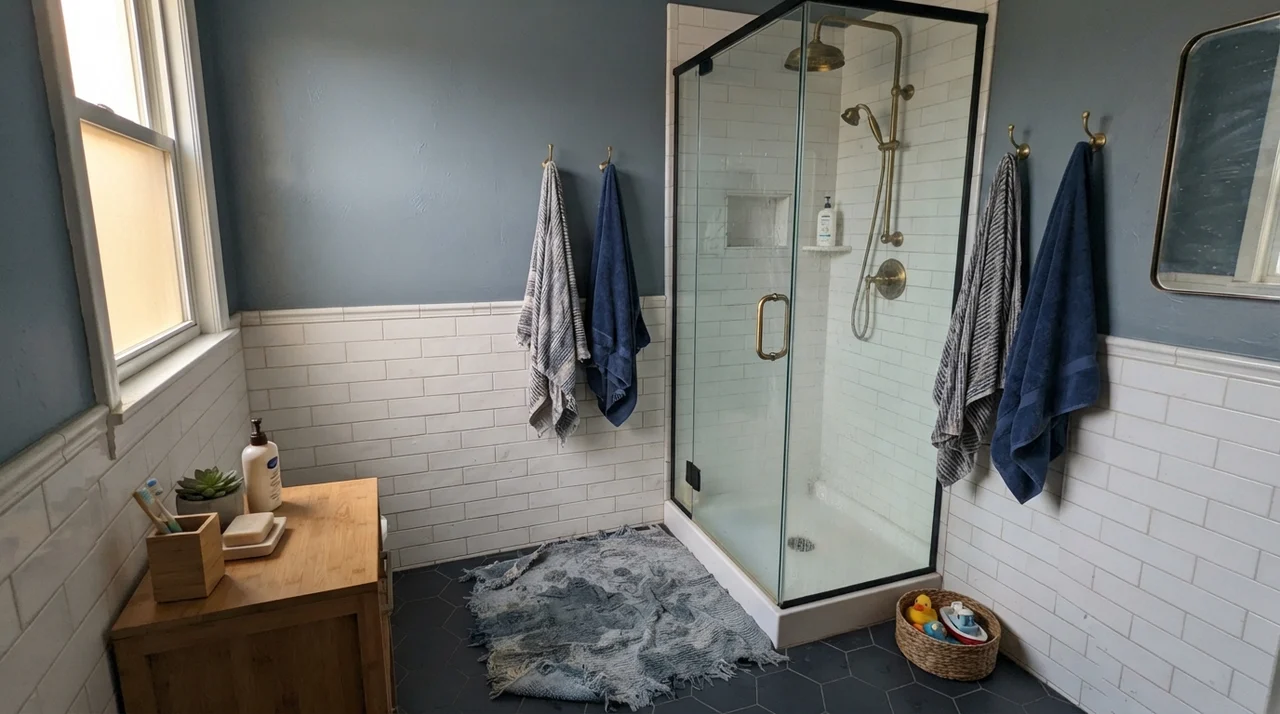
Bathrooms are one of the most reliable places to use Vintage Vogue, provided you understand how to balance the dark walls against reflective surfaces. In family bathrooms, pairing Vintage Vogue on the upper walls with white subway tile wainscoting along the bottom half is a time-tested formula. The white tile bounces light back into the upper room, while the deep olive above adds luxury and drama. It makes brass shower fixtures and warm wood accents look tailored and expensive.
In kids' bathrooms, Vintage Vogue on the upper walls holds up remarkably well against moisture and daily splashes when applied in an eggshell or satin finish. The deep color provides a calm, grounded backdrop that absorbs the visual chaos of colorful bath toys, family photos, and brightly colored shower curtains without clashing.
In cottage-style bathrooms, pairing this rich olive with a classic white clawfoot tub, white hex tile floor, and a warm oak vanity creates a timeless, grounded environment. The yellow tones in natural oak draw out the warm olive pigment in the paint, preventing it from reading cold.
You must, however, pay attention to the specific daylight your bathroom receives. Under flat, overcast skies through frosted glass, Vintage Vogue loses its vibrant olive undertone and shifts into a muted slate-gray. In north-facing bathrooms on rainy days, it can pick up a distinctly cool cast that looks drab next to dated beige vanities.
Bedrooms, Nurseries, and Laundry Rooms
In bedrooms, Vintage Vogue creates an intimate, cocoon-like atmosphere that makes going to bed feel luxurious. In a main bedroom with soft bright daylight from a side window, white linen bedding and pale oak nightstands provide the necessary high-contrast relief, keeping the deep walls from feeling oppressive.
For a nursery, pairing dark olive walls with a white crib, light-wood dresser, and soft woven textures creates a calm, soothing nursery that grows gracefully with the child without needing repainting every three years. Similarly, in a teenager's room, the color provides a mature foundation that easily accommodates white metal furniture, open shelving, and daily clutter.
In utility spaces like laundry rooms, where wall space is limited and white washers, dryers, and cabinetry dominate, Vintage Vogue adds immense depth. A warm butcher-block folding counter over white machines creates an instant high-end look against the deep olive backdrop.
Exterior Siding, Doors, and Shutters
Outside in full natural daylight, paint colors look roughly two shades lighter than they do indoors on a swatch. On exterior horizontal siding, Vintage Vogue softens into a handsome, natural forest olive that looks completely at home surrounded by garden greenery. Crisp white trim provides a sharp edge, while a dark navy front door offers subtle, sophisticated depth.
The Honest Fail: Where Vintage Vogue Betrays You
Nearly every unhappy Vintage Vogue story comes down to three situations, and all three are predictable before you open the can. If your room matches one, no second coat and no different sheen will save it.
The classic failure happens in interior hallways and windowless rooms lit only by a single overhead builder-grade ceiling fixture. Without broad daylight or multiple distributed warm lamps, LRV 12 collapses completely. The olive pigment gets crushed, leaving the wall looking like muddy, flat gray putty next to beige carpets and builder trim. It does not feel dramatic or moody; it simply feels dark, unpainted, and grim.
Durability, Sheens, and Long-Term Maintenance
When you live with a dark paint color for five years, you discover things no 2x2-inch swatch will ever tell you. Dark paints are formulated with heavy concentrations of colorant, which means application technique and sheen choice matter significantly more than they do with an agreeable beige or warm white.
For walls, stick strictly to an eggshell finish. Flat or matte paint in an LRV 12 color looks gorgeous and velvety on day one, but the moment you brush past it with a laundry basket or scrub a smudge by the light switch, you will leave behind a permanent burnished shiny mark. Eggshell gives you just enough resin to wipe the wall down with a damp microfiber cloth without altering the sheen. For doors, built-in bookshelves, and trim, use semi-gloss; on kitchen cabinets, satin is the sweet spot for cleanability and smooth finish.
Be warned: touch-ups with dark paints almost never blend invisibly after two years. The colorant in the original wall settles, and natural light subtly shifts the surface. If a child dings a hallway wall painted in Vintage Vogue four years in, you will likely need to repaint that entire wall corner-to-corner rather than dabbing a brush on the spot. On the positive side, Vintage Vogue hides scuffs, shoe marks, and vacuum bumps along baseboards far better than any mid-tone greige I have ever lived with.
Is Vintage Vogue too dark for a small bedroom?
It is not too dark if the bedroom has at least one good window for daytime light and you use warm 2700K bedside lamps at night. Pair it with crisp white linen bedding and Simply White on the ceiling so the room feels like an intentional, cozy retreat rather than a dark cave.
What light bulbs work best with Vintage Vogue?
Always use warm 2700K lighting. Warm incandescent or 2700K LED bulbs bring the yellow-olive undertones to life. Cool 4000K or 5000K daylight LED bulbs strip the warmth out of the paint, turning it into cold, muddy slate.
Can I use Vintage Vogue on kitchen cabinets?
Yes, especially on lower cabinets or kitchen islands in a satin finish. It looks exceptional paired with White Dove uppers, butcher block or warm quartz counters, and brass hardware. Avoid painting all uppers and lowers in Vintage Vogue in a small kitchen with standard eight-foot ceilings.
Why does my swatch look gray instead of green?
If your room faces north or you are sampling the color on an overcast day under cool artificial lights, the paint's gray undertones will dominate. Move the sample to a south-facing room or shine a warm 2700K lamp on it to see the olive green reemerge.
Susan's Verdict · Buy with a Lighting Plan
Vintage Vogue is one of the richest, most rewarding dark olive greens on the market, but it refuses to do the heavy lifting for a poorly lit room. At LRV 12, it requires real natural light or layered warm lamps to reveal its character. Paint it on dining room walls, kitchen islands, study built-ins, and powder rooms where you want warmth, drama, and timeless depth. Skip it in dim north-facing rooms with single ceiling bulbs, where it will only ever look like flat, tired charcoal.