Color Diary · No. 121
Benjamin Moore Wickham Gray Was Never Going to Be a Soft Greige
The blue-green chameleon gray from BM's Historical Colors line, reviewed honestly: the light where it turns silvery-blue, the light where it goes flat, and what to pick if you actually want more blue.

Susan HartleyNovember 13, 2026 · 18 min read
Wickham Gray · Benjamin Moore HC-171
Hex#D4D8D2LRV68Undertonescool gray → silvery blue → muted pale green
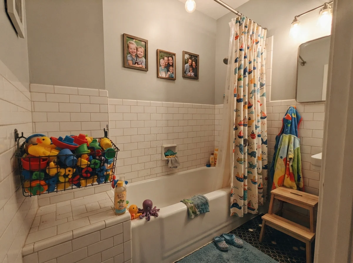
In our last house, a 1990s colonial with too much honey oak and an upstairs family bathroom that had seen better decades, I made the mistake of bringing home four different swatches of warm beige-gray. Everyone online in those days swore by warm greiges. They promised peace, neutral harmony, and that vague cozy feeling magazines love to sell. But that bathroom had a high eastern window, bright white subway tile, and polished chrome faucets. The moment I slapped those warm greiges onto the drywall beside the tub, they looked like wet cardboard. They didn't read cozy; they read dirty.
That was the week I stopped chasing trends and bought two gallons of Benjamin Moore Wickham Gray HC-171. It came out of the can looking like pale wet concrete with a faint whisper of sea glass, and the minute it went on the wall over our white wainscoting, the whole room snapped into focus. It was crisp. It was cool. It caught the morning sun and gave back a silvery blue that made an ordinary shower feel like a quiet Sunday morning at a seaside inn.
We lived with it in that colonial through eight winters and eight humid summers, and when we sold the house, the listing agent lingered in that doorway longer than anywhere else on the second floor. But Wickham Gray is not an agreeable, cooperative color that bends to whatever furniture you happen to drop in front of it. It belongs to Benjamin Moore's Historical Colors collection, carries an LRV of 68, and sits squarely in the green deck family—though in real daylight, it shifts constantly between cool gray, icy pale blue, and soft mineral green. If you feed it real sunshine and crisp cool finishes, it sings. If you starve it in a dim north-facing hallway with yellowish lighting and an oatmeal-colored sofa, you will wonder why you spent the afternoon with a roller.
The Undertone Dance: Cool Gray, Silvery Blue, and Soft Pale Green
Wickham Gray is an honest cool gray with a distinct blue-green undertone. At an LRV of 68, it reflects plenty of daylight without washing out into an anonymous off-white, but the undertone is entirely daylight-driven. Depending on the time of day and the direction of your windows, it shifts visibly between three distinct personalities.
warm sun
overcast, north light
dusk, rain, cool bulbs
Bright morning light pulls forward a clear silvery blue. Low afternoon shade or heavy cloud cover brings out a faint mineral green, while dim evening bulbs mute the cool undertone back to a quiet, flat gray.
MoonshineBenjamin Moore · see diary
Brook GreenBehr · see diary
Wickham GrayHC-171
Gray CashmereBenjamin Moore · see diary
Healing AloeBenjamin Moore · see diary
Understanding Wickham Gray means accepting that it refuses to stay in one lane. If you bring home a sample expecting a dependable true gray that will behave like a piece of quiet flannel, you are going to be startled the first time an overcast Tuesday rolls around. In flat, overcast daylight, that blue edge retreats into the drywall, and the faint green undertone steps right to the front. It is not an olive green or a celery green—it is more like weathered beach stone or dried sage. Then, twenty minutes later when the sun breaks through the clouds, the wall shifts toward a pale silvery ice blue.
This chameleon quality is exactly why people fall in love with it on color chips, and it is also why some homeowners end up repainting before the second coat has fully cured. If you genuinely want a dedicated pastel blue wall that announces itself as blue twenty-four hours a day, this is not your paint. Wickham Gray is first and foremost a cool gray; the blue and green are ghosts that come and go with the weather.
How Wickham Gray Moves from Dawn to Dusk
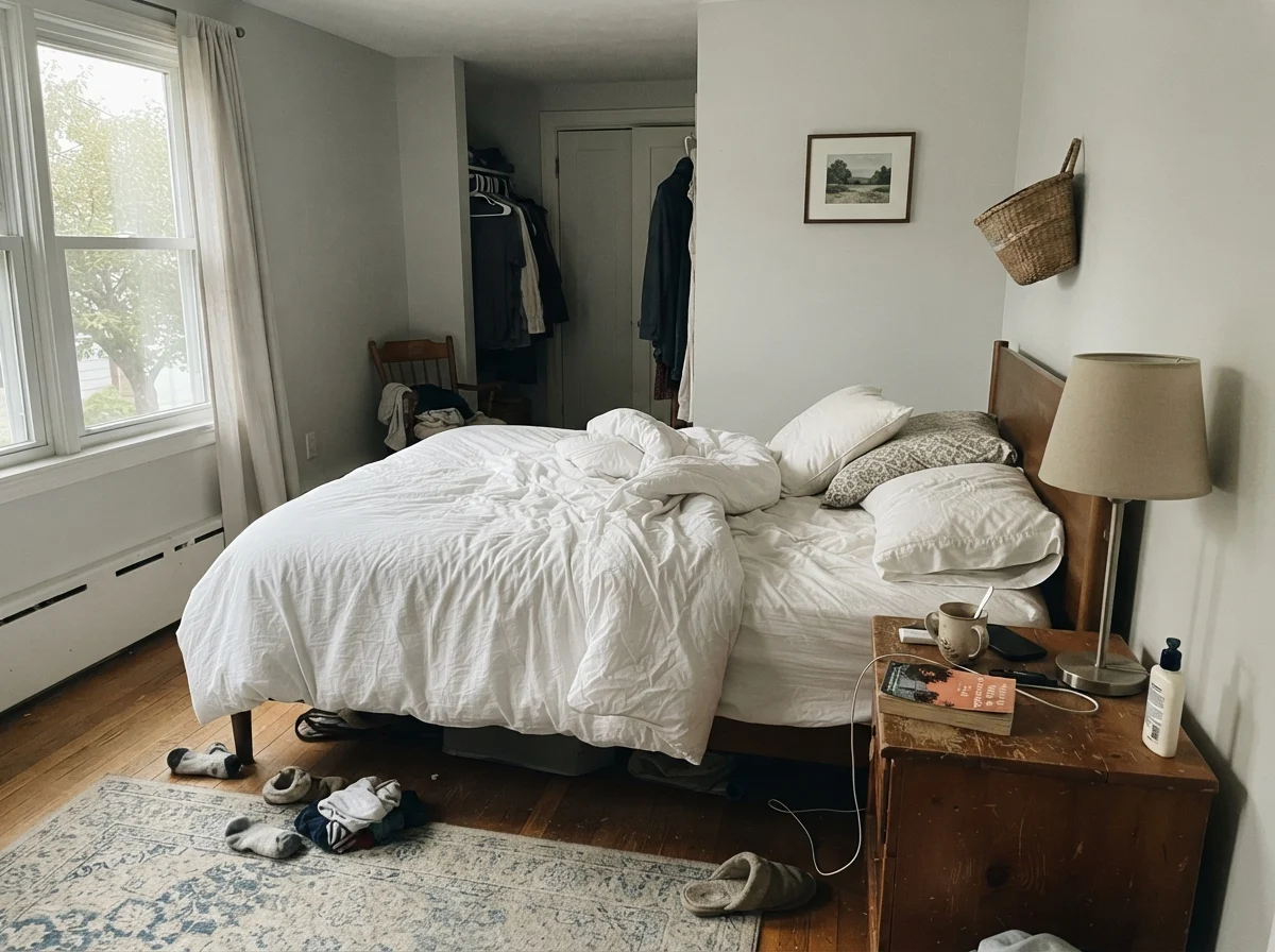
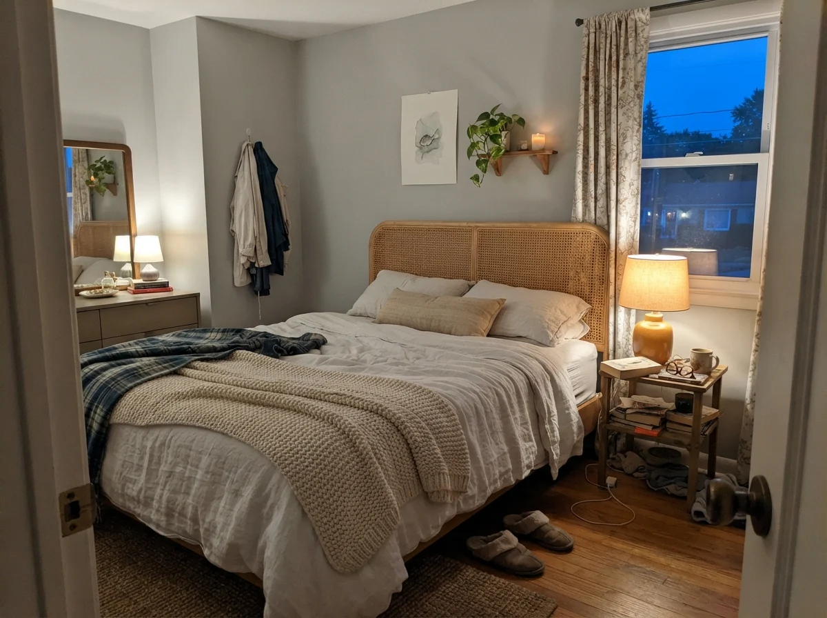
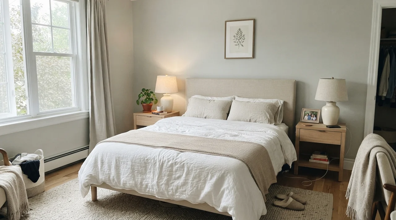
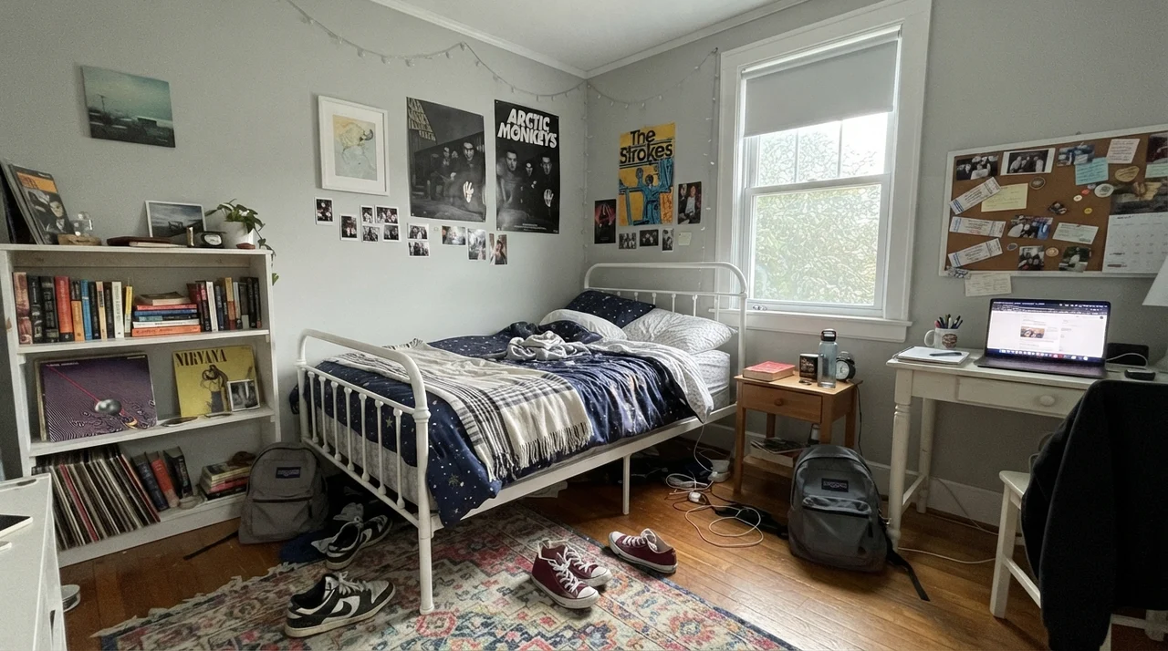
Look at the two bedrooms above and you will see the central truth of this shade. In the early morning hours, before any artificial bulbs are turned on, Wickham Gray catches the cold outside sky. At LRV 68, it holds its ground—it never collapses into total shadow—but the color feels crisp, lean, and almost ethereal. Some people might find that early morning coolness slightly stark, especially if they are waking up in mid-November in the Northeast.
By evening, the entire dynamic reverses. Click on a bedside lamp equipped with a standard warm 2700K bulb, and the blue-green pigment gets knocked down instantly. Warm yellow-toned bulb light neutralizes cool undertones, coaxing Wickham Gray into a very soft, subdued gray that feels surprisingly peaceful and restful. If you run cooler 4000K daylight LED bulbs instead, that icy blue-green stays awake all night long, but it can quickly end up looking like a clinic examination room. In our homes, I have always preferred warm bulbs at night; it lets the room feel cozy after dark while preserving the crisp silver-blue freshness during daylight hours.
Where It Belongs: Bathrooms and Wet Rooms
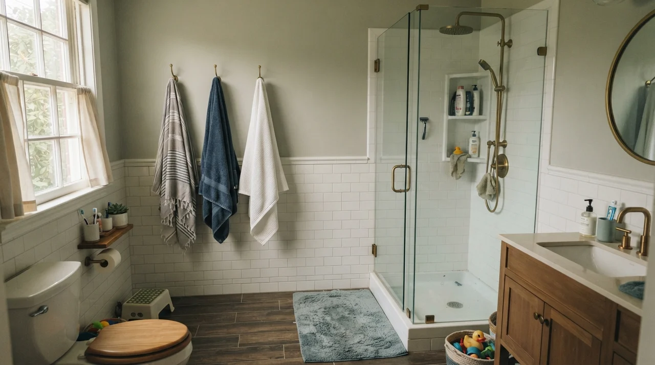
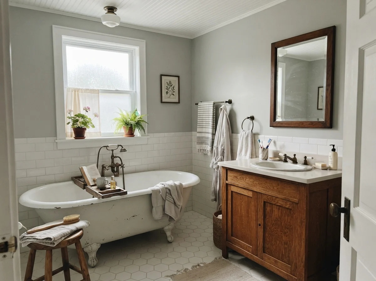
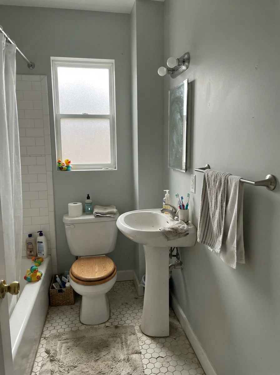
If you ask me where Wickham Gray truly shines without an ounce of drama, my answer will always be bathrooms. A bright bathroom with white ceramic tile, white quartz or marble surfaces, and polished chrome or brushed nickel hardware is the natural habitat of HC-171. White fixtures give the color an anchor. Against bright white porcelain, Wickham Gray’s LRV of 68 provides just enough contrast to define the walls cleanly, without the heavy, boxy feeling of darker grays.
In our last house, our kids' bathroom took a serious beating. Between steam, splashed soapy water, and two boys who never quite learned how to hang up a wet towel, those walls were wiped down constantly. In an eggshell sheen, Wickham Gray scrubbed clean every single time. It never burnished, never showed water marks after drying, and held up through eight years of genuine family life before we listed the house. It looked just as fresh the morning of our open house as it did the day the painters cleaned their brushes in the laundry sink.
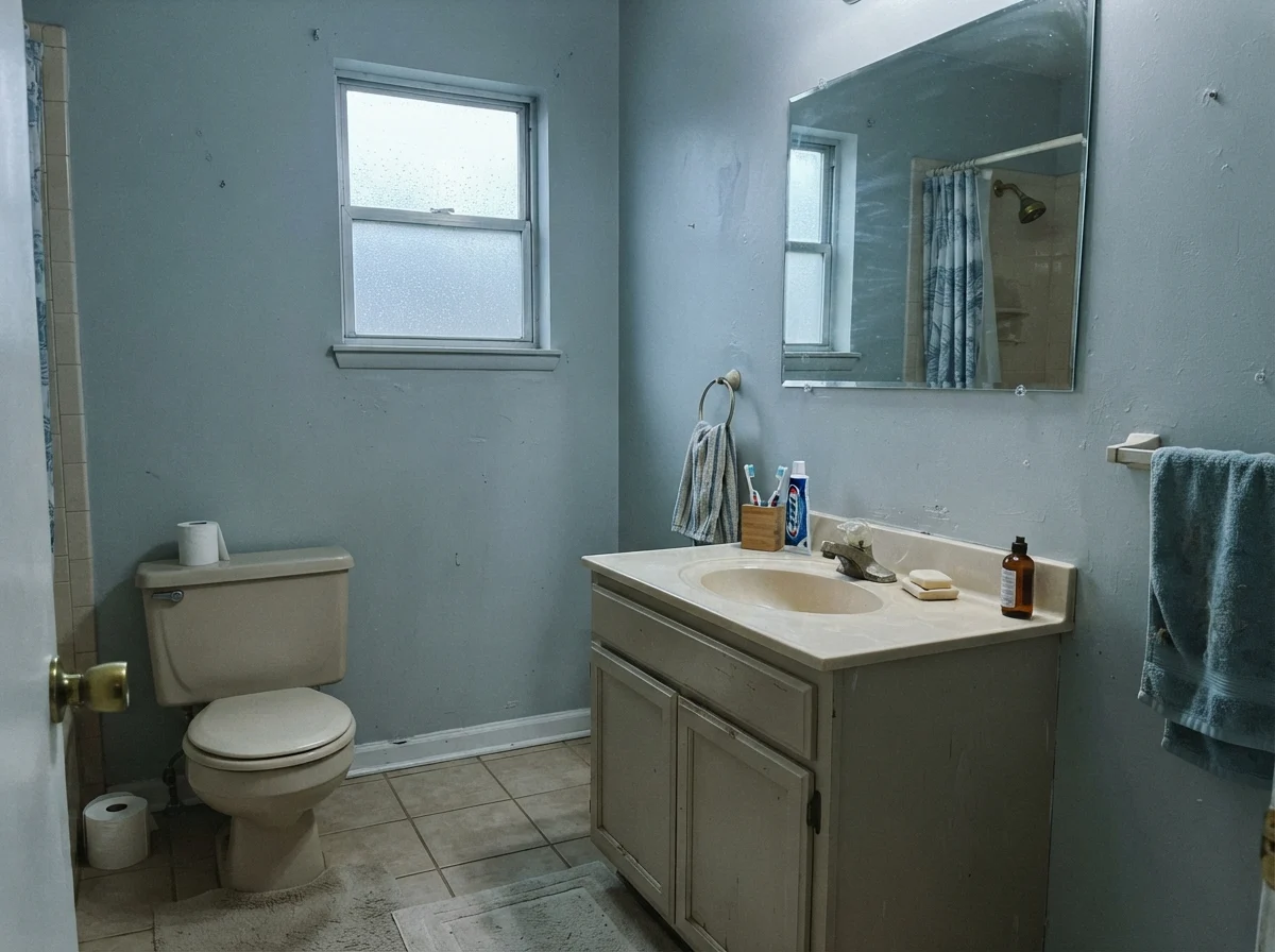
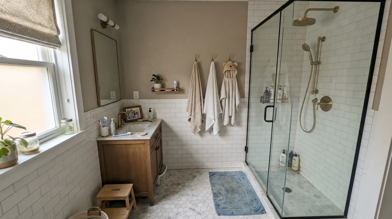
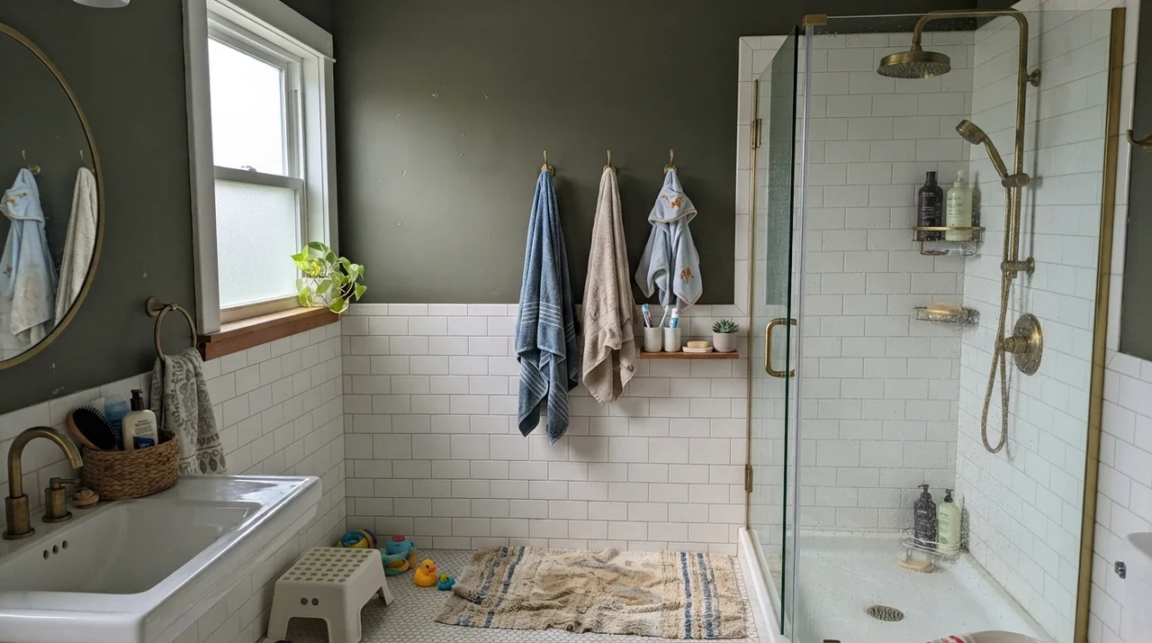
You do need to look out for the flat days, though. When heavy rain rolls in or when the window faces due north, Wickham Gray can drop its airy seaside charm and turn into a rather solemn, workmanlike gray. You can see this shift clearly in the two bathrooms above. If your bathroom has an older almond or beige vanity, that cool cast can suddenly feel chilly and detached, pointing out the age of the vanity rather than freshening it up. That is why checking your existing surfaces before ordering paint is the smartest twenty minutes you will ever spend.
Bedrooms and Quiet Living Spaces
In a bedroom with decent eastern or southern light, Wickham Gray behaves like a deep exhale. It creates an atmosphere that feels ordered, clean, and pleasantly detached from the noise of the day. Paired with washed white linen, unlacquered pale oak nightstands, and ceramic lamps, the color reads sophisticated without trying too hard. It does not demand your attention the way deeper blues or saturated greens do.
However, bedroom success depends almost entirely on how you dress the rest of the room. If your bedroom furniture consists of dark espresso veneers or warm, reddish cherry sets from thirty years ago, Wickham Gray will feel out of place. It lacks the golden or amber undertones needed to bridge that gap. But when you lean into natural pale timbers, unbleached cotton, and true white woodwork, the room looks tailored and deliberate.
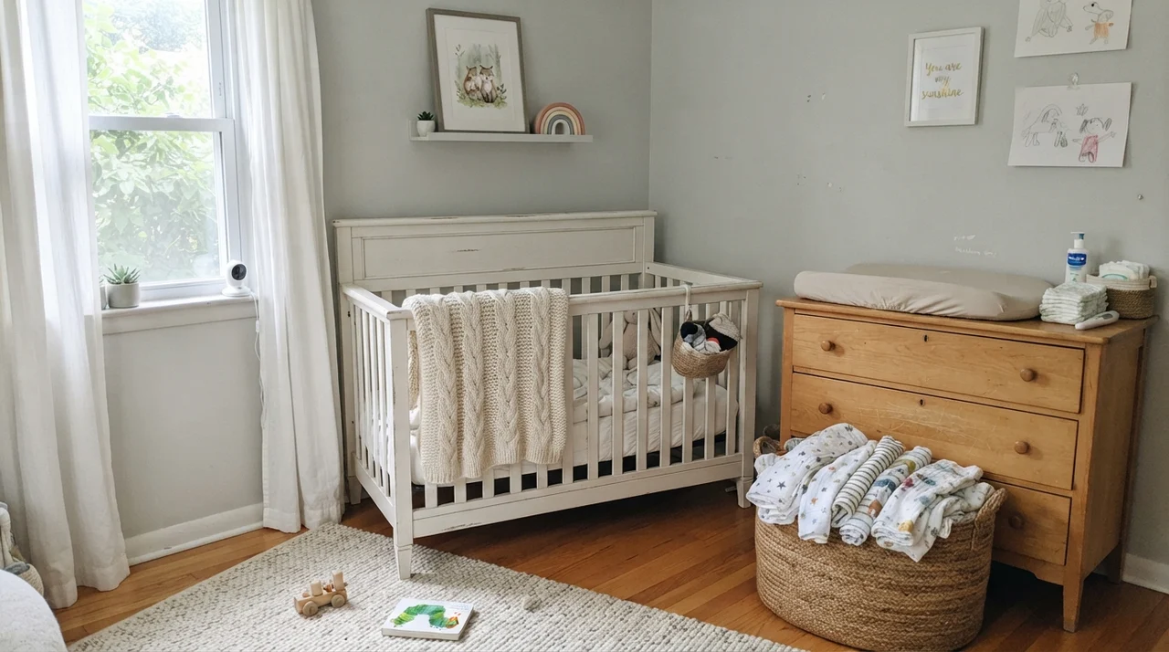
I particularly like Wickham Gray in children's rooms and nurseries because it ages gracefully. So many pastel nurseries get painted baby-blue or mint green, only to look dated within three or four years when the crib comes down and the toddler bed moves in. Because Wickham Gray is grounded in Historical Colors gray, it transitions effortlessly from a calm baby nursery with muslin cloths and light-wood dressers into a sharp teenager’s room with metal desks and wall shelves. You paint it once when they are in diapers, and you do not have to touch that roller again until they pack their bags for college.
On Kitchen Cabinets and Work Surfaces
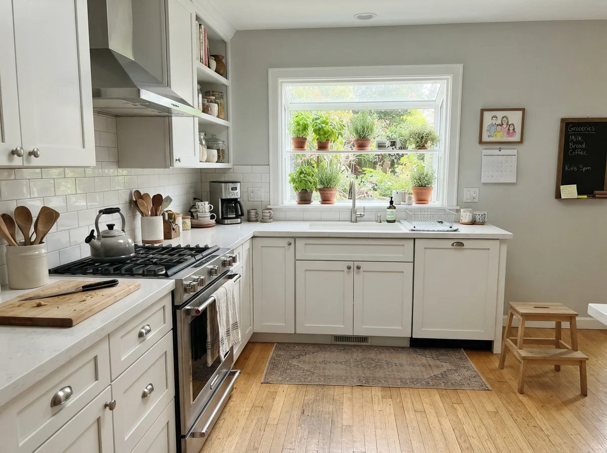
Using Wickham Gray on cabinetry is a brilliant alternative to the all-white kitchen that felt inescapable a few years ago. In satin enamel, it lends shaker doors a subtle coastal gravity without turning the kitchen into an icy cavern. Against white subway tile backsplashes and clean white quartz, it registers as a soft, thoughtful contrast that keeps the space feeling bright and expansive.
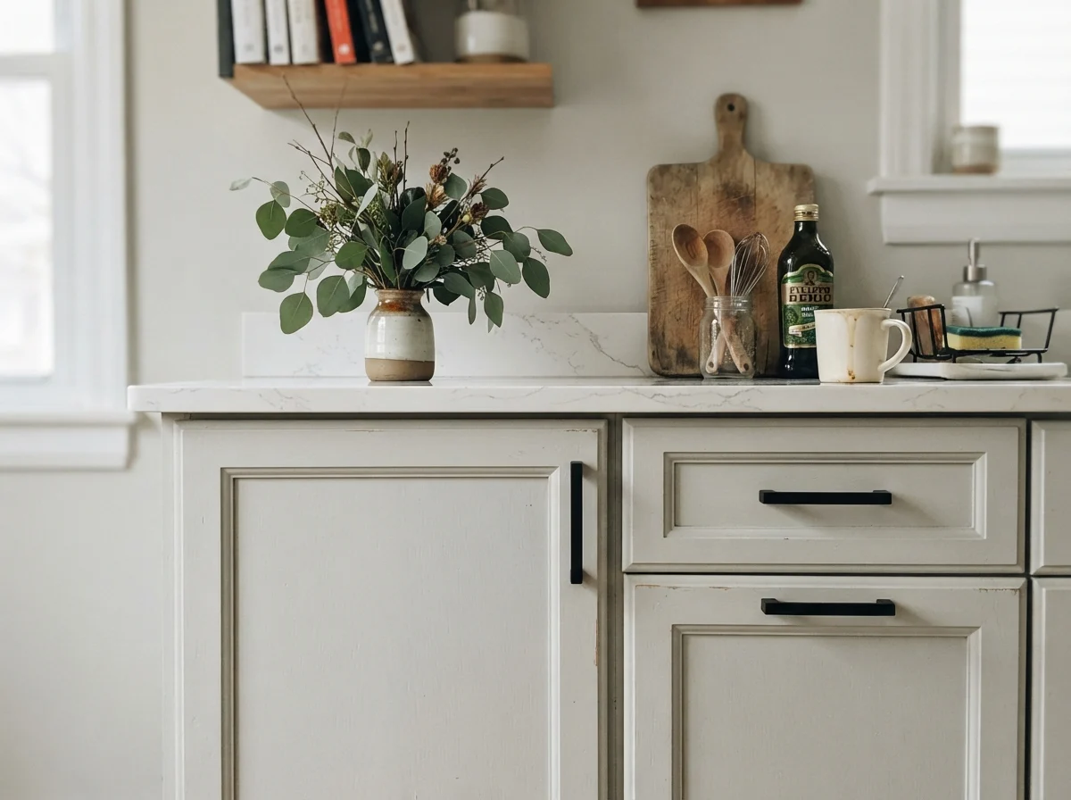
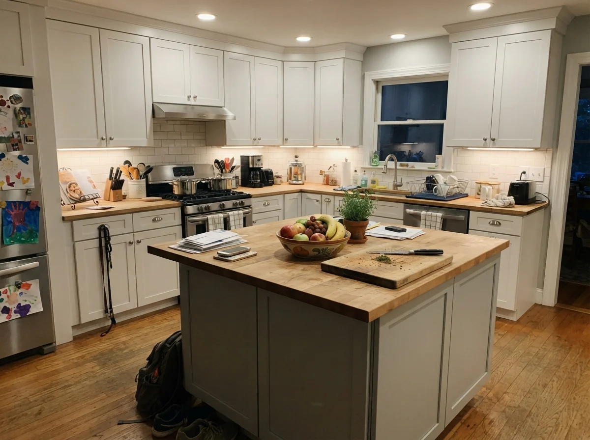
Hardware choice matters immensely here. We tried antique brass pulls on a painted cabinet sample in our current 1960s ranch, and to my eye, the yellow-gold tone fought the blue-green undertone the entire afternoon. Matte black hardware, polished chrome, or brushed nickel, on the other hand, sit in perfect harmony with Wickham Gray’s cool undertones. If you are doing a whole-house repaint or refreshing tired oak cabinets, painting only the island in Wickham Gray while keeping perimeter cabinets a clean white is an affordable way to add architectural character without committing to high-contrast navy or forest green.
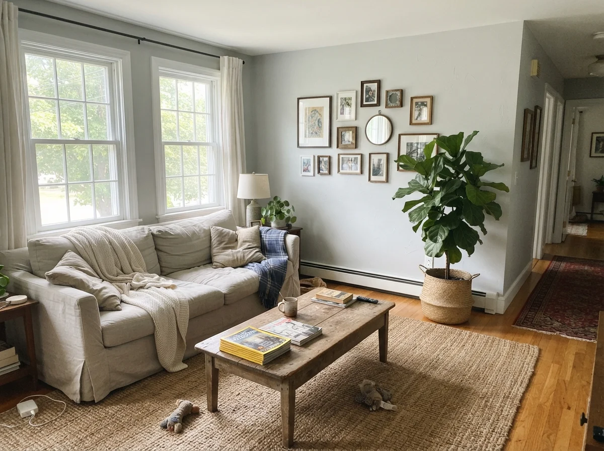
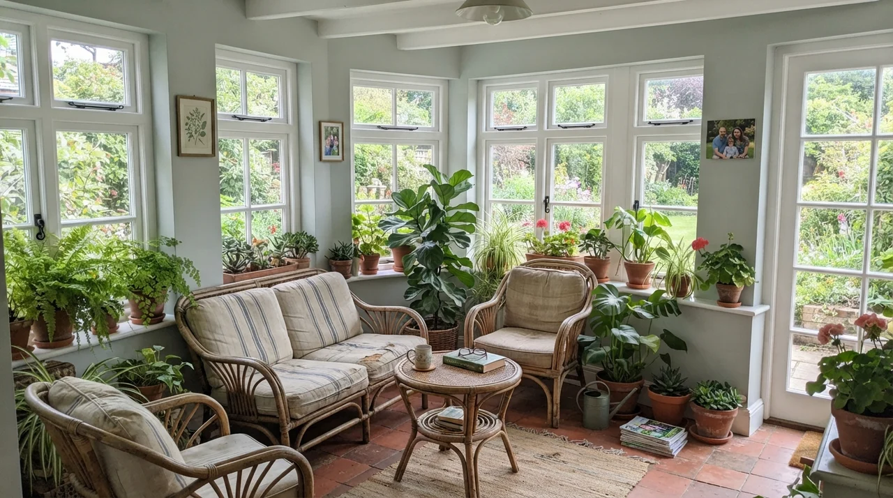
When you bring Wickham Gray into generous public living spaces, southern and eastern windows make all the difference. In a sun-drenched living room or a four-season sunroom, the green side of the formula comes alive in the best possible way, echoing the foliage and lawn outside. The space feels breezy, organic, and grounded. Natural textures like jute rugs, woven rattan chairs, and unvarnished timber coffee tables keep the cool paint from ever feeling sterile or standoffish.
Utility Rooms and Hallway Built-Ins
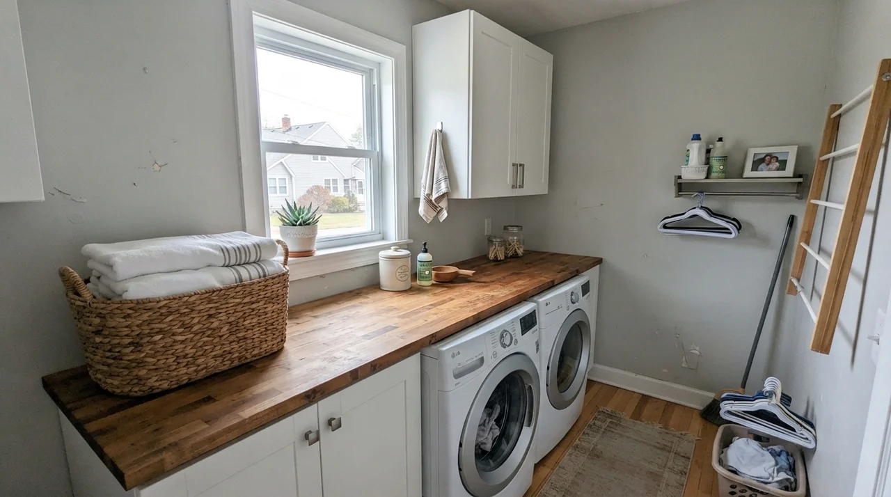
Laundry rooms are hard-working spaces that often get neglected when paint budgets run tight. But rolling Wickham Gray onto the walls of a small laundry room with a sunny window transforms what is usually a chore bunker into a bright, clean retreat. The butcher-block counter and white appliances provide both warmth and clean contrast, showing off the blue-green undertone without any fuss.
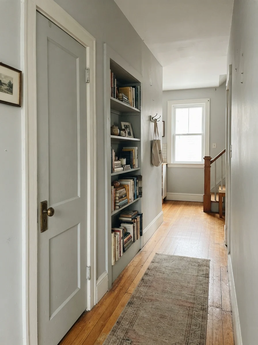
You can also use this shade in smaller doses to wake up traditional architecture. In our split-level, the hallway had an old two-panel linen closet door and a dated built-in bookcase that looked flat and forgotten against builder-white drywall. Giving that door and built-in bookshelf two coats of Wickham Gray in semi-gloss against creamy neutral walls gave the whole hallway immediate purpose. With a brass doorknob and rows of stacked books, it felt like a vintage feature that had always belonged there.
Where Wickham Gray Breaks Down: The Honest Fail
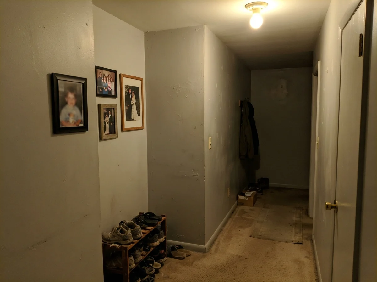
I promised you honesty, and the picture above shows exactly what happens when you ignore the lighting requirements of this paint. That is a windowless hallway corner illuminated solely by a cheap ceiling bulb. Look at that wall: there is no silvery sparkle, no coastal freshness, and no elegant blue-green whisper. It looks like wet putty. Against beige carpet, the color turns flat, drab, and strangely dirty.
Almost every disappointed homeowner review of Wickham Gray comes down to one of three predictable blunders:
- Putting it in a windowless or north-facing room without supplemental lighting: Without natural sunlight to bounce off the wall, that blue-green pigment has nothing to reflect. The wall falls back to its gray foundation, but because it is a cool gray, it reads cold and dreary rather than snug.
- Surrounding it with warm, yellowish browns: Honey oak trim, warm travertine floor tile, and brownish-gray tweed sofas sit on the opposite side of the color wheel. Rather than pulling Wickham Gray together, they fight it tooth and nail. The walls end up looking oddly clinical, while the trim looks aggressively orange.
- Expecting a sky blue: If you show a swatch to your spouse and say, "Let's paint the guest bedroom light blue," you are both going to be disappointed. It is an honest gray with a blue-green soul. If you demand blue around the clock, you will feel let down every time the sun ducks behind a cloud.
Taking It Outside: Exterior Siding
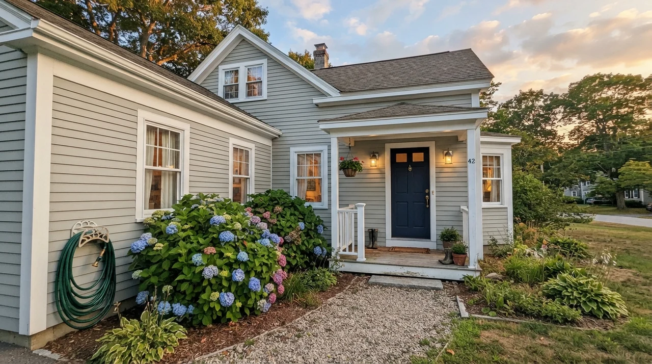
On horizontal siding, Wickham Gray takes on a crisp, weathered-shingle quality that looks stunning on coastal homes, traditional colonials, and modern farmhouses. Exterior daylight is roughly ten times brighter than interior room lighting, which washes out subtle wall colors. Outside, Wickham Gray’s LRV of 68 keeps it from blinding the neighbors in direct sun, while the blue undertone steps forward in the open air.
Paired with bright white trim and an anchor like a dark navy front door, it reads timeless and well-bred. It never looks synthetic or plastic. Set against lush green hydrangea bushes and natural landscaping, it feels like it has been standing by the shore for half a century. Just make sure to paint a large board and lean it against your foundation on all four sides of the house before buying all your gallons; north-facing exterior walls will look noticeably grayer than southern gables.
Living with It Long-Term: The Five-Year Reality
Here is what thirty years of owning three houses has taught me: picking a color is only twenty percent of the battle. The other eighty percent is living with it year after year when the family dog brushes against the corner, dirty fingerprints accumulate around the light switches, and steam coats the drywall every morning.
In our last house, our bathroom walls were done in eggshell sheen, the trim in semi-gloss, and the linen cabinet doors in satin. That sheen discipline was worth the money. An eggshell finish gave Wickham Gray enough protective resin to allow routine wipe-downs with a damp microfiber rag and mild dish soap. Because it sits at LRV 68, it does not show surface dust the way dark charcoals do, nor does it highlight drywall imperfections the way reflective high-gloss paints will.
When touch-up time came around five years in, after we repaired a small towel rack anchor that had pulled loose, Wickham Gray blended back into itself with zero flashing. Historical Colors formulas tend to use stable, mineral pigments that resist fading from sun exposure, unlike synthetic bright blues that can wash out or yellow over time. When we prepped the colonial for resale, we did not have to repaint that bathroom. We simply scrubbed clean the baseboards, washed down the door frames, and let the color do the selling for us.
What sheen should I choose for Wickham Gray?
For walls, stick to eggshell. It provides just enough washability for living rooms, bedrooms, and bathrooms without creating harsh glare. For interior doors, baseboards, and window trim, use semi-gloss for durability and contrast. If you are painting kitchen cabinets or bathroom vanities, satin is the ideal balance of wipe-clean durability and smooth appearance.
Why does my Wickham Gray sample look light green instead of blue?
Wickham Gray belongs to the green deck family. In northern daylight, overcast skies, or in rooms surrounded by heavy green tree foliage, the blue undertone steps back and the subtle pale green base emerges. If your room does not receive strong south or east sunlight, that green cast will be more noticeable.
Will Wickham Gray work with my warm honey oak cabinets?
Generally no. The cool blue-green base of Wickham Gray clashes with the heavy yellow and amber tones of traditional honey oak. It tends to make the wood look more orange and the walls look chilly and stark. If you have extensive honey oak that you cannot paint, a warmer neutral is a safer long-term companion.
Is Wickham Gray too light for a main living room?
Not at all. With an LRV of 68, it has plenty of pigment to contrast distinctly against white trim, white ceilings, and light-toned furniture. It reads as a deliberate light gray wall, never as an unpainted builder primer or a washed-out white.
Susan's Verdict · Buy the Gallon If You Have the Light
Wickham Gray HC-171 is one of the truest, most handsome cool neutrals in the Benjamin Moore deck, provided you give it what it needs. Put it in a room with generous southern or eastern daylight, pair it with crisp true white trim and cool metal finishes, and you will get a timeless, silvery blue-green that never feels dated. But if you try to force it into a dim north-facing hallway with honey oak trim and beige carpet, it will punish you with flat, muddy drabness. Test a large sample beside your actual baseboards and furniture before you dip your roller, and if your room is bright enough, you will love it for years.