Color Diary · No. 32
Benjamin Moore Wrought Iron: The Soft Black That Refuses to Be Pure Ink
America's favorite front-door near-black, reviewed honestly: why it is not the true black most people think they are buying, and where that helps.

Susan HartleySeptember 15, 2026 · 15 min read
Wrought Iron · Benjamin Moore 2124-10
Hex#494A4BLRV8Undertonescharcoal → green-gray → soft slate
When we bought our 1990s colonial—our last house, before we downsized to the 1960s ranch we live in now—the front entryway was an exercise in harsh contrasts. The builder had installed brilliant white sidelights, a stark white transom, and a front door slathered in an off-the-shelf high-gloss pitch black that looked like patent leather. Every time the morning sun hit that porch, the glare was blinding, and by year two, every speck of neighborhood dust and pollen looked like chalk dust on a blackboard.
I repainted that door with Benjamin Moore Wrought Iron (2124-10) on a brisk Saturday in October. My neighbor walked over while I was laying down the second coat with a foam roller, tilted his head, and asked why I was painting my black door dark gray. I told him to wait until the paint dried and the sun moved behind the roofline.
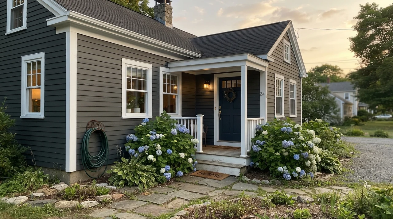
By evening, the door looked like velvet. It had the weight of ironwork without the cold, glassy bite of true black. We lived with it for seven years on that entryway, and when we sold the colonial, the listing photos showed a front entry that looked grounded and deliberate rather than harsh. But that quiet softness is exactly why so many people get into trouble with this swatch. They buy it expecting a true pitch black, and then feel betrayed when south-facing daylight washes it out into deep graphite.
How Daylight Alters the Formula
The single biggest mistake homeowners make with Wrought Iron is testing it on a piece of cardboard flat on a kitchen counter and assuming it will look that dark on a vertical wall or an exterior sash. Light does not treat dark paints politely. In direct southern sun, an LRV 8 paint gives back enough light that the color relaxes completely into a charcoal gray with a faint slate-blue airiness. In cool, shaded north light, the green-gray undertone recedes, and the shade firms up into something much closer to true black.
Understanding this balance is the key to knowing whether you will love this paint five years in or curse the day you opened the can. When people tell me their front door looks washed out, nine times out of ten it is facing due south on an unshaded street. The paint did not fail; the sun simply revealed that Wrought Iron is a charcoal in disguise.
Bedrooms and Cocooning Spaces
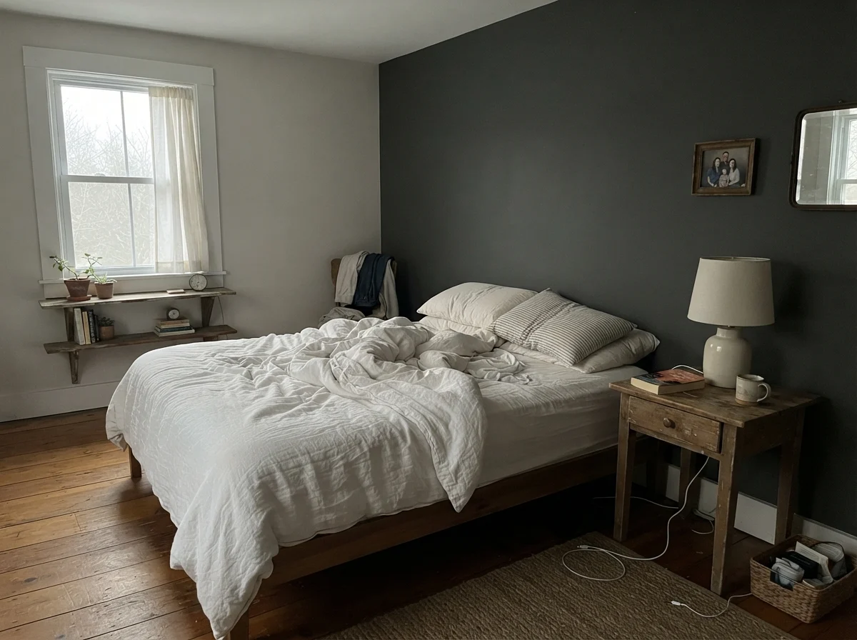
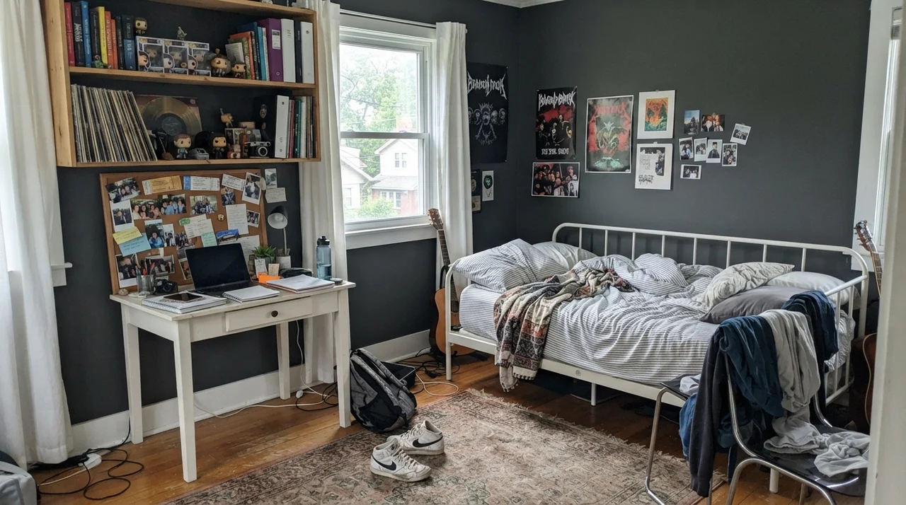
Using a deep near-black on bedroom walls is an intimidating step for most homeowners. In our current 1960s ranch, I painted a small guest bedroom walls-and-trim in a dark tone, and the first question everyone asks is whether it feels like a closet. The answer depends entirely on the lighting. In bright, diffuse morning light, Wrought Iron acts like a soft velvet backdrop. It allows white linen bedding, light oak side tables, and simple greenery to stand out in crisp relief without creating the stark, harsh contrast of a gallery white.
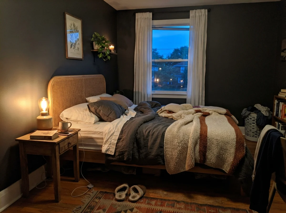
However, you cannot treat a dark bedroom like a white one. You cannot get away with a single flush-mount ceiling fixture and expect the room to look inviting. In the evening, Wrought Iron requires multiple layers of warm light—2700K incandescent or warm-spectrum LEDs—to bring out its gentle green-gray warmth. If you hit it with 4000K daylight bulbs, it flattens into cold asphalt.
Wrought Iron is the near-black for people who want the drama of black without feeling like they are living inside a sound booth.
Kitchens, Islands, and Built-In Millwork
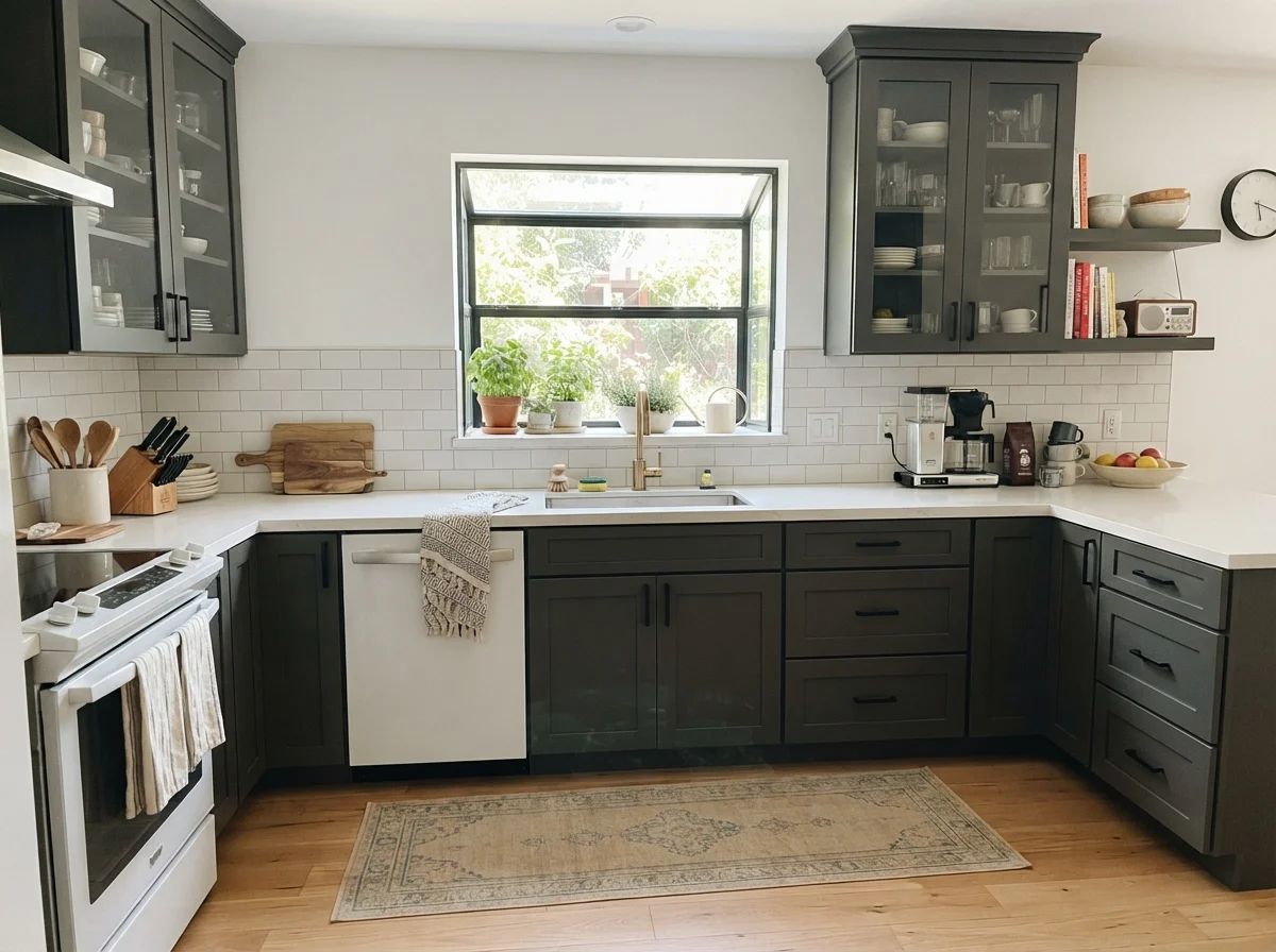
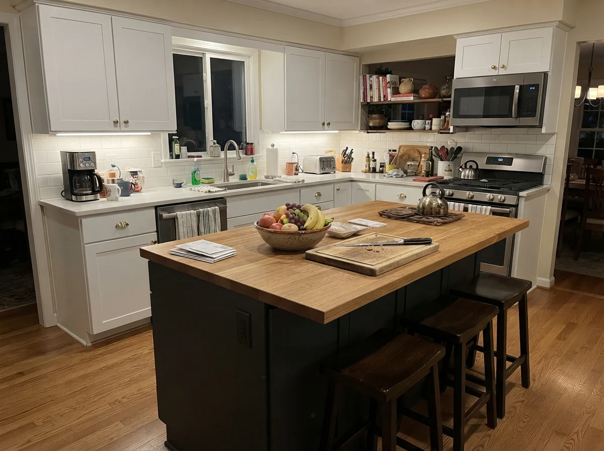
Where Wrought Iron is undeniably worth the money is on kitchen cabinetry and architectural millwork. Ten years ago, everyone wanted all-white kitchens from baseboard to crown. Three houses and several renovations taught me that an all-white kitchen looks spotless for about twelve minutes after you wipe it down. By year three, the scuffs around the island base and trash pullout start to wear on your sanity.
Using Wrought Iron on a kitchen island while keeping perimeter cabinets in White Dove (OC-17) or Chantilly Lace (OC-65) is one of the smartest design moves you can make. The dark base grounds the room and hides the inevitable scuffs from family shoes and barstools. Because Wrought Iron has almost no heavy undertone—just that whisper of green-gray—it sits under warm butcher block, cool white quartz, or unlacquered brass hardware without picking a fight. It grounds a light kitchen without adding a third color you have to spend the next decade coordinating around.
If you are painting full cabinetry runs, let me offer one practical warning: your finish matters immensely. You want a dedicated cabinet enamel in a satin sheen. Semi-gloss on a full set of dark uppers can create distracting glare under recessed task lights, while matte or eggshell on cabinets will absorb grease and hold onto every fingerprint. A fortified satin cabinet enamel allows you to scrub the area around the stove clean without burning through the pigment or creating shiny burnish spots.
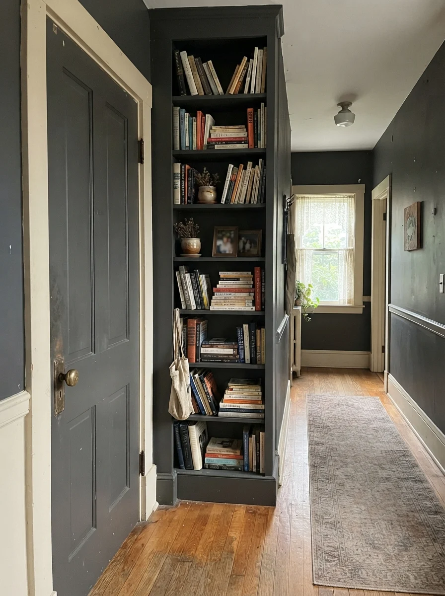
For interior doors and hallways, Wrought Iron is brilliant when executed properly. Painting an interior door and casing in semi-gloss against greige walls like Revere Pewter (HC-172) gives an older home immediate architectural backbone. But use a fine foam roller or spray them. Dark semi-gloss shows every lap mark and brush drag if you try to work too slowly on a dry afternoon.
Bathrooms and Laundry Rooms: High-Contrast Workhorses
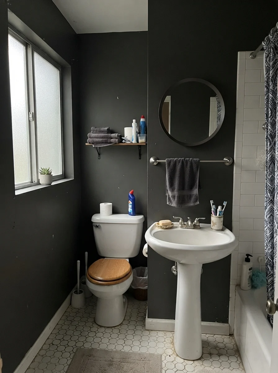
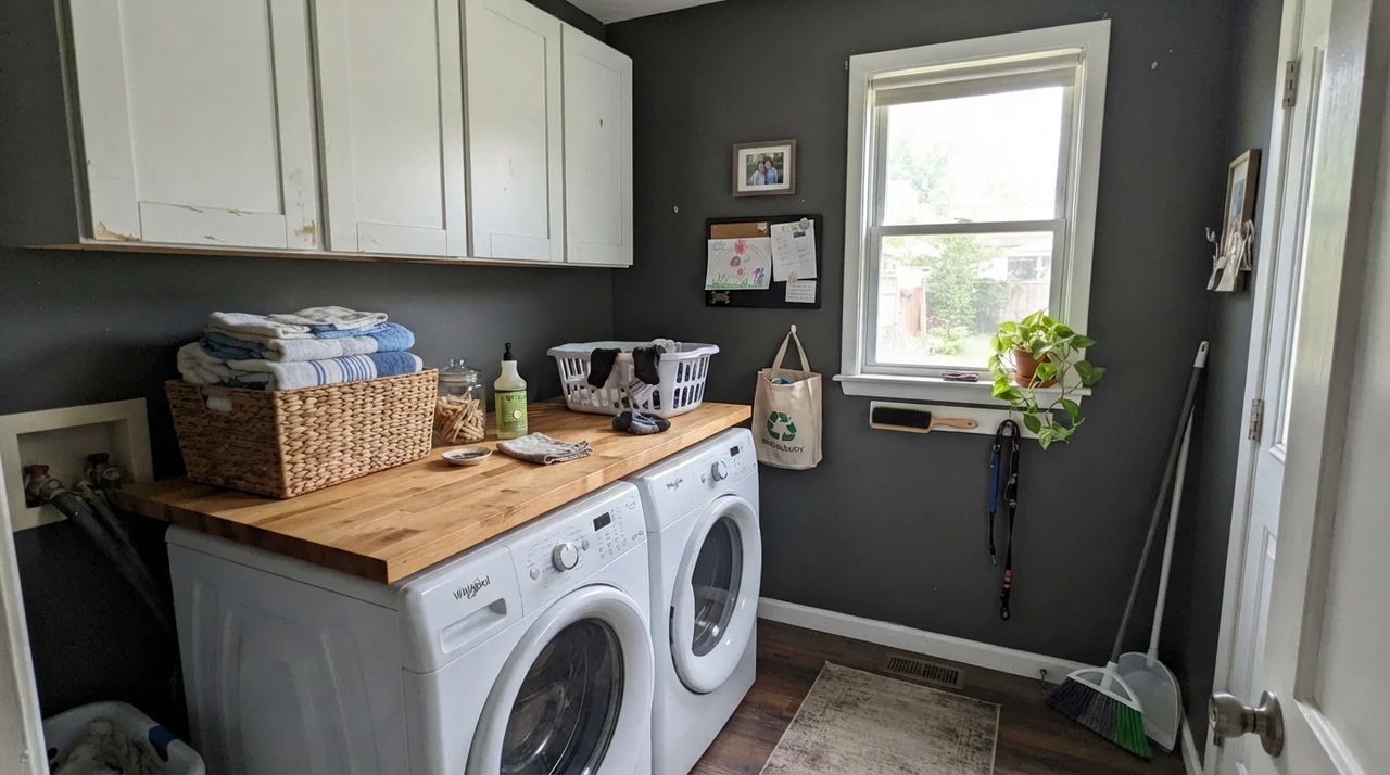
Powder rooms and family bathrooms are natural homes for Wrought Iron, but they behave very differently depending on the natural light. In a powder room with no exterior windows, lit solely by warm 2700K vanity bulbs, Wrought Iron creates a cozy jewel-box effect. You are in the room for three minutes to wash your hands; it feels moody and deliberate rather than claustrophobic.
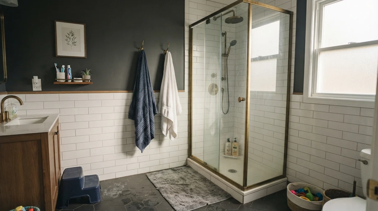
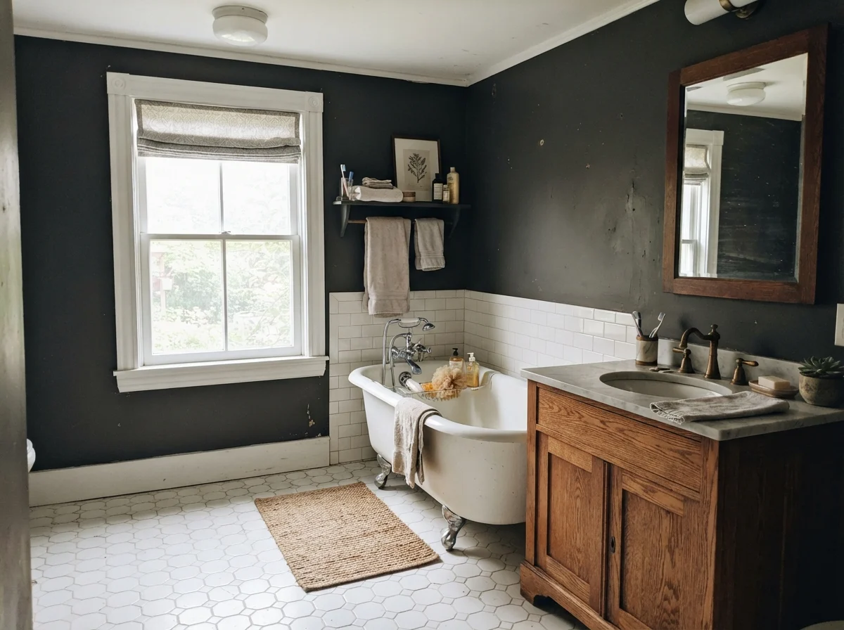
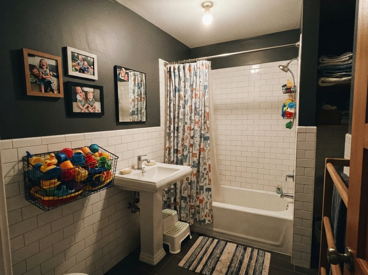
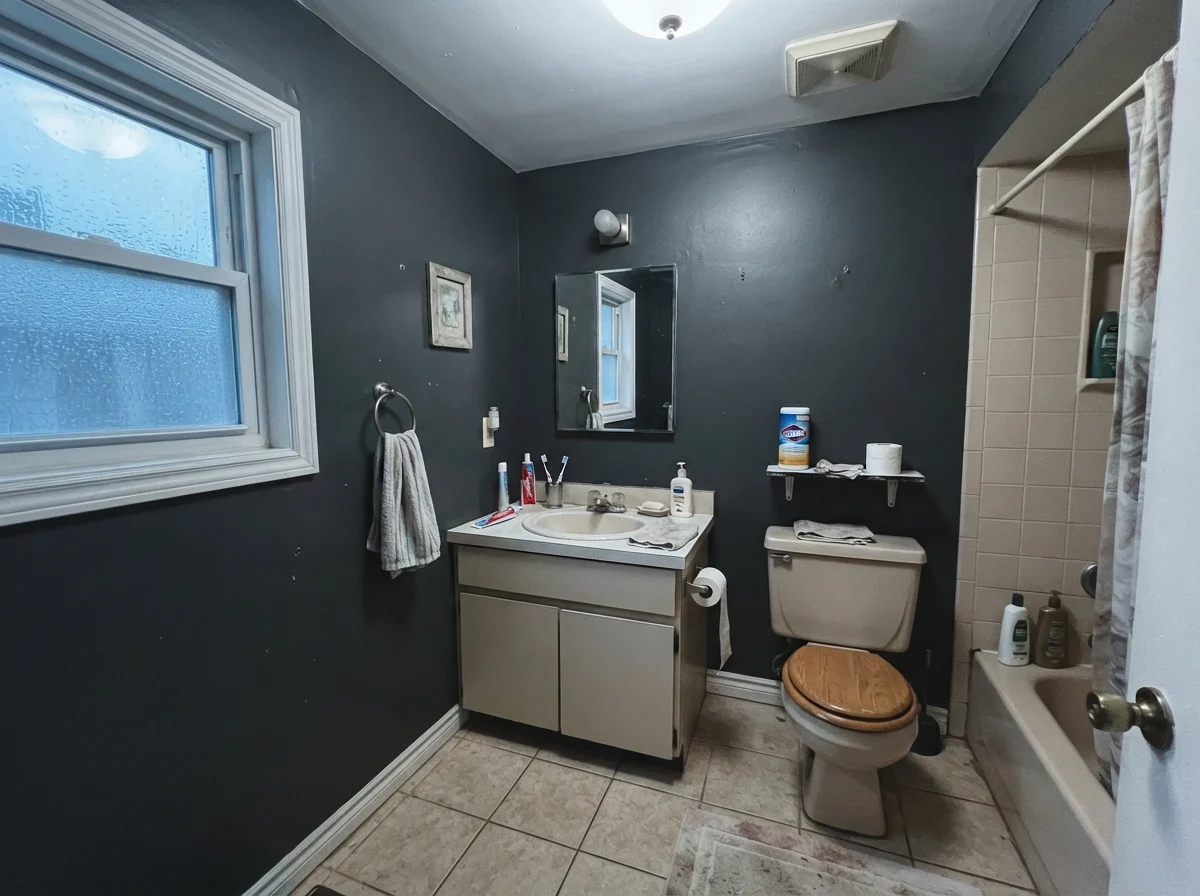
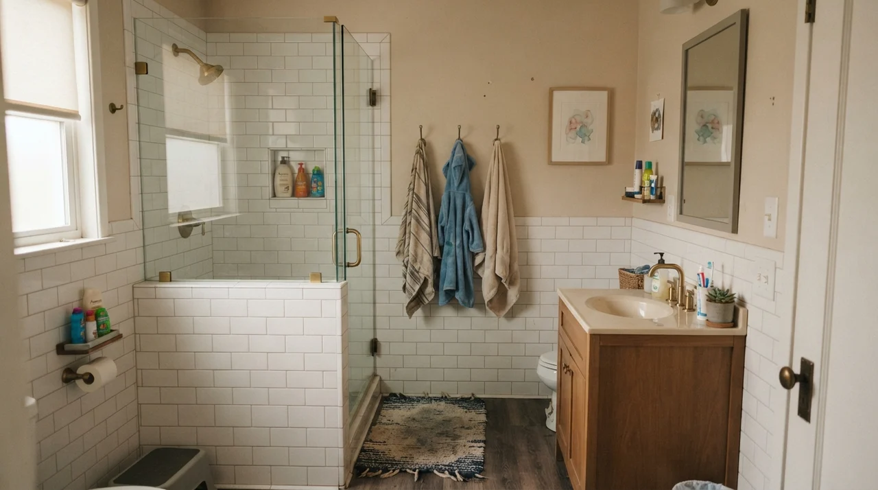
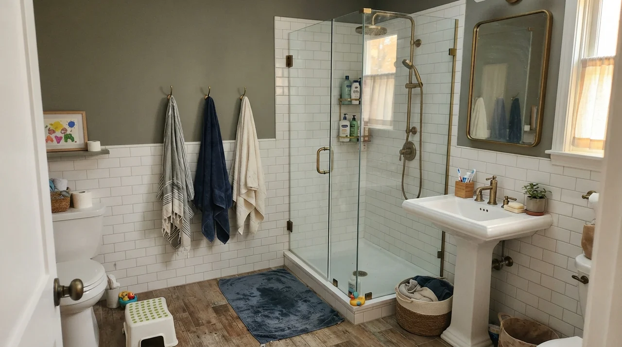
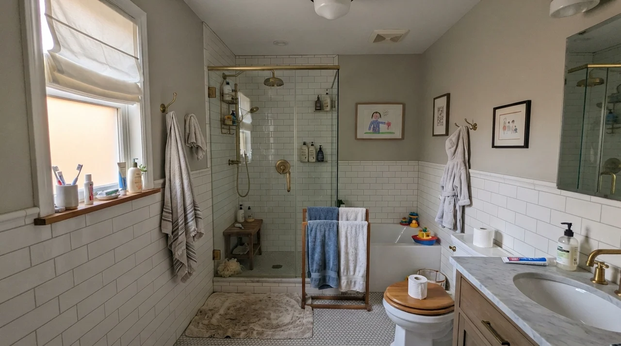
In a family bathroom with subway tile wainscoting, Wrought Iron on the upper wall provides crisp graphic contrast without feeling sterile. In our split-level home thirty years ago, we had a dated beige fiberglass tub surround that made every light color look dingy. A dark charcoal above the tile line gave the eye something strong to anchor on, making the dated beige elements fade into the background. Paired with warm oak vanities, brass faucets, or classic white porcelain, it looks timeless rather than trendy.
Sunrooms, Living Rooms, and Daylight Inundation
When you take Wrought Iron into rooms with massive window exposures, the personality of the paint changes entirely. In a sunroom wrapped in white-framed windows, the sunlight floods the walls and bounces off the LRV 8 surface, turning what felt like near-black into a rich, organic slate charcoal. It flatters terracotta pots, rattan seating, and lush green houseplant foliage in a way that true black simply cannot do.
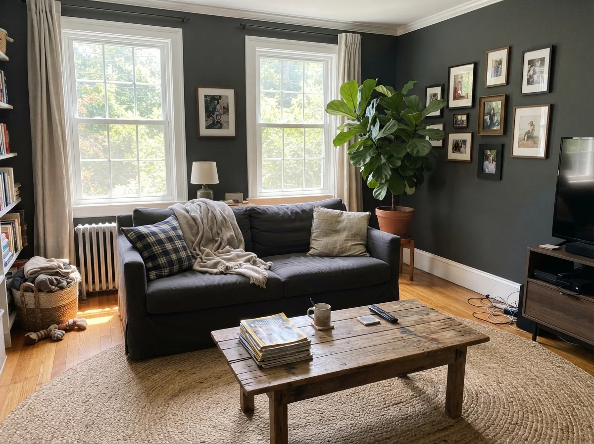
In a full living room setting, living with Wrought Iron requires committing to warm textural balances. A dark wall can easily feel cold if you pair it with glass coffee tables, chrome accents, and cool gray sofas. But when you layer in natural jute rugs, rumpled linen upholstery, and warm honey-toned wood coffee tables, the charcoal takes on an earthy, grounded quality that makes the entire room feel anchored.
Where Wrought Iron Fails: Three Common Traps
The complaints about Wrought Iron are remarkably consistent across thirty years of home forums and client consultations. People rarely complain that the color is muddy or unattractive; they complain because the paint did something unexpected in their specific lighting environment. If you want to avoid repainting two weeks after you finish, watch out for these three trouble spots.
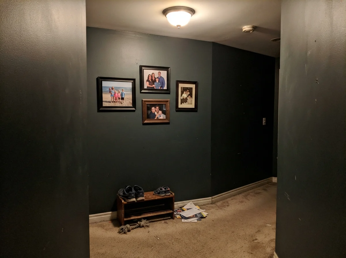
First is the dim, windowless interior space—like a central hallway or basement stairwell with only a low-wattage ceiling fixture. In low light without natural contrast, the green-gray nuance dies. The walls simply look muddy, flat, and putty-like. The corners disappear into shadows, and instead of feeling cozy, the hallway feels like a dark tunnel. In a windowless hallway, a deep paint is not worth the money; step up to a mid-tone like Kendall Charcoal (HC-166) or Chelsea Gray (HC-168) that can hold architectural definition.
Second is the exterior clash with true-black factory hardware. If your house has modern black-framed windows, black aluminum gutters, and matte black exterior sconces, putting Wrought Iron on your siding or front door can make the paint look slightly faded or dusty right out of the can. Because the metal is a true LRV 2 black, Wrought Iron's LRV 8 charcoal body gets exposed immediately. If you need to match dark metal trim, stick to Benjamin Moore Black (2132-10) or Sherwin-Williams Tricorn Black.
Third is the baking south-facing front door. Direct midday sun will lift Wrought Iron straight into dark charcoal gray. If your heart is set on a door that looks like pitch-black ink at noon, you will be disappointed. But if you have an east- or north-facing porch with white trim and brick accents, Wrought Iron gives you a tailored, designer softness that never looks severe from the street.
Durability, Cleaning, and the Reality of Touch-Ups
Let's talk about the practical side of living with a dark paint, because no swatch card tells you what happens when your dog brushes against the door casing or someone bumps a suitcase into the baseboard. Dark paints are inherently unforgiving. Scuffs on light paint leave gray marks; scuffs on near-black paint leave white or chalky abrasions where the clear binder has been scratched.
When we had Wrought Iron on our interior doors, I learned quickly that matte finishes belong strictly on powder room walls or ceilings. On anything that gets touched—doors, trim, cabinets, banisters—you must use satin or semi-gloss in a high-grade formula. When the inevitable handprints appear around the doorknob, you can scrub it clean with warm water and a drop of dish soap without stripping the sheen.
The hardest lesson with Wrought Iron is that you cannot spot touch-up a wall three years later. Dark paints flash terribly. If you try to dab a small brush in the middle of a painted wall to cover a nail hole, you will end up with a visible dark circle that catches the light from every angle. When a dark wall gets damaged, plan on rolling the entire plane from corner to corner. It takes twenty minutes longer, but it saves you from staring at a flashing roller mark every afternoon.
Is Benjamin Moore Wrought Iron considered black or gray?
Wrought Iron is technically an ultra-deep charcoal near-black with an LRV of 8. Indoors and in moderate lighting, it reads as a rich, soft black. In direct outdoor sunlight or strong daylight, its green-gray undertones show, and it reads as dark charcoal.
What is the best sheen for Wrought Iron on a front door?
Exterior semi-gloss is the best choice for a front door. It provides the durability needed to withstand weather and hand oils while giving the deep charcoal a soft, tailored luster that avoids looking plasticky.
Can I use Wrought Iron on all four walls of a small room?
Yes, but only if you have adequate natural light or multiple warm light fixtures (2700K). It works wonderfully in powder rooms, dens, and studies, but will feel gloomy and featureless in dim, windowless spaces.
Why does my Wrought Iron paint look blue or green in certain rooms?
Wrought Iron has a subtle green-gray undertone. Under cool north-facing daylight, overcast skies, or cool 4000K LED bulbs, that undertone can be pulled forward, giving the paint a cool slate or greenish-blue cast.
Susan's Verdict · The Near-Black That Forgives Your Trim
Wrought Iron is not the paint to choose if you are looking for an uncompromising, mirror-like patent black. It is the color to buy when you want the drama, weight, and presence of a dark shade without the aggressive bite that makes true black hard to live with over the long haul. Used on a front door, a kitchen island, or interior doors under good light, it gives an older home immediate structure and never looks dated within five years. Just keep it out of windowless hallways, pair it with warm lighting, and let its quiet charcoal softness do the heavy lifting.