Color Diaries.
← All colors ·  Room Diaries
Color Diary · No. 6

Green Kitchen Cabinets: 30 Years of Real Cabinet Repaints

After painting kitchen cabinets in three different houses—and living with the grease, scrubbing, and resale results—here is what eight popular green paint colors actually look like five years in.

In our last house, a 1990s colonial with builder-grade golden oak everywhere, I decided to paint the kitchen cabinets dark forest green because everyone in home magazines seemed to be doing it. I spent four weekends taking off cabinet doors, labeling hinges with masking tape, sanding down the factory varnish, and applying coat after coat of deep enamel. I loved it for about two years, tolerated it for five, and spent an entire week repainting every door before we listed the house for sale. The buyer's agent walked through during the open house and quietly told me the fresh, muted coat probably saved our asking price.

That is the thing nobody tells you about painting kitchen cabinets a rich green: you do not pick a color for the Saturday morning you take the painter's tape down. You pick it for year four, when the afternoon sunlight hits the cabinet frames by the sink, the cooking steam has tested the finish, and you have scrubbed clean the same greasy thumbprints around the lower drawer pulls a hundred times. Some greens look dignified as they age; others make your kitchen feel like a dark cave or an outdated experiment.

Across thirty years and three houses—a 1970s split-level, that colonial, and our current 1960s ranch—I have lived with cabinet colors through messy family holidays, greasy cooktop splatters, and eventual resale negotiations. Kitchen cabinets demand a far tougher standard than living room walls. You touch them dozens of times a day, clean them with degreasers, and expect them to coordinate with countertops, backsplashes, and flooring that you cannot easily swap out.

If you are getting ready to brush, roll, or spray green on your kitchen cabinetry, you need to look past the small color swatches. Here is an honest, long-term breakdown of eight major green paint candidates, evaluated for durability, lighting quirks, and how they actually hold up in a hardworking family kitchen.
The Lineup

Sea Salt · SW 6204Sherwin-Williams · LRV 63
Pewter Green · SW 6208Sherwin-Williams · LRV 12
Sage Green · ICC-77Behr · LRV 22
Saybrook Sage · HC-114Benjamin Moore · LRV 45
Vintage Vogue · 462Benjamin Moore · LRV 12
Dried Thyme · SW 6186Sherwin-Williams · LRV 21
Essex Green · HC-188Benjamin Moore · LRV 6
Palladian Blue · HC-144Benjamin Moore · LRV 60
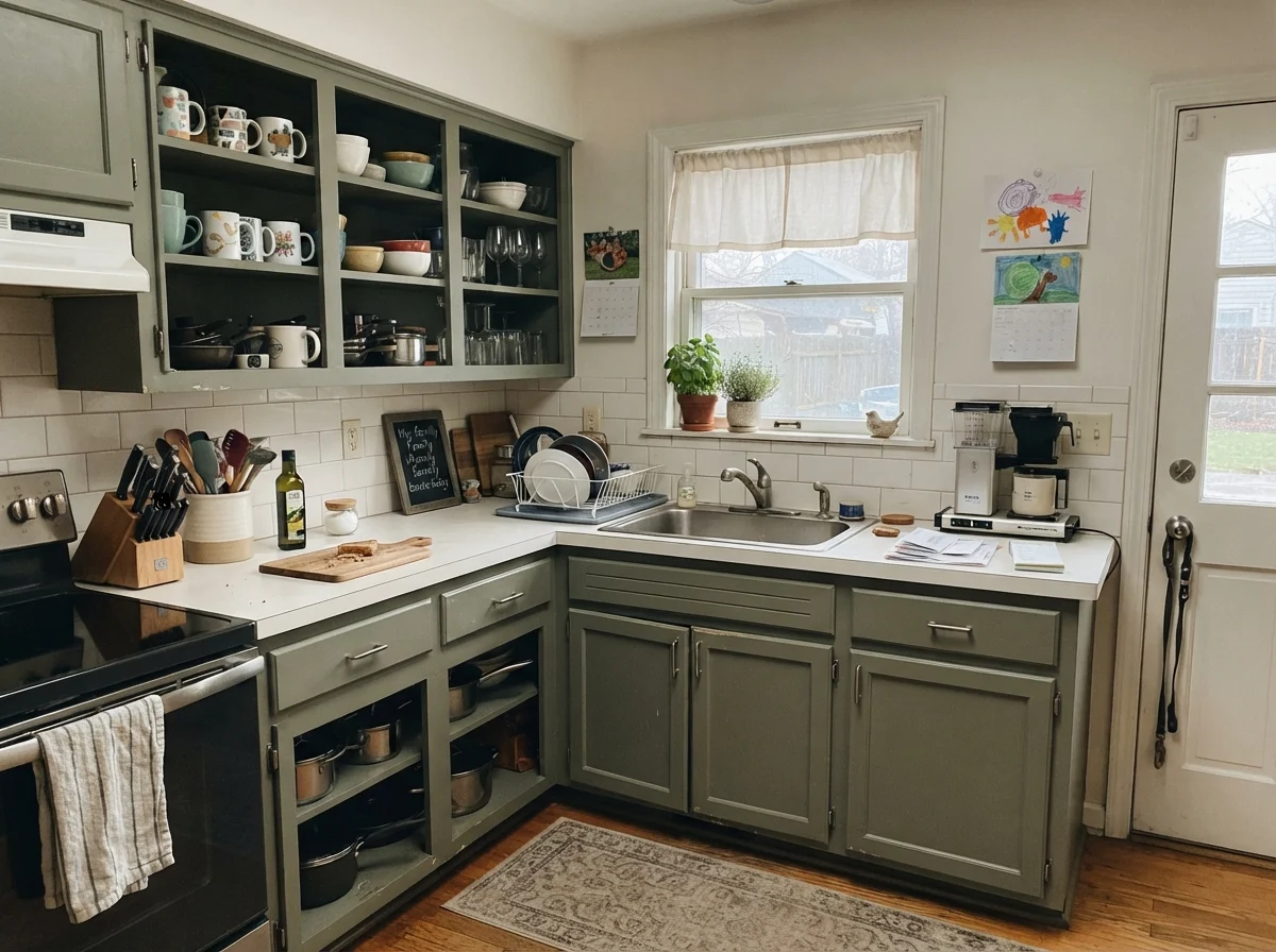
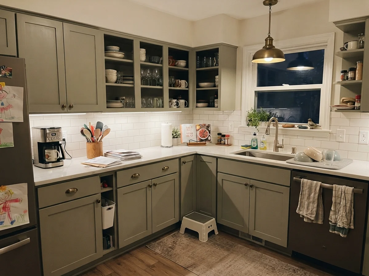
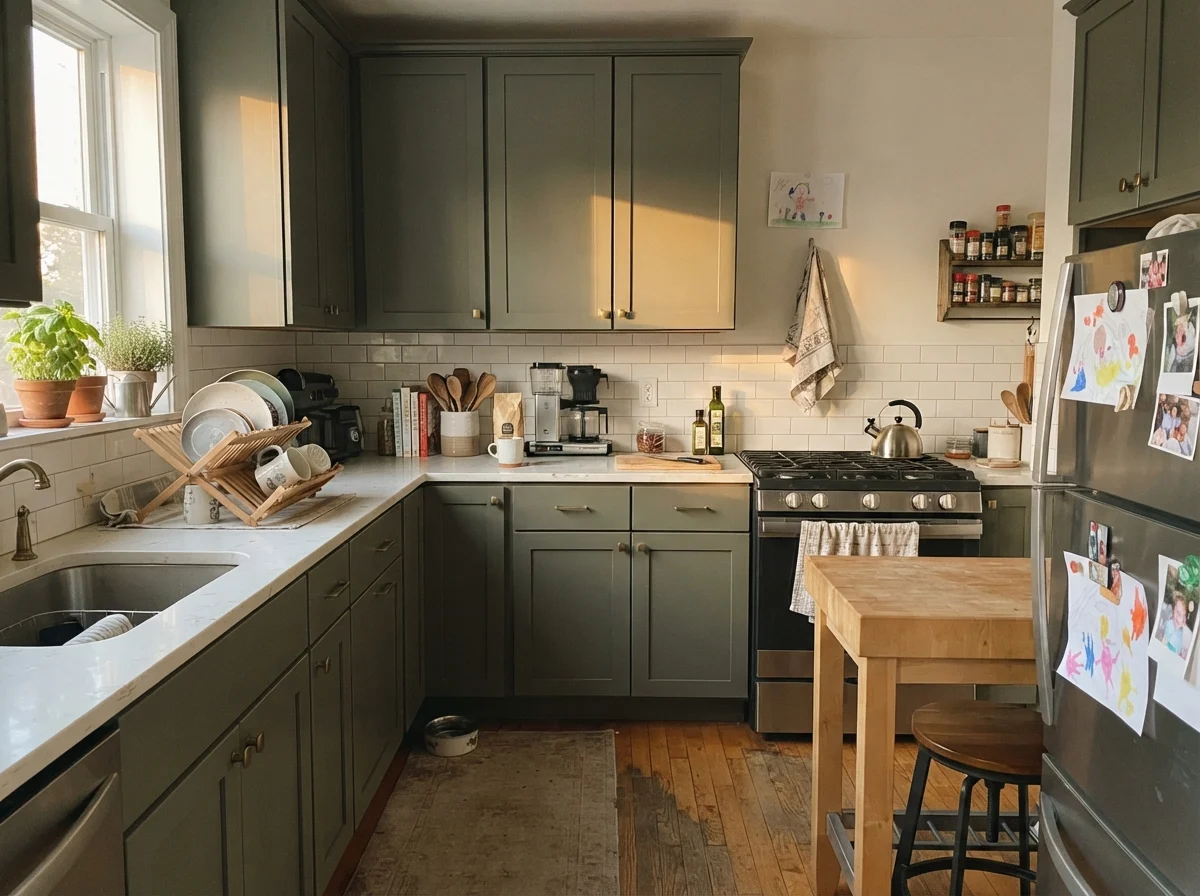
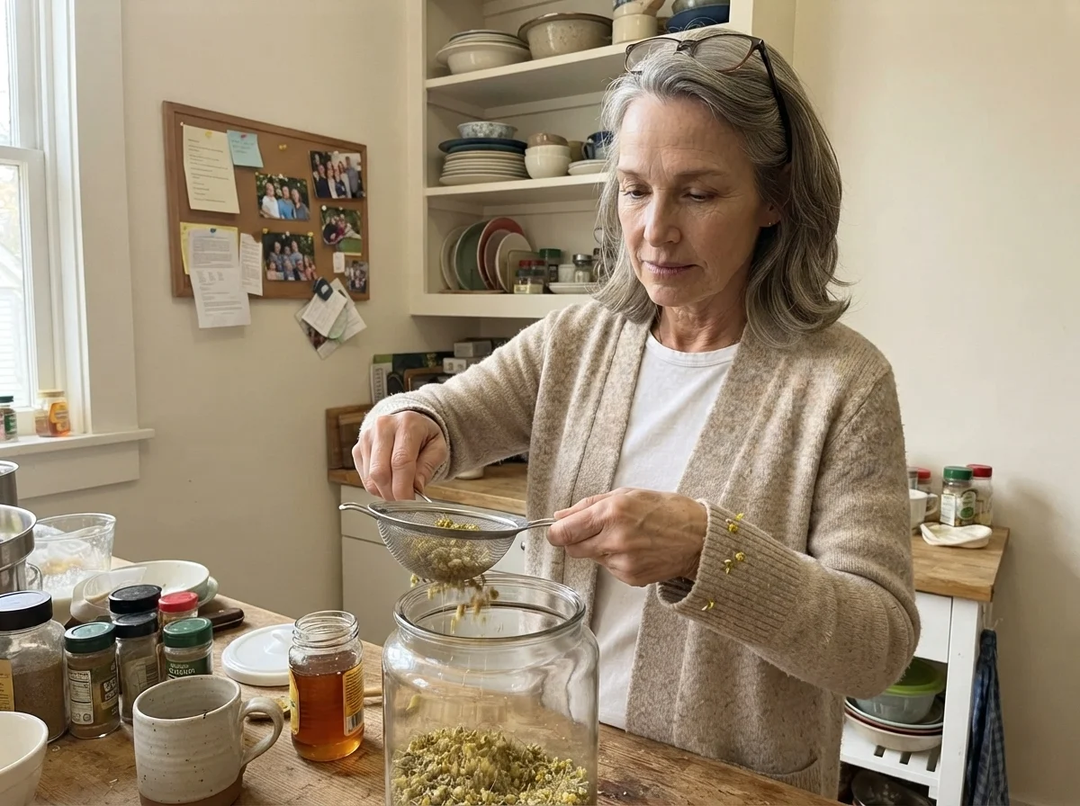
Susan Hartley working with paint in the kitchen
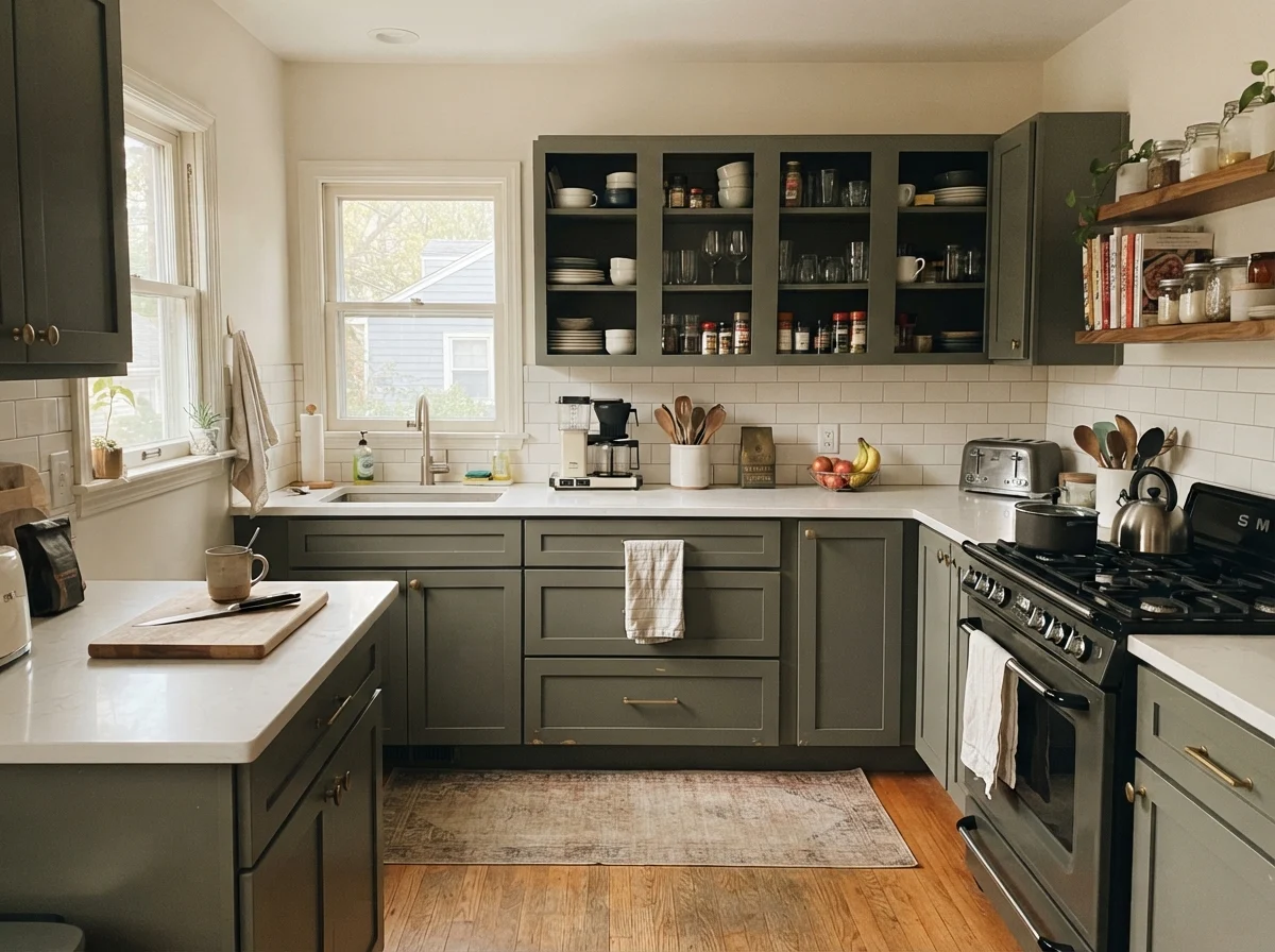
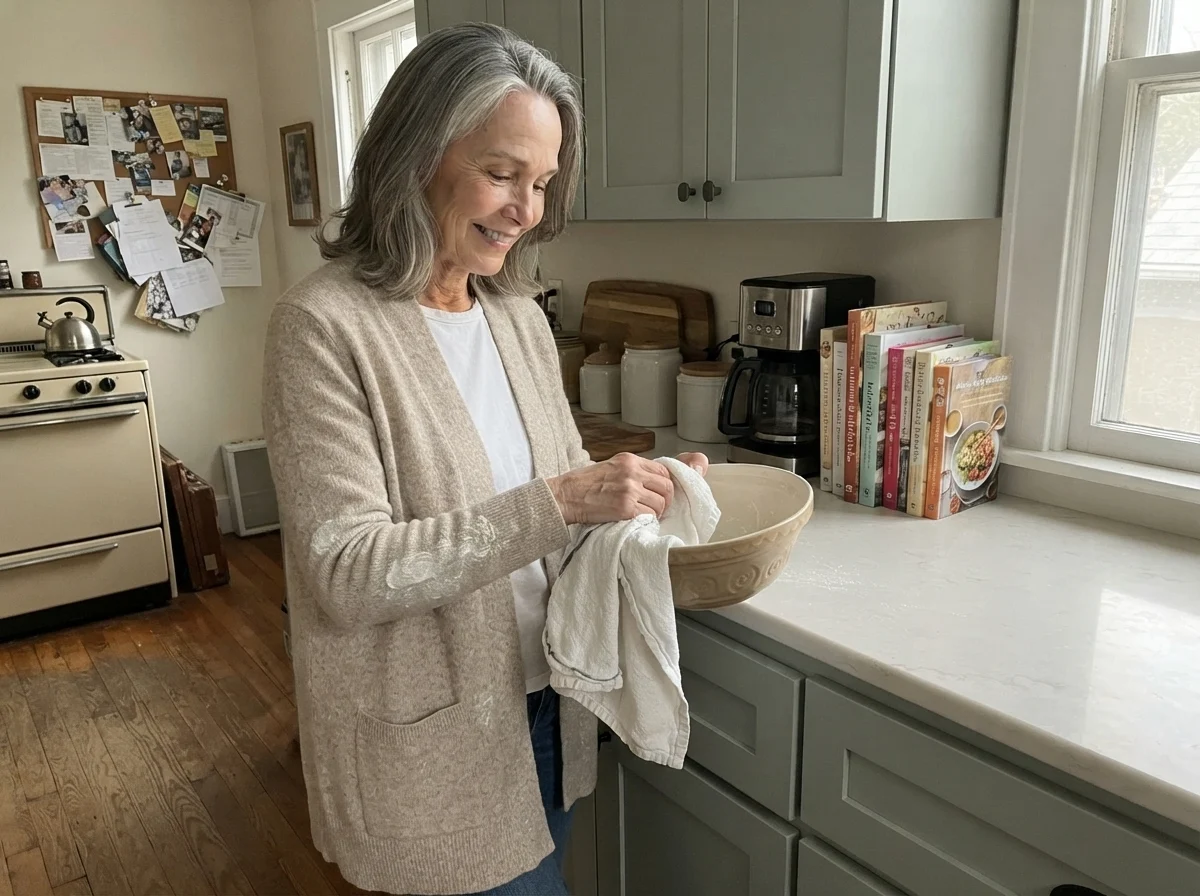
Thirty years of kitchen experiments Drying a mixing bowl in our kitchen with Shaker lower cabinets painted in Sherwin-Williams Sea Salt, a shade that gives just enough color without overwhelming everyday cooking spaces.
You don't pick a cabinet color for the weekend you finish painting. You choose it for year four, after you've scrubbed clean the door frame beside the stove a hundred times.

1. Sherwin-Williams Sea Salt (SW 6204)

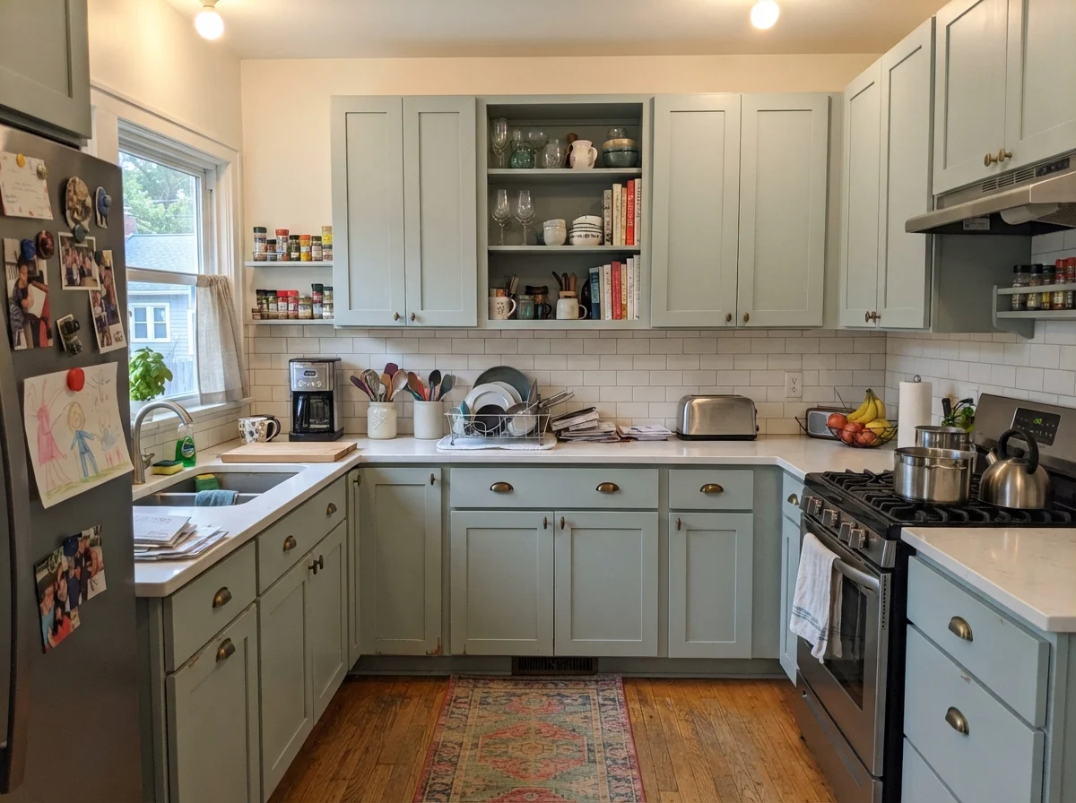
Sherwin-Williams Sea Salt is one of those legendary colors that gained fame in spa-style primary bathrooms, but it can do remarkable work on kitchen cabinetry if you understand its nature. With a Light Reflectance Value of 63, it bounces plenty of daylight around the room, keeping a busy workspace feeling airy, fresh, and light. It behaves almost like a softened neutral that carries a hint of natural pigment, making it an approachable choice for someone nervous about committing to a deep, dark color.

However, Sea Salt is an absolute chameleon on wood cabinets. It balances green, gray, and a whisper of blue in nearly equal proportions, and whatever natural light enters your kitchen will dictate which face it shows. In a south-facing room with clear, bright sunshine, it reads as a soothing, pale watery green-gray. In cool north-facing light, or under cool LED ceiling fixtures, the blue notes quickly take over, leaving you wondering why your cabinets look more like pale blue than soft sage.

If your kitchen has honey-oak floors, beige travertine, or warm creamy granite, skip Sea Salt completely. It clashes with heavy golden undertones and makes warm finishes look yellowed and tired. But if you have clean white subway tile, crisp quartz or marble countertops, and plenty of natural daylight, it provides a quiet, coastal backdrop that will not tire your eyes after five years of daily cooking.

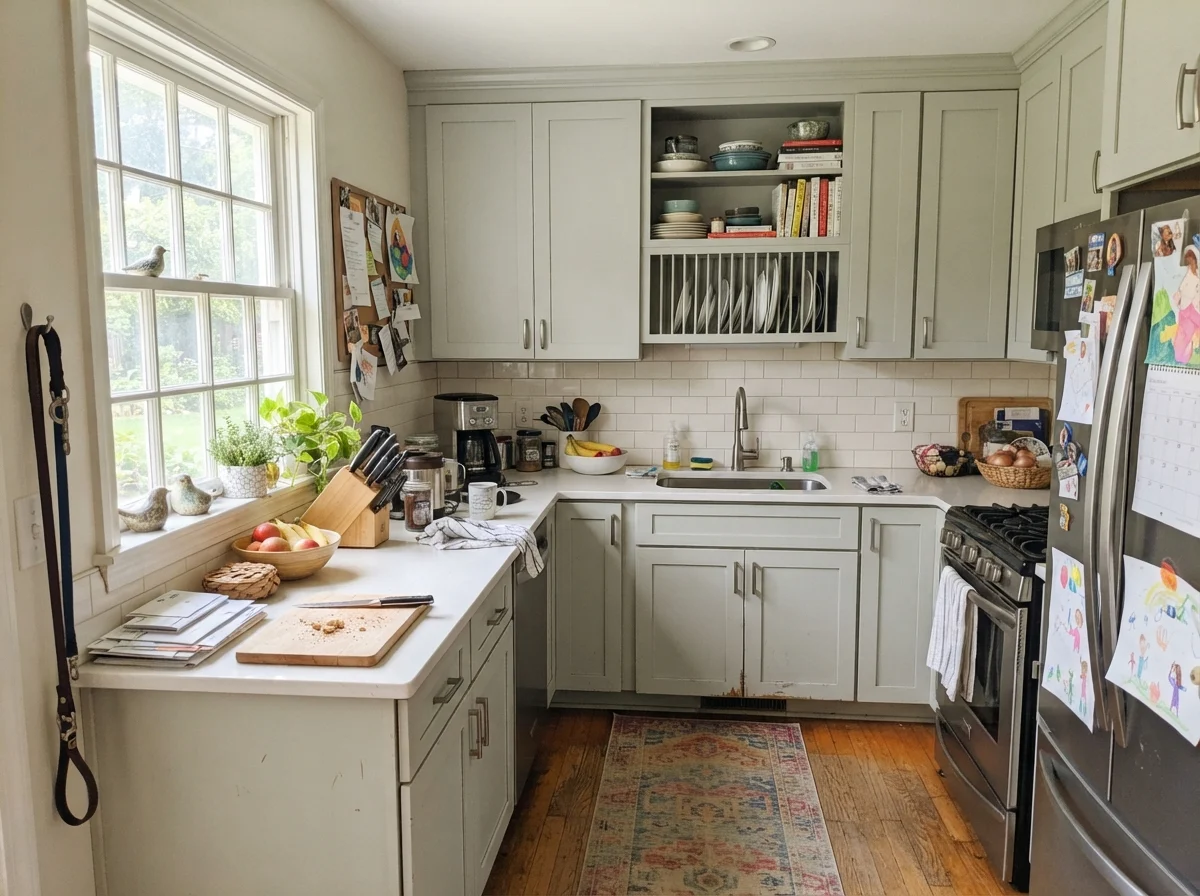
kitchen with Sherwin-Williams Sea Salt
Sherwin-Williams Sea Salt cabinets A lived-in kitchen featuring shaker kitchen uppers and lowers painted in Sherwin-Williams Sea Salt, paired with crisp white counters, white subway tile backsplash, and neutral off-white walls.
Sea Salt · SW 6204Sherwin-Williams · LRV 63

2. Sherwin-Williams Pewter Green (SW 6208)

Pewter Green is the shade people turn to when they want a serious, dark kitchen without ending up with bright emerald or forest green. With an LRV of 12, it is a deeply saturated, smoky dark green with heavy charcoal-gray undertones. Because the green is dialed back and grounded by that deep gray base, it avoids looking trendy or gimmicky, which explains why it has remained immensely popular for islands and perimeter cabinets over the last five years.

In our 1970s split-level, dark paint on kitchen lower cabinets was a lifesaver for hiding scuffs from shoes, dropped pots, and dog tails. Pewter Green excels at that kind of everyday punishment. It anchors a kitchen perimeter beautifully and pairs effortlessly with unlacquered brass hardware, warm oak butcher block, and crisp white countertops. It gives the room an architectural, grounded presence that feels substantial and classic.

You must be cautious with your lighting, though. If your kitchen has only one small window or relies on a single central flush-mount light, Pewter Green loses its green nuance entirely and flattens into a murky, dark charcoal. It also looks heavy and overwhelming if paired with dark granite or black soapstone in a small space. Use it where you have good ambient lighting, or keep it confined to lower cabinets and a central island while leaving the uppers a light, clean white.

kitchen with Sherwin-Williams Pewter Green
Sherwin-Williams Pewter Green cabinetry A lived-in kitchen showing shaker kitchen upper and lower cabinets finished in Sherwin-Williams Pewter Green, set against clean white counters, white subway tile, and neutral off-white walls.
Pewter Green · SW 6208Sherwin-Williams · LRV 12

3. Behr Sage Green (ICC-77)

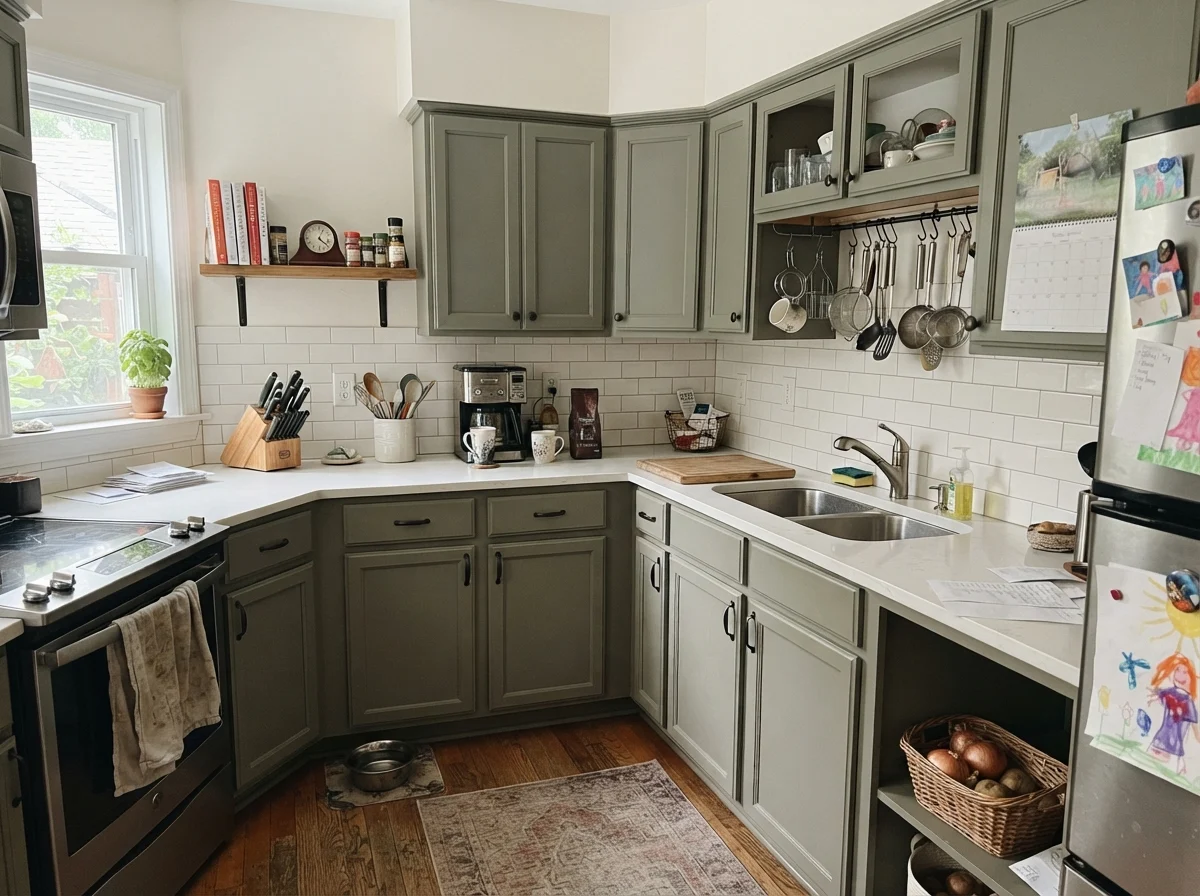
Behr Sage Green is often misunderstood by homeowners browsing swatches online. Many expect a whisper-soft, pale pastel sage, but at LRV 22, this is a grounded, mid-depth gray-olive green with a distinct cool lean. It does not pretend to be a delicate tint; it is a proper, hardworking cabinet color that carries enough visual weight to ground both upper and lower cabinet boxes without shrinking the room completely.

From a budget standpoint, Behr's dedicated cabinet and trim enamel lines in this shade offer serious value. When we refreshed the utility kitchen cabinets in our previous house, using a durable mid-tone satin enamel was worth every penny because it covered dark stains easily and scrubbed clean with ordinary soap and water. Sage Green holds its own against grease around the range hood and does not highlight every speck of dust the way ultra-dark blacks and hunter greens tend to do.

Do not pick this shade if your kitchen is cast in cool northern shade without warm under-cabinet lighting, or if your flooring has strong golden-orange polyurethane finishes. That cool olive undertone will fight warm honey woods and look somewhat muddy. Pair it instead with natural stone, matte black or brushed brass pulls, and bright white subway tile to keep the cool gray-green balance crisp and intentional.

kitchen with Behr Sage Green
Behr Sage Green shaker cabinets A lived-in kitchen with shaker upper and lower cabinets painted in Behr Sage Green, complemented by white countertops, white subway backsplash, and soft off-white perimeter walls.
Sage Green · ICC-77Behr · LRV 22

4. Benjamin Moore Saybrook Sage (HC-114)

Benjamin Moore Saybrook Sage is the classic historical green homeowners choose when they want color on their cabinetry without making an aggressive design statement. Sitting at an LRV of 45, it is right in the sweet spot for kitchen cabinets: light enough to keep the room feeling spacious and open, yet saturated enough that nobody will mistake it for an off-white or gray. It feels soft, calm, and slightly traditional in the best possible sense.

What I have noticed after living with mid-tone greens over thirty years is that they age much more gracefully than bright saturated colors. Saybrook Sage looks fantastic against classic unlacquered brass latches, white porcelain farm sinks, and natural white oak flooring. When wiped down repeatedly near the trash pullout and sink base, the color maintains its gentle composure without showing water spots or cleaning streaks.

The main challenge with Saybrook Sage is how easily its temperature shifts with your bulbs and daylight. In a dim kitchen with cool 4000K LED recessed lights, it can pull noticeably minty and cold. Conversely, under warm 2700K incandescent bulbs, it leans closer to a muted khaki-tan. Make sure to paint a large sample board and look at it beside your backsplash tile at breakfast, midday, and late evening before painting all your cabinet doors.

kitchen with Benjamin Moore Saybrook Sage
Benjamin Moore Saybrook Sage cabinets A lived-in kitchen displaying shaker kitchen uppers and lowers painted in Benjamin Moore Saybrook Sage, matched with white countertops, white subway tile backsplash, and neutral off-white walls.
Saybrook Sage · HC-114Benjamin Moore · LRV 45

5. Benjamin Moore Vintage Vogue (462)

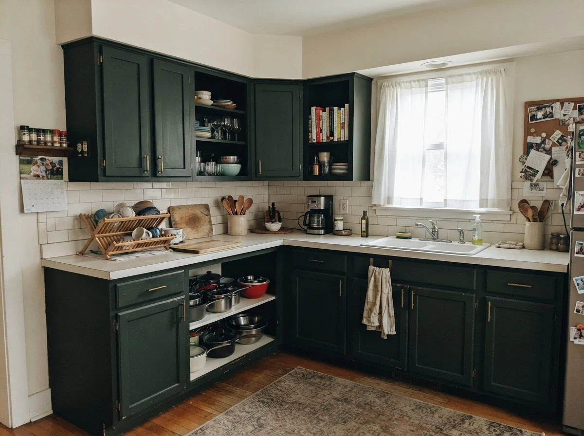
Vintage Vogue is an intoxicatingly rich dark green that often sweeps people off their feet when they look at a two-inch paint chip. At LRV 12, it shares the same deep depth as Pewter Green, but where Pewter Green leans into charcoal slate, Vintage Vogue is a dusty, deep olive-bronze green. In a kitchen bathed in warm afternoon sun, it makes white quartz countertops, polished brass cup pulls, and vintage rugs look remarkably high-end.

Because it is an olive-based dark shade, it brings an organic warmth that cool greens cannot match. When applied in a proper satin cabinet enamel, it creates depth and architectural presence on shaker doors. It also hides the inevitable scuffs around the kitchen trash bin and pantry door far better than pale shades, which is a major advantage if you have kids or pets running through the kitchen every morning.

However, you must respect its low LRV. If your kitchen has low ceilings, dark flooring, and minimal natural light, painting all your upper and lower cabinets in Vintage Vogue can quickly turn the space into a dark cavern. If you do not have multiple layers of lighting—such as recessed cans, pendant lights, and under-cabinet LED strips—it will simply look like a flat, dusty black for most of the day. Treat it with respect, ensure you have strong light, and it will reward you.

kitchen with Benjamin Moore Vintage Vogue
Benjamin Moore Vintage Vogue cabinetry A lived-in kitchen with shaker upper and lower cabinets painted in Benjamin Moore Vintage Vogue, accompanied by white counters, a white subway backsplash, and neutral off-white walls.
Vintage Vogue · 462Benjamin Moore · LRV 12

6. Sherwin-Williams Dried Thyme (SW 6186)

Sherwin-Williams Dried Thyme is arguably one of the most balanced, dependable cabinet colors available today. Coming in at LRV 21, it delivers substantial depth without plunging your kitchen into near-black darkness. It is an earthy, muted herb green with enough slate-gray mixed in to keep it from ever feeling grassy, sweet, or overly trendy. It strikes that elusive middle ground that looks just as comfortable in an old farmhouse as it does in a modern kitchen refresh.

In our 1960s ranch, I have learned that colors with earthy undertones stand up to daily life better than clean pastels. Dried Thyme does not show food splatters around the cooktop easily, and it wipes down clean without leaving burnished shiny spots when you use a soft microfiber cloth and mild cleaner. It pairs naturally with warm wood cutting boards, honed white marble or quartz, and antique brass or matte black cabinet knobs.

The main caveat with Dried Thyme is its sensitivity to lighting quality. Because it absorbs nearly 80 percent of the light that hits it, poor lighting will cause the nuanced herbal green tone to drain out, leaving you with a heavy, slate-gray cabinet face. Avoid it if your kitchen is completely windowless or if your existing trim is a heavy, yellowed cream that will make the green-gray undertones look dirty.

kitchen with Sherwin-Williams Dried Thyme
Sherwin-Williams Dried Thyme kitchen A lived-in kitchen featuring shaker upper and lower cabinets finished in Sherwin-Williams Dried Thyme, paired with white counters, white subway tile backsplash, and neutral off-white walls.
Dried Thyme · SW 6186Sherwin-Williams · LRV 21

7. Benjamin Moore Essex Green (HC-188)

Benjamin Moore Essex Green is an unapologetically dark, historic forest green with an LRV of 6. That means it bounces back practically zero natural light. Inside a home, Essex Green reads almost like an ink-black with a mysterious deep emerald heart that only reveals itself when direct sun or focused task lighting strikes the cabinet face directly.

On a dedicated kitchen island or an isolated dry bar, Essex Green can look magnificent. It provides an immediate sense of permanence, weight, and old-world character, especially when paired with polished unlacquered brass hardware, thick white stone counters, and gleaming white tile. It covers old grain well when properly primed and gives the kitchen a bespoke, tailored look that feels custom-built.

That said, for a full kitchen of upper and lower cabinets, Essex Green is a high-maintenance choice. At LRV 6, every stray speck of white flour, dried water drip, and pet hair stands out like a beacon against the dark surface. Furthermore, touching up dark, saturated satin cabinet paints down the road without leaving visible flashing marks is nearly impossible. Unless your kitchen has large south-facing windows and you are prepared for diligent wipe-downs, keep this shade to accents and islands.

kitchen with Benjamin Moore Essex Green
Benjamin Moore Essex Green cabinetry A lived-in kitchen showcasing shaker kitchen uppers and lowers painted in Benjamin Moore Essex Green, set against white countertops, white subway backsplash, and neutral off-white walls.
Essex Green · HC-188Benjamin Moore · LRV 6

8. Benjamin Moore Palladian Blue (HC-144)

While its name says blue, Benjamin Moore Palladian Blue sits squarely on the fence between blue and green. With an LRV of 60, it reflects an abundance of daylight, offering a breezy, soft vintage character that has made it a top-seller for over twenty years. On kitchen cabinets, it functions as a refreshing, watery pastel that brings instant life and gentle color into an otherwise stark white kitchen.

Because it is light and cheerful, Palladian Blue is wonderful for opening up smaller kitchens with standard eight-foot ceilings. In our first house, a tight split-level, light cabinet colors made the narrow galley feel twice as wide. Paired with polished nickel or glass cabinet knobs, clean white subway tile, and light quartz countertops, it gives you a cheerful cooking space that never feels dark or oppressive, even on gray winter mornings.

The key risk with Palladian Blue is color confusion. Because it balances blue and green undertones so evenly, your surrounding finishes will force it one way or the other. Next to warm, creamy travertine tile or yellow-toned wood flooring, the green is suppressed and it can read as an icy baby blue. If you want a guaranteed earthy green, this is not your paint. But if you want a soft, coastal-leaning color that bounces light and keeps things bright, it is a proven performer.

kitchen with Benjamin Moore Palladian Blue
Benjamin Moore Palladian Blue cabinets A lived-in kitchen with shaker upper and lower cabinets painted in Benjamin Moore Palladian Blue, coordinated with clean white counters, white subway tile backsplash, and neutral off-white perimeter walls.
Palladian Blue · HC-144Benjamin Moore · LRV 60
Alabaster · SW 7008

Susan's pickSherwin-Williams Alabaster (SW 7008) has an LRV of 82 and carries a soft, creamy undertone without leaning yellow. It is our top pick for walls, baseboards, and window casings around green cabinets because it provides a warm, forgiving frame that prevents mid-tone and dark greens from looking sterile or cold.

White Dove · OC-17

Benjamin Moore White Dove (OC-17) at LRV 83 has a tiny drop of gray in its base, making it a reliable, muted off-white for trim. It pairs especially well with cool olive greens like Sage Green and Dried Thyme, ensuring the transition between wall and cabinet remains calm and seamless.

Greek Villa · SW 7551

Sherwin-Williams Greek Villa (SW 7551) is a gentle, sunny off-white with an LRV of 84. It works nicely alongside darker greens like Pewter Green or Vintage Vogue, offering enough warmth to balance deep charcoal-olive tones in rooms that receive moderate daylight.

Swiss Coffee · OC-45

Benjamin Moore Swiss Coffee (OC-45) is a richer, traditional creamy white with an LRV of 82. It should be used carefully with green cabinets; it looks lovely beside warm, dark greens like Vintage Vogue, but it will clash with cool, pale shades like Sea Salt.

Furniture and Finishes

  • Unlacquered Brass Hardware — Warm brass and antique bronze pulls provide the ideal metallic contrast against earthy and dark green cabinet doors.
  • White Quartz or Marble Counters — Clean, light stone countertops reflect daylight down onto lower cabinet boxes and keep saturated greens crisp.
  • Natural White Oak Flooring — Muted, mid-tone natural wood grounds green cabinetry without introducing harsh orange or red undertones.
  • Honey-Oak or Orange Polyurethane Floors — Heavy golden-orange wood finishes fight gray-green and sage undertones, making cabinets look muddy and dated.
  • Black Granite Countertops — Dark counters sitting on dark green cabinets create a heavy, light-absorbing block that shrinks the kitchen.

Home Styles

  • Colonial & Traditional Kitchens — Muted, historical greens like Saybrook Sage and Dried Thyme suit classic face-frame and Shaker cabinetry perfectly.
  • Craftsman & Farmhouse Homes — Earthy olive tones and mid-depth sages integrate naturally with architectural millwork, wood trim, and apron sinks.
  • 1960s Ranch Refreshes — Soft greens like Sea Salt and mid-depth greens bring personality to simple flat-panel or shaker doors without feeling busy.
  • Windowless Galley Kitchens — Deep greens with low LRVs turn tight, enclosed cooking spaces with zero daylight into shadowy, dark tunnels.
Pewter Green vs Vintage Vogue

Both of these colors share an LRV of 12, giving them identical visual weight and light absorption. The difference lies entirely in the underlying hue: Sherwin-Williams Pewter Green leans heavily on a cool, smoky charcoal-slate base with green as a quiet secondary note, making it feel structured, modern, and architectural. Benjamin Moore Vintage Vogue, on the other hand, is a deep, warm olive-bronze green that feels richer, moodier, and more historic. If you have cool gray tile or black accents, Pewter Green is the safer choice; if you have warm unlacquered brass, copper pots, and antique rugs, Vintage Vogue creates more warmth.

Dried Thyme vs Sage Green

Sherwin-Williams Dried Thyme (LRV 21) and Behr Sage Green (LRV 22) are closely matched mid-depth cabinet greens that offer substantial presence without plunging the room into darkness. However, Dried Thyme carries a distinct herbal warmth with earthy yellow-gray undertones that mimic dried garden foliage, pairing beautifully with warm wood accents and off-white trim. Behr Sage Green runs noticeably cooler and grayer, giving it a crisper, more modern edge that excels alongside bright white subway tile and polished chrome or black fixtures.

Sea Salt vs Saybrook Sage

Choosing between these two comes down to whether you want an airy, pale tint or a committed, mid-tone color. Sherwin-Williams Sea Salt (LRV 63) is light, breezy, and constantly shifts between green, gray, and pale blue depending on the hourly daylight. It keeps small or dim kitchens feeling open and bright. Benjamin Moore Saybrook Sage (LRV 45) is noticeably deeper and stays firmly within the green family, reading as a classic, historical sage that holds its identity under both artificial bulbs and bright sunshine.

Where These Colors Fail in the Green Kitchen Cabinets

The most common way green kitchen cabinet paint fails has nothing to do with the quality of the paint and everything to do with fixed finishes. In our second house, I watched a neighbor paint her kitchen cabinets a lovely cool sage without changing her speckled beige-and-gold granite counters or yellowed oak floors. The cool green made the countertops look like dirty mustard and the floors look intensely orange. Green is an unforgiving neighbor to strong yellow or peach undertones; if your permanent surfaces are warm and golden, cool greens will always look out of place.

The second major failure is choosing dark, low-LRV greens in kitchens with inadequate lighting. Dark greens like Essex Green or Vintage Vogue absorb massive amounts of light. If your kitchen relies on a single frosted glass dome fixture in the center of the ceiling, lower cabinets will turn into shadowy black holes, making it hard to see into drawers and creating an oppressive atmosphere. You must account for your light sources—including natural windows and under-cabinet task lights—before committing to a dark green on full cabinet runs.

Finally, homeowners fail when they choose high-gloss finishes or apply standard wall paint to high-touch cabinetry. Cabinets are handled constantly by sticky fingers, bumped with grocery bags, and wiped down with cleaning sprays. Using cheap wall paint or the wrong sheen leads to peeling around handles, greasy dirt settling into chalky matte surfaces, or glaring reflections that highlight every wood grain imperfection and roller mark.

Sheens, Durability, and Touch-Ups

When painting kitchen cabinets, sheen is not just an aesthetic preference; it is your primary defense against moisture, grease, and continuous friction. Over thirty years of wiping down cabinets, I have found that satin is the absolute sweet spot for kitchen cabinetry. A premium satin enamel provides enough slip for spaghetti sauce and cooking grease to wipe clean with a damp microfiber cloth, while keeping glare to a minimum so your cabinet faces look velvety and smooth under recessed spotlights.

Semi-gloss is exceptionally durable and works well on door casings, window trim, and baseboards, but on cabinet doors it can look harsh, plastic-like, and dated. Furthermore, a high-gloss or semi-gloss finish reflects every tiny flaw in the wood, brush stroke, or sanding mark. Matte and flat paints, on the other hand, should never be used on kitchen cabinets under any circumstances; they absorb grease like a sponge, stain permanently when scrubbed, and burnish into shiny patches within months.

Always invest in dedicated waterborne alkyd or urethane-modified cabinet enamels rather than standard latex wall paints. Cabinet-grade enamels cure to a hard, durable shell that resists chipping around drawer edges and prevents the paint from softening under the natural oils of your hands. Spending the extra money on proper cabinet enamel and high-density foam rollers or a paint sprayer will save you from having to strip and repaint three years down the road.

Will green kitchen cabinets hurt the resale value of my home?

Not if you choose muted, earthy tones with broad appeal like Dried Thyme, Saybrook Sage, or Sea Salt, and keep the surrounding finishes neutral. When we sold our colonial, buyers loved clean, tastefully painted cabinetry because it looked custom and intentional. However, overly bright kelly greens or dark, cave-like greens in dim kitchens can scare off buyers who dread the labor of repainting cabinets themselves.

What is the best cabinet hardware finish to pair with green paint?

Unlacquered brass, antique brass, and warm bronze are the traditional favorites because their golden undertones provide a rich, warm contrast against both cool and earthy green tones. Matte black hardware also works exceptionally well for a modern, grounded farmhouse look, while polished nickel adds a crisp, high-end sparkle to lighter greens like Sea Salt and Palladian Blue.

Do I have to sand and prime factory-finished wood cabinets before painting them green?

Yes, absolutely. Skipping proper prep is the number one reason DIY cabinet paint jobs peel after six months. You must clean the doors thoroughly with a heavy-duty degreaser, scuff-sand the factory clear coat to give the surface tooth, and apply a high-adhesion bonding primer before your green cabinet enamel. Paint cannot stick to slick, greasy factory varnish on its own.

Can I paint just my kitchen island green and leave the perimeter cabinets white?

Painting the island a grounding green like Pewter Green, Dried Thyme, or Vintage Vogue while keeping perimeter cabinets a warm off-white like Alabaster is one of the most practical and timeless kitchen design strategies. It gives you the character and depth of green color without darkening the entire room or requiring you to paint every single upper cabinet.

How do I keep green cabinets looking clean near the stove and handles?

Use a dedicated satin cabinet enamel that cures to a hard finish, and clean cabinet fronts monthly with warm water and a few drops of mild dish soap using a soft microfiber cloth. Avoid harsh abrasive scouring pads, bleach, or ammonia-based sprays, as these will gradually degrade the paint's clear sheen layer and leave dull, scrubbed-out spots around your door hardware.

Susan's Verdict · Dried Thyme

If I had to repaint our kitchen cabinets today and live with them for the next ten years, Sherwin-Williams Dried Thyme is the exact color I would choose without hesitation. At LRV 21, it hits the absolute sweet spot for kitchen cabinetry: it carries enough visual depth to ground the room and hide daily cooking scuffs, yet contains enough muted slate-gray that it never feels loud, trendy, or overwhelming. It looks remarkably dignified beside warm white trim like Alabaster, pairs seamlessly with natural wood cutting boards and brass pulls, and holds up gracefully to everyday family living. It is a hardworking, honest green that looks like it belongs in a home, not just on a temporary design board.

Susan Hartley
Susan Hartley · Home Editor & 30-Year Homeowner

Three houses, thirty years, every room repainted at least twice. Susan writes about what colors are like to live with — five years in, not five days. More about Susan →