Color Diaries.
← All colors ·  Room Diaries
Color Diary · No. 4

The Best Kitchen Cabinet Colors: 30 Years of Real Kitchen Repaints

From dark greens that swallow light to whites that hold up to twenty years of scrubbing, here is what actually works on kitchen cabinets five years in.

In our 1970s split-level, the kitchen cabinets were heavy honey oak with deep routed grooves that caught every speck of bacon grease. When we finally decided to paint them in 1994, I bought three gallons of off-the-shelf latex semi-gloss, slapped it directly over the old varnish with a cheap brush, and felt enormously proud of myself for about four weeks. By month six, the paint was peeling away in sticky sheets around the dishwasher handle, and the grain bled through looking like dirty watermarks. I had to strip every door down to raw timber in the middle of November with the garage door cracked.

That disastrous weekend taught me the golden rule of kitchen cabinets: they are not walls. A kitchen cabinet is furniture that takes mechanical abuse three hundred and sixty-five days a year. It gets kicked by toddlers, splashed with spaghetti sauce, wiped down with hot soapy sponges, and baked by afternoon sun through the sink window. The color you put on these boxes dictates how the entire main floor feels, but more importantly, how much time you will spend cursing your sponge when scrub marks start showing.

In our 1990s colonial, we painted the lower cabinets a deep hunter green that I loved for two years, tolerated for five, and repainted right before we listed the house because it turned the cooking area into a cave on winter mornings. Now, in our 1960s ranch, I look at color samples with a much harder eye. I do not care what looks moody in a glossy magazine shoot staged with studio lighting. I care about whether that door profile will still look clean when my grandchildren run their peanut-butter fingers along the lower edge.

Over thirty years and three homes, I have tested nearly every major color direction on kitchen cabinets. If you are preparing to pull the doors off their hinges, label every hinge screw, and commit your kitchen to two weeks of drop cloths, you deserve to know how these shades actually behave once the painter's tape comes down.
The Lineup

Sea Salt · SW 6204Sherwin-Williams · LRV 63
Pewter Green · SW 6208Sherwin-Williams · LRV 12
Sage Green · ICC-77Behr · LRV 22
Hale Navy · HC-154Benjamin Moore · LRV 8
Naval · SW 6244Sherwin-Williams · LRV 4
Alabaster · SW 7008Sherwin-Williams · LRV 82
White Dove · OC-17Benjamin Moore · LRV 83
Agreeable Gray · SW 7029Sherwin-Williams · LRV 60
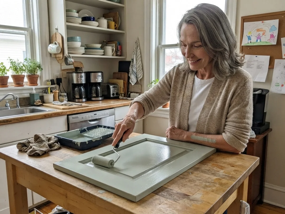
Susan Hartley working with paint in the kitchen
Testing in real morning light Brushing a taped sample square of Sea Salt onto our kitchen wall right next to the cabinetry casing to see if the green holds up against our daylight.
A kitchen cabinet is furniture that takes mechanical abuse every single day. You choose a color for year five, not the weekend the painter leaves.

1. Sherwin-Williams Sea Salt: The Coastal Chameleon

Sea Salt is one of those colors that people fall in love with in photographs without realizing it is a total chameleon in real life. With an LRV of 63, it sits in that delicate mid-light sweet spot where it reflects plenty of illumination while still carrying enough pigment to clearly register as a color. On kitchen cabinetry, it creates an airy, gentle mood that feels clean without having the sterility of an all-white kitchen.

However, you must know what you are getting into with its undertones. Sea Salt is a balanced mix of muted green and soft gray with an unpredictable splash of slate blue. In a kitchen with abundant southern or western daylight and clean white tile, it reads as a soothing, whisper-soft sage. But in a dim room or a north-facing space, that gray-blue surges forward, and you will suddenly find yourself asking why your kitchen cabinets look baby blue. It is not defective paint; it is simply reacting to cold natural light.

I lived with a very similar watery green-gray on laundry cabinets in our last house, and while it scrubbed clean beautifully with a damp microfiber cloth, it demanded specific company. Skip this shade if your kitchen has warm travertine floors, heavy golden-oak trim, or muddy granite counters. It looks phenomenal paired with crisp white quartz, white subway tile, and brushed brass hardware, but warm yellow-beige surroundings will turn it sickly.

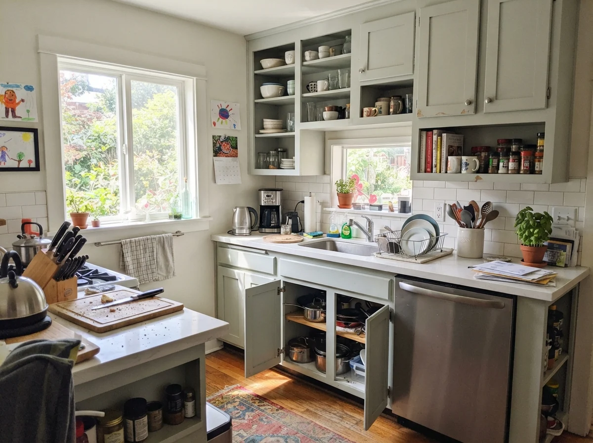
kitchen with Sherwin-Williams Sea Salt
Sea Salt SW 6204 on cabinetry A lived-in kitchen with shaker kitchen cabinets (uppers and lowers) painted exactly Sherwin-Williams Sea Salt (#CDD2CA), white counters, white subway backsplash, and neutral off-white walls.
Sea Salt · SW 6204Sherwin-Williams · LRV 63

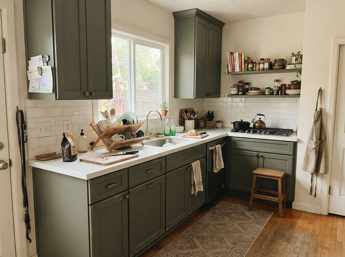
2. Sherwin-Williams Pewter Green: The Grounded Smoky Olive

Pewter Green is the color homeowners choose when they want the richness of a dark painted kitchen without feeling like they bought into a fleeting novelty trend. It has an LRV of 12, which makes it deeply saturated and serious. What makes it work so well on cabinetry is its heavy load of smoky charcoal-gray. It is not an emerald or an olive; it is a weathered, earthy dark green that behaves almost like a moody neutral.

In our colonial home, I used a color in this exact value range on the kitchen island and lower perimeter cabinets, and it held up to family wear better than almost anything else. Scuffs from shoe toes at the island disappeared, and hand oil near the drawer pulls never showed dark shadows between deep cleanings. If you have active dogs or messy cooks in the house, a saturated tone like Pewter Green in a proper satin cabinet enamel will save you countless hours of spot-wiping.

The catch is lighting. At LRV 12, it absorbs a massive amount of ambient light. If you wrap an entire compact kitchen in this color—uppers and lowers—under standard eight-foot ceilings with one modest window, you will feel like you are cooking inside a walk-in safe. Reserve it for spacious, sunlit rooms, or balance it by painting only the island and lower bases while keeping upper cabinets a luminous off-white.

kitchen with Sherwin-Williams Pewter Green
Pewter Green SW 6208 on cabinetry A lived-in kitchen with shaker kitchen cabinets (uppers and lowers) painted exactly Sherwin-Williams Pewter Green (#5E6259), white counters, white subway backsplash, and neutral off-white walls.
Pewter Green · SW 6208Sherwin-Williams · LRV 12

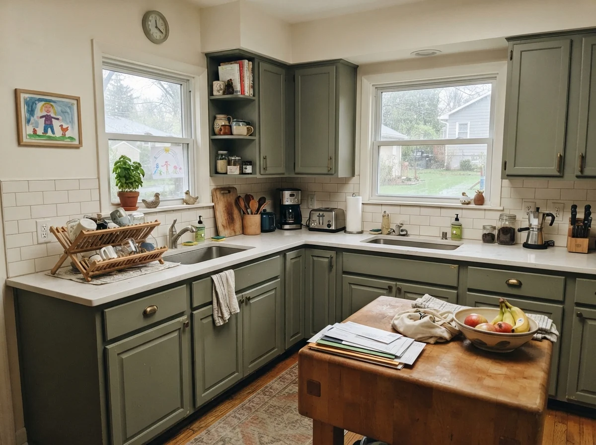
3. Behr Sage Green: The Practical Mid-Tone Workhorse

Many homeowners go searching for sage expecting a pale, powdery pastel and end up disappointed when their kitchen looks washed out. Behr Sage Green is different: with an LRV of 22, it has real backbone. It is a true mid-depth grayed green with a slightly cool edge that prevents it from turning into army drab or muddy khaki under standard incandescent ceiling pots.

From a budget and durability standpoint, this color is a tremendous choice. Behr formulated this tone across their dedicated cabinet enamel lines, meaning it levels out smoothly with minimal brush tracking if you are rolling and tipping doors yourself. Five years in, a mid-tone green like this does not show the grease accumulation that plagues white doors, nor does it highlight white flour dust the way deep charcoal or navy cabinetry inevitably will.

You should skip this shade, however, if your kitchen relies on dark mottled soapstone or black galaxy granite, as the combination can feel heavy and cheerless. It also clashes uncomfortably with honey-toned golden oak floors that have strong amber grain lines. Pair it instead with pale natural oak, clean white counters, and unlacquered brass hardware that will warm up its cool gray undertone.

kitchen with Behr Sage Green
Sage Green ICC-77 on cabinetry A lived-in kitchen with shaker kitchen cabinets (uppers and lowers) painted exactly Behr Sage Green (#7B8472), white counters, white subway backsplash, and neutral off-white walls.
Sage Green · ICC-77Behr · LRV 22

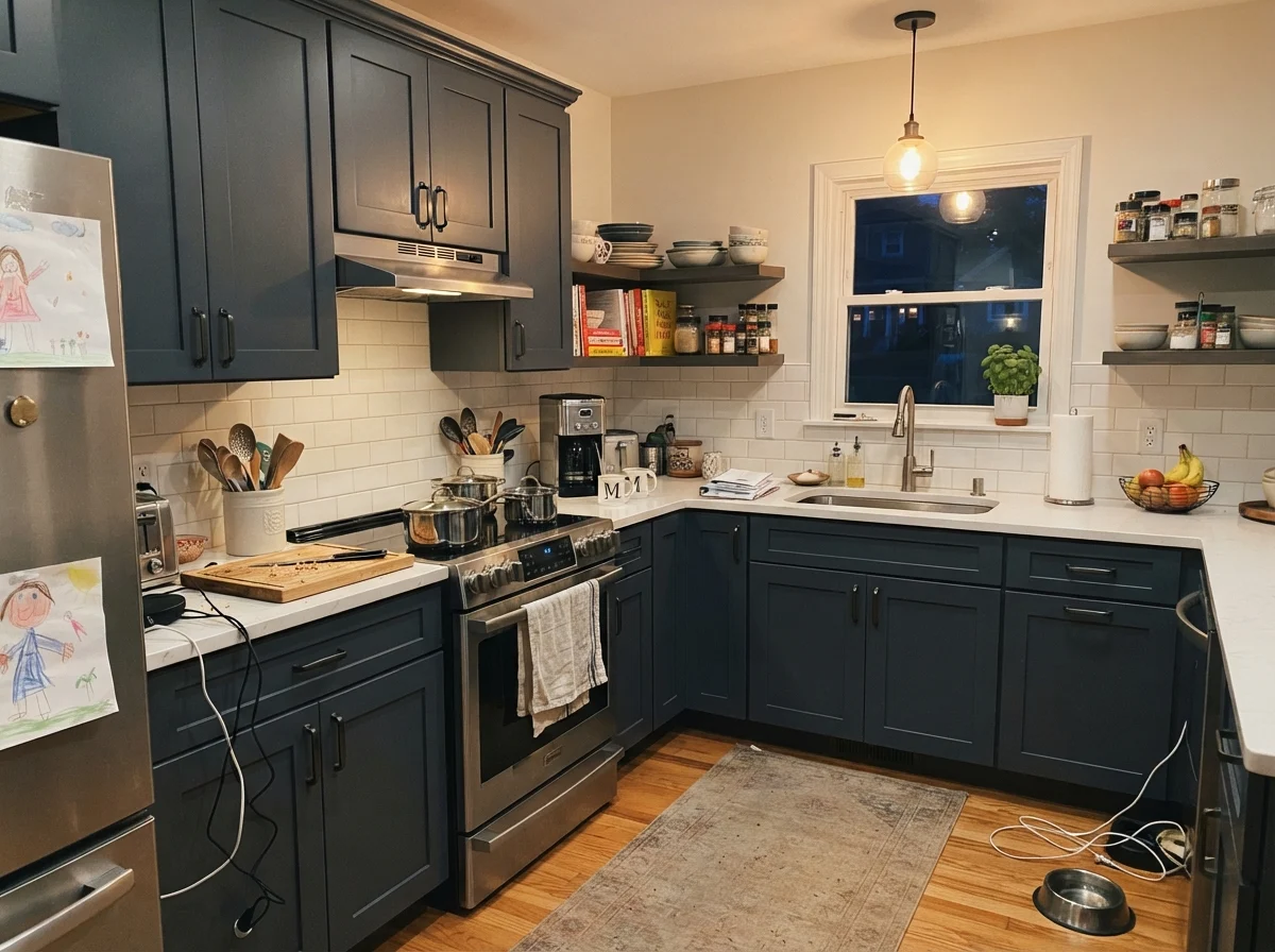
4. Benjamin Moore Hale Navy: The Unshakable Classic

Hale Navy is the measuring stick against which every other navy paint is judged, and having seen dozens of blues come and go over three decades, I can tell you it earns its reputation. With an LRV of 8, it is a very dark, formal navy, but Benjamin Moore loaded it with a heavy proportion of gray. That gray acts like an anchor, stopping the blue from screaming royal or looking like an elementary school uniform.

On kitchen cabinets, Hale Navy brings architectural structure to an open floor plan. When we put it on the island in our 1990s colonial, it instantly anchored the room and made our standard builder-grade perimeter layout look bespoke. It pairs effortlessly with polished nickel, oil-rubbed bronze, or warm brushed brass. Furthermore, when we sold that house, the listing agent pointed straight to the island as the visual centerpiece that drew buyers in.

Do not fool yourself about maintenance, though. Dark navy cabinets show water drips from the sink, dried pancake batter splatters, and dust along the lower rail molding much faster than soft whites or greiges. If you hate wiping down cabinet faces every couple of days, keep Hale Navy restricted to an accent island rather than painting every cabinet box in the room.

kitchen with Benjamin Moore Hale Navy
Hale Navy HC-154 on cabinetry A lived-in kitchen with shaker kitchen cabinets (uppers and lowers) painted exactly Benjamin Moore Hale Navy (#434B56), white counters, white subway backsplash, and neutral off-white walls.
Hale Navy · HC-154Benjamin Moore · LRV 8

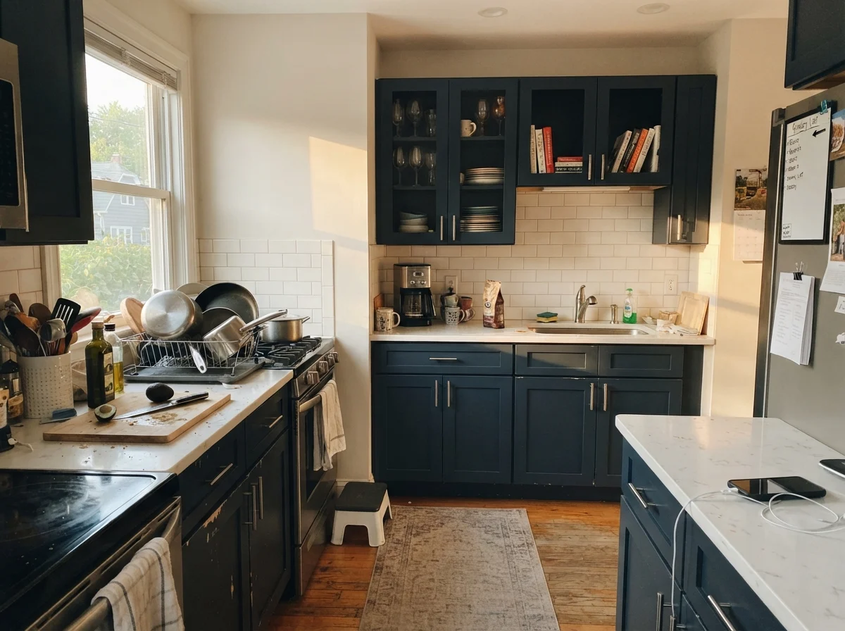
5. Sherwin-Williams Naval: The Deep Saturated Statement

If Hale Navy is a classic wool overcoat, Sherwin-Williams Naval is an evening tuxedo. With an ultra-low LRV of 4, it is nearly as dark as paint gets before turning into pure black. The remarkable thing about Naval, however, is that it maintains its unmistakable sapphire blue undertone even in low light, whereas other deep blues quietly surrender into dull charcoal.

On lower kitchen cabinets, Naval creates high-contrast drama that looks astonishing against bright white quartz or marble-look composite slabs. It gives older shaker cabinets crisp, tailored lines. In our first home, we tried a very dark navy on a small pantry cupboard, and the visual weight was striking—it gave a cheap cabinet door the gravity of historic millwork.

You must be cautious with room exposure. An LRV of 4 means this color devours light. In a dim kitchen with a small north-facing window, Naval will look like flat black boxes unless you invest in quality under-cabinet task lighting and warm ambient pendants. It also requires meticulous prep work: dark enamel highlights every dent, missed sanding swirl, or wood grain seam if you brush it by hand without proper primer.

kitchen with Sherwin-Williams Naval
Naval SW 6244 on cabinetry A lived-in kitchen with shaker kitchen cabinets (uppers and lowers) painted exactly Sherwin-Williams Naval (#2F3D4C), white counters, white subway backsplash, and neutral off-white walls.
Naval · SW 6244Sherwin-Williams · LRV 4

6. Sherwin-Williams Alabaster: The Warm Creamy Anchor

Alabaster has been a darling of kitchen remodels for years, and for very good reason. At LRV 82, it reflects an immense amount of light, bouncing morning sunshine into the deepest corners of the room. It carries a soft, creamy beige undertone that prevents it from ever feeling stark, icy, or clinical, making it one of the easiest whites to live with long-term.

In our current 1960s ranch, I have leaned on warm whites like Alabaster because they flatter natural wood flooring and warm brass fixtures so naturally. If your kitchen has honey-toned oak floorboards or exposed ceiling beams, Alabaster bridges the gap between old woodwork and fresh paint without causing that jarring visual clash that pure stark white creates.

Be careful, however, if your kitchen relies heavily on cool gray quartz countertops, ice-white subway tiles, or modern stainless steel backsplashes. Next to true stark whites and cool grays, Alabaster's yellow-cream base will come right to the surface, and your cabinets may look dingy or yellowed rather than soft. Always hold an Alabaster sample board directly against your countertop under daytime and evening bulbs before committing.

kitchen with Sherwin-Williams Alabaster
Alabaster SW 7008 on cabinetry A lived-in kitchen with shaker kitchen cabinets (uppers and lowers) painted exactly Sherwin-Williams Alabaster (#EDEAE0), white counters, white subway backsplash, and neutral off-white walls.
Alabaster · SW 7008Sherwin-Williams · LRV 82

7. Benjamin Moore White Dove: The Bulletproof Classic

If you ask me which single white cabinet paint has saved the most homeowners from expensive regrets, it is Benjamin Moore White Dove. Sitting at an LRV of 83, it is nearly identical in brightness to Alabaster, but its pigment formula includes a tiny drop of gray alongside its warmth. That drop of gray is pure magic: it softens the yellow, keeping the white creamy and grounded without ever turning buttercup.

I have lived with White Dove on cabinetry and interior trim across two houses, totaling more than fifteen years of daily wear. It is the most forgiving white I know. It looks tailored in crisp morning daylight and cozy under warm 2700K evening lighting. It harmonizes with almost any stone counter—from Carrara marble to warm butcher block—and never looks out of place whether your home was built in 1890 or 1995.

The only situation where you might want to skip White Dove is if you are aiming for an ultra-modern, minimalist aesthetic with high-gloss flat slab doors, where a clean, pigment-free optic white is necessary. For traditional shaker doors, raised panels, or beadboard kitchen faces, White Dove is about as foolproof as paint gets.

kitchen with Benjamin Moore White Dove
White Dove OC-17 on cabinetry A lived-in kitchen with shaker kitchen cabinets (uppers and lowers) painted exactly Benjamin Moore White Dove (#EFEEE5), white counters, white subway backsplash, and neutral off-white walls.
White Dove · OC-17Benjamin Moore · LRV 83

8. Sherwin-Williams Agreeable Gray: The Dependable Greige

Agreeable Gray is famous as a whole-house wall color, but people often overlook how practical and elegant it is on kitchen cabinetry. With an LRV of 60, it delivers just enough contrast against white walls and white quartz counters to give cabinetry distinct definition without darkening the kitchen. It is the classic bridge between gray and beige, designed not to pick fights with surrounding finishes.

What I love about a greige like Agreeable Gray on kitchen cabinets is how well it masks day-to-day life. In a bustling household where the kitchen is the command center, white cabinets can make you feel like a full-time custodian. Agreeable Gray hides light scuffs, dust, and drying water marks far better than pure white, while remaining bright and cheerful during dreary winter months.

The warning with Agreeable Gray lies in your lighting temperature. In south-facing daylight or warm artificial lighting, it reads as a handsome, stone-like warm greige. But in a gloomy, north-facing kitchen with poor daylight, that gray base can pull a faint violet or cool taupe undertone. Make sure you view a painted sample right next to your flooring at 8:00 AM, 1:00 PM, and 7:00 PM before opening the cabinet cans.

kitchen with Sherwin-Williams Agreeable Gray
Agreeable Gray SW 7029 on cabinetry A lived-in kitchen with shaker kitchen cabinets (uppers and lowers) painted exactly Sherwin-Williams Agreeable Gray (#D1CBC1), white counters, white subway backsplash, and neutral off-white walls.
Agreeable Gray · SW 7029Sherwin-Williams · LRV 60
White Dove · OC-17

Susan's pickThe absolute benchmark for kitchen casing, baseboards, and window trim. It pairs cleanly with white cabinets without looking cold, and provides a soft, seamless frame next to dark navy or sage green without creating harsh jarring contrast.

Alabaster · SW 7008

An excellent choice if your cabinets are painted Alabaster or another warm off-white. Using it on both trim and cabinets in differing sheens (satin on cabinets, semi-gloss on trim) creates a gorgeous, unified traditional look.

Greek Villa · SW 7551

A slightly sunnier warm white that works nicely on kitchen window trim and baseboards if you have chosen earthy green cabinetry like Pewter Green or Behr Sage Green. It adds warmth without turning distinctly yellow.

Swiss Coffee · OC-45

A deeply creamy off-white that belongs alongside warm wood countertops and vintage-inspired kitchens. It is too warm to pair with cool gray-greens like Sea Salt, but lovely with traditional dark greens and warm greiges.

Furniture and Finishes

  • Brushed brass or unlacquered brass hardware — Adds crucial warmth and timeless elegance against both deep navies, earthy greens, and creamy off-white cabinetry.
  • White quartz or marble-look composite countertops — Provides the clean, light-reflective surface needed to balance saturated lower cabinets like Pewter Green or Hale Navy.
  • Warm butcher block island accents — Breaks up painted cabinet surfaces with natural organic texture, keeping the kitchen feeling lived-in and comfortable.
  • Dark speckled brown or yellow-gold granite counters — Competes heavily with subtle undertones in colors like Sea Salt or Agreeable Gray, making cabinets look mismatched or dingy.
  • High-shine chrome builder hardware — Feels sharp and commercial against softer, traditional cabinet shades like Alabaster, White Dove, or Sage Green.

Home Styles

  • 1960s–1980s Ranch & Split-Level refreshes — Painted cabinetry is the single most cost-effective way to modernize dark or dated builder oak boxes without ripping out solid frames.
  • 1990s–2000s Suburban Colonials — Two-tone cabinetry layouts (such as Hale Navy or Pewter Green lowers with White Dove uppers) give standard tract layouts bespoke weight.
  • Craftsman and Farmhouse renovations — Earthy tones like Behr Sage Green and Benjamin Moore White Dove honor classic shaker lines and historic architectural millwork.
  • Ultra-modern minimalist lofts with flat-panel laminate — Soft historical colors like Alabaster and muted greiges look out of place on handleless high-gloss modern modular units.
Sea Salt vs Sage Green

Sea Salt (LRV 63) is a light, airy chameleon that sits between green, gray, and blue, making it perfect for brightening a dim room with clean white tile. Behr Sage Green (LRV 22) is much darker, more grounded, and solidly gray-olive. Choose Sea Salt if you want your cabinets to read as a breezy neutral; choose Sage Green if you want committed, earthy green cabinetry that will not shift to blue.

Hale Navy vs Naval

Hale Navy (LRV 8) carries a strong dose of gray, making it a restrained, historic navy that sits comfortably against any off-white trim without demanding attention. Naval (LRV 4) is noticeably darker and far more saturated sapphire. If your kitchen gets moderate light and you want classic elegance, pick Hale Navy. If you have abundant bright daylight and want dramatic, high-contrast punch, pick Naval.

Alabaster vs White Dove

Both are legendary warm whites with nearly identical brightness (LRV 82 vs 83). The difference is in the undertone formula: Alabaster leans slightly creamier and warmer with soft beige-yellow, while White Dove contains a tiny drop of gray that keeps it neutral and soft. If you have warm oak floors and brass, Alabaster is gorgeous. If you have mixed counters and cooler light, White Dove is the safer bet.

Where These Colors Fail in the Kitchen Cabinets

The biggest mistake I see homeowners make with kitchen cabinets is treating them like interior drywall. People grab standard wall latex or leftover flat paint to save a few dollars, skip the degreasing step, and then wonder why the paint chips off the first time their thumbnail catches an edge. Kitchen doors are coated with years of invisible aerosolized cooking oils, especially around the stove and pulls. If you do not scrub them with TSP or a heavy-duty degreaser, scuff-sand the factory finish, and apply a dedicated bonding primer, your topcoat will fail within twelve months regardless of the color you choose.

Another classic failure is picking a dark, light-devouring color like Naval or Pewter Green for every cabinet in a kitchen that has only a small north-facing window and standard eight-foot ceilings. Saturated colors look stunning on social media because professionals flood the space with thousand-watt photography lights. In real everyday life, painting thirty linear feet of cabinetry in an LRV 10 paint without adequate lighting turns your cooking space into a dark tunnel where you will struggle to find spices in the back of the pantry.

Finally, never choose your cabinet paint in isolation from your countertop slab and flooring. A warm creamy white like Alabaster will look dirty if it sits against an icy, cool-gray quartz countertop with blue veining. Similarly, a cool watery green like Sea Salt will look sickly if installed directly over yellow-orange honey oak flooring. Always paint large vertical sample boards and prop them upright on top of your existing counters against your backsplash before buying gallons.

Sheens, Durability, and Touch-Ups

When it comes to sheen on kitchen cabinets, there is exactly one correct answer for ninety percent of homes: satin. Flat and matte finishes should never touch a kitchen cabinet door; they are porous, trap oil from your fingertips, and burnish into shiny, blotchy patches the second you try to scrub off dried sauce. On the other end of the spectrum, high-gloss shows every single minor imperfection in the wood, every brush mark, and every dent your family has put into those doors over the last twenty years.

A dedicated satin cabinet enamel provides the ideal balance. It has just enough resin sheen to create a hard, washable barrier that lets spaghetti sauce and coffee drips slide off with a warm soapy cloth, but stays low-luster enough to hide subtle surface flaws and uneven wood grain. Look specifically for waterborne alkyd or urethane-modified enamels, which dry to a furniture-grade hardness that standard wall paints simply cannot match.

If you have high-traffic trim, baseboards, and window casings framing your kitchen, you can bump the trim sheen up to semi-gloss for extra scuff resistance against mops and vacuum cleaners. But for the cabinet faces themselves—especially shaker rails and large flat panels—keep it in a smooth, high-grade satin finish if you want them to look professional and wear gracefully five years in.

Should my upper and lower cabinets be the same color?

They do not have to be, but consistency is safer in smaller kitchens. A two-tone layout—painting lower cabinets and the island a grounding dark shade like Hale Navy or Pewter Green while keeping upper cabinets White Dove—is a proven way to add depth without closing in the ceiling. In a small galley kitchen, however, keeping all cabinets one consistent light color usually makes the room feel much larger.

Can I paint over factory finished wood or laminate cabinets?

Yes, but your prep work must be flawless. Factory finishes are slick and engineered to repel moisture, meaning regular paint will not stick. You must clean the doors with a heavy degreaser, scuff-sand the entire surface with 150-grit sandpaper to create tooth, wipe away all dust, and apply a high-adhesion bonding primer before applying two coats of dedicated cabinet enamel.

How long should painted kitchen cabinets cure before heavy use?

There is a massive difference between dry time and cure time. Modern cabinet enamels will feel dry to the touch within two to four hours, but they take a full twenty-one to thirty days to fully cross-link and reach maximum hardness. Rehang doors gently after forty-eight hours, but avoid aggressive scrubbing, harsh cleaners, or heavy bumping for the first month.

What paint color is best for resale on kitchen cabinets?

Warm, soft whites like Benjamin Moore White Dove or Sherwin-Williams Alabaster remain the undisputed champions for resale. Buyers want a kitchen that looks bright, clean, and move-in ready. While dark green or navy islands are very popular, an entire kitchen painted in a deep, highly specific color can turn off buyers who worry they will have to repaint it immediately.

How do I prevent paint from chipping around cabinet hardware?

Paint chipping around knobs is almost always caused by fingernails digging behind the pull or hand oils softening uncured paint. Use hardware with a wider base or backplate to protect the painted surface, make sure you let your primer fully bond before topcoating, and clean around pulls with a gentle damp cloth rather than harsh abrasive chemicals.

Susan's Verdict · White Dove

If I had to walk into our kitchen tomorrow with brushes, drop cloths, and twenty cabinet doors laid out on sawhorses, Benjamin Moore White Dove is the can I would open without a second thought. It is not the trendiest color on the rack, nor is it dramatic, but it is the one shade that has never let me down across thirty years of homeownership. It gives you the brightness of an LRV 83 white without the clinical chill of hospital walls, and its tiny drop of gray keeps it from turning buttery in warm light or dingy next to quartz. It flatters every wood floor, works with both brass and nickel hardware, and cleans up faithfully year after year. When you are putting forty hours of labor into painting kitchen cabinetry, you want a color that will look just as right ten years from now as it does the day the tape comes down, and White Dove does exactly that.

Susan Hartley
Susan Hartley · Home Editor & 30-Year Homeowner

Three houses, thirty years, every room repainted at least twice. Susan writes about what colors are like to live with — five years in, not five days. More about Susan →