Color Diaries.
← All colors ·  Room Diaries
Color Diary · No. 15

Navy Kitchen Cabinets: What 30 Years and 8 Dark Blues Taught Me

Dark blue cabinets look magnificent in magazines, but living with them across three houses taught me where navy forgives daily life and where it punishes you.

In our 1990s colonial, our kitchen cabinets were honey oak. You know the kind: cathedral arches, orange varnish that had yellowed over a decade, and brass hardware that pitted around the screw holes. In the spring of 2004, after staring at those golden-brown boxes through five straight winters, I finally pulled every door off its hinges, set up sawhorses in the garage, and painted the entire kitchen a deep, brooding blue. My husband thought I had lost my mind. The neighbors came over with polite smiles and carefully asked if I was worried it would look like a submarine.

I lived with that blue kitchen for nine years. Over those nine years, I learned every single lesson that glossy design magazines conveniently forget to tell you. I learned that dark cabinet paint shows dried water drips around the sink faucet faster than white ever will. I learned that pancake batter splatters dry into bright chalky spots against a dark door. But I also learned that a properly chosen navy anchors a kitchen like nothing else in the world, hiding scuffs from kids' sneakers along the island baseboard and giving cheap laminate or basic white quartz the gravitas of a historic estate.

When we sold that colonial, our real estate agent told us that the navy lowers and crisp white perimeter were the single reason we got an offer over asking in the first forty-eight hours. The buyer walked straight up to the island, ran her hand along the painted stile, and whispered, 'Thank goodness it's not all white.' But getting that reaction requires picking a navy that behaves itself under unpredictable kitchen light, because dark blue is one of the trickiest chameleon colors in the entire paint deck.

Since that first big repaint, I have worked with eight distinct navy and near-black blue shades across our homes and kitchen projects. Some gave us pure sophistication and scrubbed clean without a whimper; others collapsed into dull black coal dust the moment five o'clock winter darkness rolled in. Here is the honest, five-years-in truth about how each of these eight paints actually lives on kitchen cabinets.
The Lineup

Hale Navy · HC-154Benjamin Moore · LRV 8
Naval · SW 6244Sherwin-Williams · LRV 4
Cyberspace · SW 7076Sherwin-Williams · LRV 6
Sea Serpent · SW 7615Sherwin-Williams · LRV 7
Blue Note · 2129-30Benjamin Moore · LRV 9
Charcoal Blue · SW 2739Sherwin-Williams · LRV 6
Blue · 2066-10Benjamin Moore · LRV 6
In the Navy · SW 9178Sherwin-Williams · LRV 4
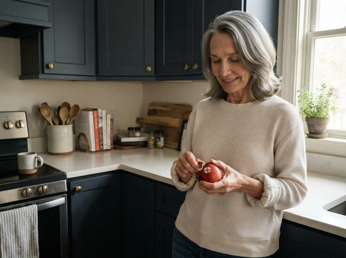
Susan Hartley working with paint in the kitchen
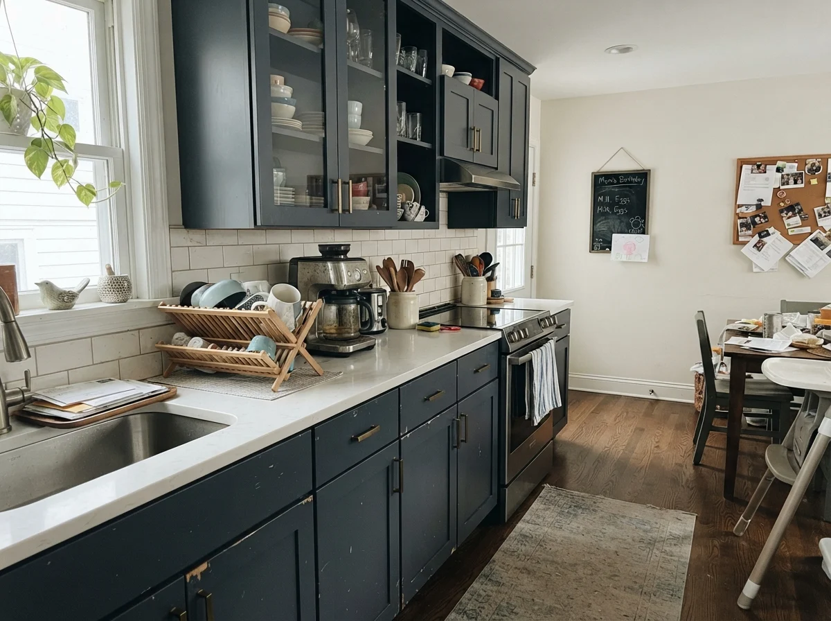
Thirty years of kitchen repaints I am standing at the counter in our 1960s ranch, leaning against Shaker cabinet doors finished in Benjamin Moore Hale Navy. After decades of scrubbing cooking grease and wiping morning coffee drips off cabinet stiles, I know exactly which dark colors hold their ground.
That is the thing nobody tells you about navy cabinets: you don't choose the color for Sunday morning when the kitchen is clean. You choose it for Tuesday night after spaghetti sauce splatters and the only light on is the hood vent.

1. Benjamin Moore Hale Navy (HC-154): The Benchmark That Rarely Fails

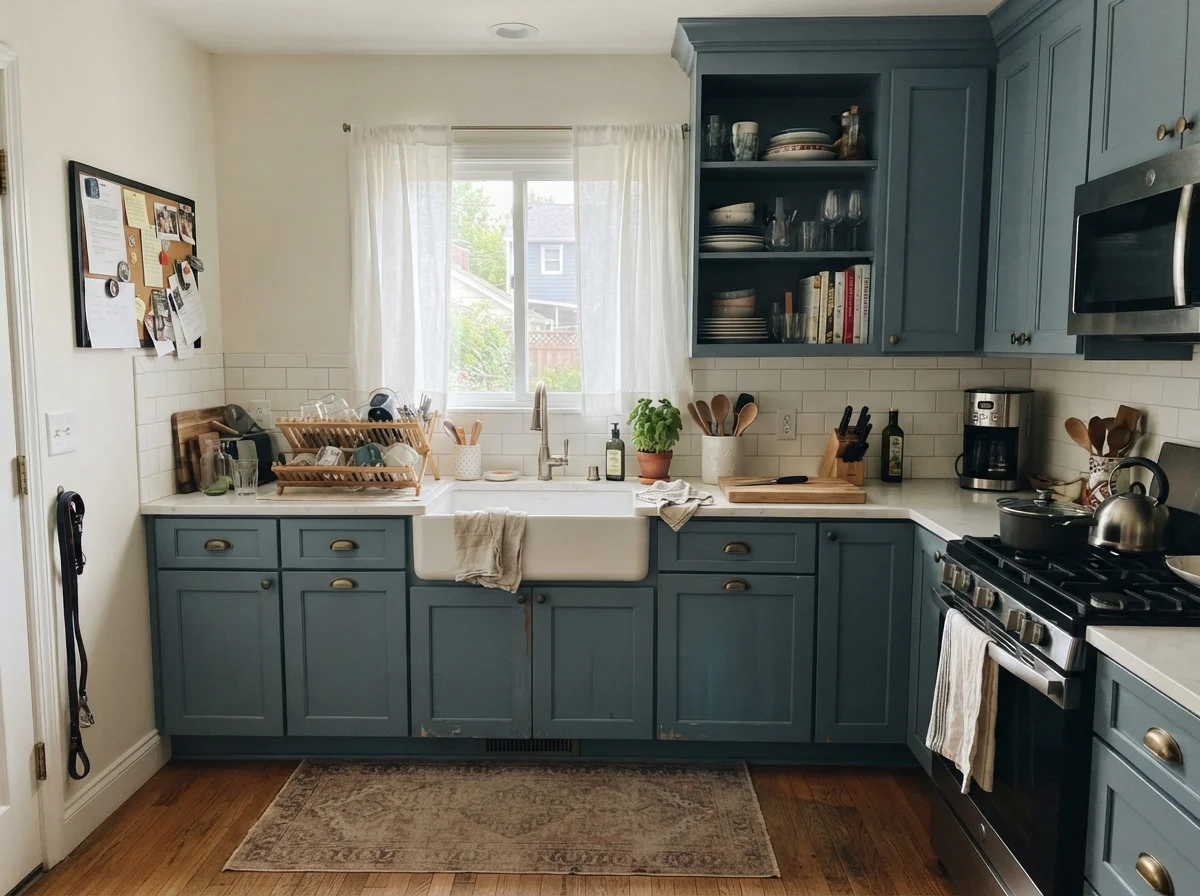
Hale Navy is the standard by which every other navy in the industry gets judged, and in my experience, it has earned that reputation honestly. At an LRV of 8, it carries a heavy dose of gray pigmentation that keeps it calm, grounded, and thoroughly grown-up. In our previous house, I put this on lower cabinets flanking an ivory range hood, and it never once looked like a child's sailor suit or a garish royal blue. It sits alongside standard white subway tile and Carrera marble without demanding all the oxygen in the room.

The reason this color succeeds so consistently where other dark blues fail is its balance. It has just enough charcoal in its undertone to stay neutral under 3000K warm LED can lights, yet enough blue pigment to register as navy when the morning sun pours across the island. When you take a sponge with warm soapy water to clean around the trash pull-out handle, a quality satin cabinet formulation in Hale Navy doesn't burnish into a shiny spot or show greasy thumbprints nearly as aggressively as darker, pure-black alternatives.

The only time you should skip Hale Navy on kitchen cabinets is if your kitchen faces strictly north and sits in a window-starved corner of an older home. Without decent ambient light, LRV 8 will lose its blue identity and read as an indeterminate, heavy dark gray. But if you have at least one working window and decent task lighting, Hale Navy is as close to a sure thing as the paint world offers.

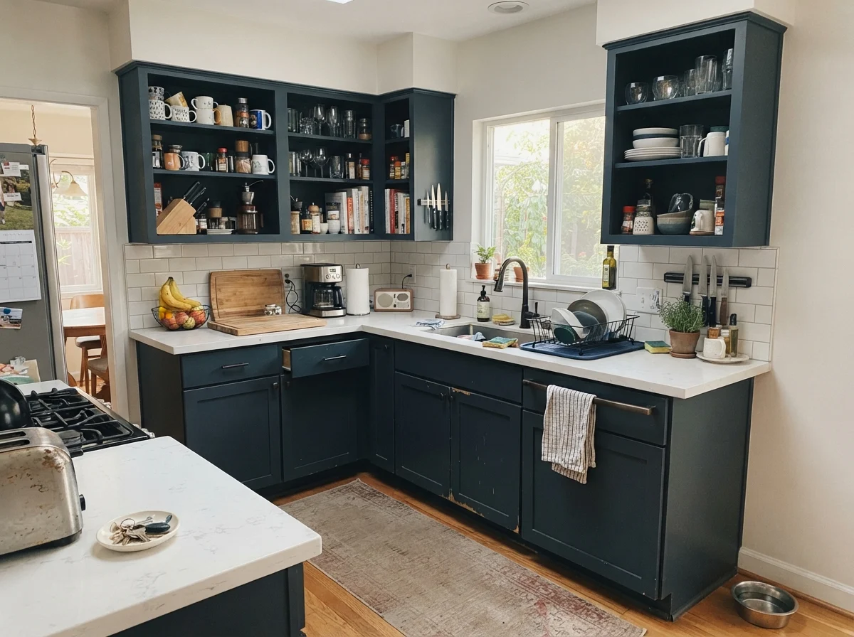
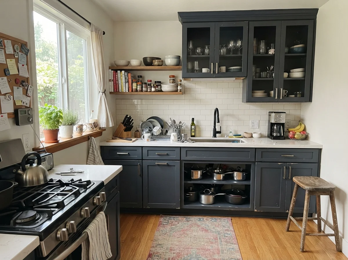
kitchen with Benjamin Moore Hale Navy
Benjamin Moore Hale Navy HC-154 A lived-in kitchen with shaker kitchen cabinets (uppers and lowers) painted exactly Benjamin Moore Hale Navy (#434B56), white counters, white subway backsplash, and neutral off-white walls.
Hale Navy · HC-154Benjamin Moore · LRV 8

2. Sherwin-Williams Naval (SW 6244): The High-Impact True Blue

If Hale Navy is the navy with a gray cardigan on, Sherwin-Williams Naval is navy in full dress uniform. With an LRV of 4, it is substantially darker than most people realize on the color strip, yet it refuses to turn into charcoal. It holds onto its true blue heart even under overcast skies. On a kitchen island or a dedicated bank of lower cabinets with white uppers, it creates a striking, crisp contrast that looks exceptionally polished next to polished nickel or unlacquered brass hardware.

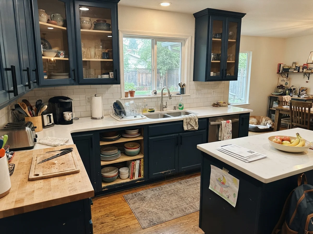
Living with Naval on cabinets, however, demands honesty about your household maintenance habits. Because it sits at LRV 4 and carries deep saturated pigment, dust, pet hair, and dried flour from weekend baking show up against it like chalk on a blackboard. In our last house, our golden retriever loved to sleep leaned against the island; with Naval, I found myself wiping dog hair off the lower stiles every single morning before coffee.

Skip Naval if you are trying to paint every upper and lower cabinet in a small, enclosed kitchen with eight-foot ceilings. Wrapping an entire compact room in LRV 4 blue will swallow the light and make the space feel like an enclosed storage locker. But if you use it on a standalone island beneath crisp white counters and bright pendant lights, it delivers that classic, confident nautical depth better than almost anything else.

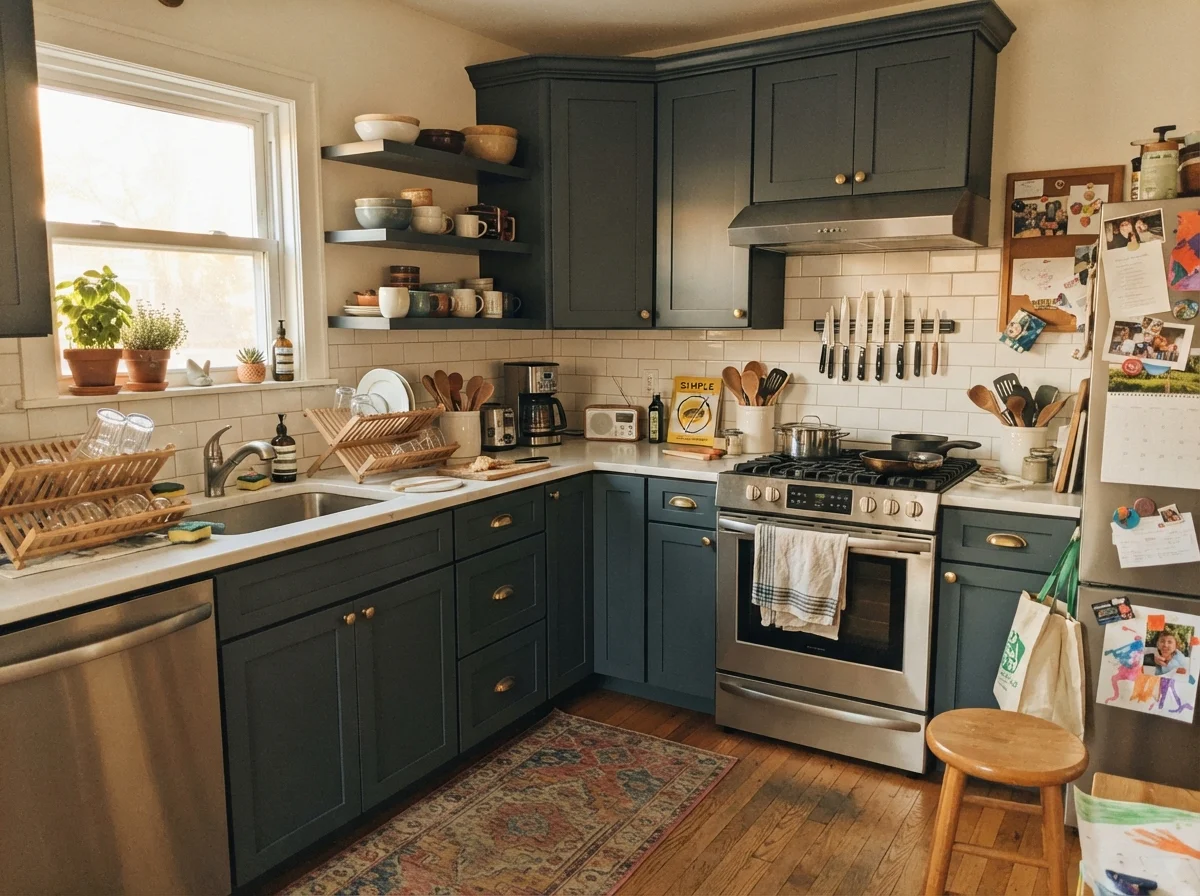
kitchen with Sherwin-Williams Naval
Sherwin-Williams Naval SW 6244 A lived-in kitchen with shaker kitchen cabinets (uppers and lowers) painted exactly Sherwin-Williams Naval (#2F3D4C), white counters, white subway backsplash, and neutral off-white walls.
Naval · SW 6244Sherwin-Williams · LRV 4

3. Sherwin-Williams Cyberspace (SW 7076): The Moody Blue-Gray Hybrid

Cyberspace is the shade people turn to when true navy feels too nautical or preppy, but true black feels too severe and cold for a family kitchen. Sitting at an LRV of 6, it is a slate-charcoal that holds a subtle, quiet navy undertone deep in its base. On kitchen cabinetry, it delivers an understated, architectural mood that pairs beautifully with soapstone, honed black granite, or heavily veined white quartz.

Five years in, what I appreciate most about Cyberspace on cabinets is how forgiving it is with daily grime. Because it is fundamentally a charcoal-blue rather than a saturated royal navy, everyday smudges, grease spatter near the stovetop, and scuff marks from kids kicking the island stools don't jump out at you. It wipes down cleanly in a satin finish without the pigment looking tired or patchy after repeat washings.

You should skip Cyberspace if your heart is truly set on people walking into your home and saying, 'Oh, I love your blue cabinets!' In a kitchen with flat northern light or weak ceiling fixtures, Cyberspace will look like a soft off-black 80 percent of the day. If you want indisputable blue, look elsewhere; if you want a sophisticated dark neutral with just a whisper of steel-blue mystery, this is your color.

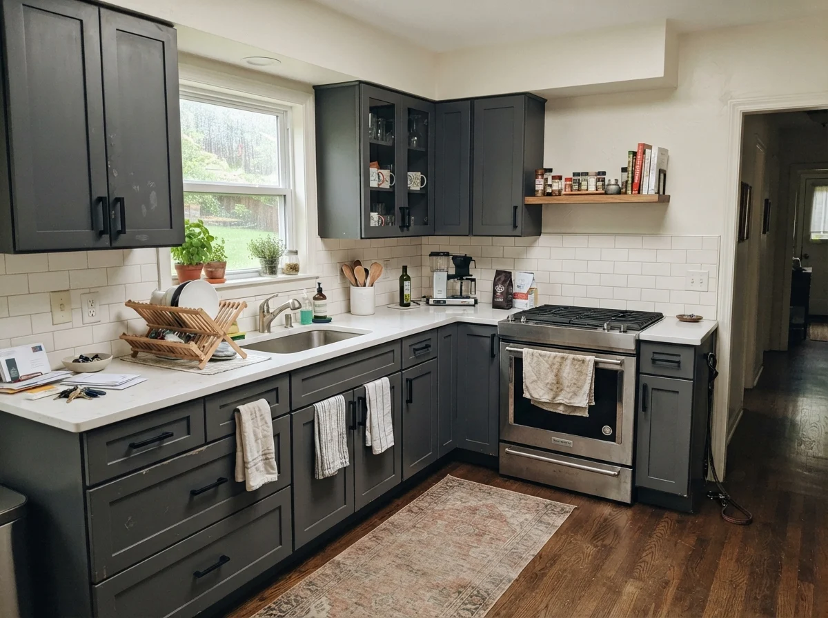
kitchen with Sherwin-Williams Cyberspace
Sherwin-Williams Cyberspace SW 7076 A lived-in kitchen with shaker kitchen cabinets (uppers and lowers) painted exactly Sherwin-Williams Cyberspace (#44484D), white counters, white subway backsplash, and neutral off-white walls.
Cyberspace · SW 7076Sherwin-Williams · LRV 6

4. Sherwin-Williams Sea Serpent (SW 7615): The Coastal Deep with Green Undertones

Sherwin-Williams officially categorizes Sea Serpent as a neutral rather than a classic blue or green, and that tells you everything about how it behaves on kitchen woodwork. At an LRV of 7, it is a complex, oceanic dark gray that pulls a definite teal-green undercurrent when warm light hits it. In our split-level, we tried a very similar moody teal-navy on the pantry door, and it added an earthy, organic richness that standard navies simply cannot duplicate.

Under 2700K under-cabinet lighting or warm incandescent pendants in the evening, Sea Serpent softens into a rich, deep sea-glass tone that makes warm wood cutting boards and natural brass drawer pulls look magnificent. It feels relaxed, historic, and lived-in rather than stiff or formal. It also handles the natural wear and tear of a working kitchen with remarkable grace, masking minor water spots around the undermount sink.

Skip Sea Serpent if you want a clean, no-doubt-about-it classic navy blue. If your kitchen walls are painted a stark, blue-cool white, Sea Serpent's greenish-gray undertones can fight with the wall color and look muddy. It needs warm off-whites, creamy quartz, and natural oak accents to sing its best song.

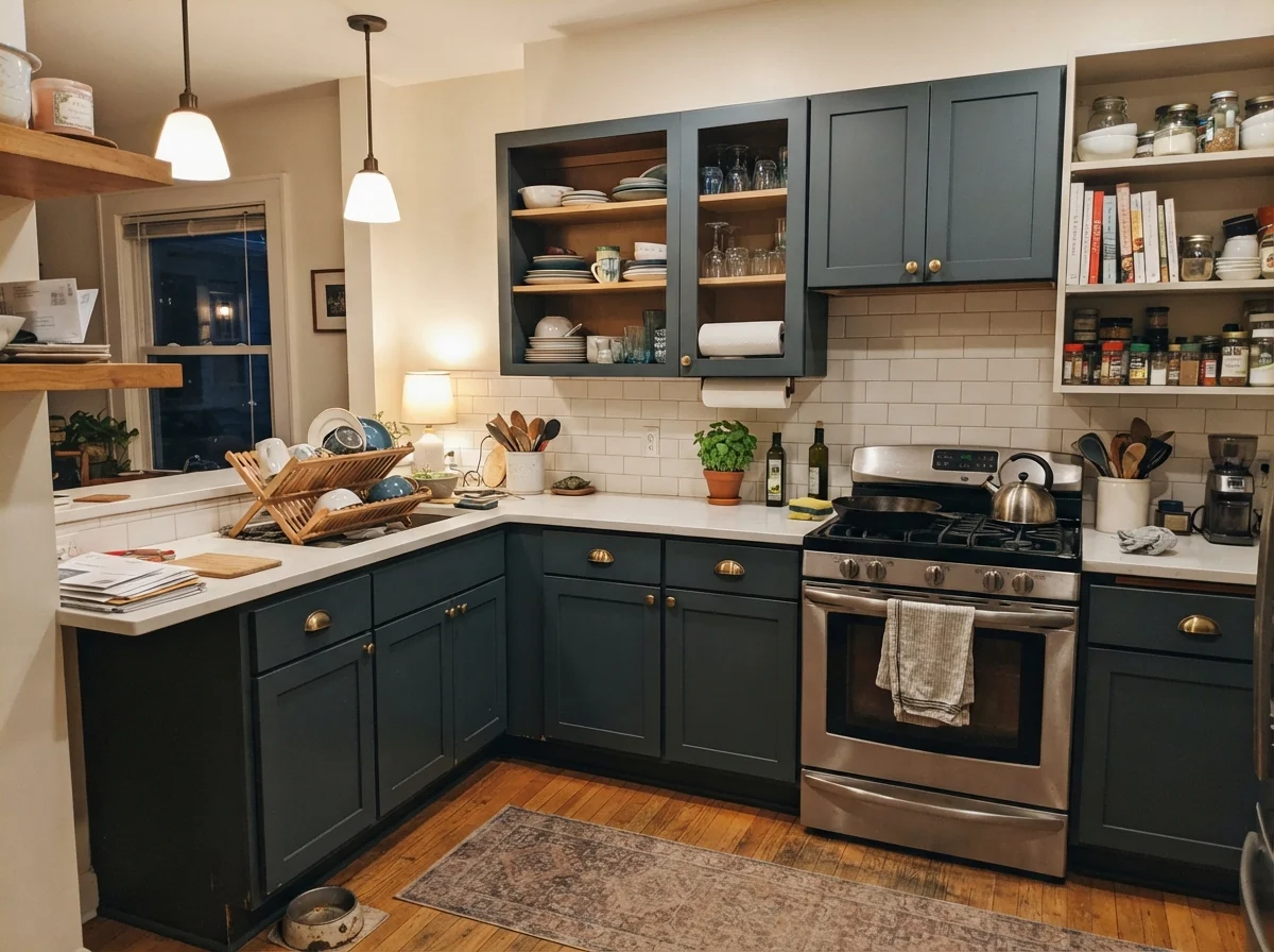
kitchen with Sherwin-Williams Sea Serpent
Sherwin-Williams Sea Serpent SW 7615 A lived-in kitchen with shaker kitchen cabinets (uppers and lowers) painted exactly Sherwin-Williams Sea Serpent (#3E4B54), white counters, white subway backsplash, and neutral off-white walls.
Sea Serpent · SW 7615Sherwin-Williams · LRV 7

5. Benjamin Moore Blue Note (2129-30): The Unsung Charcoal Navy

Blue Note is Benjamin Moore's no-nonsense answer for homeowners who find Hale Navy just a hair too decorative or popular. Registering at an LRV of 9, it is technically the lightest value among this dark navy group, but its soot-gray formulation makes it feel incredibly grounded. It is charcoal first and navy second, designed to provide quiet depth on cabinetry without demanding attention.

What I respect about Blue Note on kitchen cabinets is its sheer durability of aesthetic. It is not an 'Instagram trend' color that will look dated within four years. When you pair Blue Note on lower cabinetry with a warm off-white trim like White Dove, the contrast is refined rather than jarring. It has enough smoky depth to absorb bright southern sun without washing out or turning electric blue across cabinet faces.

However, do not choose Blue Note if your kitchen suffers from gloom or has tiny basement-style windows. In dim ambient conditions, the subtle blue pigment vanishes completely, leaving behind a plain, sooty dark gray that feels heavy and uninspired. It needs natural daylight across the cabinet faces to reveal its refined blue personality.

kitchen with Benjamin Moore Blue Note
Benjamin Moore Blue Note 2129-30 A lived-in kitchen with shaker kitchen cabinets (uppers and lowers) painted exactly Benjamin Moore Blue Note (#404B54), white counters, white subway backsplash, and neutral off-white walls.
Blue Note · 2129-30Benjamin Moore · LRV 9

6. Sherwin-Williams Charcoal Blue (SW 2739): The Cool-Toned Slate Navy

Charcoal Blue is what happens when you strip all the warmth out of a navy formulation and add a slight violet-slate tilt. With an LRV of 6, it is a very dark, steely presence on millwork and cabinetry. In bright daylight, it reveals a crisp, tailored cool-blue quality that looks exceptionally sharp next to stainless steel appliances, chrome bridge faucets, and cool marble countertops.

In a practical working kitchen, Charcoal Blue acts like iron. Because of its cool gray backbone, grease film and everyday handling near cabinet knobs don't produce the yellowed, shiny halo that sometimes plagues warmer dark blues. If you paint your cabinets with a quality urethane enamel in satin, this color holds its tailored appearance year after year through dozens of sponge scrubbings.

Be very cautious, though, if your kitchen has warm yellow-gold granite (like old Venetian Gold or Santa Cecilia) or orange-toned honey oak floors. Charcoal Blue's cool violet-slate undertone will violently clash with warm yellow stones, making the counters look dirty and the cabinets look icy purple. Skip it unless your finishes lean neutral, white, or cool gray.

kitchen with Sherwin-Williams Charcoal Blue
Sherwin-Williams Charcoal Blue SW 2739 A lived-in kitchen with shaker kitchen cabinets (uppers and lowers) painted exactly Sherwin-Williams Charcoal Blue (#3D4450), white counters, white subway backsplash, and neutral off-white walls.
Charcoal Blue · SW 2739Sherwin-Williams · LRV 6

7. Benjamin Moore Blue (2066-10): The Dramatic Inky Statement

Benjamin Moore Blue 2066-10 is not for the faint of heart. While it shares an LRV of 6 with several other dark shades, it behaves completely differently because it rejects heavy gray damping. It is an intense, saturated, inky cobalt-navy that looks like liquid velvet or deep fountain-pen ink when applied in a smooth satin cabinet finish.

In a kitchen with substantial natural light, large windows, and clean white architectural detailing, this color creates breathtaking drama. It never collapses into charcoal or black; across the entire room, anyone standing at the entryway can immediately see that your cabinets are boldly, unapologetically blue. It pairs gorgeously with polished unlacquered brass latches and exposed white oak shelving.

The trade-off is that 2066-10 is the most unforgiving color on this entire list when it comes to prep and touch-ups. If a pot bangs against the cabinet door frame and chips the paint, you cannot simply dab a brush in the center of the door; the intense pigment will flash and show the repair patch. If you have rough cabinet doors with grain texture or if you hate precision touch-ups, skip this paint and stick to a grayed navy.

kitchen with Benjamin Moore Blue
Benjamin Moore Blue 2066-10 A lived-in kitchen with shaker kitchen cabinets (uppers and lowers) painted exactly Benjamin Moore Blue (#233872), white counters, white subway backsplash, and neutral off-white walls.
Blue · 2066-10Benjamin Moore · LRV 6

8. Sherwin-Williams In the Navy (SW 9178): The Deep Midnight Anchor

In the Navy is Sherwin-Williams' answer for people who want the imposing depth of Naval but with slightly less bright-blue saturation. At an LRV of 4, it sits right at the edge of midnight black, offering a formal, tailored weight that works exceptionally well on grand kitchen islands and expansive floor-to-ceiling pantry cupboards.

What makes In the Navy a smart working choice on lower cabinets is how solidly it anchors the room beneath white countertops. It provides that classic tuxedo effect without feeling stark or sterile. Because it carries just enough black in the mix, it hides heavy scuff marks and shoe kicks on island seating bars far better than mid-tone blues ever could.

The limitation here is strictly lighting. In an average 10x12 kitchen with builder-grade lighting, In the Navy will read as jet black to 90 percent of your dinner guests. You only get that luxurious navy nuance when sunlight or focused under-cabinet task light hits the face frame directly. If you don't have good lighting installed, don't expect it to look blue.

kitchen with Sherwin-Williams In the Navy
Sherwin-Williams In the Navy SW 9178 A lived-in kitchen with shaker kitchen cabinets (uppers and lowers) painted exactly Sherwin-Williams In the Navy (#283849), white counters, white subway backsplash, and neutral off-white walls.
In the Navy · SW 9178Sherwin-Williams · LRV 4
White Dove · OC-17

Susan's pickBenjamin Moore White Dove (OC-17) is my absolute first pick alongside navy kitchen cabinets. With an LRV of 83 and a tiny touch of gray and yellow in its formula, it gives you a soft, creamy perimeter that never flashes stark primer-white against deep blue doors.

Alabaster · SW 7008

Sherwin-Williams Alabaster (SW 7008) brings a warm, cozy presence that works wonderfully if your navy cabinets lean gray or green like Sea Serpent or Cyberspace. It keeps the kitchen feeling welcoming rather than institutional.

Greek Villa · SW 7551

Sherwin-Williams Greek Villa (SW 7551) has a subtle beige warmth that pairs nicely with dark blue lower cabinets in south-facing kitchens where you want to avoid harsh glare on the upper walls.

Swiss Coffee · OC-45

Benjamin Moore Swiss Coffee (OC-45) is a traditional, creamy off-white that creates a historic, gentle contrast against navy millwork. Just make sure you test it under your specific lighting so its yellow undertone doesn't clash with cooler slate navies.

Furniture and Finishes

  • Unlacquered Brass or Warm Bronze Hardware — Warm metallic hardware provides the necessary warmth to keep dark navy cabinets from feeling sterile, aging into a gorgeous patina alongside satin paint.
  • Natural White Oak Countertops or Open Shelves — The honey and wheat tones in natural oak break up the deep blue massing, giving the kitchen organic texture and preventing a submarine effect.
  • Honed White Marble or Quartz with Warm Gray Veining — Crisp white stone surfaces reflect light downward across the lower cabinet door faces, helping the navy pigment show its true color.
  • Speckled Yellow-Brown Granite Counters — Tuscan-era brown and gold speckled granites clash aggressively with navy undertones, making the entire kitchen look dated within days.
  • High-Gloss Lacquered Finishes — High-gloss finishes on dark kitchen cabinets show every dried water splash, grease smudge, and wood prep imperfection ten times over.

Home Styles

  • Classic Colonial and Traditional Homes — Navy cabinetry on Shaker or raised-panel doors provides timeless architectural weight that honors traditional millwork and crown molding.
  • Transitional and Modern Farmhouse Kitchens — Two-tone kitchens with navy lowers and warm white uppers give modern open-concept spaces grounded focus without darkening the whole house.
  • Coastal and Shingle-Style Homes — Deep navy on an island paired with crisp white tile and polished nickel captures historic coastal elegance without resorting to kitsch.
  • Windowless Galley Kitchens with 8-Foot Ceilings — Painting full upper and lower cabinets navy in a dark, narrow corridor turns an everyday working space into a cramped, dim tunnel.
  • Ultra-Rustic Knotty Pine Cabins — Crisp tailored navy cabinetry looks disjointed and out of place against heavy, rough-sawn knotty orange pine paneling.
Hale Navy vs Naval

The choice between Hale Navy and Naval comes down to gray damping versus true blue intensity. Hale Navy (LRV 8) carries a substantial gray base, making it far more forgiving, neutral, and adaptable next to slightly creamy off-whites. Naval (LRV 4) is darker yet noticeably bluer and more vibrant; it makes a sharper, more dramatic statement on an island but will show dust, flour, and fingerprints much more readily.

Cyberspace vs Sea Serpent

Both Cyberspace (LRV 6) and Sea Serpent (LRV 7) are moody, hybrid darks that sit outside conventional navy boundaries. Cyberspace leans cool into charcoal-slate territory, pairing best with pure white quartz, concrete, and stainless steel. Sea Serpent carries an unmistakable green-teal undercurrent that feels softer and more historic, pairing exceptionally well with warm brass, butcher block, and creamier wall paints.

Naval vs In the Navy

While these two Sherwin-Williams favorites share an identical LRV of 4, they deliver distinct moods in a kitchen. Naval has higher chroma and holds onto its clean blue saturation even under artificial evening lighting. In the Navy dials back the chroma toward charcoal-black, giving you a quieter, more formal midnight effect that behaves like a dark neutral rather than an energetic accent color.

Where These Colors Fail in the Navy Kitchen Cabinets

The biggest mistake homeowners make when painting kitchen cabinets navy is failing to account for kitchen grease before priming. Kitchen cabinets accumulate an invisible film of cooking oil, hand lotion around the pulls, and dish soap residue. If you paint a deep dark navy over poorly de-glossed or un-cleaned oak, the paint will not bond properly. Within six months, you will see peeling around the trash pull-out and chipping along the bottom edge of the sink base cabinet where water drips down.

The second major failure is painting every cabinet—uppers, lowers, and tall pantry towers—navy in a room with standard eight-foot ceilings and minimal daylight. While dramatic two-page magazine spreads show all-dark kitchens, living in one day-to-day can feel oppressive if you don't have floor-to-ceiling windows. If your room is compact or dim, restrict your navy paint to the island and lower cabinets, keeping your upper cabinetry and backsplash in a warm, light-reflecting white.

Sheens, Durability, and Touch-Ups

When it comes to cabinet durability, your choice of paint sheen matters just as much as your color choice. For kitchen cabinets, never use flat, matte, or eggshell wall paint. They absorb cooking grease, and scrubbing them leaves permanent shiny burnish marks. At the same time, avoid traditional high-gloss enamels unless you have factory-sprayed flawless doors; high-gloss reflects every brush mark, roller stipple, and ding in the wood grain.

The sweet spot for living with navy cabinets long-term is a high-grade satin enamel (or semi-gloss if you have children and pets bumping into the island daily). A dedicated waterborne alkyd or urethane enamel in a satin finish cures hard, resists blocking, and allows you to wipe dried tomato sauce and greasy handprints clean with a microfiber cloth and warm water without marring the finish five years down the road.

Do navy kitchen cabinets make a kitchen look smaller?

Navy cabinets will not make a kitchen look smaller if you use them strategically. The classic formula is using navy on lower cabinets and islands while keeping upper cabinets, countertops, and backsplashes light and reflective. This anchors the room visually to the floor while keeping the sightlines at eye level bright and open.

What countertop color looks best with navy cabinets?

Crisp white quartz, honed Carrara marble, and warm butcher block look exceptional with navy cabinetry. Light surfaces reflect daylight downward onto the cabinet faces, highlighting the blue undertones. Avoid dark brown or heavily speckled yellow granites, which create a muddy, dated clash.

Will navy kitchen cabinets look dated within a few years?

Classic, gray-damped navies like Hale Navy have been used on cabinetry for over a century and function as timeless neutrals. What tends to look dated quickly are electric, oversaturated royal blues or pairing navy with trendy, cheap hardware styles. Stick to Shaker profiles and classic finishes, and your kitchen will hold up for decades.

Is navy harder to keep clean on cabinets than white?

Navy hides general scuff marks, dark shoe kicks on the island, and everyday dirt far better than white cabinets. However, dark paint reveals dried water drips around the sink faucet, flour dust from baking, and pet hair more quickly. A quick wipe with a damp microfiber cloth once a week keeps them looking immaculate.

What hardware finish pairs best with navy kitchen cabinets?

Unlacquered brass, brushed warm brass, and satin bronze create a classic, warm contrast against deep navy blue. If your style leans more transitional or coastal, polished nickel and matte black hardware also look tailored and crisp.

Do I need to sand and prime my cabinets before painting them navy?

Yes, proper prep is non-negotiable. You must thoroughly scrub every door with a heavy-duty degreaser, lightly scuff-sand the factory clear coat, and apply a bonding primer before painting. Skipping prep on dark kitchen cabinets guarantees paint chipping around knobs and handles within the first year.

Susan's Verdict · Hale Navy

If I had to walk into our kitchen today and repaint our cabinets for the next ten years, I would buy Benjamin Moore Hale Navy in a dedicated satin cabinet enamel without hesitating. It is the gold standard for a reason: the heavy dose of gray keeps it sophisticated under changing morning and evening light, it never screams like a primary color, and it pairs effortlessly with White Dove trim and warm brass pulls. It is worth every penny and gives you peace of mind that five years in, your kitchen will still look timeless.

Susan Hartley
Susan Hartley · Home Editor & 30-Year Homeowner

Three houses, thirty years, every room repainted at least twice. Susan writes about what colors are like to live with — five years in, not five days. More about Susan →