Color Diary · No. 22
Why Agreeable Gray Behaves in One Room and Betrays You in Another
America's most-painted greige, reviewed honestly: the rooms where it glows, the violet flash nobody warns you about, and what to pick instead.

Susan HartleySeptember 10, 2026 · 14 min read
Agreeable Gray · Sherwin-Williams SW 7029
Hex#D1CBC1LRV60Undertoneswarm greige → muted gray → faint violet cast
When we moved into our 1990s colonial twelve years ago, the previous owners had rolled a heavy, buttery yellow across nearly every square foot of drywall. It was warm, certainly, but it felt like living inside a jar of mustard. When the time came to tone the entire main floor down, my painter didn't even open his fan deck. He simply said, "We'll do Agreeable Gray." He spoke with the complete certainty of a contractor who had bought four hundred gallons of Sherwin-Williams SW 7029 that year alone and had zero desire to argue with a homeowner over undertones.
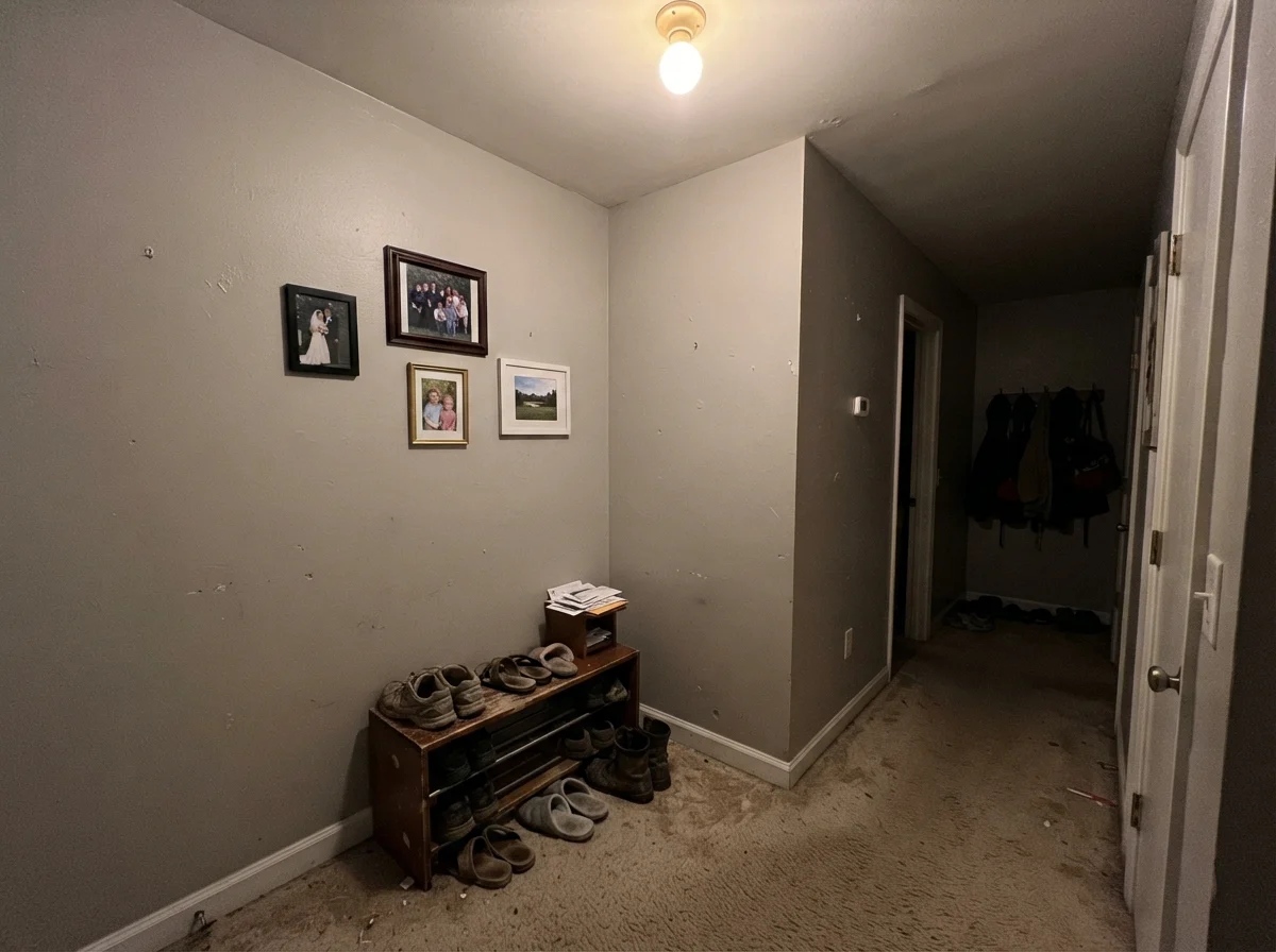
We agreed, bought the buckets, and painted the living room, center hall, and family room in a single week. For the first two years, I thought it was magic. It smoothed out the transition from our red oak flooring to our dark wood trim, stayed quiet behind family portraits, and gave the rooms an airy, calm backdrop. But then came November. In our north-facing front hall, under overcast skies, the color didn't look calm anymore—it looked dingy, bruised, and distinctly lavender.
That is the reality of Sherwin-Williams Agreeable Gray. It is the number nine globally ranked neutral and arguably the most popular interior paint in America for good reason: at an LRV (Light Reflectance Value) of 60, it hits a very specific sweet spot. It reflects enough illumination to make a modest room feel open without blinding you in full sun, and it balances gray and beige so evenly that most furnishings sit against it without a fight. But five years in, after watching it shift across three seasons and four exposures, you learn that Agreeable Gray is not a fixed color. It is a chameleon that demands real daylight to keep its promise.
The Three Shifts of Agreeable Gray
Agreeable Gray sits right at the intersection of taupe, beige, and slate. Because it does not lean heavily into any single pigment, ambient lighting completely dictates which personality takes over.
warm sun
overcast, north light
dusk, rain, cool bulbs
South light brings out the warm taupe; flat northern exposure strips the cream and leaves a cool, sometimes violet gray.
WhiskersPPG / Glidden · see diary
Tranquil GrayBehr · see diary
Agreeable GraySW 7029
Popular GraySherwin-Williams · see diary
Gossamer VeilSherwin-Williams · see diary
How Natural Light Commands the Wall
The biggest trap with Agreeable Gray is testing it on a poster board taped near a bright south-facing window and assuming it will look that pleasant in the dark corner behind the couch. In south-facing exposures or rooms flooded with midday sun, the beige pigment blooms. It turns soft, powdery, and warm, giving you that effortless modern background that designers rave about. You get all the crisp neutrality of gray without the coldness of a concrete sidewalk.
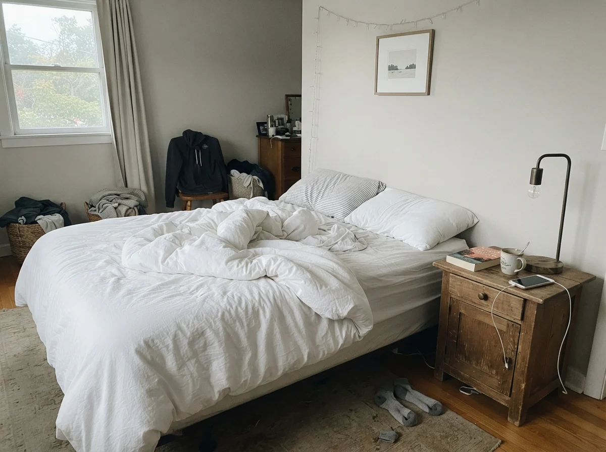
However, once the sun dips or when you step into a room that faces strictly north, the warm yellow-beige base vanishes. Cool natural light saps the life right out of the formula, pulling a shadowy, violet-gray undertone to the surface. It’s what painters quietly refer to as the "fleshy" or "bruised" cast. If your space has mixed light—such as an open-plan ranch where the kitchen gets morning sun and the adjoining family room sits under covered porch shade—Agreeable Gray will literally look like two completely different paint colors on connecting walls.
Artificial Bulbs: The 2700K vs. 4000K Divide
In our last house, I made the mistake of swapping our bedroom lamps for 4000K "daylight" LED bulbs because I thought they would help me see colors better while getting dressed. The very next evening, I walked into our bedroom and thought someone had repainted the room in primer. The cool artificial bulbs stripped every drop of warmth from Agreeable Gray, leaving the walls looking clinical and harsh.
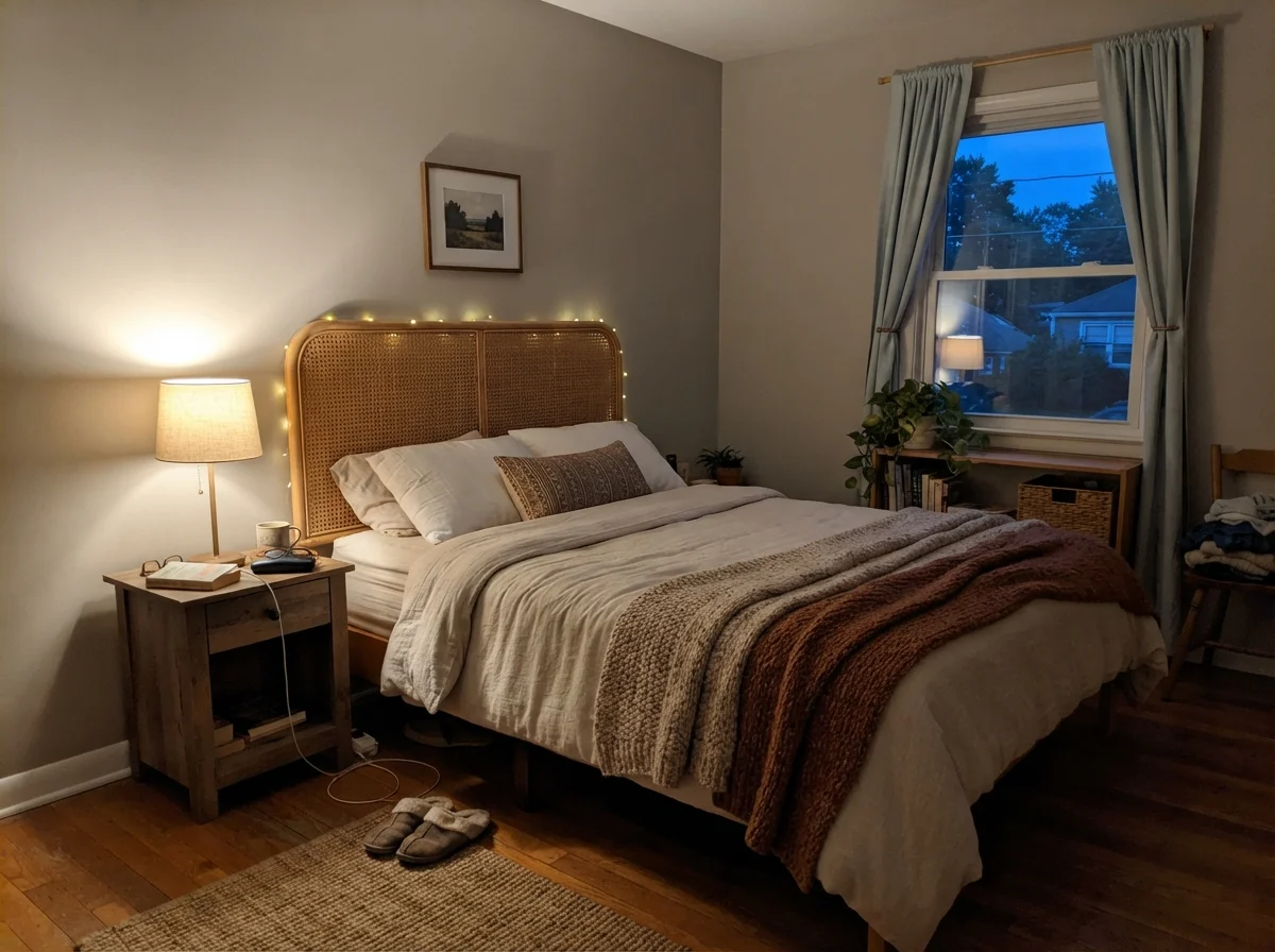
If you choose this paint, your light bulbs matter as much as the can itself. At 2700K (warm white), the room settles down into an inviting, gentle taupe that feels restful at night. If you push into 3500K or 4000K, you pull out the slate gray and risk triggering that purple undertone. Before you spend a thousand dollars repainting a room you hate, spend twenty dollars swapping your bulbs back to warm light.
Agreeable Gray Across Real Rooms
Because SW 7029 has an LRV of 60, it holds enough pigment to provide contrast against white baseboards without making smaller rooms feel claustrophobic. Let's look at how it actually performs across different rooms when lived with over years.
Living Spaces & Sunrooms
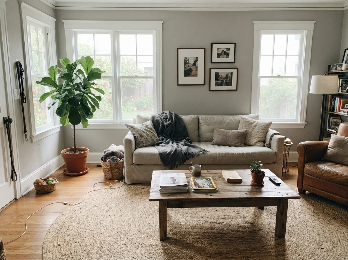
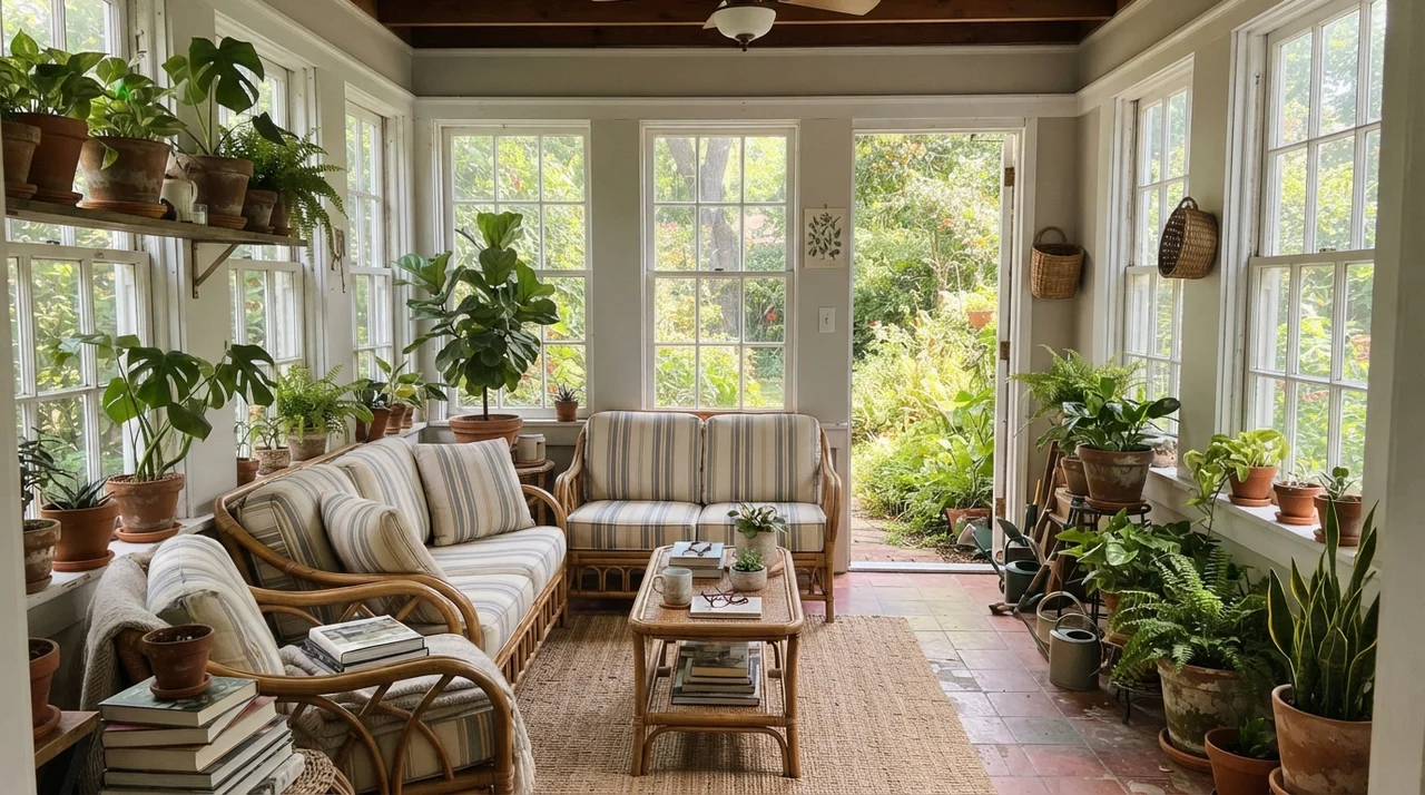
In bright living areas with large windows, this color is on its home turf. It is substantial enough to frame white window trim cleanly, yet passive enough that your rugs, art, and furniture take center stage. When we used it in a sunlit room, it never showed glare or chalkiness, even at peak afternoon light. For busy main floors where one wall flows directly into the next, it provides seamless whole-house continuity.
Kitchens, Cabinetry & Accent Islands
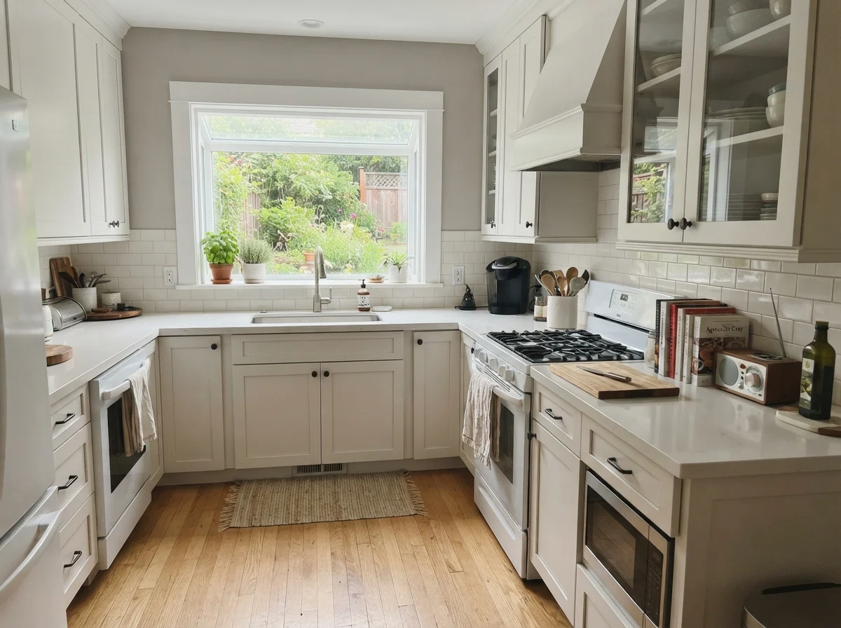
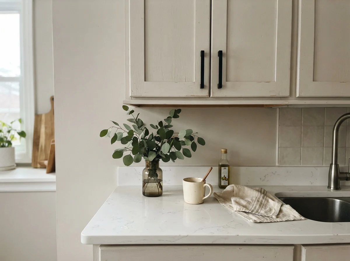
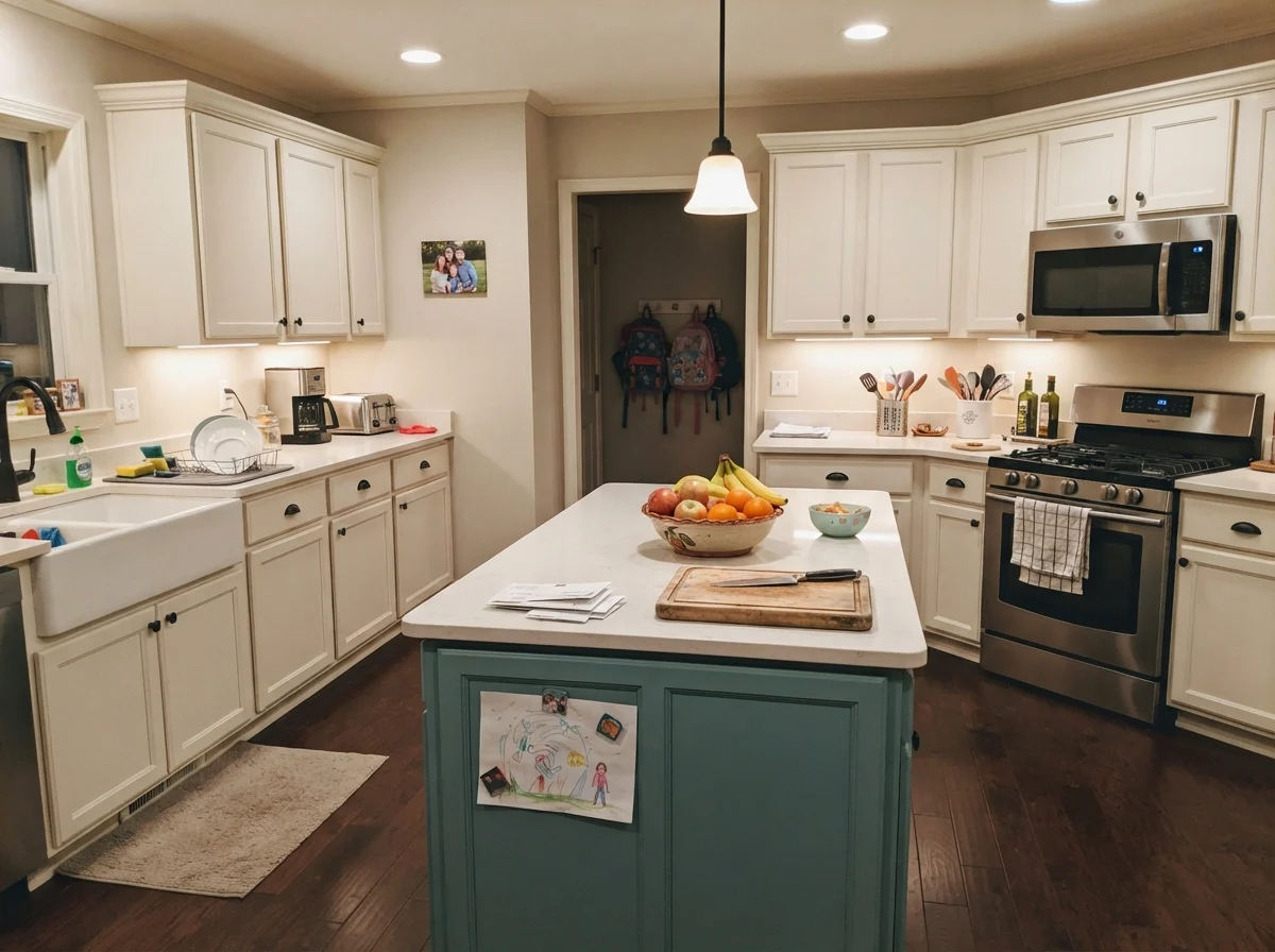
When used on kitchen cabinetry in a durable satin finish, Agreeable Gray delivers a grounded, tailored look that doesn't feel as stark as bright white or as heavy as charcoal. It pairs remarkably well with warm wood floors, butcher block, and brass or matte black hardware. If you are painting cabinets, however, keep your countertop undertones in mind: cool, violet-toned quartz will fight with Agreeable Gray, whereas warm soapstone or neutral white quartz lets it shine.
Bedrooms, Nurseries & Teen Spaces
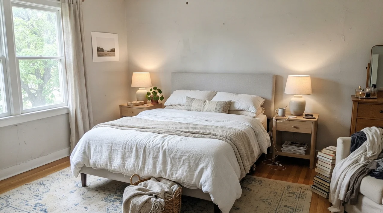
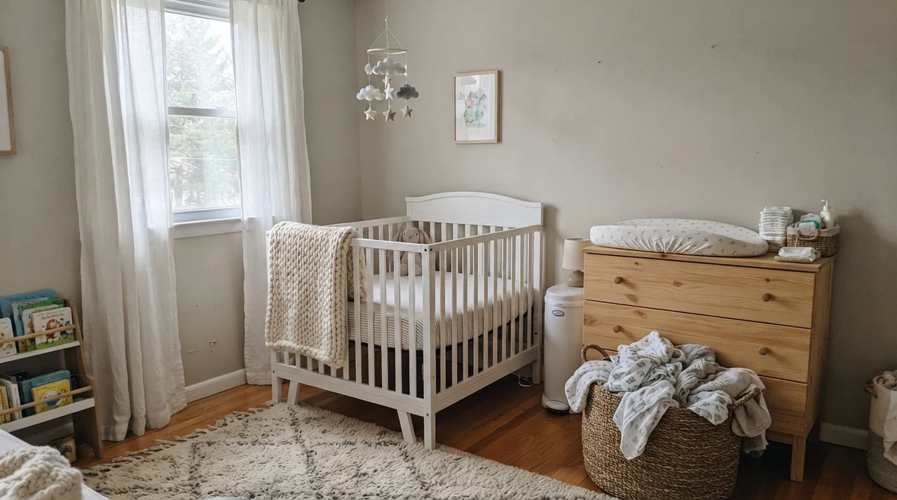
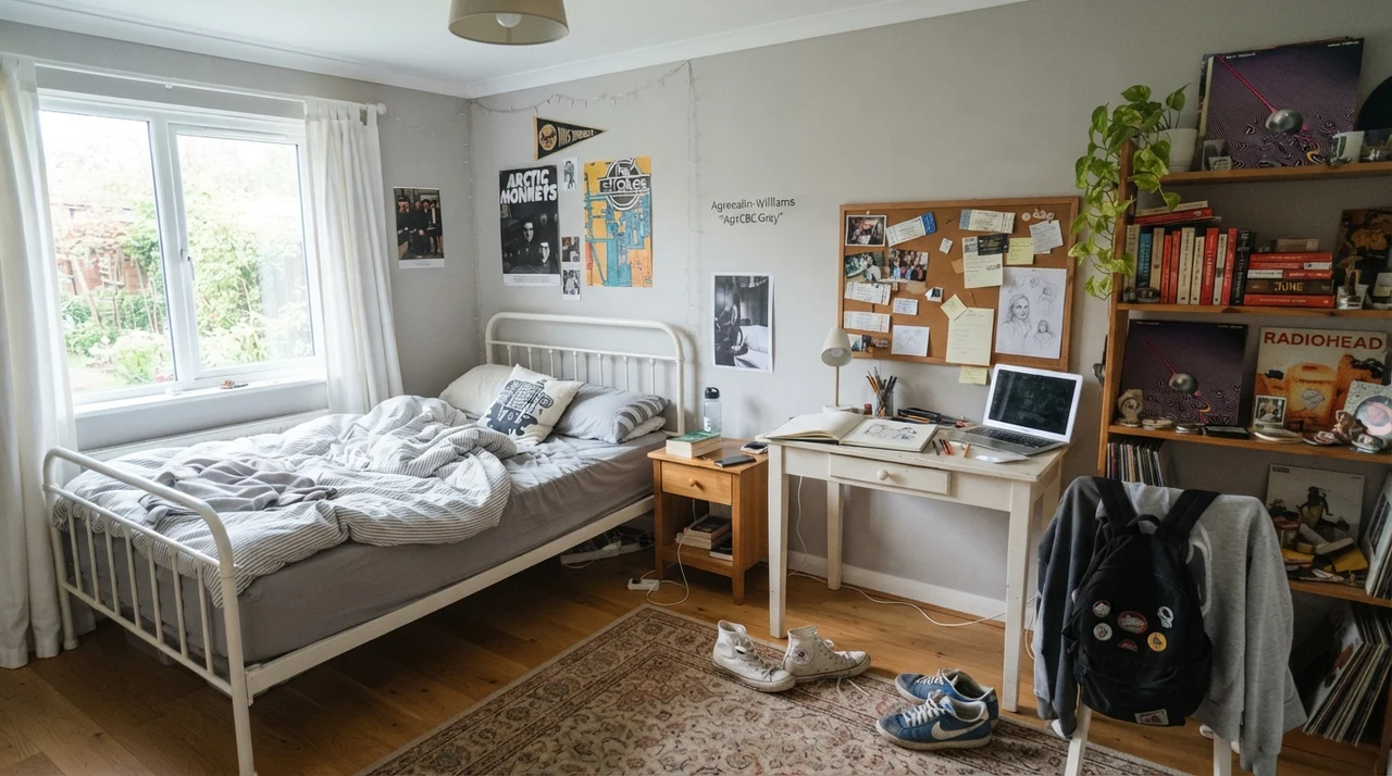
In bedrooms, Agreeable Gray functions as a soft neutral envelope that grows easily with changing decor. In our daughter's room years ago, we kept the walls neutral so we wouldn't have to repaint every time her taste shifted from pastels to band posters. In eggshell finish, it diffuses lamp glow gently, creating a restful atmosphere that avoids the clinical feeling of cooler grays.
Bathrooms, Laundry Rooms & Millwork Details
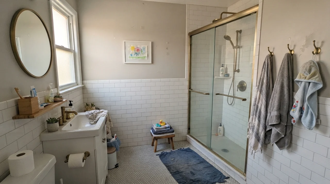
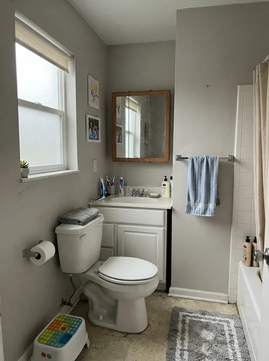
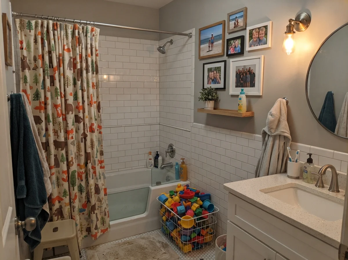
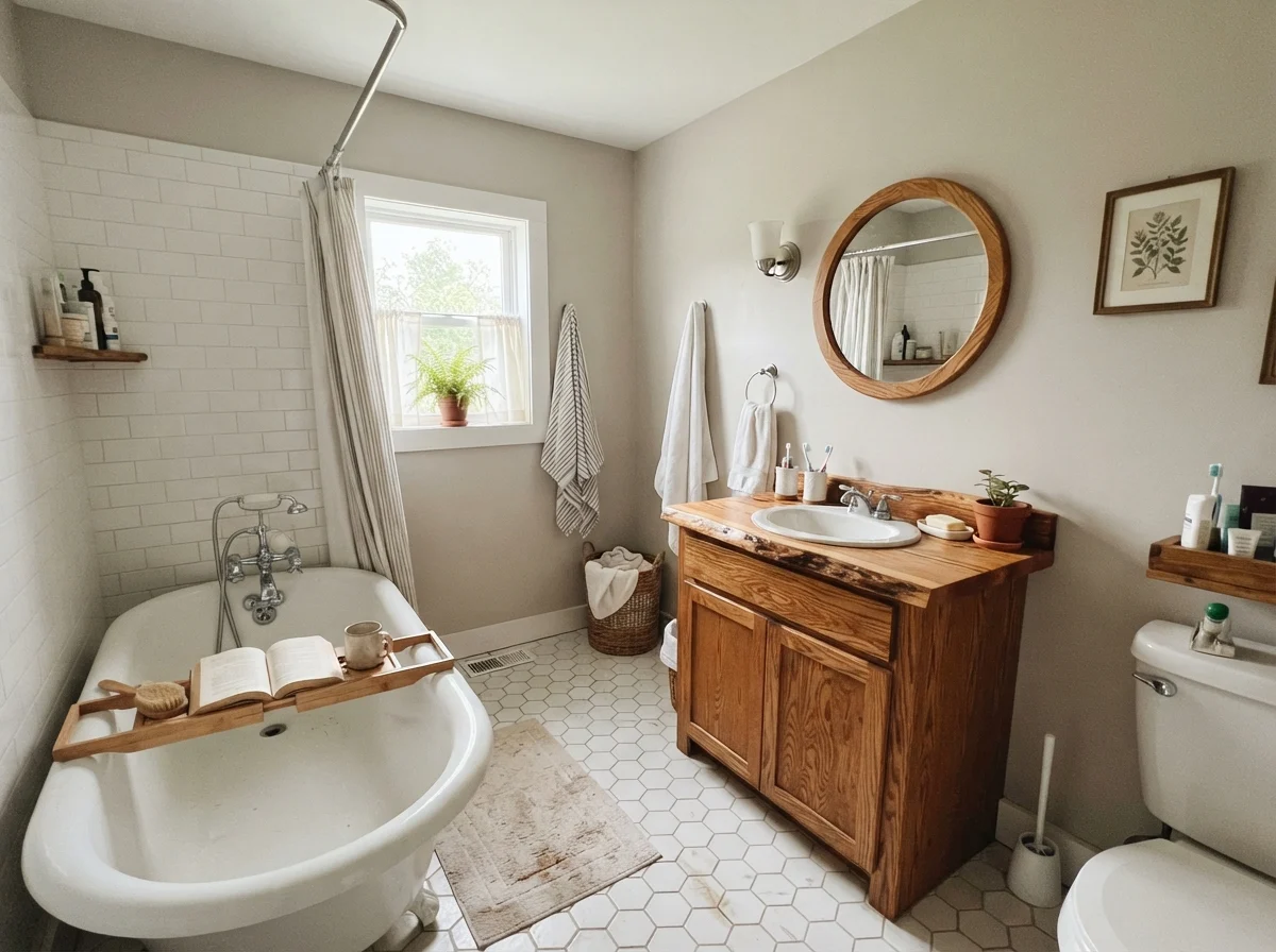
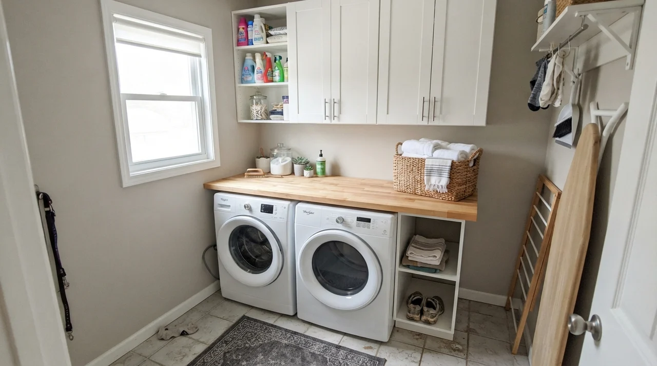
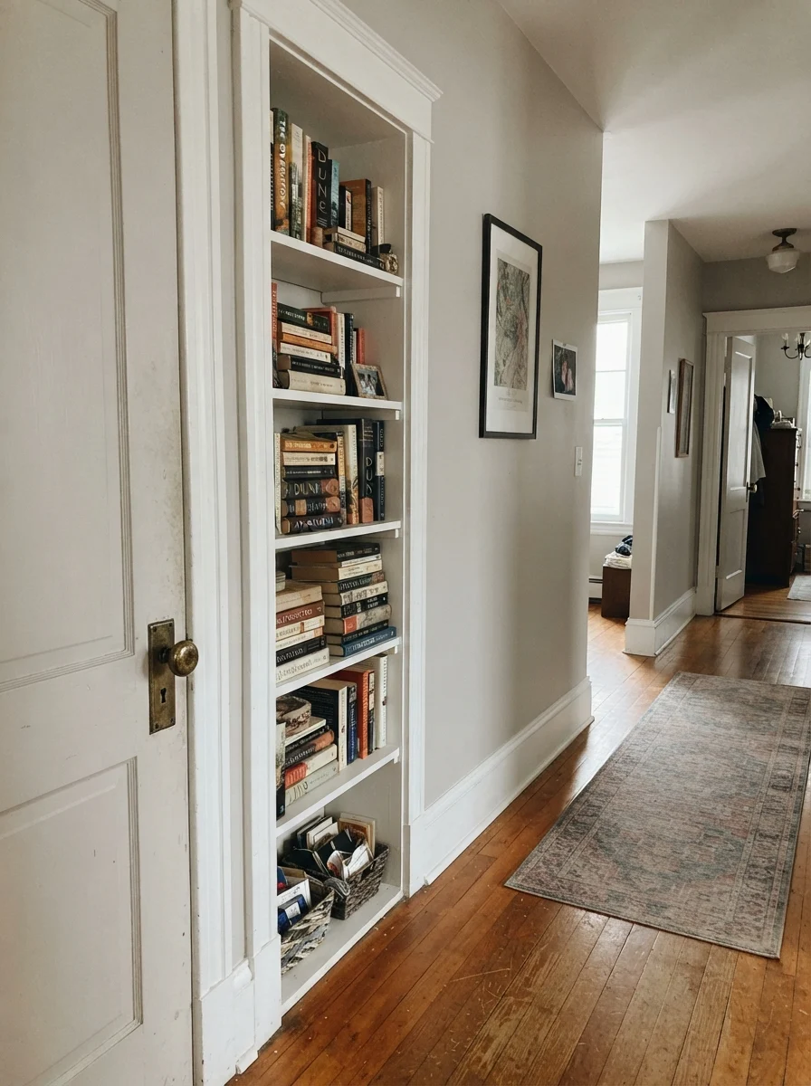
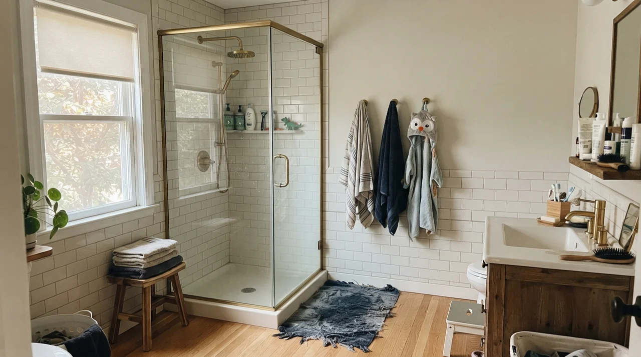
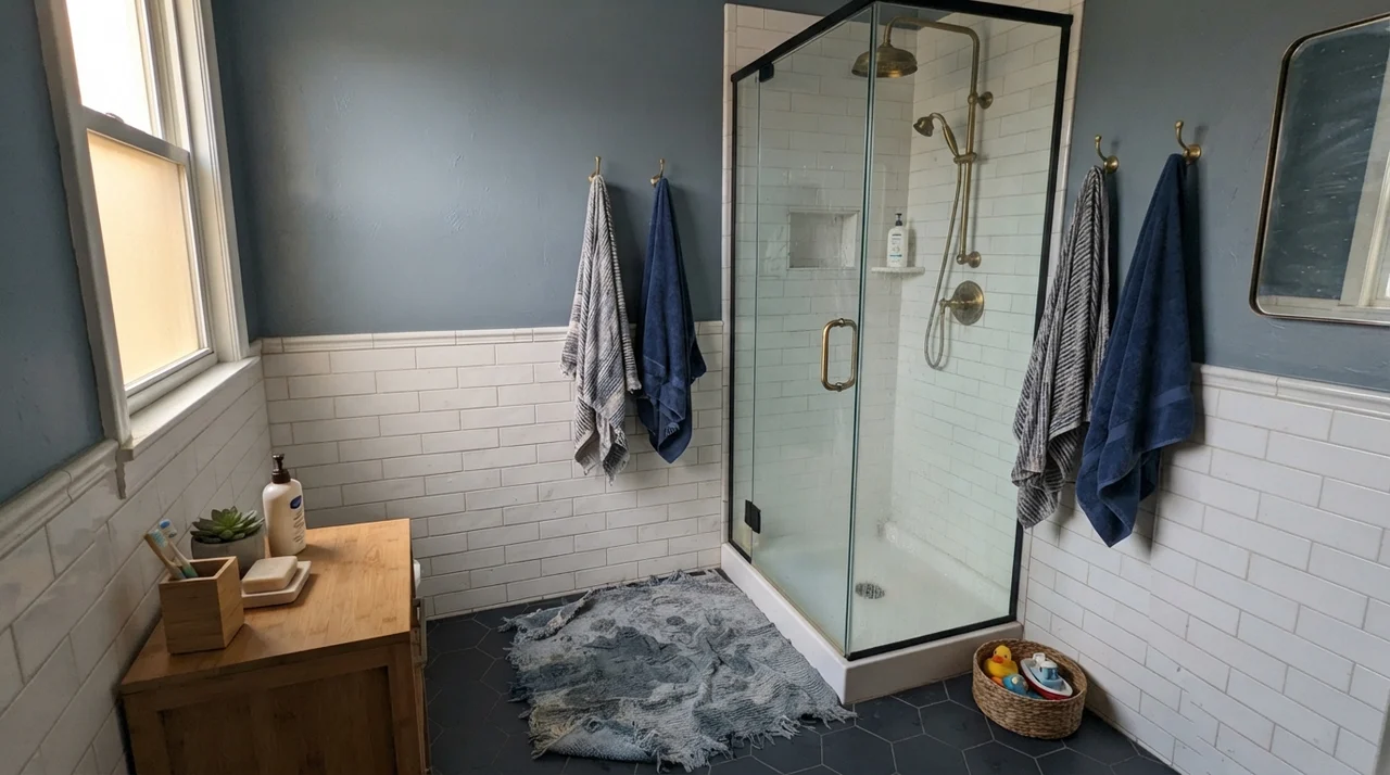
Bathrooms and laundry rooms are frequently tight on square footage and natural light, making LRV 60 an asset. When paired with bright white subway tile or clawfoot tubs, the paint gives just enough contrast to make fixtures pop. On interior passage doors or built-in bookshelves, painting them Agreeable Gray in semi-gloss against a softer off-white wall gives an architectural presence that looks custom rather than builder-grade.
Exterior Siding
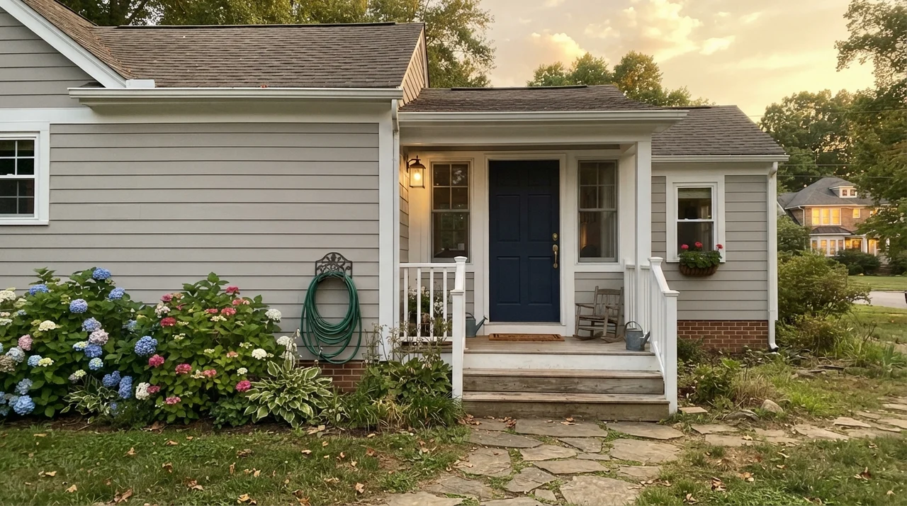
On an exterior, direct sunlight washes out paint dramatically. A color that looks mid-tone in a living room will look nearly two shades lighter outdoors. Agreeable Gray on horizontal siding reads as a calm, refined, creamy stone rather than a true gray. When paired with crisp white trim and a deep navy front door, it creates a tailored, timeless facade that never screams for attention.
The Honest Fails: Where Agreeable Gray Collapses
Agreeable Gray almost never fails on its own—it fails in company. Across thirty years of DIY painting and talking with neighbors who regretted their color choices, nearly every complaint about SW 7029 comes down to three specific mistakes you can identify before buying a single gallon.
1. Dim, Windowless, or Strictly North-Facing Rooms. North light is flat and cool, which strips away the yellow-beige warmth of the paint. What remains is a drab, muddy slate that frequently flashes a fleshy violet undertone. If you have a windowless hallway or dark basement, do not use Agreeable Gray expecting it to feel sunny. Look at Sherwin-Williams Accessible Beige (SW 7036) for true warmth, or Sherwin-Williams Gossamer Veil (SW 9165) which stays clean without turning purple.
2. Pairing with Cream Trim or Antique White Cabinets. This is the single most common installation disaster. When placed against a warm, yellow-based cream trim, Agreeable Gray gets forced into looking cold, dirty, and bruised, while the trim ends up looking jaundiced. They fight instantly. If your woodwork is cream and you cannot repaint it, choose Accessible Beige instead so the trim and walls share the same color family.
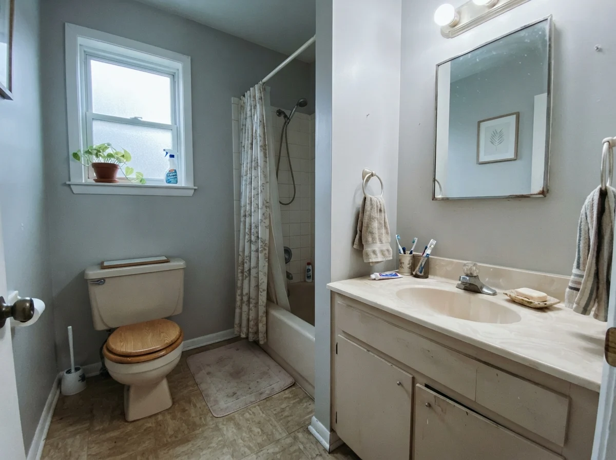
3. Cool Violet-Gray Flooring or Tile. Cool gray-purple luxury vinyl plank (LVP) or blue-gray bathroom tile will bring out the latent green in Agreeable Gray by sheer optical contrast. If your fixed flooring or counters lean cool, stop trying to warm them up with a greige; use a balanced light gray like Repose Gray (SW 7015) that complements the undertones rather than arguing with them.
Durability, Sheens & The Realities of Living with It
In thirty years and three houses, I have learned that wall color is only half the battle—the sheen and paint base determine whether you'll still love the room five years in. For Agreeable Gray, we specified eggshell on the living room walls and semi-gloss on the baseboards and door frames.
Eggshell provides just enough wipeability without creating distracting glare across wide drywall surfaces. In our busy hallway, muddy dog prints and scuffs from backpacks scrubbed clean with warm water and mild soap without burnishing the finish. Flat paint in a greige this light is not worth the money in high-traffic zones; every handprint will leave a permanent mark. For ceilings, however, stick strictly to flat white to keep the overhead light bounce even.
When we sold our colonial, Agreeable Gray proved its financial worth. Our listing agent loved that the entire main floor felt cohesive, bright, and neutral. Buyers didn't have to imagine their furniture in the house—the color stepped back and let them picture their own lives there. It looked fresh, modern, and completely unpretentious.
Agreeable Gray is not a color with an aggressive opinion. It is a quiet backdrop that either elevates everything around it or disappears completely depending on the window light.
What is the LRV of Agreeable Gray?
Sherwin-Williams Agreeable Gray (SW 7029) has a Light Reflectance Value (LRV) of 60. This places it right in the sweet spot for whole-house repaints—light enough to bounce light, but deep enough to contrast against white trim.
Does Agreeable Gray look purple or pink?
In north-facing light, low ambient lighting, or under cool 4000K LED bulbs, the warm yellow-beige pigment drops out, allowing a faint violet-gray undertone to surface. Testing a sample in your darkest room corner will reveal if this occurs in your home.
What is the best trim white for Agreeable Gray?
Sherwin-Williams Pure White (SW 7005) in semi-gloss is the most reliable trim match. It is clean and neutral without being stark. For a softer traditional look, Alabaster (SW 7008) also works well. Avoid yellow-toned cream trim.
What paint finish should I choose for Agreeable Gray?
Use eggshell on standard living and bedroom walls for scrubbability, semi-gloss on baseboards and doors, satin on kitchen and bath cabinets, and flat on ceilings.
Susan's Verdict · The Reliable Workhorse with Caveats
If you have an open main floor with generous natural light, warm oak floors, and crisp white trim, Agreeable Gray is worth the money. It connects rooms seamlessly, forgives daily family life, and helped us sell our colonial without a single objection. But if your room faces north, sits under dim ceiling bulbs, or connects to antique cream millwork, walk away. In those spaces, grab a can of Accessible Beige or Gossamer Veil instead and save yourself the repainting headache.