Color Diary · No. 3
Living with Sherwin-Williams Alabaster (SW 7008)
The warm white behind a decade of kitchen remodels and HGTV reveals, judged after years on real walls—where the cream glows, where it goes green-grey, and the rooms where it fails.

Susan HartleyAugust 27, 2026 · 18 min read
Alabaster · Sherwin-Williams SW 7008
Hex#EDEAE0LRV82Undertoneswarm cream → soft yellow → subtle green-grey in shade
When we bought our 1990s colonial back in 2004, the entire main level was painted a stark, paper-plate builder white that made our oak floors look orange and felt about as cozy as a hospital corridor. I spent the next decade hunting for whites that had actual warmth in their bones—paints that wouldn’t fight the wood trim or make our brass hardware look like a mistake. By the time Sherwin-Williams named Alabaster (SW 7008) their Color of the Year in 2016, I had already tested it on three doors, an upstairs hallway, and two bathrooms across two different houses. It became the darling of television makeovers and contractor spec sheets for good reason: on paper and under studio lights, it looks like the perfect soft white.
That is the thing nobody tells you about white paint when you are staring at a two-inch paper swatch in the store: you do not choose a white for the afternoon you roll it on. You choose it for year four, when the morning sun hits it, when the winter clouds roll in for three straight weeks, and after you have scrubbed clean the same spot around the door casing fifty times. Some whites take family life gracefully. Others turn flat, dingy, or noticeably yellow the second real life happens around them. I have lived with Alabaster long enough to know exactly where it is worth the money, where it earns its reputation, and where it will quietly betray you.
Alabaster sits at a Light Reflectance Value (LRV) of 82. In plain terms, that means it reflects eighty-two percent of the light entering a room, keeping it firmly in the white family rather than slipping into a heavy cream or beige. The gentle yellow underneath gives it that sought-after warmth that keeps drywall from feeling sterile. But that same yellow pigment means Alabaster is not a blank slate—it reacts constantly to the light outside your windows, your lightbulbs, and whatever materials you place right next to it.
The Undertone Reality: Cream, Yellow, and the Hidden Green-Grey Base
Every white paint has a personality that comes out the moment the sun moves. With Alabaster, the undertone story is simple: it has a soft yellow-cream heart anchored by a quiet green-grey base. In south-facing daylight or warm morning sun, that yellow reads as cozy, rich, and inviting. It makes old trim look intentional and softens the hard edges of a room. Most people walking into a sun-filled room painted in Alabaster simply register it as a clean, warm white.
However, when you pull daylight out of the equation—or when you feed it the flat, cool light of a northern exposure—that yellow gets neutralized, and the subtle green-grey base comes forward. It does not turn emerald green, but it loses its golden glow and goes slightly drab, like damp limestone or putty. If you put it in a dim room with zero direct sun, you will wonder why anyone called it warm. Recognizing how this undertone shifts from sunlit cream to shadowy grey is the difference between loving your repaint five years in and repainting the entire room six months later.
Alabaster Under Real Light
Because Alabaster holds both soft yellow warmth and a muted neutral base, its personality changes dramatically across the day and between exposures. Here is how its tone actually behaves when the light changes:
warm sun
overcast, north light
dusk, rain, cool bulbs
Alabaster shifts from a glowing, buttery cream in direct southern sunlight to a quiet, muted neutral on cloudy days, and leans cooler grey-green under dusk or cool artificial bulbs.
Greek VillaSherwin-Williams · see diary
Swiss CoffeeBenjamin Moore · see diary
AlabasterSW 7008
Shell WhiteSherwin-Williams · see diary
JaneBackdrop · see diary
Watching the Daylight Shift: Morning Cool to Evening Warmth
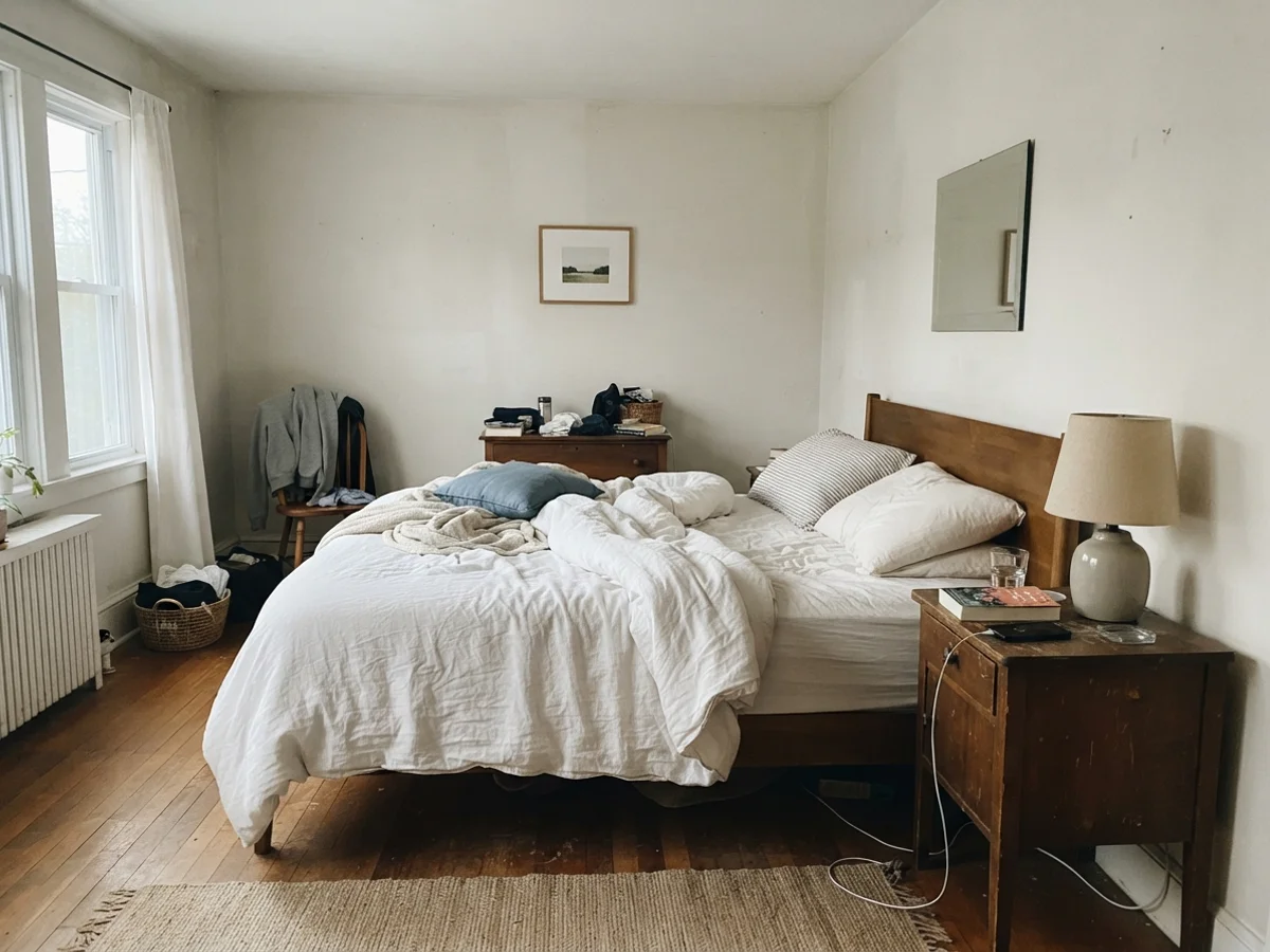
In our last house, I made the classic mistake of choosing a paint color on a Saturday afternoon when the sun was pouring through the windows, only to walk into the bedroom at seven o'clock on a Tuesday morning and wonder who swapped out my walls. Whites are shape-shifters. The exact same wall that looks washed out and chilled in early dawn will glow like fresh buttermilk by four in the afternoon once the lamps click on.
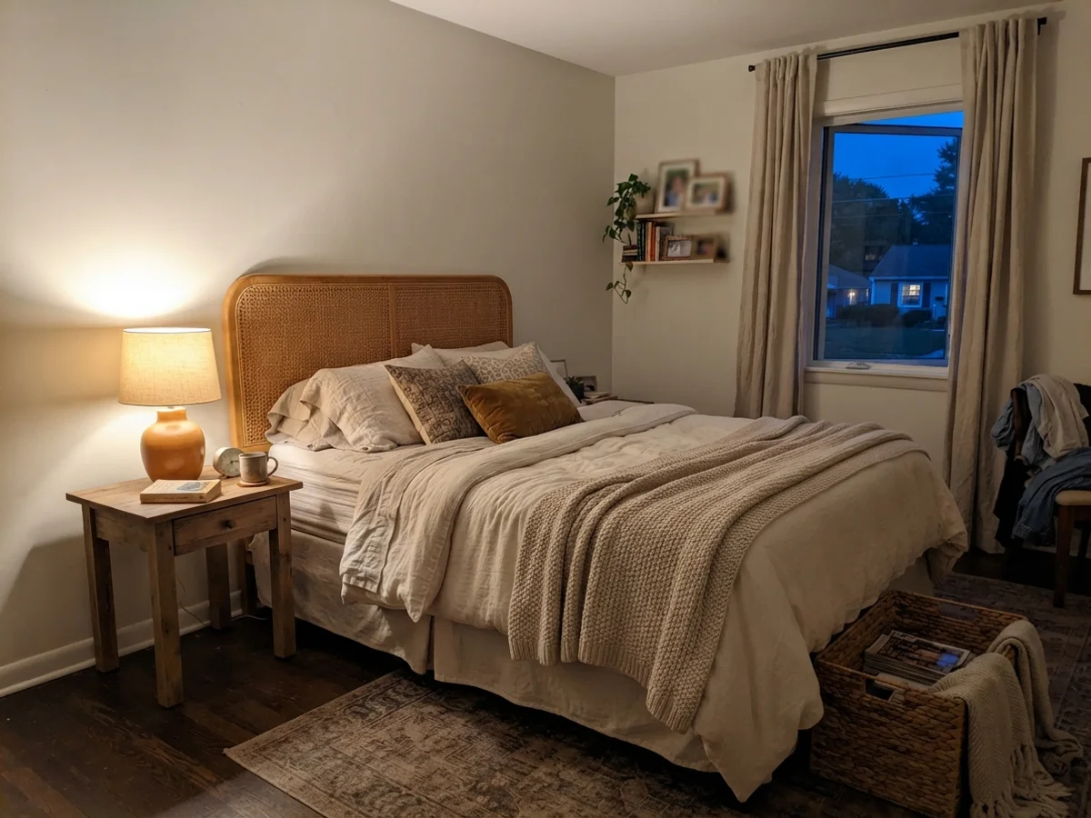
You can see that dramatic shift side-by-side below. On the left, the bedroom wakes up under cool, early-morning daylight with no lamps to help it along; Alabaster leans quiet, pale, and slightly washed out. On the right, that same bedroom in the evening, illuminated by a single warm 2700K table lamp while blue twilight sits outside the window. The warmth leaps forward, turning the space deeply restful and intimate. If you live in a climate with long, overcast winters, you need to be prepared for both faces of this color.
Where Alabaster Earned Its Name: Cabinets, Millwork, and Kitchens
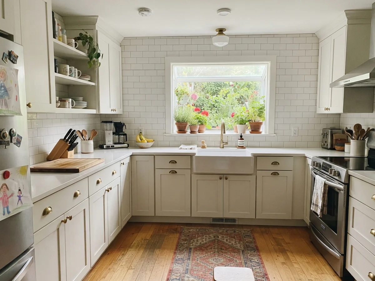
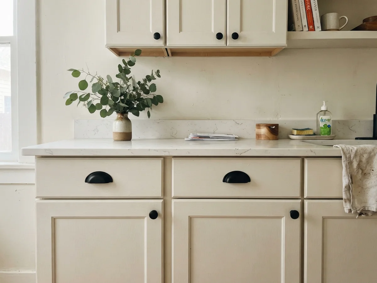
There is a reason Alabaster became the default kitchen cabinet color for every renovator on television for nearly a decade: on millwork, it solves the cold-kitchen problem. A pure, stark white on cabinet doors can make an entire kitchen feel like an operating room, especially if you have stock shaker doors from a big-box store. Painting those doors in Alabaster satin gives them an immediate sense of weight and age. It makes stock cabinets look custom, not builder-grade.
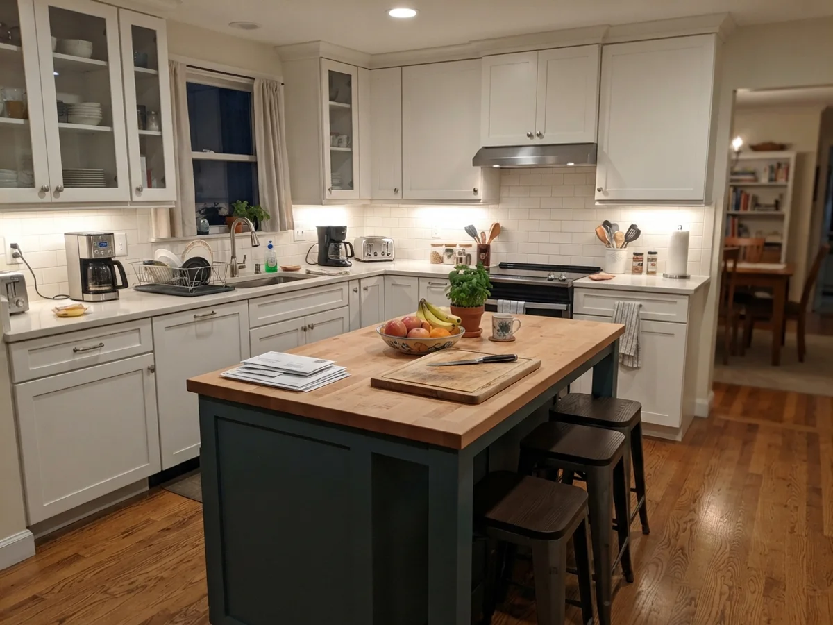
We repainted the lower cabinets in our 1960s ranch kitchen with Alabaster satin, and it held up beautifully to grease splatters, wet hands, and three decades of kitchen traffic. When you pair it with warm brass hardware, oil-rubbed bronze, or natural light oak flooring, the yellow in Alabaster settles down and just looks rich. The satin finish wipes down effortlessly, and unlike stark white cabinets that highlight every crumb and tiny dent in the wood, Alabaster hides minor imperfections with total ease.
A quick warning about kitchen counters and backsplashes, though: Alabaster looks like a true white only until you put something icy-cold next to it. If you have bright, cool Carrara marble, crisp arctic-white quartz, or bright vinyl window frames, Alabaster's warm undertone gets pushed hard toward yellow or dingy beige. If your counters are stark white, use Pure White SW 7005 instead. But if your counters have warm veining, cream flecks, or soapstone warmth, Alabaster is as good as it gets.
Living Rooms, Sunrooms, and Everyday Spaces
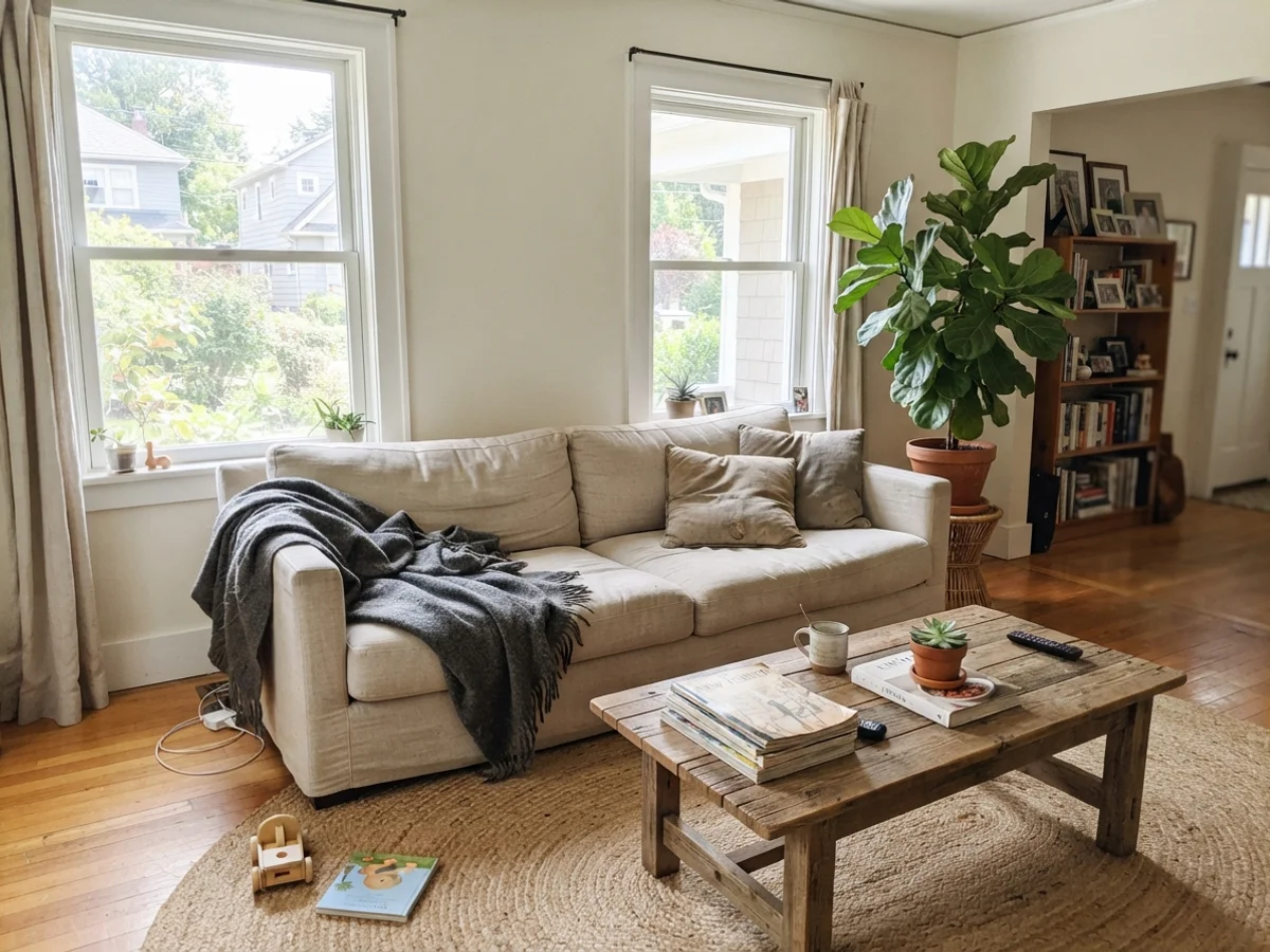
In living rooms that receive generous south or east daylight, Alabaster does something magical. It gives you a light, airy canvas with LRV 82 brightness, but without the sterile echo of modern gallery whites. In our living room, eggshell walls in Alabaster let our linen sofa, vintage wood coffee table, and jute rugs take center stage. Because the color has body, art pops against it without looking like it is hanging in a commercial showroom.
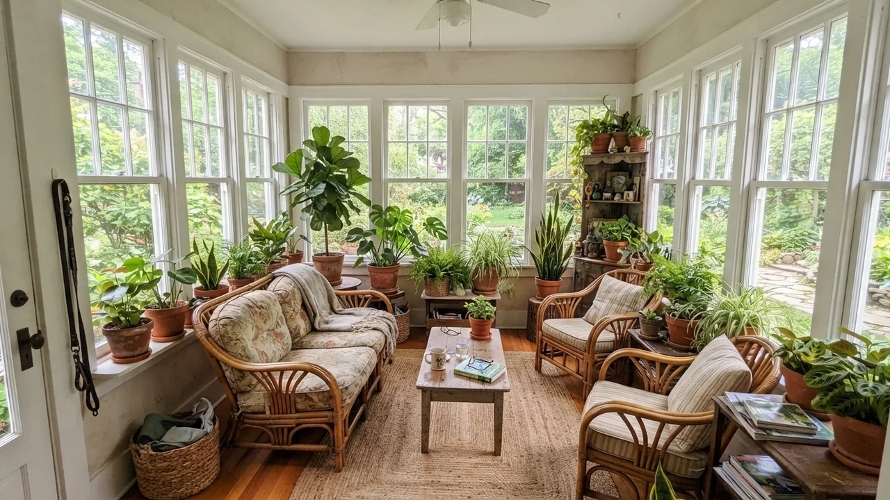
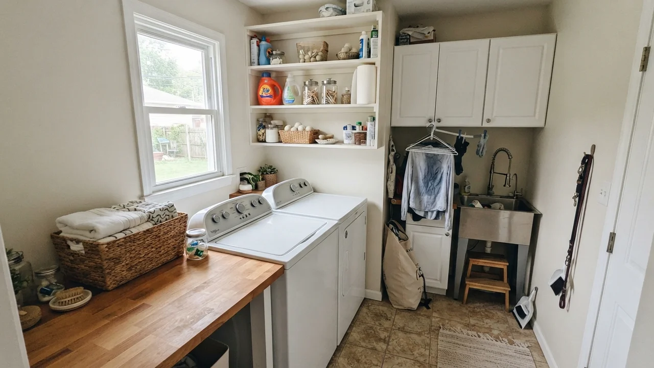
The same holds true in sunrooms and bright laundry rooms. When daylight floods the room from multiple angles, the paint washes out to a soft, clean white that flatters green houseplants, terracotta pots, and natural wicker or butcher-block surfaces. It feels fresh and sunlit, never blinding.
Bedrooms and Nurseries: The Cozy Side of White
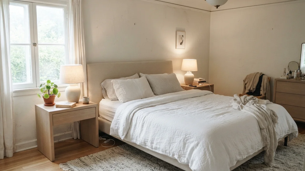
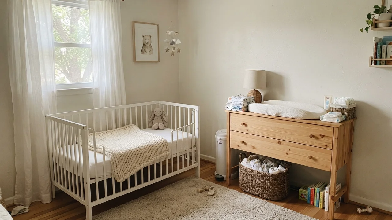
In a bedroom, your paint needs to work just as hard at nine o'clock at night under bedside lamps as it does at noon. A harsh blue-white will make a bedroom feel cold and unwelcoming once the sun goes down. In the main bedroom and nursery, Alabaster eggshell creates a soft, cocooning backdrop that pairs naturally with white linen bedding, oak nightstands, and ceramic lamps.
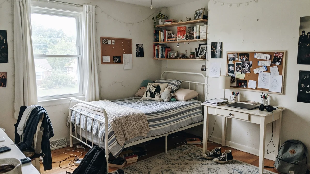
For teenagers' rooms and nurseries alike, having a warm white on the wall means you can swap bedding, rugs, and colorful artwork over the years without ever having to repaint the shell of the room. It handles the transition from baby knit blankets to teenage corkboards and sneakers without skipping a beat.
Bathrooms: Where Tile Temperature Dictates Everything
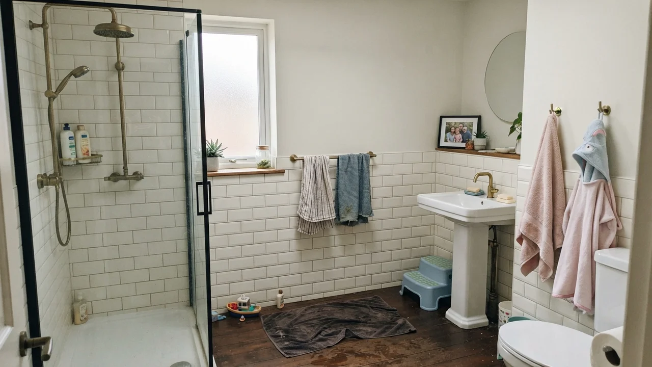
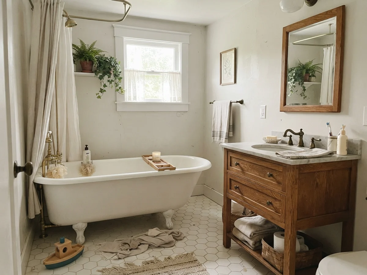
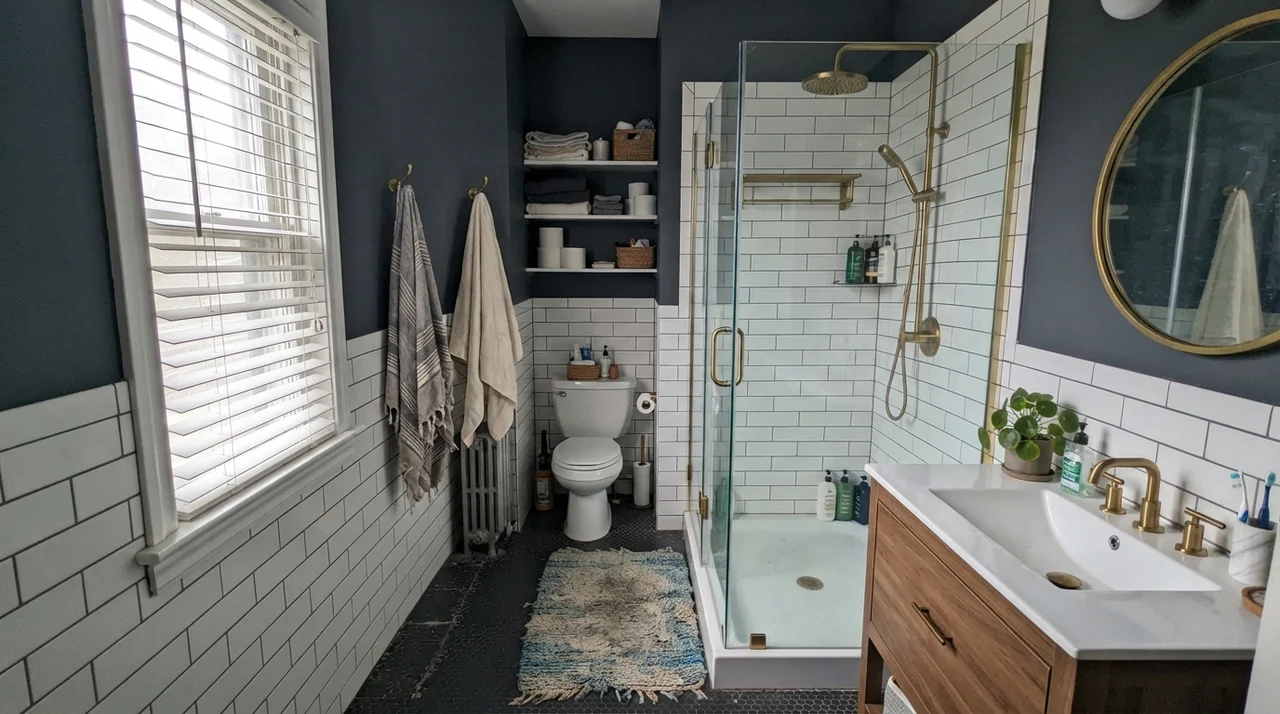
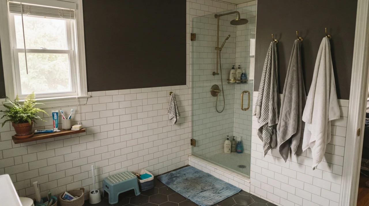
Bathrooms are the true testing ground for warm whites. Because bathrooms are packed with porcelain fixtures, glossy tile, mirrors, and tight corners, paint undertones have nowhere to hide. If your bathroom features white subway tile wainscot, an oak vanity, and brass fixtures, Alabaster looks intentional, vintage, and warm. It bridges the gap between classic cottage style and modern function effortlessly.
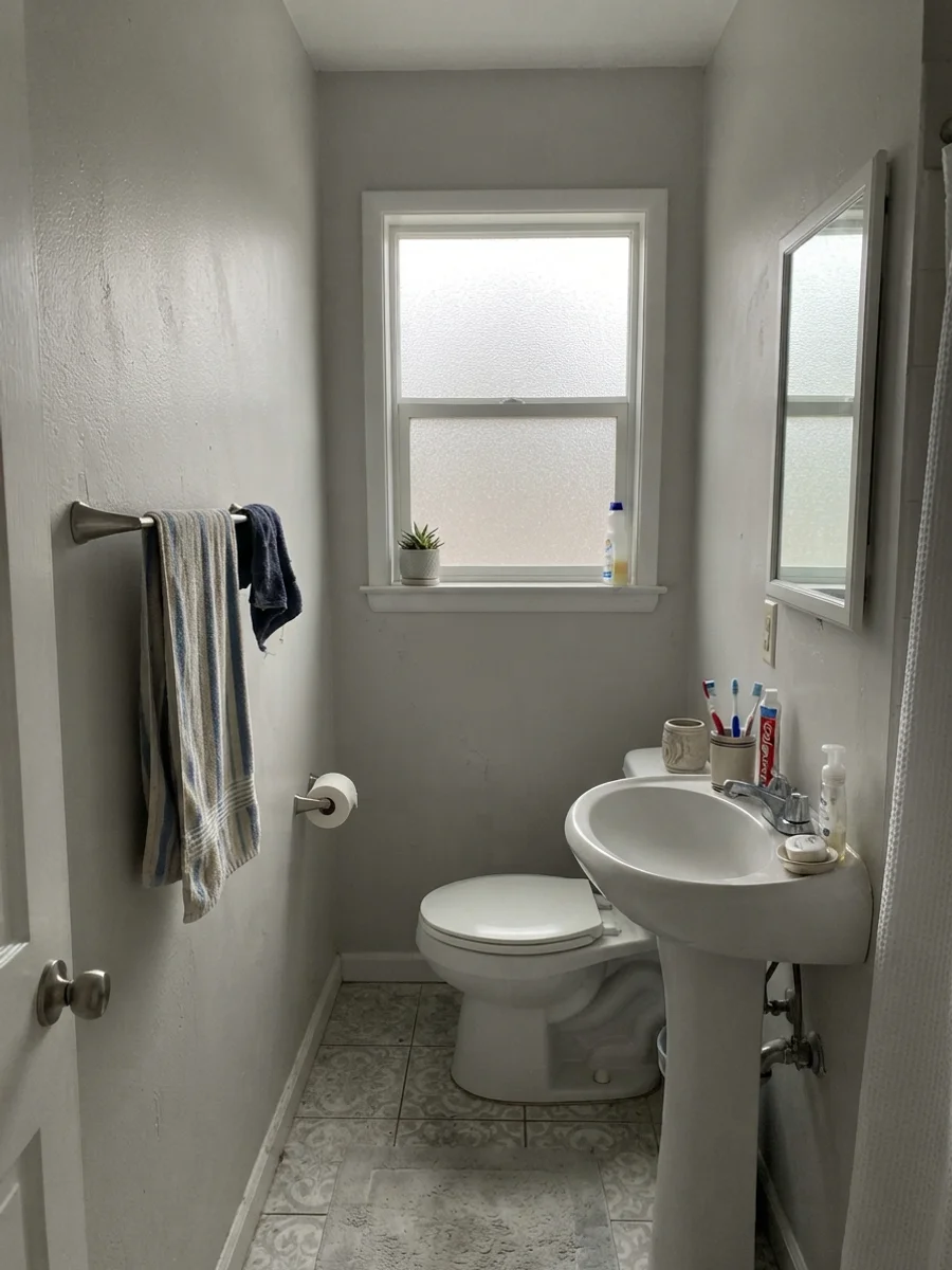
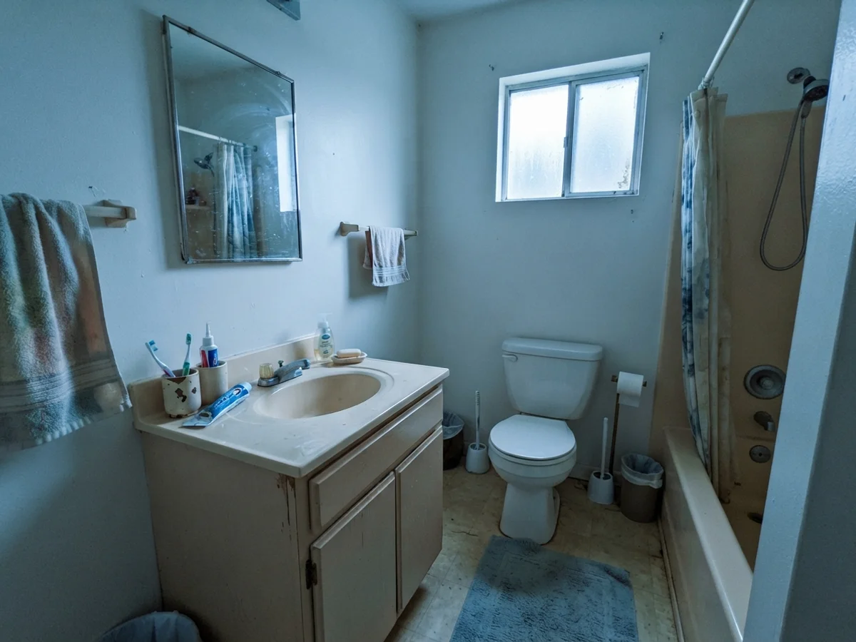
However, light quality in a bathroom changes everything. When a bathroom gets flat, overcast light through a frosted window, Alabaster drops its cream persona and turns quiet, soft, and slightly greyed out. In a north-facing bathroom on a rainy day, that cool daylight cancels out the yellow pigment entirely, leaving behind a faint green-grey shadow that can look tired next to older beige vanities.
Alabaster is a chameleon that looks like pure warmth until you put it next to icy tile or stick it in a windowless hallway, where the green-grey base suddenly takes over.
The Honest Fail: When Alabaster Goes Flat and Muddy
Almost every bad Alabaster story comes down to one simple physical fact: the yellow in the formula has nowhere to hide, and when you starve it of warm light or put it in a dark corridor, the color falls apart. I have seen homeowners spend thousands on a whole-house repaint, only to complain that their hallway looks like dirty dishwater. They blame the painter or think the paint store mixed the can wrong. It wasn't the store; it was the physics of light.
Take a look at the windowless hallway corner below. Under a single weak ceiling bulb with beige carpet, Alabaster cannot generate warmth on its own. Without natural sunlight to illuminate the cream, the yellow gets snuffed out, and you are left staring at a flat, muddy putty tone. If you have an enclosed hallway, a basement with no windows, or a room with heavy north light, do not use Alabaster expecting a glowing white. Reach for Greek Villa SW 7551 if you want genuine warmth that stays bright, or Pure White SW 7005 if you need a clean white that will not turn to mud in the shadows.
Doors, Built-ins, and Exterior Siding
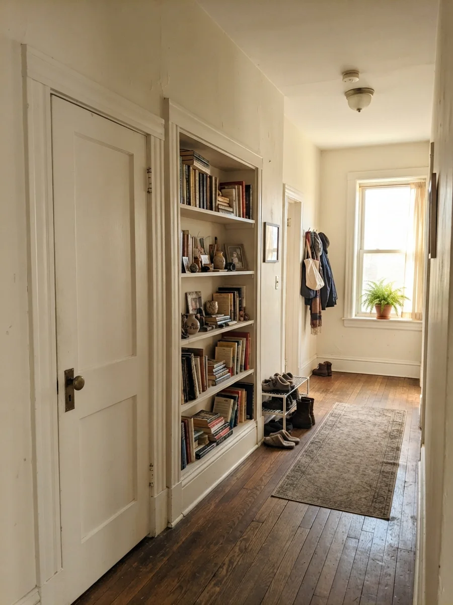
Where Alabaster truly shines without apology is on interior doors, trim work, and exterior siding. If you live in an older home with classic wood floors and brass hardware, painting your two-panel interior doors and built-in bookshelves in Alabaster semi-gloss creates a gentle, historic elegance. It softens the architecture where a stark commercial white would feel aggressive and out of place.
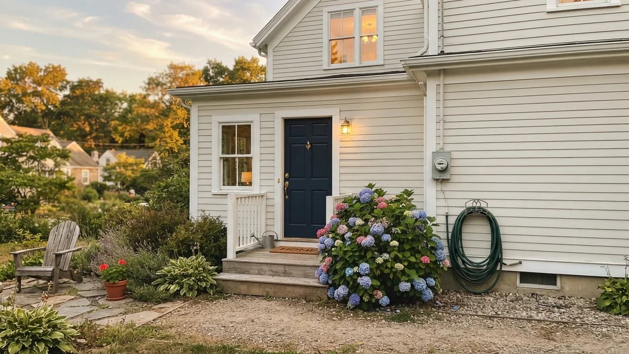
On the exterior of a home, bright sun naturally washes out all paint colors by several shades. Outdoor daylight makes Alabaster read much brighter, cleaner, and whiter than it does inside your living room, without ever producing that harsh, blinding glare that pure whites cause on sunny afternoons. Paired with dark trim, cedar accents, or a deep navy front door, it looks rooted, timeless, and substantial.
Choosing the Right Trim White for Alabaster
Picking the trim color to accompany Alabaster walls is where many DIYers get tripped up. Because Alabaster is already an off-white, putting a stark, blue-toned builder white on the baseboards will make your walls look dirty by comparison. You have two proven paths: contrast with a crisper neutral white, or the designer monochrome trick.
My favorite approach in small rooms or hallways is using Alabaster everywhere: eggshell on the walls, semi-gloss on the trim, and flat on the ceiling. Because the sheen changes how the light hits the surface, the trim looks subtly crisper, but you avoid any harsh contrast lines that chop up the space. If you prefer defined trim, Pure White SW 7005 gives you just enough brightness to create a clean border without triggering an undertone war.
Pairing Alabaster with Finishes, Materials, and Architecture
After repainting dozens of rooms across thirty years, I have learned that wall paint never lives in a vacuum. It reflects off your floorboards and takes on the personality of your lighting fixtures. Alabaster loves natural materials: warm white oak, antique walnut, unlacquered brass, soapstone, and textured linen all bring out its best qualities. Conversely, cool grey luxury vinyl plank (LVP) flooring, icy grey Carrara marble, and cold chrome hardware will actively drag Alabaster into an awkward, dirty-looking clash.
Durability, Sheens, and Long-Term Wear: Five Years In
Let's talk about the practical side that swatches never show: how does Alabaster actually hold up to family life? When we repainted our hallway and kitchen cabinets, I chose Sherwin-Williams Emerald in Satin for the woodwork and Duration Home in Eggshell for the walls. Here is my rule of thumb on sheens for Alabaster:
- Walls: Eggshell. It gives you just enough wipeability without creating glossy reflection glare across broad drywall surfaces.
- Trim & Doors: Semi-Gloss. The harder enamel finish resists shoe scuffs, pet marks, and vacuum cleaner dings.
- Cabinets: Satin. Satin provides a smooth, furniture-grade finish that wipes clean without the high-shine plasticky look of gloss.
Five years in, Alabaster holds up exceptionally well compared to starker whites. A bright gallery white shows every greasy fingerprint, pencil line, and scuff mark the moment someone brushes against it. Because Alabaster has a touch of cream and grey in its DNA, it disguises everyday dust and small wall imperfections far better than high-LRV whites. When you do have to scrub clean a smudge around a high-traffic light switch, high-quality Sherwin-Williams paint formulas hold their color without leaving a burnished, shiny spot behind.
One vital budget note: do not try to save ten dollars by color-matching Alabaster at a different paint counter using cheap base paint. Sherwin-Williams bases have specific undertone characteristics. When big-box stores attempt to color-match Alabaster into another brand's base, it almost always comes out noticeably yellower or dingier. Buy the genuine can—it is worth the money every single time.
How Alabaster Compares to Other Iconic Whites
If you are standing in the paint aisle holding four white swatches and feeling overwhelmed, you are not alone. Here is how Alabaster compares directly to its closest competitors so you can make your choice with confidence.
Does Sherwin-Williams Alabaster look yellow on walls?
In rooms with generous natural sunlight or warm incandescent bulbs, Alabaster reads as a soft, creamy off-white rather than true yellow. However, if paired against stark white quartz counters, bright white subway tile, or cool grey floors, its yellow undertone becomes much more noticeable.
What is the LRV of Alabaster and what does it mean?
Alabaster has an LRV (Light Reflectance Value) of 82. This places it solidly in the off-white category, reflecting 82% of light to keep spaces bright and open without producing the sterile glare of higher-LRV gallery whites.
Can I use Alabaster on both walls and trim?
Yes, using Alabaster on both walls and trim is one of the most effective ways to paint a home. Use eggshell on the walls and semi-gloss on the trim; the difference in sheen creates subtle definition while eliminating harsh contrast lines in hallways and small rooms.
Why does Alabaster look grey or green in my room?
In dim rooms or spaces with north-facing exposure, the cool daylight cancels out Alabaster's warm yellow pigment. When that happens, the quiet green-grey base comes forward, making the walls look somewhat flat, cool, or muted.
What color lightbulbs look best with Alabaster?
Warm 2700K bulbs bring out Alabaster's cozy, buttery cream warmth for living rooms and bedrooms in the evening. If you prefer a cleaner, crisper look in a workspace or laundry room, 3000K to 3500K bulbs keep it bright without triggering cool green undertones.
Is Alabaster good for kitchen cabinets?
Alabaster in a satin finish is one of the most popular cabinet colors in America. It makes stock shaker cabinets look custom and high-end, provided your countertops and backsplash are warm or neutral rather than stark, icy white.
The Final Call: What I'd Do Today
When you look back over three houses and three decades of repainting, you realize that trendy colors come and go, but the whites that endure are the ones that make living in a home comfortable. Alabaster isn't perfect for every single drywall surface in the country—no white paint is. If your house is full of cool grey floors, icy marble, and dim north-facing windows, you will end up repainting it within two years.
But if your home is filled with natural wood, warm sunlight, classic brass hardware, and the everyday mess of real family life, Alabaster delivers exactly what it promises. It is a warm, forgiving, timeless white that makes cabinets look custom and rooms feel like home. Five years in, when the morning light floods your kitchen and your cabinets still look rich and welcoming, you will be glad you bought the real can.
Susan's Verdict · Worth the Money for Warm Homes
Sherwin-Williams Alabaster earns its iconic status on cabinets, trim, and sunlit living spaces where oak, brass, and warm stone live. At LRV 82, it delivers soft warmth that hides minor wall flaws without looking sterile. Skip it in dim windowless hallways or against cool grey LVP floors, but in daylit rooms with natural materials, it is one of the most dependable warm whites you can buy.