Color Diary · No. 122
Sherwin-Williams Caviar Belongs on Cabinets, Not Four Walls
The cooler, blue-leaning black in Sherwin-Williams' deck, reviewed honestly: where it earns its keep on cabinets and doors, the whole-room mistake that swallows a space, and how it actually compares to Tricorn Black.

Susan HartleyNovember 14, 2026 · 18 min read
Caviar · Sherwin-Williams SW 6990
Hex#313031LRV3Undertonesgraphite black → cool blue-charcoal → muted slate
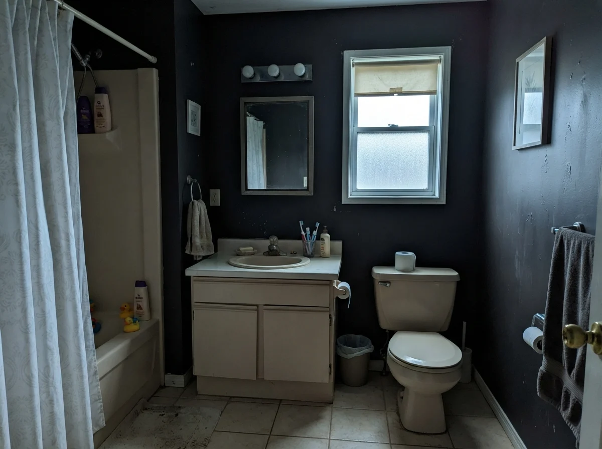
In our last house—the 1990s colonial with the drafty family room—I convinced myself that painting our small downstairs powder room in a midnight shade would feel like stepping into a chic downtown hotel. I bought three gallons of dark paint, bypassed the primer shelf entirely because I was impatient, and spent an entire Saturday rolling what felt like black ink over white builder drywall. By Sunday afternoon, the room had not become a boutique hotel. It had become a coal bin with a sink. The light from our lone frosted window was completely swallowed, the roller marks flashed like ribbons under the vanity globe, and the space felt so tight that guests started making polite excuses to use the upstairs bath instead. I lived with it for seven months before surrendering to two coats of gray primer and repainting the entire thing.
That was my first real lesson in Light Reflectance Value, though nobody at the paint counter called it that back then. Sherwin-Williams Caviar (SW 6990) sits right at the bottom of the deck with an LRV of 3. When you look at an LRV of 3 on a two-inch paper chip under retail fluorescent strips, you see a sophisticated, moody charcoal-black. What the chip fails to tell you is that a surface reflecting only three percent of incoming light behaves like a sponge. In a house where real people drop coats, track in mud, and search for their keys, that kind of darkness demands absolute architectural intention. It is not a color that forgives casual enthusiasm.
Over thirty years and three houses, I have watched dark paints cycle through every possible iteration. We did deep hunter green in our first house back in 1998, and it looked dated within five years. We went through the heavy espresso phase in the mid-2000s, which looked dated within three. But a true, disciplined black, applied with restraint on the right surface, has an entirely different staying power. Caviar is one of those paints that can look astonishingly tailored or utterly suffocating, and the difference between the two almost always comes down to where you put the borders.
The Cool Graphite Undertone Behind the Black
Every dark paint in the fan deck is hiding a color behind its pigment load. True blacks are rare; most near-blacks lean decisively brown, green, or blue once daylight hits them across a flat surface. Caviar is built on a cool, graphite-blue base, which sets it apart from dead-neutral blacks and warm, earthy near-blacks alike.
warm sun
overcast, north light
dusk, rain, cool bulbs
Caviar's base carries a cool graphite cast that sharpens under morning daylight and stabilizes into a velvety blue-black under neutral light. In warm afternoon light it softens, but never turns brown.
Black MagicSherwin-Williams · see diary
BlackBenjamin Moore · see diary
CaviarSW 6990
Tricorn BlackSherwin-Williams · see diary
OnyxBenjamin Moore · see diary
When you place Caviar against a dead-neutral black like Tricorn Black, the difference is immediate. Tricorn is flat, absolute, and indifferent to its surroundings; it refuses to lean warm or cool. Caviar, by contrast, has a quiet pulse of slate and graphite. On an overcast morning, that blue-gray whisper comes forward, giving the paint a tailored, iron-like dignity. But under direct late-day sun, the blue recedes and the black reads crisp and grounded. That subtle shift is why people fall in love with it on cabinetry, and it is also why it can look surprisingly chilly if you surround it with golden oak floors or yellow-tinted creams.
The Daylight Test: Why Morning and Evening Tell Different Stories
The cardinal rule of living with near-black walls is understanding what happens when the sun moves across your roofline. In our 1970s split-level, we had an east-facing den that received dazzling sun from seven until ten in the morning, followed by cold, flat shadow for the rest of the day. A dark paint in that room lived two completely different lives every twenty-four hours. Caviar does exactly the same thing. In early morning light, when the sun is low and cool, the blue-gray component sharpens, giving the surface a lean, almost industrial feel. If you do not have warm lighting planned for four in the afternoon, that sharpness can start feeling austere.
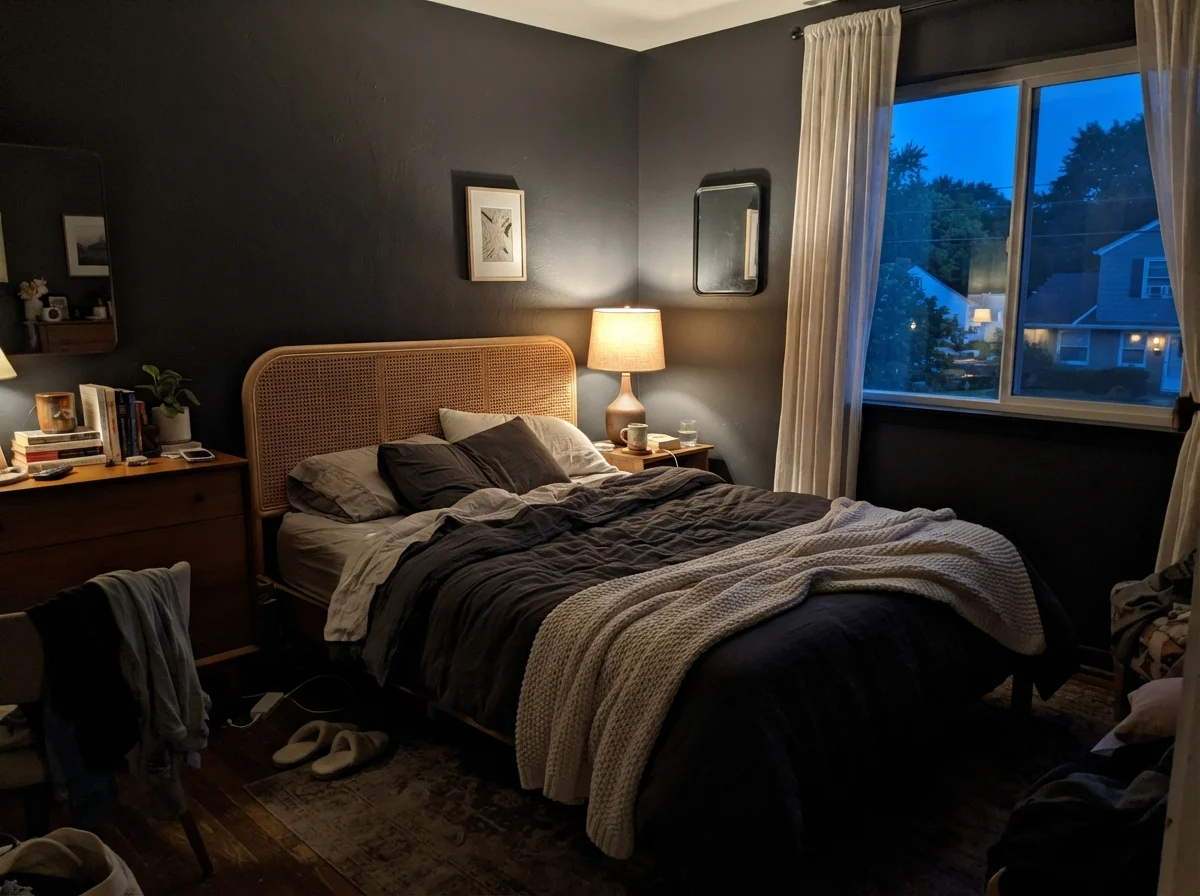
By evening, under ordinary 2700K incandescent or warm LED lamplight, the cool undertone relaxes into a deep, velvety charcoal. It stops reading as blue-black and settles down into something much cozier, provided you have enough pools of warm light to break up the shadow planes. The trap is relying on a single overhead fixture. An overhead bulb in a Caviar room casts sharp, unflattering downward shadows that emphasize every speck of dust on your trim and leave the corners looking hollow.
Kitchens and Cabinetry: Where Caviar Earns Its Keep
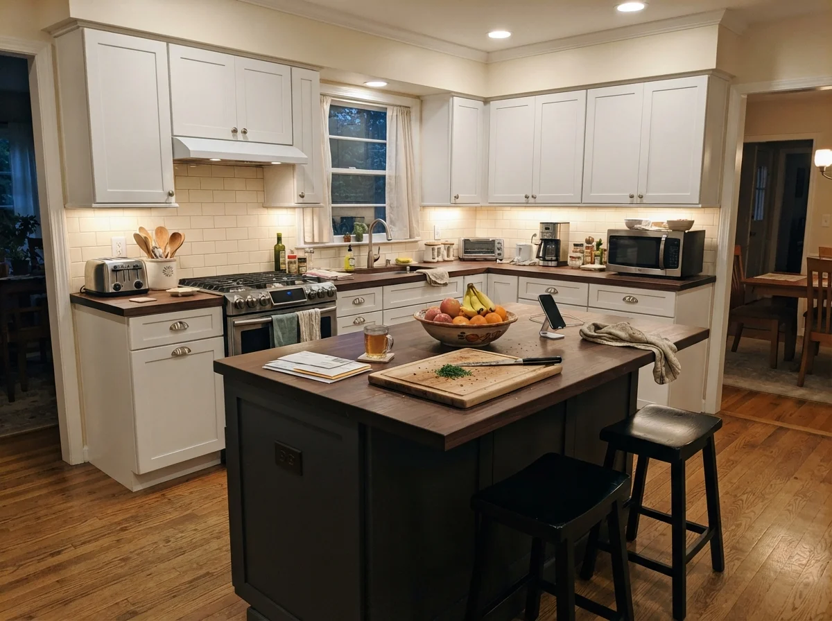
If you ask me where Caviar is genuinely worth the money, the answer is always cabinetry and millwork. When we updated the kitchen in our 1960s ranch, the original cabinets were sound maple boxes with tired, honey-amber doors. Tearing them out would have cost half our renovation budget. Instead, we prepped them down to the bare wood, used a tinted bonding primer, and sprayed the lower cabinets and the island in a deep, cool black. That was seven years ago, and those cabinets still anchor the room with an authority that off-white paint could never manage.
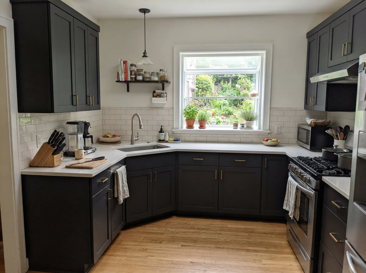
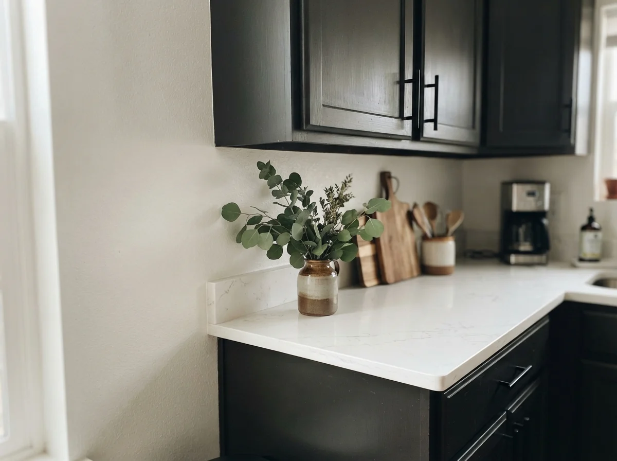
On kitchen cabinetry, Caviar’s graphite edge behaves beautifully. Because it is not a lifeless pitch black, it reads intentional and architectural rather than harsh. It frames crisp white quartz countertops and clean white subway tile without looking like a piano finish. Pair it with brushed nickel, chrome, or matte black hardware, and the cool undertones sit in total harmony. I have seen homeowners try to force unlacquered brass and warm honey oak alongside Caviar, and the result is almost always an argument between warm yellow and cool slate.
For most kitchens, painting every upper and lower cabinet in Caviar is more commitment than the space can handle. Unless your kitchen has tall ceilings and floor-to-ceiling windows, dark upper cabinets tend to loom over the counters, cutting off sightlines and making dinner prep feel claustrophobic. The smarter play—the one that holds up to daily life and resale down the road—is treating Caviar as an anchor. Painting just the island creates a focal point that absorbs the scuffs of counter stools, dirty shoes, and grocery bags without flinching.
Interior Doors, Trim, and Architectural Boundaries
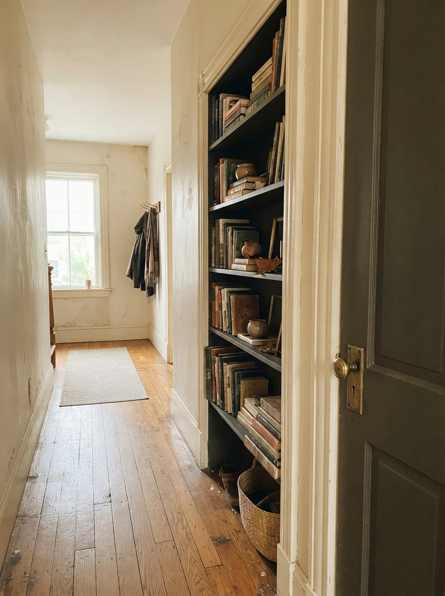
Another place where Caviar consistently pays for itself is on interior doors and hallway built-ins. An interior door is essentially a piece of furniture that swings on hinges. In our colonial, every bedroom door was standard hollow-core birch stained a muddy walnut that looked dated within minutes of moving in. When we replaced them with solid two-panel doors, we painted the doors in a rich satin black while keeping the door casings and surrounding hallway walls light. The hallway immediately felt wider, taller, and more expensive.
A door painted in Caviar gives the eye a definite resting place without demanding that the entire hallway surrender its light. Because doors collect hand oils, fingerprints, and hallway bumps, the dark pigment hides everyday wear that would turn an off-white door gray around the knob within three months. And when we sold that colonial, our real estate agent specifically pointed out the black interior doors as a feature that made the second-floor hallway photograph like a custom build rather than a developer special.
Living Rooms and Sunrooms: When Daylight Makes Dark Walls Work
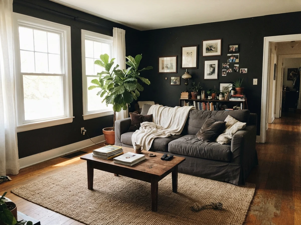
Can you paint all four walls in Caviar and love it five years in? Yes, but only under one strict condition: the room must have generous, unblocked daylight. In our current 1960s ranch, our front living room has two large picture windows that flood the room with midday sun. A dark wall in that kind of direct light stops acting like a blackout curtain; instead, the light bounces across the texture of the plaster, highlighting the graphite nuances and making artwork jump off the surface.
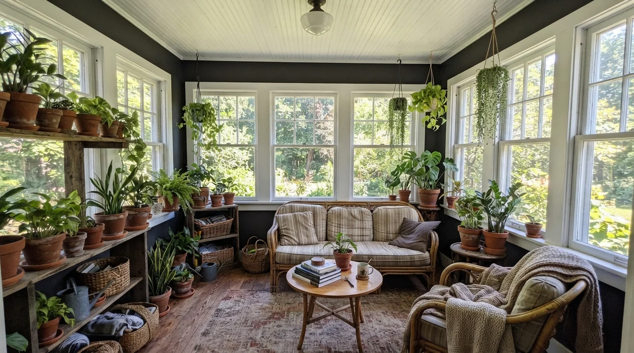
In a sunroom or living room wrapped in glass, Caviar performs a neat optical trick. By painting the wall segments between large windows black, the walls seem to disappear, pushing your gaze directly out into the green yard. The black acts like a frame around the outdoor view rather than an enclosure. However, if your living room has eight-foot ceilings, a deep porch overhang outside, and only one window facing north, putting Caviar on four walls is not moody—it is depressing.
When you have natural light pouring in from multiple directions, Caviar provides a striking backdrop for natural textures. Rattan, linen, bleached jute, and crisp white trim look sharper and cleaner against a cool dark surface than against mid-tone beige. But keep your plant pots in mind: terracotta and red brick fight Caviar's cool blue-gray undertone, whereas stone, zinc, and painted concrete sit together comfortably.
Bedrooms and Nurseries: The Four-Wall Reality
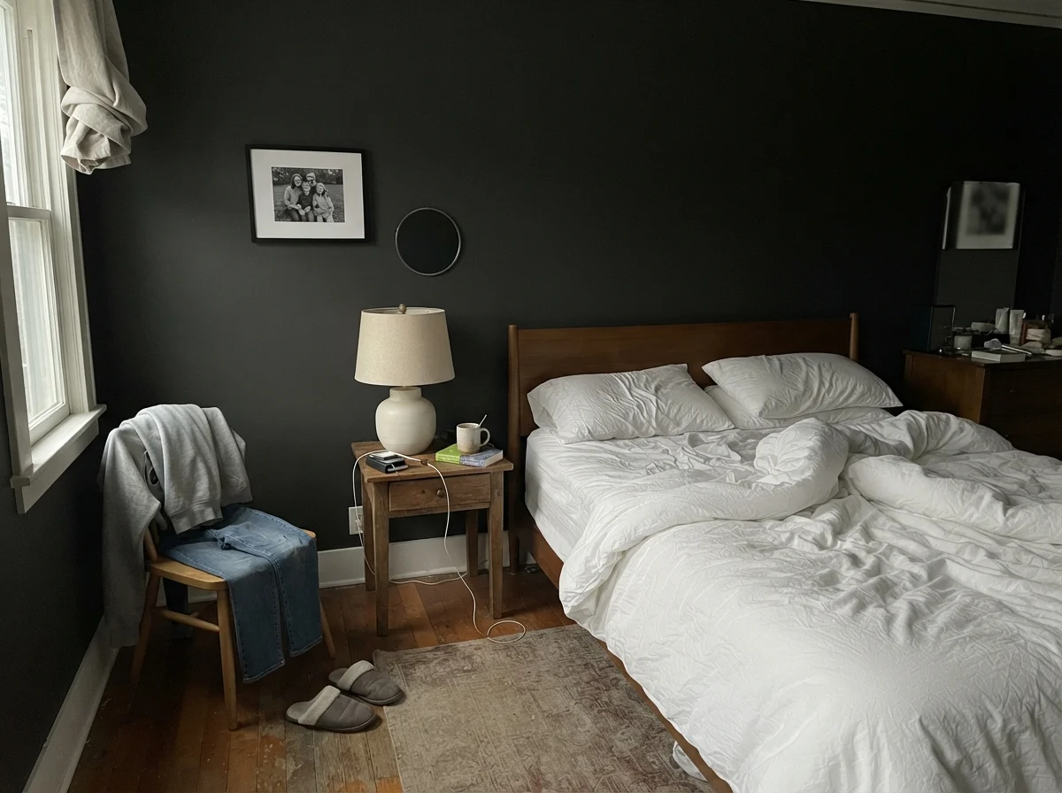
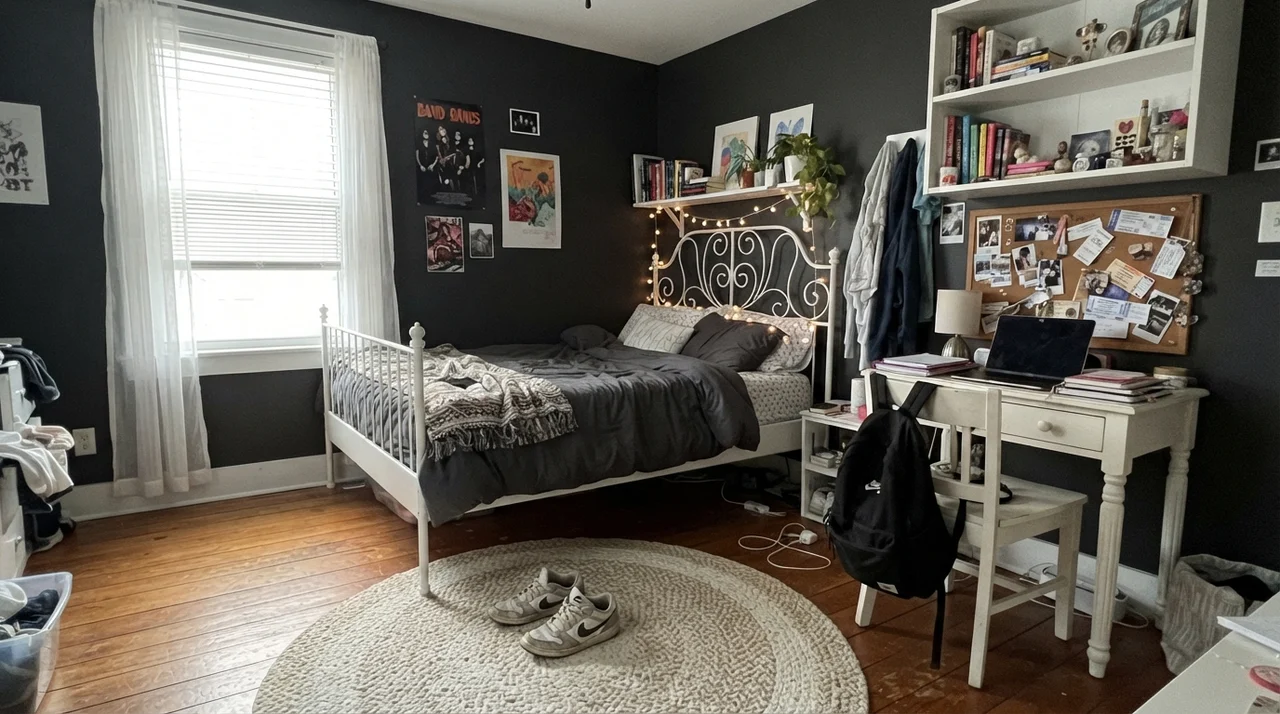
There is a massive difference between seeing a photograph of a dark bedroom in a magazine and waking up inside one on a gray Tuesday morning in November. A main bedroom painted in Caviar can feel cocooning and quiet at night, especially when dressed with crisp white linen bedding, pale oak furnishings, and ceramic lamps. It cuts glare and creates a restful, cave-like retreat that makes falling asleep remarkably easy.
However, living with it five years in means accepting that you will need lamps on at two in the afternoon on cloudy days. In nurseries and teenagers' rooms, dark walls require serious thought. A nursery with soft daylight can look sweet with pale wood dressers and white crib rails against dark walls, but as soon as the child becomes a toddler who scribbles on walls and rubs chalky hands across surfaces, matte black drywall turns into an maintenance headache. On flat paint, every touch leaves a shiny trail of body oils that cannot simply be wiped away with a dry rag.
Bathrooms and Powder Rooms: Managing Moisture and Light
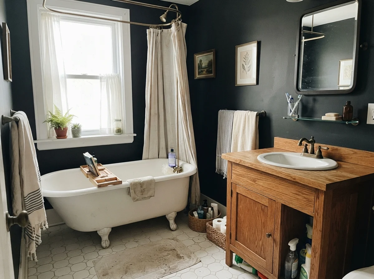
Bathrooms are where near-blacks face their toughest physical test. Between steam, water splashes, hairspray, and soap scum, bathroom walls take an incredible beating. If you put Caviar in a bathroom, the surface finish is non-negotiable: you must use satin. Flat paint on a bathroom wall painted in LRV 3 will develop water dribble marks that look like permanent snail trails after three hot showers.
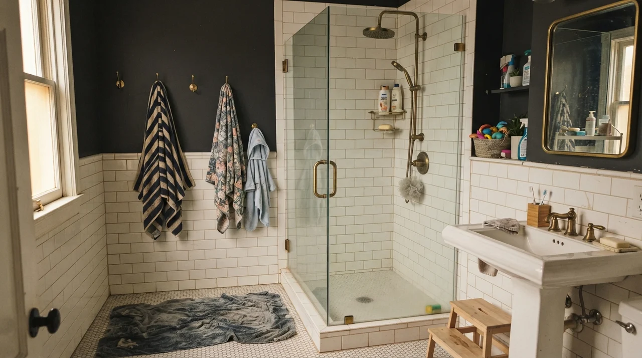
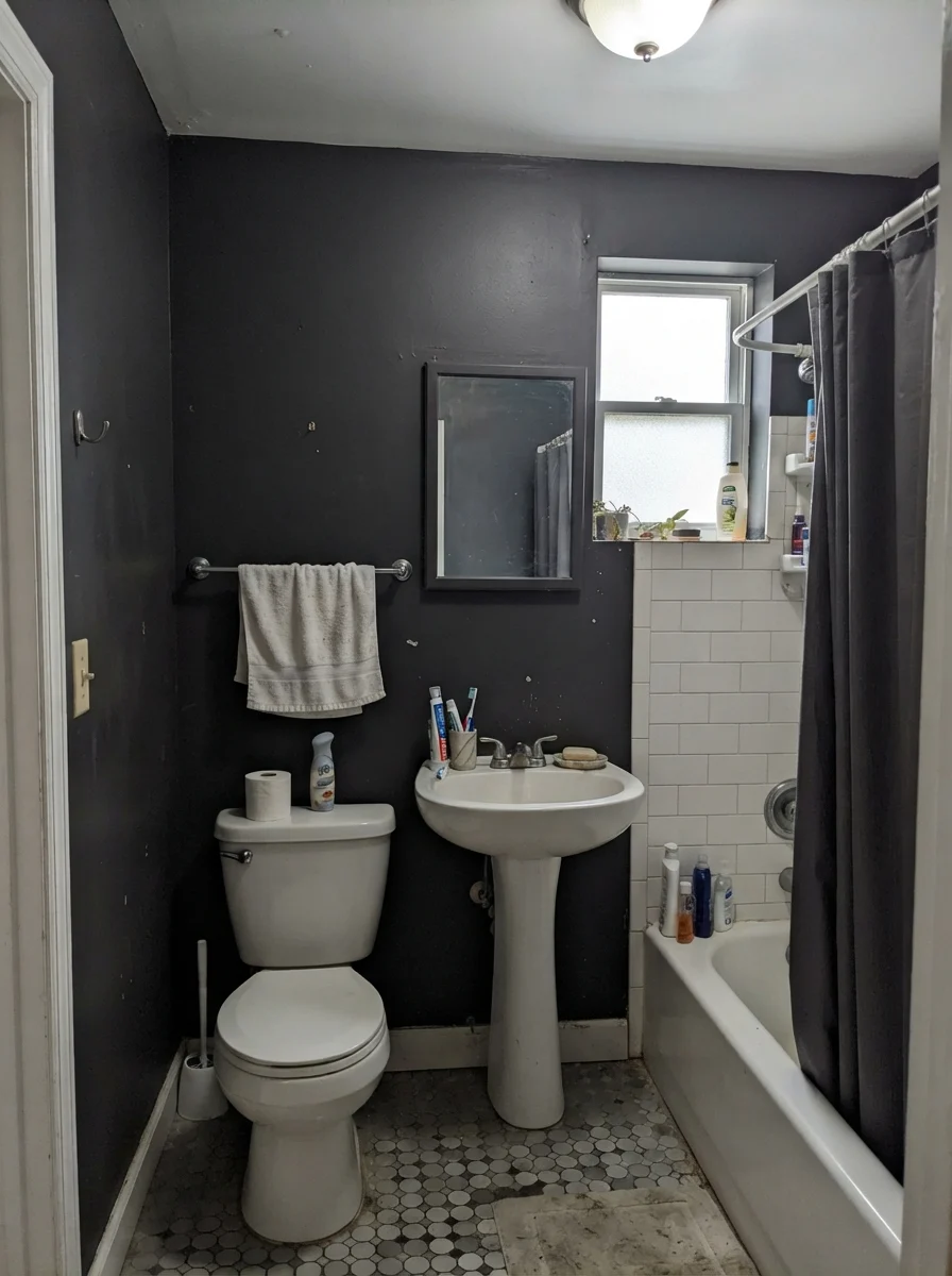
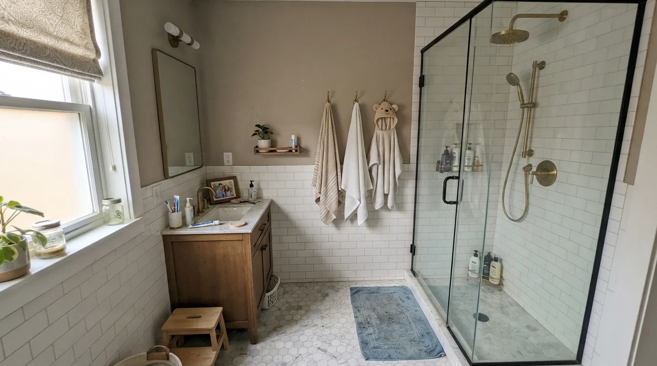
In a cottage bath with a white clawfoot tub, white hex tiles, and bright morning sun, Caviar on the upper walls provides gorgeous contrast that makes vintage fixtures look pristine. But watch what happens when the lighting changes. Under flat overcast light, Caviar drops its crispness and reads as a muted, chalky charcoal. Under cold north daylight in a modest, window-starved bathroom with an older beige vanity, that cool cast can read downright chilly, turning beige fixtures muddy and making the room feel sterile.
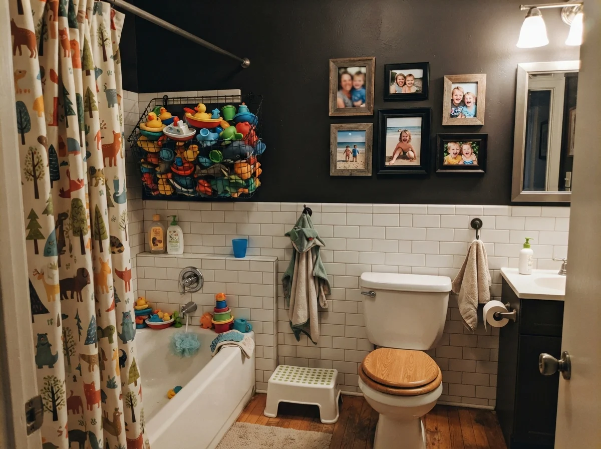
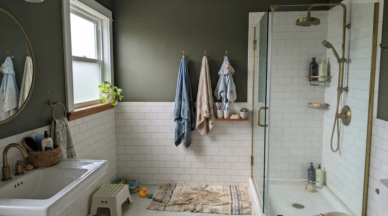
In our own family bathroom, keeping dark walls tidy around small children taught me that dark colors don't hide dirt—they just trade brown dirt for white dirt. Toothpaste splatter, talcum powder, and dried water spots show up like beacons against a black wall. If you run a household with kids, keeping Caviar above a high wainscot of wipeable white subway tile is the only sane strategy. That way, the splashes hit the ceramic, and the paint stays clean above the splash zone.
Laundry Rooms and House Exteriors
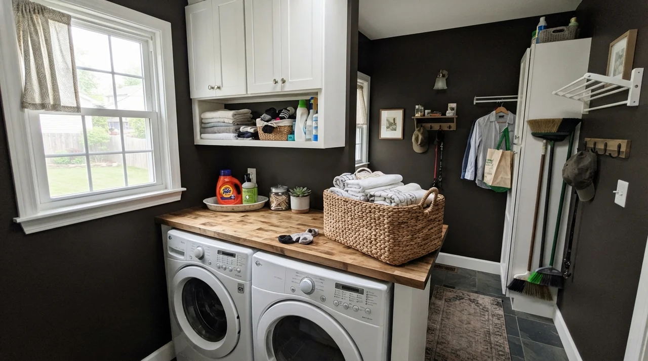
A laundry room is often the most neglected utility space in the house, but giving it a dose of bold color can make folding towels slightly less tedious. In a laundry room with even one good exterior window, painting the walls in Caviar creates sharp definition against white appliances, white upper cabinets, and a natural butcher-block counter. Because laundry spaces are task-oriented, that contrast feels orderly and crisp.
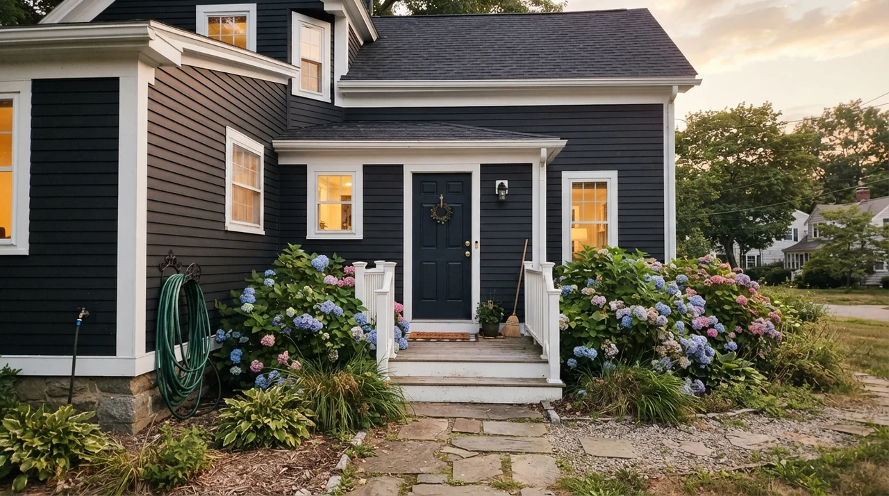
Outdoors, Caviar takes on an entirely different persona. Full exterior sun washes out subtle undertones, so on exterior horizontal siding, Caviar reads as an uncompromising, modern black. Paired with crisp white fascia, trim, and gutters, it gives a standard suburban home dramatic curb appeal that looks deliberate rather than heavy. Just be prepared for exterior dust: dark siding shows pollen, dried rain spots, and lawnmower dust far more readily than light gray or taupe siding ever will.
The Honest Fail: When Caviar Collapses a Space
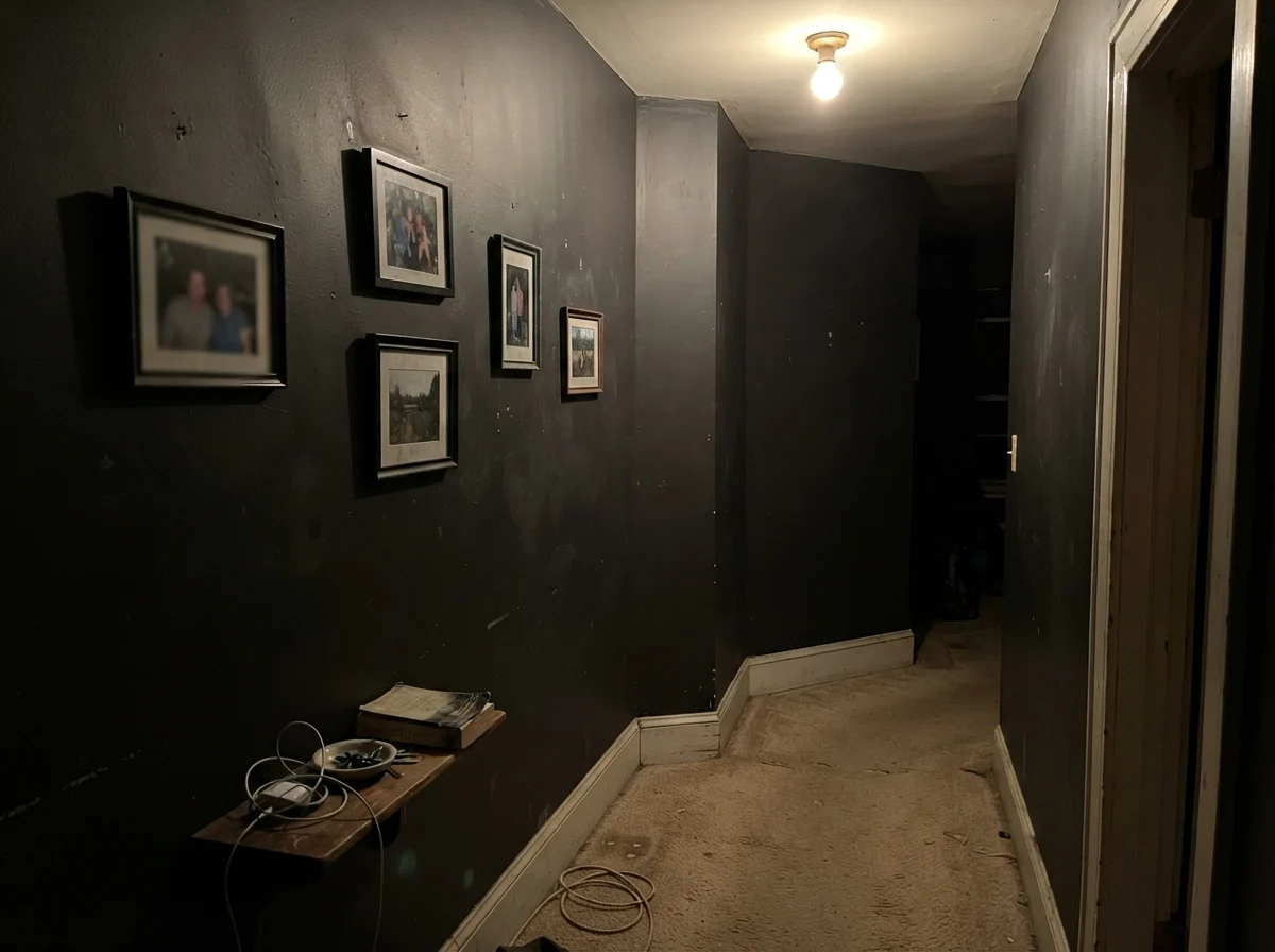
Almost every regret story I hear about Caviar comes down to a homeowner ignoring what an LRV of 3 means in an enclosed hallway or windowless interior room. If you roll Caviar onto the walls of a dark hallway with beige carpet, no exterior light, and a single low-wattage ceiling fixture, the paint will not look rich or sophisticated. It reads flat, muddy, and putty-like, as if the drywall were coated in wet asphalt.
Instead of feeling intentional, the walls seem to press in from both sides, making the hallway look narrow and neglected. When a dark wall has no daylight to activate its depth and no crisp architectural trim to frame it, the eye simply registers a void. If your space lacks good natural light or deliberate directional sconces, skip this paint entirely. It is not worth the money or the frustration of trying to live inside a tunnel.
Durability, Scrubbing, and Living with LRV 3 Five Years In
Here is what nobody tells you at the paint counter: dark paints show physical life in reverse. When you live with an off-white wall, your enemies are coffee dribbles, muddy paws, and grease marks around switch plates. When you live with a near-black wall, grease disappears, but dust, dry skin flakes, chalk, and dried water spots show up instantly. In our ranch, the lower section of our dark accent wall where the vacuum cleaner bumper grazes it needs to be wiped down twice a month just to remove carpet dust that clings by static.
Sheen selection with Caviar is critical. If you are painting cabinetry, doors, or exterior trim, use satin or semi-gloss. A satin finish gives you the washability you need to wipe away peanut butter and sticky fingerprints without burnishing the finish. On drywall, however, satin is treacherous: it reflects light unevenly, making every drywall seam and roller overlap visible from twenty feet away. For walls, flat or matte is the only way to avoid sheen flashing—but flat black drywall cannot simply be scrubbed clean with soapy water. Scrubbing flat black paint burnishes the latex binders, leaving a shiny, permanent smudge that looks worse than the scuff you were trying to remove. If you have active pets or young children, keep dark wall paint above chair-rail height or stick to cabinetry.
Finally, do not make the rookie mistake of skipping primer. Rolling Caviar directly over white drywall or pale paint is the fastest way to waste your weekend. Without a deep gray- or black-tinted primer, you will need three—and sometimes four—coats of finish paint before the white drywall stops grinning through. A tinted primer gives you complete coverage in two finish coats, saving you hours of rolling and a second expensive gallon of paint.
Does Sherwin-Williams Caviar look like true black on walls?
In small doses and direct sun it reads as a rich, true black. Across four walls in average room lighting, however, its cool graphite-blue base comes through, making it look like a very deep, velvety slate-black rather than absolute pitch black.
What primer should I use under Caviar?
Always use a gray- or black-tinted deep-base primer. Rolling Caviar directly over white drywall or light paint typically requires three to four coats for full opacity, whereas a tinted primer achieves uniform coverage in two finish coats.
What is the best sheen for Caviar on kitchen cabinets and doors?
Satin is the sweet spot. It provides enough surface washability to handle fingerprints, hand oils, and water drops without creating the distracting glare of semi-gloss or high-gloss finishes.
Does Caviar make small rooms feel smaller?
Yes, if the room lacks natural daylight. With an LRV of 3, Caviar absorbs nearly all light, making windowless powder rooms and dark hallways feel enclosed. In a room with abundant natural light, however, it can make the walls visually recede.
Can I use warm brass hardware with Caviar?
You can, but be cautious. Because Caviar has a cool graphite-blue undertone, bright yellow brass can look jarring against it. Brushed nickel, chrome, matte black, or aged antique pewter pair much more naturally with its cool undertone.
Susan's Verdict · Restrained and Tailored
Caviar is an exceptional paint that gets ruined by unearned confidence. If you use it where it belongs—on a kitchen island, an architectural front door, bathroom vanity, or a single daylight-flooded feature wall framed by clean white trim—it looks tailored, expensive, and grounded. But if you attempt to wrap an ordinary, light-starved bedroom or windowless hallway in it, LRV 3 will swallow your room whole. Treat it as a structural anchor, prime with a tinted base, and let daylight do the heavy lifting.