Color Diary · No. 54
Sherwin-Williams City Loft: The Whole-House Greige with a Late-Day Catch
The light greige that behaves in most houses and flashes pink in a few, reviewed honestly: the rooms it saves, the rooms it ruins, and what to buy instead.

Susan HartleySeptember 30, 2026 · 14 min read
City Loft · Sherwin-Williams SW 7631
Hex#DFDAD1LRV70Undertoneswarm gray → soft violet-pink in west sun
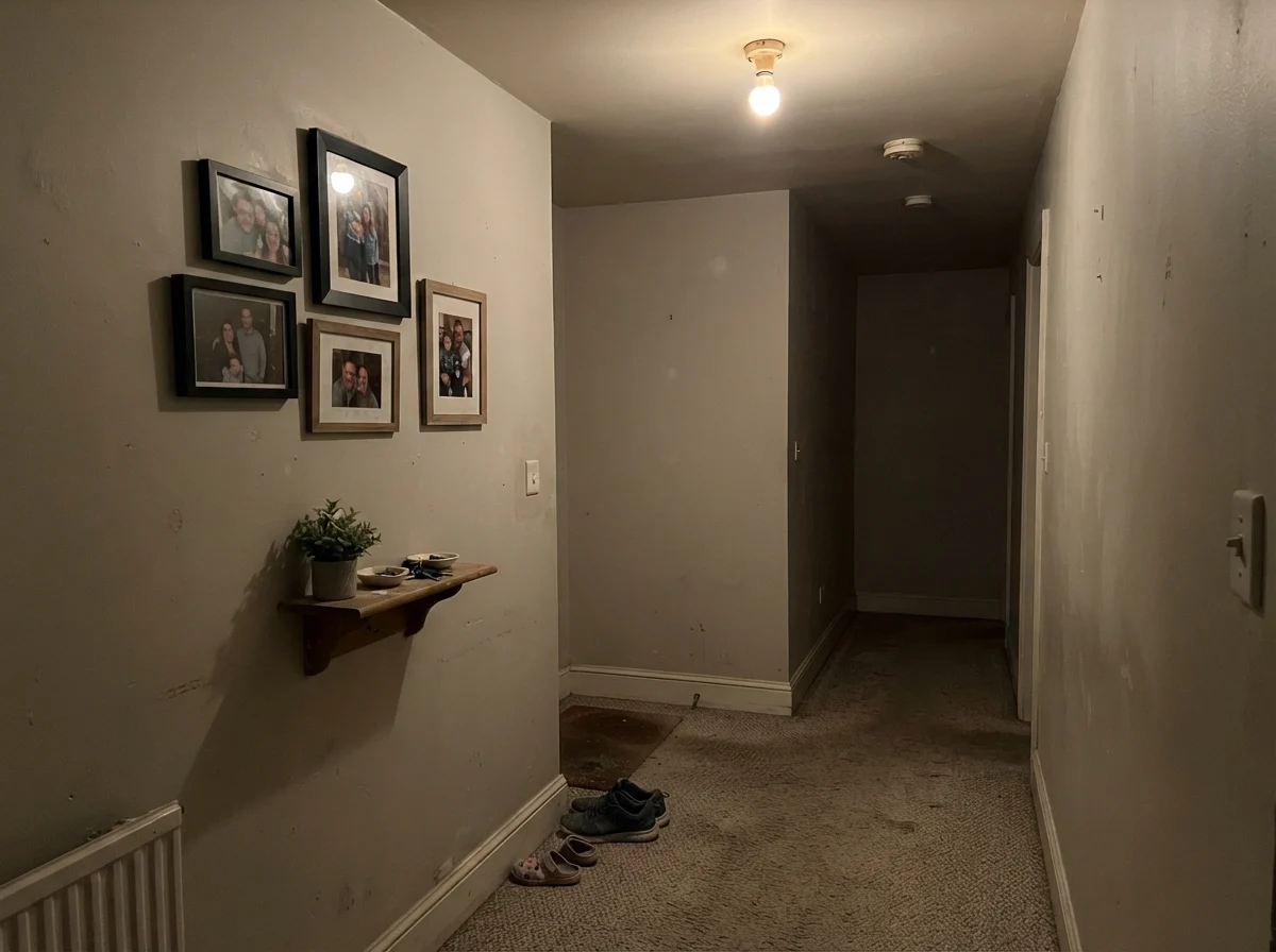
In our last house, a 1990s center-hall colonial with stubborn honey oak floors and a foyer that swallowed light, I spent three weeks staring at paper paint chips taped to the hallway drywall. Every gray I tested looked like wet cement the moment the clouds rolled in, and every classic beige made the oak look like a jar of French mustard. When a neighbor suggested Sherwin-Williams City Loft (SW 7631), I was skeptical. On the small swatch, it barely registered as a color—just an unassuming, chalky off-white sitting squarely in the greige family with a Light Reflectance Value of 70.
We bought five gallons, rolled it through the two-story foyer and up the main staircase, and lived with it for seven years. When we sold that house, the listing photos looked bright, calm, and unmistakably cohesive. But City Loft is not an entirely innocent neutral. It has a specific personality built on a faint red base that makes it brilliant in three specific rooms and infuriating in one. Five years in, you learn exactly what a paint color is hiding behind its marketing name.
The Anatomy of LRV 70: Why It Solves the Whole-House Problem
The central dilemma of repainting an entire main floor is that modern homes rarely have separate rooms with uniform lighting. An open floor plan forces one color to run past oak flooring, white baseboards, gray kitchen tile, and stone countertops without picking a fight with any of them. If you pick a true gray at LRV 60, your windowless hallways will feel like basements. If you pick a cream or warm off-white at LRV 75, your north-facing living room will turn dingy and green.
City Loft sits right at the sweet spot of LRV 70. That means it bounces 70 percent of available light back into the room, lifting gloomy corners while still providing enough contrast against white millwork to prove you actually painted. It is warm without carrying a trace of yellow or muddy green undertones in standard daylight. When people ask me why their neighbor’s house feels so effortlessly pulled together, nine times out of ten it is because they chose a neutral in this exact weight class.
The Undertone Breakdown: The Red Base in Real Daylight
City Loft is categorized as a light greige, but its underlying pigment recipe relies on a subtle red-violet component. In balanced daylight, that red simply keeps the gray from feeling sterile or cold. But shift the light source, and the color tells three entirely different stories.
warm sun
overcast, north light
dusk, rain, cool bulbs
greige → warm cream in south sun → soft violet-pink in west light
Egret WhiteSherwin-Williams · see diary
Taupe TeaseBehr · see diary
City LoftSW 7631
Drift of MistSherwin-Williams · see diary
Pale OakBenjamin Moore · see diary
How Daylight Dictates the Wall: Morning to Nightfall
Every paint swatch is a polite promise that daylight immediately tests. Because City Loft carries very low saturation and an LRV of 70, it is exceptionally reactive to the Kelvin temperature of your light bulbs and the angle of the sun outside your windows. In our 1960s ranch, I tested large sample boards in every exposure before touching a roller, and the shift from morning to evening was dramatic.
In cool morning daylight or rooms with clear northern exposure, City Loft does its finest work. The cold, slightly blue sky cools down the red undertone, balancing the formula into a perfectly tailored, whisper-soft warm gray. It never looks icy, nor does it look like a muddy taupe. It just looks like clean, expensive plaster.
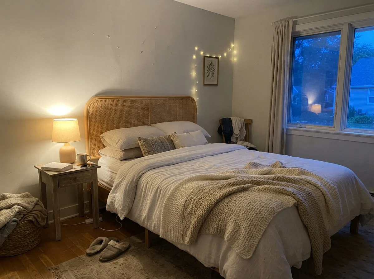
When artificial light takes over, your choice of light bulbs will either make or break this color. Under traditional 2700K warm incandescent lamps, the walls cozy up into a mellow, velvety cream that makes bedrooms feel instantly restful. However, if you have modern recessed fixtures fitted with cool 4000K or 5000K LED bulbs, beware: the sharp, blue-tinted daylight diodes will interact poorly with City Loft's red base, causing large walls to read with an unmistakable pale violet cast.
Let's look at how differing natural exposures alter the face of City Loft across real spaces throughout an overcast afternoon, rainy weather, and high noon sun.
The Kitchen and Cabinet Reality: When Warm Gray Wins
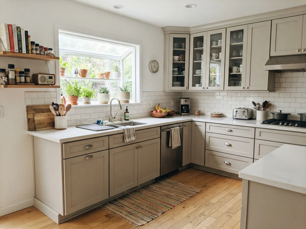
White shaker cabinets have reigned supreme for twenty years, but after painting our kitchen cabinets three times across three different decades, I can tell you that stark untinted white can feel shockingly sterile in a busy family kitchen. City Loft in a durable satin enamel on cabinet fronts is one of the smartest design compromises you can make.
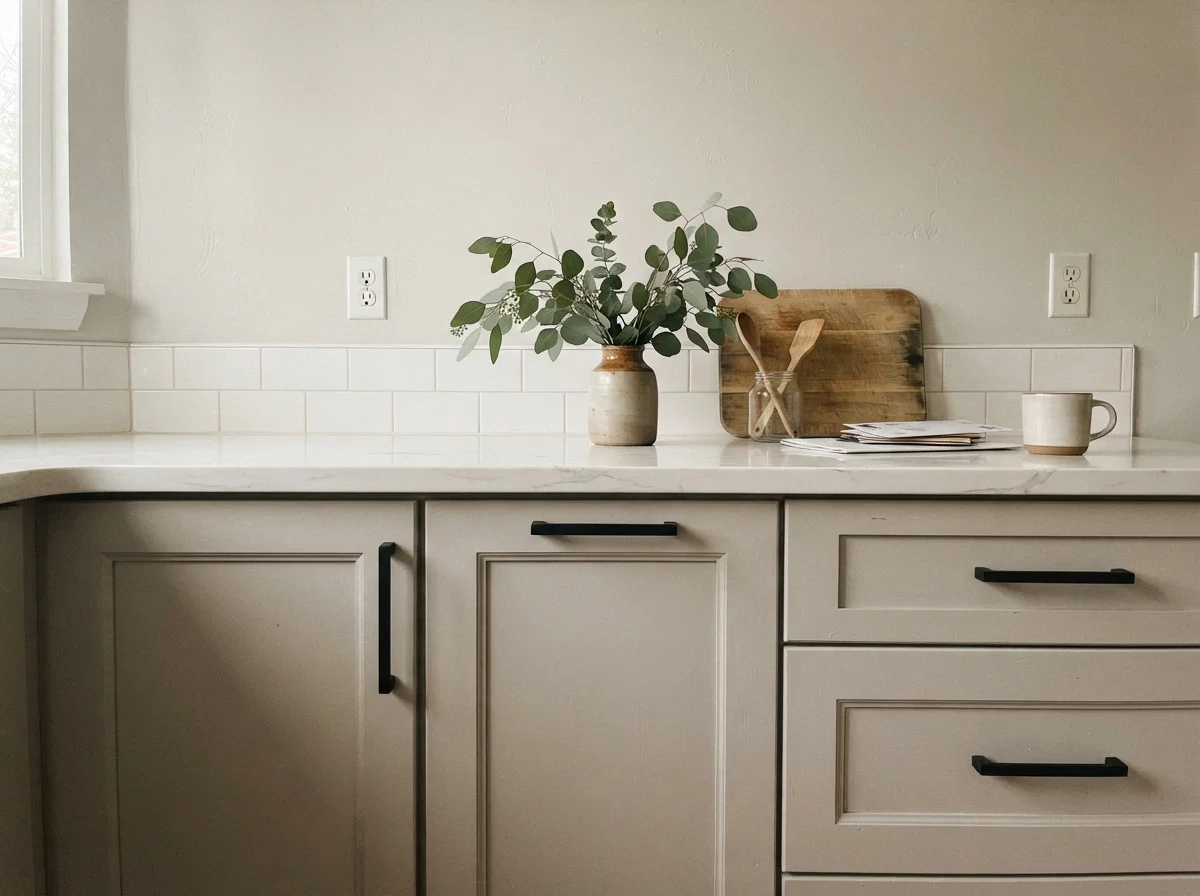
On cabinetry, City Loft does not read as off-white; it reads as an intentional, soft greige. It gives just enough pigment contrast against pure white subway tile backsplashes and pale quartz counters to look bespoke. It is especially forgiving next to natural wood accents like butcher block islands, walnut open shelving, unlacquered brass pulls, and brushed nickel hardware.
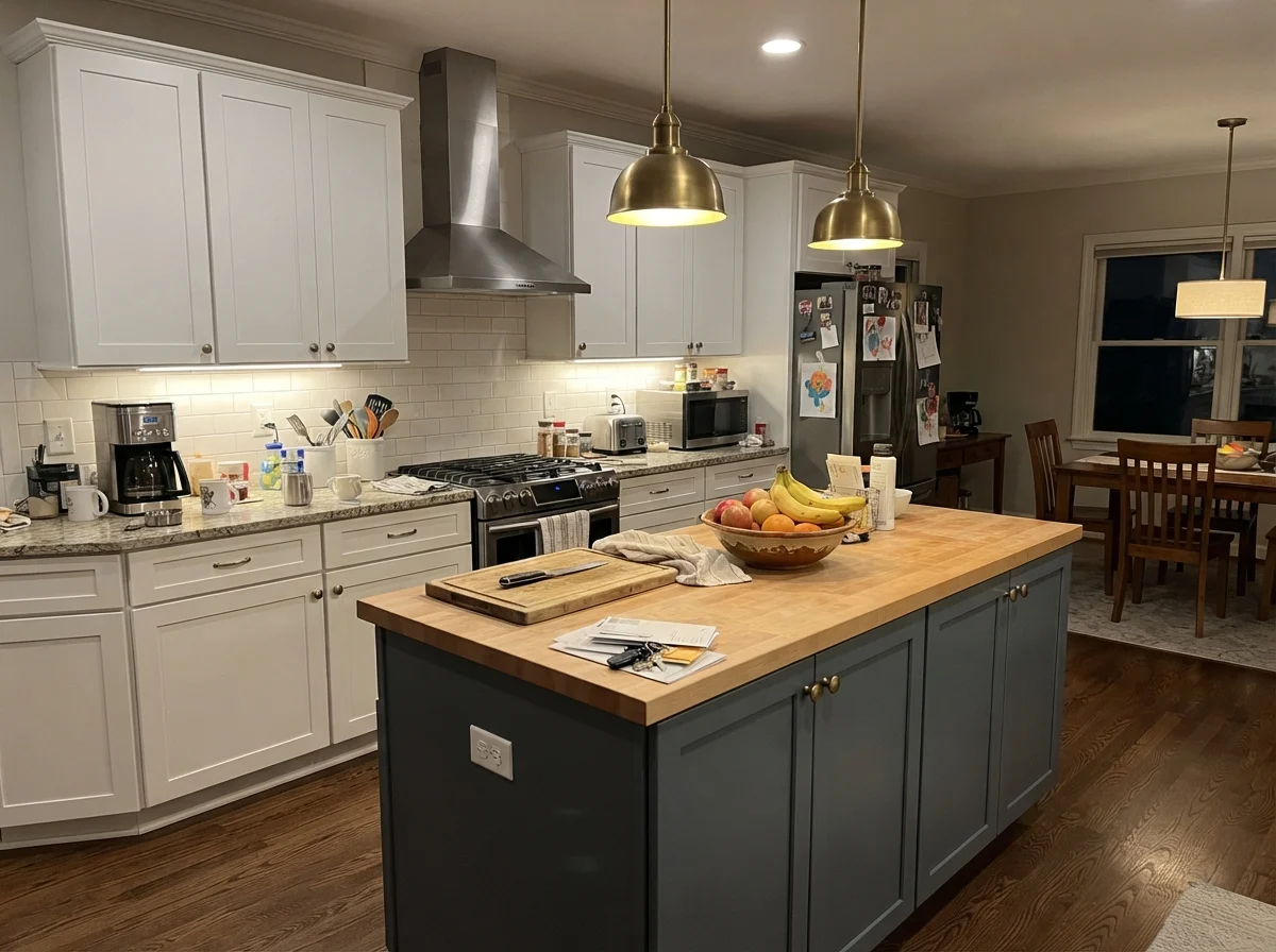
If you don't want to commit to painting every cabinet door in the kitchen, spraying just the island base in City Loft against perimeter white cabinets grounds the room without shrinking the floor area. It also handles scuffs from swinging kid feet significantly better than pure white paint, hiding everyday household marks until you get around to your weekend wipe-down.
Bedrooms and Nurseries: Quiet, Unobtrusive Rest
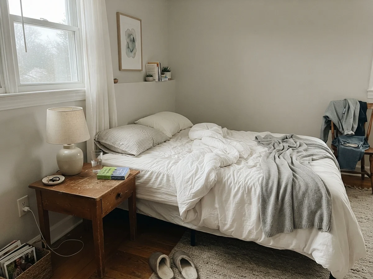
In private quarters like bedrooms and nurseries, City Loft functions as a quiet companion. Because it lacks harsh yellow undertones, it flatters white linen bedding, pale oak dressers, and textured rugs without screaming for attention. It gives walls just enough depth that white trim pops neatly, creating a gentle framing effect around doors and windows.
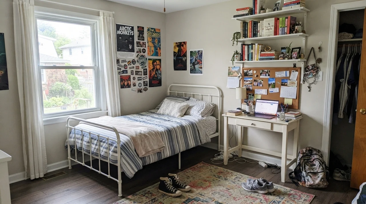
For a teenager's room or guest bedroom where furniture finishes might be a mixed bag of painted desks, metal frames, and varied wood tones, City Loft bridges the gap effortlessly. It doesn't lock you into a single design era or a narrow color palette.
Bathrooms and Utility Spaces: Watching Your Tile Tones
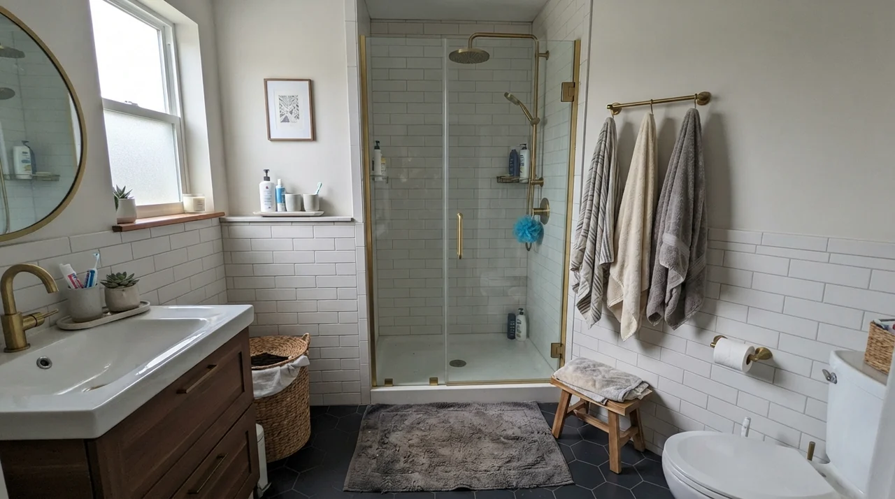
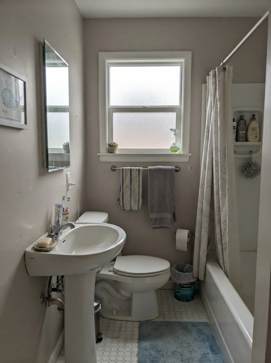
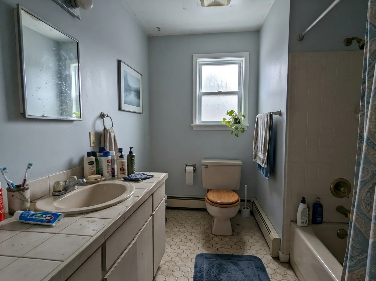
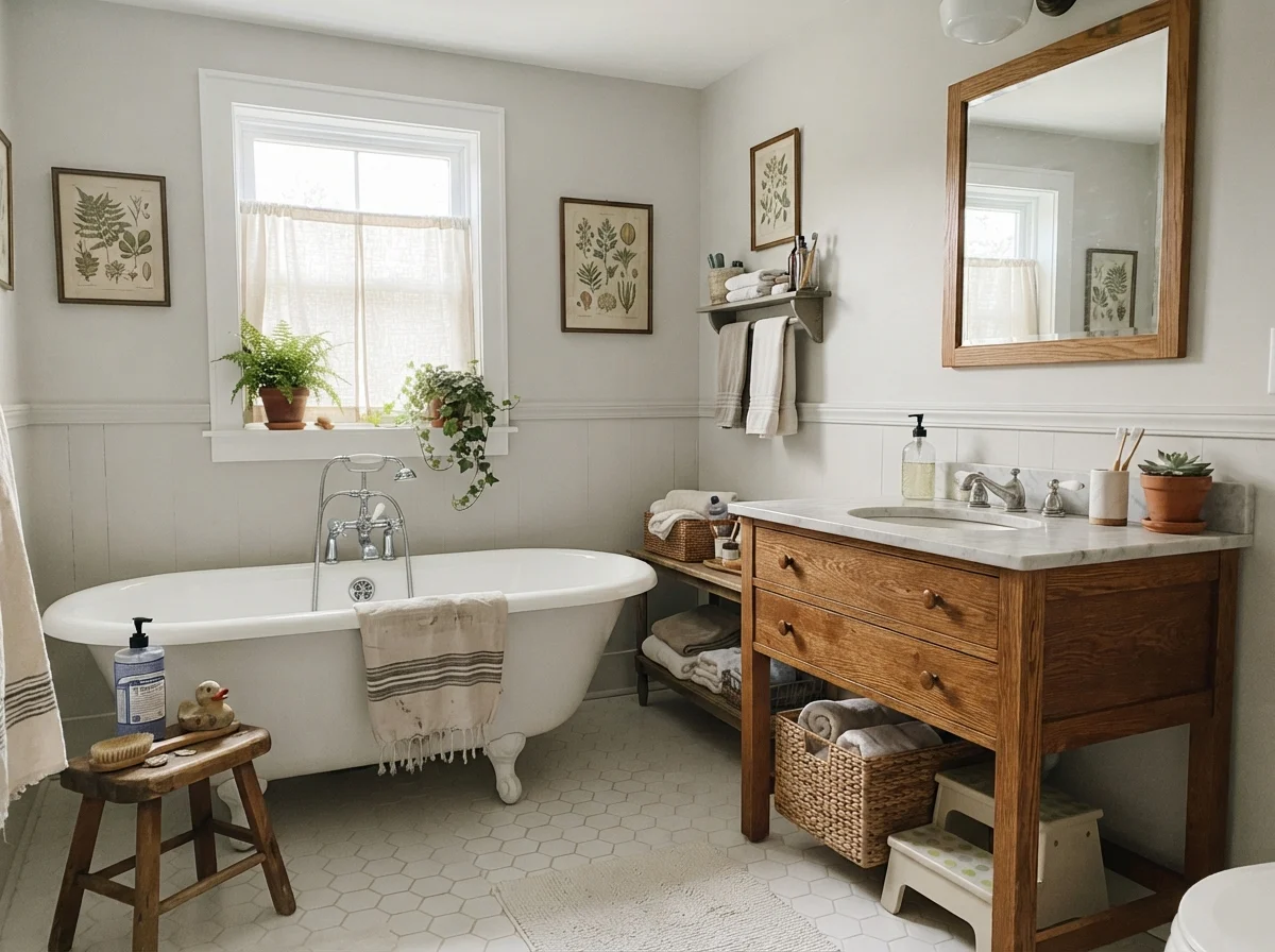
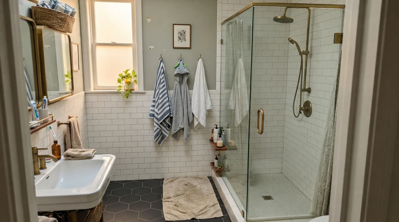
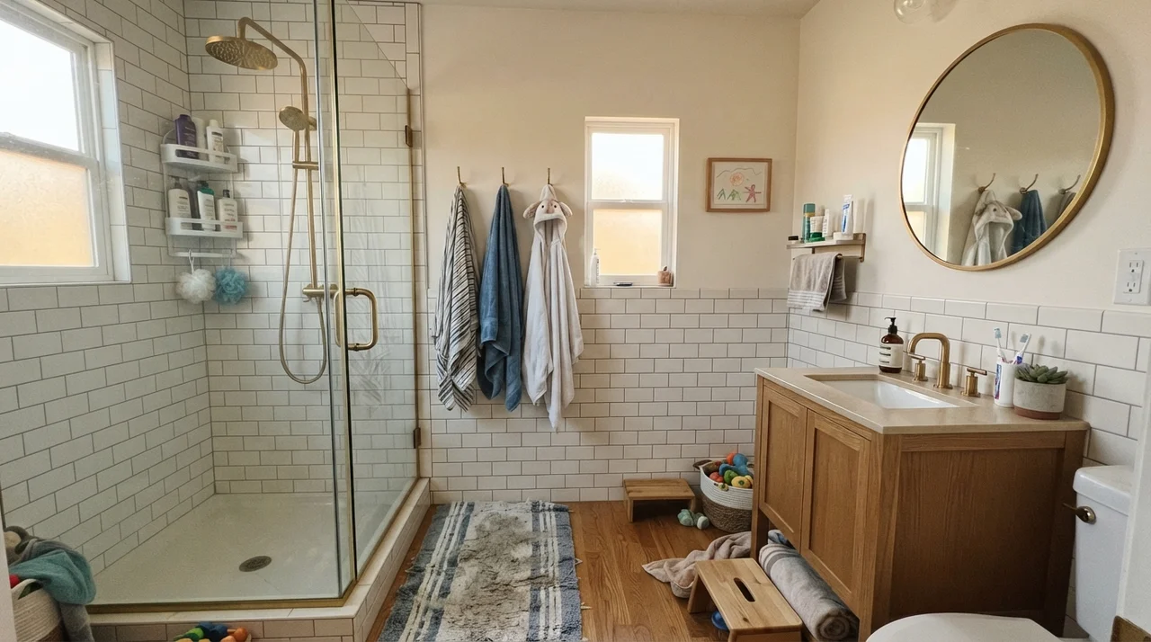
Bathrooms are high-moisture, high-scrub zones where lighting is often artificial and tile Undertones rule the roost. City Loft works wonders above white wainscoting or paired with classic marble and travertine. However, here is where you must be careful: if your bathroom floor features cool blue-gray porcelain or slate tile, that cool floor will immediately tease out City Loft’s red base, giving your drywall a subtle blush.
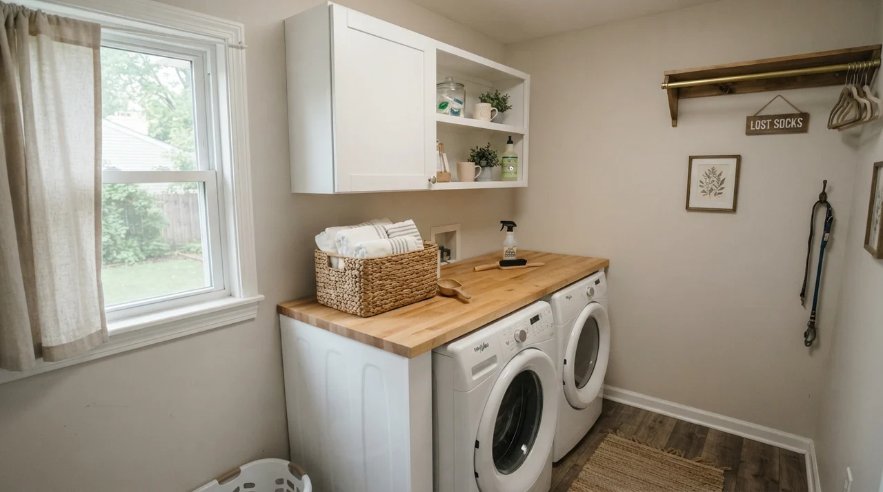
In a utility room or bright laundry area, on the other hand, City Loft in an eggshell or satin finish provides a cheerful, clean backdrop that stands up to steam, laundry baskets, and splashing sinks while reflecting natural window daylight.
Sunrooms, Built-ins, and Architectural Millwork
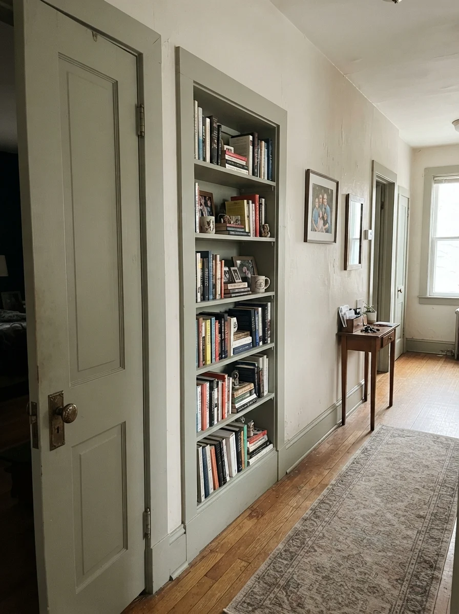
In sunrooms wrapped in glass, City Loft is softened by green foliage and open sky. Because it is free of yellow, it lets natural greenery outside take center stage. When used on interior millwork—such as interior passage doors, wainscoting, or built-in bookshelves against off-white walls—City Loft creates low-contrast, architectural interest that looks timeless rather than trendy.
Where City Loft Fails: The Three Scenarios to Avoid
The complaints about City Loft are not random. They come from three very specific situations, and every one of them is predictable from a sample board. If your room is one of these, this is not your color and more coats will not save it.
1. A West-Facing Room in Late Afternoon
Low, raking 5 p.m. sunlight is rich in red and orange spectrum wavelengths. When that intense late-afternoon sun hits a large, uninterrupted wall painted in City Loft, the red base flares up. Big walls can flash distinctly pink, or even a muddy violet if your carpeting or tile leans toward cool gray. This is the single most-repeated complaint about this color. If your room faces west and you want warmth without pink, step over to Sherwin-Williams Shoji White (SW 7042)—it is yellow-based and will never flash pink.
2. Walls and Trim Painted in the Exact Same Can
The monochromatic trick where you spray walls, trim, and ceiling in a single color works brilliantly with high-LRV whites in the 80s. But at LRV 70 with minimal chroma, painting trim and walls identical looks less like architectural intention and more like unfinished builder primer. Without a crisp, true white trim to give it boundaries, City Loft can feel flat and dingy.
3. Sun-Blasted Rooms with Huge Glass
If you have floor-to-ceiling south-facing picture windows, the sheer volume of direct sun will bleach City Loft into nothingness. At LRV 70, there isn't enough raw pigment in the formula to hold its ground under aggressive sun, leading homeowners to complain that their walls simply look washed out. If you have intense sun and want a visible, grounding greige, step down to Agreeable Gray (SW 7029) at LRV 60 or Accessible Beige (SW 7036) at LRV 58.
Exterior Application: Siding and Trim Pairings
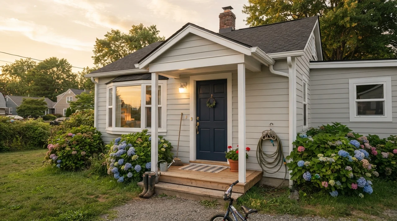
Outside in direct sun, City Loft reads noticeably lighter than it does inside. On horizontal lap siding or board-and-batten, it presents as a crisp, softly warmed off-white rather than a dark greige. When paired with charcoal roofing, black bronze window frames, and a rich dark front door, it creates a tailored, clean exterior facade that does not glare in full sunlight.
Trim Colors That Work (and One That Fails)
Choosing the right trim paint is what unlocks City Loft's potential. Because it is an off-white greige, pairing it with the wrong trim white can make the wall look dirty or the woodwork look blue.
Materials and Styles: What Loves City Loft
Over thirty years of renovating, I've learned that walls don't exist in a vacuum. Your floor stain, upholstery fabric, and metal finishes have to live alongside your wall paint every single day. Here is where City Loft thrives, and where it clashes.
Durability, Sheens, and the Five-Year Reality
When you choose a light neutral at LRV 70, you are going to touch it, scuff it, and scrub it. In high-traffic hallways and mudrooms, flat finish is simply not worth the money unless you enjoy repainting touch-up patches every twelve months. In our colonial, we rolled City Loft in an eggshell finish on every main drywall surface, satin enamel on cabinet doors, semi-gloss on trim, and flat on ceilings.
Eggshell gave us just enough washability that muddy paw marks and stray pencil scuffs scrubbed clean with a warm microfiber cloth and mild soap without burnishing the paint into a shiny spot. Five years in, the walls held up against direct sun without fading or yellowing. If you have an active household, spending a few extra dollars per can on Sherwin-Williams' higher-tier washable formulations is an investment that pays off every single time a sticky hand touches the hallway corner.
You don't choose a whole-house neutral for the weekend you paint it. You choose it for year five, when it has to survive three flooring transitions and twenty scuffs a month.
City Loft vs. The Alternatives
Before you buy your paint, you should know how City Loft measures up against the four neutrals homeowners cross-shop most often.
Does Sherwin-Williams City Loft look gray or beige on the wall?
It sits directly in between as a greige. In north light or overcast days, it leans toward a soft, warm gray. Under warm incandescent lighting or southern sun, its beige warmth steps forward without turning yellow.
Why does City Loft look pink in my house?
City Loft contains a subtle red base. When exposed to low, warm afternoon sunlight from west-facing windows or cool 4000K LED light bulbs, that red pigment can flare, causing the wall to read faintly pink or violet.
What is the best trim color for City Loft?
Sherwin-Williams Pure White (SW 7005) is the most foolproof choice. It provides crisp contrast without looking harsh or pulling out City Loft's red undertone.
Can I paint my whole house in City Loft?
Yes. At LRV 70, it is one of the best whole-house colors on the market for connecting oak floors, tile, and open-concept hallways. Just be sure to sample it on your west-facing walls first.
Susan's Verdict · SW 7631
City Loft is the color people land on when gray felt too cold and beige felt too dated. It is light, quiet, and remarkably easy to live with across an entire house. Sample it on your west-facing drywall at 5 p.m. before buying five gallons, pair it with Pure White on your trim, and it will reward you for years.