Color Diary · No. 34
Sherwin-Williams Drift of Mist: The Five-Gallon Test Across an Entire House
The light greige people paint whole houses in, reviewed honestly: where it stays soft and quiet, the rooms where it turns dingy or vanishes into white, and what to buy instead.

Susan HartleySeptember 17, 2026 · 16 min read
Drift of Mist · Sherwin-Williams SW 9166
Hex#DCD8D0LRV69Undertoneswarm gray → soft greige → shadowy violet or olive
In our last house, a 1990s colonial with high ceilings and an entryway that bled straight into the kitchen, dining room, and upstairs stairwell, I made the classic mistake of trying to give every single room its own distinct personality. By year three, walking through that ground floor felt like flipping through someone else's paint fan deck at top speed. It felt disjointed, busy, and exhausting to keep up with whenever trim scuffed or a wall needed a touch-up. When we moved into our current 1960s ranch, I swore I wouldn't do that again. I wanted one quiet, cohesive shade that could carry across the entire main floor without demanding attention or fighting the furniture.
That is how I ended up buying a contractor five-gallon bucket of Sherwin-Williams Drift of Mist SW 9166. At a Light Reflectance Value (LRV) of 69, it sits right at that pale, airy threshold where gray meets beige. It is ranked 13th globally for a reason: on paper, it promises to be the ultimate chameleon neutral that will never fight your hardwood floors, never clash with your kitchen counters, and never close in a windowless hallway. But after living with it across multiple rooms, under morning sun, dreary rainstorms, and 2700K lamplight, I can tell you that low-pigment greiges come with very specific compromises that no one-inch paint chip will ever show you.
The Undertone Reality: What LRV 69 Actually Does in Real Light
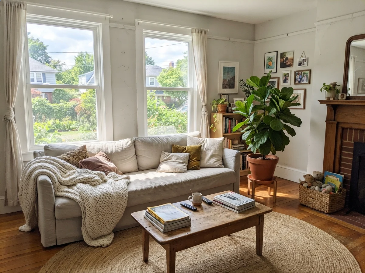
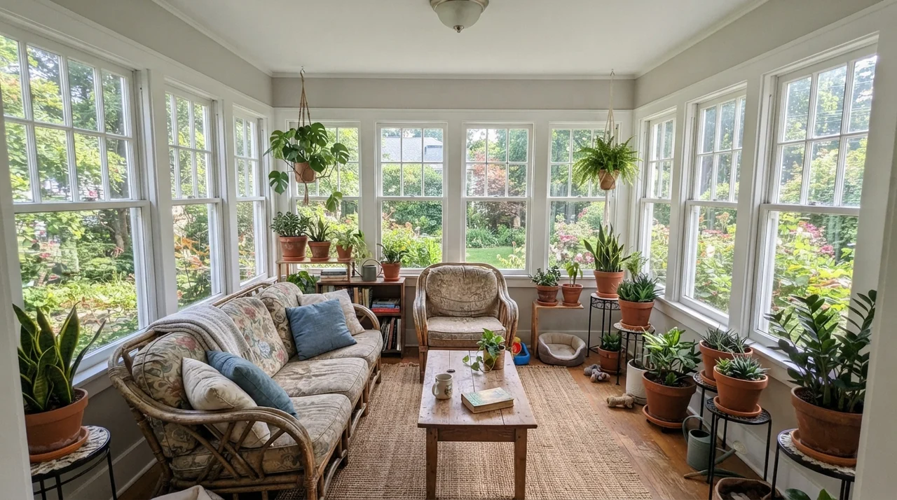
Drift of Mist is what I call a featherweight neutral. Because its LRV is 69, it has just enough tint to separate itself from crisp white trim, but very little heavy pigment to defend itself against whatever light hits it. In a southern exposure flooded with warm midday sun, the beige notes wake up. It reads as a soft, warm linen wash that feels calm and completely unpretentious. If you want a room that feels serene and bright without the harsh glare of builder white, that south-facing view is where this color shines brightest.
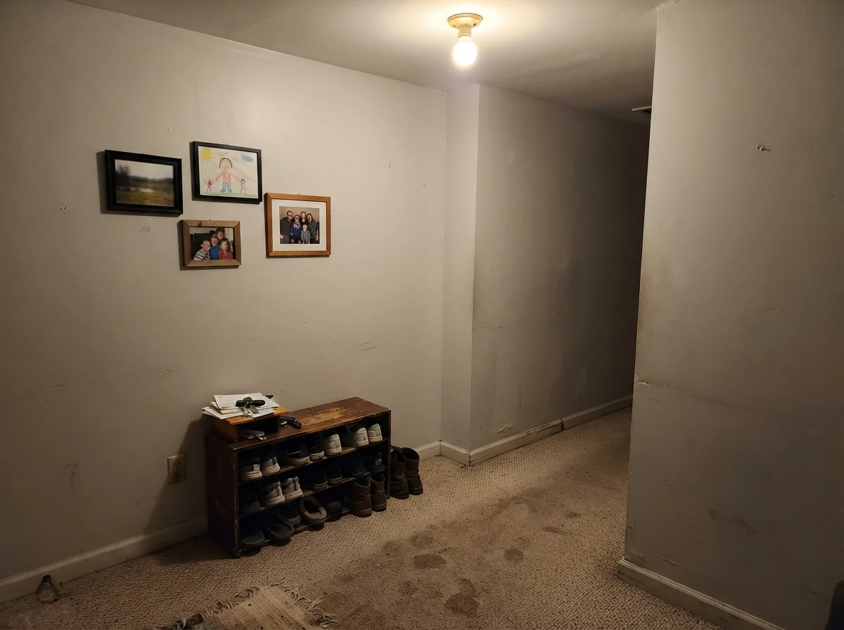
The trouble starts when the light drops or turns cool. In north-facing rooms, or on grey winter mornings, Drift of Mist strips down to its bare gray foundation. Without warm sun to support the beige, the paint can cast a slight violet or muddy undertone in the corners. Worse, if you pair it with cool 4000K LED bulbs, it completely loses its warmth and looks flat and dingy—almost like damp cement or aged primer that someone forgot to topcoat. Five years in, I have learned that if a room doesn't have generous natural light or warm 2700K lamps, you cannot count on Drift of Mist to manufacture warmth out of thin air.
Drift of Mist in Bedrooms: Calming Retreat or Washed-Out Box?
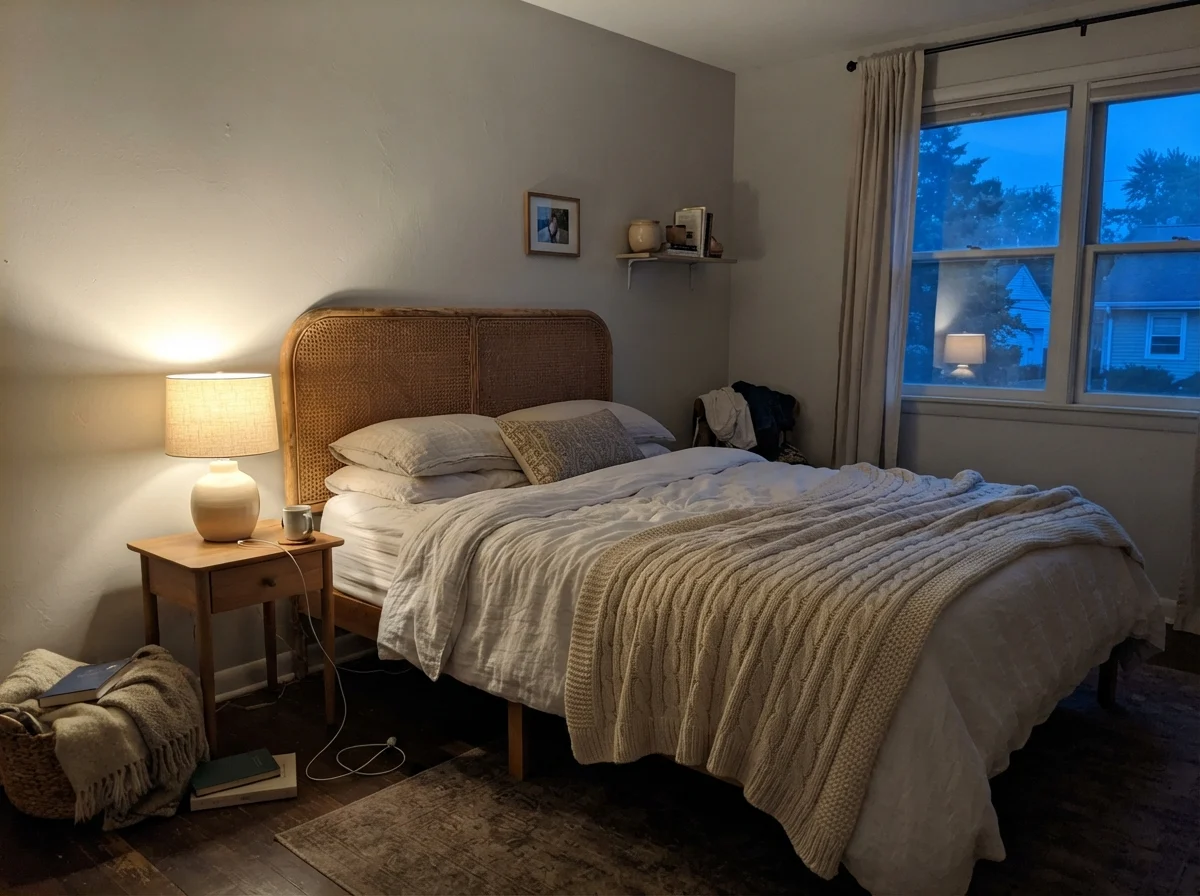
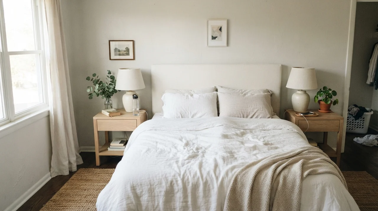
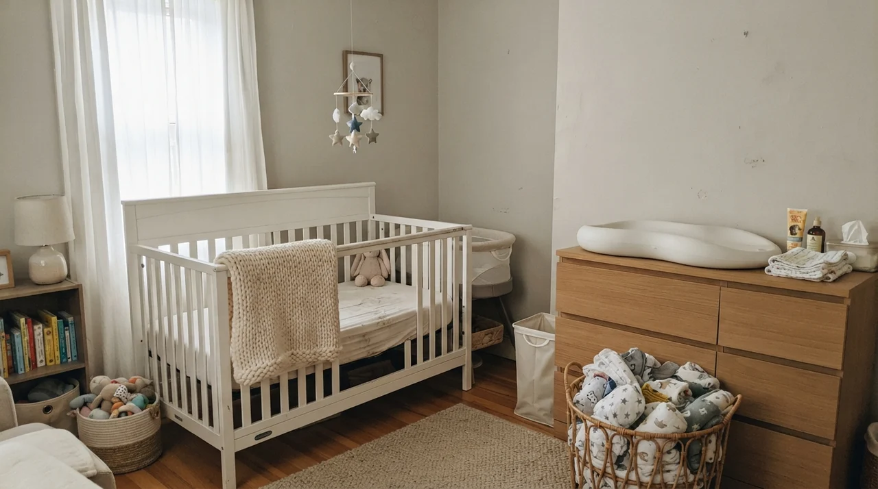
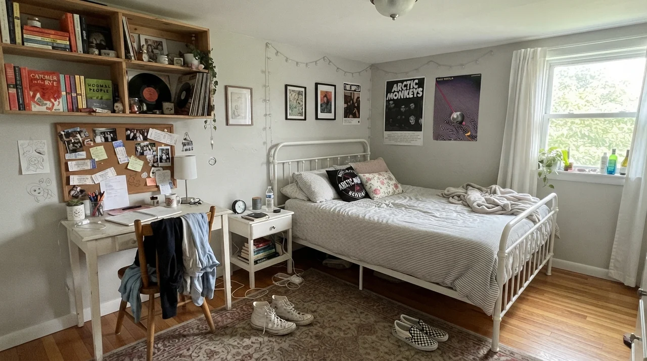
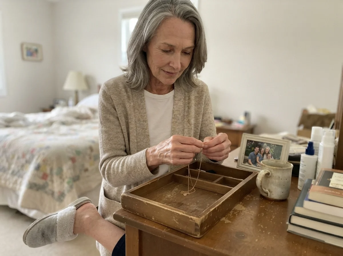
In a bedroom, we want walls that feel like a quiet exhale at the end of a long day. Drift of Mist delivers that beautifully if you understand its lighting rules. In a primary bedroom with east- or south-facing windows, the color creates an effortless backdrop for white linen bedding, natural wood tones, and soft ceramic lamps. It does not demand your attention when you walk in, which allows textures—like woven rugs and chunky knit blankets—to do the heavy lifting.
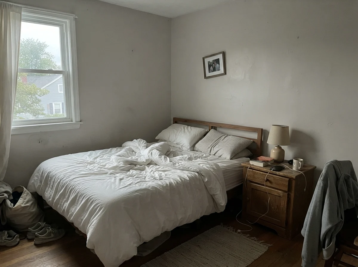
However, you must be careful in rooms that don't get direct sunlight. In a teenager's bedroom with cool window light or a guest room kept dark during the day, the color can flatten out until it feels like nothing was painted at all. The secret to living with it in sleeping spaces is strict bulb discipline: swap out any high-kelvin utility bulbs for soft, warm 2700K lighting. When those table lamps turn on in the evening, Drift of Mist settles into a cozy, creamy greige that makes the room feel grounded and restful.
Bathrooms and Tile: The Hard Surface Trap
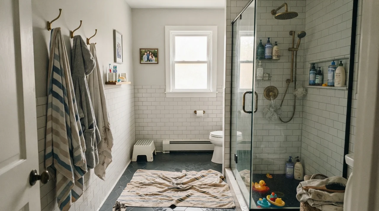
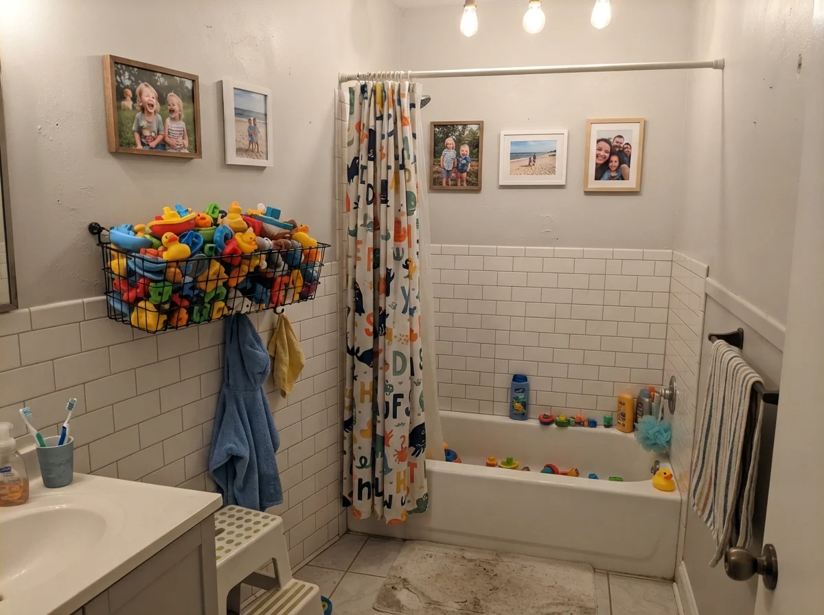
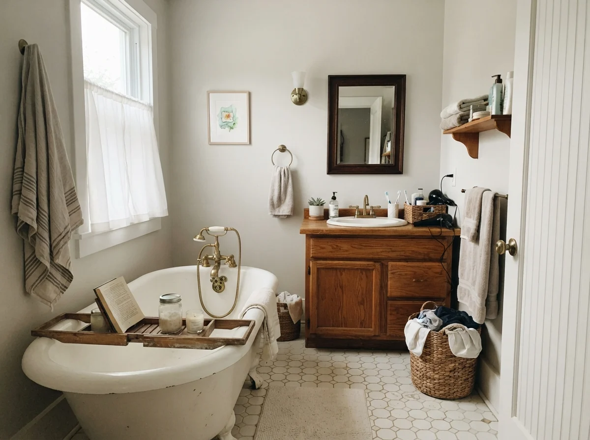
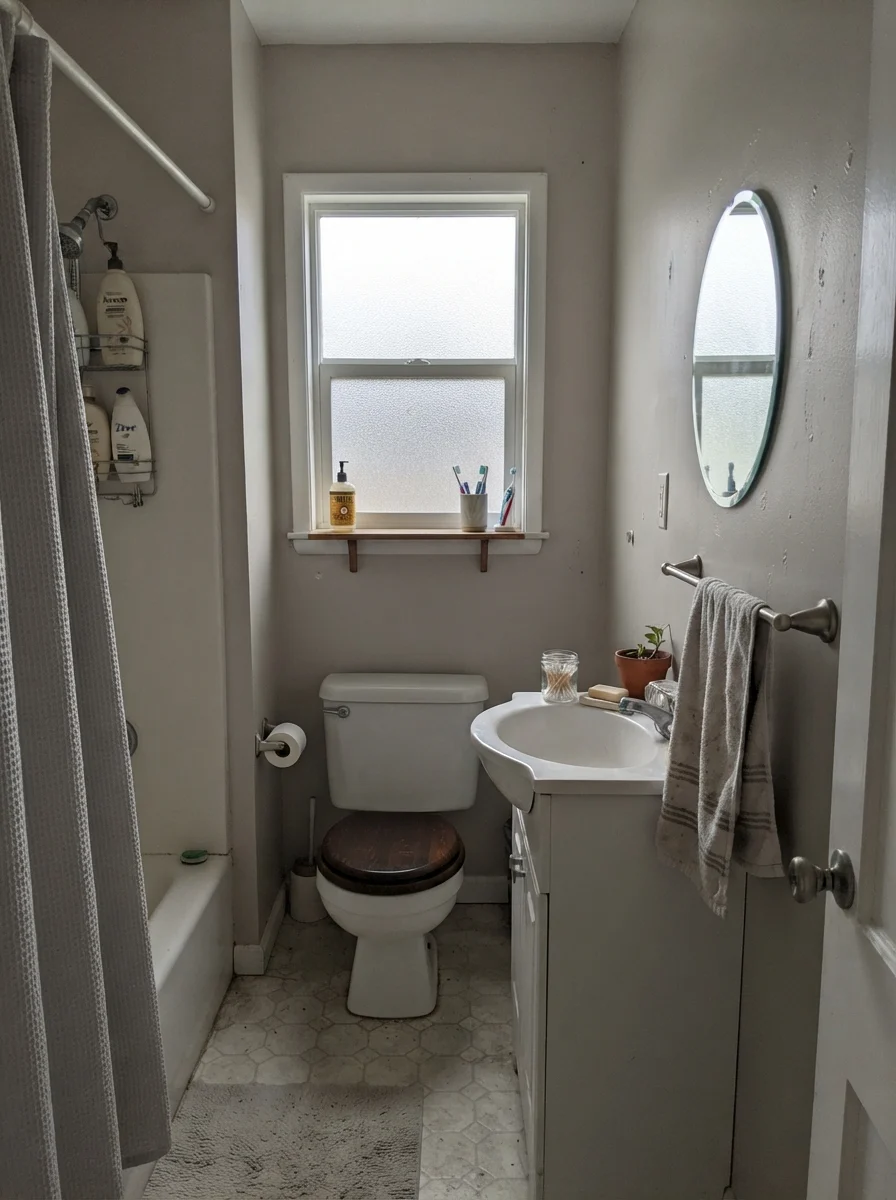
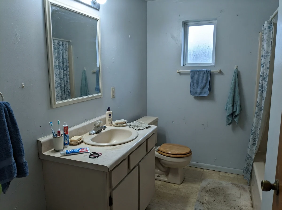
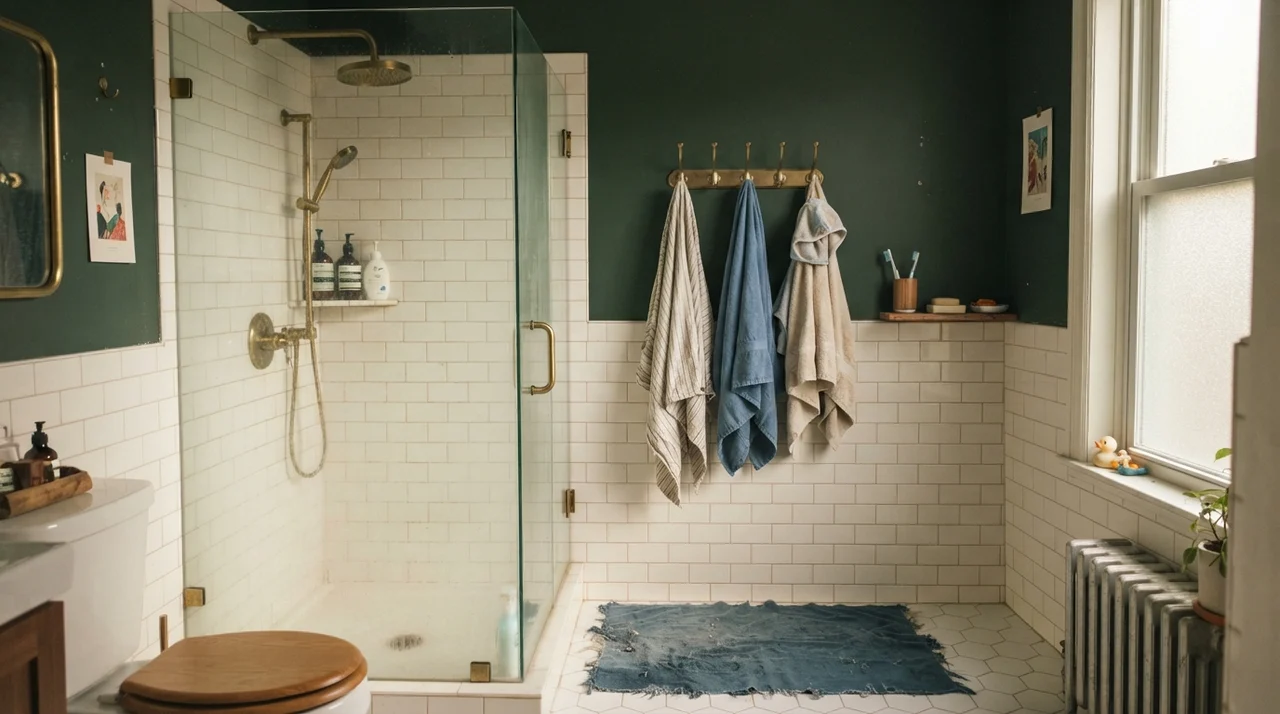
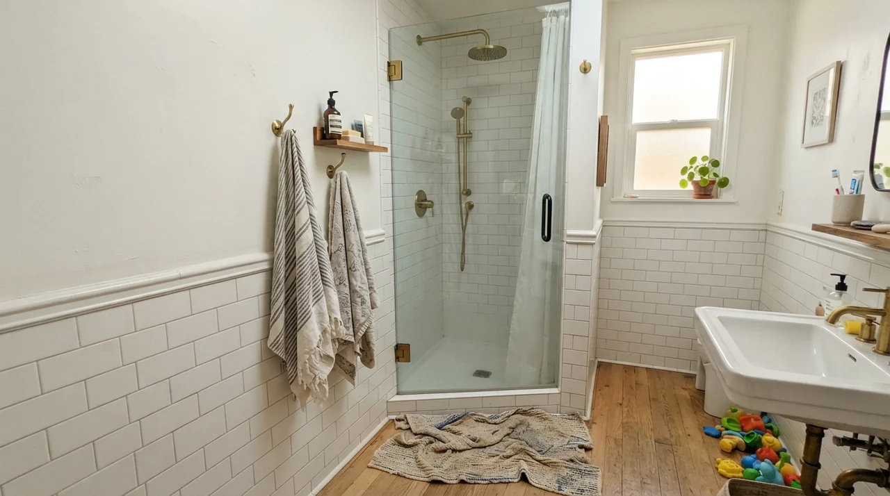
Bathrooms are where paint colors face their toughest test, because you are trapping the paint between hard, unyielding surfaces: porcelain toilets, glossy tile wainscoting, and stone countertops. Drift of Mist works well in bathrooms only when those hard surfaces are chosen thoughtfully. Over classic white subway tile with warm brass fixtures or white hex tile floors, it creates a clean, vintage-cottage look that feels tailored rather than clinical.
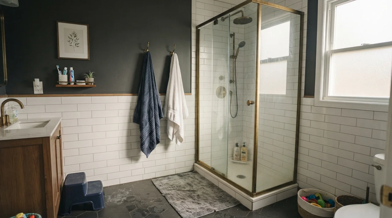
The danger zone in bathrooms is the vanity countertop and tile undertone. Drift of Mist sits near the yellow-green edge of the greige spectrum. If your bathroom has cool, blue-gray veined marble or slate, Drift of Mist can suddenly look muddy and yellowish by comparison. Conversely, if your floor tile or vanity top leans heavy olive or warm sage, it can pull an unflattering greenish cast out of the paint. If you have older fixtures or mixed tile, test a large swatch next to the tile before committing to the whole room.
Kitchens and Cabinetry: The Almost-White Alternative
If you have ever painted kitchen cabinets a pure, stark white, you know the daily headache that follows: every single fingerprint around the pulls, every dropped coffee splash, and every smudge shows up under kitchen downlights like a spotlight. When we refreshed the kitchen cabinets in our 1990s colonial, I realized that going just two steps down from white makes everyday maintenance ten times easier.
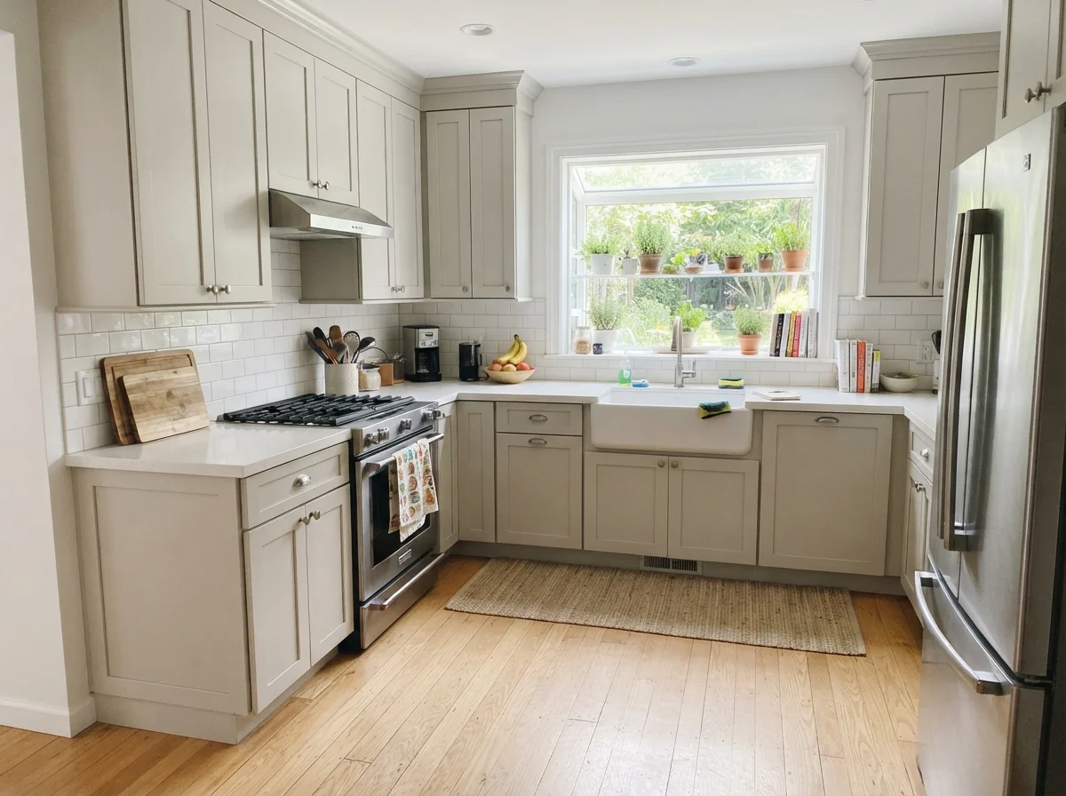
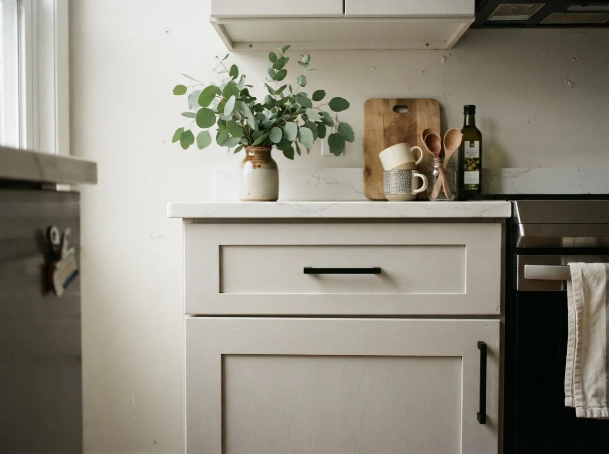
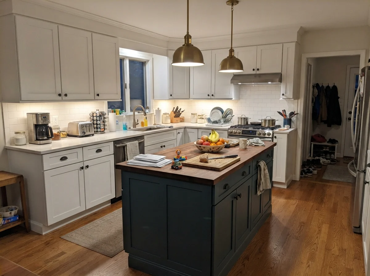
Drift of Mist in a satin finish is exceptional on cabinetry. It gives you the airy, open feeling of an off-white kitchen without that blinding glare or the harsh institutional feel of pure white. It pairs effortlessly with white quartz counters, light oak floors, and matte black or antique brass hardware. If you are doing a two-tone kitchen, Drift of Mist on the perimeter cabinets or on a center island paired with creamy walls creates subtle depth without looking dated within a few seasons.
Main Living Areas: The Whole-House Glue
Where Drift of Mist earns its keep is on open-plan main floors. In modern layouts where the living room, dining area, and foyer share sightlines, using multiple paint colors often chops up the architecture and makes the space feel smaller. Drift of Mist flows from brightly lit window walls to shadowed interior corners without looking like two entirely different paints. In eggshell on the walls with Pure White SW 7005 on the baseboards and door frames, it creates a unified canvas that lets your furniture take center stage.
The one rule for large living spaces is that you must ground this color. Because LRV 69 is so pale, an entire room painted in Drift of Mist with light beige furniture and white rugs can feel floaty and unfinished. You need contrast to anchor the eye: a rich jute rug, walnut or warm oak coffee tables, linen textiles with weight, or an accent feature painted in a grounding dark shade like Sherwin-Williams Urbane Bronze SW 7048 or Iron Ore SW 7069 on a fireplace surround.
Transitional Spaces: Hallways, Doors, and Trim Accents
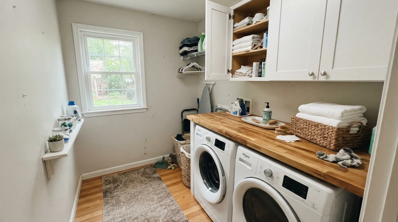
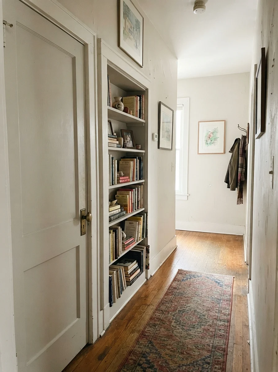
Hallways and stairwells are notoriously tricky because they rarely have their own dedicated windows. In dark passageways, heavier greiges like Repose Gray or Agreeable Gray can sometimes close in the walls and feel like a tunnel. At LRV 69, Drift of Mist reflects enough ambient light from adjoining rooms to keep stairwells and windowless hallways feeling open and breathable.
Another clever application in older homes is using Drift of Mist not on the walls, but on interior architectural elements. Painting interior doors, built-in bookshelves, or hallway wainscoting in satin Drift of Mist against soft off-white or cream walls creates subtle, elegant definition. It adds just enough depth to highlight crown molding or panel doors without the sharp, stark contrast of dark trim.
Where Drift of Mist Fails: The Honest Mistakes
The bad stories about this color are remarkably consistent, and they all come down to a single weakness: there is simply not enough heavy pigment in Drift of Mist to defend itself when conditions turn against it. If your space matches one of the three scenarios below, you will likely regret putting it on your walls.
First, a dim, north-facing room lit by cool 4000K LED bulbs is Drift of Mist's worst enemy. The flat daylight drains what little warmth the paint possesses, while the blue-heavy LEDs expose its gray base. The wall turns dingy, casting an unpleasant gray-violet shadow into the corners. If you cannot switch to warm 2700K bulbs or bring in natural light, skip this shade and choose a richer neutral like Sherwin-Williams Shoji White SW 7042 (LRV 74), which holds its warmth even in deep shade.
Second, in a brilliant south- or west-facing room paired with pure white trim, Drift of Mist washes out completely. Midday sun bleaches the subtle greige tint straight out of the wall, making it read as plain, unpainted builder off-white. If you wanted noticeable contrast against your trim, you will be disappointed. In high-sun rooms where you want visible depth, step down to Agreeable Gray SW 7029 (LRV 60) or Gossamer Veil SW 9165 (LRV 62).
Third, be very careful around green-leaning elements like sage backsplash tiles, olive granite, or golden honey oak floors. Drift of Mist sits near that delicate yellow-green neutral boundary; when surrounded by strong green or orange-honey tones, the walls can reflect a faint greenish-olive cast under overhead lights. In those rooms, Accessible Beige SW 7036 (LRV 58) behaves much more reliably.
Exterior Siding: Sunlight and Scale
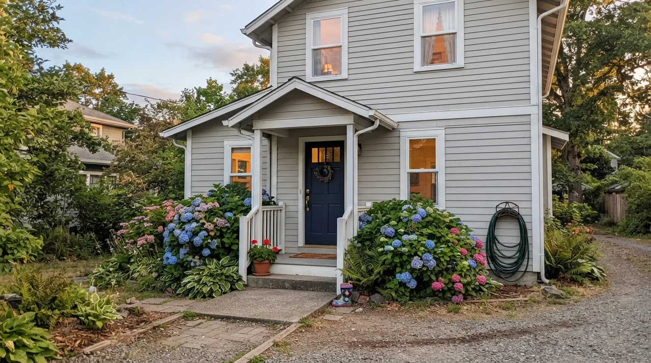
Using Drift of Mist on an exterior requires understanding the power of outdoor sun. Direct sunlight washes out exterior paint by roughly two full shades. On horizontal siding, Drift of Mist reads as a soft, clean off-white rather than a true gray or greige. It looks fresh, welcoming, and timeless when paired with crisp white trim and a bold, deep accent—such as a Sherwin-Williams Naval SW 6244 front door or Iron Ore SW 7069 shutters.
However, it cannot carry an exterior facade entirely on its own. Without architectural contrast—such as a brick foundation, stone walkways, or dark shutters—a house painted head-to-toe in Drift of Mist can look washed out under full sun. Furthermore, avoid using it on heavily shaded north-facing elevations surrounded by dense trees, where it will read as a flat, chalky gray rather than a warm off-white.
You don't pick a whole-house neutral for how it looks on an empty wall on painting day. You pick it for how quietly it steps aside when real life, furniture, and family clutter move into the room.
Durability, Scrubbing, and Sheen Choices
When you paint large transitional spaces like hallways, entryways, and stairwells, you have to think about what those walls will look like five years in. In our house, the stairwell wall gets brushed by laundry baskets, backpacks, and muddy dog tails weekly. The right sheen makes all the difference between a quick wipe-down and having to repaint the entire run of drywall.
For all general living areas, bedrooms, and hallways, specify an eggshell finish. Eggshell provides just enough washability to be scrubbed clean with a damp microfiber cloth without creating an unwanted glossy sheen across large expanses of drywall. For trim, baseboards, and interior doors, stick to semi-gloss in Pure White SW 7005 to resist scuffs and vacuum dings. For kitchen cabinets or bathroom built-ins, satin is worth the money—it resists steam, wipes down easily around cabinet handles, and hides minor surface imperfections far better than high-gloss.
Is Drift of Mist considered gray, beige, or off-white?
Drift of Mist is classified as a light greige with an LRV of 69. It sits right on the border between a pale greige and an off-white, reading as a warm gray in cool light and a soft beige-linen in direct sun.
What is the best trim color for Drift of Mist?
Sherwin-Williams Pure White (SW 7005) in semi-gloss is the most dependable trim partner. It provides clean, crisp definition without the stark blue-cold glare of an un-tinted builder white.
Can Drift of Mist look green in some rooms?
Yes. Because Drift of Mist sits near the green-yellow boundary of neutral pigments, pairing it with sage tile, olive countertops, or strong honey oak floors can cause the walls to reflect a faint olive-green undertone.
Will Drift of Mist make a dark room look brighter?
With an LRV of 69, it reflects plenty of light, but it cannot create warmth where there is none. In a dim north-facing room, it can look shadowy and dingy unless paired with warm 2700K lamps.
Susan's Verdict · The Whole-House Workhorse
Drift of Mist SW 9166 is not a paint color meant to drop jaws or make a bold artistic statement. It is a quiet, hardworking backdrop designed to carry an entire floor plan effortlessly from the front foyer to the upstairs bedrooms without clashing with your furniture. If you have warm lighting, natural wood tones, and open sightlines, it is absolutely worth the money in five-gallon buckets. Just don't ask it to do what it wasn't made for: keep it out of dark, north-facing rooms with cool bulbs, and always ground it with rich wood, dark hardware, or a deep accent note.