Color Diary · No. 9
Sherwin-Williams Iron Ore: What Nobody Tells You About Soft Black
America's favorite soft black, reviewed honestly: where it looks incredible, the rooms and walls where it lets people down, and what to paint instead.

Susan HartleySeptember 1, 2026 · 15 min read
Iron Ore · Sherwin-Williams SW 7069
Hex#434341LRV6Undertonesbronze-green → charcoal → inky blue-black
In our last house—a 1990s colonial with too much golden oak and nine-foot ceilings that felt cavernous in the wrong ways—I got brave. It was year twelve of living there, and I was thoroughly exhausted by the sea of polite, timid beiges that had ruled our main floor since move-in day. I decided the powder room and the back den needed drama. Everyone at the paint counter was buzzing about Sherwin-Williams Iron Ore (SW 7069). They called it the ultimate soft black, the foolproof charcoal that works everywhere, the shade that never goes harsh. So I bought two gallons, rolled it on four walls in both rooms, and stepped back.
In the den, which had a wide south-facing window overlooking the deck, the color was a triumph. It felt tailored, grounded, and rich. In the windowless powder room under the stairs, however, it swallowed every stray photon of light and made the space feel like an unlit elevator shaft. I had to replace the light fixture with higher-wattage bulbs just so guests could find the hand soap.
That was my first real lesson with Iron Ore: it is not just a dark gray paint; it is an LRV 6 light sponge. With a Light Reflectance Value of 6, it bounces almost nothing back into the room. When you put it in the right space with deliberate lighting, intentional woodwork, and crisp contrast, it looks like a million bucks. But when you ask it to rescue a dark, neglected corner, it will simply turn out the lights and leave you sitting in the shadows. We lived with it in that colonial for six years until we sold, and I have since rolled it onto kitchen islands, front doors, and exterior siding in our current 1960s ranch. Here is the unvarnished reality of what Iron Ore is actually like to live with long-term.
How Natural Light Alters the Personality of Iron Ore
One of the biggest mistakes I see homeowners make with ultra-dark paints is choosing them strictly from a tiny two-inch paper chip under the fluorescent strip lights of a home improvement store. On that swatch, Iron Ore looks like a solid, unchanging matte black. On a twelve-foot wall, however, it is at the mercy of your window exposure.
In strong southern or western sunlight, Iron Ore lifts out of the black territory entirely. The heavy sun illuminates the pigment particles, revealing a deep, refined charcoal with a clean, slightly steely edge. It never turns muddy or yellowish the way warmer darks can. But on overcast mornings or in rooms facing strictly north, the cool, diffuse light strips away that depth. In weak exposure, Iron Ore collapses down into a flat, impenetrable near-black. That is fine if you are intentionally creating a dramatic, moody den, but if you expected a cozy, gentle charcoal gray, a dim north window will disappoint you every time.
Iron Ore in Bathrooms: Wainscoting, Vanity Mirrors, and Cool Casts
Bathrooms are one of the most common places people experiment with Iron Ore, and for good reason: small spaces allow you to take risks you might hesitate to take in a sprawling open-concept living area. But how Iron Ore performs in a bathroom depends entirely on what sits below eye level and where the daylight enters.
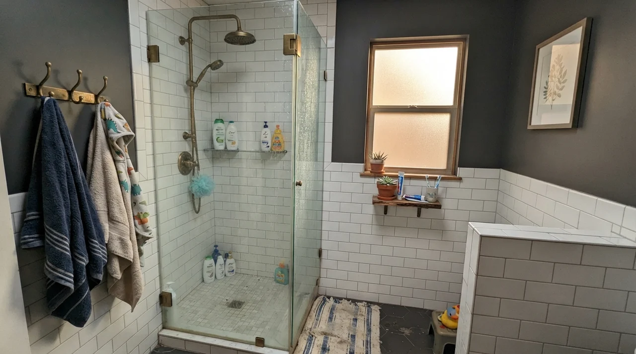
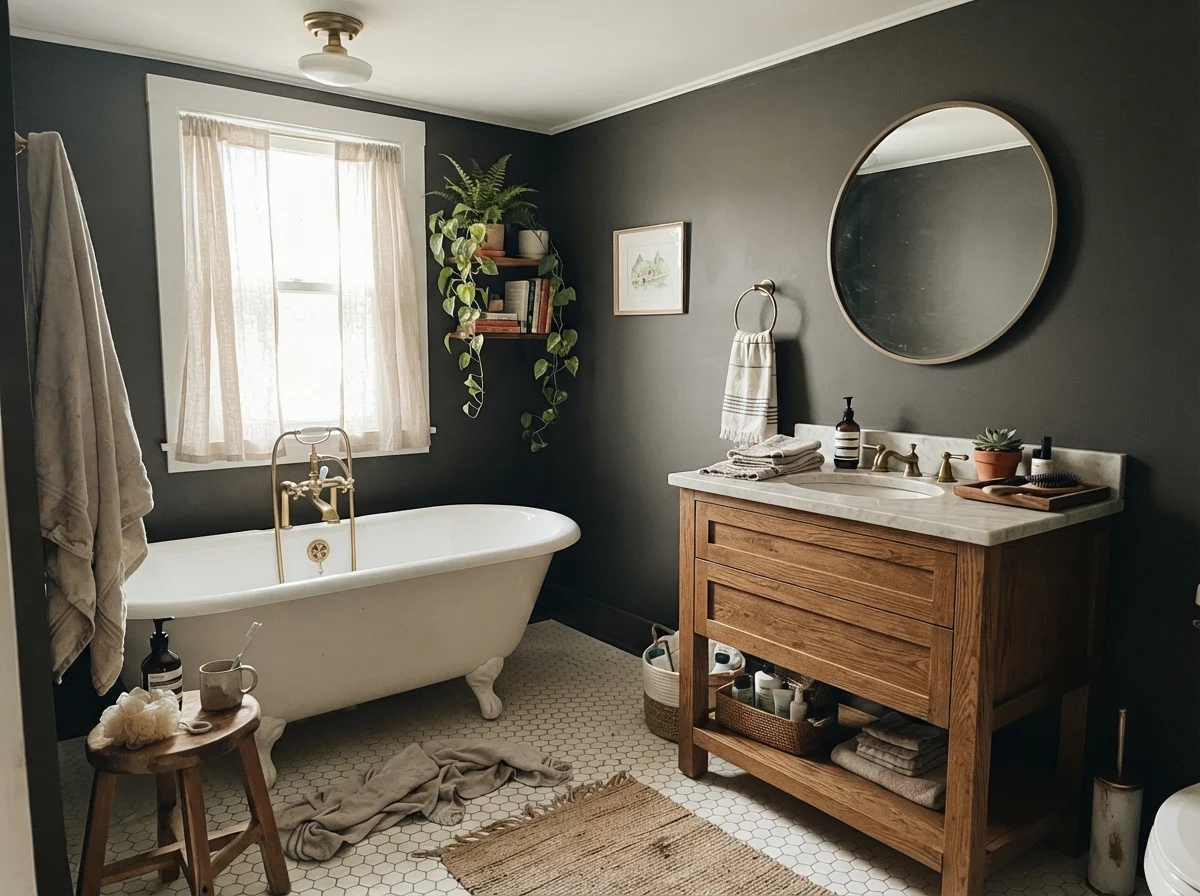
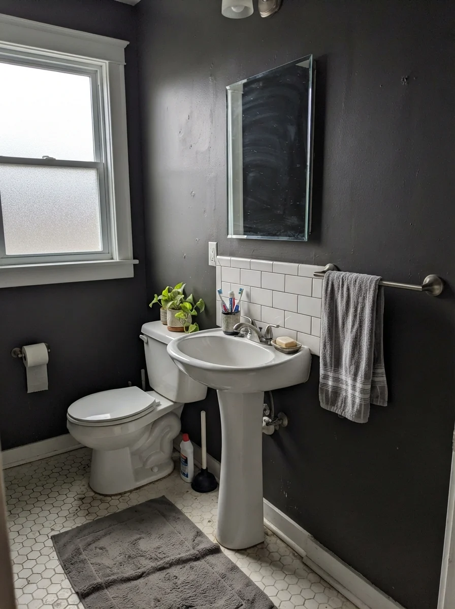
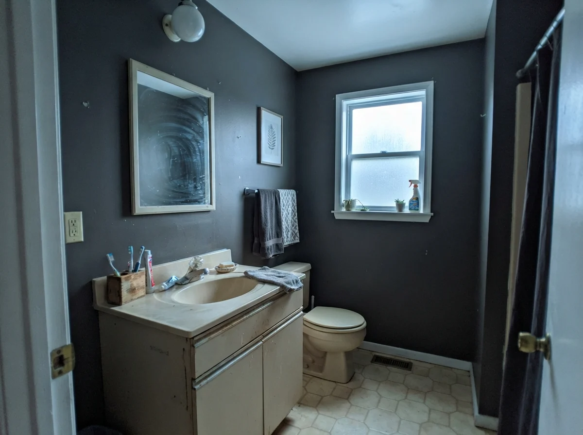
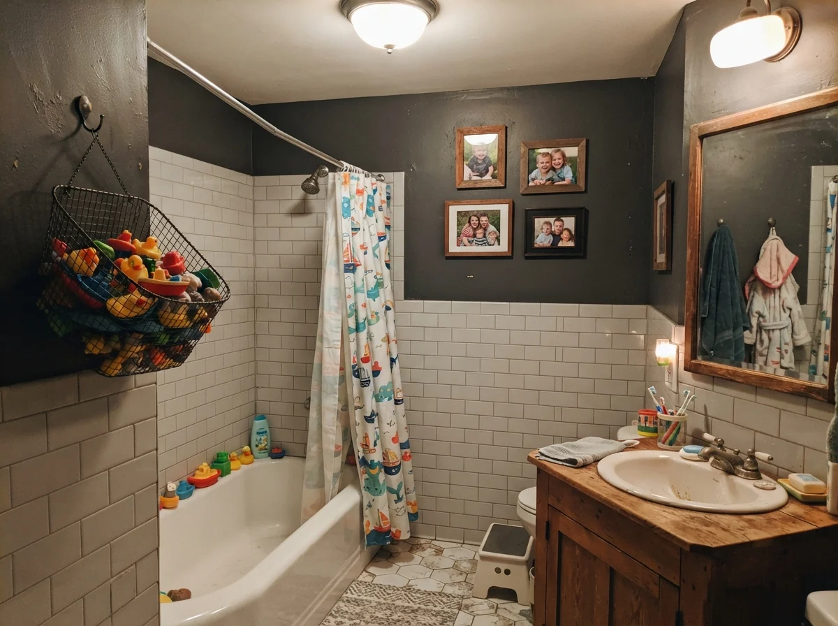
When paired with crisp white tile wainscoting—such as classic subway tile—Iron Ore acts as an architectural anchor. It gives the room weight and purpose without making you feel trapped in a dark container. White hex tile floors, porcelain tubs, and warm oak vanities reflect enough light upward to balance the low LRV of the paint. On the other hand, in a modest bathroom with older beige counters and cool overcast daylight through frosted glass, the color can read decidedly gray, picking up a cool, utilitarian cast. If your bathroom lacks generous daylight, make sure your light fixtures are fitted with warm 2700K bulbs to soften the perimeter.
Kitchen Cabinets and Islands: The Practical Test
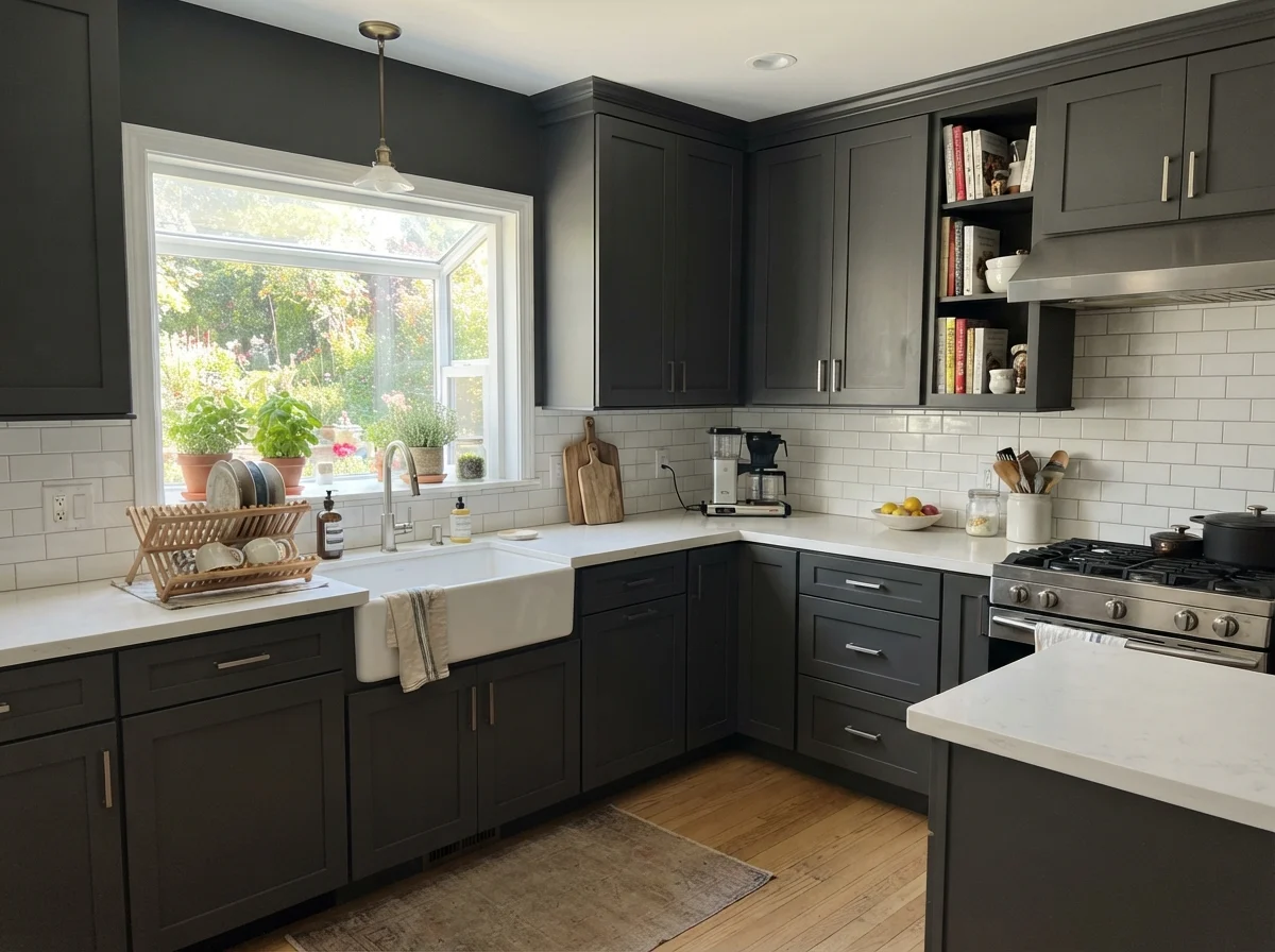
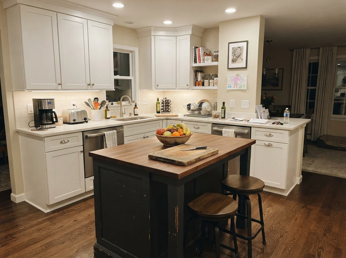
In thirty years of maintaining houses, I have painted kitchen cabinets five separate times. I know what holds up to grease, daily scuffs, and flying pasta sauce, and what looks tired within twenty-four months. When we tackled our kitchen refresh four years ago, I put Iron Ore on the kitchen island while keeping the perimeter cabinetry in Sherwin-Williams Pure White (SW 7005) and the walls in Accessible Beige (SW 7036).
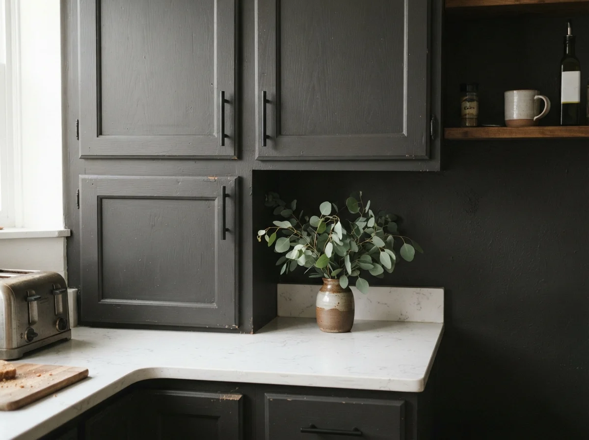
Here is why Iron Ore is worth the money on cabinetry: unlike true jet blacks (like Tricorn Black), Iron Ore has just enough charcoal softness that it does not show every single speck of kitchen dust or flour the second you wipe the counters down. When painted in a durable satin urethane cabinet enamel, the finish is scrubbed clean effortlessly. The slight steely depth also makes brass hardware, natural butcher block, and quartz countertops look deliberate and custom. On full uppers and lowers in a small kitchen, it can feel heavy; but on an island or lower cabinetry base, it anchors the entire room with zero fuss.
Bedrooms, Nurseries, and Living Areas: Accent Wall vs. Four Walls
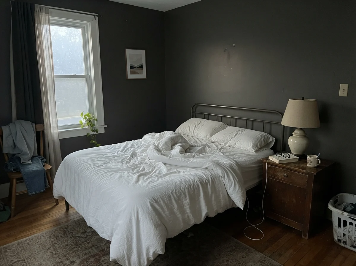
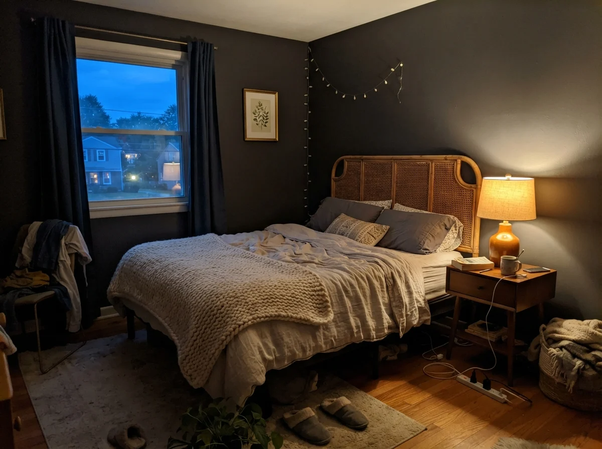
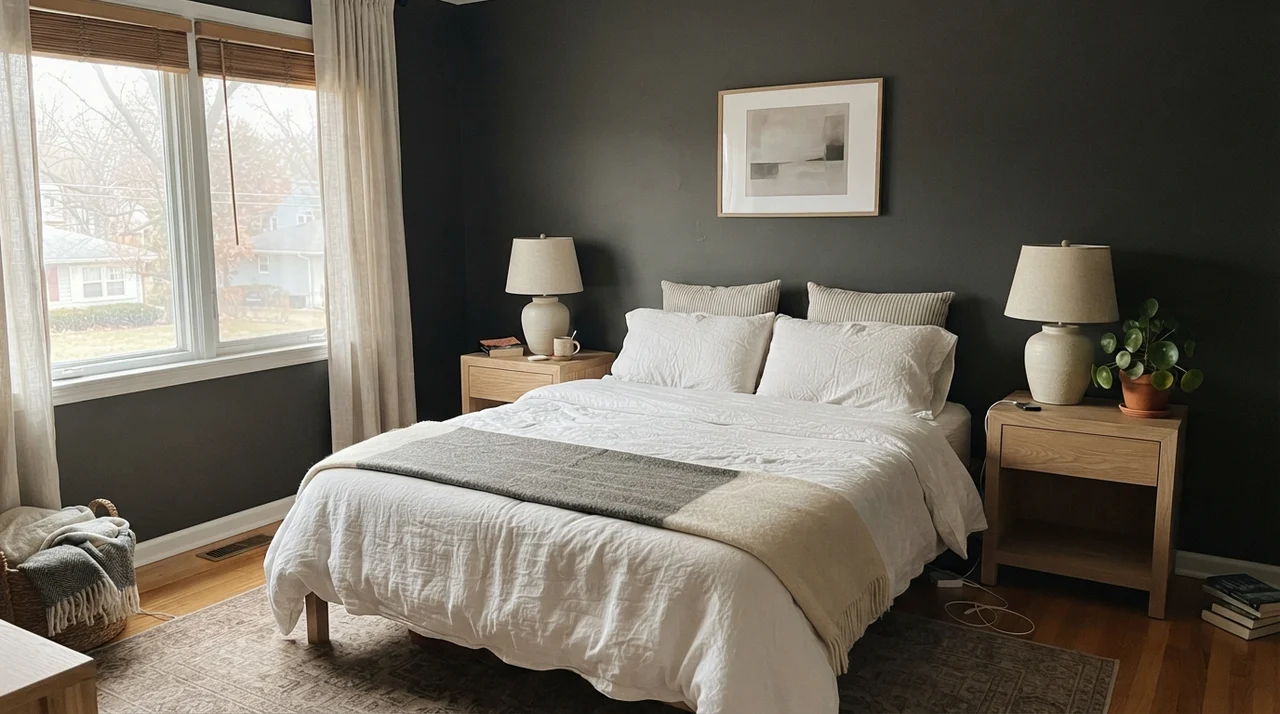
Whenever a neighbor asks me if they should paint their entire primary bedroom in Iron Ore, my answer is always the same: how much natural light do you get at 2:00 PM? If you have floor-to-ceiling southern windows, wrapping the entire room can feel like a moody boutique hotel suite. But in an average bedroom with standard eight-foot ceilings and a modest window, four walls of an LRV 6 color will quickly turn your peaceful retreat into a cave.
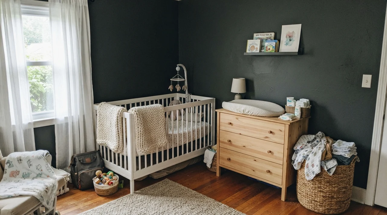
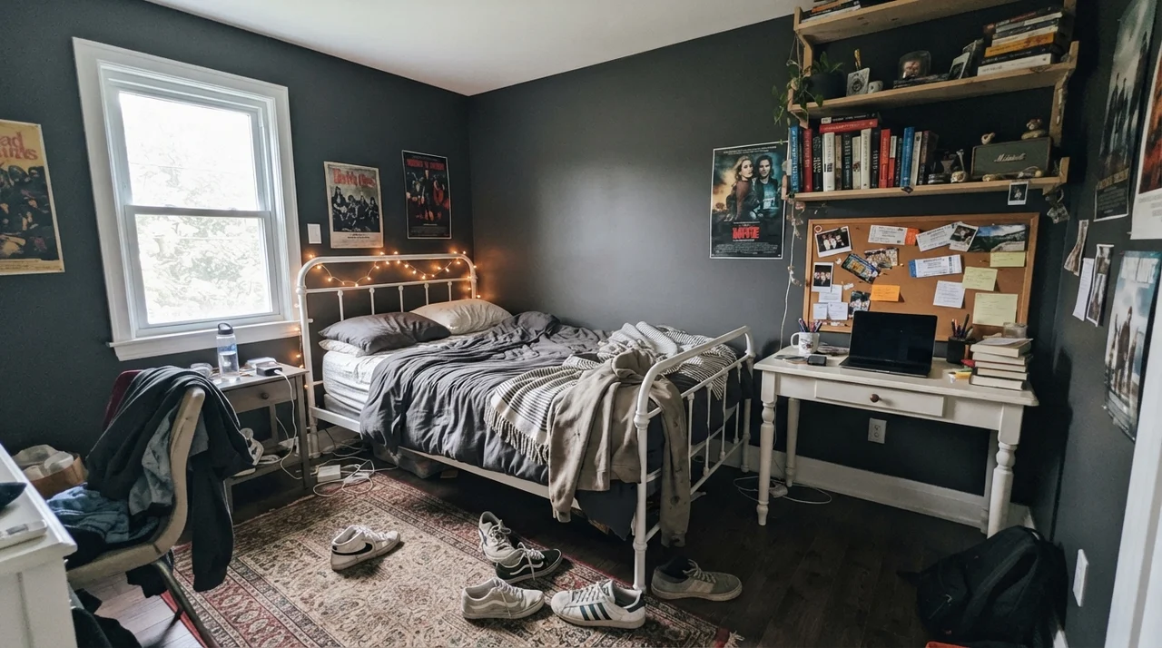
Where Iron Ore shines reliably in bedrooms is behind the headboard as a dedicated accent wall. It provides immediate grounding for pale oak nightstands, white linen bedding, and brass sconces without draining all ambient light from the room. In teenagers' rooms and modern nurseries, it offers a crisp, tailored backdrop that easily outlasts childhood phases—you will not find yourself having to repaint bright pastel walls three years in when their tastes change.
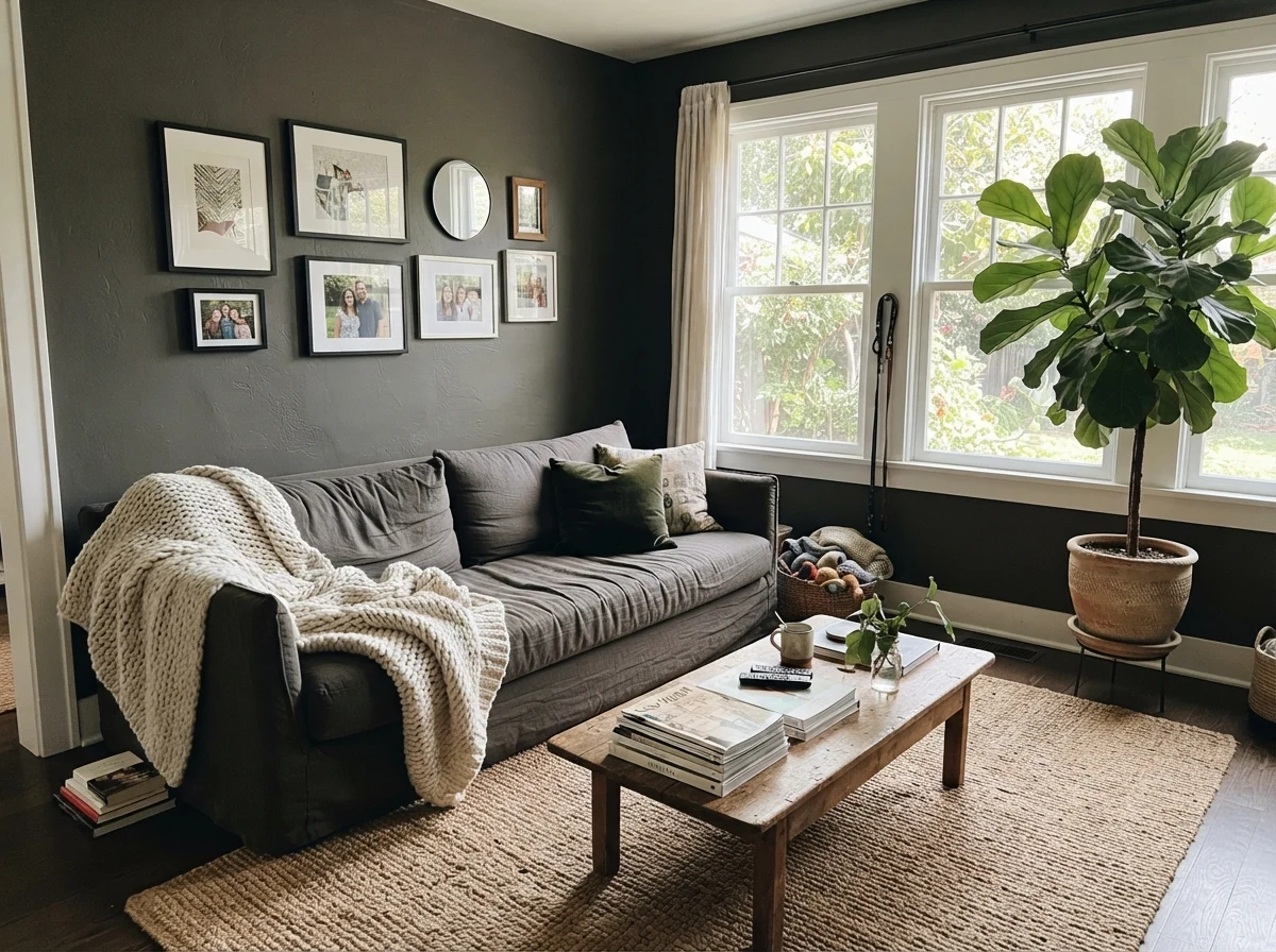
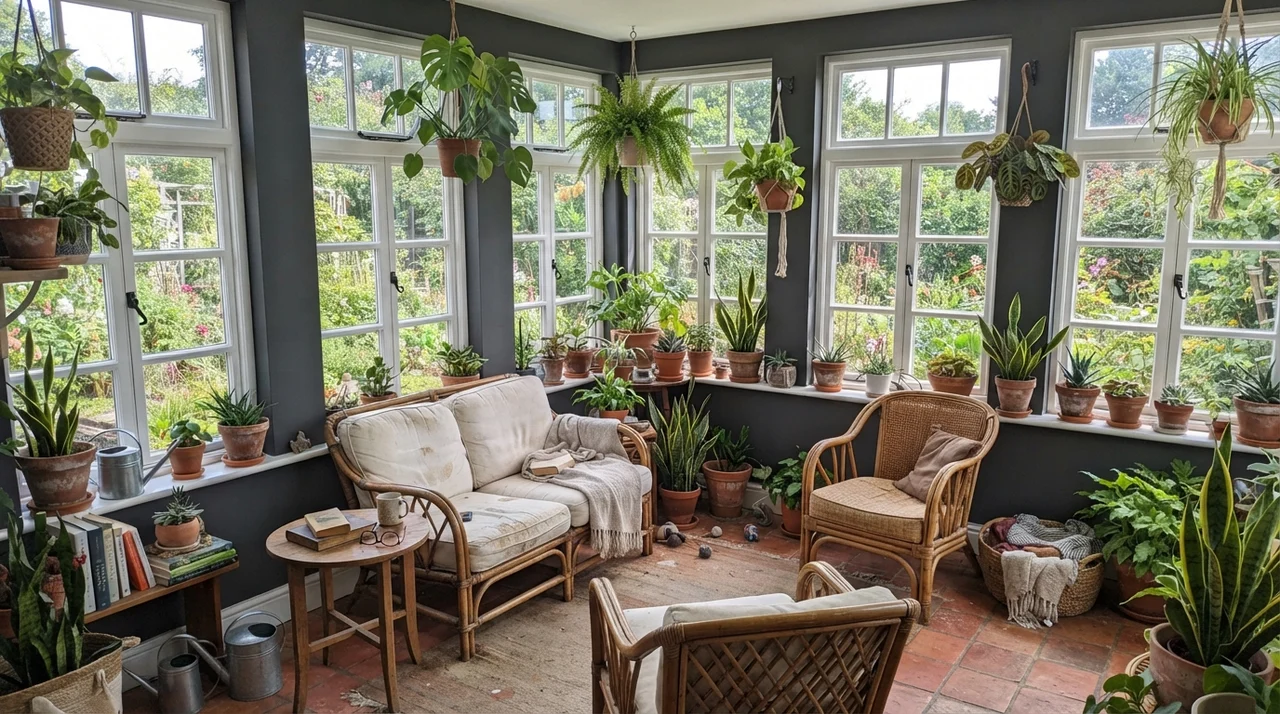
In living rooms and sunrooms, Iron Ore behaves like a chameleon. When bathed in direct midday sun, the charcoal undertone softens, pairing naturally with textured jute rugs, rumpled linen sofas, and potted greenery. In a sunroom lined with white-framed windows, the slivers of dark wall create a frame effect, drawing the eye directly past the glass and into the garden outdoors.
Laundry Rooms, Interior Doors, and Architectural Millwork
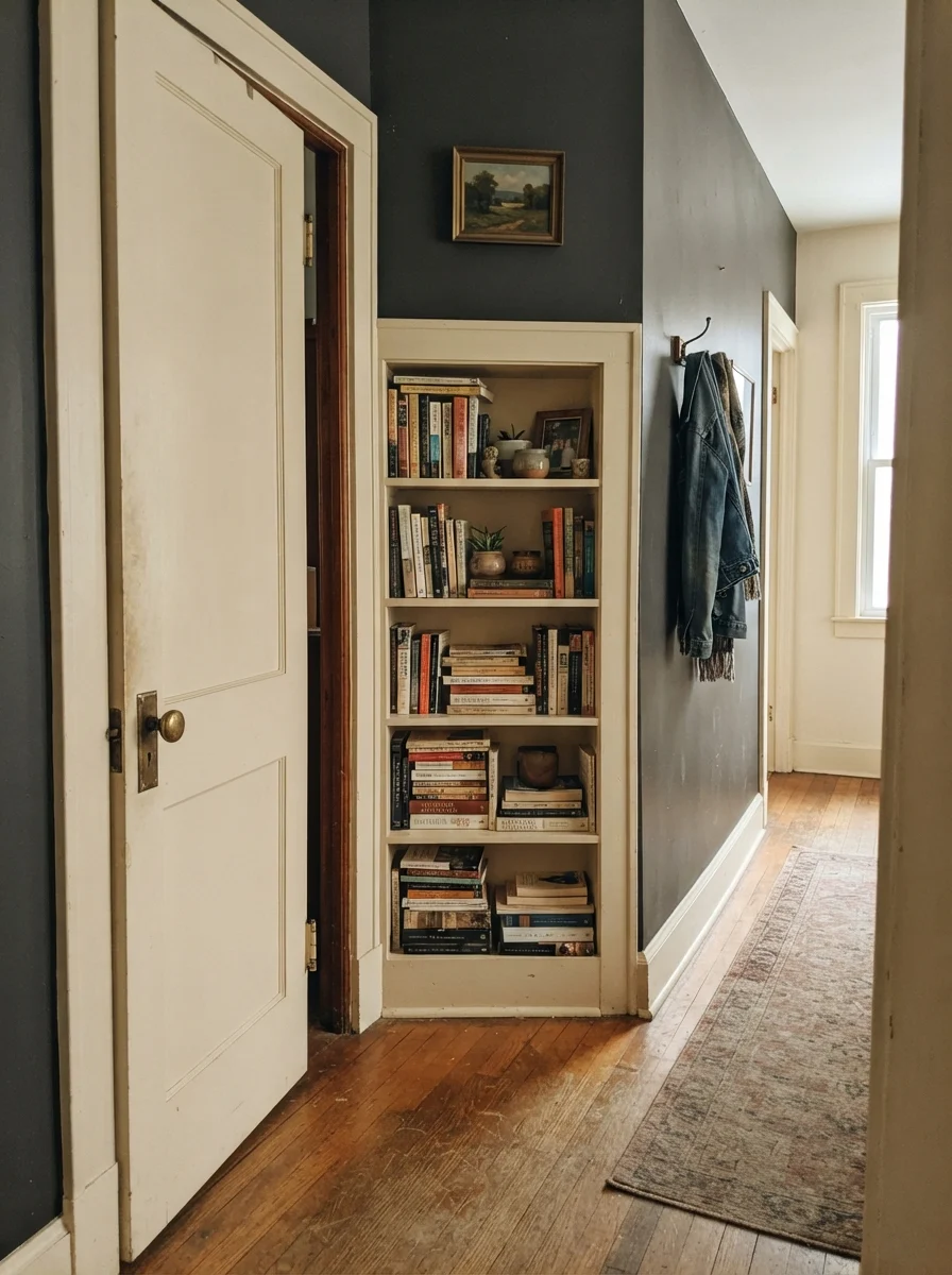
If you want the elegance of a high-contrast home without committing an entire room to dark walls, paint your interior doors and built-ins. In our 1970s split-level, the interior hollow-core doors were an uninspired faux-wood grain. Two coats of Iron Ore in a durable semi-gloss turned them from builder-grade embarrassments into architectural features that looked solid and heavy.
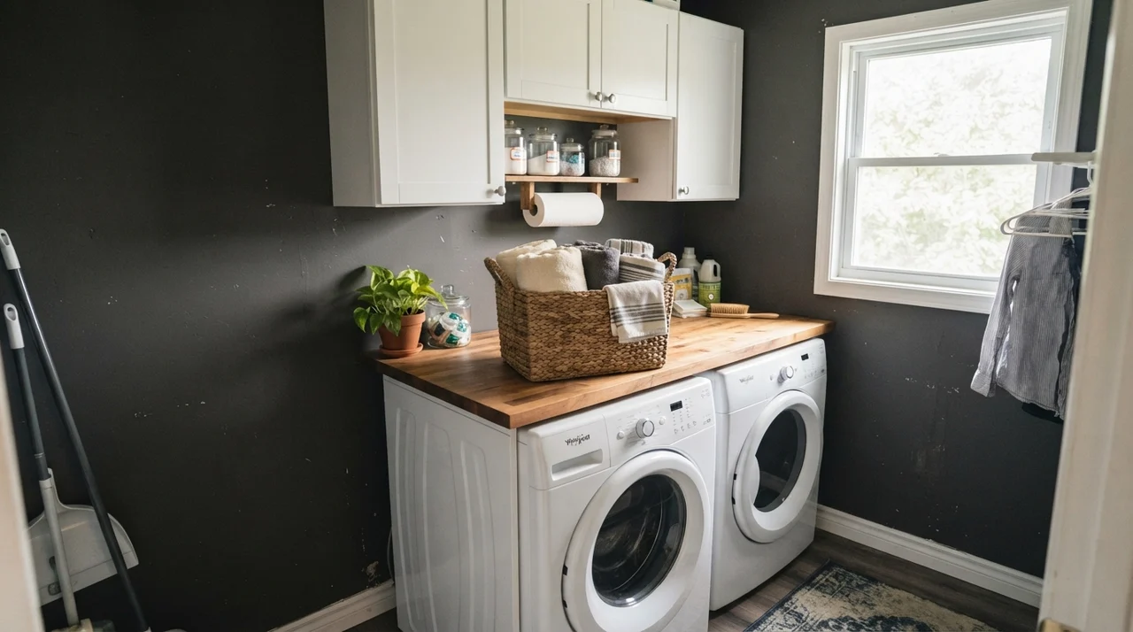
The same principle applies to utility spaces like laundry rooms and family hallway drop zones. Against white washers and dryers, butcher-block counters, and white upper cabinets, Iron Ore provides depth that masks everyday fingerprints around light switches. It gives functional utility zones a finished, deliberate feel that held up beautifully across five years of heavy family use.
Exteriors: The Setting Where Iron Ore Truly Dominates
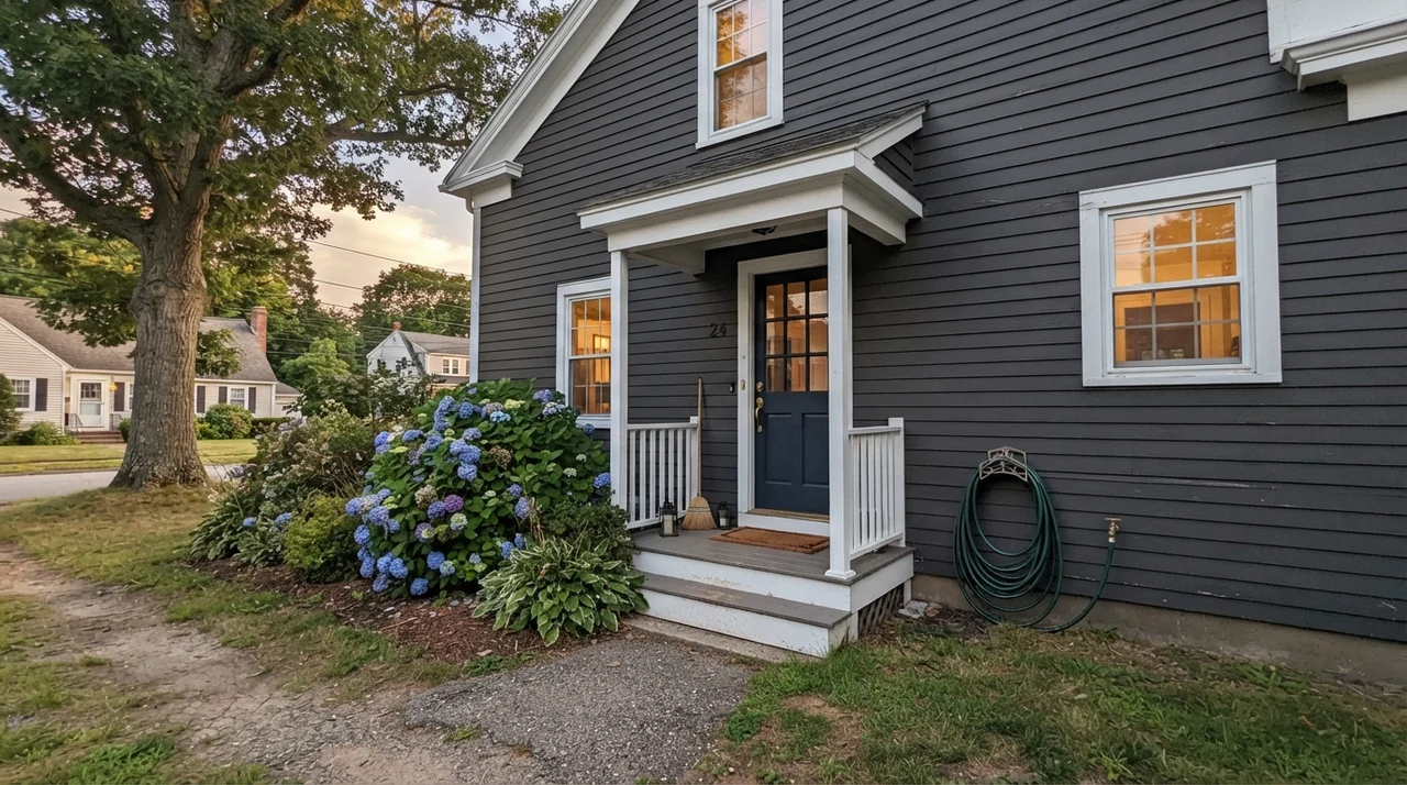
If Iron Ore has a native habitat where it beats almost every competitor on the fan deck, it is outside on siding, trim, and shutters. Many homeowners make the mistake of painting their exterior in true jet black, only to find that harsh summer sunlight makes the house look like an ominous monolith, or worse, highlights every tiny imperfection in the siding wood grain.
Iron Ore avoids that trap completely. From the street, it reads as a rich, sophisticated black. But as you walk up the driveway, the charcoal undertone softens the silhouette, allowing architectural trim, porch railings, and siding panels to retain their visual texture. On horizontal siding paired with crisp white trim and a contrasting front door, it delivers an updated, tailored curb appeal that buyer's agents consistently praise.
The Three Real-World Failures: Where Iron Ore Lets People Down
The complaints about Iron Ore are remarkably consistent across homeowner forums and neighborhood paint groups, and none of them are about paint quality—Sherwin-Williams makes great paint. The failures happen when people expect an ultra-dark neutral to perform miracles in rooms with zero lighting or clashing fixtures. If your project matches one of these three scenarios, be warned: extra coats will not save it.
1. Small, Windowless Rooms Wrapped on All Four Sides
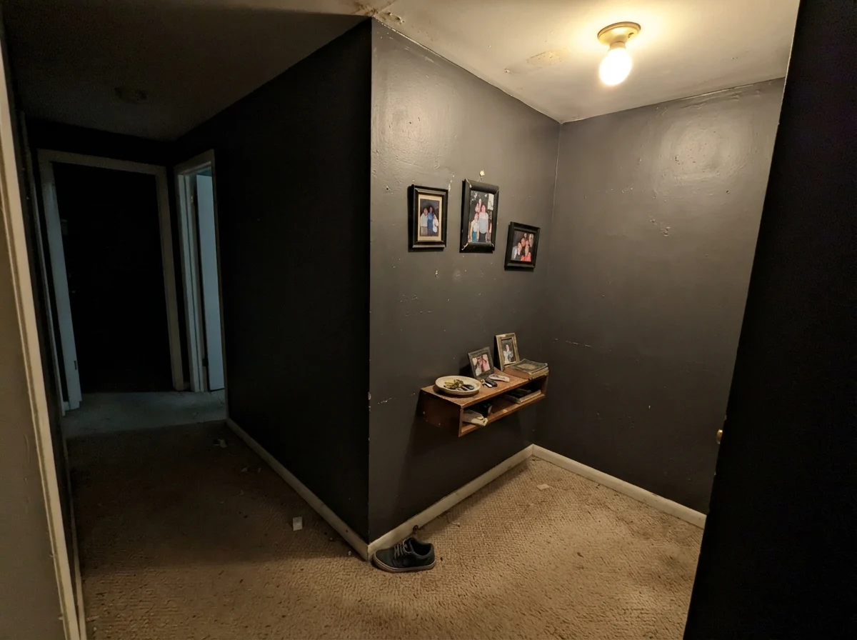
At LRV 6, Iron Ore bounces practically zero ambient light back into a space. When you roll it on all four walls of a dim hallway, a tight box bedroom, or a windowless interior corridor, corners vanish and the ceiling appears to drop. Without sunlight or strategic warm lamplight, the room does not feel cozy; it feels dead and muddy. If you want drama in a dim room without losing definition, look at Peppercorn (SW 7674), which sits at LRV 10 and stays visibly gray.
2. Pairing Next to True-Black Factory Windows or Metal Roofs
If your home features factory-finished black aluminum window frames, true-black gutters, or a standing-seam black metal roof, Iron Ore will betray you. Those manufactured building materials are finished in true jet black. When placed right against them, Iron Ore loses its black illusion and suddenly reads like faded charcoal siding that was washed in the sun too many times. In that case, choose Tricorn Black (SW 6258) so the whole exterior agrees.
3. Sun-Blasted Siding Over Green Lawns
Because Iron Ore is so neutral with just a hint of cool slate, strong direct sun lifts it off black and forces it to mirror whatever is reflecting nearby. On the west side of a house directly over a bright green lawn, it can reflect a bronze-green cast in late afternoon. On the open-sky side, it leans navy. If you need an exterior dark that holds strictly still without environmental color bounce, Benjamin Moore Wrought Iron commits to its blue-black undertone on purpose.
Durability, Sheens, and the Reality of Everyday Wear
Here is something professional staging photos never show you: dark paint finishes behave very differently under a family's daily routine than standard off-whites. With an LRV 6 color like Iron Ore, choosing the correct sheen is half the battle.
For walls in bedrooms, living rooms, and dens, stick to matte or a very low-sheen flat. Why? Because dark paint in an eggshell or satin finish will reflect every single wave, drywall seam, and imperfect patch on your walls like a funhouse mirror. However, matte dark walls come with a compromise: if a dog tail wags hard against it or a laundry basket rubs the hallway wall, it will leave a burnished mark. When you try to touch up that spot a year later, the fresh paint will flash unless you roll the whole wall from corner to corner.
For trim, doors, and wainscoting, use a high-quality semi-gloss. It wipes clean with a damp rag without leaving cloudy streaks. For kitchen cabinets and exterior siding, satin in a dedicated urethane or exterior acrylic is the sweet spot. It sheds rain, resists hand oils, and hides scuffs significantly better than jet black ever could.
You don't choose a soft black for the weekend you paint it. You choose it for year four, when the light hits the scuffs by the doorway and you need to know if the color still holds its ground.
Does Iron Ore look black or dark gray on interior walls?
From across the room or under low evening light, Iron Ore reads as a soft, velvety black. Up close and under direct natural light, you will clearly see it as a deep charcoal with a cool slate undertone.
Can I use Iron Ore on vinyl siding?
No. At LRV 6, Iron Ore absorbs an enormous amount of solar heat. Applying it to standard vinyl siding can cause the panels to warp, buckle, and fail in direct summer sun.
What is the best white paint to pair with Iron Ore trim or walls?
Sherwin-Williams Alabaster (SW 7008) is our top recommendation for a balanced, classic look. If you prefer a cleaner, less creamy backdrop, Sherwin-Williams Pure White (SW 7005) is practically foolproof.
How many coats of paint does Iron Ore require over light walls?
Expect at least two full, generous coats over a gray-tinted primer. If you roll dark paint directly over builder beige or bright white without a tinted primer base, you may need three coats to eliminate lap marks and achieve full color depth.
Susan's Verdict · Sherwin-Williams Iron Ore
Iron Ore is America's favorite soft black for a very good reason: outside on siding and trim, or inside on kitchen islands, front doors, and accent millwork, it delivers refined, high-end drama that never looks harsh. But respect its LRV of 6. Keep it out of small, windowless boxes, pair it with warm natural wood and creamy whites, and it will serve your home beautifully for decades.