Color Diary · No. 58
Kilim Beige and the Unapologetic Truth About Warm Walls
The warm beige that never goes gray, reviewed honestly: the oak and travertine it rescues, the afternoon light that turns it peach, and what to pick instead.

Susan HartleyOctober 2, 2026 · 13 min read
Kilim Beige · Sherwin-Williams SW 6106
Hex#D7C5AELRV57Undertonestan → peach-gold → warm orange
When we bought our 1990s colonial back in 2003, every single room on the ground floor was drowning in honey oak and builder-grade travertine tile. The real estate listing called it "warm and welcoming," which was polite realtor code for wall-to-wall golden amber. I spent the first three months testing every popular neutral on the market, trying desperately to make those orange cabinets and honey-stained baseboards look like something out of a magazine. Everything cool turned into a dismal, chalky cement the second the sun dipped, fighting the trim until the whole house looked like a bad argument between two different decades.
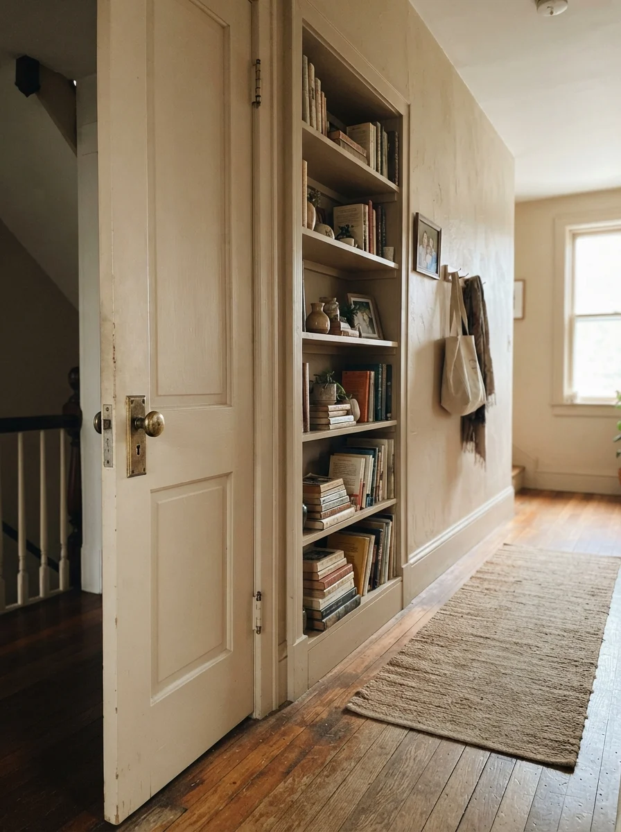
That was how I learned about Sherwin-Williams Kilim Beige (SW 6106). At an LRV of 57, it wasn't trying to be an airy white or a sleek modern greige. It was a true, unapologetic warm tan built squarely on an orange base. I rolled it across the main living areas and our family bath, and for the first time, our honey oak didn't look like an accident we couldn't afford to fix. It looked intentional. We lived with it through elementary school art projects, messy hallway scuffs, and two dog adoptions, and by the time we moved on, it had taught me exactly what real beige can and cannot do.
The Orange Base You Cannot Bargain With
Sherwin-Williams files Kilim Beige in their orange deck family, and that is exactly where it belongs. There is no gray hiding underneath to soften the blow or turn it into a fashionable greige. In cool daylight it holds as a steady, grounded tan; in hot afternoon sun or under low-kelvin incandescent bulbs, that orange base wakes up with a noticeable pink-gold flush.
warm sun
overcast, north light
dusk, rain, cool bulbs
tan → peach-gold → warm orange
SaharaDunn-Edwards · see diary
BajaBehr · see diary
Kilim BeigeSW 6106
Cocoa DustValspar · see diary
RiverbedDunn-Edwards · see diary
How Daylight Moves Kilim Beige Across the Clock
The biggest trap with warm neutrals is assuming they sit quietly from dawn to bedtime. Kilim Beige does not sit still. Because its backbone is warm earth and orange rather than charcoal or black pigment, it reacts dramatically to shifting daylight. If your room faces east, you get a clean, reassuring tan with your morning coffee that steadily gains heat and saturation as the afternoon progresses. By 5:00 PM, that wall is glowing.
Where people get into trouble is western exposure on double-height walls. Low, raking afternoon sun throws fuel on an already-warm color, pushing it straight into peach territory—and on tall sheets of drywall, it can read almost salmon. But in a north-facing room? That is where this color performs its quiet miracle. Because there is no gray in the formulation to collapse into mud, cold northern daylight simply leaves it looking like a solid, warm tan while modern greiges wither into flat dishwater.
Living Rooms, Dining Rooms, and Main Living Floors
In our last house, our living and dining rooms flowed directly into each other under an open floor plan. Painting open layouts is always a headache because finding one paint that handles a bright south window and a dim hallway transition without turning into two different colors is nearly impossible. Kilim Beige was worth the money because it carried that entire open main floor—living room, dining area, and connecting corridor—in a single, unified coat.
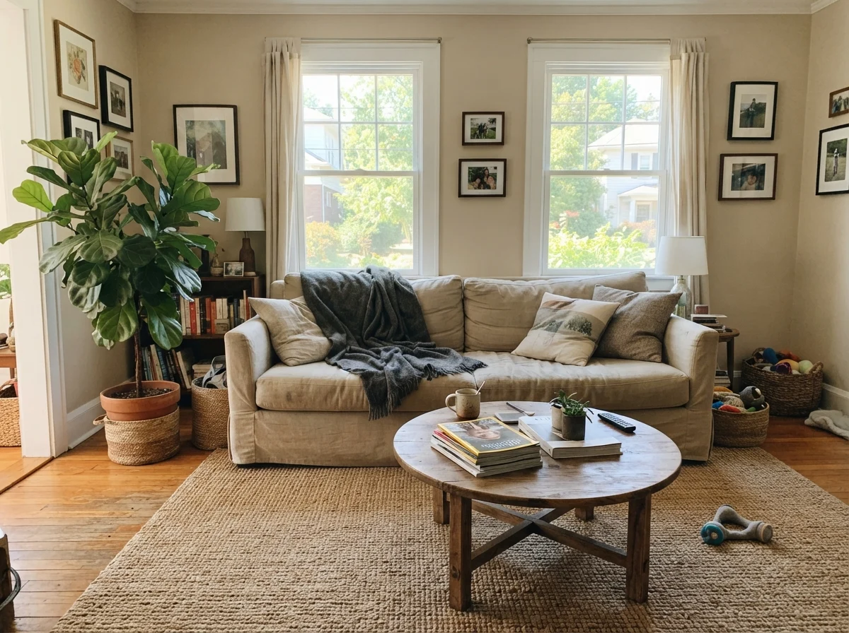
In a family room, it brings the cozy warmth that gray-heavy neutrals keep promising but fail to deliver once the sun drops. It flatters aged leather armchairs, traditional oak flooring, and vintage brick hearths without requiring you to replace every furnishing you own. At night, with a couple of 2700K table lamps switched on, it develops an amber depth that makes the whole room feel grounded and expensive.
Kilim Beige is a real beige, not a greige in disguise. If your honey oak or brick fireplace is staying put, this color meets it halfway instead of starting a fight.
Bedrooms, Nurseries, and Sunrooms
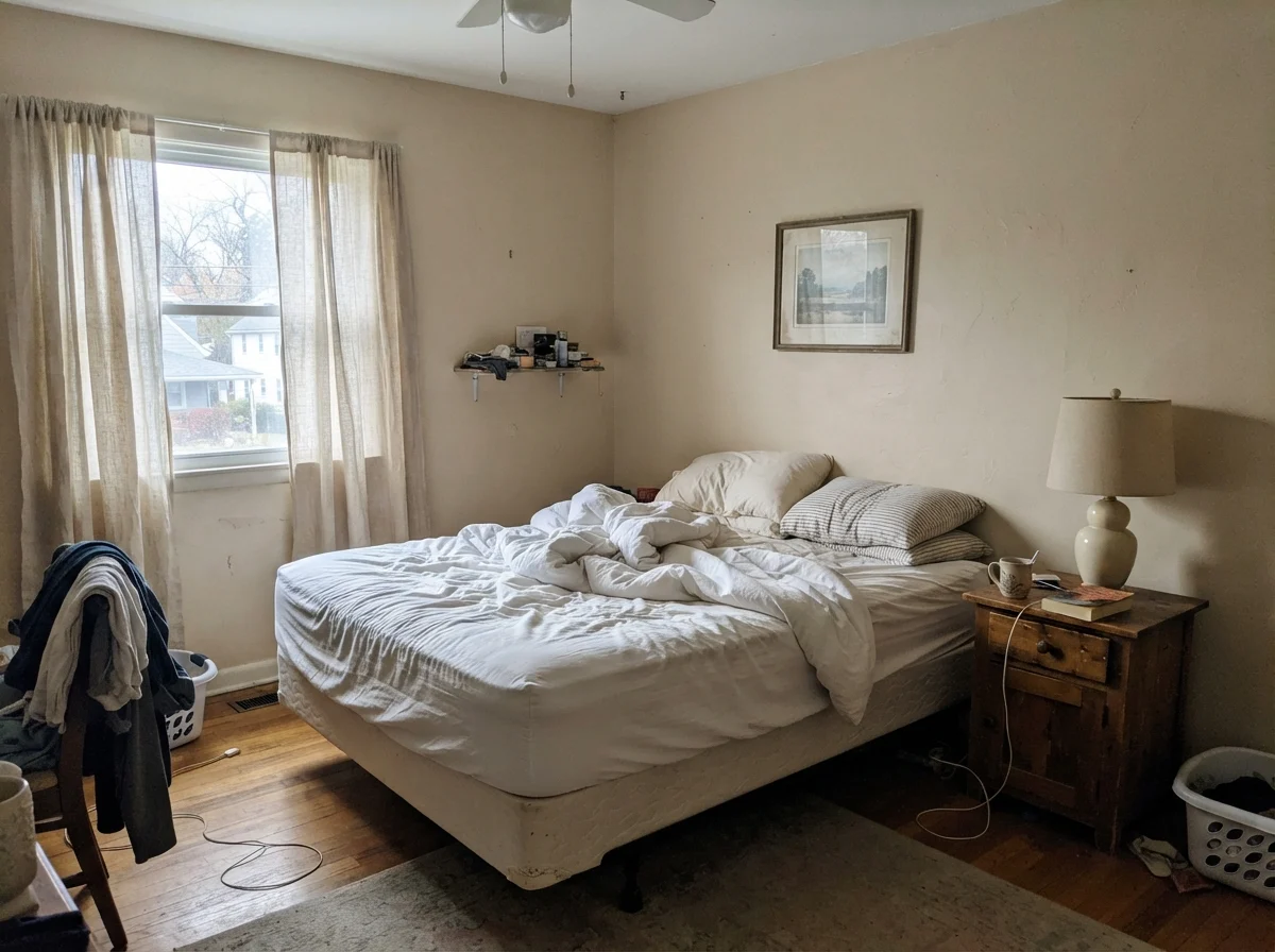
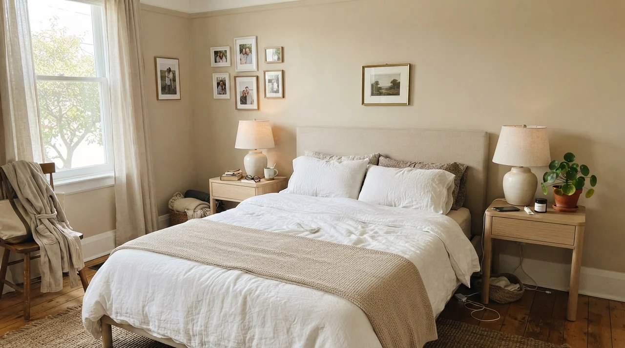
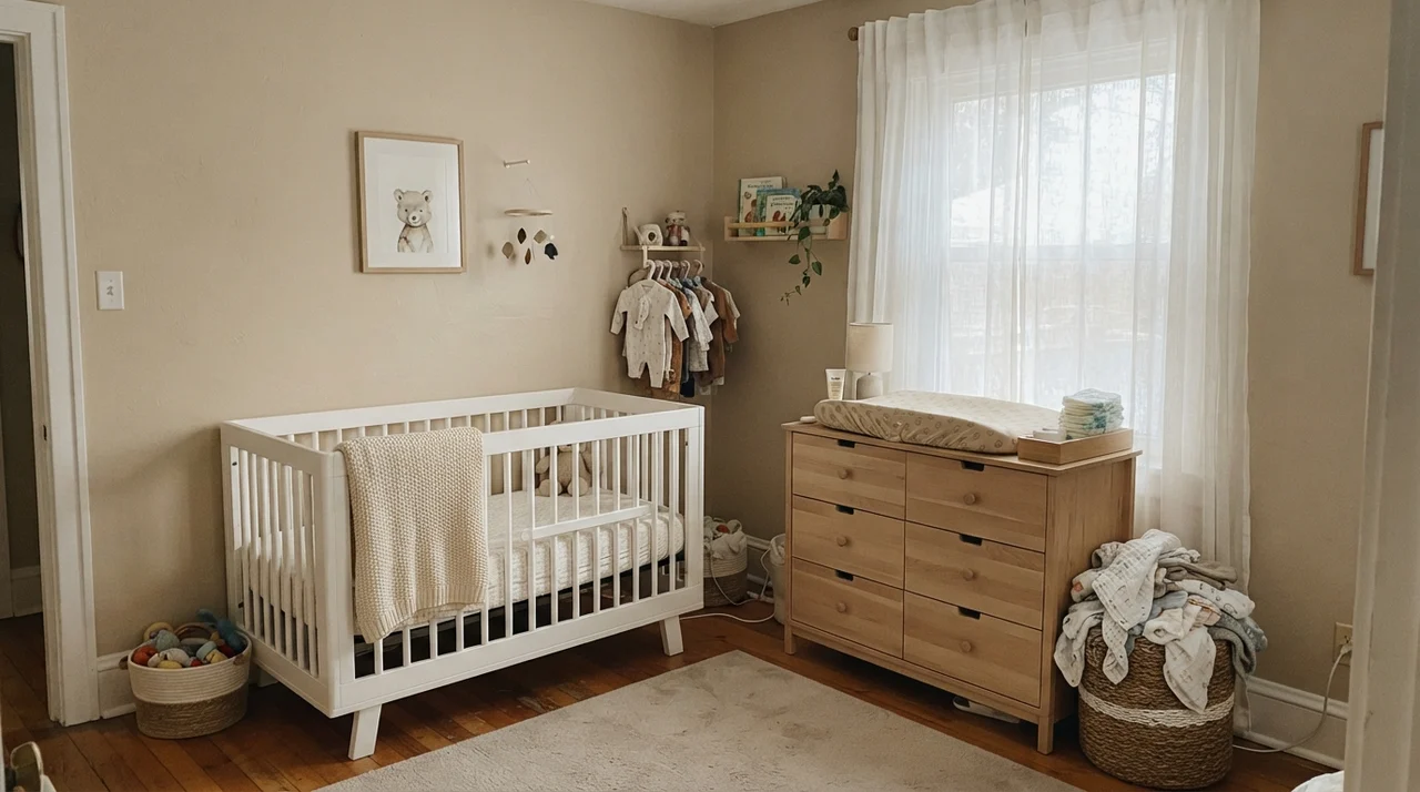
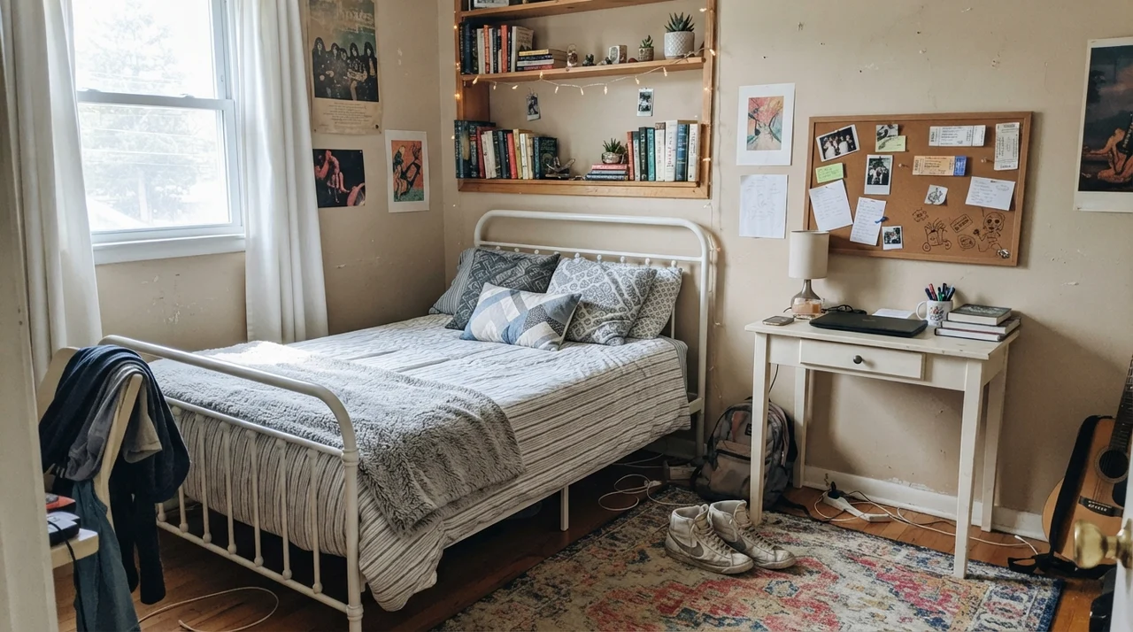
In a bedroom, Kilim Beige feels enveloping rather than crisp. It reminds me of classic hotel rooms in warm climates—calm, substantial, and forgiving of everyday life. Five years in, our guest bedroom walls still looked pristine because mid-tone tans don't highlight minor scuffs the way pale off-whites do. Pair it with soft cream bedding and natural woods rather than stark optical white, which can look jarringly clinical against a warm wall.
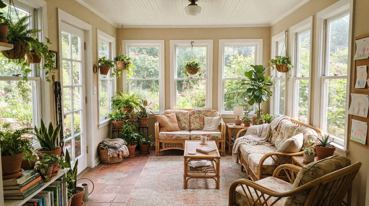
For children's rooms and sunrooms, it provides a stable, earthy backdrop that can handle bright sunlight, botanical accents, and plenty of activity without feeling delicate. In a sunroom loaded with terracotta planters and rattan, the warmth feels completely native to the space.
Bathrooms and Shifting Skies
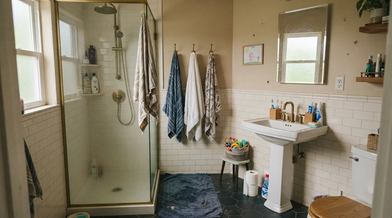
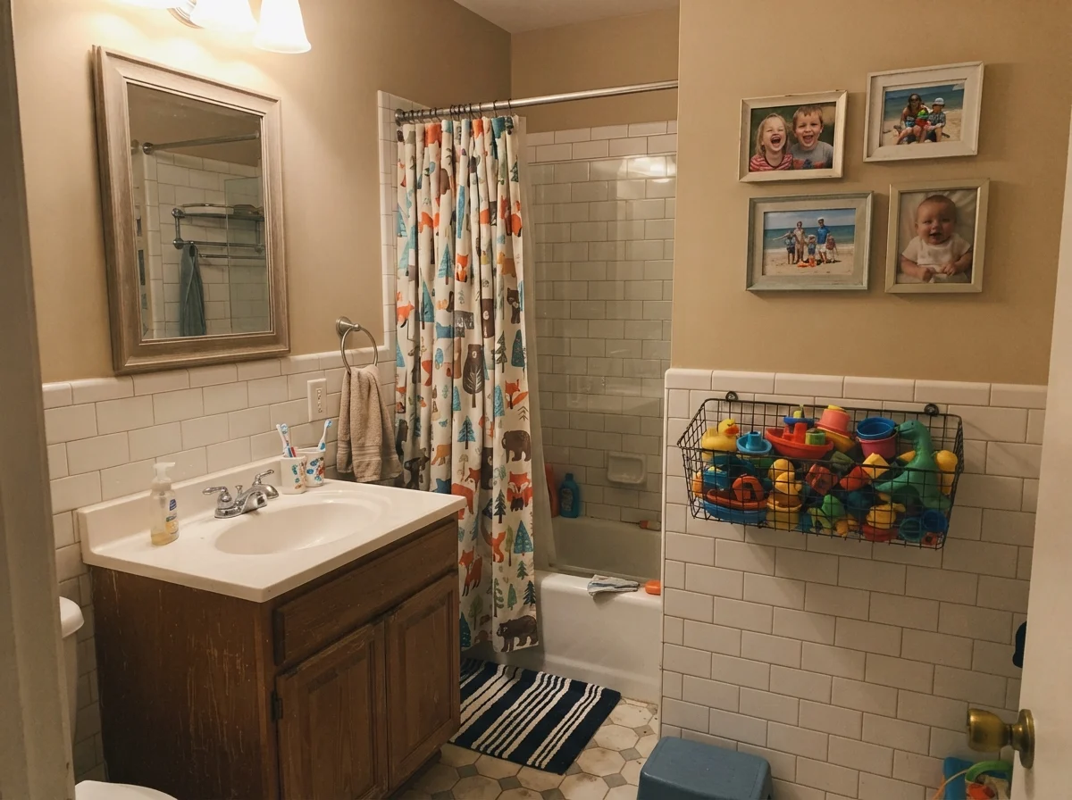
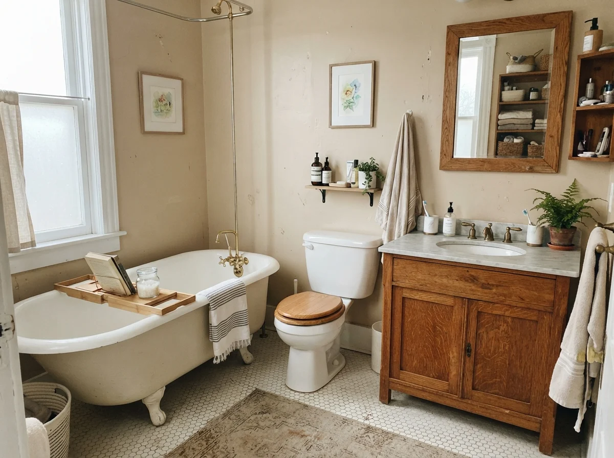
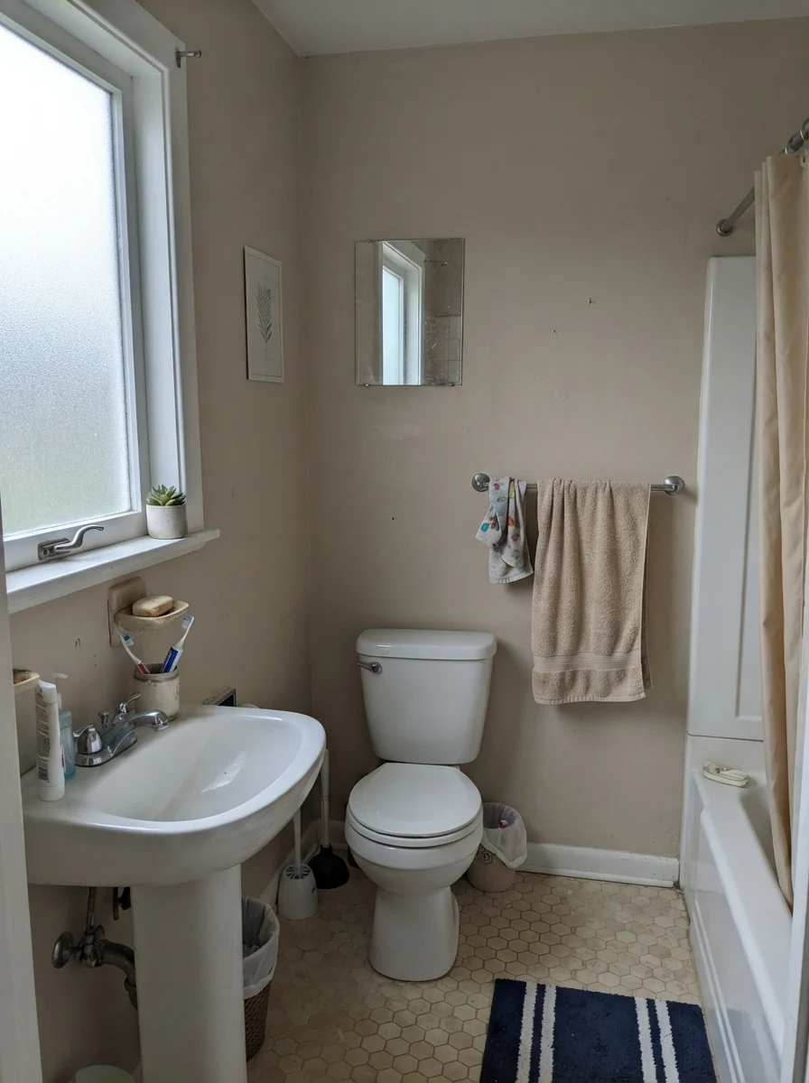
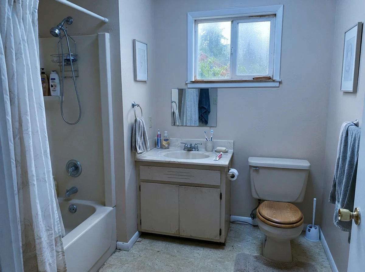
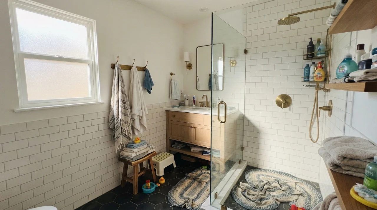
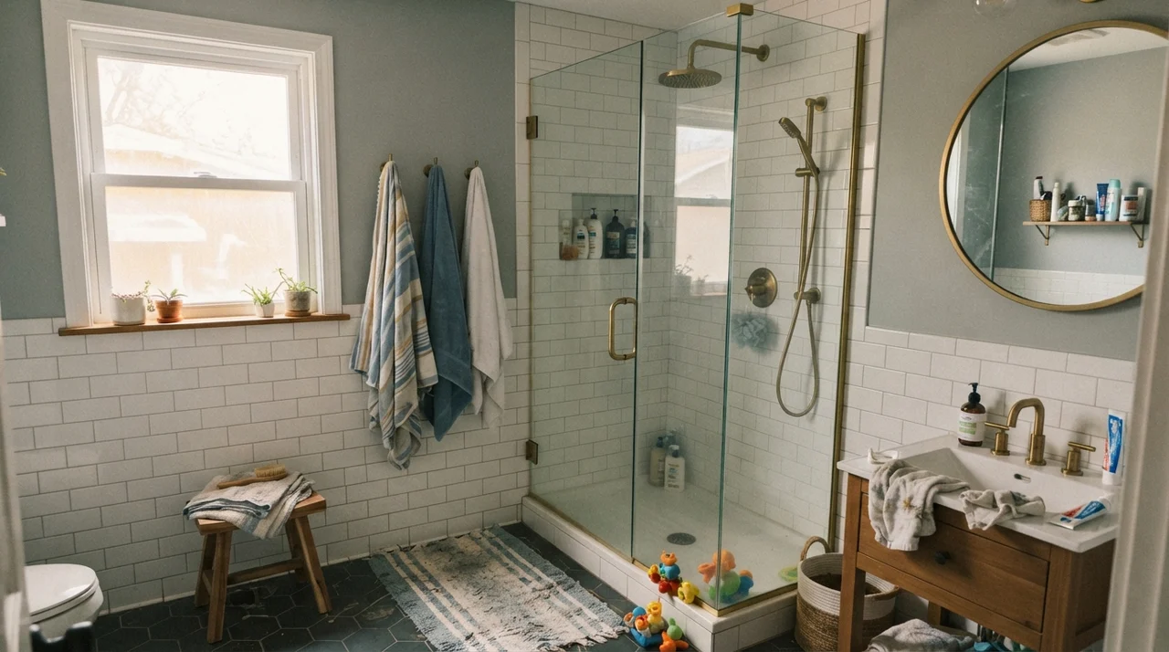
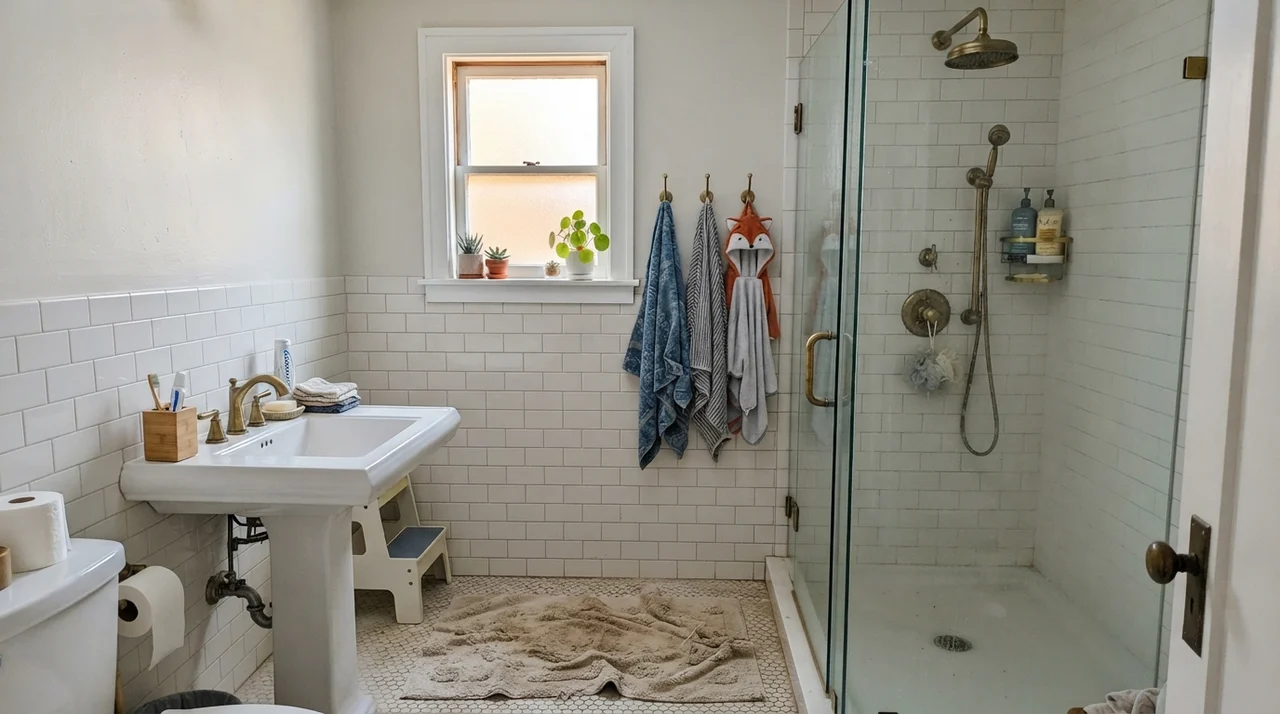
Bathrooms are where undertones get put under the microscope. Between mirrors, vanity lighting, and ceramic fixtures, a paint has nowhere to hide. Over our thirty years across three houses, I have painted at least six bathrooms in warm neutrals. With white tile and brass hardware, Kilim Beige gives a bathroom historic, cottage-like substance. But pay close attention to the sky outside your window: overcast mornings mute the color into a soft, quiet taupe-tan, while a rainy north-facing window can lend it a brief, cool edge before your indoor vanity lamps take over.
Kitchens: Walls vs. Cabinets
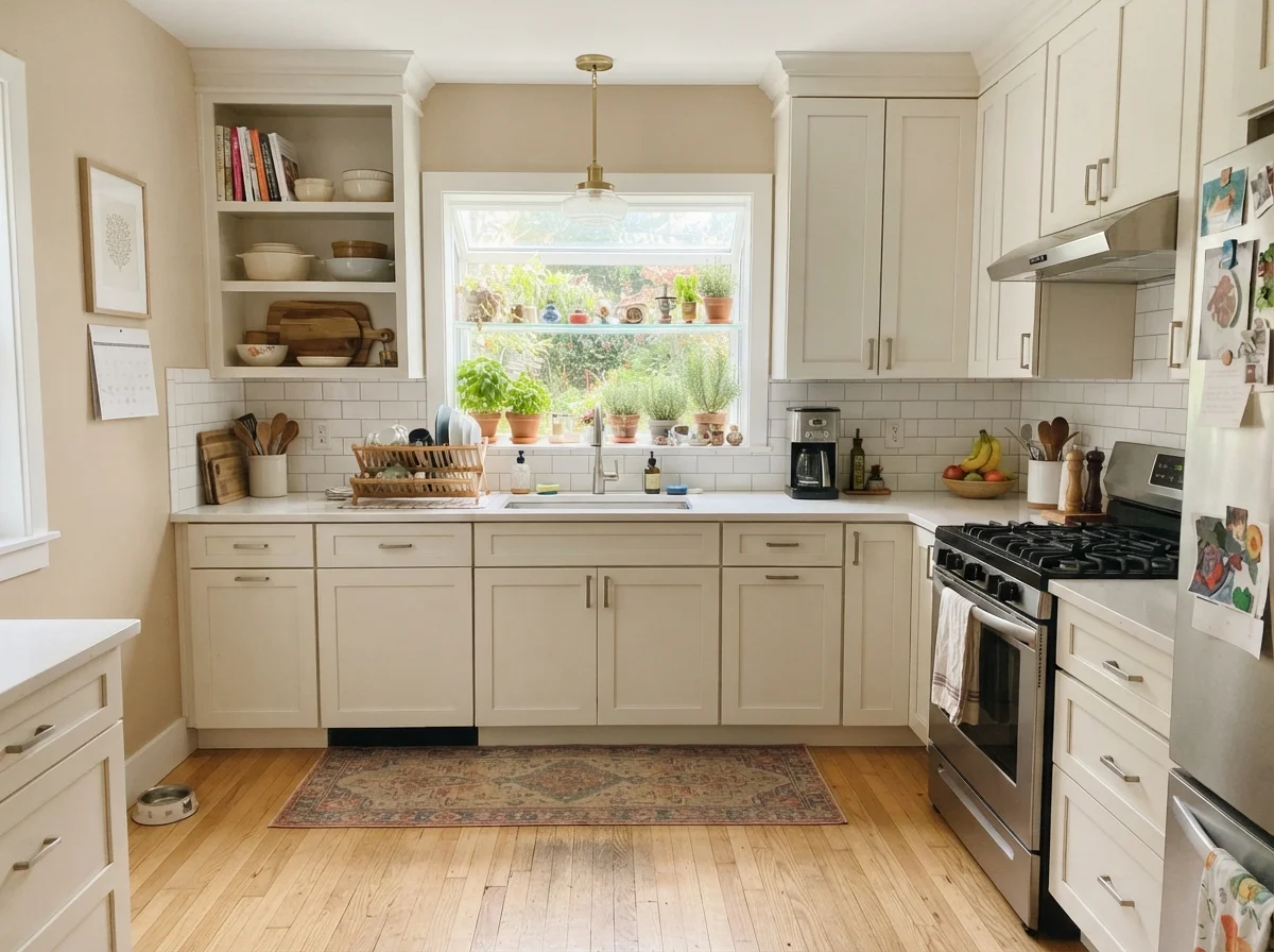
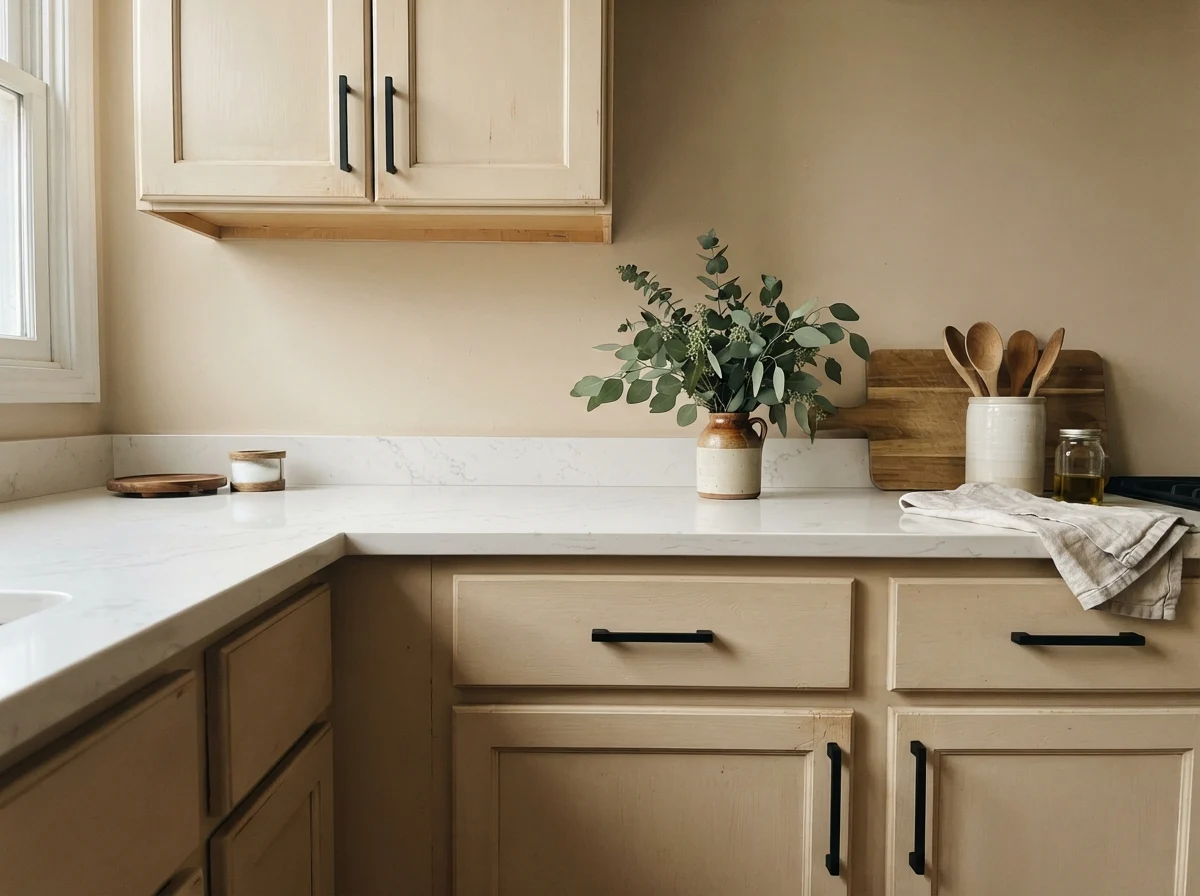
I will give you my honest verdict on kitchens: Kilim Beige is fantastic on kitchen walls, but think twice before painting your cabinets in it. If your kitchen has tumbled travertine backsplash, granite with gold flecks, or older beige tile that is not worth the money to rip out, rolling Kilim Beige on the walls ties the entire room together effortlessly.
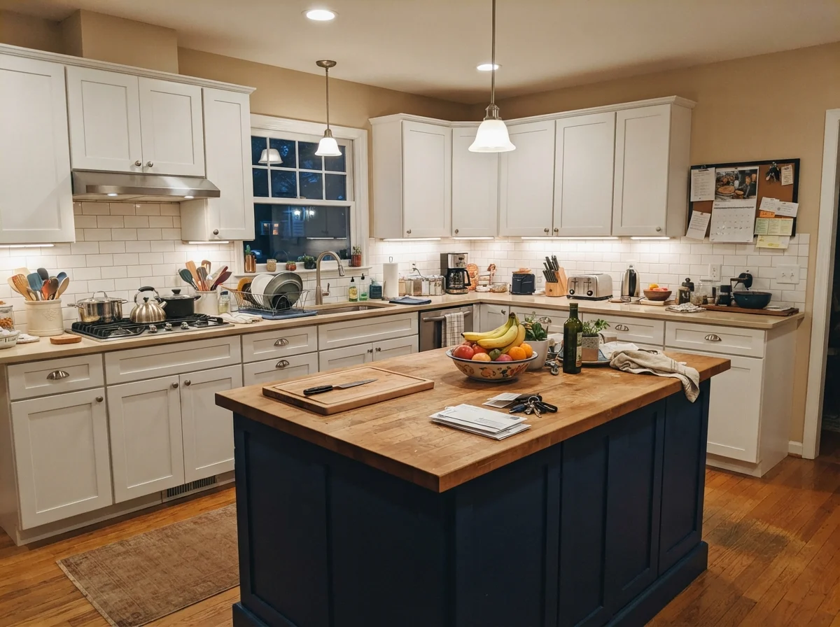
However, painting a full run of upper and lower cabinetry in a mid-tone orange-tan is a risk. While an accent island can look charming in a traditional kitchen with white perimeter units, full cabinetry in this depth looked dated within just a few years of the 2000s boom. Unless you have a very specific rustic aesthetic in mind, stick to drywall applications.
The Honest Fail: Dim Hallways with the Wrong Bulbs
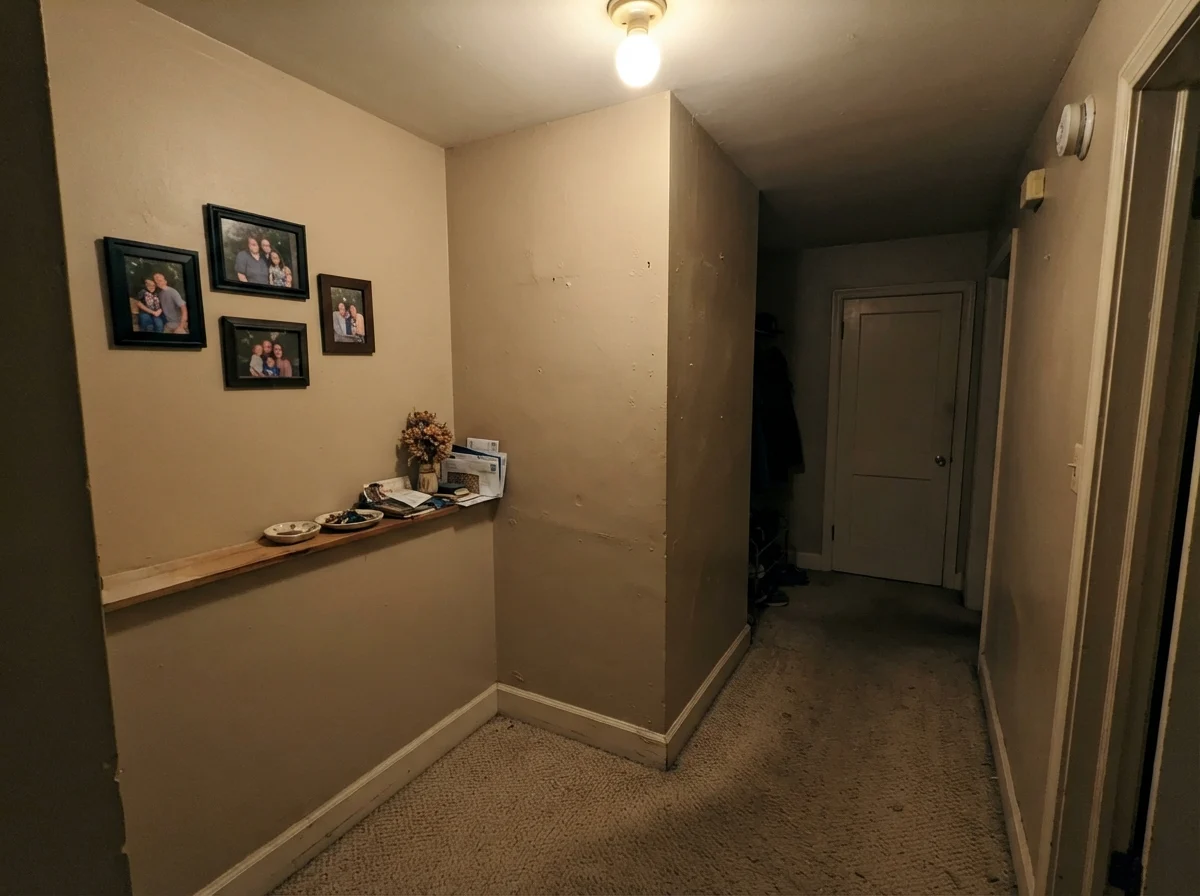
Every paint has a breaking point, and Kilim Beige is no exception. If you drop it into a completely windowless interior hallway lit by a single builder-grade flush-mount ceiling fixture, it will disappoint you. Without natural daylight to give it dimension, and without warm lamplight to highlight its gold tones, it flattens into a muddy, heavy putty that drags the ceiling down.
If you have an enclosed hallway, use satin on the trim and hallway walls to bounce light, and make sure your light bulbs are 2700K rather than cheap 4000K daylight LEDs. Cool 4000K bulbs hit this orange base awkwardly, stripping out the warmth and exposing a weirdly flat, chalky undertone that does nobody any favors.
Exterior Siding and Masonry
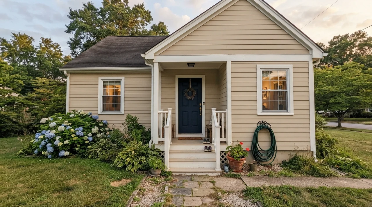
Kilim Beige has a long track record as an exterior siding and stucco color, and for good reason. Direct outdoor sunlight washes out roughly twenty percent of any paint's perceived depth, meaning LRV 57 looks softer, airier, and significantly brighter outside than it does on an indoor living room wall. It pairs beautifully with sandstone steps, clay barrel tile, and warm red or peach brick masonry. When we sold our colonial, the exterior color palette was one of the first things prospective buyers complimented.
Durability, Scrubbing, and Long-Term Wear
Here is what thirty years of repainting rooms teaches you: pale off-whites look fabulous for about two weeks until a muddy golden retriever brushes against the hallway corner or someone scuffs a suitcase along the baseboard. Kilim Beige is one of the most forgiving colors I have ever lived with. Because it possesses genuine depth and color pigment at LRV 57, scuffs, everyday fingerprints, and family wear blend right into the wall rather than standing out like a sore thumb.
For sheen advice, keep walls in eggshell, woodwork in semi-gloss, and high-traffic hallways and closets in satin. When our kids were small, I scrubbed clean the wall next to the mudroom door handle dozens of times with a damp sponge, and the eggshell finish held up year after year without burnishing or peeling. That long-term resilience is what makes a paint color truly worth the money.
Does Kilim Beige look pink or orange on the wall?
It sits firmly on an orange base. In west-facing rooms with low, blazing afternoon sun, it will definitely show a peach or pink-gold flush. If you want a neutral that never reads warm orange, choose Accessible Beige instead.
What is the best trim color for Kilim Beige?
Sherwin-Williams Alabaster and Pure White are ideal. Alabaster provides a soft, warm transition, while Pure White gives sharp contrast without feeling icy. Avoid heavy yellow-creams.
Can I use Kilim Beige on my kitchen cabinets?
You can, but it is risky. While it looks wonderful on kitchen walls paired with travertine or wood, mid-tone orange-tan on entire cabinet runs can look dated quickly. Use it on an accent island instead.
Is Kilim Beige too dark for a hallway?
At LRV 57, it has moderate depth. In windowless halls, use satin sheen and 2700K warm bulbs so it doesn't read muddy under dim overhead lighting.
Susan's Verdict · The Oak-Saver That Refuses to Apologize
If you are living in a home filled with 1990s honey oak trim, warm travertine tile, or an orange-brick fireplace that you have no intention of replacing, stop torturing yourself with modern greiges. Kilim Beige is the honest, hardworking neutral that will make your existing materials look intentional rather than dated. Just respect its orange base: keep it away from cool gray flooring, check your 5:00 PM western light, and let it do what it does best.