Color Diary · No. 38
Natural Choice SW 7011: The Builder Off-White That Demands Warm Wood
The off-white half the new houses in America already wear, reviewed honestly: where it looks expensive, the trim mistake that makes it look dirty, and what to pick instead.

Susan HartleySeptember 20, 2026 · 13 min read
Natural Choice · Sherwin-Williams SW 7011
Hex#E3DED0LRV73Undertoneswarm tan-orange → muted cream → soft putty
In our last house—the 1990s colonial with honey oak casings everywhere you looked—I spent three weeks trying to convince myself that a stark gallery white would modernize the hallway. It didn't. What it actually did was make my woodwork look like old shipping pallets and the hallway look like an unfinished basement clinic. That was the year I learned the hard difference between a white and an off-white, and it’s why I have a soft spot for Sherwin-Williams Natural Choice (SW 7011).
Natural Choice sits at an LRV of 73 with a quiet orange-tan backbone. That number matters. At 73, it is not trying to be a crisp, modern white. It belongs to that practical category of paints designed to solve the everyday architectural problems of real houses: drywall seams that aren't quite plumb, north-facing corridors that feel like walk-in coolers, and thirty-year-old woodwork that you don't have the budget to strip. Builders buy it by the five-gallon drum because it covers a whole house without offending anyone. But lived with over five years, it has some very specific opinions about the materials sitting next to it.
The Undertone and Why Lighting Dictates Everything
Every can of off-white hides an anchor. Natural Choice lives in the orange deck family, which means underneath its light surface is a blend of yellow, red, and raw umber. In balanced daylight, that gives you a gentle, limestone warmth. But change the bulb or the direction of the window, and that tan pigment will step right to the front.
If you put it in a north-facing room, cool blue skylight cancels out the tan base. That is actually where Natural Choice does its absolute finest work: it reads as a calm, soft off-white without a drop of dinginess. In a south-facing room or an east room in the morning, the sun pulls out the warmth, making the wall feel like heavy cream. The danger zone is a strong west exposure after four in the afternoon. When low, hot sun hits this color, the orange base flares, and you will suddenly find yourself living with the exact beige everyone spent the last decade trying to paint over.
Watching the Daylight Shift
Before you commit five gallons to a bedroom, you have to watch the wall across a full twelve-hour cycle. In the early morning hours, before any lamps are switched on, Natural Choice can look surprisingly pale and washed out—almost like unprimed plaster in gray light. It doesn't fight the gray morning; it just absorbs it quietly.
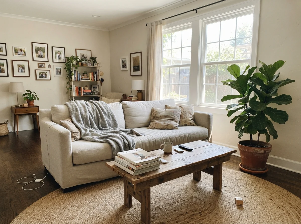
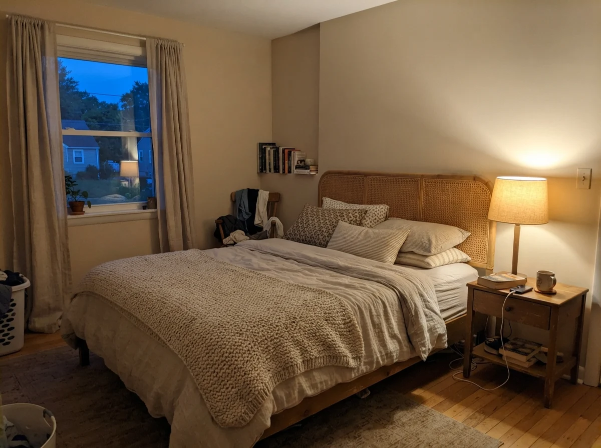
By evening, the entire personality flips. When you flick on a 2700K bedside lamp, the warm filaments ignite the orange-tan undertone. The wall turns into a cozy, enveloping cream that feels twenty years older than modern builder white in the best possible way. If your nightstand has cane, rattan, or warm wood, the color settles right in like an old friend.
Bedrooms, Bathrooms, and Family Spaces
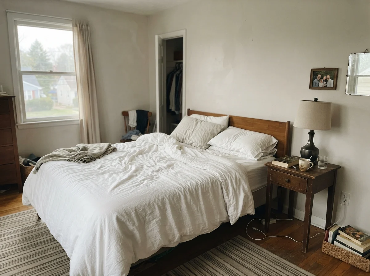
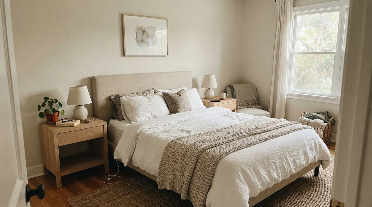
Where Natural Choice really earns its keep is in spaces that see real daily life. In our current 1960s ranch, the main bedroom faces north-northeast. In pure white, that room felt drafty even in July. When you bring in Natural Choice in eggshell, it cushions the space without turning dark. Linen bedding, pale oak dressers, and ceramic lamp bases look grounded because the wall isn't screaming for attention.
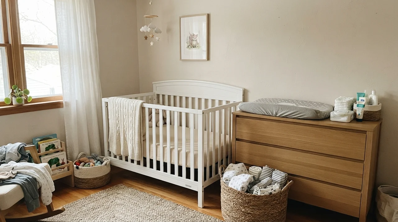
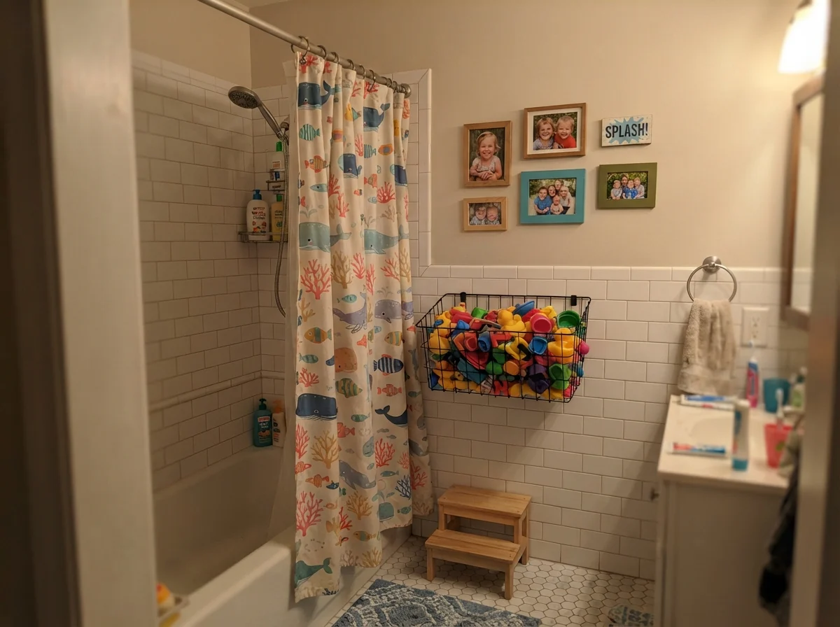
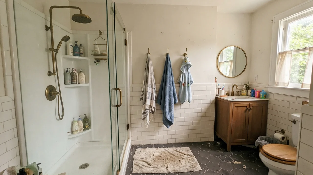
It is equally forgiving in children's rooms and nurseries. When you have white cribs, open shelving with colorful clutter, or wire baskets full of bath toys, you need a wall that acts as a quiet backdrop. Pure white bounces every tiny visual distraction across the room; Natural Choice absorbs the noise. And practically speaking, when you have to scrub scuffs or handprints off the wall, an off-white at LRV 73 hides drywall patches and touch-up spots that a high-reflective white broadcasts from across the room.
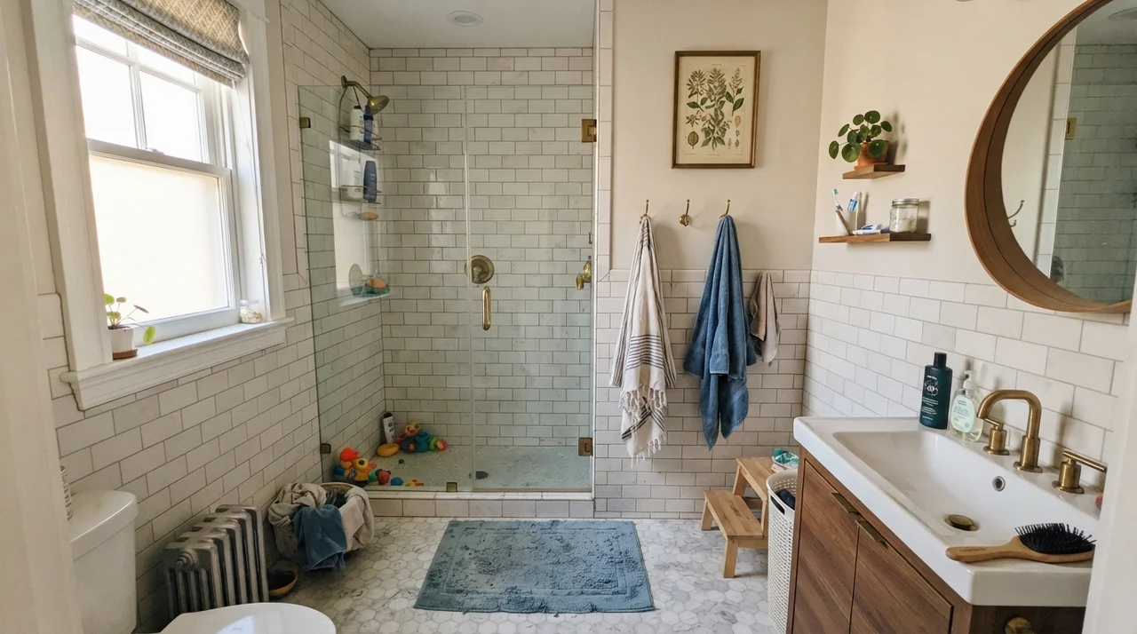
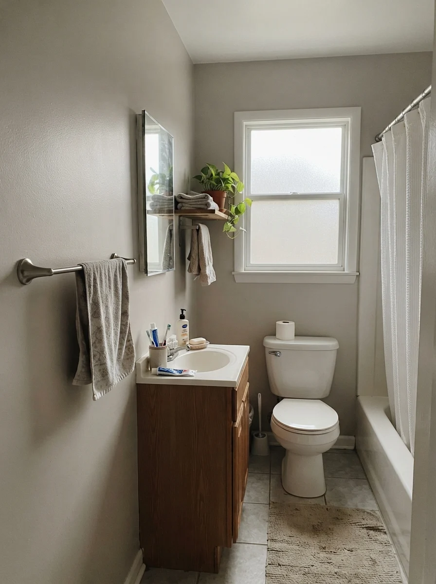
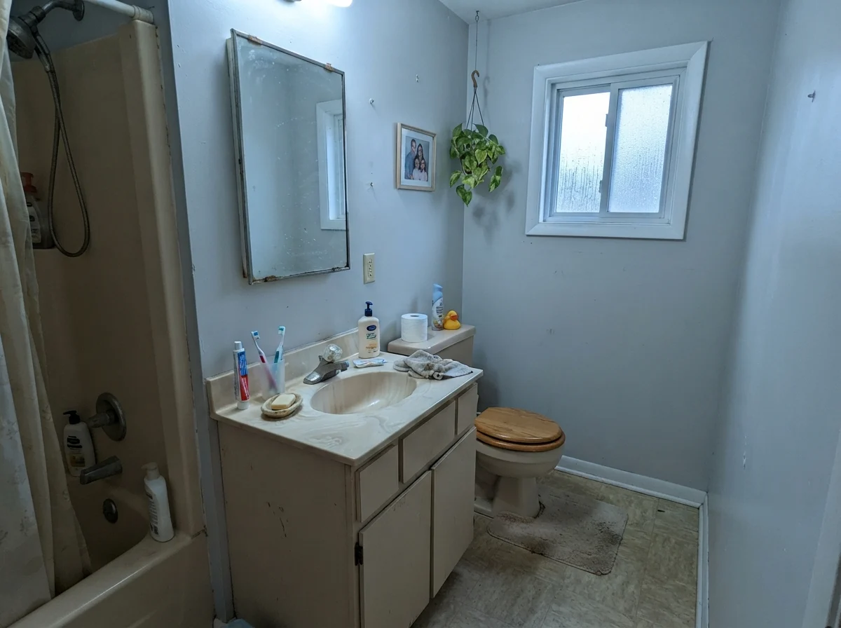
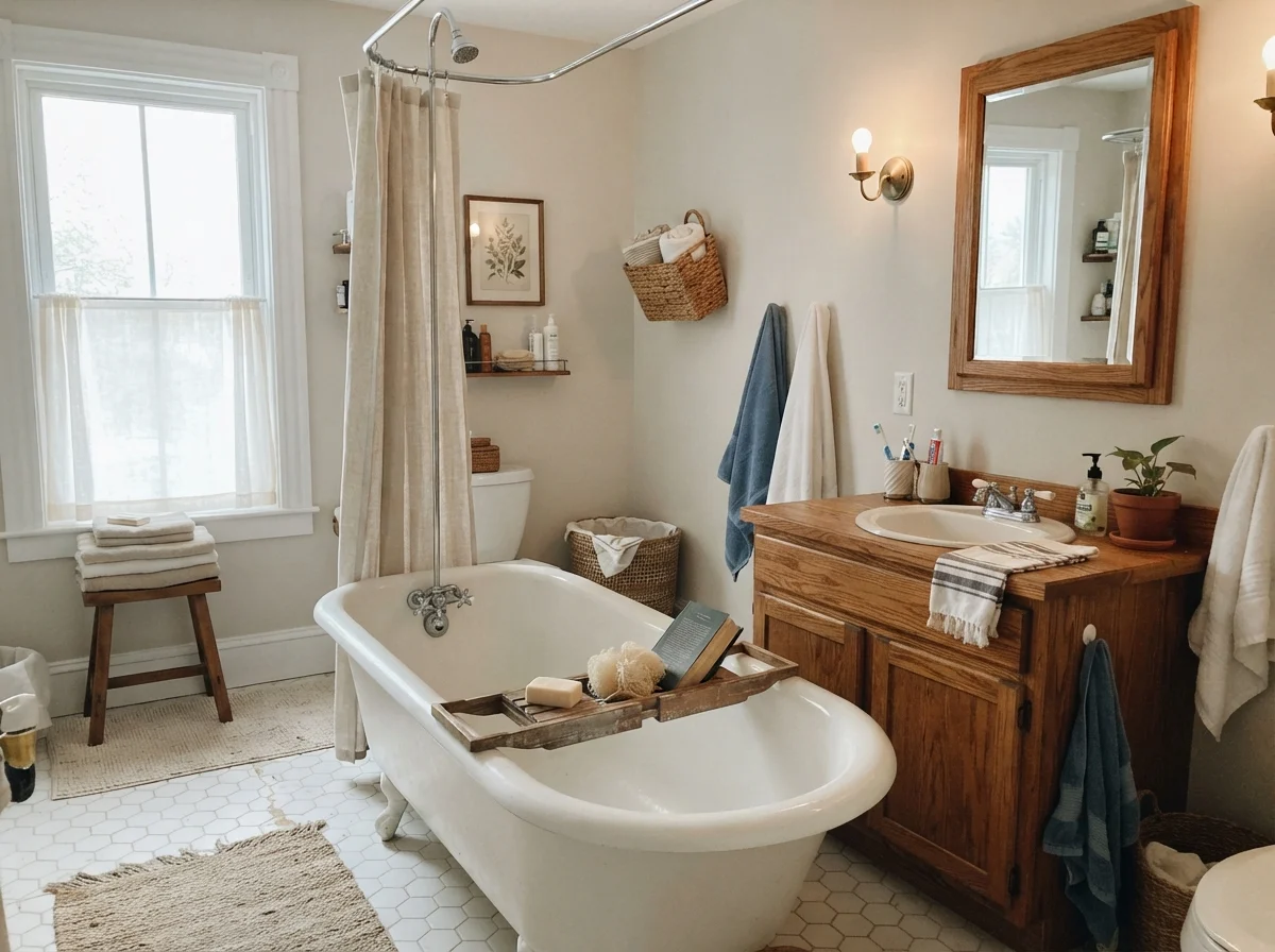
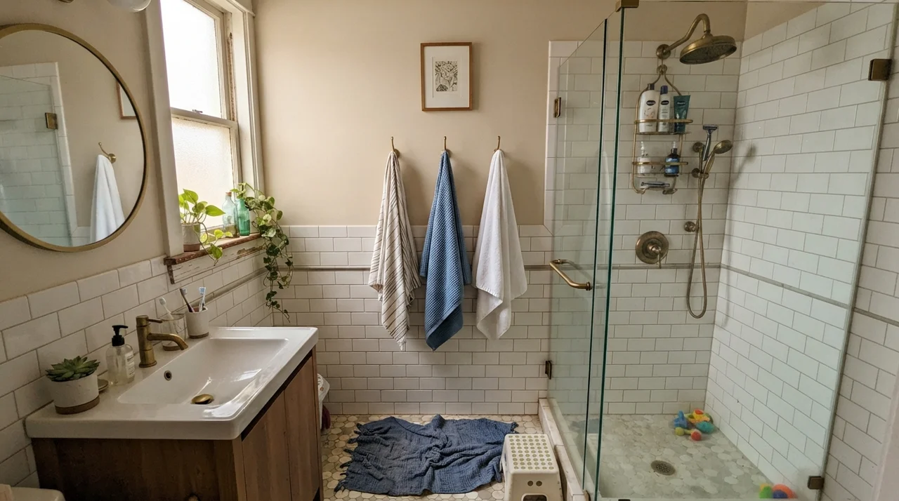
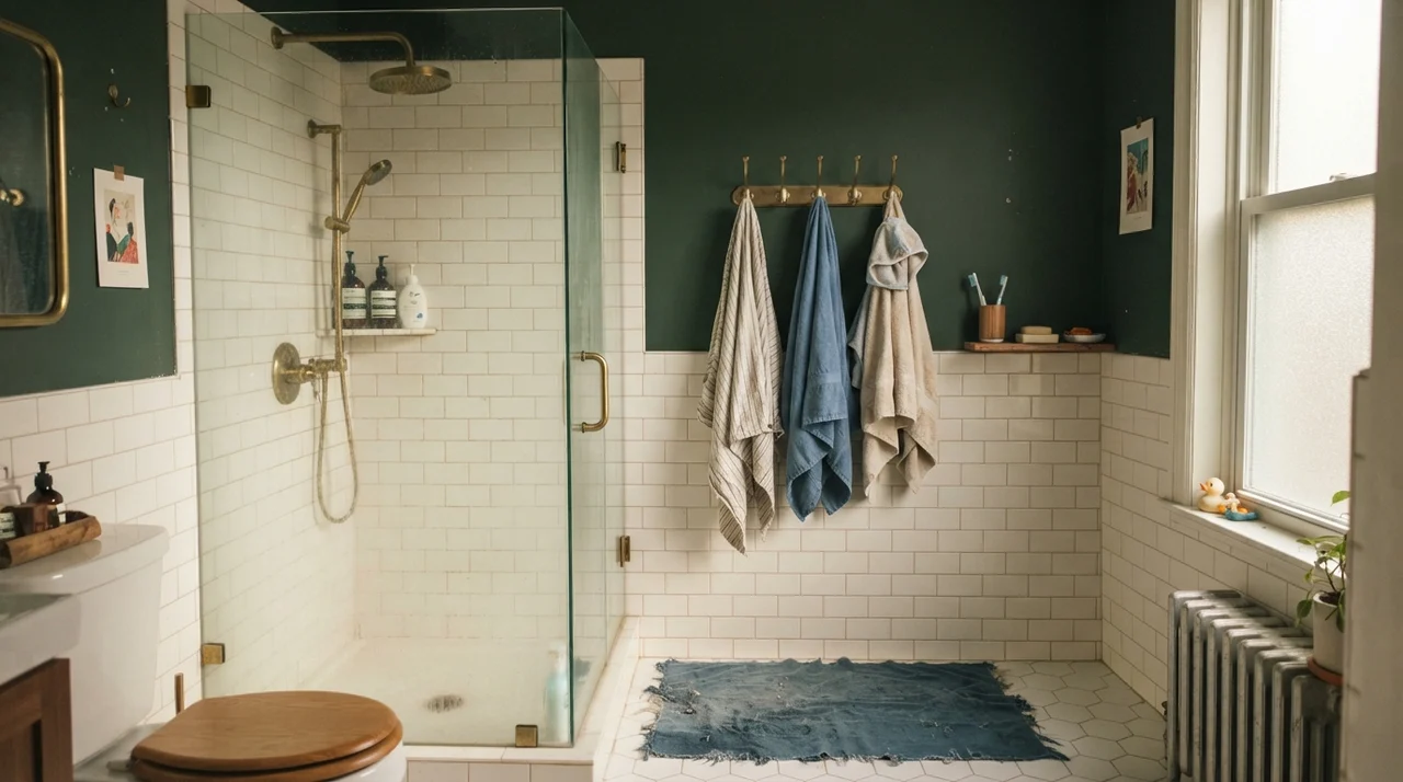
In secondary bathrooms and older cottage spaces, it pairs beautifully with vintage elements. When you have a cast-iron clawfoot tub and an older oak vanity, stark white paint makes the woodwork look yellowed and tired. Natural Choice meets warm wood halfway. It creates an intentional, settled atmosphere where vintage plumbing and hex tile look like heirloom choices rather than outdated fixtures waiting for a demo crew.
Kitchens, Cabinets, and Millwork
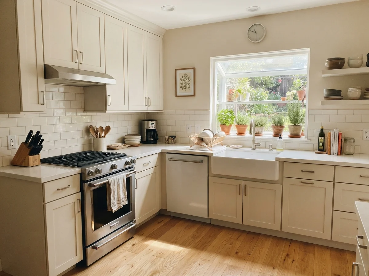
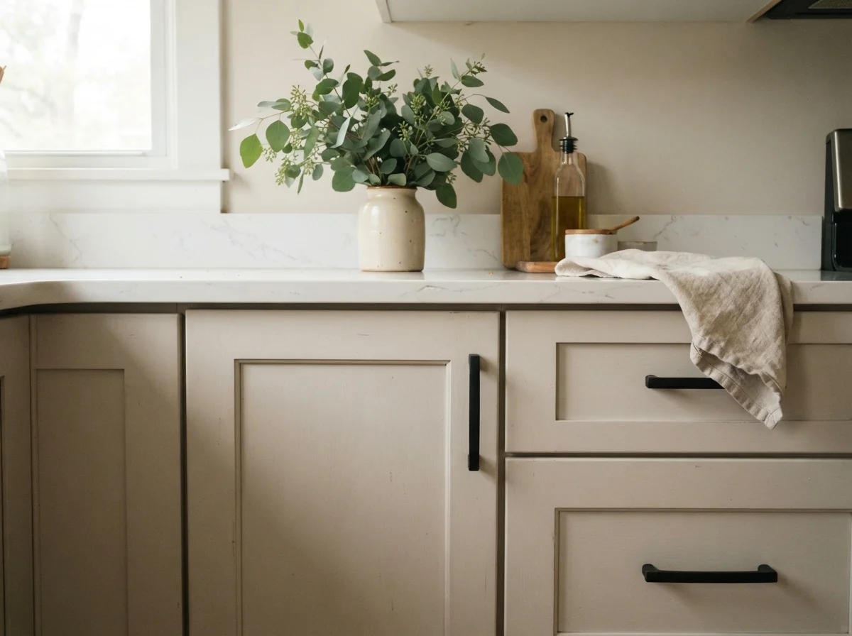
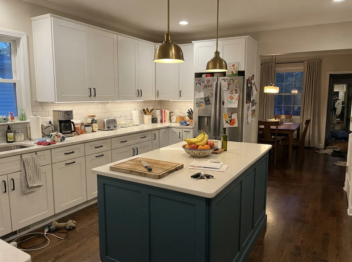
If you are painting kitchen cabinets, you need to understand that Natural Choice in satin finish will deliver a traditional, furniture-weight presence. It does not look like a contemporary European lacquer kitchen. On shaker uppers and lowers, it brings a warm, lived-in feel that hides grease smudges and thumb marks by the drawer pulls vastly better than a crisp white ever could.
However, your countertop choice will make or break this color. Natural Choice on cabinetry looks stunning next to butcher block, warm quartz, or granite flecked with beige and amber. But if you have cool Carrara marble with sharp gray-blue veining, Natural Choice will suddenly look yellowed and dingy by comparison. In that situation, you would want to step to Sherwin-Williams Alabaster instead.
Everyday Spaces: Sunrooms, Laundry, and Hallways
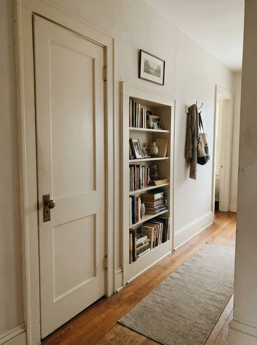
One of the quietest tricks with Natural Choice is painting your doors and built-in shelving in the same color as the walls or framing them in soft cream. In older houses where doors have settled and woodwork has character, painting an interior two-panel door in semi-gloss Natural Choice against cream walls with a brass knob gives instant architectural weight.
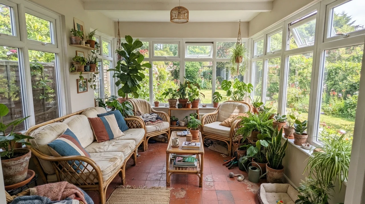
It also thrives in high-utility rooms like sunrooms and bright laundry spaces. Surrounded by garden glass, terracotta pots, and butcher-block counters over white appliances, the color holds its composure without bouncing harsh glare into your eyes when the sun is high.
Where Natural Choice Fails (The Three Hard Mistakes)
The bad stories about Natural Choice almost never say the paint itself is flawed. They say the room looks muddy, pink, or like a smoker lived there for ten years. In every single case, the culprit isn't the color—it's the surface sitting directly next to it. Here are the three pairing mistakes you cannot afford to make.
1. Bright white trim on the exact same wall. This is the number one complaint. If your baseboards are painted Sherwin-Williams Extra White (SW 7006) at LRV 86, that trim beats Natural Choice by thirteen points of lightness. The trim reads sharp and clean, which instantly forces the wall to look dirty and yellowed. If you have bright factory-white trim and aren't willing to repaint it, do not put Natural Choice on your walls.
2. Gray luxury vinyl plank or cool gray tile. Gray-washed oak and cool cement tile sit on the icy end of the spectrum. When you place Natural Choice directly over them, the cool floor pushes the paint's red-orange base forward. Suddenly the wall reads pink-beige or muddy taupe. If your floors are cool gray, step to a balanced greige like Agreeable Gray (SW 7029) or a clean neutral white.
3. Low western sun in primary living rooms. A west-facing living room will look lovely from eight in the morning until three in the afternoon. But when late afternoon sun hits the wall at a low angle, Natural Choice turns straight into 1995 builder beige. If you want that space to stay reading as an airy off-white until dusk, move to Sherwin-Williams Greek Villa (SW 7551), which has the lightness (LRV 84) to survive the sunset flare.
Natural Choice is an off-white, not a white. The minute you put it beside stark trim or cool gray floors, the tan in it will show up and demand answers.
Exterior Siding and Exterior Trim
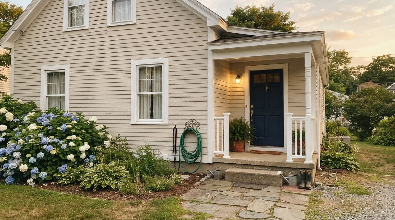
Under direct outdoor sunlight, Natural Choice sheds much of its indoor depth. Sunlight washes paint out by about ten LRV points, so on horizontal siding, it reads as a clean, warm, creamy white rather than a tan. It is fantastic for updating older ranches or colonials where stark white siding would look blinding from the street.
Just make sure you give it dark trim to ground it. Pair it with shutters and front doors in Sherwin-Williams Iron Ore (SW 7069) or Urbane Bronze (SW 7048). Without that dark framing, an all-Natural Choice exterior can look slightly washed out when the sun is overhead.
Long-Term Durability, Cleaning, and Budget Reality
In thirty years of maintaining painted walls, I have scrubbed every brand of paint on the market. In our second home, we put Natural Choice in the main entry hallway and lived with it for seven years through two golden retrievers and neighborhood carpools.
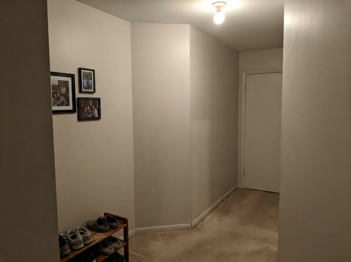
Here is what five years in taught me: at LRV 73 in an eggshell finish, Natural Choice is one of the most forgiving paints you can buy. When you wipe scuffs off the wall with a damp microfiber cloth and mild soap, the surface doesn't burnish or flash the way ultra-deep or ultra-bright paints do. If you have to patch a drywall ding by the front door where a hockey stick hit the casing, a feathered brush touch-up blends back in cleanly. When we sold that house, the listing agent specifically remarked on how calm and cohesive the main floor felt—we didn't have to repaint a single room to get it market-ready.
How Natural Choice Compares to Other Popular Off-Whites
If you're standing in the paint aisle holding four swatches that all look identical under fluorescent store lighting, here is how Natural Choice actually compares to its closest relatives on a real wall.
What sheen should I use for Natural Choice?
Use eggshell on standard living and bedroom walls for scrubbability without glare. Use semi-gloss on baseboards and doors, satin on kitchen cabinets, and flat on ceilings.
Can I use Natural Choice on my ceiling?
Yes, absolutely. Painting the ceiling in flat Natural Choice above Natural Choice walls removes the jarring contrast line of a stark white ceiling, softening the entire room and making the ceiling feel higher.
Does Natural Choice look yellow?
It rarely reads pure yellow, but it does have an orange-tan undertone. In warm south or late-afternoon west light, or under 2700K incandescent bulbs, it will read as a rich warm cream. If paired with bright white trim, that warmth can look yellow-tan by comparison.
Is Natural Choice a good whole-house color?
It is one of the best whole-house colors Sherwin-Williams makes, provided your flooring is warm wood or beige tile. Because it carries an LRV of 73, windowless hallways don't go dark, and transitions from room to room feel seamless.
Susan's Verdict · Buy the Gallon If You Have Warm Wood
Natural Choice is the workhorse off-white that makes lived-in homes look settled and expensive. If your house has warm oak floors, beige tile, or north-facing windows that need taking the chill off, it is worth every penny. Just don't trap it beside bright factory-white trim or cool gray vinyl flooring—give it warm trim like Alabaster, and let it do what it does best.