Color Diary · No. 55
The Daylight Bargain with Sherwin-Williams Oyster Bay
The coastal gray-green everyone loves on Instagram, reviewed honestly: the blue surprise nobody warns you about, and the rooms where it turns on you.

Susan HartleyOctober 1, 2026 · 14 min read
Oyster Bay · Sherwin-Williams SW 6206
Hex#AEB3A9LRV44Undertonesgreen → slate-gray → cool blue
In our last house—the 1990s colonial with the drafty north-facing dining room—I fell hard for a paint chip that promised to be the quietest, most dignified coastal green ever formulated. It was Sherwin-Williams Oyster Bay (SW 6206). On the card under the paint counter's fluorescent strip, it sat right in that soothing, dusty gray-green pocket that feels pulled from a salt marsh. I bought four gallons without putting a sample on the wall, rolled two coats over builder off-white on a Saturday, and went to bed feeling immensely accomplished.
On Sunday morning, the sky outside was overcast, the lamps were off, and my peaceful sage dining room looked like a chilly navy destroyer. The green had completely evaporated, replaced by a stubborn, moody slate blue that made my dark wood dining table look entirely out of place. I lived with it for five months before I admitted defeat, but that mistake taught me the central rule of Oyster Bay: it makes a very specific bargain with daylight, and if your room can't pay up, the color changes into something else entirely.
How Light Dictates the Color You Actually Get
Oyster Bay has a Light Reflectance Value (LRV) of 44, placing it firmly in the mid-tone category. That means it absorbs more than half the light entering the room. When you put a mid-tone pigment with a complex gray-green-blue formulation into a room, the quality of your daylight doesn't just illuminate the color—it decides which pigment leads.
Under generous southern sun, the warmth of the natural rays feeds the yellow in the green pigment. The wall relaxes into a soft, earthy eucalyptus sage that looks grounded and organic. But step into a north-facing room, or wait for an overcast Tuesday afternoon, and the cool outdoor light saps that yellow out instantly. What is left behind is the slate-blue backbone. If you planned for sage, you feel cheated; if you know it's coming and accommodate it, the transformation is fascinating to watch.
The Three Bathrooms Test: Light, Tiles, and Vanities
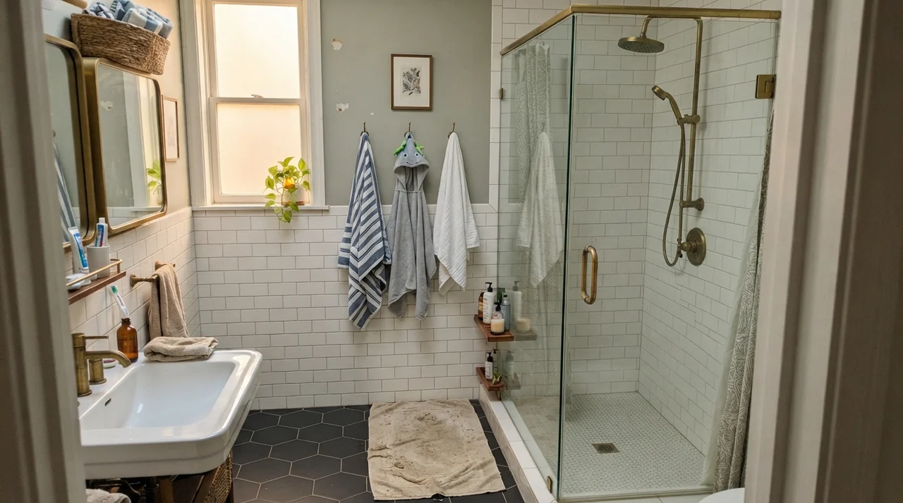
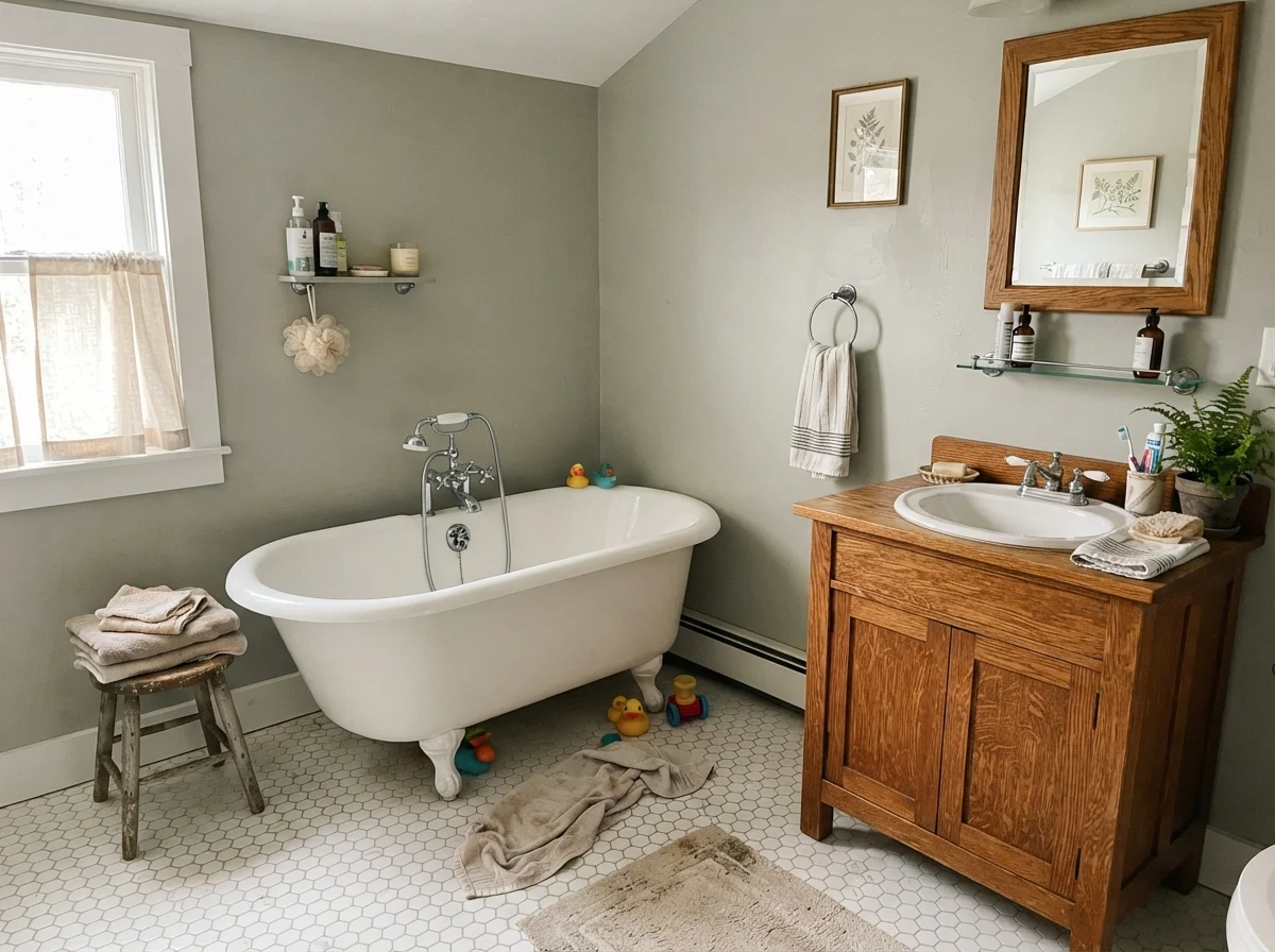
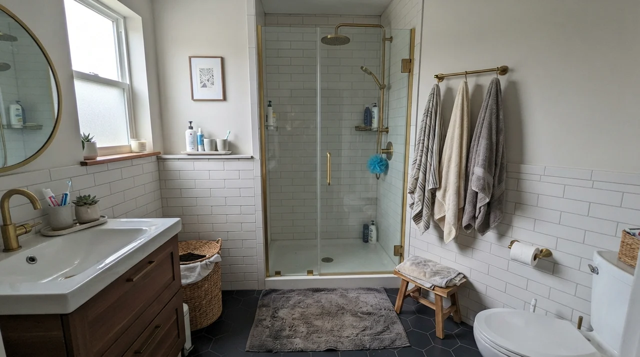
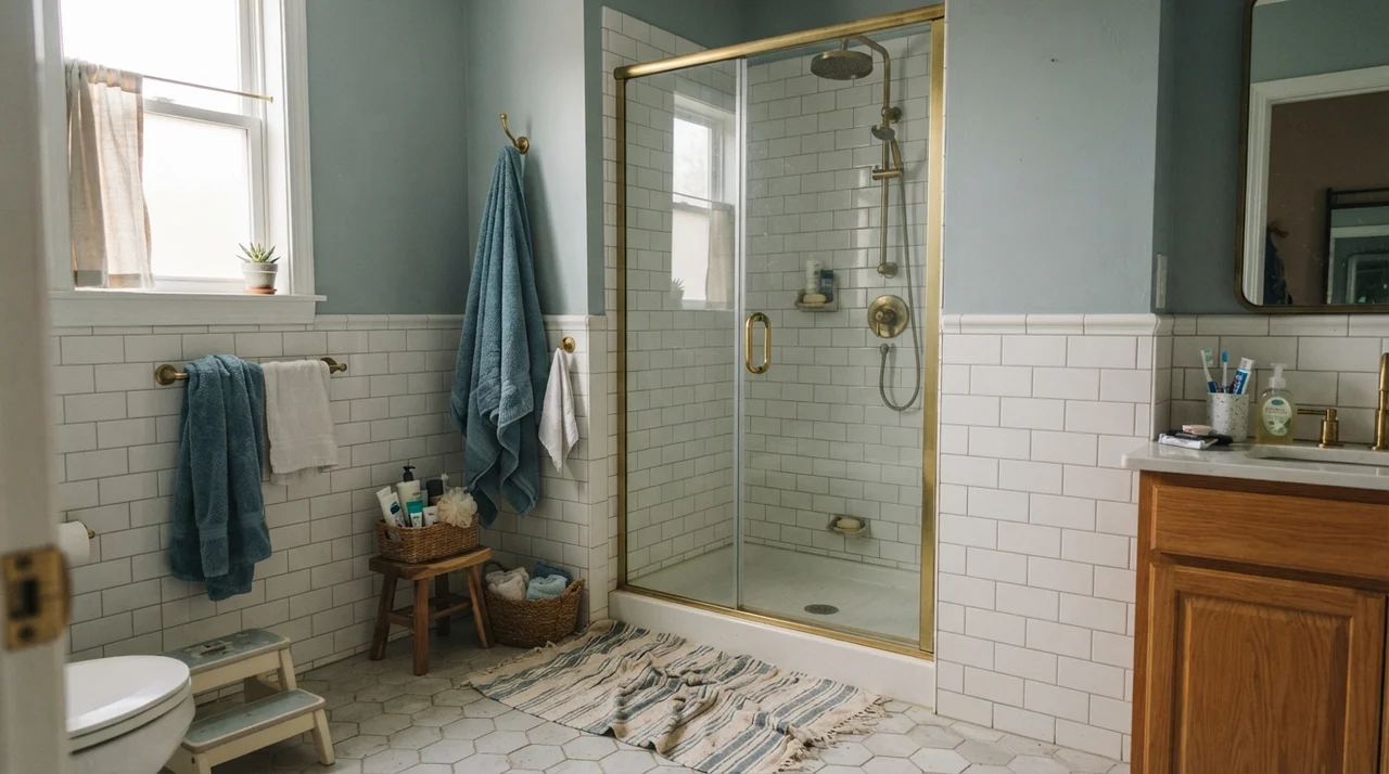
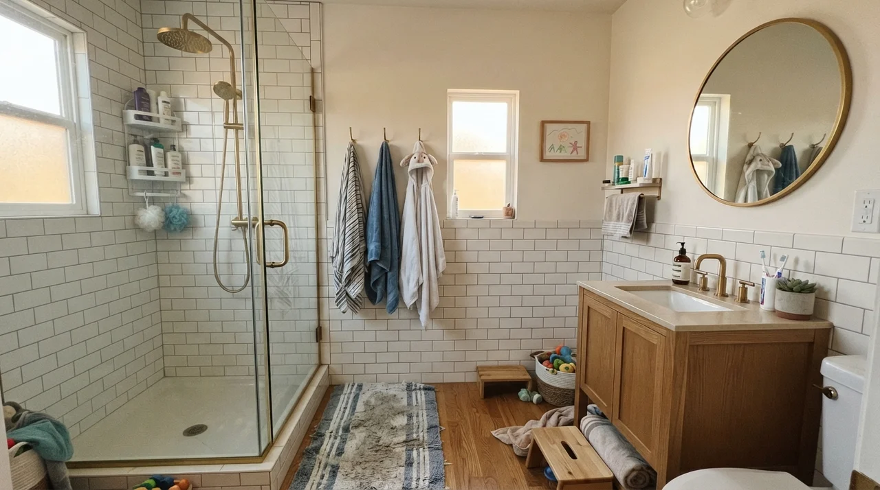
Bathrooms are where homeowners fall most deeply in love with this shade, and it isn't hard to see why. When paired with clean white subway tile and warm wood accents, Oyster Bay delivers that tailored, high-end guest retreat atmosphere without feeling like a sterile clinic. But you have to be mindful of your bathroom's window situation and your permanent fixtures.
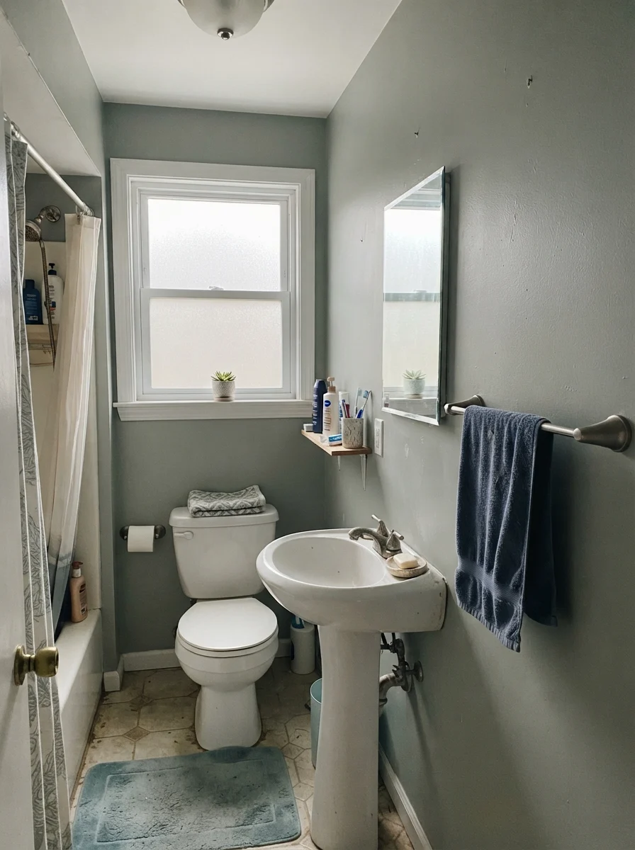
If your bathroom has a south-facing frosted window or good natural daylight, the walls settle into a tranquil, organic tone. Bring in an oak vanity and unlacquered brass hardware, and the warmth in those materials anchors the green. However, if your bath relies on cool daylight through a small north-facing pane, or if you have older beige laminate and tan tile leftover from the early 2000s, Oyster Bay will push back. The warm tan tile forces the cool blue out of the paint, and the two surfaces will bicker every single morning.
In our 1960s ranch, we used Oyster Bay in satin on the kids' bathroom walls over white subway tile wainscoting. Five years in, that finish has been scrubbed clean more times than I care to admit—from water splashes to stray toothpaste splatters—and it has held up remarkably well. Because we kept the overhead fixtures at a warm 2700K temperature, the room stays cheerful and soft even during nighttime routines.
Bedrooms and Nursery: The Low-Heart-Rate Neutral
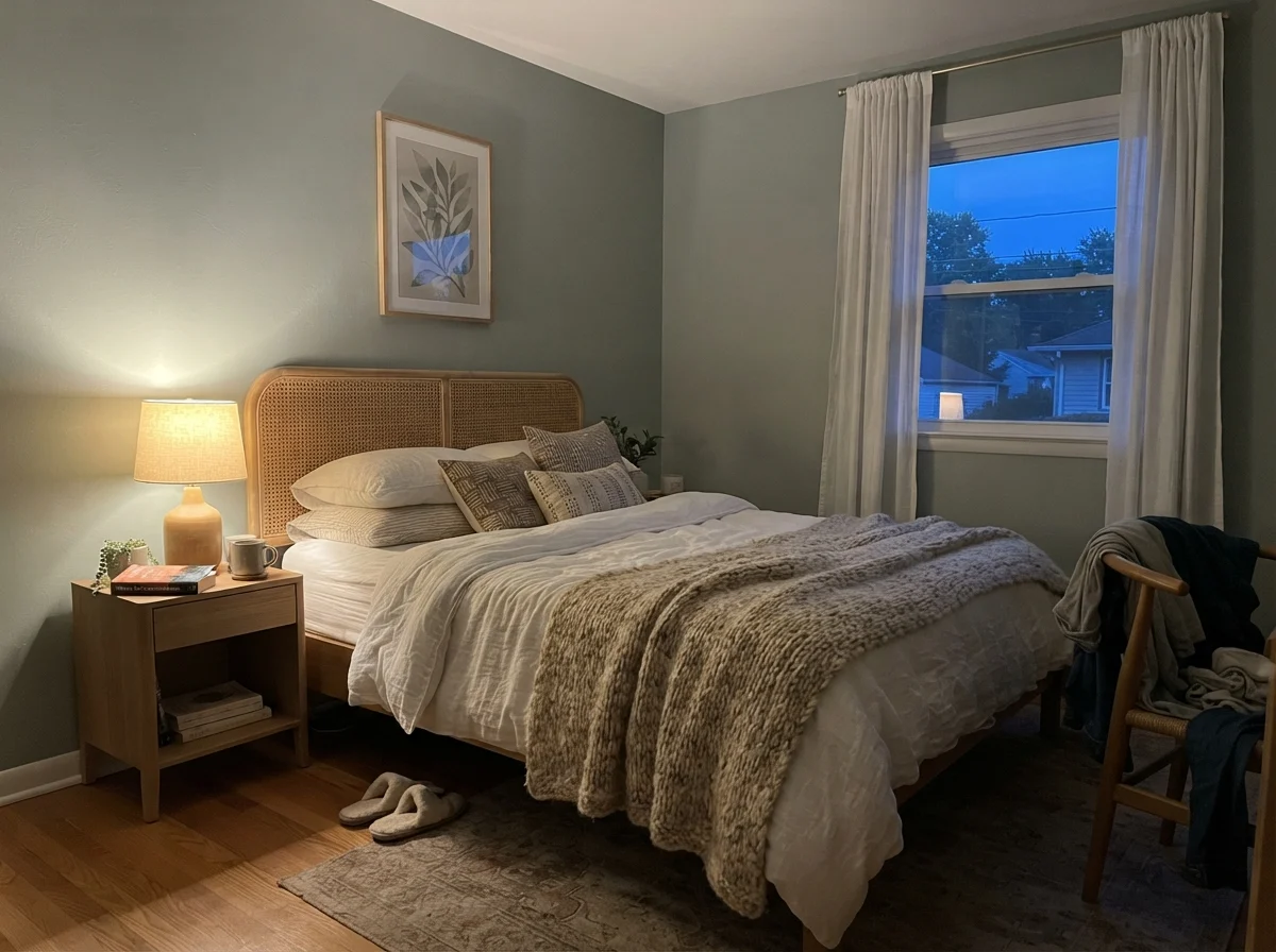
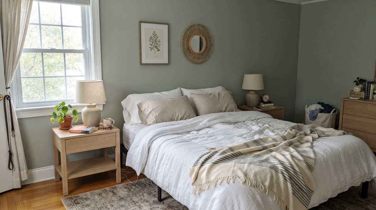
If you want a bedroom to feel restful without defaulting to plain beige or sterile white, Oyster Bay is one of the strongest contenders in the fan deck. It gives the room an envelope of color without shouting. It reads as a real color while still behaving like a neutral, meaning you aren't locked into matching your bedding or curtains to a loud, assertive shade.
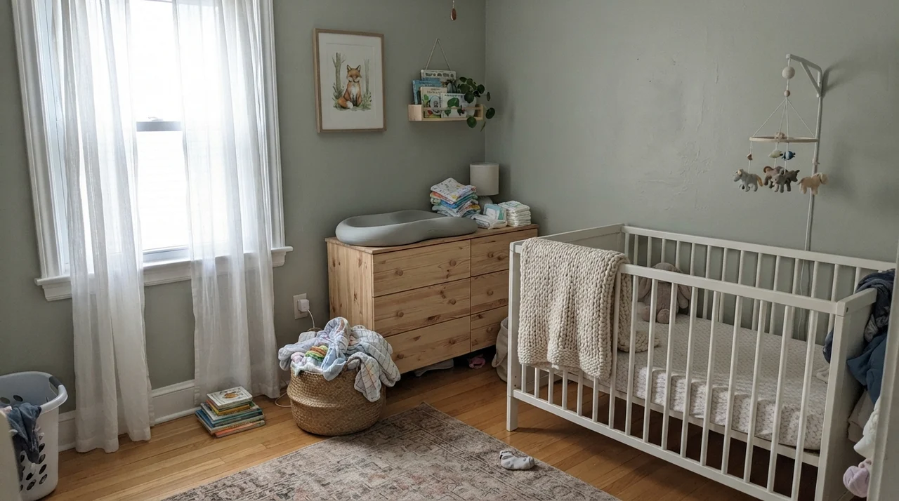
We have lived with this family of muted green-grays across two different houses now. In a bedroom that receives generous morning or afternoon sun, it creates a serene backdrop for crisp white linen, woven rattan, and pale oak nightstands. Even in a teenager's room or a shared nursery, it balances clutter and mismatched books gracefully because the mid-tone depth absorbs visual noise.
Even in rooms with cooler, indirect lighting—like a teenager's room with open bookshelves and a desk—Oyster Bay stays composed, provided you keep the trim bright and avoid piling in cool, icy gray accents. It offers a grounded, mature backdrop that transitions effortlessly from toddler cribs to high school study desks without demanding a repaint every three years.
You don't choose a color for the sunny Saturday afternoon you roll it. You choose it for the rainy November morning when you have to live with what the light strips away.
Kitchens: Islands, Cabinets, and Millwork
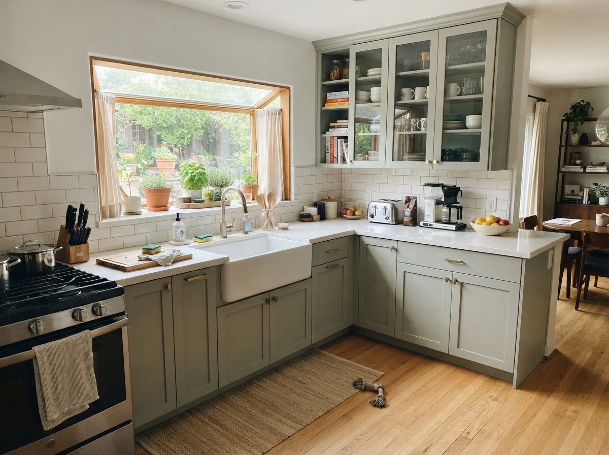
Repainting kitchen cabinets is an expensive, grueling job. Whether you hire a professional crew or spend three weeks taping and spraying doors in the garage yourself, you want a color that won't look dated within three years. Oyster Bay on cabinetry is one of the safest bets you can make in the entire Sherwin-Williams catalog.
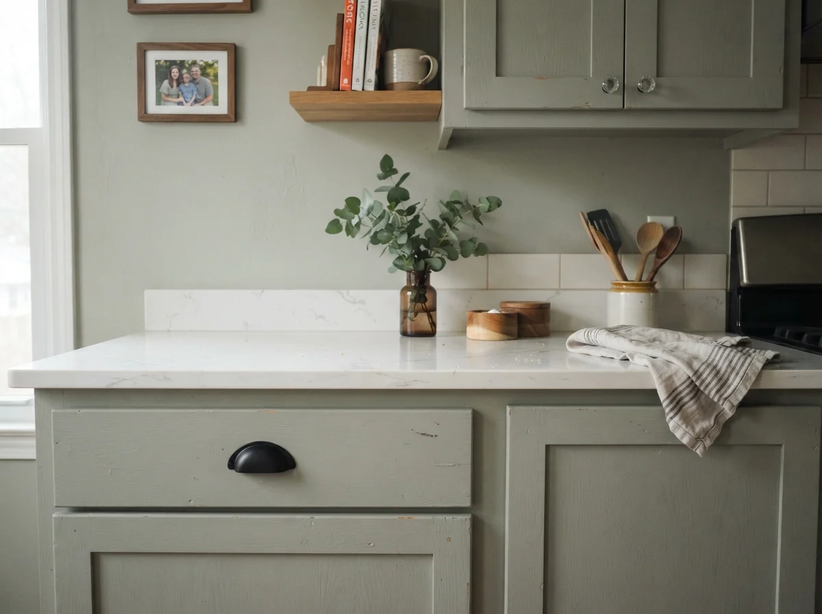
Because kitchen perimeters usually carry white quartz, marble, or pale tile backsplashes, painting your lower cabinets or island in Oyster Bay provides weight and anchor without dragging the room down. In satin finish, it flatters aged bronze handles, unlacquered brass pulls, and warm butcher block counters.
If you aren't ready to commit an entire wall of cabinetry to color, putting Oyster Bay solely on an island is a brilliant compromise. It provides that tailored focal point while the perimeter uppers stay a clean white like Alabaster (SW 7008) or Pure White (SW 7005). Even amidst the inevitable daily family mess—cutting boards, grocery bags, and mail piles—the muted undertones keep the kitchen looking intentional and composed.
Living Rooms, Sunrooms, and Small Spaces
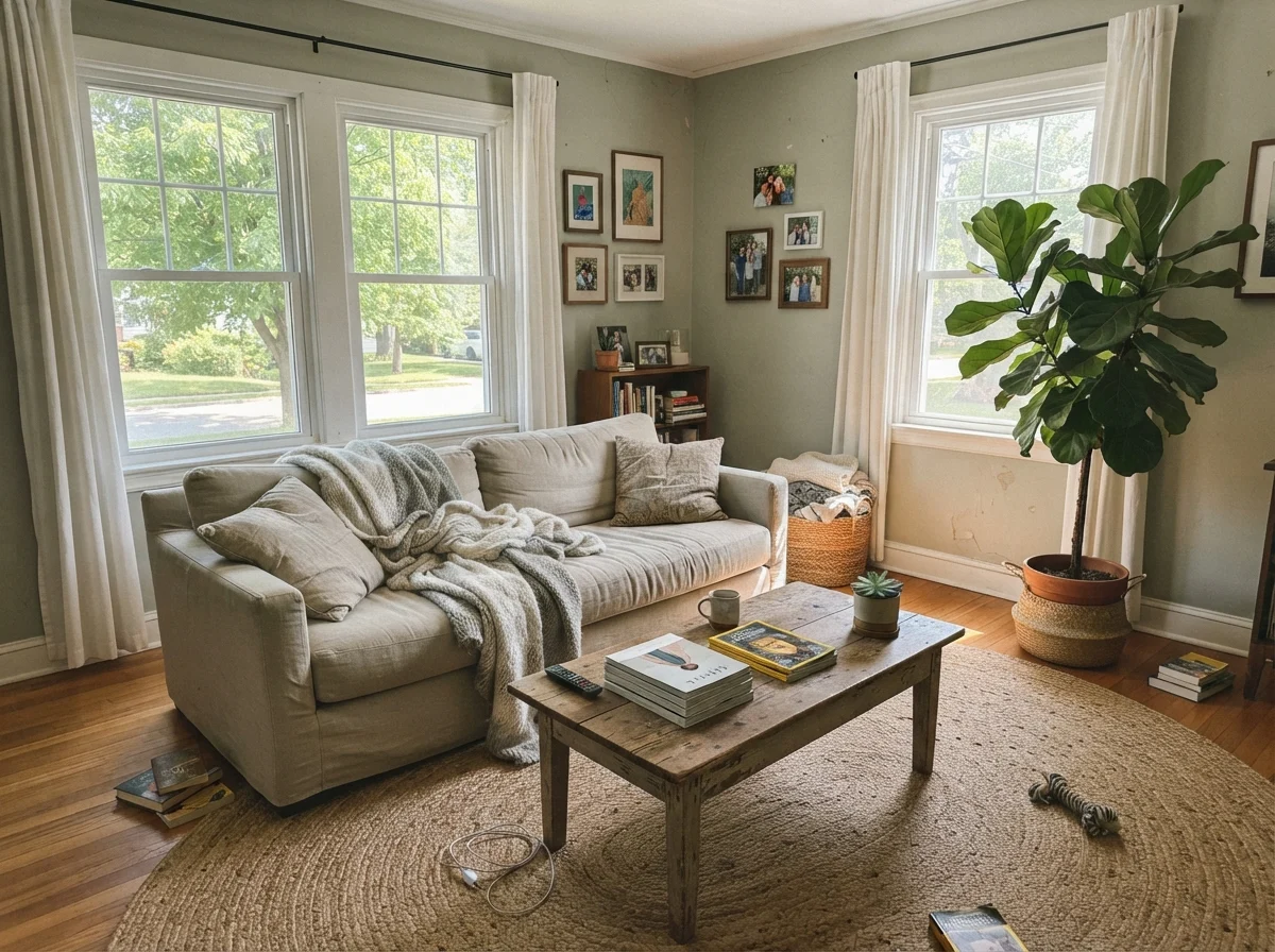
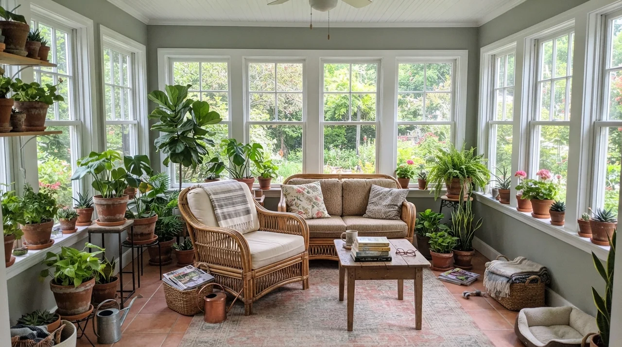
In generous living rooms and sunrooms wrapped in glass, Oyster Bay is in its absolute element. Flooded with all-day natural light, the green pigment never wavers. It ties interior spaces directly to the garden greenery outside, making natural materials like jute rugs, rattan chairs, linen slipcovers, and terracotta planters look effortlessly curated.
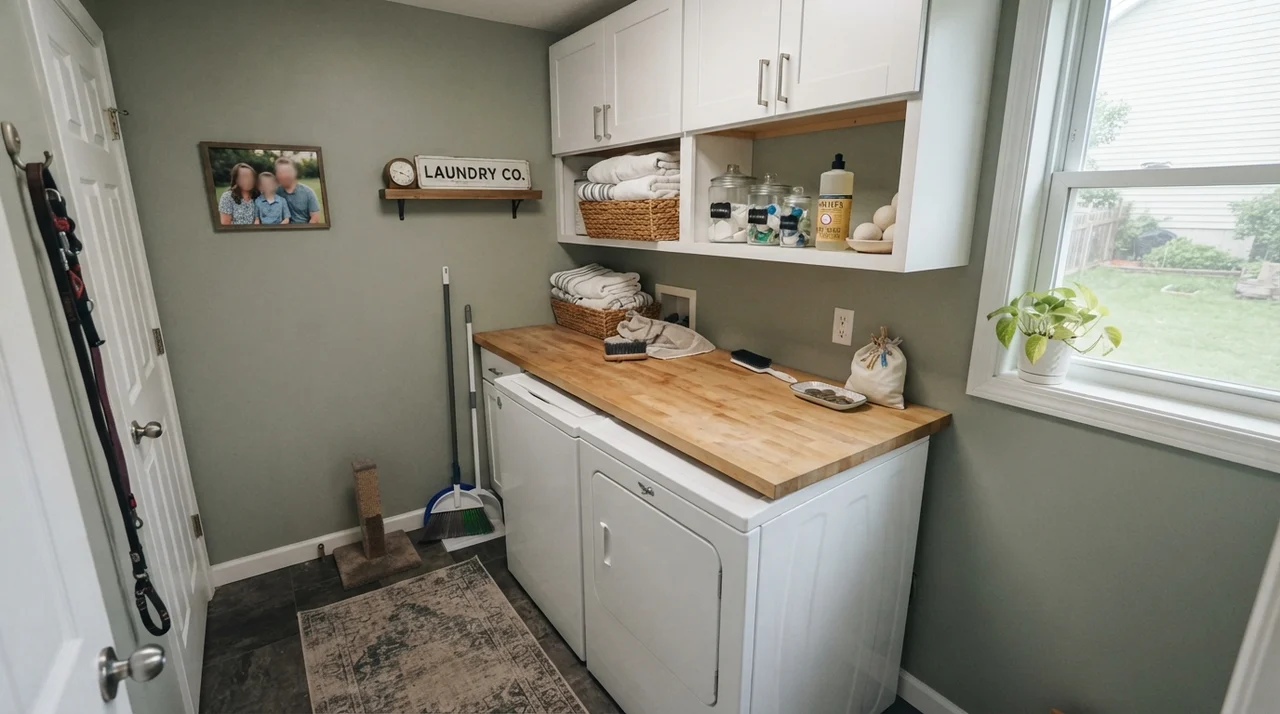
In a sunroom or well-lit laundry room, it turns an ordinary utilitarian corner into a custom space. But beware of using it in windowless utility closets or small, dark basements. LRV 44 absorbs light rather than bouncing it. If a room has zero daylight, Oyster Bay will not make it feel like an airy coastal cottage; it will make it feel like a cave.
Where Oyster Bay Fails: The Windowless Trap
I always tell readers that the unhappy reviews for paint colors are rarely accidents. They happen when a color is forced into a lighting environment it was never built to handle. With Oyster Bay, the failures happen in dim, windowless hallways or basement rooms lit by a single sad ceiling bulb.
In a dark hallway with beige carpet, Oyster Bay loses its coastal grace entirely. The green dies, the blue flattens into a muddy, dull putty gray, and the space feels cramped. If you want a small, dark space to feel larger, this is not your can of paint.
A Note from Thirty Years of Painting Walls
People often ask me why I bother spending three weeks testing sample boards when paint stores sell five-dollar peel-and-stick swatches. I do it because I have repainted rooms twice when I got lazy, and there is no budget line item more frustrating than buying ten gallons of paint to fix a mistake you could have caught with a sample board.
When you look at Oyster Bay in your home, don't just look at it at 2:00 PM on a clear Saturday. Look at it at 7:00 AM on a rainy morning, and at 9:00 PM with your bedside lamp on. If you still love the wall when the slate-blue comes forward, you have your winner.
Exteriors: Where Oyster Bay Never Misses
If Oyster Bay can be finicky indoors under shifting light, it is remarkably well-behaved outdoors. Full direct sunlight washes out subtle undertone squabbles and locks the paint into a timeless, dignified sage green that looks right at home among trees, hydrangeas, and stone walkways.
When we sold our split-level years ago, exterior color was what got buyers out of their cars. Oyster Bay on horizontal siding with crisp Extra White (SW 7006) trim and a deep door like Naval (SW 6244) or Urbane Bronze (SW 7048) strikes that elusive balance: it looks historic and classic, but fresh enough to signal that the house has been meticulously cared for.
Durability, Scrubbing, and Sheen Choices
Because Oyster Bay sits at LRV 44, choosing the correct sheen is critical to how it wears over the years. In five years in our busy household, here is what has held up and what was worth the money:
- Walls (Eggshell): Eggshell gives you just enough resin to wipe away fingerprints and scuffs near door frames without creating an annoying, plastic-like glare on long living room walls.
- Trim & Baseboards (Semi-Gloss): Semi-gloss provides the hard-wearing shell needed to handle vacuum cleaner bumps and muddy boots.
- Cabinets & Bathrooms (Satin): Never use flat or eggshell on bathroom walls or kitchen cabinet boxes. A high-quality satin enamel resists moisture beads, steam, and food splatters, and can be scrubbed clean with soapy water without leaving burnished shiny spots behind.
How Oyster Bay Compares to Similar Shades
When you stand in front of the color rack, several neighboring swatches look nearly identical. Here is how Oyster Bay actually behaves when compared side-by-side with its closest alternatives.
Why does Oyster Bay look blue in my house?
Oyster Bay contains a slate-blue undertone. In rooms with cool northern light, indirect exposure, or 4000K LED light bulbs, the cool light neutralizes the yellow-green pigment and pulls the blue forward. Switching your lamps to warm 2700K bulbs often restores the sage look.
What is the best white paint for trim with Oyster Bay?
Sherwin-Williams Alabaster (SW 7008) is the most forgiving pairing because its warm, creamy undertone balances the cool side of the wall. For a crisper look, Sherwin-Williams Pure White (SW 7005) works beautifully.
Can I use Oyster Bay on kitchen cabinets?
Yes, lower cabinets and kitchen islands are among its safest and most successful uses. In a durable satin finish, it looks tailored and pairs gorgeously with white quartz countertops, warm oak floors, and brass hardware.
Is Oyster Bay too dark for a whole house?
At LRV 44, it is generally too dark and moody to use as a default whole-house color unless your home has expansive south-facing windows and tall ceilings. In windowless hallways or small powder rooms, it can feel closed-in.
What exterior colors pair best with Oyster Bay?
For a house exterior, use Oyster Bay on the main siding, Sherwin-Williams Extra White (SW 7006) on the trim and fascia, and a deep contrast color like Naval (SW 6244) or Urbane Bronze (SW 7048) on the front door and shutters.
Susan's Verdict · Worth It With Daylight
Sherwin-Williams Oyster Bay is a gorgeous, quiet coastal gray-green that delivers an expensive, tailored look when paired with generous daylight, white trim, and warm wood. But if your room faces north, sits in the dark, or is ringed with beige tile and honey-tan floors, that slate-blue surprise will catch you off guard. Sample it on a two-foot board, look at it on a cloudy morning, and let your actual light make the call.