Color Diary · No. 11
Sherwin-Williams Pewter Green: Where LRV 12 Works and Where It Collapses
The moody green-gray behind a thousand kitchen islands, reviewed honestly: the surfaces it wins on, the rooms where it turns black, and what to pick instead.

Susan HartleySeptember 2, 2026 · 14 min read
Pewter Green · Sherwin-Williams SW 6208
Hex#5E6259LRV12Undertonesgreen → smoky gray → blue-sage
In our last house, a 1990s colonial with builder-grade golden oak everywhere the eye could see, I spent six months trying to convince myself that every dark green was basically the same dark green. I had four swatches taped to the island, each one promising an English countryside mood, and each one looking like blackboard chalk by 4:00 p.m. That was my first real lesson in how unforgiving a deep, muted hue can be once you put it on four square yards of cabinet face.
Sherwin-Williams Pewter Green (SW 6208) is currently sitting at global rank 14 in popular paint decks, and it is easy to understand why. It is the color people mean when they say they want a dark green kitchen without feeling like they live inside an evergreen tree. The green here is strictly a lean; most of what hits your eye is a deep, grounded charcoal-gray. That built-in restraint is precisely why it has survived five years in an era of hyper-fast design cycles. But at a Light Reflectance Value of 12, it is a heavyweight paint that demands certain conditions. Give it southern sunlight, crisp light stone, and warm wood, and it looks like a million dollars. Starve it of daylight, and it simply collapses into a flat, impenetrable shadow.
When you look at its closest neighbors in the fan deck—shades like Cast Iron (SW 6202) and Behr's Black Bamboo—you see just how tight the margin is between a quiet, dusky sage and a near-charcoal. Pewter Green sits directly in that pocket. In direct south-facing sunlight, the underlying green blooms forward, giving you an earthy, rich finish that warms up adjacent oak or butcher block. In flat or northern daylight, however, that green pulls back, letting the slate-gray dominate and occasionally drifting toward a cool blue-sage.
Understanding this shifting nature saves you from an expensive repaint. If you paint this color expecting guests to walk in and immediately say, "Oh, what a lovely dark green," you may be disappointed. Pewter Green is a mood first and a color second. If you want an unmistakable botanical green, Sherwin-Williams Rosemary (SW 6187) is the louder choice. Pewter Green is for people who want the wall to recede quietly into the background while still providing serious depth.
How Daylight and Artificial Bulbs Change the Mood
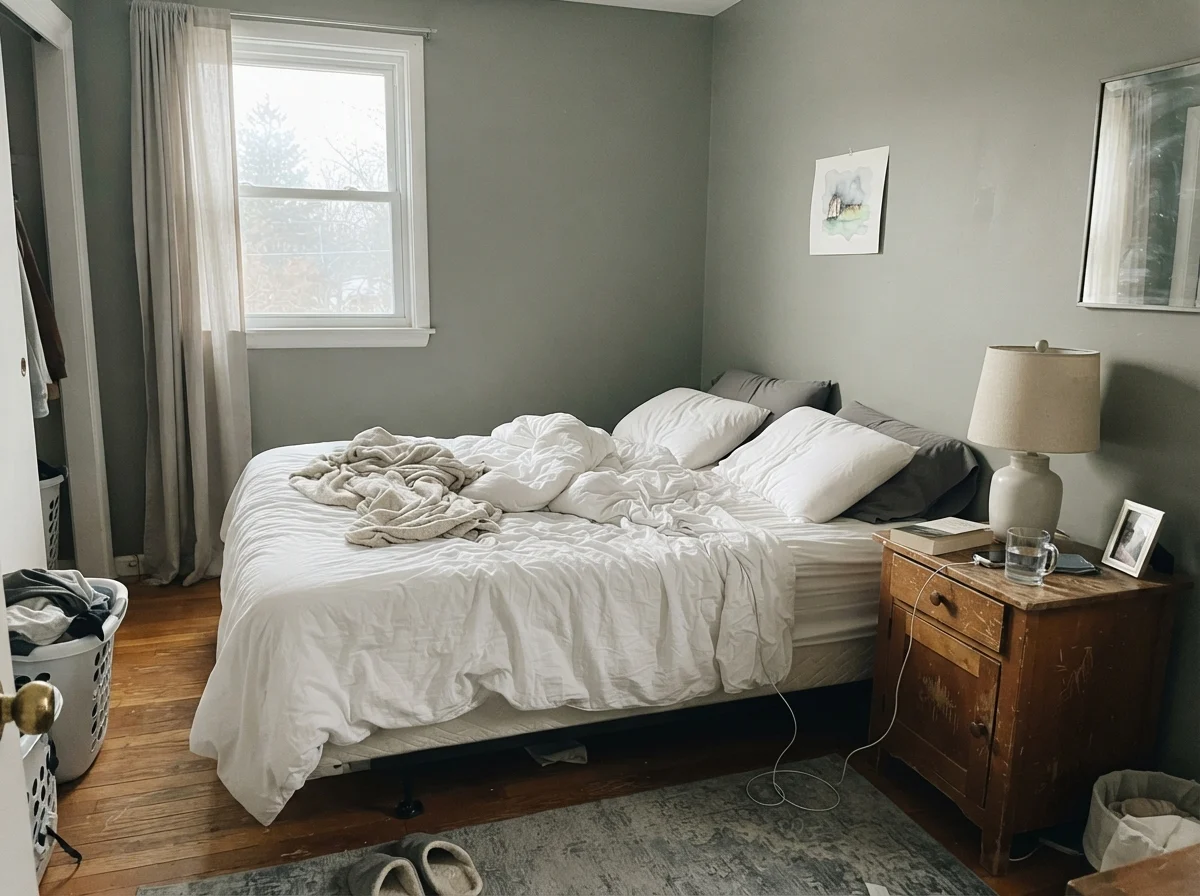
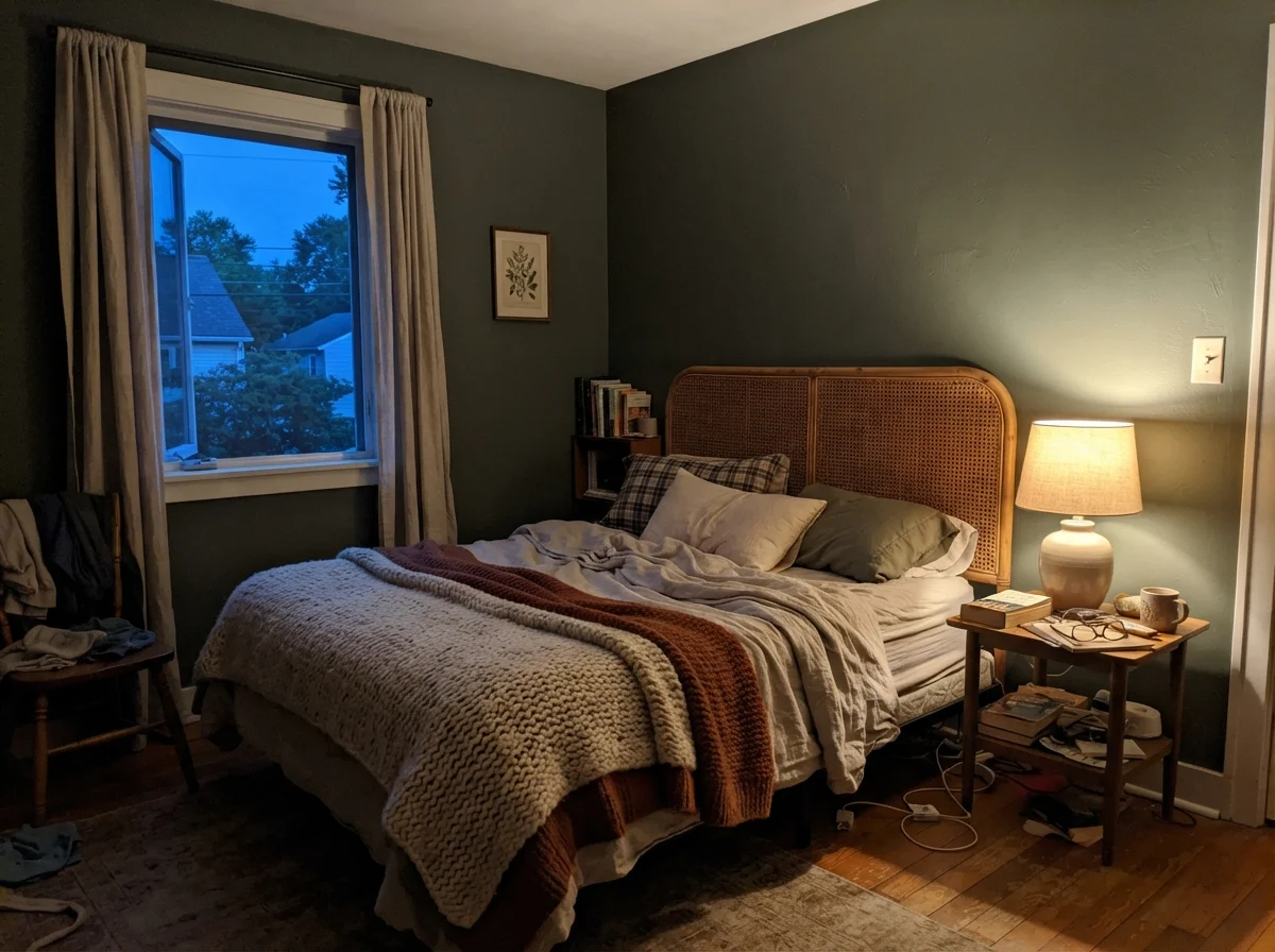
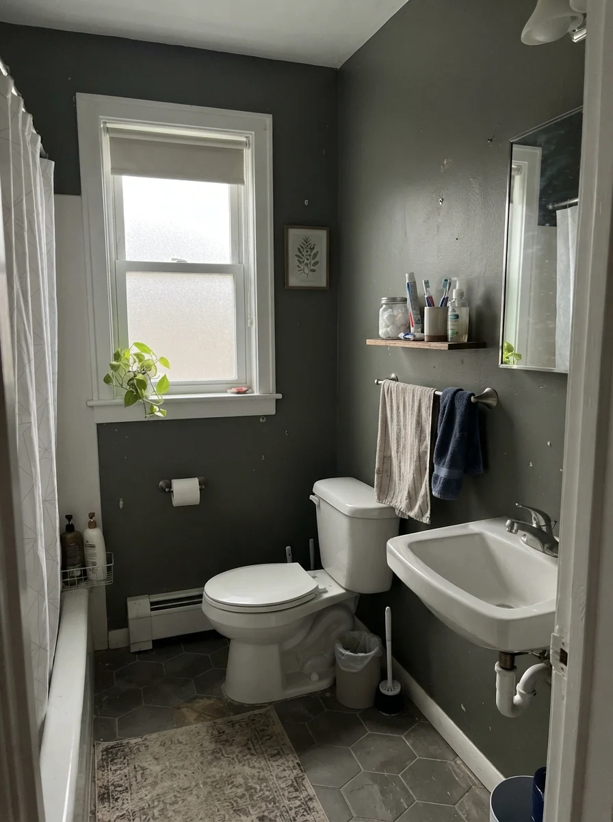
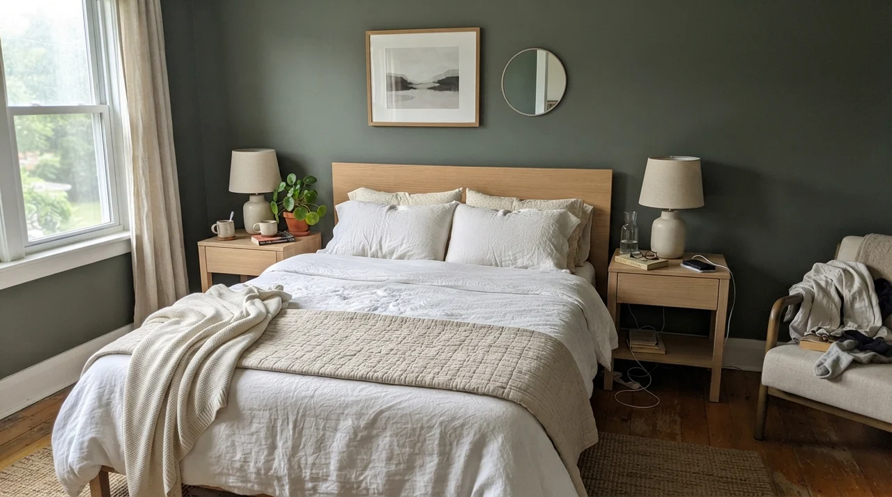
You cannot judge LRV 12 on a paper swatch held under fluorescent hardware store lights. That was true thirty years ago in our split-level and it remains true today. In cool morning light, as shown above, Pewter Green loses its warmth and reads remarkably subdued. But flip on a bedside lamp fitted with a 2700K warm bulb in the evening, and the smoky undertones soften into a cozy, mossy backdrop that feels tailored and grounded.
Lighting hardware matters here immensely. If you install 4000K or 5000K daylight LED bulbs in a room painted with Pewter Green, the wall turns hard, cold, and cement-like. Keep your artificial lighting between 2700K and 3000K to let the rich olive-gray undertones surface. In north-facing rooms with cool sky light, be aware that pairing this shade directly against stark, brilliant white trim will exaggerate the cool, blue-gray side of the pigment.
Pewter Green in Bathrooms: When to Enclose and When to Step Back
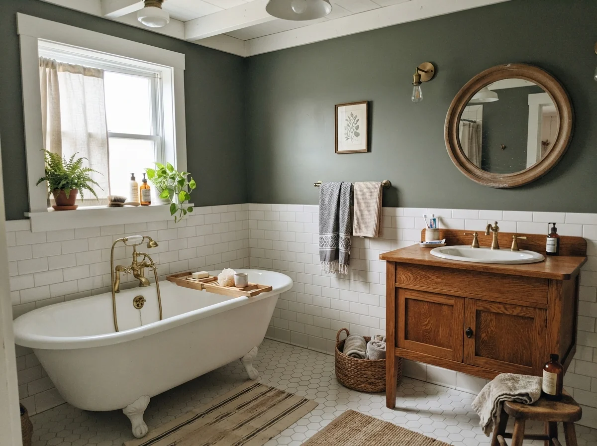
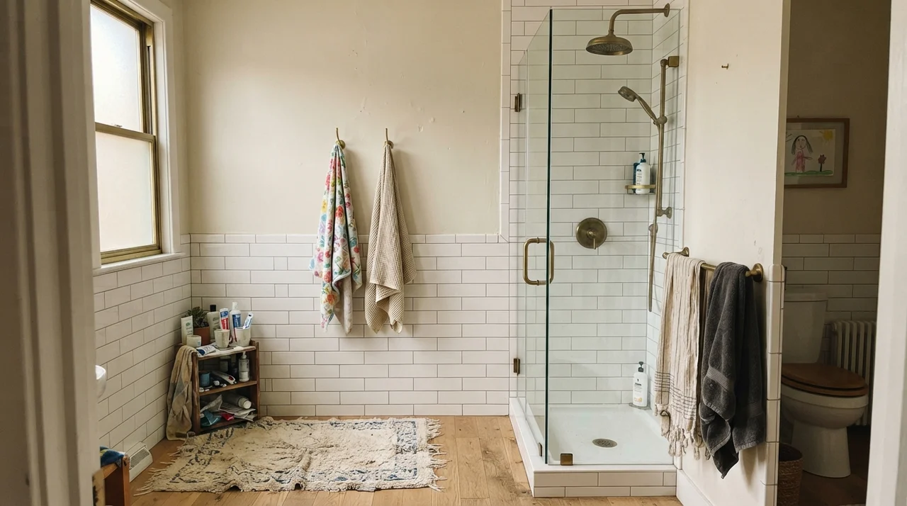
Bathrooms are natural test laboratories for deep colors. A powder room is one of the very few spaces where painting all four walls in LRV 12 works without reservation—provided you have adequate artificial lighting. Because a powder room is inherently small, wrapping the walls creates a deliberate, jewel-box feel rather than an accidental cave.
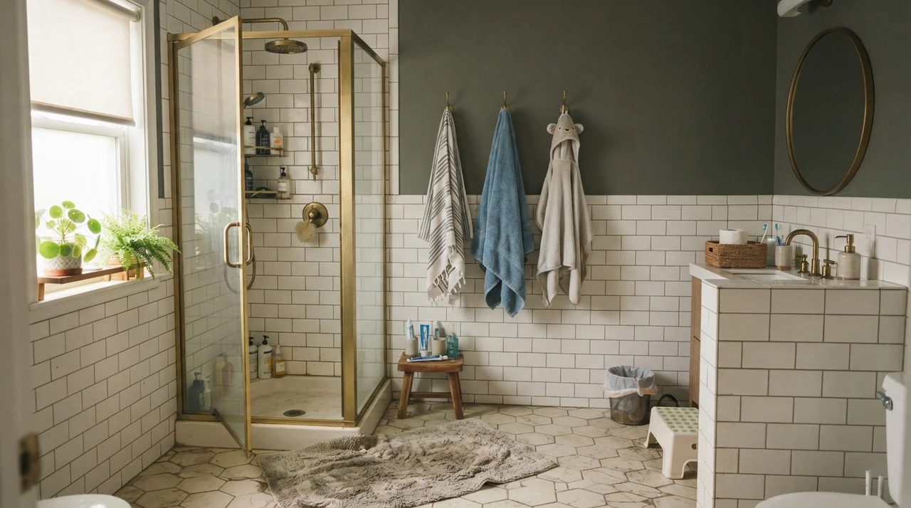
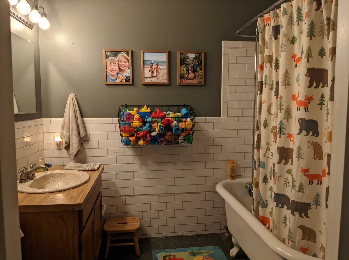
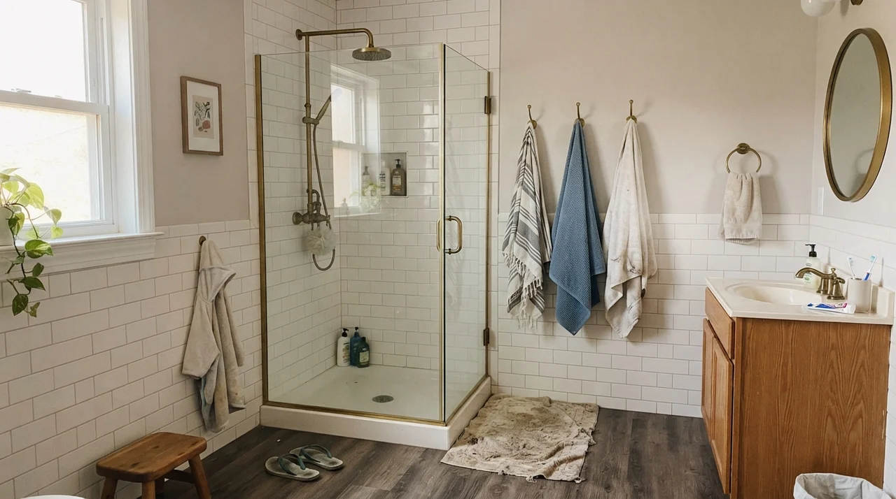
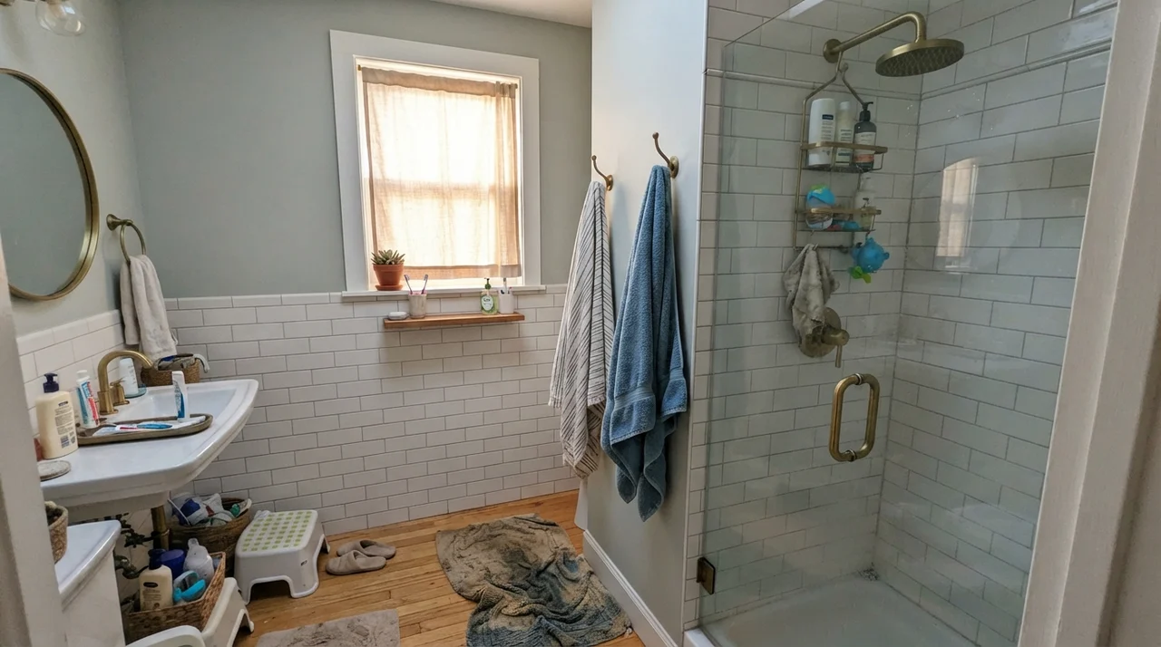
In a family bathroom or kids' bath, pairing Pewter Green with bright white wainscoting or white subway tile balances the visual weight. The high-contrast lower half prevents the room from feeling dim while letting the upper walls carry the drama. For trim and ceilings in these smaller spaces, a soft off-white like Snowbound (SW 7004) keeps the transition from looking jarring.
Kitchen Cabinetry: The Island Rule
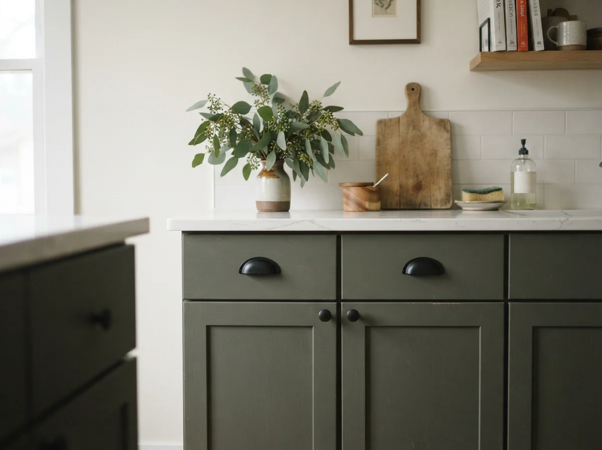
If you ask three interior designers for a dark kitchen cabinet recommendation, two of them will mention Pewter Green within five minutes. And for good reason: it anchors lower cabinetry and islands like almost nothing else in the Sherwin-Williams lineup. It doesn't scream for attention like a bright emerald, nor does it feel severe the way pure black sometimes does.
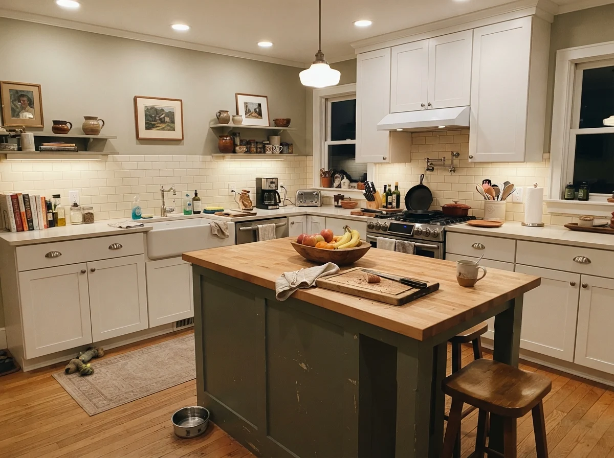
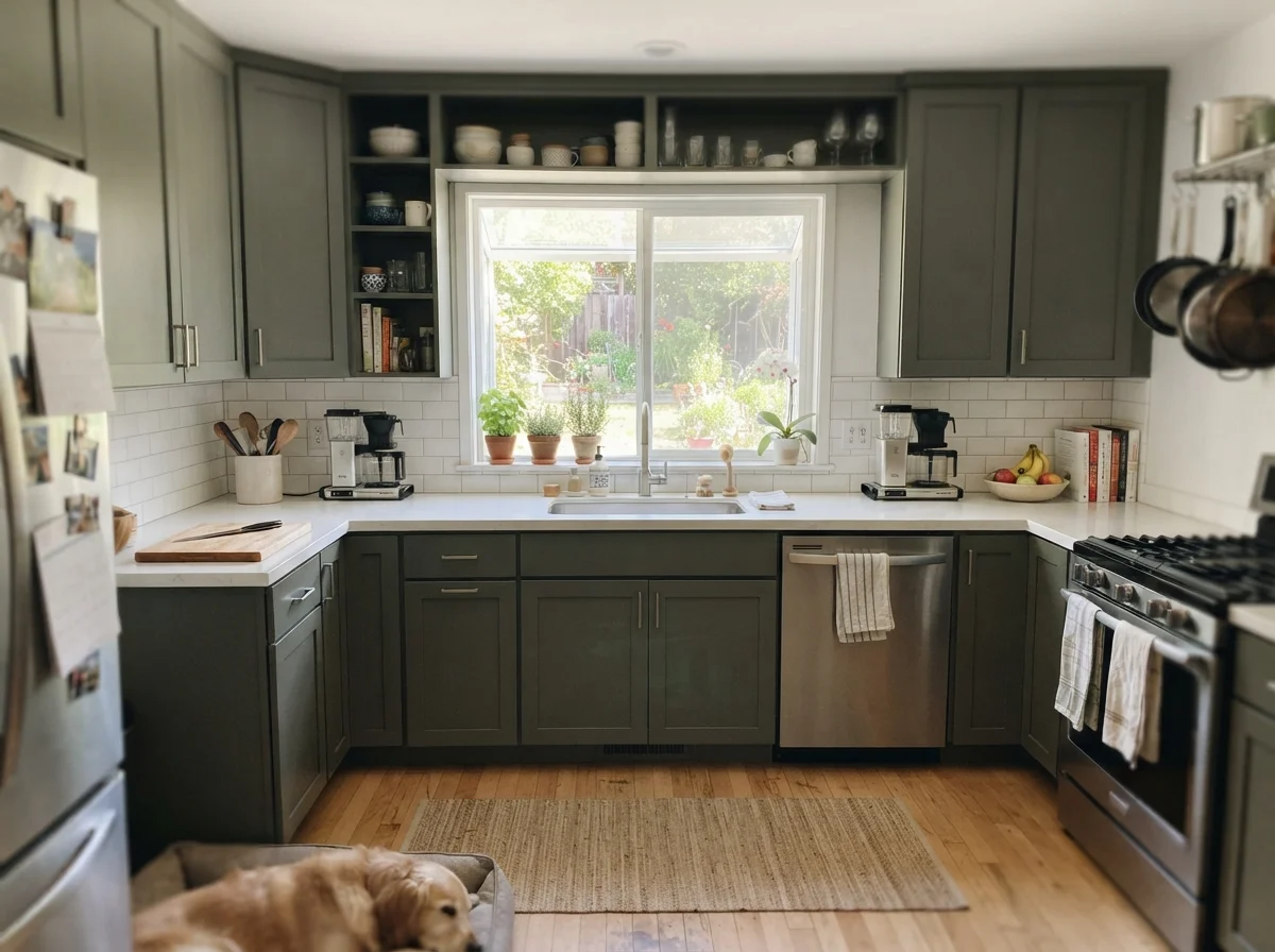
However, I have seen homeowners make the mistake of painting every single cabinet in an 8x10 kitchen with it. Painting both uppers and lowers in LRV 12 in a modest room shrinks the visual boundary instantly. When we repainted our 1960s ranch kitchen, keeping the dark tone on the island and lower cabinets while running a light perimeter like Alabaster (SW 7008) on the main walls gave us the depth we wanted without turning the workspace into a tunnel.
Countertop pairings are crucial here. Pewter Green requires contrast. It pairs effortlessly with light quartz, white marble, pale oak butcher block, and warm unlacquered brass hardware. But if you drop dark polished granite or dark soapstone directly on top of Pewter Green cabinetry, the boundary disappears and the entire bank of cabinets reads as a heavy, murky mass.
Pewter Green is the color people mean when they say they want a dark green kitchen without feeling like they live inside an evergreen tree.
Bedrooms and Living Areas: Accent vs. Four Walls
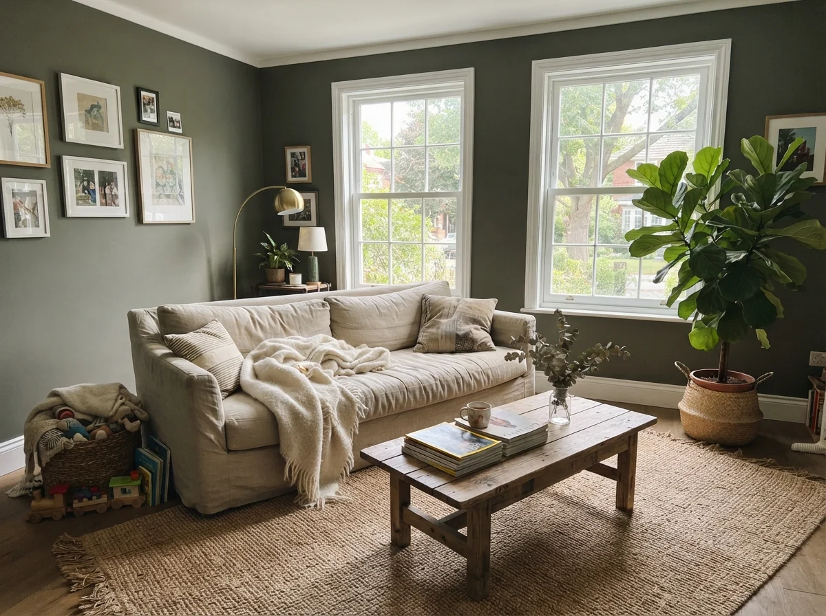
In main living areas and bedrooms, painting all four walls in Pewter Green is a commitment that requires generous square footage and strong daylight. In our current 1960s ranch, the primary living room has wide windows on two sides, which allows the natural green undertone to emerge cleanly during the afternoon hours. Linen upholstery, warm wood furniture, and textured jute rugs break up the surface area and keep the space balanced.
For bedrooms, running this shade across a single accent wall behind the headboard offers a restful anchor that takes white linen bedding and warm oak nightstands beautifully. If you attempt all four walls in an average-sized room with only one north-facing window, the space quickly tips from cozy to cave-like. If you are determined to wrap an entire low-light bedroom in green-gray, stepping up nine reflectance points to Retreat (SW 6207) is the safer path.
Sunrooms, Built-Ins, and Trim
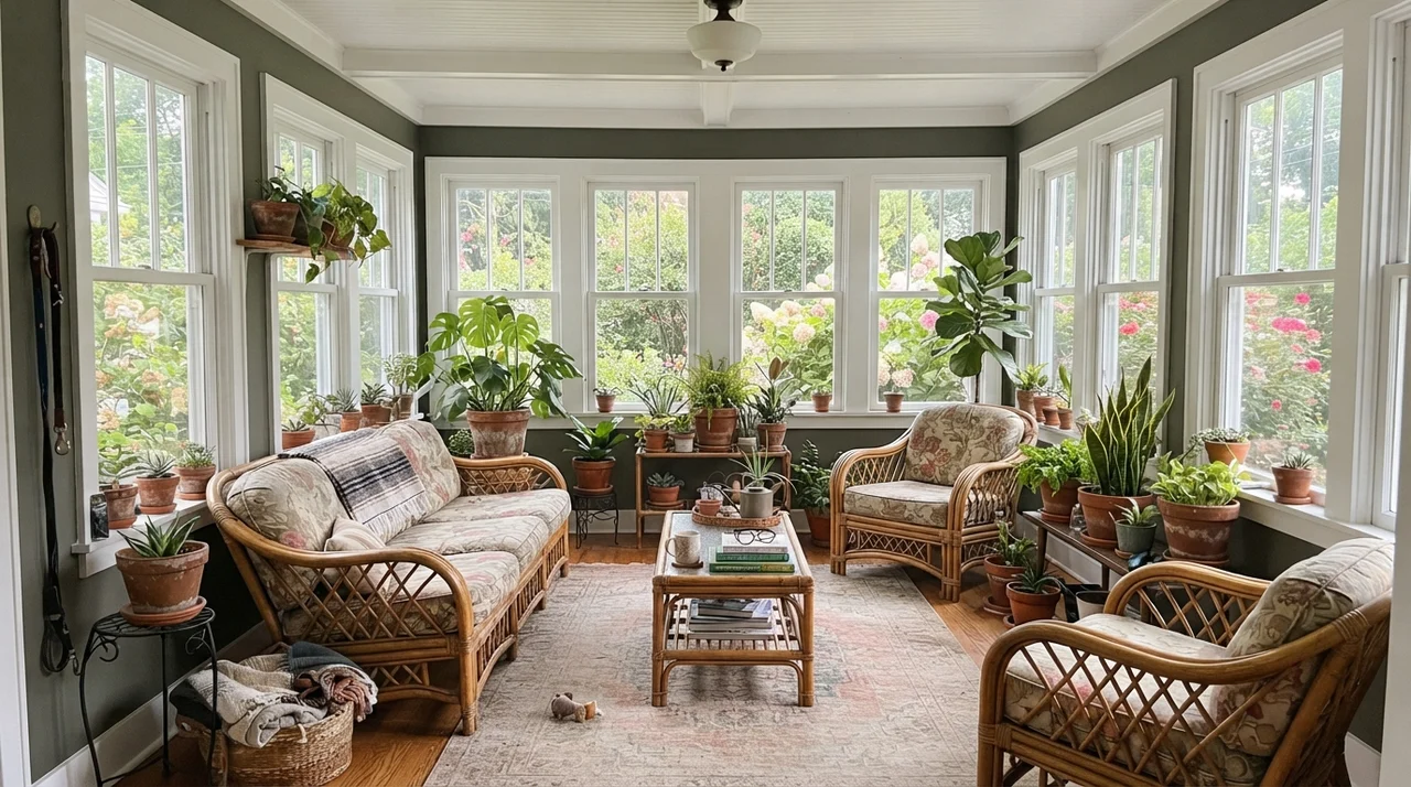
Where Pewter Green shines brightest is on architectural millwork and spaces with expansive glazing. In a sunroom lined with white-framed windows, the deep wall color frames outdoor garden greenery rather than competing with it. The terracotta pots and rattan furniture provide natural warmth that complements the charcoal-moss balance.
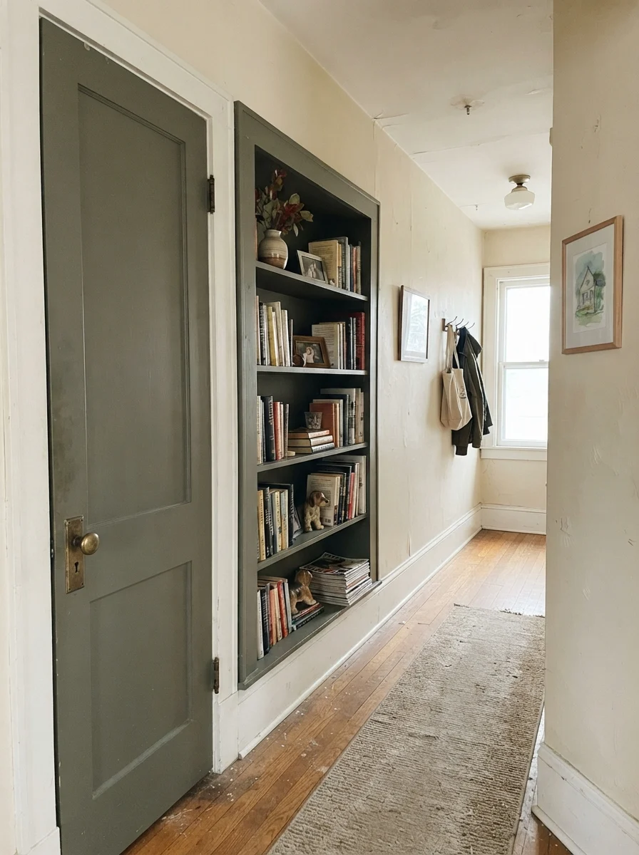
Likewise, using Pewter Green on interior doors or built-in bookshelves against cream or off-white walls—such as Accessible Beige (SW 7036) or Sea Salt (SW 6204)—adds deliberate architectural interest without darkening the entire hallway or study.
The Honest Fail: When LRV 12 Collapses
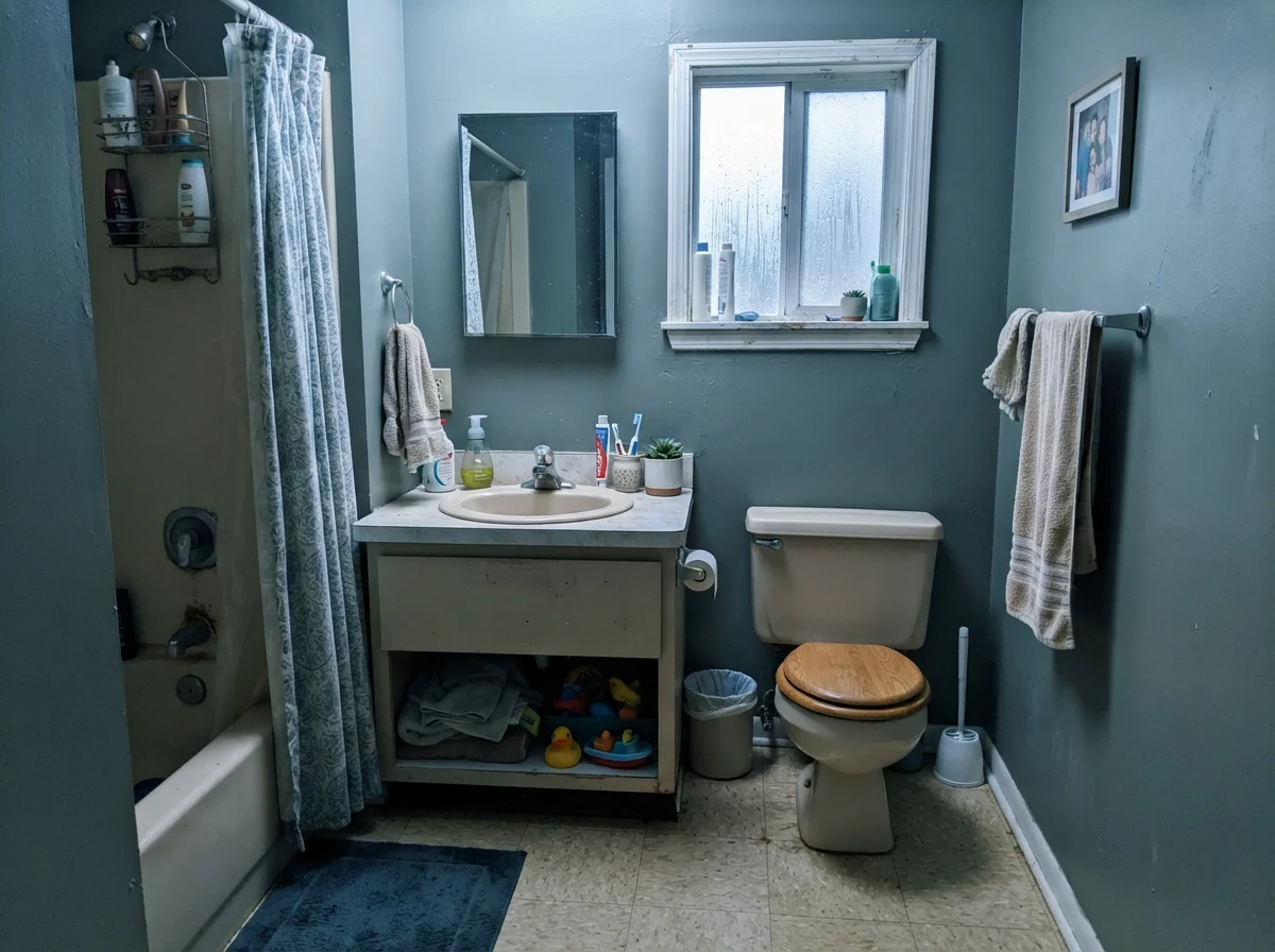
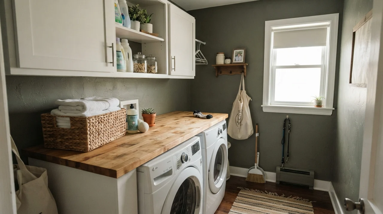
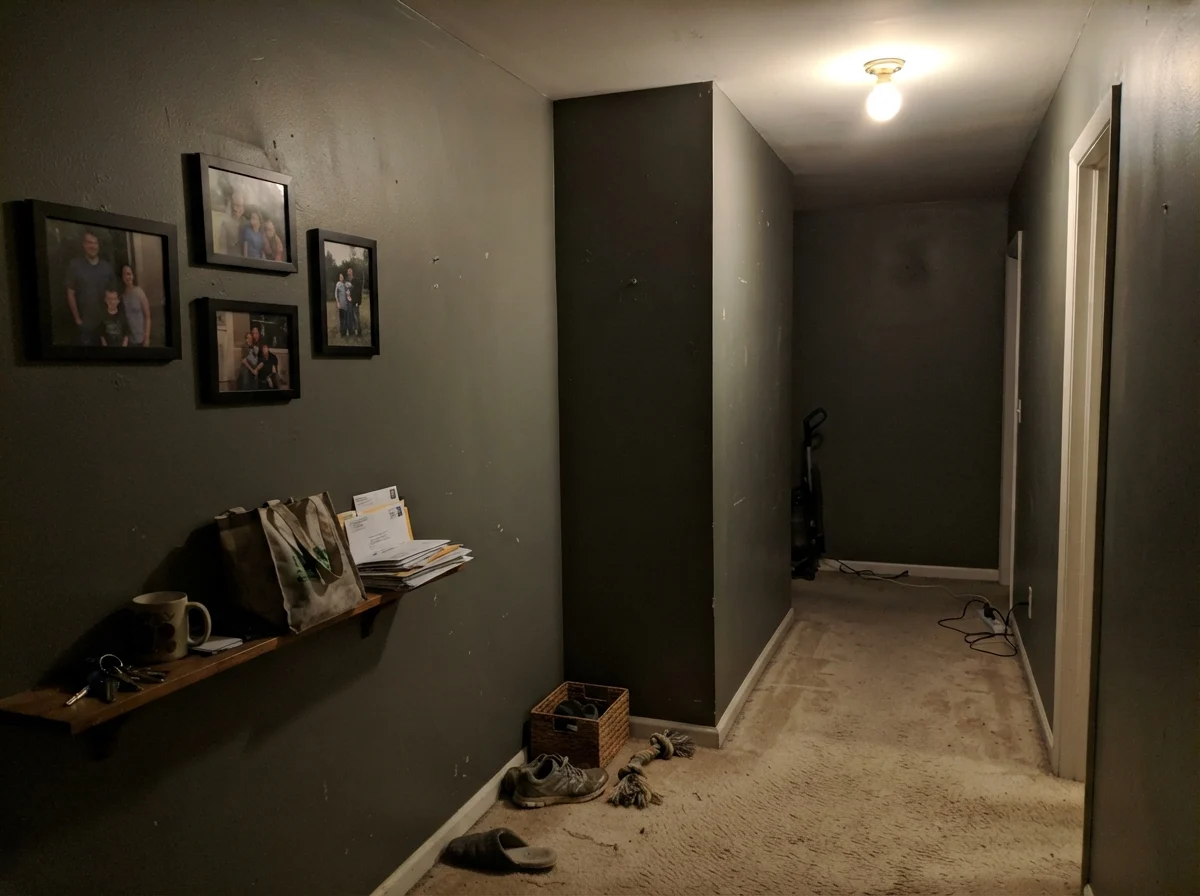
The bad Pewter Green stories are remarkably consistent, and every one of them traces back to a room or surface that simply could not carry an LRV 12 paint. The photograph above shows exactly what happens when you roll this color into a dim hallway or windowless pantry with a single, weak ceiling fixture: with no natural daylight to bounce off the wall, the green pigment completely dies. The wall flattens into a muddy, dull charcoal-putty that shrinks the hallway and absorbs all available light.
If your room has no exterior window and you are not planning to install high-quality 2700K sconces or vanity lights, do not choose this shade. Step up to Retreat (SW 6207) at LRV 21. Retreat shares the same slate-green family DNA but retains enough baseline reflectance to still read as an intentional color in dim environments.
Exterior Siding and Long-Term Durability
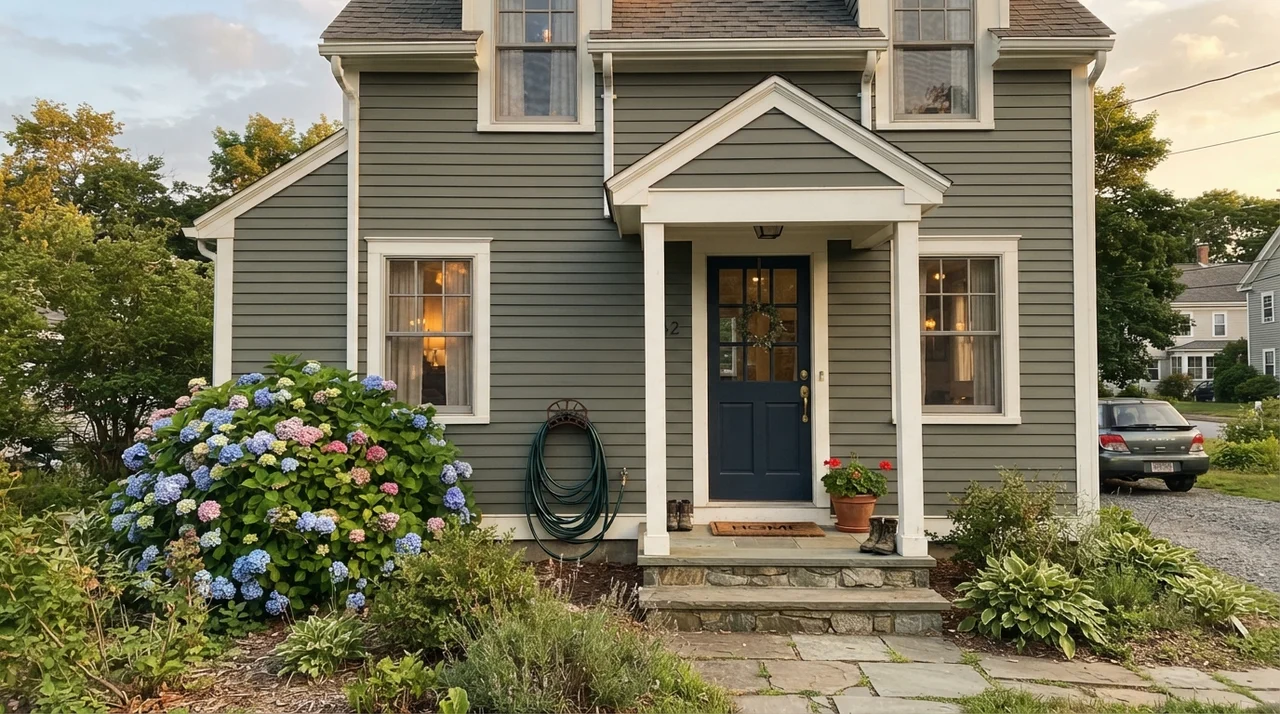
Full outdoor sunlight does what a dim hallway cannot: it draws out the rich green heart of the paint. On horizontal siding, Pewter Green stands as one of the strongest, most handsome dark exterior colors in the Sherwin-Williams fan deck. Paired with Pure White (SW 7005) trim and an accent front door, it gives a home an established, grounded presence that outlasts passing fads.
One practical caution: if your house sits on a lot heavily shaded by dense, mature trees, the exterior will look considerably darker and grayer than it does on a sunny suburban lot. Always test a large sample board against your home's north and south elevations before committing to a full repaint.
Durability, Cleaning, and Sheen Selection
After thirty years of scrubbing walls across three houses, I can tell you that dark, saturated paints behave very differently under a sponge than warm whites or greiges. Pewter Green in a dark satin finish on cabinetry will show grease smudges and knuckle marks around door pulls faster than a lighter color. However, satin is strictly worth the money here because it can be scrubbed clean with a damp microfiber cloth without burnishing.
For drywall, stick to an eggshell finish. A flat finish in an LRV 12 shade looks velvety on day one, but the moment someone bumps against it with a laundry basket or you try to wipe away a scuff, it leaves a shiny burnish mark that is impossible to hide. Keep trim in semi-gloss for crisp contrast and wipeability, and choose satin for exterior siding to withstand weather and washing.
Be warned: touch-ups on dark walls rarely blend seamlessly five years in. When you scratch or scuff an LRV 12 wall, you will almost always need to paint from corner to corner rather than dabbing a small brush in the middle of a wall.
What is the LRV of Sherwin-Williams Pewter Green?
Pewter Green has a Light Reflectance Value (LRV) of 12. This places it firmly in the dark category, meaning it absorbs roughly 88% of light and requires adequate natural or warm artificial lighting to reveal its green undertone.
Is Pewter Green warm or cool?
It sits directly in the center. Its heavy slate-gray base reads cool in north light, while its mossy green lean warms up nicely under direct southern sunshine and 2700K interior lamps.
What trim color goes best with Pewter Green?
Sherwin-Williams Alabaster (SW 7008) is the most reliable pairing for a soft, warm transition. For a crisper, more modern border, Pure White (SW 7005) provides clean contrast without turning stark.
Can I paint all my kitchen cabinets in Pewter Green?
It is best suited for kitchen islands and lower cabinets. Painting both upper and lower cabinets in a small kitchen can make the workspace feel enclosed. If you want full-height cabinetry in dark green, ensure your room has large windows and light quartz or marble countertops.
Why does my Pewter Green swatch look blue-gray on the wall?
In rooms with northern exposure or flat overcast daylight, the cool outdoor sky pulls the gray pigment forward and pushes the green toward a cool blue-sage. Test with warm 2700K light bulbs to restore its earthy warmth.
Susan's Verdict · A Masterpiece on Islands, a Hazard in the Dark
Pewter Green is one of the most sophisticated dark neutrals in the modern deck because it refuses to be loudly green. On a kitchen island, lower cabinets, built-in bookcases, an exterior front porch, or a well-lit powder room, it delivers instant, grounded depth. But respect its LRV 12 rating: if your room lacks windows or daylight, do not try to force it. Step up to Retreat (SW 6207) and save yourself a weekend of regret.