Color Diary · No. 59
Sherwin-Williams Pure White: The One Can That Solved Decades of Trim
Sherwin-Williams' best-selling white, reviewed honestly: why it works on almost everything, the three rooms where readers call it dirty, and what to paint instead.

Susan HartleyOctober 2, 2026 · 14 min read
Pure White · Sherwin-Williams SW 7005
Hex#EDECE6LRV84Undertonessubtle yellow-warmth → soft neutral → faint cool shadow
In our last house, a 1990s colonial with honey-oak baseboards that fought me at every turn, I spent two full weekends testing five different cans of bright white paint on the hallway doors. Everything I brought home from the hardware store either looked like a hospital corridor or turned violently blue the moment the late afternoon clouds rolled in. A contractor friend finally took pity on my patchwork hallway, handed me a quart of Sherwin-Williams Pure White (SW 7005), and told me to stop overthinking it. He was right. We painted every door, baseboard, and window casing in that house Pure White, and when we sold six years later, not a single buyer asked what color the trim was—because it simply looked like trim ought to look.
That is the quiet magic of Pure White. It is not an exciting color on the chip. It doesn't promise to turn your home into an avant-garde design showcase, and it won't make your neighbors gasp. But thirty years of owning three houses has taught me that the paints you love on day two are rarely the paints you can stand on day two thousand. Pure White is Sherwin-Williams' rank-11 workhorse for a very good reason: it sits right on the edge of true brightness without tumbling into icy sterility.
When you look at the numbers, Pure White carries a Light Reflectance Value (LRV) of 84. In plain English, that means it reflects eighty-four percent of the light bouncing into a room. It is genuinely bright, but it stops short of those blinding LRV 90+ gallery whites that make everyday clutter look like a crime scene. What makes it behave so well in real houses is its tiny drop of warm pigment. It contains just enough warmth to soften the blow of direct daylight, keeping the tone gentle and livable rather than sharp.
The Shifting Faces of LRV 84
Because that warm lean is subtle—only a faint nudge away from pure neutral—Pure White changes its personality depending on what direction your windows face and what kind of bulbs you screw into your lamps. It is not a chameleon in the dramatic sense that greiges are, but you will notice it shifting across three distinct moods during the day.
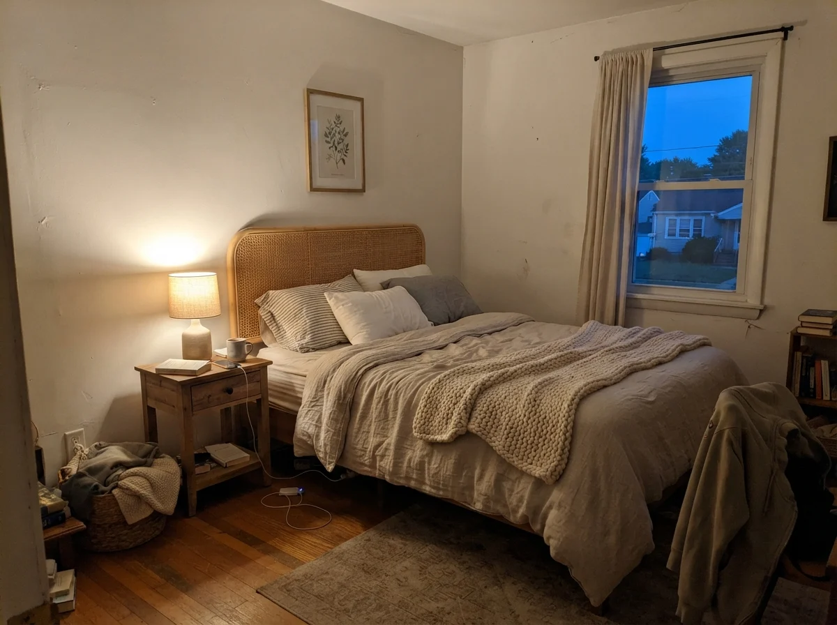
In our current 1960s ranch, I put Pure White in a bedroom that gets morning sun and evening shadows to see how it handled the swing. In the early morning before the lamps are flipped on, the walls look quiet, pale, and slightly washed out. But come evening, when we turn on the 2700K bedside reading lamps, the entire room fills with a warm, comforting glow that makes you want to curl up with a book.
Bathrooms and Tile: The High-Stakes Pairing
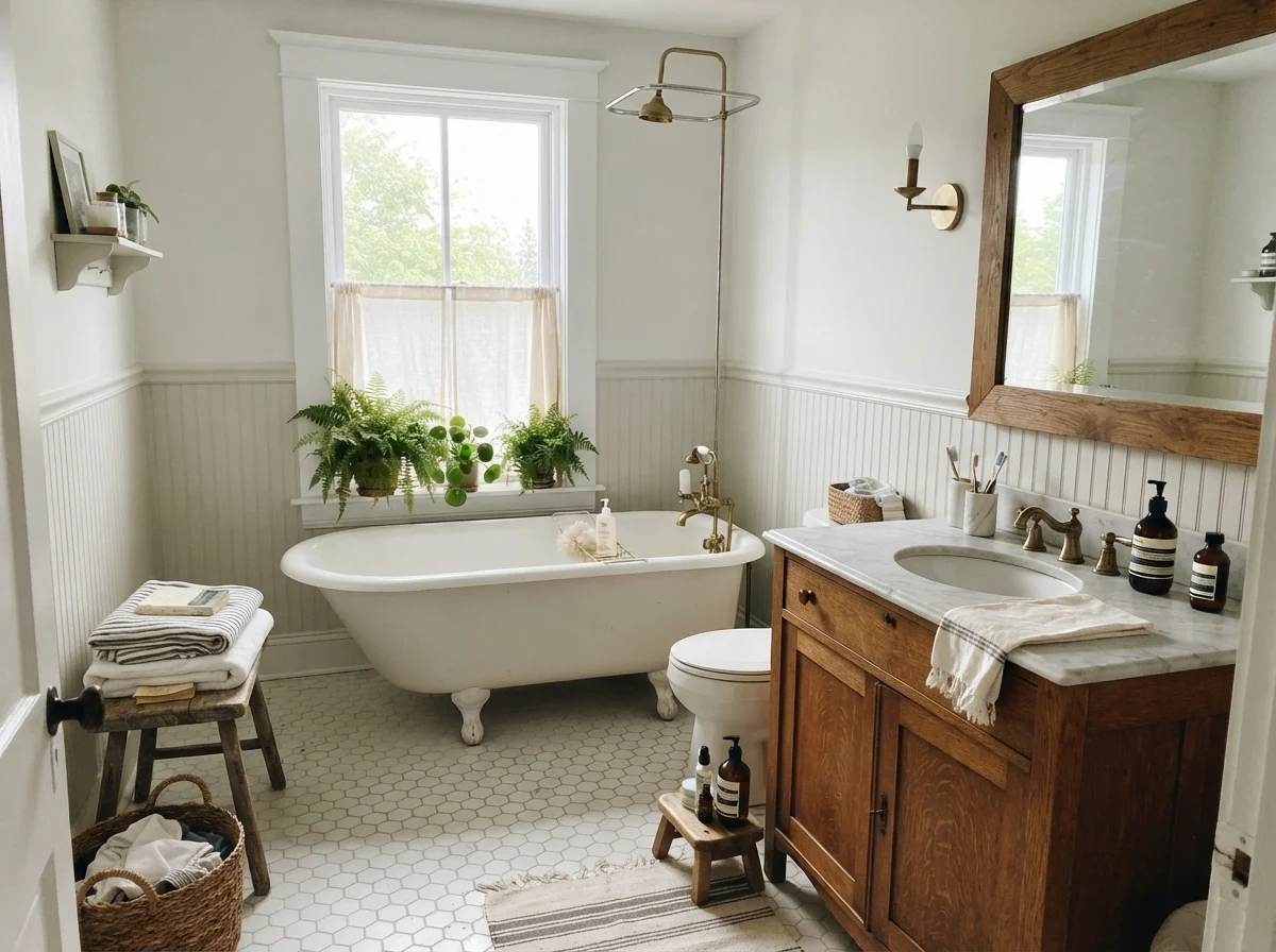
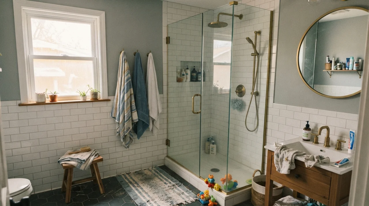
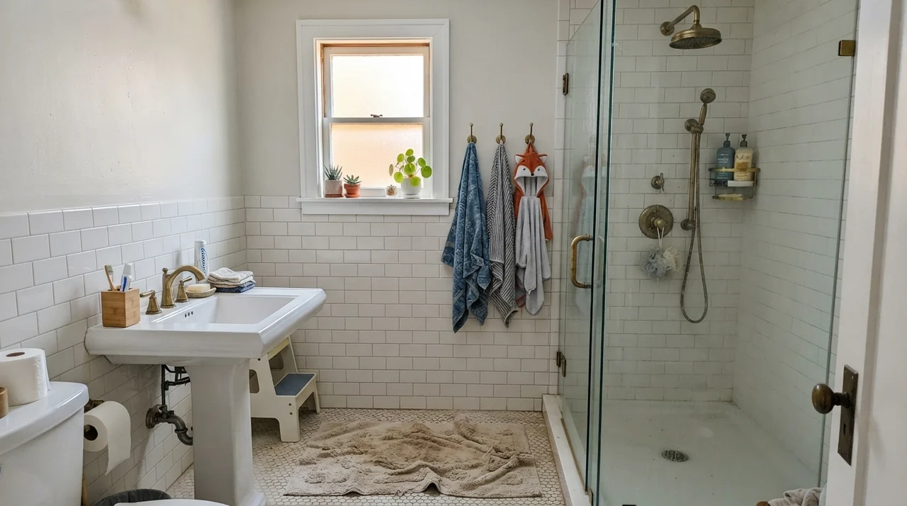
Bathrooms are where people run into the biggest headaches with off-whites, and Pure White is no exception. Because it has that faint touch of warmth, it can look exceptionally soft against warm wood vanities and traditional brass plumbing fixtures. In a classic cottage bathroom with a clawfoot tub and warm oak accents, it reads clean, comfortable, and timeless.
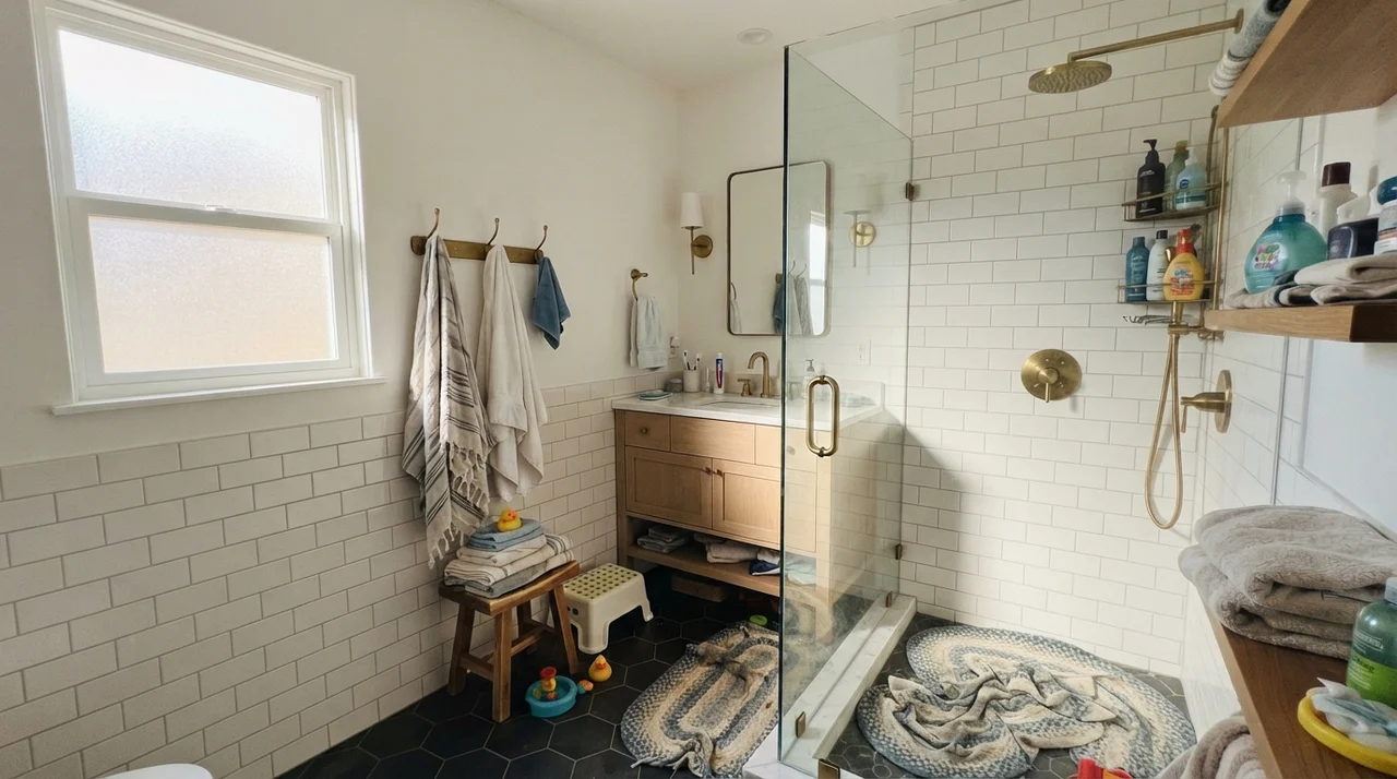
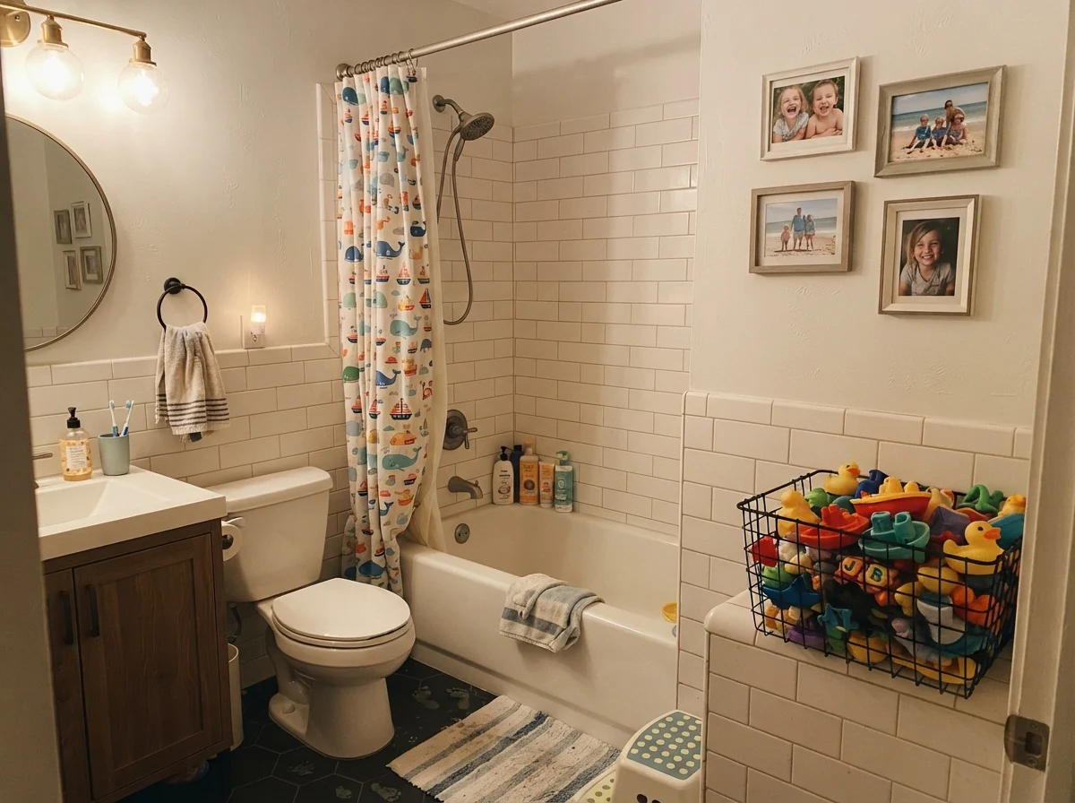
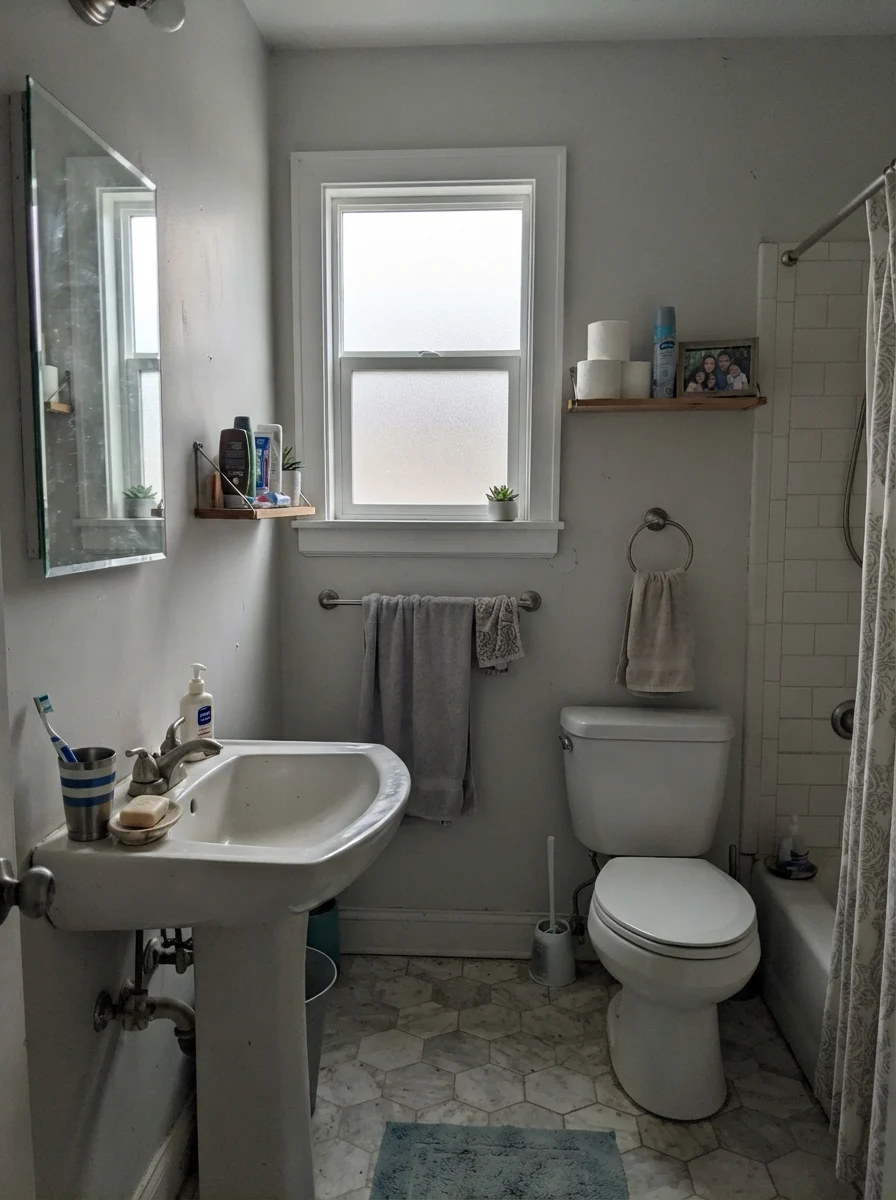
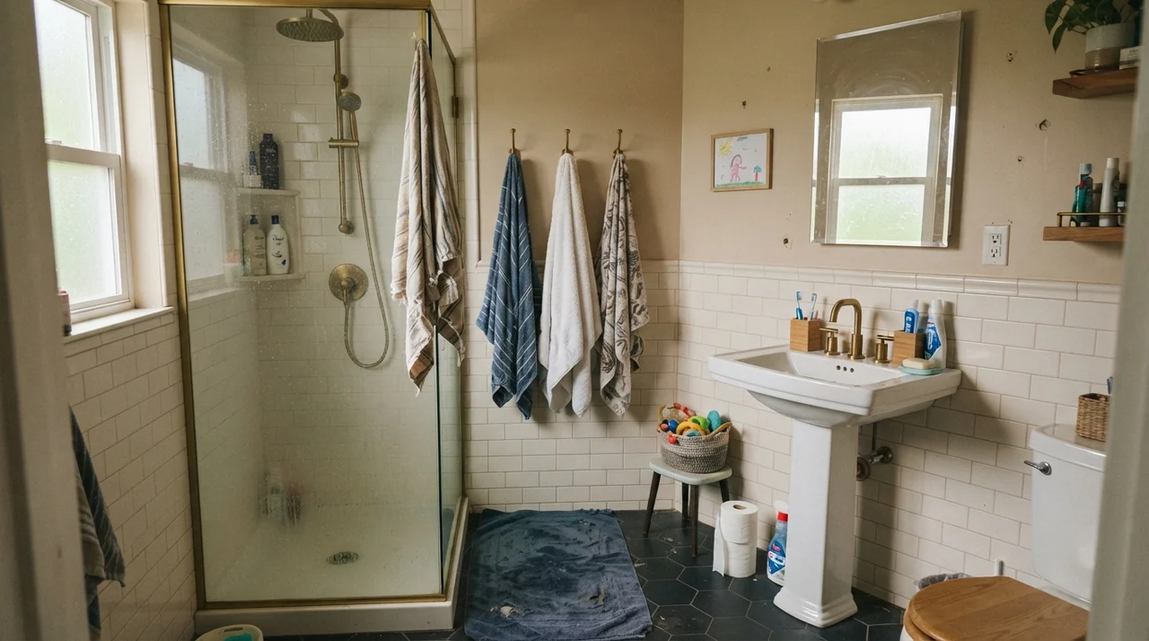
However, you have to watch what is staying in the room. If you have crisp, ultra-bright white subway tile or a stark builder-grade vanity, Pure White upper walls can suddenly look a little dingy by comparison. The human eye doesn't measure color in a vacuum; it compares whatever two surfaces are touching. If your tile is an icy LRV 90 and your wall is an LRV 84 with a yellow undertone, your wall is going to lose the contest and look slightly soiled. But if the bathroom has warm tile or older fixtures, Pure White bridges the gap beautifully.
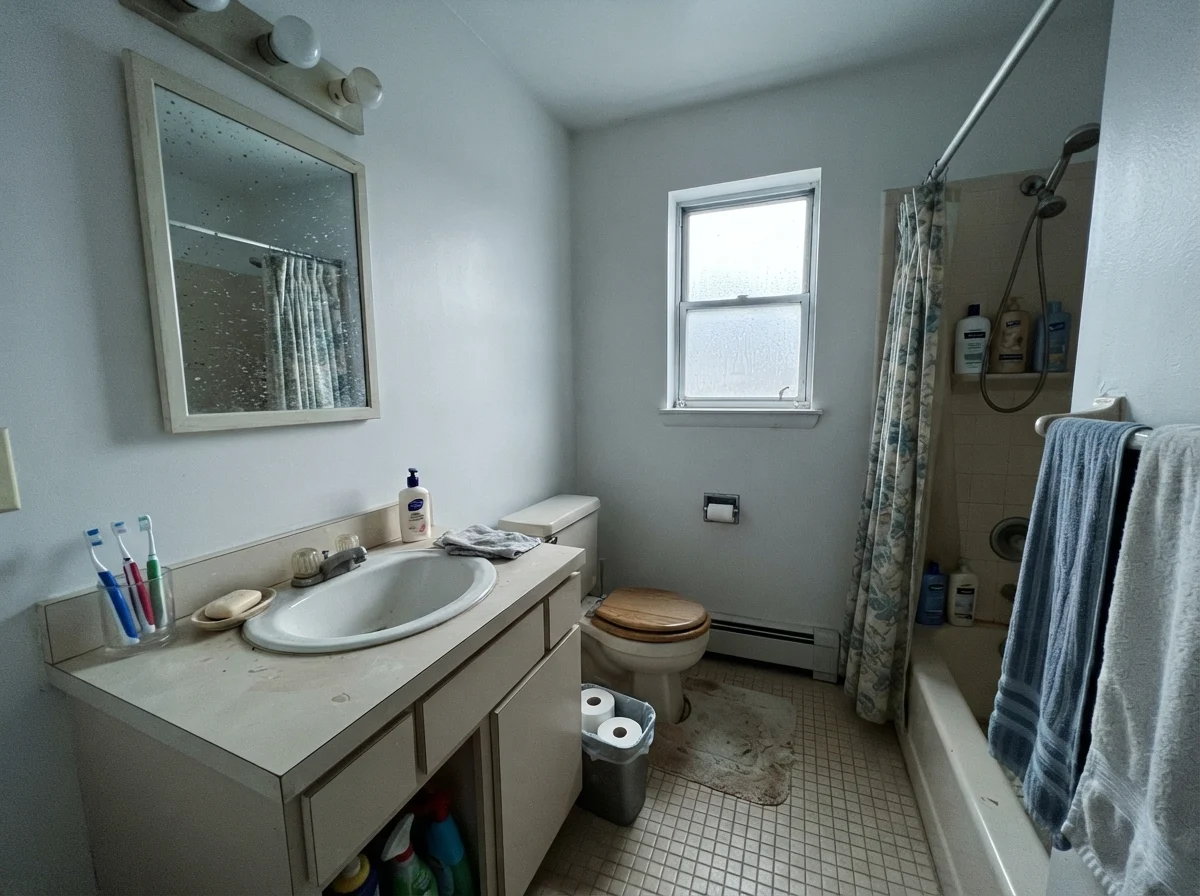
Take a look at how cool north light can impact a dated space, too. If you are working with an older bathroom that gets cold indirect light, Pure White can pick up a faint slate cast that emphasizes dated beige fixtures rather than refreshing them. Before you buy three gallons, paint a large sample board and hold it directly against your vanity and shower surround at noon and at 8 PM.
Bedrooms and Nurseries: The Soft Background
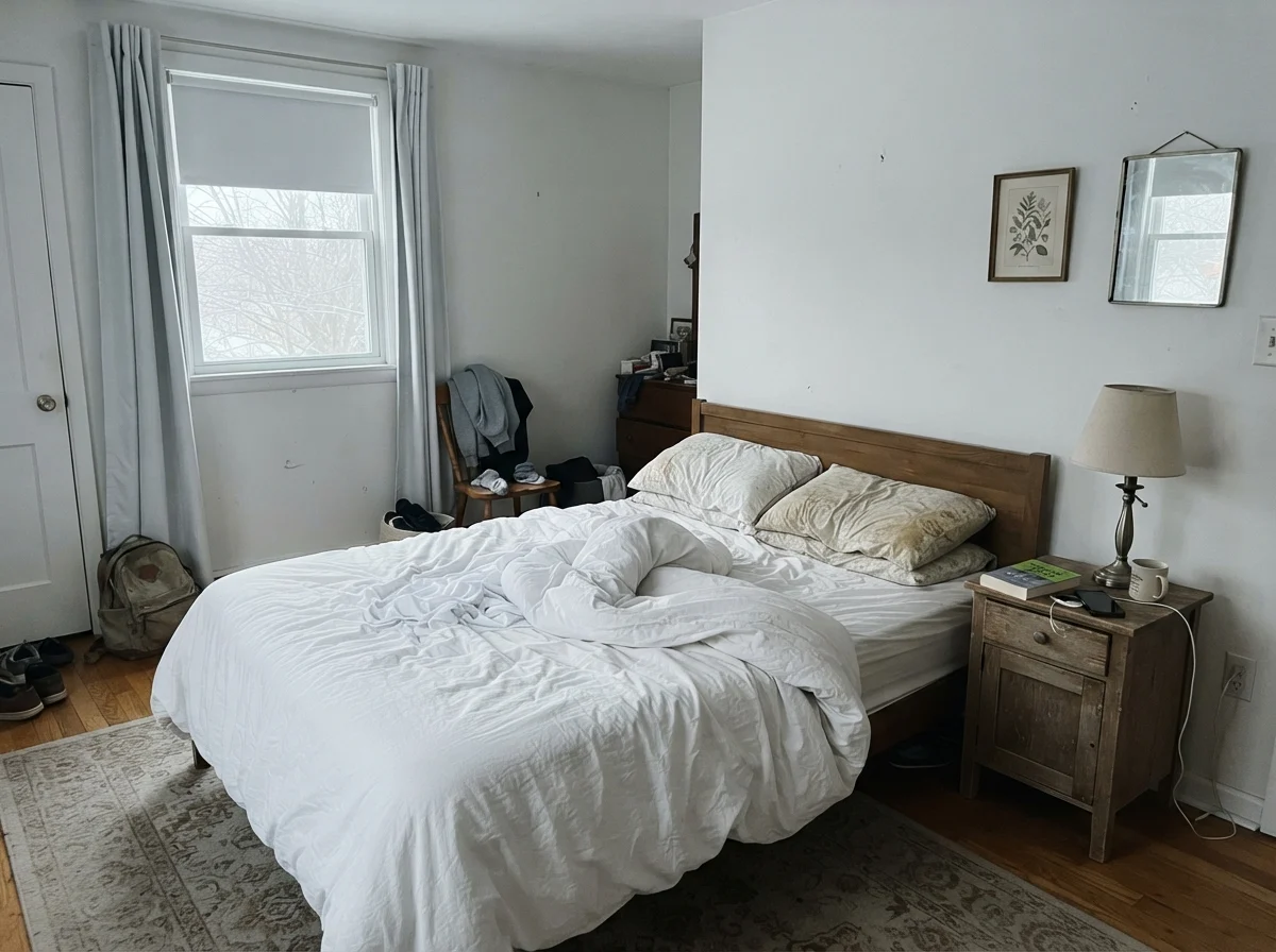
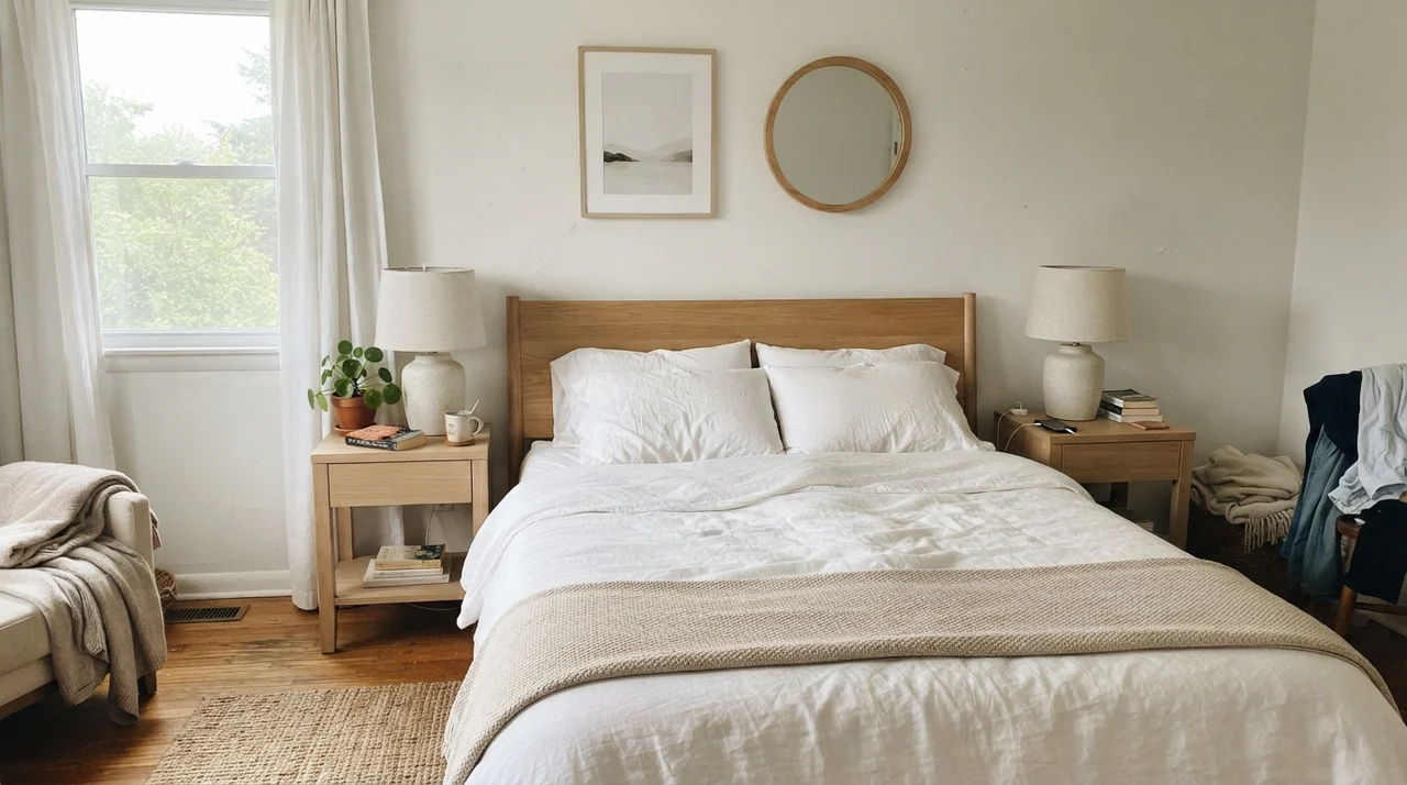
Where Pure White truly shines is in spaces where you want furniture, textiles, and daily life to take center stage. In a main bedroom with white linen bedding and pale oak nightstands, it doesn't shout. It creates an airy, serene envelope that feels clean without making the bedroom feel like an operating theater.
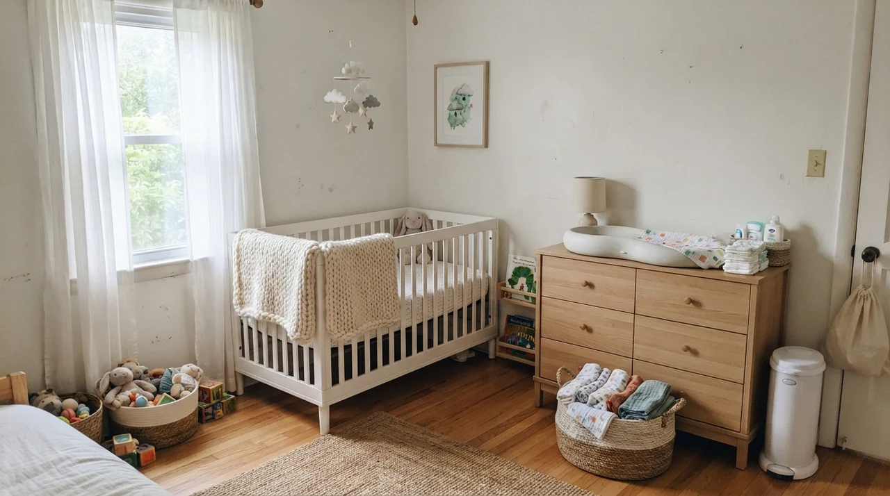
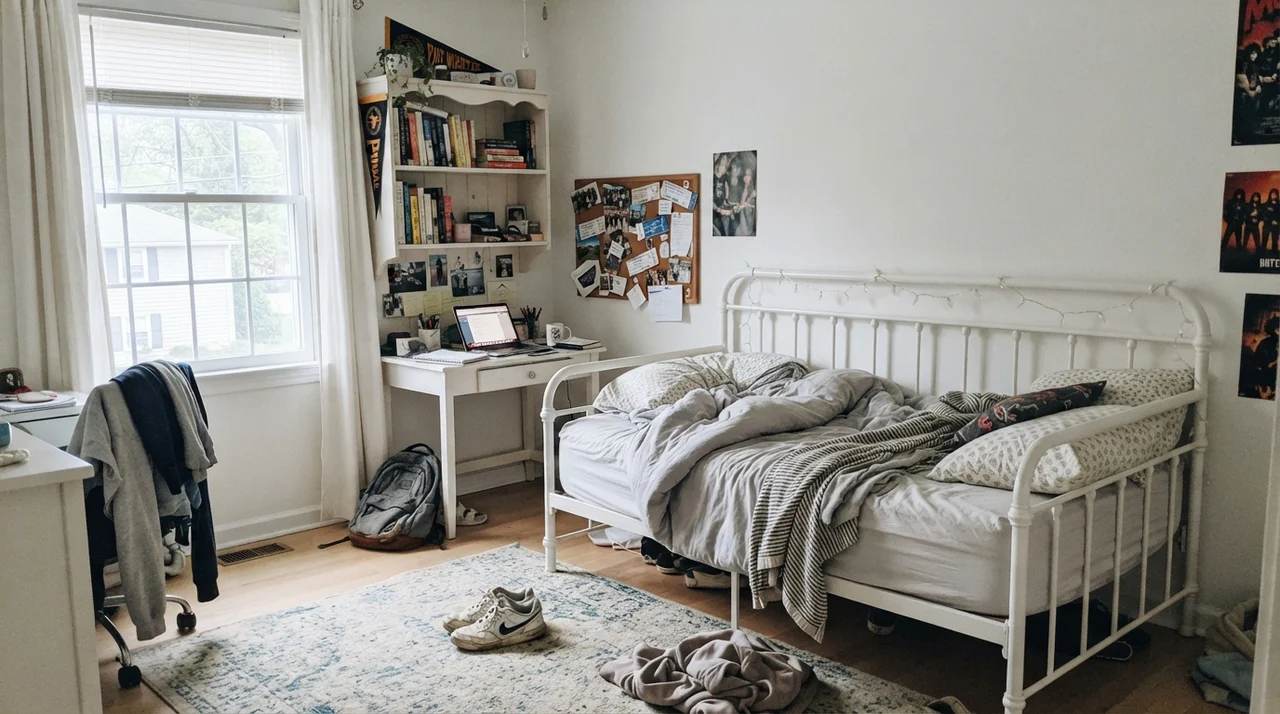
We used this color in my daughter's room through two different life stages. Five years in, through messy craft projects and countless bedroom layout shuffles, the walls held up to repeated wipe-downs without losing their finish. It worked when she had a nursery crib and light wood changing dresser, and it worked just as smoothly years later when her room was filled with open book shelves, a white desk, and sneakers tossed on the rug.
The cleanest version of this color is one house, one white, three sheens — nothing to clash, nothing to second-guess.
Kitchens, Cabinets, and Everyday Wear
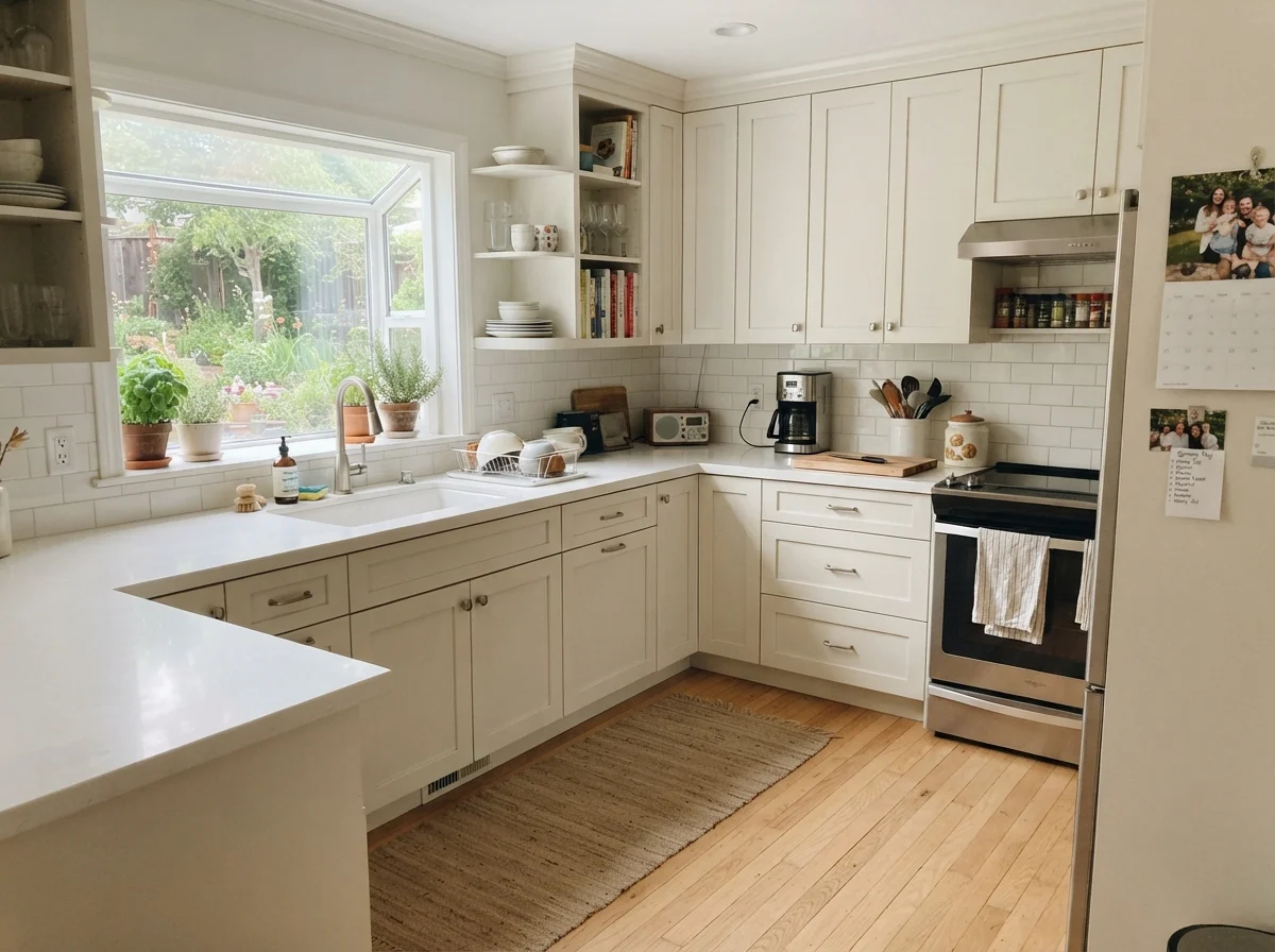
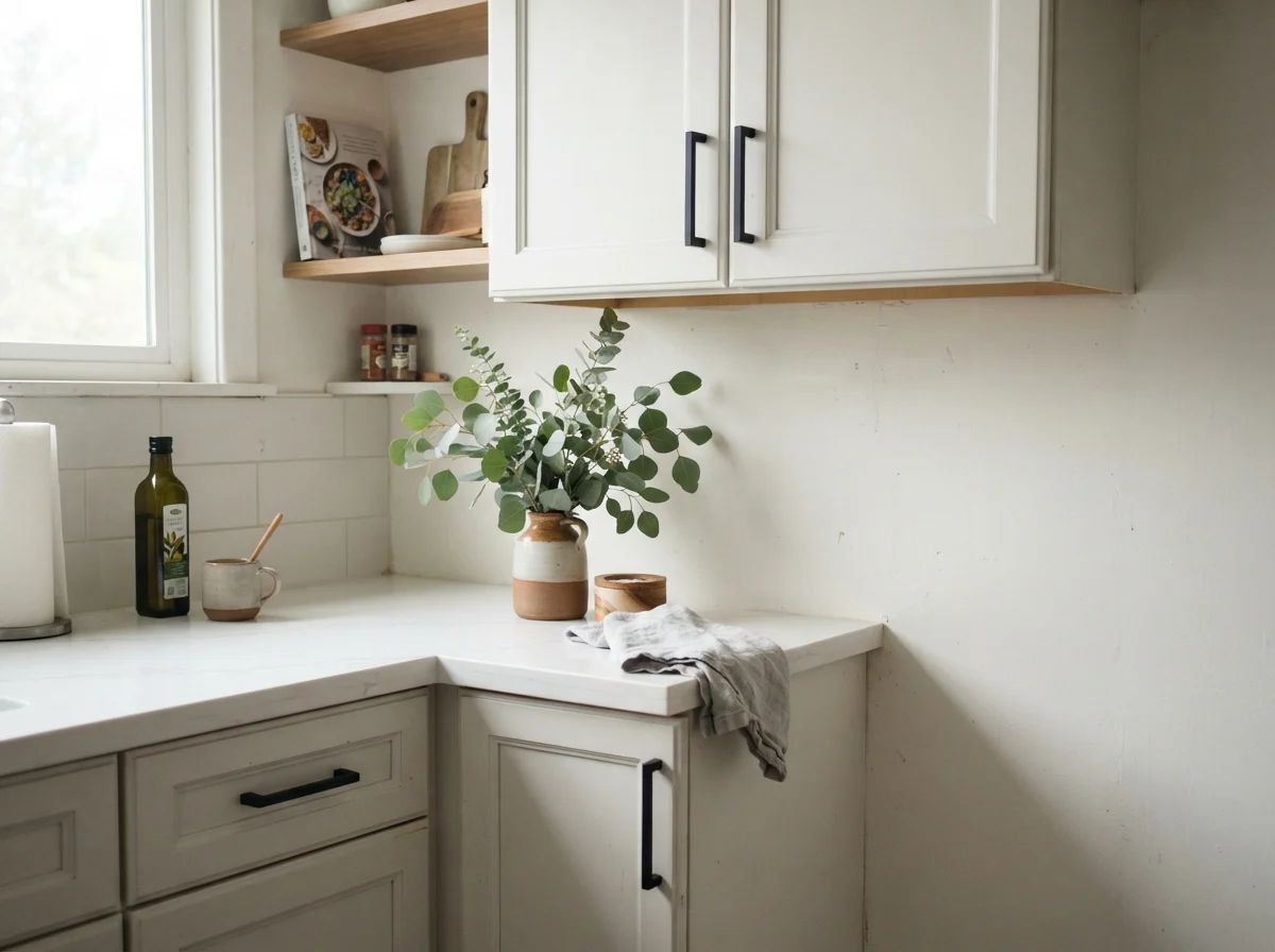
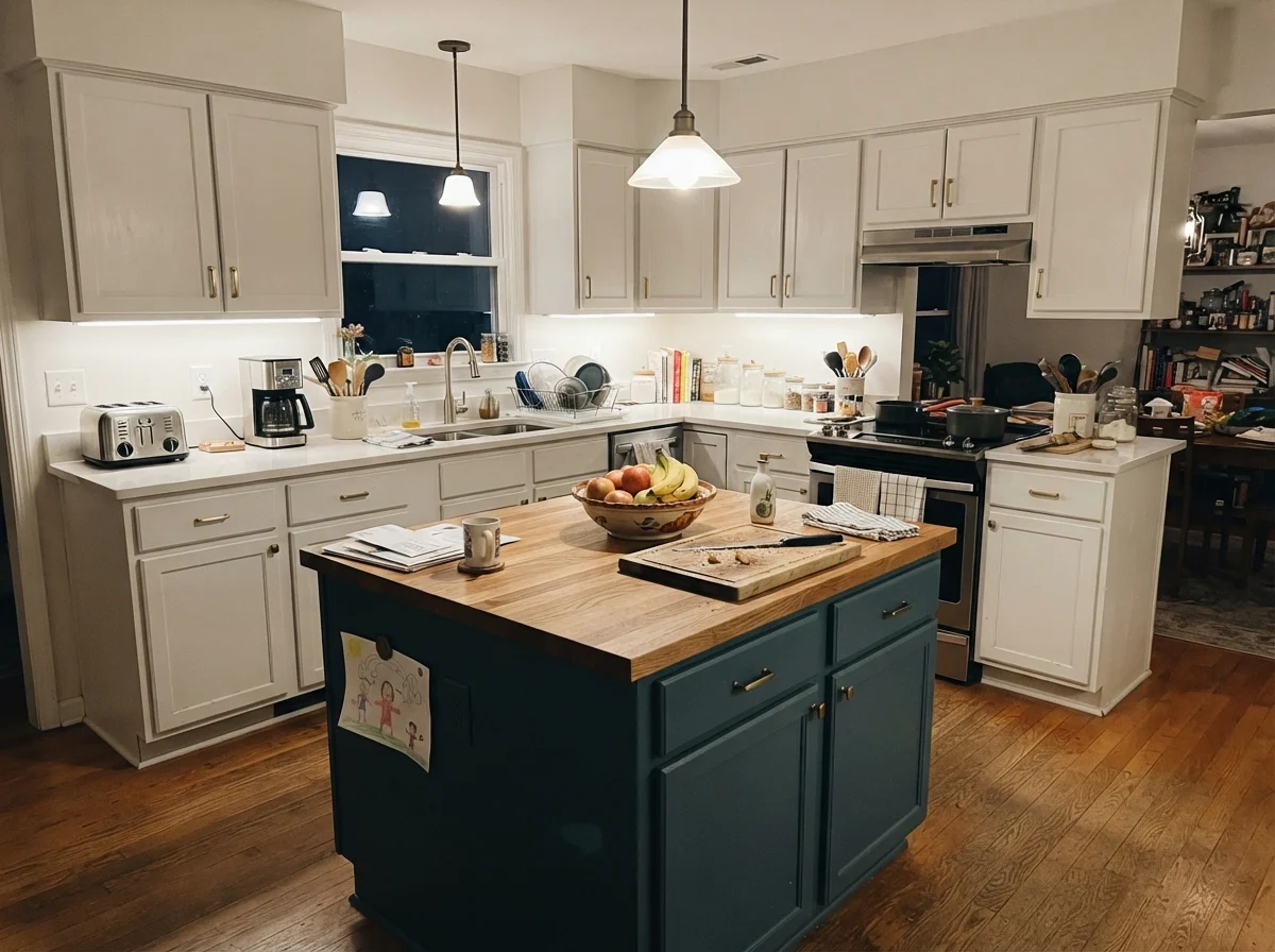
Ask ten kitchen cabinet refinishers what their most-sprayed white is, and at least seven will tell you it's Pure White. There's good reason for that. Pure White in a satin sheen on cabinet doors gives you that crisp painted-kitchen look without making your kitchen feel cold. It bridges the gap between warm oak flooring and cool quartz countertops better than almost any color on the market.
In our 1970s split-level, our kitchen cabinets were a dark, heavy laminate that sucked the life out of the room. When we finally prepped, primed, and sprayed them, Pure White turned the room into a bright, cheerful hub. Because we used a high-quality enamel in satin, they scrubbed clean around the handles year after year. Greasy fingerprints near the pantry wiped away with warm water and mild soap, and the paint never yellowed behind the stove.
If you don't want to repaint all your cabinetry, you can also use it selectively. Painting just a kitchen island in Pure White while keeping surrounding cabinetry or walls a creamy off-white can define the workspace without introducing a stark, jarring clash.
Living Spaces, Sunrooms, and Everyday Utility
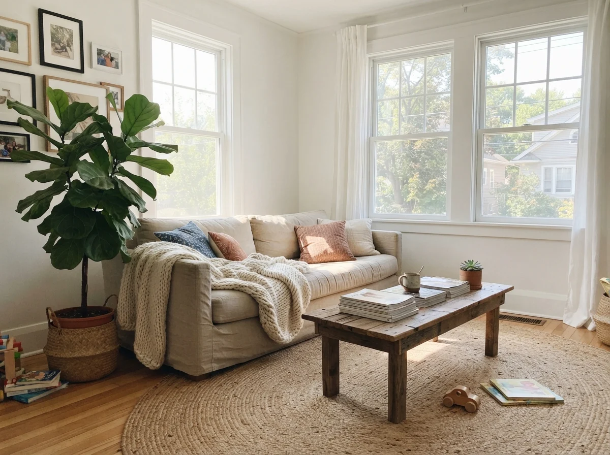
In living rooms that receive generous natural sun, Pure White simply glows. It lets a linen sofa, jute rug, and warm wood coffee table provide texture while the walls stay quietly luminous in the background. It is forgiving of the scuffs that happen when grandkids drag toys across the floor, provided you choose an eggshell or washable satin finish on the drywall.
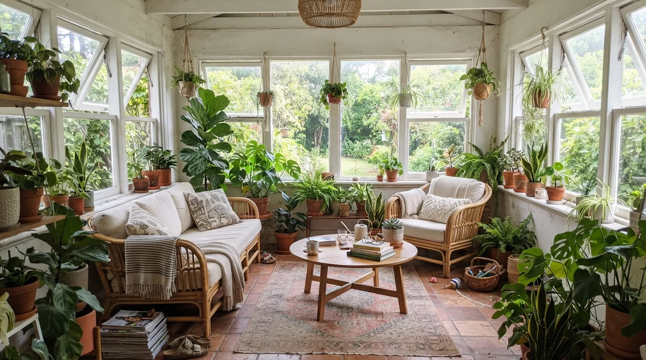
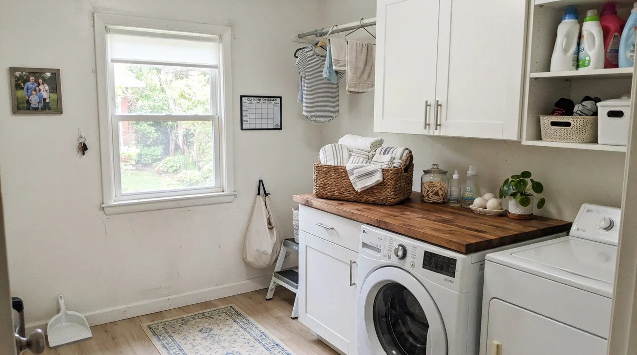
The same holds true in sunrooms and laundry rooms. Surrounded by bright garden windows and terracotta pots, Pure White reflects the outdoor greenery without taking on an unpleasantly muddy green cast. And in a compact laundry room with butcher-block counters over a washer and dryer, LRV 84 does the heavy lifting of making a hardworking utility space feel fresh and spacious.
Doors, Built-ins, and the Trim Strategy
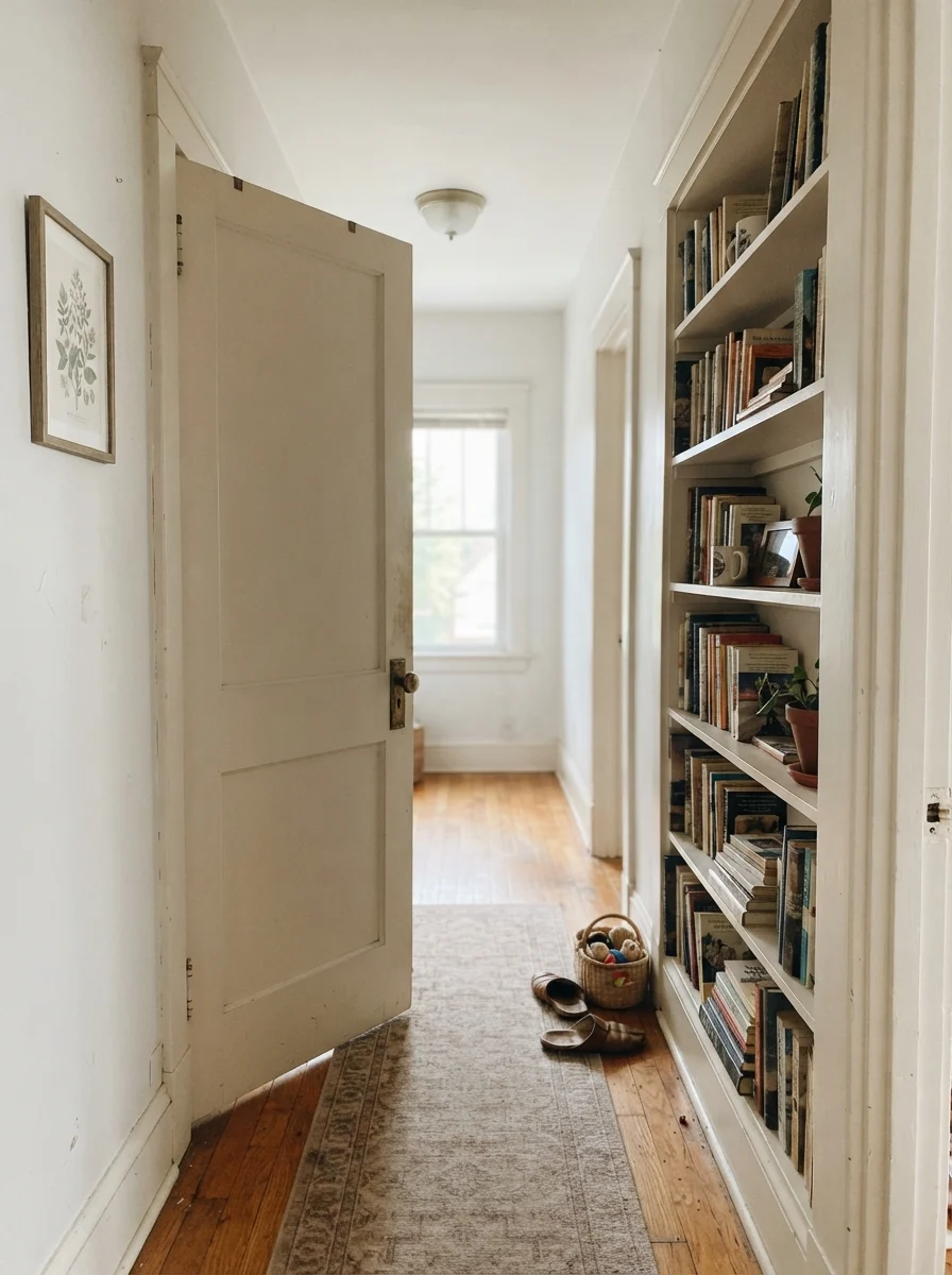
My favorite way to use Pure White in a traditional or transitional house is on interior doors, trim, and built-in bookshelves. When you paint a two-panel door in semi-gloss Pure White against slightly warmer cream or greige walls, you get a clean, architectural definition with brass hardware that feels substantial and classic rather than clinical.
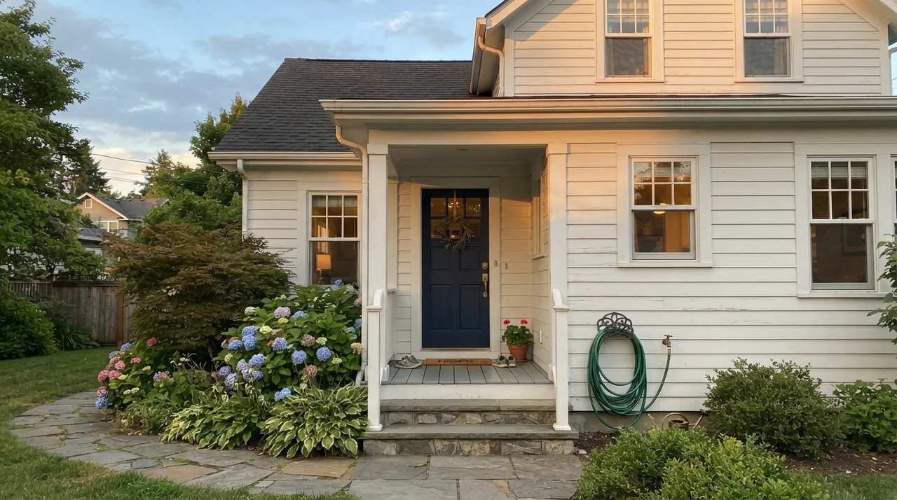
Outside, Pure White has become a modern standard for horizontal siding. In outdoor sun, colors read about one to two shades brighter than they do inside, so Pure White looks crisp and clean without blinding your neighbors down the street. Paired with dark shutters or a navy front door, it gives an exterior instant curb appeal that won't look dated within three years.
The Honest Fail: Where Pure White Falls Flat
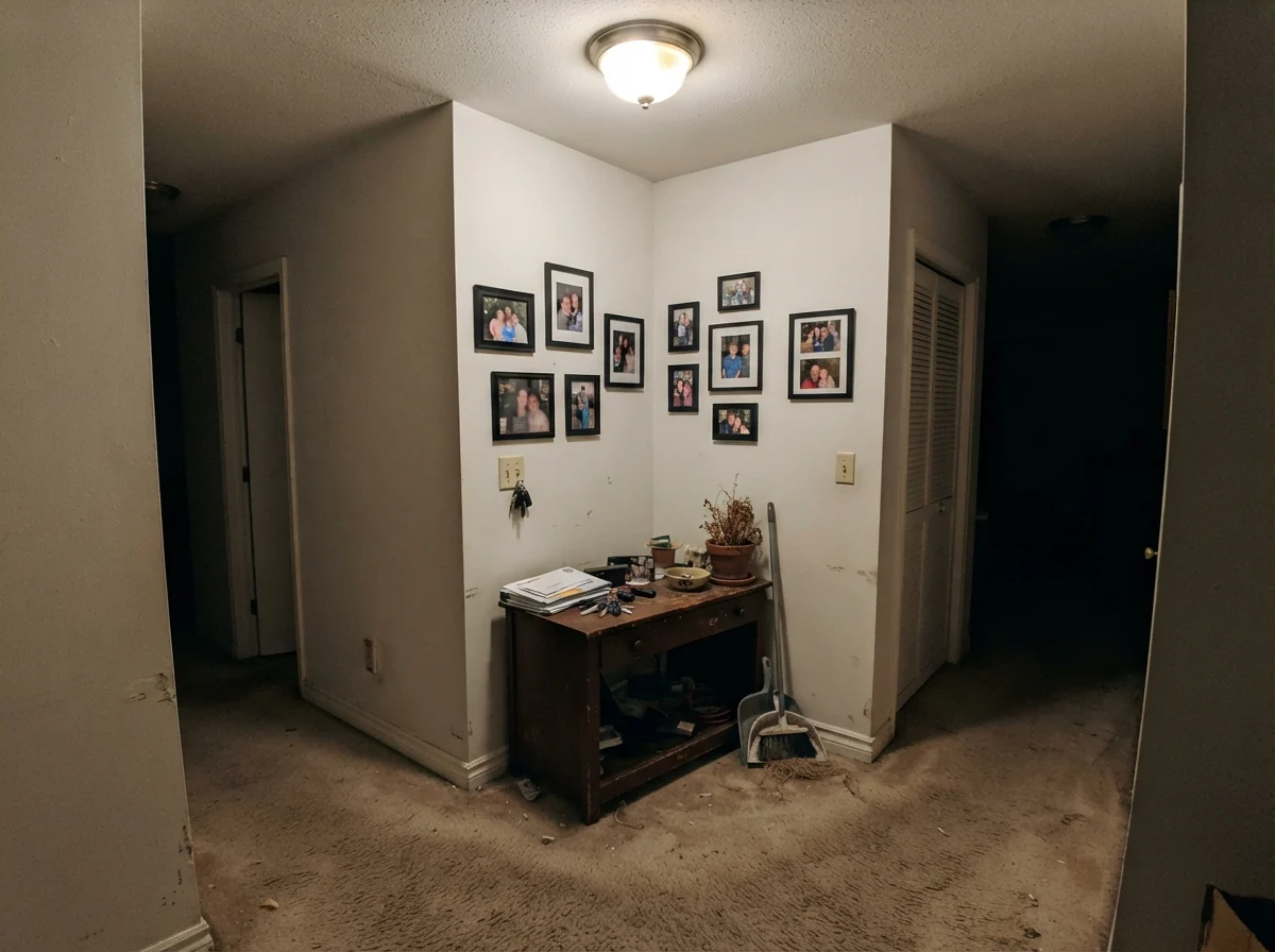
I promised you the unvarnished truth, so let's talk about where Pure White fails. The biggest mistake homeowners make is putting Pure White into a windowless, low-light hallway or a dim north-facing room with only a single overhead bulb. Because Pure White relies on natural daylight to wake up its subtle warmth, taking away the light causes the paint to go flat, lifeless, and muddy putty-like. If your hallway has beige carpet and no exterior window, this color will not rescue it—it will simply look like unpainted primer.
When you find yourself dealing with a dim, light-starved corner like that, don't try to force a crisp white to do a warm cream's job. Step toward a color with genuine pigment density like Alabaster (SW 7008) or Creamy (SW 7012), or fix your lighting scheme before you open another paint can.
Pairing Trim and Choosing Finishes
When you choose Pure White, you have two options for your trim: you can either match the white exactly using different sheens, or you can use Pure White as the trim color against warmer walls. Here is how I navigate the choices across a whole house.
Durability, Touch-Ups, and the Resale Factor
Let's talk about what happens five years in. White walls take a beating—backpacks drag along the baseboards, dogs shake wet fur against the drywall, and hands rest by the light switches. In our current home, I used Sherwin-Williams Emerald in eggshell for the walls and ProClassic semi-gloss for the baseboards. It has held up through years of scrubbing with a damp microfiber cloth and mild soap. The paint film does not burnish easily, and touch-ups with a leftover quart blend in seamlessly even two years later.
From a budget perspective, Pure White is worth the money because it is universally available. Every Sherwin-Williams store and professional painter knows the formula by heart. When we prepped our 1990s colonial for listing, our painter didn't even need to ask what to buy for the touch-up trim work. That predictability saves you costly color-matching headaches down the road.
What sheens should I use for Sherwin-Williams Pure White across my house?
The time-tested rule is: eggshell on main walls, semi-gloss on baseboards, doors, and millwork, satin on kitchen and bath cabinets, and flat on ceilings. Using one color in three sheens prevents clash while defining the woodwork.
Why does Pure White look dingy next to my bathroom tile?
Pure White has an LRV of 84 and a small warm undertone. If placed beside bright, cool-white subway tile (often LRV 90+), the human eye compares the two and reads the warmer shade as dirty. In that case, paint trim and walls the same color or choose a clearly softer cream like Alabaster.
Does Pure White turn yellow in south-facing rooms?
No. In strong southern sunlight, Pure White warms up to a gentle cream-white, but it does not have enough yellow saturation to look butter-colored or dated. It stays soft and luminous.
Is Pure White a good choice for whole-house repaints before selling?
Yes. It is one of the safest resale whites available. It makes rooms look bright and freshly updated without looking stark, and it flatters whatever furniture the prospective buyer brings in.
Susan's Verdict · The Most Reliable White in the Deck
If you are tired of overthinking white paint chips, buy Sherwin-Williams Pure White and don't look back. As long as you don't stick it in a dim, windowless hallway or pair it against icy builder-grade tile, it will serve your walls, trim, and cabinets faithfully for a decade without looking dated.