Color Diary · No. 63
Sherwin-Williams Rainwashed: Where the Spa Promise Holds and Where It Fails
Sherwin-Williams' signature spa green-blue, reviewed honestly: the light where it turns sea-glass, the light where it goes flat and gray, and what to pick instead.

Susan HartleyOctober 5, 2026 · 17 min read
Rainwashed · Sherwin-Williams SW 6211
Hex#C2CDC5LRV59Undertonesgreen → gray → blue
In our last house, a 1990s colonial with oversized windows and builder-grade oak everywhere, I painted our primary bathroom Sherwin-Williams Rainwashed because I was exhausted by beige. It was 2004, and every home magazine on the newsstand was selling the dream of turning your master bath into a personal retreat. I bought two gallons, rolled it over the builder's flat off-white above a new run of white subway tile, and stepped back feeling very accomplished. At ten in the morning on a sunny Tuesday, the room looked like a boutique hotel: fresh, quiet, watery, and clean.
Then November arrived. The leaves dropped, the Ohio skies turned into a solid sheet of galvanized steel, and my tranquil retreat suddenly looked like the holding room in a municipal clinic. The green washed out completely, leaving a cold, slightly lifeless aqua-gray on the drywall that made my morning routine feel chilly before I even turned on the shower.
We lived with it for seven years. I didn't repaint it immediately because, on sunny mornings, it still delivered that gorgeous sea-glass lift that made the whole room sing. But those seven years taught me the single most important rule about Sherwin-Williams Rainwashed (SW 6211): it is an absolute chameleon that demands daylight to pay rent. If you feed it good south or west sun, it is easily one of the prettiest colors Sherwin-Williams has ever mixed. If you starve it in a dim north-facing corner, it will punish you with a flat, muddy dullness that no amount of clean towels can rescue.
The Undertone Anatomy: Why It Shifts
If you look at the Sherwin-Williams fan deck, Rainwashed lives firmly in the green family, despite half the internet calling it a pale blue. That green classification matters. Rainwashed is a true blue-green built over a heavy foundation of quiet gray. That gray backbone is the secret weapon: it keeps the color grounded so it never reads like pastel nursery candy or cheap coastal mint. But because it balances right on the knife-edge between blue, green, and gray, its personality changes completely depending on the time of day and the direction of your windows.
warm sun
overcast, north light
dusk, rain, cool bulbs
green → gray → blue
Quiet MomentsBenjamin Moore · see diary
Woodlawn BlueBenjamin Moore · see diary
RainwashedSW 6211
Palladian BlueBenjamin Moore · see diary
Frosted JadeBehr · see diary
With a Light Reflectance Value (LRV) of 59, Rainwashed sits right in that sweet spot where it reflects enough light to keep a space open, but carries enough pigment that nobody will ever mistake it for an off-white. It has clear color ambition. If you walk into a paint store hoping to find a subtle neutral gray that simply has a cool whisper, do not buy Rainwashed. On four walls, its green-blue identity is loud and unmistakable.
The shift happens when the light changes. Under direct warm sun, the yellow spectrum pulls the green forward, giving you that authentic coastal sea-glass tone. Under cool north daylight or overcast skies, the green recedes and you are left looking at an aqua-gray. In the evening under standard 2700K incandescent or warm LED bulbs, it settles down into a muted, cozy sage. But switch to cool 4000K daylight LEDs, and you will turn your walls into an icy, sterile operating room. Before you judge the paint on your wall, make sure you know which lightbulbs you have screwed into your fixtures.
The Morning-to-Evening Shift
The mistake I see homeowners make most often with soft blue-greens is painting a sample swatch at noon on a Saturday, loving what they see, and signing off on three gallons. You cannot evaluate Rainwashed in a single snapshot of time. You have to watch it wake up and go to sleep.
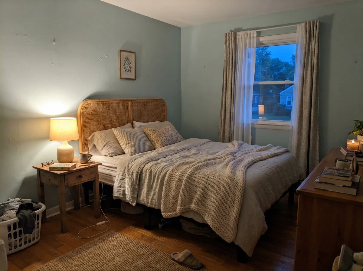
In early morning light, before the direct sun comes around to heat up the walls, Rainwashed can look surprisingly pale and washed out. The cool morning blue dominates. By noon, as the sun moves overhead and fills the space with broad-spectrum light, the gray base stabilizes the color and the green starts to emerge. By dusk, as the natural light bleeds away and warm interior lamps take over, the entire wall deepens into a comforting, sage-adjacent tone that wraps around the room.
Where Rainwashed Belongs: Bathrooms and Bedrooms
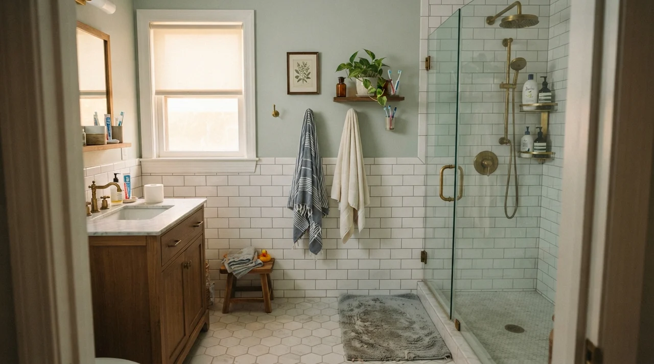
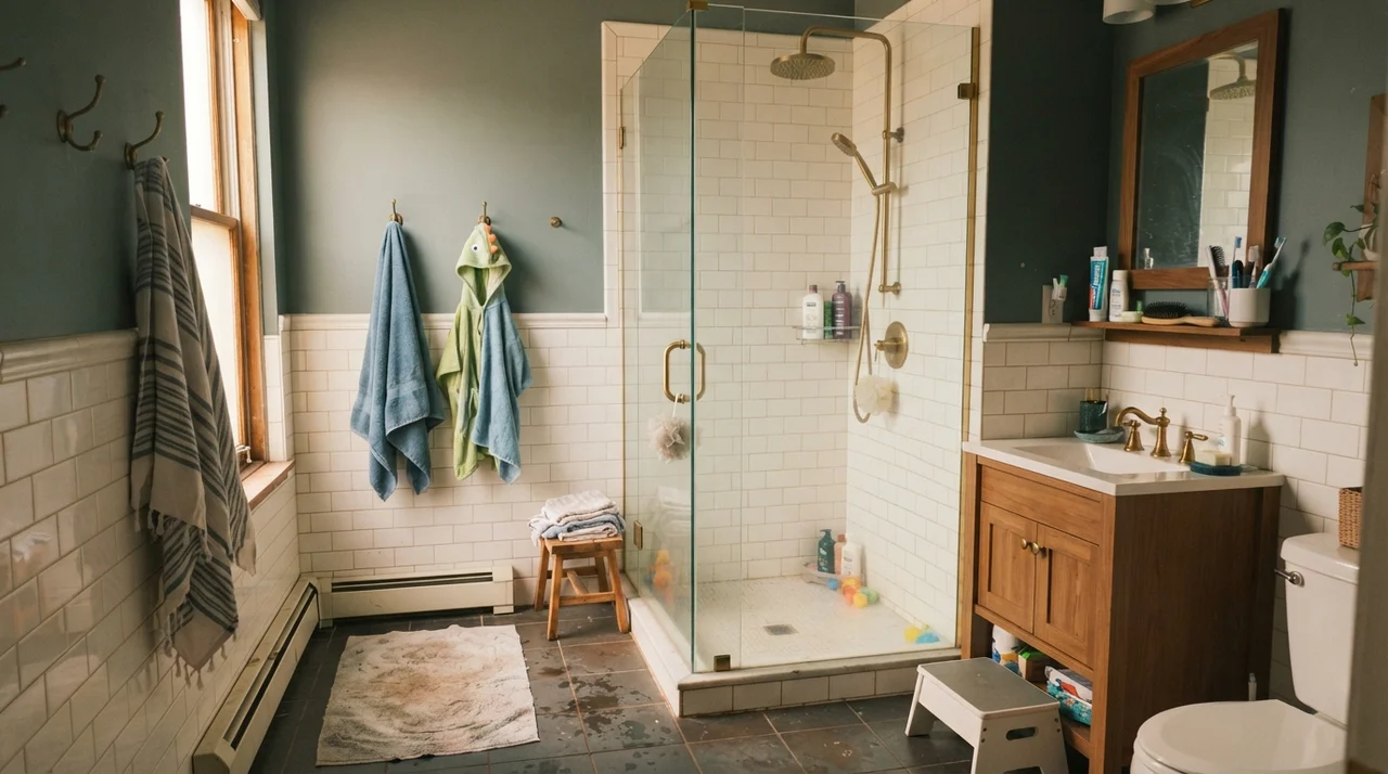
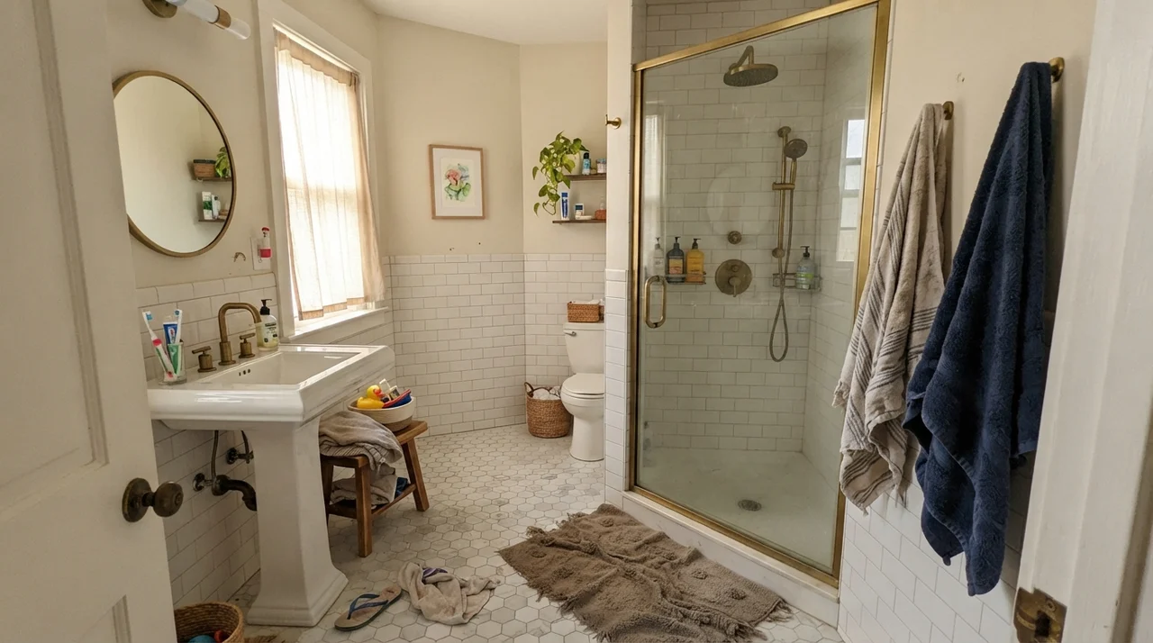
There is a reason Rainwashed ranks among Sherwin-Williams' top 100 colors nationwide (holding spot #77): when it works, it works better than almost anything else in the fan deck. Its absolute wheelhouse is the bathroom. Bathrooms are filled with hard, glossy, sterile surfaces—porcelain tubs, glass shower doors, polished chrome fixtures, and white ceramic tile. Rainwashed steps in as the soft organic counterweight. It gives the eye a place to rest without feeling dark or heavy.
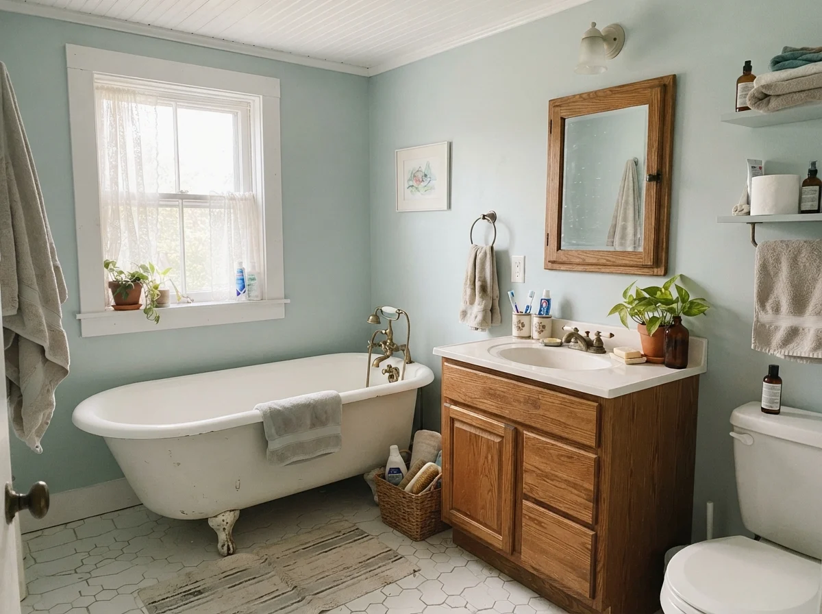
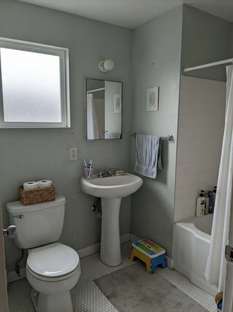
In our current 1960s ranch, I put it right back into the guest bathroom. We paired it with crisp white hex floor tile, a warm oak vanity, and a classic white clawfoot tub. Against clean white ceramic and warm wood, Rainwashed looks intentional, grounded, and expensive. It turns what could be a cold utilitarian room into something that feels like an upscale bed-and-breakfast.
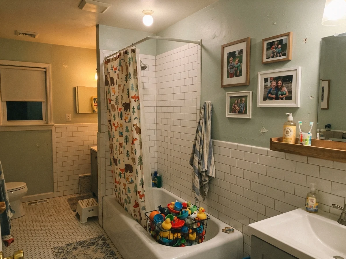
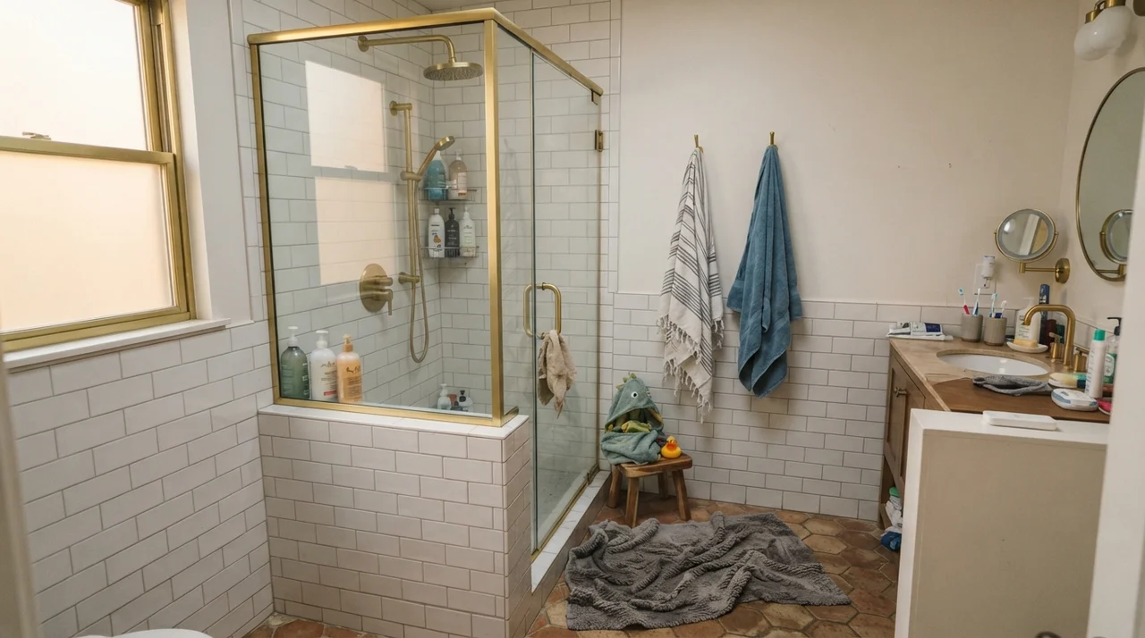
It also handles the chaos of everyday family life surprisingly well. In a busy kids' bathroom with colorful bath toys in wire baskets, damp bath mats, and steam filling the air twice a day, Rainwashed keeps its composure. The gray base stops it from competing with bright plastic toys or busy shower curtains. It just hums along quietly in the background.
The key here is sheen. Never use flat or eggshell on bathroom walls if you have children or anyone who takes long, hot showers. Water vapor condenses on flat paint and leaves vertical drip tracks that never fully go away. A dedicated satin finish on your bathroom walls stands up to steam, wipes down without leaving shiny burnish marks, and gives the blue-green just enough surface luster to bounce window light around the room.
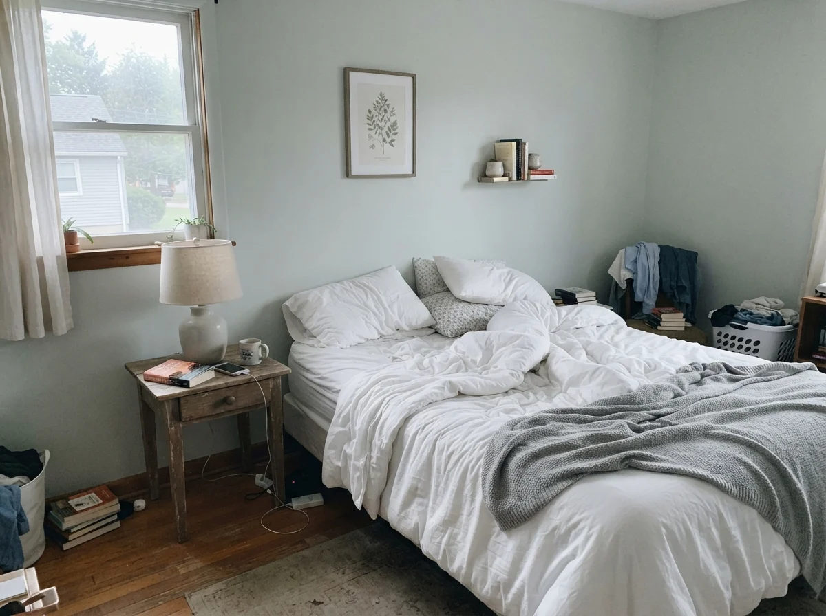
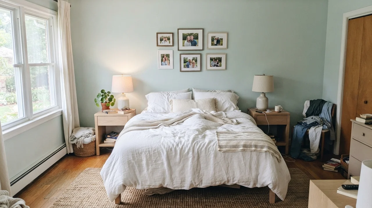
When you take Rainwashed into a main bedroom, the effect is pure relaxation. The LRV of 59 means it won't darken a room, but the pigment envelope creates an immediate sense of quiet. I love seeing it paired with crisp white or natural linen bedding, pale oak bedside tables, and simple ceramic lamps. Because the color has enough gray in its DNA, you don't wake up feeling like you are sleeping inside a tropical smoothie shop. It feels restful, mature, and understated.
Nurseries, Kids' Rooms, and Workspaces
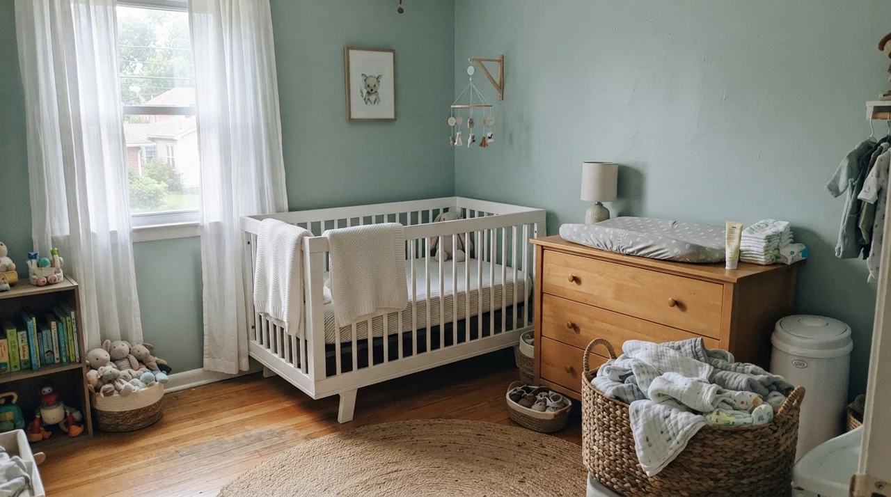
Another place where Rainwashed pays for itself is in secondary bedrooms. If you are setting up a nursery and want to avoid the predictable pale pinks and baby blues, this is one of the strongest gender-neutral colors on the market. It pairs seamlessly with white cribs, knit blankets, light-wood dressers, and woven baskets. It has enough color to feel playful and sweet, but enough sophistication that the child won't outgrow it by the time they hit kindergarten.
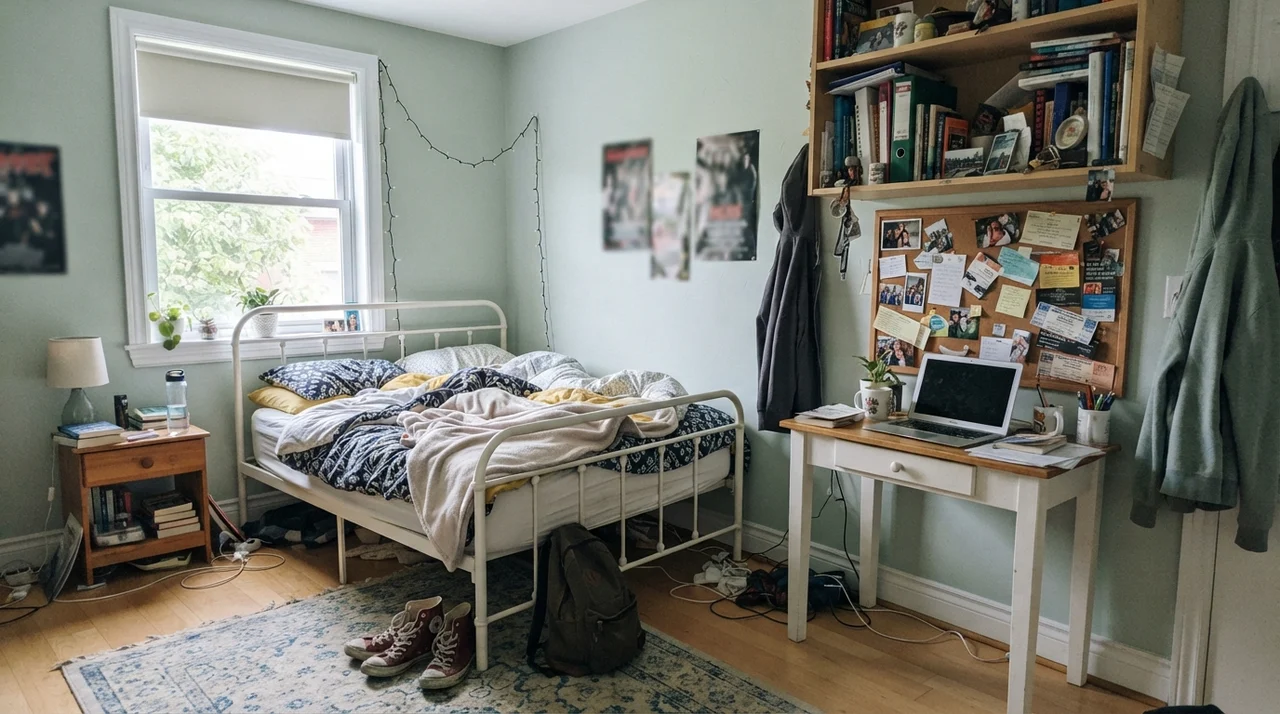
We used a very similar pale sea-glass in our daughter's bedroom when she was a toddler in our split-level, and it carried her all the way through middle school without a single repaint. When she hit her teenage years and filled the room with white metal furniture, open bookshelves, corkboards, and sneakers dropped across the rug, the walls still looked completely appropriate. That is what I look for in a paint investment: a color that can survive eight years of life changes without demanding another Saturday on a ladder.
Kitchens, Built-Ins, and Cabinetry
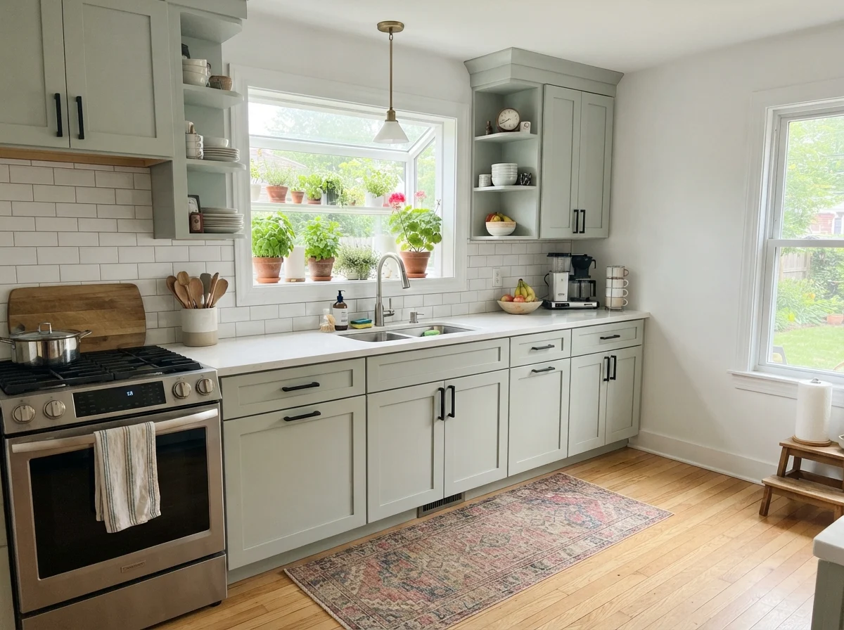
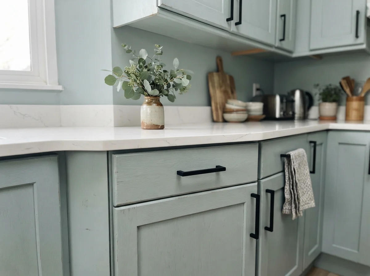
I get asked all the time whether Rainwashed works on kitchen cabinets. My answer is almost always: yes, but proceed with caution. A full kitchen painted in Rainwashed—uppers, lowers, and pantry walls—is a major aesthetic commitment. In a bright kitchen with garden windows, light oak flooring, and white quartz counters, a full run of painted shaker cabinets looks charming and airy. But in a kitchen with limited windows, doing all the cabinets can make the space feel closed-in and overly tinted.
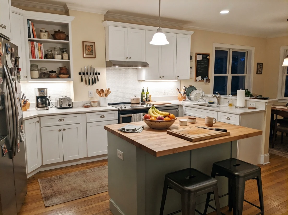
Where it truly excels is as a focused accent. Painting just the kitchen island in Rainwashed while keeping the perimeter cabinets clean white is a foolproof way to add personality without risking resale value. Under warm evening pendant lights and under-cabinet illumination, that painted island anchors the kitchen, providing a gentle splash of color amidst the cutting boards, fruit bowls, and everyday kitchen clutter.
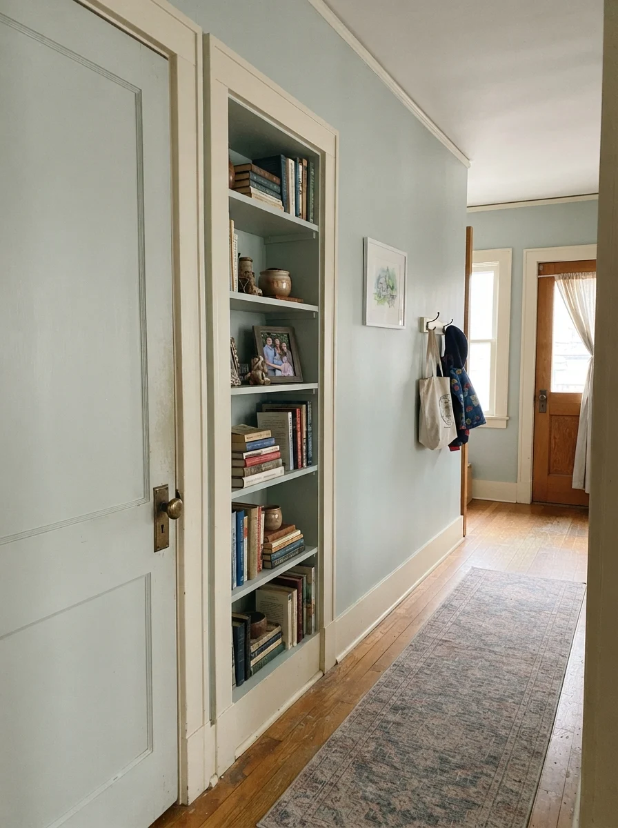
Beyond the kitchen, Rainwashed is a wonderful secret weapon for interior architectural details. In our 1970s split-level, the interior hallway was a sea of hollow-core brown doors that made the center of the house feel like a tunnel. Painting a two-panel interior door and a built-in hallway bookshelf in Rainwashed against cream walls instantly broke up the monotony. When accented with an aged brass doorknob and filled with stacked hardcovers, it gave an otherwise dated transitional hallway an intentional, historic feel.
Sunrooms, Living Spaces, and Laundry
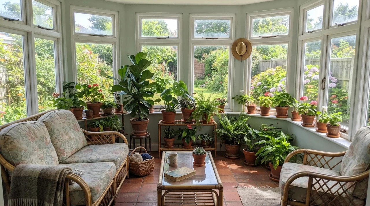
If you have a room with windows on multiple sides—especially facing south or west—Rainwashed performs at its absolute peak. In a sunroom filled with rattan chairs, terracotta pots, and potted ferns, the paint mirrors the green of the garden outside and the blue of the sky. It eliminates the harsh glare that stark white walls can produce under heavy sunlight, creating a soft, filtered atmosphere that feels naturally cooling during the heat of July.
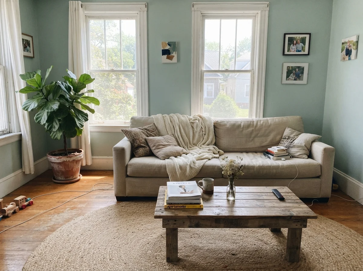
In a primary living room, it works best when paired with organic, tactile textures. Linen sofas with rumpled throws, jute rugs underfoot, and natural wood coffee tables keep the room grounded. The gray undertone prevents the space from looking like a beach-house caricature, allowing it to function as a year-round family living space.
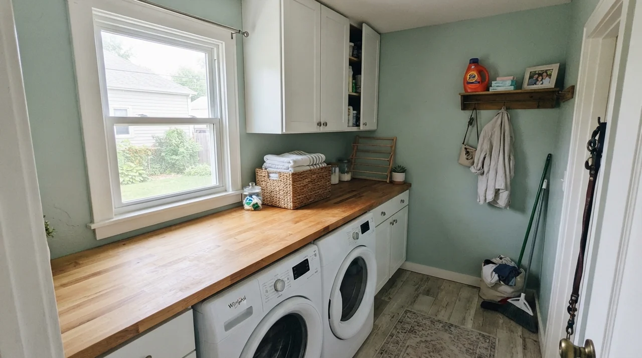
Do not overlook the utility spaces, either. A small laundry room with a single good window is prime real estate for a mood-lifting color. When you are standing over a washer and dryer folding towels on a Sunday night, staring at builder-white drywall feels like a chore. Painting the laundry room in Rainwashed, topped with crisp white upper cabinets and a warm butcher-block counter, makes a mundane workspace feel deliberate and cheerful.
Where Rainwashed Fails: The Honest Truth
Almost every disappointed review of Rainwashed comes from one of three situations, and all three are completely predictable before you ever pry the lid off the can. None of them are the paint's fault, but if your room fits one of these descriptions, buying a sample pot will only confirm the heartbreak.
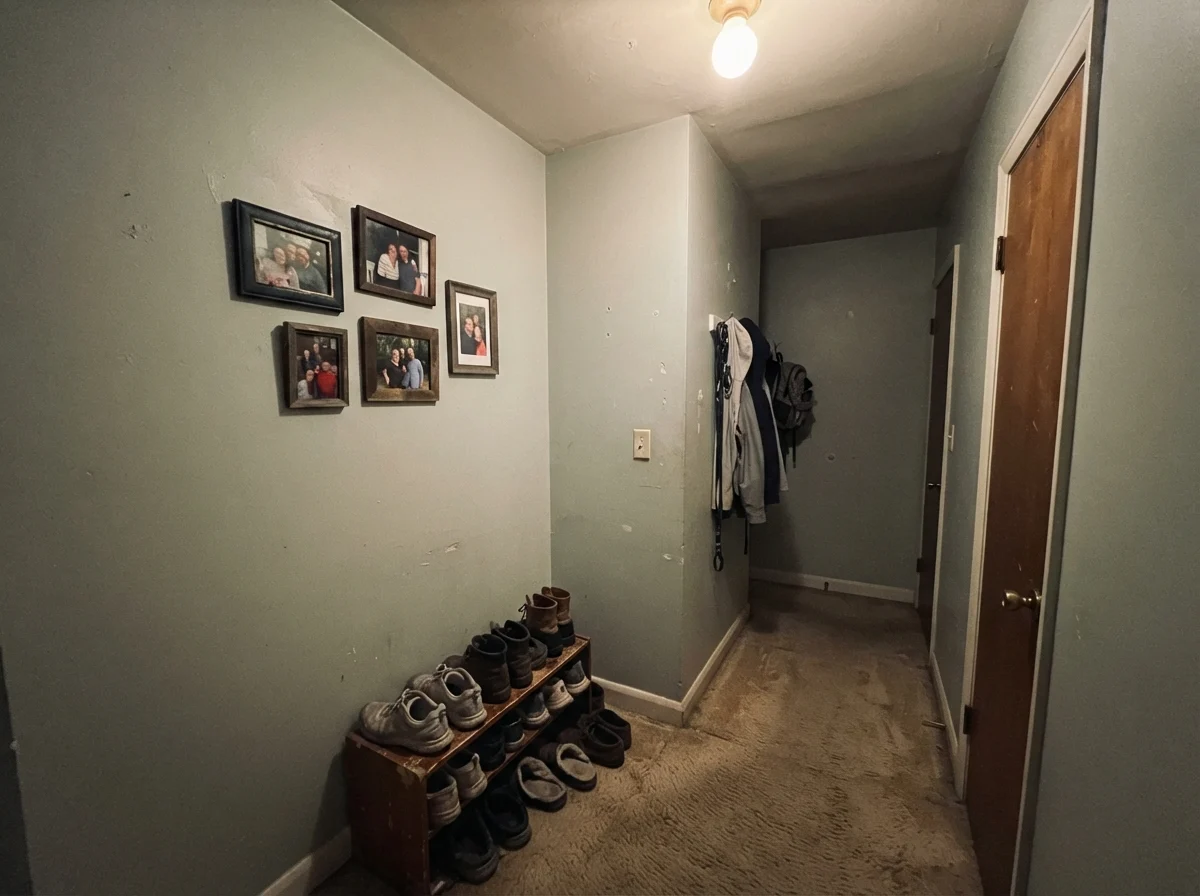
First: the dim, north-facing room with no windows or poor interior lighting. In low-light environments, the human eye struggles to pick up the green spectrum. When cool, overcast north light enters a windowless hallway or a basement bathroom, Rainwashed drains of its warmth and collapses into a flat, dreary, putty-like aqua-gray. It looks muddy and sad.
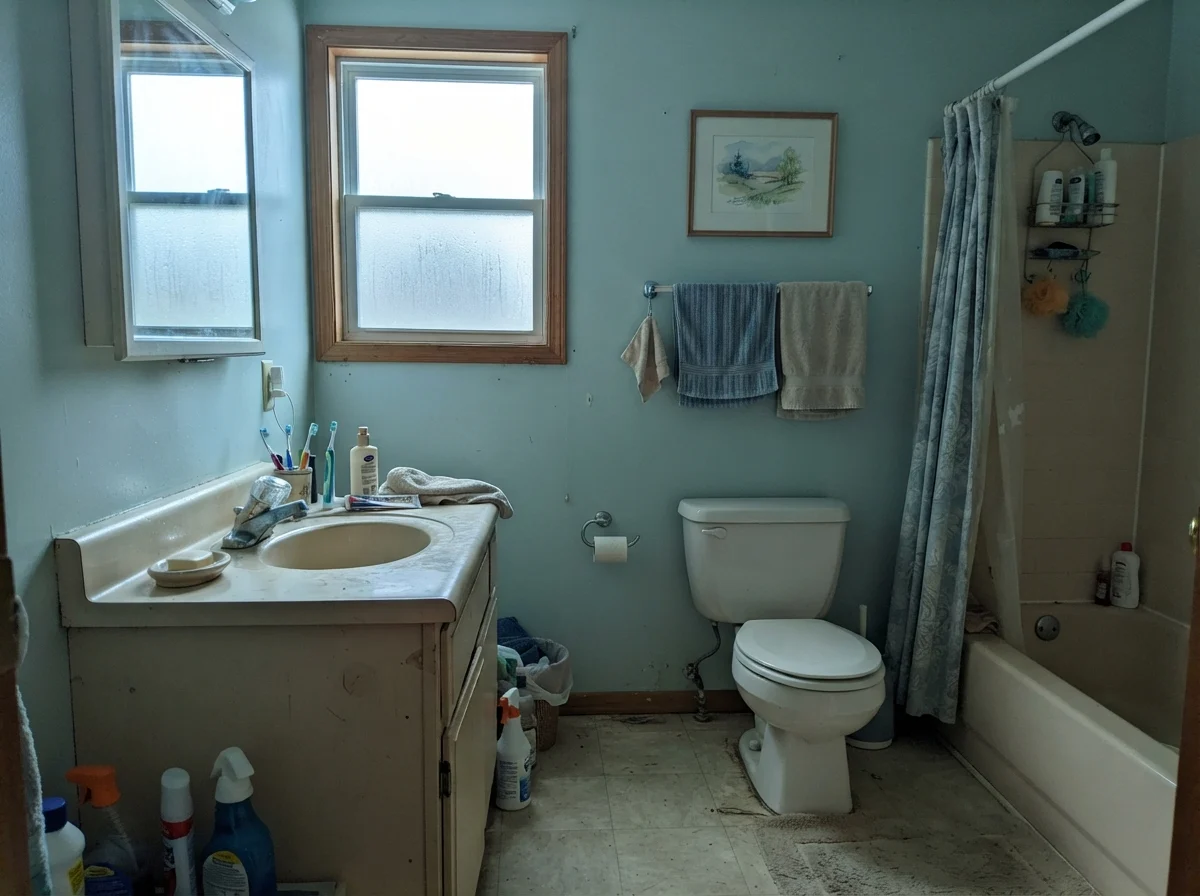
Second: cool north light paired with dated finishes. If you put Rainwashed into a modest, older bathroom with an aging beige vanity and cool north daylight streaming through a frosted window, the paint picks up a frosty, chilly cast. It accentuates the tired beige fixtures rather than updating them.
Third: yellow brass and heavy honey oak. Because Rainwashed leans cool, pairing it with 1990s golden oak trim or bright yellow polished brass creates a jarring color clash. The warm orange and yellow in the wood fight the cool blue-green on the drywall, making the paint look like cheap hospital mint rather than refined sea glass. If you have honey oak that you cannot afford to change, stick with a warm neutral like Accessible Beige or a true warm off-white, and leave Rainwashed alone.
Exterior Performance: Siding and Trim
Can you use Rainwashed on a house exterior? Absolutely, but you must understand how direct outdoor sunlight affects paint. Outdoor UV light washes out color by roughly twenty to thirty percent. On horizontal siding, Rainwashed will look noticeably lighter and greener in direct sun than it ever does in a living room swatch.
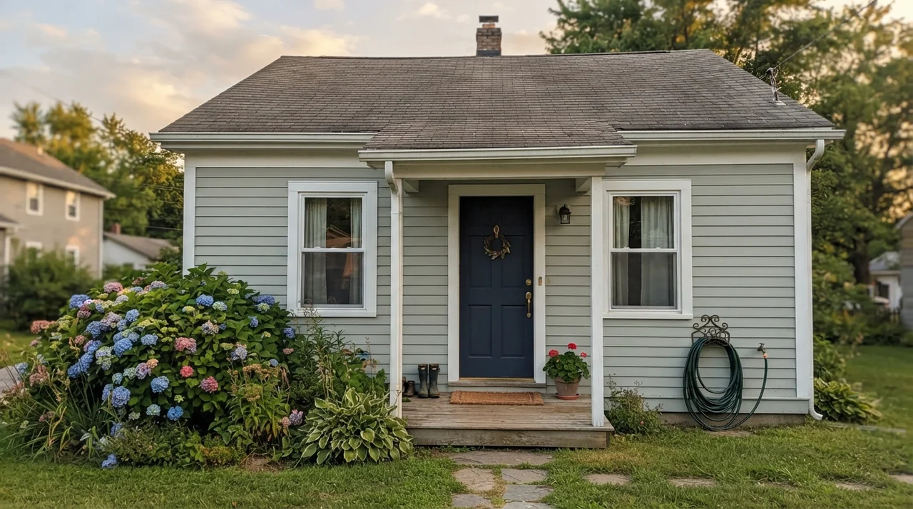
When we sold our 1990s colonial, the neighbor across the street painted her cape cod siding in Rainwashed with crisp white corner boards and window trim, anchored by a deep navy front door and charcoal shutters. From the curb, framed by blooming hydrangea bushes, it looked utterly stunning—fresh, coastal, and perfectly balanced. Just remember to walk your sample board around all four sides of your house before committing: the south-facing facade will look like breezy sea glass, while the shaded north side will lean much grayer.
Five Years In: How It Wears and Cleans
Here is the reality of living with color long-term: no matter how pretty a room looks the week you paint it, you have to clean it. In our colonial's bathroom, that Rainwashed wall was five years in when our son decided to test whether shaving cream sticks to drywall. I have scrubbed that wall near the vanity dozens of times with warm soapy water and a microfiber rag.
Because we spent the extra five dollars a can on Sherwin-Williams' higher-tier formula in a satin finish, it held up beautifully. It scrubbed clean without peeling, water staining, or burnishing into a shiny spot. If you paint a bathroom or kitchen in cheap builder-grade flat paint, every splash of water from the faucet will leave a watermark, and the first time you wipe away toothpaste, you will take the pigment right off the drywall. Paying for quality paint in the correct sheen is always worth the money—it saves you from having to repaint on a Saturday three years down the road.
Is Sherwin-Williams Rainwashed considered blue or green?
Sherwin-Williams officially categorizes Rainwashed in its green color family. However, it is a genuine 50/50 blue-green hybrid built over a gray foundation. In warm sunlight or under 2700K incandescent bulbs, it leans toward a soft sage green; in cool north daylight or overcast weather, it leans distinctly toward aqua-blue.
What is the best paint finish for Rainwashed in a bathroom?
Always choose a satin finish for bathrooms. Satin provides the moisture resistance needed to repel steam and condensation without looking overly glossy. It allows you to wipe down water spots and soap splatters easily without dulling or burnishing the finish.
Will Rainwashed make a small bathroom look smaller?
No. With an LRV of 59, Rainwashed reflects plenty of light to keep small bathrooms feeling open and airy. When paired with bright white subway tile, a white vanity, and polished nickel or chrome hardware, it actually gives small bathrooms an expansive, spa-like feel.
Does Rainwashed go well with honey oak cabinets?
Generally, no. The cool blue-green tones in Rainwashed tend to fight the strong orange and yellow pigments in honey oak, which can make the paint look slightly minty and outdated. If you have honey oak that you cannot paint, a warmer greige or neutral off-white is a safer partner.
What lightbulbs make Rainwashed look best?
Stick with 2700K to 3000K warm white bulbs. Warm interior lighting enhances the soft green notes and keeps the gray base cozy. Avoid 4000K or 5000K 'daylight' bulbs, which will pull out harsh, icy-blue undertones and make your walls look cold.
Susan's Verdict · A Spa Winner That Needs Sunlight
Rainwashed is one of those rare colors that genuinely earns its widespread popularity, provided you give it what it needs. Put it in a bathroom with white subway tile, chrome or nickel fixtures, and a real window, and it will give you that serene, spa-inspired atmosphere every single day. Wrap it around a bedroom with pale oak furniture and white linen, and you have an instant sanctuary. But remember its rules: keep it away from dim, windowless hallways, don't force it to live with 1990s honey oak, and always sample it on a large poster board across morning, noon, and evening before you buy your cans.