Color Diary · No. 66
Repose Gray Across Ten Years: What Happens When the Light Turns North
America's default light greige, reviewed honestly: the rooms where it glows, the three rooms where it turns lavender or baby blue, and what to paint instead.

Susan HartleyOctober 6, 2026 · 14 min read
Repose Gray · Sherwin-Williams SW 7015
Hex#CCC9C0LRV58Undertonesneutral greige → subtle violet → soft cool gray
In our last house—a 1990s colonial with oversized windows in the back and a perpetually dim, narrow center hall—I painted three rooms in Sherwin-Williams Repose Gray (SW 7015) in a single long weekend. It was the color everyone in our neighborhood was using, and on the paper swatch, it looked like the ultimate peace treaty between beige and gray. At an LRV of 58, it promised to keep rooms bright without bouncing clinical white glare off the baseboards.
For the first two years in our south-facing family room, I thought it was the smartest twenty-dollar sample can I’d ever bought. But that same can of paint taught me a lesson I have carried through thirty years and three houses: no neutral exists in a vacuum. A paint color is never just a formula on a mixing machine; it is a mirror to whatever light and woodwork you park next to it.
Repose Gray sits right at the intersection where greiges either sing or misbehave. If you give it warm daylight, it holds its composure beautifully. But take that light away or put it next to the wrong countertop, and the quiet violet base resting under all that pigment will make itself known in an afternoon.
The Underlying Pigment: Where the Violet Hides
Repose Gray is technically categorized as a greige, but its backbone is far cooler than traditional taupes. In balanced daylight, it reads as a grounded, modern light gray with just enough warmth to avoid feeling like wet concrete. However, because it carries a faint violet undertone, its personality changes dramatically depending on the quality of light hitting the surface.
warm sun
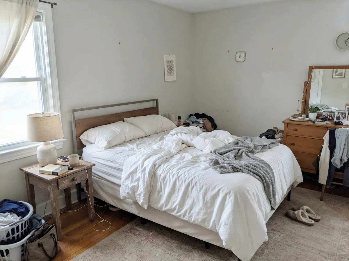
overcast, north light
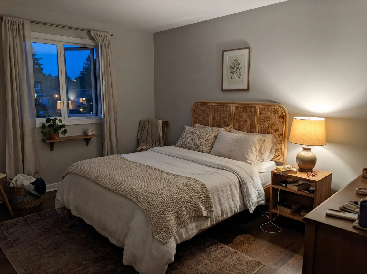
dusk, rain, cool bulbs
South-facing sun pulls out the gentle greige warmth, while cool northern exposure or 4000K daylight LEDs immediately expose the violet base.
Gratifying GrayBehr · see diary
Dolphin FinBehr · see diary
Repose GraySW 7015
Cornforth WhiteFarrow & Ball · see diary
WhiskersPPG / Glidden · see diary
How Daylight Dictates the Mood
When people ask me why their neighbor's Repose Gray looks like a warm designer blanket while their own looks like a chilly nursery, I always ask about their windows first. Light isn't an afterthought; it is the active ingredient in how an LRV 58 wall behaves across twenty-four hours.
In cool early-morning daylight or beneath gray winter skies, the yellow in the formula gets swallowed up. What remains is a soft, pale gray that can look slightly washed out before the sun gets over the trees. But once the lamps click on at dusk, everything shifts.
That shift between cool dawn and lamp-lit evening is why lighting hardware matters just as much as paint sheen. If you screw 4000K daylight LED bulbs into your lamps, you are going to freeze this color in its tracks. A harsh blue-white bulb pulls out every ounce of violet and baby blue in the can, leaving the room looking sterile and flat. Swapping those bulbs out for warm 2700K incandescent-style LEDs restores the greige character immediately. I have saved several friends from repainting whole rooms simply by having them change their lightbulbs.
The Changing Faces in Bathrooms
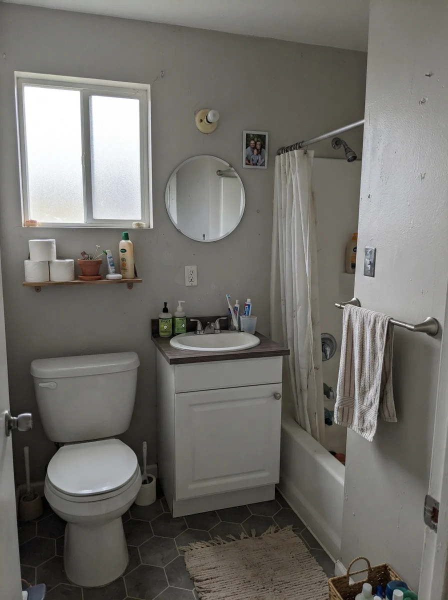
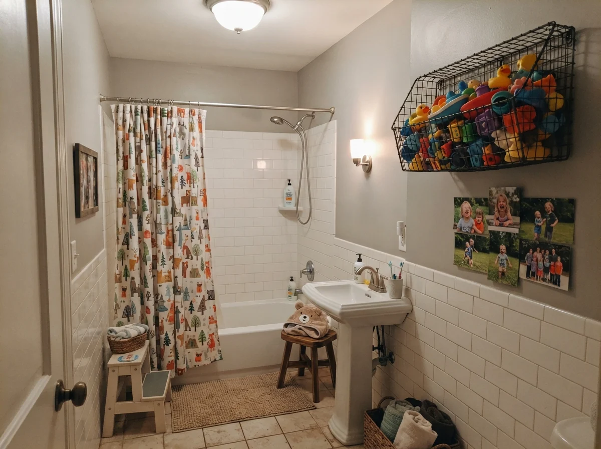
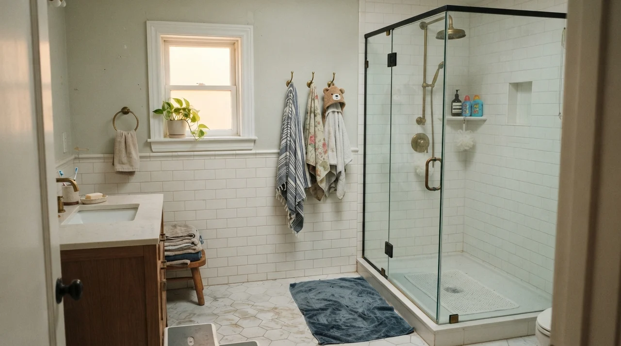
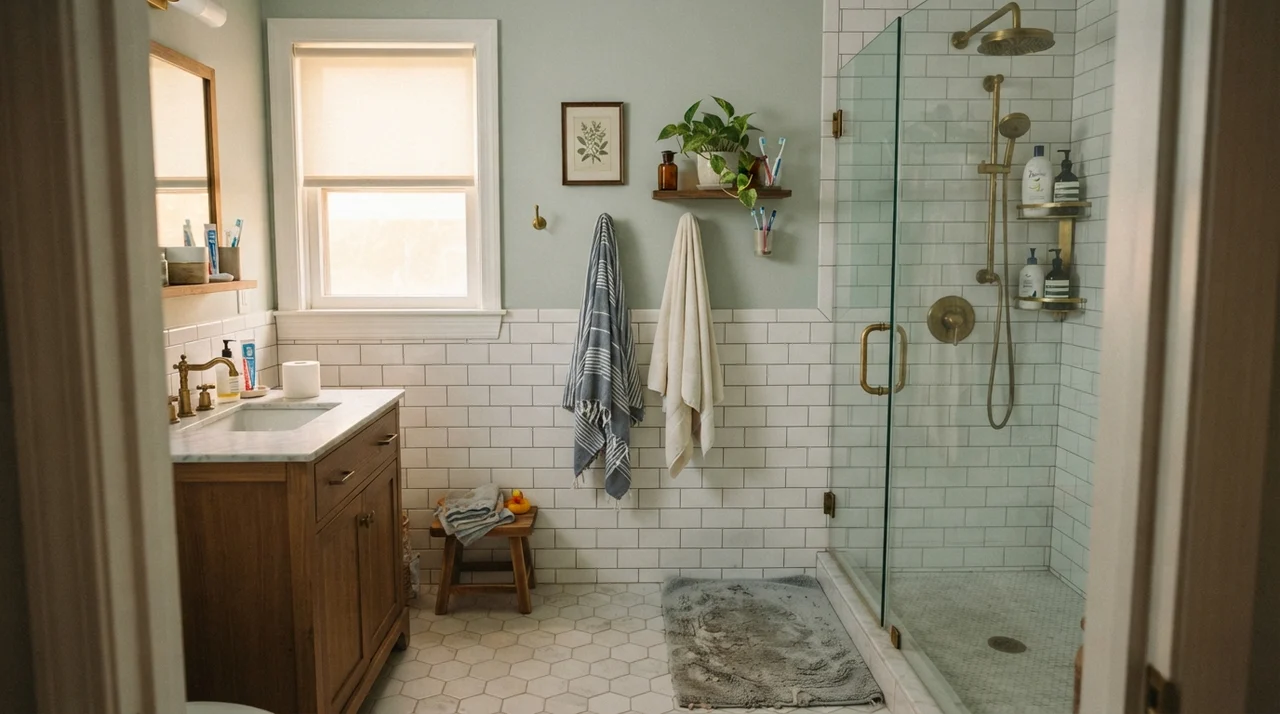
Bathrooms are a trial by fire for light neutrals because they combine small square footage with fixed, unforgiving surfaces like tile, porcelain, and vanity stone. Five years in our second house taught me that Repose Gray needs clean white companions to look its best in tight quarters.
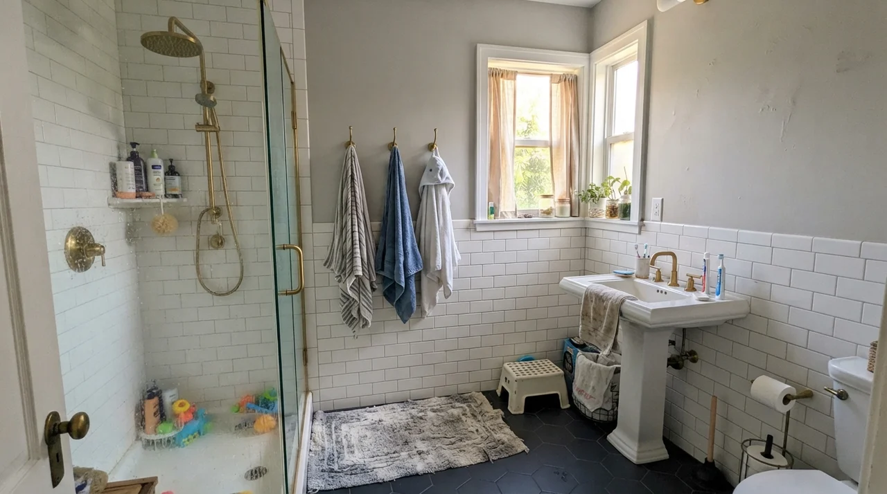
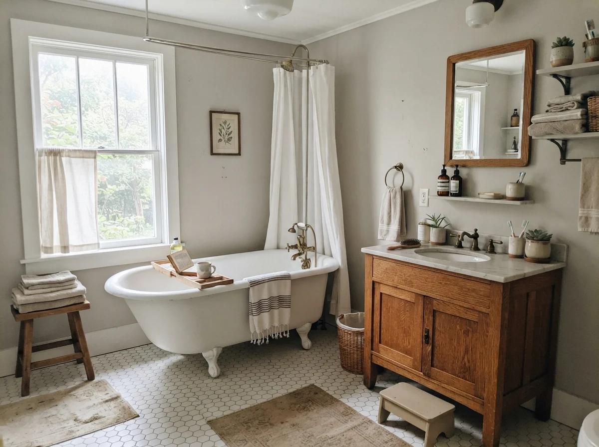
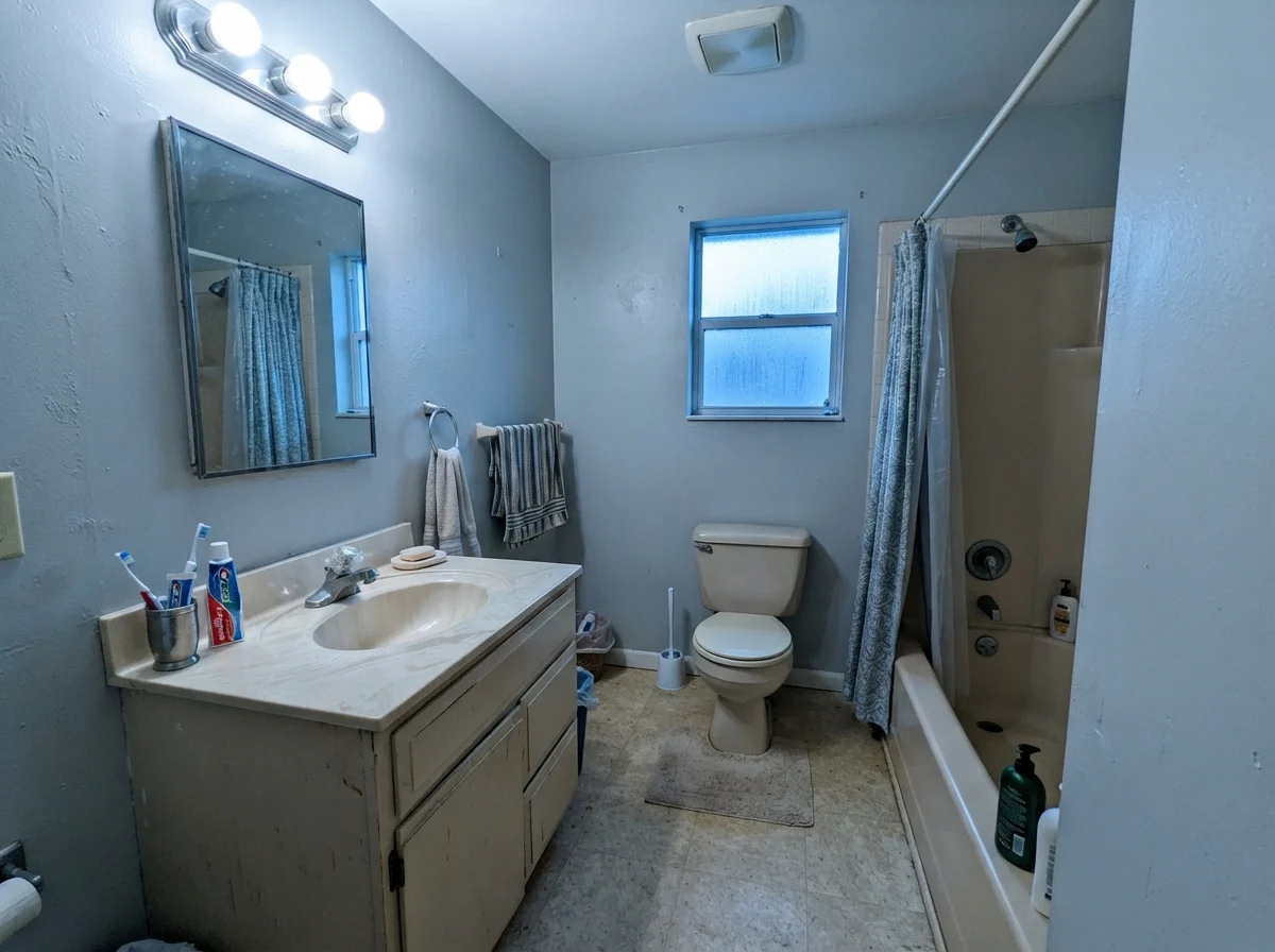
When paired with bright white subway tile, clean white hex floors, and warm natural oak, Repose Gray behaves like a crisp, tailored backdrop. It provides just enough contrast against crisp white fixtures without feeling heavy or dark. But if your bathroom has dated beige fixtures, yellowed travertine, or an older almond vanity, the color dynamic breaks down. The yellow and tan undertones in older beige stone will immediately force Repose Gray's cool violet undertone to the surface. Next to yellow-beige, it doesn't look neutral—it looks distinctly lavender.
Living Rooms and Main Living Areas
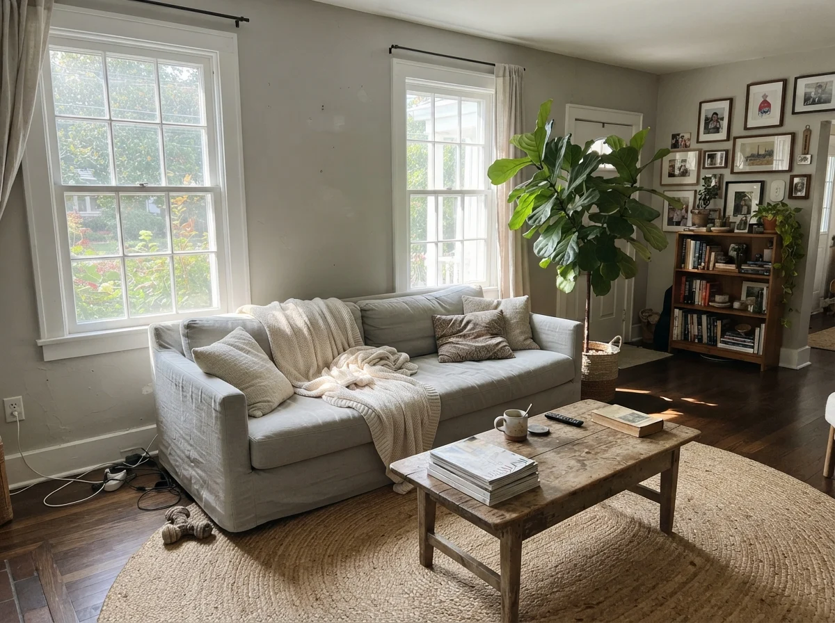
Where Sherwin-Williams Repose Gray truly earns its reputation as a top-three bestseller is on open-concept main floors blessed with southern or western sun. In generous midday light, the warmth of the sun balances the cool base, settling the wall into a serene, effortless greige that never fights your furniture.
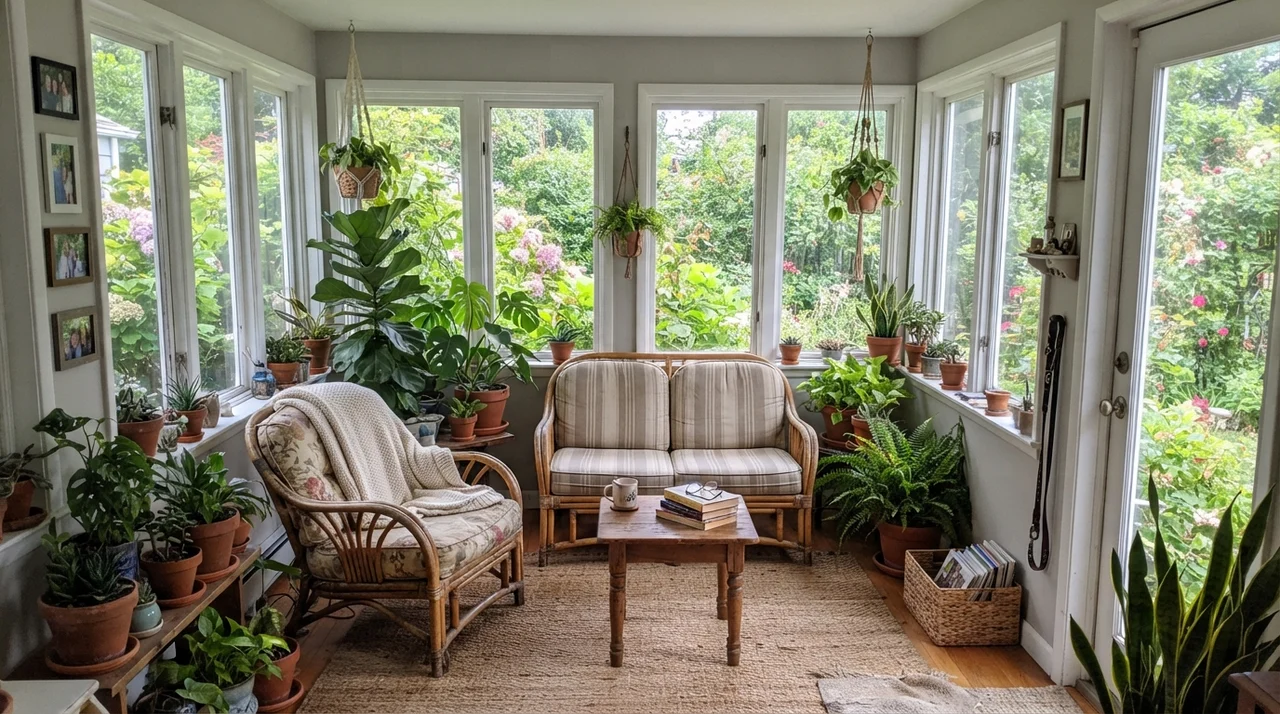
In our current 1960s ranch, our main living space connects directly into a bright sunroom. When sunlight pours in from multiple angles, Repose Gray washes out slightly—in full, direct afternoon sun, it can bleach out to look almost like a soft off-white. But on large expansive walls, that softness is an asset. It sits happily alongside natural jute rugs, linen upholstery, warm wood coffee tables, and earthy terracotta without ever screaming for attention.
Kitchens, Cabinets, and the Cream Warning
Cabinet painting is a massive undertaking, whether you are spraying them yourself in the garage or paying a crew thousands of dollars to prep and spray them. Before you commit to Repose Gray on cabinetry, check your countertop and backsplash undertones with ruthless honesty.
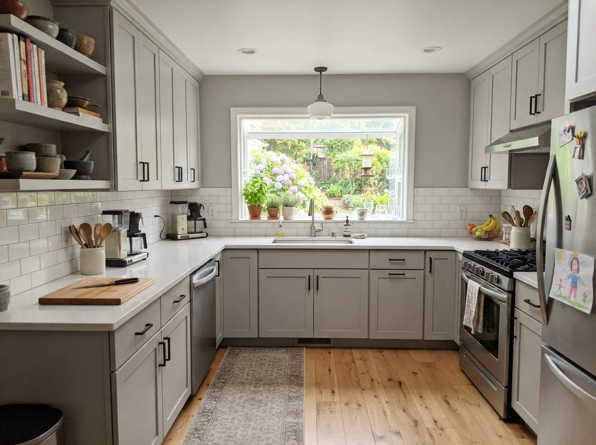
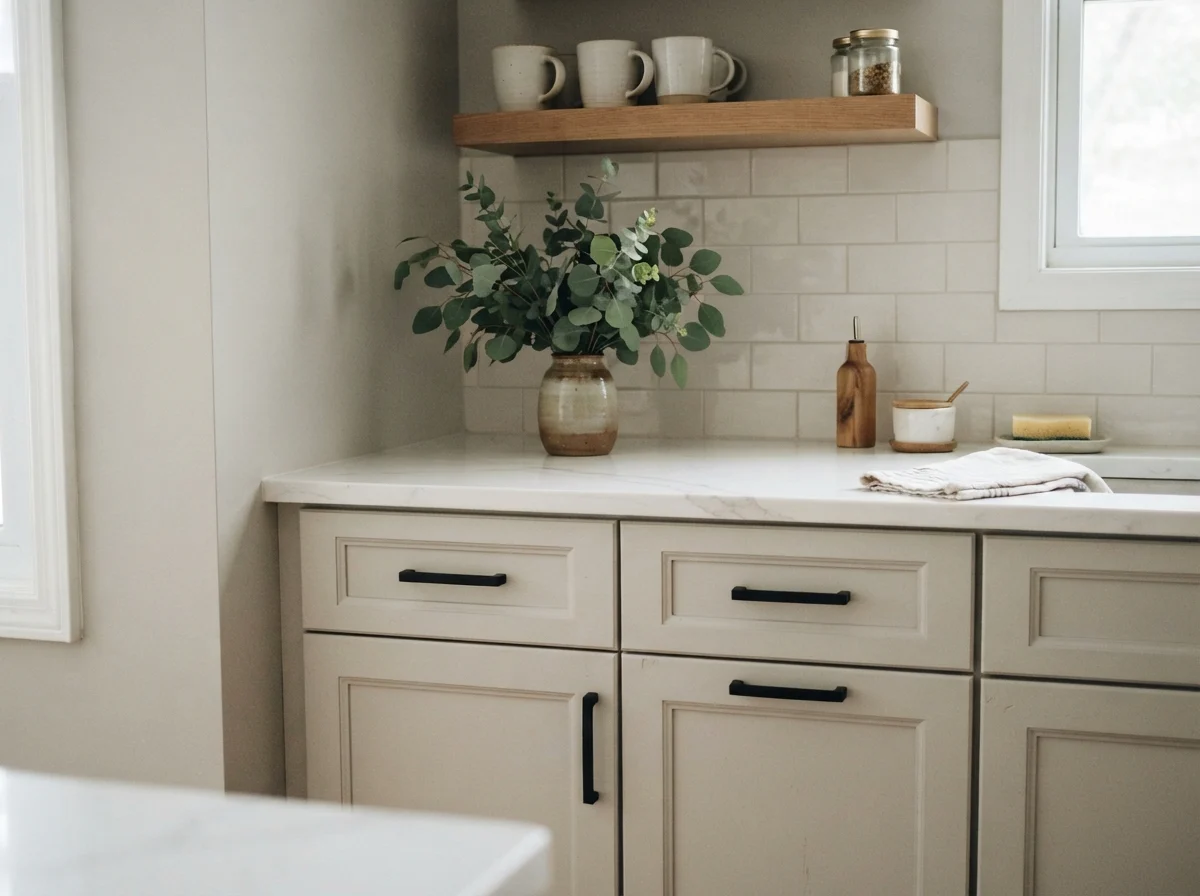
On shaker doors surrounded by clean white quartz counters and classic white subway tile, Repose Gray in a satin finish is a gorgeous, soft alternative to standard stark white. It pairs effortlessly with matte black hardware or warm brushed brass. But if you have creamy off-white perimeter cabinets, champagne quartz, or tuscan-era tumbled marble backsplashes, be warned.
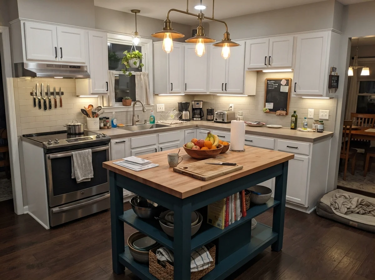
If you paint a kitchen island in Repose Gray while the surrounding walls or cabinetry are a warm cream, you create a direct clash. The warmth in the cream forces the cool gray to tilt violet right at the transition seam. For kitchens with heavy cream elements, you are far better off choosing a dedicated warm neutral like Agreeable Gray (SW 7029) or Accessible Beige (SW 7036).
Bedrooms, Nurseries, and Everyday Spaces
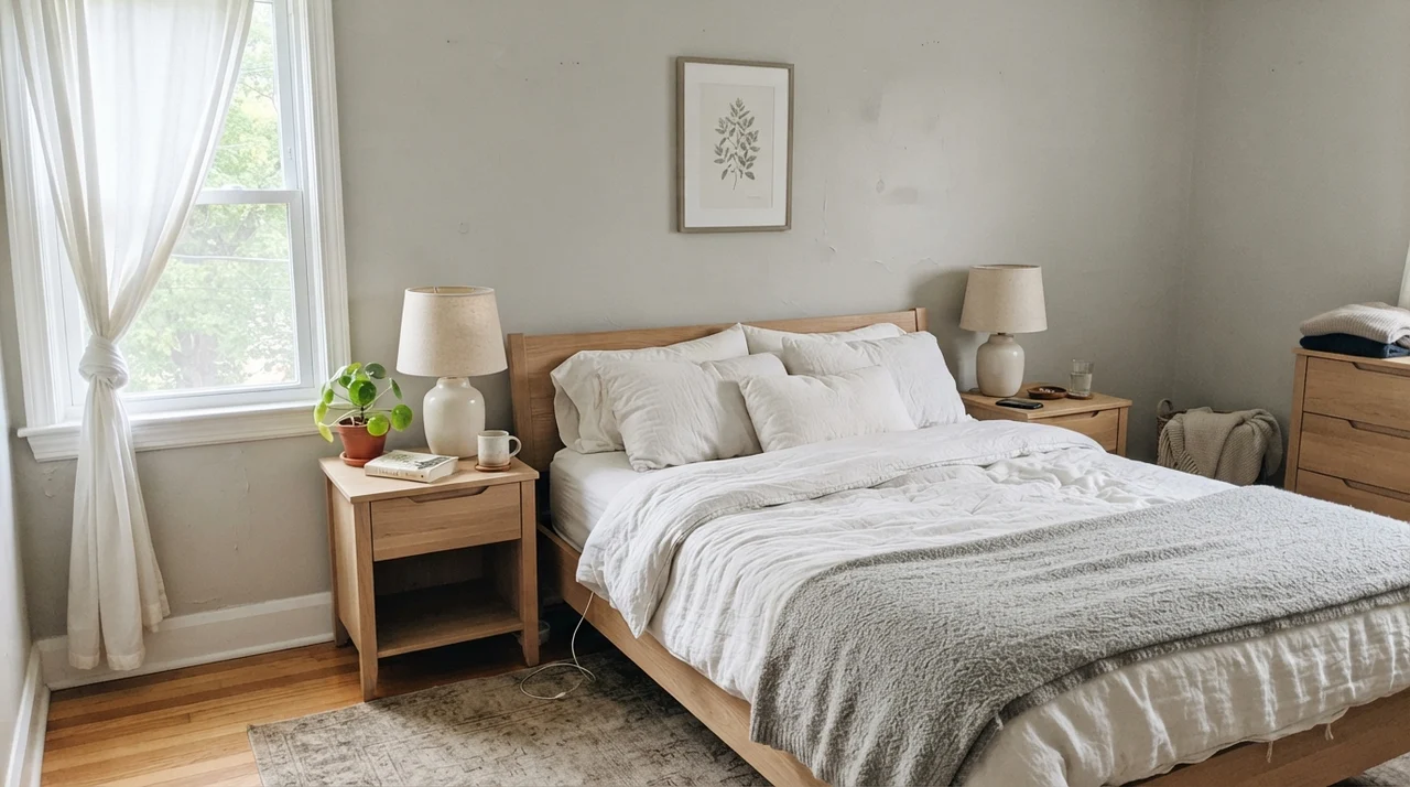
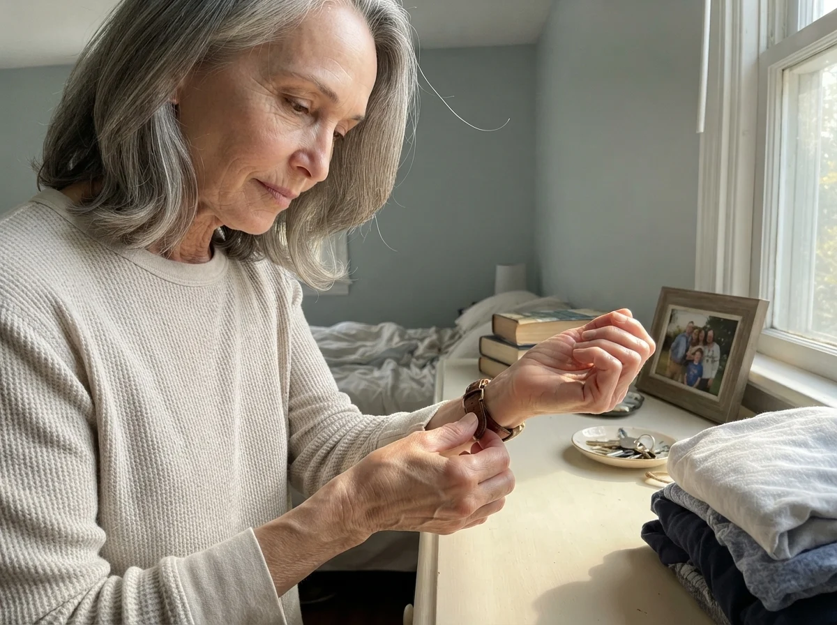
In bedrooms, quiet colors are worth their weight in gold. A bedroom painted in Repose Gray feels grounded and restful, especially when paired with simple white linen bedding, pale oak nightstands, and ceramic lamps.
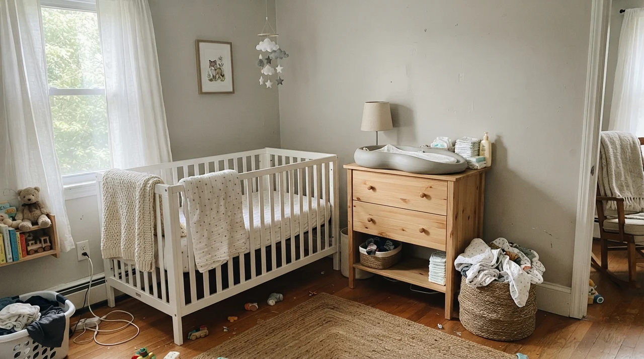
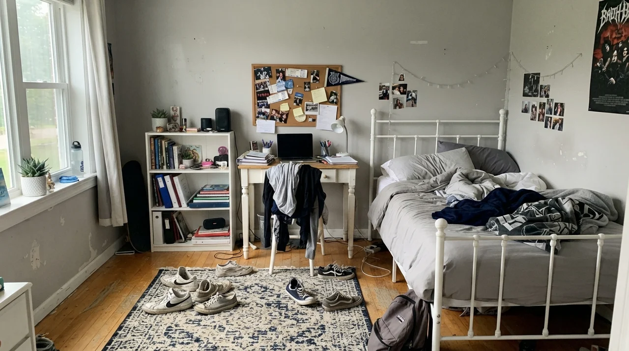
Because it doesn't skew heavily masculine or feminine, it adapts seamlessly as kids grow. In a nursery, it provides a quiet foundation against light wood furniture and soft knit blankets. A decade later, that same room can hold metal bed frames, corkboards, and teenage clutter without needing a repaint. When we sold our second house, having versatile, neutral bedrooms painted in a cohesive color meant we didn't spend weeks repainting before listing.
Utility Spaces, Millwork, and Siding
Beyond standard drywall, Repose Gray handles hard-working utility zones and exterior siding with surprising grace—provided the lighting conditions cooperate.
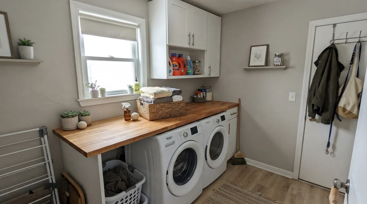
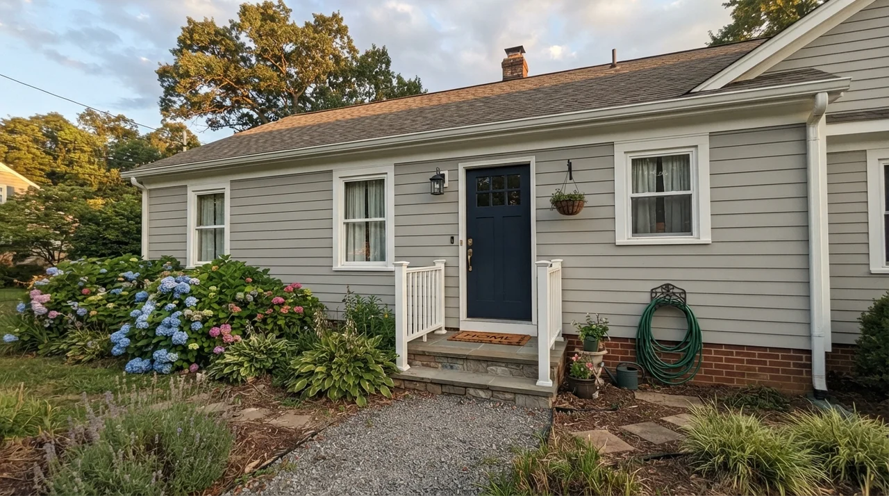
In a laundry room with a window, pairing these walls with warm butcher-block counters and white cabinetry creates a fresh, clean utility space. On an exterior, natural sunlight is so intense that Repose Gray flattens out into an airy, crisp light neutral siding color. Paired with crisp white trim, dark bronze or Tricorn Black shutters, and a deep Naval (SW 6244) front door, it gives a dated exterior an immediate refresh that looks elegant and timeless from the curb.
A two-inch chip lies light. On four continuous walls with limited windows, LRV 58 will read a full shade deeper and cooler than you expected.
The Three Places Repose Gray Fails
Because Repose Gray is recommended so frequently on social media and design blogs, disappointed homeowners often feel blindsided when it looks wrong on their walls. After living with color for thirty years, I have found that almost every complaint comes down to one of three predictable scenarios:
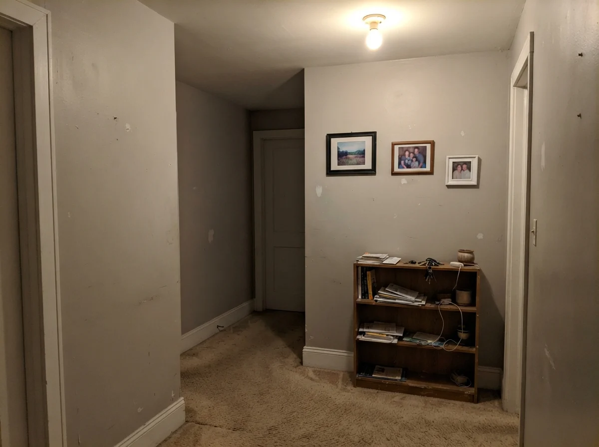
- Dim, North-Facing Rooms: Cool, weak northern light drains the warmth out of the paint, allowing the violet base to dominate. In a dark room with north exposure, the walls frequently read as lavender or flat baby blue. If your room faces north and lacks natural brightness, choose a warmer alternative like Benjamin Moore Edgecomb Gray (HC-173) or Accessible Beige (SW 7036).
- Adjoining Cream or Ivory Cabinets: When placed directly beside warm ivory, champagne, or yellowed cream woodwork, Repose Gray is forced across the color wheel into a noticeable purple cast. Never pair it with warm cream millwork; stick to clean whites.
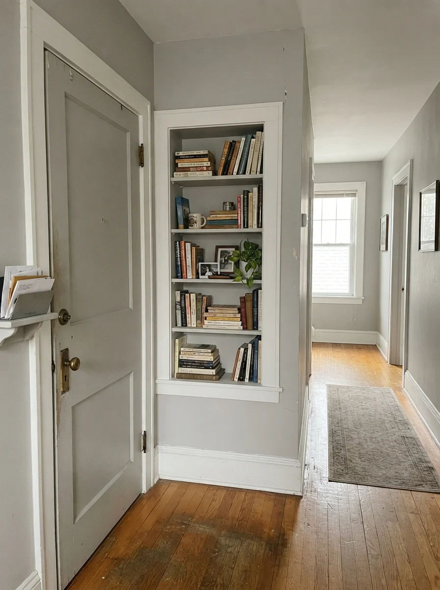
- The Small Swatch Trap: Testing a tiny 2-inch paint chip against existing darker walls is a recipe for surprise. LRV 58 carries substantial body. Across four enclosed walls in a hallway, it reads noticeably darker and moodier than on a small swatch. Always paint a large test board and move it around the room before committing to gallons.
Durability, Sheens, and Long-Term Living
Choosing the right paint finish is just as crucial as picking the pigment. Over thirty years of wiping scuffs, dog nose prints, and sticky toddler fingerprints off drywall, I have settled on a strict formula for sheens:
- Drywall Walls: Eggshell. It provides a soft, non-reflective surface that hides minor wall imperfections while remaining durable enough to be scrubbed clean with a damp microfiber cloth and mild soap.
- Trim, Millwork & Doors: Semi-Gloss. Trim takes the brunt of vacuum cleaners and daily contact. Semi-gloss on Pure White baseboards creates a clean, wipeable finish that held up for years in our last house.
- Kitchen & Bathroom Cabinets: Satin. High-traffic cabinetry needs protection against water splashes and cooking grease around pulls. A quality cabinet-grade enamel in satin wipes clean easily without looking overly shiny.
- Ceilings: Flat. Never put an eggshell on a ceiling unless you want to see every joint and taped seam under overhead lights. A dead-flat white ceiling keeps overhead glare non-existent.
Five years in, Repose Gray holds its shade well without noticeable fading in sunny rooms, provided you invest in a quality paint line. For touch-ups, keep a small, airtight glass jar of leftover wall paint in the utility closet—stir it thoroughly and feather the edges with a foam brush for invisible repairs.
Why does Repose Gray look purple or baby blue in my room?
Repose Gray carries a subtle violet undertone beneath its gray pigments. In rooms with cool northern daylight or when lit by 4000K daylight LED bulbs, the warm pigments disappear, leaving only the cool violet and blue tones on the wall.
Can I use Repose Gray as a whole-house paint color?
Yes, but with one condition: your house must have consistent natural light. It works brilliantly in open-concept homes with south or west exposure, but windowless center hallways and north-facing bedrooms may read noticeably darker and cooler.
What is the best white paint for trim with Repose Gray walls?
Sherwin-Williams Pure White (SW 7005) in semi-gloss is the safest, most foolproof pairing. It is a clean white with just enough warmth to avoid looking stark, without any yellow undertones that fight the gray.
Does Repose Gray look beige or gray?
In sunny, south-facing rooms, it reads as a soft, balanced greige with subtle warmth. In north-facing rooms or on cloudy days, it reads distinctly gray with a cool cast.
Can I cut Repose Gray to 50 percent strength?
Yes. If you love the hue of Repose Gray but find an LRV of 58 too dark for your smaller rooms or dim hallways, having the paint counter mix it at 50% formula strength is a popular painter trick to keep the room lighter.
Susan's Verdict · The Sunlit Greige Standard
Sherwin-Williams Repose Gray (SW 7015) earned its spot as America's go-to greige for good reason: in south-facing sun, paired with crisp white trim and natural wood, it delivers a calm, modern, and effortless whole-house backdrop that looks high-end for years. Just don't ask it to do a job it wasn't made for. Keep it far away from dim, windowless north rooms and yellow-cream cabinetry, ensure your lamps run warm 2700K bulbs, and test a full board on every wall before opening the gallon cans.