Color Diary · No. 50
Sherwin-Williams Retreat: The Grayed Sage That Needs Windows to Survive
The gray-green everyone calls sage on the chip and gray on the wall, reviewed honestly: where it earns its price, and the rooms where it flattens.

Susan HartleySeptember 26, 2026 · 12 min read
Retreat · Sherwin-Williams SW 6207
Hex#7A8076LRV21Undertonesmuted green → slate gray → soft olive shadow
In our last house, a 1990s colonial with oversized windows and endless oak baseboards, we went through a phase where everyone seemed to be painting their interior doors and kitchen islands in saturated forest tones. I bought into it, painted our lower kitchen run a heavy spruce, and lived with it for about three seasons before the constant visual shouting wore me down. When we moved into our current 1960s ranch, I swore I wouldn't paint another cabinet a loud green. But a house full of plain drywall still asks for depth somewhere.
That is usually the exact moment someone hands you the paint chip for Sherwin-Williams Retreat (SW 6207). On the paper swatch under store lights, it looks like a refined, botanical sage that has spent time in the shade. On an actual wall, five years in, it behaves quite differently. It is not an energetic pasture green, and it certainly is not a cheerful mint. Retreat is a low-saturation gray-green sitting at a light reflectance value of 21. That means it absorbs almost eighty percent of the light entering a room. If you give it sunlight and incandescent warmth, it reads like a tailored wool coat. If you starve it of daylight, the green packs its bags and leaves you with heavy, wet slate.
The Morning Light Shift: What Happens at Dawn Versus Dusk
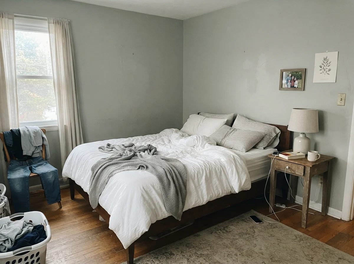
Before you commit five gallons to a bedroom or living area, you need to understand how Retreat reacts across twelve hours of changing sky. In cool, early-morning daylight without any artificial lamps turned on, the color looks surprisingly pale and washed out. The green undertone stays quiet, almost hesitant, reading more like an unpigmented stone wash than an intentional paint choice.
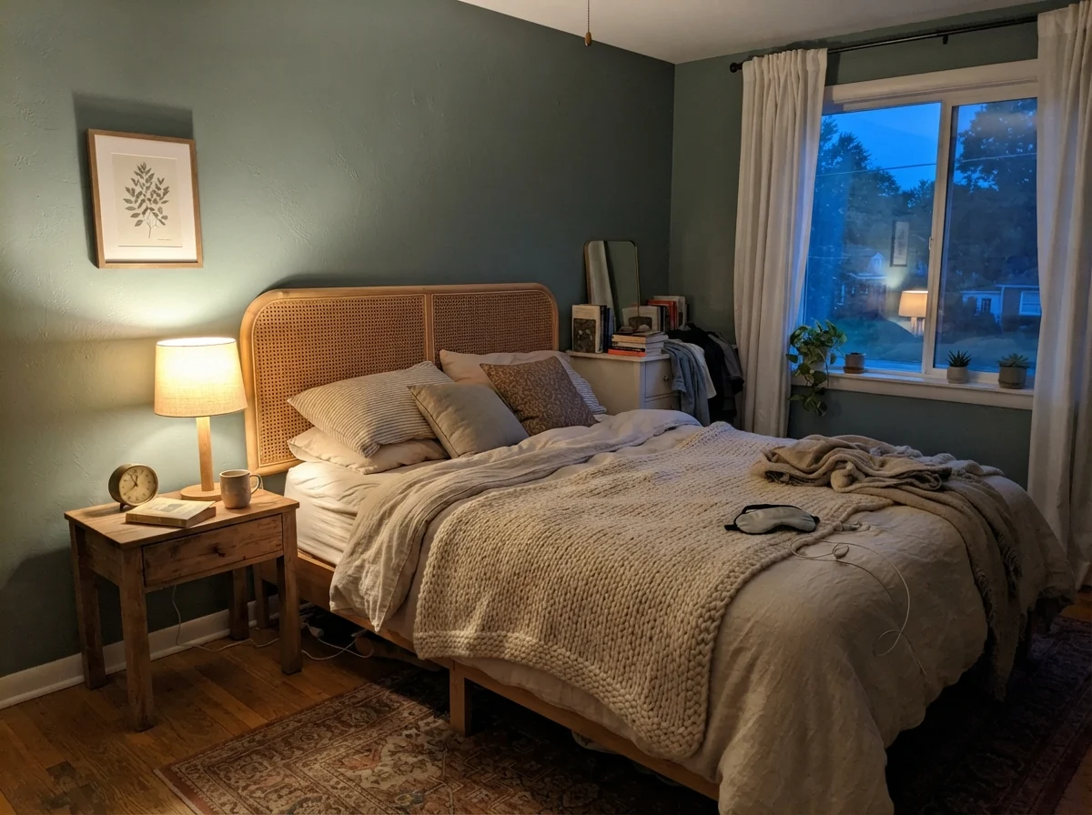
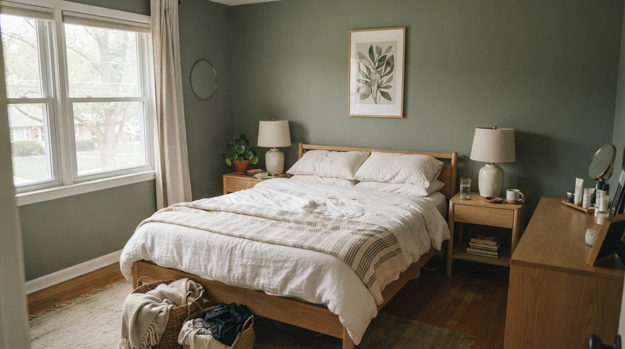
Wait twelve hours until dusk, turn on a bedside lamp fitted with a warm 2700K bulb, and the color undergoes a total personality transfer. Under that low, warm lamp glow, the green warms up into a cozy, grounding olive-gray. It settles into the perimeter of the room like a thick blanket. This dramatic shift is why swatching on a single afternoon will mislead you: you have to live with the swatch through every transition of the day.
Retreat on Walls: Bathrooms, Trim Lines, and Overcast Sky
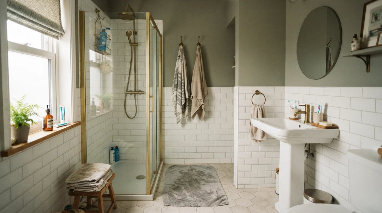
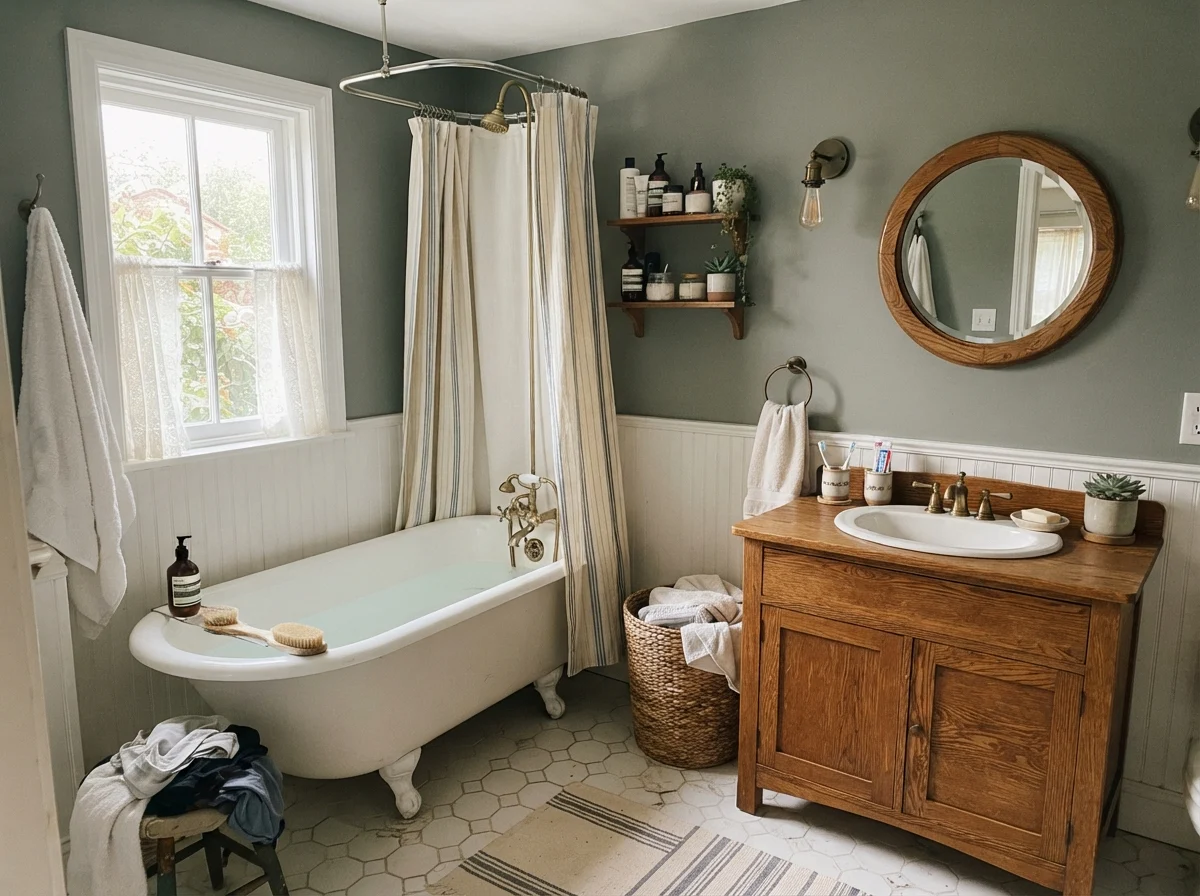
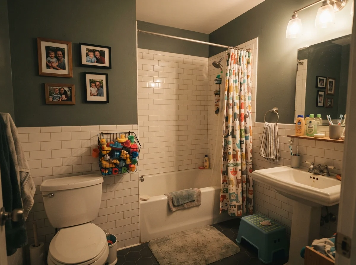
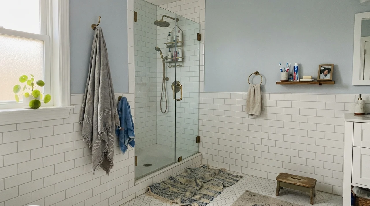
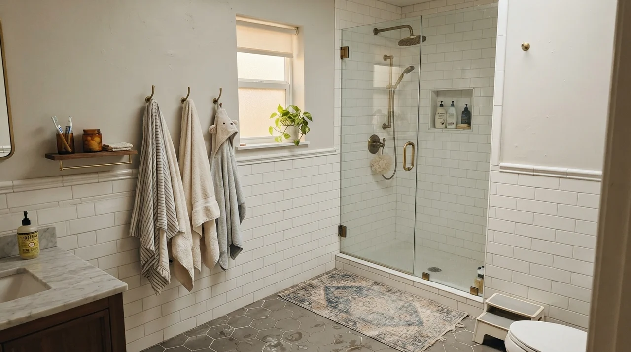
One of the safest places to use Retreat indoors is where it is balanced by clean, crisp white elements. In a family bathroom, painting Retreat only on the upper portion of the wall above white subway tile wainscoting works brilliantly. The white tile bounces illumination around the room, keeping the LRV 21 depth from feeling suffocating, while brass fixtures and glass doors provide the warm glint this color secretly craves.
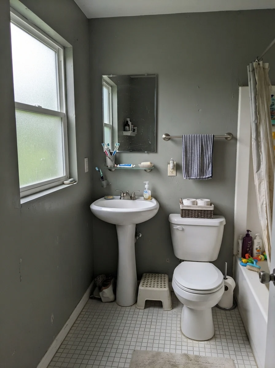
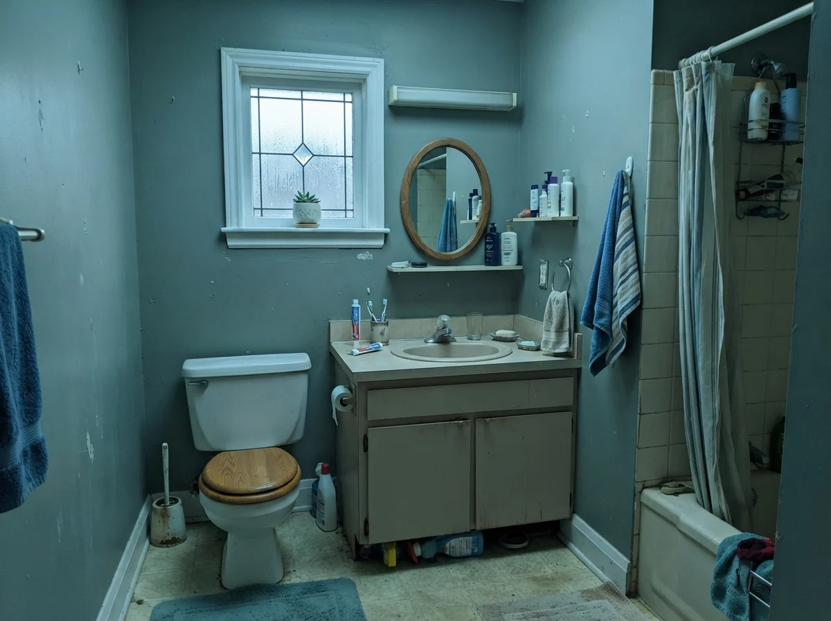
However, when an overcast day rolls in and daylight filters through frosted glass, the color shows its stubborn side. Without direct sun or warm bulbs, Retreat immediately flattens out, muting into a simple, functional gray. In modest, north-facing bathrooms with older beige fixtures, rainy-day daylight can even lend it a slightly cold, chalky cast. It doesn't turn ugly, but anyone expecting a lush forest canopy will wonder where their green went.
Kitchens and Built-Ins: Where Retreat Earns Its Keep
If you ask me where this color is genuinely worth the money, the answer is cabinetry. In our thirty years of remodeling, I have scrubbed every conceivable cabinet surface, and nothing tests a finish like busy family life. Light painted cabinets broadcast grease around the knobs, pot dings near the dishwasher, and dark knuckle marks along the drawer edges within months. Ultra-dark black cabinets, on the other hand, show every stray flake of flour and water streak.
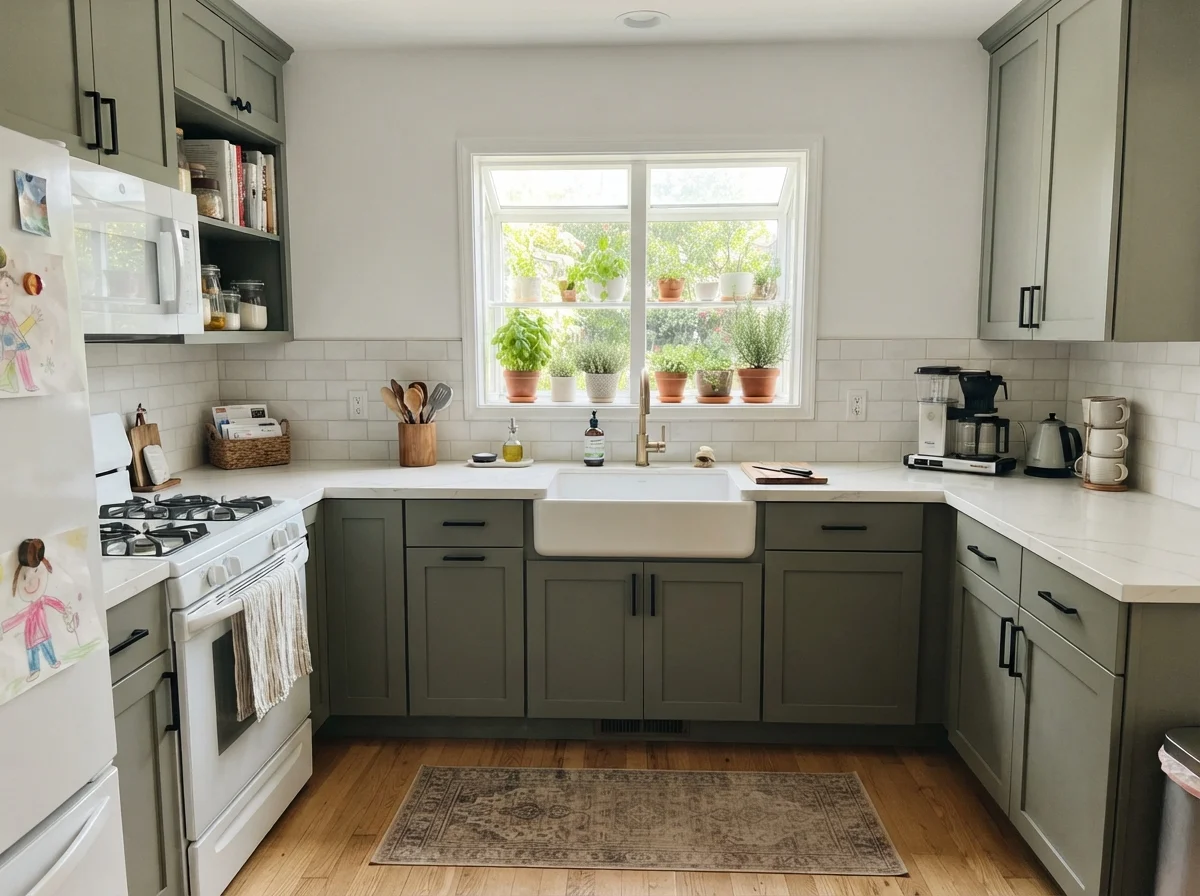
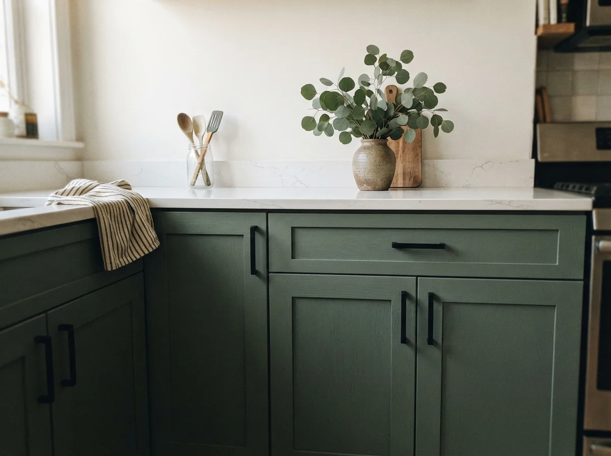
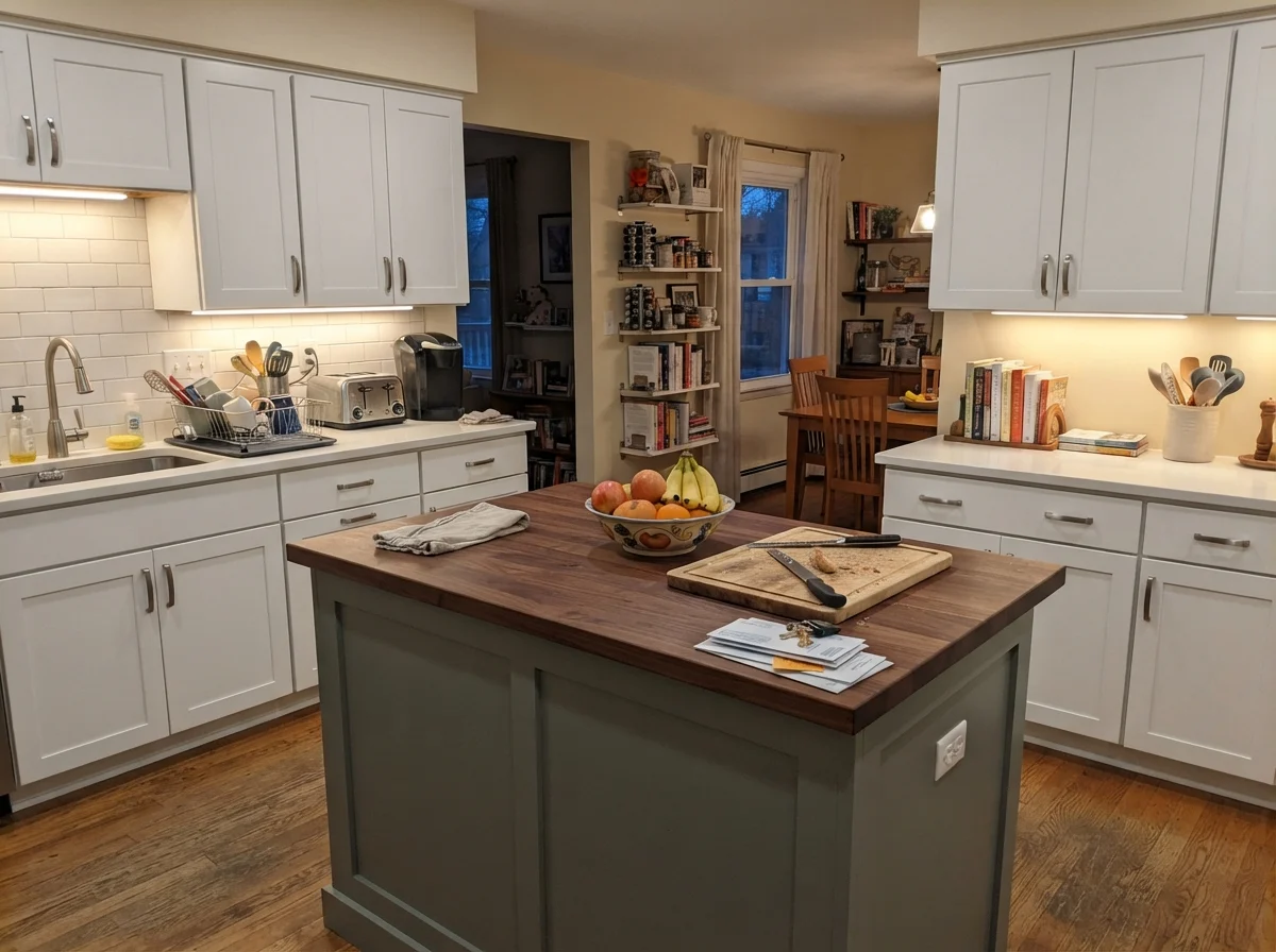
Retreat hits the exact sweet spot for kitchen millwork. When brushed or sprayed in a satin finish on shaker cabinets, it hides the honest scuffs of meal prep without making the room feel like a cave. On a kitchen island surrounded by cream walls and white perimeter units, it grounds the layout immediately. It sits naturally against white quartz countertops, light oak hardwood flooring, and unlacquered brass or matte black hardware. Because it is so restrained in its saturation, it refuses to fight with existing stone or tile.
Living Rooms, Bedrooms, and High-Sunlight Spaces
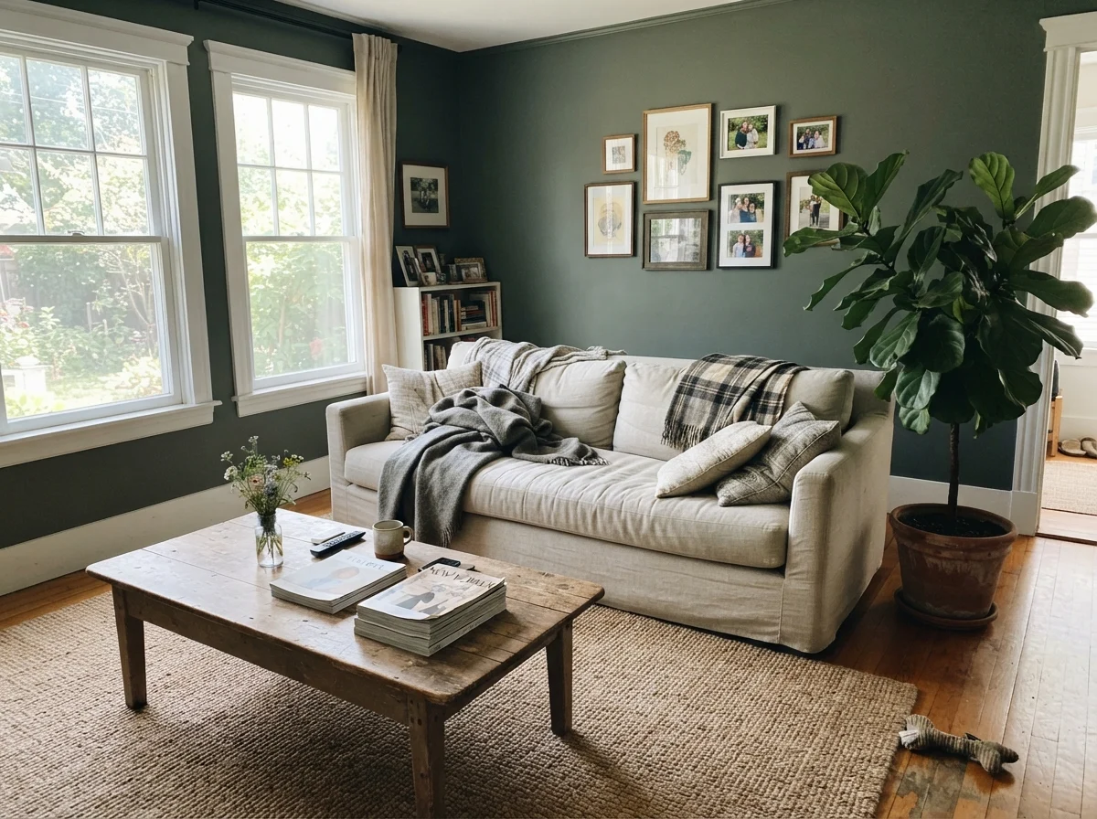
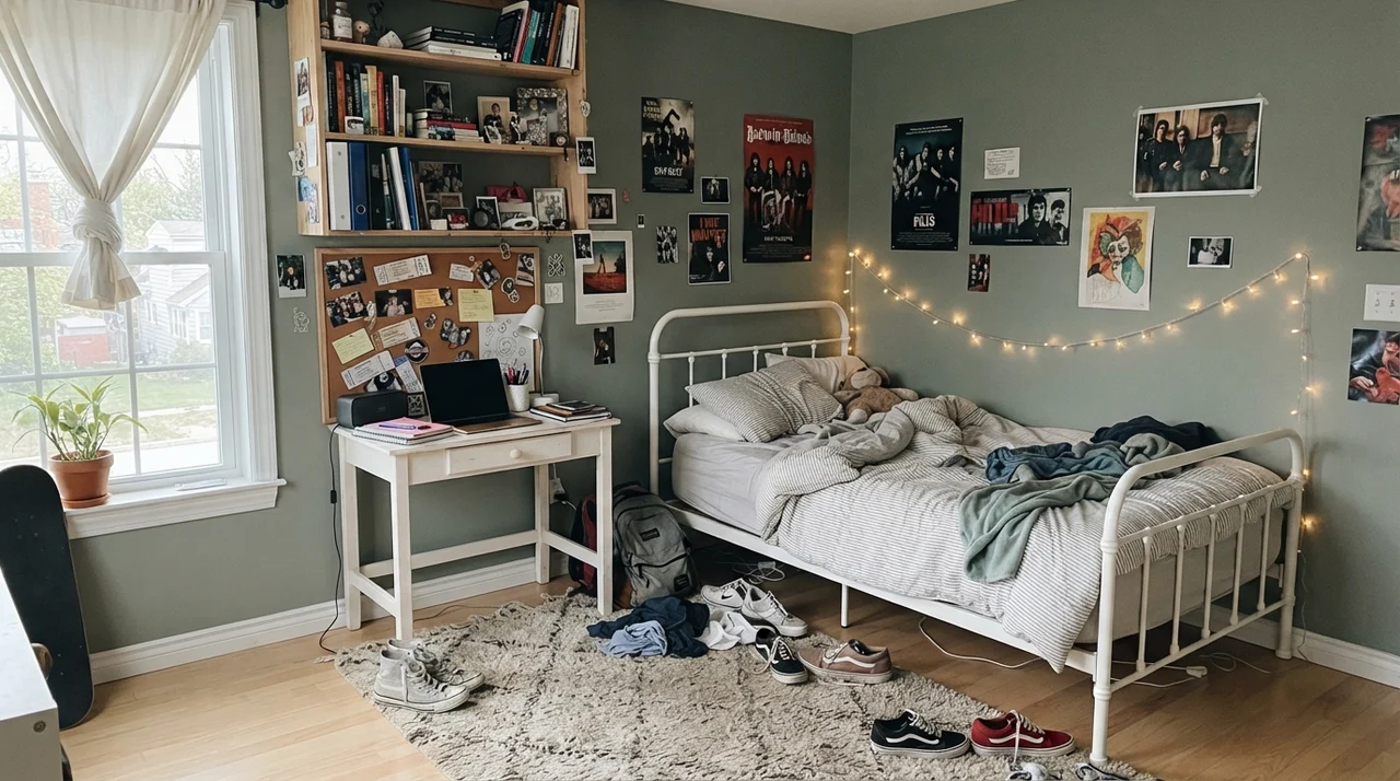
In our current home, I've learned that painting an entire living space in a dark LRV 21 color requires generosity from the sun. In a living room blessed with two large windows pouring in midday rays, Retreat comes alive. The warmth of direct sunlight brings the herbal sage character forward, pairing effortlessly with a neutral linen sofa, rumpled throws, wood coffee tables, and natural jute rugs. It feels rooted and intentional rather than dark.
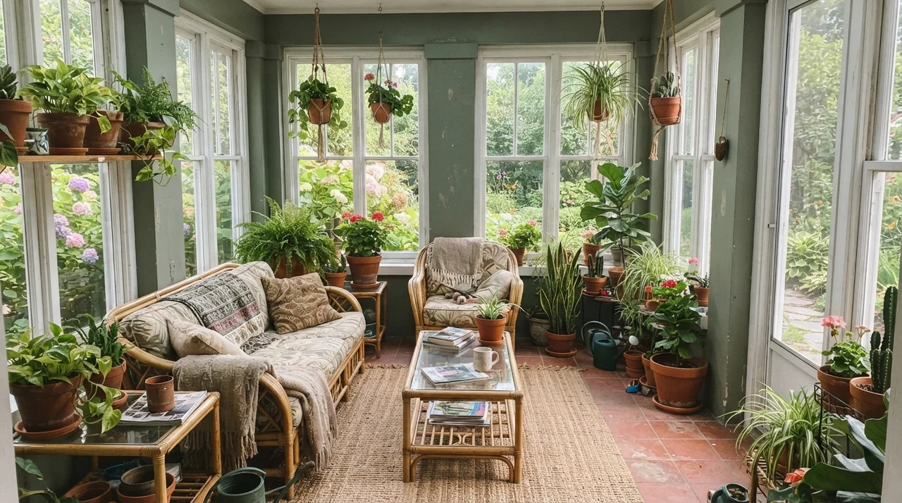
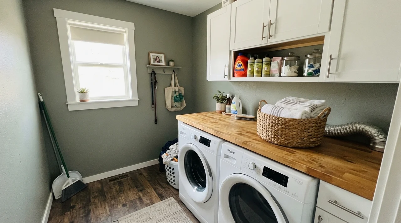
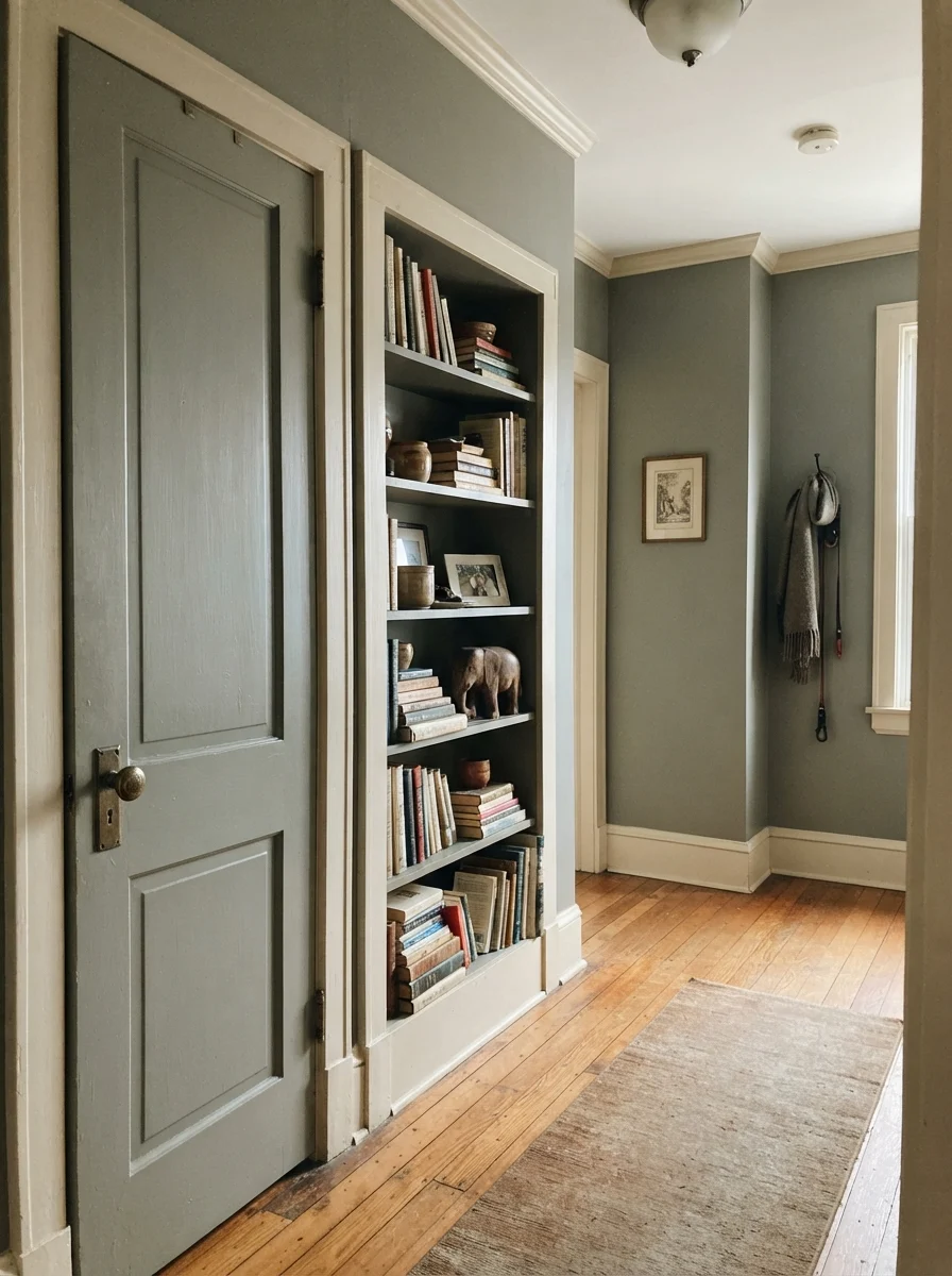
The same holds true for sunrooms and laundry rooms that enjoy unobstructed garden exposure. Between multiple white window frames or above clean butcher-block counters, Retreat offers an organic stillness that never feels synthetic. When we repainted our hallway built-ins and interior doors in Retreat against soft cream walls, it gave an older home that tailored, architectural look without requiring a full structural overhaul.
Retreat is the color you choose when you want the depth of green without turning your home into an arboretum.
Exterior Siding: How the Sun Unlocks the Green
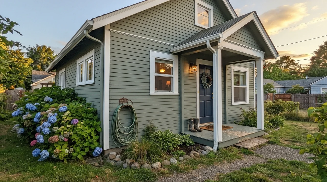
Exterior paint is an entirely different discipline because direct, unfiltered sunlight instantly washes out roughly five to ten points of depth. On horizontal siding, Sherwin-Williams Retreat looks lighter and significantly greener than it ever does in an interior room. Surrounded by sky and landscaping, the gray pigment acts like a stabilizer, preventing the green from turning fluorescent or sickly under midday heat.
When framed with crisp white trim, a dark navy front door, and green foundation plantings like hydrangeas, Retreat gives a home a grounded, timeless presence. It has that established, historic quality that looked appropriate twenty years ago and will hold up just as well twenty years from now. If you have exterior stonework or cedar elements, it blends seamlessly without competing for attention.
Where Retreat Fails: The Windowless Corner
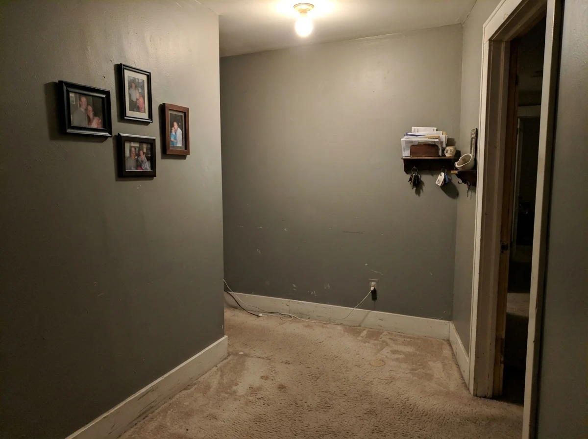
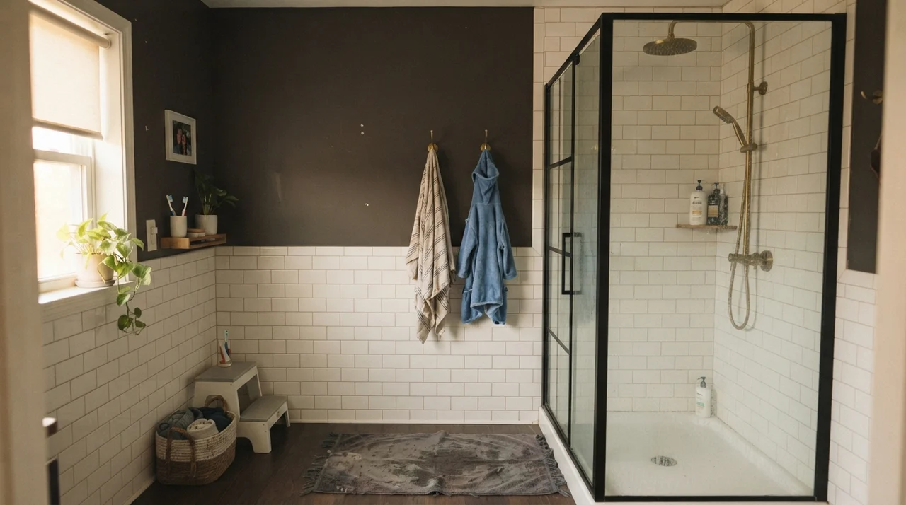
Here is the honest truth that glossy magazine spreads leave out: the bad stories about Retreat are never about the paint quality; they are about the room's light. At an LRV of 21, this paint simply cannot manufacture its own radiance. If you roll it across all four walls of a dark, windowless hallway or a tight basement powder room under a single dim overhead bulb, the color completely collapses.
Instead of an earthy, restorative gray-green, you get a muddy, heavy putty that drags the ceiling down. The walls appear to step inward, casting dreary shadows across beige carpet and framed pictures. In a space that lacks natural illumination, choosing a dark, low-chroma paint is not a bold design statement—it is a recipe for a room you will want to repaint within six months.
Durability, Scrubbing, and Long-Term Wear
Five years in on a painted surface tells you what the swatch never will. On kitchen base cabinets and high-traffic interior doors, Retreat in a satin finish held up remarkably well in our testing. Because it carries substantial gray depth, it conceals everyday scuff marks, dark bag rubs, and dog tail sweeps far better than any pale greige or creamy white ever could. When the inevitable sticky handprints appear near drawer pulls, they can be scrubbed clean with a damp microfiber cloth without leaving visible burnish halos.
However, you must be realistic about wall touch-ups. With any dark, low-sheen paint at LRV 21, dab-and-go brush touch-ups will flash noticeably under angled light. If a door swung too hard and gouged the drywall behind the knob, don't expect to feather in a two-inch patch and have it disappear. You will need to patch, prime, and roll that section from corner to corner. Spend the extra money on quality eggshell for the walls and satin for the trim, and keep an extra quart sealed tight in the basement for full-panel refreshes.
What is the LRV of Sherwin-Williams Retreat?
Sherwin-Williams Retreat has an LRV (Light Reflectance Value) of 21. It absorbs approximately 79 percent of the light that hits it, placing it in the medium-dark category of interior wall paints.
What sheen should I choose for Retreat?
Use an eggshell finish on general living room and bedroom walls to keep glare low. For kitchen cabinets and bathroom vanities, use satin for moisture resistance. Trim and interior doors look best in semi-gloss.
Why does Retreat look gray in my room?
Retreat contains a heavy dose of gray pigment. In north-facing rooms or under cool 4000K daylight LED bulbs, the cool light neutralizes the subtle green tone and leaves behind a flat slate gray.
Is Retreat a good choice for kitchen cabinets?
Yes, it is one of the best cabinet shades Sherwin-Williams produces. It provides rich color depth without being loud, hides everyday kitchen scuffs, and pairs effortlessly with brass, black hardware, and white quartz.
Susan's Verdict · Worth It for Cabinets and Sunlit Rooms
Retreat is the paint color for people who love the idea of green but hate living with trends that shout. On kitchen base cabinets, islands, and exterior siding, it is worth every penny of the gallon price—it hides daily family wear, anchors white finishes, and refuses to fight your existing countertops. But do not try to force it into a dark, windowless hallway or a dim bathroom expecting a lush forest retreat. Give it daylight, pair it with 2700K warm bulbs, and it will serve your home quietly for the next ten years.