Color Diary · No. 68
Sherwin-Williams Rosemary: When Olive Green Goes Rich and When It Goes Charcoal
The dark green everyone puts on islands and front doors, reviewed honestly: where the green actually shows, the rooms where it turns to charcoal, and what to pick instead.

Susan HartleyOctober 7, 2026 · 13 min read
Rosemary · Sherwin-Williams SW 6187
Hex#64695CLRV14Undertonesolive green → charcoal gray → muted khaki
In our last house—a 1990s colonial with oversized baseboards and endless builder beige—I spent six months looking for a deep green that wouldn’t read like an English pub from 1994. I wanted weight, warmth, and depth, but navy felt too cold against our oak handrails and black felt like an absolute surrender of daylight. We eventually put Sherwin-Williams Rosemary SW 6187 on our lower kitchen cabinets and the back door, and we lived with it for seven years before we sold the property.
Here is what thirty years and three houses teach you about dark green paints: you do not pick them for how they look on a two-inch cardboard chip under store fluorescents. You pick them for how they behave on year four, when the afternoon sun hits them at an angle or when the kids leave fingerprints along the door frame. Rosemary is one of those deceptive colors that looks perfectly balanced until you starve it of natural light or pair it with the wrong light bulbs.
With a Light Reflectance Value of roughly 12 to 14, Rosemary absorbs a massive amount of daylight. In a bright room, the rich olive undertone sings alongside warm woods, brass pulls, and creamy whites. But strip away the natural light, and that olive note retreats into a flat, shadowy charcoal. It is a workhorse shade when used intentionally, but it will punish anyone who treats it like a neutral you can slap across a windowless hallway without thinking.
The Three Faces of Rosemary
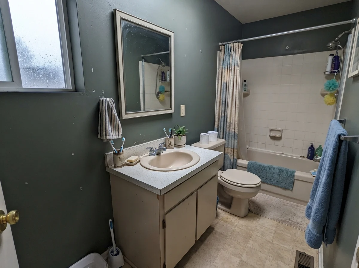
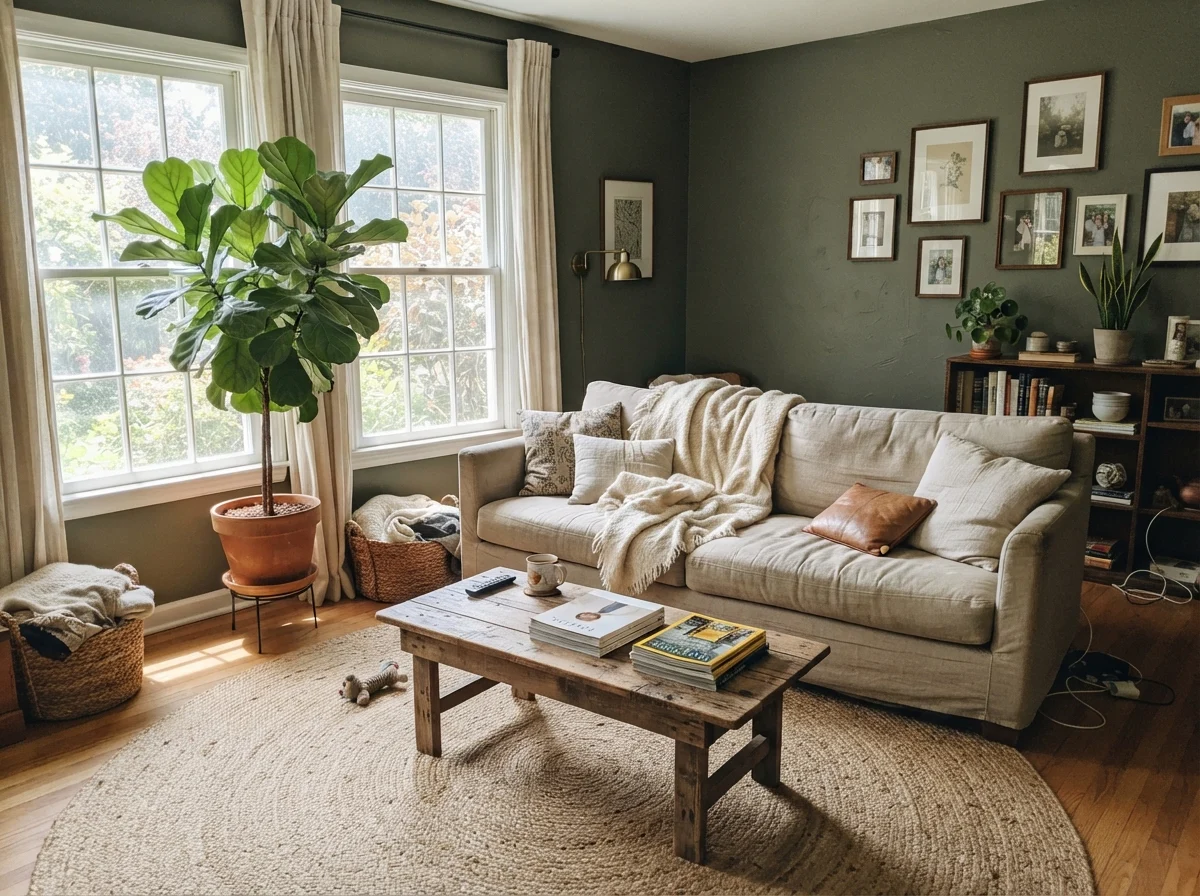
Rosemary holds a strong olive thread under normal daylight, but its low LRV means the ambient illumination dictates whether you see forest moss, weathered slate, or near-black charcoal.
warm sun
overcast, north light
dusk, rain, cool bulbs
Under warm sunlight the yellow-olive core comes alive; weak overcast daylight turns it smoky; harsh cool bulbs pull out a chilly, slate-charcoal cast.
Rainy AfternoonBenjamin Moore · see diary
Cast IronSherwin-Williams · see diary
RosemarySW 6187
BasilSherwin-Williams · see diary
Dark OliveBenjamin Moore · see diary
How Daylight Dictates the Hue
The single biggest mistake homeowners make with a dark, earthy green like Rosemary is ignoring the orientation of their windows. If you have south-facing or west-facing windows, the warm afternoon rays lift the yellow-green pigment, giving walls a grounded, tailored warmth that flatters vintage furniture and natural wood floors. In that light, it never feels somber.
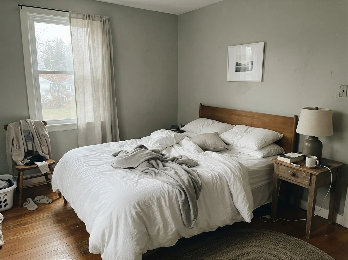
Turn that same paint can toward a north-facing window or a dim room, however, and the experience completely changes. North light is cool and blue-gray. When weak daylight hits an LRV 12 surface, there is simply not enough illumination bouncing back to carry the green pigment to your eye. The walls flatten out into a muted charcoal. If you went into the project expecting a rich woodland green, you will be disappointed. If you went in expecting a moody charcoal with a faint earthy heritage, you might love it.
That shift between morning gray and evening warmth is why lighting fixtures matter so much. If your home has fixed 4000K cool white LED bulbs, Rosemary will look lifeless by dinnertime. It completely strips the organic olive warmth out of the paint. Switching your lamps and recessed cans to 2700K warm white bulbs is the cheapest upgrade you can make—it instantly rescues the green tones after sundown.
Kitchen Cabinets, Islands, and Built-Ins
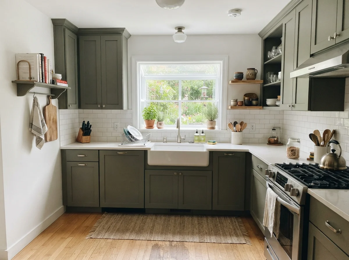
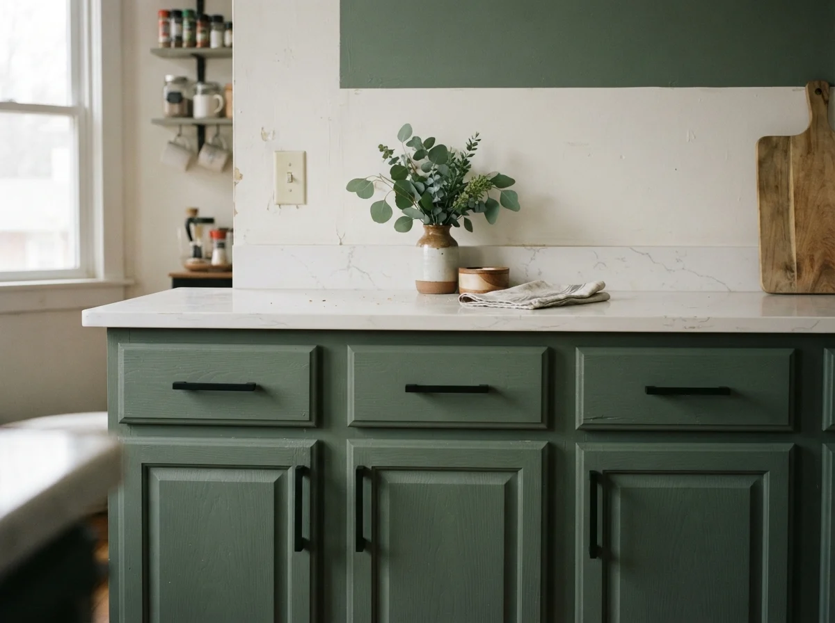
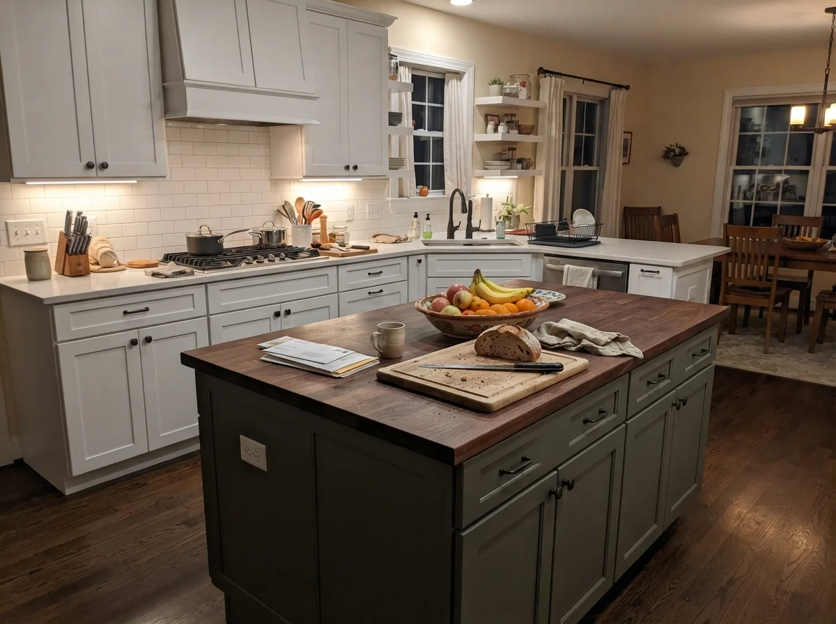
If you ask me where Rosemary earns every penny of its reputation, it is on woodwork framed by lighter colors. In our 1990s colonial, our kitchen had builder-basic cathedral-style oak cabinets that had turned an aggressive amber color. We didn't have thirty thousand dollars for a gut remodel, so we painted the perimeter cabinets in Alabaster and coated the island and lower runs in Rosemary using a durable satin cabinet enamel.
Five years in, that island had survived dropped spoons, kicking boots from barstools, and thousands of wipe-downs with dish soap and warm water. It held up beautifully because a dark satin finish on cabinetry acts like an anchor in a busy space. It conceals day-to-day scuffs far better than a bright white, while the olive undertone makes warm wood cutting boards and antique brass hardware look intentional rather than dated.
Dark green cabinets don't hide dirty cooking habits, but on an island with brass pulls, Rosemary forgives the bumps and scrapes of a real family home.
Living with Rosemary in Bathrooms and Bedrooms
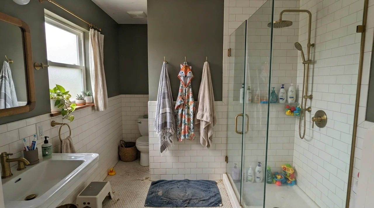
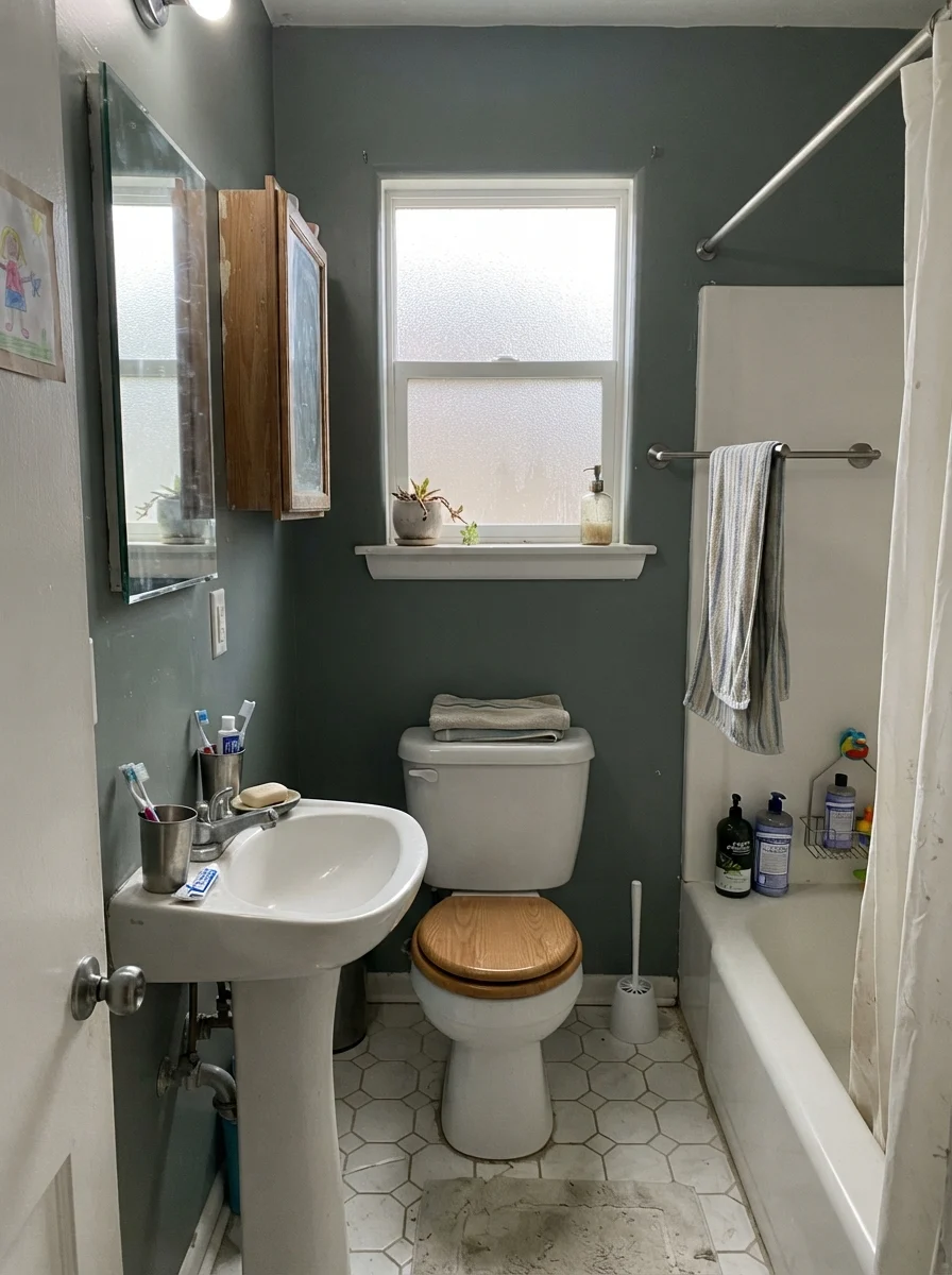
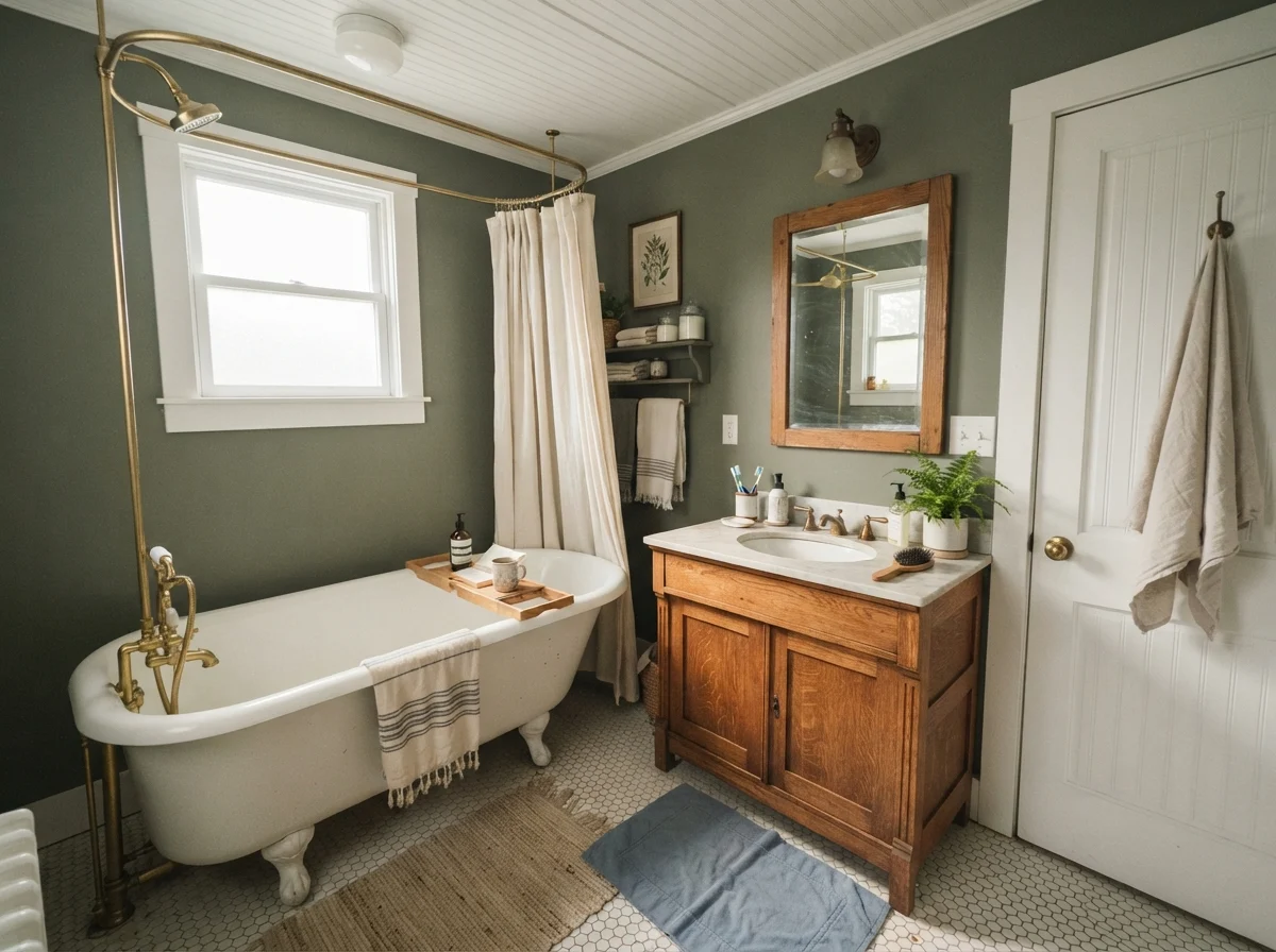
Bathrooms are natural candidates for deep botanical greens, provided you have clean white tile or paneling to balance the darkness. In a small powder room with no exterior window, painting all four walls in Rosemary will make the space read near-black. That can be stunning if you install a warm brass sconce and an off-white ceiling, but if you want the room to feel clean and airy, keep the paint strictly above a white wainscot line.
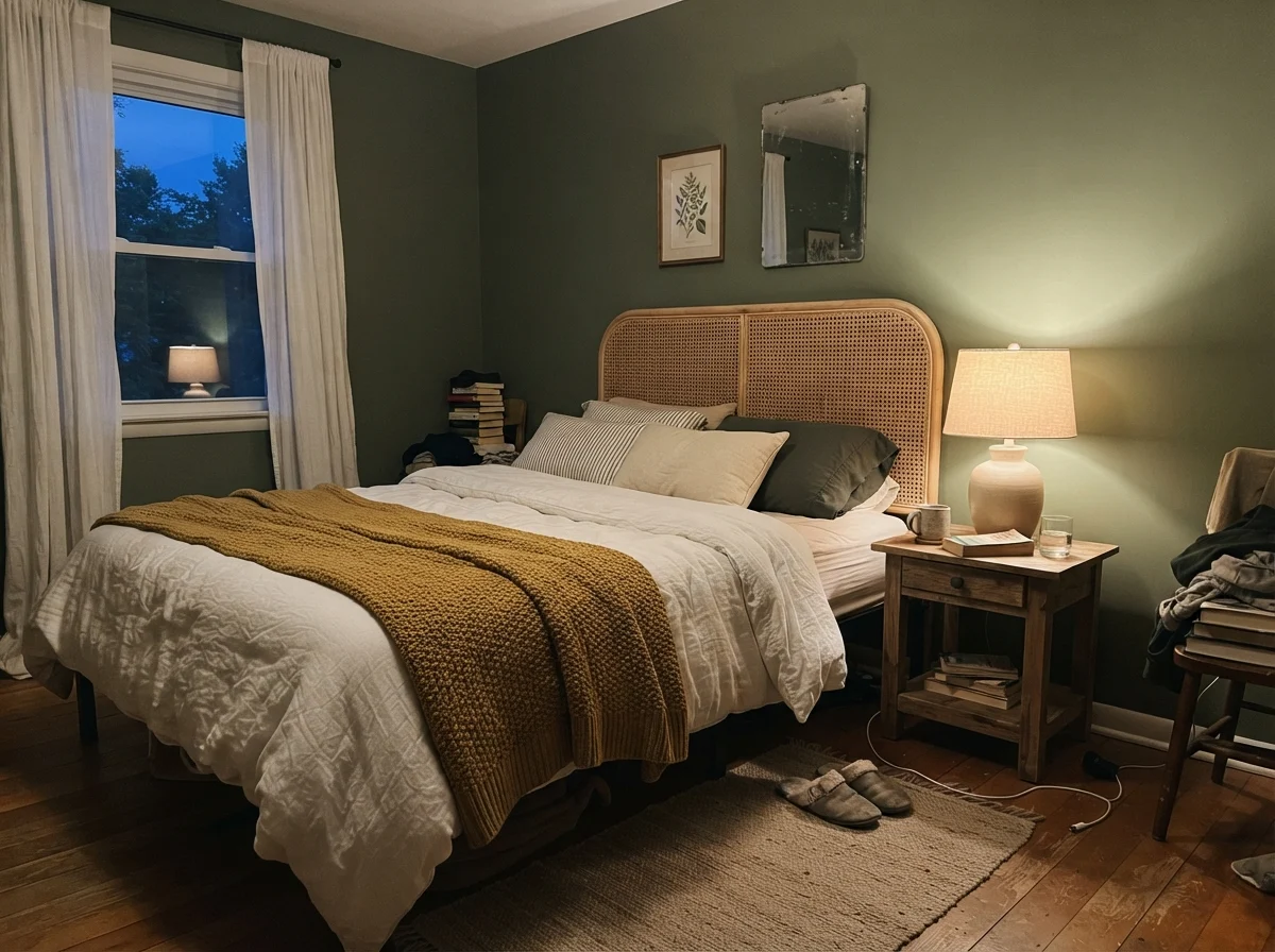
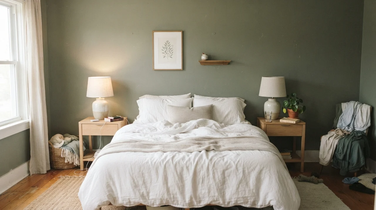
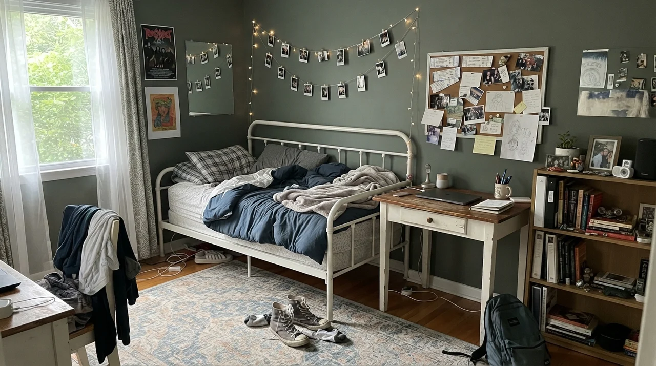
In bedrooms, Rosemary creates a cocooning, quiet sanctuary. When we repainted the guest bedroom in our current 1960s ranch, I used Rosemary in an eggshell finish on the walls. Paired with washed linen bedding, simple oak bedside tables, and warm table lamps, it feels restorative rather than cavernous. However, if the room lacks decent window light, the walls will suck the life out of your textiles; you must bring in crisp pale linens and light wood tones to keep the space breathing.
Sunrooms, Laundry Rooms, and Hallway Details
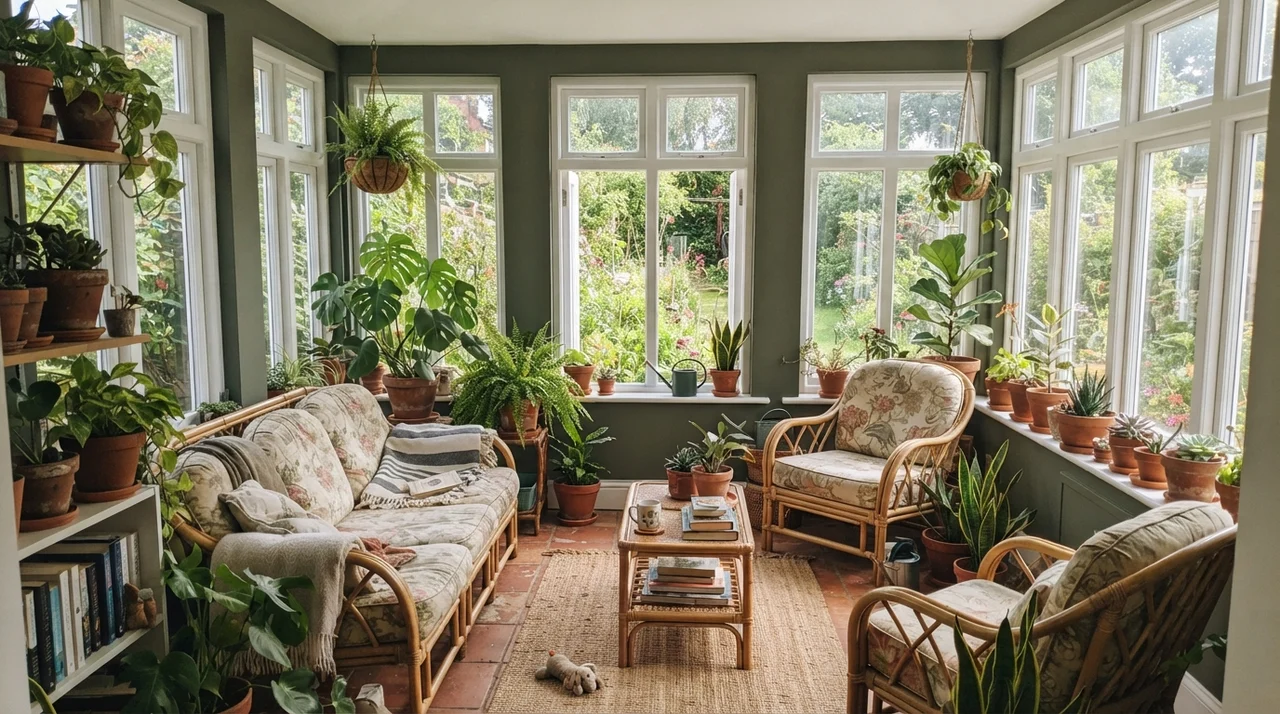
Any room with wrap-around natural light—like a porch conversion or a garden sunroom—lets Rosemary show its finest colors. When surrounded by bright outdoor daylight, the dark green mirrors garden foliage outside the glass, blurring the boundary between your interior and your yard. Terracotta pots, rattan chairs, and leafy plants look completely at home against it.
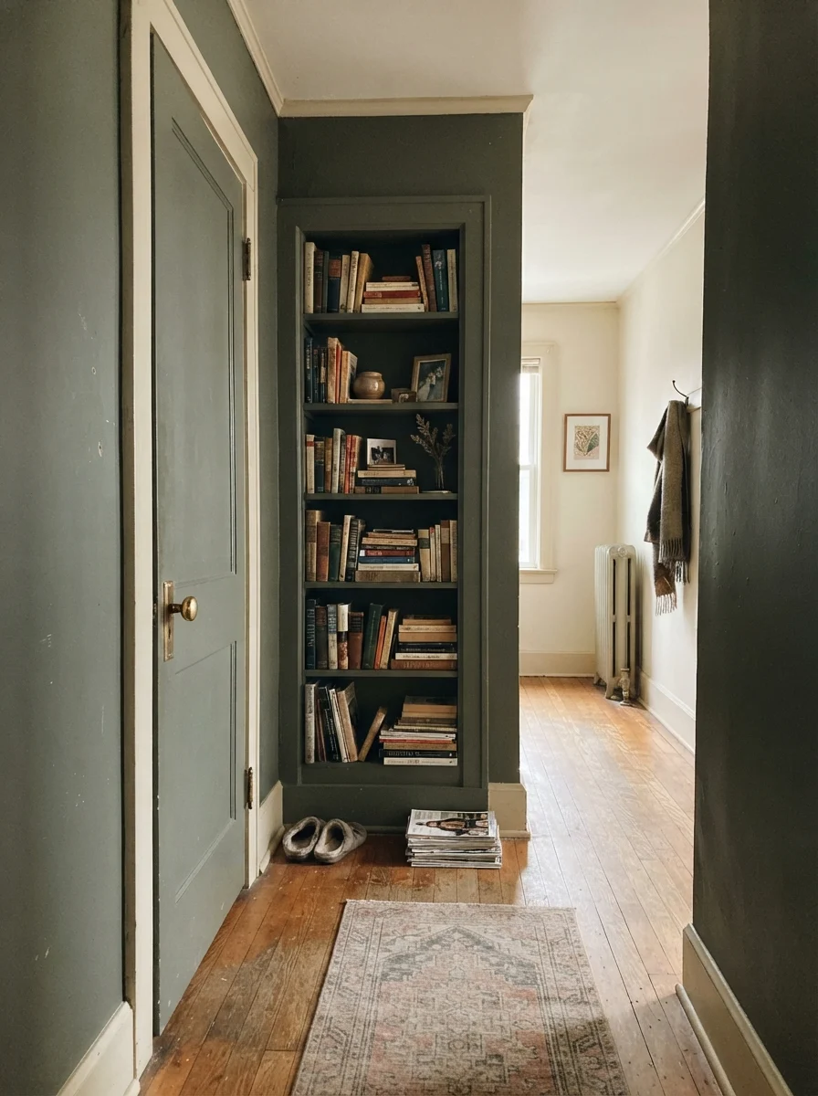
You can also use this color as an architectural accent rather than a whole-room wall paint. Painting a single interior passage door or a set of recessed bookshelves in Rosemary brings instant architectural character to an otherwise plain hallway painted in an off-white like Shoji White or Accessible Beige.
Exterior Siding, Front Doors, and Shutters
Outside, daylight is ten times stronger than inside any house, which means Rosemary never risks turning into charcoal on exterior surfaces. On siding, shutters, or a front door, it reads as a timeless, earthy forest tone that feels rooted in the landscape. It is far more inviting than cold jet black, and it carries more warmth than modern charcoal.
When we refreshed the exterior trim on our colonial before listing it, we painted the front door in Rosemary satin exterior enamel against creamy white siding. The real estate agent told us that three separate open-house visitors asked for the paint name. It sets an immediate tone of calm, established quality.
Where Rosemary Fails: The Honest Mistakes
Nearly every regret story I hear about Rosemary comes down to lighting and flooring collisions. Because Rosemary sits at an LRV near 12, it takes light away from a space rather than contributing any bounce. When a room has no light to spare, that trade goes badly.
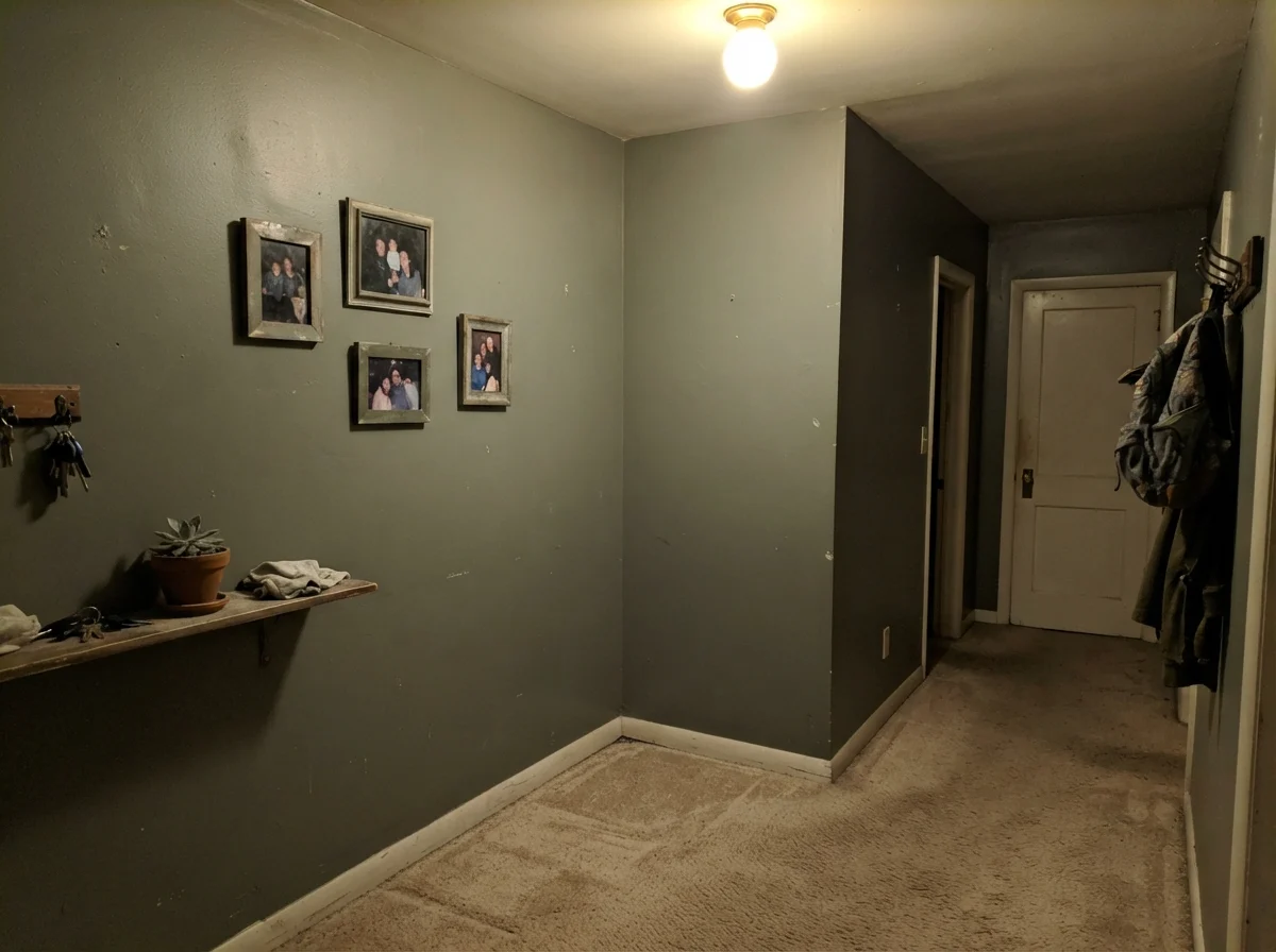
First, windowless interior hallways. If you paint an enclosed corridor with one weak overhead ceiling fixture in Rosemary, the color degrades into a muddy, dingy olive-putty that makes the hallway feel narrow and uninviting. Second, be very cautious if you have 1990s orange-toned builder oak floors. Orange and olive green sit directly opposite each other on the color wheel; the orange floor pushes the green into an unmistakable military army-khaki cast. If your orange floors are staying, you are better off choosing a grayer green like Pewter Green SW 6208 that stays neutral.
Durability, Cleaning, and Sheen Decisions
Let's talk about the practical side of living with a dark paint can. Dark paints show roller texture and flashing far more easily than pale neutrals. If you scuff an eggshell wall painted in Rosemary, touching it up with a brush six months later will almost certainly leave a visible sheen halo. When you paint, buy quality paint, roll floor-to-ceiling in single passes with a wet edge, and save extra paint in a sealed glass mason jar for whole-wall repaints down the road.
For walls in bedrooms, dining rooms, and home offices, eggshell is the correct sheen: it provides just enough wipeability without bouncing harsh glare from lamps. For cabinets, interior doors, and built-ins, stick with a high-grade satin enamel. Satin is scrubbed clean easily when kitchen messes happen, but it does not have the harsh commercial shine of semi-gloss. For exterior doors and shutters, an exterior satin enamel will withstand rainfall and garden hoses without fading prematurely.
What is the LRV of Sherwin-Williams Rosemary?
Rosemary has a Light Reflectance Value (LRV) of approximately 12 to 14. This places it firmly in the dark paint category, meaning it absorbs roughly 86-88% of ambient light and requires good daylight or warm fixtures to show its green hue.
What undertones are present in Rosemary SW 6187?
Rosemary is a rich, grayed-down olive green. It has an earthy yellow undertone that keeps it warm in sunny rooms, balanced by a charcoal-slate base that prevents it from looking overly bright or grassy.
Can I use Rosemary on all four walls of a small bedroom?
Yes, but only if the bedroom receives good natural daylight and you use warm 2700K lighting in the evening. Keep the ceiling and trim in a clean off-white like Pure White SW 7005 and balance the dark walls with pale linen bedding and light oak furniture.
What is the best white paint to pair with Rosemary trim or cabinets?
Alabaster SW 7008 and Shoji White SW 7042 are our top recommendations for walls and cabinetry pairings. If you prefer a cleaner, less creamy look for trim, Pure White SW 7005 provides crisp contrast without clashing.
Why does Rosemary look like charcoal gray in my room?
If your room faces north, lacks windows, or uses cool 4000K LED lighting, there is not enough warm illumination to activate the yellow-olive pigments. Under cool or weak light, the color flattens into charcoal.
Susan's Verdict · Grounded Drama That Demands Good Daylight
Rosemary is the color to reach for when you want real architectural weight without the chill of charcoal or navy. On a kitchen island, lower cabinets, built-in study shelves, or a front door, it is close to foolproof and handles real-life family wear with dignity. Just respect its low LRV: give it warm 2700K lamps, pair it with creamy whites and brass, and keep it out of windowless hallways.