Color Diary · No. 62
Shoji White SW 7042: The Off-White That Refuses to Be Rushed
Sherwin-Williams' warm off-white that is really a greige, reviewed honestly: the rooms where it glows, the light that turns it taupe, and the trim mistake almost everyone makes.

Susan HartleyOctober 4, 2026 · 16 min read
Shoji White · Sherwin-Williams SW 7042
Hex#E6DFD3LRV74Undertonescream → warm greige → muted taupe
When we moved into our 1990s colonial back in 2004, the previous owners had painted virtually every square inch of drywall in a builder-grade optic white that felt about as welcoming as a dental exam room. On sunny July mornings, the glare off the two-story foyer walls was enough to give you an instant headache. My immediate impulse was to run to the paint counter and grab a heavy, golden beige—because back then, that was how we corrected cold rooms. But after repainting our previous split-level three times in seven years, I knew better than to swing wildly from one extreme to the other.
I wanted a color that felt like a quiet sigh of relief when you opened the front door. Something that had enough body to soften bright sunlight, enough warmth to flatter the honey oak banister and trim we couldn't afford to replace, but enough lightness that the windowless upstairs hallway wouldn't feel like a mineshaft. That search led me straight to Sherwin-Williams Shoji White (SW 7042). We lived with it across three main living zones for eight years, and five years in, it was still doing the heavy lifting without asking for attention.
Shoji White sits at an Light Reflectance Value (LRV) of 74. In the paint store, nestled among the white swatches, it looks like a soft, creamy off-white. But the very first lesson you learn once you roll it across eight linear feet of drywall is that Shoji White is not an untinted bright white—it is a gentle, warm greige. It holds a subtle cream cast in warm sun, but beneath that sits a delicate gray-green ground that gives it genuine backbone. If you buy it expecting a crisp, gallery-style background for cool white quartz and gray driftwood floors, you are going to be sorely disappointed. But if you have oak floors, unlacquered brass, and real daylight, it is one of the most forgiving neutrals in the entire fan deck.
The Greige Ground Beneath the Cream
Shoji White is a chameleon, but not a random one. Its behavior follows the sun and the color temperature of your light fixtures with complete predictability. Under bright southern sun, the cream surfaces and makes the room feel naturally illuminated and soft. When the sky turns overcast or the room faces north, the cream recedes, exposing the subtle gray-green undertone and shifting the wall into a muted taupe. In the evening under warm 2700K incandescent lamps, it settles back into a cozy, comforting cream.
warm sun
overcast, north light
dusk, rain, cool bulbs
cream → warm greige → muted taupe
Cotton KnitBehr · see diary
Crisp LinenBehr · see diary
Shoji WhiteSW 7042
White DuckSherwin-Williams · see diary
Slipper SatinFarrow & Ball · see diary
How Daylight and Lamps Change the Story
The biggest mistake people make with Shoji White is painting a tiny swatch on one wall at noon, loving the creamy warmth, and assuming it will look that way around the clock. Light shifts throughout the day, and because Shoji White sits at LRV 74 with a complex greige base, it responds dramatically to changing exposures.
In cool early-morning light or rooms with weak northern daylight, Shoji White strips off its yellow-cream coat and reveals its cooler, stonier side. It can look slightly washed out or read as a quiet, pale putty. But the moment warm afternoon sun or a bedside table lamp with a 2700K bulb clicks on, that stony quality vanishes, replaced by a radiant, grounded warmth that wraps around you. Understanding this shift is the secret to loving this color long-term.
The Three Faces of Shoji White
Over thirty years of renovating our homes, I have learned that every neutral has three distinct personalities: what it looks like under full sun, what it does on a gloomy rainy day, and how it behaves when starved of southern exposure. Shoji White demonstrates all three beautifully.
When bathed in generous south-facing or midday sunlight, the walls reflect light effortlessly without ever glaring back at you. The warmth is palpable, making natural materials like jute, linen, and warm wood glow. But let an overcast sky take over or put it in a modest room with a small, shaded window, and the color pulls inward, taking on a subdued, grayed-taupe tone. It rarely looks harsh, but if you expected pure white, that overcast shift will remind you instantly that this paint has color pigment in it.
Bathrooms and Everyday Routines
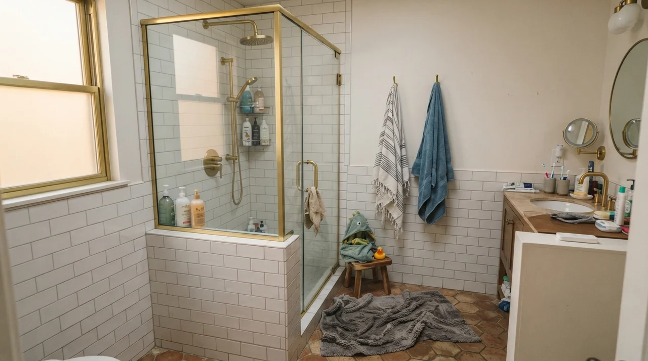
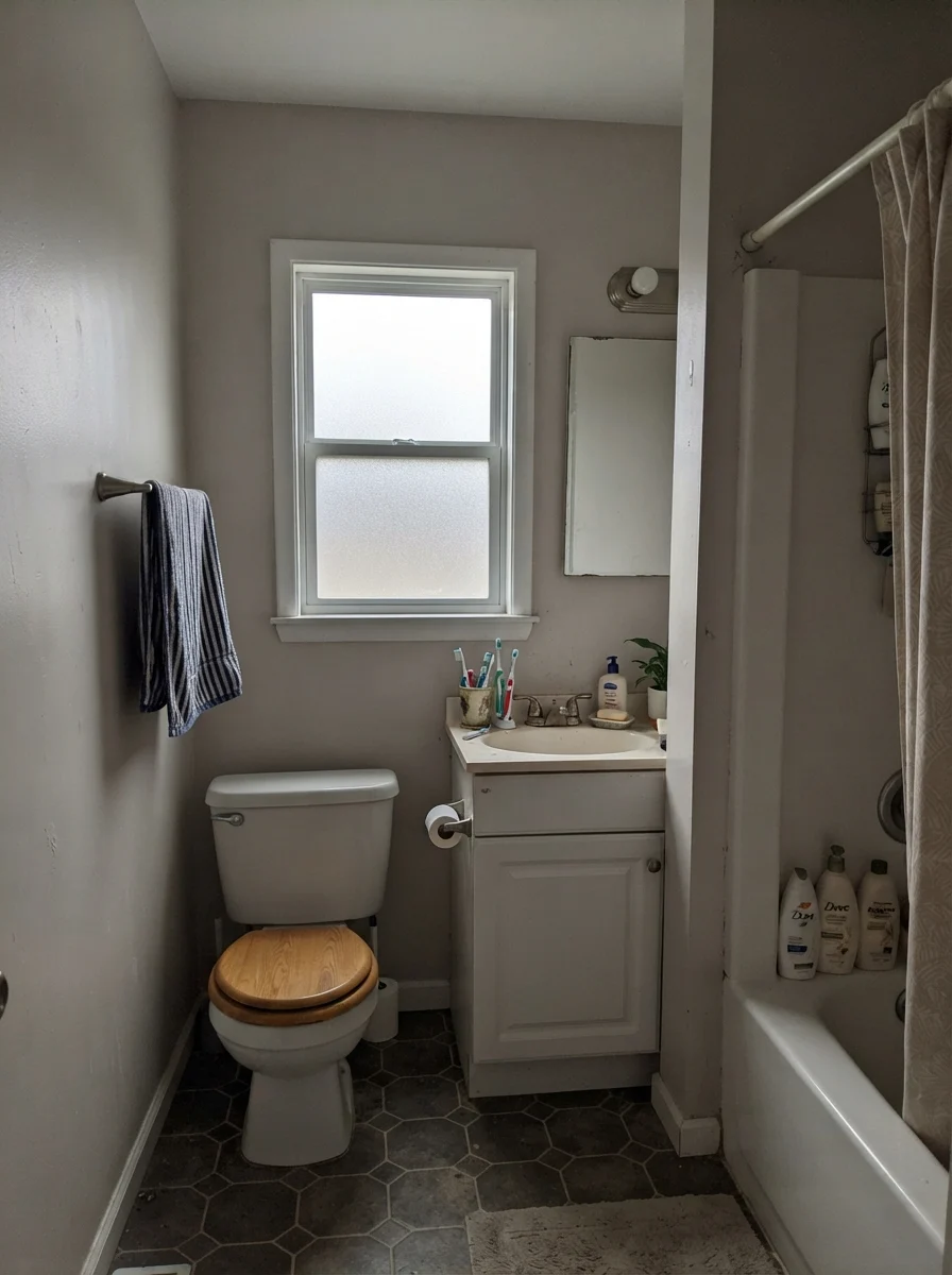
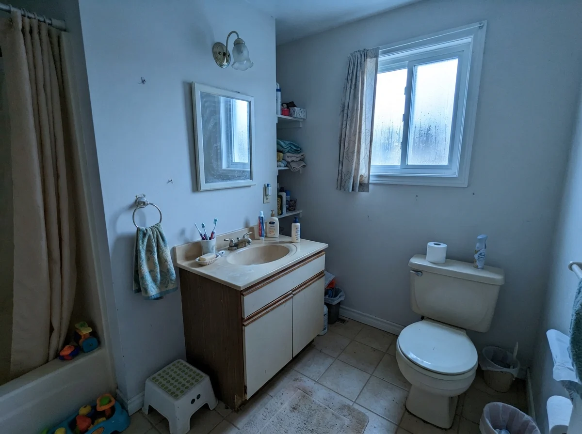
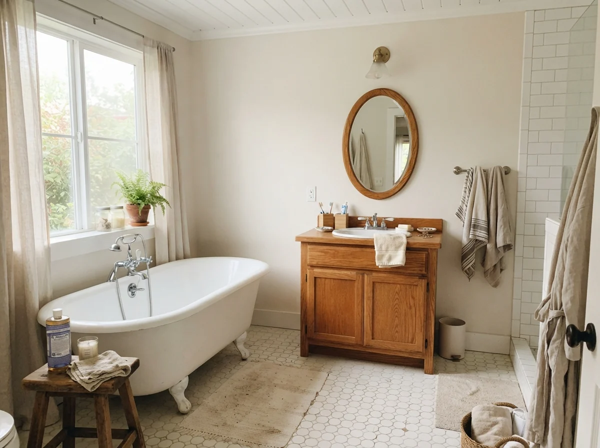
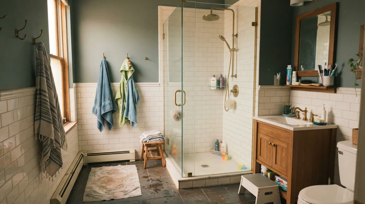
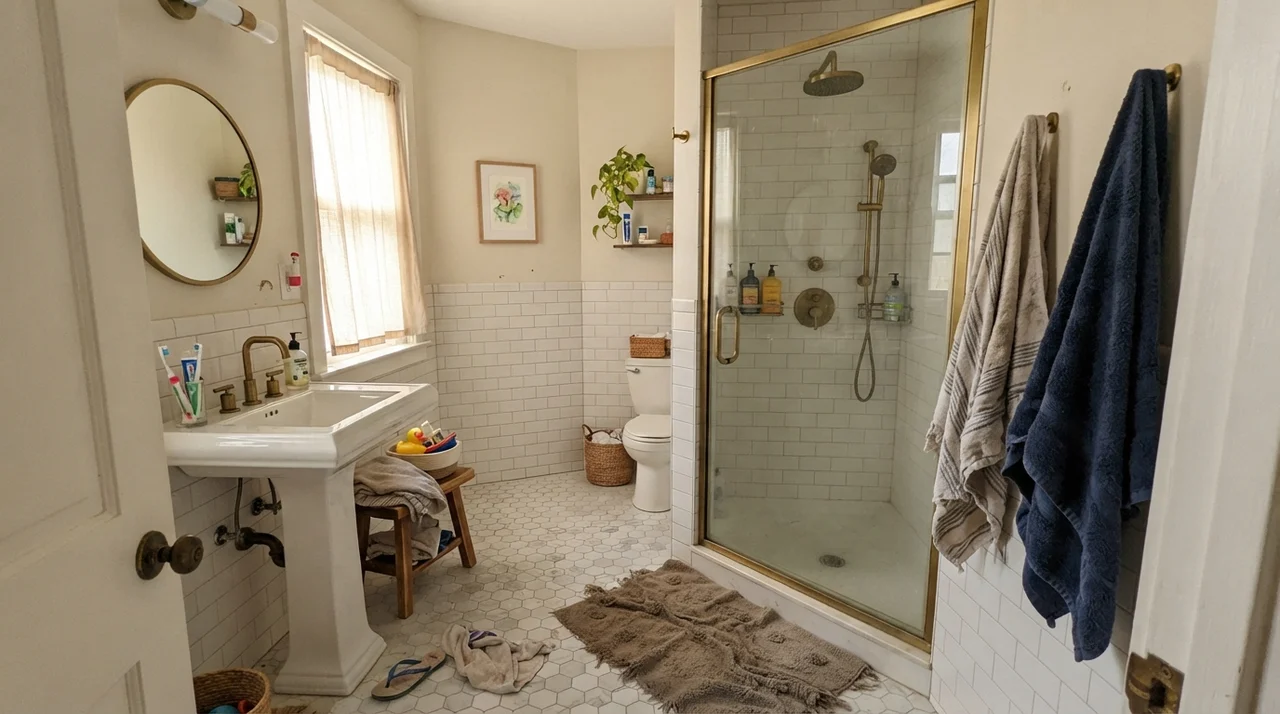
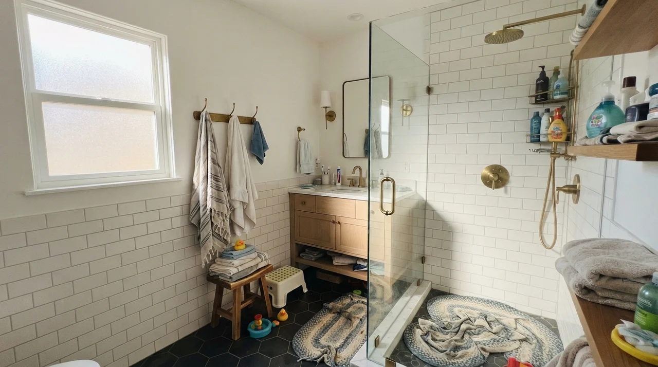
Bathrooms are where off-whites are tested most brutally. You have high humidity, harsh vanity lighting, and stark white porcelain tubs and sinks that will instantly reveal if your wall color has too much yellow or too much gray. In our last house, we used Shoji White in the family bath above white wainscoting, and it hit the exact sweet spot we needed.
Because bright white subway tile has zero pigment, placing a bright white paint on the upper wall can make the space feel sterile and cold. Shoji White provides just enough contrast—a gentle step down in value—to make the white fixtures pop cleanly while keeping the room warm and approachable. It pairs effortlessly with warm honey oak vanities, brass plumbing fixtures, and classic clawfoot silhouettes.
Bedrooms and Quiet Spaces
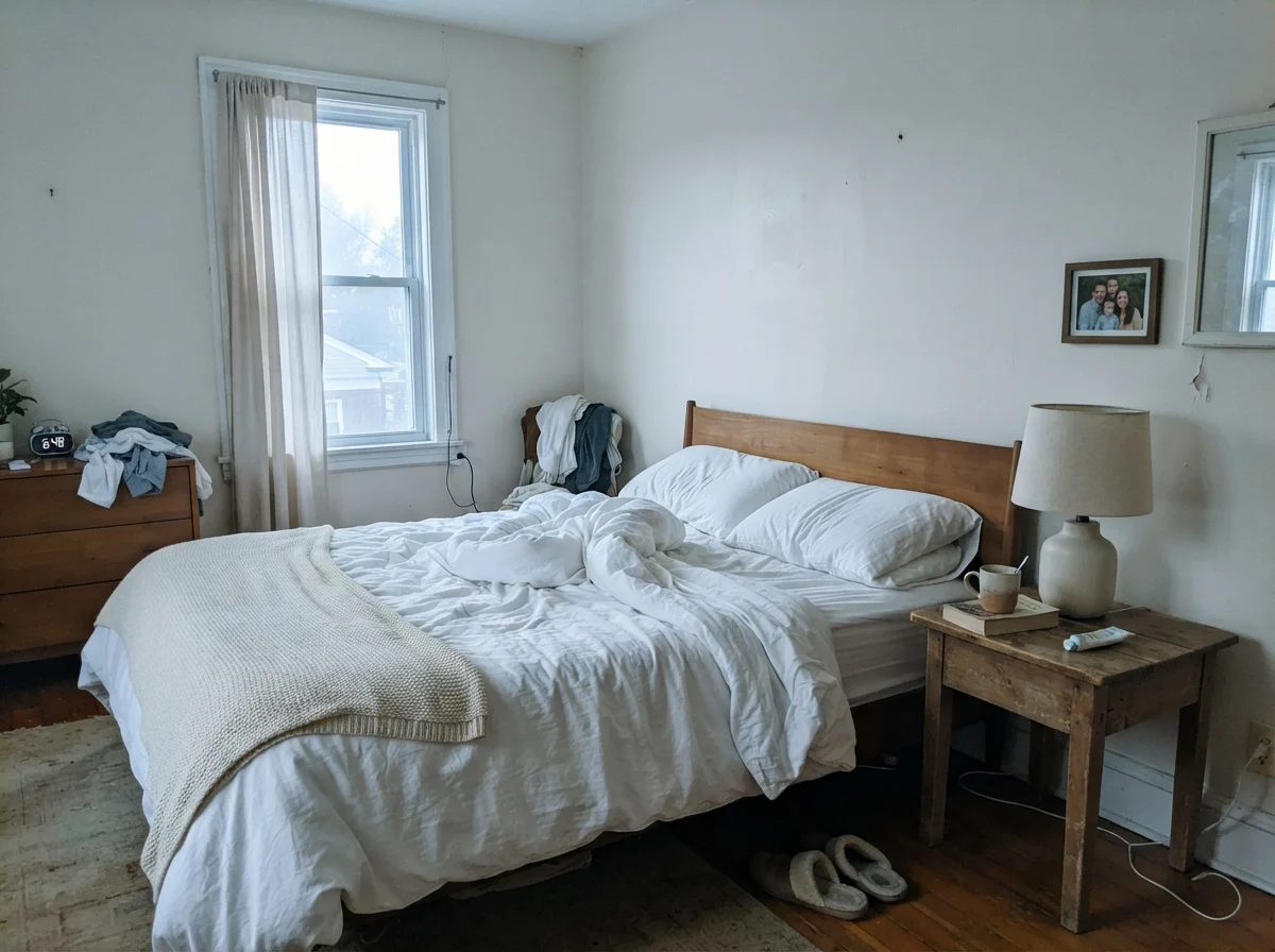
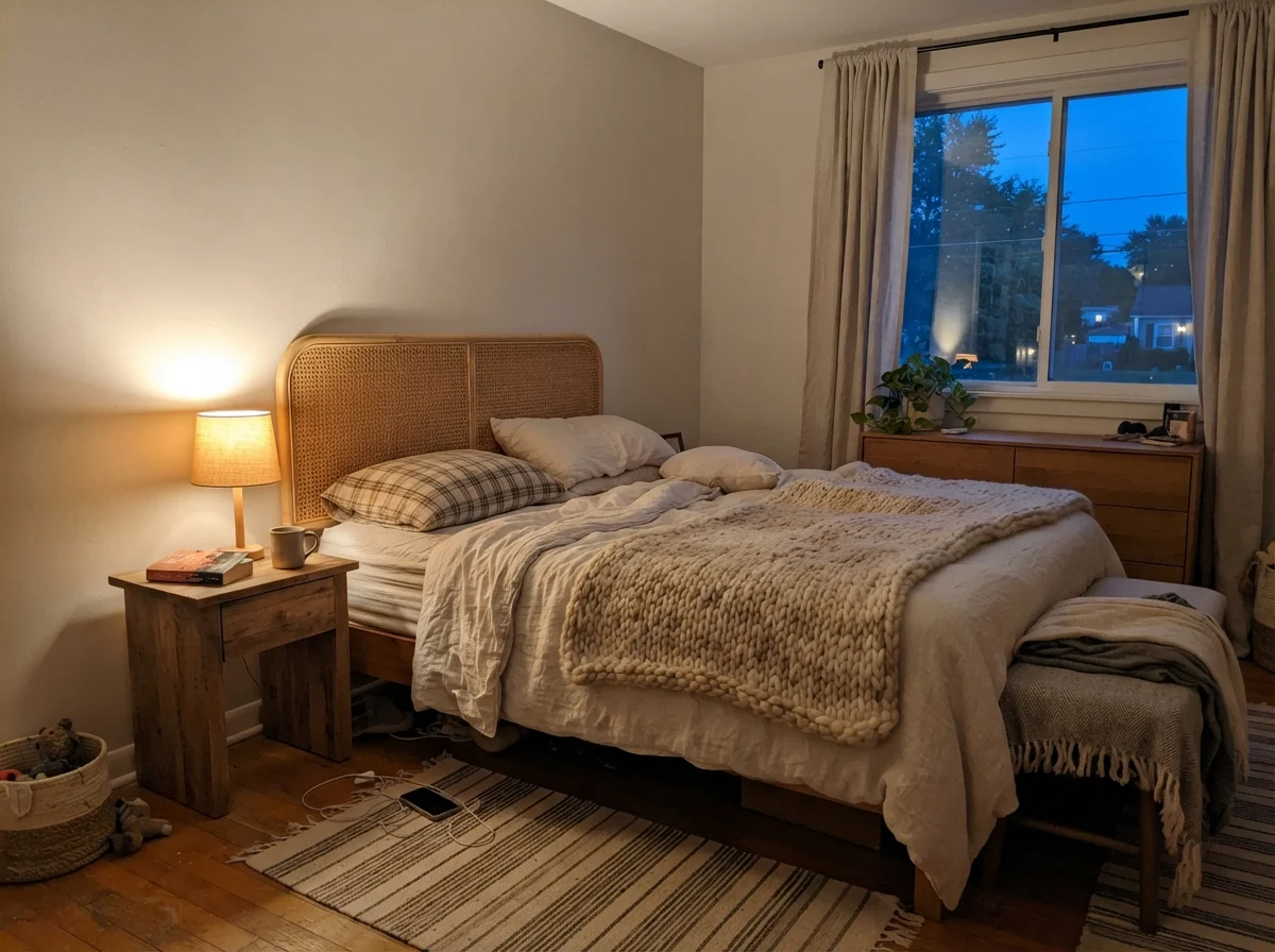
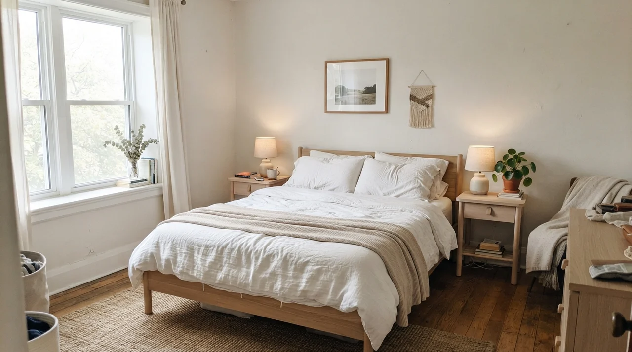
In a bedroom, your paint needs to work under two completely different conditions: when you wake up to natural morning daylight, and when you unwind at night under lamplight. A stark white wall feels institutional under a 60-watt bedside lamp, but a heavy tan can feel suffocating when you throw open the curtains on a bright spring morning.
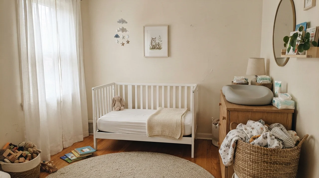
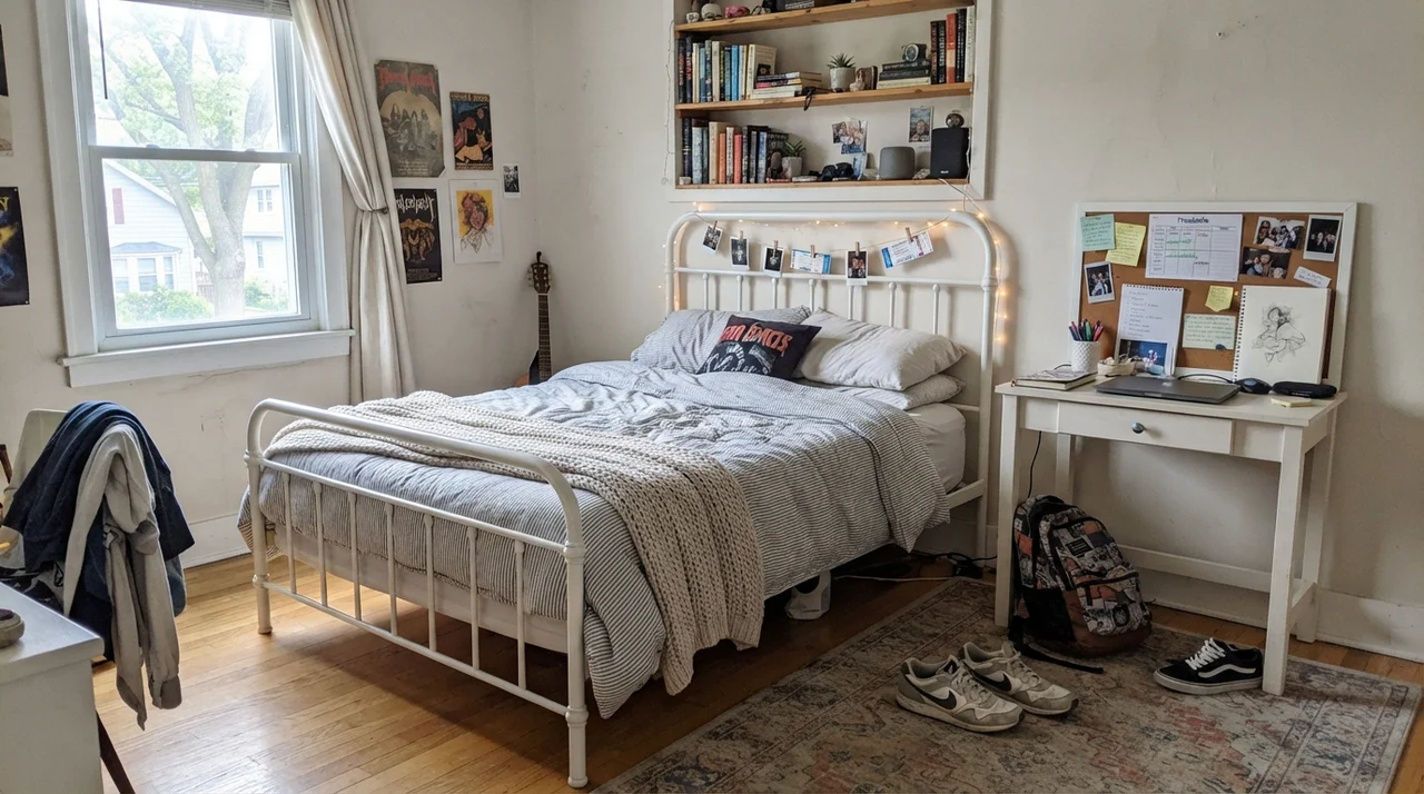
Shoji White excels in bedrooms because it adapts to both rhythms without drama. In a main bedroom paired with crisp linen and pale oak, it creates an atmosphere of grounded serenity. In nurseries and children's rooms, it serves as a soft, adaptable canvas that grows with the child—flattering light-wood changing dressers and white cribs just as comfortably as teenage study desks and bookshelves.
Kitchens and Cabinetry: Where Warmth Matters
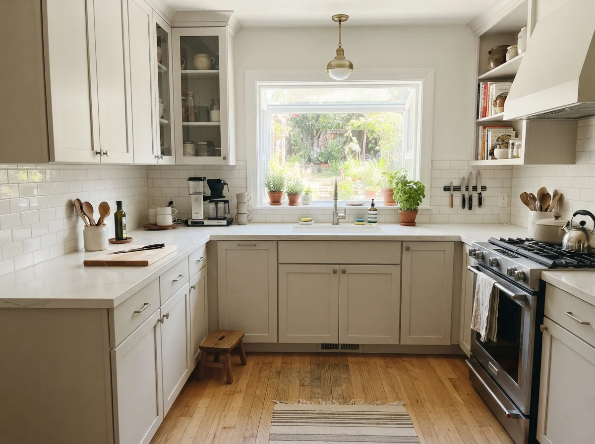
If you have spent any time looking at modern kitchen remodels, you have seen dozens of stark, bright-white shaker cabinets paired with icy marble countertops. It looks striking in magazine photos, but in a real family home with crumbs, messy dinners, and warm hardwood floors, that clinic-white finish can feel uncomfortably sterile. That is why so many homeowners turn to Shoji White for cabinetry.
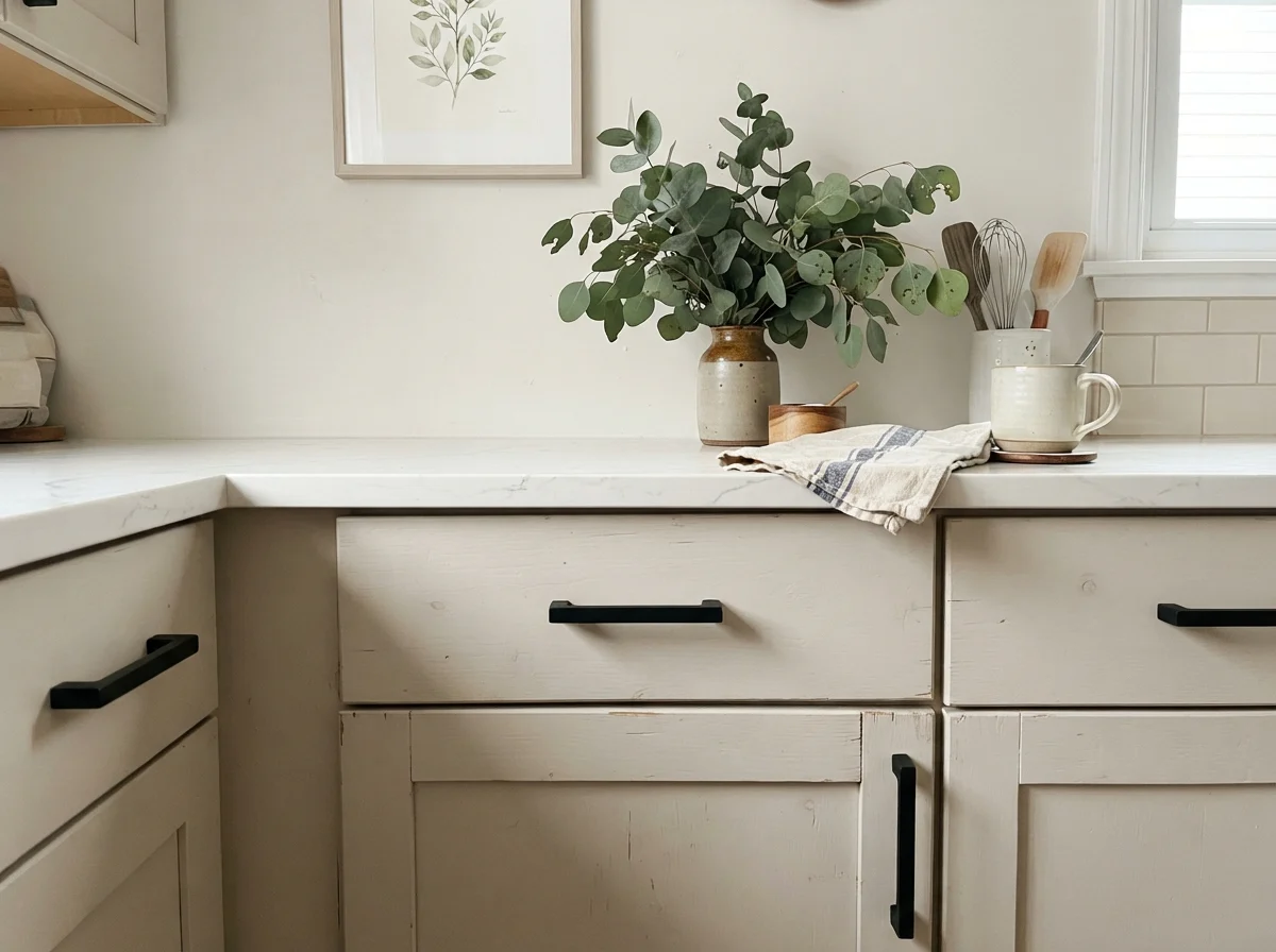
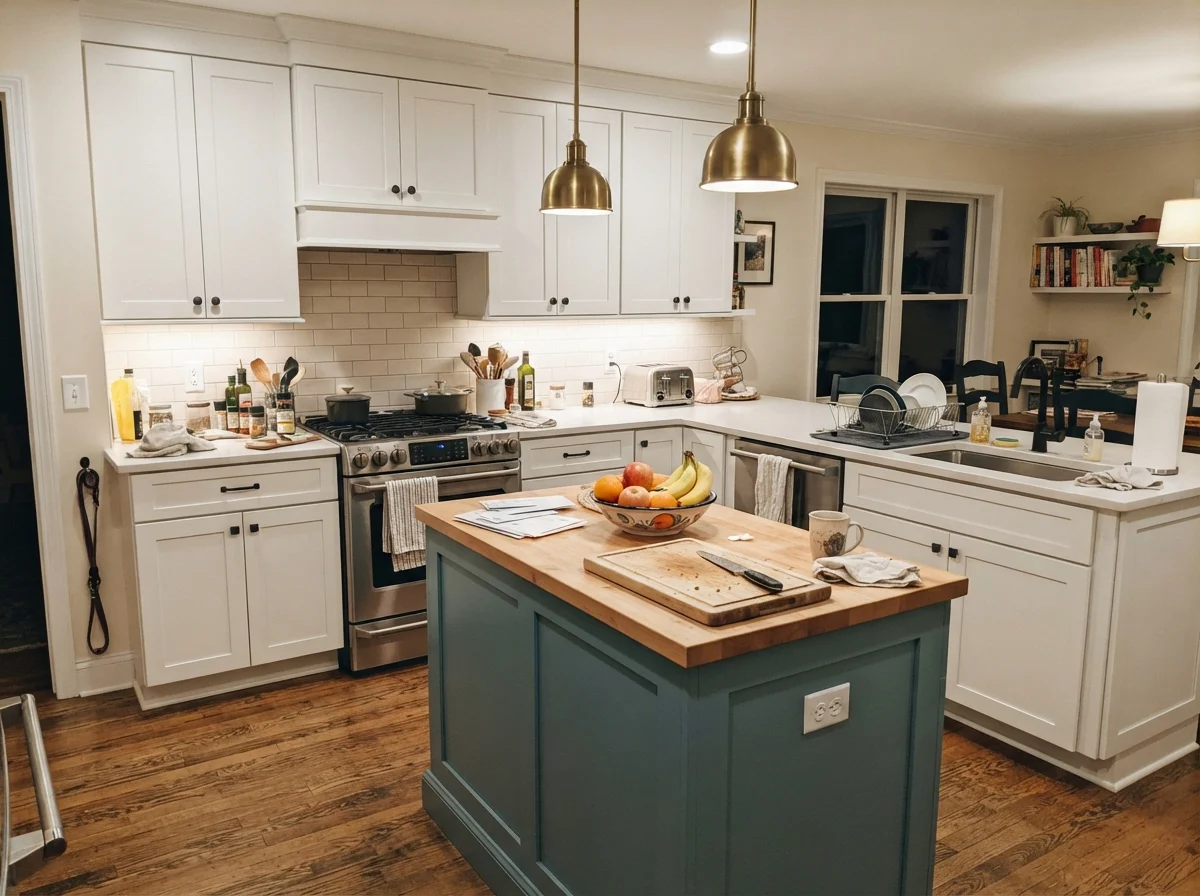
On kitchen cabinets, painted in a durable satin urethane finish, Shoji White looks custom, collected, and mature. It gives shaker doors a soft, furniture-like presence that looks incredible against warm butcher block, natural honey oak flooring, and unlacquered brass hardware. If you are painting only an island while keeping surrounding cabinets crisp, it provides a subtle, grounding two-tone effect without making the island look like an afterthought.
When you use Shoji White on a kitchen island under warm under-cabinet lights, it ties everyday kitchen clutter—cutting boards, fruit bowls, and ceramic canisters—into the rest of the room. It feels lived-in and hospitable rather than precious.
Living Rooms, Sunrooms, and Workhorse Utility Spaces
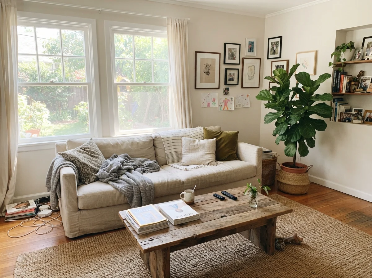
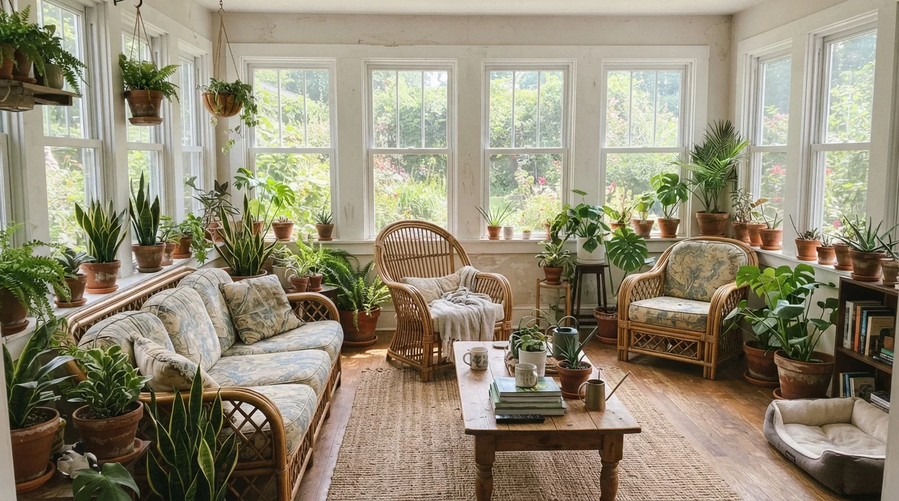
In living rooms and sunrooms with multiple window exposures, Shoji White truly earns its reputation. Because it has enough gray-green pigment to prevent high-noon glare, you can wrap a glass-heavy sunroom in it without needing sunglasses inside. It sits behind rattan chairs, terracotta planters, and lush houseplants like a natural extension of the garden outside.
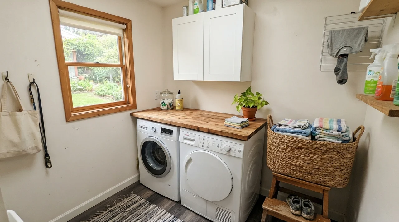
The same balance works in utility spaces. A laundry room with a single window can often feel cramped and forgotten. Painted in eggshell on the walls with crisp white utility cabinetry and a warm butcher-block folding counter, Shoji White turns a purely functional chore room into a bright, pleasant corner of the home.
You don't choose a wall color for the weekend you paint it. You choose it for year four, when the light has faded it half a shade and you've scrubbed the same spot by the door handle a hundred times.
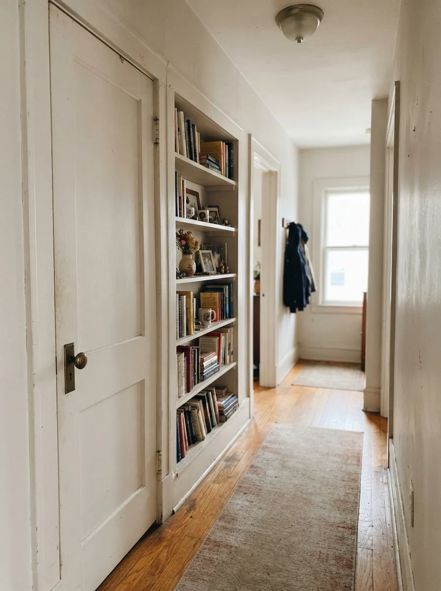
Where Shoji White Fails: The Muddy Hallway Trap
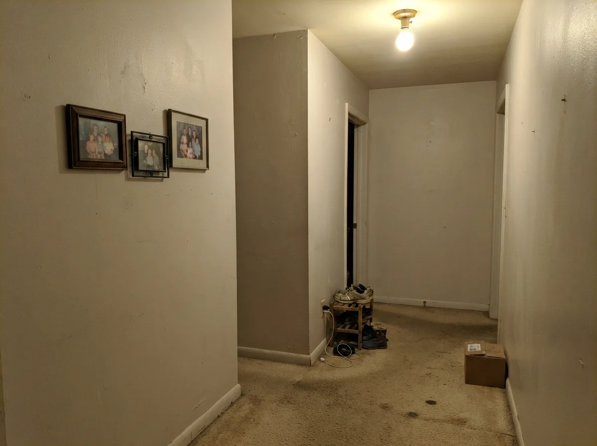
I promised you honest assessments, and here is where Shoji White can go completely sideways: windowless, dim hallways illuminated by a single, cheap overhead fixture. Because Shoji White relies on natural daylight to elevate its cream tones, starving it of light causes the color to collapse directly into its base pigment.
In a dark corridor, especially over older beige carpet, Shoji White stops reading as an intentional off-white and settles into a flat, dreary, muddy putty. It looks like an unwashed rental wall from 1985. If you have a closed hallway with no exterior windows, do not rely on Shoji White to create brightness out of thin air. In those spaces, you need a cleaner, higher-LRV white like Alabaster or Greek Villa to reflect whatever artificial lumens you have.
Architectural Accents and Whole-House Flow
Where Shoji White shines exceptionally well is in homes that need a unifying whole-house color that bridges older architectural quirks. In our 1960s ranch, the transition between rooms can feel abrupt if every doorway introduces a new color swatch. Using Shoji White consistently across hallways and public rooms allows the house to breathe, letting wood floors, furniture, and art supply the personality.
It also performs surprisingly well on interior doors and built-in shelving when set against cream or mid-toned walls. With a solid brass doorknob and rows of vintage books, a Shoji White door looks solid, substantial, and architectural rather than standard builder-grade hollow core.
Exterior Siding and Natural Facades
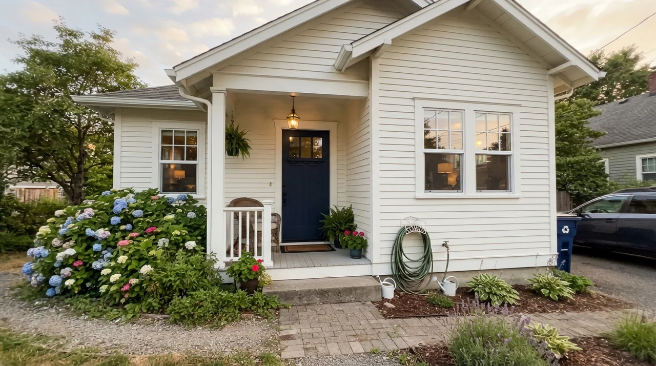
Painting an exterior off-white is notoriously risky. Bright whites that look lovely on an interior swatch card will turn blindingly reflective under full direct sunlight, wiping out architectural texture. Shoji White on an exterior facade behaves completely differently.
Because it carries that subtle greige backbone, full sunlight brightens it to a soft, rich parchment rather than a stark, glaring white. It sits beautifully on horizontal siding, stucco, and buff or red brick. When paired with dark trim like Iron Ore (SW 7069) or Urbane Bronze (SW 7048) and a dark navy front door, it gives a house timeless, grounded curb appeal that looks established on day one.
The Trim Mistake Almost Everyone Makes
Here is the trim trap that catches hundreds of homeowners every year: people buy Shoji White for their walls, know that it is a warm color, and instinctively grab another warm white—like Alabaster (SW 7008)—for the baseboards, doors, and crown molding. It sounds logical on paper: warm walls, warm trim.
In the room, however, it looks awful. Alabaster carries a yellow-cream undertone. When placed directly against Shoji White's subtle gray-green ground, the two undertones fight immediately. Alabaster ends up looking like dingy, yellowed ivory, while Shoji White looks muddy and dirty next to it. They cancel out each other's best qualities.
The solution is simple: pair Shoji White walls with Sherwin-Williams Pure White (SW 7005). Pure White has just enough warmth that it never turns icy or stark, but it has enough clean brightness to create crisp, unmistakable separation between the wall and the trim. It lets Shoji White read as the soft, intentional neutral it is.
Durability, Cleaning, and Five Years In
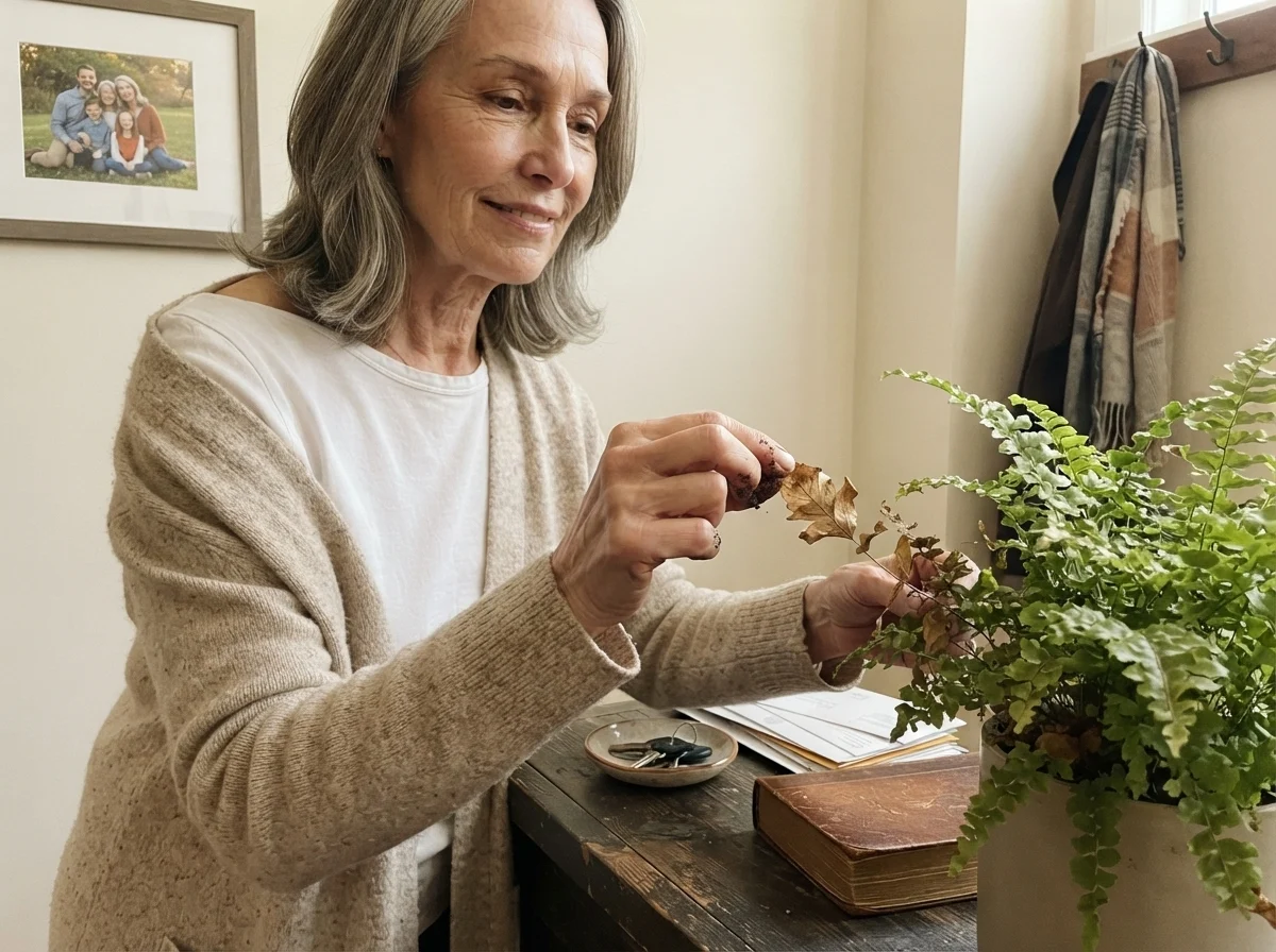
One of the quietest advantages of living with Shoji White over an untinted bright white is how it handles daily family life. In our 1990s colonial, with kids, dogs, and muddy boots coming through the entryway, pure white walls were an ongoing maintenance headache. Every scuff mark, fingerprint, and dog nose smudge stood out like a neon sign.
Shoji White's LRV 74 and greige pigmentation hide everyday scuffs significantly better. On our hallway walls, painted in standard eggshell, minor marks wiped away cleanly with a damp microfiber cloth and mild dish soap without burnishing the finish. Five years into living with it, we hadn't needed a single wall-to-wall repaint—just an occasional spot touch-up around high-traffic door frames. That kind of longevity is worth far more than chasing whatever sterile white trend is circulating on social media this month.
Is Shoji White considered a white or a beige?
Despite the name, Shoji White behaves as a warm greige or light beige on drywall. With an LRV of 74, it carries enough gray and cream pigment that it will clearly contrast against any true white trim or ceiling.
What is the best trim color to pair with Shoji White walls?
Sherwin-Williams Pure White (SW 7005) in semi-gloss is the safest, most dependable choice. It provides crisp, clean separation without looking harsh or pulling out the muddy undertones of Shoji White.
Why does Shoji White look dingy or muddy in my room?
Shoji White looks muddy when placed in dim, north-facing rooms or under cool 4000K LED lighting. Cool light strips the cream out of the paint, leaving the underlying gray-green base exposed. Switching to warm 2700K bulbs often solves the issue immediately.
Can I use Shoji White on my kitchen cabinets?
Yes, provided your countertops and backsplash are warm or neutral. It looks exceptional with butcher block, warm oak floors, and brass hardware. Avoid using it alongside cool gray quartz or blue-gray marble, which will make the cabinets look dirty.
Susan's Verdict · A Masterclass in Everyday Warmth
Shoji White is not the color to buy if you want crisp, ultra-modern white walls. But if you have lived through the era of sterile gray renovations and want your home to feel warm, grounded, and forgiving of everyday life, it is one of the smartest cans of paint Sherwin-Williams sells. Put it in rooms with natural daylight, pair it with Pure White trim, keep it away from dim north corridors, and it will serve your family quietly for a decade.