Color Diary · No. 21
Sherwin-Williams Snowbound: The Soft White That Turns Rosy at Sunset
The designer's default cool-leaning white, reviewed honestly: where it glows, the exact rooms where it turns pink, and what to pick instead.

Susan HartleySeptember 10, 2026 · 12 min read
Snowbound · Sherwin-Williams SW 7004
Hex#EDEAE5LRV83Undertonessoft white → violet-gray → rosy pink
In our last house, a 1990s colonial with oversized windows in the back and a perpetually dim center hallway, I thought I had solved the entire first floor with a single white. I had seen Sherwin-Williams Snowbound (SW 7004) in a dozen designer portfolios. On paper, its LRV of 83 looked like the exact sweet spot: bright enough to bounce light down a long corridor, but soft enough not to look like fresh plaster or unpainted drywall. We bought four five-gallon buckets, had the painters spray the whole main level, and went out for dinner.
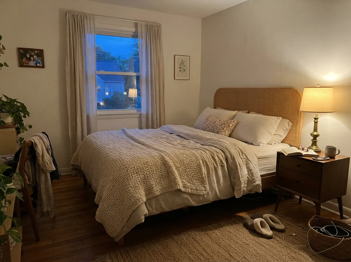
When we walked back into the house around eight o'clock and flipped on the warm table lamps, my husband stopped in the entryway and asked why the foyer looked like strawberry ice cream. He wasn't wrong. Under the 2700K incandescent bulbs, that calm, muted white had pulled a distinct pink-violet undertone out of nowhere, bouncing off our red oak floors like a blush compact.
That is the reality of Snowbound. It is one of Sherwin-Williams' top ten most popular colors for good reason—when you give it generous south-facing daylight and modern white oak finishes, it is quiet, elegant, and completely timeless. But if you put it in a low-light room with warm lamps, or pair it with creamy trim, you will find yourself staring at a wall that refused to stay neutral. Five years in, having lived with it across multiple renovations, here is everything you need to know before opening a can.
The Undertone Profile: Why Snowbound Plays Tricks
Snowbound sits in the Sherwin-Williams white collection with an LRV of 83, making it slightly softer than high-reflective whites like Extra White. What makes it tricky is its gray base with a faint violet-magenta undertone. In natural sunlight, the gray subdues the warmth and makes it read crisp and clean. The moment daylight disappears, or gets replaced by cool north light, that hidden base emerges.
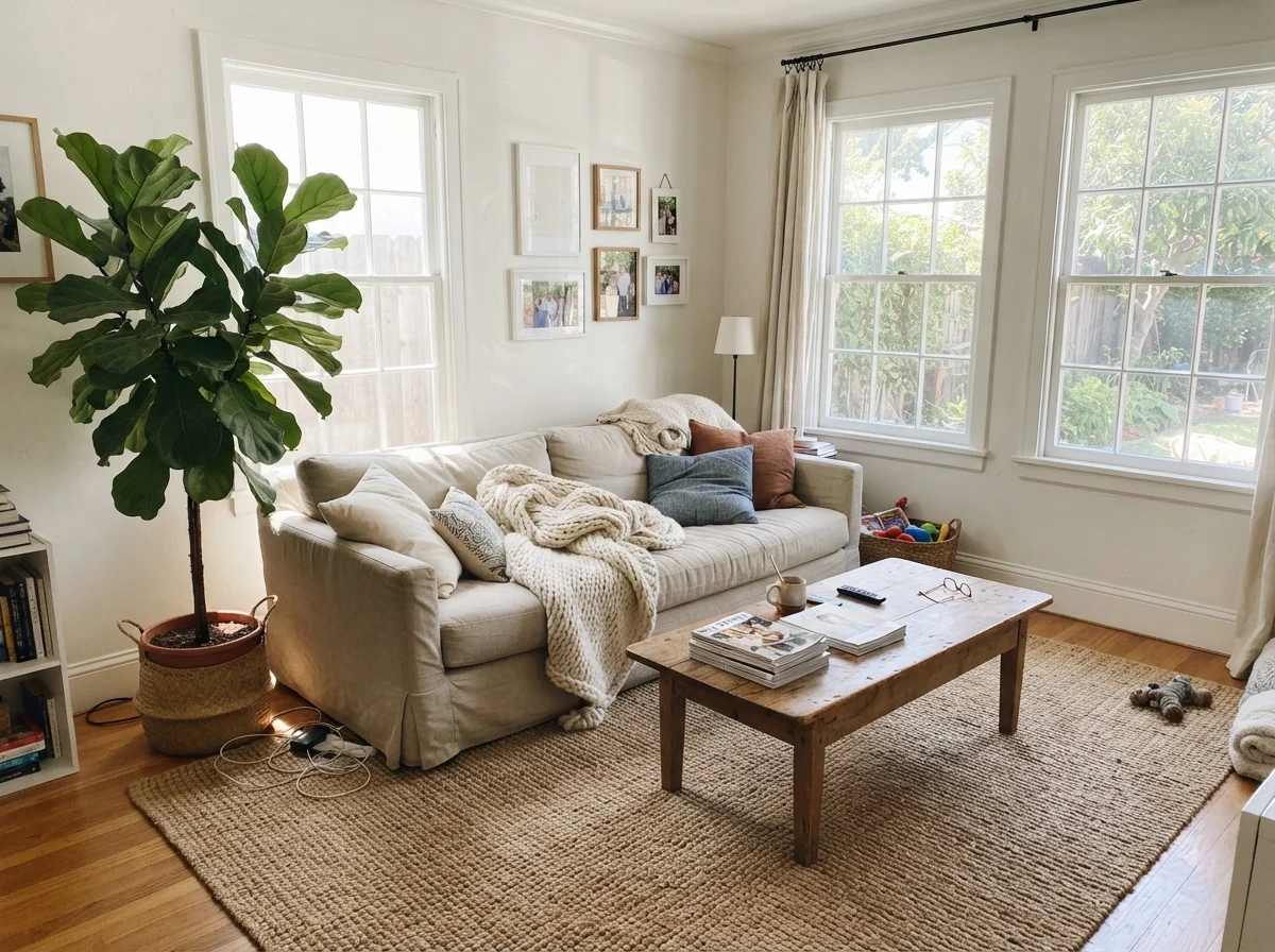
warm sun
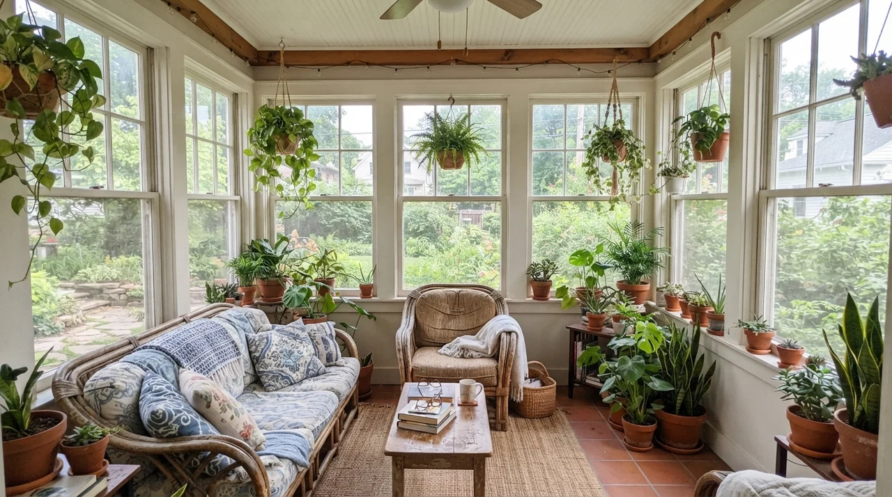
overcast, north light
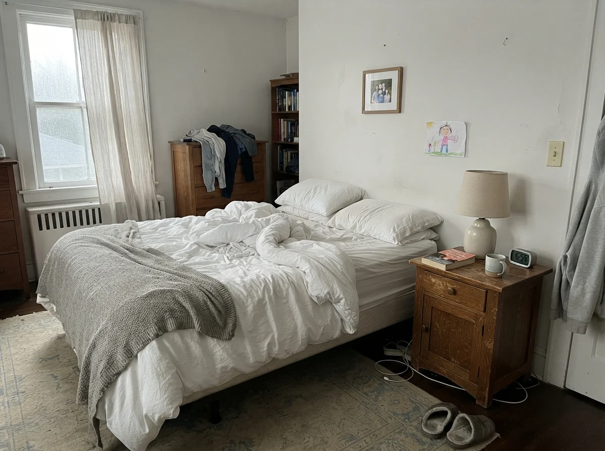
dusk, rain, cool bulbs
Snowbound is chameleon-like: warm afternoon sunlight turns it into a soft, serene white, but flat north light exposes a violet-gray chill, while warm interior lamps pull out a rosy blush.
White SandSherwin-Williams · see diary
Pure WhiteSherwin-Williams · see diary
SnowboundSW 7004
WhiteBehr · see diary
Statement WhiteBehr · see diary
Light Shifts: The Morning Calm and the Evening Blush
The cardinal rule of living with Snowbound is that the room will look like two completely different paint jobs depending on whether the sun is up or down. In the morning, when cool, natural daylight washes over the walls, Snowbound appears very soft, pale, and slightly muted. There is zero glare. You get none of that piercing starkness you find with high-LRV gallery whites.
However, as evening approaches and the artificial lights take over, you have to watch your bulb temperatures closely. Standard warm white bulbs (2700K) feed the pink-violet pigment in the mix. If your floors are red oak, beige carpeting, or warm terracotta tile, that rosy tint bounces directly onto the walls. Switching to 3000K bulbs helps temper the blush, but it will never turn Snowbound into a bone-dry neutral like Pure White.
Living Rooms and Open Spaces: Where Daylight Does the Heavy Lifting
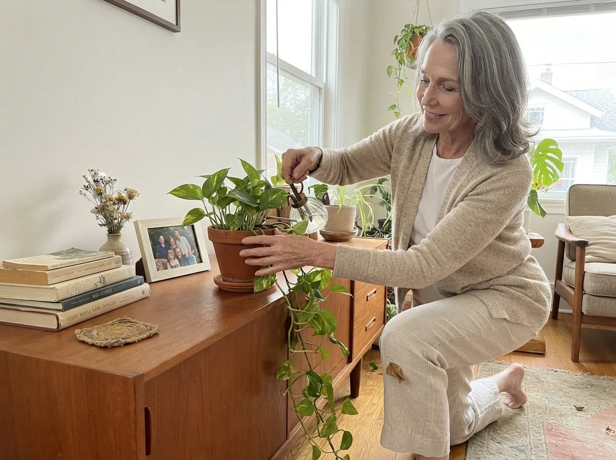
In our current 1960s ranch, the main living room faces south with broad sliding glass doors. Here, Snowbound is at its absolute best. Strong, direct sunlight washes out the pink undertone, leaving a velvety, luminous white that makes our furniture and framed art stand out effortlessly. It doesn't fight natural wood tones, and it flatters unlacquered brass and linen upholstery wonderfully.
We used an eggshell sheen on the walls, which gives enough wipeability to survive grandchildren and dogs without reflecting harsh window glare. If you have an open floor plan that shares light across connected living and dining rooms, Snowbound provides a continuous, cohesive backdrop that never feels heavy or cavernous.
You don't choose a white paint for the afternoon you roll it on. You choose it for how it behaves at eight o'clock at night under a living room floor lamp.
Kitchen Cabinetry: Snowbound's Most Successful Application
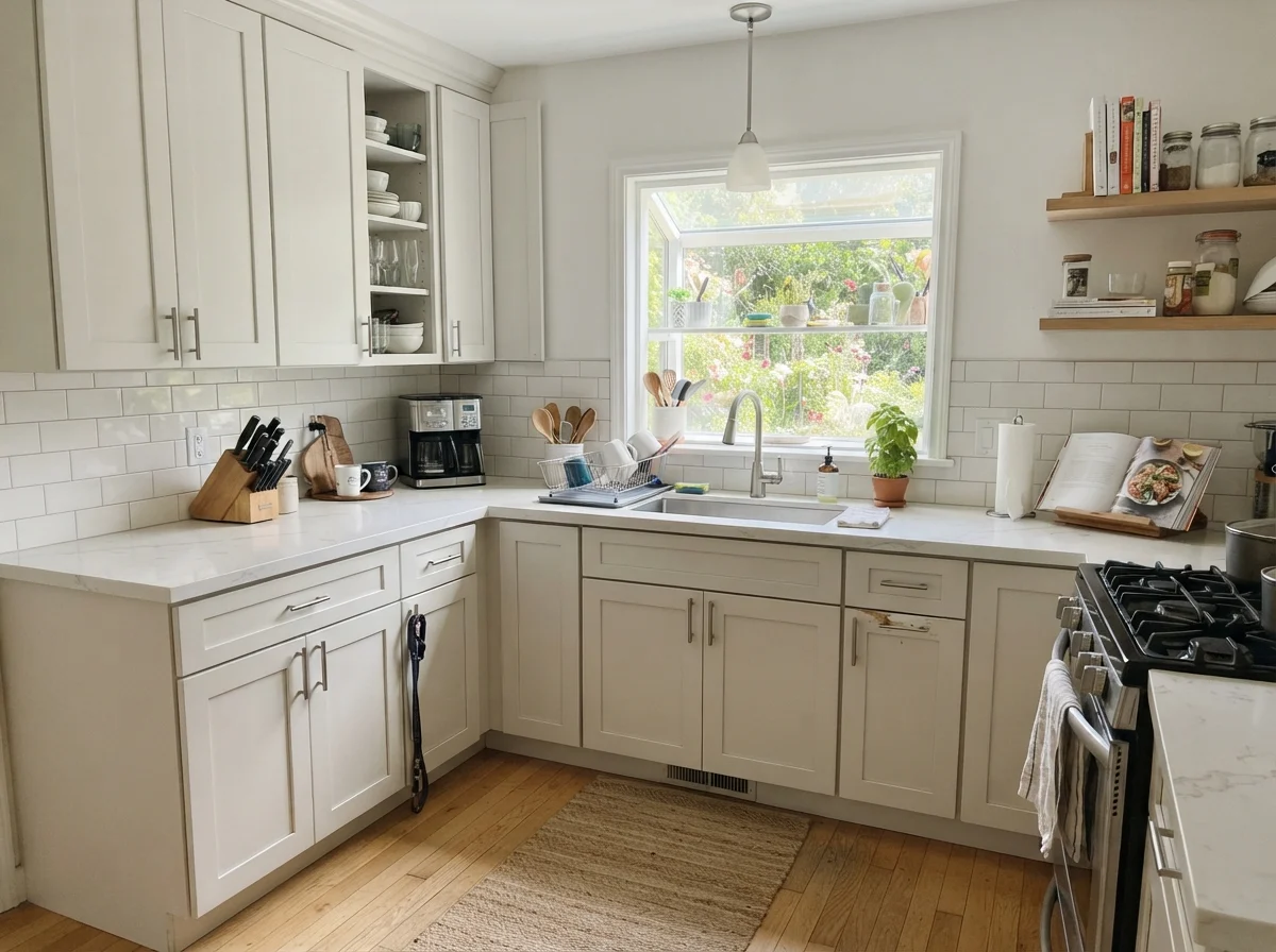
While Snowbound on large interior walls can occasionally surprise you, putting it on kitchen cabinets is where it consistently shines. Because cabinet paint is sprayed in a smooth satin finish, the subtle gray base grounds the cabinetry and keeps it from looking like cheap plastic wrap or primed factory boards.
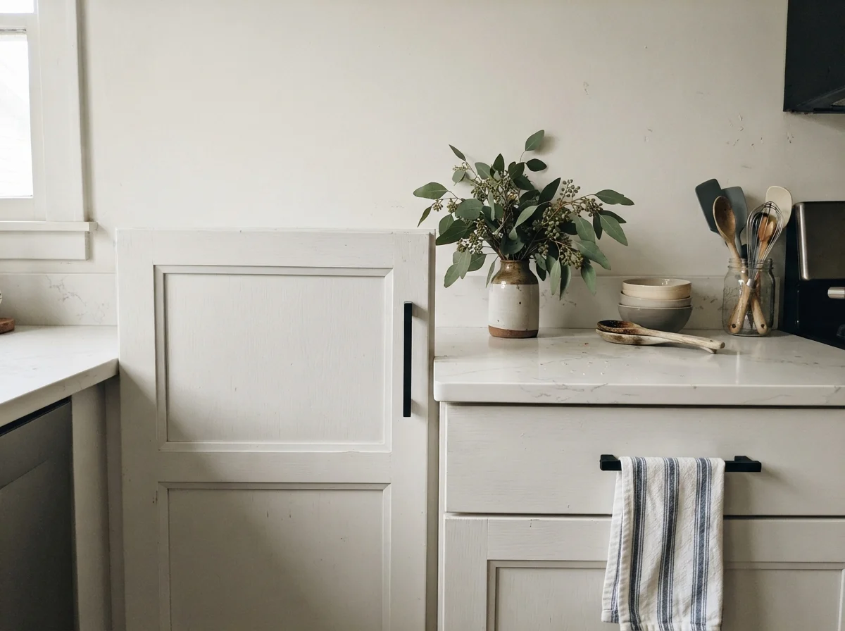
In a kitchen remodel we helped our daughter with two years ago, we sprayed her shaker cabinets with Snowbound and paired them with matte black hardware and white quartz countertops. Against a natural white oak floor, it looked crisp and grounded. If you are doing an island accent or pairing it with surrounding wall colors, keep your walls in the Sherwin-Williams greige family—like Repose Gray (SW 7015) or Agreeable Gray (SW 7029)—which share the exact same grayed undertone structure.
Bathrooms and Bedrooms: Tile Warnings and Calming Backdrops
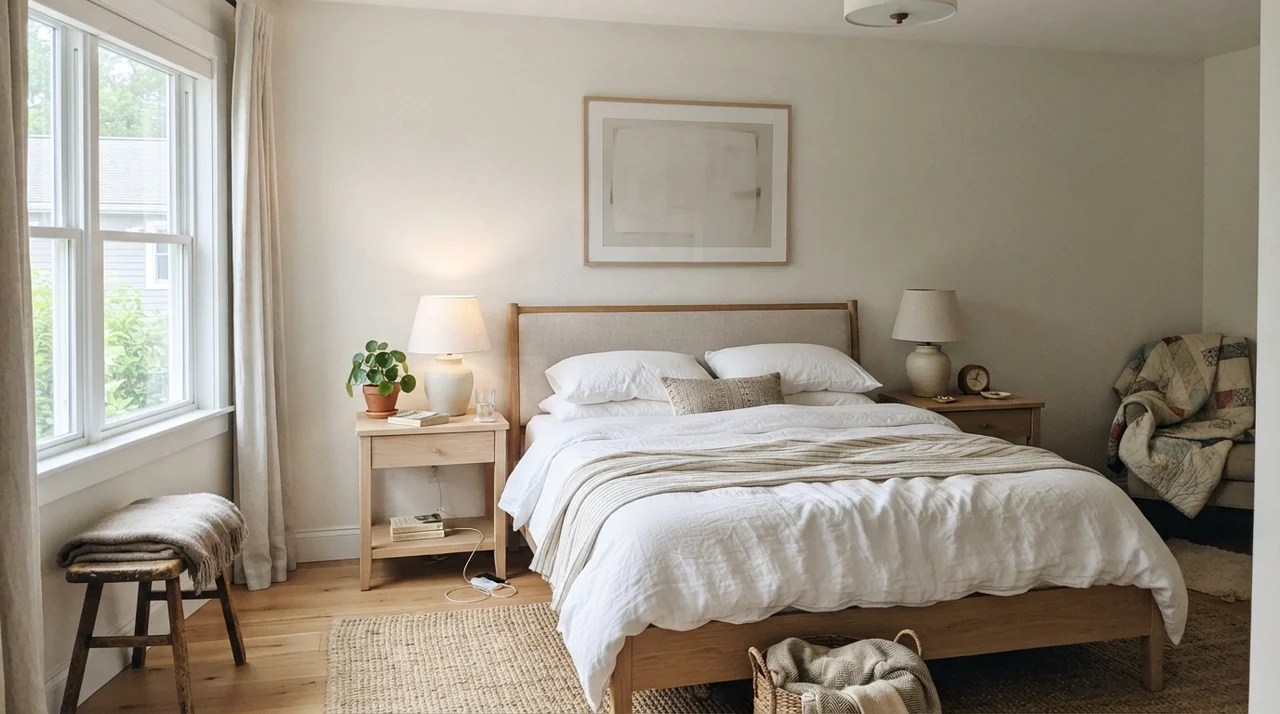
In bedrooms, Snowbound can create an exceptionally restful envelope, provided your textiles don't compete with it. If you throw dusty rose, blush pink, or mauve bedding onto the bed, the wall will immediately pick up that tone and magnify it. But when balanced with crisp white linen, pale oak nightstands, and ceramic lamps, it creates a serene retreat.
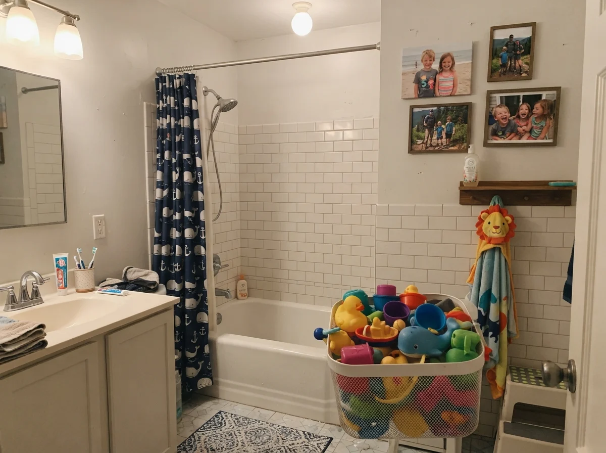
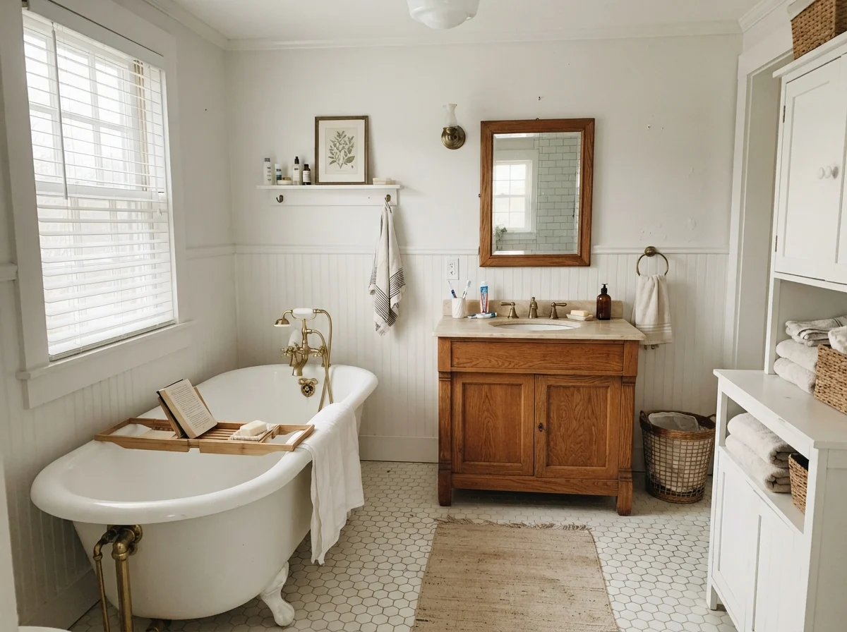
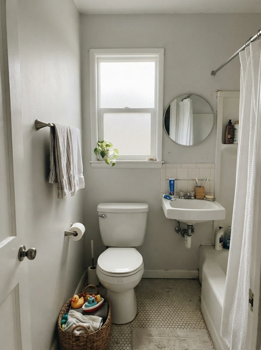
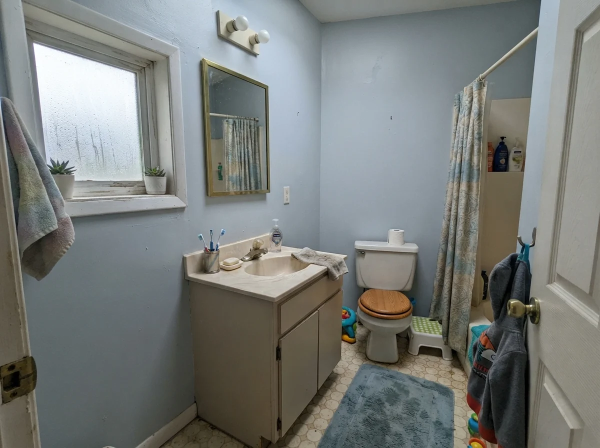
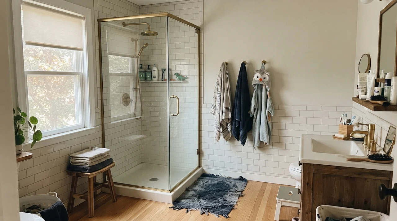
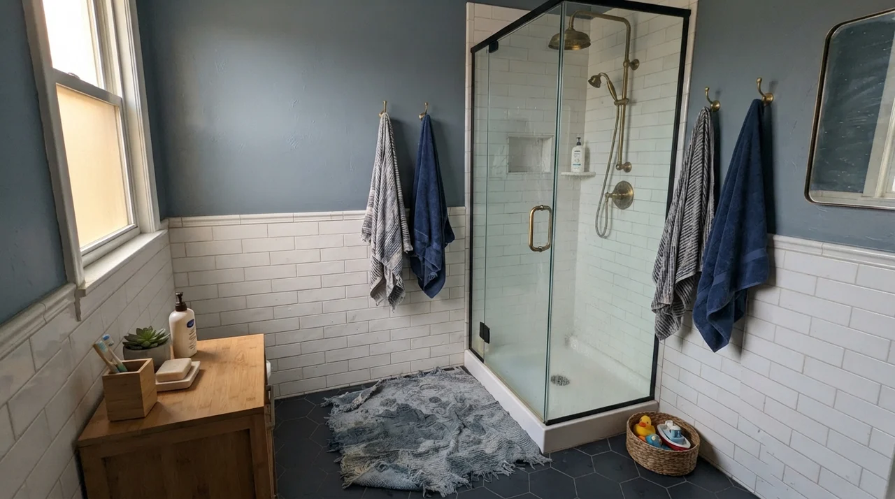
Bathrooms, however, require extreme caution around tile selection. Snowbound looks stunning against classic white subway tile, white hex mosaics, or clean white marble. But if your bathroom has dated beige travertine, pink-tan builder tile, or quartz with warm mauve veining, Snowbound will look dingy and clash instantly. In our split-level's guest bath years ago, we made the mistake of pairing it with 1980s almond fixtures, and it made the fixtures look positively yellow-green.
Bedrooms for Growing Families
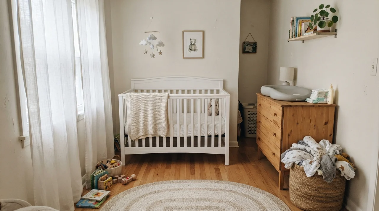
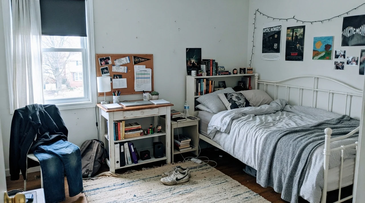
In secondary bedrooms, nurseries, and teenagers' rooms, Snowbound performs well because it transitions easily as furniture and decor shift over the years. In a bright nursery with sheer curtains, it feels soft and gentle against light-wood dressers and woven baskets. In a teen's room with white metal bed frames, corkboards, and bookshelves, it provides a clean backdrop without feeling sterile like an office hallway.
The durability in these rooms comes down to the paint line you choose. For our grandchildren's rooms, we used eggshell in Sherwin-Williams Emerald, and after three years of scuffs, tape marks, and stray toys, the walls have scrubbed clean every time without burnishing.
Doors, Trim, and the Infamous Windowless Hallway
One of Snowbound's greatest strengths is its ability to handle both walls and trim within the same home. When you use Snowbound in an eggshell finish on the walls and semi-gloss on the baseboards, doors, and built-ins, the difference in sheen creates a subtle, tailored contrast without introducing competing undertones.
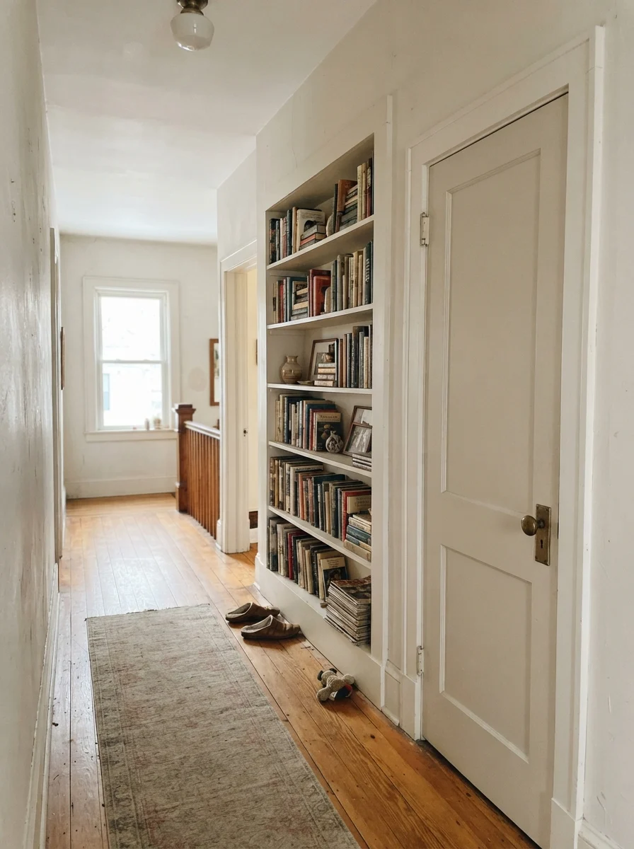
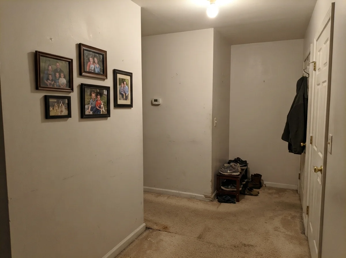
However, you must be ruthless about hallway lighting. If you have a dark interior corridor with no windows and older beige carpeting, Snowbound will look flat, putty-colored, and muddy. This is where homeowners get disappointed and wonder why their walls look dirty. If you cannot bring natural light or upgraded 3000K lighting into a windowless hall, do not use Snowbound there.
Exterior Siding: How Snowbound Becomes a Whole-House Color
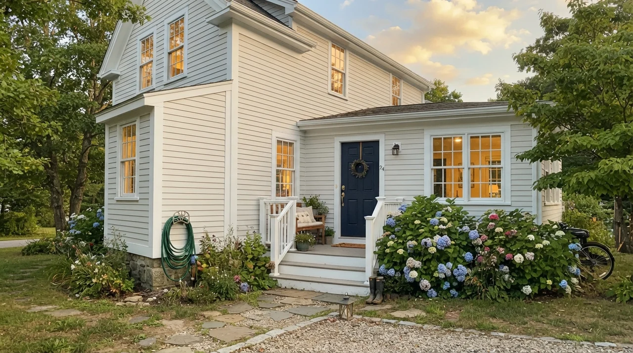
When used on house siding, Snowbound takes on an entirely fresh personality. Outside, under intense open daylight, the gray base keeps the color from blinding the neighborhood, reading as a clean, soft white rather than a harsh primer coat. It pairs smartly with dark navy or charcoal front doors, crisp white trim, and natural landscaping.
The only caveat on exteriors is shade. On the north-facing or heavily shaded side of a house, especially under heavy tree cover, Snowbound can pull slightly violet-gray on cold, rainy days. Keep your samples large and check all four sides of the house before committing to a full exterior spray.
Durability, Resale, and the Five-Year Test
When you live with a paint color for five years, your opinion stops being about swatch cards and starts being about how it survives a vacuum cleaner bumping into the baseboard. In our experience, Snowbound in an eggshell wall finish held up remarkably well to regular wipe-downs around light switches and door frames. Because it is not a bright chalky white, small scuffs do not jump out at you the way they do on pure builder whites.
From a resale standpoint, Snowbound is worth the money if you are repainting an entire home before listing. When we sold our colonial, the listing agent pointed out how clean and airy the main living areas felt in the photographs. Buyers loved the transitional look. Just make sure your painter uses flat on the ceilings, eggshell on the walls, and semi-gloss on the trim. That combination gives you a unified, upscale envelope without distracting line breaks overhead.
Why does Sherwin-Williams Snowbound look pink on my walls?
Snowbound has a gray base that contains a faint violet-magenta undertone. When exposed to warm artificial light (such as 2700K incandescent or LED bulbs) or when bouncing off red oak flooring, that undertone surfaces and makes the wall appear soft pink or rosy.
What ceiling paint should I use with Snowbound walls?
The cleanest look is Snowbound itself in a flat sheen on the ceiling. This creates a cohesive shell without a jarring bright white glare. If you want a dedicated ceiling white, standard Sherwin-Williams Flat White works well.
Does Snowbound go well with Agreeable Gray or Repose Gray?
Yes, exceptionally well. Snowbound shares the same grayed undertone structure as Repose Gray (SW 7015) and Agreeable Gray (SW 7029). It is one of the most popular trim and cabinet whites to pair with those greige wall colors.
Is Snowbound too stark for a north-facing room?
It is not too bright or stark, but it can read flat, cold, and slightly mauve-gray in dim north light. If your room faces north and gets limited daylight, a warmer white like Shoji White (SW 7042) or Pure White (SW 7005) is usually safer.
Susan's Verdict · A Gorgeous White That Demands a Sample Test
If you have a daylight-filled room, modern oak accents, and greige or cool-neutral trim, Sherwin-Williams Snowbound is one of the softest, most flattering whites on the market. It gives you all the freshness of a modern white without the cold sterility of a hospital wing. However, do not skip sampling it on a large poster board first. Move that sample from morning sun to evening lamp glow, especially near your floors. If you respect its undertone, you will love living with it for years.