Color Diary · No. 65
Sherwin-Williams Tradewind: Finding the Line Between Spa Blue and Muddy Gray
Sherwin-Williams' coastal blue-green-gray, reviewed honestly: the light where it glows, the light where it goes flat gray, and why it's suddenly showing up on kitchen cabinets, not just walls.

Susan HartleyOctober 6, 2026 · 14 min read
Tradewind · Sherwin-Williams SW 6218
Hex#C2CFCFLRV61Undertonesgreen → gray → blue
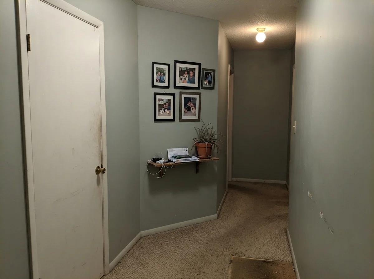
In our last house, I spent nearly eighteen months trying to talk myself into painting our main hallway and back bath a safe, colorless gray. It was the early 2010s, and every magazine cover told us that if a room had color in it, you were practically burning your home equity on the front lawn. We painted that bathroom a flat, slate greige, lived with it for three years, and every time I walked in on a cloudy Tuesday morning, the space felt like an empty concrete stairwell. When we sold that house, the new buyers repainted it within two weeks—and they were entirely right to do so.
That experience cured me of choosing colors out of fear. When we bought our 1960s ranch, I promised myself that if a room called for color, I would give it actual color, not a beige wearing a disguise. That is where Sherwin-Williams Tradewind (SW 6218) enters the conversation. Tradewind sits at an interesting crossroads: it is a genuine coastal blue-green-gray. With a Light Reflectance Value (LRV) of 61, it has enough bounce to keep a tight space feeling open, but it carries enough pigment to read as an intentional, deliberate choice on four walls. It does not apologize for being a blue-green, and that is precisely why so many homeowners are drawn to it—and why a few end up deeply disappointed when they put it in the wrong room.
How Daylight and Bulbs Shift Tradewind Across the Day
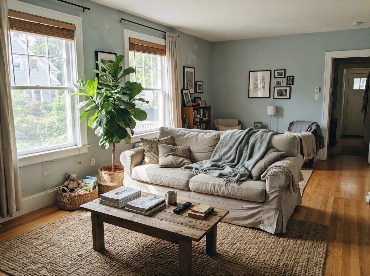
Here is the reality of living with a color like Tradewind: it does not stay frozen in the state you see on the two-inch paint swatch at the store counter. In bright daylight, Tradewind reads exactly as advertised—a clean, crisp, breezy coastal blue-green-gray. That is the face that sells the sample chip and populates design boards. The blue and green notes harmonize with the gray, keeping the room feeling fresh, open, and undeniably relaxed.
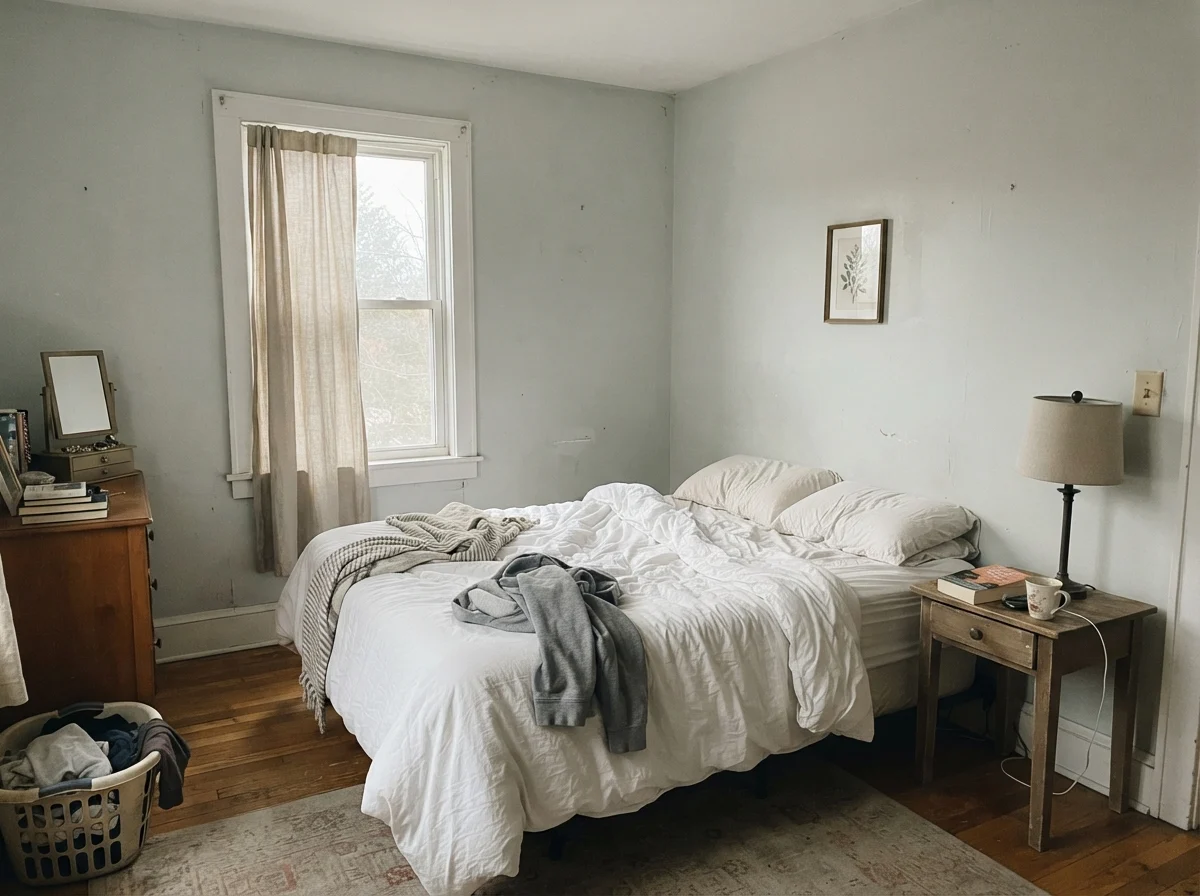
However, when the sun moves or shadows roll in, the mood shifts. In southern and western daylight, especially late in the afternoon, the warm sun draws out the green pigment. By dinner time, a west-facing bedroom will lean noticeably greener than it looked at ten in the morning. Conversely, in a dim, cool north-facing room, or under flat overcast skies, the warmth disappears entirely. Without direct sun, Tradewind drains down to a muted, quiet gray-blue. If you were hoping for a sparkling resort bathroom, north light will make it look considerably more subdued.
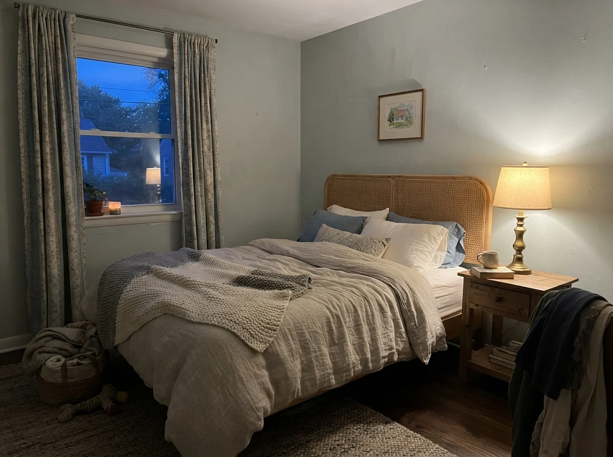
Artificial lighting also dictates the outcome. Under standard 2700K warm household bulbs, Tradewind softens into a gentle, muted sage-blue at night. If you switch to cool white LEDs, the paint holds onto its crisp blue character, though in a small bathroom, cool LEDs can quickly steer the space into clinical territory. For living spaces and private baths, warm bulbs remain the friendlier choice to maintain that welcoming, spa-like feel.
The True Home Base: Bathrooms and Powder Rooms
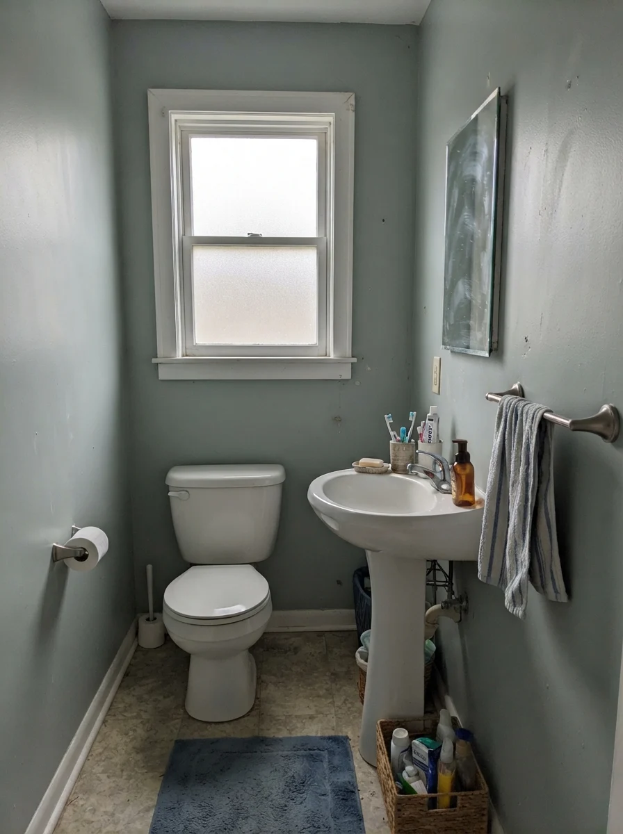
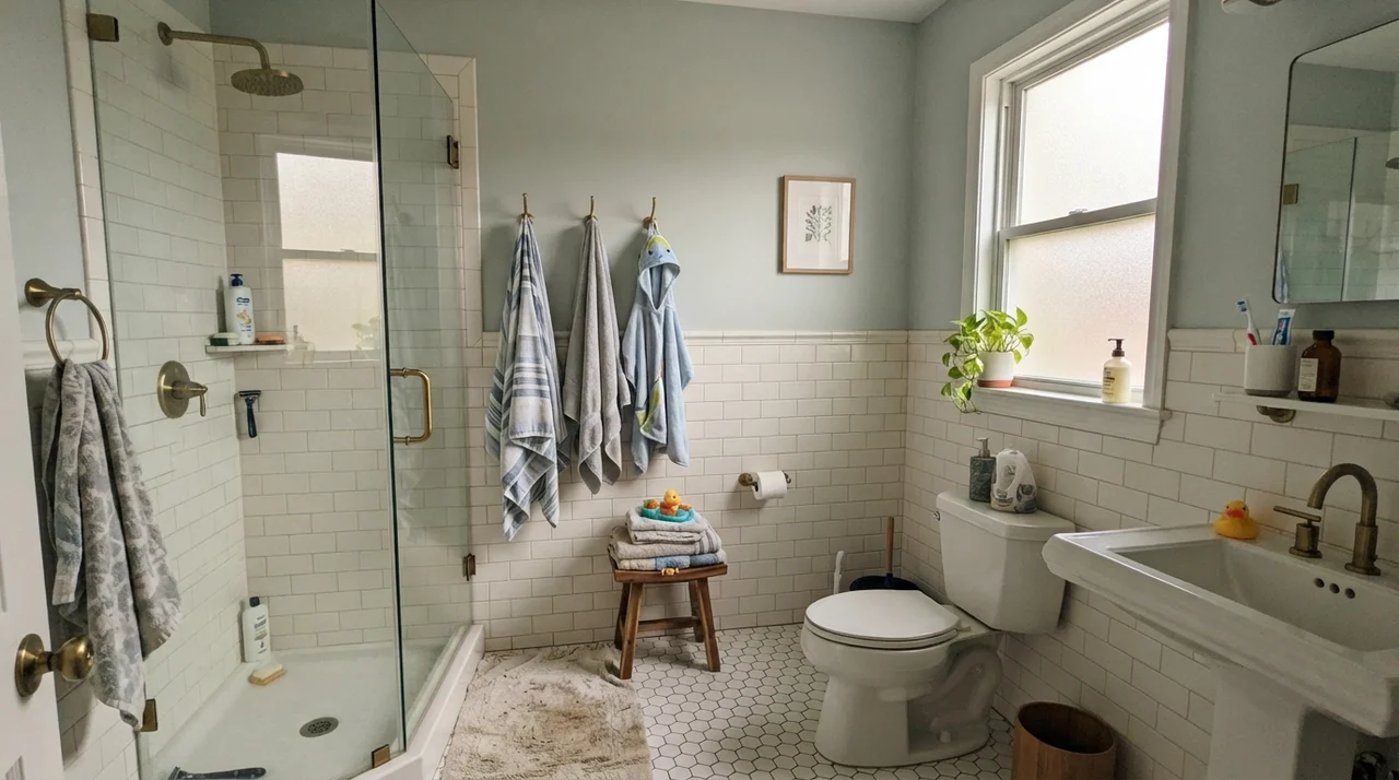
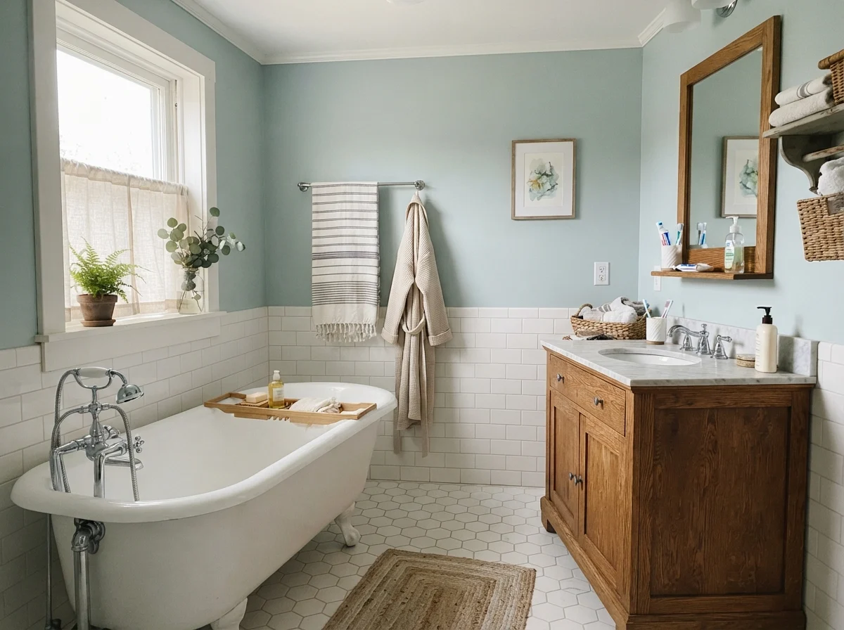
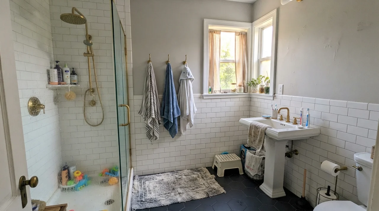
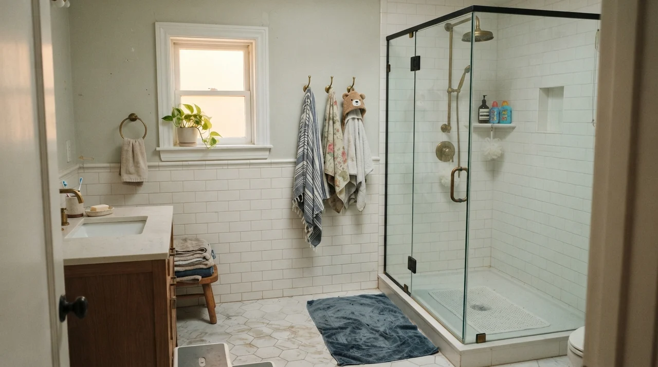
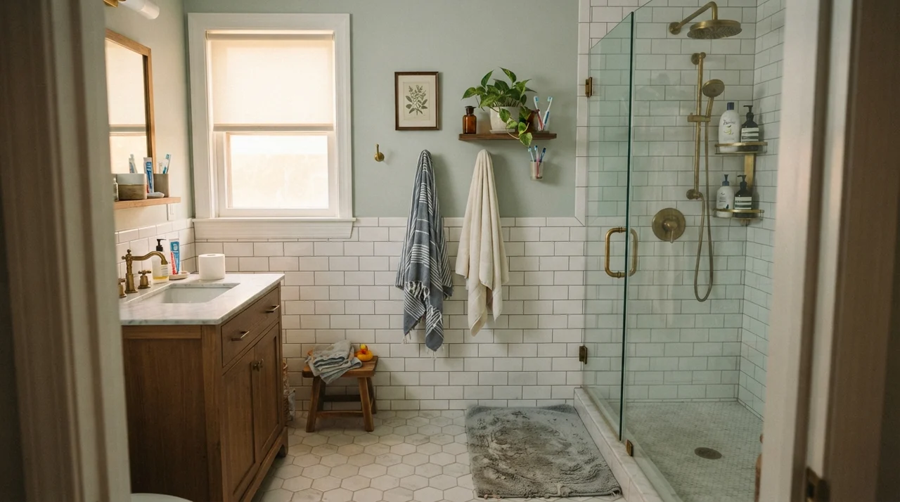
If Tradewind has a natural habitat where it practically never fails, it is the bathroom. It is Sherwin-Williams' classic spa-style shade for good reason. When paired with bright white subway tile, crisp white trim, and brushed nickel or brass fixtures, the color feels balanced, tailored, and clean. Its LRV of 61 is a massive asset here: it keeps small, windowed powder rooms or master baths from feeling closed-in, offering enough lightness to reflect light while giving your eyes a genuine rest from stark white drywall.
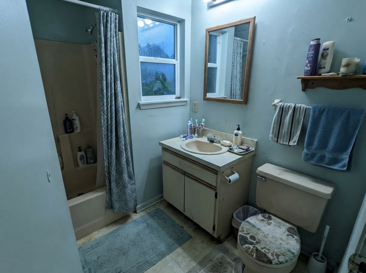
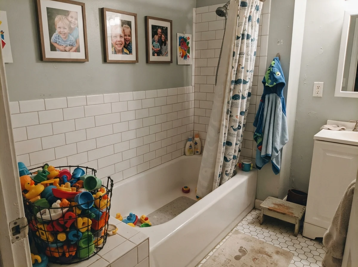
In family bathrooms, where everyday chaos takes over, Tradewind maintains its poise. I always recommend an eggshell sheen on bathroom walls so soap splashes and condensation can be wiped down without leaving permanent burnish marks on the finish. For kids' bathrooms and cottage guest baths, it delivers that clean, vintage charm without looking like nursery pastel.
Bedrooms, Sunrooms, and Living Spaces
Using Tradewind across an entire bedroom or sunroom requires an honest evaluation of your windows. In rooms that receive healthy daylight throughout the day, Tradewind acts as a calming retreat. It wraps the space in a quiet coastal atmosphere that feels miles away from the generic beige builder defaults of twenty years ago. In main bedrooms, it pairs effortlessly with pale oak nightstands, white linen bedding, and simple ceramic lamps.
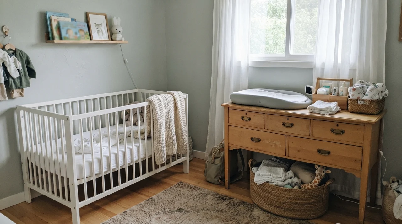
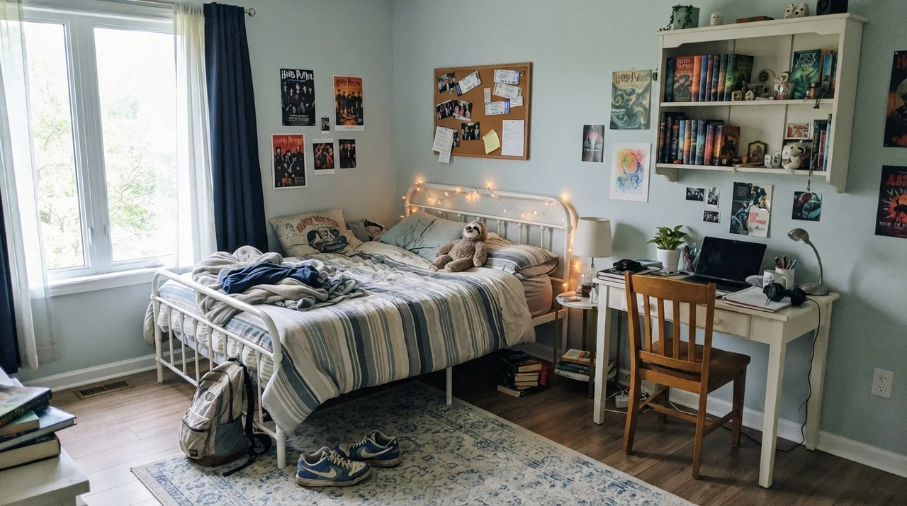
It is equally comfortable in a nursery or a teenager's bedroom because it does not skew excessively babyish. As natural light streams through sheer curtains or large double-hung windows, the gray undertone keeps the blue-green grounded. However, if your bedroom faces dead north and relies solely on a solitary overhead ceiling fixture, take caution: without ample daylight or multiple warm lamps, the walls will drop that pretty coastal hue and settle into a flat, shadowy gray-blue.
The Modern Specialty: Kitchen Islands and Cabinets
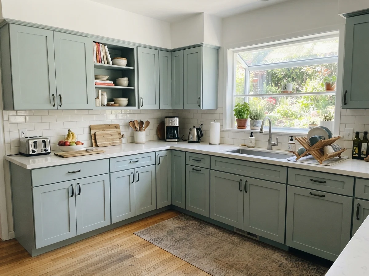
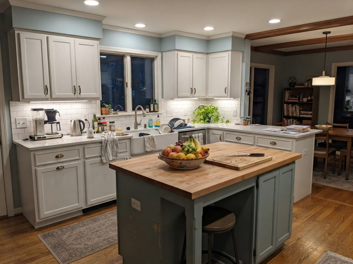
Ten years ago, nobody was putting Tradewind on cabinetry. Today, it has built a devoted following for kitchen islands and lower cabinet runs. If you have white or light-greige perimeter cabinets and white quartz or light stone countertops, Tradewind on a central island or lower cabinetry provides an instant anchor. It reads as a high-end, custom design decision rather than a hesitant paint-chip gamble.
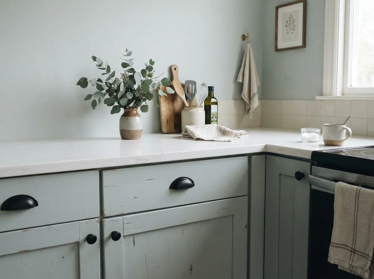
When spraying or rolling cabinetry, finish selection matters enormously. Satin is the sweet spot for cabinets—it provides the scrubbability needed around handles and trash pullouts without the harsh plastic glare of high-gloss. Whether paired with matte black hardware for a sharp, modern contrast or brushed nickel for a seamless coastal utility look, Tradewind turns ordinary kitchen millwork into a genuine focal point.
Sunrooms, Laundries, and Exterior Accents
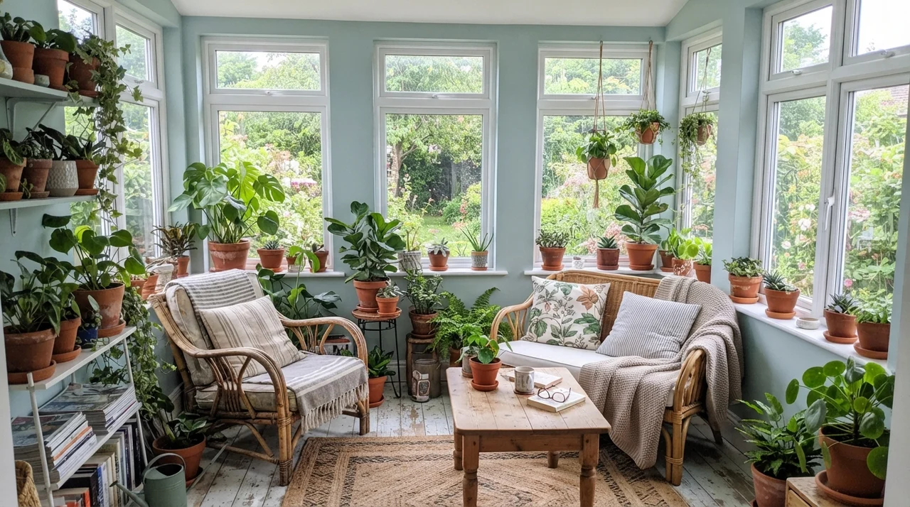
Because Tradewind thrives on daylight, a dedicated sunroom is one of its safest, most rewarding applications. Surrounded by multi-pane windows, rattan furniture, and terracotta planters, the color comes alive, reflecting outdoor greenery while maintaining its clean, watery character. It bridges the gap between indoor comfort and outdoor garden views better than any flat gray ever could.
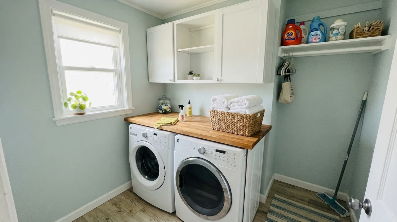
Laundry rooms are another low-risk space to enjoy this shade. Because laundry rooms are often compact, pairing Tradewind on the walls with white utility cabinetry, butcher-block folding counters, and black or nickel hardware injects personality into what is otherwise the most utilitarian corner of the house. On home exteriors, Tradewind works remarkably well as horizontal siding paint when framed by crisp white trim and anchored by a dark navy front door, especially under soft early-evening skies.
Where Tradewind Fails: The Three Predictable Traps
Almost every disappointment with Tradewind traces back to one of three predictable situations, and none of them are the fault of the paint formula—they are simply the reality of how blue-green-grays operate in the physical world.
First, buying it when you actually wanted a colorless neutral. Tradewind often gets tagged as a 'gray' on digital mood boards. But the moment you roll it across all four walls of an eight-by-ten room, that blue-green pigment asserts itself immediately. If you were hoping the color would quietly settle down into an invisible background backdrop, you will be disappointed. Tradewind is a colored wall, not a safe off-white.
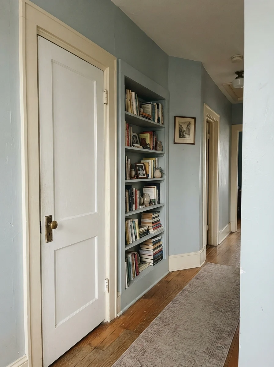
Second, trapping it in a windowless or north-facing room with inadequate lighting. When starved of warm natural daylight or proper lamp layers, the green notes fade into the shadows, leaving behind a flat, muted gray-blue that can feel cold and uninviting.
Third, pairing it with creamy, yellowed, or ivory trim. Tradewind needs crisp, clean white trim to act as a sharp visual boundary. When placed against soft ivory or aged almond woodwork, the blue-green undertone gets confused, and the wall can end up looking muddy and dated five years in.
Tradewind refuses to act like a timid gray. Give it daylight and crisp white woodwork, and it sings; starve it of light, and it will give you nothing but cold shadows.
Durability, Sheens, and the Five-Year Test
When you commit to a color that bridges blue, green, and gray, sheen selection is not just an aesthetic choice—it is a long-term maintenance decision. On walls, I strictly advocate for an eggshell finish. Flat paint may hide drywall imperfections, but in high-traffic hallways or moisture-heavy bathrooms, flat finishes absorb oils and water spots. Eggshell gives you the wipeability needed to keep the surface scrubbed clean after years of family use without creating an unflattering plastic sheen.
For millwork, doors, and trim, semi-gloss provides the necessary barrier against dings, kicks, and vacuum cleaner bumps. On kitchen islands and lower cabinets, satin is the absolute sweet spot. A satin sheen holds up against wet hands and spills around the sink, while allowing for easy touch-ups if the kids slam a barstool into the paneling. Five years in, a quality satin enamel over a properly primed cabinet box will still look sharp, whereas a cheap finish will have chipped around the drawer edges.
Is Tradewind considered a blue, a green, or a gray?
Tradewind is classified within Sherwin-Williams' teal family. It is a genuine blue-green-gray hybrid. In southern daylight, the green steps forward; in cool or overcast light, the gray-blue dominates.
What is the Light Reflectance Value (LRV) of SW 6218?
Tradewind has an LRV of 61. This places it in the medium-light range—light enough to keep small bathrooms and sunrooms feeling airy, but pigmented enough to read as an intentional wall color.
Can I use Tradewind on kitchen cabinets?
Yes. It is exceptionally popular right now on kitchen islands and lower cabinets, particularly when paired with white quartz countertops, crisp white perimeter cabinetry, and black or brushed nickel hardware.
What trim white works best with Tradewind?
Sherwin-Williams Pure White (SW 7005) or Extra White (SW 7006). A clean, crisp white keeps Tradewind looking fresh. Avoid creamy or ivory trims, which can make the walls look muddy.
Why does Tradewind look like plain gray in my room?
Cool, diffuse northern daylight or windowless rooms drain the green undertones from Tradewind, leaving behind a flat, muted gray-blue. Adding warm 2700K lamps helps restore its coastal warmth.
Susan's Verdict · A Coastal Staple with Clear Rules
Tradewind is not a timid gray, and it will not behave like one. If you put it in a bright bathroom, a daylit bedroom, or across a kitchen island with crisp white trim, it delivers one of the freshest, most enduring spa-coastal looks on the market. Just do not strand it in a dim, north-facing hallway with ivory baseboards and expect a miracle. Give it the light it demands, and it will reward you for years to come.