Color Diary · No. 49
Sherwin-Williams Upward: Why the 2024 Color of the Year Belongs Behind a Closed Door
Sherwin-Williams' 2024 Color of the Year, reviewed honestly: the light it was built for, the one where it turns lavender, and what to pick instead.

Susan HartleySeptember 26, 2026 · 13 min read
Upward · Sherwin-Williams SW 6239
Hex#BFC9D0LRV57Undertonessoft blue → slate gray → subtle violet
In our second house—a drafty 1990s colonial with oversized baseboards and far too much builder-beige drywall—I decided our upstairs guest bedroom needed to feel like a crisp morning by the coast. I marched down to the paint store, picked a charming little blue paint chip that looked light and airy under the fluorescent retail lights, and rolled two coats onto the walls over a single Saturday. By Sunday afternoon, when the gray autumn overcast rolled in from the north, the room didn't look coastal at all. It looked like a cold, institutional nursery that had lost its way.
I lived with it for three years before repainting, mostly out of sheer stubbornness. Every time I walked past that doorway on a rainy Tuesday, I saw the exact mistake I had made: I had bought a blue without understanding what gray and violet do when natural daylight walks out of the room.
When Sherwin-Williams announced Upward (SW 6239) as their 2024 Color of the Year, I felt a familiar flicker of recognition. Upward is Sherwin-Williams' deliberate answer to the question every homeowner eventually asks about pale blue paint: can it actually read grown-up instead of infantile? Sitting at a Light Reflectance Value (LRV) of 57, Upward carries a heavy dose of slate gray in its foundation. That gray is precisely what keeps the shade grounded, quiet, and tailored. But make no mistake: this is a real color with real undertones, and treating it like a breezy whole-house neutral is the fastest way to ruin a good paint job.
Light Shifts: The Violet Risk and Bulb Temperature
The biggest trap with SW Upward is assuming it will behave like a pale greige. At LRV 57, it reflects slightly more than half of the light entering a room. That puts it right in the sweet spot for medium-depth wall colors—it has substance, but it will never wash out into an off-white.
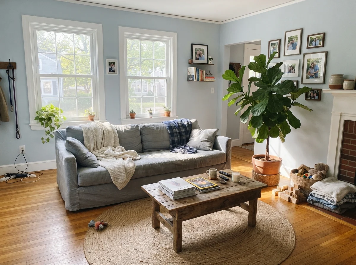
However, that same depth means its undertones are impossible to hide. In direct southern exposure or generous midday sunshine, Upward is exceptional. The sun warms the gray base just enough to let a crisp, breezy sky blue come through without tipping into pastel territory. It feels collected, peaceful, and wonderfully clean against crisp white woodwork.
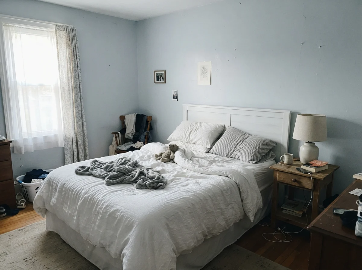
The trouble starts when you turn to north-facing rooms or live through long, overcast winter afternoons. North daylight is naturally cool and blue-tinted. When that cool light hits Upward's slate pigment, the violet undertones jump straight to the surface. Your wall suddenly reads as a flat, slightly dingy lavender-gray. It isn't a bad can of paint; it is basic color physics. If you don't account for your compass orientation, you will find yourself wondering why your peaceful blue room suddenly feels chilly.
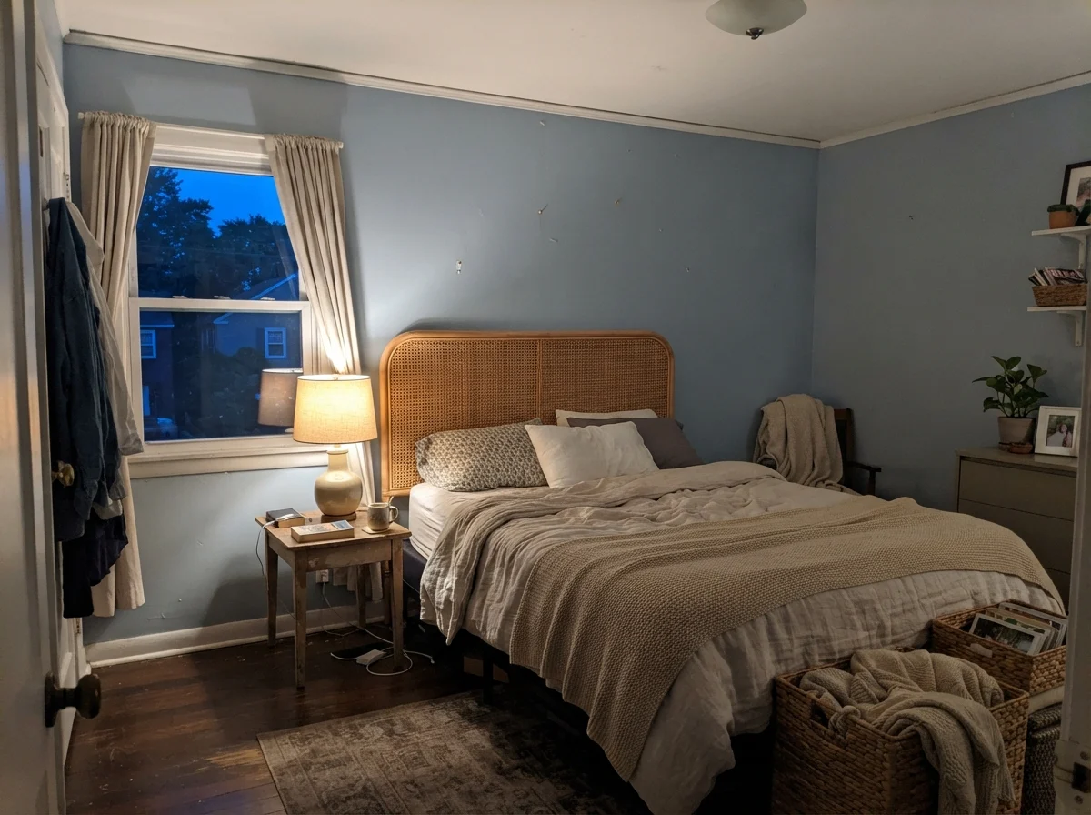
Artificial lighting is equally critical. In our current 1960s ranch, I replaced every cool builder-grade light bulb with warm 2700K LEDs the first week we moved in. If you shine 4000K or 5000K daylight bulbs onto Upward, you strip out all the warmth and leave behind a sterile, cement-like gray. Warm 2700K lamps, by contrast, restore balance to the blue-gray pigments after the sun sets, preserving the cozy atmosphere you wanted in the first place.
The Three Faces of Upward in Real Daily Light
Over thirty years of repainting rooms, I have learned that a color never looks like just one thing. It has faces that change with the weather, the hour, and the season. Upward has three distinct personalities you need to be prepared to live with.
Bedrooms, Nurseries, and Closed Retreats
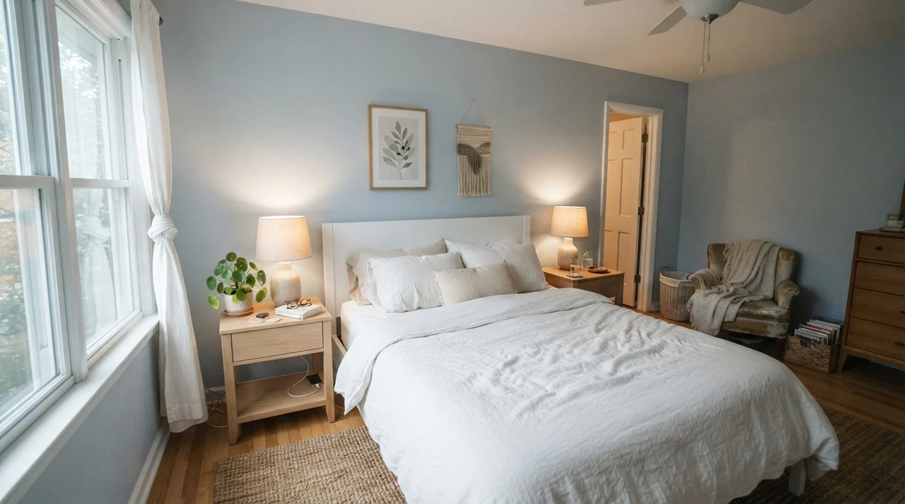
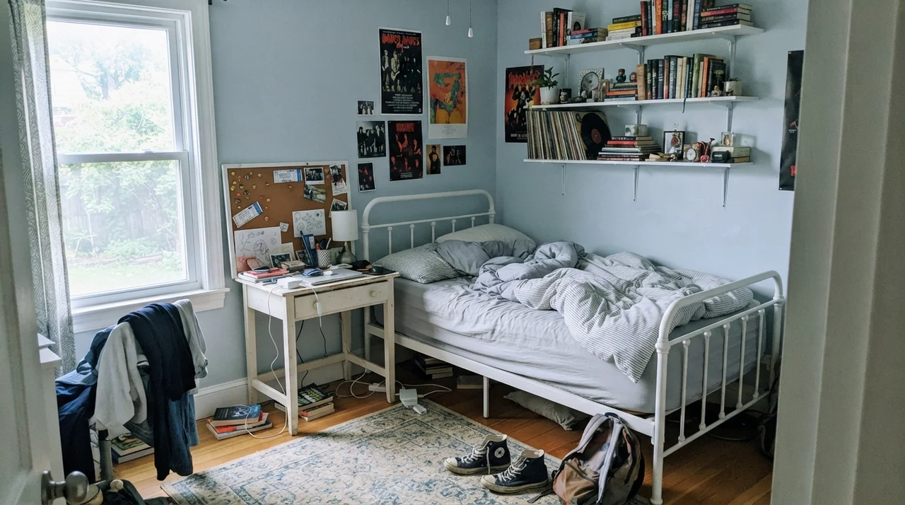
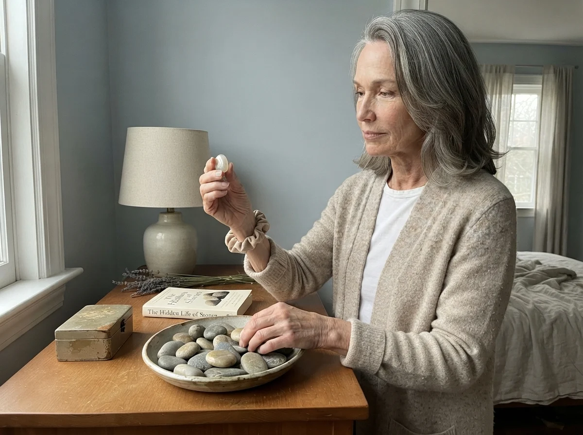
Where does Upward perform best on walls? In dedicated, enclosed rooms where you want a calm, cocooned feeling. Guest bedrooms and primary suites with decent natural light are prime candidates. In our last house, our guest room suffered because I chose a saturated pastel. Upward avoids that entirely: the gray pigment keeps the walls looking mature and quiet, pairing effortlessly with linen sheets, pale oak furniture, and simple ceramic lamps.
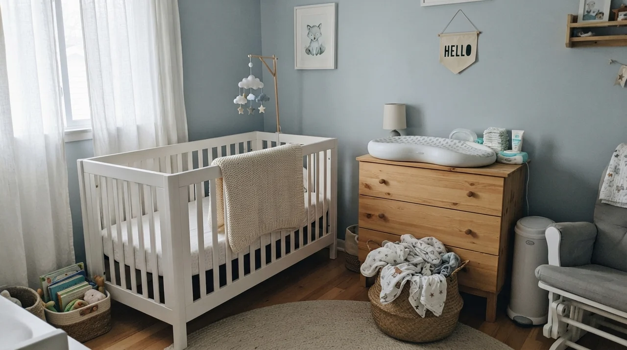
It is also a brilliant choice for modern nurseries. For years, people got stuck choosing between sugary baby blues and stark modern grays. Upward splits the difference perfectly. It delivers color without feeling saccharine or heavily gender-coded, and it transitions smoothly into a child's or teenager's room years down the road without demanding an immediate repaint.
Kitchens, Islands, and Built-In Cabinetry
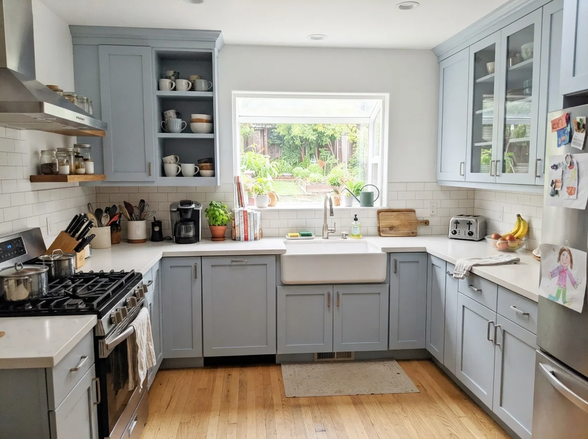
If you ask me where Upward does its most impressive work, I will tell you without hesitation: on cabinetry. Painting kitchen cabinets is messy, expensive, and stressful. In our 1970s split-level, I painted our worn oak uppers by hand on folding tables in the garage, and I swore I would never choose a color that would look dated within five years.
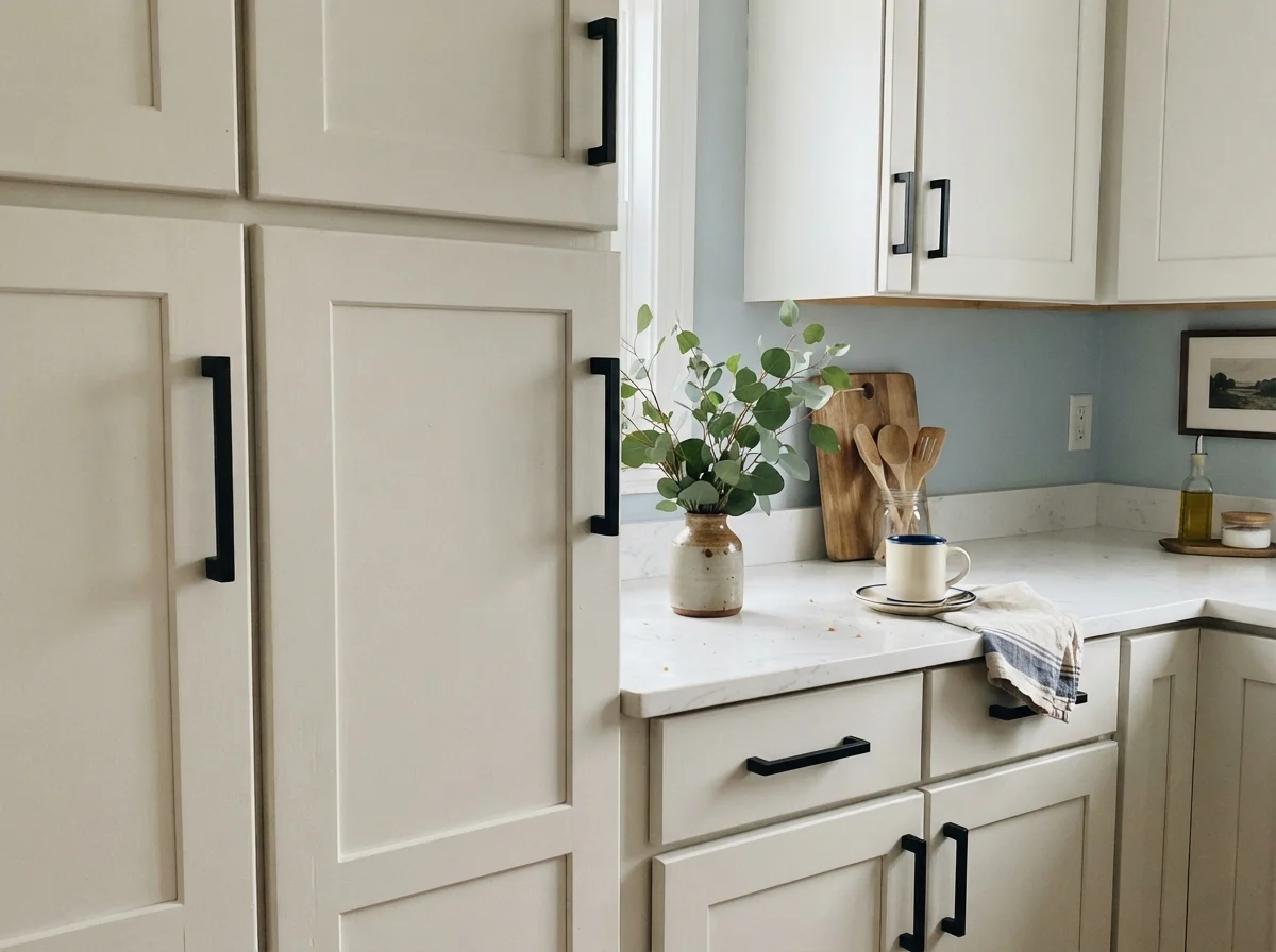
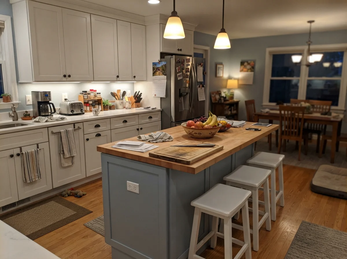
Upward has become a breakout kitchen cabinet color because it hits a very specific sweet spot. When sprayed in a durable satin enamel across shaker doors, it looks custom-tailored. It creates a striking, high-end contrast when paired with crisp white quartz or marble countertops, warm white subway tile backsplashes, and warm brass or matte-black hardware. Because the color sits at LRV 57, it provides enough visual weight to anchor a kitchen island or base cabinets without making a small kitchen feel dark or cramped.
Bathrooms, Sunrooms, and Utility Spaces
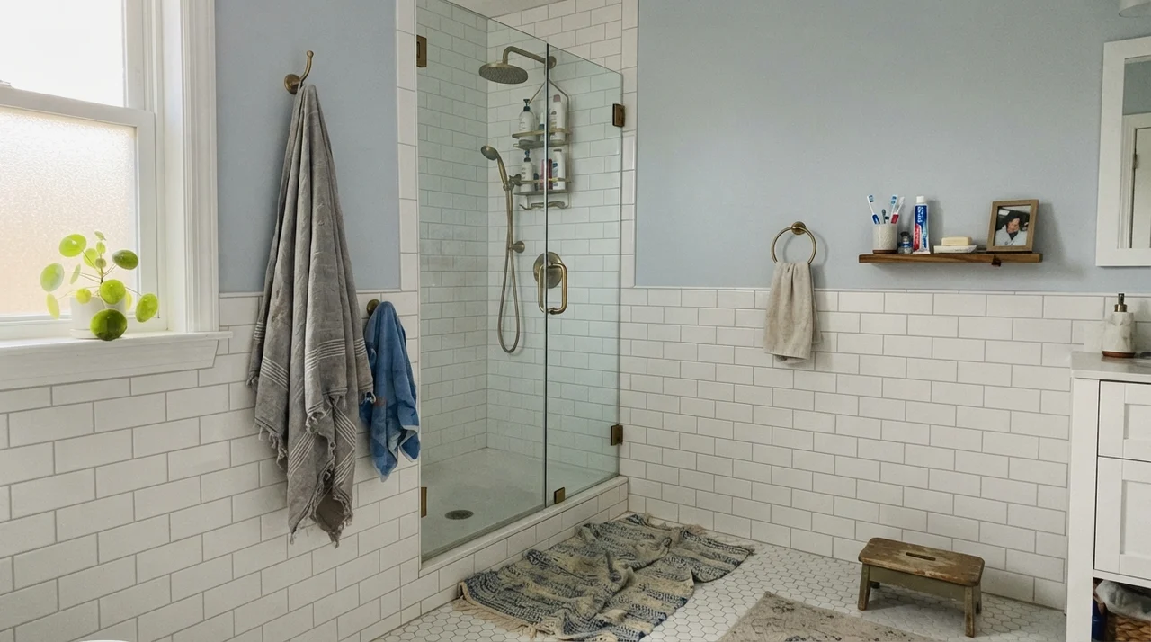
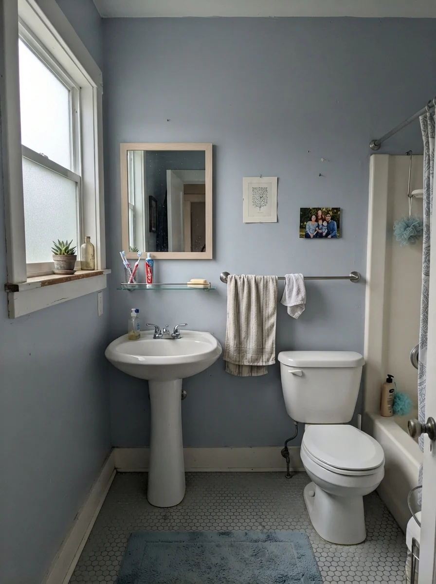
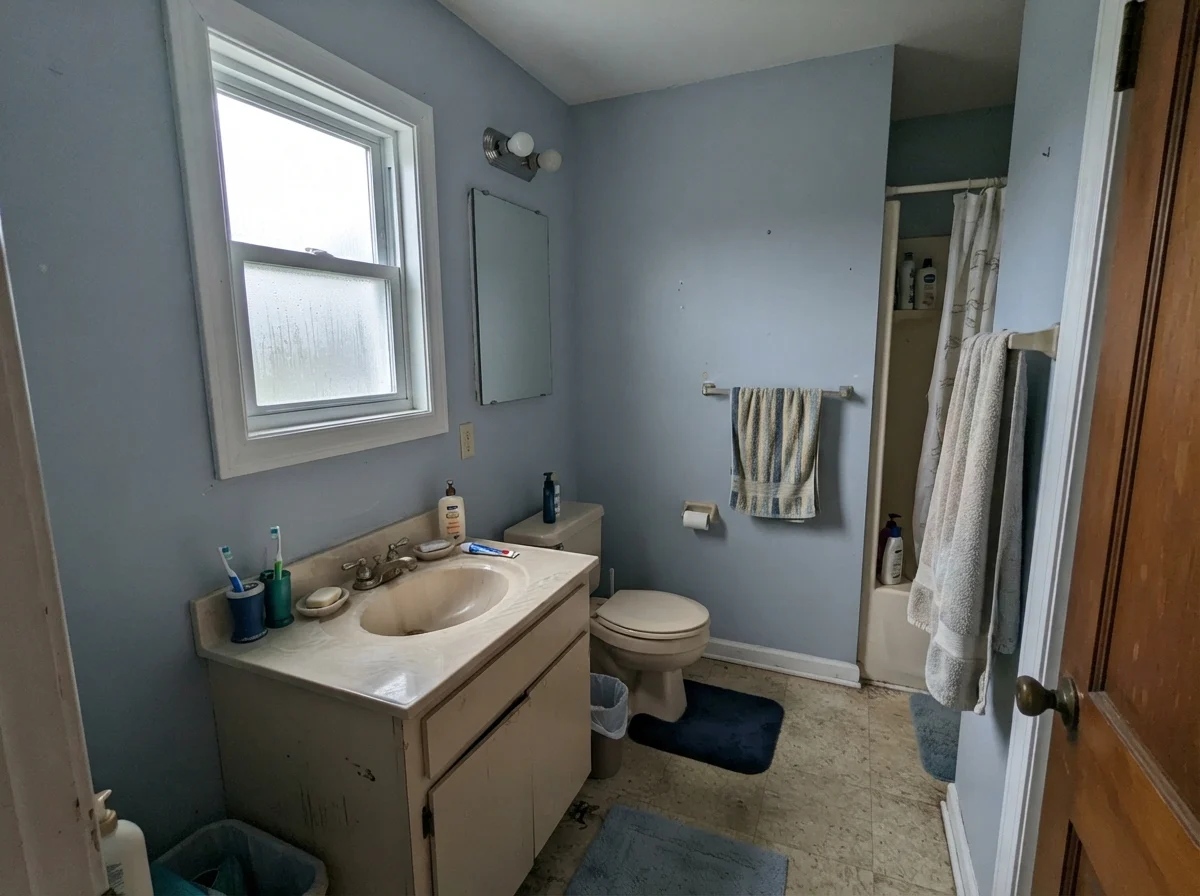
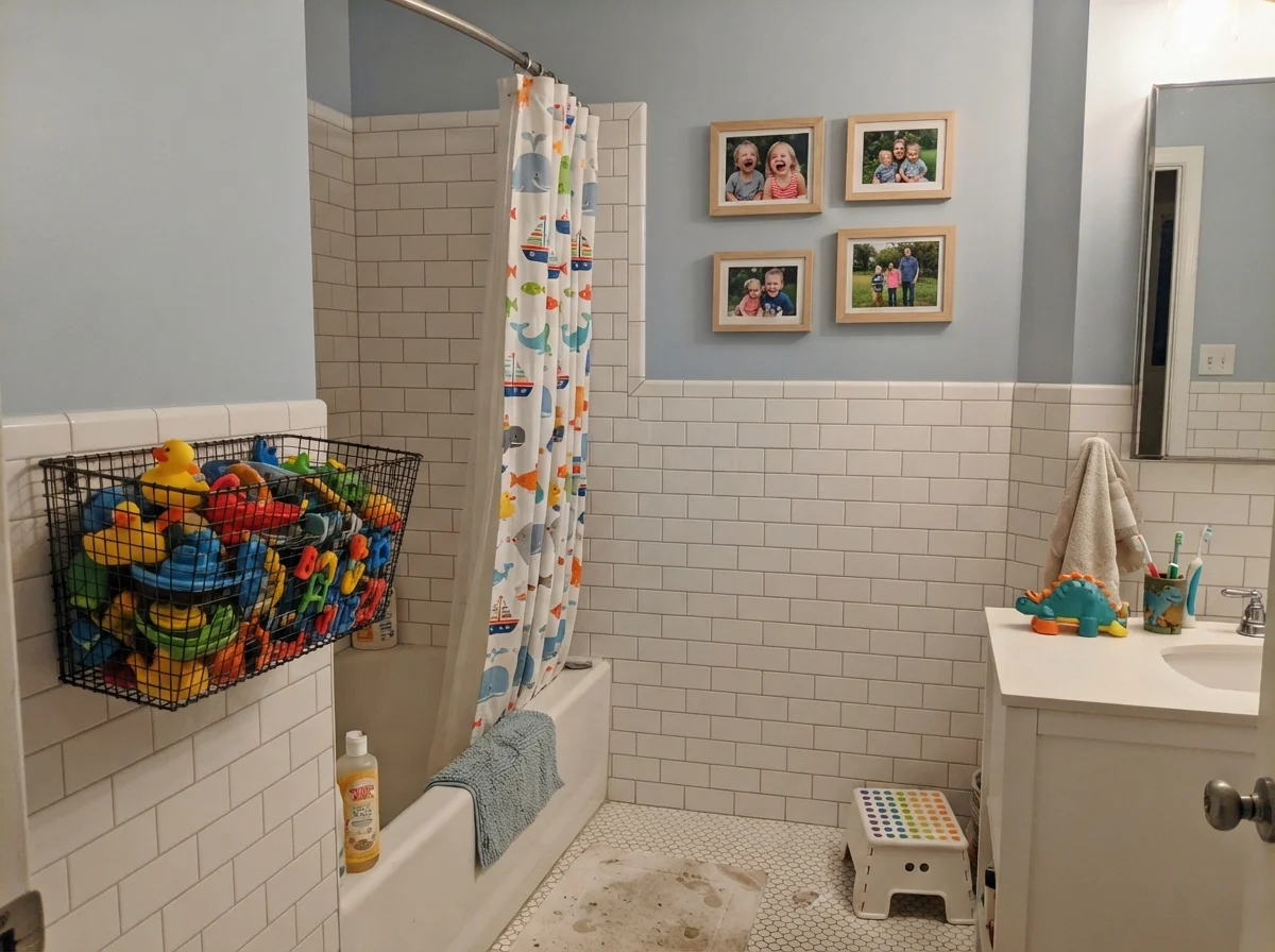
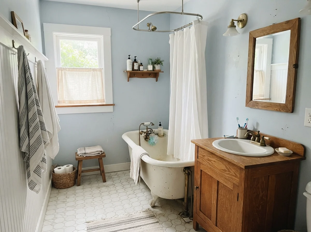
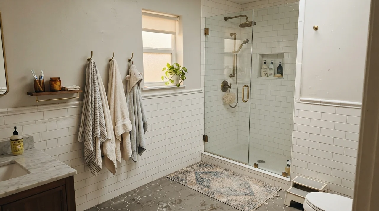
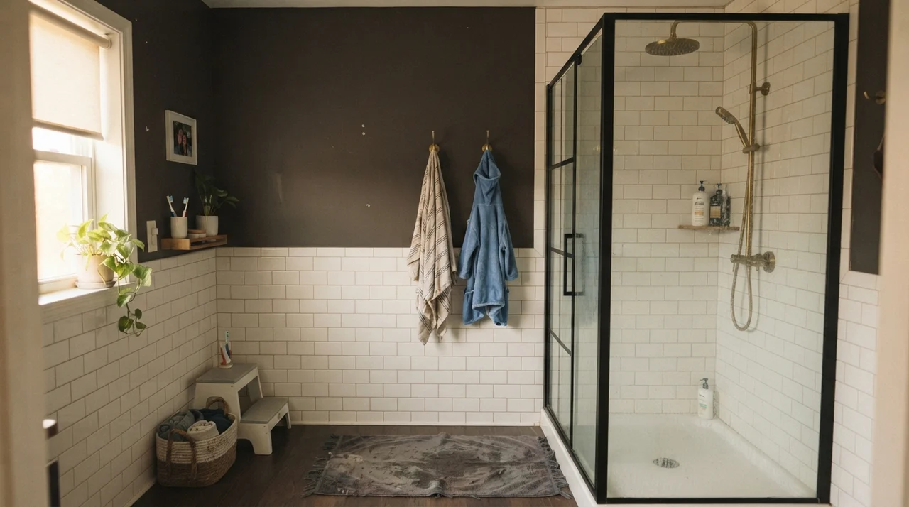
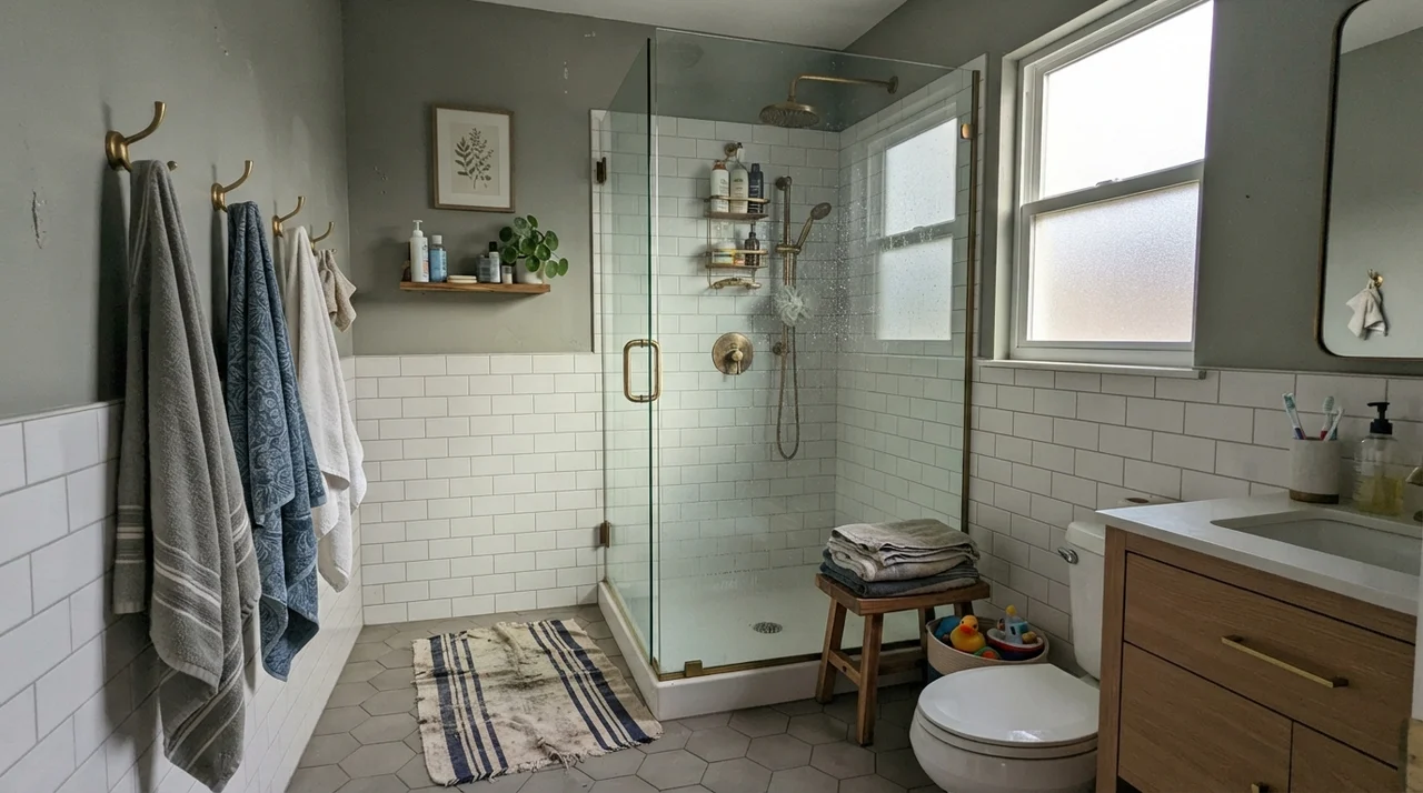
Small, closed rooms are natural territory for Upward. Powder rooms and family bathrooms benefit from its clean, orderly demeanor. When installed above traditional white beadboard or classic subway tile wainscoting, Upward provides just enough contrast to make the white ceramic and polished chrome or warm brass fixtures pop.
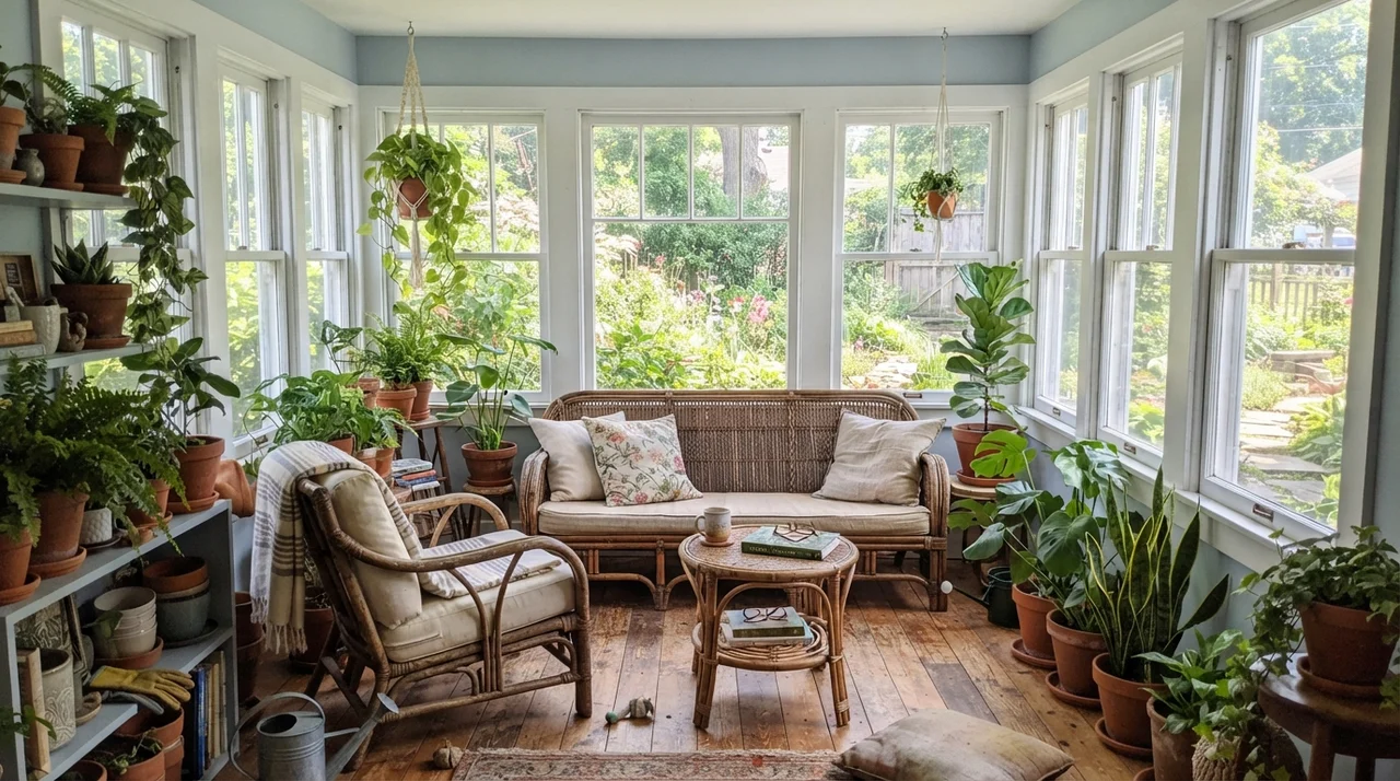
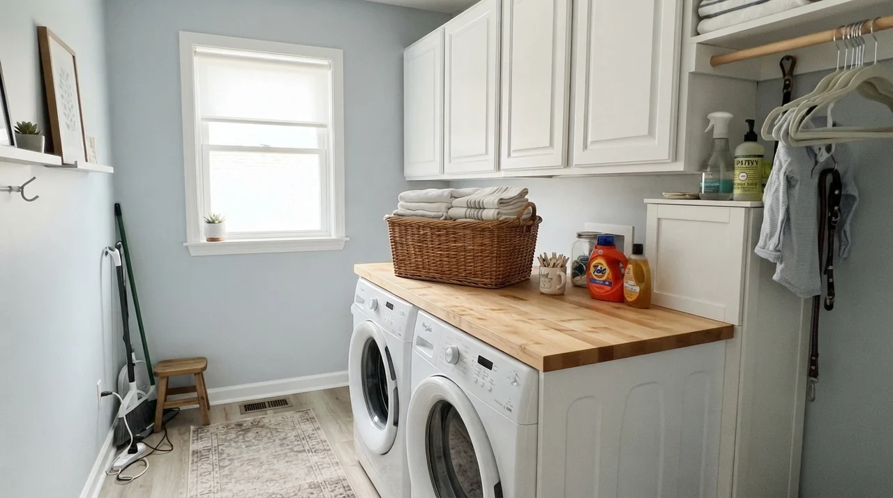
Laundry rooms and sunrooms also benefit immensely. These are spaces where you want energy to feel fresh and brisk. In a sunroom surrounded by glass and greenery, the blue-gray tone reflects the outdoor foliage cleanly without fighting natural terracotta pots or rattan furniture.
Where Upward Fails: The Honest Mistakes
Almost every disappointed homeowner review of Upward comes down to one of two critical mistakes: attempting to use it as a whole-house neutral, or putting it in a windowless cave.
Upward is a definite color. It is not an off-white, and it is not a beige. When people try to run it continuously across an open-concept living room, kitchen, and adjoining hallways, it quickly becomes overwhelming. By the third room, you feel like you are trapped inside a blue box. A true neutral—like an ivory, soft greige, or warm cream—needs to carry the main open spaces, letting Upward do its work in defined rooms with real boundaries.
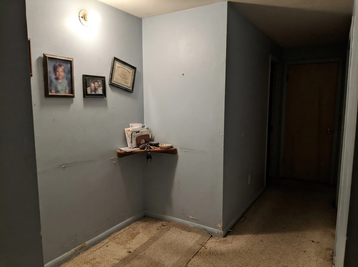
The other failure happens in dark, windowless interior hallways or basements lit by a single overhead fixture. Without natural daylight to give the blue dimension, the slate-gray undertones collapse into a dull, muddy putty. If a space has no natural light, this is simply not worth the money.
Doors, Architectural Details, and Exteriors
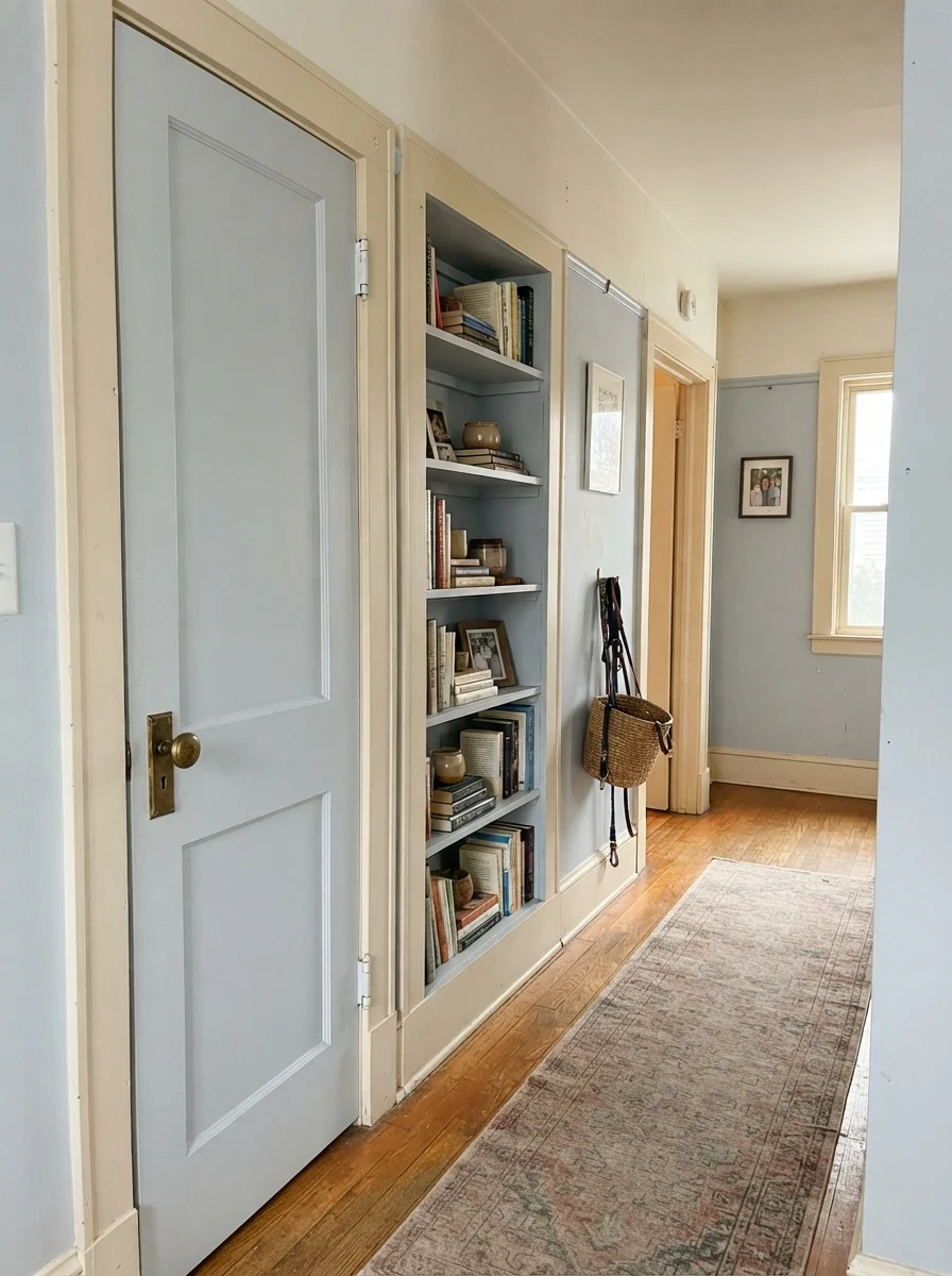
If committing to four walls feels like too much, using Upward as an accent color is an exceptionally smart move. Painting an interior passage door or built-in bookcase in satin Upward against soft cream walls brings immediate architectural character to an older home without overwhelming the room.
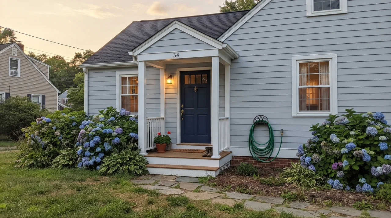
On exteriors, exercise caution. I would never recommend Upward as a whole-house siding color. Under direct, intense exterior sunlight, the subtle blue pigment washes out quickly, leaving siding that looks like an ambiguous, faded gray. But as an accent—on front doors, decorative shutters, or porch ceilings against crisp white siding—it holds up beautifully and offers welcoming curb appeal.
Durability, Sheens, and Long-Term Wear
When you have lived in three houses over thirty years, you stop evaluating paint by how pretty it looks on day two. You evaluate it by how it looks five years in, after dogs have brushed against the baseboards, kids have dragged backpacks down the hall, and you've scrubbed clean the same greasy fingerprints by the door frame a dozen times.
For general living spaces and bedrooms, eggshell is my non-negotiable recommendation for Upward. Flat paint will scuff instantly when you try to clean it, and at LRV 57, burnished marks show up prominently on cool blue-grays. Eggshell gives you just enough resin to wipe the wall down with a damp microfiber cloth while masking minor drywall imperfections.
For cabinets, use a dedicated waterborne alkyd or urethane enamel in a satin finish. Satin provides the smooth, scrubbable hardness needed to withstand cooking grease and constant handling around drawer pulls without throwing glaring reflections under overhead can lights. For trim and baseboards, stick to semi-gloss in a clean, soft white to create a durable, washable boundary that frames the blue cleanly.
Upward is a color with real backbone, not a background neutral. Treat it like a feature in a dedicated room, and it will reward you for years.
Is Sherwin-Williams Upward too baby blue for a living room?
No, provided the room receives good natural light and has defined walls. Upward carries a heavy slate-gray base that keeps it looking tailored and sophisticated rather than like a pastel nursery swatch.
Why does Upward look purple on my walls?
Upward has subtle violet undertones in its slate foundation. When exposed to cool northern daylight, heavily overcast skies, or cool-white (4000K+) LED bulbs, those violet notes pull forward. Switching to warm 2700K bulbs helps mitigate this shift.
Can I paint my whole house in Upward?
I strongly advise against it. Upward has too much color depth (LRV 57) to serve as a continuous open-concept neutral. It works best in closed rooms like bedrooms, offices, powder rooms, or on cabinetry, connected by a true warm white or soft greige.
What is the best trim color for Sherwin-Williams Upward?
Sherwin-Williams Pure White (SW 7005) is the most reliable option for a clean, balanced contrast. If you want a softer, slightly warmer look, Sherwin-Williams Alabaster (SW 7008) pairs wonderfully without clashing.
Susan's Verdict · A Tailored Blue That Needs Boundaries
Sherwin-Williams Upward SW 6239 earned its 2024 Color of the Year title honestly: it solves the classic problem of blue paint by using gray to keep it mature and versatile. On kitchen cabinets, powder room walls, or in a sun-drenched bedroom, it is worth every penny and held up beautifully under real family life. Just respect its boundaries: keep it out of windowless hallways, don't spread it across an entire open floor plan, and ensure your lamps are burning warm 2700K light.