Color Diary · No. 13
Urbane Bronze in Real Houses: The Dark Paint That Needs Sunshine to Work
The 2021 Color of the Year, reviewed honestly: where the bronze warmth actually shows up, the rooms where it turns flat black, and what to paint instead.

Susan HartleySeptember 3, 2026 · 15 min read
Urbane Bronze · Sherwin-Williams SW 7048
Hex#54504ALRV8Undertonesbronze-brown → deep charcoal → flat black
When Sherwin-Williams named Urbane Bronze (SW 7048) their Color of the Year back in 2021, my inbox filled up with notes from readers asking if they should paint their entire living room in it. My answer then was the same answer I give now after watching people live with it for years: only if that room gets enough natural daylight to justify the commitment.
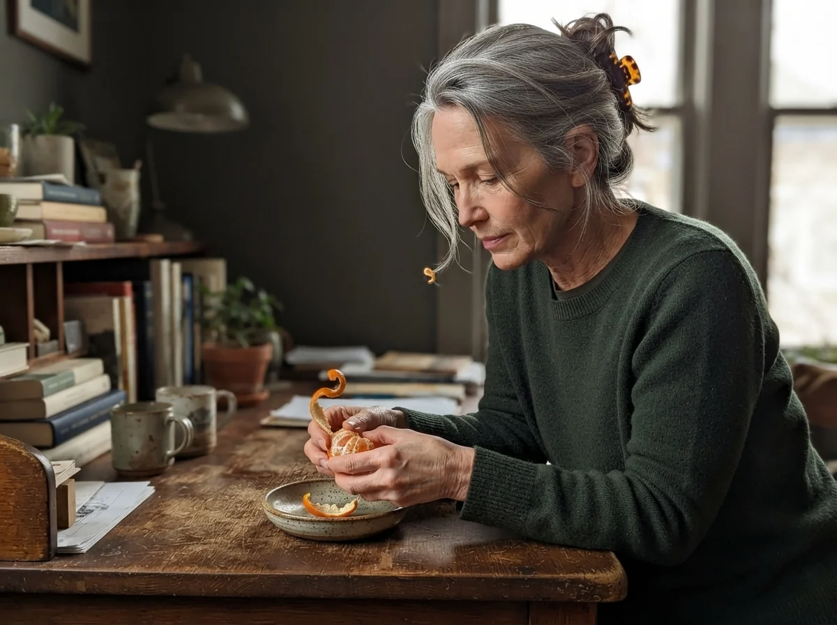
We painted the study in our 1960s ranch with Urbane Bronze four years ago. Before that, in our last house—a 1990s colonial with oversized windows—I had used a very dark charcoal on the library built-ins. I thought I knew exactly how a dark, moody wall would behave. But Urbane Bronze is not a standard charcoal, and it is certainly not a true black. It sits at a light reflectance value of 8, tucked into the warm orange deck family, which means it carries a heavy dose of brown and bronze pigment right under the surface.
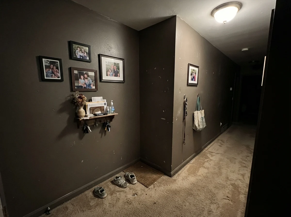
When the sun hits it directly, it is one of the most handsome, sophisticated colors in the entire fan deck. It looks soft, deep, and expensive. But the moment the light fades, or if you slap it on four walls in a small, windowless space, all that bronze nuance packs its bags. What you are left with is a flat, heavy near-black that makes the room feel smaller, not cozier. If you are going to spend the weekend taping baseboards and rolling out two coats of an ultradeep base, you need to know exactly which face this paint is going to show you once the roller dries.
How Daylight Dictates the Warmth
The biggest trap with Urbane Bronze is picking it under the bright fluorescent tubes of a paint counter. On the swatch card, it looks like a rich, grounding espresso-charcoal. In real rooms, however, its personality swings dramatically depending on your window orientation and the temperature of your light bulbs.
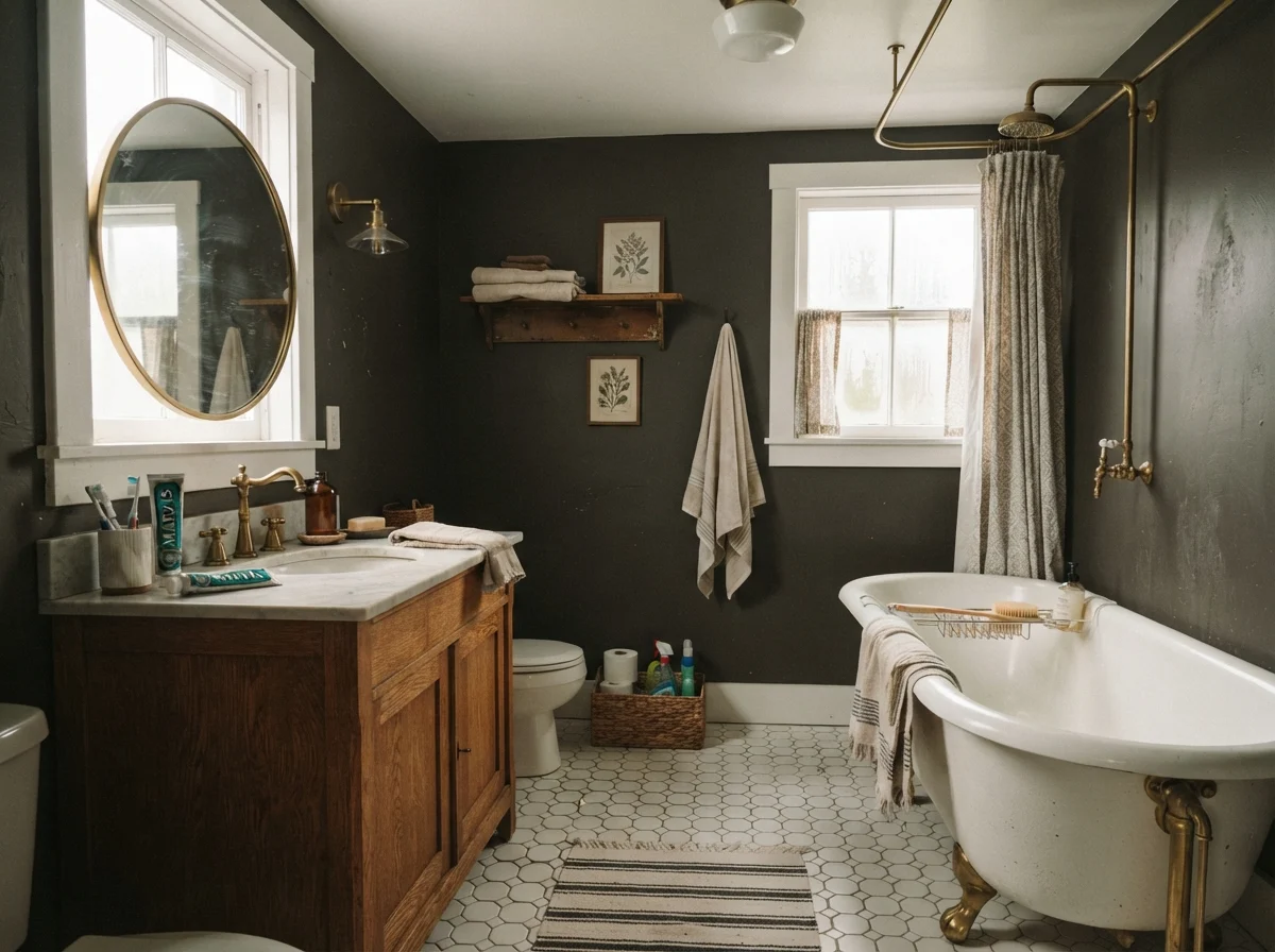
In a south-facing room flooded with midday sun, the warmth emerges instantly. You see the deep bronze undertones, a subtle earthy brown that softens the edge of what would otherwise be an intimidating dark wall. It pairs effortlessly with warm wood furniture, unlacquered brass hardware, and off-white linens. In east- and west-facing rooms, you get that gorgeous bronzy depth during the golden hours of sunrise and sunset, while during the middle of the day it settles into a quiet, tailored dark charcoal.
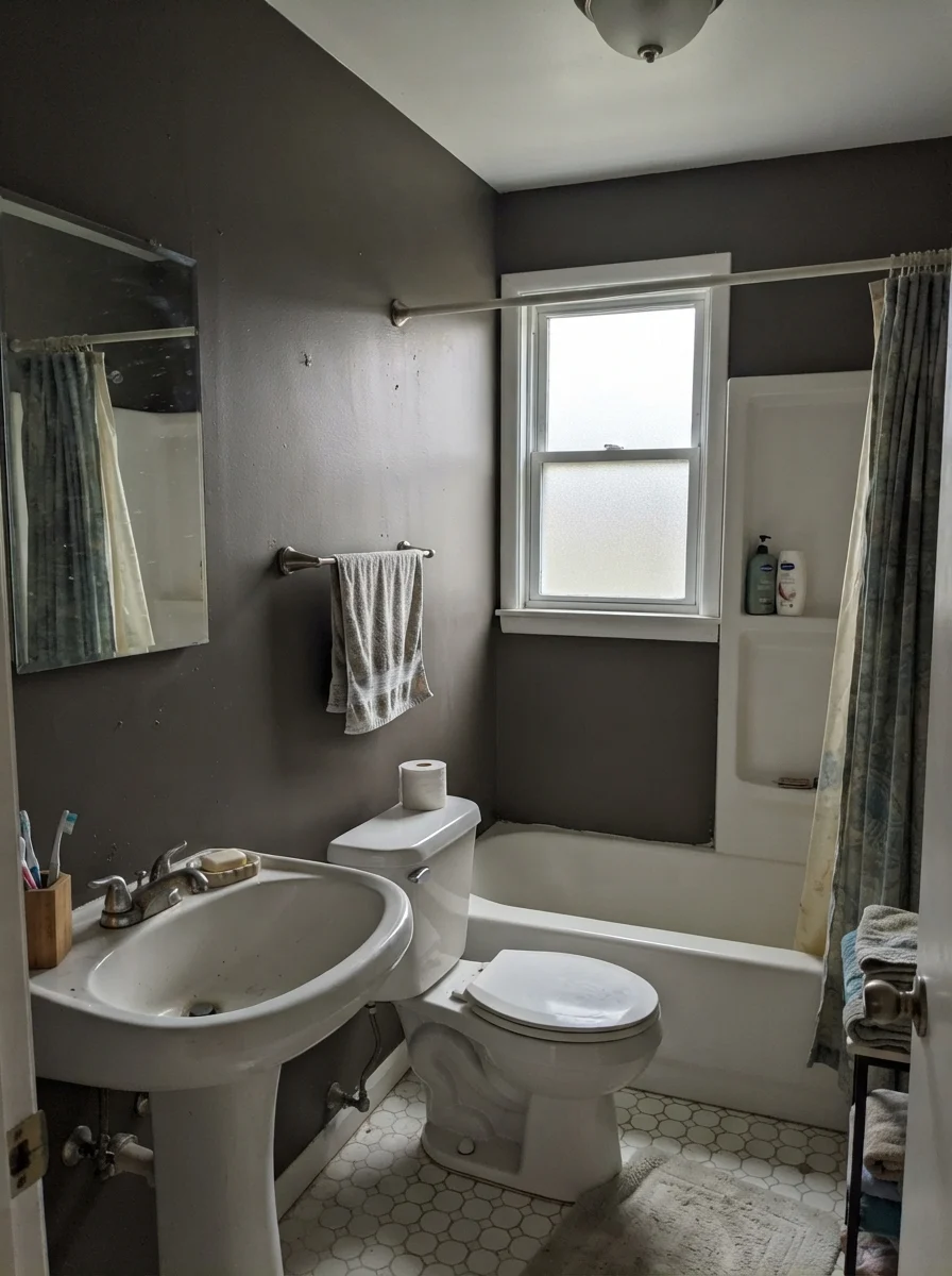
The trouble starts when you take this color into a north-facing room or rely on modern cool-white LED lighting. Cool, indirect light strips the yellow-orange undertone right out of the paint film. Under a 4000K bulb or on a rainy afternoon with north-facing windows, Urbane Bronze turns into a flat, cold near-black. Even worse, if you pair it with weak illumination over honey-oak or golden flooring, that reflected yellow light hitting the low-chroma brown base can make the wall flash an unsettling muddy olive. If you want this color to look like the brochure, you have to feed it warm light.
Bathrooms and Powder Rooms: The High-Contrast Move
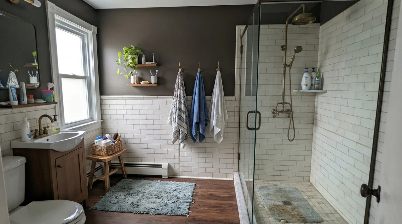
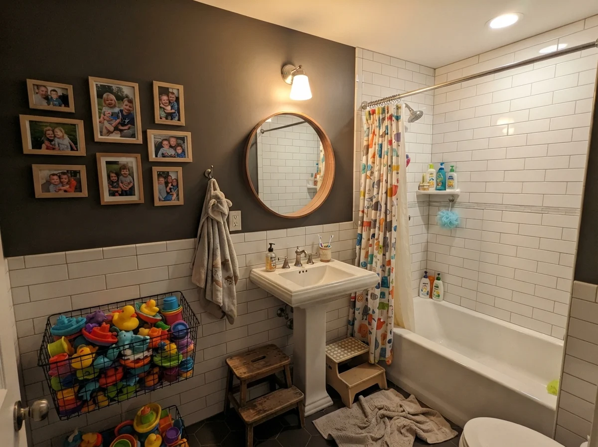
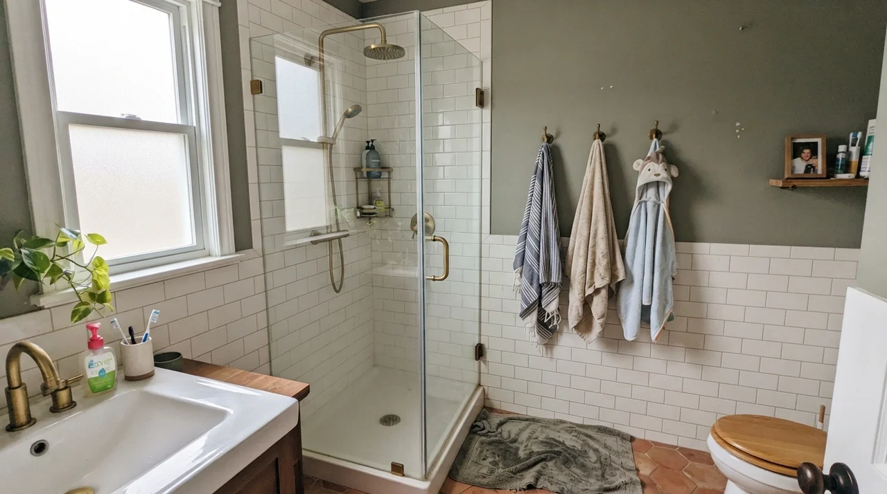
One of the most reliable ways to make a dark paint earn its keep is to pair it against crisp white tile. In bathrooms, where you often have white subway wainscoting, porcelain fixtures, and polished chrome or warm brass hardware, Urbane Bronze provides an anchor without overwhelming the entire square footage.
We have seen it used above wainscoting across dozens of home refreshes over the years. Because bathroom upper walls generally represent only forty percent of the visible wall plane, the LRV 8 value does not close the room in like a vault. Instead, it gives you that tailored boutique-hotel feel that holds up even as design trends shift. The trick is maintaining balanced lighting around the mirror so your morning routine doesn't feel like stepping into a cave.
Bedrooms and Quiet Retreats
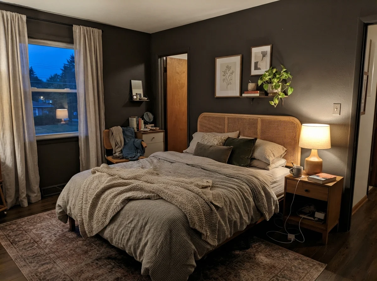
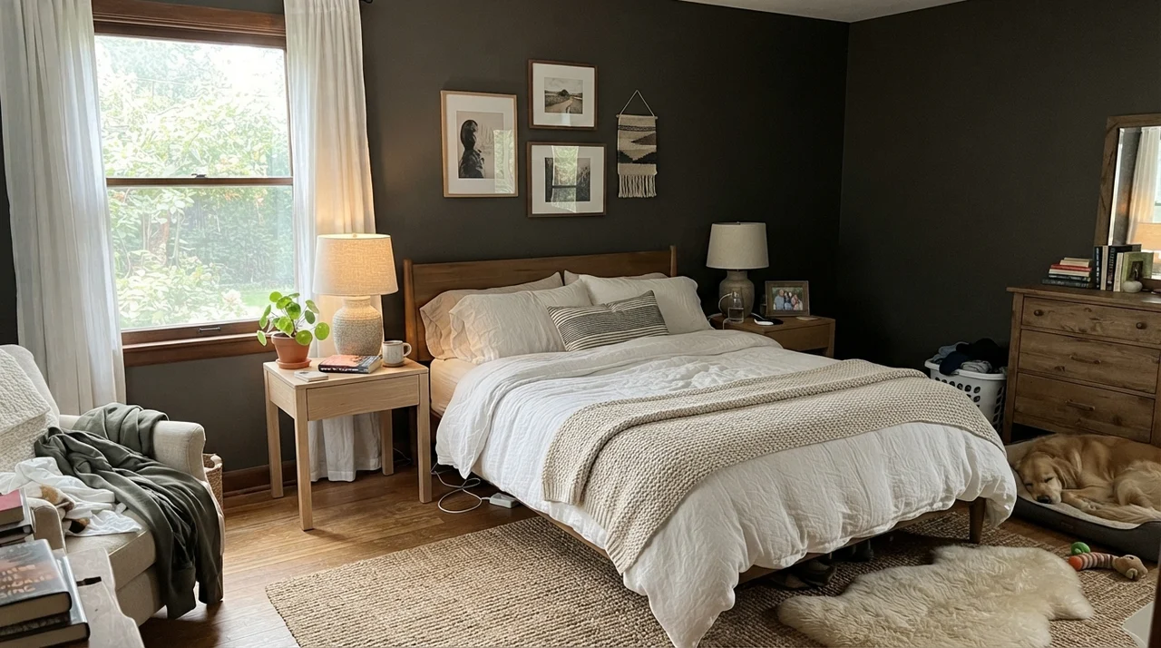
People often hesitate to paint bedrooms dark for fear of feeling claustrophobic. But five years in a dark bedroom will teach you that deep walls actually make boundaries recede at night, provided you keep your lighting deliberate. With Urbane Bronze, a bedroom feels enveloping and restful during sleeping hours, especially if you pair it with warm 2700K bedside lamps and natural linen textiles.
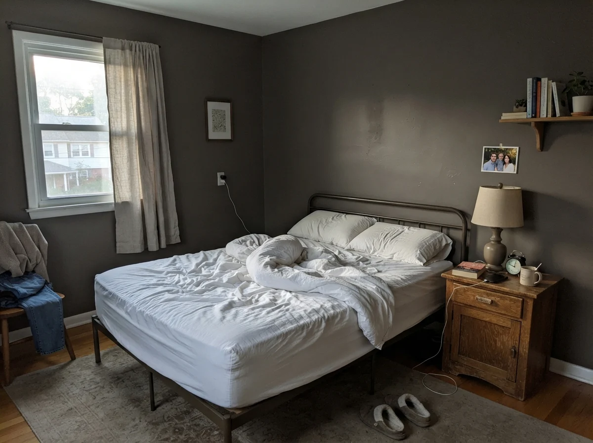
The danger zone is early morning. When the lamps are off and cool, gray dawn enters the room, the walls can look somewhat stark and drained of their bronze richness. If you are someone who works from home in your bedroom all day under ambient overcast skies, that flat look might wear on you. But if the bedroom is primarily used for winding down in the evening, the cocooning effect is genuinely hard to beat.
Kitchen Cabinets and Islands: Where the Practicality Shines
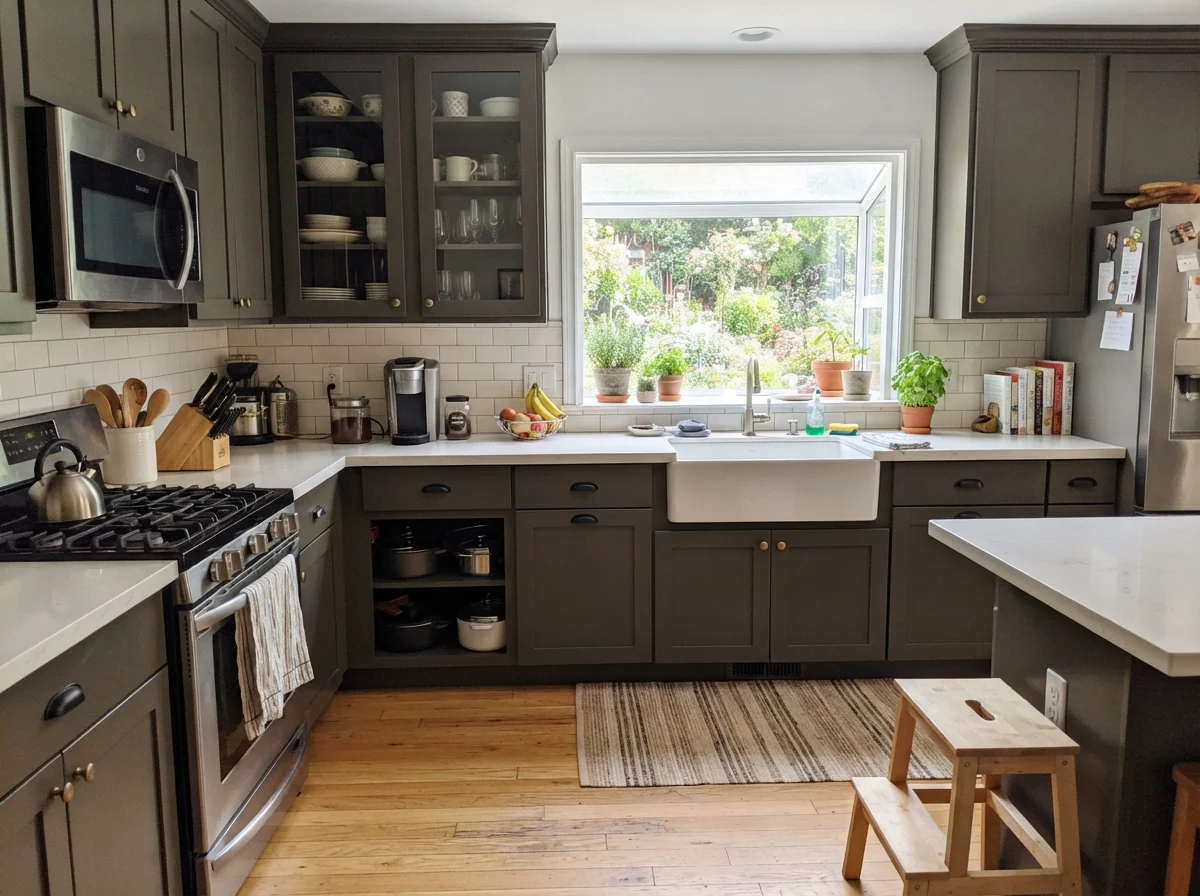
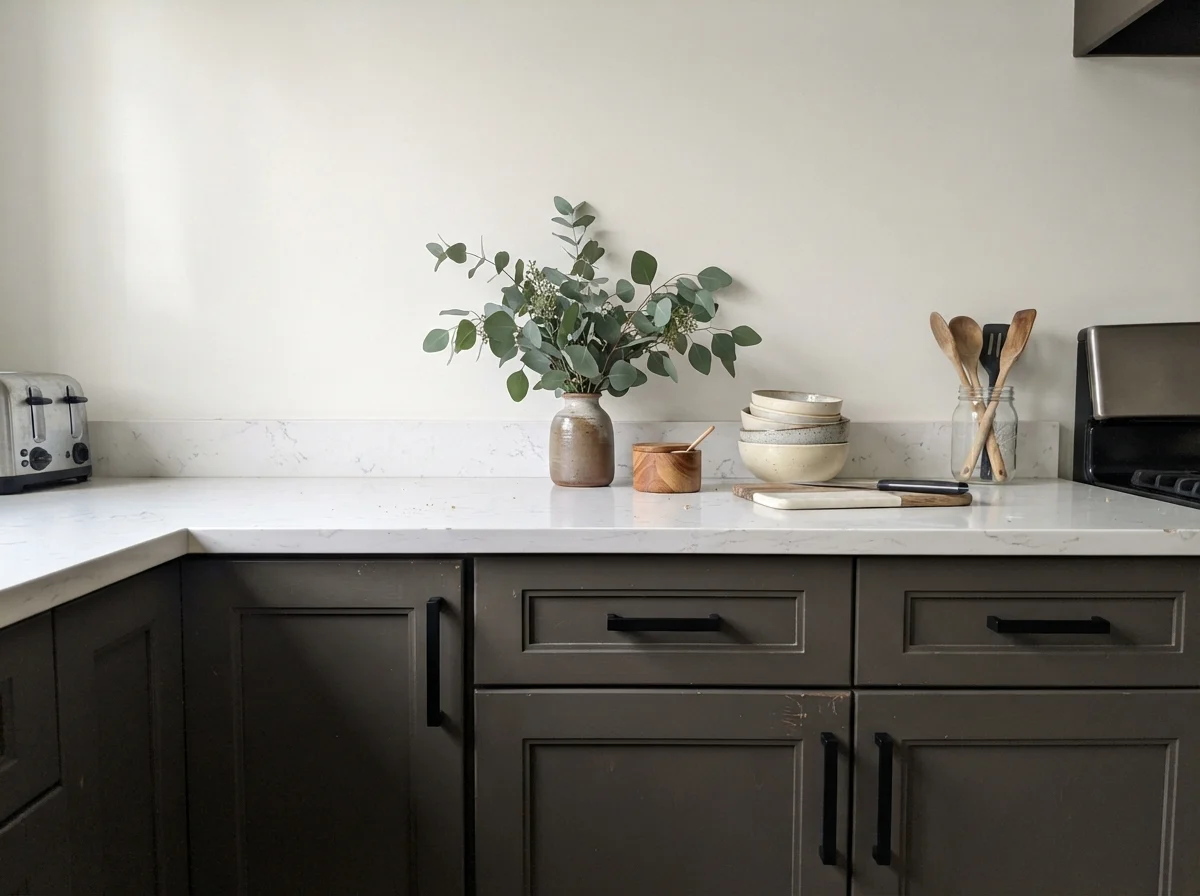
If you have ever lived with pristine white kitchen cabinets, you already know the weekly headache: scrub marks near the garbage pull-out, greasy smudges around the handles, and water streaks under the sink. This is where Urbane Bronze proves itself worth the money on cabinet surfaces.
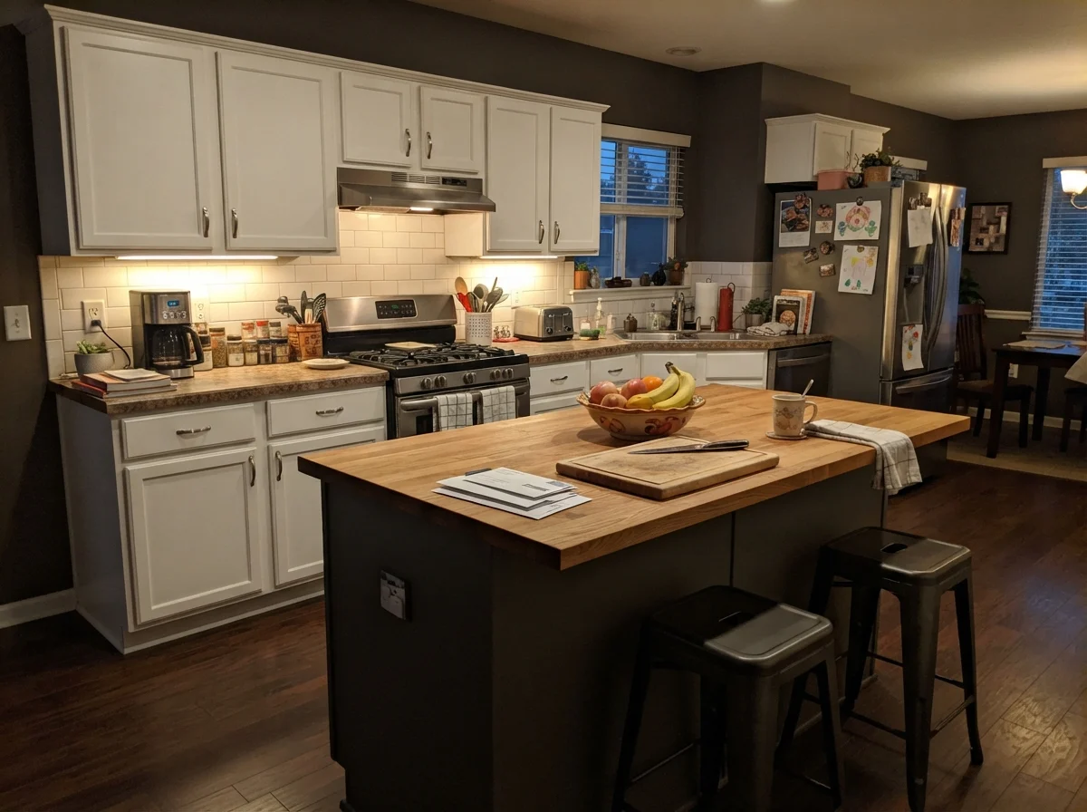
Because it is deeply pigmented with an earthy undertone, it hides the daily wear and tear of family cooking far better than light grays or crisp whites. It doesn't show water drips from the sink, and muddy shoe scuffs against the island kick plate disappear. When painted in a durable satin urethane enamel, a kitchen island in Urbane Bronze grounds an open floor plan without looking sterile or industrial.
A word of caution for smaller kitchens: avoid painting both upper and lower cabinets in this shade unless your space is drenched in perimeter daylight. In our 1970s split-level, we made the mistake of putting a heavy dark finish on every single cabinet in an enclosed U-shaped layout; it looked dated within three years and felt like cooking in a broom closet. Keep Urbane Bronze on the island and lower bases, and run a warm off-white like Pure White (SW 7005) or Alabaster (SW 7008) on your uppers.
Living Rooms, Sunrooms, and Utility Spaces
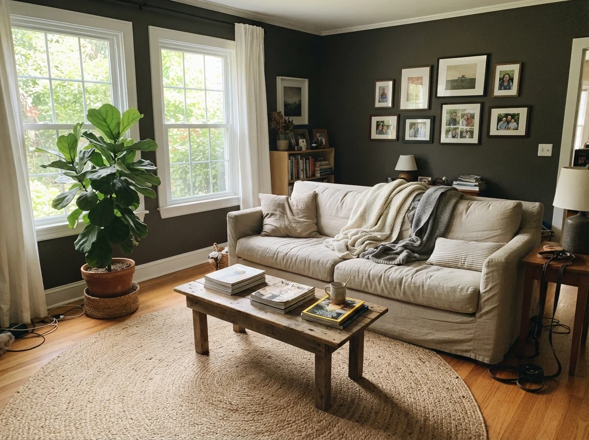
In living rooms, the most successful application is often an accent wall—framing a fireplace or anchoring the wall behind a large sofa—paired with warm neutrals like Accessible Beige (SW 7036) or Agreeable Gray (SW 7029) on the adjacent surfaces. This prevents the room from losing too much ambient bounce while giving your eye a handsome, grounded focal point.
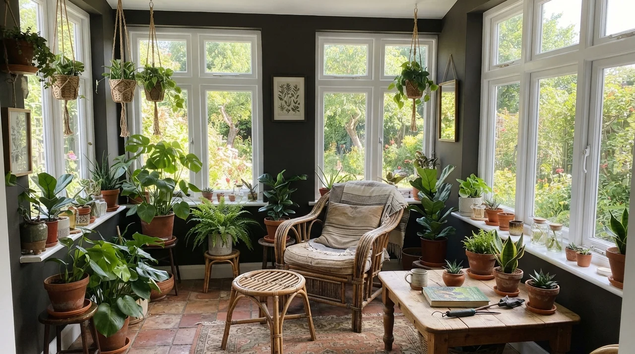
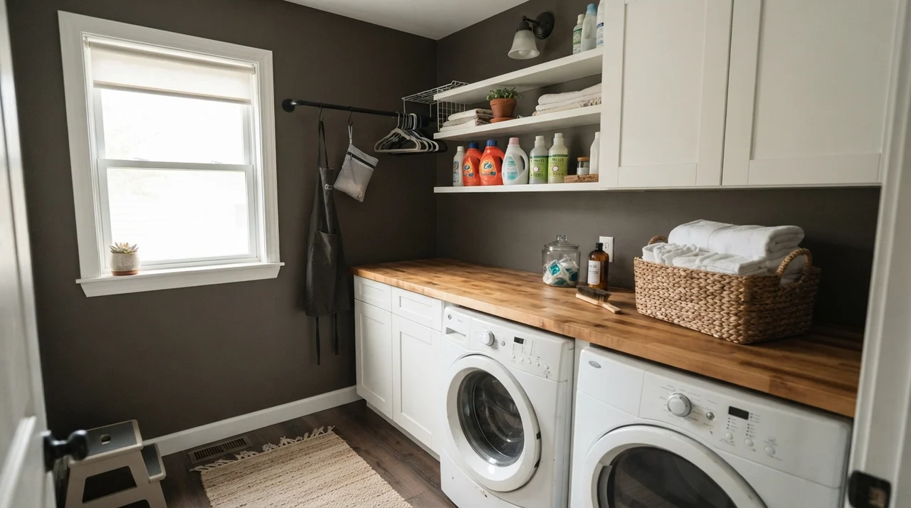
Surprisingly, sunrooms and laundry rooms handle Urbane Bronze exceptionally well if they have decent exterior glazing. In a sunroom lined with white-trimmed windows, the dark paint between the mullions actually makes the greenery outside look brighter and more vivid. In a laundry room, a splash of deep bronze-gray above a white washer and butcher-block folding counter turns a purely utilitarian chore space into something that feels intentional and finished.
Interior Doors and Architectural Trim
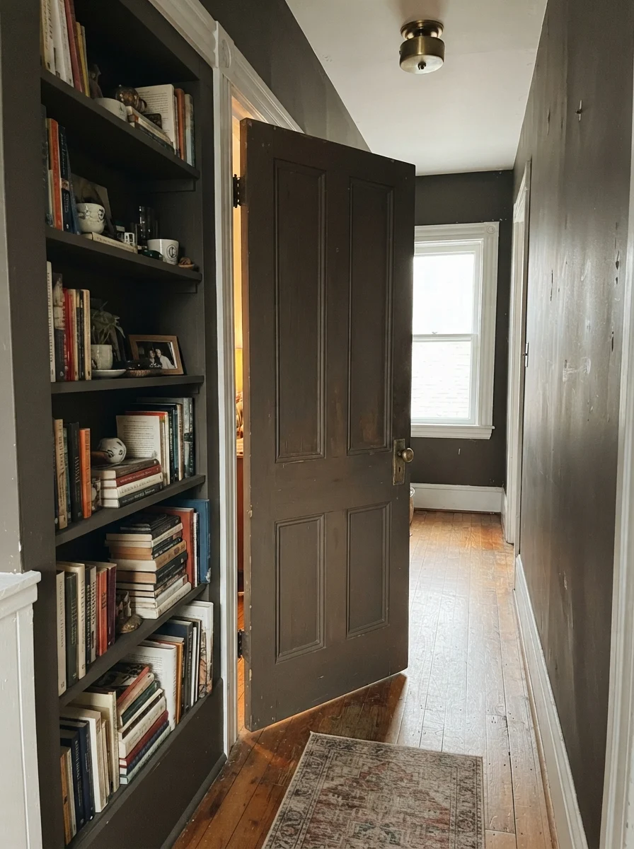
If committing an entire wall or room to an LRV 8 color feels too risky, interior doors and built-in shelving are where Urbane Bronze delivers maximum payoff for minimal paint. Painting a standard two-panel or six-panel interior door in this shade gives it instant visual weight, especially when paired with solid brass hardware.
In our hallway, we lived with it on the doors against warm cream walls for several years. It never showed grime around the latch plates, and when we sold our second house, the listing agent specifically commented on how substantial the interior doors felt simply because they were finished in a deep, grounded tone instead of builder-grade white.
Three Places Where Urbane Bronze Fails Completely
The complaints about this color are remarkably consistent, and none of them are about paint quality. They are about three specific situations where the bronze warmth simply refuses to show up. If your room falls into one of these categories, no amount of sheen adjustments will save it:
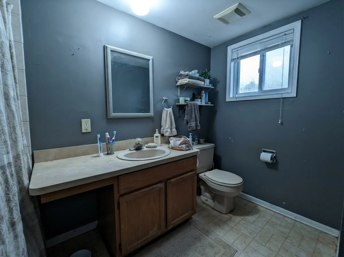
- A small, windowless or north-facing room: North light is cool and indirect throughout the entire day. It strips the bronze right out of the paint, leaving a flat, heavy near-black that swallows the corners. This is the single most common regret story. If you want depth without the flat black collapse, step up to Porpoise (SW 7047) at LRV 13.
- Directly over orange-toned honey oak floors: Warm oak bounces strong yellow wavelengths upward. When yellow light lands on a low-chroma, yellow-orange based dark paint, it pushes the undertone into a muddy olive-green. People swear the can was mixed wrong, but it is pure color reflection. If you have vintage oak floors, test Iron Ore (SW 7069) instead—it stays clean and neutral.
- Uppers and lowers in an enclosed kitchen: Full-height dark cabinets in a small kitchen choke the light out immediately. The warmth gets lost in the shadow lines beneath the upper boxes, making the kitchen look dingy rather than high-end.
Durability, Sheens, and the Truth About Scrubbing Dark Walls
Anyone who tells you that all paint colors clean up the same has never had to scrub dried spaghetti sauce off a dark wall five years in. Dark colors formulated in deep bases contain significantly more colorant and less titanium dioxide than whites or pastels. That heavy pigment load makes the dried film softer and more prone to burnishing—that shiny, rubbed mark that appears when you scrub too hard with a sponge.
For walls, you want a high-grade matte or flat enamel. A standard cheap flat paint will leave chalky white streaks the first time you wipe it down, while an eggshell or satin finish will bounce glare and highlight every tape seam and drywall patch on the wall. For cabinets, doors, and trim, use a dedicated satin urethane enamel. That gives you the hard, scuff-resistant shell required around door handles while keeping water spots easy to wipe down.
One more practical lesson: never throw away the leftover paint can, and always confirm your touch-up paint comes from an ultradeep base. If a painter tries to touch up an Urbane Bronze wall with a sample mixed in an extra-white base or off-ratio tint, the patch will dry visibly lighter and chalky, forcing you to repaint the entire wall from corner to corner.
What is the LRV of Sherwin-Williams Urbane Bronze?
Urbane Bronze has a Light Reflectance Value (LRV) of 8. This puts it squarely in the dark category, reflecting only eight percent of available light. It requires either generous natural daylight or intentional warm artificial lighting to keep from looking like a flat black.
Does Urbane Bronze look green?
It can flash an olive-green cast in two specific situations: when illuminated by cool 4000K LED bulbs, or when bounced light from orange-toned honey oak floors hits the wall. In natural south or west daylight, the undertone stays warm brown-bronze.
What is the best trim color for Urbane Bronze?
Sherwin-Williams Alabaster (SW 7008) and Pure White (SW 7005) are the safest choices. Their soft, subtle warmth prevents the high contrast against the dark walls from feeling cold or stark.
Can I use Urbane Bronze on exterior siding?
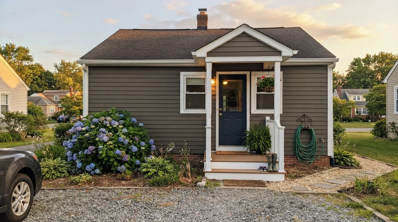
Yes. Direct sunlight brings the bronze and brown pigments forward, making it read noticeably warmer outside than it does indoors. It is an exceptional whole-body exterior color for modern and craftsman homes, as well as a durable front door color.
What sheen should I choose for Urbane Bronze walls?
Use a washable matte finish on interior walls. Higher sheens like satin or semi-gloss reflect too much glare on deep colors and highlight drywall flaws, while matte keeps the finish velvety and rich.
Susan's Verdict · Buy with Confidence (If You Have Windows)
Urbane Bronze is the color you choose when pure black feels too harsh and charcoal feels too industrial. That bronze-brown warmth is genuine, and in a sunlit study, on a kitchen island, or across a front door, it looks soft, deliberate, and undeniably high-end. But treat it with respect: if your room faces north, has no windows, or sits above orange honey-oak floors, walk away and choose a lighter greige or a neutral charcoal instead. In the right light, it's worth every penny.