Color Diary · No. 17
Valspar Goose Feathers: The No-Drama Greige That Demands the Right Trim
The most balanced light greige at Lowe's, reviewed honestly: the whole-house rooms where it stays calm, the north light that turns it drab, and what to pick instead.

Susan HartleySeptember 6, 2026 · 14 min read
Goose Feathers · Valspar 8006-2B
Hex#D6D2CALRV65Undertoneswarm gray → soft stone → muted drab
In our last house—a 1990s colonial with too many angled drywall corners and eight-foot ceilings—I spent the better part of six months trying to find a single, quiet wall color that could run from the front foyer all the way back into the kitchen without throwing a tantrum at every doorway. Every greige swatch I taped to the wall seemed to carry a hidden personality. One turned lilac whenever a cloud rolled past; another flashed bright celery green in the morning sun; a third looked like wet cardboard the second we turned on the ceiling cans.
That is the universal headache of greige. It is supposed to be the easiest color family in the deck—the sensible compromise between gray and beige—yet it causes more repaints than almost anything else. If you have spent any time browsing the paint racks at Lowe’s, you have almost certainly pulled the swatch for Valspar Goose Feathers (8006-2B). On the card, Valspar files it under cool grays, but the moment you put it on a wall in daylight, it reads as an exceptionally calm, soft greige.
With a Light Reflectance Value (LRV) of 65, it sits in that rare sweet spot: light enough to open up a dim central hallway, but carrying just enough pigment so it never washes out into a generic builder white. It is currently ranked #46 globally, and for good reason. It is the color people grab when they are simply exhausted by undertone drama. But living with it five years in is very different from liking a four-inch paper chip. There are specific rooms where Goose Feathers is practically foolproof, and there are three exact lighting situations where it will fall completely flat.
The Undertone Profile: Why It Stays Neutral
The magic of Goose Feathers is what is missing from the formula. Most popular greiges lean noticeably into pink, purple, or green undertones the moment your daylight shifts. Valspar Goose Feathers carries so little competing pigment that it simply behaves like quiet, sun-warmed stone under balanced light. However, because it lacks a heavy dose of yellow or red warmth, its appearance is deeply dependent on your room's light source and fixed surfaces.
warm sun
overcast, north light
dusk, rain, cool bulbs
South light brings out an honest, creamy warmth without yellowing. Flat overcast or cool northern exposure strips that warmth instantly, leaving a muted, putty-gray face.
Crushed IceSherwin-Williams · see diary
AbaloneBenjamin Moore · see diary
Goose Feathers8006-2B
DoveBehr · see diary
AmmoniteFarrow & Ball · see diary
How Daylight and Bulbs Alter the Formula
When you evaluate a color with an LRV of 65, you have to watch how it reacts to the sun across a full twelve-hour cycle. In generous southern daylight, Goose Feathers is at its absolute best. The greige reads soft, airy, and grounded—never stark, and never overly warm like an early-2000s Tuscan tan. In east- and west-facing rooms, you will notice a gentle shift: slightly cooler and more crisp in the morning shade, softening into a warm, comfortable stone as the late afternoon sun washes across the floorboards. The shift is modest, which is precisely why homeowners select it for open floor plans.
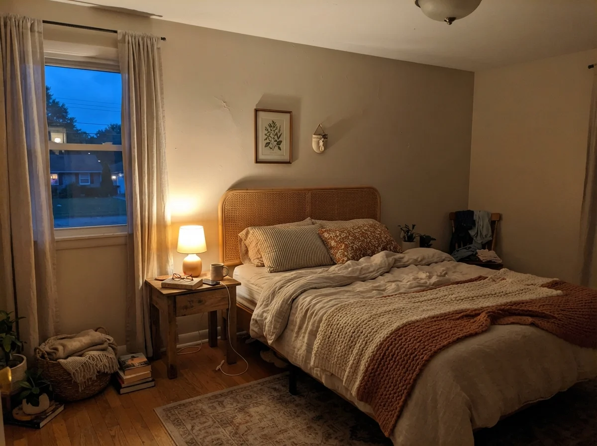
The trouble begins when you starve it of natural light or blast it with the wrong light bulbs. Cool 4000K LED ceiling fixtures or gloomy northern daylight will strip away every ounce of warmth Goose Feathers possesses, turning the walls into a lifeless, slightly muddy gray. In our current 1960s ranch, I have learned the hard way that bulb temperature can make or break a neutral wall. If you run 2700K warm incandescent or warm LED bulbs, Goose Feathers rewards you by leaning cozy and gentle in the evening.
Goose Feathers in the Kitchen and Living Areas
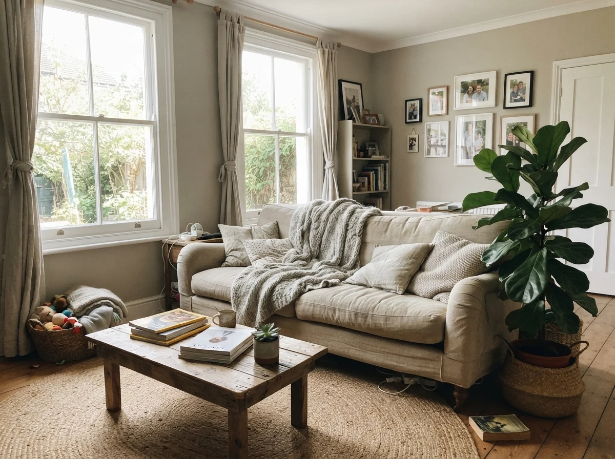
In living rooms and family spaces with generous windows, Goose Feathers is a true workhorse. It doesn't fight with natural materials. If you have honey oak trim, walnut mid-century dressers, warm leather chairs, or brass sconces, this paint steps politely into the background and lets your furnishings take center stage. It gives mixed artwork and layered rugs a cohesive, deliberate look.
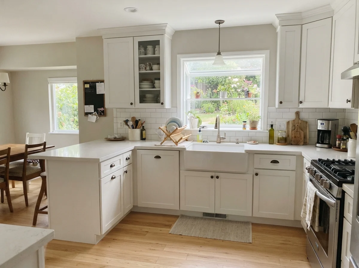
In kitchens, however, you need to be thoughtful about where and how you apply it. As a wall color behind warm wood or creamy off-white cabinetry, it is nearly impossible to mess up. It creates a gentle contrast that feels timeless. But if you are thinking about spraying your kitchen cabinets in Goose Feathers, proceed with caution. Because it is a soft, low-contrast neutral, a full kitchen of Goose Feathers cabinets can look slightly tired or dingy unless it is paired against a distinctly crisp countertop and bright backsplash tile. If your counters are already a muddy mottled laminate or a cool blue-gray granite, Goose Feathers cabinets will look undecided rather than tailored.
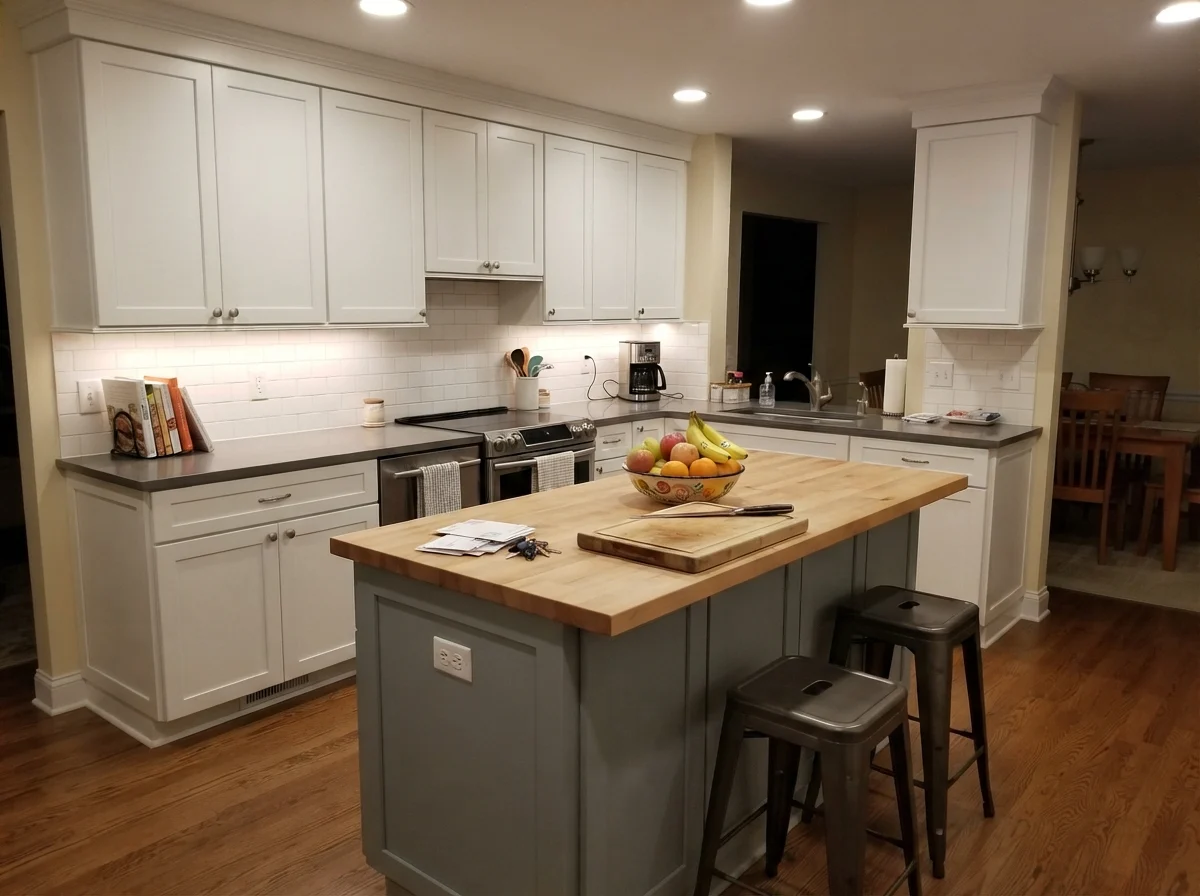
One compromise I have seen work beautifully in kitchen renovations is using Goose Feathers strictly on a central island while keeping the perimeter cabinetry white. It breaks up the monochrome sterility of an all-white kitchen without committing you to a heavy navy or dark charcoal island that shows every kicked shoe scuff and dust bunny.
Bedrooms, Bathrooms, and Transitional Rooms
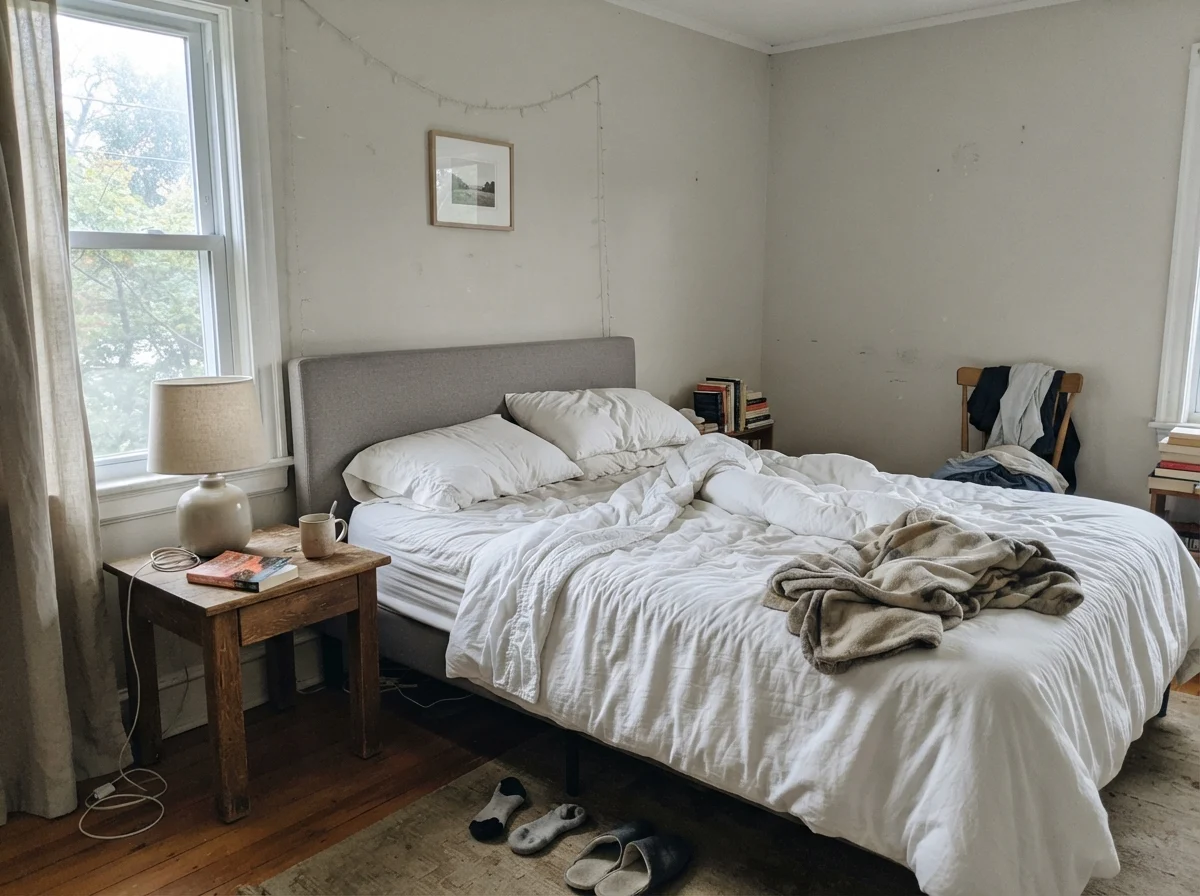
In private quarters, Goose Feathers delivers that restful, calm environment everyone wants in a retreat. In a main bedroom or a nursery, it pairs naturally with pale oak, linen bedding, and woven wicker baskets. It feels grounded enough to anchor light furniture, yet light enough that the room feels airy the minute you pull back the curtains in the morning.
For a teenager’s room or a guest bedroom, it adapts remarkably well as bedding and posters rotate over the years. When our kids were growing up, their taste in bedroom decor changed every twenty-four months. A neutral like Goose Feathers spared us from repainting the walls every time someone decided their favorite color was suddenly cobalt blue or forest green.
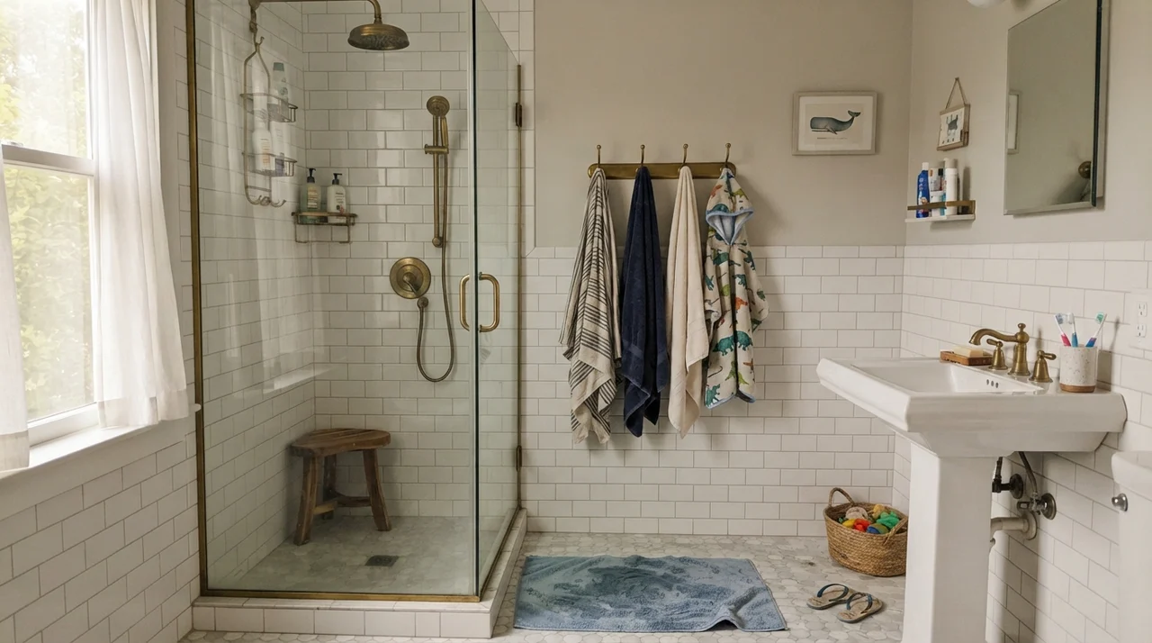
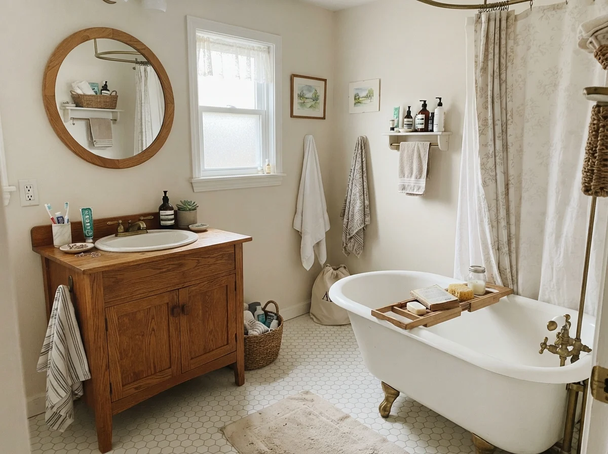
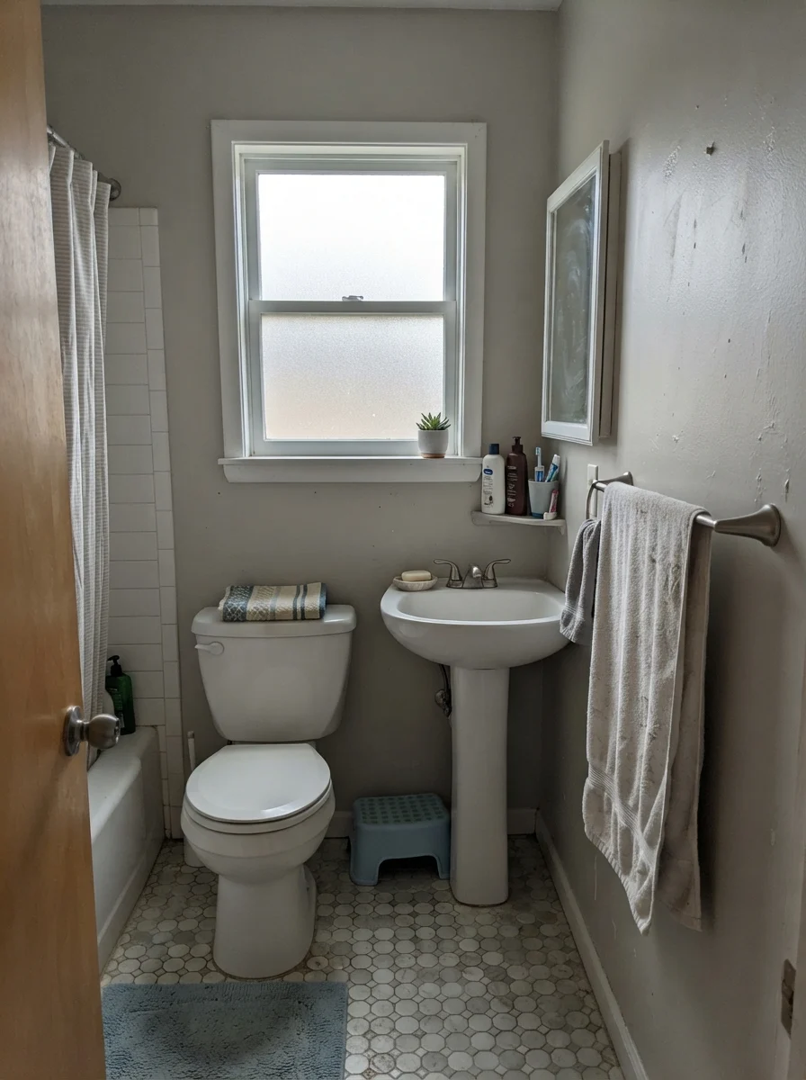
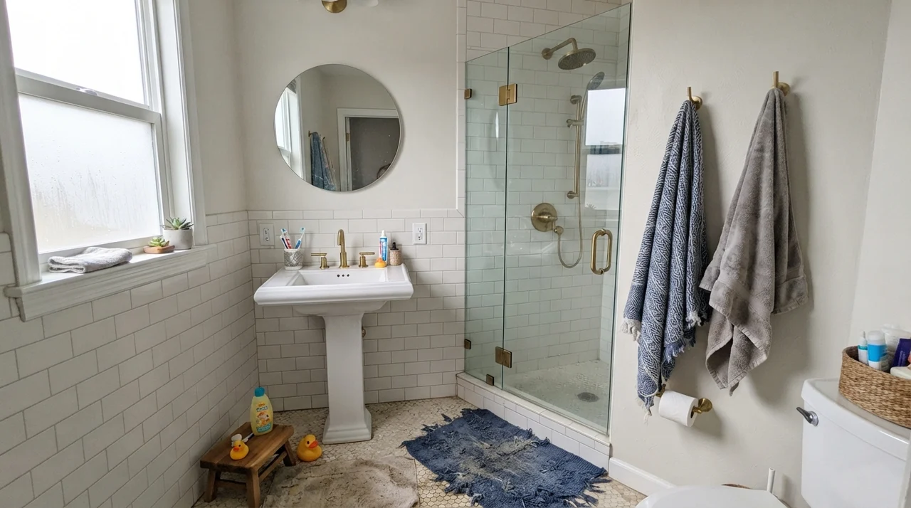
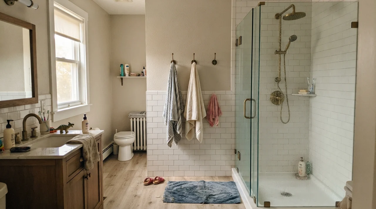
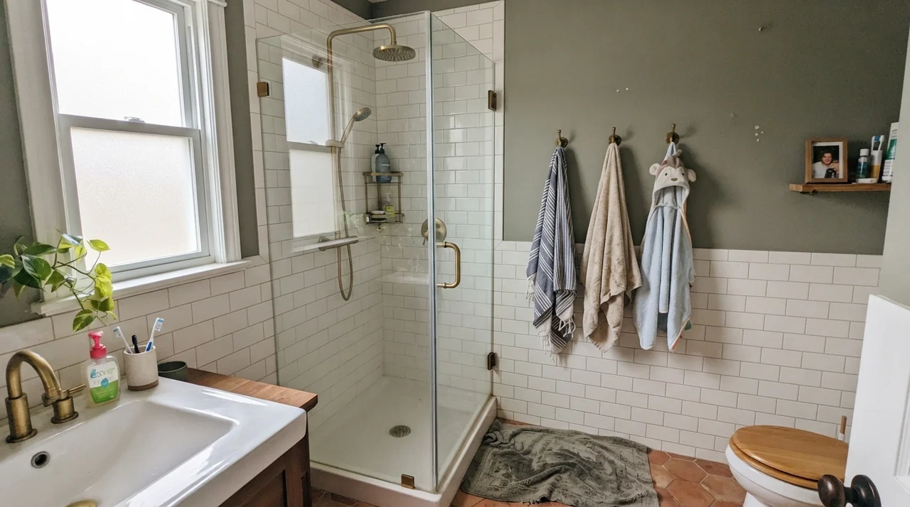
Bathrooms require a close look at your tile and stone before you open a can. If your bathroom features classic white subway tile, a vintage clawfoot tub, warm brass fixtures, or beige travertine, Goose Feathers acts as a bridge that ties the whole space together. It gives enough warmth to keep the porcelain fixtures from feeling clinical.
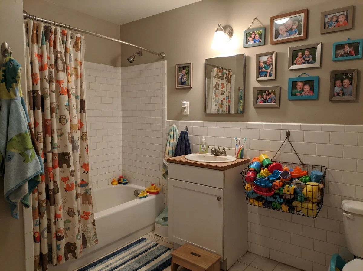
However, if your bathroom has cool Carrara marble, blue-gray slate, or chilly fluorescent vanity bars, Goose Feathers will look unwashed and muddy by comparison. A bathroom is too small and wet of a space to tolerate an undertone clash.
Sunrooms, Laundry Rooms, and Hallway Runs
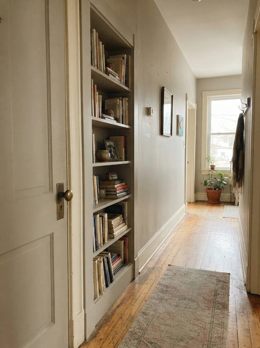
Where Goose Feathers truly shines as a whole-house paint is across continuous hallways and connecting utility spaces. In sunrooms flooded with garden daylight, it absorbs the intense brightness and stays completely calm, cutting the blinding glare you often get with standard bright whites. In high-traffic laundry rooms and mudrooms with decent windows, it pairs handsomely with butcher-block countertops, white washers and dryers, and open utility shelving.
If your home features original wood doors, wide casing, or built-in bookshelves, painting those architectural details in Goose Feathers against off-white or cream walls creates a subtle, layered depth that feels collected rather than brand-new.
The magic of a whole-house greige isn't that it turns heads. It's that you can walk from the foyer to the back bedroom without the wall color ever picking a fight.
Where Goose Feathers Fails (And Three Scripts to Watch For)
After thirty years of painting rooms, I have learned that almost every paint failure comes down to lighting or trim choices, not a bad can from the store. With Goose Feathers, almost every homeowner regret story matches one of three exact scenarios:
- The windowless interior hallway or dim north room: In spaces with zero direct natural light and weak lighting, the color collapses into a flat, drab putty. It loses all depth. If you have a dark hallway corner, test your sample there first. If it looks lifeless on day one, an entire gallon will not improve it.
- Paired with ultra-bright builder white trim: This is the single most common installation mistake. When you roll Goose Feathers against a stark, blue-leaning gallery white like Chantilly Lace or Extra White, the trim makes the greige look unwashed and dingy. Goose Feathers needs a softer, creamier companion.
- Cool gray luxury vinyl plank (LVP) or cool marble: Placing Goose Feathers next to blue-gray synthetic flooring or cool Carrara stone forces its tiny drop of warmth forward in an unflattering way, making the wall look yellow-dirty. If your fixed floors are icy gray, pick a dedicated gray like Repose Gray instead.
Exterior Siding and Long-Term Durability
Can you use Goose Feathers outside? Yes, but remember that outdoor sunlight washes out paint colors by roughly one full step. On exterior horizontal siding, Goose Feathers reads as a very soft, sophisticated off-white stone rather than a deep greige. When paired with deep accents like Iron Ore or Kendall Charcoal on the shutters and a rich Hale Navy front door, it creates an understated, handsome facade that will not look dated within three years.
When it comes to sheens and everyday maintenance, I always follow the same rule: eggshell on walls, semi-gloss on trim, and satin for cabinets or built-ins. Flat paint in a whole-house greige is an invitation for disaster if you have children or pets; every scuff requires a touch-up rather than a wipe. In eggshell, Goose Feathers can be scrubbed clean with a damp microfiber cloth and mild soap without burnishing the finish. Five years in, it holds up remarkably well against daily wear and tear.
How Goose Feathers Compares to Other Leading Greiges
If you are standing in the aisle trying to choose between brands, here is how Goose Feathers stacks up against the most popular whole-house neutrals on the market.
What is the Light Reflectance Value (LRV) of Valspar Goose Feathers?
Valspar Goose Feathers has an LRV of 65. This puts it in the sweet spot for whole-house painting: light enough to bounce natural daylight through hallways, but pigmented enough to contrast against off-white trim.
Is Goose Feathers a gray or a beige?
It is a true greige. While Valspar catalogs it as a cool gray on their swatch card, in real homes with daylight it reads as a soft, warm stone gray that bridges the gap between beige and gray.
What trim color goes best with Valspar Goose Feathers?
Pair it with warm off-whites such as Valspar Swiss Coffee or Valspar Dove White. Avoid stark, cold whites like Chantilly Lace or Extra White, which make Goose Feathers look dingy.
Can I use Goose Feathers in a north-facing room?
You can, but test it first. Cool northern light strips away its faint warmth and can make it read as a flat, muddy gray. If your north room has limited daylight, consider warming it up with 2700K lamps or choosing a warmer paint like Accessible Beige.
What paint sheen should I use for Goose Feathers?
Use eggshell on standard walls for easy cleaning and durability, semi-gloss on doors and baseboards, and satin enamel if you are painting kitchen cabinets or bathroom vanities.
Susan's Verdict · Worth the Money for Whole-House Living
Goose Feathers is the paint you buy when you are sick of repainting rooms because the undertones wouldn't behave. At LRV 65, it is one of the most balanced, low-fuss light greiges available at the big-box desk. Give it warm wood, decent daylight, 2700K bulbs, and a soft cream trim like Valspar Swiss Coffee, and it will quietly do its job for a decade without looking dated.