Color Diaries.
← All colors ·  Room Diaries
Color Diary · No. 20

Painting Kitchen Cabinets White: The 8 Shades Tested Across Three Homes

After thirty years of scrubbing spaghetti sauce off cabinet doors in three different houses, here is what actually happens when you paint your kitchen cabinets white.

In our 1990s colonial, the kitchen came wrapped in that shiny, honey-orange builder oak that was mandatory for the era. By 2004, I could not look at those cathedral-arched doors for another morning. I bought eight gallons of a budget bright white paint, took off all twenty-six doors over a long weekend, and learned my very first hard lesson about cabinet painting: a swatch taped to an index card tells you absolutely nothing about how a kitchen will feel on a gray Tuesday in November. That bright white turned our north-facing kitchen into what looked like an operating room, and every speck of toast crumb became an emergency.

When we moved into our 1960s ranch nine years ago, the kitchen cabinets were tired again, but this time I knew better than to grab the purest white on the rack. Kitchen cabinets are not walls; you do not look at them from across the room under soft lampshade lighting. You lean against them while the kettle boils, your children kick the island base with muddy sneakers, and grease from the saute pan drifts up into the corners above the range hood. You touch the stiles around the pulls dozens of times every day.

A white cabinet paint has to do two conflicting jobs at the exact same time. It has to brighten a hardworking room without looking sterile, and it has to sit peacefully alongside your countertop stone, your tile backsplash, your floorboards, and your trim. If your cabinet white has too much yellow, it looks like forty years of cooking grease under evening lights. If it has too much blue or stark grey, it makes your warm wood cutting boards and brass hardware look like mistakes.

Over three houses and more kitchen refreshes than my back cares to remember, I have lived with the good, the bad, and the scrubbed-clean reality of these paints. If you are getting ready to brush, roll, or spray your kitchen cabinets, here is how the eight most popular cabinet whites perform over years of daily living, cooking, and resale.
The Lineup

Alabaster · SW 7008Sherwin-Williams · LRV 82
White Dove · OC-17Benjamin Moore · LRV 83
Greek Villa · SW 7551Sherwin-Williams · LRV 84
Swiss Coffee · OC-45Benjamin Moore · LRV 82
Chantilly Lace · 2121-70Benjamin Moore · LRV 91
Snowbound · SW 7004Sherwin-Williams · LRV 83
Pure White · SW 7005Sherwin-Williams · LRV 84
Simply White · 2143-70Benjamin Moore · LRV 90
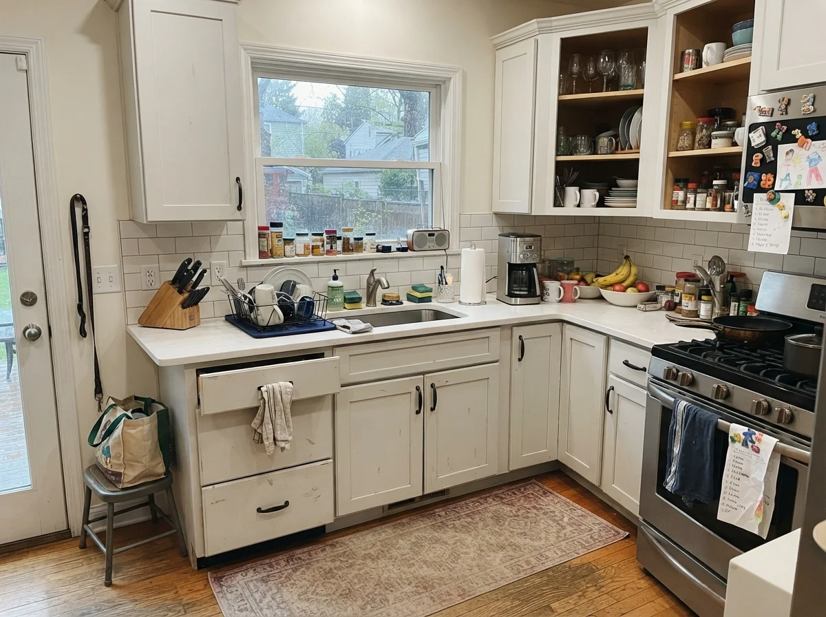
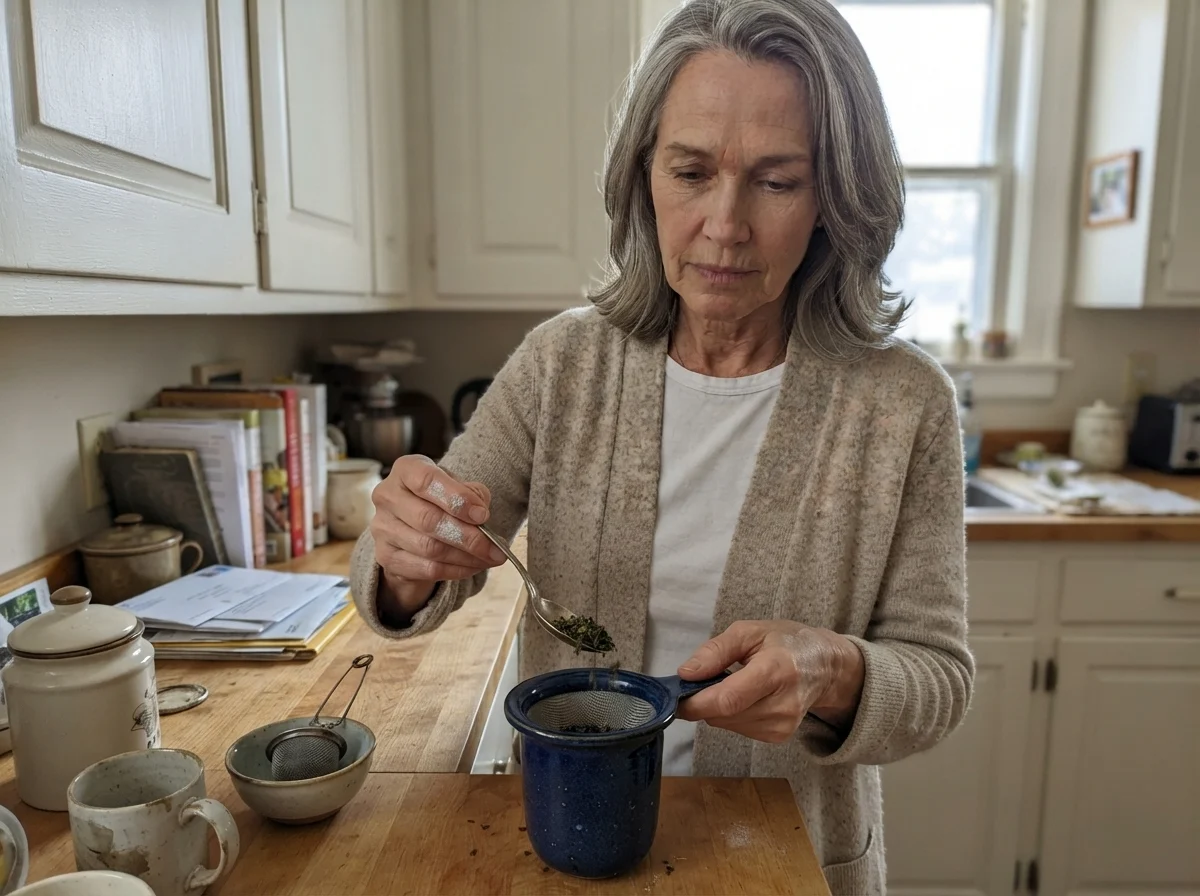
Susan Hartley working with paint in the kitchen
Susan in her kitchen Carefully measuring loose tea at the counter, with cabinets painted in Sherwin-Williams Alabaster holding up to daily morning routines.
You don't pick a cabinet white for the day the painter pulls off the tape. You pick it for year five, when you've wiped down the trash pull-out a thousand times.

1. Sherwin-Williams Alabaster: The Warm White That Refuses to Look Harsh

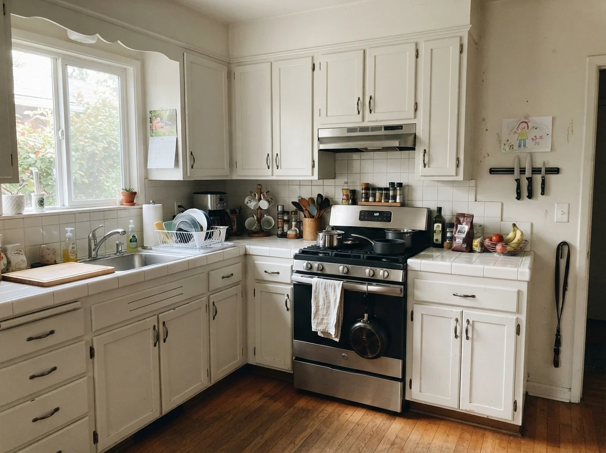
In our last house, I painted the entire kitchen perimeter in Sherwin-Williams Alabaster after our previous stark white experiment failed so miserably. At LRV 82, Alabaster has enough reflective power to bounce daylight all the way into dark corners, but it carries a soft cream base that keeps it comfortable to live with. It does not pretend to be a crisp gallery white, and that is precisely why it works so well on cabinetry. When you walk into the kitchen at seven in the morning, it greets you with warmth rather than a glare.

What I appreciated most five years in was how well Alabaster held up alongside our natural materials. We had warm white oak floors and unlacquered brass cup pulls, and Alabaster made those elements look deliberate and rich. It has a gentle yellow undertone that reads simply as 'soft white' under standard sunlight. When we sold that house, three different buyers remarked on how welcoming the kitchen felt, and our listing agent specifically credited the cabinet color for making the room look updated without feeling cold.

The catch with Alabaster is that it is unapologetically warm, which means you cannot pair it with just anything. If you have installed crisp, cool-gray quartz counters with blue veining, or if you have bright, icy-white subway tiles on your backsplash, Alabaster will look dingy and slightly aged by comparison. It also struggles in dim, north-facing kitchens where cold blue natural light fights the yellow base, turning it a muddy shade of oatmeal. Skip it if your permanent fixtures lean cool or stark modern.

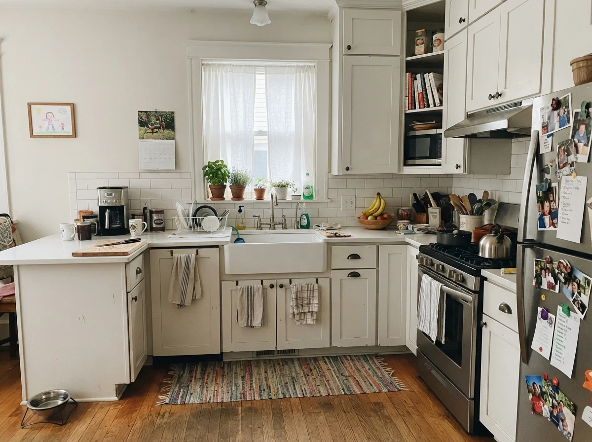
kitchen with Sherwin-Williams Alabaster
Warm and lived-in Shaker kitchen cabinets painted in Sherwin-Williams Alabaster with white countertops, subway tile, and neutral walls.
Alabaster · SW 7008Sherwin-Williams · LRV 82

2. Benjamin Moore White Dove: The Safe Harbor That Rarely Fails

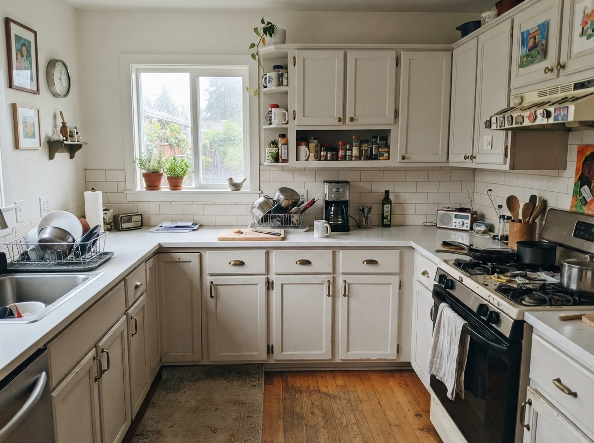
Benjamin Moore White Dove is the color I tell my neighbors to buy when they are paralyzed by white paint swatches and losing sleep over cabinet decisions. At LRV 83, it sits in that sweet spot where it reflects plenty of illumination without ever feeling clinical. What separates White Dove from other warm whites is a microscopic touch of gray pigment in the mix. That tiny drop of gray acts like a leash on the yellow undertones, keeping the paint calm, quiet, and grounded even under strong afternoon light.

I lived with White Dove on our kitchen cabinets for over seven years, and it was one of the easiest surfaces I have ever maintained. Grease splatters, hand lotion smudges around the drawer handles, and pencil marks from homework time scrubbed clean with mild soap without leaving shiny, polished spots or wearing through the pigment. Because it does not skew heavily yellow or icy blue, it transitioned smoothly between our morning daylight and our evening 3000K overhead recessed lights.

However, White Dove is not completely invincible. If your kitchen trim, baseboards, or ceiling are already painted a super-bright, factory-fresh builder white, White Dove cabinets will look a bit dirty against them. It demands that you either carry the color onto the adjacent millwork or select a ceiling white that isn't glaringly cold. It also looks muted and tired if your kitchen is dominated by cool gray marble or stark slate flooring.

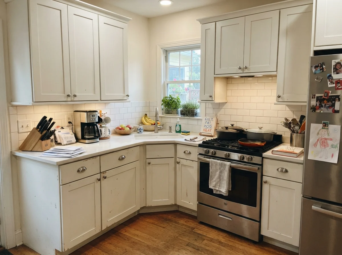
kitchen with Benjamin Moore White Dove
Balanced cabinetry Shaker kitchen cabinets painted in Benjamin Moore White Dove paired with white counters, subway tile backsplash, and neutral off-white walls.
White Dove · OC-17Benjamin Moore · LRV 83

3. Sherwin-Williams Greek Villa: A Bright, Sunny Lift for Heavy Woodwork

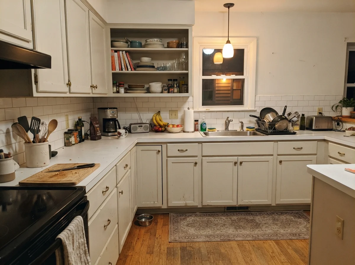
Sherwin-Williams Greek Villa is what I reached for when we refreshed the kitchen in our 1970s split-level. The room had heavy trim, lower ceilings, and a window that sat under the shade of a massive backyard maple tree. At LRV 84, Greek Villa is noticeably brighter than Alabaster, but it holds onto a cheerful, sunny warmth that makes a dark kitchen feel like it just woke up on vacation. It gave our dated cabinets an immediate lift without turning the kitchen into an uninviting, stark box.

On cabinet boxes and shaker doors, Greek Villa creates a lush, creamy finish that flatters honey oak, reclaimed wood islands, and aged bronze cabinet latches. It is especially forgiving if you are painting over older solid wood cabinets where the grain might show slightly through, as the creaminess softens shadows and imperfections across the door panels. Over four years of hard family use, it wiped down beautifully and never looked chalky.

You must be cautious with what sits beside Greek Villa, though. Because it leans into a distinct sunny warmth, harsh western afternoon sun can push it to look noticeably yellow for an hour or two before sunset. Furthermore, if you place Greek Villa cabinets directly beneath an untreated, ultra-bright ceiling or against icy white quartz, the contrast will immediately highlight the yellow undertone, making your fresh paint job look prematurely aged. It needs warm companions to thrive.

kitchen with Sherwin-Williams Greek Villa
Sunlit cabinetry Shaker kitchen cabinets painted in Sherwin-Williams Greek Villa surrounded by white counters, subway backsplash, and neutral off-white walls.
Greek Villa · SW 7551Sherwin-Williams · LRV 84

4. Benjamin Moore Swiss Coffee: The Traditional Cream for Historic Character

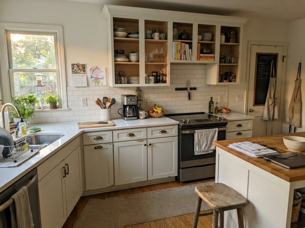
Benjamin Moore Swiss Coffee is a classic for a reason, but you have to know what you are buying before you open the can. At LRV 82, it is a true, rich off-white with undeniable cream running through its core. If you put Swiss Coffee on modern flat-panel cabinets next to polished chrome and stainless steel, it will look out of place. But if you have an older home, traditional shaker profiles, butcher block surfaces, or unlacquered brass latches, Swiss Coffee creates a kitchen that feels like it has been loved for forty years.

In our current 1960s ranch, I used Swiss Coffee on the lower perimeter cabinets in our butler's pantry area. It softens the entire corner of the house, bouncing warm light into an otherwise windowless hallway. It is exceptionally forgiving when it comes to everyday family wear and tear; dust and minor scuffs do not announce themselves on Swiss Coffee the way they do on starker whites, and wiping it down five years in has left the surface looking as rich as the week it cured.

The downside is what happens when Swiss Coffee meets modern, high-kelvin lighting or cool architectural materials. If you have 2700K warm incandescent bulbs overhead or bright builder-white ceiling drywall, Swiss Coffee can rapidly turn the color of melted butter. It is also an absolute mismatch for cool gray veined quartz, white subway tiles with cold blue-gray grout, or modern stainless-heavy layouts. Treat it as a soft cream, not a pure white, and you won't be disappointed.

kitchen with Benjamin Moore Swiss Coffee
Warm traditional woodwork Shaker kitchen cabinets painted in Benjamin Moore Swiss Coffee alongside white countertops, subway backsplash, and neutral walls.
Swiss Coffee · OC-45Benjamin Moore · LRV 82

5. Benjamin Moore Chantilly Lace: The High-Maintenance Modern Pure White

Benjamin Moore Chantilly Lace is the shade people are picturing when they say they want a 'pure, clean white.' At an unmistakable LRV 91, this paint has virtually zero warm yellow or muddy brown pigments weighing it down. It is bright, crisp, and completely neutral. If you have installed crisp white quartz countertops with delicate charcoal veining and modern polished chrome fixtures, Chantilly Lace is one of the few cabinet colors that will match that level of clean sharpness without clashing.

However, living with Chantilly Lace on kitchen cabinets is an exercise in discipline. Because there is almost no tint in the can, getting full coverage over dark or honey-toned wood cabinets requires serious patience—usually a high-grade stain-blocking primer and at least three full coats of cabinet paint. Once it is on, it acts like a mirror to whatever light enters your kitchen. In bright, balanced southern light, it looks dazzling; in dim north light, it can feel chilly and uncompromising.

From a daily maintenance standpoint, Chantilly Lace does not give you any leeway. Every stray drop of coffee, every smudge of olive oil near the trash pull-out, and every scuff from a pet bowl stands out in sharp relief. It also has a cruel way of making any nearby off-white surface—like an older biscuit-toned sink, almond appliances, or creamy trim—look noticeably dingy and dirty. Choose this only if you want an ultra-crisp look and are prepared to wipe your cabinet fronts frequently.

kitchen with Benjamin Moore Chantilly Lace
Pure crisp line Shaker kitchen cabinets painted in Benjamin Moore Chantilly Lace framed by white counters, subway tile backsplash, and neutral off-white walls.
Chantilly Lace · 2121-70Benjamin Moore · LRV 91

6. Sherwin-Williams Snowbound: The Soft Contemporary with a Hidden Side

Sherwin-Williams Snowbound has become a darling of transitional kitchen renovations, and on paper, it makes total sense. With an LRV of 83, it gives you plenty of light reflection without the stark, hospital-like glare of pure titanium white. It is soft, velvety, and pairs exceptionally well with charcoal soapstone counters, matte black hardware, and weathered white oak accents. In a kitchen with generous natural daylight, Snowbound reads as a sophisticated, quiet off-white.

When our daughter renovated her first kitchen four years ago, we sprayed her builder-grade oak cabinets in Snowbound. In her bright, south-facing kitchen, the finish has held up remarkably well to two toddlers and a golden retriever. Grease spots near the stove have scrubbed clean without eroding the satin sheen, and the color bridges the gap between her modern stainless appliances and warm hardwood flooring perfectly.

The warning you must heed with Snowbound lies in its undertone. Snowbound carries a faint taupe-pink base that remains completely invisible in bright rooms, but comes out aggressively in dim, north-facing kitchens or rooms with warm 2700K lighting. If your flooring has pinkish-beige tile or mauve undertones, Snowbound will pull those tones right out and look slightly violet-gray. Always paint a generous sample board and look at it at 8:00 PM under your actual kitchen lights before committing.

kitchen with Sherwin-Williams Snowbound
Soft transitional profile Shaker kitchen cabinets painted in Sherwin-Williams Snowbound with white counters, subway tile, and neutral off-white walls.
Snowbound · SW 7004Sherwin-Williams · LRV 83

7. Sherwin-Williams Pure White: The Dependable All-Rounder

There is a very good reason professional cabinet painters recommend Sherwin-Williams Pure White more than almost any other shade. At LRV 84, it is bright enough to make a kitchen feel fresh and expansive, but it contains a tiny droplet of black and a drop of warm raw umber. That formulation keeps it completely neutral—it does not pull creamy yellow like Alabaster, nor does it look cold and icy like Chantilly Lace. It simply looks like a clean, well-proportioned white.

In our 1990s colonial, when I finally repainted over our disastrous stark-white cabinet mistake, Pure White was the color that saved the room. It sat comfortably against our warm subway tile backsplash, flattered our brushed brass cup pulls, and did not make our off-white crown molding look dirty. Five years in, after countless wipe-downs with damp microfiber cloths, the color maintained its integrity and never yellowed or faded near the sunlit kitchen window.

The only time Pure White runs into trouble is when it is forced to compete against high-contrast, cooler elements in low light. In a windowless kitchen or a dim room with cool-blue low-E glass windows, Pure White can lose its subtle warmth and look slightly flat or dull gray. It also will not deliver that antique, cottage-like charm if you are trying to create a historic, creamy farmhouse aesthetic. But for ninety percent of family kitchens, it is virtually foolproof.

kitchen with Sherwin-Williams Pure White
Balanced kitchen perimeter Shaker kitchen cabinets painted in Sherwin-Williams Pure White with white counters, subway backsplash, and neutral off-white walls.
Pure White · SW 7005Sherwin-Williams · LRV 84

8. Benjamin Moore Simply White: The Bright, Cheerful Crowd Pleaser

Benjamin Moore Simply White is the paint that defined an entire generation of open-concept kitchen remodels, and for good reason. With a high LRV of 90, it is remarkably bright, yet it has a delicate kiss of warm yellow that keeps it from ever feeling sterile or chalky. When painted on kitchen cabinetry, it reflects morning light around the room like a lantern, creating a cheerful, energetic cooking space where you actually want to spend time.

What I love about Simply White on cabinets is its versatility with natural materials. It flatters butcher block islands, honey-toned pine floors, and warm marble countertops with golden veining. It covers significantly better than colder, untinted whites, meaning you can achieve a solid, opaque factory-like finish on your cabinet doors without having to apply five tedious coats. In our last house, our laundry and secondary prep cabinets were in Simply White, and they looked brand new right up until the day we handed over the keys.

You do, however, need to manage your lighting expectations. Because that warm undertone is yellow rather than greige, an intense west-facing sunset will make Simply White flare quite warm, almost reading as a light cream for an hour each evening. It also does not belong in a kitchen that features cool gray concrete counters, blue-gray glass backsplashes, or stark commercial stainless workstations. Treat it to warm surroundings and balanced light, and it will reward you every day.

kitchen with Benjamin Moore Simply White
Bright open kitchen Shaker kitchen cabinets painted in Benjamin Moore Simply White paired with white counters, subway backsplash, and neutral walls.
Simply White · 2143-70Benjamin Moore · LRV 90
Alabaster · SW 7008

Use Alabaster on your kitchen baseboards, window casings, and crown molding when your cabinets are also Alabaster or Greek Villa. It creates a seamless, wrapped warmth that makes older wood floors and brass accents feel cohesive rather than broken up by harsh lines.

White Dove · OC-17

Susan's pickMy absolute top recommendation for kitchen trim work. White Dove has just enough gray pigment to sit quietly against almost every warm or neutral cabinet white without creating a distracting, jarring contrast at the ceiling line or floorboards.

Greek Villa · SW 7551

An excellent trim choice if you have painted your cabinets in Swiss Coffee or Greek Villa and want the trim to feel bright and sunny without flashing stark bright white. Avoid using it if your walls are a cool, slate gray.

Swiss Coffee · OC-45

Reserve Swiss Coffee for trim only if your cabinets are also painted Swiss Coffee or a deep, rich historical color like navy or forest green. On trim next to bright white cabinets, it will read as yellowed and aged.

Furniture and Finishes

  • Unlacquered brass and warm bronze hardware — Aged brass cup pulls and latch hardware bring out the rich undertones in warm white cabinets without looking harsh or overly shiny.
  • Warm white oak islands and butcher block — Natural wood tones ground off-white cabinets, preventing the kitchen from feeling like a sterile laboratory.
  • Cool blue-gray Carrara marble counters — Heavily cool-toned gray marble makes creamy and warm white cabinet paints look dirty, muddy, and yellowed by comparison.
  • Tumbled warm limestone and beige travertine floors — Earthy, warm stone underfoot complements whites with LRVs between 82 and 84, creating a harmonious, lived-in feel.
  • High-gloss chrome and cold acrylic barstools — Ultra-modern, cold reflective furnishings clash sharply with soft, traditional warm-white shaker cabinetry.

Home Styles

  • 1960s to 1980s ranch and split-level refreshes — Warm whites instantly update dated dark oak and laminate cabinetry while maintaining harmony with lower ceilings and existing woodwork.
  • 1990s center-hall colonials — Balanced whites like White Dove and Pure White bridge the gap between traditional trim profiles and updated countertops.
  • Ultra-minimalist industrial concrete lofts — Warm, creamy whites clash with raw concrete, commercial steel, and sharp architectural angles that require true gallery whites.
  • Classic Craftsman and farmhouse kitchens — Shades like Swiss Coffee and Alabaster honor historical woodwork and heavy millwork without feeling artificially modern.
  • Spec-homes with stark cool-gray builder quartz — Cool, patterned gray composite countertops will fight against warm white cabinets, making the paint look dingy.
Alabaster vs White Dove

Both are legendary cabinet choices, but they handle undertones differently. Alabaster relies on a soft, creamy yellow base that glows warmly in southern light and flatters natural wood. White Dove adds a drop of gray pigment to its warm base, which keeps it more neutral and prevents it from flaring yellow in strong afternoon sun. If your kitchen has mixed lighting or cooler stone, White Dove is safer; if you want undeniable cozy warmth, choose Alabaster.

Greek Villa vs Swiss Coffee

Greek Villa is a brighter, more sunlit off-white at LRV 84, designed to lift darker rooms while staying warm. Swiss Coffee sits at LRV 82 and is significantly creamier and more traditional. Greek Villa works wonderfully for a transitional kitchen refresh over oak, while Swiss Coffee is best suited for historic homes, heavy moldings, and spaces where you genuinely want the cabinetry to read as a soft, rich cream.

Chantilly Lace vs Pure White

Chantilly Lace is an ultra-crisp, untinted gallery white at LRV 91 with zero warmth, making it ideal for modern spaces with stark quartz and stainless steel, though it requires constant cleaning and multiple coats. Pure White at LRV 84 carries a tiny dose of raw umber, making it far more forgiving of everyday smudges, easier to apply over wood, and much gentler alongside warm trim and hardwood flooring.

Where These Colors Fail in the White Kitchen Cabinets

The most expensive cabinet painting mistake I ever made was ignoring the fixed surfaces in the room. In our first colonial house, I chose an icy, bright white for the cabinet boxes because it looked clean on a tiny paint chip. The moment the doors were rehung, our beige-flecked laminate counters looked filthy, our biscuit-colored ceramic sink looked yellowed, and the warm oak floorboards looked like an orange accident. Cabinet paint does not live in a vacuum; if your countertops, backsplash, or flooring carry warm beige or golden tones, a cold pure white cabinet paint will instantly turn them into an eyesore.

The second major failure occurs when homeowners skip the necessary prep work and reach for standard wall paint on cabinetry. Kitchen cabinets endure more daily physical contact, steam, cooking grease, and aggressive scrubbing than any other surface in the home. Using standard latex wall paint or skipping a dedicated bonding primer over sanded wood will result in chipped edges around the pull handles within six months. When you wipe off dried tomato paste, standard paint will peel away right down to the wood grain.

Finally, beware of pairing creamy cabinet whites with stark builder-white ceilings. If you paint your cabinets in a lovely, cozy shade like Swiss Coffee or Greek Villa, but leave the ceiling above them in a cheap, un-tinted flat bright white, the eye will immediately register your cabinets as 'dirty' rather than 'warm.' The ceiling will look glaring and your custom cabinetry will lose all its intentional richness. Always balance your ceiling and trim to complement your cabinet undertones.

Sheens, Durability, and Touch-Ups

When it comes to kitchen cabinets, sheen is not just a stylistic preference; it is your primary defense against moisture, spaghetti sauce, and sticky fingers. In my thirty years of maintaining kitchens, I have found that a dedicated satin cabinet enamel is the gold standard for daily family living. Satin delivers a soft, furniture-like luster that hides minor wood imperfections while providing a tight, non-porous finish that wipes clean effortlessly with a damp microfiber cloth.

Do not let anyone talk you into using flat, matte, or eggshell paint on your kitchen cabinets. While ultra-matte finishes look lovely in glossy design magazines, in a working kitchen they are an absolute disaster. Matte finishes absorb oils from your hands, trap cooking grease, and will burnish into shiny, uneven patches the very first time you scrub off a dried spill. Eggshell does not fare much better around high-use areas like the trash pull-out or the drawers beneath the sink.

Semi-gloss is durable and easy to scrub, but on large cabinet doors, high-gloss sheens can highlight every single brush stroke, roller stipple, and natural flaw in the wood grain. Unless you have brand-new, factory-sprayed flawless doors and prefer a traditional, high-shine aesthetic, stick to a high-quality waterborne alkyd or urethane enamel in a satin finish. It provides maximum scrubbability without turning your kitchen into a hall of mirrors.

Should my kitchen cabinets match my trim color exactly?

They do not have to match identically, but their undertones must be in harmony. If your cabinets are painted a warm off-white like White Dove, your trim can either be the exact same color in a semi-gloss sheen or a slightly cleaner white with a neutral undertone. The only fatal mistake is pairing creamy warm cabinets with stark, icy-blue builder white trim, which makes the cabinets look dingy.

How do I prevent white kitchen cabinets from yellowing over time?

Yellowing typically happens for two reasons: using traditional oil-based paints that oxidize in low light, or constant exposure to cooking grease and UV rays. To prevent this, always use modern waterborne alkyd or water-based urethane cabinet enamels, run your range hood vent whenever cooking with oils, and choose quality paints with colorfast pigments.

Is it worth paying more for specialized cabinet paint instead of regular latex?

Yes, absolutely. Specialized cabinet enamels cure into a hard, furniture-grade shell that resists chipping, blocking, and hand oils. Regular latex wall paint stays slightly soft and rubbery, meaning cabinet doors will stick to the face frames and peel within months. The extra twenty or thirty dollars per gallon pays for itself ten times over in longevity.

What white cabinet color looks best with dark or honey oak floors?

Warm and balanced whites like Sherwin-Williams Alabaster, Sherwin-Williams Pure White, or Benjamin Moore White Dove look exceptional with oak flooring. Their gentle warmth harmonizes with the natural grain and golden tones of the wood, creating a timeless, welcoming kitchen that avoids harsh visual contrasts.

How many coats of white paint are needed to cover dark wood cabinets?

Plan on one thorough coat of a high-hiding, stain-blocking primer followed by two to three full coats of cabinet enamel. If you are using a low-pigment, ultra-pure white like Chantilly Lace over dark cherry or oak, you will likely need three full finish coats to achieve complete opacity without the dark grain shadowing through.

How do I clean white painted cabinets without damaging the paint finish?

Avoid harsh abrasive powders, ammonia-based sprays, or stiff scouring pads. Use warm water mixed with a few drops of mild dish soap and a soft microfiber cloth. For stubborn grease above the stove, a gentle citrus-based cleaner diluted in water works wonders. Always wipe dry with a clean towel to protect the paint seams from trapped moisture.

Susan's Verdict · White Dove

If I had to pack my paint brushes today and repaint the cabinets in our kitchen one last time, my money would be on Benjamin Moore White Dove in a satin enamel finish. It is the single most dependable, forgiving white I have ever lived with across thirty years and three homes. It has just enough cream to feel warm and human when the morning sun pours in, but that critical drop of gray stops it from ever turning yellow or sloppy under artificial evening lights. It forgives hand smudges, wipes clean without wearing down, flatters warm brass and natural wood, and never makes a kitchen feel cold. It is simply the white that lets you get on with living.

Susan Hartley
Susan Hartley · Home Editor & 30-Year Homeowner

Three houses, thirty years, every room repainted at least twice. Susan writes about what colors are like to live with — five years in, not five days. More about Susan →